
Search results for "Check fit" in Home Design Ideas

 Legendary Escapes Pools
Nautical-themed hybrid swimming pool with raised spa, sunshelf, slide, grotto, and pizza oven
(September 2013) – Ask the Pool Guy and his team at Legendary Escapes recently unveiled the newest Legendary Escape, a stunning nautical-themed hybrid swimming pool. The hand-carved concrete waterfall, rock slide, and grotto are the focal point of this incredible project, and designer and builder Al Curtis has truly outdone himself this time. Behind the waterfall sits a grotto that seats 8-10 people comfortably. The waterfall, slide, and grotto area come complete with intricate details and additions that perfectly play into the project’s theme. An immense amount of creativity, talent, and skill is required to take ordinary materials like vinyl and concrete and turn them into the outstanding backyards that Curtis creates, but these details allow his creativity to shine in a different light. Curtis immerses himself completely in just one or two projects at a time, which allows him the opportunity to add those intricate details that take his extraordinary projects to the next level. Some of the details in the grotto area of this hybrid project include real ship portholes that open and close, as well as carvings and lanterns to add visual interest inside of the grotto.
The project also includes a raised spillover spa and a sunshelf with a bubbling water feature. The sunshelf has steps leading into the main body of the pool, giving swimmers an easy entry point if they don’t feel the urge to jump off the top of the waterfall or take a ride down the hand-carved, hand-tiled slide. The shelf has just enough water to allow shallow wading or lounging, and the pebbled finish provides a perfect place to set a lounge chair without worrying about damaging the vinyl liner. With the spa nearby, this whole end of the pool is perfect for relaxing, talking, or watching the kids while they swim.
This incredible hybrid swimming pool also includes a poolside pizza oven, so fresh, stone-fired pizza is never far away. The brick oven can cook a pizza in about 90 seconds, and produces authentic, outstanding pizzas. The homeowners have spent years perfecting their pizza crust and sauce recipes, as well as growing their own tomatoes and basil. The pizza oven adds another element of their own personality, and makes this project even more perfect for them. With a built-in countertop, it’s easy to get a couple of pies going at one time, or to prep ingredients for personal pizzas.
The homeowners are very family-oriented and love to have friends and family over to their home. During the construction process, the Legendary Escapes crew met several friends and family members who stopped in for some quality time and to check out the progress of the pool. The finished product is a perfect place for entertaining, and it feels very comfortable and welcoming. With the sunshelf, spa, grotto, poolside seating, and the pool itself, there are plenty of different places to sit or soak and have conversations or splash around.
Curtis is incredibly proud of this project, and he has high hopes for it. He was recently named a Master of Design by Pool & Spa News for a hybrid swimming pool he built in Brighton, MI. This new, nautical hybrid pool fits in beautifully with his portfolio, but also stands out as extraordinary. The team at Legendary Escapes anticipates positive feedback and recognition for this project, and looks forward to building more swimming pools that push the envelope and wow clients and fans.

 RAJ Kitchen and Bath, LLC
**Check out the video of this transformation on our website**
This small kitchen was way too small for this 2 bedrooms, 2 bathrooms apartment. Not only was it a very small kitchen, but the physical location of it made it very difficult to make it any bigger. There wasn't much that could have been done without incurring astronomical cost, which would get little or no return on the investment. The client wanted a kitchen that can be optimized in its current location to add a ton of value for resale.
This was difficult to do, because there was no moving of any mechanical around in the kitchen and even if we wanted to, the management of the building would not allow. For those of you who live in condos, co-ops or apartment building, you know how difficult it is to rework these foot prints. When we showed up, we saw the problems, but we also saw a huge opportunity where we can achieve those goals in the small space. This was accomplished by making some key changes and to incorporate some new things that was not possible when this kitchen was built years ago.
The crucial part of the design that would drive the entire new layout, was selecting the only appliance; that was the Refrigerator. Once we nailed down that refrigerator, we then proceeded to design the kitchen around it. We moved it to the other side of the wall where the sink was so that we can tap into the water line from the sink plumbing. It was crucial that it stays exactly 24" deep, not an inch more because we had to keep the entry as open as possible. Also, it was going to be directly in front of another big storage unit - The pantry. It is not ideal in most cases, but we needed the rest of the space to ramp up the design and open feel towards the side where all of the activities would take place, which happend to be the dining room and the view.
Once all that was figured out, we re-positioned the sink, dishwasher and the range and proceeded to wrap the cabinets around the columns to integrate them into the space. Thirty- six inches cabinets height was used so that they can be installed higher towards the ceiling height to give more room rather than the standard 18" required height between the counter tops. This was done to make the room feel a lot bigger than it really was. Not to mention, we also didn't want the faucet to be buried under the cabinets so that was also a necessary design detail for the space.
We then lowered both knee walls so that the counter top can sit on top of them, by removing that stop point that would have otherwise defined the kitchen area. This allowed us to pick up that extra footprint into the room for added prep space and enabled us to create the illusion of a kitchen that is looking longer than it really is. Every inch mattered when designing this kitchen and we made a conscious decision to use every one of that inch.
White cabinets were selected to do just what white cabinets are design to do; make a small or dark room appear bigger, brighter and more open. In this kitchen, this was amplified the more because of the kitchen location. It was perfect! We knew we did justice to the space because while we were there taking some photos, a few potential buyers walked in and went straight for the kitchen! They said its design just to fit the apartment.
Pantry roll out shelving, Double recycle bin, fancy handles, LED lighting, Quartz counter top, beautiful backslash tiles and grey linen floors finished off the kitchen which looked over a beautiful view of the George Washington Bridge from the top of this lovely 4th floor apartment.
Credit to Masterpiece Tile and Marble (Annmarie on the selection of Tiles and countertop and Val on the Construction to complete this project).
Davor Kokic Photography
 Tile Doctor Ltd
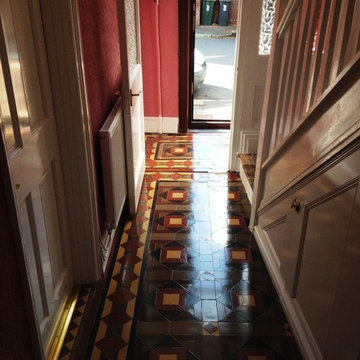
This Victorian tiled hallway at a house in the Forest of Dean had a very interesting pattern, consisting of an array of different colours, including shades of red, yellow and blue. Unfortunately, as you can see from the first photograph below, the tiles had lost all life, with the colours largely masked by months’ – or maybe even years’ – worth of ingrained dirt and muck. The floor as a whole was also suffering from a number of loose tiles that needed to be reset before it could be cleaned.
The property owner was keen to employ some professional assistance to restore the appearance of the floor and prevent it from getting in an even wrote state, and so contacted Tile Doctor who have a lot of experience working with Victorian tiled floors.
As mentioned, the loose tiles had to be repaired before the cleaning process could be started. I removed the tiles and extracted excess grout and old adhesive from the exposed concrete substrate using a vacuum, before putting the original tiles back into place and fixing them back into position carefully using fresh adhesive and matching grout.
Once happy the replaced tiles had set, I started the process of cleaning the entire area of hallway tiles using a combination of Tile Doctor Remove and Go to strip away the old sealer and Tile Doctor NanoTech HBU (formerly Ultra Clean) remover to get the tiles as clean as possible. The latter product contains nano-sized cleaning particles (hence the name) to reach difficult areas of trapped dirt, making it more effective than your run-of-the-mill tile cleaner. These two products were scrubbed into the tiles using a rotary machine fitted with a black scrubbing pad. The floor was then rinsed with water and the soiled residue was extracted with a wet vacuum.
I then paid particular attention to the grout, applying our alkaline-based multi-purpose cleaner Tile Doctor Pro-Clean to the grout lines, before scrubbing them with a narrow grout brush. This quickly had the grout looking clean again: I’d even go as far as to say that it matched it seamlessly with the fresh grout that had just been laid.
With the tile and grout as clean as it was possible to get it, I gave the whole floor a final rinse to neutralise the excess chemicals. I extracted as much water as possible with a wet vacuum and left the floor to dry overnight.
My first task upon returning to the property the next day was to check for any dampness. If you neglect to remove all excess moisture from the surface of the tiles before sealing it is more than likely going to cloud the sealer, rendering it less effective I’m protecting the stone against ingrained dirt and stains.
Once satisfied that the floor was completely dry, I proceeded to seal the tiles using multiple costs of Tile Doctor Seal and Go. Seal and Go is what we would classify as a topical sealer, meaning it rests on the surface of the tiles to act as a durable layer of protection against all kinds of muck. While providing surface protection, Seal and Go also adds a nice subtle sheen to the tiles, as per the customer’s request.
The customer was quite amazed at how quickly the appearance of the tiles had been restored. It was fantastic to see the colours we both knew were hidden in the tiles come to life once again. Another satisfied customer for sure!
Paul Wales
Monmouthshire Tile Doctor
Find the right local pro for your project

 Flooring Supply Shop
SERENE STEAM SHOWER SPA SENSORY SPLASH MODEL COMPLETE UNIT
NO Generators - NO Electrical Required!
Install the world’s first Eco Friendly Steam Spa in your home shower enclosure.
The Sensory Splash model is our latest, signature spa system, including our exclusive steam/hot vapor feature, Bluetooth audio and an Essential Oils mechanism. This model also includes a full shower feature described as a pressure balanced, hot and cold mixing valve with a two function diverter for switching between a shower head and a hand held shower for regular shower use, and incorporates a pressure balanced mixing valve system for optimum performance.
Steam/hot vapor is our patented, signature feature.
Available finishes are: Brushed Satin - Polished Mirror
An impressive alternative to regular steam generators
With a Serene Steam system you can enjoy all the benefits of a personal spa in the comfort of your home. Rejuvenate your senses and relax with a hot and humid spa session.
Most people would jump at an opportunity like this and Serene Steam has invented and designed innovative methods to create a complete wellness environment producing heat, steam/hot vapor infused with your choice of Essential Oils for the ultimate relaxation and rejuvenation as an elegant stand-alone unit installed in your shower enclosure .
Serene Steam is bringing innovation to the wellness culture. The way we perceive and gauge relaxation is about to change with a Serene Steam spa system. Now you have the perfect opportunity to pamper yourself in your personal shower enclosure with a beautifully designed spa system which produces a hot and humid spa environment.
Benefits - A hot steam spa, or steam shower environment has a physiological effect on the body which is very similar to that of a sauna. The hot vapors and heat may open up the pores, increases the metabolism, elevates the heart rate, and the body begins to sweat. This can result in health benefits, especially when a hot steamy environment is used safely and frequently (please read precautions). Some spas have also introduced the use of Aromatherapy in their systems to provide additional health benefits and relax clients. Enjoy a Serene Steam Spa system in your own shower enclosure.
Clearer skin - May improve the clarity of their skin over time.
Stress relief - One of the most powerful benefits may be the ability to reduce both physical and mental stress.
Metabolism and weight loss - In some instances, a hot steamy environment can even assist with weight management due to heavier perspiration.
WHY CONSIDER A SERENE STEAM SPA SYSTEM?
The fundamental reason among others, is that Serene Steam does not require any generators, nor any electricity at all. Rather, It is an impressive alternative to bulky electrical generators and has been certified by IAPMO for easy installation by a qualified plumber or contractor. A Serene Steam Spa system brings a moist heat, Essential Oils infused steam/Spa experience into your existing shower enclosure and generally requires basic installation.
Unlike competitors who require generators and an electrical supply to create a hot spa environment, (also known as a steam shower, wet sauna and alike), Serene Steam only requires the two primary connections which already exist in every bathroom - A water supply, and a drain, that's it. There are also no extra "a la carte" expenses required (other than basic plumbing parts) after you have purchased a Serene Steam Spa system. Everything is ready out of the box and only requires basic off the shelf plumbing fittings to install. You may require an additional spa bench for your new spa (not included).
All models are inclusive of our patented steam/hot vapor feature, a Bluetooth Audio system for music and phone calls, and a dedicated Aromatherapy feature for using Essential oils . When constructing a shower enclosure to use with any steam product, or alike, the type of wall materials which you use may also have an impact on the shower enclosure temperature and the time required to reach optimal comfort, please check with your local contractor. Remember, regardless of which steam system you use, all shower enclosures must be steam ready, and your local contractor or plumber should know how to seal your shower enclosure correctly to avoid the hot water vapors from exiting your shower enclosure during use.
PREFERRED SHOWER SIZE:
During use, Serene Steam provides an impressive amount of steam/hot vapor to occupy most standard shower enclosures, However, as with most steam shower enclosures, the smaller the area, the more effective the heat will feel.
With Serene Steam there is no specific size shower required due to the way it functions, also bearing in mind that with a movable spa bench (not included) it is possible to position yourself within any desired location should you have an extra-large/nonstandard shower enclosure. The diagram below should be a good indication of the preferred size of your shower enclosure. Please note that not all shower enclosures will provide the exact same results.
Certifications: cUPC - IAPMO certified, meets all local and federal ASTM standards ICG-54-2019 for shower panels and steam showers. Green Business Bureau Certified.
Product Specifications
Constructed from 16 gauge, 304 Stainless Steel.
The main body panel and mixing valve panel are designed to appear as one-themed unit for a beautiful flush wall mount.
Main hot & cold mixing valve
Aromatherapy Feature
Main body panel
Height: 27 inches
Width: 6 inches
Depth: 3.5 inches - Flush mount
Mixing valve panel
Height: 9 inches
Width: 6 inches
Depth: based on construction parameters
Total height and width of the installed unit is approximately: 38 x 6 inches (flush with wall).
Patented and IAPMO certified.
Disclaimer
The content on this site is not a substitute for a qualified physician, pharmacist, or other healthcare professionals. All content regarding benefits of a hot spa, or steam environment on this site is opinion, and is based entirely on ubiquitous publications supporting the opinion. Content is also gathered from public, & known sources & is as accurate as the general information provided & is opinion only, and not claimed by Serene Steam in any way whatsoever.
MADE IN USA
Join us at flooringsupplyshop.com for this product and many others
Patent U.S.A. & INTERNATIONAL
 RAJ Kitchen and Bath, LLC
**Check out the video of this transformation on our website**
This small kitchen was way too small for this 2 bedrooms, 2 bathrooms apartment. Not only was it a very small kitchen, but the physical location of it made it very difficult to make it any bigger. There wasn't much that could have been done without incurring astronomical cost, which would get little or no return on the investment. The client wanted a kitchen that can be optimized in its current location to add a ton of value for resale.
This was difficult to do, because there was no moving of any mechanical around in the kitchen and even if we wanted to, the management of the building would not allow. For those of you who live in condos, co-ops or apartment building, you know how difficult it is to rework these foot prints. When we showed up, we saw the problems, but we also saw a huge opportunity where we can achieve those goals in the small space. This was accomplished by making some key changes and to incorporate some new things that was not possible when this kitchen was built years ago.
The crucial part of the design that would drive the entire new layout, was selecting the only appliance; that was the Refrigerator. Once we nailed down that refrigerator, we then proceeded to design the kitchen around it. We moved it to the other side of the wall where the sink was so that we can tap into the water line from the sink plumbing. It was crucial that it stays exactly 24" deep, not an inch more because we had to keep the entry as open as possible. Also, it was going to be directly in front of another big storage unit - The pantry. It is not ideal in most cases, but we needed the rest of the space to ramp up the design and open feel towards the side where all of the activities would take place, which happend to be the dining room and the view.
Once all that was figured out, we re-positioned the sink, dishwasher and the range and proceeded to wrap the cabinets around the columns to integrate them into the space. Thirty- six inches cabinets height was used so that they can be installed higher towards the ceiling height to give more room rather than the standard 18" required height between the counter tops. This was done to make the room feel a lot bigger than it really was. Not to mention, we also didn't want the faucet to be buried under the cabinets so that was also a necessary design detail for the space.
We then lowered both knee walls so that the counter top can sit on top of them, by removing that stop point that would have otherwise defined the kitchen area. This allowed us to pick up that extra footprint into the room for added prep space and enabled us to create the illusion of a kitchen that is looking longer than it really is. Every inch mattered when designing this kitchen and we made a conscious decision to use every one of that inch.
White cabinets were selected to do just what white cabinets are design to do; make a small or dark room appear bigger, brighter and more open. In this kitchen, this was amplified the more because of the kitchen location. It was perfect! We knew we did justice to the space because while we were there taking some photos, a few potential buyers walked in and went straight for the kitchen! They said its design just to fit the apartment.
Pantry roll out shelving, Double recycle bin, fancy handles, LED lighting, Quartz counter top, beautiful backslash tiles and grey linen floors finished off the kitchen which looked over a beautiful view of the George Washington Bridge from the top of this lovely 4th floor apartment.
Credit to Masterpiece Tile and Marble (Annmarie on the selection of Tiles and countertop and Val on the Construction to complete this project).
Davor Kokic Photography

 Teness Herman
Photo: Teness Herman Photography © 2015 Houzz
Inspiration for a large eclectic women's carpeted walk-in closet remodel in Portland with flat-panel cabinets and white cabinets
Inspiration for a large eclectic women's carpeted walk-in closet remodel in Portland with flat-panel cabinets and white cabinets

 Metro Tile Inc
Alcove shower - small contemporary 3/4 gray tile, white tile and matchstick tile porcelain tile and beige floor alcove shower idea in New York with a one-piece toilet
Sponsored
Columbus, OH

Snider & Metcalf Interior Design, LTD
Leading Interior Designers in Columbus, Ohio & Ponte Vedra, Florida

 Tile Doctor Ltd
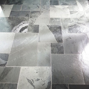
The pictures below are of a Riven Slate floor at a house in in the Leeds suburb of Horsforth which had been laid ten years prior. It’s probably difficult to appreciate from the images but the sealer on this floor was well worn through in the high traffic areas making it patchy in places. Without the protection of the sealer dirt was now ingrained in the pores of the stone leaving it looking dull. Riven slate is always tricky to clean thoroughly due to the rough surface and that combined with the ingrained dirt was making it very difficult to keep clean.
The floor now needed to be stripped of old sealer and then resealed and although I can provide a price for this over the phone my preference is to visit the property and survey the floor. In the case the owner had sent me some photographs via email however they were not too clear and so I felt it would be best if I paid the customer a visit to ensure I could give them an accurate price.
The floor was indeed overdue a clean and seal, as suspected dirt was ingrained into the areas where the seal had worn off. The house was home to a very busy family, so the area was subject to the significant traffic. I carried out a test clean on a small area and they were surprised by the results, when you live with a floor for so long you don’t notice the very slow decline in its appearance. They agreed to my quote and we arranged a time to return and carry the deep clean out.
When I arrived, I started off by protecting the skirting and surrounding woodwork. Given the rough surface of the floor I first applied Tile Doctor Wax Away which is a very effective coatings remover that is designed for removing wax but works very well in these situations. The product was left to dwell for a round ten minutes so it could get to work breaking down the old sealer and then scrubbed in using a black scrubbing pad fitted to a rotary machine.
This process removed most of the dirt and old sealer, but some stubborn patches remained. To treat these, I replaced the black pad with a coarse 200-grit burnishing pad and finally some handheld diamond burnishing blocks for the edges and corners where more intricate work was required, and the circular pads struggle to reach.
I gave the floor a rinse, and extracted the soil with a wet vacuum, the floor was then left to dry off overnight.
The next day I returned, first the slate floor was checked for moisture using the moisture meter. Once I was happy it was within the correct parameters, I then sealed with four coats of Tile Doctor Seal and Go. This is a modern water-based blend of acrylic polymers that provides both a stain resistant surface seal and a durable low-sheen finish also being water based there’s no smell as it dries.
The sealer really brought the stone to back to life and the lovely colours in the natural stones were now evident. The patchy appearance of the floor was gone, and the customer was happy.
I discussed with them how they should maintain the floor and advised them to use Tile Doctor Neutral Tile Cleaner. This is pH neutral cleaner that won’t prematurely erode the new sealer like the stronger products you find in Supermarkets which are only for use on Vinyl and Ceramic floors.
Nigel Stoker
North West Yorkshire Tile Doctor

 Manomin Resawn Timbers
This charming rustic mudroom features a built in bench with wall hooks, storage cabinetry, and a bold red door leading outside, all set against slate tile flooring. Reclaimed Wood Paneling covers the accent wall, Reclaimed Wood Cabinetry provides built in storage, and Reclaimed Wood Timbers frame the coffered ceiling above, bringing natural texture and warmth into this practical, cozy entryway.
Every piece of reclaimed wood at Manomin Resawn Timbers is salvaged from 19th and early 20th century barns, factories, and warehouses, structures built during the Industrial Revolution from old growth hardwoods that grew slower and denser than the trees available today. Through our detailed process of denailing, kiln drying, and precision milling, that history is preserved and prepared for a new life in modern homes.
Whether you are a homebuilder, a home remodeling contractor, a homeowner, or a designer planning a space like this one, Manomin Resawn Timbers has reclaimed wood paneling, custom cabinetry, and timbers to fit your vision. Visit our showroom in Hugo, MN or reach out to us with a call or a message to discover the antique charm of reclaimed wood.
 Tile Doctor Ltd
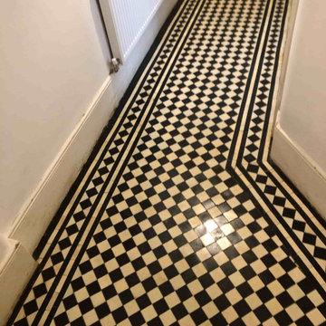
This property was in theLadbroke Grove area of West London near Kensington. The client had found an old and probably original black and white checkered pattern Victorian tiled floor under their cork tiled flooring. They also reported that it was badly damaged so I thought it would be best if I paid them a visit first to see how extensive the damage was and whether it was repairable. The floor was in a quite a state, the tiles were covered in glue from the cork and had several areas had been back filled with cement.
I reassured them that the damage could be rectified, and that it would be possible to completely restore the floor back to a good standard. I would have to remove the glue, remove the cement that had been used to level the floor and replace with reclaimed tiles to match. They were relieved to find out it could be done and happy with my quote I was instructed to go ahead with the work.
We started by taping up the skirting boards to protect the woodwork. With this done attention was turned to the glue which was softened using a strong dilution of Tile Doctor Remove and Go so it could be carefully scraped off. Multiple techniques and tools were needed to remove the glue including hand-held scrappers and a black pad fitted to a buffing machine. For the stubborn areas steam was applied to help lift the adhesive out the tile.
Once all the glue was removed the floor was rinsed and the alkaline cleaner neutralised with Tile Doctor Grout Clean Up which further cleaned the tiles and removed old traces of grout from the floor. Old floors like this generally don’t have a damp proof membrane underneath so the acids in the Grout Clean-up also counter any efflorescent salts trapped in the tile.
Once this was completed the slurry was removed with a wet vacuum and left to fully dry out overnight.
The following day focus turned to repairing the areas of the floor where the tiles were missing or broken. The main issue being the cemented areas, we see this a lot with Victorian Hallways and generally what happens is a heating engineer digs out the floor to install pipework. Not being tilers, your average plumber then repairs the floor with a self-levelling cement that brings the level up to the surface of the tile so it can be covered with lino, carpet of in this case cork.
The sub floor was then rebuilt with rapid setting self-levelling compound but this time to below the level of the tile.
Once the new base was dry it was a just a question of re-tiling with the replacement tiles to match the original checkered pattern. The replacement reproduction tiles were sourced from Original Features in Crouch End North London. After grouting we left the floor to dry out over the weekend.
When we returned to seal the floor our first step was to check the floor was dry using a moisture meter. This is critical as the sealant will not cure correctly if there is too much moisture in the floor. In this case the extra two days we had allowed had done its job and the test had confirmed it was ready to accept a sealer.
The client wanted the floor finish not to be too shiny once sealed so we opted to seal with two coats of Tile Doctor Seal and Go Extra. This is good choice for old Victorian floors such as this example as it’s special acrylic-based formula allows for moisture vapour transmission which as mentioned previously is a concern where no damp proof membrane has been installed.
I’m please to confirm my clients were delighted with the result, as you can see from the pictures the black and white floor restoration makes for a dramatic entrance well in keeping with the style of the property. For aftercare I recommended the use of Tile Doctor Neutral Tile Cleaner which will keep the tiles in good condition going forward without damaging the new sealer.
Jackson Davis
Central London Tile Doctor
 Bloomming
CUTTING-EDGE OFFICE FRONT DESK DESIGN
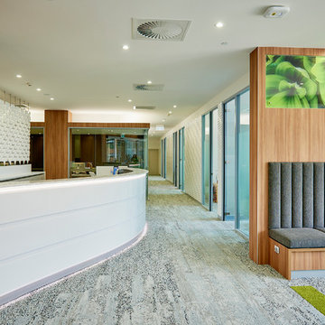
We have created the ultimate room divider for your professional workspace. Say hello to Facet – the best you can find in office front desk design. Facet is a fully modular system and available in any size. The separate facets can rotate. If you leave Facet as it is, you have a neat, polished look, but if you decide to turn some of the facets around you can create a quirky, fun screen for your office. It is all up to you! Either way, you are sure to impress your clients with this chic and unique modern office divider.
CREATE AN INSPIRING WORKSPACE WITH FACET
Having a welcoming and motivational workspace is very important. Your colleagues and you spend so much time at your office, you should be able to draw inspiration from it instead of feeling drained when you enter it. Having well-made furniture and beautifully designed pieces in your workspace, will help in creating an inspiring workspace. And that is why Facet office front desk design is ideal for an office environment. The craftsmanship and attention to detail in the design, will make anyone feel motivated to be creative and do their best.
Facet works perfectly as a backdrop behind reception to separate it from the rest of the office. This creates a calm and welcoming area at reception for your clients and guests. It also gives a stylish and professional first impression of your company. Choose Facet for on trend office front desk design décor.
GO FROM POLISHED TO PLAYFUL WITH FACET
The cool thing about Facet is that you can alter the look of it. You can turn around the diamond-shaped facets to change the look of the pattern and to adjust the amount that can be seen through it. Take a look at the sixth picture on this page. Drag the vertical line over the picture from left to right and back again. See how the screen goes from neat and polished to fun and playful? You can achieve the same look with our office front desk design screen by turning the facets around or keeping them as they are.
Facet room divider screens are available in any size, we just need your desired dimensions and will start assembling it. It is also available in a range of sophisticated colors. Choose one that fits your office interior, or we can develop a specific color if you want something that we don’t have on offer. Developing your own color will cost a bit more, contact us for the possibilities. We want you to be 100% happy with your office front desk design, so feel free to phone or email us if you have any questions or special requests!
This particular office divider is installed in a trendy medical clinic in Brisbane, Australia. It divides the reception area from the working area. Interior design is done by Louise Kollosche.
Project – Office Front Desk Design
Product – Room Divider Facet
Dimensions – Width 306cm x Height 171cm
Color – White
Ceiling Attachments – Brushed Stainless Steel
Location – Brisbane, Australia
Client – Karen Campbell, BCNC
Architect – Louise Kollosche, Kodesigned
Builder – Phillip Boon, Ulex Constructions
Photography – Cathy Taylor Photography

 Cure Design Group
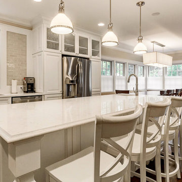
First things first…this renovation was certainly a labor of love for everyone involved, from our amazing clients, to the contractors, vendors and us, this project consumed all of us and the outcome is more than Gorgeous. This contemporary home is nestled back in a a great area of St Louis County. A brick ranch with contemporary touches…once adorned glass blocked bar and stairwell, a tiny galley kitchen and a remodeled garage that once housed their “dining and hearth room” but no one ever used that space.
CURE Senior Designer, Cori Dyer took this space, completely and brilliantly re worked the configuration and entire floor plan and layout. Tearing out the dividing wall from the kitchen and what was once the garage, allowed the new kitchen layout to be flipped to the now long perpendicular wall, and created an open mega kitchen with great natural light, double islands, eat in kitchen and seating area, bar and open the great room. You can stand among the space at any point and are able to take in the entire view.
Creating an uber chic space doesn’t happen on its own…it takes intricate design, research and planning. Custom made cabinets, a double island featuring two surfaces a butcher block and unforgettable marble. This clean color palette plays well with the new custom furniture in the great room, creating a seating area that sparks conversations.
Sponsored
Columbus, OH

Hope Restoration & General Contracting
Columbus Design-Build, Kitchen & Bath Remodeling, Historic Renovations
 RAJ Kitchen and Bath, LLC
**Check out the video of this transformation on our website**
This small kitchen was way too small for this 2 bedrooms, 2 bathrooms apartment. Not only was it a very small kitchen, but the physical location of it made it very difficult to make it any bigger. There wasn't much that could have been done without incurring astronomical cost, which would get little or no return on the investment. The client wanted a kitchen that can be optimized in its current location to add a ton of value for resale.
This was difficult to do, because there was no moving of any mechanical around in the kitchen and even if we wanted to, the management of the building would not allow. For those of you who live in condos, co-ops or apartment building, you know how difficult it is to rework these foot prints. When we showed up, we saw the problems, but we also saw a huge opportunity where we can achieve those goals in the small space. This was accomplished by making some key changes and to incorporate some new things that was not possible when this kitchen was built years ago.
The crucial part of the design that would drive the entire new layout, was selecting the only appliance; that was the Refrigerator. Once we nailed down that refrigerator, we then proceeded to design the kitchen around it. We moved it to the other side of the wall where the sink was so that we can tap into the water line from the sink plumbing. It was crucial that it stays exactly 24" deep, not an inch more because we had to keep the entry as open as possible. Also, it was going to be directly in front of another big storage unit - The pantry. It is not ideal in most cases, but we needed the rest of the space to ramp up the design and open feel towards the side where all of the activities would take place, which happend to be the dining room and the view.
Once all that was figured out, we re-positioned the sink, dishwasher and the range and proceeded to wrap the cabinets around the columns to integrate them into the space. Thirty- six inches cabinets height was used so that they can be installed higher towards the ceiling height to give more room rather than the standard 18" required height between the counter tops. This was done to make the room feel a lot bigger than it really was. Not to mention, we also didn't want the faucet to be buried under the cabinets so that was also a necessary design detail for the space.
We then lowered both knee walls so that the counter top can sit on top of them, by removing that stop point that would have otherwise defined the kitchen area. This allowed us to pick up that extra footprint into the room for added prep space and enabled us to create the illusion of a kitchen that is looking longer than it really is. Every inch mattered when designing this kitchen and we made a conscious decision to use every one of that inch.
White cabinets were selected to do just what white cabinets are design to do; make a small or dark room appear bigger, brighter and more open. In this kitchen, this was amplified the more because of the kitchen location. It was perfect! We knew we did justice to the space because while we were there taking some photos, a few potential buyers walked in and went straight for the kitchen! They said its design just to fit the apartment.
Pantry roll out shelving, Double recycle bin, fancy handles, LED lighting, Quartz counter top, beautiful backslash tiles and grey linen floors finished off the kitchen which looked over a beautiful view of the George Washington Bridge from the top of this lovely 4th floor apartment.
Credit to Masterpiece Tile and Marble (Annmarie on the selection of Tiles and countertop and Val on the Construction to complete this project).
Davor Kokic Photography
 RAJ Kitchen and Bath, LLC
**Check out the video of this transformation on our website**
This small kitchen was way too small for this 2 bedrooms, 2 bathrooms apartment. Not only was it a very small kitchen, but the physical location of it made it very difficult to make it any bigger. There wasn't much that could have been done without incurring astronomical cost, which would get little or no return on the investment. The client wanted a kitchen that can be optimized in its current location to add a ton of value for resale.
This was difficult to do, because there was no moving of any mechanical around in the kitchen and even if we wanted to, the management of the building would not allow. For those of you who live in condos, co-ops or apartment building, you know how difficult it is to rework these foot prints. When we showed up, we saw the problems, but we also saw a huge opportunity where we can achieve those goals in the small space. This was accomplished by making some key changes and to incorporate some new things that was not possible when this kitchen was built years ago.
The crucial part of the design that would drive the entire new layout, was selecting the only appliance; that was the Refrigerator. Once we nailed down that refrigerator, we then proceeded to design the kitchen around it. We moved it to the other side of the wall where the sink was so that we can tap into the water line from the sink plumbing. It was crucial that it stays exactly 24" deep, not an inch more because we had to keep the entry as open as possible. Also, it was going to be directly in front of another big storage unit - The pantry. It is not ideal in most cases, but we needed the rest of the space to ramp up the design and open feel towards the side where all of the activities would take place, which happend to be the dining room and the view.
Once all that was figured out, we re-positioned the sink, dishwasher and the range and proceeded to wrap the cabinets around the columns to integrate them into the space. Thirty- six inches cabinets height was used so that they can be installed higher towards the ceiling height to give more room rather than the standard 18" required height between the counter tops. This was done to make the room feel a lot bigger than it really was. Not to mention, we also didn't want the faucet to be buried under the cabinets so that was also a necessary design detail for the space.
We then lowered both knee walls so that the counter top can sit on top of them, by removing that stop point that would have otherwise defined the kitchen area. This allowed us to pick up that extra footprint into the room for added prep space and enabled us to create the illusion of a kitchen that is looking longer than it really is. Every inch mattered when designing this kitchen and we made a conscious decision to use every one of that inch.
White cabinets were selected to do just what white cabinets are design to do; make a small or dark room appear bigger, brighter and more open. In this kitchen, this was amplified the more because of the kitchen location. It was perfect! We knew we did justice to the space because while we were there taking some photos, a few potential buyers walked in and went straight for the kitchen! They said its design just to fit the apartment.
Pantry roll out shelving, Double recycle bin, fancy handles, LED lighting, Quartz counter top, beautiful backslash tiles and grey linen floors finished off the kitchen which looked over a beautiful view of the George Washington Bridge from the top of this lovely 4th floor apartment.
Credit to Masterpiece Tile and Marble (Annmarie on the selection of Tiles and countertop and Val on the Construction to complete this project).
Davor Kokic Photography
 RAJ Kitchen and Bath, LLC
**Check out the video of this transformation on our website**
This small kitchen was way too small for this 2 bedrooms, 2 bathrooms apartment. Not only was it a very small kitchen, but the physical location of it made it very difficult to make it any bigger. There wasn't much that could have been done without incurring astronomical cost, which would get little or no return on the investment. The client wanted a kitchen that can be optimized in its current location to add a ton of value for resale.
This was difficult to do, because there was no moving of any mechanical around in the kitchen and even if we wanted to, the management of the building would not allow. For those of you who live in condos, co-ops or apartment building, you know how difficult it is to rework these foot prints. When we showed up, we saw the problems, but we also saw a huge opportunity where we can achieve those goals in the small space. This was accomplished by making some key changes and to incorporate some new things that was not possible when this kitchen was built years ago.
The crucial part of the design that would drive the entire new layout, was selecting the only appliance; that was the Refrigerator. Once we nailed down that refrigerator, we then proceeded to design the kitchen around it. We moved it to the other side of the wall where the sink was so that we can tap into the water line from the sink plumbing. It was crucial that it stays exactly 24" deep, not an inch more because we had to keep the entry as open as possible. Also, it was going to be directly in front of another big storage unit - The pantry. It is not ideal in most cases, but we needed the rest of the space to ramp up the design and open feel towards the side where all of the activities would take place, which happend to be the dining room and the view.
Once all that was figured out, we re-positioned the sink, dishwasher and the range and proceeded to wrap the cabinets around the columns to integrate them into the space. Thirty- six inches cabinets height was used so that they can be installed higher towards the ceiling height to give more room rather than the standard 18" required height between the counter tops. This was done to make the room feel a lot bigger than it really was. Not to mention, we also didn't want the faucet to be buried under the cabinets so that was also a necessary design detail for the space.
We then lowered both knee walls so that the counter top can sit on top of them, by removing that stop point that would have otherwise defined the kitchen area. This allowed us to pick up that extra footprint into the room for added prep space and enabled us to create the illusion of a kitchen that is looking longer than it really is. Every inch mattered when designing this kitchen and we made a conscious decision to use every one of that inch.
White cabinets were selected to do just what white cabinets are design to do; make a small or dark room appear bigger, brighter and more open. In this kitchen, this was amplified the more because of the kitchen location. It was perfect! We knew we did justice to the space because while we were there taking some photos, a few potential buyers walked in and went straight for the kitchen! They said its design just to fit the apartment.
Pantry roll out shelving, Double recycle bin, fancy handles, LED lighting, Quartz counter top, beautiful backslash tiles and grey linen floors finished off the kitchen which looked over a beautiful view of the George Washington Bridge from the top of this lovely 4th floor apartment.
Credit to Masterpiece Tile and Marble (Annmarie on the selection of Tiles and countertop and Val on the Construction to complete this project).
Davor Kokic Photography
 Amile bills
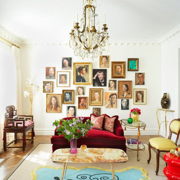
If you are googling about picking wall art for your home, then you probably fall into one of two categories. Either your walls are way too bare, or they're smothered in outdated and generic artwork that doesn't represent you anymore! Don’t worry – neither of these situations have to last forever, and there are plenty of stylish ways to make sure that your personality gets to shine in your room decor as well as in the rest of your life! Just follow these 8 wall art ideas from our bedroom designer below, and get ready to be the star of your own show!
1) Blank Walls can be Fun
If you're online researching how to buy any sort of wall art for your home, then you fall into one of two categories. It seems either your walls are bare, or your art isn't fitting. Either way, it doesn't represent you! But blank walls don’t have to be boring. In fact, they can be a canvas for you to express your unique personality.
2) Create an eye-catching Statement Piece
A big, bold piece of wall art is the perfect way to make a statement in your room. But if you’re not careful, it can also look like you’re trying too hard. The key is to find a piece that reflects your personality and style, without being too over-the-top.
3) Hang something Larger than Life
Go big or go home, right? Especially when it comes to wall art. Hanging a large piece of artwork will make a huge impact in your room. It’ll be the first thing people see when they walk in, and it’ll set the tone for the rest of your decor. Plus, it’s a great way to fill up a large wall space. Just make sure you pick a piece that you really love – you’ll be looking at it every day. For further Inspiration you can check out Wall Art Ideas from Unique-Canvas.com to decorate your Room.
4) Use a Vibrant Focal Point
A focal point is a great way to add drama and interest to a room. It can be anything from a piece of wall art to a piece of furniture. In this case, we’re going to focus on wall art. A vibrant focal point will add color and life to your room. Making a statement and displaying your personality is easy with this.
5) Smaller is Better
People often make the mistake of thinking that they need large, expensive pieces of art to fill up a large, empty wall. But the truth is, sometimes all you need is a small piece of art that packs a big punch. A small piece of art can be more intimate and personal, and it can also be less expensive. So if you’re looking for wall art ideas that are both unique and budget-friendly, try looking for smaller pieces!
6) Get Personal
When it comes to wall art, the most important thing is that it speaks to you on a personal level. You should let your home reflect who you are and what you love!
7) Adorn yourself with Soulful Quotes
A great way to show off your personality is with soulful quotes. Pick out a few of your favourites and have them printed on canvas. You can hang them up in your room or office as a daily reminder of what’s important to you.
8) Add some Colourful Décor Pieces
A blank wall is like a blank canvas—it’s begging to be filled with something colorful and eye-catching! That said, if you're still unsure of where to start, don't worry. We’ve got eight wall art ideas that will help you decorate your room and bring out your personality.
Final Thought
No matter what your style is, you can find wall art that represents you. The key is to take your time searching for the right piece, and don’t be afraid to step outside your comfort zone.

 RAJ Kitchen and Bath, LLC
**Check out the video of this transformation on our website**
This small kitchen was way too small for this 2 bedrooms, 2 bathrooms apartment. Not only was it a very small kitchen, but the physical location of it made it very difficult to make it any bigger. There wasn't much that could have been done without incurring astronomical cost, which would get little or no return on the investment. The client wanted a kitchen that can be optimized in its current location to add a ton of value for resale.
This was difficult to do, because there was no moving of any mechanical around in the kitchen and even if we wanted to, the management of the building would not allow. For those of you who live in condos, co-ops or apartment building, you know how difficult it is to rework these foot prints. When we showed up, we saw the problems, but we also saw a huge opportunity where we can achieve those goals in the small space. This was accomplished by making some key changes and to incorporate some new things that was not possible when this kitchen was built years ago.
The crucial part of the design that would drive the entire new layout, was selecting the only appliance; that was the Refrigerator. Once we nailed down that refrigerator, we then proceeded to design the kitchen around it. We moved it to the other side of the wall where the sink was so that we can tap into the water line from the sink plumbing. It was crucial that it stays exactly 24" deep, not an inch more because we had to keep the entry as open as possible. Also, it was going to be directly in front of another big storage unit - The pantry. It is not ideal in most cases, but we needed the rest of the space to ramp up the design and open feel towards the side where all of the activities would take place, which happend to be the dining room and the view.
Once all that was figured out, we re-positioned the sink, dishwasher and the range and proceeded to wrap the cabinets around the columns to integrate them into the space. Thirty- six inches cabinets height was used so that they can be installed higher towards the ceiling height to give more room rather than the standard 18" required height between the counter tops. This was done to make the room feel a lot bigger than it really was. Not to mention, we also didn't want the faucet to be buried under the cabinets so that was also a necessary design detail for the space.
We then lowered both knee walls so that the counter top can sit on top of them, by removing that stop point that would have otherwise defined the kitchen area. This allowed us to pick up that extra footprint into the room for added prep space and enabled us to create the illusion of a kitchen that is looking longer than it really is. Every inch mattered when designing this kitchen and we made a conscious decision to use every one of that inch.
White cabinets were selected to do just what white cabinets are design to do; make a small or dark room appear bigger, brighter and more open. In this kitchen, this was amplified the more because of the kitchen location. It was perfect! We knew we did justice to the space because while we were there taking some photos, a few potential buyers walked in and went straight for the kitchen! They said its design just to fit the apartment.
Pantry roll out shelving, Double recycle bin, fancy handles, LED lighting, Quartz counter top, beautiful backslash tiles and grey linen floors finished off the kitchen which looked over a beautiful view of the George Washington Bridge from the top of this lovely 4th floor apartment.
Credit to Masterpiece Tile and Marble (Annmarie on the selection of Tiles and countertop and Val on the Construction to complete this project).
Davor Kokic Photography
 SabaRehman Abdulrehman
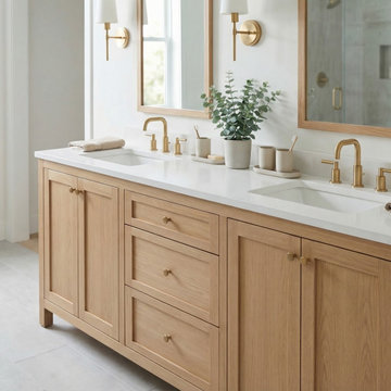
Morning routines shouldn’t involve a traffic jam at the sink. The 2025 Houzz Bathroom Trends Study found that 65 percent of U.S. renovators now choose a double-sink vanity to skip the wait. Designers agree: Titan Builders dubbed 2025 “the year of bigger, storage-packed double vanities,” forecasting dual-basin setups in family, guest, and even powder baths. As KBIS 2025 launches land, prototypes for 2026 layer in spa-grade wood, built-in outlets, and planet-friendly finishes. In this guide, we rank six standout models and show you how to size, install, and enjoy a clutter-free, two-sink future.
Methodology and selection criteria
A well-planned double-sink vanity keeps busy morning routines calm and clutter-free.
Before we crowned any winners, we mapped the entire 2024–2026 double-sink (dual-basin) market. That meant parsing KBIS exhibitor releases, scraping bestseller lists from Home Depot, Lowe’s, and Wayfair, and reviewing designer short lists in trade magazines. The sweep produced 110 candidate vanities, giving us visibility into every style, price tier, and material in play.
We then scored each model against six weighted factors that continue to matter long after installers leave:
- Build quality – 25 percent.Solid hardwood frames, dovetail drawers, and furniture-grade plywood backs, never particleboard in disguise.
- Design versatility – 20 percent.Lines and finishes that suit modern, classic, or farmhouse baths without dating quickly.
- Sustainability – 15 percent.FSC-certified wood, CARB 2 compliance, and low-VOC finishes for healthier air.
- Storage efficiency – 15 percent.Deep drawers, tilt-outs, or power cubbies that corral countertop clutter.
- Value for money – 15 percent.Fair street price for the materials, stone tops, sinks, and soft-close hardware included.
- Brand reputation and warranty – 10 percent.Manufacturers with responsive support and at least a one-year parts guarantee.
- Footprint: 72 W × 22 D × 36 H in. (183 × 56 × 91 cm)
- Crated weight: 506 lb / 230 kg
- Street price: about $2,575 with marble top and basins, Q4 2025
- Footprint: 48 W × 22 D in. (122 × 56 cm)
- Height: 34.8 in. (88 cm) with backsplash
- Sliding barn door plus 3 drawers
- Pre-drilled 8-in. faucet spacing, sinks included
- Footprint: 60 W × 21 D × 34 H in. (152 × 53 × 86 cm)
- Integrated power: 4 AC + 2 USB, UL-listed
- Crated weight: 300 lb / 136 kg
- Street price: about $2,349 at Home Depot, Q4 2025
- Footprint: 72 W × 22 D in. (183 × 56 cm)
- Height: 34 in. (86 cm) plus 4 in. backsplash
- Counter: 1 in. Carrara marble, apron-front sinks included
- Hardware: oil-rubbed bronze, soft-close doors and drawers
- Footprint: 60 W × 22 D × 34 H in. (152 × 56 × 86 cm)
- Construction: solid poplar and plywood, waterfall quartz top
- Integrated slim power bank, soft-close doors and drawers
- Target price: just under $2,300 with top and basins
 Tile Doctor Ltd
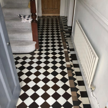
This job was carried out in a terraced property in Llanelli which had a Victorian Tiled Hallway laid in a diamond pattern that looking worse for wear and in need of some attention. The clients were a young couple who had moved in two years previously and had only recently decided they wanted the floor renovated. This was earlier in the year, so I was able to pop over to the property and take a detailed look at the floor before recommending a course of action to renovate the tiles.
Upon arrival the first thing we noticed was that the border had been laid with an inconsistent pattern, non- matching tiles had been patched in essentially filling voids as you can see in the images. The floor wasn’t terribly dirty however it wasn’t very clean either.
I discussed with the client replacing the non-matching tiles, so the floor pattern was uniform however they decided against it and were happy to just to have it cleaned and sealed. We can usually source either reclaimed original tiles or some great reproduction ones, so most floors can be restored if needed. I worked out a quote for the work and they were happy to go ahead.
If you have never been you should know that Llanelli is the largest town in the county of Carmarthenshire and famous for Rugby and the production of Tin. It is located on the Loughor Estuary, some 10 miles from Swansea and 12 miles from Carmarthen.
With no tiling to do the first job was to protect the woodwork such as skirting and staircase with tape. Once done the process of cleaning began with the application of a 400-grit burnishing pad fitted to a buffing machine. The process is lubricated with water and the pad run over the whole floor two to three times to remove dirt and refine the appearance of the tile. Even after the first application of the pad we could see a massive improvement to the appearance of the tiles. To get right into the edges of the tiled floor we use a 400-grit handheld diamond block, this proved especially useful under the stairs where our buffer machine could not reach.
During this process, the water turns into a fine slurry which is rinsed off with more water and extracted with a wet vacuum. On this occasion the floor was not dirty enough to require any chemicals, the use of water and the machine was enough to get the floor cleaned up.
This job was very straight forward, and we did not run into any problems at all. After allowing the floor to dry out for 24 hours we returned to seal the tiles checking first that the floor was sufficiently dry first using a damp meter. Fortunately, the burnishing method uses a lot less water than a chemical clean, so I was able to get straight on with sealing.
The client wanted a satin sheen finish, so I applied four coats of Tile Doctors Seal and Go which works well on Victorian tiles. The sealer really put the life back into the tiles and will protect them from staining going forward. It will also make the floor much easier to maintain and keep it looking good for much longer.
I’m pleased to say the owners were very happy with the floor and recommended us to one of their friends who we also did some work for. For aftercare I recommended the use of Tile Doctor Neutral Tile Cleaner. This is an everyday tile cleaning product that is sealer friendly and not prematurely reduce the life of the sealer which can happen with many household cleaning products which are simply too strong.
Adrian Iacono
Swansea Tile Doctor
93