
Search results for "Check fit" in Home Design Ideas

 RAJ Kitchen and Bath, LLC
**Check out the video of this transformation on our website**
This small kitchen was way too small for this 2 bedrooms, 2 bathrooms apartment. Not only was it a very small kitchen, but the physical location of it made it very difficult to make it any bigger. There wasn't much that could have been done without incurring astronomical cost, which would get little or no return on the investment. The client wanted a kitchen that can be optimized in its current location to add a ton of value for resale.
This was difficult to do, because there was no moving of any mechanical around in the kitchen and even if we wanted to, the management of the building would not allow. For those of you who live in condos, co-ops or apartment building, you know how difficult it is to rework these foot prints. When we showed up, we saw the problems, but we also saw a huge opportunity where we can achieve those goals in the small space. This was accomplished by making some key changes and to incorporate some new things that was not possible when this kitchen was built years ago.
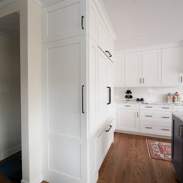
The crucial part of the design that would drive the entire new layout, was selecting the only appliance; that was the Refrigerator. Once we nailed down that refrigerator, we then proceeded to design the kitchen around it. We moved it to the other side of the wall where the sink was so that we can tap into the water line from the sink plumbing. It was crucial that it stays exactly 24" deep, not an inch more because we had to keep the entry as open as possible. Also, it was going to be directly in front of another big storage unit - The pantry. It is not ideal in most cases, but we needed the rest of the space to ramp up the design and open feel towards the side where all of the activities would take place, which happend to be the dining room and the view.
Once all that was figured out, we re-positioned the sink, dishwasher and the range and proceeded to wrap the cabinets around the columns to integrate them into the space. Thirty- six inches cabinets height was used so that they can be installed higher towards the ceiling height to give more room rather than the standard 18" required height between the counter tops. This was done to make the room feel a lot bigger than it really was. Not to mention, we also didn't want the faucet to be buried under the cabinets so that was also a necessary design detail for the space.
We then lowered both knee walls so that the counter top can sit on top of them, by removing that stop point that would have otherwise defined the kitchen area. This allowed us to pick up that extra footprint into the room for added prep space and enabled us to create the illusion of a kitchen that is looking longer than it really is. Every inch mattered when designing this kitchen and we made a conscious decision to use every one of that inch.
White cabinets were selected to do just what white cabinets are design to do; make a small or dark room appear bigger, brighter and more open. In this kitchen, this was amplified the more because of the kitchen location. It was perfect! We knew we did justice to the space because while we were there taking some photos, a few potential buyers walked in and went straight for the kitchen! They said its design just to fit the apartment.
Pantry roll out shelving, Double recycle bin, fancy handles, LED lighting, Quartz counter top, beautiful backslash tiles and grey linen floors finished off the kitchen which looked over a beautiful view of the George Washington Bridge from the top of this lovely 4th floor apartment.
Credit to Masterpiece Tile and Marble (Annmarie on the selection of Tiles and countertop and Val on the Construction to complete this project).
Davor Kokic Photography
 RAJ Kitchen and Bath, LLC
**Check out the video of this transformation on our website**
This small kitchen was way too small for this 2 bedrooms, 2 bathrooms apartment. Not only was it a very small kitchen, but the physical location of it made it very difficult to make it any bigger. There wasn't much that could have been done without incurring astronomical cost, which would get little or no return on the investment. The client wanted a kitchen that can be optimized in its current location to add a ton of value for resale.
This was difficult to do, because there was no moving of any mechanical around in the kitchen and even if we wanted to, the management of the building would not allow. For those of you who live in condos, co-ops or apartment building, you know how difficult it is to rework these foot prints. When we showed up, we saw the problems, but we also saw a huge opportunity where we can achieve those goals in the small space. This was accomplished by making some key changes and to incorporate some new things that was not possible when this kitchen was built years ago.
The crucial part of the design that would drive the entire new layout, was selecting the only appliance; that was the Refrigerator. Once we nailed down that refrigerator, we then proceeded to design the kitchen around it. We moved it to the other side of the wall where the sink was so that we can tap into the water line from the sink plumbing. It was crucial that it stays exactly 24" deep, not an inch more because we had to keep the entry as open as possible. Also, it was going to be directly in front of another big storage unit - The pantry. It is not ideal in most cases, but we needed the rest of the space to ramp up the design and open feel towards the side where all of the activities would take place, which happend to be the dining room and the view.
Once all that was figured out, we re-positioned the sink, dishwasher and the range and proceeded to wrap the cabinets around the columns to integrate them into the space. Thirty- six inches cabinets height was used so that they can be installed higher towards the ceiling height to give more room rather than the standard 18" required height between the counter tops. This was done to make the room feel a lot bigger than it really was. Not to mention, we also didn't want the faucet to be buried under the cabinets so that was also a necessary design detail for the space.
We then lowered both knee walls so that the counter top can sit on top of them, by removing that stop point that would have otherwise defined the kitchen area. This allowed us to pick up that extra footprint into the room for added prep space and enabled us to create the illusion of a kitchen that is looking longer than it really is. Every inch mattered when designing this kitchen and we made a conscious decision to use every one of that inch.
White cabinets were selected to do just what white cabinets are design to do; make a small or dark room appear bigger, brighter and more open. In this kitchen, this was amplified the more because of the kitchen location. It was perfect! We knew we did justice to the space because while we were there taking some photos, a few potential buyers walked in and went straight for the kitchen! They said its design just to fit the apartment.
Pantry roll out shelving, Double recycle bin, fancy handles, LED lighting, Quartz counter top, beautiful backslash tiles and grey linen floors finished off the kitchen which looked over a beautiful view of the George Washington Bridge from the top of this lovely 4th floor apartment.
Credit to Masterpiece Tile and Marble (Annmarie on the selection of Tiles and countertop and Val on the Construction to complete this project).
Davor Kokic Photography
 RAJ Kitchen and Bath, LLC
**Check out the video of this transformation on our website**
This small kitchen was way too small for this 2 bedrooms, 2 bathrooms apartment. Not only was it a very small kitchen, but the physical location of it made it very difficult to make it any bigger. There wasn't much that could have been done without incurring astronomical cost, which would get little or no return on the investment. The client wanted a kitchen that can be optimized in its current location to add a ton of value for resale.
This was difficult to do, because there was no moving of any mechanical around in the kitchen and even if we wanted to, the management of the building would not allow. For those of you who live in condos, co-ops or apartment building, you know how difficult it is to rework these foot prints. When we showed up, we saw the problems, but we also saw a huge opportunity where we can achieve those goals in the small space. This was accomplished by making some key changes and to incorporate some new things that was not possible when this kitchen was built years ago.
The crucial part of the design that would drive the entire new layout, was selecting the only appliance; that was the Refrigerator. Once we nailed down that refrigerator, we then proceeded to design the kitchen around it. We moved it to the other side of the wall where the sink was so that we can tap into the water line from the sink plumbing. It was crucial that it stays exactly 24" deep, not an inch more because we had to keep the entry as open as possible. Also, it was going to be directly in front of another big storage unit - The pantry. It is not ideal in most cases, but we needed the rest of the space to ramp up the design and open feel towards the side where all of the activities would take place, which happend to be the dining room and the view.
Once all that was figured out, we re-positioned the sink, dishwasher and the range and proceeded to wrap the cabinets around the columns to integrate them into the space. Thirty- six inches cabinets height was used so that they can be installed higher towards the ceiling height to give more room rather than the standard 18" required height between the counter tops. This was done to make the room feel a lot bigger than it really was. Not to mention, we also didn't want the faucet to be buried under the cabinets so that was also a necessary design detail for the space.
We then lowered both knee walls so that the counter top can sit on top of them, by removing that stop point that would have otherwise defined the kitchen area. This allowed us to pick up that extra footprint into the room for added prep space and enabled us to create the illusion of a kitchen that is looking longer than it really is. Every inch mattered when designing this kitchen and we made a conscious decision to use every one of that inch.
White cabinets were selected to do just what white cabinets are design to do; make a small or dark room appear bigger, brighter and more open. In this kitchen, this was amplified the more because of the kitchen location. It was perfect! We knew we did justice to the space because while we were there taking some photos, a few potential buyers walked in and went straight for the kitchen! They said its design just to fit the apartment.
Pantry roll out shelving, Double recycle bin, fancy handles, LED lighting, Quartz counter top, beautiful backslash tiles and grey linen floors finished off the kitchen which looked over a beautiful view of the George Washington Bridge from the top of this lovely 4th floor apartment.
Credit to Masterpiece Tile and Marble (Annmarie on the selection of Tiles and countertop and Val on the Construction to complete this project).
Davor Kokic Photography
Find the right local pro for your project
 RAJ Kitchen and Bath, LLC
**Check out the video of this transformation on our website**
This small kitchen was way too small for this 2 bedrooms, 2 bathrooms apartment. Not only was it a very small kitchen, but the physical location of it made it very difficult to make it any bigger. There wasn't much that could have been done without incurring astronomical cost, which would get little or no return on the investment. The client wanted a kitchen that can be optimized in its current location to add a ton of value for resale.
This was difficult to do, because there was no moving of any mechanical around in the kitchen and even if we wanted to, the management of the building would not allow. For those of you who live in condos, co-ops or apartment building, you know how difficult it is to rework these foot prints. When we showed up, we saw the problems, but we also saw a huge opportunity where we can achieve those goals in the small space. This was accomplished by making some key changes and to incorporate some new things that was not possible when this kitchen was built years ago.
The crucial part of the design that would drive the entire new layout, was selecting the only appliance; that was the Refrigerator. Once we nailed down that refrigerator, we then proceeded to design the kitchen around it. We moved it to the other side of the wall where the sink was so that we can tap into the water line from the sink plumbing. It was crucial that it stays exactly 24" deep, not an inch more because we had to keep the entry as open as possible. Also, it was going to be directly in front of another big storage unit - The pantry. It is not ideal in most cases, but we needed the rest of the space to ramp up the design and open feel towards the side where all of the activities would take place, which happend to be the dining room and the view.
Once all that was figured out, we re-positioned the sink, dishwasher and the range and proceeded to wrap the cabinets around the columns to integrate them into the space. Thirty- six inches cabinets height was used so that they can be installed higher towards the ceiling height to give more room rather than the standard 18" required height between the counter tops. This was done to make the room feel a lot bigger than it really was. Not to mention, we also didn't want the faucet to be buried under the cabinets so that was also a necessary design detail for the space.
We then lowered both knee walls so that the counter top can sit on top of them, by removing that stop point that would have otherwise defined the kitchen area. This allowed us to pick up that extra footprint into the room for added prep space and enabled us to create the illusion of a kitchen that is looking longer than it really is. Every inch mattered when designing this kitchen and we made a conscious decision to use every one of that inch.
White cabinets were selected to do just what white cabinets are design to do; make a small or dark room appear bigger, brighter and more open. In this kitchen, this was amplified the more because of the kitchen location. It was perfect! We knew we did justice to the space because while we were there taking some photos, a few potential buyers walked in and went straight for the kitchen! They said its design just to fit the apartment.
Pantry roll out shelving, Double recycle bin, fancy handles, LED lighting, Quartz counter top, beautiful backslash tiles and grey linen floors finished off the kitchen which looked over a beautiful view of the George Washington Bridge from the top of this lovely 4th floor apartment.
Credit to Masterpiece Tile and Marble (Annmarie on the selection of Tiles and countertop and Val on the Construction to complete this project).
Davor Kokic Photography
 RAJ Kitchen and Bath, LLC
**Check out the video of this transformation on our website**
This small kitchen was way too small for this 2 bedrooms, 2 bathrooms apartment. Not only was it a very small kitchen, but the physical location of it made it very difficult to make it any bigger. There wasn't much that could have been done without incurring astronomical cost, which would get little or no return on the investment. The client wanted a kitchen that can be optimized in its current location to add a ton of value for resale.
This was difficult to do, because there was no moving of any mechanical around in the kitchen and even if we wanted to, the management of the building would not allow. For those of you who live in condos, co-ops or apartment building, you know how difficult it is to rework these foot prints. When we showed up, we saw the problems, but we also saw a huge opportunity where we can achieve those goals in the small space. This was accomplished by making some key changes and to incorporate some new things that was not possible when this kitchen was built years ago.
The crucial part of the design that would drive the entire new layout, was selecting the only appliance; that was the Refrigerator. Once we nailed down that refrigerator, we then proceeded to design the kitchen around it. We moved it to the other side of the wall where the sink was so that we can tap into the water line from the sink plumbing. It was crucial that it stays exactly 24" deep, not an inch more because we had to keep the entry as open as possible. Also, it was going to be directly in front of another big storage unit - The pantry. It is not ideal in most cases, but we needed the rest of the space to ramp up the design and open feel towards the side where all of the activities would take place, which happend to be the dining room and the view.
Once all that was figured out, we re-positioned the sink, dishwasher and the range and proceeded to wrap the cabinets around the columns to integrate them into the space. Thirty- six inches cabinets height was used so that they can be installed higher towards the ceiling height to give more room rather than the standard 18" required height between the counter tops. This was done to make the room feel a lot bigger than it really was. Not to mention, we also didn't want the faucet to be buried under the cabinets so that was also a necessary design detail for the space.
We then lowered both knee walls so that the counter top can sit on top of them, by removing that stop point that would have otherwise defined the kitchen area. This allowed us to pick up that extra footprint into the room for added prep space and enabled us to create the illusion of a kitchen that is looking longer than it really is. Every inch mattered when designing this kitchen and we made a conscious decision to use every one of that inch.
White cabinets were selected to do just what white cabinets are design to do; make a small or dark room appear bigger, brighter and more open. In this kitchen, this was amplified the more because of the kitchen location. It was perfect! We knew we did justice to the space because while we were there taking some photos, a few potential buyers walked in and went straight for the kitchen! They said its design just to fit the apartment.
Pantry roll out shelving, Double recycle bin, fancy handles, LED lighting, Quartz counter top, beautiful backslash tiles and grey linen floors finished off the kitchen which looked over a beautiful view of the George Washington Bridge from the top of this lovely 4th floor apartment.
Credit to Masterpiece Tile and Marble (Annmarie on the selection of Tiles and countertop and Val on the Construction to complete this project).
Davor Kokic Photography
 Tile Doctor Ltd
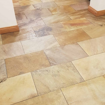
This is a large 17.2 m2 Sandstone Floor installed throughout the living and kitchen areas of a property in the beautiful village of Disley close to Lyme Park which is run by the National Trust. The floor had been installed four years ago and my client was unhappy with the original sealer which hadn’t lasted very long. Without the protection of a sealer dirt had become ingrained in the pores of the stone which was now difficult to clean. Another issue was the rough nature of the Sandstone meant it was impossible to mop as it shreds the mop! As a result, the floor was mainly cleaned with a hoover which was not ideal, especially in a kitchen.
I went over to survey the floor and before quoting I ran a small test clean in the kitchen which took the floor back to its natural pale colour and really showed how dirty the floor had become. Test cleans are great as it helps me to formulate an effective cleaning plan and provide an accurate quote. My client was impressed with the result and so I was booked to come back and deep clean and then reseal the whole floor. Due to its size I estimated the floor would take two days to deep clean and a further day to apply a new sealer, so three days in total.
Working in large sections I started by cleaning the floor and stripping off the old sealer with a strong dilution of Tile Doctor Remove and Go which is a coatings remover that is safe to use on stone. The solution was left to soak into the pores of the Sandstone for ten minutes before being worked in with a 200-grit diamond pad fitted to a rotary floor machine. This action not only removed the old sealer and cleaned the floor but the 200-grit pad being vey coarse removed a lot of the roughness from the surface of the Sandstone so it shouldn’t shred any more mops.
After rinsing the floor with water and removing the slurry with a wet vacuum I set about cleaning the grout with Tile Doctor Pro-Clean worked into the grout line with a stiff brush and assisted with steam from a professional steam cleaner with a grout attachment. Once done the floor was rinsed and extracted again to remove the soil from the grouting. There was also an area near one of the doors where the grout had become loose and needed replacing so I made up a batch of matching grout and filled this in. The floor was then left overnight to dry with assistance from a couple of air movers.
I returned the next day to finish the floor by applying a sealer. First, I double checked the floor was dry with the damp meter. The readings confirmed the air movers had done a good job and that the floor was within the accepted parameters, so I was ready to seal. The sealer I chose was Tile Doctor Seal and Go which being water based doesn’t leave a smell as it dries, it really works well on Sandstone and adds a nice subtle sheen to the stone.
Once finished the floor looked much cleaner, lighter in colour overall more inviting, you could even see the fossils in some of the tiles.
The surface was also smoother so the customer should find cleaning with a mop much easier in future. On that subject its worth pointing out that owners of sealed floors should always use a neutral pH tile cleaner on their floors as most supermarket products are simply too strong and will prematurely strip the sealer off a tile if used repeatedly. Tile Doctor sell a product called Tile Doctor Neutral Cleaner which is ideal for cleaning sealed Sandstone floors like this one.
My client was really happy with the results and sent me a message later saying: “the floor looks amazing!”
Kamila Logonzy
East Cheshire Tile Doctor

 CairnsCraft Design & Remodel
Great spacious bathroom with lot of amenities.
Photographer: Jon Upson
Large elegant master beige tile and porcelain tile drop-in bathtub photo in San Diego with an undermount sink, raised-panel cabinets, medium tone wood cabinets, granite countertops, beige walls and a two-piece toilet
Large elegant master beige tile and porcelain tile drop-in bathtub photo in San Diego with an undermount sink, raised-panel cabinets, medium tone wood cabinets, granite countertops, beige walls and a two-piece toilet
Sponsored
Delaware, OH

Buckeye Basements, Inc.
Central Ohio's Basement Finishing ExpertsBest Of Houzz '13-'21
 Tile Doctor Ltd
Having an effective sealer in place is essential for ensuring the long term condition of tiled floors in fact a lack of sealer can make cleaning the tiles exceptionally difficult as the sealer prevents dirt becoming ingrained in the tile.
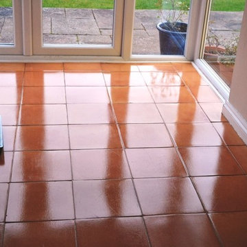
This property owner, living in the former spa town of Matlock in Derbyshire, was experiencing problems with their Terracotta tiled kitchen floor since they had applied some kind of wax to act as a sealer, and this had worn off within a few weeks. After this happened the tiles were not sealed again, making cleaning a big problem. Terracotta is a highly porous stone and thus easily soaks in spillages and stains, and allows dirt to become very easily trapped.
In this situation, the property owner resolved to contact me about some professional maintenance. I suggested that the tiles would need a deep clean followed by the application of a fresh, high quality sealer. The work was agreed on and I made my way down to the property the following week.
When I arrived at the property and saw the tiles first hand it became clear that a professional clean had been in need for a long time: greasy looking stains were particularly prevalent and covered large areas of the kitchen floor.
To remove I mixed a strong solution of Tile Doctor Pro Clean, which is a multi-purpose, high-alkaline cleaner, stripper and degreaser, and, working in small areas, applied it to the floor. Working in small sections was important because the stone is very porous and quickly soaked in any product laid down. I scrubbed the cleaner into the stone using a rotary machine fitted with a black scrubbing pad, with the dirt and stains coming away nicely. Pro Clean is highly versatile and can be used for similar cleaning purposes on most types of natural stone floor.
After cleaning each section, I quickly removed the excess dirty water and chemicals with my wet vax machine. Once the whole floor had been cleaned I rinsed it several times with fresh water just to make sure all cleaning chemicals were gone. I then left the floor to dry completely for 36 hours.
When I returned to the property, I conducted several damp tests to check for any areas of the floor that needed further drying. As is almost always the case, there were a few areas that remained slightly damp, and I set about speeding the drying process along using my heat gun. In fact, it actually took me more than three hours to get the floor completely dry, but this was worth the effort as even the slightest excess moisture can damage the performance of the sealer.
Once the floor was finally dried I began sealing the floor with one coat of Tile a Doctor Colour Grow sealer. Colour Grow is an impregnating sealer that penetrates deep into the pores of the stone, thus acting as a shield against ingrained dirt, and also raises the colour of the tiles to provide an aesthetically appealing appearance. sealer. After sealing with Colour Grow, I left the floor to dry for couple of hours and then applied six coats of Tile Doctor Seal & Go, which is a topical sealer that builds up durable protection on the surface of the tiles.
The combination of through cleaning and the application of not one, but two high quality sealers really did wonders for the appearance of these Terracotta tiles. Looking at the final results you wouldn’t have believed they had been without a proper clean and seal for so long! Needless to say the customer was exceptionally pleased and will surely be able to keep her floor looking great for a long time to come.
Tony Olmet
Derbyshire Tile Doctor
 RAJ Kitchen and Bath, LLC
**Check out the video of this transformation on our website**
This small kitchen was way too small for this 2 bedrooms, 2 bathrooms apartment. Not only was it a very small kitchen, but the physical location of it made it very difficult to make it any bigger. There wasn't much that could have been done without incurring astronomical cost, which would get little or no return on the investment. The client wanted a kitchen that can be optimized in its current location to add a ton of value for resale.
This was difficult to do, because there was no moving of any mechanical around in the kitchen and even if we wanted to, the management of the building would not allow. For those of you who live in condos, co-ops or apartment building, you know how difficult it is to rework these foot prints. When we showed up, we saw the problems, but we also saw a huge opportunity where we can achieve those goals in the small space. This was accomplished by making some key changes and to incorporate some new things that was not possible when this kitchen was built years ago.
The crucial part of the design that would drive the entire new layout, was selecting the only appliance; that was the Refrigerator. Once we nailed down that refrigerator, we then proceeded to design the kitchen around it. We moved it to the other side of the wall where the sink was so that we can tap into the water line from the sink plumbing. It was crucial that it stays exactly 24" deep, not an inch more because we had to keep the entry as open as possible. Also, it was going to be directly in front of another big storage unit - The pantry. It is not ideal in most cases, but we needed the rest of the space to ramp up the design and open feel towards the side where all of the activities would take place, which happend to be the dining room and the view.
Once all that was figured out, we re-positioned the sink, dishwasher and the range and proceeded to wrap the cabinets around the columns to integrate them into the space. Thirty- six inches cabinets height was used so that they can be installed higher towards the ceiling height to give more room rather than the standard 18" required height between the counter tops. This was done to make the room feel a lot bigger than it really was. Not to mention, we also didn't want the faucet to be buried under the cabinets so that was also a necessary design detail for the space.
We then lowered both knee walls so that the counter top can sit on top of them, by removing that stop point that would have otherwise defined the kitchen area. This allowed us to pick up that extra footprint into the room for added prep space and enabled us to create the illusion of a kitchen that is looking longer than it really is. Every inch mattered when designing this kitchen and we made a conscious decision to use every one of that inch.
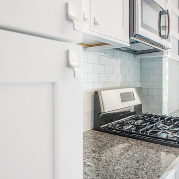
White cabinets were selected to do just what white cabinets are design to do; make a small or dark room appear bigger, brighter and more open. In this kitchen, this was amplified the more because of the kitchen location. It was perfect! We knew we did justice to the space because while we were there taking some photos, a few potential buyers walked in and went straight for the kitchen! They said its design just to fit the apartment.
Pantry roll out shelving, Double recycle bin, fancy handles, LED lighting, Quartz counter top, beautiful backslash tiles and grey linen floors finished off the kitchen which looked over a beautiful view of the George Washington Bridge from the top of this lovely 4th floor apartment.
Credit to Masterpiece Tile and Marble (Annmarie on the selection of Tiles and countertop and Val on the Construction to complete this project).
Davor Kokic Photography
 Tile Doctor Ltd
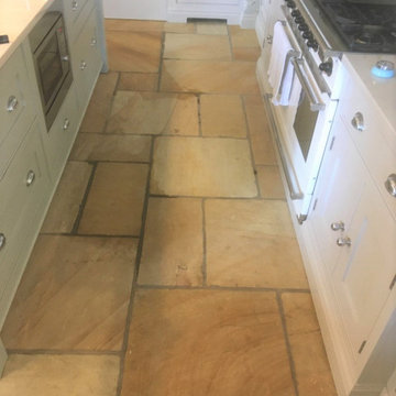
The photos on this page are of a Sandstone Kitchen floor at a house in the High Green suburb of Sheffield. The Sandstone tiles looked grubby and needed some love and attention. Our client was getting fed up trying to keep the stone clean, particularly around the kitchen area where cleaning didn’t seem to make much. You can see how dirty it had become on the before picture below, this is stark contrast to the middle of the of the kitchen where the portable kitchen island normally sits.
I went to the property to get a better look at the problem floor and carried out a small test clean to see which products and methods would have the best impact. The patch came up really clean without much difficulty, so I was confident on being able to restore its appearance.
It was clear to me the original protective sealer had worn off and dirt had become ingrained in the pores of the stone where it was proving difficult to remove. My client was very encouraged by the test clean initial result and agreed to go ahead with the quote. We arranged a suitable time to carry out the work on a day when the family would be out of the way.
I started by taping up the area to make sure the skirting and woodwork were protected from splashing. Once done a strong dilution of Tile Doctor Pro-Clean was sprayed onto Sandstone tile and grout. It was left to dwell for approximately ten minutes to help break down all the grime and dirt and was then worked into the stone using a rotary floor machine fitted with a stiff bristled brush.
This method totally transformed the dull sandstone, the stunning sandstone colours started to leap out and I could see the stone was well on its way to being transformed. The floor was then rinsed several times with water and the now soiled cleaning solution carefully removed with an industrial wet vacuum.
With the floor clean I inspected all the tiles and repeated the process until I was happy the floor was total clean. I should mention It’s not always this easy to clean a stone floor and quite often I find myself having to utilise all sorts of products and methods before I’m totally satisfied it’s as clean as it could possibly be.
With the cleaning done I left the floor to dry out overnight aided with heaters and air blowers.
I returned to seal the floor the next day checking first that the stone was dry with a damp meter. Leaving the blowers on overnight had helped and the readings I took from the floor confirmed it was now ready for sealing.
Earlier I had discussed the different types of sealer available with my clients and they had chosen to have the floor sealed with Tile Doctor Seal & Go. This works really well on Sandstone, enhancing its appearance, improving colour and of course adding protection to the stone to prevent grime and dirt stuck in the pores of the stone. Several coats were applied until I could see if was fully sealed and the right level of finish had been achieved. Sealing a floor can take some time as you need to allow each coat to dry before applying the next.
Once done the floor looked meticulously clean and the new sealer had added a lovely subtle sheen to the stone. My client was very please with the transformation and left the following feedback.
‘Very professional approach, friendly, and offered great advice throughout the job. Very pleased with the finish Cheers Matt we will see you again’
One of the problems we find with many homeowners is that for cleaning they use strong bleach-based cleaning product on their sealed tiles, and this actually strips off the sealer leaving the stone vulnerable to ingrained dirt. As a result, Tile Doctor has developed Tile Doctor Neutral Tile Cleaner, it is pH neutral and gentle enough for everyday use without affecting the sealer.
Matthew Lovett
South Yorkshire Tile Doctor
 RAJ Kitchen and Bath, LLC
**Check out the video of this transformation on our website**
This small kitchen was way too small for this 2 bedrooms, 2 bathrooms apartment. Not only was it a very small kitchen, but the physical location of it made it very difficult to make it any bigger. There wasn't much that could have been done without incurring astronomical cost, which would get little or no return on the investment. The client wanted a kitchen that can be optimized in its current location to add a ton of value for resale.
This was difficult to do, because there was no moving of any mechanical around in the kitchen and even if we wanted to, the management of the building would not allow. For those of you who live in condos, co-ops or apartment building, you know how difficult it is to rework these foot prints. When we showed up, we saw the problems, but we also saw a huge opportunity where we can achieve those goals in the small space. This was accomplished by making some key changes and to incorporate some new things that was not possible when this kitchen was built years ago.
The crucial part of the design that would drive the entire new layout, was selecting the only appliance; that was the Refrigerator. Once we nailed down that refrigerator, we then proceeded to design the kitchen around it. We moved it to the other side of the wall where the sink was so that we can tap into the water line from the sink plumbing. It was crucial that it stays exactly 24" deep, not an inch more because we had to keep the entry as open as possible. Also, it was going to be directly in front of another big storage unit - The pantry. It is not ideal in most cases, but we needed the rest of the space to ramp up the design and open feel towards the side where all of the activities would take place, which happend to be the dining room and the view.
Once all that was figured out, we re-positioned the sink, dishwasher and the range and proceeded to wrap the cabinets around the columns to integrate them into the space. Thirty- six inches cabinets height was used so that they can be installed higher towards the ceiling height to give more room rather than the standard 18" required height between the counter tops. This was done to make the room feel a lot bigger than it really was. Not to mention, we also didn't want the faucet to be buried under the cabinets so that was also a necessary design detail for the space.
We then lowered both knee walls so that the counter top can sit on top of them, by removing that stop point that would have otherwise defined the kitchen area. This allowed us to pick up that extra footprint into the room for added prep space and enabled us to create the illusion of a kitchen that is looking longer than it really is. Every inch mattered when designing this kitchen and we made a conscious decision to use every one of that inch.
White cabinets were selected to do just what white cabinets are design to do; make a small or dark room appear bigger, brighter and more open. In this kitchen, this was amplified the more because of the kitchen location. It was perfect! We knew we did justice to the space because while we were there taking some photos, a few potential buyers walked in and went straight for the kitchen! They said its design just to fit the apartment.
Pantry roll out shelving, Double recycle bin, fancy handles, LED lighting, Quartz counter top, beautiful backslash tiles and grey linen floors finished off the kitchen which looked over a beautiful view of the George Washington Bridge from the top of this lovely 4th floor apartment.
Credit to Masterpiece Tile and Marble (Annmarie on the selection of Tiles and countertop and Val on the Construction to complete this project).
Davor Kokic Photography
 User
Exquisite Worktops and High-end Kitchen Guide
Homeowners
The fuel to every person's happiness: food; is stored in a kitchen. We gotta agree that even if life is created in a bedroom, it is certainly lived in a kitchen. Hence, It is undeniable that every homeowner would want to invest mindfully in creating a proper outlook of a place that nourishes the heart of both its family and its guests. While designing a kitchen unlike other spaces of a home one must pay attention to the choice of materials for worktops, floors, sinks, etc that suit the hygiene purposes alongside the aesthetic point of view, which might usually result in a very high budget plan. So this is where practicality hits a common man as no matter what one`s wishlist is, execution ultimately depends on their capability of expenditure.
However, with sufficient guidance on kitchen design planning, one can drastically minimise the expenses without necessarily having to purchase cheap worktops. The choice of the right materials is just as important as the ability to financially invest in the same, if not more. This means if a person has enough knowledge of what they are looking for, they can cleverly create an exquisite look under a much lesser budget-friendly scheme.
Key Points to Consider When on a Mission to Create a High-end Kitchen Under Restrained Pockets
Estimating a Budget Plan:
Setting a realistic budget before the investment is a very important aspect which shouldn't be overlooked. According to NKBA, a proper guide to setting one`s kitchen budget while planning a new one should look like- 29% cabinets and hardware, 17% installation, 14% appliances and ventilation, 10% countertops, 7% flooring, 5% walls and ceilings, 5% lighting, 5% faucets and plumbing, 4% doors and windows, 4% design fees and 1% miscellaneous.
Pick Your Beautiful Stone for Work-top:
As we all know, beauty is not just conventional, so natural stones, as well as engineered stones, are beautiful in their own way. Engineered countertops are still impressively resistant to scratch and stains. They can almost replicate the intrinsic character and sparkle of granite and marbles. The manufacturing technique of engineered stones has made it so that, wherever they are incorporated, they add a sense of style and class. And with minimal maintenance, they can last for a very long time in a household. One can even go for the mix and matching technique where one can use both expensive and inexpensive buys in such a way that the former occupies the areas on display while the latter covers up for other units.
Being on a budget, though, must not mean hiring inexperienced fabricators to compromise on cost. The short-term result might be tempting but doing so will only increase the future risk thus being more of a loss than an advantage. However, if one is confident enough in their skills, DIY-ing the fittings will drastically reduce the cost of expenditure.
Reusing and Recycling Off Cuts:
While extending or renovating one always has the option to think about how some materials from the previous space can be given a second life. Worktops can be altered to fit a new plan, cupboard doors can be fitted to the kitchen and given a fresh look by repainting, and old appliances can be sold on to help contribute towards pitching in some money for purchasing new ones. The stone remnants and offcuts can always be utilised for smaller projects. Check out these Remnants that are available within your region.
Flooring:
Renovating a floor on a tight budget doesn't necessarily mean that one doesn't care about durability or looks. Ideally, one will still want a decent lifespan and great finish even if it's the most affordable kitchen floor out there. To avail this best possible combination of durability, style, and affordability, consider laminate and vinyl flooring designs. They mimic wood and tile flooring convincingly enough.
Work-top Lights:
Light fixtures are easy and impactful and one of the easiest ways to upgrade a room's look. Impeccable lighting not only makes the room look stunning but also provides effective task lighting to make the space easier and more enjoyable to use. If the plan is to introduce new lighting to an existing kitchen, one can try using battery-operated LED spotlights and strips that don’t need wiring in. Installing them over worktops, under cabinets and inside open or glass-fronted cupboards can create an expensive appearance.
Colour Details:
Choosing the right colour of paint has the potential to drastically change the outlook. For example, just visualise a completely white kitchen worktop. Done? Now similarly, a completely black kitchen. You can't deny that both would bring out completely different aesthetic values. Colour is one of the best ways to inject personality into a space but it's important to get the proportions right. For a guaranteed unregretted approach, you can choose neutral tones for the structural elements that are more costly and difficult to replace, including cabinets, floors, worktops, kitchen countertops, and appliances. Then introduce colour with less-expensive updates to the walls, backsplash, window treatments, lighting, and other accents. With this strategy, you can easily and affordably swap out your colour scheme as your tastes and popular trends change.
Creating Interest:
Worktops
One unique way to enhance the design is by introducing an interesting element to catch the eye and provide a focal point.
Decorating Walls:
Attractive wallpapers add a sense of style to the kitchen. It is a great way to freshen up a room without needing to do a lot of work or spending much money. In a rental property, one can try vinyl wall decals or temporary wallpaper. However, overdoing the work in the hype of excitement will make it worse than doing good.
Open Shelf:
One can utilize an empty wall for open shelves. It adds more storage and creates a display area. Go for a decorative or contrasting shelf to add character. Keeping the shelves clear of clutter and using them as a design piece to show off styled arrangements of recipe books, beautiful objects and interesting pieces is always recommended.
Upgrading Cabinet Doors:
Replacing the cabinet doors is a simple way to give the appearance a brand-new look. As long as the units are standard size and the main framework is in good condition, one can just swap the doors without having to worry about the worktop, splashback, plumbing or electrics. Another simple way to upgrade the units is to replace the handles. Vintage cabinets can be given a modification to look contemporary or vice versa with this simple trick. Similarly, cheap, basic-looking handles can be replaced with beautiful handmade ceramic knobs or adding a stylish leather door pull can upgrade the kitchen’s chic factor.
With all these points and our collection of stones, you will have an exquisite kitchen right in front of you. Our service charges are minimum to make kitchen renovation an achievable dream for all homeowners. Email info@work-tops.com for free quotes and to know about our special offers.

 Cuckooland
This Caravan Children's Bed is a fabulous addition to any kids bedroom, not only does it bring fun and adventure to your room, but being a fully enclosed bed, it's a great escape from stressful brothers, sisters and parents! And you can even personalise the number plate!
This Caravan Kids Bed is available in 20 brilliant colours of your choice (see colour chart above). Swatches of your preferred colour are available on request.
The Caravan Bed can also be painted in 2 colours (two tone option) at an additional cost of £100. The feature colour will be painted on the lid of the storage box, the curved back panel above the number plate, the internal shelves and two small hooks beside the door.
Inside this luxury & unusual kids bed you can store your favourite toys and pictures on the shelf along the back wall. You can also place the door on either side of the caravan depending on the shape of the room and where you want to position the bed. The shelf can be placed on either side depending on your preference. The bed underneath pulls out so is ideal for sleepovers.
We also deliver to the United States & Countries outside the UK! Please contact us for an overseas shipping quote. Email us at customerservice@cuckooland.com or call +44 (0) 1305 231 231 Mon-Fri 9-6pm UK time.
The roof is made of Ecru Cloth and can be covered up or rolled back if you wish to gaze out the roof at night time (or so parents can peek inside).
Dimension: Width 246cm x Depth 112cm x Height 148cm.
Side door can fit to both sides.
Includes 2 x Shelves & 2 x Hooks.
Includes retractable cloth canopy.
Pull out drawer / second bed (Mattress size required 140 x 80 - this can be ordered through Cuckooland).
Excludes mattress. (Mattress size required: 90cm x 190cm - this can be ordered through Cuckooland).
The chest and the helm with the additional storage box is included in this price but is available without.
This product is made to order in Belgium and will take 4-5 weeks for delivery.
Sponsored
Columbus, OH

Hope Restoration & General Contracting
Columbus Design-Build, Kitchen & Bath Remodeling, Historic Renovations
 Atlas Roofing - Shingles
Summer will soon be knocking at your door, begging you to come outside and spend time in its warm sunshine. The nicer weather means hosting family barbecues and parties, kicking back in the shade with a good book or floating around in the pool, allowing the stresses of everyday life to slowly drift away.
Outdoor Seating - Sectional
Is your back yard ready for all of the summertime fun? More specifically, take a good look at your patio furniture. Perhaps certain pieces should be spruced up or repurposed, while others may need to be replaced altogether.
Whether you’re dealing with a big or small project, don’t let the details intimidate you. With the right preparation and planning, you can transform your outdoor living space into an oasis where everyone can relax and enjoy themselves.
Choose Your Aesthetic
Before you dive into an outdoor renovation and end up feeling like you’re drowning in all of the possibilities and decisions, take some time to think about how you envision your new space. How will you be using it? Do you spend more time entertaining or relaxing? What kind of seating do you need? Does it need to be kid- and/or pet-friendly? Do you prefer clean, modern lines or playful, colorful textures? Do you like harder surfaces, such as wood, or softer ones, like cushions?
Addressing these questions should help you narrow down the outdoor seating options that work best for your family.
Get Trendy
Once you’ve honed in on your desired aesthetic, start putting your ideas into action. Looking at this year’s trends can help.
For instance, the biggest trend of 2017 is bringing the indoor look outdoors. This theme incorporates plush sofas made from durable fabrics, side tables, ottomans, vibrant-colored throw pillows and outdoor rugs. To protect their outdoor living room, many homeowners also opt for a patio cover, which can be either a hard cover or soft awning.
Outdoor Seating - Benches
This year’s outdoor furniture also blends wood-grain finishes with worn surface textures and pairs neutral colors with pastels for a washed-out effect. When it comes to dining tables and chairs, classic wrought-iron tea garden furniture is always in style.
Go Green
Adding a new chair or replacing an entire outdoor living room can be a great opportunity to bring in materials that look great and are also good for the environment. You can make your own (try these ideas from WooHome) or purchase eco-friendly furniture from shops such as Breezesta and Viesso, which offer “green” seating options in a variety of styles and colors.
Create A Warm Front
While you’ll probably focus on furnishing your back yard, don’t forget to pay some attention to the front of your house, too. Curb appeal counts – it’s the first thing your friends and neighbors see, so making a good impression is a must.
Be sure to keep the area clean. As for décor, don’t over-decorate. A simple rocking chair or swing can generate a warm, welcoming feeling for all.
Stay On Budget
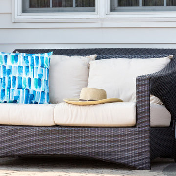
Outdoor Seating - Wicker
Whether money is no object or you follow a strict budget, options are available for every wallet.
High-end luxury furniture sites such as Frontgate, offer posh designer couches, mosaic dining tables, cushioned hammocks and even a hanging daybed.
However, affordable, luxurious-looking options are available, too — especially if you’re not afraid to roll up your sleeves and do some of the work yourself. Pinterest provides countless design inspirations for do-it-yourselfers, such as repurposing an old tire into a cushioned seat and building a lawn chair using wood pallets, among others.
Plus, check out money-saving suggestions from Better Homes and Gardens’ Budget-Friendly Ideas for Outdoor Rooms, DIY Network’s 10 Outdoor Rooms on a Budget and HGTV’s 25 Budget-Friendly Ideas for Small Outdoor Spaces.
Remember, you don’t have to do everything at once. Concentrate on small areas and budget your time and money for the items that will best fit each space.
Have you recently redone your outdoor living space? We’d love to see photos! Post them in the comments below.
 Drury Design
THE SETUP
“You have to figure out how to rebuild a life worth living,” Basia Kozub’s client says. Her husband passed away suddenly three years ago. Holidays with family became more important, and she found herself struggling with a 37-year old kitchen that was falling apart. “I made a decision to move forward,” she says. “I went, ‘You know what? I’m redoing the kitchen.'”
The big task of getting started was as easy as having a conversation – literally. Basia was on the job, helping the client sort through priorities, wishes and ideas. Basia’s client is 5′ 4″, likes keeping an eye on the kiddoes in the backyard and wanted certain things to have their own place.
THE REMODEL
The objectives were:
Enlarge and open the space
Find a classic look that incorporates blues
Upgrade to easy-to-use appliances
Hide an office space within the space
Ample storage for dishes
Design challenges:
Uneven window alignment on the back wall
Original kitchen smaller than desired, stuctural concerns if walls to be moved
Keep folks close – figure out seating for entertaining
Main sink in corner is ideal, but windows are hard to reach
Lots of storage needed for dishes, glass collection, pantry items, bar bottles and office supplies
Specific storage needs for oft-used spices and utensils
THE RENEWED SPACE
Design solutions:
Replace back wall windows, establish window size continuity
Take out two walls to open up the space, tall shallow cabinet and a tall filler added to conceal a new header
Large island that seats six easily
Custom corner sink cabinet with recessed edge allows vertically challenged homeowner to reach the windows
Mindful storage planning features: plenty of cabinets, pull-out bar bottle storage, file drawers & cubbies with pocket doors for office appliances, magic corner pullouts, and appliance garages with pocket doors
Shelf behind range for easy access to daily-use spices and oils. Also: spice and utensil pullouts on either side of range
The clients says every priority and wish box got checked. The highly functional design absorbed everything that used to be in that area of the house, but now those things are out of the way.
“In the past, we were all spread out when we gathered for the holidays, because we had to spread out. Now, we’re all in here together, including my 92-year old mother. We’re visiting, cooking, laughing… everyone is here. And I’m really learning how to use these appliances. This kitchen has given me a whole new life.”
 Tile Doctor Ltd
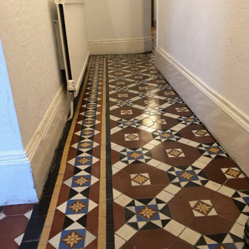
We received a request to renovate Victorian tiled hallway floor at a house in the London borough of Harlesden NW10. My client had modernised the heating system and this unfortunately required a section of the tiled flooring to be dug up so new pipework could be laid.
After speaking on the phone, I arranged an initial visit to the property so I could properly assess the work required and provide a price for restoring the floor. During my visit I could see there was another section of missing tiles at one of the door thresholds which would need attention. Except for the missing sections of floor I could see that the tiles themselves were in good condition for their age and would respond well to a deep clean and fresh seal.
I was confident on being able to source matching replacements for the missing tiles and reassured my client that we would be able not only repair the floor but also renovate it to a good standard. I gave them a price to do the restoration which they were happy to accept, and the work was booked.
After some research I managed to source replacement tiles from the Vintage Floor Tile Company in Kent; Victorian tiles are still popular so there a few companies that keep stock so we can usually find a match.
With the replacements in hand, work started by removing the cement and loose material from the missing sections of flooring and backfilling with self-levelling compound to bring the exposed base up to the right level for tiling.
The tiles were then cut to shape as required to match the existing patten and fixed into place with a quick setting adhesive and then grouted.
The floor was left to overnight to allow the adhesive to harden fully, and I returned the next day to deep clean the whole floor. To give the tiles are deep clean a strong dilution of Tile Doctor Remove and Go was sprayed onto the floor and left to soak in for ten minutes. It was then scrubbed into the floor using a rotary machine fitted with a with a black pad. This action lifted the dirt out of the tiles and the resulting slurry was removed with the wet vacuum.
It turned out that the pores of the tiles were holding a lot of dirt, so the process was repeated until I was satisfied. Due to the age of the property, there was no damp-proof membrane installed so I do try to minimise the amount of water I use in this process as there is always a chance of exacerbating any latent efflorescence issues.
Efflorescence occurs where moisture rises through the tile bringing with it salts from underneath the floor as it evaporates on the surface. This can lead to unsightly white marks appearing on the tile. To counteract this potential problem the cleaning was followed by an acid wash using Tile Doctor Acid Gel applied with a 100 then 200-grit pad, before finishing on a 400-grit burnishing pad. The floor was again rinsed with water after the application of each pad to remove the slurry and extracted with a wet vacuum.
Once I was satisfied the floor was as clean as possible, we left site and the area was left to dry over the weekend ready for application of a new sealer.
I returned on the Monday and started by taking a few moisture readings to check the floor was dry. The floor was in an acceptable range, so I applied the first of 4 coats of sealer. For this floor I chose Tile Doctor Seal and Go Extra which is specially formulated product that provides stain resistance with a hard wearing low-sheen finish.
This product is also breathable which is an important feature for old floors, anything that blocks moisture from rising through the tile will cause it to become trapped underneath where it will pool and eventually reach out to the walls and result in rising damp.
Once complete the floor looked brand new and I’m pleased to say with the deep clean and a fresh sealer applied it was impossible to tell the difference between the original and repaired sections of flooring.
For the aftercare of sealed Victorian tiled floors, I recommend Tile Doctor Neutral Cleaner, it’s a mild day to day cleaner with a neutral pH that won’t damage the sealer. Many of the tile cleaning products you find in supermarkets are simply too strong.
Andrew Newstead
North London Tile Doctor


Sponsored
Columbus, OH

Snider & Metcalf Interior Design, LTD
Leading Interior Designers in Columbus, Ohio & Ponte Vedra, Florida
 Tile Doctor Ltd
I was contacted about a Georgian property in the Kent village of Leeds , to see if I could do anything to improve a Travertine tiled floor. The use of Travertine was extensive and had been installed throughout the ground floor including the kitchen, dining room, utility and bathroom WC. Travertine is probably my favourite stone, but it is acid sensitive and attracts dirt easily, due to its ‘holey’ composition.
Initially we discussed the floor over the phone where I got to know about the issues they were experiencing, and I detailed the renovation process I normally use to restore it including the products and timelines. Naturally they wanted to me to provide a quote for the work however its tricky to do that accurately without seeing the floor, so I arranged a date to pop over.
Upon arriving I could see the tiles and the wide grout joints had extensive, ingrained dirt indicating the previous sealer had long since worn away. This is a common issue with stone floors, and to re-assure myself and the client it could be resolved I cleaned a small area in the utility room with pleasing results!
This test clean helped me to understand which products and methods would work best on the floor and later that day I emailed over a detailed quote for the renovation. Happy with the quote I received a reply the same day asking when I could start.
My colleague and I arrived on the agreed date and work started with adding protection to all areas that required it. We use a lot of water during the cleaning process and some materials such as MDF can become damaged with water ingress, so it makes sense to do this.
To get the floor clean, a coarse Carbide Brush fitted to a rotary machine was run over the Travertine tiles to scrub in a strong solution of Tile Doctor Pro-Clean. This process generates a lot of slurry as the dirt was washed out of the stone and grout which is extracted with a wet vacuum as we progressed.
Next it was on hands and knees with more Tile Doctor Pro-Clean and handheld brushes run over stubborn areas and along the grout lines to take them from 80% up to 100%.
Happy with the results, the next step was to renovate the stone using a series of diamond encrusted burnishing pads. Using only water for lubrication this process starts with the application of a coarse 400-grit burnishing pad attached to the floor buffer. This produces a lot of slurry which again was removed with a wet vacuum.
This left the Travertine clean, but the pores of the stone had been opened giving the floor a matt finish and more absorbent than it was originally. To further refine the appearance of the stone the next two burnishing pads were applied which are 800 and 1500-grit. These pads polish the stone and close the pores, restoring the natural sheen in the process. After each pad was applied the slurry was rinsed off the floor with water and extracted with the wet vacuum. Once complete the floor was left to dry off fully overnight.
I arrived the next day and took several moisture readings from the floor to check that it had dried off sufficiently overnight. The results were good, so work moved onto sealing the Travertine with two coats of Tile Doctor Ultra Seal which is a natural look impregnating sealer. It works by soaking into the stone, occupying the pores and thereby preventing dirt from becoming ingrained there. This ensures dirt remains on the surface where it is easily cleaned away.
The final step in the floor’s renovation was to apply the last of the diamond polishing pads which is a very fine 3000-grit. This pad further improves the polished appearance of the stone resulting in a satisfying sheen.
The work made a massive difference to the floor, and I received an email the next day from one of the owners who was really pleased with the transformation:
”Floors look brilliant. Very pleased.”
For the care and maintenance of polished sealed floors I recommend the use of Tile Doctor’s Stone Soap which is a gentle but effective cleaning product that won’t impact the sealer and contains a patina enhancer. When it comes to sealed floors my mantra is:
“If you look after the sealer, the sealer will look after the floor!”
Graham Davis
North Kent Tile Doctor


 Interior Pros - Design Studio
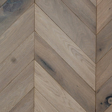
The grey trend has evolved in the last twelve months. Nowadays browns, beige and a touch of grey are in demand. Greige is the new buzzword.
Heavier hand scraped or contoured products, the rage that started around 2005 has taken a back seat in most areas, while a softer wire brushed "ceruse effect" seen mostly on White Oak has been remarkably strong showing no effects of becoming “dated” like the others mentioned.
Ceruse Color Possibilities
There are numerous color combinations to the "cerused" process with the most popular being white or off white. This design trend in hardwood flooring can have darker gray white oak with a mild ceruse off white effect.
There are limitless possibilities in either a prefinished hardwood floor or with what we can create for you in a custom on-site finished hardwood floor.
If something suits your fancy, contact us and we can work on creating just the look and sense of style you are looking for.
94