
Search results for "Choice carries" in Home Design Ideas
 Pierre Jean-Baptiste Interiors
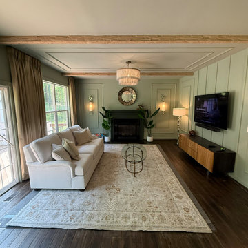
There’s something timeless about a traditional living room—its ability to feel both refined and deeply livable is what makes it such a lasting favorite. In this recent project, we set out to create a space that honored classic design principles while thoughtfully adapting to the realities of modern life—especially in a home shared with two large, beloved dogs.
The foundation of the room begins with color. We selected Sherwin-Williams SW 7741 “Willow Tree” for both the walls and trim, creating a rich, enveloping tone that immediately establishes warmth and cohesion. By carrying the same hue across architectural elements, the space feels grounded and intentional, allowing texture and detail to take center stage rather than contrast alone.
To elevate the architecture, we introduced a series of custom ceiling beams that draw the eye upward and add a sense of structure and craftsmanship. These were complemented by wall and ceiling ogee molding, bringing in a layer of traditional ornamentation that feels both elegant and tailored. The subtle curves of the ogee profiles soften the room while reinforcing its classic character.
Lighting played a key role in enhancing both ambiance and functionality. We incorporated wall sconces to provide a warm, diffused glow in the evenings, creating a cozy and inviting atmosphere. These are balanced by crinkle metal floor lamps, which add a touch of modern texture and visual interest without straying from the overall aesthetic.
At the heart of the room sits a custom-designed sofa—arguably the most important piece in any living space. Given the homeowners’ lifestyle, durability was just as important as beauty. We upholstered the sofa in outdoor-grade Sunbrella fabric, a decision that ensures long-term performance without sacrificing style. The fabric resists wear, stains, and fading, making it an ideal solution for a home with pets while maintaining a polished, tailored look.
Layering was essential in completing the design. A generously sized 9' x 12' area rug anchors the seating arrangement, adding softness underfoot and defining the space. Decorative mirrors were strategically placed to reflect light and create depth, while faux plants introduce greenery without the maintenance—an ideal choice for busy households.
The result is a living room that feels elevated yet approachable, traditional yet practical. It’s a space designed not just to be admired, but to be lived in—where thoughtful material choices and timeless details come together to support both style and everyday life.
 Kimberlee Marie Interiors
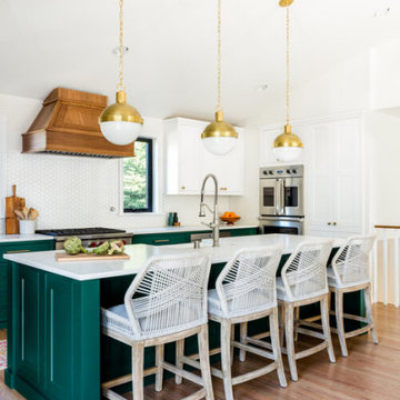
Set in the charming neighborhood of Wedgwood, this Cape Cod-style home needed a major update to satisfy our client's lifestyle needs. The living room, dining room, and kitchen were all separated, making it hard for our clients to carry out day-to-day life with small kids or adequately entertain. Our client also loved to cook for her family, so having a large open concept kitchen where she could cook, keep tabs on the kids, and entertain simultaneously was very important. To accommodate those needs, we bumped out the back and side of the house and eliminated all the walls in the home's communal areas. Adding on to the back of the house also created space in the basement where they could add a separate entrance and mudroom.
We wanted to make sure to blend the character of this home with the client's love for color, modern flare, and updated finishes. So we decided to keep the original fireplace and give it a fresh look with tile, add new hardwood in a lighter stain to match the existing and bring in pops of color through the kitchen cabinets and furnishings. New windows, siding, and a fresh coat of paint were added to give this home the curbside appeal it deserved.
In the second phase of this remodel, we transformed the basement bathroom and storage room into a primary suite. With the addition of baby number three, our clients wanted to create a retreat they could call their own. Bringing in soft, muted tones made their bedroom feel calm and collected, a relaxing place to land after a busy day. With our client’s love of patterned tile, we decided to go a little bolder in the bathroom with the flooring and vanity wall. Adding the marble in the shower and on the countertop helped balance the bold tile choices and keep both spaces feeling cohesive.

 Castle Building & Remodeling
This 1907 home in the Ericsson neighborhood of South Minneapolis needed some love. A tiny, nearly unfunctional kitchen and leaking bathroom were ready for updates. The homeowners wanted to embrace their heritage, and also have a simple and sustainable space for their family to grow. The new spaces meld the home’s traditional elements with Traditional Scandinavian design influences.
In the kitchen, a wall was opened to the dining room for natural light to carry between rooms and to create the appearance of space. Traditional Shaker style/flush inset custom white cabinetry with paneled front appliances were designed for a clean aesthetic. Custom recycled glass countertops, white subway tile, Kohler sink and faucet, beadboard ceilings, and refinished existing hardwood floors complete the kitchen after all new electrical and plumbing.
In the bathroom, we were limited by space! After discussing the homeowners’ use of space, the decision was made to eliminate the existing tub for a new walk-in shower. By installing a curbless shower drain, floating sink and shelving, and wall-hung toilet; Castle was able to maximize floor space! White cabinetry, Kohler fixtures, and custom recycled glass countertops were carried upstairs to connect to the main floor remodel.
White and black porcelain hex floors, marble accents, and oversized white tile on the walls perfect the space for a clean and minimal look, without losing its traditional roots! We love the black accents in the bathroom, including black edge on the shower niche and pops of black hex on the floors.
Tour this project in person, September 28 – 29, during the 2019 Castle Home Tour!
Find the right local pro for your project
 Pierre Jean-Baptiste Interiors
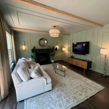
There’s something timeless about a traditional living room—its ability to feel both refined and deeply livable is what makes it such a lasting favorite. In this recent project, we set out to create a space that honored classic design principles while thoughtfully adapting to the realities of modern life—especially in a home shared with two large, beloved dogs.
The foundation of the room begins with color. We selected Sherwin-Williams SW 7741 “Willow Tree” for both the walls and trim, creating a rich, enveloping tone that immediately establishes warmth and cohesion. By carrying the same hue across architectural elements, the space feels grounded and intentional, allowing texture and detail to take center stage rather than contrast alone.
To elevate the architecture, we introduced a series of custom ceiling beams that draw the eye upward and add a sense of structure and craftsmanship. These were complemented by wall and ceiling ogee molding, bringing in a layer of traditional ornamentation that feels both elegant and tailored. The subtle curves of the ogee profiles soften the room while reinforcing its classic character.
Lighting played a key role in enhancing both ambiance and functionality. We incorporated wall sconces to provide a warm, diffused glow in the evenings, creating a cozy and inviting atmosphere. These are balanced by crinkle metal floor lamps, which add a touch of modern texture and visual interest without straying from the overall aesthetic.
At the heart of the room sits a custom-designed sofa—arguably the most important piece in any living space. Given the homeowners’ lifestyle, durability was just as important as beauty. We upholstered the sofa in outdoor-grade Sunbrella fabric, a decision that ensures long-term performance without sacrificing style. The fabric resists wear, stains, and fading, making it an ideal solution for a home with pets while maintaining a polished, tailored look.
Layering was essential in completing the design. A generously sized 9' x 12' area rug anchors the seating arrangement, adding softness underfoot and defining the space. Decorative mirrors were strategically placed to reflect light and create depth, while faux plants introduce greenery without the maintenance—an ideal choice for busy households.
The result is a living room that feels elevated yet approachable, traditional yet practical. It’s a space designed not just to be admired, but to be lived in—where thoughtful material choices and timeless details come together to support both style and everyday life.

 Seattle Staging Company
the kitchen island provides ample room for 4 counter stools, making it easy for people to come have a seat. we provided small pops of color to accentuate the earth tones in the kitchen, from the flooring, to the backsplash to the cabinets. allowing the quartersawn flooring to carry on throughout the entire main floor, including in the kitchen and powder room, created a cohesive space.

 Cantoni Atlanta
Cantoni is Designer's Choice for this Palatial Home in South Carolina. Cantoni partners on many projects with architects, interior designers, developers, realtors and others in the trade. The featured project in this eNewsletter is a spectacular example of a recent partnering between Susan Sentell ASID, Beaux Monde, Inc., Cumming, Georgia, and Design Consultant Kohl Sudnikovich of Cantoni Atlanta. While inspired by classic Italian architecture, this palatial home is not in the foothills of Italy’s Apennines but in the foothills of the Blue Ridge Mountains in South Carolina. When we saw the images of this stunning home and what went into planning and executing its interiors, I thought: here’s a perfect illustration of Cantoni’s branding theme: Great Design Is A Way of Life. Design isn’t just something cosmetic, something tacked on, but the very essence of a residence’s personality and of the personality of the people who make the house a home. This sensational South Carolina project is a superb example of Cantoni’s Great Design theme brought to life. According to Kohl, Cantoni’s involvement kicked in when Susan, whom he’d worked with before, contacted him to consult on furniture collections that would help her fulfill her and her client’s overall design theme. Susan says, "This is a 5,800-sq. ft. new construction designed by a prestigious national architectural group. Given the Mediterranean-influenced elevation and the client’s wish for an airy, Italian-contemporary interior treatment I felt Cantoni was the best source for furnishing some of the main rooms. "The theme of our project we called, ‘The Goddess House’ for its ethereal look and feel– open, warm, free, filled with light and natural colors, flowing with sophisticated detail. I felt Cantoni was the right choice to help us carry out the theme. I knew Cantoni not only for its Italian design but for the quality of its products and depth and breadth of its selection. "After creating furniture plans and the overall palette, I contacted Kohl and asked him to consult with us on Cantoni pieces that would realize our plans for the living room, dining room, master bedroom, media room and outdoor. "The finished product is a beautiful example of what you can achieve when the vision of the client and the skills of the design team are in alignment. I think the feeling you get in this home is a manifestation of that harmony.” Thanks so much to Susan for choosing Cantoni and for her client for generously allowing us to show the interiors of the rooms with Cantoni product. And good job Kohl and the Cantoni Atlanta team for your efforts–not the least of which were the logistics involved in delivery and installation, this home being a great distance from Atlanta. Great Design IS a Way of Life. That theme works at many levels: alluding to our clients’ tastes and dreams and sophistication, the product itself, and the creative talents of the designers.
 Kimberlee Marie Interiors
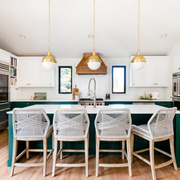
Set in the charming neighborhood of Wedgwood, this Cape Cod-style home needed a major update to satisfy our client's lifestyle needs. The living room, dining room, and kitchen were all separated, making it hard for our clients to carry out day-to-day life with small kids or adequately entertain. Our client also loved to cook for her family, so having a large open concept kitchen where she could cook, keep tabs on the kids, and entertain simultaneously was very important. To accommodate those needs, we bumped out the back and side of the house and eliminated all the walls in the home's communal areas. Adding on to the back of the house also created space in the basement where they could add a separate entrance and mudroom.
We wanted to make sure to blend the character of this home with the client's love for color, modern flare, and updated finishes. So we decided to keep the original fireplace and give it a fresh look with tile, add new hardwood in a lighter stain to match the existing and bring in pops of color through the kitchen cabinets and furnishings. New windows, siding, and a fresh coat of paint were added to give this home the curbside appeal it deserved.
In the second phase of this remodel, we transformed the basement bathroom and storage room into a primary suite. With the addition of baby number three, our clients wanted to create a retreat they could call their own. Bringing in soft, muted tones made their bedroom feel calm and collected, a relaxing place to land after a busy day. With our client’s love of patterned tile, we decided to go a little bolder in the bathroom with the flooring and vanity wall. Adding the marble in the shower and on the countertop helped balance the bold tile choices and keep both spaces feeling cohesive.
Sponsored
Delaware, OH

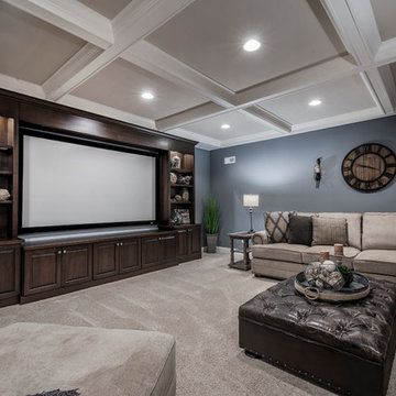
Buckeye Basements, Inc.
Central Ohio's Basement Finishing ExpertsBest Of Houzz '13-'21
 Kimberlee Marie Interiors
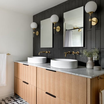
Set in the charming neighborhood of Wedgwood, this Cape Cod-style home needed a major update to satisfy our client's lifestyle needs. The living room, dining room, and kitchen were all separated, making it hard for our clients to carry out day-to-day life with small kids or adequately entertain. Our client also loved to cook for her family, so having a large open concept kitchen where she could cook, keep tabs on the kids, and entertain simultaneously was very important. To accommodate those needs, we bumped out the back and side of the house and eliminated all the walls in the home's communal areas. Adding on to the back of the house also created space in the basement where they could add a separate entrance and mudroom.
We wanted to make sure to blend the character of this home with the client's love for color, modern flare, and updated finishes. So we decided to keep the original fireplace and give it a fresh look with tile, add new hardwood in a lighter stain to match the existing and bring in pops of color through the kitchen cabinets and furnishings. New windows, siding, and a fresh coat of paint were added to give this home the curbside appeal it deserved.
In the second phase of this remodel, we transformed the basement bathroom and storage room into a primary suite. With the addition of baby number three, our clients wanted to create a retreat they could call their own. Bringing in soft, muted tones made their bedroom feel calm and collected, a relaxing place to land after a busy day. With our client’s love of patterned tile, we decided to go a little bolder in the bathroom with the flooring and vanity wall. Adding the marble in the shower and on the countertop helped balance the bold tile choices and keep both spaces feeling cohesive.

 Studio TOOP
design: Carrie Preston (Studio TOOP) and Jasper Helmantel (Cruydt Hoeck), 2011
location: Appeltern, NL
status: built in 2012 by Appeltern Model Garden Complex
photos: Olga van Saane, October 2013
Designed as assignment from both the Dutch gardening magazine Groei & Bloei and the television and radio nature program Vara's Vroege Vogels, this garden serves as a model of how homeowners can incorporate lots of plant life and wildlife into the design but without sacrificing practicality or aesthetics. The garden is deliberately contemporary in its style to emphasize that nature-rich gardens need not look a certain way - insects and birds don't care if the lines are straight or curved.
At the same time the garden makes use of affordable, simple, no-nonsense materials. The 40x60 cm paving stones are one of the most common and affordable paving options in the Netherlands, available en masse for free on the Internet. Conceptually we imagined a garden completely paved with the tiles (as to many gardens are) and what would happen if took out some of these stones, used them to build benches and structure and added plants where the tiles had been. In the construction of the benches we include other materials such as bamboo sticks and insulation bricks that create habitat for insects such as solitary bees.
The plant palette is based on a selection of native and host plants in combination with the 26 plants plan set up by Groei & Boei -- a list of plants aimed at making the use of more plants in gardens accessible and less intimidating. The choice for the number 26 corresponds with the number of letters in the alphabet in line with the famous Dutch garden designer Mien Ruy's comment that if we only need 26 letters to create a whole language, we should be able to combine and mix 26 plants to express far more than we think.
 Kimberlee Marie Interiors
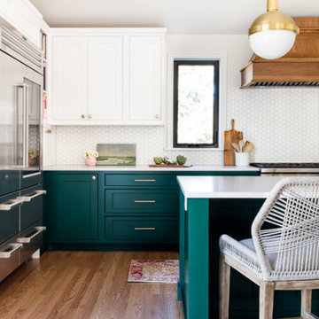
Set in the charming neighborhood of Wedgwood, this Cape Cod-style home needed a major update to satisfy our client's lifestyle needs. The living room, dining room, and kitchen were all separated, making it hard for our clients to carry out day-to-day life with small kids or adequately entertain. Our client also loved to cook for her family, so having a large open concept kitchen where she could cook, keep tabs on the kids, and entertain simultaneously was very important. To accommodate those needs, we bumped out the back and side of the house and eliminated all the walls in the home's communal areas. Adding on to the back of the house also created space in the basement where they could add a separate entrance and mudroom.
We wanted to make sure to blend the character of this home with the client's love for color, modern flare, and updated finishes. So we decided to keep the original fireplace and give it a fresh look with tile, add new hardwood in a lighter stain to match the existing and bring in pops of color through the kitchen cabinets and furnishings. New windows, siding, and a fresh coat of paint were added to give this home the curbside appeal it deserved.
In the second phase of this remodel, we transformed the basement bathroom and storage room into a primary suite. With the addition of baby number three, our clients wanted to create a retreat they could call their own. Bringing in soft, muted tones made their bedroom feel calm and collected, a relaxing place to land after a busy day. With our client’s love of patterned tile, we decided to go a little bolder in the bathroom with the flooring and vanity wall. Adding the marble in the shower and on the countertop helped balance the bold tile choices and keep both spaces feeling cohesive.
 Studio TOOP
design: Carrie Preston (Studio TOOP) and Jasper Helmantel (Cruydt Hoeck), 2011
location: Appeltern, NL
status: built in 2012 by Appeltern Model Garden Complex
photos: Olga van Saane, October 2013
Designed as assignment from both the Dutch gardening magazine Groei & Bloei and the television and radio nature program Vara's Vroege Vogels, this garden serves as a model of how homeowners can incorporate lots of plant life and wildlife into the design but without sacrificing practicality or aesthetics. The garden is deliberately contemporary in its style to emphasize that nature-rich gardens need not look a certain way - insects and birds don't care if the lines are straight or curved.
At the same time the garden makes use of affordable, simple, no-nonsense materials. The 40x60 cm paving stones are one of the most common and affordable paving options in the Netherlands, available en masse for free on the Internet. Conceptually we imagined a garden completely paved with the tiles (as to many gardens are) and what would happen if took out some of these stones, used them to build benches and structure and added plants where the tiles had been. In the construction of the benches we include other materials such as bamboo sticks and insulation bricks that create habitat for insects such as solitary bees.
The plant palette is based on a selection of native and host plants in combination with the 26 plants plan set up by Groei & Boei -- a list of plants aimed at making the use of more plants in gardens accessible and less intimidating. The choice for the number 26 corresponds with the number of letters in the alphabet in line with the famous Dutch garden designer Mien Ruy's comment that if we only need 26 letters to create a whole language, we should be able to combine and mix 26 plants to express far more than we think.
 Save home
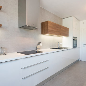
Choosing between American framed cabinets and European frameless renditions often boils down to personal preference.
While the American framed counterpart emerges as an immensely popular choice, classic white European kitchen cabinets exhibit a timeless charm that one can't ignore.
It's pretty easy to distinguish a framed and a frameless cabinet as one pays close attention.
The American framed cabinets typically have wide gaps around the doors showing the face of the wood.
In comparison, the European frameless cabinets have much smaller gaps (less than a quarter-inch or more). Moreover, they also carry a matching edge band which is visible on the cabinet box, when its doors are left open.
Well, that's there with the basics and many more subtle differences that distinguish one kind from another.
In this post, we take a closer look at both frameless and framed cabinet styles, their merits and demerits, and help you make an informed decision to buy one.
The American Style Face Frames
As the name suggests, face frame cabinets dominate the structure of a cabinet and use comparatively thinner materials for the cabinet box.
One can find additional frame pieces (mullions) that rest right between the door and the face of the drawer.
One of the standout features of American framed cabinets is the doors that remain attached to the face frame and carry hinges concealed within. In such structures, the shelves are generally of half depth and can be hung side up or down according to one’s need.
Face frame cabinets are known to sport doors that are not classic or pure square in shape. Also, they use a trim mold for their finish which measures just about an inch, but wide enough to press on the wall contours. Thus, they are nailed right on the face of the cabinet as well as to the sides to even out the gaps following the installation.
In essence, this particular style of cabinetry is geared towards keeping things under budget and allows the makers to work persistently and create a specific line of products.
The European Frameless Style
Taking a different stance from American face frame cabinets, we have the European Frameless style that views the cabinet box as the main structure.
It goes to work with a thin edge connected to the cabinet box matching the exteriors. The material used for the cabinet box is also thicker and carries quite a bit of weight.
Also, instead of the face frame, the glides for the door and the drawers stay attached to the cabinet box itself. The white European kitchen cabinets also use concealed hinges, which is again chunkier compared to its American counterpart.
While such frameless cabinets can be easily ordered by referring to a catalog, most buyers opt for a custom made product.
Another glaring difference between the two cabinetry styles is how the European frameless renditions work with cabinet doors that are perfect squares, and all lines between the drawers and doors are straight, imparting consistency throughout.
Furthermore, the finishing detail instead of using trim molds are scribed and further cut to fit within the walls.
Delightful enough, one can have a European frameless cabinets customized to their liking, mood, and style. White European kitchen cabinets, unlike framed ones, can be made to look rustic, transitional, modern, or traditional, and could be even a blend of any two styles.
How Do You Know Which Is The Right Style For You?
As mentioned earlier, choosing a particular style of cabinetry is all dependent on your personal preference. However, there are a few merits and demerits to each style.
For instance, the white European kitchen cabinets are extremely high in demand and can offer a rich look and elegant feel to any space.
Even if you go for any other color other than the classic ones, it is the flexibility, the visually stunning appearance, and precise carpentry that goes in its favor.
Come-of-age cabinet makers have a wide range of white kitchen cabinets for sale to choose from. Cabinet DIY is one such professional and passionate cabinet maker that has helped many homeowners pick the right piece for their place. One can order from their website and get it shipped to their doorstep.
It's only evident why this carefully cut and sculpted cabinetry finds its place across leading home decor magazines and websites around the world.
The American face frame cabinets can seldom claim to match the elegance and timeless beauty of white European kitchen cabinets. Also, given the choice, European frameless cabinets have multiple doors and wide drawer banks offering adequate room for storage.
Most importantly, the hardware that goes into the making of a frameless cabinet has everything attached to the cabinet box which promises more longevity, compared to face frame renditions. While the former is more likely to stay the same over several years, the latter is prone to cracks appearing in places now and then, with slides and hinges fitted with screws.
Nevertheless, one of the standout reasons that might give American face frame cabinets an upper hand over European frameless cabinetry is budget.
American framed cabinets using much thinner finish material attributes to lower pricing. Also, given the fact that there isn't much room for exquisite designs, the budget is often an overpowering factor for many buyers.
Wrap up
For anyone who would like to order a cabinet that is aesthetically pleasing and promises endless customization and longevity will side with European frameless cabinets.
In doing so, it is quite probable that pricing won't be a hindrance as one wages the investment for the value the furniture adds to a living space. Something that American face framed cabinets can't seem to match up.
While the American framed counterpart emerges as an immensely popular choice, classic white European kitchen cabinets exhibit a timeless charm that one can't ignore.
It's pretty easy to distinguish a framed and a frameless cabinet as one pays close attention.
The American framed cabinets typically have wide gaps around the doors showing the face of the wood.
In comparison, the European frameless cabinets have much smaller gaps (less than a quarter-inch or more). Moreover, they also carry a matching edge band which is visible on the cabinet box, when its doors are left open.
Well, that's there with the basics and many more subtle differences that distinguish one kind from another.
In this post, we take a closer look at both frameless and framed cabinet styles, their merits and demerits, and help you make an informed decision to buy one.
The American Style Face Frames
As the name suggests, face frame cabinets dominate the structure of a cabinet and use comparatively thinner materials for the cabinet box.
One can find additional frame pieces (mullions) that rest right between the door and the face of the drawer.
One of the standout features of American framed cabinets is the doors that remain attached to the face frame and carry hinges concealed within. In such structures, the shelves are generally of half depth and can be hung side up or down according to one’s need.
Face frame cabinets are known to sport doors that are not classic or pure square in shape. Also, they use a trim mold for their finish which measures just about an inch, but wide enough to press on the wall contours. Thus, they are nailed right on the face of the cabinet as well as to the sides to even out the gaps following the installation.
In essence, this particular style of cabinetry is geared towards keeping things under budget and allows the makers to work persistently and create a specific line of products.
The European Frameless Style
Taking a different stance from American face frame cabinets, we have the European Frameless style that views the cabinet box as the main structure.
It goes to work with a thin edge connected to the cabinet box matching the exteriors. The material used for the cabinet box is also thicker and carries quite a bit of weight.
Also, instead of the face frame, the glides for the door and the drawers stay attached to the cabinet box itself. The white European kitchen cabinets also use concealed hinges, which is again chunkier compared to its American counterpart.
While such frameless cabinets can be easily ordered by referring to a catalog, most buyers opt for a custom made product.
Another glaring difference between the two cabinetry styles is how the European frameless renditions work with cabinet doors that are perfect squares, and all lines between the drawers and doors are straight, imparting consistency throughout.
Furthermore, the finishing detail instead of using trim molds are scribed and further cut to fit within the walls.
Delightful enough, one can have a European frameless cabinets customized to their liking, mood, and style. White European kitchen cabinets, unlike framed ones, can be made to look rustic, transitional, modern, or traditional, and could be even a blend of any two styles.
How Do You Know Which Is The Right Style For You?
As mentioned earlier, choosing a particular style of cabinetry is all dependent on your personal preference. However, there are a few merits and demerits to each style.
For instance, the white European kitchen cabinets are extremely high in demand and can offer a rich look and elegant feel to any space.
Even if you go for any other color other than the classic ones, it is the flexibility, the visually stunning appearance, and precise carpentry that goes in its favor.
Come-of-age cabinet makers have a wide range of white kitchen cabinets for sale to choose from. Cabinet DIY is one such professional and passionate cabinet maker that has helped many homeowners pick the right piece for their place. One can order from their website and get it shipped to their doorstep.
It's only evident why this carefully cut and sculpted cabinetry finds its place across leading home decor magazines and websites around the world.
The American face frame cabinets can seldom claim to match the elegance and timeless beauty of white European kitchen cabinets. Also, given the choice, European frameless cabinets have multiple doors and wide drawer banks offering adequate room for storage.
Most importantly, the hardware that goes into the making of a frameless cabinet has everything attached to the cabinet box which promises more longevity, compared to face frame renditions. While the former is more likely to stay the same over several years, the latter is prone to cracks appearing in places now and then, with slides and hinges fitted with screws.
Nevertheless, one of the standout reasons that might give American face frame cabinets an upper hand over European frameless cabinetry is budget.
American framed cabinets using much thinner finish material attributes to lower pricing. Also, given the fact that there isn't much room for exquisite designs, the budget is often an overpowering factor for many buyers.
Wrap up
For anyone who would like to order a cabinet that is aesthetically pleasing and promises endless customization and longevity will side with European frameless cabinets.
In doing so, it is quite probable that pricing won't be a hindrance as one wages the investment for the value the furniture adds to a living space. Something that American face framed cabinets can't seem to match up.
 Cantoni Atlanta
Cantoni is Designer's Choice for this Palatial Home in South Carolina. Cantoni partners on many projects with architects, interior designers, developers, realtors and others in the trade. The featured project in this eNewsletter is a spectacular example of a recent partnering between Susan Sentell ASID, Beaux Monde, Inc., Cumming, Georgia, and Design Consultant Kohl Sudnikovich of Cantoni Atlanta. While inspired by classic Italian architecture, this palatial home is not in the foothills of Italy’s Apennines but in the foothills of the Blue Ridge Mountains in South Carolina. When we saw the images of this stunning home and what went into planning and executing its interiors, I thought: here’s a perfect illustration of Cantoni’s branding theme: Great Design Is A Way of Life. Design isn’t just something cosmetic, something tacked on, but the very essence of a residence’s personality and of the personality of the people who make the house a home. This sensational South Carolina project is a superb example of Cantoni’s Great Design theme brought to life. According to Kohl, Cantoni’s involvement kicked in when Susan, whom he’d worked with before, contacted him to consult on furniture collections that would help her fulfill her and her client’s overall design theme. Susan says, "This is a 5,800-sq. ft. new construction designed by a prestigious national architectural group. Given the Mediterranean-influenced elevation and the client’s wish for an airy, Italian-contemporary interior treatment I felt Cantoni was the best source for furnishing some of the main rooms. "The theme of our project we called, ‘The Goddess House’ for its ethereal look and feel– open, warm, free, filled with light and natural colors, flowing with sophisticated detail. I felt Cantoni was the right choice to help us carry out the theme. I knew Cantoni not only for its Italian design but for the quality of its products and depth and breadth of its selection. "After creating furniture plans and the overall palette, I contacted Kohl and asked him to consult with us on Cantoni pieces that would realize our plans for the living room, dining room, master bedroom, media room and outdoor. "The finished product is a beautiful example of what you can achieve when the vision of the client and the skills of the design team are in alignment. I think the feeling you get in this home is a manifestation of that harmony.” Thanks so much to Susan for choosing Cantoni and for her client for generously allowing us to show the interiors of the rooms with Cantoni product. And good job Kohl and the Cantoni Atlanta team for your efforts–not the least of which were the logistics involved in delivery and installation, this home being a great distance from Atlanta. Great Design IS a Way of Life. That theme works at many levels: alluding to our clients’ tastes and dreams and sophistication, the product itself, and the creative talents of the designers.
 Kimberlee Marie Interiors
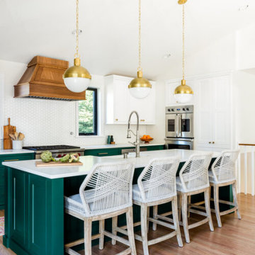
Set in the charming neighborhood of Wedgwood, this Cape Cod-style home needed a major update to satisfy our client's lifestyle needs. The living room, dining room, and kitchen were all separated, making it hard for our clients to carry out day-to-day life with small kids or adequately entertain. Our client also loved to cook for her family, so having a large open concept kitchen where she could cook, keep tabs on the kids, and entertain simultaneously was very important. To accommodate those needs, we bumped out the back and side of the house and eliminated all the walls in the home's communal areas. Adding on to the back of the house also created space in the basement where they could add a separate entrance and mudroom.
We wanted to make sure to blend the character of this home with the client's love for color, modern flare, and updated finishes. So we decided to keep the original fireplace and give it a fresh look with tile, add new hardwood in a lighter stain to match the existing and bring in pops of color through the kitchen cabinets and furnishings. New windows, siding, and a fresh coat of paint were added to give this home the curbside appeal it deserved.
In the second phase of this remodel, we transformed the basement bathroom and storage room into a primary suite. With the addition of baby number three, our clients wanted to create a retreat they could call their own. Bringing in soft, muted tones made their bedroom feel calm and collected, a relaxing place to land after a busy day. With our client’s love of patterned tile, we decided to go a little bolder in the bathroom with the flooring and vanity wall. Adding the marble in the shower and on the countertop helped balance the bold tile choices and keep both spaces feeling cohesive.
 Kimberlee Marie Interiors
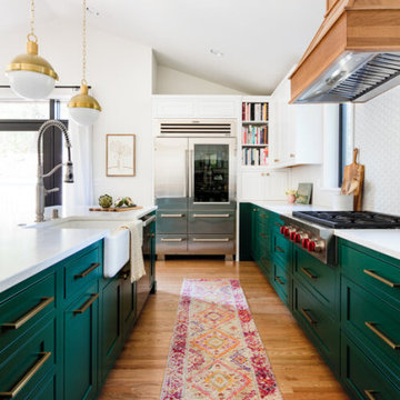
Set in the charming neighborhood of Wedgwood, this Cape Cod-style home needed a major update to satisfy our client's lifestyle needs. The living room, dining room, and kitchen were all separated, making it hard for our clients to carry out day-to-day life with small kids or adequately entertain. Our client also loved to cook for her family, so having a large open concept kitchen where she could cook, keep tabs on the kids, and entertain simultaneously was very important. To accommodate those needs, we bumped out the back and side of the house and eliminated all the walls in the home's communal areas. Adding on to the back of the house also created space in the basement where they could add a separate entrance and mudroom.
We wanted to make sure to blend the character of this home with the client's love for color, modern flare, and updated finishes. So we decided to keep the original fireplace and give it a fresh look with tile, add new hardwood in a lighter stain to match the existing and bring in pops of color through the kitchen cabinets and furnishings. New windows, siding, and a fresh coat of paint were added to give this home the curbside appeal it deserved.
In the second phase of this remodel, we transformed the basement bathroom and storage room into a primary suite. With the addition of baby number three, our clients wanted to create a retreat they could call their own. Bringing in soft, muted tones made their bedroom feel calm and collected, a relaxing place to land after a busy day. With our client’s love of patterned tile, we decided to go a little bolder in the bathroom with the flooring and vanity wall. Adding the marble in the shower and on the countertop helped balance the bold tile choices and keep both spaces feeling cohesive.
 Cantoni Atlanta
Cantoni is Designer's Choice for this Palatial Home in South Carolina. Cantoni partners on many projects with architects, interior designers, developers, realtors and others in the trade. The featured project in this eNewsletter is a spectacular example of a recent partnering between Susan Sentell ASID, Beaux Monde, Inc., Cumming, Georgia, and Design Consultant Kohl Sudnikovich of Cantoni Atlanta. While inspired by classic Italian architecture, this palatial home is not in the foothills of Italy’s Apennines but in the foothills of the Blue Ridge Mountains in South Carolina. When we saw the images of this stunning home and what went into planning and executing its interiors, I thought: here’s a perfect illustration of Cantoni’s branding theme: Great Design Is A Way of Life. Design isn’t just something cosmetic, something tacked on, but the very essence of a residence’s personality and of the personality of the people who make the house a home. This sensational South Carolina project is a superb example of Cantoni’s Great Design theme brought to life. According to Kohl, Cantoni’s involvement kicked in when Susan, whom he’d worked with before, contacted him to consult on furniture collections that would help her fulfill her and her client’s overall design theme. Susan says, "This is a 5,800-sq. ft. new construction designed by a prestigious national architectural group. Given the Mediterranean-influenced elevation and the client’s wish for an airy, Italian-contemporary interior treatment I felt Cantoni was the best source for furnishing some of the main rooms. "The theme of our project we called, ‘The Goddess House’ for its ethereal look and feel– open, warm, free, filled with light and natural colors, flowing with sophisticated detail. I felt Cantoni was the right choice to help us carry out the theme. I knew Cantoni not only for its Italian design but for the quality of its products and depth and breadth of its selection. "After creating furniture plans and the overall palette, I contacted Kohl and asked him to consult with us on Cantoni pieces that would realize our plans for the living room, dining room, master bedroom, media room and outdoor. "The finished product is a beautiful example of what you can achieve when the vision of the client and the skills of the design team are in alignment. I think the feeling you get in this home is a manifestation of that harmony.” Thanks so much to Susan for choosing Cantoni and for her client for generously allowing us to show the interiors of the rooms with Cantoni product. And good job Kohl and the Cantoni Atlanta team for your efforts–not the least of which were the logistics involved in delivery and installation, this home being a great distance from Atlanta. Great Design IS a Way of Life. That theme works at many levels: alluding to our clients’ tastes and dreams and sophistication, the product itself, and the creative talents of the designers.
 Cantoni Atlanta
Cantoni is Designer's Choice for this Palatial Home in South Carolina. Cantoni partners on many projects with architects, interior designers, developers, realtors and others in the trade. The featured project in this eNewsletter is a spectacular example of a recent partnering between Susan Sentell ASID, Beaux Monde, Inc., Cumming, Georgia, and Design Consultant Kohl Sudnikovich of Cantoni Atlanta. While inspired by classic Italian architecture, this palatial home is not in the foothills of Italy’s Apennines but in the foothills of the Blue Ridge Mountains in South Carolina. When we saw the images of this stunning home and what went into planning and executing its interiors, I thought: here’s a perfect illustration of Cantoni’s branding theme: Great Design Is A Way of Life. Design isn’t just something cosmetic, something tacked on, but the very essence of a residence’s personality and of the personality of the people who make the house a home. This sensational South Carolina project is a superb example of Cantoni’s Great Design theme brought to life. According to Kohl, Cantoni’s involvement kicked in when Susan, whom he’d worked with before, contacted him to consult on furniture collections that would help her fulfill her and her client’s overall design theme. Susan says, "This is a 5,800-sq. ft. new construction designed by a prestigious national architectural group. Given the Mediterranean-influenced elevation and the client’s wish for an airy, Italian-contemporary interior treatment I felt Cantoni was the best source for furnishing some of the main rooms. "The theme of our project we called, ‘The Goddess House’ for its ethereal look and feel– open, warm, free, filled with light and natural colors, flowing with sophisticated detail. I felt Cantoni was the right choice to help us carry out the theme. I knew Cantoni not only for its Italian design but for the quality of its products and depth and breadth of its selection. "After creating furniture plans and the overall palette, I contacted Kohl and asked him to consult with us on Cantoni pieces that would realize our plans for the living room, dining room, master bedroom, media room and outdoor. "The finished product is a beautiful example of what you can achieve when the vision of the client and the skills of the design team are in alignment. I think the feeling you get in this home is a manifestation of that harmony.” Thanks so much to Susan for choosing Cantoni and for her client for generously allowing us to show the interiors of the rooms with Cantoni product. And good job Kohl and the Cantoni Atlanta team for your efforts–not the least of which were the logistics involved in delivery and installation, this home being a great distance from Atlanta. Great Design IS a Way of Life. That theme works at many levels: alluding to our clients’ tastes and dreams and sophistication, the product itself, and the creative talents of the designers.

 RKD Architects, Inc
Gravity Shots
Example of a minimalist wooden floating open staircase design in Denver
Example of a minimalist wooden floating open staircase design in Denver
 Kimberlee Marie Interiors
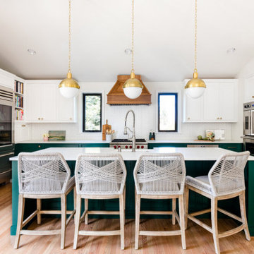
Set in the charming neighborhood of Wedgwood, this Cape Cod-style home needed a major update to satisfy our client's lifestyle needs. The living room, dining room, and kitchen were all separated, making it hard for our clients to carry out day-to-day life with small kids or adequately entertain. Our client also loved to cook for her family, so having a large open concept kitchen where she could cook, keep tabs on the kids, and entertain simultaneously was very important. To accommodate those needs, we bumped out the back and side of the house and eliminated all the walls in the home's communal areas. Adding on to the back of the house also created space in the basement where they could add a separate entrance and mudroom.
We wanted to make sure to blend the character of this home with the client's love for color, modern flare, and updated finishes. So we decided to keep the original fireplace and give it a fresh look with tile, add new hardwood in a lighter stain to match the existing and bring in pops of color through the kitchen cabinets and furnishings. New windows, siding, and a fresh coat of paint were added to give this home the curbside appeal it deserved.
In the second phase of this remodel, we transformed the basement bathroom and storage room into a primary suite. With the addition of baby number three, our clients wanted to create a retreat they could call their own. Bringing in soft, muted tones made their bedroom feel calm and collected, a relaxing place to land after a busy day. With our client’s love of patterned tile, we decided to go a little bolder in the bathroom with the flooring and vanity wall. Adding the marble in the shower and on the countertop helped balance the bold tile choices and keep both spaces feeling cohesive.
 Studio TOOP
design: Carrie Preston (Studio TOOP) and Jasper Helmantel (Cruydt Hoeck), 2011
location: Appeltern, NL
status: built in 2012 by Appeltern Model Garden Complex
photos: Olga van Saane, October 2013
Designed as assignment from both the Dutch gardening magazine Groei & Bloei and the television and radio nature program Vara's Vroege Vogels, this garden serves as a model of how homeowners can incorporate lots of plant life and wildlife into the design but without sacrificing practicality or aesthetics. The garden is deliberately contemporary in its style to emphasize that nature-rich gardens need not look a certain way - insects and birds don't care if the lines are straight or curved.
At the same time the garden makes use of affordable, simple, no-nonsense materials. The 40x60 cm paving stones are one of the most common and affordable paving options in the Netherlands, available en masse for free on the Internet. Conceptually we imagined a garden completely paved with the tiles (as to many gardens are) and what would happen if took out some of these stones, used them to build benches and structure and added plants where the tiles had been. In the construction of the benches we include other materials such as bamboo sticks and insulation bricks that create habitat for insects such as solitary bees.
The plant palette is based on a selection of native and host plants in combination with the 26 plants plan set up by Groei & Boei -- a list of plants aimed at making the use of more plants in gardens accessible and less intimidating. The choice for the number 26 corresponds with the number of letters in the alphabet in line with the famous Dutch garden designer Mien Ruy's comment that if we only need 26 letters to create a whole language, we should be able to combine and mix 26 plants to express far more than we think.
40