
Search results for "Chooses" in Home Design Ideas
 Margie Grace - Grace Design Associates
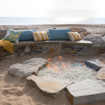
We used Sydney Peak stone slabs to build this firepit. The bench was made with Sydney Peak flagstone and boulders for the bench.
Design ideas for a small contemporary landscaping in Santa Barbara.
Design ideas for a small contemporary landscaping in Santa Barbara.
 Thorndike Development
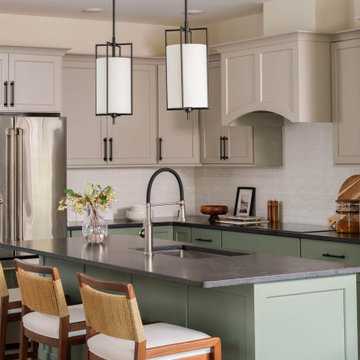
Kitchen in the Birch model home at Larkwood in Raynham, MA — Larkwood's largest floor plan at 2,830 sq ft with 3 bedrooms + den, 2.5 baths, and an oversized two-car garage. Fireplace with custom built-in shelving and hardwood floors throughout the main living area. Every buyer works one-on-one with Thorndike's in-house interior designer Nikkie Gaitan on every finish selection — countertops, cabinetry, flooring, tile, and fixtures
 Jeanne K Chung, Inc. // Cozy•Stylish•Chic
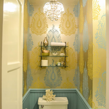
A petite powder room is brought to life with a bright metallic and flocked wallpaper and accented with a turquoise chair rail. The door is painted a bright citron to further bring some punch to the room.
Find the right local pro for your project
 Nathan Homes LLC
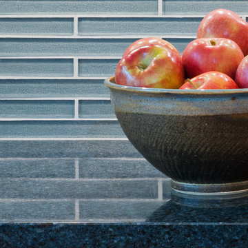
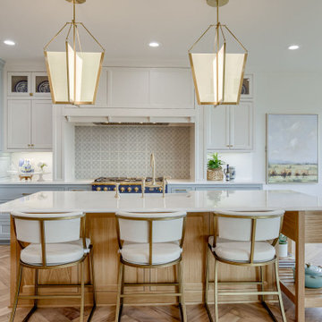
Eat-in kitchen - light wood floor eat-in kitchen idea in Omaha with a farmhouse sink, quartz countertops, blue backsplash, paneled appliances, an island and white countertops
 Land2c Landscape Architecture
Land2c photos
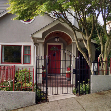
Entry is now crisply defined with a surround of fenced walls with an arched metal door repeating the home's architecture, The old porch support columns were reclad to create a grander entry. A lit address light was added, smooth new concrete walk, and welcoming plantings greet guests. The old maple tree has been well-pruned to allow more light into the entry. Plants are bright and have four seasons interest. The red fence will be painted matching black soon. The new entry was poured to meet the angle of the stair risers and the city sidewalk. The existing exposed aggregate concrete retaining walls were skimmed and painted to mimic the stucco finish of the house. The iron fencing will be all black.
All now appears to be original to the home's era.


 StoneMill Construction
With timbers, vertical siding and eyebrow roofs, Style Y is the beautiful Farmhouse version.
Choose a model, choose your style, choose your colors, choose your lot, choose your add-on features -- building a brand new home with StoneMill is fun and easy.
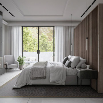
 Ferriss - Architectural Renderings
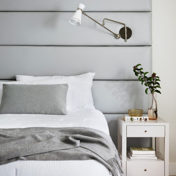
7 mistakes in bedroom design and ways to avoid them.
ERROR # 1 - Incorrect bed size.
This is a problem with any furniture in principle. When, according to the plan and ergonomic calculations, it becomes size to size, but in fact, it looks cumbersome, visually overflowing the space or, on the contrary, turns out to be too small and looks awkward.
How to avoid: Always be guided by the proportions of the size of the furniture in the room. Try to choose as big a bed as possible, but stay realistic. The main thing is that the width of the passageways in the bedroom should not be less than 70cm, and for comfortable movement, it is better to do everything 100cm.
ERROR # 2 - Poor lighting and switches.
Even in a small bedroom, you need multiple light sources. A single chandelier in the center of the ceiling is not enough, because it creates the effect of darkening the corners, and the room seems uncomfortable.
How to avoid: Hang a sconce over your headboard. Don't forget to light up the space next to the mirror and wardrobe. And be sure to place switches close to the bed so that you don't have to go to the other end of the room after an evening with a book in bed.
Do not forget about a sufficient number of outlets, this should be done even at the planning stage.
ERROR # 3 - Few storage locations
The fewer well-thought-out cabinets and shelving, the more things are visible. And the clutter spoils even the most stylish and expensive interior.
How to avoid: In addition to bedside tables, a chest of drawers (for storing small things) and a built-in wardrobe can be placed in a small bedroom: unlike a usual one, it takes up space from floor to ceiling, thereby accommodating more items. In addition, the built-in structure looks more solid and often merges with the walls, making the setting complete.
ERROR # 4 - Carpet of the wrong size.
The carpet in the bedroom is a great addition, and sometimes the final touch of the whole composition. But often people choose the wrong size or do not use it at all.
How to avoid: Choosing the right size can be guided by the unspoken rule, according to which the carpet should be 1 meter larger than the bed, both lengthwise and across. If the room is large, then it is recommended that the indentation of the carpet from the wall is 45-50 cm, if it is small, then 20-30 cm can be dispensed with.
ERROR # 5 Typical design.
If you buy a typical bed, bedside tables, and wardrobe from one manufacturer, then the interior will turn out to be formulaic and impersonal. No accessories and color schemes will help him.
How to avoid: The interior should reflect the character of its owner, and the person living in it will feel comfortable. Explore different collections of furniture and try to assemble a capsule in the same color scheme, but at the same time different in texture and shape.
ERROR # 6 Empty walls.
Even if the bedroom is a room for relaxation, it would be a mistake to make a space out of it that is intended solely for sleeping. Ascetic furnishings, unadorned walls, boring furniture, and bed linen - all this does not improve the mood at all, but, on the contrary, creates a gloomy mood.
How to avoid: The walls in the bedroom are a blank slate that you can transform into something original, beautiful, and unique to your liking. Even if you just paint one of the walls in a contrasting color, and decorate the other with several photos from the Internet, printed and inserted into frames, you can transform the atmosphere of the room as a whole.
ERROR # 7 Too dark interior.
One should not be deceived by the beauty of the thick dark tones of interior paint. It has long been known that dark blue, burgundy, blueberry, chocolate, and black for the bedroom should not be used in large quantities, since such an environment will have a tangible effect and interfere with a vigorous awakening in the morning.
How to avoid: If you like a rich range, try choosing derived shades a few tones lighter, for example, instead of black or graphite, choose gray-brown, dove-gray for the walls, and blue can be replaced with cornflower blue or azure.
Don't forget to combine dark tones with lots of whites, creams, complementing shimmery accessories, and vibrant décor.
https://www.ferriss.co/
#ferriss #We_bring_objects_to_life #3drendering #architecture #San_Francisco
 SabaRehman Abdulrehman
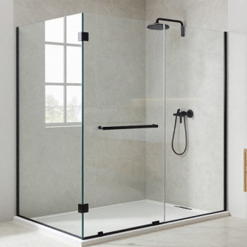
Bathrooms are no longer just functional spaces; they’re mini sanctuaries where we unwind, reset, and start or end the day. One of the biggest trends driving modern bathroom design is the move towards open, spacious layouts – and at the centre of that look is the wet room shower screen.
At BathroomNation, we’ve helped countless homeowners transform traditional bathrooms into sleek, practical wet rooms using high-quality wet room shower screens. In this blog, we’ll explain what a wet room shower screen is, why it’s such a smart choice, how to plan and style it, and what to look for when choosing the perfect one for your home.
What Is a Wet Room Shower Screen?
A wet room shower screen is a fixed or semi-fixed glass panel designed to separate your shower area from the rest of the bathroom floor, without enclosing it like a traditional cubicle. Instead of a full tray and door, you have:
- A level or gently sloped floor (often fully tiled)
- A walk-in, open shower space
- One or more glass panels providing splash protection
- Small bathrooms that feel cramped
- Rooms with limited or no natural light
- Long, narrow spaces where every inch counts
- Ideal for people with limited mobility
- Safer for older users and children
- More comfortable for everyday use
- Almost invisible glass boundaries
- Minimal metal hardware and framing
- A seamless link between shower and non-shower areas
- Quick to wipe down after a shower
- Simple to clean with standard glass cleaner
- Less prone to discoloured seals and hard-to-reach dirt
- The shower head is positioned sensibly to minimise overspray
- Your bathroom is medium or large in size
- You want an ultra‑open, walk‑in feel
- Extends coverage
- Helps keep more water inside the shower area
- Still keeps the openness of a walk‑in design
- Increase the effective width of protection during showering
- Fold the panel away slightly when not in use to open up the space
- 8mm toughened safety glass as standard
- 10mm toughened glass for an even more solid, premium feel
- Prevent water spots and mineral build-up
- Make daily and weekly cleaning quicker
- Keep your wet room shower screen looking clear and new for longer
- Taller screens (often 1900mm or more) provide better splash control
- Various widths let you create both compact and expansive walk-in areas
- Enhance rigidity and safety
- Are typically mounted at the top, near the ceiling or wall
- Can be designed in finishes that match your brassware (chrome, black, brass, etc.)
- Chrome
- Brushed nickel
- Matt black
- Brushed brass or gold tone
- Where the shower head will be placed (ceiling, wall‑mounted, or both)
- How water will naturally fall and drain
- How much splash you’re comfortable with elsewhere in the room
- The floor needs a gentle, even fall towards the drain
- You can use a central drain or linear (channel) drain
- Waterproofing (tanking) is essential beneath tiles or flooring
- Catch most of the spray from your shower head
- Shield the main walkway and dry areas
- Clear, frameless-style glass panel
- Large-format light grey or stone‑effect tiles
- Wall‑mounted rainfall shower head with matching controls
- Floating vanity and wall-hung toilet
- Wet room shower screen with black profile and support bar
- Concrete or stone-look tiles on floor and walls
- Black rainfall shower and matching mixer valve
- Simple timber stool or bench for warmth
- Ultra-clear glass wet room shower screen
- Natural stone or stone‑effect tiles in warm tones
- Brushed brass shower fittings
- Niche shelving built into the wall for toiletries
- Open, walk-in design
- Easier access, especially for mobility needs
- More airy look, less visual clutter
- Simpler to clean (fewer frames and corners)
- Fully enclosed, more contained water
- Usually involves a tray and door
- Can feel more “boxed in” in smaller rooms


 Flavin Architects
Albert Frey House II : Designed by Albert Frey : Palm Springs
Photo by Colin Flavin
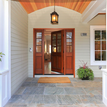
Modern exterior home idea in Boston
Modern exterior home idea in Boston
 Novell Design Build & Novella Outdoors
Janis Nicolay
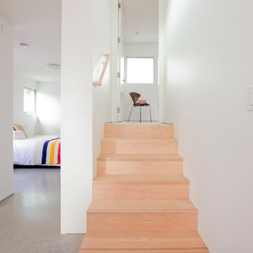
Example of a trendy staircase design in Vancouver
Example of a trendy staircase design in Vancouver

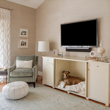
 LMB Interiors
Locally-made, from all natural and eco-friendly materials, including sustainably-farmed hardwood, no glues, low-VOC paint; and this space-saving custom-built cabinet doubles as a dog bed (see next photo).
When we choose to go green, we are choosing to live healthier and lower our impact on the environment. We are choosing to live more authentically. And as many parents and parents-to-be are aware, we are choosing to create a non-toxic environment for our children, including our canine children, to grow up in. Photo by Eric Rorer.
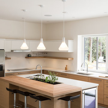
 NZ Builders Ltd
Example of a trendy l-shaped gray floor kitchen design in Vancouver with an undermount sink, flat-panel cabinets, brown cabinets, stainless steel appliances and an island
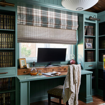
 Katie Carlin Interiors
Transitional built-in desk dark wood floor, brown floor, vaulted ceiling and wood ceiling home office photo in Baltimore with blue walls
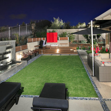
 Eco Minded Solutions
The homeowners desired a color palette of moody reds, grounding blacks, and ethereal silver.
Inspiration for a modern landscaping in San Diego.
Inspiration for a modern landscaping in San Diego.
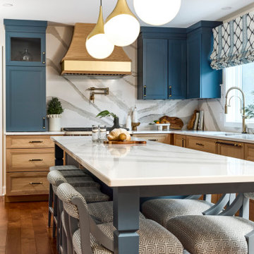
 Jennifer Lynn Interiors
Transitional u-shaped medium tone wood floor and brown floor kitchen photo in New York with an undermount sink, recessed-panel cabinets, blue cabinets, white backsplash, stone slab backsplash, stainless steel appliances, an island and white countertops
40