
Search results for "Clarifies" in Home Design Ideas

 CITYDESKSTUDIO, Inc.
Built in 1949, this Edina home had a strong horizontal presence on the site, but through subsequent renovations the overall massing was lacking clarity and refinement and the entry was diminutive and uninviting. The roof and siding materials were aging, and important interior spaces were cramped and closed in. The house needed better light, better connection internally and out, and exterior updates to clarify and enhance the strengths of the home.
The primary design evolved out of a celebration of the existing horizontality of the home and a recognition that a bigger home was not needed. By layering materiality and color, a new identity was created. A new cedar entry canopy slips out from under the previous roof line, extending further towards the street. This added warmth at the entry is echoed along the facade, creating a graceful rhythm and texture. The previous additions were re-clad with a darker material palette in order to anchor and unify the ends of the home. As the grade slopes down towards the back yard, horizontal bands are exposed, revealing the layering top to bottom. Combined, these few shifts in color and materiality allowed for a complete transformation of the home.
The interior is reflective of the material and color palette used outside. The main living spaces are opened up and connected while strengthening the original symmetry of the more formal linear alignment of rooms. A whole new kitchen relocates the center of the home and makes more fluid the daily life of this young family. The house is fully transformed inside and out, all without adding more square feet.
Project Team:
Ben Awes, AIA, Principal-in-Charge
Nate Dodge

 Donald Lococo Architects
©️Maxwell MacKenzie THE HOME, ESSENTIALLY A RUIN WAS PRESERVED THROUGH NEGLECT. A CLARIFIED HISTORIC RENOVATION REMOVES BAY WINDOWS AND 1950’S WINDOWS FROM THE MAIN FAÇADE. TWO WINGS AND A THIRD FLOOR AND A SYMPATHETIC STAIRWAY ACCOMMODATE MODERN LIFE. MASONS WERE TASKED TO MAKE THE STONE WORK LOOK AS THOUGH “A FARMER BUILT THE WALLS DURING THE NON-PLANTING SEASON,” THE FINAL DESIGN SIMPLIFIES THE FIRST FLOOR PLAN AND LEAVES LOGICAL LOCATIONS FOR EXPANSION INTO COMING DECADES. AMONG OTHER AWARDS, THIS TRADITIONAL YET HISTORIC RENOVATION LOCATED IN MIDDLEBURG, VA HAS RECEIVED 2 AWARDS FROM THE AMERICAN INSTITUTE OF ARCHITECTURE.. AND A NATIONAL PRIVATE AWARD FROM VETTE WINDOWS
WASHINGTON DC ARCHITECT DONALD LOCOCO UPDATED THIS HISTORIC STONE HOUSE IN MIDDLEBURG, VA.lauded by the American Institute of Architects with an Award of Excellence for Historic Architecture, as well as an Award of Merit for Residential Architecture
 CITYDESKSTUDIO, Inc.
Built in 1949, this Edina home had a strong horizontal presence on the site, but through subsequent renovations the overall massing was lacking clarity and refinement and the entry was diminutive and uninviting. The roof and siding materials were aging, and important interior spaces were cramped and closed in. The house needed better light, better connection internally and out, and exterior updates to clarify and enhance the strengths of the home.
The primary design evolved out of a celebration of the existing horizontality of the home and a recognition that a bigger home was not needed. By layering materiality and color, a new identity was created. A new cedar entry canopy slips out from under the previous roof line, extending further towards the street. This added warmth at the entry is echoed along the facade, creating a graceful rhythm and texture. The previous additions were re-clad with a darker material palette in order to anchor and unify the ends of the home. As the grade slopes down towards the back yard, horizontal bands are exposed, revealing the layering top to bottom. Combined, these few shifts in color and materiality allowed for a complete transformation of the home.
The interior is reflective of the material and color palette used outside. The main living spaces are opened up and connected while strengthening the original symmetry of the more formal linear alignment of rooms. A whole new kitchen relocates the center of the home and makes more fluid the daily life of this young family. The house is fully transformed inside and out, all without adding more square feet.
Project Team:
Ben Awes, AIA, Principal-in-Charge
Nate Dodge
Find the right local pro for your project
 CITYDESKSTUDIO, Inc.
Built in 1949, this Edina home had a strong horizontal presence on the site, but through subsequent renovations the overall massing was lacking clarity and refinement and the entry was diminutive and uninviting. The roof and siding materials were aging, and important interior spaces were cramped and closed in. The house needed better light, better connection internally and out, and exterior updates to clarify and enhance the strengths of the home.
The primary design evolved out of a celebration of the existing horizontality of the home and a recognition that a bigger home was not needed. By layering materiality and color, a new identity was created. A new cedar entry canopy slips out from under the previous roof line, extending further towards the street. This added warmth at the entry is echoed along the facade, creating a graceful rhythm and texture. The previous additions were re-clad with a darker material palette in order to anchor and unify the ends of the home. As the grade slopes down towards the back yard, horizontal bands are exposed, revealing the layering top to bottom. Combined, these few shifts in color and materiality allowed for a complete transformation of the home.
The interior is reflective of the material and color palette used outside. The main living spaces are opened up and connected while strengthening the original symmetry of the more formal linear alignment of rooms. A whole new kitchen relocates the center of the home and makes more fluid the daily life of this young family. The house is fully transformed inside and out, all without adding more square feet.
Project Team:
Ben Awes, AIA, Principal-in-Charge
Nate Dodge

 Costa Bella Builders
The clients were familiar with remodeling, friendly, clear about what they wanted for the home and how much they wanted to spend. We were selected from among three other Contractors who were bidding on the project. Within a few weeks of that decision, the permit was ready and we had clarified all of the clients interior finishes and selections.
The home addition design required the removal of a large portion of the roof, concrete porches, a fair amount of siding, some windows, plus demolition of the kitchen and existing bathroom. New foundations and framing were installed to accommodate higher ceilings, the enlarged kitchen, new master bathroom and bedroom, larger front porch, and interior wall changes.
The home's exterior was updated with new gable and wall siding, new roof and gutters, new energy efficient windows, and trim. Inside, the electrical system was updated, new plumbing services and furnace were installed along with all new wood flooring. The existing bathroom was completely remodeled, and the new master bathroom was outfitted with new cabinetry, plumbing fixtures and tile surfacing. The new open kitchen was finished with custom hardwood cabinetry, high end appliances, and stone countertops. Throughout the interior, walls were finished with wood paneling and trim to fit the cottage architecture. A full interior and exterior paint job completed the project with charming results.
http://santaellamedia.com/

 Kimberly Montante Interiors
This kitchen remodel married the owners love of traditional design and antiques with function for large family dinners. We used their beautiful antique wall piece and antique trestle table as the inspiration for the cabinetry. To add more function for this avid southern cook, we added a butcher block pull-out cart to hide her many pots and give her more cooking space right where she needs it, by the beautiful 6 burner range. Glass front cabinets show off some of their many antique pieces of crystal and stoneware as well as adds sparkle and light reflection. The deep red walls add more warmth as does the highly patterned granite behind the range and on the large island. A drink station near the entrance keeps guests away from the cooking triangle. Photos by Clarified Studios.
 Costa Bella Builders
The clients were familiar with remodeling, friendly, clear about what they wanted for the home and how much they wanted to spend. We were selected from among three other Contractors who were bidding on the project. Within a few weeks of that decision, the permit was ready and we had clarified all of the clients interior finishes and selections.
The home addition design required the removal of a large portion of the roof, concrete porches, a fair amount of siding, some windows, plus demolition of the kitchen and existing bathroom. New foundations and framing were installed to accommodate higher ceilings, the enlarged kitchen, new master bathroom and bedroom, larger front porch, and interior wall changes.
The home's exterior was updated with new gable and wall siding, new roof and gutters, new energy efficient windows, and trim. Inside, the electrical system was updated, new plumbing services and furnace were installed along with all new wood flooring. The existing bathroom was completely remodeled, and the new master bathroom was outfitted with new cabinetry, plumbing fixtures and tile surfacing. The new open kitchen was finished with custom hardwood cabinetry, high end appliances, and stone countertops. Throughout the interior, walls were finished with wood paneling and trim to fit the cottage architecture. A full interior and exterior paint job completed the project with charming results.
http://santaellamedia.com/
 Costa Bella Builders
The clients were familiar with remodeling, friendly, clear about what they wanted for the home and how much they wanted to spend. We were selected from among three other Contractors who were bidding on the project. Within a few weeks of that decision, the permit was ready and we had clarified all of the clients interior finishes and selections.
The home addition design required the removal of a large portion of the roof, concrete porches, a fair amount of siding, some windows, plus demolition of the kitchen and existing bathroom. New foundations and framing were installed to accommodate higher ceilings, the enlarged kitchen, new master bathroom and bedroom, larger front porch, and interior wall changes.
The home's exterior was updated with new gable and wall siding, new roof and gutters, new energy efficient windows, and trim. Inside, the electrical system was updated, new plumbing services and furnace were installed along with all new wood flooring. The existing bathroom was completely remodeled, and the new master bathroom was outfitted with new cabinetry, plumbing fixtures and tile surfacing. The new open kitchen was finished with custom hardwood cabinetry, high end appliances, and stone countertops. Throughout the interior, walls were finished with wood paneling and trim to fit the cottage architecture. A full interior and exterior paint job completed the project with charming results.
http://santaellamedia.com/
 Costa Bella Builders
The clients were familiar with remodeling, friendly, clear about what they wanted for the home and how much they wanted to spend. We were selected from among three other Contractors who were bidding on the project. Within a few weeks of that decision, the permit was ready and we had clarified all of the clients interior finishes and selections.
The home addition design required the removal of a large portion of the roof, concrete porches, a fair amount of siding, some windows, plus demolition of the kitchen and existing bathroom. New foundations and framing were installed to accommodate higher ceilings, the enlarged kitchen, new master bathroom and bedroom, larger front porch, and interior wall changes.
The home's exterior was updated with new gable and wall siding, new roof and gutters, new energy efficient windows, and trim. Inside, the electrical system was updated, new plumbing services and furnace were installed along with all new wood flooring. The existing bathroom was completely remodeled, and the new master bathroom was outfitted with new cabinetry, plumbing fixtures and tile surfacing. The new open kitchen was finished with custom hardwood cabinetry, high end appliances, and stone countertops. Throughout the interior, walls were finished with wood paneling and trim to fit the cottage architecture. A full interior and exterior paint job completed the project with charming results.
http://santaellamedia.com/

 GS Construction
Example of a small classic 3/4 white tile and stone tile mosaic tile floor alcove shower design in Chicago with an undermount sink, recessed-panel cabinets, black cabinets, quartzite countertops, a two-piece toilet and gray walls

 Spire North
Tucked away in the backwoods of Torch Lake, this home marries “rustic” with the sleek elegance of modern. The combination of wood, stone and metal textures embrace the charm of a classic farmhouse. Although this is not your average farmhouse. The home is outfitted with a high performing system that seamlessly works with the design and architecture.
The tall ceilings and windows allow ample natural light into the main room. Spire Integrated Systems installed Lutron QS Wireless motorized shades paired with Hartmann & Forbes windowcovers to offer privacy and block harsh light. The custom 18′ windowcover’s woven natural fabric complements the organic esthetics of the room. The shades are artfully concealed in the millwork when not in use.
Spire installed B&W in-ceiling speakers and Sonance invisible in-wall speakers to deliver ambient music that emanates throughout the space with no visual footprint. Spire also installed a Sonance Landscape Audio System so the homeowner can enjoy music outside.
Each system is easily controlled using Savant. Spire personalized the settings to the homeowner’s preference making controlling the home efficient and convenient.

 MDT, Inc.
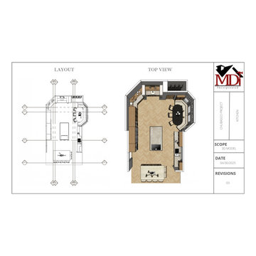
The top view shown in this design presentation provides a full-color, scaled 3D overview of the final kitchen layout. It allows clients and trade professionals to visualize the spatial relationships between key elements—such as the two islands, perimeter cabinetry, appliance zones, custom banquette, and bar area—in a single glance.
Why It’s Important:
Clarifies Functionality: The top view reveals how traffic will flow, how different zones (cooking, prep, dining, entertaining) interact, and how open the space feels after removing the dividing wall.
Enhances Communication: It serves as a bridge between the technical floor plan and the client’s understanding—making it easier for everyone from homeowners to electricians and cabinet installers to be on the same page.
Reduces Mistakes: With every element clearly placed and proportioned, it helps avoid on-site guesswork and ensures proper measurements and installations from day one.
Sets Expectations: It visually confirms the final design intent, so clients know exactly what to expect—eliminating surprises later in construction.
This top view is a vital part of MDT’s seamless preconstruction process, ensuring our vision is fully aligned with our clients’ goals before we even break ground.

 Regency Builders Inc.
Relax after a long work week in an incredible master bath.
Inspiration for a large timeless master beige tile travertine floor drop-in bathtub remodel in Milwaukee with a drop-in sink, raised-panel cabinets, light wood cabinets, marble countertops and beige walls
Inspiration for a large timeless master beige tile travertine floor drop-in bathtub remodel in Milwaukee with a drop-in sink, raised-panel cabinets, light wood cabinets, marble countertops and beige walls

 MC Design LLC
A second vanity replaced a bathtub in this Jack-and-Jill bathroom. A custom wood framed oval mirror hangs from the ceiling in front of the glass block window, creating the ideal lighting conditions to apply makeup in the daylight.
 CITYDESKSTUDIO, Inc.
So often our task as residential architects is not to create something out of nothing. Instead, it is to help evolve, or bring forward something that is already there; to see with new eyes the best of what exists and to clarify and expand it, so that the house supports and celebrates how the client lives, and hopes to live, in the home.
So was the case with our House of Blues. The house was already wonderful. There was plenty of space, good views, a functioning floor plan, and the home was in overall good condition. The best features however, were embedded in the time it was built – mid 1960’s. The views were good, but too small. The kitchen location worked well, but is was closed off, cramped, and lacking counter space. The dining room was elegant, but too large and isolated. The graceful central hallway remained the homes most unique feature, but it was dark and the entry to the rooms on either side were accessed via small doorways. The bathrooms were large enough, and in the right locations, but they were tired and dated, and there was no mudroom.
We created something out of something. Beautiful shades of blue permeated the owner’s things and became a central theme in new elements. Daylight was expanded and brought deeper into the space. Doorways were widened and walls removed. The central hallway was fully opened at the end with two-story glass to improve on an already good idea. The kitchen was wholly new and expanded by borrowing space from the dining room. A mudroom was carved out of the garage. All the bathrooms were remodeled with fresh materials and new features. The gracious concrete stoop was reclad in stone and the front door was changed out for a splash of color. Light now permeates all the rooms and spaces flow together without losing their identity or function. The owners no longer feel blue in their House of Blues!
Location: St Paul, MN
Project Team:
Ben Awes, AIA, Principal- in -Charge
Nate Dodge

 J&L Interiors, LLC
Traditional living room in Northern Virginia residence. Design by J&L Interiors, LLC. Photo by MGN Photography
Living room - traditional living room idea in DC Metro
Living room - traditional living room idea in DC Metro
 CITYDESKSTUDIO, Inc.
So often our task as residential architects is not to create something out of nothing. Instead, it is to help evolve, or bring forward something that is already there; to see with new eyes the best of what exists and to clarify and expand it, so that the house supports and celebrates how the client lives, and hopes to live, in the home.
So was the case with our House of Blues. The house was already wonderful. There was plenty of space, good views, a functioning floor plan, and the home was in overall good condition. The best features however, were embedded in the time it was built – mid 1960’s. The views were good, but too small. The kitchen location worked well, but is was closed off, cramped, and lacking counter space. The dining room was elegant, but too large and isolated. The graceful central hallway remained the homes most unique feature, but it was dark and the entry to the rooms on either side were accessed via small doorways. The bathrooms were large enough, and in the right locations, but they were tired and dated, and there was no mudroom.
We created something out of something. Beautiful shades of blue permeated the owner’s things and became a central theme in new elements. Daylight was expanded and brought deeper into the space. Doorways were widened and walls removed. The central hallway was fully opened at the end with two-story glass to improve on an already good idea. The kitchen was wholly new and expanded by borrowing space from the dining room. A mudroom was carved out of the garage. All the bathrooms were remodeled with fresh materials and new features. The gracious concrete stoop was reclad in stone and the front door was changed out for a splash of color. Light now permeates all the rooms and spaces flow together without losing their identity or function. The owners no longer feel blue in their House of Blues!
Location: St Paul, MN
Project Team:
Ben Awes, AIA, Principal- in -Charge
Nate Dodge
 CITYDESKSTUDIO, Inc.
So often our task as residential architects is not to create something out of nothing. Instead, it is to help evolve, or bring forward something that is already there; to see with new eyes the best of what exists and to clarify and expand it, so that the house supports and celebrates how the client lives, and hopes to live, in the home.
So was the case with our House of Blues. The house was already wonderful. There was plenty of space, good views, a functioning floor plan, and the home was in overall good condition. The best features however, were embedded in the time it was built – mid 1960’s. The views were good, but too small. The kitchen location worked well, but is was closed off, cramped, and lacking counter space. The dining room was elegant, but too large and isolated. The graceful central hallway remained the homes most unique feature, but it was dark and the entry to the rooms on either side were accessed via small doorways. The bathrooms were large enough, and in the right locations, but they were tired and dated, and there was no mudroom.
We created something out of something. Beautiful shades of blue permeated the owner’s things and became a central theme in new elements. Daylight was expanded and brought deeper into the space. Doorways were widened and walls removed. The central hallway was fully opened at the end with two-story glass to improve on an already good idea. The kitchen was wholly new and expanded by borrowing space from the dining room. A mudroom was carved out of the garage. All the bathrooms were remodeled with fresh materials and new features. The gracious concrete stoop was reclad in stone and the front door was changed out for a splash of color. Light now permeates all the rooms and spaces flow together without losing their identity or function. The owners no longer feel blue in their House of Blues!
Location: St Paul, MN
Project Team:
Ben Awes, AIA, Principal- in -Charge
Nate Dodge

 Jack Calderone
This bedroom and full bathroom are part of an adventuresome project my wife and I embarked upon to create a complete apartment in the basement of our townhouse. We designed a floor plan that creatively and efficiently used all of the 385-square-foot-space, without sacrificing beauty, comfort or function – and all without breaking the bank! To maximize our budget, we did the work ourselves and added everything from thrift store finds to DIY wall art to bring it all together.
A partial double closet bar adds a little extra space while still leaving room for longer hanging clothes.
17