
Search results for "Clarify" in Home Design Ideas
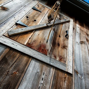
 Olde Wood Ltd.
J. Albert Studios
Huge traditional brown two-story wood exterior home idea in Cleveland
Huge traditional brown two-story wood exterior home idea in Cleveland
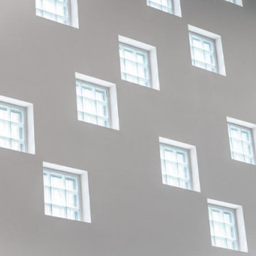
 Seves Glass Block Inc
Make a statement! Have a wall of windows that need replacing? Looking for design inspiration for an industrial project that needs some flair without breaking the budget? As you can see, glass block makes for a very dramatic statement! Visit sevesglassblockinc.com for industrial application ideas and more!
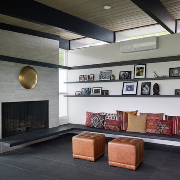
 Klopf Architecture
Set in a quiet neighborhood and framed by mature trees, this residence presented a unique opportunity: to thoughtfully evolve a custom mid-century modern home into a space that supports the everyday rhythms of a growing family. With a deep respect for the home’s original architecture, Klopf Architecture reimagined the house to better meet the needs of its owners—introducing functional improvements while preserving the spirit and character of its mid-century roots.
The clients approached Klopf Architecture with a clear vision: refresh their home while seamlessly integrating new programmatic elements. Key goals included clarifying and enhancing the entry sequence; connecting the detached garage to the main house with a practical yet architecturally intentional intervention; adding functional spaces such as a mudroom and laundry room; expanding and remodeling the primary suite’s bathroom and closet; and creating a more engaging outdoor space that capitalized on the site’s impressive views, featuring a fire pit and outdoor kitchen.
As a couple with distinct yet complementary perspectives—one focused on modern functionality and technology, and the other dedicated to preserving the home’s architectural integrity—their collaboration with Klopf Architecture resulted in a solution that harmonized both ideals. Their shared commitment to improving the livability of their home led to a design dialogue rooted in balance. This dynamic partnership shaped the direction of the renovation, ensuring that every decision honored the spirit of the original home while aligning with the practical needs of their growing family.
Designing within the constraints of the sloped site posed one of the project’s central challenges. The detached garage sat at a higher elevation than the main house, requiring a solution that ensured architectural and geometric compatibility between the two structures. Rather than create a purely utilitarian link, Klopf Architecture introduced an intentional connection that contributes to the overall architectural language. A notable pinch point in the plan—where differing geometries converged—was treated as a hinge point, turning a potentially awkward juncture into an architectural feature. This area now functions as both a transition and a moment of design interest that unifies the overall plan.
The design also addressed the underutilized outdoor area, which was located in a shadowed portion of the site with geometrical limitations. A new connection to the rear deck was created in this same area, making the outdoor space more useful and inviting. Klopf Architecture introduced carefully positioned openings and spatial improvements that forged a strong visual and functional connection between indoor and outdoor spaces. The outdoor area now reads as a deliberate extension of the home, embracing natural light and emphasizing the dramatic views.
Working through multiple design iterations, Klopf Architecture crafted a solution that preserved the architectural language of the original home while supporting the functional needs of modern life. The garage-to-house connection became more than a passage—it evolved into an architectural moment of transition. A new mudroom and laundry space enhanced convenience without compromising the clean lines of the design. The primary suite was expanded to create a private, serene retreat. The reimagined backyard, complete with fire pit and kitchen, now plays a vital role in the family’s daily routine and social life.
Outcomes and Lasting Impact
The result is a home that balances heritage with contemporary design, technical precision with design sensibility. The redesign not only met the clients’ initial goals but also exceeded expectations in its ability to seamlessly blend past and present, function and beauty, making the outdoor kitchen a favorite gathering place.
Beyond aesthetics, the renovation has significantly improved daily life for the family. The newly integrated garage connection has streamlined routines, providing a seamless transition between arriving home, storing belongings, and entering the main living spaces. The expanded primary suite offers a retreat-like atmosphere, creating a private space to unwind at the end of the day. The redesigned outdoor areas have also become an extension of their lifestyle—whether it's casual family dinners around the fire pit, entertaining friends in the outdoor kitchen, or simply enjoying the view from the reimagined backyard.
Through a thoughtful and strategic approach, the house has been successfully evolved into a home that remains true to its mid-century modern roots while enhancing livability, functionality, and the overall quality of life for the modern-day owners.
Klopf Architecture Team: Geoffrey Campen, Fernanda Bernardes
Architectural Interior Design: Klopf Architecture
Structural Engineer: Base Design Inc.
Contractor: Golden Snail Builders
Photography: Mariko Reed
Year Completed:2022
Find the right local pro for your project
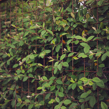
 Regenesis Ecological Design
A modern steel mesh fence contrasts with spring growth of Cotoneaster multiflorus
http://annacaitlinphotography.com/
 Stone Improvement Inc.
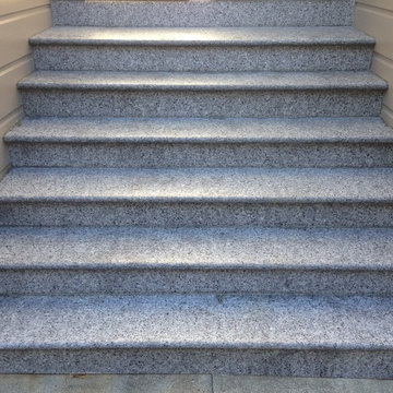
Granite entry staircase cleaning, sealing and caulking application after photo. These stairs cleaned up beautifully after our extractor cleaning process. This just shows the durability and longevity that granite can have.
 Paul Arcoite
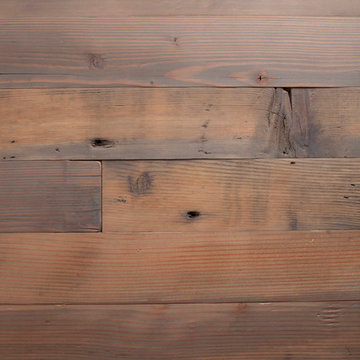
Reclaimed fir T&G with faded grey finish.
Photo: Sterling Lorence
Example of a beach style deck design in Vancouver
Example of a beach style deck design in Vancouver
 Gaile Guevara
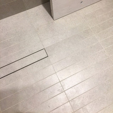
| DETAILS | in concrete constructed condos it's very rare that we ever want to have to core new drain locations. For the Master Ensuite more and more when we do full renovations down to studs we are removing the terrible 5' tubs and tiny itty bitty 3x3' showers. For some reason the idea of luxury meant squeeze as much as you can so you have a long list of features when you go to market. More and more we are doing oversized his and hers showers. So when you have a drain that you are repurposing from previous plumbing fixtures and the drain isn't centred, it's pretty much magic to have the team surprise you after several site meetings and evaluations - we opted for the plumbers favourite to use Schluter linear tile over drains and have the oversized tile cut to fit and provide the necessary grout lines for a flush shower threshold. This might seem like nothing but is everything when we have the perfect tile layout be inline with the what we think is a centred drain. These are the kind of details that make my OCD sister inside so happy, we call it the centre flush drain happy dance. Kudos to @caisleydevelopments @4thdimensionconstruction with the help of @stonetilevancouver for finding a perfect subtle sand toned oversized porcelain. A large format tile in a shade and same tone value as our hardwood floor and one shade darker than our Baltic Birch flush panels for ease of cleaning and hiding dirt. When you want things clean I opt for showers with minimal detailing to be in shades darker than white. Cleaning becomes less treacherous. Also gone is this idea of ugly accent tile, we opt for uniform tile one material throughout a bathroom floor to ceiling and if possible all walls. Construction geekery 101 continues



 Neumann & Rudy Architecture
**I. Spatial Composition & Architectural Volume**
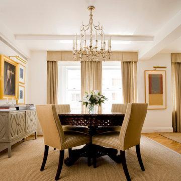
This is a pre-war Manhattan dining room whose proportions have been surgically clarified rather than reinvented. The room reads as a compressed rectilinear volume, its ceiling plane articulated by a shallow dropped soffit and a single exposed transverse beam — a candid acknowledgment of the building's structural grid, left legible rather than concealed behind a coved plaster surround. That beam performs a quiet spatial function: it registers the threshold between the dining zone and the adjoining passage at right, where a sliver of herringbone parquet and a second curtained aperture extend the sightline into a further room, relieving the enclosure and establishing a discreet enfilade. The composition is emphatically axial and symmetrical — chandelier, floral centerpiece, pedestal table and central window mullion align on a single spine — yet the symmetry is deliberately imperfect: the flanking chairs are turned inward on the diagonal, the sideboard weights the left wall, and the artwork on the right hangs off-axis. The result is a Beaux-Arts discipline softened by a decorator's asymmetry. Most consequential is the pelmet, a deep upholstered box valance carried nearly wall-to-wall, which annexes the window into a single monumental glazed field and visually raises the ceiling by drawing the eye above the actual head height of the sash.
**II. Materiality, Color & Texture**
The palette is a study in monochromatic warmth held within a narrow tonal band of buff, oatmeal, flax and champagne, with saturation kept deliberately low so that texture carries the burden of variety. Underfoot, a wall-to-wall seagrass or sisal matting with a coarse basketweave provides the room's tactile bass note — hard-wearing, faintly agricultural, and set in productive tension with the refined silk-and-linen sheen of the curtains and pelmet. The chairs are a masterstroke of dual upholstery: matte sand-toned fabric on the outside back and a subtle self-striped ottoman weave on the seat and inner face, a device that renders the seating both plush and graphic. Against this envelope of pale neutrals, two dark accents supply the necessary chromatic gravity: the deeply carved, pierced-apron rosewood or mahogany center table, almost Anglo-Indian in its fretwork and baluster pedestal, and the ebonized klismos-splayed chair legs that echo it. The left wall introduces a painted, dry-brushed Gustavian-style commode with lozenge-fretwork doors, its chalky grey-green a cool counterpoint, while gilt frames, a burnished picture light and the silvered chandelier thread a metallic warmth through the whole.
**III. Lighting, Atmosphere & Style Profile**
Daylight is the room's primary illuminant and it is handled with restraint: the curtains are dressed open but the roman-like sheer inner treatment diffuses the light into a milky, north-facing wash that flattens shadow and flatters the neutral surfaces. Artificial lighting is layered and entirely decorative in expression — the tall, attenuated candle-arm chandelier, hung low and generously scaled, functions as sculpture and as the room's compositional keystone, while two swing-arm brass picture lights provide directional accents that anchor the art as evening focal points. There is no visible downlighting or recessed apparatus; the mood is candlelit, hushed and faintly nocturnal even in daytime. Stylistically the room resolves into what might be termed **Refined Neutral Traditionalism** — an American-classical, Bilhuber-adjacent idiom that marries eighteenth-century Swedish and Anglo-colonial furniture archetypes with contemporary tailoring, tonal upholstery and humble natural-fiber flooring. Its sophistication lies precisely in that calibration: heirloom silhouettes stripped of pattern and color noise, so that carving, weave and gilding become the sole ornamental language.

 Cloud Hunter
Have you been searching for your ‘Happily Ever After’? Look no more! This dreamy duvet cover topped with pure white textured floral and leaves trimmed with clear beading IS your happy end to a tiring day. It’s whimsical design is storybook friendly! Classically white but modernly individualistic with it’s unique feminine detail. Inspirations of french, vintage and natural elements come together to create this clean crisp bed set.
Freshly cut flower and leaves adorn the top of the duvet with a soft-to-the-touch but sturdy-through-the-wear chiffon overlay. Tear drop and leaf translucent beads trim the sides and foot. Top off the look with coordinating shams that are sold separately. Trimmed with beautiful high quality feathers to complete your new incredible nest look!
Support USA made products with Cloud Hunter, handmade in California with high end materials and a passion for quality. We’re a fashion minded home decor company who believes your bed should be as well dressed as you! Please view our unique bedding collections at www.cloudhunterco.com or contact us for our custom decor needs- we work with every style.
-Dry cleaning recommended
-Zipper closure
-Twin and queen ready to ship
-King and custom sizes available
-Coordinating shams and decor pillows sold separately
-Made in the USA
MADE WITH LOVE IN C A L I F O R N I A
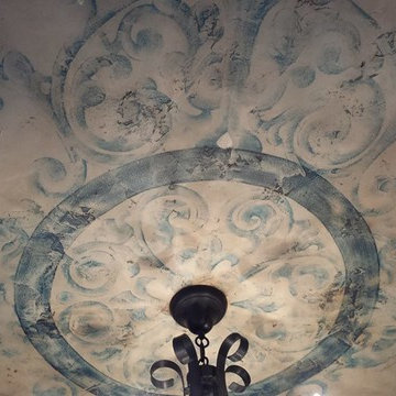
 The Artists Hands - Faux Finishes
Hand painted ceiling distressed into a glazed textured finish. Copyright © 2016 The Artists Hands
Eat-in kitchen - mid-sized mediterranean u-shaped terra-cotta tile eat-in kitchen idea in Houston with flat-panel cabinets, white cabinets, an undermount sink, granite countertops, white backsplash, porcelain backsplash and stainless steel appliances
Eat-in kitchen - mid-sized mediterranean u-shaped terra-cotta tile eat-in kitchen idea in Houston with flat-panel cabinets, white cabinets, an undermount sink, granite countertops, white backsplash, porcelain backsplash and stainless steel appliances
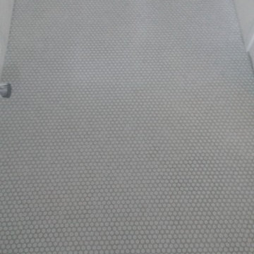
 Custom Surface Solutions
Custom Surface Solutions (www.css-tile.com) - Owner Craig Thompson (512) 430-1215. This project shows the remodel of a small 1950's vintage home master bathroom. 8"" x 18" Calcutta gold marble tile was used on the shower walls and floor wall base and ceramic gray penny tile on the floor. Shower includes curbless pan / floor, dual shower boxes, frameless glass slider, trough duel fixture sink and chrome fixtures.
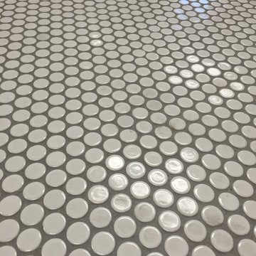
 LaFauci Tile and Marble
Clean and simple 1" penny round tile with a contrasting grey grout. Looks Great and easy to clean
Example of a mid-sized classic ceramic tile home design design in Boston
Example of a mid-sized classic ceramic tile home design design in Boston

 Klopf Architecture
Set in a quiet neighborhood and framed by mature trees, this residence presented a unique opportunity: to thoughtfully evolve a custom mid-century modern home into a space that supports the everyday rhythms of a growing family. With a deep respect for the home’s original architecture, Klopf Architecture reimagined the house to better meet the needs of its owners—introducing functional improvements while preserving the spirit and character of its mid-century roots.
The clients approached Klopf Architecture with a clear vision: refresh their home while seamlessly integrating new programmatic elements. Key goals included clarifying and enhancing the entry sequence; connecting the detached garage to the main house with a practical yet architecturally intentional intervention; adding functional spaces such as a mudroom and laundry room; expanding and remodeling the primary suite’s bathroom and closet; and creating a more engaging outdoor space that capitalized on the site’s impressive views, featuring a fire pit and outdoor kitchen.
As a couple with distinct yet complementary perspectives—one focused on modern functionality and technology, and the other dedicated to preserving the home’s architectural integrity—their collaboration with Klopf Architecture resulted in a solution that harmonized both ideals. Their shared commitment to improving the livability of their home led to a design dialogue rooted in balance. This dynamic partnership shaped the direction of the renovation, ensuring that every decision honored the spirit of the original home while aligning with the practical needs of their growing family.
Designing within the constraints of the sloped site posed one of the project’s central challenges. The detached garage sat at a higher elevation than the main house, requiring a solution that ensured architectural and geometric compatibility between the two structures. Rather than create a purely utilitarian link, Klopf Architecture introduced an intentional connection that contributes to the overall architectural language. A notable pinch point in the plan—where differing geometries converged—was treated as a hinge point, turning a potentially awkward juncture into an architectural feature. This area now functions as both a transition and a moment of design interest that unifies the overall plan.
The design also addressed the underutilized outdoor area, which was located in a shadowed portion of the site with geometrical limitations. A new connection to the rear deck was created in this same area, making the outdoor space more useful and inviting. Klopf Architecture introduced carefully positioned openings and spatial improvements that forged a strong visual and functional connection between indoor and outdoor spaces. The outdoor area now reads as a deliberate extension of the home, embracing natural light and emphasizing the dramatic views.
Working through multiple design iterations, Klopf Architecture crafted a solution that preserved the architectural language of the original home while supporting the functional needs of modern life. The garage-to-house connection became more than a passage—it evolved into an architectural moment of transition. A new mudroom and laundry space enhanced convenience without compromising the clean lines of the design. The primary suite was expanded to create a private, serene retreat. The reimagined backyard, complete with fire pit and kitchen, now plays a vital role in the family’s daily routine and social life.
Outcomes and Lasting Impact
The result is a home that balances heritage with contemporary design, technical precision with design sensibility. The redesign not only met the clients’ initial goals but also exceeded expectations in its ability to seamlessly blend past and present, function and beauty, making the outdoor kitchen a favorite gathering place.
Beyond aesthetics, the renovation has significantly improved daily life for the family. The newly integrated garage connection has streamlined routines, providing a seamless transition between arriving home, storing belongings, and entering the main living spaces. The expanded primary suite offers a retreat-like atmosphere, creating a private space to unwind at the end of the day. The redesigned outdoor areas have also become an extension of their lifestyle—whether it's casual family dinners around the fire pit, entertaining friends in the outdoor kitchen, or simply enjoying the view from the reimagined backyard.
Through a thoughtful and strategic approach, the house has been successfully evolved into a home that remains true to its mid-century modern roots while enhancing livability, functionality, and the overall quality of life for the modern-day owners.
Klopf Architecture Team: Geoffrey Campen, Fernanda Bernardes
Architectural Interior Design: Klopf Architecture
Structural Engineer: Base Design Inc.
Contractor: Golden Snail Builders
Photography: Mariko Reed
Year Completed:2022
 User
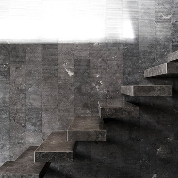
UserStairs in honed Pietra d'Avola and wall in Raw texture from Salvatori
Pepe Fotografia
Staircase - contemporary staircase idea in Turin
Staircase - contemporary staircase idea in Turin
 The Fabricsmith
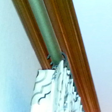
Design by Young Home These by-pass rings allow the panels to be opened and closed over the brackets on a large slider door. Provided by The Fabricsmith.
22