
Search results for "Client support" in Home Design Ideas
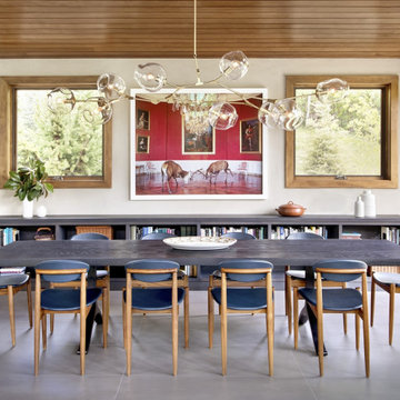
 Joe McGuire Design
Embracing the challenge of grounding this open, light-filled space, our Boulder studio focused on comfort, ease, and high design. The built-in lounge is flanked by storage cabinets for puzzles and games for this client who loves having people over. The high-back Living Divani sofa is paired with U-Turn Benson chairs and a "Rabari" rug from Nanimarquina for casual gatherings. The throw pillows are a perfect mix of Norwegian tapestry fabric and contemporary patterns. In the child's bedroom, we added an organically shaped Vitra Living Tower, which also provides a cozy reading niche. Bold Marimekko fabric colorfully complements more traditional detailing and creates a contrast between old and new. We loved collaborating with our client on an eclectic bedroom, where everything is collected and combined in a way that allows distinctive pieces to work together. A custom walnut bed supports the owner's tatami mattress. Vintage rugs ground the space and pair well with a vintage Scandinavian chair and dresser.
Combining unexpected objects is one of our favorite ways to add liveliness and personality to a space. In the little guest bedroom, our client (a creative and passionate collector) was the inspiration behind an energetic and eclectic mix. Similarly, turning one of our client's favorite old sweaters into pillow covers and popping a Native American rug on the wall helped pull the space together. Slightly eclectic and invitingly cozy, the twin guestroom beckons for settling in to read, nap or daydream. A vintage poster from Omnibus Gallery in Aspen and an antique nightstand add period whimsy.
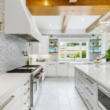
 The Olde Mill - Box Beams, Mantels & Shelves
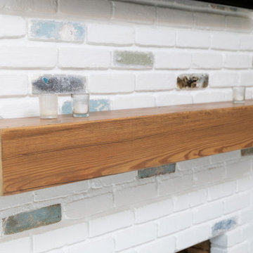
This gorgeous Bocage home was originally too compartmentalized for entertaining guests. The kitchen itself and the opening between the kitchen and family area were both small, making the space feel closed in and cut off from the rest of the house. Our goal was to open the space as much as possible and give the clients everything they needed to entertain. Early in the design process, we decided it was necessary to add square footage to give these clients their dream kitchen. Adding this space allowed for a large kitchen island, tons of cabinet storage, a walk-in pantry, half bath and small office, all accessible from the focal kitchen. Flanking the kitchen window are sets of floating shelves from The Olde Mill. The hollow floating shelf design allowed for color-changing LED lights to be set into the shelves, allowing for a change of mood at the press of a button. We were able to widen the opening between the kitchen and family room to allow the spaces to flow together. The doorway was framed with reclaimed wood posts and headers, also from The Olde Mill. After the expansion, a structural beam was added to support the second floor, and the clients decided to cover it with a beautiful reclaimed wood beam as well. To wrap the laminated structural beam, this beam was made 22″ wide. All of these elements gave the clients a large, show-stopping kitchen with tons of storage and plenty of room to entertain family and friends.
Space Planning by Ourso Designs
Designer: Rachel Cannon Limited
Builder/Remodeler: Bertell Cook Construction
Beams, Mantel, and Floating Shelves: The Olde Mill
Photos: Collin Richie Photography
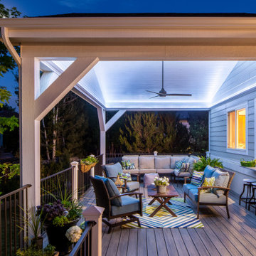
 Christie's Design Build Remodeling
This deck was falling apart, and the wood was rotting and becoming dangerous; it was important to fix this issue. Our client’s dream was to easily serve meals from the kitchen in an enjoyable outdoor eating space. It was a MUST to have enough deck support for the hot tub so that our clients could happily use it daily. They wanted to add a window that opens to the covered deck and a beautiful serving counter, it made it much easier for our client to serve her guests while enjoying the beautiful weather and having a space to entertain.
Find the right local pro for your project
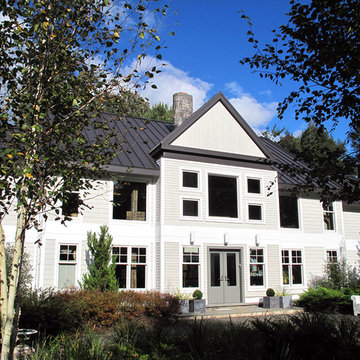
 Morpurgo Architects
It was foretold to both client and architect that they would find in each other the ideal client and the ideal architect. And, so it came to pass that this collector of American folk art commissioned Morpurgo Architects to design a contemporary residence that would encompass her historic Dutch Colonial barn.
The barn frame was disassembled, the 200-year-old chestnut beams were restored and the barn was reconstructed in the same configuration on new pier footings on the adjoining property.
The open living space rises 35 feet, exposing multiple levels of timber framing and braces. The loft spaces and floating staircases intertwine with the barn structure, uniting the modern and the historic. Two main galleries overlook the soaring frame, creating a sense of immediacy to the monumental timbers and their joinery.
This contemporary house is infused with the spirit of the old barn, and the barn framing, freestanding and self-supporting, has become the most prominent piece in our client’s noteworthy collection.
 Joe McGuire Design
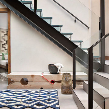
Embracing the challenge of grounding this open, light-filled space, our Boulder studio focused on comfort, ease, and high design. The built-in lounge is flanked by storage cabinets for puzzles and games for this client who loves having people over. The high-back Living Divani sofa is paired with U-Turn Benson chairs and a "Rabari" rug from Nanimarquina for casual gatherings. The throw pillows are a perfect mix of Norwegian tapestry fabric and contemporary patterns. In the child's bedroom, we added an organically shaped Vitra Living Tower, which also provides a cozy reading niche. Bold Marimekko fabric colorfully complements more traditional detailing and creates a contrast between old and new. We loved collaborating with our client on an eclectic bedroom, where everything is collected and combined in a way that allows distinctive pieces to work together. A custom walnut bed supports the owner's tatami mattress. Vintage rugs ground the space and pair well with a vintage Scandinavian chair and dresser.
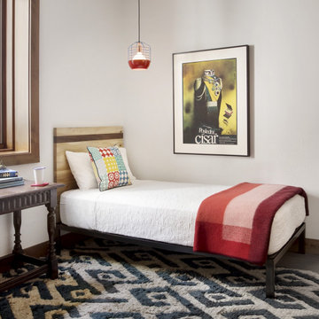
Combining unexpected objects is one of our favorite ways to add liveliness and personality to a space. In the little guest bedroom, our client (a creative and passionate collector) was the inspiration behind an energetic and eclectic mix. Similarly, turning one of our client's favorite old sweaters into pillow covers and popping a Native American rug on the wall helped pull the space together. Slightly eclectic and invitingly cozy, the twin guestroom beckons for settling in to read, nap or daydream. A vintage poster from Omnibus Gallery in Aspen and an antique nightstand add period whimsy.
 Dream Home Construction
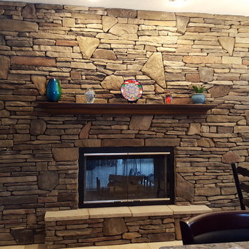
Our client contacted us regarding the fireplace he was building in his new home. He decided to
be a general contractor and build his house himself, he bought blue prints over the internet.
However after framing the home he realized that his fireplace in the main portion of the house
was out of proportion . He wanted this fireplace to be the focal point of his home.
Client’s Desires:
• Larger Fireplace
• Wall of Stone
• Large Mantel proportion to the size of the fireplace
When we first meet our client at his new home, the framing of the fireplace was approx. 6 feet
wide and 18 ft. high. After talking to him, we both felt that the fireplace needed to be a lot larger
to give that dramatic look, he was looking for. We also suggested, because the wall wrapped into
the kitchen that he should have a two sided fireplace with the other side facing his kitchen.
We started by re-framing the fireplace to 12.5 feet wide, because of the size we enlarged the
insert to 48" opening. We realized when ordering the stone for the fireplace that the weight of
the stone was going to be very heavy. When looking at the framing of the house, we got an
structural engineer involved to determine the stone weight and beams in the home and that the
wall was not a load bearing wall. It was determined that we had to add an additional 6 LVL
beams between the two load barring steel beams, to support the weight of the stone.
The stone is a 70/30 mix to give it a more rustic look, we wrapped the stone around the wall into
the kitchen to give it a beefy look.
We had two custom mantels made, the living room mantel is made of alder wood and is 8.5 feet
long with a two tier step with custom corbels. The homeowner chose a distress look.
The kitchen mantel is more elegant with custom molding to match their kitchen cabinets.
 Fabco Sanctuary
The architect and designer Guy Derwent was approached by his client with a clear and compelling brief: to completely transform a grand Victorian terrace house they were planning to renovate. The client envisioned something far beyond a standard renovation – this was to be a bold and dramatic reimagining of a family home that could grow with them over time.
With the property having remained largely untouched for more than fifty years, the architects saw an opportunity to unlock its potential and deliver a contemporary design that would contrast beautifully with its Victorian heritage.
The existing layout consisted of a series of small, disconnected rooms to the rear of the house. To respond to the client’s need for openness and flexibility, the architect proposed a radical restructuring of the ground floor:
The rear rooms were completely removed
Suspended timber floors were lowered by up to two metres to align with the garden
Two bold extensions were added
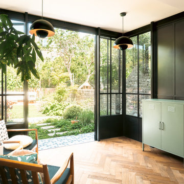
The first extension filled in the side return with a London stock brick facade and a glazed roof, while the second – a striking black steel and glass pavilion was glazed on three sides and placed along the garden elevation.
This new pavilion redefined the building’s relationship with the garden. Its steel-framed glazing created a seamless dialogue between interior and exterior, offering a sense of immersion in the surrounding landscape.
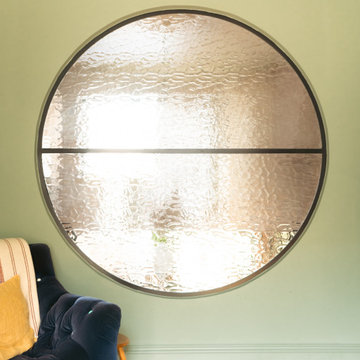
At the heart of the plan sits a dramatic, five-metre-tall dining space that acts as a transition from the original entrance hall into the new addition. A large, circular cast-glass window, framed in steel, provides a visual and spatial link between old and new, allowing light and movement to travel through the depth of the home.
Throughout the project, a series of black metal elements were introduced as sculptural interventions – each marking moments of transformation within the house. These included the bespoke steel framed circular window, a custom metal staircase, a cylindrical support column, and the striking steel and glass garden pavilion. Together, they formed a coherent architectural language that underscored the project’s bold intent.
Our steel windows and doors played a vital role in delivering the project’s vision. The architects chose steel for its refined sight lines and distinctive material character, which helped bridge the gap between the historical context of the building and the bold new additions.
The black steel frames provided a crisp contrast to the pale London stock brick and added definition to the glazed pavilion, reinforcing the sense of architectural precision. In particular, the fine steel profiles of the garden room allowed the extension to feel both lightweight and immersive, blurring the boundary between the house and its garden.
The architect drew inspiration from the Bauhaus Movement, particularly the work of Walter Gropius, whose approach to functional beauty and industrial materials informed the design of the garden pavilion.
Here, our glazing system was used not just for transparency, but as an expressive architectural element. The carefully proportioned panels help to conceal the roof thickness and reinforce the pavilion’s industrial yet abstract character – a deliberate nod to product design and modernist detailing.
Sustainability was an important factor in the selection of materials. Our steel systems, made from 99% recycled content and 100% recyclable, aligned with the project’s broader environmental goals.
The architects noted that this commitment to material longevity and circularity was central to their decision to use steel. The durability and recyclability of the windows and doors ensured the project met both aesthetic and ethical criteria.
This London terrace house now stands as a celebration of contrast – between heritage and innovation, solidity and transparency, tradition and transformation. Our steel windows and doors were not simply components; they were essential tools in crafting a home that is as bold and expressive as it is functional.
The result is a home designed for modern family life, where light, space, and materiality come together in perfect harmony.


 Joe McGuire Design
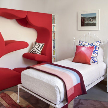
Embracing the challenge of grounding this open, light-filled space, our Aspen studio focused on comfort, ease, and high design. The built-in lounge is flanked by storage cabinets for puzzles and games for this client who loves having people over. The high-back Living Divani sofa is paired with U-Turn Benson chairs and a "Rabari" rug from Nanimarquina for casual gatherings. The throw pillows are a perfect mix of Norwegian tapestry fabric and contemporary patterns. In the child's bedroom, we added an organically shaped Vitra Living Tower, which also provides a cozy reading niche. Bold Marimekko fabric colorfully complements more traditional detailing and creates a contrast between old and new. We loved collaborating with our client on an eclectic bedroom, where everything is collected and combined in a way that allows distinctive pieces to work together. A custom walnut bed supports the owner's tatami mattress. Vintage rugs ground the space and pair well with a vintage Scandinavian chair and dresser.
Combining unexpected objects is one of our favorite ways to add liveliness and personality to a space. In the little guest bedroom, our client (a creative and passionate collector) was the inspiration behind an energetic and eclectic mix. Similarly, turning one of our client's favorite old sweaters into pillow covers and popping a Native American rug on the wall helped pull the space together. Slightly eclectic and invitingly cozy, the twin guestroom beckons for settling in to read, nap or daydream. A vintage poster from Omnibus Gallery in Aspen and an antique nightstand add period whimsy.
 Joe McGuire Design
Embracing the challenge of grounding this open, light-filled space, our Boulder studio focused on comfort, ease, and high design. The built-in lounge is flanked by storage cabinets for puzzles and games for this client who loves having people over. The high-back Living Divani sofa is paired with U-Turn Benson chairs and a "Rabari" rug from Nanimarquina for casual gatherings. The throw pillows are a perfect mix of Norwegian tapestry fabric and contemporary patterns. In the child's bedroom, we added an organically shaped Vitra Living Tower, which also provides a cozy reading niche. Bold Marimekko fabric colorfully complements more traditional detailing and creates a contrast between old and new. We loved collaborating with our client on an eclectic bedroom, where everything is collected and combined in a way that allows distinctive pieces to work together. A custom walnut bed supports the owner's tatami mattress. Vintage rugs ground the space and pair well with a vintage Scandinavian chair and dresser.
Combining unexpected objects is one of our favorite ways to add liveliness and personality to a space. In the little guest bedroom, our client (a creative and passionate collector) was the inspiration behind an energetic and eclectic mix. Similarly, turning one of our client's favorite old sweaters into pillow covers and popping a Native American rug on the wall helped pull the space together. Slightly eclectic and invitingly cozy, the twin guestroom beckons for settling in to read, nap or daydream. A vintage poster from Omnibus Gallery in Aspen and an antique nightstand add period whimsy.
---
Joe McGuire Design is an Aspen and Boulder interior design firm bringing a uniquely holistic approach to home interiors since 2005.
For more about Joe McGuire Design, see here: https://www.joemcguiredesign.com/
To learn more about this project, see here:
https://www.joemcguiredesign.com/aspen-eclectic
 Klopf Architecture
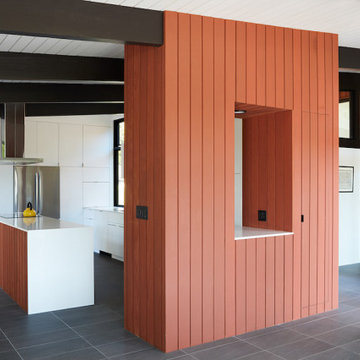
The Roger Lee designed house from 1962 was purchased by the current homeowners in almost original condition, as the previous owners elected to defer most maintenance projects over the years. The clients were able to see beyond the dated materials and finishes, single-paned glass and uninsulated walls and they approached Klopf Architecture to help them expand and update the entire home, one the family could settle into and enjoy for years to come. It was important that the new designs were aligned with Lee's original intent not only because of the client's appreciation for mid-century modern architecture, but also because the house was deemed historical. The Stanford Real Estate Office requires a stringent design review which safeguards the integrity of the community, which Klopf Architecture was happy to oblige going into their updated designs.
As with many original mid-century modern homes, the house was scaled to the 1960s lifestyle where rooms were smaller and openings to views were limited and tightly framed. The original conditions defined the direction the family of four would take in updating the house and making it comfortable for their modern lifestyle. Klopf designed a full gut remodel and major addition to bring the house into the 21st century and provide the living area needed for the client's family. The newly expanded house added just about 1,100 sf to create an airy, comfortable and family friendly house, taking full advantage of the beautiful southwestern views that extend out to the hills beyond. The enclosed garage created an additional 240 sf of covered space for long-term storage.
A cracked swimming pool created an eyesore taking up a majority of the backyard landscape, so it was one of the first elements to go during the transformation. Working with Outer Space Landscape Architects, the family asked for a mix of relaxing outdoor patio spaces that eventually blend into the native landscaping, extending their views outward toward the natural greenery of the trees beyond their property. Filling in the old pool was a smart way to expand the living spaces outward. The orientation of the house was designed to enjoy the views, but the original architecture provided the first homeowners with mere glimpses of the landscape outside.
Klopf was able to broaden those views, continuing and extending on the original architecture to take full advantage of the unobstructed natural views across the rear facade of the house. Small horizontal openings in the primary bedroom and office were replaced with much taller windows that now follow the angled roof line upward, extending across almost all of the facade. We worked with Western Windows, whose designs included an oblique-shaped, operable casement that allowed our design to rise with the slope. A new corner office added to the primary suite, offers a bright and functional work-from-home solution that looks out at the distant views and added natural light from the expanded window configuration that now wraps around the corner.
The existing lower level was designed by Lee as a utilitarian space, serving as a wet pool room with a drain in the center of the floor, bathroom, laundry and storage areas. Without the need for a pool room, Klopf was able to convert the area into a much more comfortable and functional living space with a new family room and guest suite. The new spaces enjoy easy access to a new outdoor patio through floor to ceiling, full-width glass sliders.
Continuing along the rear facade, a previously exposed deck extending from the living room and hallway provided access to the backyard through a single set of stairs leading toward the side of the house which made sense when the pool was in place. The new deck was re-envisioned as an extension of the main living room and now serves as a second outdoor living room. A new slatted pergola above provides the homeowners welcome relief from the hot afternoon sun. A second set of stairs now creates a better connection to the redesigned lower level. Klopf was able to reconfigure the spaces, extending the living room outward toward the views, where the family now claims it as the heart of the home, spending a large majority of their time outdoors.
Back inside, the original wood-burning Malm fireplace was beautifully restored and a gas burner installed to comply with California's strict air standards. It now rests in front of a wall of Heath accent tiles where a dated red brick wall used to stand. A new taller window brings more light and views into the refreshed interior living room. The original glass doors opposite the fireplace were replaced by larger sliders that when fully opened, create a seamless transition to the new outdoor living area so the two spaces feel like one connected space. The original utilitarian kitchen was needlessly tucked into the far back corner and closed-off, out of sight from the living room, so the clients asked Klopf to open it up and expand the kitchen forward so it felt more connected. Today the much larger kitchen is connected to the living area where a short wall with a cutout offers a visual glimpse into the kitchen and a handy pass-through counter for serving guests. A new breakfast nook was also added to create another spot where the family can gather for casual meals. Just outside, a new built-in outdoor grill and prep area extends the kitchen outside and connects to a new outdoor dining spot nestled amongst the trees, taking advantage of the views out back.
Klopf was able to expand the other two bedrooms, add a new laundry room and half-bath and convert the carport to an enclosed garage to add more storage areas which was lost when the pool house was converted to the family and guest room.
To maintain a historical connection to the original designs, the exterior siding was repeated on all exterior walls, a full-height stained glass window at the front entryway restored, and an interior slatted screen element repeated outside at the exterior entry courtyard and over the new outdoor living room to create a shade trellis. The new house stands proudly and shines against it's new landscaping features, while respecting and expanding on the original intent of Roger Lee's designs epitomizing the comforts of indoor-outdoor living in Northern California.
Completion year: 2020
Klopf Architecture project team: John Klopf, Klara Kevane, Noel Andrade
Contractor: ORB Construction, Brendan O'Reilly
Structural engineer: Sezen and Moon
Landscape architect: Outer space
Furnishings and decoration: Urbanism Designs
Photographer: Mariko Reed
 Fabco Sanctuary
The architect and designer Guy Derwent was approached by his client with a clear and compelling brief: to completely transform a grand Victorian terrace house they were planning to renovate. The client envisioned something far beyond a standard renovation – this was to be a bold and dramatic reimagining of a family home that could grow with them over time.
With the property having remained largely untouched for more than fifty years, the architects saw an opportunity to unlock its potential and deliver a contemporary design that would contrast beautifully with its Victorian heritage.
The existing layout consisted of a series of small, disconnected rooms to the rear of the house. To respond to the client’s need for openness and flexibility, the architect proposed a radical restructuring of the ground floor:
The rear rooms were completely removed
Suspended timber floors were lowered by up to two metres to align with the garden
Two bold extensions were added
The first extension filled in the side return with a London stock brick facade and a glazed roof, while the second – a striking black steel and glass pavilion was glazed on three sides and placed along the garden elevation.
This new pavilion redefined the building’s relationship with the garden. Its steel-framed glazing created a seamless dialogue between interior and exterior, offering a sense of immersion in the surrounding landscape.
At the heart of the plan sits a dramatic, five-metre-tall dining space that acts as a transition from the original entrance hall into the new addition. A large, circular cast-glass window, framed in steel, provides a visual and spatial link between old and new, allowing light and movement to travel through the depth of the home.
Throughout the project, a series of black metal elements were introduced as sculptural interventions – each marking moments of transformation within the house. These included the bespoke steel framed circular window, a custom metal staircase, a cylindrical support column, and the striking steel and glass garden pavilion. Together, they formed a coherent architectural language that underscored the project’s bold intent.
Our steel windows and doors played a vital role in delivering the project’s vision. The architects chose steel for its refined sight lines and distinctive material character, which helped bridge the gap between the historical context of the building and the bold new additions.
The black steel frames provided a crisp contrast to the pale London stock brick and added definition to the glazed pavilion, reinforcing the sense of architectural precision. In particular, the fine steel profiles of the garden room allowed the extension to feel both lightweight and immersive, blurring the boundary between the house and its garden.
The architect drew inspiration from the Bauhaus Movement, particularly the work of Walter Gropius, whose approach to functional beauty and industrial materials informed the design of the garden pavilion.
Here, our glazing system was used not just for transparency, but as an expressive architectural element. The carefully proportioned panels help to conceal the roof thickness and reinforce the pavilion’s industrial yet abstract character – a deliberate nod to product design and modernist detailing.
Sustainability was an important factor in the selection of materials. Our steel systems, made from 99% recycled content and 100% recyclable, aligned with the project’s broader environmental goals.
The architects noted that this commitment to material longevity and circularity was central to their decision to use steel. The durability and recyclability of the windows and doors ensured the project met both aesthetic and ethical criteria.
This London terrace house now stands as a celebration of contrast – between heritage and innovation, solidity and transparency, tradition and transformation. Our steel windows and doors were not simply components; they were essential tools in crafting a home that is as bold and expressive as it is functional.
The result is a home designed for modern family life, where light, space, and materiality come together in perfect harmony.
 Joe McGuire Design
Embracing the challenge of grounding this open, light-filled space, our Boulder studio focused on comfort, ease, and high design. The built-in lounge is flanked by storage cabinets for puzzles and games for this client who loves having people over. The high-back Living Divani sofa is paired with U-Turn Benson chairs and a "Rabari" rug from Nanimarquina for casual gatherings. The throw pillows are a perfect mix of Norwegian tapestry fabric and contemporary patterns. In the child's bedroom, we added an organically shaped Vitra Living Tower, which also provides a cozy reading niche. Bold Marimekko fabric colorfully complements more traditional detailing and creates a contrast between old and new. We loved collaborating with our client on an eclectic bedroom, where everything is collected and combined in a way that allows distinctive pieces to work together. A custom walnut bed supports the owner's tatami mattress. Vintage rugs ground the space and pair well with a vintage Scandinavian chair and dresser.
Combining unexpected objects is one of our favorite ways to add liveliness and personality to a space. In the little guest bedroom, our client (a creative and passionate collector) was the inspiration behind an energetic and eclectic mix. Similarly, turning one of our client's favorite old sweaters into pillow covers and popping a Native American rug on the wall helped pull the space together. Slightly eclectic and invitingly cozy, the twin guestroom beckons for settling in to read, nap or daydream. A vintage poster from Omnibus Gallery in Aspen and an antique nightstand add period whimsy.
 The Olde Mill - Box Beams, Mantels & Shelves
This gorgeous Bocage home was originally too compartmentalized for entertaining guests. The kitchen itself and the opening between the kitchen and family area were both small, making the space feel closed in and cut off from the rest of the house. Our goal was to open the space as much as possible and give the clients everything they needed to entertain. Early in the design process, we decided it was necessary to add square footage to give these clients their dream kitchen. Adding this space allowed for a large kitchen island, tons of cabinet storage, a walk-in pantry, half bath and small office, all accessible from the focal kitchen. Flanking the kitchen window are sets of floating shelves from The Olde Mill. The hollow floating shelf design allowed for color-changing LED lights to be set into the shelves, allowing for a change of mood at the press of a button. We were able to widen the opening between the kitchen and family room to allow the spaces to flow together. The doorway was framed with reclaimed wood posts and headers, also from The Olde Mill. After the expansion, a structural beam was added to support the second floor, and the clients decided to cover it with a beautiful reclaimed wood beam as well. To wrap the laminated structural beam, this beam was made 22″ wide. All of these elements gave the clients a large, show-stopping kitchen with tons of storage and plenty of room to entertain family and friends.
Space Planning by Ourso Designs
Designer: Rachel Cannon Limited
Builder/Remodeler: Bertell Cook Construction
Beams, Mantel, and Floating Shelves: The Olde Mill
Photos: Collin Richie Photography
Sponsored
Columbus, OH

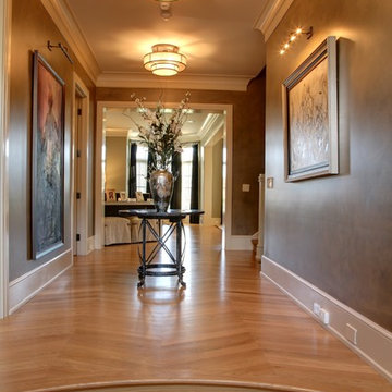
Snider & Metcalf Interior Design, LTD
Leading Interior Designers in Columbus, Ohio & Ponte Vedra, Florida
 Joe McGuire Design
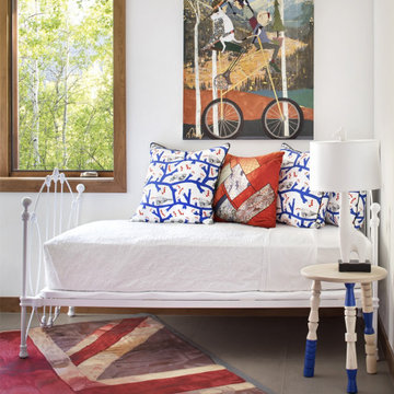
Embracing the challenge of grounding this open, light-filled space, our Boulder studio focused on comfort, ease, and high design. The built-in lounge is flanked by storage cabinets for puzzles and games for this client who loves having people over. The high-back Living Divani sofa is paired with U-Turn Benson chairs and a "Rabari" rug from Nanimarquina for casual gatherings. The throw pillows are a perfect mix of Norwegian tapestry fabric and contemporary patterns. In the child's bedroom, we added an organically shaped Vitra Living Tower, which also provides a cozy reading niche. Bold Marimekko fabric colorfully complements more traditional detailing and creates a contrast between old and new. We loved collaborating with our client on an eclectic bedroom, where everything is collected and combined in a way that allows distinctive pieces to work together. A custom walnut bed supports the owner's tatami mattress. Vintage rugs ground the space and pair well with a vintage Scandinavian chair and dresser.
Combining unexpected objects is one of our favorite ways to add liveliness and personality to a space. In the little guest bedroom, our client (a creative and passionate collector) was the inspiration behind an energetic and eclectic mix. Similarly, turning one of our client's favorite old sweaters into pillow covers and popping a Native American rug on the wall helped pull the space together. Slightly eclectic and invitingly cozy, the twin guestroom beckons for settling in to read, nap or daydream. A vintage poster from Omnibus Gallery in Aspen and an antique nightstand add period whimsy.
 Fabco Sanctuary
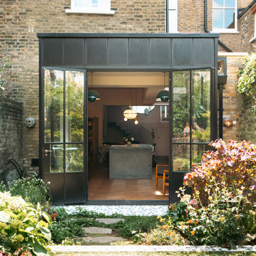
The architect and designer Guy Derwent was approached by his client with a clear and compelling brief: to completely transform a grand Victorian terrace house they were planning to renovate. The client envisioned something far beyond a standard renovation – this was to be a bold and dramatic reimagining of a family home that could grow with them over time.
With the property having remained largely untouched for more than fifty years, the architects saw an opportunity to unlock its potential and deliver a contemporary design that would contrast beautifully with its Victorian heritage.
The existing layout consisted of a series of small, disconnected rooms to the rear of the house. To respond to the client’s need for openness and flexibility, the architect proposed a radical restructuring of the ground floor:
The rear rooms were completely removed
Suspended timber floors were lowered by up to two metres to align with the garden
Two bold extensions were added
The first extension filled in the side return with a London stock brick facade and a glazed roof, while the second – a striking black steel and glass pavilion was glazed on three sides and placed along the garden elevation.
This new pavilion redefined the building’s relationship with the garden. Its steel-framed glazing created a seamless dialogue between interior and exterior, offering a sense of immersion in the surrounding landscape.
At the heart of the plan sits a dramatic, five-metre-tall dining space that acts as a transition from the original entrance hall into the new addition. A large, circular cast-glass window, framed in steel, provides a visual and spatial link between old and new, allowing light and movement to travel through the depth of the home.
Throughout the project, a series of black metal elements were introduced as sculptural interventions – each marking moments of transformation within the house. These included the bespoke steel framed circular window, a custom metal staircase, a cylindrical support column, and the striking steel and glass garden pavilion. Together, they formed a coherent architectural language that underscored the project’s bold intent.
Our steel windows and doors played a vital role in delivering the project’s vision. The architects chose steel for its refined sight lines and distinctive material character, which helped bridge the gap between the historical context of the building and the bold new additions.
The black steel frames provided a crisp contrast to the pale London stock brick and added definition to the glazed pavilion, reinforcing the sense of architectural precision. In particular, the fine steel profiles of the garden room allowed the extension to feel both lightweight and immersive, blurring the boundary between the house and its garden.
The architect drew inspiration from the Bauhaus Movement, particularly the work of Walter Gropius, whose approach to functional beauty and industrial materials informed the design of the garden pavilion.
Here, our glazing system was used not just for transparency, but as an expressive architectural element. The carefully proportioned panels help to conceal the roof thickness and reinforce the pavilion’s industrial yet abstract character – a deliberate nod to product design and modernist detailing.
Sustainability was an important factor in the selection of materials. Our steel systems, made from 99% recycled content and 100% recyclable, aligned with the project’s broader environmental goals.
The architects noted that this commitment to material longevity and circularity was central to their decision to use steel. The durability and recyclability of the windows and doors ensured the project met both aesthetic and ethical criteria.
This London terrace house now stands as a celebration of contrast – between heritage and innovation, solidity and transparency, tradition and transformation. Our steel windows and doors were not simply components; they were essential tools in crafting a home that is as bold and expressive as it is functional.
The result is a home designed for modern family life, where light, space, and materiality come together in perfect harmony.
 EK ARCHITECTURE, PLLC
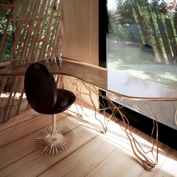
Discover our revolutionary line of customizable biophilic home-office furniture WellthyFlex. WellthyFlex is crafted from natural stone and carbon-fiber-reinforced plastic with its tree branch-inspired form. It brings the beauty of nature indoors. Each piece is thoughtfully designed to create a harmonious and soothing environment, allowing you to thrive in your work. Immerse yourself in the tranquility of your surroundings as our furniture's gentle curves and organic textures evoke a sense of calm and balance. Experience the power of biophilia as you tap into the therapeutic qualities of nature, boosting your focus, creativity, and overall well-being. Embrace the future of work with our biophilic home workplace furniture and create a sanctuary that inspires success.
Lightweight carbon-fiber-reinforced plastic, which would be algae-based in the near future, is used for table structure. With tensile strength at one-quarter the weight of steel, and lighter than aluminum, carbon-fiber-reinforced plastic legs are further optimized with generative design algorithms to use less material.
Algae-based carbon fiber:
https://www.compositesworld.com/articles/technical-university-of-munich-researchers-explore-using-algae-to-make-carbon-fiber
 Joe McGuire Design
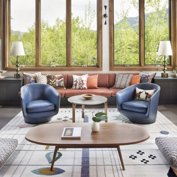
Embracing the challenge of grounding this open, light-filled space, our Aspen studio focused on comfort, ease, and high design. The built-in lounge is flanked by storage cabinets for puzzles and games for this client who loves having people over. The high-back Living Divani sofa is paired with U-Turn Benson chairs and a "Rabari" rug from Nanimarquina for casual gatherings. The throw pillows are a perfect mix of Norwegian tapestry fabric and contemporary patterns. In the child's bedroom, we added an organically shaped Vitra Living Tower, which also provides a cozy reading niche. Bold Marimekko fabric colorfully complements more traditional detailing and creates a contrast between old and new. We loved collaborating with our client on an eclectic bedroom, where everything is collected and combined in a way that allows distinctive pieces to work together. A custom walnut bed supports the owner's tatami mattress. Vintage rugs ground the space and pair well with a vintage Scandinavian chair and dresser.
Combining unexpected objects is one of our favorite ways to add liveliness and personality to a space. In the little guest bedroom, our client (a creative and passionate collector) was the inspiration behind an energetic and eclectic mix. Similarly, turning one of our client's favorite old sweaters into pillow covers and popping a Native American rug on the wall helped pull the space together. Slightly eclectic and invitingly cozy, the twin guestroom beckons for settling in to read, nap or daydream. A vintage poster from Omnibus Gallery in Aspen and an antique nightstand add period whimsy.

Sponsored
Columbus, OH

Wannemacher Interiors
Customized Award-Winning Interior Design Solutions in Franklin Cnty OH
 The Olde Mill - Box Beams, Mantels & Shelves
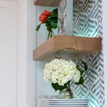
This gorgeous Bocage home was originally too compartmentalized for entertaining guests. The kitchen itself and the opening between the kitchen and family area were both small, making the space feel closed in and cut off from the rest of the house. Our goal was to open the space as much as possible and give the clients everything they needed to entertain. Early in the design process, we decided it was necessary to add square footage to give these clients their dream kitchen. Adding this space allowed for a large kitchen island, tons of cabinet storage, a walk-in pantry, half bath and small office, all accessible from the focal kitchen. Flanking the kitchen window are sets of floating shelves from The Olde Mill. The hollow floating shelf design allowed for color-changing LED lights to be set into the shelves, allowing for a change of mood at the press of a button. We were able to widen the opening between the kitchen and family room to allow the spaces to flow together. The doorway was framed with reclaimed wood posts and headers, also from The Olde Mill. After the expansion, a structural beam was added to support the second floor, and the clients decided to cover it with a beautiful reclaimed wood beam as well. To wrap the laminated structural beam, this beam was made 22″ wide. All of these elements gave the clients a large, show-stopping kitchen with tons of storage and plenty of room to entertain family and friends.
Space Planning by Ourso Designs
Designer: Rachel Cannon Limited
Builder/Remodeler: Bertell Cook Construction
Beams, Mantel, and Floating Shelves: The Olde Mill
Photos: Collin Richie Photography
 Joe McGuire Design
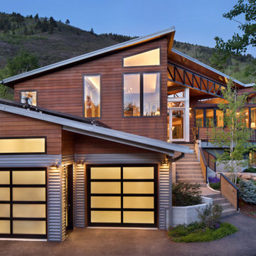
Embracing the challenge of grounding this open, light-filled space, our Aspen studio focused on comfort, ease, and high design. The built-in lounge is flanked by storage cabinets for puzzles and games for this client who loves having people over. The high-back Living Divani sofa is paired with U-Turn Benson chairs and a "Rabari" rug from Nanimarquina for casual gatherings. The throw pillows are a perfect mix of Norwegian tapestry fabric and contemporary patterns. In the child's bedroom, we added an organically shaped Vitra Living Tower, which also provides a cozy reading niche. Bold Marimekko fabric colorfully complements more traditional detailing and creates a contrast between old and new. We loved collaborating with our client on an eclectic bedroom, where everything is collected and combined in a way that allows distinctive pieces to work together. A custom walnut bed supports the owner's tatami mattress. Vintage rugs ground the space and pair well with a vintage Scandinavian chair and dresser.
Combining unexpected objects is one of our favorite ways to add liveliness and personality to a space. In the little guest bedroom, our client (a creative and passionate collector) was the inspiration behind an energetic and eclectic mix. Similarly, turning one of our client's favorite old sweaters into pillow covers and popping a Native American rug on the wall helped pull the space together. Slightly eclectic and invitingly cozy, the twin guestroom beckons for settling in to read, nap or daydream. A vintage poster from Omnibus Gallery in Aspen and an antique nightstand add period whimsy.
 Joe McGuire Design
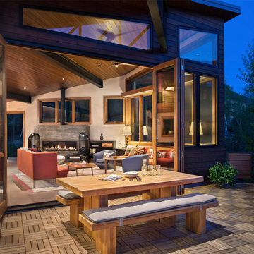
Embracing the challenge of grounding this open, light-filled space, our Aspen studio focused on comfort, ease, and high design. The built-in lounge is flanked by storage cabinets for puzzles and games for this client who loves having people over. The high-back Living Divani sofa is paired with U-Turn Benson chairs and a "Rabari" rug from Nanimarquina for casual gatherings. The throw pillows are a perfect mix of Norwegian tapestry fabric and contemporary patterns. In the child's bedroom, we added an organically shaped Vitra Living Tower, which also provides a cozy reading niche. Bold Marimekko fabric colorfully complements more traditional detailing and creates a contrast between old and new. We loved collaborating with our client on an eclectic bedroom, where everything is collected and combined in a way that allows distinctive pieces to work together. A custom walnut bed supports the owner's tatami mattress. Vintage rugs ground the space and pair well with a vintage Scandinavian chair and dresser.
Combining unexpected objects is one of our favorite ways to add liveliness and personality to a space. In the little guest bedroom, our client (a creative and passionate collector) was the inspiration behind an energetic and eclectic mix. Similarly, turning one of our client's favorite old sweaters into pillow covers and popping a Native American rug on the wall helped pull the space together. Slightly eclectic and invitingly cozy, the twin guestroom beckons for settling in to read, nap or daydream. A vintage poster from Omnibus Gallery in Aspen and an antique nightstand add period whimsy.
56