
Search results for "Coherent visual" in Home Design Ideas
 Princeton Design Collaborative
Architecture by : Princeton Design Collaborative 360pdc.com
photo by Jeffery Edward Tryon
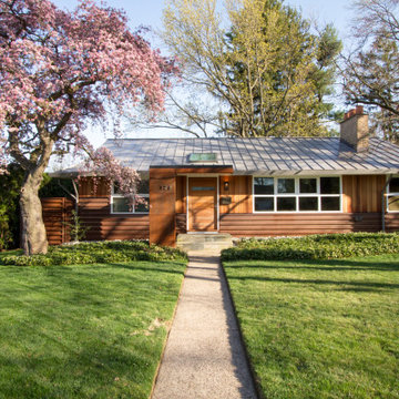
Mid-sized mid-century modern brown one-story metal and board and batten exterior home photo in Philadelphia with a metal roof and a gray roof
Mid-sized mid-century modern brown one-story metal and board and batten exterior home photo in Philadelphia with a metal roof and a gray roof
 DeForest Architects
Contractor: Joseph McKinstry Construction; Interior Design: Jan Holbrook; Photo: Benjamin Benschneider
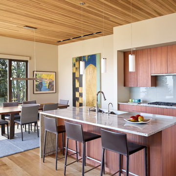
Inspiration for a contemporary medium tone wood floor kitchen remodel in Seattle with an undermount sink, flat-panel cabinets, dark wood cabinets, gray backsplash and glass sheet backsplash
Inspiration for a contemporary medium tone wood floor kitchen remodel in Seattle with an undermount sink, flat-panel cabinets, dark wood cabinets, gray backsplash and glass sheet backsplash
 Fabco Sanctuary
The architect and designer Guy Derwent was approached by his client with a clear and compelling brief: to completely transform a grand Victorian terrace house they were planning to renovate. The client envisioned something far beyond a standard renovation – this was to be a bold and dramatic reimagining of a family home that could grow with them over time.
With the property having remained largely untouched for more than fifty years, the architects saw an opportunity to unlock its potential and deliver a contemporary design that would contrast beautifully with its Victorian heritage.
The existing layout consisted of a series of small, disconnected rooms to the rear of the house. To respond to the client’s need for openness and flexibility, the architect proposed a radical restructuring of the ground floor:
The rear rooms were completely removed
Suspended timber floors were lowered by up to two metres to align with the garden
Two bold extensions were added
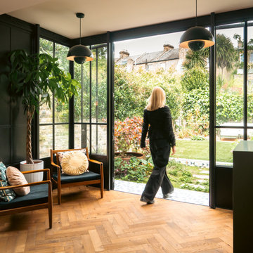
The first extension filled in the side return with a London stock brick facade and a glazed roof, while the second – a striking black steel and glass pavilion was glazed on three sides and placed along the garden elevation.
This new pavilion redefined the building’s relationship with the garden. Its steel-framed glazing created a seamless dialogue between interior and exterior, offering a sense of immersion in the surrounding landscape.
At the heart of the plan sits a dramatic, five-metre-tall dining space that acts as a transition from the original entrance hall into the new addition. A large, circular cast-glass window, framed in steel, provides a visual and spatial link between old and new, allowing light and movement to travel through the depth of the home.
Throughout the project, a series of black metal elements were introduced as sculptural interventions – each marking moments of transformation within the house. These included the bespoke steel framed circular window, a custom metal staircase, a cylindrical support column, and the striking steel and glass garden pavilion. Together, they formed a coherent architectural language that underscored the project’s bold intent.
Our steel windows and doors played a vital role in delivering the project’s vision. The architects chose steel for its refined sight lines and distinctive material character, which helped bridge the gap between the historical context of the building and the bold new additions.
The black steel frames provided a crisp contrast to the pale London stock brick and added definition to the glazed pavilion, reinforcing the sense of architectural precision. In particular, the fine steel profiles of the garden room allowed the extension to feel both lightweight and immersive, blurring the boundary between the house and its garden.
The architect drew inspiration from the Bauhaus Movement, particularly the work of Walter Gropius, whose approach to functional beauty and industrial materials informed the design of the garden pavilion.
Here, our glazing system was used not just for transparency, but as an expressive architectural element. The carefully proportioned panels help to conceal the roof thickness and reinforce the pavilion’s industrial yet abstract character – a deliberate nod to product design and modernist detailing.
Sustainability was an important factor in the selection of materials. Our steel systems, made from 99% recycled content and 100% recyclable, aligned with the project’s broader environmental goals.
The architects noted that this commitment to material longevity and circularity was central to their decision to use steel. The durability and recyclability of the windows and doors ensured the project met both aesthetic and ethical criteria.
This London terrace house now stands as a celebration of contrast – between heritage and innovation, solidity and transparency, tradition and transformation. Our steel windows and doors were not simply components; they were essential tools in crafting a home that is as bold and expressive as it is functional.
The result is a home designed for modern family life, where light, space, and materiality come together in perfect harmony.
Find the right local pro for your project
 Envision Web
Stuart Wade, Envision Virtual Tours
Bobcat Lodge- Lake Rabun
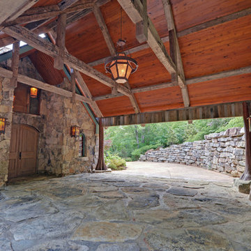
Be welcomed to this perfect mountain/lake lodge through stone pillars down a driveway of stamped concrete and brick paver patterns to the porte cochere. The design philosophy seen in the home's exterior extends to the interior with 10 fireplaces, the finest materials, and extraordinary craftsmanship.
Great Room
Enter the striking foyer with the antique heart pine, walnut and bird's-eye maple inlaid pattern that harmonizes with the natural unity of the spacious great room. The visually anchored stone fireplace accented by hand hewn circa 1800 oak beams silhouettes the soft lake views making a dynamic design statement. The great room was designed with togetherness in mind and features high vaulted ceilings, wormy oak flooring with walnut borders, a spacious dining area, a gourmet kitchen and for softer and more intimate moments a keeping room.
Kitchen:
Wormy chestnut cabinets,
Complimenting South American granite countertops
Wolf cooktop, double oven
Preparation bar
Serving Buffet
Separate wet bar
Walk-in Pantry
Laundry Room: entrance off the foyer, wormy chestnut cabinets and South American granite
Keeping Room: Nestled off the kitchen area intimately scaled for quieter moments, wormy chestnut ceilings with hand hewn oak beams from Ohio and Pennsylvania, wormy oak flooring accented with walnut and sycamore, and private fireplace
Powder Room off foyer
Three Master Bedroom Suites: each with its own unique full bathroom and private alcove with masonry wood burning fireplace
Master suite on the main floor with full bath enlivened by a fish theme with earthtones and blue accents, a copper soaking tub, large shower and copper sinks
Upstairs master suite with wormy oak flooring sits snug above the lake looking through a tree canopy as from a tree house facilitating a peaceful, tranquil atmosphere- full bath features jetted tub, separate shower, large closet, and friendly lizards sitting on copper sinks
Terrace Level Master Suite offers trey ceilings, entrance to stone terrace supported by cyprus tree trunks giving the feel of a rainforest floor: Full bath includes double mosaic-raised copper sinks, antler lighting, jetted tub accented with aquatic life tiles and separate water closet
This warm and inviting rustic interior perfectly balances the outdoor lake vistas with the comfort of indoor living.moving directly to the outdoor living spaces. A full length deck supported by cyprus trees offers the opportunity for serious entertaining. The stone terrace off the downstairs family room leads directly to the two stall boathouse for lakeside entertaining with its own private fireplace.
Terrace Level:
14 foot ceilings, transom windows
A master suite
A guest room with trey ceilings, wool carpet, and full bath with copper sinks,double vanity and riverock shower
Family room with focal stone fireplace, wet bar with wine cooler, separate kitchen with sink, mini refrigerator and built in microwave
Wine closet with hand painted plaster finish
A full bath for drippy swimmers with oversized river rock shower accented with crayfish and salamander tiles
Extras
All windows are Loewen windows
A ridge vent system
Custom design closets
Poured foundation for house and boathouse
European spruce framing
Exterior siding: 1 x 12 pressure treated pine with 1 x 4 batten strips
Siding has three coat process of Sikkens stain finish
Ten masonry fireplaces
Stacked rock from Rocky Gap Virginia
Eight foot custom Honduran Pine
True plaster walls with three coat process faux finish
Locust hand rails for the deck
Support cyprus tree trunks from Charleston
Outside light fixtures custom made in NY
Five hot water heaters, circulating pump
Duel fuel heat pump/propane, 1000 gallon buried propane tank, four zone heating system
Two laundry rooms
All Fireplaces set up for flat screen TV's
Adjacent lot available for purchase
 Foremost Interiors
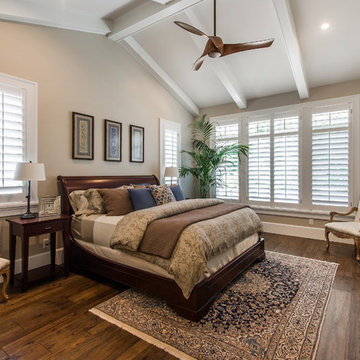
Master bedroom with white shutters and medium wood flooring.
Large elegant master medium tone wood floor and brown floor bedroom photo in Salt Lake City with beige walls and no fireplace
Large elegant master medium tone wood floor and brown floor bedroom photo in Salt Lake City with beige walls and no fireplace
 Vertebrae Art and Architecture
Art Gray
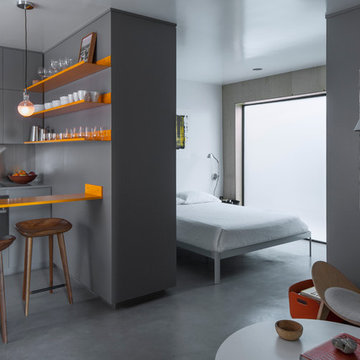
Small trendy master concrete floor and gray floor bedroom photo in Los Angeles with gray walls and no fireplace
Small trendy master concrete floor and gray floor bedroom photo in Los Angeles with gray walls and no fireplace
 Dura Supreme Cabinetry
One important element with any design project is the development of a "design path" (or "color path"), that creates a coherent, well-planned look for the entire space. Oftentimes this is called a "color board" and all the swatches, finishes and fabrics are laid out together to see the entire room (or entire home) and how all the design elements coordinate and work together.
In kitchen design, this includes wall paint colors, cabinetry finish colors, flooring, countertops, and tile along with appliance, plumbing, and hardware finishes. For the interior design with a room or entire home, it includes furnishings and other surfaces as well. The idea is to create a cohesive look for the entire space.
To create a color path for your home or remodeling project, begin with your neutral colors and then select the other colors for your space. The colors you select may be based on your existing furnishings, a favorite piece of art, or simply colors that resonate to you. In order to create a visually appealing space, let this color page guide your color selections going forward.
Neutral colors (gray, beige, taupe or white) will usually be the background palette with 1-3 other dominant colors layered.
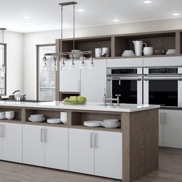
For contemporary or transitional designs, oftentimes a sleek, neutral palette is selected and it's important for all colors to be consistent with this palette. For this soft contemporary kitchen, a neutral palette of gray wood-tone (Weathered "A" finish on Oak) with white-gray paint, stainless and black appliances were selected and then carefully blended throughout the home for a clean, sleek appearance.
Once the "color path" was selected, the cabinetry was specified in the appropriate colors and all of the surfaces, soft goods, plateware, and accent pieces were selected to coordinate.
Featuring Dura Supreme's Bria Frameless Cabinetry shown with the Dura Supreme's Chroma door style. The Chrome door style is one of our many classic slab cabinet door styles. This design combines our Pearl light gray paint finish with our Weathered "A" finish on Red Oak for the accents and shelving.
Request a FREE Dura Supreme Brochure Packet:
http://www.durasupreme.com/request-brochure
Find a Dura Supreme Showroom near you today:
http://www.durasupreme.com/dealer-locator


 Dura Supreme Cabinetry
One important element with any design project is the development of a "design path" (or "color path"), that creates a coherent, well-planned look for the entire space. Oftentimes this is called a "color board" and all the swatches, finishes and fabrics are laid out together to see the entire room (or entire home) and how all the design elements coordinate and work together.
In kitchen design, this includes wall paint colors, cabinetry finish colors, flooring, countertops, and tile along with appliance, plumbing, and hardware finishes. For the interior design with a room or entire home, it includes furnishings and other surfaces as well. The idea is to create a cohesive look for the entire space.
To create a color path for your home or remodeling project, begin with your neutral colors and then select the other colors for your space. The colors you select may be based on your existing furnishings, a favorite piece of art, or simply colors that resonate to you. In order to create a visually appealing space, let this color page guide your color selections going forward.
Neutral colors (gray, beige, taupe or white) will usually be the background palette with 1-3 other dominant colors layered.
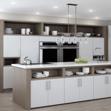
For contemporary or transitional designs, oftentimes a sleek, neutral palette is selected and it's important for all colors to be consistent with this palette. For this soft contemporary kitchen, a neutral palette of gray wood-tone (Weathered "A" finish on Oak) with white-gray paint, stainless and black appliances were selected and then carefully blended throughout the home for a clean, sleek appearance.
Once the "color path" was selected, the cabinetry was specified in the appropriate colors and all of the surfaces, soft goods, plateware, and accent pieces were selected to coordinate.
Featuring Dura Supreme's Bria Frameless Cabinetry shown with the Dura Supreme's Chroma door style. The Chrome door style is one of our many classic slab cabinet door styles. This design combines our Pearl light gray paint finish with our Weathered "A" finish on Red Oak for the accents and shelving.
Request a FREE Dura Supreme Brochure Packet:
http://www.durasupreme.com/request-brochure
Find a Dura Supreme Showroom near you today:
http://www.durasupreme.com/dealer-locator
 Roeser Home Remodeling
This Mid-Century home had been updated except for the kitchen and master bath. After a few years of being empty nesters, and with the neighborhood turning over drastically to infill property in the millions, this couple decided the time was right to update the last remaining rooms.
Starting in the Kitchen
Taking a dark, u-shaped kitchen out of the past and updating it for the future, was a dream come true for this family. They knew what they wanted in order to entertain their large extended family, which included their three kids; plus, his family, consisting of nine children, spouses, and now grandchildren. Requirements of an open space to hang out and help out, a banquet for food presentation without obstruction, bright and clean, easy storage, a place for her mother’s china decanters, and an instant hot for tea were all part of the “must haves” for this kitchen. We also needed to work around the homeowners’ existing appliances since many of them were practically new.
Vaulted ceilings, lots of high windows, and large openings to other spaces in the house, were challenges that only a galley style kitchen could address. Blending and lacing the hardwood floor with new flooring required both the new and existing to be sanded down and refinished. This provided a coherent look to the entire first floor of this home. Matching casings, baseboards and base shoe helped to make the updates look fresh, but original to the house.
In the kitchen, choosing the sandstone slate finish on our Wellborn Maple select series cabinets kept the space soft; but really opened it, making the space lighter and brighter. The Harmony style door choice blended with the décor in the rest of the house, while also giving straight clean lines the homeowner desired. Grounding the row of cabinets with their refrigerator and a pantry cabinet, gave symmetry to this side of the kitchen.
On the opposite side, a built-in pantry cabinet mirrors the refrigerator. A row of drawer cabinets expanded the storage and banquet space, to lay out food for entertaining. Also added were some much-needed wall cabinets with glass inserts to mirror the windows and keep the space open. This also allowed the taller canister to be displayed and admired. A few smaller shelves were added above the window space, to house the smaller canisters so loved by the homeowner.
An artist by trade, this homeowner added two narrow cabinets to the side of the pantry and the side of the refrigerator panel to house and create easy access to the various spices her husband loves to use while cooking. She painted them to blend with Wellborn’s Sandstone finish. The Caesarstone countertop with a 3cm eased edge in London Gray has a small pattern that is subtle and interesting. Cutting down the Caesarstone to 2 cm and carrying the same London Gray pattern up the backsplash area, lended to the clean lines and easy cleaning this homeowner requested.
Choosing chrome plumbing fixtures from Moen’s Brantford line is timeless choice. Chrome is always popular and yet in today’s market, also very trendy. The Brantford faucet has a pull-down spray and one side handle, leaving space for the all-important request of a Transcape hot water dispenser, also in chrome.
Scraping away the past included smoothing out the popcorn ceiling. Adding LED slope cans to the vaulted ceilings provided the necessary task lighting to elevate these homeowners’ joy of cooking. Removing the dated “popcorn look” enhanced the clean and spacious feel created by the architecture of the ceiling. Adding Top Knob chrome hardware was the final element that tied the kitchen all together.
Master Bathroom
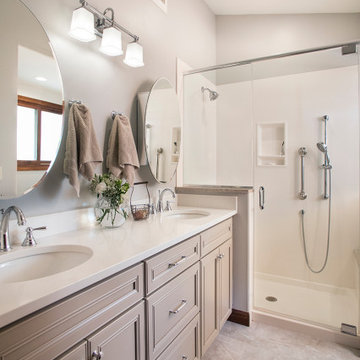
The original dated Master Bathroom had dark cabinets, a huge Jacuzzi tub and a small shower stall that provided barely enough room for even a child to shower. Removing the Jacuzzi tub that was never used, opened this floor plan to a grand shower that is comfortable and spacious. For easy cleaning, these homeowners opted for a panel system in their shower. Onyx shower walls with a shower seat and recess wide shower caddy were installed in place of the old Jacuzzi style tub.
The large panels were quite a challenge for our team, with an eight foot door and vaulted ceilings; but they were determined not to have a seam. These seamless panels are beautiful and very easy to clean. Keeping with the original floor plan, a double sink vanity from Wellborn’s select line with the Harmony door style in a pebble finish was installed. New Kohler Caxton under mount sinks were installed, along with the Moen Kinsley 8” wide spread faucets in chrome. Matching Kingsley 18” grab bars were added to the shower area, along with the Kohler Brantford fixed shower head and handheld slide bar.
The countertop was a beautiful Caesarstone in Frosty Carrina with an eased edge and 4” back and side splash. Matching Kinsley towel hooks were added, along with mirrors the homeowner purchased and we installed for her. Top Knobs chrome cabinet hardware finished the look along with a beautiful tile floor AO Mira 1224-S Silver Maple laid in a broken joint pattern. Matching marble sills were added on top of the knee walls and threshold in the doorway. A 3/8” frameless custom shower door with fixed panels surrounded the shower creating an open airy feel to the space.
Not shown: Kohler’s Wellworth highline toilet with a slow-close seat replaces the original toilet. The original shower stall became a space used to house a stackable washer and dryer, a top a safety pan and drain to slop sink in the basement. There was even enough room for small shelving to provide storage for laundry essentials. Adding a louver door keeps the laundry area behind the scene and opens the master area to multiple tasks needed.
Master Bedroom Fireplace
This homeowner really missed a bedroom fireplace they had in a previous home. Since we were going to be working on their master bathroom anyway; was there a way to create a fireplace without making it feel too odd in their large bedroom area? They had purchased a ventless gas fireplace and they had their original television as well.
Challenged by windows, a vaulted ceiling and the natural light streaming from the back window; this divided wall was created, keeping the lighting from the other side of the room and providing a dressing area opposite the fireplace. This was a perfect idea since the closets are now in the dressing area and the creative wall houses the fireplace and TV for cold winter nights of snuggling to a movie. Better yet, the fireplace and TV are all on remote control!
 Sierra Living Concepts Inc
Dimension:
Upper Rack: 34" L X 11" D X 16" H
Storage Box: 34" L X 18" D X 26" H
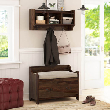
Emulate a visual and functional coherence in your entryways, foyers, and corridors by furnishing with our stylish Sapinero Rustic Solid Wood Wall Hanging Hall Tree Bench with Storage!
It’s absolutely stylish and has been sleekly designed to suit the architecture of all transitional spaces quite well. It has a gorgeous solid wood build and has a plethora of compartments where you can store personal items and even feature accessories. The sturdy hand craftsmanship ensures that it has a great heirloom quality!
The design of this solid wood hall tree is divided into 2 distinct parts. The top half comprises a floating shelf that hangs a few feet above the bottom credenza. It has an open shelf on top with 3 open cubbies underneath where you can showcase trendy decoration pieces or neatly organize your shoes. Below the cubbies are 3 double prong stainless steel hooks, which can be used to hang coats whenever you arrive back home.
The bottom half is just as simple and pragmatic with the design of a low back bench. It has a top that is framed by extended dips and cuts, and here you can place a bowl for keys and whatever else you may need for going to-and-fro from the foyer and also use to sit while putting on your shoes. There are 2 pullout filing-cabinet style drawers at the bottom for extra storage and the base is supported by simple feet.
The sleek hand-rubbed finish and gorgeous wood grain of this solid Rosewood hall tree give it an interesting and visually versatile quality. You can definitely match it with any and all kinds of interior design settings.
Special Features:
• 100% Handcrafted
• Solid Rosewood craftsmanship
• Rustic style
• Floating cabinet with 3 open cubbies and open shelf
• 3 double prong hooks
• Bottom storage bench with a smooth top frame
• 2 large pullout drawers
• Stylish hand-wrought metal hardware
• Sleek designing
• Gorgeous wood grain
• Stunning hand-rubbed finish
• Heirloom quality
• Visually versatile
• Easy maintenance
Note: Real wood is a product of nature, and as such, no two pieces are alike. Variations in solid wood grain patterns are to be expected and make each furniture uniquely beautiful, just like us humans.
 Atkinson Architecture
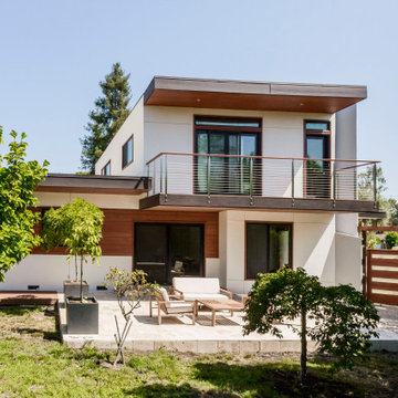
Side yard "After" view. This side facade proved the most difficult to organize and make visually coherent. The wide variety of window sizes, overhangs and angles needed to be coherently organized and re-surfaced.
 Escala y Espacio SAS
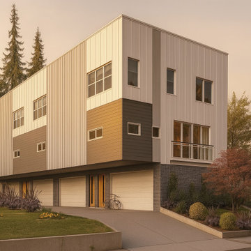
This multifamily residential project showcases a fully integrated interior design proposal, where concept, color palette, and materiality work together to create timeless, refined living spaces. The design emphasizes warmth, functionality, and visual coherence, elevating everyday living while enhancing the overall value and identity of the development.
 Leicht San Diego
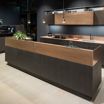
Copper-coloured effect lacquer fronts from the LAIKA range generate visual drama with a metallic effect in this horizontally planned kitchen of the product line PRIMO with a carbon grey carcase. In addition to various unit elements and a satin-finished glass worktop, the metallic look is also reflected in the raised frame of the kitchen island – an architectural detail reminiscent of a bar situation. The colour-contrasting wall unit consists of individual elements placed in front of each other, but, due to the clasping of the side panels in the upper row of shelves, it looks like a coherent furniture soloist. The metallic lacquer in “copper shadow” clearly emphasises the spatially offset part and creates a three-dimensional look. In this way, this kitchen design dissolves the classic arrangement of wall units strung together and creates a completely new look. To match this, the planners of this ensemble chose the MADERO programme in dark “wild oak marsh” and created a modern, trendy flair with a contrast to the copper tone implemented throughout.

Sponsored
Columbus, OH

Snider & Metcalf Interior Design, LTD
Leading Interior Designers in Columbus, Ohio & Ponte Vedra, Florida
 SERGIO HALFON | Architecture & Interior Design
English
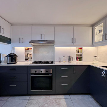
This kitchen renovation focused on transforming a visually cluttered and spatially inefficient space into a calm, functional, and architecturally coherent environment. The original kitchen felt overcrowded, dark, and constrained, limiting both usability and spatial clarity.
A key strategic decision was relocating the refrigerator to the adjacent patio, which functions as a natural extension of the kitchen. This intervention significantly improved circulation, freed valuable workspace, and enhanced the perception of openness within the interior.
The material palette was developed in response to the client’s preference for neutral, timeless tones, combining white quartz countertops, soft gray cabinetry, and warm wood accents to create visual balance and spatial continuity.
Custom millwork plays a central role in the project. Upper cabinets with glass fronts and integrated interior lighting introduce depth, transparency, and a lighter visual presence, while concealed spice storage was integrated directly into the backsplash through sliding panels, optimizing accessibility without introducing visual clutter.
Under-cabinet lighting enhances functionality and provides a soft ambient glow, reinforcing the clarity of surfaces and work zones. The installation of a separate cooktop and built-in oven, instead of a conventional range, contributes to a cleaner and more contemporary architectural expression.
An existing counter was redefined and fully integrated as a breakfast bar for four people, improving the kitchen’s social function and reinforcing its role as a central living space.
The result is a kitchen that prioritizes spatial efficiency, material clarity, and functional precision, transforming a previously constrained space into a calm, modern, and highly usable architectural environment.
Español
La remodelación de esta cocina se centró en transformar un espacio visualmente saturado y espacialmente ineficiente en un entorno funcional, claro y arquitectónicamente coherente. La cocina original se percibía oscura, sobrecargada y limitada, lo que afectaba tanto su uso cotidiano como la calidad espacial.
Una decisión clave fue reubicar el refrigerador en el patio adyacente, el cual funciona como una extensión natural de la cocina. Esta intervención permitió liberar superficie de trabajo, mejorar la circulación y generar una percepción mucho mayor de amplitud.
La selección de materiales respondió a la preferencia de la clienta por tonos neutros y atemporales, incorporando cubiertas de cuarzo blanco, gabinetes en tonos grises y acentos en madera cálida, creando un equilibrio visual y continuidad espacial.
La carpintería diseñada a medida es un elemento central del proyecto. Los gabinetes superiores con frentes de vidrio e iluminación interior aportan ligereza visual y profundidad, mientras que los especieros ocultos integrados en el backsplash, mediante puertas corredizas, optimizan la funcionalidad sin generar ruido visual.
La iluminación bajo gabinetes mejora la ergonomía del espacio y aporta una iluminación ambiental cálida que refuerza la claridad de las superficies. La instalación de parrilla y horno independientes, en lugar de una estufa convencional, contribuye a una expresión más limpia y contemporánea.
La barra existente fue rediseñada y plenamente integrada como desayunador para cuatro personas, fortaleciendo el carácter social de la cocina y ampliando su funcionalidad.
El resultado es una cocina que prioriza la eficiencia espacial, la claridad material y la precisión funcional, transformando un espacio previamente limitado en un entorno contemporáneo, sereno y altamente funcional.
 STUDIO KONDE | Konrad Idaszewski Architect
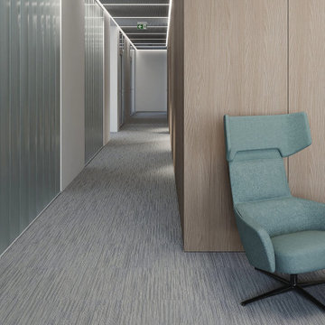
A generous lounge area provides a relaxed setting for informal meetings and conversations.
Blue upholstered armchairs and a matching sofa create a coherent visual language throughout the space.
Large glazed openings bring natural light into the interior and connect the lounge with the surrounding architecture.
The dark rug visually defines the seating zone against the lighter flooring.
The combination of soft upholstery and natural materials creates a comfortable and sophisticated atmosphere.
Visit the full project: https://conde.pl/portfolio/projekt-wnetrz-biurowych-siedziby-firmy-airoptic/
 Amos Goldreich Architecture
The apartment occupies the third floor of a prominent corner property originally constructed in 1860.
The building was formerly two neighbouring town houses, reconfigured in 1939 as a residential school for girls. In 1968, the State of Kuwait purchased the property which became their London Embassy until 2000 at which time the two houses were converted into 13 flats.
Amos Goldreich Architecture was appointed as lead architects to create a contemporary 3 bedroom home within this Grade II Listed Building.
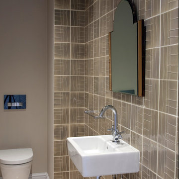
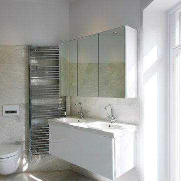
AGA has sought to rationalise the formerly over-complex configuration, clarifying spatial sequences and creating a coherent visual palette. The apartment is finished to a high standard, with bespoke joinery and ingenious storage solutions.
 Amos Goldreich Architecture
The apartment occupies the third floor of a prominent corner property originally constructed in 1860.
The building was formerly two neighbouring town houses, reconfigured in 1939 as a residential school for girls. In 1968, the State of Kuwait purchased the property which became their London Embassy until 2000 at which time the two houses were converted into 13 flats.
Amos Goldreich Architecture was appointed as lead architects to create a contemporary 3 bedroom home within this Grade II Listed Building.
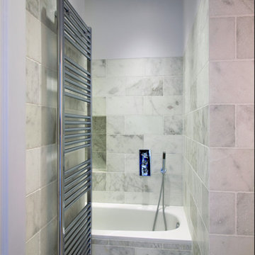
AGA has sought to rationalise the formerly over-complex configuration, clarifying spatial sequences and creating a coherent visual palette. The apartment is finished to a high standard, with bespoke joinery and ingenious storage solutions.


 Amos Goldreich Architecture
The apartment occupies the third floor of a prominent corner property originally constructed in 1860.
The building was formerly two neighbouring town houses, reconfigured in 1939 as a residential school for girls. In 1968, the State of Kuwait purchased the property which became their London Embassy until 2000 at which time the two houses were converted into 13 flats.
Amos Goldreich Architecture was appointed as lead architects to create a contemporary 3 bedroom home within this Grade II Listed Building.
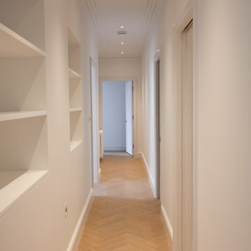
AGA has sought to rationalise the formerly over-complex configuration, clarifying spatial sequences and creating a coherent visual palette. The apartment is finished to a high standard, with bespoke joinery and ingenious storage solutions.
 Amos Goldreich Architecture
The apartment occupies the third floor of a prominent corner property originally constructed in 1860.
The building was formerly two neighbouring town houses, reconfigured in 1939 as a residential school for girls. In 1968, the State of Kuwait purchased the property which became their London Embassy until 2000 at which time the two houses were converted into 13 flats.
Amos Goldreich Architecture was appointed as lead architects to create a contemporary 3 bedroom home within this Grade II Listed Building.
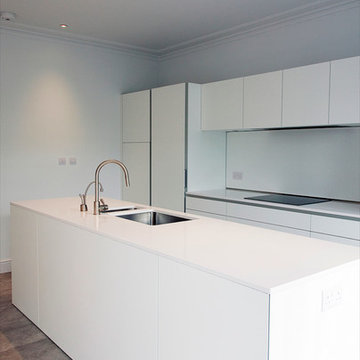
AGA has sought to rationalise the formerly over-complex configuration, clarifying spatial sequences and creating a coherent visual palette. The apartment is finished to a high standard, with bespoke joinery and ingenious storage solutions.
 Amos Goldreich Architecture
The apartment occupies the third floor of a prominent corner property originally constructed in 1860.
The building was formerly two neighbouring town houses, reconfigured in 1939 as a residential school for girls. In 1968, the State of Kuwait purchased the property which became their London Embassy until 2000 at which time the two houses were converted into 13 flats.
Amos Goldreich Architecture was appointed as lead architects to create a contemporary 3 bedroom home within this Grade II Listed Building.
AGA has sought to rationalise the formerly over-complex configuration, clarifying spatial sequences and creating a coherent visual palette. The apartment is finished to a high standard, with bespoke joinery and ingenious storage solutions.
1