
Search results for "Cold processing" in Home Design Ideas
 Living with Lolo
Bathroom in Lexington Ave | Room Type:
Primary Bathroom (Master Bath Remodel) |
Project Name:
Lexington Ave |
Key Feature:
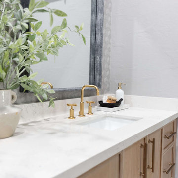
A modern, luxury bathroom with a subtle boho influence, featuring unique tile placement, statement lighting, and layered materials that create visual interest in a compact footprint.
Challenge:
The client wanted a full bathroom transformation while keeping all plumbing in its existing locations to minimize renovation costs, requiring creative design solutions within structural limitations.
Solution:
The design team reimagined the space by introducing updated finishes, distinctive tile layouts, wallpaper, and statement lighting to elevate the bathroom while working within the existing layout. The project was executed entirely remotely, demonstrating a seamless virtual design process.
Materials:
Bedrosians tile, Thibaut wallpaper, Arteriors lighting, Kohler plumbing fixtures, Jaipur Living rugs, Made Goods bath mirrors, and Bungalow5 bath stool.
Budget:
Not specified
Timeline:
Completed April 2021.
 Manomin Resawn Timbers
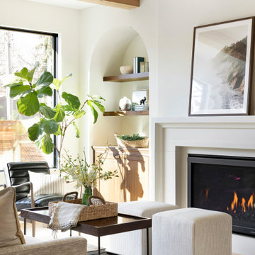
Two Antique White Oak box beams run across the white ceiling of this bright contemporary living room, their warm honey-brown tones and subtle gray patina bringing natural warmth and antique character to a clean, minimalist space defined by white walls, an arched niche, and a white plaster fireplace surround. The beams are understated but essential, adding just enough texture and warmth to keep a crisp modern interior from feeling cold or sterile. Sourced from 19th century structures, our Antique White Oak carries a subtle gray patina earned over years of natural weathering alongside the unique grain patterns and density that only old growth Oak develops over time. Through our process of denailing, kiln drying, and precision milling, Manomin Resawn Timbers prepares these antique timbers to make a quiet but meaningful statement in any room.
Whether you are a homebuilder, a home remodeling contractor, or a homeowner looking to add Antique White Oak box beams to a contemporary living room, Manomin Resawn Timbers has been helping people discover the antique charm of reclaimed wood since 2002. We ship nationwide and are happy to help you find the right pieces from anywhere in the country. Visit our showroom in Hugo, MN or reach out to us with a call or a message to get started.

 Zola European Windows
McKeesport Downtown Housing, formerly a YMCA, is an 84-unit SRO for people at risk of homelessness. The old brick and terracotta building was important historically for McKeesport. The decision to design the project to Passive House criteria actually went a long way to making the pro-forma work. This project was the first large scale retrofit to be designed to meet Passive House Standards in the US. Another major concern of the project team was to maintain the historic charm of the building.
Space was at a premium and a reorganization of space allowed for making larger resident rooms. Through a community process with various stakeholders, amenities were identified and added to the project, including a community room, a bike storage area, exterior smoking balconies, single-user rest rooms, a bed bug room for non-toxic treatment of bed bugs, and communal kitchens to provide healthy options for food. The renovation includes new additional lighting, air-conditioning, make-up air and ventilation systems, an elevator, and cooking facilities. A cold-weather shelter, 60-day emergency housing, bridge housing, and section 8 apartment rentals make up the housing programs within the shelter. Thoughtful Balance designed the interiors, and selected the furniture for durability and resistance to bed bugs.
The project team worked closely with Zola Windows to specify a unique uPVC window that not only offers passive house performance levels at an affordable cost, but also harmonizes with the building’s historic aesthetic. Zola’s American Heritage SDH (simulated double hung) from the popular, budget-friendly Thermo uPVC line was specified for the project. The windows implemented in this project feature a lower tilt & turn window and a fixed upper for maximum airtightness and thermal performance. The implementation of these windows helped the project team achieve a very significant energy consumption reduction of at least 75%.
Photographer: Alexander Denmarsh
Find the right local pro for your project

 Cassoni Furniture & Accessories
- MARCEL SOFA.
Frame in wood with elastic bands, covered in high density polyurethane foam. Seat and backrest cushions in sterilised goose down, with insert in multi-thickness polyurethane foam. Tubular finishing base in polished aluminium or painted in the colour bronze. The fabric upholstery is entirely removable.
133''7/8W x 43''3/8D x 33''1/2H.
Armrest height: 24’’3/8.
Seat height: 16’’1/2.
http://ow.ly/3yvEJu
- GORKY COFFEE TABLE.
Ground iron frame with satin bronze finish. Glass top in bronze mono-colour or with a special pattern obtained through an exclusive laser processing, alternatively, with leather covered wooden top.
Square:
40''1/8W x 40''1/8D x 11''3/8H. Top: 39''3/8 x 39’’3/8.
48''W x 48''D x 11''3/8H. Top: 47''1/4 x 47’’1/4.
59''7/8W x 59''7/8D x 11''3/8H. Top: 59'' x 59’’.
28''W x 28''D x 20''7/8H. Top: 11''3/8 x 11’’3/8.
15''W x 15''D x 37''3/8H. Top: 28'' x 28’’.
Rectangular:
59''7/8W x 24''3/8D x 11''3/8H. Top: 59'' x 23’’5/8.
40''1/2W x 28''D x 20''7/8H. 39''3/8 x 11’’3/8.
http://ow.ly/3yvEKs
- YAKI SIDE TABLE.
Service table with a hand-engraved cast brass base. Column and top: covered in cat leather.
Marbles: Nubuck, Calacatta Gold Marble, Frappuccino Marble, Port Black Marble, White Onyx.
Oval:
31''1/2W x 19''5/8D x 17''3/4H.
23''5/8W x 15''3/4D x 21''5/8H.
http://ow.ly/3yvEMm
- MIDORI LOUNGE CHAIR.
Iron bearing frame with elastic webbing, padding in high-density cold moulded foam. Given the special processing, both the leather and fabric upholsteries are not removable.
26''W x 24''3/4D x 30''5/8H.
Seat height: 15’’3/8.
http://ow.ly/3yvEN5
 Twelve Stones Designs, LLC
The owners of this kitchen had spent the money to upgrade the finishes in their kitchen upon building the home 12 years ago, but after living in the space for several years they realized how nonfunctional the layout really was. The (then) two preschool aged children had grown into busy, hungry teenagers with many friends who also liked to hang out at the house. So the family needed a more functional kitchen with better traffic flow, space for daily activities revolving around the kitchen at different times of day, and a kitchen that could accommodate cooking for and serving large groups. Furthermore, the dark, traditional finishes no longer reflected the homeowners’ style. They requested a brighter, more relaxed, coastal style that reflected their love of the seaside cities they like to visit.
Originally, the kitchen was U-shaped with a narrow island in the middle. The island created narrow aisles that bottle-necked at the dishwasher, refrigerator, and cooktop areas. There was a pass-through from the foyer into the kitchen, but the owners never liked that the pass-through was also located so close to the powder room. The awkward proximity was unappealing and made guests feel uncomfortable.
The kitchen’s storage was made up of lots of narrow cabinets, apothecary drawers, clipped corner units, and very few drawers. It lacked useful storage for the larger items the family used on a daily basis. And the kitchen’s only pantry was small closet that had only builder-grade, narrow shelving with no illumination to be able to see the contents inside.
Overall, the kitchen’s lighting plan was poorly executed. Only six recessed cans illuminated the entire kitchen and nook areas. The under cabinet lighting was not evenly distributed either. In fact, the builder had mis-placed the under cabinet lighting around the decorative pilasters which made for choppy, dark cubbies. Further, the builder didn’t include any lighting over the sink or the bar area, which meant whoever was doing the dishes was always in their own shadow. That, coupled with the steep overhang of the game room above made the bar area feel like a dim, cavernous space that wasn’t inviting or task oriented. The kitchen looked out into the main living space, but the raised bar and a narrow wall (which held the only large cabinet in the kitchen) created more of a barrier than a relationship to the living room or breakfast nook. In fact, one couldn’t even see the breakfast nook from the cooktop or sink areas due to its orientation. The raised bar top was too narrow to comfortably sit to either dine at or chat from due to the lack of knee space. The the homeowners confided that the kitchen felt more like a dark, dirty prison than place where the family, or their guests, wanted to gather and commune.
The clients' needs and desires were:
➢ to create a kitchen that would be a space the family loved to be in; to relate to the adjacent spaces all around, and to have better flow for entertaining large groups
➢ to remove the walls between the breakfast nook and living area and to be able to utilize the natural light from the windows in both those areas
➢ to incorporate a functional chopping block for prepping fresh food for home cooked meals, an island with a large sink and drain board, 2 pull out trash cans, and seating for at least the 2 teens to eat or do homework
➢ to design a kitchen and breakfast nook with an airy, coastal, relaxed vibe that blended with the rest of the house's coastal theme
➢ to integrate a layered lighting plan which would include ample general illumination, specific task lighting, decorative lighting, and lots of illuminated storage
➢ to design a kitchen with not only more storage for all the husband’s kitchen gadgets and collection of oils and spices, but smart storage, including a coffee/breakfast bar and a place to store and conceal the toaster oven and microwave
➢ to find a way to utilize the large open space between the kitchen, pantry area, and breakfast nook
Twelve Stones Designs achieved the owner's goals by:
➢ removing the walls between the kitchen and living room to allow the natural light to filter in from the adjacent rooms and to create a connection between the kitchen, nook, and living spaces for a sense of unity and communion
➢ removing the existing pantry and designing 3 large pantry style cabinets with LED tape lights and rollout drawers to house lots of kitchen appliances, gadgets, and tons of groceries. We also took the cabinets all the way up to the 9’ ceiling for additional storage for seasonal items and bulk storage.
➢ designing 2 islands - 1 with a gorgeous black walnut chopping block that houses a drawer for chopping and carving knives and a custom double pull out trash unit for point of use utilization - and 1 that houses the dishwasher, a large Blanco Gourmet sink with integrated drain board, woven baskets for fresh root vegetables and kitchen towels, plenty of drawer storage for kitchen items, and bar seating for up to 4 diners.
➢ closing off the space between the kitchen and the powder room to create a beautiful new private alcove for the powder room as well as adding some decorative storage. This also gave us space to include more tall storage near the new range for precision placement of the husband’s extensive oil and spice collection as well as a location for a combo-steam oven the wife wanted for baking and cooking healthy meals.
The project is enhanced functionally by:
➢ incorporated USB and standard receptacles for the kids’ laptops and phone charging in the large island
➢ designing the small island to include additional open shelving for items used on a daily basis such as a variety of bowls, plates, and colanders. This set up also works well for the husband who prefers to “plate” his dinners in restaurant-style fashion before presenting them to the table.
➢ the integration of specific storage units, such as double stacked cutlery drawers, a custom spice pull-out, a Kuerig coffee and tea pod drawer, and custom double stacked utensil drawers
➢ moving the refrigerator to the old oven location - this eliminated the bottle neck as well as created a better relationship to the eating table. It also utilizes the floor space between the pantry, nook, and kitchen
➢ creating a banquet style breakfast nook - this banquette seating not only doubles the amount of seating for large gatherings but it better utilizes the odd space between the kitchen and the previous nook area. It also helps to create a distinct pathway from the mudroom room through the pantry area, kitchen, nook, and living room.
➢ the coffee/breakfast bar area which includes the perfect location for the concealed microwave and toaster oven, convenient storage for the coffee pods and tea accoutrements. Roll-out drawers below also house the smoothie maker, hot water kettle, and a plethora of smoothie-making ingredients such as protein powders, smoothie additives, etc. Furthermore, the drawers below the Keurig house measuring utensil, cutlery, baking supplies and tupperware storage.
➢ incorporating lots of wide drawers and pullouts to accommodate large cookware.
➢ utilizing as much vertical space as possible by building storage to the ceiling which accommodates the family’s abundant amount of serving platters, baking sheets, bakeware, casserole dishes, and additional cutting boards.
The project is enhanced aesthetically by:
➢ new 5-piece Versailles pattern porcelain tile that now seamlessly joins the entire down stairs area together creating a bright, cohesiveness feeling instead of choppy separated spaces - it also adds a coastal feeling
➢ designing a cabinet to conceal the microwave and toaster oven
➢ the coastal influenced light fixtures over the nook table and island
➢ the sandy colors of the Langdon Cambria countertops. The swirling pattern and sparkling quartz pieces remind the homeowner of black-and-tan sandy beaches
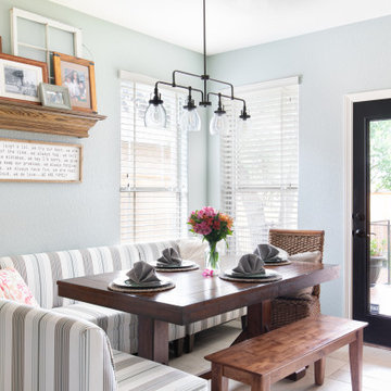
➢ the striped banquet seating whose creamy white background and blue-green stripes were the inspiration for the cabinet and wall colors.
➢ All the interior doors were painted black to coordinate with the blacks and grays in the backsplash tile and countertop. This also adds a hint of tailored formality to an otherwise casual space.
➢ the use of WAC's Oculux small aperture LED units for the overhead lighting complimented with Diode LED strips for task lighting under the cabinets and inside the pantry and glass wall cabinets. All of the lighting applications are on separate dimmer switches.
Innovative uses of materials or construction methods by Realty Restoration LLC:
➢ Each 1-1/2” x 3” block of reclaimed end-grain black walnut that makes up the center island chopping block was hand milled and built in the shop. It was designed to look substantial and proportional to the surrounding elements, executed by creating the 4 inch tall top with a solid wood chamfered edge band.
➢ The metal doors on either side of the vent hood were also custom designed for this project and built in the Realty Restoration LLC shop. They are made 1x2, 11-gauge mild steel with ribbed glass. Weighing 60 lbs a piece, heavy duty cabinet hinges were added to support the weight of the door and keep them from sagging.
➢ Under-cabinet receptacles were added along the range wall in order to have a clean, uninterrupted backsplash.
Design obstacles to overcome:
➢ Because we were removing the demising walls between the kitchen and living room, we had to find a way to plumb and vent the new island. We did this by tunneling through the slab (the slab had post tension cables which prevented us from just trenching) to run a new wet vent through a nearby structural wall. We pulled the existing hot and cold lines between upper floor joists and ran them down the structural wall as well and up through a conduit in the tunnel.
➢ Since we were converting from wall overs to a gas range it allowed us to utilize the 220 feed for the wall ovens to provide a new sub panel for all the new kitchen circuits
➢ Due to framing deficiencies inherited from the original build there was a 1-1/2” differential in the floor-to-ceiling height over a 20 foot span; by utilizing the process of cutting and furring coupled with the crown moulding details on the cabinet elevations we were able to mask the problem and provide seamless transitions between the cabinet components.
Evidence of superior craftsmanship:
➢ uniquely designed, one-of-a-kind metal “X” end panels on the large island. The end panels were custom made in the Realty Restoration LLC shop and fitted to the exact dimensions of the island. The welding seams are completely indistinguishable - the posts look like they are cut from a single sheet of metal
➢ square metal posts on the small island were also custom made and designed to compliment and carry through the metal element s throughout the kitchen
➢ the beautiful, oversized end panels on the pantry cabinets which give the breakfast nook a tailored look
➢ integrating a large format 5 piece Versailles tile pattern to seamlessly flow from the existing spaces into the new kitchen space
➢ By constructing a custom cabinet that jogged around a corner we could not remodel (housing the entry way coat closet) we were able to camouflage the adjacent wall offset within the upper and lower cabinets. By designing around the existing jog in the structural walls we accomplished a few things: we were able to find the space to house, and hide, the microwave and toaster oven yet still have a clean cohesive appearance from the kitchen side. Additionally, the owners were able to keep their much needed coat closet and we didn’t have to increase the budget with unnecessary structural work.

 SUPERIOR CHIMNEY SERVICES CORPORATION
Is it crazy to think about chimney repairs in the winter? It’s cold and snowy outside and the rooftops are solid white, coated with a layer of ice. A homeowner called us with a concern about her home. She reported that a small stream of water was coming down the chimney and into the firebox. To keep the water from flooding the firebox, the homeowner placed a Tupperware container to collect the water. Not a good look. Can chimney repairs in the winter be done by a certified chimney technician?
Chimney Repairs in the Winter
Chimney repairs can be completed in the winter, although it depends on what type of chimney repair is needed. Let’s take a quick look at the different chimney repairs in our cold winter months.
Chimney Cap: If your chimney cap comes loose, or if the winter winds knocked it out of place or blew it off completely, our certified chimney technician can go up on the roof and take care of the chimney cap for you with a chimney cap replacement. Our technicians follow the guidelines for safety, especially in the winter months when roofing systems are the slipperiest.
Flashing: Flashing is the connector from the roofing system to the chimney. It is the barrier that protects water from finding its way into your home. However, if the flashing becomes loose or comes away from the roof and chimney, it is open season for the rain to come directly into your home and create chaos.
Chimney Crown: The chimney crown is the slab of cement that sits on top of the chimney and right below the chimney cap. Hairline cracks can form in the chimney crown allowing water, melted snow, to enter. Even the smallest hairline crack can cause the melted snow to find the weak spot on the chimney crown and make its way into your home.
Remember, hairline cracks can and will grow in width and length with the freeze thaw cycles. When the melted snow freezes at night, it expands inside of the crack. If the temperatures cooperate in the daytime, it melts the snow. But remember, it doesn’t necessarily dry out inside of the crack. It can remain moist and freeze again at night.
Chimney Tuckpointing: Tuckpointing the chimney can be done in the winter, but it certainly isn’t an easy process as we’re dealing with wet mortar. Cracks can create an entry point for melted snow to enter, further deteriorating the mortar.
Although it is not optimal to perform chimney repairs in the winter, Superior Chimney takes precautions to ensure a safe and effective repair. Now the homeowner can get rid of the streaming water in the firebox and enjoy the rest of the winter with a warm and dry fireplace.
Be sure to contact us today if you have a water leak in your fireplace. If you would like to have your chimney inspected and checked for water leaks coming this spring, contact us today to schedule it up in March. This way, you’ll be all set and not compete with others in the Spring.
 Zola European Windows
McKeesport Downtown Housing, formerly a YMCA, is an 84-unit SRO for people at risk of homelessness. The old brick and terracotta building was important historically for McKeesport. The decision to design the project to Passive House criteria actually went a long way to making the pro-forma work. This project was the first large scale retrofit to be designed to meet Passive House Standards in the US. Another major concern of the project team was to maintain the historic charm of the building.
Space was at a premium and a reorganization of space allowed for making larger resident rooms. Through a community process with various stakeholders, amenities were identified and added to the project, including a community room, a bike storage area, exterior smoking balconies, single-user rest rooms, a bed bug room for non-toxic treatment of bed bugs, and communal kitchens to provide healthy options for food. The renovation includes new additional lighting, air-conditioning, make-up air and ventilation systems, an elevator, and cooking facilities. A cold-weather shelter, 60-day emergency housing, bridge housing, and section 8 apartment rentals make up the housing programs within the shelter. Thoughtful Balance designed the interiors, and selected the furniture for durability and resistance to bed bugs.
The project team worked closely with Zola Windows to specify a unique uPVC window that not only offers passive house performance levels at an affordable cost, but also harmonizes with the building’s historic aesthetic. Zola’s American Heritage SDH (simulated double hung) from the popular, budget-friendly Thermo uPVC line was specified for the project. The windows implemented in this project feature a lower tilt & turn window and a fixed upper for maximum airtightness and thermal performance. The implementation of these windows helped the project team achieve a very significant energy consumption reduction of at least 75%.
Photographer: Alexander Denmarsh
 Zola European Windows
McKeesport Downtown Housing, formerly a YMCA, is an 84-unit SRO for people at risk of homelessness. The old brick and terracotta building was important historically for McKeesport. The decision to design the project to Passive House criteria actually went a long way to making the pro-forma work. This project was the first large scale retrofit to be designed to meet Passive House Standards in the US. Another major concern of the project team was to maintain the historic charm of the building.
Space was at a premium and a reorganization of space allowed for making larger resident rooms. Through a community process with various stakeholders, amenities were identified and added to the project, including a community room, a bike storage area, exterior smoking balconies, single-user rest rooms, a bed bug room for non-toxic treatment of bed bugs, and communal kitchens to provide healthy options for food. The renovation includes new additional lighting, air-conditioning, make-up air and ventilation systems, an elevator, and cooking facilities. A cold-weather shelter, 60-day emergency housing, bridge housing, and section 8 apartment rentals make up the housing programs within the shelter. Thoughtful Balance designed the interiors, and selected the furniture for durability and resistance to bed bugs.
The project team worked closely with Zola Windows to specify a unique uPVC window that not only offers passive house performance levels at an affordable cost, but also harmonizes with the building’s historic aesthetic. Zola’s American Heritage SDH (simulated double hung) from the popular, budget-friendly Thermo uPVC line was specified for the project. The windows implemented in this project feature a lower tilt & turn window and a fixed upper for maximum airtightness and thermal performance. The implementation of these windows helped the project team achieve a very significant energy consumption reduction of at least 75%.
Photographer: Alexander Denmarsh
 Zola European Windows
McKeesport Downtown Housing, formerly a YMCA, is an 84-unit SRO for people at risk of homelessness. The old brick and terracotta building was important historically for McKeesport. The decision to design the project to Passive House criteria actually went a long way to making the pro-forma work. This project was the first large scale retrofit to be designed to meet Passive House Standards in the US. Another major concern of the project team was to maintain the historic charm of the building.
Space was at a premium and a reorganization of space allowed for making larger resident rooms. Through a community process with various stakeholders, amenities were identified and added to the project, including a community room, a bike storage area, exterior smoking balconies, single-user rest rooms, a bed bug room for non-toxic treatment of bed bugs, and communal kitchens to provide healthy options for food. The renovation includes new additional lighting, air-conditioning, make-up air and ventilation systems, an elevator, and cooking facilities. A cold-weather shelter, 60-day emergency housing, bridge housing, and section 8 apartment rentals make up the housing programs within the shelter. Thoughtful Balance designed the interiors, and selected the furniture for durability and resistance to bed bugs.
The project team worked closely with Zola Windows to specify a unique uPVC window that not only offers passive house performance levels at an affordable cost, but also harmonizes with the building’s historic aesthetic. Zola’s American Heritage SDH (simulated double hung) from the popular, budget-friendly Thermo uPVC line was specified for the project. The windows implemented in this project feature a lower tilt & turn window and a fixed upper for maximum airtightness and thermal performance. The implementation of these windows helped the project team achieve a very significant energy consumption reduction of at least 75%.
Photographer: Alexander Denmarsh

 Robin's Nest Interiors
Homearama 2016: An Introduction
Welcome to Homearama 2016: An Introduction where we will take you into the process for creating a showcase home – a phenomenal 12 month long project filled with plenty of blood, sweat and tears. Mostly sweat with the actual even held in middle of a regular Kentucky July – consistently high 90s and a humidity that can steam any pair of glasses.
Our Team
Nevertheless, we are so proud of all those who helped contribute to creating a beautiful home for our ever-patient homeowners. This gorgeous “Southern Belle” took home 3 of the 6 awards given by the Building Industry Association at the River Crest Development: Best Kitchen Cabinetry (M&H Cabinetry), Best Closet Design (Closets by Design), and Best Lighting (Ferguson).
Also cheers to our builder, Chad Stoyell of Stoyell Built Homes for winning 3rd place in the popular vote for Best Builder! He, of course, is at the top of our list as Stoyell Built Homes pride themselves in custom homes built with impeccable craftsmanship. Our Southern Belle did not detour from his reputation! Beautifully executed detail can be found everywhere from the hot/cold exterior hose hookup to the wooden dormer over the front porch.
In addition, the house is a looker – a home you can’t find in just any neighborhood. Notice the bold symmetry with the stone walls flanking the large front porch. Windows placed high on either side of the front facade provide plenty of light while maintaining privacy.
Our landscaper, Chad Rodgers, complemented the symmetry with matching Japanese Maples that in due time will grow up to be perfectly positioned. Concrete planters anchor the front door, while bold blue rocking chairs brighten up the facade two by two.
Natural Wood Elements
Chad Stoyell, the builder, used real material throughout the house and the front door is no exception. This beauty is made of solid wood.
The natural beauty of wood is continued in this wooden open dormer. The lighting fixture keeps that southern charm going with lantern accents – also seen in the fixtures flanking the garage door.
Hydrangeas line the driveway along the side of the house. Great craftsmanship on the shake siding and stone application.
View of the back porch, including two seating areas-a cozy fireplace and a patio for those lazy, hazy, crazy days of summer!
And on a final note, we just love the accessibility of the patio from the garage! The door to the right of the table and chairs leads directly into the garage! Stay tuned for what door #2 leads to….
Stay Tuned for More
Hope you liked our introduction on this great project – Homearama 2016! Please stay tuned for more insight on the design process of each space. I can’t wait to show you the inside of this Southern Belle. Enjoy!
 Twelve Stones Designs, LLC
The owners of this kitchen had spent the money to upgrade the finishes in their kitchen upon building the home 12 years ago, but after living in the space for several years they realized how nonfunctional the layout really was. The (then) two preschool aged children had grown into busy, hungry teenagers with many friends who also liked to hang out at the house. So the family needed a more functional kitchen with better traffic flow, space for daily activities revolving around the kitchen at different times of day, and a kitchen that could accommodate cooking for and serving large groups. Furthermore, the dark, traditional finishes no longer reflected the homeowners’ style. They requested a brighter, more relaxed, coastal style that reflected their love of the seaside cities they like to visit.
Originally, the kitchen was U-shaped with a narrow island in the middle. The island created narrow aisles that bottle-necked at the dishwasher, refrigerator, and cooktop areas. There was a pass-through from the foyer into the kitchen, but the owners never liked that the pass-through was also located so close to the powder room. The awkward proximity was unappealing and made guests feel uncomfortable.
The kitchen’s storage was made up of lots of narrow cabinets, apothecary drawers, clipped corner units, and very few drawers. It lacked useful storage for the larger items the family used on a daily basis. And the kitchen’s only pantry was small closet that had only builder-grade, narrow shelving with no illumination to be able to see the contents inside.
Overall, the kitchen’s lighting plan was poorly executed. Only six recessed cans illuminated the entire kitchen and nook areas. The under cabinet lighting was not evenly distributed either. In fact, the builder had mis-placed the under cabinet lighting around the decorative pilasters which made for choppy, dark cubbies. Further, the builder didn’t include any lighting over the sink or the bar area, which meant whoever was doing the dishes was always in their own shadow. That, coupled with the steep overhang of the game room above made the bar area feel like a dim, cavernous space that wasn’t inviting or task oriented. The kitchen looked out into the main living space, but the raised bar and a narrow wall (which held the only large cabinet in the kitchen) created more of a barrier than a relationship to the living room or breakfast nook. In fact, one couldn’t even see the breakfast nook from the cooktop or sink areas due to its orientation. The raised bar top was too narrow to comfortably sit to either dine at or chat from due to the lack of knee space. The the homeowners confided that the kitchen felt more like a dark, dirty prison than place where the family, or their guests, wanted to gather and commune.
The clients' needs and desires were:
➢ to create a kitchen that would be a space the family loved to be in; to relate to the adjacent spaces all around, and to have better flow for entertaining large groups
➢ to remove the walls between the breakfast nook and living area and to be able to utilize the natural light from the windows in both those areas
➢ to incorporate a functional chopping block for prepping fresh food for home cooked meals, an island with a large sink and drain board, 2 pull out trash cans, and seating for at least the 2 teens to eat or do homework
➢ to design a kitchen and breakfast nook with an airy, coastal, relaxed vibe that blended with the rest of the house's coastal theme
➢ to integrate a layered lighting plan which would include ample general illumination, specific task lighting, decorative lighting, and lots of illuminated storage
➢ to design a kitchen with not only more storage for all the husband’s kitchen gadgets and collection of oils and spices, but smart storage, including a coffee/breakfast bar and a place to store and conceal the toaster oven and microwave
➢ to find a way to utilize the large open space between the kitchen, pantry area, and breakfast nook
Twelve Stones Designs achieved the owner's goals by:
➢ removing the walls between the kitchen and living room to allow the natural light to filter in from the adjacent rooms and to create a connection between the kitchen, nook, and living spaces for a sense of unity and communion
➢ removing the existing pantry and designing 3 large pantry style cabinets with LED tape lights and rollout drawers to house lots of kitchen appliances, gadgets, and tons of groceries. We also took the cabinets all the way up to the 9’ ceiling for additional storage for seasonal items and bulk storage.
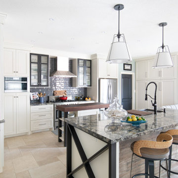
➢ designing 2 islands - 1 with a gorgeous black walnut chopping block that houses a drawer for chopping and carving knives and a custom double pull out trash unit for point of use utilization - and 1 that houses the dishwasher, a large Blanco Gourmet sink with integrated drain board, woven baskets for fresh root vegetables and kitchen towels, plenty of drawer storage for kitchen items, and bar seating for up to 4 diners.
➢ closing off the space between the kitchen and the powder room to create a beautiful new private alcove for the powder room as well as adding some decorative storage. This also gave us space to include more tall storage near the new range for precision placement of the husband’s extensive oil and spice collection as well as a location for a combo-steam oven the wife wanted for baking and cooking healthy meals.
The project is enhanced functionally by:
➢ incorporated USB and standard receptacles for the kids’ laptops and phone charging in the large island
➢ designing the small island to include additional open shelving for items used on a daily basis such as a variety of bowls, plates, and colanders. This set up also works well for the husband who prefers to “plate” his dinners in restaurant-style fashion before presenting them to the table.
➢ the integration of specific storage units, such as double stacked cutlery drawers, a custom spice pull-out, a Kuerig coffee and tea pod drawer, and custom double stacked utensil drawers
➢ moving the refrigerator to the old oven location - this eliminated the bottle neck as well as created a better relationship to the eating table. It also utilizes the floor space between the pantry, nook, and kitchen
➢ creating a banquet style breakfast nook - this banquette seating not only doubles the amount of seating for large gatherings but it better utilizes the odd space between the kitchen and the previous nook area. It also helps to create a distinct pathway from the mudroom room through the pantry area, kitchen, nook, and living room.
➢ the coffee/breakfast bar area which includes the perfect location for the concealed microwave and toaster oven, convenient storage for the coffee pods and tea accoutrements. Roll-out drawers below also house the smoothie maker, hot water kettle, and a plethora of smoothie-making ingredients such as protein powders, smoothie additives, etc. Furthermore, the drawers below the Keurig house measuring utensil, cutlery, baking supplies and tupperware storage.
➢ incorporating lots of wide drawers and pullouts to accommodate large cookware.
➢ utilizing as much vertical space as possible by building storage to the ceiling which accommodates the family’s abundant amount of serving platters, baking sheets, bakeware, casserole dishes, and additional cutting boards.
The project is enhanced aesthetically by:
➢ new 5-piece Versailles pattern porcelain tile that now seamlessly joins the entire down stairs area together creating a bright, cohesiveness feeling instead of choppy separated spaces - it also adds a coastal feeling
➢ designing a cabinet to conceal the microwave and toaster oven
➢ the coastal influenced light fixtures over the nook table and island
➢ the sandy colors of the Langdon Cambria countertops. The swirling pattern and sparkling quartz pieces remind the homeowner of black-and-tan sandy beaches
➢ the striped banquet seating whose creamy white background and blue-green stripes were the inspiration for the cabinet and wall colors.
➢ All the interior doors were painted black to coordinate with the blacks and grays in the backsplash tile and countertop. This also adds a hint of tailored formality to an otherwise casual space.
➢ the use of WAC's Oculux small aperture LED units for the overhead lighting complimented with Diode LED strips for task lighting under the cabinets and inside the pantry and glass wall cabinets. All of the lighting applications are on separate dimmer switches.
Innovative uses of materials or construction methods by Realty Restoration LLC:
➢ Each 1-1/2” x 3” block of reclaimed end-grain black walnut that makes up the center island chopping block was hand milled and built in the shop. It was designed to look substantial and proportional to the surrounding elements, executed by creating the 4 inch tall top with a solid wood chamfered edge band.
➢ The metal doors on either side of the vent hood were also custom designed for this project and built in the Realty Restoration LLC shop. They are made 1x2, 11-gauge mild steel with ribbed glass. Weighing 60 lbs a piece, heavy duty cabinet hinges were added to support the weight of the door and keep them from sagging.
➢ Under-cabinet receptacles were added along the range wall in order to have a clean, uninterrupted backsplash.
Design obstacles to overcome:
➢ Because we were removing the demising walls between the kitchen and living room, we had to find a way to plumb and vent the new island. We did this by tunneling through the slab (the slab had post tension cables which prevented us from just trenching) to run a new wet vent through a nearby structural wall. We pulled the existing hot and cold lines between upper floor joists and ran them down the structural wall as well and up through a conduit in the tunnel.
➢ Since we were converting from wall overs to a gas range it allowed us to utilize the 220 feed for the wall ovens to provide a new sub panel for all the new kitchen circuits
➢ Due to framing deficiencies inherited from the original build there was a 1-1/2” differential in the floor-to-ceiling height over a 20 foot span; by utilizing the process of cutting and furring coupled with the crown moulding details on the cabinet elevations we were able to mask the problem and provide seamless transitions between the cabinet components.
Evidence of superior craftsmanship:
➢ uniquely designed, one-of-a-kind metal “X” end panels on the large island. The end panels were custom made in the Realty Restoration LLC shop and fitted to the exact dimensions of the island. The welding seams are completely indistinguishable - the posts look like they are cut from a single sheet of metal
➢ square metal posts on the small island were also custom made and designed to compliment and carry through the metal element s throughout the kitchen
➢ the beautiful, oversized end panels on the pantry cabinets which give the breakfast nook a tailored look
➢ integrating a large format 5 piece Versailles tile pattern to seamlessly flow from the existing spaces into the new kitchen space
➢ By constructing a custom cabinet that jogged around a corner we could not remodel (housing the entry way coat closet) we were able to camouflage the adjacent wall offset within the upper and lower cabinets. By designing around the existing jog in the structural walls we accomplished a few things: we were able to find the space to house, and hide, the microwave and toaster oven yet still have a clean cohesive appearance from the kitchen side. Additionally, the owners were able to keep their much needed coat closet and we didn’t have to increase the budget with unnecessary structural work.

 Advance Design Studio, Ltd.
Mike and Michelle of Lake Barrington knew they needed extra space. Their home was becoming too crowded for their family with blossoming teenagers, so a basement renovation offered the perfect solution for more space for the kids and more room to entertain for the adults.
“Our project consisted of expanding our laundry room, putting in a first floor wet bar so we had adult space upstairs, while also renovating our basement for a family-friendly and teen-functional area as well,” Michelle says.
They found Advance Design Studio through a neighbor who gave a glowing recommendation, giving Michelle and Mike the confidence they needed to move forward with a major home renovation. They felt like they knew Advance Design before they even worked together. When they met with the owner Todd Jurs and designer Nicole Ryan, Mike and Michelle knew they were getting a trustworthy, dependable team that could create the project they had been dreaming about for 7 years.
Having virtually no natural light to work with, one of the biggest design challenges was creating a basement that did not feel dark and depressing. The Advance team got to work creating architectural archways and custom detailed dry-stack stone columns artfully designed into the space, adding a dramatic element that made the space feel less like a basement or more like a relaxing family room. Color 3D renderings were created to portray what the space would look like so Mike and Michelle could visualize the space in advance.
Detailed trim and crown moldings grace the built in buffet and wet bar making for an amazingly functional space that lacks nothing in style and visual interest. Cherry wood cabinetry by Dura Supreme is featured in the space with a “Cocoa Brown” finish and includes beautiful mirrored glass doors embellished with unique elliptical mullion details. A built-in microwave, dishwasher and mini fridge add practicality to the ample entertainment mecca. An under mounted sink finishes the space joined with a intricate mosaic tile backsplash and “Ventisca Polished” quartz countertops.
The basement is absolutely perfect for hosting friends and family with expertly designed key areas such as a game space for the kids, a movie area for the family, an ample workout room with luxurious full bath, and even built in wine storage. The family absolutely loves the new basement living space, and has already enjoyed numerous family movie nights and sleep-overs with friends.
While custom cabinets made by Dura Supreme were used to create unique spaces that lived up to Mike and Michelle’s expectations., heated flooring under the 16”x16” “Mongolian Spring” tile was installed giving all tiled areas of the basement a much cozier feel, eliminating that cold hard surface most of us hate in our basements!
The new basement must-have requirement list included a new bath space, which was incorporated adjacent to the work out room. The sleek shower door and cabinets in the new bathroom make guests and family feel like they are in an elegant hotel. The new guest bath features 4”x36” “Silver Screen” honed marble tile in a brick pattern on the shower walls and 2”x2” “Chenille” limestone tile in a hexagon mosaic pattern on the shower floor.
“I came in with very specific requirements for our three project areas,” Michelle says. “There was not one time that I felt like I was asking for something that was not going to turn out how I anticipated.”
Tying in multiple rooms during a renovation if you have can do it makes a lot of sense and saves money in the long run. A fully functional laundry room as well was a must on this family’s wish list. Michelle wanted to add space to the existing cramped and awkward laundry room, and Mike wanted to make sure they could still park a car in the garage. Reconfiguring interior walls required borrowing unused space cleverly from the garage in order to enlarge the laundry room space.
Drawers under the stairs added beautiful hidden storage created almost magically out of dead space. White painted Dura Supreme cabinets bring additional light into the small space; while the 16”x16” cleft slate tile flooring provides excellent contrast and the naturally earthy feel Michelle wanted. Quartz countertops with a 3”x12” “Debut Dew” subway tile backsplash add elegance to the now upliftingly bright laundry room.
The extra space makes doing laundry much more pleasurable and the added storage is a great for all those little things like winter hats and gloves, umbrellas and the like. “The Advance Design project team was phenomenal to work with,” Michelle says. “They came in, shared the plans with us and walked us through the expectations. We always knew what was coming next.”
Converting an existing closet space, the wet bar upstairs was challenging because they wanted a functional area that didn’t look or feel like cabinets just sticking out of a closet. So the Advance team transformed this ordinary closet space into a stunning wet bar that architecturally appears as if it’s always been there. Traditional, elegant hand carved custom molding matching the adjacent fireplace ties the new entertainment bar area in nicely with the existing family room and kitchen area.
Featuring a built in wine refrigerator, Dura Supreme cabinetry in deep cherry wood elegantly displays wine bottles and etched glass mullion doors that fill with soft light in the evening hours. Cambria “Windermere” quartz countertops with a sophisticated hammered copper sink and a glimmering backsplash round out the stunning wet bar. Hosting parties and family functions has become much more enjoyable now that they have a dedicated beverage serving area large enough to include hors devours.
All three projects were designed and constructed together at the same time, making for a cohesive project that was administered smoothly and easily both for the design team and for the family. Disruption to the home was minimal as each phase was completed in each project conclusively, and design and meeting time for the homeowner was efficient and organized making for an enjoyable process.
“Advance Design was great to work with,” Michelle says. “I would highly recommend them to anyone considering a home improvement project. They took the time at the beginning to understand our needs, our budget, and our vision for our home. The field team was great, attentive, on time, cleaned up each day and made the overall experience very positive. We couldn't be happier with the finished product.”
With the help of our talented, award winning design team you can create the basement, laundry room, or any other home renovation that you have been dreaming of. With our “Common Sense Remodeling” approach, the process of renovating you home has never been easier. Contact us today at 847-836-2600 or schedule an appointment to talk with us about that kitchen remodeling project.
Joe Nowak
 United Porte Inc
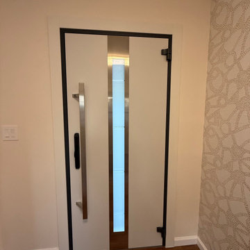
Deux 1717 Gray Graphite Frosted Glass Description Your front door is your best defender. It protects you, your family, and your most valuable personal belongings from theft and damage. Furthermore, VDom Doors insulate your home from extreme weather conditions, as well as unwanted animals, insects, and dust from entering. Our doors have several superior features: - Single sheet of metal is used in construction. No welded seams are best as these can significantly weaken the structural integrity of the entranceway. Our doors are also more resilient to mechanic damage, such as sledgehammer strikes. - The advantage of a single, non-welded door is that it reduces interior internal condensation. Over time, condensation can negatively affect the door mechanisms. - Stiffening Ribs: These non-visible details add to our door's security. - Quality insulation serves to reduce unwanted external noise, as well as protect against extreme heat, and severe cold. Introducing the Deux collection of modern exterior entrance doors in a sleek gray graphite color. These doors are expertly crafted from a single sheet of metal with a sturdy Aluminum frame and threshold, ensuring both durability and security for your home. The exterior design features four horizontal strips and a vertical insert, creating a bold and modern look that will enhance the curb appeal of any home. The gray graphite color provides a contemporary and sophisticated feel, perfect for those who want to make a statement with their entrance. The interior design also boasts four horizontal strips and a vertical insert, creating a cohesive and stylish look throughout the home. With the Deux collection, you don't have to compromise on style or function. These modern front doors offer both, making them the perfect choice for homeowners who want to elevate the look of their home's exterior. Plus, with our user-friendly website and easy ordering process, you can have your new modern exterior entrance door delivered right to your doorstep. Upgrade your home's curb appeal
 United Porte Inc
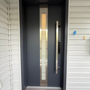
Deux 1717 Gray Graphite Frosted Glass Description Your front door is your best defender. It protects you, your family, and your most valuable personal belongings from theft and damage. Furthermore, VDom Doors insulate your home from extreme weather conditions, as well as unwanted animals, insects, and dust from entering. Our doors have several superior features: - Single sheet of metal is used in construction. No welded seams are best as these can significantly weaken the structural integrity of the entranceway. Our doors are also more resilient to mechanic damage, such as sledgehammer strikes. - The advantage of a single, non-welded door is that it reduces interior internal condensation. Over time, condensation can negatively affect the door mechanisms. - Stiffening Ribs: These non-visible details add to our door's security. - Quality insulation serves to reduce unwanted external noise, as well as protect against extreme heat, and severe cold. Introducing the Deux collection of modern exterior entrance doors in a sleek gray graphite color. These doors are expertly crafted from a single sheet of metal with a sturdy Aluminum frame and threshold, ensuring both durability and security for your home. The exterior design features four horizontal strips and a vertical insert, creating a bold and modern look that will enhance the curb appeal of any home. The gray graphite color provides a contemporary and sophisticated feel, perfect for those who want to make a statement with their entrance. The interior design also boasts four horizontal strips and a vertical insert, creating a cohesive and stylish look throughout the home. With the Deux collection, you don't have to compromise on style or function. These modern front doors offer both, making them the perfect choice for homeowners who want to elevate the look of their home's exterior. Plus, with our user-friendly website and easy ordering process, you can have your new modern exterior entrance door delivered right to your doorstep. Upgrade your home's curb appeal
 In Detail Interiors
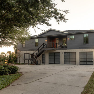
Collaboration of nature and modern home design
Often when motivations point to a more modern interior space, the direction of materials and furnishings leans to hard lines, harsh juxtaposition of cold finishes and a level of simplicity that can feel sterile. When broad horizons, airy space and modern inclinations was on this client’s wish list, we dug in on nailing the right overall schematic flow, affording opportunity for natural textures and selections in a warmer, neutral palette to collaborate in order to develop harmonious ambiance and depth. Notable project highlights were efforts to open up and carve out a chef’s kitchen with modern appliances, bold wooden & quartz-clad bar for gatherings, an extra guest bedroom off the entry that could double as a hide-away video game room, and a master suite with a more suitable layout for work at home office setup, optimized waterfront view potential, and fresh bathroom aesthetics.
Maximizing the architectural potential
Broad glass sliders, floor-to-ceiling fixed pane windows in a dark bronze metal finish and a magnificent custom mahogany front door added great architectural features to this formerly mostly characterless home. Appointing the right wall coverings and solid surface materials furthered the goals of flow, serenity and balance. Achieving a beautiful symbiosis of rich darks and soft lights, coastal-inspired textures in the furnishings – everything from the bleached wood-look tile floors to the thin bamboo burnout-pattern window treatments – work towards a multi-layered, coastal contemporary vibe inspired by the home’s natural surroundings that the client loved.
This client trusted the process; let us run with our vision for something completely unique and landed with an amazing turn-key project that exceeded all expectations, particularly with COVID and a hurricane taking out bridge access to the property. A primary residence sure – but we definitely also created a getaway in it’s own right. We love the transformation and know this home’s value increased substantially by the time we were done!


 Daniel Scerri Periti
We were approached with a request to design the furnishings for an existing ‘finished’ apartment. The intention was to move in relatively fast, and the property already had an existing marble floor, kitchen and bathrooms which had to be kept. The property also boasted a fantastic 270 degree view, seen from most of the apartment. The clients had a very important role in the completion of the project. They were very involved during the design process and through various decoration choices. The final design was kept as a rigid guideline when faced with picking out all the different elements.
Once clear of all previous furniture, the space felt cold and bare; so we immediately felt the need for warmth, and raw, natural elements and textures to complement the cold marble floor while visually tying in the design of the whole apartment together.
Since the existing kitchen had a touch of dark walnut stain, we felt this material was one we should add to the palette of materials to contest the stark materials. A raw cement finish was another material we felt would add an interesting contrast and could be used in a variety of ways, from cabinets to walls and ceilings, to tie up the design of various areas of the apartment.
To warm up the living/dining area, keeping the existing marble floor but visually creating zones within the large living/dining area without hindering the flow, a dark timber custom-made soffit, continuous with a floor-to-ceiling drinks cabinet zones the dining area, giving it a degree of much-needed warmth.
The various windows with a stupendous 270 degree view needed to be visually tied together. This was done by introducing a continuous sheer [drape] which also doubled up as a sound-absorbing material along 2 of the 4 walls of the space.
A very large sofa was required to fill up the space correctly, also required for the size of the young family.
Services were integrated within the units and soffits, while a customized design in the corner between the kitchen and the living room took into consideration the viewpoints from the main areas to create a pantry without hindering the flow or views. A strategically placed floor-to-ceiling mirror doubles up the space and extends the view to the inner parts of the apartment.
The daughter’s bedroom was a small challenge in itself, and a fun task, where we wanted to achieve the perception of a cozy niche with its own enclosed reading nook [for reading fairy tales], behind see-through curtains and a custom-ordered wall print sporting the girl’s favorite colors.
The sons’ bedroom had double the requirements in terms of space needed: more wardrobe, more homework desk space, a tv/play station area… “We combined a raised platform area between the boys’ beds to become an area with cushions where the kids can lay down and play, and face a hidden screen behind the homework desk’s sliding back panel for their play station”. The color of the homework desk was chosen in relation to the boys’ ages. A more masculine material palette was chosen for this room, in contrast to the light pastel palette of the girl’s bedroom. Again, this colour can easily be changed over time for a more mature look.
PROJECT DATA:
St. Paul’s Bay, Malta
DESIGN TEAM:
Perit Rebecca Zammit, Perit Daniel Scerri, Elyse Tonna
OTHER CREDITS:
Photography: Tonio Lombardi
Styling : TKS
 Daniel Scerri Periti
We were approached with a request to design the furnishings for an existing ‘finished’ apartment. The intention was to move in relatively fast, and the property already had an existing marble floor, kitchen and bathrooms which had to be kept. The property also boasted a fantastic 270 degree view, seen from most of the apartment. The clients had a very important role in the completion of the project. They were very involved during the design process and through various decoration choices. The final design was kept as a rigid guideline when faced with picking out all the different elements.
Once clear of all previous furniture, the space felt cold and bare; so we immediately felt the need for warmth, and raw, natural elements and textures to complement the cold marble floor while visually tying in the design of the whole apartment together.
Since the existing kitchen had a touch of dark walnut stain, we felt this material was one we should add to the palette of materials to contest the stark materials. A raw cement finish was another material we felt would add an interesting contrast and could be used in a variety of ways, from cabinets to walls and ceilings, to tie up the design of various areas of the apartment.
To warm up the living/dining area, keeping the existing marble floor but visually creating zones within the large living/dining area without hindering the flow, a dark timber custom-made soffit, continuous with a floor-to-ceiling drinks cabinet zones the dining area, giving it a degree of much-needed warmth.
The various windows with a stupendous 270 degree view needed to be visually tied together. This was done by introducing a continuous sheer [drape] which also doubled up as a sound-absorbing material along 2 of the 4 walls of the space.
A very large sofa was required to fill up the space correctly, also required for the size of the young family.
Services were integrated within the units and soffits, while a customized design in the corner between the kitchen and the living room took into consideration the viewpoints from the main areas to create a pantry without hindering the flow or views. A strategically placed floor-to-ceiling mirror doubles up the space and extends the view to the inner parts of the apartment.
The daughter’s bedroom was a small challenge in itself, and a fun task, where we wanted to achieve the perception of a cozy niche with its own enclosed reading nook [for reading fairy tales], behind see-through curtains and a custom-ordered wall print sporting the girl’s favorite colors.
The sons’ bedroom had double the requirements in terms of space needed: more wardrobe, more homework desk space, a tv/play station area… “We combined a raised platform area between the boys’ beds to become an area with cushions where the kids can lay down and play, and face a hidden screen behind the homework desk’s sliding back panel for their play station”. The color of the homework desk was chosen in relation to the boys’ ages. A more masculine material palette was chosen for this room, in contrast to the light pastel palette of the girl’s bedroom. Again, this colour can easily be changed over time for a more mature look.
PROJECT DATA:
St. Paul’s Bay, Malta
DESIGN TEAM:
Perit Rebecca Zammit, Perit Daniel Scerri, Elyse Tonna
OTHER CREDITS:
Photography: Tonio Lombardi
Styling : TKS
 Daniel Scerri Periti
We were approached with a request to design the furnishings for an existing ‘finished’ apartment. The intention was to move in relatively fast, and the property already had an existing marble floor, kitchen and bathrooms which had to be kept. The property also boasted a fantastic 270 degree view, seen from most of the apartment. The clients had a very important role in the completion of the project. They were very involved during the design process and through various decoration choices. The final design was kept as a rigid guideline when faced with picking out all the different elements.
Once clear of all previous furniture, the space felt cold and bare; so we immediately felt the need for warmth, and raw, natural elements and textures to complement the cold marble floor while visually tying in the design of the whole apartment together.
Since the existing kitchen had a touch of dark walnut stain, we felt this material was one we should add to the palette of materials to contest the stark materials. A raw cement finish was another material we felt would add an interesting contrast and could be used in a variety of ways, from cabinets to walls and ceilings, to tie up the design of various areas of the apartment.
To warm up the living/dining area, keeping the existing marble floor but visually creating zones within the large living/dining area without hindering the flow, a dark timber custom-made soffit, continuous with a floor-to-ceiling drinks cabinet zones the dining area, giving it a degree of much-needed warmth.
The various windows with a stupendous 270 degree view needed to be visually tied together. This was done by introducing a continuous sheer [drape] which also doubled up as a sound-absorbing material along 2 of the 4 walls of the space.
A very large sofa was required to fill up the space correctly, also required for the size of the young family.
Services were integrated within the units and soffits, while a customized design in the corner between the kitchen and the living room took into consideration the viewpoints from the main areas to create a pantry without hindering the flow or views. A strategically placed floor-to-ceiling mirror doubles up the space and extends the view to the inner parts of the apartment.
The daughter’s bedroom was a small challenge in itself, and a fun task, where we wanted to achieve the perception of a cozy niche with its own enclosed reading nook [for reading fairy tales], behind see-through curtains and a custom-ordered wall print sporting the girl’s favorite colors.
The sons’ bedroom had double the requirements in terms of space needed: more wardrobe, more homework desk space, a tv/play station area… “We combined a raised platform area between the boys’ beds to become an area with cushions where the kids can lay down and play, and face a hidden screen behind the homework desk’s sliding back panel for their play station”. The color of the homework desk was chosen in relation to the boys’ ages. A more masculine material palette was chosen for this room, in contrast to the light pastel palette of the girl’s bedroom. Again, this colour can easily be changed over time for a more mature look.
PROJECT DATA:
St. Paul’s Bay, Malta
DESIGN TEAM:
Perit Rebecca Zammit, Perit Daniel Scerri, Elyse Tonna
OTHER CREDITS:
Photography: Tonio Lombardi
Styling : TKS
 Cassoni Furniture & Accessories
- RIM DINING TABLE.
Tables in ground iron laser cut and assembled. Frame finishes: Glossy black nickel, satined bronze. Top finishes: Glass: Black Painted Glass, Bronze Mirror Glass, Wood Covered In Leather, Marble: Calacatta Oro, White Marble Emperador Dark, Brown Marble Wood: Glossy Ebony, Tobacco Tinted Oak, Grey Tinted Oak.
98''3/8W x 46''1/2D x 30’’H.
http://ow.ly/3yyHf1
- DAMSEL CHAIR.
Iron load-bearing frame with elastic webbing, padding in high density cold moulded foam. Given the special processing, both the leather and fabric upholsteries are not removable.
18''1/8W x 19''5/8D x 37’’H.
Seat height: 18’’1/8.
http://ow.ly/3yyEfa
- LADY CUPBOARD.
Wooden case available in glossy ebony, grey tinted oak, tobacco tinted oak or wood covered in leather. Wooden panels covered in leather with marble handles. Internal part satin covered with a glass shelf and lighted with LEDs. Ground iron base with drawer, laser cut in glossy black nickel or satined bronze finishes.
32''5/8W x 18''1/2D x 65’’H.
http://ow.ly/3yvEHl
- PARIS FLOOR LAMP.
Ground iron frame, with glossy black nickel or satined bronze finish. Lampshade white or black outside and gold inside, or satin fabric. Electrification 220v e 27.
Ø23''5/8 x 70''7/8H.
http://ow.ly/3yvs02
12