
Search results for "Commonly matching" in Home Design Ideas
 Dynamic Garage Door
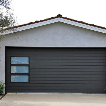
Renovation and construction of traditional homes in California is increasingly adopting a design concept that has an eclectic taste for the various architectural styles found throughout the sate. Dynamic Garage Door designs some of the most attractive eclectic garage door designs that are commonly applied to traditional, historical and newly constructed homes in California and the rest of the nation as well.
This custom modern garage door was designed with window panels offset to one side for dramatic curb appeal and to resonate the home's modernistic eclectic style. The overlay material is a paint grade eco-friendly material that his highly resistant to moisture, cracking splitting and salinity in the air since the home is located in Newport Beach close to the ocean. The dark paint that was selected makes an outstanding contrast between the earthy colored exterior walls while offering continuity of the rest of the home's windows and doors alike. The actual glass is safety, white laminate glass that offers privacy inside the garage while allowing ample natural light to bathe the interior of the garage during the day. Offsetting the location of the windows also creates dramatic interest and a unique design concept that is formidably trendy in eclectic style homes.
Designing and building eclectic style garage doors is one of the many talents our in-house designers and craftsmen do well. Our garage doors are absolutely unique, high-quality and second to nothing. We are leaders in the garage door design industry and our forté is customization! Don't expect to select a door from a preset brochure but rather allow us to innovate, create and inspire your own taste and home's eclectic essence!
 Advance Design Studio, Ltd.
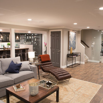
Karen and Chad of Tower Lakes, IL were tired of their unfinished basement functioning as nothing more than a storage area and depressing gym. They wanted to increase the livable square footage of their home with a cohesive finished basement design, while incorporating space for the kids and adults to hang out.
“We wanted to make sure that upon renovating the basement, that we can have a place where we can spend time and watch movies, but also entertain and showcase the wine collection that we have,” Karen said.
After a long search comparing many different remodeling companies, Karen and Chad found Advance Design Studio. They were drawn towards the unique “Common Sense Remodeling” process that simplifies the renovation experience into predictable steps focused on customer satisfaction.
“There are so many other design/build companies, who may not have transparency, or a focused process in mind and I think that is what separated Advance Design Studio from the rest,” Karen said.
Karen loved how designer Claudia Pop was able to take very high-level concepts, “non-negotiable items” and implement them in the initial 3D drawings. Claudia and Project Manager DJ Yurik kept the couple in constant communication through the project. “Claudia was very receptive to the ideas we had, but she was also very good at infusing her own points and thoughts, she was very responsive, and we had an open line of communication,” Karen said.
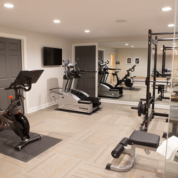
A very important part of the basement renovation for the couple was the home gym and sauna. The “high-end hotel” look and feel of the openly blended work out area is both highly functional and beautiful to look at. The home sauna gives them a place to relax after a long day of work or a tough workout. “The gym was a very important feature for us,” Karen said. “And I think (Advance Design) did a very great job in not only making the gym a functional area, but also an aesthetic point in our basement”.
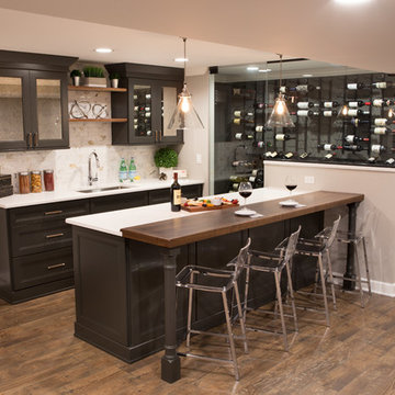
An extremely unique wow-factor in this basement is the walk in glass wine cellar that elegantly displays Karen and Chad’s extensive wine collection. Immediate access to the stunning wet bar accompanies the wine cellar to make this basement a popular spot for friends and family.
The custom-built wine bar brings together two natural elements; Calacatta Vicenza Quartz and thick distressed Black Walnut. Sophisticated yet warm Graphite Dura Supreme cabinetry provides contrast to the soft beige walls and the Calacatta Gold backsplash. An undermount sink across from the bar in a matching Calacatta Vicenza Quartz countertop adds functionality and convenience to the bar, while identical distressed walnut floating shelves add an interesting design element and increased storage. Rich true brown Rustic Oak hardwood floors soften and warm the space drawing all the areas together.
Across from the bar is a comfortable living area perfect for the family to sit down at a watch a movie. A full bath completes this finished basement with a spacious walk-in shower, Cocoa Brown Dura Supreme vanity with Calacatta Vicenza Quartz countertop, a crisp white sink and a stainless-steel Voss faucet.
Advance Design’s Common Sense process gives clients the opportunity to walk through the basement renovation process one step at a time, in a completely predictable and controlled environment. “Everything was designed and built exactly how we envisioned it, and we are really enjoying it to it’s full potential,” Karen said.
Constantly striving for customer satisfaction, Advance Design’s success is heavily reliant upon happy clients referring their friends and family. “We definitely will and have recommended Advance Design Studio to friends who are looking to embark on a remodeling project small or large,” Karen exclaimed at the completion of her project.
 Gallery KBNY
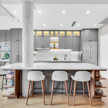
A classic West Side loft in Hell’s Kitchen, Gallery’s main task was to renovate the large kitchen. The clients like to entertain, so in addition to remodeling the aesthetic, we expanded the footprint of the island and built an entirely new bar at the opposite end of the kitchen. Some design choices are a natural fit for the space. In this case, that meant leaning into the industrial vibe of the exposed concrete while bringing in some character with the material choices.
INDUSTRIAL CHIC
With an industrial aesthetic in mind, gray was a natural color choice for the fully custom Miralis cabinets. The backsplash was designed in a subway brick pattern, but rather than the typical porcelain or marble, a clay tile in a white matte tone resembling cement was chosen to further coordinate with the exposed concrete.
Stacked cabinets were installed to accommodate the tall loft ceilings. For contrast, we incorporated glass front cabinetry with lighting in some areas. The resulting marriage of concrete, glass, and wood is well-matched for an industrial chic loft kitchen.
Further highlighting the homeowners’ love of entertaining, we also built an entirely custom bar at one end of the space, featuring open shelving in contrasting wood tones with underlighting and a custom mirrored backsplash for an authentic bar feel.
ADVENTURES IN APPROACHING COLUMNS
Loft renovations tend to come with two common needs: how to fill all that space tastefully and how to work with those ever present columns. In the case of this loft kitchen renovation, it suited the industrial aesthetic not to wrap the concrete column as one typically would, but rather to leave it exposed, accentuating the raw character of the space. Partially as a result, the island expanded too, creating more room for functional additions such as a built-in microwave, wine fridge, and more open shelving to match the bar, outlined with a countertop overhang to optimize counter space and chair storage.
ANCHORED IN SYMMETRY
With a loft space as unusually large as this one, an ideal design strategy, especially when high ceilings are involved, is to anchor the kitchen on opposing sides. Here, one side is anchored by a large floor-to-ceiling pantry, while the other is anchored by the counter-depth fridge with cabinetry above. The connecting element is the counter space in the middle, resulting in the visual impact of a long kitchen run within the open floor plan of a loft.
SOME HIGHLIGHTS
- Entirely custom-built bar with custom mirrored backsplash templated specifically for this project
- Large, oversized island with seating all around, open shelving, and built-in microwave
- Subway backsplash tiles in clay rather than porcelain or marble
- Olympian white marble countertops
Considering a kitchen loft renovation in New York? Our expertise is in renovating all kinds of New York Spaces, from gut renovations of historic landmark buildings like brownstones and townhomes to kitchens and bathrooms in lofts and other apartments in managed buildings. Contact us to find out if our full-scale design-and-build approach is right for your project.
Find the right local pro for your project
 Klopf Architecture
Built for the Bluff, A Sea Ranch Home is Remade from the Inside Out
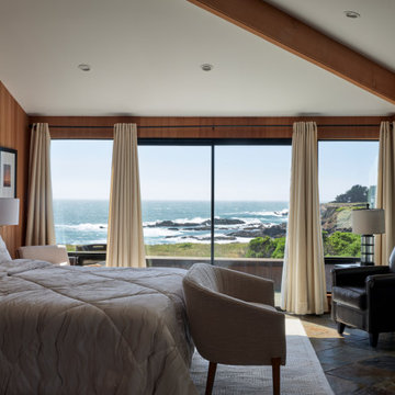
The house had always been grounded, on an ocean bluff at The Sea Ranch. It sits unencumbered, adjacent to one of the most dramatic stretches of the Sonoma coast with protected commons meadow to the east, uninterrupted Pacific views to the west, and a bluff trail running alongside. What it lacked was the feeling of home, one that could hold up its own against the natural landscape.
The owners are entrepreneurs with deep involvement across tech, real estate, and development and they know how things are built. The Sea Ranch house had been in their lives for years, a second residence and a place for family to gather. Built for a different time, it felt more compromising than comfortable. Sitting in a closed off nook, the kitchen fit one cook at a time and turned its back on the rest of the house. The entry was dim and compressed, divided by a structural column that presented itself at exactly the wrong moment. The primary suite was small relative to the view outside it. A large rear bedroom sat behind a lowered ceiling with a bathroom that had never been added. The house was certainly worth the trouble of doing it right.
What followed was not one project but four, each with its own design challenge, each addressed over a period of time.
Where the House Meets the Ocean
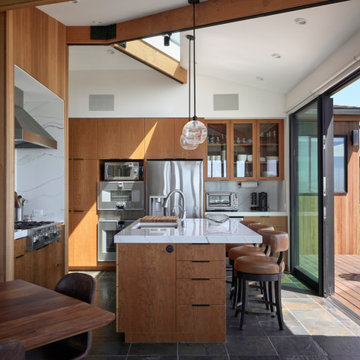
The most complex piece of the project, in both structural and spatial terms, was the kitchen expansion. The existing room was a single-person galley squeezed in as an afterthought with no meaningful connection to the dining room, the living space, or the deck outside. To make it useful for a family that cooks and gathers, it needed to grow outward into an existing patio and flow into the rooms around it.
A big challenge was the roofline. Several planes at different pitches and angles converged directly where additional volume was needed. A new form had to join that geometry without reading as a correction. The solution found the simplest possible connection between the existing angles, a roofline that from outside the structure, appears entirely original. From the bluff trail where the addition is visible, there is no discernible seam.
Inside, the kitchen is now open to the living and dining rooms without interruption. A large sliding glass door connects the space onto the rear deck. The deck itself was expanded and oriented so that the body of the house shields it from the coastal wind which is a common consideration that determines whether outdoor space at The Sea Ranch actually gets used. The result is a room that works for large family gatherings where no one feels cutoff, and one that makes the boundary between being inside and outside easy to ignore.
Welcoming Light
A structural column stood at the convergence of eight distinct roof planes in the entry. It was load-bearing, but it was also the reason the entry had always felt like a hallway rather than a welcoming arrival.
With the structural engineer, a custom steel connector was designed to receive beams from six separate directions, redistributing the load through a single new continuous beam. The column was surgically removed. Three triangular skylights were then cut into the roof above, their shapes drawn from the
existing geometry of the planes around them. The entry is now bright and open. The skylights feel native to the structure because they follow the logic already present in the roof.
Two Suites, Two Views
At opposite ends of the house, the two bedroom suites were each reconfigured, and each found a different way to introduce more of the landscape into the room.
An addition to the primary suite extended the structure outward to create a wraparound plan with a loop from the bedroom through bath and closet that had not been possible before. The expansion opened a slot view from the tub and shower toward the ocean. The view is precise and private. The ocean view is present and deliberate.
The rear bedroom absorbed an adjacent storage room to transform it into a full second suite with a vaulted ceiling, a large bathroom with a tub, a shower, and a sauna. A private fenced garden courtyard sits just beyond the glass bringing the outdoors inside. The tub was placed so that, looking past the courtyard and through the bedroom beyond, the ocean is visible at the far end. It is a long view and it makes the room feel larger and more settled than its footprint would suggest.
Glass on Four Sides, Fire at the Center
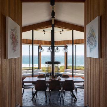
The main living and gathering room had always been caught between two competing facts: glass on four sides meant exceptional views but at The Sea Ranch, it also meant a cold room. A 360-degree cylindrical fireplace was added at the center on a raised stone base, providing radiant heat in every direction and giving the room a focal point around which a group naturally orients itself, whether that means two people at the end of the day or the whole family after dinner.
Owners Who Picked Up the Tools
The owner was not a passive client. they came with construction knowledge, specific ideas, and the desire to be an active part of the process, a dynamic that other architects may had found difficult, which Klopf Architecture accepted as an asset. They took it upon themselves to complete some of the work during construction, including the installation of a new radiant heating system beneath the floors.
The radiant system added to the older and less-desirable forced-air setup. At The Sea Ranch, that change matters as the house sits close enough to the ocean and moving air competes with the sound of it, where radiant heat does not. Solar panels were added to the roof as part of the new system. Insulation was upgraded throughout the walls, roof, and crawl space. The house that had always had the right setting now holds warmth the way a house on the bluff should.
They were also deeply involved in the design and selections throughout, and the finished house reflects both of them in ways that are specific rather than generic. The process took longer and moved through more iterations than a more arms-length relationship might have allowed. The result is more defined and personal because of it.
The Landscape Holds Priority
Every exterior decision was shaped by The Sea Ranch Design Standards, which require that buildings defer to the landscape around them rather than compete with it. Because this house sits on the bluff and is visible from the public trail, the additions faced a close review. Existing materials were matched. Geometries were resolved. The additions had to become indistinguishable from the original building.
From the trail, the house reads exactly as it always has — low, cedar-clad, secondary to the meadow and the water. The setting holds priority. Inside, the house has been remade.
Klopf Architecture Project Team: Geoff Campen and Trenton Jewett
Contractor: Shawn Bettega Construction
Photography: ©2025 Mariko Reed
Year Completed: 2023
Location: The Sea Ranch, CA
 Klopf Architecture
Built for the Bluff, A Sea Ranch Home is Remade from the Inside Out
The house had always been grounded, on an ocean bluff at The Sea Ranch. It sits unencumbered, adjacent to one of the most dramatic stretches of the Sonoma coast with protected commons meadow to the east, uninterrupted Pacific views to the west, and a bluff trail running alongside. What it lacked was the feeling of home, one that could hold up its own against the natural landscape.
The owners are entrepreneurs with deep involvement across tech, real estate, and development and they know how things are built. The Sea Ranch house had been in their lives for years, a second residence and a place for family to gather. Built for a different time, it felt more compromising than comfortable. Sitting in a closed off nook, the kitchen fit one cook at a time and turned its back on the rest of the house. The entry was dim and compressed, divided by a structural column that presented itself at exactly the wrong moment. The primary suite was small relative to the view outside it. A large rear bedroom sat behind a lowered ceiling with a bathroom that had never been added. The house was certainly worth the trouble of doing it right.
What followed was not one project but four, each with its own design challenge, each addressed over a period of time.
Where the House Meets the Ocean
The most complex piece of the project, in both structural and spatial terms, was the kitchen expansion. The existing room was a single-person galley squeezed in as an afterthought with no meaningful connection to the dining room, the living space, or the deck outside. To make it useful for a family that cooks and gathers, it needed to grow outward into an existing patio and flow into the rooms around it.
A big challenge was the roofline. Several planes at different pitches and angles converged directly where additional volume was needed. A new form had to join that geometry without reading as a correction. The solution found the simplest possible connection between the existing angles, a roofline that from outside the structure, appears entirely original. From the bluff trail where the addition is visible, there is no discernible seam.
Inside, the kitchen is now open to the living and dining rooms without interruption. A large sliding glass door connects the space onto the rear deck. The deck itself was expanded and oriented so that the body of the house shields it from the coastal wind which is a common consideration that determines whether outdoor space at The Sea Ranch actually gets used. The result is a room that works for large family gatherings where no one feels cutoff, and one that makes the boundary between being inside and outside easy to ignore.
Welcoming Light
A structural column stood at the convergence of eight distinct roof planes in the entry. It was load-bearing, but it was also the reason the entry had always felt like a hallway rather than a welcoming arrival.
With the structural engineer, a custom steel connector was designed to receive beams from six separate directions, redistributing the load through a single new continuous beam. The column was surgically removed. Three triangular skylights were then cut into the roof above, their shapes drawn from the
existing geometry of the planes around them. The entry is now bright and open. The skylights feel native to the structure because they follow the logic already present in the roof.
Two Suites, Two Views
At opposite ends of the house, the two bedroom suites were each reconfigured, and each found a different way to introduce more of the landscape into the room.
An addition to the primary suite extended the structure outward to create a wraparound plan with a loop from the bedroom through bath and closet that had not been possible before. The expansion opened a slot view from the tub and shower toward the ocean. The view is precise and private. The ocean view is present and deliberate.
The rear bedroom absorbed an adjacent storage room to transform it into a full second suite with a vaulted ceiling, a large bathroom with a tub, a shower, and a sauna. A private fenced garden courtyard sits just beyond the glass bringing the outdoors inside. The tub was placed so that, looking past the courtyard and through the bedroom beyond, the ocean is visible at the far end. It is a long view and it makes the room feel larger and more settled than its footprint would suggest.
Glass on Four Sides, Fire at the Center
The main living and gathering room had always been caught between two competing facts: glass on four sides meant exceptional views but at The Sea Ranch, it also meant a cold room. A 360-degree cylindrical fireplace was added at the center on a raised stone base, providing radiant heat in every direction and giving the room a focal point around which a group naturally orients itself, whether that means two people at the end of the day or the whole family after dinner.
Owners Who Picked Up the Tools
The owner was not a passive client. they came with construction knowledge, specific ideas, and the desire to be an active part of the process, a dynamic that other architects may had found difficult, which Klopf Architecture accepted as an asset. They took it upon themselves to complete some of the work during construction, including the installation of a new radiant heating system beneath the floors.
The radiant system added to the older and less-desirable forced-air setup. At The Sea Ranch, that change matters as the house sits close enough to the ocean and moving air competes with the sound of it, where radiant heat does not. Solar panels were added to the roof as part of the new system. Insulation was upgraded throughout the walls, roof, and crawl space. The house that had always had the right setting now holds warmth the way a house on the bluff should.
They were also deeply involved in the design and selections throughout, and the finished house reflects both of them in ways that are specific rather than generic. The process took longer and moved through more iterations than a more arms-length relationship might have allowed. The result is more defined and personal because of it.
The Landscape Holds Priority
Every exterior decision was shaped by The Sea Ranch Design Standards, which require that buildings defer to the landscape around them rather than compete with it. Because this house sits on the bluff and is visible from the public trail, the additions faced a close review. Existing materials were matched. Geometries were resolved. The additions had to become indistinguishable from the original building.
From the trail, the house reads exactly as it always has — low, cedar-clad, secondary to the meadow and the water. The setting holds priority. Inside, the house has been remade.
Klopf Architecture Project Team: Geoff Campen and Trenton Jewett
Contractor: Shawn Bettega Construction
Photography: ©2025 Mariko Reed
Year Completed: 2023
Location: The Sea Ranch, CA
 Klopf Architecture
Built for the Bluff, A Sea Ranch Home is Remade from the Inside Out
The house had always been grounded, on an ocean bluff at The Sea Ranch. It sits unencumbered, adjacent to one of the most dramatic stretches of the Sonoma coast with protected commons meadow to the east, uninterrupted Pacific views to the west, and a bluff trail running alongside. What it lacked was the feeling of home, one that could hold up its own against the natural landscape.
The owners are entrepreneurs with deep involvement across tech, real estate, and development and they know how things are built. The Sea Ranch house had been in their lives for years, a second residence and a place for family to gather. Built for a different time, it felt more compromising than comfortable. Sitting in a closed off nook, the kitchen fit one cook at a time and turned its back on the rest of the house. The entry was dim and compressed, divided by a structural column that presented itself at exactly the wrong moment. The primary suite was small relative to the view outside it. A large rear bedroom sat behind a lowered ceiling with a bathroom that had never been added. The house was certainly worth the trouble of doing it right.
What followed was not one project but four, each with its own design challenge, each addressed over a period of time.
Where the House Meets the Ocean
The most complex piece of the project, in both structural and spatial terms, was the kitchen expansion. The existing room was a single-person galley squeezed in as an afterthought with no meaningful connection to the dining room, the living space, or the deck outside. To make it useful for a family that cooks and gathers, it needed to grow outward into an existing patio and flow into the rooms around it.
A big challenge was the roofline. Several planes at different pitches and angles converged directly where additional volume was needed. A new form had to join that geometry without reading as a correction. The solution found the simplest possible connection between the existing angles, a roofline that from outside the structure, appears entirely original. From the bluff trail where the addition is visible, there is no discernible seam.
Inside, the kitchen is now open to the living and dining rooms without interruption. A large sliding glass door connects the space onto the rear deck. The deck itself was expanded and oriented so that the body of the house shields it from the coastal wind which is a common consideration that determines whether outdoor space at The Sea Ranch actually gets used. The result is a room that works for large family gatherings where no one feels cutoff, and one that makes the boundary between being inside and outside easy to ignore.
Welcoming Light
A structural column stood at the convergence of eight distinct roof planes in the entry. It was load-bearing, but it was also the reason the entry had always felt like a hallway rather than a welcoming arrival.
With the structural engineer, a custom steel connector was designed to receive beams from six separate directions, redistributing the load through a single new continuous beam. The column was surgically removed. Three triangular skylights were then cut into the roof above, their shapes drawn from the
existing geometry of the planes around them. The entry is now bright and open. The skylights feel native to the structure because they follow the logic already present in the roof.
Two Suites, Two Views
At opposite ends of the house, the two bedroom suites were each reconfigured, and each found a different way to introduce more of the landscape into the room.
An addition to the primary suite extended the structure outward to create a wraparound plan with a loop from the bedroom through bath and closet that had not been possible before. The expansion opened a slot view from the tub and shower toward the ocean. The view is precise and private. The ocean view is present and deliberate.
The rear bedroom absorbed an adjacent storage room to transform it into a full second suite with a vaulted ceiling, a large bathroom with a tub, a shower, and a sauna. A private fenced garden courtyard sits just beyond the glass bringing the outdoors inside. The tub was placed so that, looking past the courtyard and through the bedroom beyond, the ocean is visible at the far end. It is a long view and it makes the room feel larger and more settled than its footprint would suggest.
Glass on Four Sides, Fire at the Center
The main living and gathering room had always been caught between two competing facts: glass on four sides meant exceptional views but at The Sea Ranch, it also meant a cold room. A 360-degree cylindrical fireplace was added at the center on a raised stone base, providing radiant heat in every direction and giving the room a focal point around which a group naturally orients itself, whether that means two people at the end of the day or the whole family after dinner.
Owners Who Picked Up the Tools
The owner was not a passive client. they came with construction knowledge, specific ideas, and the desire to be an active part of the process, a dynamic that other architects may had found difficult, which Klopf Architecture accepted as an asset. They took it upon themselves to complete some of the work during construction, including the installation of a new radiant heating system beneath the floors.
The radiant system added to the older and less-desirable forced-air setup. At The Sea Ranch, that change matters as the house sits close enough to the ocean and moving air competes with the sound of it, where radiant heat does not. Solar panels were added to the roof as part of the new system. Insulation was upgraded throughout the walls, roof, and crawl space. The house that had always had the right setting now holds warmth the way a house on the bluff should.
They were also deeply involved in the design and selections throughout, and the finished house reflects both of them in ways that are specific rather than generic. The process took longer and moved through more iterations than a more arms-length relationship might have allowed. The result is more defined and personal because of it.
The Landscape Holds Priority
Every exterior decision was shaped by The Sea Ranch Design Standards, which require that buildings defer to the landscape around them rather than compete with it. Because this house sits on the bluff and is visible from the public trail, the additions faced a close review. Existing materials were matched. Geometries were resolved. The additions had to become indistinguishable from the original building.
From the trail, the house reads exactly as it always has — low, cedar-clad, secondary to the meadow and the water. The setting holds priority. Inside, the house has been remade.
Klopf Architecture Project Team: Geoff Campen and Trenton Jewett
Contractor: Shawn Bettega Construction
Photography: ©2025 Mariko Reed
Year Completed: 2023
Location: The Sea Ranch, CA
 Advance Design Studio, Ltd.
Karen and Chad of Tower Lakes, IL were tired of their unfinished basement functioning as nothing more than a storage area and depressing gym. They wanted to increase the livable square footage of their home with a cohesive finished basement design, while incorporating space for the kids and adults to hang out.
“We wanted to make sure that upon renovating the basement, that we can have a place where we can spend time and watch movies, but also entertain and showcase the wine collection that we have,” Karen said.
After a long search comparing many different remodeling companies, Karen and Chad found Advance Design Studio. They were drawn towards the unique “Common Sense Remodeling” process that simplifies the renovation experience into predictable steps focused on customer satisfaction.
“There are so many other design/build companies, who may not have transparency, or a focused process in mind and I think that is what separated Advance Design Studio from the rest,” Karen said.
Karen loved how designer Claudia Pop was able to take very high-level concepts, “non-negotiable items” and implement them in the initial 3D drawings. Claudia and Project Manager DJ Yurik kept the couple in constant communication through the project. “Claudia was very receptive to the ideas we had, but she was also very good at infusing her own points and thoughts, she was very responsive, and we had an open line of communication,” Karen said.
A very important part of the basement renovation for the couple was the home gym and sauna. The “high-end hotel” look and feel of the openly blended work out area is both highly functional and beautiful to look at. The home sauna gives them a place to relax after a long day of work or a tough workout. “The gym was a very important feature for us,” Karen said. “And I think (Advance Design) did a very great job in not only making the gym a functional area, but also an aesthetic point in our basement”.
An extremely unique wow-factor in this basement is the walk in glass wine cellar that elegantly displays Karen and Chad’s extensive wine collection. Immediate access to the stunning wet bar accompanies the wine cellar to make this basement a popular spot for friends and family.
The custom-built wine bar brings together two natural elements; Calacatta Vicenza Quartz and thick distressed Black Walnut. Sophisticated yet warm Graphite Dura Supreme cabinetry provides contrast to the soft beige walls and the Calacatta Gold backsplash. An undermount sink across from the bar in a matching Calacatta Vicenza Quartz countertop adds functionality and convenience to the bar, while identical distressed walnut floating shelves add an interesting design element and increased storage. Rich true brown Rustic Oak hardwood floors soften and warm the space drawing all the areas together.
Across from the bar is a comfortable living area perfect for the family to sit down at a watch a movie. A full bath completes this finished basement with a spacious walk-in shower, Cocoa Brown Dura Supreme vanity with Calacatta Vicenza Quartz countertop, a crisp white sink and a stainless-steel Voss faucet.
Advance Design’s Common Sense process gives clients the opportunity to walk through the basement renovation process one step at a time, in a completely predictable and controlled environment. “Everything was designed and built exactly how we envisioned it, and we are really enjoying it to it’s full potential,” Karen said.
Constantly striving for customer satisfaction, Advance Design’s success is heavily reliant upon happy clients referring their friends and family. “We definitely will and have recommended Advance Design Studio to friends who are looking to embark on a remodeling project small or large,” Karen exclaimed at the completion of her project.

 Advance Design Studio, Ltd.
Karen and Chad of Tower Lakes, IL were tired of their unfinished basement functioning as nothing more than a storage area and depressing gym. They wanted to increase the livable square footage of their home with a cohesive finished basement design, while incorporating space for the kids and adults to hang out.
“We wanted to make sure that upon renovating the basement, that we can have a place where we can spend time and watch movies, but also entertain and showcase the wine collection that we have,” Karen said.
After a long search comparing many different remodeling companies, Karen and Chad found Advance Design Studio. They were drawn towards the unique “Common Sense Remodeling” process that simplifies the renovation experience into predictable steps focused on customer satisfaction.
“There are so many other design/build companies, who may not have transparency, or a focused process in mind and I think that is what separated Advance Design Studio from the rest,” Karen said.
Karen loved how designer Claudia Pop was able to take very high-level concepts, “non-negotiable items” and implement them in the initial 3D drawings. Claudia and Project Manager DJ Yurik kept the couple in constant communication through the project. “Claudia was very receptive to the ideas we had, but she was also very good at infusing her own points and thoughts, she was very responsive, and we had an open line of communication,” Karen said.
A very important part of the basement renovation for the couple was the home gym and sauna. The “high-end hotel” look and feel of the openly blended work out area is both highly functional and beautiful to look at. The home sauna gives them a place to relax after a long day of work or a tough workout. “The gym was a very important feature for us,” Karen said. “And I think (Advance Design) did a very great job in not only making the gym a functional area, but also an aesthetic point in our basement”.
An extremely unique wow-factor in this basement is the walk in glass wine cellar that elegantly displays Karen and Chad’s extensive wine collection. Immediate access to the stunning wet bar accompanies the wine cellar to make this basement a popular spot for friends and family.
The custom-built wine bar brings together two natural elements; Calacatta Vicenza Quartz and thick distressed Black Walnut. Sophisticated yet warm Graphite Dura Supreme cabinetry provides contrast to the soft beige walls and the Calacatta Gold backsplash. An undermount sink across from the bar in a matching Calacatta Vicenza Quartz countertop adds functionality and convenience to the bar, while identical distressed walnut floating shelves add an interesting design element and increased storage. Rich true brown Rustic Oak hardwood floors soften and warm the space drawing all the areas together.
Across from the bar is a comfortable living area perfect for the family to sit down at a watch a movie. A full bath completes this finished basement with a spacious walk-in shower, Cocoa Brown Dura Supreme vanity with Calacatta Vicenza Quartz countertop, a crisp white sink and a stainless-steel Voss faucet.
Advance Design’s Common Sense process gives clients the opportunity to walk through the basement renovation process one step at a time, in a completely predictable and controlled environment. “Everything was designed and built exactly how we envisioned it, and we are really enjoying it to it’s full potential,” Karen said.
Constantly striving for customer satisfaction, Advance Design’s success is heavily reliant upon happy clients referring their friends and family. “We definitely will and have recommended Advance Design Studio to friends who are looking to embark on a remodeling project small or large,” Karen exclaimed at the completion of her project.
 Crystal Kitchen + Bath
Tying multiple floors together using 6”x36” dark grey wood-looking tile, laid on a staggered patterned worked well with the tile and concrete floors next to it.
Two-toned cabinetry of wired brushed hickory with a grey stain wash, combined with maple wood in a dark slate finish is a current trend.
Counter tops: combination of splashy granite and white Caesarstone grounded the display. A custom-designed table of ash wood, with heavy distressing and grey washed stain added warmth.
Show custom features:
Arched glass door cabinets with crown moulding to match.
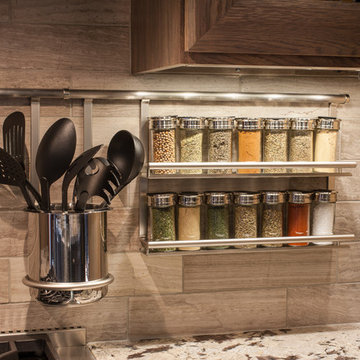
Unique Features: drawer in drawer for pot lids, pull out drawer in toe kick for dog dishes, toe space step stool, swing up mixer shelf, pull out spice storage.
Built in Banquette seating with table and docking station for family meals and working.
Custom open shelves and wine rack with detailed legs anchor the three sides of the island.
Backsplash rail with spice rack, knife and utensil holder add more storage space.
A floating soffit matches the shape of island and helps lower the showroom ceiling height to what would be found in a normal home. It includes: pendant lights for the snack bar, chandelier for the table and recess for task lights over the sink.
The large triangular shaped island has eleven foot legs. It fills the unusual space and creates three separate areas: a work space, snack bar/room divider and table area.
 CRC Builders Inc.
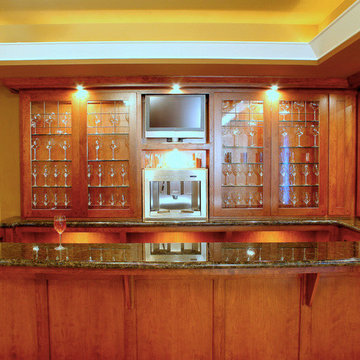
The homeowner wanted something different, out of the ordinary, as an entertainment center and bar combination that would add an unusual dimension to watching TV. It had to be in character with the rest of the residence, tastefully designed and executed to deliver the maximum effect.
A two-piece combination bar and seating, coupled with a fireplace and large screen TV was designed. A system was designed and custom built cabinet consisting of a radius front entertainment center houses a large flat screen TV and enclosed stereo speakers on the top level, and a gas log fireplace below.
A custom built see-through bar sports a matching radius front, plenty of storage, and room for three to eat, drink, and enjoy the warmth of the fireplace without missing any of the action on the TV. For even greater functionality, the TV is also viewable through the large opening in the bar while meals or snacks are prepared from the kitchen. Traffic flow is unique: access and egress between the bar front and TV can happen with ease around both sides of the bar, and the opening in the back of the bar provides for service both from and to the kitchen area. Because of the free and easy movement about the space, adequate lighting, and lack of combustibles at or on the fireplace, safety, as well as an ample use of space, are both achieved. Both pieces are custom fabricated from start to finish, and match each other identically in all respects. Both are constructed of clear cherry finish with a clear satin lacquer. Both enjoy chrome accents strips and custom crafted, glass cabinet doors with matching radii, and both are tastefully lit with accenting puck lights. The design and fabrication for both units shared issues in common as well as individually.
The entertainment center was fabricated in the shop in three units and then assembled onsite. The opening for the flat screen TV had to be carefully considered as it too had a radius and therefore had to be designed so that the TV would fit.
The entire bar system, except the countertop, had to be fabricated onsite due to the structural columns on either side between which the curved lower cabinets would rest. Then the countertop template was prepared, fabricated elsewhere, returned and installed. After the countertop was in place, the cabinetmaker had to wrap the two columns on either side as well as the overhead beam while making sure the joints at the columns and header maintained alignment. A complement of matching radii cabinet doors had to be constructed for both units. Radius glass inserts had to be ordered with precise dimensions to assure a perfect fit to openings with tight tolerances. Any mistake would have been expensive to correct. Because of the abundance of natural light into the space, the finishes had to be dead-on, otherwise every flaw would show. The custom walnut inlays were fabricated out of square stock, which protruded above the radius in each door. A jig matching the radius had to be designed and fabricated, then a router used to trim excess material and then sanded and finished.
Solving the multitude of challenges associated with the project was one of the parts that made the project fun and interesting. The homeowners now can entertain every night.
 CRC Builders Inc.
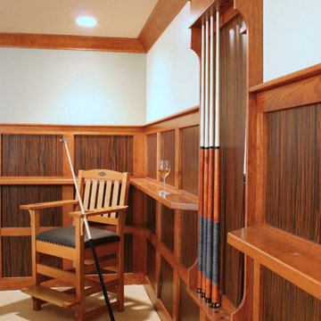
The homeowner wanted something different, out of the ordinary, as an entertainment center and bar combination that would add an unusual dimension to watching TV. It had to be in character with the rest of the residence, tastefully designed and executed to deliver the maximum effect.
A two-piece combination bar and seating, coupled with a fireplace and large screen TV was designed. A system was designed and custom built cabinet consisting of a radius front entertainment center houses a large flat screen TV and enclosed stereo speakers on the top level, and a gas log fireplace below.
A custom built see-through bar sports a matching radius front, plenty of storage, and room for three to eat, drink, and enjoy the warmth of the fireplace without missing any of the action on the TV. For even greater functionality, the TV is also viewable through the large opening in the bar while meals or snacks are prepared from the kitchen. Traffic flow is unique: access and egress between the bar front and TV can happen with ease around both sides of the bar, and the opening in the back of the bar provides for service both from and to the kitchen area. Because of the free and easy movement about the space, adequate lighting, and lack of combustibles at or on the fireplace, safety, as well as an ample use of space, are both achieved. Both pieces are custom fabricated from start to finish, and match each other identically in all respects. Both are constructed of clear cherry finish with a clear satin lacquer. Both enjoy chrome accents strips and custom crafted, glass cabinet doors with matching radii, and both are tastefully lit with accenting puck lights. The design and fabrication for both units shared issues in common as well as individually.
The entertainment center was fabricated in the shop in three units and then assembled onsite. The opening for the flat screen TV had to be carefully considered as it too had a radius and therefore had to be designed so that the TV would fit.
The entire bar system, except the countertop, had to be fabricated onsite due to the structural columns on either side between which the curved lower cabinets would rest. Then the countertop template was prepared, fabricated elsewhere, returned and installed. After the countertop was in place, the cabinetmaker had to wrap the two columns on either side as well as the overhead beam while making sure the joints at the columns and header maintained alignment. A complement of matching radii cabinet doors had to be constructed for both units. Radius glass inserts had to be ordered with precise dimensions to assure a perfect fit to openings with tight tolerances. Any mistake would have been expensive to correct. Because of the abundance of natural light into the space, the finishes had to be dead-on, otherwise every flaw would show. The custom walnut inlays were fabricated out of square stock, which protruded above the radius in each door. A jig matching the radius had to be designed and fabricated, then a router used to trim excess material and then sanded and finished.
Solving the multitude of challenges associated with the project was one of the parts that made the project fun and interesting. The homeowners now can entertain every night.

 julianhardacre
Top Tips for Selling a Home in 2016
Want to sell your house in 2016? It’s a great year to sell your home and if you go about it the right way you’ll get what it’s worth and maybe more.
Now I could write this post and do the usual “do this, “do that” type stuff but I wouldn’t be doing you any favors. Because unless you know your numbers and the value of your home, you could wind up leaving money on the table or even losing it.
So here you go.
If you want tips for selling your house in 2016, listen to me - a guy who has bought and sold hundreds of properties as a full-time professional Real Estate Investor. Before you repair anything or call a real estate agent…
...you have to know your numbers.
Tip #1: Know the After Repair Value (ARV) of Your Home
If you’re going to get the right amount of money for your house, you have to know the After Repair Value (ARV). Essentially this means that you should know what your home can sell for after it’s is 100% rehabbed.
If you have a house that you can sell for $120,000, you need to know that. If it will sell for $350,000, you need to know what you need to do to your house to get it there. At the same time, you don’t want to overdo it.
If you have a house that’s currently worth $100,000 as is and it can sell for $115,000 when it’s all fixed up, you may or may not want to put the money into a rehab job. If you put $10,000 in just to make an extra $5,000, it might not be worth the hassle.
So whatever you do, know what it’s worth now (as -is) and know what it’ll sell for afterward. If you want to find out how much your house is worth, there are plenty of agents out there who will give you comps (Comps is a term that is short for “Comparisons” that lets you determine an appraisal value for your home by comparing it to recently sold homes in your area that are similar to yours) or advice for free, so ask them.
So don’t over do it, but don’t be hesitant to put money into your house if it’ll yield a big payoff when you sell it.
TIP #2: Make Your Agent Work For You
After you determine your ARV and enlist a good agent to help you sell your home, It might be worthwhile to hop in their Escalade to drive around town and look at some high end houses in your area to see what kind of upgrades they have. And when you see a common theme, you’ll have a good idea as to what kind of upgrades you might want to do to be able to sell your house.
Granite? Concrete? Tile? Carpet? Wood floors?
It depends.
I don’t know your area or market so you have to do the research, ask your agent questions, and exercise wisdom. Every market is different and you don’t want to put money into an upgrade or rehab if it’s not the type of thing people in your area are looking for.
So talk to a competent agent, and even offer to pay them a bit more in commissions if they can sell your home for a higher price.
This is not a waste of money.
A good agent with a proven track record is worth every penny because they know exactly what needs to be done to sell your home for the most money.
Tip #3: Interior Improvements
So once you have an idea about what your home is worth, have a good agent, and have toured homes in your area to see what kind of upgrades homes in your area typically have, it's time to look at your interior to decide what you should and shouldn’t do to sell your house in 2016.
No matter what you do, you need to be wise about it. Maybe you live in non-traditional or funky house. That’s fine. Just go through 2 or 3 times with a notepad, write down the frustrations you have with it, and do what you need to do to make it functional, warm, beautiful, and inviting.
Interior must-haves:
1. Make sure your kitchen is functional.
2. Always have (or add) a 2nd bathroom: If you don’t have a second bathroom, build one. Sure it could cost you $5-$6k, but it could net you an additional $20k when you sell. No matter what you do, make sure there is a second bathroom. It’s a must.
1. Open floor plans are huge in 2016: If you don’t have one, first- make sure it’s right for your area, and if it is, create one. This might mean building or breaking down a wall, but it’ll pay off in the end.
2. Stage your house: Just do it. Staging your home means that you hire a home stager and/or an interior design consultant (like the lady on Love It or List It) to set up your home in the most inviting way possible and tell you everything you need to do to make it sell. You’ll pay some cash up front but staged homes are shown to sell for 6% to 10% higher according to realtor.org.
Tip #4: Exterior Improvements
Just like the interior, you have to make sure the exterior of your house looks appealing if you want to get the most value of your house in 2016.
Exterior must haves:
1. Add curb appeal: When people pull up to your house, most won’t even want to go inside or look at it unless it looks good from the curb. So make sure it looks gorgeous. Rake the leaves, plant some flowers, mow the lawn - make it inviting.
2. Make sure the picture on the MLS listing matches what your house currently looks like: People don’t want to look at a picture and pull up to your house, only to be disappointed.
3. Hire a professional photographer: This is crucial. It could mean the difference between someone viewing your house, or someone skipping it because the pictures look like a child took them. Hire a pro - it’s worth it. Ask me how I know.
4. Don’t paint your house diarrhea green or brown: This is just common sense. If you’re going to paint, use a neutral color. You don’t want to make your house unsellable because you chose an odd color or made a bad decision elsewhere.
Tip #5: Common Sense, Common Sense, Common Sense
No matter what you do or do not do, don’t make any hasty decisions. Ask your agent questions, look around, be observant, and don't do anything extreme. If you need to fix up your house to see a big profit, do it. If you have a modest budget and improvements won’t raise the value or your house (the ARV) anyways, don’t go crazy.
2016 is a great year to sell your house.
Do it right and do it wisely.
Cheers,
Nate
---
Nate Pyles is a long term Real Estate Investor who made it through the crash in 2008 and spends his week buying and selling houses for profit in the Boise, ID area. He runs House Flip Mentor, has 4 kids, a gorgeous wife, loves to fly, and even built his own Irish pub on his property.
 Architect
Why Mattress Thickness Is One of the Most Misunderstood Specs
When most people shop for a memory foam mattress, they focus on firmness, materials, and brand. Thickness tends to be an afterthought — or worse, treated as a proxy for quality. The assumption goes: thicker equals better. That assumption is wrong in a meaningful number of cases, and getting it wrong means waking up with exactly the kind of stiffness, pressure pain, or lower back ache you bought a new mattress to avoid.
The right thickness for a memory foam mattress is not a single number. It is a combination of your body weight, your sleep position, and any specific health conditions you are managing. A 14-inch mattress that provides ideal support for a 250-pound side sleeper may cause a 115-pound stomach sleeper to experience spinal misalignment all night. A 10-inch mattress that works perfectly for a back sleeper of average build offers inadequate pressure relief for a heavier side sleeper whose hips need to sink further into the comfort layer before the support base engages.
This guide maps thickness to the factors that actually determine whether a mattress works for your body. It covers the science of mattress layers, the three primary variables (weight, position, condition), and a complete decision table so you can find your ideal thickness without guesswork.
Understanding Mattress Thickness: Layers, Not Just Height
A memory foam mattress’s total thickness is the sum of its individual layers, and those layers serve entirely different functions. Two mattresses that are both 12 inches thick may feel radically different because their comfort layer depths and support core thicknesses are distributed differently.
The Two Parts That Matter
Every memory foam mattress has two functional zones: the comfort layer at the top and the support core at the bottom. The comfort layer — which in quality mattresses consists of gel-infused viscoelastic foam, transition foam, and a cooling cover — is the zone that contours to your body, relieves pressure, and cushions the joints. The support core — high-density foam or pocketed springs in a hybrid — is the zone that keeps the spine aligned and prevents the entire body from sinking into the mattress.
The key relationship is this: the comfort layer must be deep enough for your body’s heaviest pressure points to sink in fully before the firmer support core pushes back. If it is too shallow, those pressure points press against a firm surface and cause localised pain. If the support core is too thin, the whole mattress sags under body weight and the spine loses alignment regardless of how comfortable the top feels.
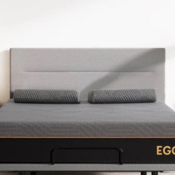
Here is how EGOHOME’s Black series layers map to these functions:
Layer
Material
Function
EGOHOME Technology
Cover (0.5–1")
Fabric + cooling tech
Temperature regulation, hygiene
Anti-heat™ Graphene Cooling Cover
Comfort layer (2–6")
Gel foam, AeroFusion™
Pressure relief, contouring
Copper Gel AeroFusion™ Foam
Transition layer (1–2")
Mid-density foam
Prevents sinkage past comfort zone
BraceSleeper™ Support Foam (upper)
Support core (6–12")
High-density foam or coils
Spinal alignment, edge support
BraceSleeper™ Support Foam (core)
Thickness alone does not tell you how a mattress will perform. A 14-inch mattress with a 2-inch comfort layer and a 12-inch support core will feel firm and supportive. A 14-inch mattress with a 6-inch comfort layer and an 8-inch support core will feel plush and contouring. Always check the comfort layer depth, not just the total inches.
Memory Foam Mattress Thickness Ranges: What Each Category Delivers
Here is a complete breakdown of what to expect from each thickness range and who each suits best:
Thickness
Profile
Best Use Case
Body Weight
Best Sleep Position
6–8"
Low profile
Children, bunk beds, guest rooms, adjustable bases
Under 130 lbs
Kids, lightweight, occasional use
8–10"
Standard-thin
Stomach sleepers, lightweight adults, budget setups
Under 130 lbs
Stomach, lightweight back sleepers
10–12"
Standard
Most adults, back sleepers, back pain relief
130–230 lbs
Back, stomach, combo sleepers
12–14"
High-profile
Side sleepers, plus-size, pressure relief
130–230 lbs+
Side sleepers, hip/shoulder pain
14"+
Premium
Plus-size sleepers, heavy duos, luxury setups
230 lbs+
Plus-size, side sleepers, chronic pain
6–8 Inches: Low-Profile (Specific Use Cases Only)
Low-profile mattresses in the 6 to 8 inch range are designed for specific applications rather than general adult use. They work well on bunk beds and trundle beds where height clearance is limited, for children’s beds where a lower sleep surface is safer, on adjustable bases where the mattress needs to flex significantly, and for lightweight individuals under 130 pounds who need minimal depth to reach the support core. For a standard adult of average build, a mattress under 8 inches is unlikely to provide adequate comfort layer depth for sustained pressure relief.
8–10 Inches: Standard-Thin (Stomach Sleepers and Lightweight Adults)
The 8 to 10 inch range is the practical starting point for most adult use. At this thickness, there is enough comfort layer to provide basic pressure relief without the excessive depth that allows heavier body sections to sink past the support zone. Stomach sleepers in particular benefit from this range: when sleeping face down, the goal is to keep the hips from sinking lower than the shoulders and chest, which would create a downward bow in the lumbar spine. A thinner mattress with a firmer feel prevents this hyperextension more reliably than a thicker, softer model. EGOHOME offers 8-inch memory foam options suited to this profile.
10–12 Inches: Standard (The Sweet Spot for Most Adults)
The 10 to 12 inch range is the most broadly appropriate thickness for adults of standard build. At this depth, a quality memory foam mattress contains enough comfort layer material to contour genuinely around the hips and shoulders without allowing the body to bottom out into the support core. It also contains enough support core depth to maintain spinal alignment under continuous body weight across seven or eight hours. Back sleepers of standard weight (130 to 230 pounds) typically find this range the most supportive, as the lumbar region receives adequate underlying resistance without the excessive softness that taller mattresses can develop under consistent pressure.
12–14 Inches: High-Profile (Side Sleepers and Plus-Size Sleepers)
The 12 to 14 inch range addresses two specific needs: side sleepers who require a deep enough comfort layer to allow the shoulder and hip to sink in while the waist remains supported, and heavier individuals whose body weight requires more foam depth before reaching full support core engagement. For a side sleeper of standard or higher body weight, a comfort layer of less than 4 to 6 inches is often not deep enough for the shoulder to sink fully into an aligned position. The result is an upward lateral bow in the thoracic spine that causes shoulder and upper back pain upon waking. The EGOHOME Black 14-inch Pro and Hybrid models are built specifically for this thickness range.
14 Inches and Above: Premium and Plus-Size
Mattresses at 14 inches or more are appropriate for plus-size sleepers over 230 pounds and for couples where one partner is significantly heavier. At higher body weights, a greater depth of both comfort material and support foam is required because the heavier load compresses the foam more aggressively. A support core that adequately resists a 160-pound sleeper may allow excessive sinkage under a 280-pound sleeper, causing the hips to drop past the point of lumbar support. EGOHOME’s Black 14-inch Firm model includes a 12-inch BraceSleeper™ Support Foam core specifically designed to resist this deep compression under higher body weights.
Thickness by Body Weight: The Primary Determining Factor
Body weight is the single most important variable in thickness selection because it directly determines how far the body sinks into the foam. The same mattress will feel completely different to a 120-pound sleeper versus a 240-pound sleeper, because the heavier person compresses the foam significantly more deeply.
Lightweight Sleepers (Under 130 lbs)
Lightweight sleepers do not need and often cannot benefit from thick mattresses. Because they exert less pressure on the foam, they may not compress a 14-inch mattress deeply enough to feel the support core at all, resulting in a floating sensation with insufficient underlying resistance. For lightweight sleepers, 8 to 10 inches provides adequate comfort layer depth for full pressure relief. The EGOHOME Black 10-inch Classic (medium feel) is the appropriate starting point for this weight category.
Standard-Weight Sleepers (130–230 lbs)
Standard-weight adults represent the broadest population of mattress buyers, and the 10 to 12 inch range was designed specifically for this group. At this weight range, the body compresses the comfort layer meaningfully enough for the foam to contour around pressure points, while the support core remains thick enough to prevent excessive sinkage. The EGOHOME Black 12-inch and the Black 10-inch ranges both address this category, with the 12-inch models being more appropriate for side sleepers who need the extra comfort layer depth.
Plus-Size Sleepers (Over 230 lbs)
Heavier sleepers require 12 to 14 inches at minimum to prevent bottoming out — the point at which body weight compresses through the comfort layer entirely and the sleeper feels the firm support core directly. Bottoming out eliminates pressure relief completely and can significantly worsen joint pain and lower back stiffness. EGOHOME recommends a suggested maximum of 300 pounds per person across their mattress range, and the 14-inch Hybrid and 14-inch Firm models are engineered with the deeper support cores required to handle higher body weights without performance degradation over time.
Thickness by Sleep Position: Matching Depth to Alignment Needs
Side Sleepers: 12 Inches or More
Side sleeping places the body’s heaviest pressure points — the shoulder and hip — in direct contact with the mattress. These points need to sink into the comfort layer deeply enough that the spine remains horizontal from head to toe. If the comfort layer is too thin or too firm, the shoulder cannot descend fully into the mattress, and the spine develops an upward lateral curve between the shoulder and the head. This causes the neck, shoulder, and upper back tension that many side sleepers report upon waking.
Side sleepers of standard weight need at least 12 inches, with a soft to medium-soft comfort layer. EGOHOME’s Black 12-inch Pro (soft feel, 7.5 out of 10 cooling score) is specifically recommended for side sleepers managing back, shoulder, or joint pain. The Black 14-inch Pro (medium-soft, 8 out of 10 cooling) adds additional comfort layer depth for those who need greater pressure relief.
Back Sleepers: 10–12 Inches
Back sleeping is the most spinal-alignment-friendly position because the body’s weight is distributed relatively evenly across the mattress. The primary challenge for back sleepers is lumbar support: the natural inward curve of the lower back creates a gap between the lumbar spine and the mattress surface that must be filled by the foam contouring upward into it. A mattress that is too soft allows the pelvis to sink excessively, flattening this curve and creating lower back compression. A mattress that is too firm cannot conform into the lumbar curve at all.
For back sleepers, 10 to 12 inches with a medium or medium-firm feel provides the optimal combination. EGOHOME’s Black 12-inch Hybrid (medium-firm, 6.5 out of 10 cooling) is specifically noted as ideal for back sleepers, combining pocketed spring zoned support with gel foam contouring for precise lumbar engagement.
Stomach Sleepers: 8–10 Inches
Stomach sleepers face the opposite alignment challenge from side sleepers. Rather than needing the mattress to yield deeply at the joints, they need the mattress to maintain a flat, firm surface that prevents the hips from sinking below the chest. If the hips drop lower than the upper body, the lumbar spine hyperextends into an arched position that compresses the posterior vertebral joints and causes significant lower back pain.
Stomach sleepers need a thinner mattress with a firmer feel. The EGOHOME Black 14-inch Firm is specifically recommended for stomach sleepers and heavier sleepers who need maximum surface resistance. Its 12-inch BraceSleeper™ Support Foam core provides the deep, unyielding base that prevents hip sinkage without requiring a thin mattress that compromises comfort.
Best Thickness for Back Pain: The Medium-Firm 10–12 Inch Principle
For people managing chronic lower back pain, herniated discs, sciatica, or general spinal stiffness, mattress thickness interacts with back health in a specific way that differs from general sleep comfort recommendations.
The key principle for back pain is controlled contouring. You need enough foam depth to relieve pressure at the hips and shoulders, but not so much depth that the foam develops a sag under the heavier sections of the body over time. Excessive thickness combined with a soft comfort layer is one of the most common causes of mattress-induced back pain — the sleeper sinks into a gentle hammock shape that feels comfortable initially but compresses the lumbar discs continuously throughout the night.
10–12 Inches: The Optimal Back Pain Range
A medium-firm mattress of 10 to 12 inches addresses both needs simultaneously. It provides adequate foam depth for genuine pressure relief at the hips and shoulders without the risk of comfort layer collapse that taller, softer mattresses can develop. The support core at this thickness is deep enough to maintain consistent lumbar support from the first night through years of regular use.
For side sleepers with lower back pain, the recommendation extends to 12 inches with a soft feel to ensure the hip can sink into full alignment. For back sleepers with lower back pain, 10 to 12 inches with a medium-firm feel is the target. For stomach sleepers with lower back pain, a firmer feel at any thickness is more important than depth — preventing hip sinkage is the priority.
⚠️ Mattresses over 14 inches with very soft comfort layers are a common hidden cause of lower back pain. The deep softness feels luxurious initially but allows the lumbar region to sag into misalignment through the night. If you sleep on a thick, very soft mattress and wake with lower back stiffness, the mattress — not your position — may be the cause.
Complete Thickness Decision Table: Your Position × Your Weight
Use this table to find your recommended thickness and the matching EGOHOME model:
Sleep Position
Body Weight
Ideal Thickness
EGOHOME Recommendation
Side sleeper
Under 130 lbs
12"
EGOHOME Black 12” Pro (soft, 7.5/10 cool)
Side sleeper
130–230 lbs
12–14"
EGOHOME Black 14” Pro (medium-soft, 8/10 cool)
Side sleeper
Over 230 lbs
14"
EGOHOME Black 14” Hybrid (medium-firm, 8.5/10 cool)
Back sleeper
Under 130 lbs
10"
EGOHOME Black 10” Classic (medium, 6/10 cool)
Back sleeper
130–230 lbs
10–12"
EGOHOME Black 12” Hybrid (medium-firm, 6.5/10 cool)
Back sleeper
Over 230 lbs
12–14"
EGOHOME Black 14” Hybrid (medium-firm, 8.5/10 cool)
Stomach sleeper
Under 130 lbs
8–10"
EGOHOME 8" Memory Foam (firm, standard support)
Stomach sleeper
130–230 lbs
10–12"
EGOHOME Black 10” Hybrid (medium-firm, 6.5/10 cool)
Stomach sleeper
Over 230 lbs
12–14"
EGOHOME Black 14” Firm (firm, 7/10 cool)
Combination
Any weight
10–14"
EGOHOME Black 14” Pro or 14” Hybrid
? If you are between two categories — for example, a 220-pound back sleeper with occasional side sleeping — choose the model suited to your heavier variable. A 12” hybrid model handles the heavier weight and still adapts to position changes. When in doubt, go medium-firm over soft.
EGOHOME Memory Foam Mattresses by Thickness
EGOHOME’s range spans 6 to 14 inches across memory foam and hybrid constructions, with every model carrying CertiPUR-US® and OEKO-TEX® Standard 100 certification, a 10-year warranty, a 100-night home trial, and free shipping and returns across the contiguous U.S.
For 8–10 Inch Needs
The EGOHOME 8-inch memory foam and Black 10-inch Classic and Hybrid models cover the lightweight and stomach sleeper range. The 10-inch Classic offers a medium feel suited to back and side sleepers under 130 pounds. The 10-inch Hybrid adds pocketed spring support for better lumbar engagement and airflow.
For 10–12 Inch Needs
The EGOHOME Black 12-inch range — Classic, Pro, and Hybrid — is the most widely applicable thickness tier. The 12-inch Classic (soft, cool 6/10) suits side sleepers and those with joint pain. The 12-inch Hybrid (medium-firm, cool 6.5/10) is specifically recommended for back sleepers and standard-weight adults across positions. The 12-inch Pro (soft, cool 7.5/10) is the top choice for side sleepers dealing with shoulder or hip pain.
For 12–14 Inch Needs
The EGOHOME Black 14-inch series is the flagship range. The 14-inch Pro (medium-soft, cool 8/10) is designed for side sleepers and pressure-relief-first buyers. The 14-inch Hybrid (medium-firm, cool 8.5/10) handles all sleep positions and is the strongest all-rounder in the range. The 14-inch Firm is built for stomach sleepers and heavier individuals, with a 12-inch BraceSleeper™ Support Foam core that resists sinkage under higher body weights.
Frequently Asked Questions
Is a thicker memory foam mattress always better?
No. Thickness should match your body weight and sleep position, not simply be maximised. A 14-inch mattress with a very soft comfort layer can cause back pain in lightweight sleepers or stomach sleepers by allowing excessive sinkage. A well-calibrated 10-inch mattress will consistently outperform an oversized 14-inch model for the wrong body type.
What thickness of memory foam is good for back pain?
A medium-firm mattress of 10 to 12 inches is the most widely recommended range for lower back pain. It provides enough foam depth for genuine pressure relief without the risk of comfort layer collapse that causes lumbar sagging. Side sleepers with back pain may benefit from 12 inches with a softer feel to ensure hip and shoulder alignment.
What is the minimum thickness for a memory foam mattress for adults?
For most adults, 8 inches is the practical minimum for sustained comfort. Below 8 inches, there is often insufficient comfort layer depth for pressure relief across a full night of sleep. The exception is stomach sleepers who may intentionally choose 8 inches for a firmer surface that prevents hip sinkage.
Does mattress thickness affect how long it lasts?
Yes, indirectly. A mattress that is too thin for the body weight it supports will experience faster comfort layer compression and develop sags and pressure indentations earlier than one appropriately sized for that load. Choosing the correct thickness for your weight extends the usable lifespan of the mattress. EGOHOME mattresses are expected to last 6 to 8 years with proper care, with regular rotation every 3 to 6 months recommended.
Can I use a thick mattress on an adjustable base?
Memory foam mattresses up to 14 inches are generally compatible with adjustable bases, though the mattress should be flexible enough to bend at the head and foot sections without cracking or deforming. EGOHOME mattresses are confirmed compatible with adjustable bases. For very thick or firm mattresses, check the specific flex requirements of your adjustable base before purchasing.
Final Thoughts
The best thickness for a memory foam mattress is not the thickest you can find or the most expensive number on the specification sheet. It is the thickness that aligns precisely with your body weight, your sleep position, and any specific conditions you are managing — then pairs that depth with a comfort layer and support core calibrated to work


 CRC Builders Inc.
The homeowner wanted something different, out of the ordinary, as an entertainment center and bar combination that would add an unusual dimension to watching TV. It had to be in character with the rest of the residence, tastefully designed and executed to deliver the maximum effect.
A two-piece combination bar and seating, coupled with a fireplace and large screen TV was designed. A system was designed and custom built cabinet consisting of a radius front entertainment center houses a large flat screen TV and enclosed stereo speakers on the top level, and a gas log fireplace below.
A custom built see-through bar sports a matching radius front, plenty of storage, and room for three to eat, drink, and enjoy the warmth of the fireplace without missing any of the action on the TV. For even greater functionality, the TV is also viewable through the large opening in the bar while meals or snacks are prepared from the kitchen. Traffic flow is unique: access and egress between the bar front and TV can happen with ease around both sides of the bar, and the opening in the back of the bar provides for service both from and to the kitchen area. Because of the free and easy movement about the space, adequate lighting, and lack of combustibles at or on the fireplace, safety, as well as an ample use of space, are both achieved. Both pieces are custom fabricated from start to finish, and match each other identically in all respects. Both are constructed of clear cherry finish with a clear satin lacquer. Both enjoy chrome accents strips and custom crafted, glass cabinet doors with matching radii, and both are tastefully lit with accenting puck lights. The design and fabrication for both units shared issues in common as well as individually.
The entertainment center was fabricated in the shop in three units and then assembled onsite. The opening for the flat screen TV had to be carefully considered as it too had a radius and therefore had to be designed so that the TV would fit.
The entire bar system, except the countertop, had to be fabricated onsite due to the structural columns on either side between which the curved lower cabinets would rest. Then the countertop template was prepared, fabricated elsewhere, returned and installed. After the countertop was in place, the cabinetmaker had to wrap the two columns on either side as well as the overhead beam while making sure the joints at the columns and header maintained alignment. A complement of matching radii cabinet doors had to be constructed for both units. Radius glass inserts had to be ordered with precise dimensions to assure a perfect fit to openings with tight tolerances. Any mistake would have been expensive to correct. Because of the abundance of natural light into the space, the finishes had to be dead-on, otherwise every flaw would show. The custom walnut inlays were fabricated out of square stock, which protruded above the radius in each door. A jig matching the radius had to be designed and fabricated, then a router used to trim excess material and then sanded and finished.
Solving the multitude of challenges associated with the project was one of the parts that made the project fun and interesting. The homeowners now can entertain every night.
 CRC Builders Inc.
The homeowner wanted something different, out of the ordinary, as an entertainment center and bar combination that would add an unusual dimension to watching TV. It had to be in character with the rest of the residence, tastefully designed and executed to deliver the maximum effect.
A two-piece combination bar and seating, coupled with a fireplace and large screen TV was designed. A system was designed and custom built cabinet consisting of a radius front entertainment center houses a large flat screen TV and enclosed stereo speakers on the top level, and a gas log fireplace below.
A custom built see-through bar sports a matching radius front, plenty of storage, and room for three to eat, drink, and enjoy the warmth of the fireplace without missing any of the action on the TV. For even greater functionality, the TV is also viewable through the large opening in the bar while meals or snacks are prepared from the kitchen. Traffic flow is unique: access and egress between the bar front and TV can happen with ease around both sides of the bar, and the opening in the back of the bar provides for service both from and to the kitchen area. Because of the free and easy movement about the space, adequate lighting, and lack of combustibles at or on the fireplace, safety, as well as an ample use of space, are both achieved. Both pieces are custom fabricated from start to finish, and match each other identically in all respects. Both are constructed of clear cherry finish with a clear satin lacquer. Both enjoy chrome accents strips and custom crafted, glass cabinet doors with matching radii, and both are tastefully lit with accenting puck lights. The design and fabrication for both units shared issues in common as well as individually.
The entertainment center was fabricated in the shop in three units and then assembled onsite. The opening for the flat screen TV had to be carefully considered as it too had a radius and therefore had to be designed so that the TV would fit.
The entire bar system, except the countertop, had to be fabricated onsite due to the structural columns on either side between which the curved lower cabinets would rest. Then the countertop template was prepared, fabricated elsewhere, returned and installed. After the countertop was in place, the cabinetmaker had to wrap the two columns on either side as well as the overhead beam while making sure the joints at the columns and header maintained alignment. A complement of matching radii cabinet doors had to be constructed for both units. Radius glass inserts had to be ordered with precise dimensions to assure a perfect fit to openings with tight tolerances. Any mistake would have been expensive to correct. Because of the abundance of natural light into the space, the finishes had to be dead-on, otherwise every flaw would show. The custom walnut inlays were fabricated out of square stock, which protruded above the radius in each door. A jig matching the radius had to be designed and fabricated, then a router used to trim excess material and then sanded and finished.
Solving the multitude of challenges associated with the project was one of the parts that made the project fun and interesting. The homeowners now can entertain every night.
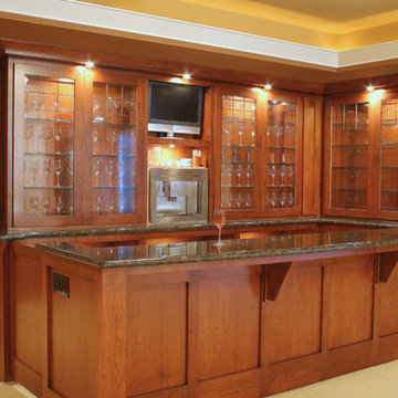 CRC Builders Inc.
The homeowner wanted something different, out of the ordinary, as an entertainment center and bar combination that would add an unusual dimension to watching TV. It had to be in character with the rest of the residence, tastefully designed and executed to deliver the maximum effect.
A two-piece combination bar and seating, coupled with a fireplace and large screen TV was designed. A system was designed and custom built cabinet consisting of a radius front entertainment center houses a large flat screen TV and enclosed stereo speakers on the top level, and a gas log fireplace below.
A custom built see-through bar sports a matching radius front, plenty of storage, and room for three to eat, drink, and enjoy the warmth of the fireplace without missing any of the action on the TV. For even greater functionality, the TV is also viewable through the large opening in the bar while meals or snacks are prepared from the kitchen. Traffic flow is unique: access and egress between the bar front and TV can happen with ease around both sides of the bar, and the opening in the back of the bar provides for service both from and to the kitchen area. Because of the free and easy movement about the space, adequate lighting, and lack of combustibles at or on the fireplace, safety, as well as an ample use of space, are both achieved. Both pieces are custom fabricated from start to finish, and match each other identically in all respects. Both are constructed of clear cherry finish with a clear satin lacquer. Both enjoy chrome accents strips and custom crafted, glass cabinet doors with matching radii, and both are tastefully lit with accenting puck lights. The design and fabrication for both units shared issues in common as well as individually.
The entertainment center was fabricated in the shop in three units and then assembled onsite. The opening for the flat screen TV had to be carefully considered as it too had a radius and therefore had to be designed so that the TV would fit.
The entire bar system, except the countertop, had to be fabricated onsite due to the structural columns on either side between which the curved lower cabinets would rest. Then the countertop template was prepared, fabricated elsewhere, returned and installed. After the countertop was in place, the cabinetmaker had to wrap the two columns on either side as well as the overhead beam while making sure the joints at the columns and header maintained alignment. A complement of matching radii cabinet doors had to be constructed for both units. Radius glass inserts had to be ordered with precise dimensions to assure a perfect fit to openings with tight tolerances. Any mistake would have been expensive to correct. Because of the abundance of natural light into the space, the finishes had to be dead-on, otherwise every flaw would show. The custom walnut inlays were fabricated out of square stock, which protruded above the radius in each door. A jig matching the radius had to be designed and fabricated, then a router used to trim excess material and then sanded and finished.
Solving the multitude of challenges associated with the project was one of the parts that made the project fun and interesting. The homeowners now can entertain every night.
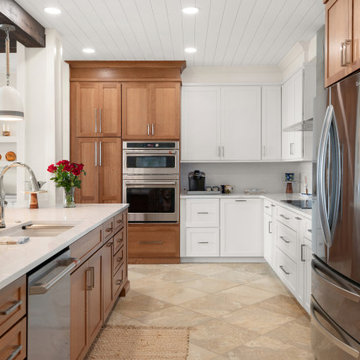

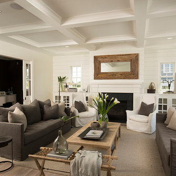
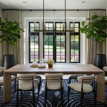

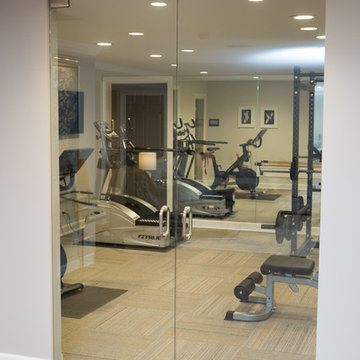 Advance Design Studio, Ltd.
Karen and Chad of Tower Lakes, IL were tired of their unfinished basement functioning as nothing more than a storage area and depressing gym. They wanted to increase the livable square footage of their home with a cohesive finished basement design, while incorporating space for the kids and adults to hang out.
“We wanted to make sure that upon renovating the basement, that we can have a place where we can spend time and watch movies, but also entertain and showcase the wine collection that we have,” Karen said.
After a long search comparing many different remodeling companies, Karen and Chad found Advance Design Studio. They were drawn towards the unique “Common Sense Remodeling” process that simplifies the renovation experience into predictable steps focused on customer satisfaction.
“There are so many other design/build companies, who may not have transparency, or a focused process in mind and I think that is what separated Advance Design Studio from the rest,” Karen said.
Karen loved how designer Claudia Pop was able to take very high-level concepts, “non-negotiable items” and implement them in the initial 3D drawings. Claudia and Project Manager DJ Yurik kept the couple in constant communication through the project. “Claudia was very receptive to the ideas we had, but she was also very good at infusing her own points and thoughts, she was very responsive, and we had an open line of communication,” Karen said.
A very important part of the basement renovation for the couple was the home gym and sauna. The “high-end hotel” look and feel of the openly blended work out area is both highly functional and beautiful to look at. The home sauna gives them a place to relax after a long day of work or a tough workout. “The gym was a very important feature for us,” Karen said. “And I think (Advance Design) did a very great job in not only making the gym a functional area, but also an aesthetic point in our basement”.
An extremely unique wow-factor in this basement is the walk in glass wine cellar that elegantly displays Karen and Chad’s extensive wine collection. Immediate access to the stunning wet bar accompanies the wine cellar to make this basement a popular spot for friends and family.
The custom-built wine bar brings together two natural elements; Calacatta Vicenza Quartz and thick distressed Black Walnut. Sophisticated yet warm Graphite Dura Supreme cabinetry provides contrast to the soft beige walls and the Calacatta Gold backsplash. An undermount sink across from the bar in a matching Calacatta Vicenza Quartz countertop adds functionality and convenience to the bar, while identical distressed walnut floating shelves add an interesting design element and increased storage. Rich true brown Rustic Oak hardwood floors soften and warm the space drawing all the areas together.
Across from the bar is a comfortable living area perfect for the family to sit down at a watch a movie. A full bath completes this finished basement with a spacious walk-in shower, Cocoa Brown Dura Supreme vanity with Calacatta Vicenza Quartz countertop, a crisp white sink and a stainless-steel Voss faucet.
Advance Design’s Common Sense process gives clients the opportunity to walk through the basement renovation process one step at a time, in a completely predictable and controlled environment. “Everything was designed and built exactly how we envisioned it, and we are really enjoying it to it’s full potential,” Karen said.
Constantly striving for customer satisfaction, Advance Design’s success is heavily reliant upon happy clients referring their friends and family. “We definitely will and have recommended Advance Design Studio to friends who are looking to embark on a remodeling project small or large,” Karen exclaimed at the completion of her project.
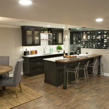 Advance Design Studio, Ltd.
Karen and Chad of Tower Lakes, IL were tired of their unfinished basement functioning as nothing more than a storage area and depressing gym. They wanted to increase the livable square footage of their home with a cohesive finished basement design, while incorporating space for the kids and adults to hang out.
“We wanted to make sure that upon renovating the basement, that we can have a place where we can spend time and watch movies, but also entertain and showcase the wine collection that we have,” Karen said.
After a long search comparing many different remodeling companies, Karen and Chad found Advance Design Studio. They were drawn towards the unique “Common Sense Remodeling” process that simplifies the renovation experience into predictable steps focused on customer satisfaction.
“There are so many other design/build companies, who may not have transparency, or a focused process in mind and I think that is what separated Advance Design Studio from the rest,” Karen said.
Karen loved how designer Claudia Pop was able to take very high-level concepts, “non-negotiable items” and implement them in the initial 3D drawings. Claudia and Project Manager DJ Yurik kept the couple in constant communication through the project. “Claudia was very receptive to the ideas we had, but she was also very good at infusing her own points and thoughts, she was very responsive, and we had an open line of communication,” Karen said.
A very important part of the basement renovation for the couple was the home gym and sauna. The “high-end hotel” look and feel of the openly blended work out area is both highly functional and beautiful to look at. The home sauna gives them a place to relax after a long day of work or a tough workout. “The gym was a very important feature for us,” Karen said. “And I think (Advance Design) did a very great job in not only making the gym a functional area, but also an aesthetic point in our basement”.
An extremely unique wow-factor in this basement is the walk in glass wine cellar that elegantly displays Karen and Chad’s extensive wine collection. Immediate access to the stunning wet bar accompanies the wine cellar to make this basement a popular spot for friends and family.
The custom-built wine bar brings together two natural elements; Calacatta Vicenza Quartz and thick distressed Black Walnut. Sophisticated yet warm Graphite Dura Supreme cabinetry provides contrast to the soft beige walls and the Calacatta Gold backsplash. An undermount sink across from the bar in a matching Calacatta Vicenza Quartz countertop adds functionality and convenience to the bar, while identical distressed walnut floating shelves add an interesting design element and increased storage. Rich true brown Rustic Oak hardwood floors soften and warm the space drawing all the areas together.
Across from the bar is a comfortable living area perfect for the family to sit down at a watch a movie. A full bath completes this finished basement with a spacious walk-in shower, Cocoa Brown Dura Supreme vanity with Calacatta Vicenza Quartz countertop, a crisp white sink and a stainless-steel Voss faucet.
Advance Design’s Common Sense process gives clients the opportunity to walk through the basement renovation process one step at a time, in a completely predictable and controlled environment. “Everything was designed and built exactly how we envisioned it, and we are really enjoying it to it’s full potential,” Karen said.
Constantly striving for customer satisfaction, Advance Design’s success is heavily reliant upon happy clients referring their friends and family. “We definitely will and have recommended Advance Design Studio to friends who are looking to embark on a remodeling project small or large,” Karen exclaimed at the completion of her project.
10