
Search results for "Compelled" in Home Design Ideas
 Gallery KBNY
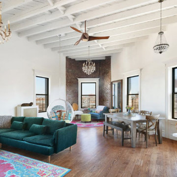
For this Brooklyn condo renovation, Gallery Kitchen and Bath updated the entire kitchen and both bathrooms, as well as painted and laid out new flooring throughout the entire apartment. The owners wanted to unite the seeming medley of the existing space into a cohesive design more representative of their own style. With its ultra-high ceilings and exposed joints and beams, the space already lent itself to the farmhouse look. The end result is a modernized, eclectic farmhouse style that we keenly carried throughout the home.
MORE DETAILS
Compelling textures and color combos reign supreme. The kitchen features semi-custom Shaker-style stone gray cabinets, a white subway tile backsplash running all the way up the wall, and white quartz countertops. We built the island in part to create a pleasing yet efficient flow from the kitchen into the living and dining areas as the space was opened up. We also painted the plumbing stack white to not make it stand out.
We also redesigned the bathrooms, giving each a unique treatment. In the master bath, we took a Victorian-goes-modern approach with coral walls, champagne fixtures, and a clawfoot tub. In the guest bathroom, we stuck to a transitional style that approaches modern without becoming contemporary, pairing herringbone marble floor tiles with a mix of subway and penny tiles on the walls and in the shower. Both maintain elements, such as tiles, fixtures, and colors, that coordinate with the overall eclectic farmhouse look.
HOW WE COLLABORATE
Collaboration with our clients to their desired degree is one of our core pillars. In this condo renovation, the clients wanted central air and were initially considering a true central air system. We advised against it, as not only would it take away from the unique beauty of unusually tall ceilings by adding unsightly ductwork, but it would also significantly detract from the farmhouse look. Instead, we suggested a mini-split system. Our recommended units were both cost-effective and much more complementary to the comprehensive theme. Of course, we ultimately always honor the clients’ choices but it’s just as important to us that we make sure to provide all the necessary information so our clients can make educated decisions that are best for their needs.
SPACE PLANNING
Another key element of the renovation process is space planning. From this perspective, we consider the placement and positioning of objects with regard to the overall flow of space. The building where this renovation took place is U-shaped at one end, which happens to be where this particular apartment is located. Uniquely-shaped spaces naturally require more concentration than those built in the standard rectangular shape. Questions we consider include: Where will people really spend time in this space? What will the flow of foot traffic be? Is there easy access to the kitchen island? Does it flow well into the hallways? Does the island protrude into anything? Working in New York, with its variety of homes and architectural styles, has greatly developed our experience with standard spaces and unconventional ones alike.
SOME HIGHLIGHTS
- Ultra-tall ceilings, allowing for stacked cabinets in the kitchen, as well as long pendant light fixtures and more chandeliers than usual throughout the home
- Completely refurbished cast iron clawfoot tub in one bathroom, with a 270-degree shower curtain around the tub
- Vibrant color choices, including an all-blue bedroom in various shades
- Treated exposed brick walls
Fun Fact: A client once showed us inspiration photos that they sourced online of this exact project, having no idea it was one of ours.
Thinking about renovating your condo? Contact us today to find out how you can benefit from our expertise in remodeling New York City condos. We are a design-and-build firm with a full-scale approach that handles every single aspect of your condo renovation from start to finish.
 Gallery KBNY
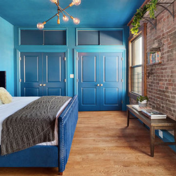
For this Brooklyn condo renovation, Gallery Kitchen and Bath updated the entire kitchen and both bathrooms, as well as painted and laid out new flooring throughout the entire apartment. The owners wanted to unite the seeming medley of the existing space into a cohesive design more representative of their own style. With its ultra-high ceilings and exposed joints and beams, the space already lent itself to the farmhouse look. The end result is a modernized, eclectic farmhouse style that we keenly carried throughout the home.
MORE DETAILS
Compelling textures and color combos reign supreme. The kitchen features semi-custom Shaker-style stone gray cabinets, a white subway tile backsplash running all the way up the wall, and white quartz countertops. We built the island in part to create a pleasing yet efficient flow from the kitchen into the living and dining areas as the space was opened up. We also painted the plumbing stack white to not make it stand out.
We also redesigned the bathrooms, giving each a unique treatment. In the master bath, we took a Victorian-goes-modern approach with coral walls, champagne fixtures, and a clawfoot tub. In the guest bathroom, we stuck to a transitional style that approaches modern without becoming contemporary, pairing herringbone marble floor tiles with a mix of subway and penny tiles on the walls and in the shower. Both maintain elements, such as tiles, fixtures, and colors, that coordinate with the overall eclectic farmhouse look.
HOW WE COLLABORATE
Collaboration with our clients to their desired degree is one of our core pillars. In this condo renovation, the clients wanted central air and were initially considering a true central air system. We advised against it, as not only would it take away from the unique beauty of unusually tall ceilings by adding unsightly ductwork, but it would also significantly detract from the farmhouse look. Instead, we suggested a mini-split system. Our recommended units were both cost-effective and much more complementary to the comprehensive theme. Of course, we ultimately always honor the clients’ choices but it’s just as important to us that we make sure to provide all the necessary information so our clients can make educated decisions that are best for their needs.
SPACE PLANNING
Another key element of the renovation process is space planning. From this perspective, we consider the placement and positioning of objects with regard to the overall flow of space. The building where this renovation took place is U-shaped at one end, which happens to be where this particular apartment is located. Uniquely-shaped spaces naturally require more concentration than those built in the standard rectangular shape. Questions we consider include: Where will people really spend time in this space? What will the flow of foot traffic be? Is there easy access to the kitchen island? Does it flow well into the hallways? Does the island protrude into anything? Working in New York, with its variety of homes and architectural styles, has greatly developed our experience with standard spaces and unconventional ones alike.
SOME HIGHLIGHTS
- Ultra-tall ceilings, allowing for stacked cabinets in the kitchen, as well as long pendant light fixtures and more chandeliers than usual throughout the home
- Completely refurbished cast iron clawfoot tub in one bathroom, with a 270-degree shower curtain around the tub
- Vibrant color choices, including an all-blue bedroom in various shades
- Treated exposed brick walls
Fun Fact: A client once showed us inspiration photos that they sourced online of this exact project, having no idea it was one of ours.
Thinking about renovating your condo? Contact us today to find out how you can benefit from our expertise in remodeling New York City condos. We are a design-and-build firm with a full-scale approach that handles every single aspect of your condo renovation from start to finish.
 Dura Supreme Cabinetry
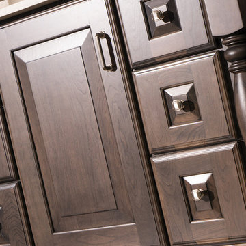
Plunge in your new bath with darling design elements to create a coordinated bathroom with a surprising appeal. Small spaces call for big design details like the ornate turn posts that frame the sink area to create a compelling look for the bath vanity. The decorative toe detail creates a matching set between the mirror, vanity and linen cabinet. Any combination of Dura Supreme’s many cabinet door styles, wood species, and finishes can be selected to create a one-of-a-kind bath furniture collection.
A centered sink basin leaves expansive counter space on both sides of the vanity, while drawer stacks create convenient storage. This luxurious bathroom features Dura Supreme’s “Style Three” furniture series. Style Three offers 15 different configurations (for single sink vanities, double sink vanities, or offset sinks) with multiple turn posts and decorative toe options to create a personal look. On this example, the decorative detailing of the sculpted turned post is a stunning look!
The bathroom has evolved from its purist utilitarian roots to a more intimate and reflective sanctuary in which to relax and reconnect. A refreshing spa-like environment offers a brisk welcome at the dawning of a new day or a soothing interlude as your day concludes.
Our busy and hectic lifestyles leave us yearning for a private place where we can truly relax and indulge. With amenities that pamper the senses and design elements inspired by luxury spas, bathroom environments are being transformed from the mundane and utilitarian to the extravagant and luxurious.
Bath cabinetry from Dura Supreme offers myriad design directions to create the personal harmony and beauty that are a hallmark of the bath sanctuary. Immerse yourself in our expansive palette of finishes and wood species to discover the look that calms your senses and soothes your soul. Your Dura Supreme designer will guide you through the selections and transform your bath into a beautiful retreat.
Request a FREE Dura Supreme Brochure Packet:
http://www.durasupreme.com/request-brochure
Find a Dura Supreme Showroom near you today:
http://www.durasupreme.com/dealer-locator
Find the right local pro for your project
 Dura Supreme Cabinetry
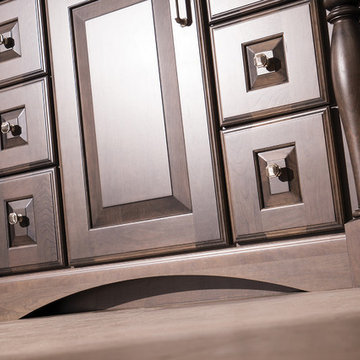
Plunge in your new bath with darling design elements to create a coordinated bathroom with a surprising appeal. Small spaces call for big design details like the ornate turn posts that frame the sink area to create a compelling look for the bath vanity. The decorative toe detail creates a matching set between the mirror, vanity and linen cabinet. Any combination of Dura Supreme’s many cabinet door styles, wood species, and finishes can be selected to create a one-of-a-kind bath furniture collection.
A centered sink basin leaves expansive counter space on both sides of the vanity, while drawer stacks create convenient storage. This luxurious bathroom features Dura Supreme’s “Style Three” furniture series. Style Three offers 15 different configurations (for single sink vanities, double sink vanities, or offset sinks) with multiple turn posts and decorative toe options to create a personal look. On this example, the decorative detailing of the sculpted turned post is a stunning look!
The bathroom has evolved from its purist utilitarian roots to a more intimate and reflective sanctuary in which to relax and reconnect. A refreshing spa-like environment offers a brisk welcome at the dawning of a new day or a soothing interlude as your day concludes.
Our busy and hectic lifestyles leave us yearning for a private place where we can truly relax and indulge. With amenities that pamper the senses and design elements inspired by luxury spas, bathroom environments are being transformed from the mundane and utilitarian to the extravagant and luxurious.
Bath cabinetry from Dura Supreme offers myriad design directions to create the personal harmony and beauty that are a hallmark of the bath sanctuary. Immerse yourself in our expansive palette of finishes and wood species to discover the look that calms your senses and soothes your soul. Your Dura Supreme designer will guide you through the selections and transform your bath into a beautiful retreat.
Request a FREE Dura Supreme Brochure Packet:
http://www.durasupreme.com/request-brochure
Find a Dura Supreme Showroom near you today:
http://www.durasupreme.com/dealer-locator
 Fabco Sanctuary
The architect and designer Guy Derwent was approached by his client with a clear and compelling brief: to completely transform a grand Victorian terrace house they were planning to renovate. The client envisioned something far beyond a standard renovation – this was to be a bold and dramatic reimagining of a family home that could grow with them over time.
With the property having remained largely untouched for more than fifty years, the architects saw an opportunity to unlock its potential and deliver a contemporary design that would contrast beautifully with its Victorian heritage.
The existing layout consisted of a series of small, disconnected rooms to the rear of the house. To respond to the client’s need for openness and flexibility, the architect proposed a radical restructuring of the ground floor:
The rear rooms were completely removed
Suspended timber floors were lowered by up to two metres to align with the garden
Two bold extensions were added
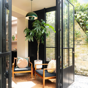
The first extension filled in the side return with a London stock brick facade and a glazed roof, while the second – a striking black steel and glass pavilion was glazed on three sides and placed along the garden elevation.
This new pavilion redefined the building’s relationship with the garden. Its steel-framed glazing created a seamless dialogue between interior and exterior, offering a sense of immersion in the surrounding landscape.
At the heart of the plan sits a dramatic, five-metre-tall dining space that acts as a transition from the original entrance hall into the new addition. A large, circular cast-glass window, framed in steel, provides a visual and spatial link between old and new, allowing light and movement to travel through the depth of the home.
Throughout the project, a series of black metal elements were introduced as sculptural interventions – each marking moments of transformation within the house. These included the bespoke steel framed circular window, a custom metal staircase, a cylindrical support column, and the striking steel and glass garden pavilion. Together, they formed a coherent architectural language that underscored the project’s bold intent.
Our steel windows and doors played a vital role in delivering the project’s vision. The architects chose steel for its refined sight lines and distinctive material character, which helped bridge the gap between the historical context of the building and the bold new additions.
The black steel frames provided a crisp contrast to the pale London stock brick and added definition to the glazed pavilion, reinforcing the sense of architectural precision. In particular, the fine steel profiles of the garden room allowed the extension to feel both lightweight and immersive, blurring the boundary between the house and its garden.
The architect drew inspiration from the Bauhaus Movement, particularly the work of Walter Gropius, whose approach to functional beauty and industrial materials informed the design of the garden pavilion.
Here, our glazing system was used not just for transparency, but as an expressive architectural element. The carefully proportioned panels help to conceal the roof thickness and reinforce the pavilion’s industrial yet abstract character – a deliberate nod to product design and modernist detailing.
Sustainability was an important factor in the selection of materials. Our steel systems, made from 99% recycled content and 100% recyclable, aligned with the project’s broader environmental goals.
The architects noted that this commitment to material longevity and circularity was central to their decision to use steel. The durability and recyclability of the windows and doors ensured the project met both aesthetic and ethical criteria.
This London terrace house now stands as a celebration of contrast – between heritage and innovation, solidity and transparency, tradition and transformation. Our steel windows and doors were not simply components; they were essential tools in crafting a home that is as bold and expressive as it is functional.
The result is a home designed for modern family life, where light, space, and materiality come together in perfect harmony.
 Simply Perfect
Many homeowners have their own ideas about how light or dark their home interiors should be. Some folks love nothing more than sunny, light-filled rooms. Other people adore their comforting, softly-lit spaces.
While light levels can be a matter of personal preference, lighting can also be a powerful tool for shaping the mood, emotional tone and usage of every room. In fact, lighting is just as important as furnishings.
Lighting Tips
1. Stay Warm
Cool light looks brighter to the eye and can seem more like daylight. It can also make your home feel like a hospital or grocery store, which is not what we’re going for. Warm light is softer and creates a more relaxed mood. That’s what you want in your home.
2. Yes, You Can
We’re big fans of can lighting. These in-ceiling lights draw zero attention to themselves while creating a foundation for excellent interior lighting. We add lamps for emphasis and mood in particular areas and put everything on a dimmer switch (see #3). This formula gives you maximum flexibility.
3. The Great Dimmer
What did people do before the dimmer switch was invented? We suspect they shielded their eyes or huddled together in the dark because there was nothing inbetween. We use dimmer switches everywhere except the bathroom. Controlling the level of every light in your home allows you to create the right mood for the moment every time.
4. Beam Me Up
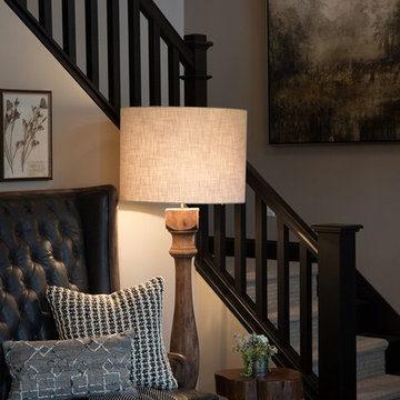
We’re head over heels in love with this stunning raw wood beam wrapped with light bulbs on cords. Flip one dimmer switch and all the lights go on, at the exact intensity level you choose. The can lights in the ceiling gently illuminate the room, so this fabulous fixture can serve its true purpose—which is to create an irresistibly inviting space and a found-object, vintage vibe.
5. Open Bulb Policy
Many of our light fixtures feature exposed bulbs. Once upon a time, light bulbs might have been ugly, but clear Edison bulbs, showing the filaments within, are themselves works of art. In a chandelier with an open, orb structure, candelabra bulbs are reminiscent of candle flames. A small lamp with a square metal base and a single bulb takes the open concept one step further.
6. Double Up
Above a long dining table or bar, consider using multiple light fixtures. Especially with hanging light fixtures, we tend to think of putting just one in the middle. But lighting only the center of a long table would leave some of your dinner guests in the dark while others take the spotlight.
7. Reflections
Reflections off mirrors, glass and tile bring a secondary light source into play and add a soft, beautiful touch. Candles create particularly compelling reflections.
8. Looking Up
In high, open spaces, a light fixture can help balance the space, bringing the eye downward and helping make the area less cavernous and more inviting.
9. Looking Out
Lighting is also a safety issue. Make sure you can turn on the stair lights at the top and the bottom of the stairs. Incorporate the flexibility to light up the room you’re entering before you get there, so you aren’t stumbling around in the dark, trying to find the switch.
10. How Low Can You Go?
While low light may be flattering, people tend to err on the side of too little light, rather than too much. Turn up that dimmer a notch more than you would normally and you may like what you see. Having sufficient light is particularly important in areas such as basements, where there may be little to no natural light.
 Dura Supreme Cabinetry
Plunge in your new bath with darling design elements to create a coordinated bathroom with a surprising appeal. Small spaces call for big design details like the ornate turn posts that frame the sink area to create a compelling look for the bath vanity. Select the most inviting and luxurious materials to create a relaxing space that rejuvenates as it soothes and calms. Coordinating bath furniture from Dura Supreme brings all the details together with your choice of beautiful styles and finishes.
A linen cabinet with a mirrored back beautifully displays stacks of towels and bathroom sundries. These furniture vanities showcase Dura Supreme’s “Style Five” furniture series. Style Five is designed with a selection of turned posts for iconic furniture style to meet your personal tastes. The two individual vanities separated by the free-standing linen cabinet provide each spouse their own divided space to organize their personal bath supplies, while the linen cabinet provides universal storage for items the couple will both use.
Style Five furniture series offers 10 different configurations (for single sink vanities, double sink vanities, or offset sinks), 15 turn post designs and an optional floor with either plain or slatted detail. A selection of classic post designs offers personalized design choices. Any combination of Dura Supreme’s many door styles, wood species, and finishes can be selected to create a one-of-a-kind bath furniture collection.
The bathroom has evolved from its purist utilitarian roots to a more intimate and reflective sanctuary in which to relax and reconnect. A refreshing spa-like environment offers a brisk welcome at the dawning of a new day or a soothing interlude as your day concludes.
Our busy and hectic lifestyles leave us yearning for a private place where we can truly relax and indulge. With amenities that pamper the senses and design elements inspired by luxury spas, bathroom environments are being transformed from the mundane and utilitarian to the extravagant and luxurious.
Bath cabinetry from Dura Supreme offers myriad design directions to create the personal harmony and beauty that are a hallmark of the bath sanctuary. Immerse yourself in our expansive palette of finishes and wood species to discover the look that calms your senses and soothes your soul. Your Dura Supreme designer will guide you through the selections and transform your bath into a beautiful retreat.
Request a FREE Dura Supreme Brochure Packet:
http://www.durasupreme.com/request-brochure
Find a Dura Supreme Showroom near you today:
http://www.durasupreme.com/dealer-locator
 Simply Perfect
Many homeowners have their own ideas about how light or dark their home interiors should be. Some folks love nothing more than sunny, light-filled rooms. Other people adore their comforting, softly-lit spaces.
While light levels can be a matter of personal preference, lighting can also be a powerful tool for shaping the mood, emotional tone and usage of every room. In fact, lighting is just as important as furnishings.
Lighting Tips
1. Stay Warm
Cool light looks brighter to the eye and can seem more like daylight. It can also make your home feel like a hospital or grocery store, which is not what we’re going for. Warm light is softer and creates a more relaxed mood. That’s what you want in your home.
2. Yes, You Can
We’re big fans of can lighting. These in-ceiling lights draw zero attention to themselves while creating a foundation for excellent interior lighting. We add lamps for emphasis and mood in particular areas and put everything on a dimmer switch (see #3). This formula gives you maximum flexibility.
3. The Great Dimmer
What did people do before the dimmer switch was invented? We suspect they shielded their eyes or huddled together in the dark because there was nothing inbetween. We use dimmer switches everywhere except the bathroom. Controlling the level of every light in your home allows you to create the right mood for the moment every time.
4. Beam Me Up
We’re head over heels in love with this stunning raw wood beam wrapped with light bulbs on cords. Flip one dimmer switch and all the lights go on, at the exact intensity level you choose. The can lights in the ceiling gently illuminate the room, so this fabulous fixture can serve its true purpose—which is to create an irresistibly inviting space and a found-object, vintage vibe.
5. Open Bulb Policy
Many of our light fixtures feature exposed bulbs. Once upon a time, light bulbs might have been ugly, but clear Edison bulbs, showing the filaments within, are themselves works of art. In a chandelier with an open, orb structure, candelabra bulbs are reminiscent of candle flames. A small lamp with a square metal base and a single bulb takes the open concept one step further.
6. Double Up
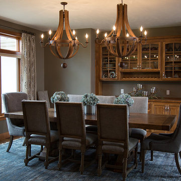
Above a long dining table or bar, consider using multiple light fixtures. Especially with hanging light fixtures, we tend to think of putting just one in the middle. But lighting only the center of a long table would leave some of your dinner guests in the dark while others take the spotlight.
7. Reflections
Reflections off mirrors, glass and tile bring a secondary light source into play and add a soft, beautiful touch. Candles create particularly compelling reflections.
8. Looking Up
In high, open spaces, a light fixture can help balance the space, bringing the eye downward and helping make the area less cavernous and more inviting.
9. Looking Out
Lighting is also a safety issue. Make sure you can turn on the stair lights at the top and the bottom of the stairs. Incorporate the flexibility to light up the room you’re entering before you get there, so you aren’t stumbling around in the dark, trying to find the switch.
10. How Low Can You Go?
While low light may be flattering, people tend to err on the side of too little light, rather than too much. Turn up that dimmer a notch more than you would normally and you may like what you see. Having sufficient light is particularly important in areas such as basements, where there may be little to no natural light.
 Klopf Architecture
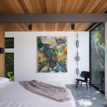
Malibu Glass Box House by Klopf Architecture
Following the devastating Woolsey Fire of 2018, the site in Malibu offered a unique opportunity to rebuild not just a home, but a new architectural composition that highlighted the property’s potential while navigating strict fire-rebuild codes in the area. Designed by Klopf Architecture, this project embraced a set of limitations and translated them into an architectural asset.
The city’s fire-rebuild process required the new structure to remain close to the original footprint, size and bulk, a constraint that ultimately clarified the architectural direction. Perched near the front of a long, narrow lot, the new home frames and overlooks a private, park-like rear expanse, an uncommon luxury especially in this part of Malibu .
Without a fixed program, the design process allowed for a different kind of creative focus allowing Klopf Architecture the opportunity to explore how a modernist home could best respond to this site. The team approached the project not with a list of requirements, but with a question: How might a modernist live here? What spatial qualities would inspire calm, connection, and a sense of wonder in this setting? The process became less about problem-solving and more about architectural storytelling—letting the site, the light, and the principles of modern design guide the form and flow of the home.
The response emerged in the form of a glass-box pavilion, an open, Mid-Century Modern inspired living, dining, and kitchen space that floats at the edge of the property’s natural descent. Connected to the more enclosed, private areas of the home by a glass-walled hallway, the living pavilion becomes a distinct centerpiece of the design. It opens on all four sides to the landscape with decks and patios on the flanks, an internal garden and water feature to the north, and a dramatic unguarded view of the expansive backyard and ocean horizon to the south.
Because of the mandated footprint, careful planning was required to ensure every space could still engage with light, landscape, or both. Strategic voids in the form of atriums and courtyards allow daylight to filter deep into the home’s core, while offering moments of surprise and retreat. These design gestures allow natural light to filter deep into the interior, creating a sense of brightness and openness throughout the day. At the same time, they expand the perceptual boundaries between inside and out, making the home feel more expansive while anchoring its connection to the surrounding landscape.
The siting of the house is what gives it its unique character. Rather than receding into the backyard like the neighboring homes, the house holds a slight prominence. From the central living pavilion, stepping down into the landscape feels more like entering a secluded park where a separate existing accessory structure, trail, and recreational areas await. The home’s modest street presence gives way to this unfolding drama of space, view, and nature.
Fire-resilient materials and assemblies are integrated seamlessly throughout including triple-pane glazing, under-slab and roof insulation, and locally sourced fire-rated cladding ensure the house not only meets Calfornia’s rigorous wildland-urban interface (WUI) standards, but feels effortlessly aligned with them. While technical decisions like fire-hardening and mechanical systems presented some construction challenges, particularly around the cantilevered glass box, the team found a functional compromise that preserved the integrity of the design.
Inside, a restrained palette and exposed post and beam design celebrate the ethos of mid-century modernism. A central circulation spine extends from the entry to the rear glass wall, offering a continuous visual link from street to ocean. Spaces such as the library and office, though more intimate in scale, are never cut off from nature as each opens to its own unique courtyard or garden view.
Though born out of a strict regulatory framework and developed without a specific client, the rebuild design unfolded with remarkable clarity. Grounded in site logic, refined by limitations and an emphasis on timeless spatial relationships – light, proportion, and a strong connection to nature, the resulting design feels both effortless and uplifting. The home lives lightly on the land, opens generously to its surroundings, and strikes a careful balance between privacy, openness, and calm. For Klopf Architecture, it stands as a compelling case study in how site, code, and circumstantial constraints can inspire enduring, modernist architecture. With years of experience reimagining mid-century modern design for how people live today, the firm took the project’s limitations as an opportunity. The result is a home shaped by open, flowing spaces, strong indoor-outdoor connections, and a calm, clear sense of structure. It’s a good reminder that even with strict constraints, there’s still room for architecture to breathe—and for modernism to keep moving forward.
Klopf Architecture project team: Geoff Campen, John Klopf, AIA, and Sherry Tan
Structural Engineer: ZFA
Contractor: Maison D’Artiste
Photography: ©2025 Mariko Reed
Year Completed: 2023
 Fabco Sanctuary
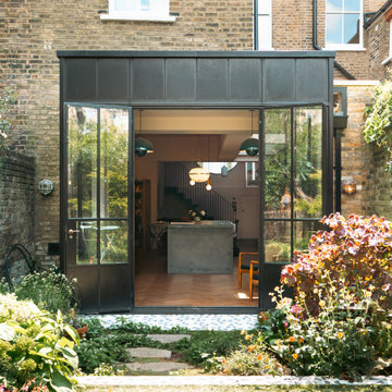
The architect and designer Guy Derwent was approached by his client with a clear and compelling brief: to completely transform a grand Victorian terrace house they were planning to renovate. The client envisioned something far beyond a standard renovation – this was to be a bold and dramatic reimagining of a family home that could grow with them over time.
With the property having remained largely untouched for more than fifty years, the architects saw an opportunity to unlock its potential and deliver a contemporary design that would contrast beautifully with its Victorian heritage.
The existing layout consisted of a series of small, disconnected rooms to the rear of the house. To respond to the client’s need for openness and flexibility, the architect proposed a radical restructuring of the ground floor:
The rear rooms were completely removed
Suspended timber floors were lowered by up to two metres to align with the garden
Two bold extensions were added
The first extension filled in the side return with a London stock brick facade and a glazed roof, while the second – a striking black steel and glass pavilion was glazed on three sides and placed along the garden elevation.
This new pavilion redefined the building’s relationship with the garden. Its steel-framed glazing created a seamless dialogue between interior and exterior, offering a sense of immersion in the surrounding landscape.
At the heart of the plan sits a dramatic, five-metre-tall dining space that acts as a transition from the original entrance hall into the new addition. A large, circular cast-glass window, framed in steel, provides a visual and spatial link between old and new, allowing light and movement to travel through the depth of the home.
Throughout the project, a series of black metal elements were introduced as sculptural interventions – each marking moments of transformation within the house. These included the bespoke steel framed circular window, a custom metal staircase, a cylindrical support column, and the striking steel and glass garden pavilion. Together, they formed a coherent architectural language that underscored the project’s bold intent.
Our steel windows and doors played a vital role in delivering the project’s vision. The architects chose steel for its refined sight lines and distinctive material character, which helped bridge the gap between the historical context of the building and the bold new additions.
The black steel frames provided a crisp contrast to the pale London stock brick and added definition to the glazed pavilion, reinforcing the sense of architectural precision. In particular, the fine steel profiles of the garden room allowed the extension to feel both lightweight and immersive, blurring the boundary between the house and its garden.
The architect drew inspiration from the Bauhaus Movement, particularly the work of Walter Gropius, whose approach to functional beauty and industrial materials informed the design of the garden pavilion.
Here, our glazing system was used not just for transparency, but as an expressive architectural element. The carefully proportioned panels help to conceal the roof thickness and reinforce the pavilion’s industrial yet abstract character – a deliberate nod to product design and modernist detailing.
Sustainability was an important factor in the selection of materials. Our steel systems, made from 99% recycled content and 100% recyclable, aligned with the project’s broader environmental goals.
The architects noted that this commitment to material longevity and circularity was central to their decision to use steel. The durability and recyclability of the windows and doors ensured the project met both aesthetic and ethical criteria.
This London terrace house now stands as a celebration of contrast – between heritage and innovation, solidity and transparency, tradition and transformation. Our steel windows and doors were not simply components; they were essential tools in crafting a home that is as bold and expressive as it is functional.
The result is a home designed for modern family life, where light, space, and materiality come together in perfect harmony.

 Real Estate Renderings
3D Real Estate Renderings
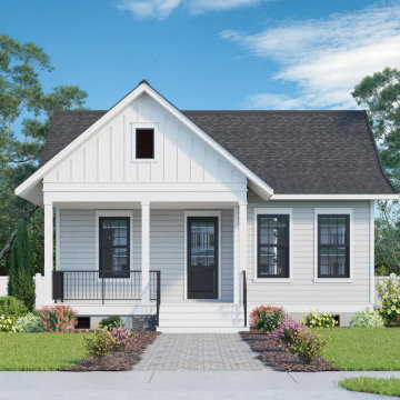
If you are looking for High-Quality Real Estate Rendering Services at a Lowest and Unbeatable Price, then we are here to assist you. We provide Photo-realistic and Professional 3D Real Estate Renderings at an insanely low price. This lowest pricing is only possible, because of our operations technical team set-up in India, large volume and bulk orders, and matured-efficient operations delivery process. At this price, we do offer high-quality real estate 3D renderings, using the most advanced Real Estate 3D Rendering Software i.e. 3DsMax (for 3D modeling) and V-ray (for 3D rendering). This software combination makes the best possible photo-realistic rendering images.3D Renderings are a very powerful marketing tool. Customers do not want to see your property in 2D, they want to SEE IT! There is nothing more effective than seeing a 3D Rendering of your property. With today’s technology you can give your customers the ability to look at your home from any angle and even close up. This will eliminate the guessing game for buyers and help them make that all important decision to purchase.
Our photo-realistic 3D renderings are unmatched in quality. We can give you an incredible virtual tour of your property that will have interested buyers, brokers and real estate agents wanting to see more. Our 3D renderings come with unlimited revisions, so you can tweak and make changes until you’re satisfied.
Our team of professional, highly-trained 3D Renderersspecialize in turning your ideas and design concepts into photo-realistic images that look virtually the same as a photograph. We specialize in custom designs and will work with you until you are 100% satisfied with your rendering. No project is too large or too small!
We provide realistic, visual marketing solutions in order to give you the edge in today’s competitive housing market. We produce stunning 3D virtual tours and 3D rendered animations (Movies). Our marketing packages are unmatched in quality, creativity and affordability. Whether you are a realtor who wants to sell your client’s property or an investor looking for outstanding 3D renderings for your next project, we have a solution for you!
3D Real Estate Renderings are undeniably the most effective way to sell a property and they are our specialty. We’ll take your property from drab to fab by creating a beautiful, custom 3D real estate renderingthat will get you the highest price possible. Our designers will polish your home to perfection, bringing out its best features through lighting and camera angles, in order to create the most compelling visual presentation of your listing or product.
Professional Out-of-the-Box 3D Real Estate Renderings for your REDFIN ZILLOW, and other real estate website. We take the guesswork out of selling your home by creating online showings that will make buyers feel like they have already toured your home in person. Our 3D renderings are customized to fit the style of a specific location, such as the architecture or neighborhood of a property. This customization gives our virtual tours an authentic look that is unparalleled among other competitors’ presentations.
Other Services:
Real Estate Rendering Services
Real Estate Rendering Company
Real Estate Rendering Companies
Digital Real Estate Renderings
3D Real Estate Renderings
Real Estate 3D Rendering
High-Quality Real Estate Renderings
Real Estate Renderings
 lavish
When a professional office space needs to make a lasting impression on clients and create an inspiring environment for staff, the design details matter just as much as they do at home. This thoughtful commercial interior refresh transformed a dated, purely functional office into a warm, sophisticated, and beautifully layered space — one that feels more like a high-end boutique or luxury residence than a typical workplace.
The guiding philosophy throughout was clear: every space, no matter how utilitarian its purpose, deserves intentional design. From the reception corridor to the staff break room, from the client restrooms to the storage corridor, each area received careful attention to finish, color, and texture.
Restrooms Reimagined
The two client-facing restrooms were the most dramatic transformations in the project. Rather than the builder-grade wallpaper and basic fixtures typically found in commercial spaces, both were treated as true design moments.
The first features floor-to-ceiling wallpaper in a rich taupe with a delicate white botanical branch pattern, creating an immersive, jewel-box feel. A white shaker vanity with dark granite countertop grounds the space, while an arched frameless mirror and brushed gold wall sconce add glamour. A tall gold and glass etagere serves as both decorative storage and a sculptural element, styled with woven baskets, greenery, and stacked accessories. Framed landscape watercolor art adds a serene, organic note, and a freestanding brass toilet paper holder elevates a typically overlooked detail.
The second restroom takes an entirely different but equally compelling direction — soft, dusty blue-grey grasscloth-style wallpaper printed with a tone-on-tone chevron leaf stripe wraps every wall, creating a calm, spa-like atmosphere. A weathered wood console provides casual charm beneath a large-scale botanical tulip artwork in sage and cream. The wall-mount sink with exposed plumbing adds an intentional, editorial touch. An arched mirror with a sleek multi-bulb bar sconce in brushed nickel completes the look, while a pair of sculptural brass branch wall sculptures mounted directly to the wallpaper serve as unexpected, memorable art.
Storage Made Beautiful
The internal storage corridor received a full wall of custom floor-to-ceiling white shaker cabinetry with chrome pulls, flanked by open shelving sections for accessible display and storage. Clean, crisp, and highly organized — this space proves that even a purely functional corridor can be architectural and refined.
The Break Room & Kitchenette
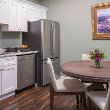
The staff break room was updated with white shaker cabinetry, light speckled granite countertops, stainless appliances — including a French door refrigerator, dishwasher, and over-counter microwave — and warm sage green walls that bring a restful, refreshing energy to the space. Dark hardwood luxury vinyl plank flooring runs throughout the room, warming the look considerably. A round walnut dining table with upholstered chairs creates a proper gathering space for the team, and framed landscape oil art in an ornate gold frame adds a touch of collected character to the room.
Reception & Corridor Details
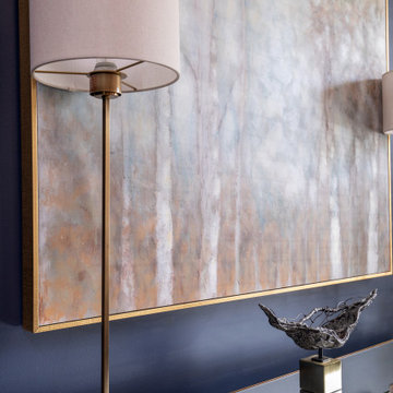
The reception and corridor spaces were treated with deep navy blue paint — bold, sophisticated, and unexpected in a commercial setting. A large abstract landscape painting in warm blues, blush, and gold hangs in a gilded frame against the navy wall, making an immediate statement. A brass and lucite table lamp sits on a floating brass-trimmed shelf alongside a sculptural art object, creating a vignette that communicates creativity and intentionality from the moment clients arrive.
The result is a professional environment that communicates confidence, taste, and care — one that clients will remember long after their visit, and one that staff will genuinely enjoy working in every day.
 lavish
When a professional office space needs to make a lasting impression on clients and create an inspiring environment for staff, the design details matter just as much as they do at home. This thoughtful commercial interior refresh transformed a dated, purely functional office into a warm, sophisticated, and beautifully layered space — one that feels more like a high-end boutique or luxury residence than a typical workplace.
The guiding philosophy throughout was clear: every space, no matter how utilitarian its purpose, deserves intentional design. From the reception corridor to the staff break room, from the client restrooms to the storage corridor, each area received careful attention to finish, color, and texture.
Restrooms Reimagined
The two client-facing restrooms were the most dramatic transformations in the project. Rather than the builder-grade wallpaper and basic fixtures typically found in commercial spaces, both were treated as true design moments.
The first features floor-to-ceiling wallpaper in a rich taupe with a delicate white botanical branch pattern, creating an immersive, jewel-box feel. A white shaker vanity with dark granite countertop grounds the space, while an arched frameless mirror and brushed gold wall sconce add glamour. A tall gold and glass etagere serves as both decorative storage and a sculptural element, styled with woven baskets, greenery, and stacked accessories. Framed landscape watercolor art adds a serene, organic note, and a freestanding brass toilet paper holder elevates a typically overlooked detail.
The second restroom takes an entirely different but equally compelling direction — soft, dusty blue-grey grasscloth-style wallpaper printed with a tone-on-tone chevron leaf stripe wraps every wall, creating a calm, spa-like atmosphere. A weathered wood console provides casual charm beneath a large-scale botanical tulip artwork in sage and cream. The wall-mount sink with exposed plumbing adds an intentional, editorial touch. An arched mirror with a sleek multi-bulb bar sconce in brushed nickel completes the look, while a pair of sculptural brass branch wall sculptures mounted directly to the wallpaper serve as unexpected, memorable art.
Storage Made Beautiful
The internal storage corridor received a full wall of custom floor-to-ceiling white shaker cabinetry with chrome pulls, flanked by open shelving sections for accessible display and storage. Clean, crisp, and highly organized — this space proves that even a purely functional corridor can be architectural and refined.
The Break Room & Kitchenette
The staff break room was updated with white shaker cabinetry, light speckled granite countertops, stainless appliances — including a French door refrigerator, dishwasher, and over-counter microwave — and warm sage green walls that bring a restful, refreshing energy to the space. Dark hardwood luxury vinyl plank flooring runs throughout the room, warming the look considerably. A round walnut dining table with upholstered chairs creates a proper gathering space for the team, and framed landscape oil art in an ornate gold frame adds a touch of collected character to the room.
Reception & Corridor Details
The reception and corridor spaces were treated with deep navy blue paint — bold, sophisticated, and unexpected in a commercial setting. A large abstract landscape painting in warm blues, blush, and gold hangs in a gilded frame against the navy wall, making an immediate statement. A brass and lucite table lamp sits on a floating brass-trimmed shelf alongside a sculptural art object, creating a vignette that communicates creativity and intentionality from the moment clients arrive.
The result is a professional environment that communicates confidence, taste, and care — one that clients will remember long after their visit, and one that staff will genuinely enjoy working in every day.

 habibisoft
We extend our gratitude for selecting Habibisoft as your trusted partner for a social media marketing agency in Dubai. Our team is dedicated to boosting your brand using tailored social media services of unrivaled quality. Our outstanding strategies aim at making your brand stand out in the digital world; trust us and let us make it a reality. At Habibisoft, we consider the dynamic trends that shape social media marketing and tailor our services to achieve lasting results. Strengthen your visibility online with our expertly crafted social media packages. Enlist us as your ideal social media partner of choice in Dubai!
Choose Habibisoft for an unparalleled social media marketing experience in Dubai. Drive engagement and conversions with our superior services, crafted by a team of skilled professionals exclusively for your brand. From recognition to lasting memorability, we've got the expertise to make your company stand out. Browse our variety of customized social media packages adaptable to your brand's requirements. At Habibisoft, Dubai's premium social media company, we pledge our unwavering dedication to helping you succeed.
Embark on a path towards digital triumph with Habibisoft, the leading social media marketing company in Dubai. Our team of dedicated professionals strives towards incomparable excellence, curating a diverse suite of services to offer the most distinguished experience in the market. Here at Habibisoft, we recognize the constantly changing landscape of social media marketing and develop consolidated approaches to hook your audience. Regardful of your brand's singular individuality, we emphasize crafting your distinct image, taking you to the forefront of competitors.
At Habibisoft, our team utilizes innovation, creative approaches, and sound strategy to obtain concrete outcomes through effective social media campaigns. No matter your scale, whether fledgling or a long-established icon, we at Habibisoft commit ourselves to compelling marketing efforts that successfully engage your following and bolster your virtual footprint.
Explore our expertly developed social media packages tailored to your business needs. Whether you focus on increasing visibility or producing valuable leads, we provide all the solutions and select the ideal package for you. See your brand reach new boundaries today by selecting the bundle that aligns perfectly with your vision.
Habibisoft stands out because of our steadfast loyalty to our clients' journeys to prosperity. Our scope extends beyond simply handling social media to forging lasting bonds and curating powerful encounters. Being guided by social values, we appreciate the vitality of fostering interactions within the digital landscape.
Entrusting your brand with Habibisoft means working with a team of vibrant specialists. Informed by data, our approach enables us to make sound business choices to enhance your social media campaigns. Count on our competence in Social Media Advertising in Dubai and Social Media Marketing in Dubai to give your brand the polished appeal it deserves.
Put your confidence in Habibisoft for all your social media needs in today's fast-paced digital world. Our team provides expert guidance in navigating the intricacies and steering your brand to success. For Dubai's premier social media marketing experience, team up with Habibisoft – where conscious progress meets creative balance.
 Fabco Sanctuary
The architect and designer Guy Derwent was approached by his client with a clear and compelling brief: to completely transform a grand Victorian terrace house they were planning to renovate. The client envisioned something far beyond a standard renovation – this was to be a bold and dramatic reimagining of a family home that could grow with them over time.
With the property having remained largely untouched for more than fifty years, the architects saw an opportunity to unlock its potential and deliver a contemporary design that would contrast beautifully with its Victorian heritage.
The existing layout consisted of a series of small, disconnected rooms to the rear of the house. To respond to the client’s need for openness and flexibility, the architect proposed a radical restructuring of the ground floor:
The rear rooms were completely removed
Suspended timber floors were lowered by up to two metres to align with the garden
Two bold extensions were added
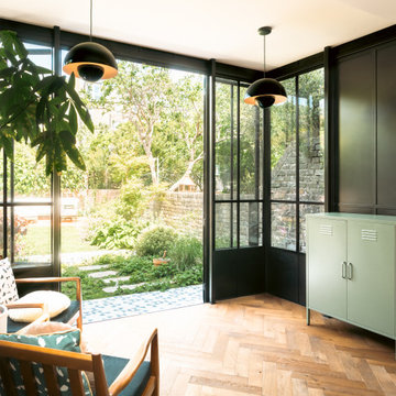
The first extension filled in the side return with a London stock brick facade and a glazed roof, while the second – a striking black steel and glass pavilion was glazed on three sides and placed along the garden elevation.
This new pavilion redefined the building’s relationship with the garden. Its steel-framed glazing created a seamless dialogue between interior and exterior, offering a sense of immersion in the surrounding landscape.
At the heart of the plan sits a dramatic, five-metre-tall dining space that acts as a transition from the original entrance hall into the new addition. A large, circular cast-glass window, framed in steel, provides a visual and spatial link between old and new, allowing light and movement to travel through the depth of the home.
Throughout the project, a series of black metal elements were introduced as sculptural interventions – each marking moments of transformation within the house. These included the bespoke steel framed circular window, a custom metal staircase, a cylindrical support column, and the striking steel and glass garden pavilion. Together, they formed a coherent architectural language that underscored the project’s bold intent.
Our steel windows and doors played a vital role in delivering the project’s vision. The architects chose steel for its refined sight lines and distinctive material character, which helped bridge the gap between the historical context of the building and the bold new additions.
The black steel frames provided a crisp contrast to the pale London stock brick and added definition to the glazed pavilion, reinforcing the sense of architectural precision. In particular, the fine steel profiles of the garden room allowed the extension to feel both lightweight and immersive, blurring the boundary between the house and its garden.
The architect drew inspiration from the Bauhaus Movement, particularly the work of Walter Gropius, whose approach to functional beauty and industrial materials informed the design of the garden pavilion.
Here, our glazing system was used not just for transparency, but as an expressive architectural element. The carefully proportioned panels help to conceal the roof thickness and reinforce the pavilion’s industrial yet abstract character – a deliberate nod to product design and modernist detailing.
Sustainability was an important factor in the selection of materials. Our steel systems, made from 99% recycled content and 100% recyclable, aligned with the project’s broader environmental goals.
The architects noted that this commitment to material longevity and circularity was central to their decision to use steel. The durability and recyclability of the windows and doors ensured the project met both aesthetic and ethical criteria.
This London terrace house now stands as a celebration of contrast – between heritage and innovation, solidity and transparency, tradition and transformation. Our steel windows and doors were not simply components; they were essential tools in crafting a home that is as bold and expressive as it is functional.
The result is a home designed for modern family life, where light, space, and materiality come together in perfect harmony.
 Gallery KBNY
For this Brooklyn condo renovation, Gallery Kitchen and Bath updated the entire kitchen and both bathrooms, as well as painted and laid out new flooring throughout the entire apartment. The owners wanted to unite the seeming medley of the existing space into a cohesive design more representative of their own style. With its ultra-high ceilings and exposed joints and beams, the space already lent itself to the farmhouse look. The end result is a modernized, eclectic farmhouse style that we keenly carried throughout the home.
MORE DETAILS
Compelling textures and color combos reign supreme. The kitchen features semi-custom Shaker-style stone gray cabinets, a white subway tile backsplash running all the way up the wall, and white quartz countertops. We built the island in part to create a pleasing yet efficient flow from the kitchen into the living and dining areas as the space was opened up. We also painted the plumbing stack white to not make it stand out.
We also redesigned the bathrooms, giving each a unique treatment. In the master bath, we took a Victorian-goes-modern approach with coral walls, champagne fixtures, and a clawfoot tub. In the guest bathroom, we stuck to a transitional style that approaches modern without becoming contemporary, pairing herringbone marble floor tiles with a mix of subway and penny tiles on the walls and in the shower. Both maintain elements, such as tiles, fixtures, and colors, that coordinate with the overall eclectic farmhouse look.
HOW WE COLLABORATE
Collaboration with our clients to their desired degree is one of our core pillars. In this condo renovation, the clients wanted central air and were initially considering a true central air system. We advised against it, as not only would it take away from the unique beauty of unusually tall ceilings by adding unsightly ductwork, but it would also significantly detract from the farmhouse look. Instead, we suggested a mini-split system. Our recommended units were both cost-effective and much more complementary to the comprehensive theme. Of course, we ultimately always honor the clients’ choices but it’s just as important to us that we make sure to provide all the necessary information so our clients can make educated decisions that are best for their needs.
SPACE PLANNING
Another key element of the renovation process is space planning. From this perspective, we consider the placement and positioning of objects with regard to the overall flow of space. The building where this renovation took place is U-shaped at one end, which happens to be where this particular apartment is located. Uniquely-shaped spaces naturally require more concentration than those built in the standard rectangular shape. Questions we consider include: Where will people really spend time in this space? What will the flow of foot traffic be? Is there easy access to the kitchen island? Does it flow well into the hallways? Does the island protrude into anything? Working in New York, with its variety of homes and architectural styles, has greatly developed our experience with standard spaces and unconventional ones alike.
SOME HIGHLIGHTS
- Ultra-tall ceilings, allowing for stacked cabinets in the kitchen, as well as long pendant light fixtures and more chandeliers than usual throughout the home
- Completely refurbished cast iron clawfoot tub in one bathroom, with a 270-degree shower curtain around the tub
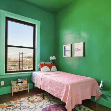
- Vibrant color choices, including an all-blue bedroom in various shades
- Treated exposed brick walls
Fun Fact: A client once showed us inspiration photos that they sourced online of this exact project, having no idea it was one of ours.
Thinking about renovating your condo? Contact us today to find out how you can benefit from our expertise in remodeling New York City condos. We are a design-and-build firm with a full-scale approach that handles every single aspect of your condo renovation from start to finish.
 lavish
When a professional office space needs to make a lasting impression on clients and create an inspiring environment for staff, the design details matter just as much as they do at home. This thoughtful commercial interior refresh transformed a dated, purely functional office into a warm, sophisticated, and beautifully layered space — one that feels more like a high-end boutique or luxury residence than a typical workplace.
The guiding philosophy throughout was clear: every space, no matter how utilitarian its purpose, deserves intentional design. From the reception corridor to the staff break room, from the client restrooms to the storage corridor, each area received careful attention to finish, color, and texture.
Restrooms Reimagined
The two client-facing restrooms were the most dramatic transformations in the project. Rather than the builder-grade wallpaper and basic fixtures typically found in commercial spaces, both were treated as true design moments.
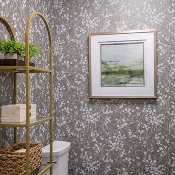
The first features floor-to-ceiling wallpaper in a rich taupe with a delicate white botanical branch pattern, creating an immersive, jewel-box feel. A white shaker vanity with dark granite countertop grounds the space, while an arched frameless mirror and brushed gold wall sconce add glamour. A tall gold and glass etagere serves as both decorative storage and a sculptural element, styled with woven baskets, greenery, and stacked accessories. Framed landscape watercolor art adds a serene, organic note, and a freestanding brass toilet paper holder elevates a typically overlooked detail.
The second restroom takes an entirely different but equally compelling direction — soft, dusty blue-grey grasscloth-style wallpaper printed with a tone-on-tone chevron leaf stripe wraps every wall, creating a calm, spa-like atmosphere. A weathered wood console provides casual charm beneath a large-scale botanical tulip artwork in sage and cream. The wall-mount sink with exposed plumbing adds an intentional, editorial touch. An arched mirror with a sleek multi-bulb bar sconce in brushed nickel completes the look, while a pair of sculptural brass branch wall sculptures mounted directly to the wallpaper serve as unexpected, memorable art.
Storage Made Beautiful
The internal storage corridor received a full wall of custom floor-to-ceiling white shaker cabinetry with chrome pulls, flanked by open shelving sections for accessible display and storage. Clean, crisp, and highly organized — this space proves that even a purely functional corridor can be architectural and refined.
The Break Room & Kitchenette
The staff break room was updated with white shaker cabinetry, light speckled granite countertops, stainless appliances — including a French door refrigerator, dishwasher, and over-counter microwave — and warm sage green walls that bring a restful, refreshing energy to the space. Dark hardwood luxury vinyl plank flooring runs throughout the room, warming the look considerably. A round walnut dining table with upholstered chairs creates a proper gathering space for the team, and framed landscape oil art in an ornate gold frame adds a touch of collected character to the room.
Reception & Corridor Details
The reception and corridor spaces were treated with deep navy blue paint — bold, sophisticated, and unexpected in a commercial setting. A large abstract landscape painting in warm blues, blush, and gold hangs in a gilded frame against the navy wall, making an immediate statement. A brass and lucite table lamp sits on a floating brass-trimmed shelf alongside a sculptural art object, creating a vignette that communicates creativity and intentionality from the moment clients arrive.
The result is a professional environment that communicates confidence, taste, and care — one that clients will remember long after their visit, and one that staff will genuinely enjoy working in every day.
 THE Remodel Group
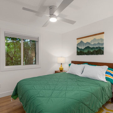
Behind the unassuming exterior of this 1985 split-level home in Southwest Portland lies a dramatic whole-home transformation that blends thoughtful functionality with bold postmodern design. What began as a series of disconnected, dated spaces evolved into a cohesive living environment tailored to the homeowners' everyday routines, entertaining style, and appreciation for distinctive design.
The kitchen served as the anchor of the renovation and set the tone for the home's updated aesthetic. Rich Sapele cabinetry, geometric white tile, and sleek contemporary finishes create a sophisticated gathering space that balances warmth with modern refinement. The original layout suffered from limited storage, inefficient workflow, and underutilized square footage. Through comprehensive space planning, the kitchen was completely reimagined with highly customized storage solutions, including dedicated organization for cookware, utensils, baking supplies, waste management, and small appliances. Panel-ready appliances, concealed storage features, and a striking waterfall island maintain clean visual lines while enhancing everyday functionality.
Entertaining was a major priority for the homeowners and inspired the creation of a dedicated hospitality zone adjacent to the kitchen. A previously overlooked nook was transformed into a custom beverage station complete with a kegerator, wine refrigerator, beverage refrigerator, illuminated display shelving, and storage designed specifically for the homeowners' collection of glassware and spirits. The result is a welcoming destination for gathering with friends and family.
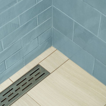
Beyond the kitchen, the renovation extended throughout the home to create a more functional and cohesive living experience. The primary bathroom was completely reconfigured to improve storage, accessibility, and comfort. By reshaping the shower into a more efficient footprint, space was gained for a larger custom walnut double vanity with integrated storage and open shelving. Layered tile selections introduce texture and visual interest, combining porcelain floor tile with blue-gray ceramic wall tile and coordinating patterned accents throughout the space. A Toto bidet toilet, updated plumbing, and provisions for future accessibility enhancements ensure the bathroom is both beautiful and practical.
A nearby powder room received its own bold personality through the use of geometric flooring, warm honey-gold wall color, floating walnut-toned shelving, and a vanity featuring linear detailing that echoes the patterns found throughout the space. The combination of warm wood tones, graphic shapes, and contemporary fixtures creates a memorable guest experience while complementing the home's overall design language.
The basement level was also transformed from a dated and underutilized area into functional living space designed to support the homeowners' evolving needs. Luxury vinyl plank flooring was installed throughout to coordinate with the main floor finishes, while outdated wall coverings were removed in favor of fresh drywall and modern finishes. An existing closet was converted into a dedicated laundry area with integrated storage, and new spaces were created for a guest bedroom and home gym, adding versatility and value to the home.
To unify the renovation, updates were carried throughout the entire residence. Flat-panel interior doors, modern chrome hardware, simplified flat-stock trim, and updated lighting establish a cohesive mid-century-inspired aesthetic from room to room. Electrical improvements throughout the home support the new fixtures while enhancing overall functionality and comfort. New lighting in the dining room, entry, primary bedroom, outdoor living areas, and throughout the home further reinforces the clean, modern design approach.
What makes this remodel especially compelling is the balance between bold design expression and everyday livability. Every decision, from the custom cabinetry and specialized storage to the carefully selected finishes and lighting, was made with both aesthetics and function in mind. The completed renovation transforms an ordinary split-level home into a highly personalized environment where modern convenience, thoughtful organization, and distinctive design come together seamlessly.
 THE Remodel Group
Behind the unassuming exterior of this 1985 split-level home in Southwest Portland lies a dramatic whole-home transformation that blends thoughtful functionality with bold postmodern design. What began as a series of disconnected, dated spaces evolved into a cohesive living environment tailored to the homeowners' everyday routines, entertaining style, and appreciation for distinctive design.
The kitchen served as the anchor of the renovation and set the tone for the home's updated aesthetic. Rich Sapele cabinetry, geometric white tile, and sleek contemporary finishes create a sophisticated gathering space that balances warmth with modern refinement. The original layout suffered from limited storage, inefficient workflow, and underutilized square footage. Through comprehensive space planning, the kitchen was completely reimagined with highly customized storage solutions, including dedicated organization for cookware, utensils, baking supplies, waste management, and small appliances. Panel-ready appliances, concealed storage features, and a striking waterfall island maintain clean visual lines while enhancing everyday functionality.
Entertaining was a major priority for the homeowners and inspired the creation of a dedicated hospitality zone adjacent to the kitchen. A previously overlooked nook was transformed into a custom beverage station complete with a kegerator, wine refrigerator, beverage refrigerator, illuminated display shelving, and storage designed specifically for the homeowners' collection of glassware and spirits. The result is a welcoming destination for gathering with friends and family.
Beyond the kitchen, the renovation extended throughout the home to create a more functional and cohesive living experience. The primary bathroom was completely reconfigured to improve storage, accessibility, and comfort. By reshaping the shower into a more efficient footprint, space was gained for a larger custom walnut double vanity with integrated storage and open shelving. Layered tile selections introduce texture and visual interest, combining porcelain floor tile with blue-gray ceramic wall tile and coordinating patterned accents throughout the space. A Toto bidet toilet, updated plumbing, and provisions for future accessibility enhancements ensure the bathroom is both beautiful and practical.
A nearby powder room received its own bold personality through the use of geometric flooring, warm honey-gold wall color, floating walnut-toned shelving, and a vanity featuring linear detailing that echoes the patterns found throughout the space. The combination of warm wood tones, graphic shapes, and contemporary fixtures creates a memorable guest experience while complementing the home's overall design language.
The basement level was also transformed from a dated and underutilized area into functional living space designed to support the homeowners' evolving needs. Luxury vinyl plank flooring was installed throughout to coordinate with the main floor finishes, while outdated wall coverings were removed in favor of fresh drywall and modern finishes. An existing closet was converted into a dedicated laundry area with integrated storage, and new spaces were created for a guest bedroom and home gym, adding versatility and value to the home.
To unify the renovation, updates were carried throughout the entire residence. Flat-panel interior doors, modern chrome hardware, simplified flat-stock trim, and updated lighting establish a cohesive mid-century-inspired aesthetic from room to room. Electrical improvements throughout the home support the new fixtures while enhancing overall functionality and comfort. New lighting in the dining room, entry, primary bedroom, outdoor living areas, and throughout the home further reinforces the clean, modern design approach.
What makes this remodel especially compelling is the balance between bold design expression and everyday livability. Every decision, from the custom cabinetry and specialized storage to the carefully selected finishes and lighting, was made with both aesthetics and function in mind. The completed renovation transforms an ordinary split-level home into a highly personalized environment where modern convenience, thoughtful organization, and distinctive design come together seamlessly.
71