
Search results for "Compensated housing" in Home Design Ideas

 Blue Sound Construction, Inc.
The addition replicates the home's original Tudor openings throughout, but in this case, beckons into a large, light-filled master closet. The Ukrainian tilt and turn windows with their metal divisions are both charming and impressively engineered. Photo: John Granen, Builder: Blue Sound Construction, Inc. Seattle.

 TKS Design Group
Free ebook, Creating the Ideal Kitchen. DOWNLOAD NOW
This young family of four came in right after closing on their house and with a new baby on the way. Our goal was to complete the project prior to baby’s arrival so this project went on the expedite track. The beautiful 1920’s era brick home sits on a hill in a very picturesque neighborhood, so we were eager to give it the kitchen it deserves. The clients’ dream kitchen included pro-style appliances, a large island with seating for five and a kitchen that feels appropriate to the home’s era but that also is fresh and modern. They explicitly stated they did not want a “cookie cutter” design, so we took that to heart.
The key challenge was to fit in all of the items on their wish given the room’s constraints. We eliminated an existing breakfast area and bay window and incorporated that area into the kitchen. The bay window was bricked in, and to compensate for the loss of seating, we widened the opening between the kitchen and formal dining room for more of an open concept plan.
The ceiling in the original kitchen is about a foot lower than the rest of the house, and once it was determined that it was to hide pipes and other mechanicals, we reframed a large tray over the island and left the rest of the ceiling as is. Clad in walnut planks, the tray provides an interesting feature and ties in with the custom walnut and plaster hood.
The space feels modern yet appropriate to its Tudor roots. The room boasts large family friendly appliances, including a beverage center and cooktop/double oven combination. Soft white inset cabinets paired with a slate gray island provide a gentle backdrop to the multi-toned island top, a color echoed in the backsplash tile. The handmade subway tile has a textured pattern at the cooktop, and large pendant lights add more than a bit of drama to the room.
Designed by: Susan Klimala, CKD, CBD
Photography by: Mike Kaskel
For more information on kitchen and bath design ideas go to: www.kitchenstudio-ge.com
 TKS Design Group
Free ebook, Creating the Ideal Kitchen. DOWNLOAD NOW
This young family of four came in right after closing on their house and with a new baby on the way. Our goal was to complete the project prior to baby’s arrival so this project went on the expedite track. The beautiful 1920’s era brick home sits on a hill in a very picturesque neighborhood, so we were eager to give it the kitchen it deserves. The clients’ dream kitchen included pro-style appliances, a large island with seating for five and a kitchen that feels appropriate to the home’s era but that also is fresh and modern. They explicitly stated they did not want a “cookie cutter” design, so we took that to heart.
The key challenge was to fit in all of the items on their wish given the room’s constraints. We eliminated an existing breakfast area and bay window and incorporated that area into the kitchen. The bay window was bricked in, and to compensate for the loss of seating, we widened the opening between the kitchen and formal dining room for more of an open concept plan.
The ceiling in the original kitchen is about a foot lower than the rest of the house, and once it was determined that it was to hide pipes and other mechanicals, we reframed a large tray over the island and left the rest of the ceiling as is. Clad in walnut planks, the tray provides an interesting feature and ties in with the custom walnut and plaster hood.
The space feels modern yet appropriate to its Tudor roots. The room boasts large family friendly appliances, including a beverage center and cooktop/double oven combination. Soft white inset cabinets paired with a slate gray island provide a gentle backdrop to the multi-toned island top, a color echoed in the backsplash tile. The handmade subway tile has a textured pattern at the cooktop, and large pendant lights add more than a bit of drama to the room.
Designed by: Susan Klimala, CKD, CBD
Photography by: Mike Kaskel
For more information on kitchen and bath design ideas go to: www.kitchenstudio-ge.com
Find the right local pro for your project

 Jackie James LLC
Master Bathroom with Frameless Walk In Shower, Navy Blue Fan Tiles with White Grout, Walnut Vanities with Gold Mirror, Faucets and Hardware. Verticle Offset Bond Subway Tile in the Master Shower

 Moss & Jane
Midcentury modern home on Lake Sammamish. We used mixed materials and styles to add interest to this bright space. A Caesarstone quartz insert protects the reclaimed wood counter top and provides a work space for the chef. The crushed granite sink allows for easy clean-up and a scratch proof surface.
 TKS Design Group
Free ebook, Creating the Ideal Kitchen. DOWNLOAD NOW
This young family of four came in right after closing on their house and with a new baby on the way. Our goal was to complete the project prior to baby’s arrival so this project went on the expedite track. The beautiful 1920’s era brick home sits on a hill in a very picturesque neighborhood, so we were eager to give it the kitchen it deserves. The clients’ dream kitchen included pro-style appliances, a large island with seating for five and a kitchen that feels appropriate to the home’s era but that also is fresh and modern. They explicitly stated they did not want a “cookie cutter” design, so we took that to heart.
The key challenge was to fit in all of the items on their wish given the room’s constraints. We eliminated an existing breakfast area and bay window and incorporated that area into the kitchen. The bay window was bricked in, and to compensate for the loss of seating, we widened the opening between the kitchen and formal dining room for more of an open concept plan.
The ceiling in the original kitchen is about a foot lower than the rest of the house, and once it was determined that it was to hide pipes and other mechanicals, we reframed a large tray over the island and left the rest of the ceiling as is. Clad in walnut planks, the tray provides an interesting feature and ties in with the custom walnut and plaster hood.
The space feels modern yet appropriate to its Tudor roots. The room boasts large family friendly appliances, including a beverage center and cooktop/double oven combination. Soft white inset cabinets paired with a slate gray island provide a gentle backdrop to the multi-toned island top, a color echoed in the backsplash tile. The handmade subway tile has a textured pattern at the cooktop, and large pendant lights add more than a bit of drama to the room.
Designed by: Susan Klimala, CKD, CBD
Photography by: Mike Kaskel
For more information on kitchen and bath design ideas go to: www.kitchenstudio-ge.com
 TKS Design Group
Free ebook, Creating the Ideal Kitchen. DOWNLOAD NOW
This young family of four came in right after closing on their house and with a new baby on the way. Our goal was to complete the project prior to baby’s arrival so this project went on the expedite track. The beautiful 1920’s era brick home sits on a hill in a very picturesque neighborhood, so we were eager to give it the kitchen it deserves. The clients’ dream kitchen included pro-style appliances, a large island with seating for five and a kitchen that feels appropriate to the home’s era but that also is fresh and modern. They explicitly stated they did not want a “cookie cutter” design, so we took that to heart.
The key challenge was to fit in all of the items on their wish given the room’s constraints. We eliminated an existing breakfast area and bay window and incorporated that area into the kitchen. The bay window was bricked in, and to compensate for the loss of seating, we widened the opening between the kitchen and formal dining room for more of an open concept plan.
The ceiling in the original kitchen is about a foot lower than the rest of the house, and once it was determined that it was to hide pipes and other mechanicals, we reframed a large tray over the island and left the rest of the ceiling as is. Clad in walnut planks, the tray provides an interesting feature and ties in with the custom walnut and plaster hood.
The space feels modern yet appropriate to its Tudor roots. The room boasts large family friendly appliances, including a beverage center and cooktop/double oven combination. Soft white inset cabinets paired with a slate gray island provide a gentle backdrop to the multi-toned island top, a color echoed in the backsplash tile. The handmade subway tile has a textured pattern at the cooktop, and large pendant lights add more than a bit of drama to the room.
Designed by: Susan Klimala, CKD, CBD
Photography by: Mike Kaskel
For more information on kitchen and bath design ideas go to: www.kitchenstudio-ge.com
Sponsored
Columbus, OH
Free consultation for landscape design!

Peabody Landscape Group
Columbus' Reliable Landscape Design & Contracting
 Otogawa-Anschel Design-Build
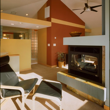
The owners of this 1970s-era split-level on Lake Calhoun recently added a third story bringing the home up-to-date with attractive soffits, angles, and half-walls built to create depth and dimension. But in a house where every room registered a dull white, a healthy dose of color becomes the true force for modernizing this space. The homeowners asked Otogawa-Anschel to bring color into their lives.
The standalone fireplace in the room’s center wears an entirely different chromatic palette on each side. From the sleeping area and looking out toward the lake, cool tones tease out the aqua and dark blue in the slate fireplace surround. From the opposite side, warm hues pick up the rose and violet of the same material. The wall separating the bedroom from the bathroom boasts a rich adobe red, set off by a gold soffit and a rich chocolate panel. The bold, earthy color triad serves as the eye-catching anchor point for the room.
Asymmetrical glass block flanking the bathroom vanity opens up an otherwise restrictive space, allowing it to communicate with the walk-in closet on one side and the natural light spill on the other. Because the green glass block diffuses the light, the room’s colors work to compensate for this softening. A mix of tangerine, pale green, and lemon yellow tile used in the shower find a place on the floor and walls as well for a burst of synthetic sunshine designed to shift and bend depending on vantage point. The gently morphing pattern eliminates the flat sterility of white tile and ordinary glass block.
The transition from the second floor to the third floor features a combination of yellow hues that also appear to shimmer and shift with the movement of natural light through the space. In the intense afternoon sun, the pigments lose their distinction and become a solid glowing wall. As the sun sets, they regain their individual character.
Like any healthy relationship, the living room and dining room work together while maintaining independence. In the living room, a soft suede wall gives way to the room’s large bank of windows and smartly complements the stone fireplace. Muted greens and golds segue effortlessly to the spectacular lake view. Meanwhile, the vibrant tones of the dining room tastefully contrast the cool calm of the living area.
highlights
Fifty-six colors in whole house
Forty-two colors in master suite
 Otogawa-Anschel Design-Build
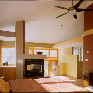
The owners of this 1970s-era split-level on Lake Calhoun recently added a third story bringing the home up-to-date with attractive soffits, angles, and half-walls built to create depth and dimension. But in a house where every room registered a dull white, a healthy dose of color becomes the true force for modernizing this space. The homeowners asked Otogawa-Anschel to bring color into their lives.
The standalone fireplace in the room’s center wears an entirely different chromatic palette on each side. From the sleeping area and looking out toward the lake, cool tones tease out the aqua and dark blue in the slate fireplace surround. From the opposite side, warm hues pick up the rose and violet of the same material. The wall separating the bedroom from the bathroom boasts a rich adobe red, set off by a gold soffit and a rich chocolate panel. The bold, earthy color triad serves as the eye-catching anchor point for the room.
Asymmetrical glass block flanking the bathroom vanity opens up an otherwise restrictive space, allowing it to communicate with the walk-in closet on one side and the natural light spill on the other. Because the green glass block diffuses the light, the room’s colors work to compensate for this softening. A mix of tangerine, pale green, and lemon yellow tile used in the shower find a place on the floor and walls as well for a burst of synthetic sunshine designed to shift and bend depending on vantage point. The gently morphing pattern eliminates the flat sterility of white tile and ordinary glass block.
The transition from the second floor to the third floor features a combination of yellow hues that also appear to shimmer and shift with the movement of natural light through the space. In the intense afternoon sun, the pigments lose their distinction and become a solid glowing wall. As the sun sets, they regain their individual character.
Like any healthy relationship, the living room and dining room work together while maintaining independence. In the living room, a soft suede wall gives way to the room’s large bank of windows and smartly complements the stone fireplace. Muted greens and golds segue effortlessly to the spectacular lake view. Meanwhile, the vibrant tones of the dining room tastefully contrast the cool calm of the living area.
highlights
Fifty-six colors in whole house
Forty-two colors in master suite
 Otogawa-Anschel Design-Build
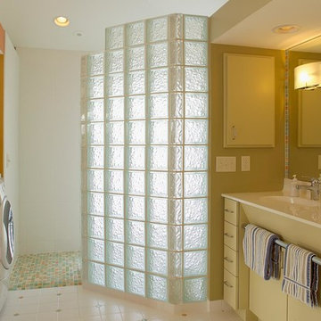
The owners of this 1970s-era split-level on Lake Calhoun recently added a third story bringing the home up-to-date with attractive soffits, angles, and half-walls built to create depth and dimension. But in a house where every room registered a dull white, a healthy dose of color becomes the true force for modernizing this space. The homeowners asked Otogawa-Anschel to bring color into their lives.
The standalone fireplace in the room’s center wears an entirely different chromatic palette on each side. From the sleeping area and looking out toward the lake, cool tones tease out the aqua and dark blue in the slate fireplace surround. From the opposite side, warm hues pick up the rose and violet of the same material. The wall separating the bedroom from the bathroom boasts a rich adobe red, set off by a gold soffit and a rich chocolate panel. The bold, earthy color triad serves as the eye-catching anchor point for the room.
Asymmetrical glass block flanking the bathroom vanity opens up an otherwise restrictive space, allowing it to communicate with the walk-in closet on one side and the natural light spill on the other. Because the green glass block diffuses the light, the room’s colors work to compensate for this softening. A mix of tangerine, pale green, and lemon yellow tile used in the shower find a place on the floor and walls as well for a burst of synthetic sunshine designed to shift and bend depending on vantage point. The gently morphing pattern eliminates the flat sterility of white tile and ordinary glass block.
The transition from the second floor to the third floor features a combination of yellow hues that also appear to shimmer and shift with the movement of natural light through the space. In the intense afternoon sun, the pigments lose their distinction and become a solid glowing wall. As the sun sets, they regain their individual character.
Like any healthy relationship, the living room and dining room work together while maintaining independence. In the living room, a soft suede wall gives way to the room’s large bank of windows and smartly complements the stone fireplace. Muted greens and golds segue effortlessly to the spectacular lake view. Meanwhile, the vibrant tones of the dining room tastefully contrast the cool calm of the living area.
highlights
Fifty-six colors in whole house
Forty-two colors in master suite
 Otogawa-Anschel Design-Build
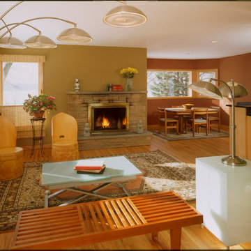
The owners of this 1970s-era split-level on Lake Calhoun recently added a third story bringing the home up-to-date with attractive soffits, angles, and half-walls built to create depth and dimension. But in a house where every room registered a dull white, a healthy dose of color becomes the true force for modernizing this space. The homeowners asked Otogawa-Anschel to bring color into their lives.
The standalone fireplace in the room’s center wears an entirely different chromatic palette on each side. From the sleeping area and looking out toward the lake, cool tones tease out the aqua and dark blue in the slate fireplace surround. From the opposite side, warm hues pick up the rose and violet of the same material. The wall separating the bedroom from the bathroom boasts a rich adobe red, set off by a gold soffit and a rich chocolate panel. The bold, earthy color triad serves as the eye-catching anchor point for the room.
Asymmetrical glass block flanking the bathroom vanity opens up an otherwise restrictive space, allowing it to communicate with the walk-in closet on one side and the natural light spill on the other. Because the green glass block diffuses the light, the room’s colors work to compensate for this softening. A mix of tangerine, pale green, and lemon yellow tile used in the shower find a place on the floor and walls as well for a burst of synthetic sunshine designed to shift and bend depending on vantage point. The gently morphing pattern eliminates the flat sterility of white tile and ordinary glass block.
The transition from the second floor to the third floor features a combination of yellow hues that also appear to shimmer and shift with the movement of natural light through the space. In the intense afternoon sun, the pigments lose their distinction and become a solid glowing wall. As the sun sets, they regain their individual character.
Like any healthy relationship, the living room and dining room work together while maintaining independence. In the living room, a soft suede wall gives way to the room’s large bank of windows and smartly complements the stone fireplace. Muted greens and golds segue effortlessly to the spectacular lake view. Meanwhile, the vibrant tones of the dining room tastefully contrast the cool calm of the living area.
highlights
Fifty-six colors in whole house
Forty-two colors in master suite
 UltraMedia, Inc.
UltraMedia featured in Electronic House magazine:
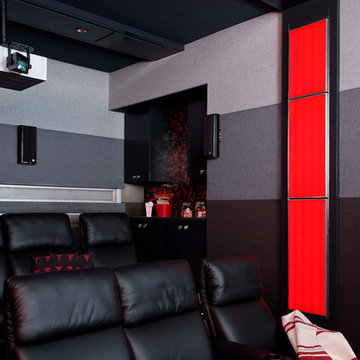
"Reaching this point of acoustical nirvana required plenty of calculations, CAD drawings and calibration, says Mike Brock of custom electronics design and installation firm UltraMedia, Richardson, Texas. His company worked directly with the manufacturer—Auralex—to make sure every inch of wall surface, both inside and out, was covered with the perfect type and amount of acoustical material. “We sent the room dimensions and the planned locations of the video projector, speakers and other equipment to the engineers at Auralex,” Brock explains. Using this information, the company was able to specify products and determine their proper placement. “This was the first time where I actually had the manufacturer come down and take an active role in the project and it really worked to everyone’s advantage,” Brock continues.
Home-Theater-Wolf-Projector.jpg
Auralex’s help with the design of the acoustical treatments afforded Brock the time to implement other sound-enhancing solutions. For example, he filled the hollow metal legs of the bar with sand to prevent them from resonating during loud passages in movie soundtracks. A thick, heavily padded carpet was added, and the general contractor constructed the shell of the room with sound-reducing drywall and installed a solid core door to prevent audio from seeping out into other areas of the house.
Lastly, the sound system was calibrated. Unlike many acoustically treated theaters, where the speakers are installed within the walls and covered with special fabric, in this room UltraMedia kept the nine Vienna Acoustic speakers completely exposed. The front three Vienna Acoustics Klimt Music speakers (as well as two REL sub bass units) were positioned on the floor, and the back six speakers were mounted to the surface of the walls. “The cherry in this theater are the Klimts,” says Brock. “We really dialed them in for the best possible sound.” By “dialing in,” Brock means using his and his team’s critical listening skills to position the speakers properly, then using the Integra receiver’s built-in Audyssey technology (a combination of sophisticated software and microphones) to calibrate the speakers to compensate for any acoustical anomalies. The end result: audio perfection."
Photo credit: UltraMedia, Inc.
 TKS Design Group
Free ebook, Creating the Ideal Kitchen. DOWNLOAD NOW
This young family of four came in right after closing on their house and with a new baby on the way. Our goal was to complete the project prior to baby’s arrival so this project went on the expedite track. The beautiful 1920’s era brick home sits on a hill in a very picturesque neighborhood, so we were eager to give it the kitchen it deserves. The clients’ dream kitchen included pro-style appliances, a large island with seating for five and a kitchen that feels appropriate to the home’s era but that also is fresh and modern. They explicitly stated they did not want a “cookie cutter” design, so we took that to heart.
The key challenge was to fit in all of the items on their wish given the room’s constraints. We eliminated an existing breakfast area and bay window and incorporated that area into the kitchen. The bay window was bricked in, and to compensate for the loss of seating, we widened the opening between the kitchen and formal dining room for more of an open concept plan.
The ceiling in the original kitchen is about a foot lower than the rest of the house, and once it was determined that it was to hide pipes and other mechanicals, we reframed a large tray over the island and left the rest of the ceiling as is. Clad in walnut planks, the tray provides an interesting feature and ties in with the custom walnut and plaster hood.
The space feels modern yet appropriate to its Tudor roots. The room boasts large family friendly appliances, including a beverage center and cooktop/double oven combination. Soft white inset cabinets paired with a slate gray island provide a gentle backdrop to the multi-toned island top, a color echoed in the backsplash tile. The handmade subway tile has a textured pattern at the cooktop, and large pendant lights add more than a bit of drama to the room.
Designed by: Susan Klimala, CKD, CBD
Photography by: Mike Kaskel
For more information on kitchen and bath design ideas go to: www.kitchenstudio-ge.com
Sponsored
Westerville, OH

Custom Home Works
Franklin County's Award-Winning Design, Build and Remodeling Expert

 Adventure in Building, Inc.
New garage with loft space with the garage doors open and view of the salvaged antique wood stairway. The garage was built around the stairs. Monarcha Marcet

 Proto Homes, LLC
On average, a Proto Home™ can be constructed within four months, thanks to our new building methods that save time and money, while increasing accuracy. Proto Homes™ are built through a hybrid construction system: factory produced + site built elements. By prefabricating the shell and core features of the home off-site, construction can essentially begin before permitting has, thus saving you time and money.
Foundation/Slab Detailing: The foundation is detailed to serve two primary purposes. The foundation curb is formed in such a way that it acts as a measuring "rubric" for the house, first in providing a horizontal registration point for finish floors inside the house, and grading and landscape for outside. Secondly, it serves as a vertical indexing margin for all exterior finishes including panel systems and metal cladding. In addition, the delineation provided by the curb provides a clean aesthetic for the foundation itself and waterproofs the home.
Roofing construction is made more efficient in a Proto Home™. By doing away with the traditional attic, we've utilized every last square inch – which in this case provides higher ceilings. Every Proto Home™ features a "zero-penetration" roof that is uninterrupted by plumbing vents or ducts thanks to the Proto Core™ design, which moves traditional roof vents to the side wall of the core. The all-steel roof assembly provides structural stability and resists damage from weather and pests, giving it longevity not typical in today's roofs.
With Proto Home's™, it's all about the details. From the garage to the bathrooms, the amenities we use everyday have been slightly adjusted to make our lives easier.
The Proto Home™ garage is carefully designed to function as efficiently as the rest of the home. The floor is perfectly level, and outfitted with the same concrete as the rest of the first floor, which makes fitting the space with shelves and furniture much easier.
Bathtubs are reworked into "Soak In Showers," which are easy to enter and exit, yet deep enough to bathe in.
In keeping with sleek lines and uninterrupted design, we have developed "Zero Jam," a patented interior door jam made of solid aluminum. When closed, the door blends with the adjoining wall to create the appearance of one continuous unit.
Proto Home's™ also work with the seasons to compensate for changes in weather. The climate control can be adjusted so that during the summer air-conditioned cold air flows in from the top and descends to cool the space below. During the winter, the hot air is forced in from the ground level and ascends heating the entire house.
Photo Credit: Lisa Romerein, Proto Homes, LLC
 Metke Remodeling & Luxury Homes
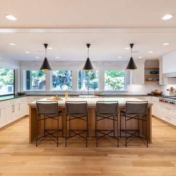
This spacious entertainer's kitchen is part of a whole house remodel and 2-story addition. Our clients' goal was to create a larger, more functional kitchen with a strong connection to the outdoors. The unique flip up window allows for a complete connection to the outdoor covered space.
No expense was spared in this design as the clients' desire for all natural materials drove the selections. The quartzite island in Opus White provides a textural and colorful element that grounds the space and complements the soapstone perimeter counters. The flip out window is a unique feature that bridges indoor and outdoor, and provides unique entertaining element. The focal point of the kitchen are the large windows looking into their greenspace, in order to preserve the view there were very few upper cabinets planned. To compensate with this direction, the lower cabinets were outfitted with top-of-the line interior accessories to provide the most functional and efficient storage. High-end, Wolf and Sub Zero appliance and the addition of a walk-in pantry completed the wish list!
Steel beams were the solution to creating the large open connection between existing structure and new kitchen addition. We had to incorporate a shallow steel beam spanning the whole width of the kitchen to not impede the existing 8' ceiling height, yet allow for the master bedroom addition directly above the new kitchen addition. In order to bridge interior and exterior spaces, a custom, flip-out window was selected. This sits on the finished counter slab, which extended into the adjacent covered entertaining patio. This allowed no room for error, all the components had to fit together exactly to insure the extended countertop would function as the sill.
The value provided our clients was in helping select high quality materials and install them with exceptional quality. Our team did an outstanding job of keeping our client on track and avoiding costly mistakes. This project was not delivered within the original budget due to several client driven change orders.

Sponsored
Westerville, OH
Custom Home Works
Franklin County's Award-Winning Design, Build and Remodeling Expert

 a.d.d. concept + design
Large cottage black two-story mixed siding exterior home photo in San Francisco

 G. Christianson Construction, Inc.
This beautiful Craftsman style Passive House has a carbon footprint 20% that of a typically built home in Oregon. Its 12-in. thick walls with cork insulation, ultra-high efficiency windows and doors, solar panels, heat pump hot water, Energy Star appliances, fresh air intake unit, and natural daylighting keep its utility bills exceptionally low.
Jen G. Pywell

 Jean Stoffer Design, Ltd
Stoffer Photography
Example of a small classic porcelain tile single front door design in Grand Rapids with white walls and a black front door
Example of a small classic porcelain tile single front door design in Grand Rapids with white walls and a black front door
7