
Search results for "Compliment linear" in Home Design Ideas
 Prime & Precision
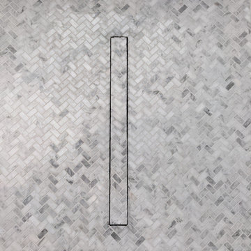
This shower design features large format Firenze marble tile from #thetileshop, #Kohler purist fixtures and a custom made shower pan recessed into the concrete slab to create a one of a kind zero curb shower. Featuring a herringbone mosaic marble for the shower floor, custom bench with quartz top to match the vanity, recessed shampoo niche with matching pencil edging and an extended glass surround, you feel the difference from basic economy to first class when you step into this space ✈️
The Kohler Purist shower system consists of a ceiling mounted rain head, handheld wand sprayer and wall mounted shower head that features innovative Katalyst air-induction technology, which efficiently mixes air and water to produce large water droplets and deliver a powerful, thoroughly drenching overhead shower experience, simulating the soaking deluge of a warm summer downpour.
We love the vibrant brushed bronze finish on these fixtures as it brings out the sultry effect in the bathroom and when paired with classic marble it adds a clean, minimal feel whilst also being the showstopper of the space ?


Find the right local pro for your project

 Design8, LLC
White River granite, Honed marble granite
Example of a classic kitchen design in New Orleans
Example of a classic kitchen design in New Orleans

 Brewster Home Fashions
Modern grey triangles alternate with metallic accents. Printed on foil for a spectacular and radiant wallpaper option.
Example of a minimalist living room design in Boston
Example of a minimalist living room design in Boston

 TVL Creative Ltd.
Cramped kitchen be gone! That was the project motto and top priority. The goal was to transform the current layout from multiple smaller spaces into a connected whole that would activate the main level for our clients, a young family of four.
The biggest obstacle was the wall dividing the kitchen and the dining room. Removing this wall was central to opening up and integrating the main living spaces, but the existing ductwork that ran right through the center of the wall posed a design challenge, er design opportunity. The resulting design solution features a central pantry that captures the ductwork and provides valuable storage- especially when compared to the original kitchen's 18" wide pantry cabinet. The pantry also anchors the kitchen island and serves as a visual separation of space between the kitchen and homework area.
Through our design development process, we learned the formal living room was of no service to their lifestyle and therefore space they rarely spent time in. With that in mind, we proposed to eliminate the unused living room and make it the new dining room. Relocating the dining room to this space inherently felt right given the soaring ceiling and ample room for holiday dinners and celebrations. The new dining room was spacious enough for us to incorporate a conversational seating area in the warm, south-facing window alcove.
Now what to do with the old dining room?! To answer that question we took inspiration from our clients' shared profession in education and developed a craft area/homework station for both of their boys. The semi-custom cabinetry of the desk area carries over to the adjacent wall and forms window bench base with storage that we topped with butcher block for a touch of warmth. While the boys are young, the bench drawers are the perfect place for a stash of toys close to the kitchen.
The kitchen begins just beyond the window seat with their refrigerator enclosure. Opposite the refrigerator is the new pantry with twenty linear feet of shelving and space for brooms and a stick vacuum. Extending from the backside of the pantry the kitchen island design incorporates counter seating on the family room side and a cabinetry configuration on the kitchen side with drawer storage, a trashcan center, farmhouse sink, and dishwasher.
We took careful time in design and execution to align the range and sink because while it might seem like a small detail, it plays an important role in supporting the symmetrical configuration of the back wall of the kitchen. The rear wall design utilizes an appliance garage mirrors the visual impact of the refrigerator enclosure and helps keep the now open kitchen tidy. Between the appliance garage and refrigerator enclosure is the cooking zone with 30" of cabinetry and work surface on either side of the range, a chimney style vent hood, and a bold graphic tile backsplash.
The backsplash is just one of many personal touches we added to the space to reflect our client's modern eclectic style and love of color. Swooping lines of the mid-mod style barstools compliment the pendants and backsplash pattern. A pop of vibrant green on the frame of the pantry door adds a fresh wash of color to an otherwise neutral space. The big show stopper is the custom charcoal gray and copper chevron wall installation in the dining room. This was an idea our clients softly suggested, and we excitedly embraced the opportunity. It is also a kickass solution to the head-scratching design dilemma of how to fill a large and lofty wall.
We are so grateful to bring this design to life for our clients and now dear friends.

 Daniel Contelmo Architects
This kitchen was part of the construction of an entire new house. The clients were looking for a classic, simple design on a budget. We used simple detailing and careful planning to create this space. The moldings and panels are simple, with straight edges. The kitchen opens up to the great room to create one big open space. The ceiling is vaulted to create a feeling of grandeur.
Photo by: Daniel Contelmo Jr.

 Advanced Concrete Designs, Inc
Example of a mid-sized backyard concrete and rectangular natural pool design in Oklahoma City

 MSI
White Glossy Penny Round Mosaics add a punch of classic design to any design installation. For traditional design, select a grout similar to the white tile in tone and color, and for a more contemporary or modern approach, select a contrasting grout to make this backsplash tile or floor tile really pop.
 LL Flooring
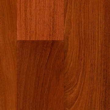
We apply our durable, industry-leading finish to each board using a groundbreaking multi-layered, micro-particle process for superior wear and scratch resistance. So, go ahead bring on life and everything that comes with it. Your Bellawood floor will stay beautiful year after year. Brazilian Cherry is one of our most popular woods because of its ideal balance of rich beauty and proven durability. Its majestic colors range from a yellowish tan to reddish brown when just milled, and it deepens significantly to an exquisite deep cherry brown as it ages. For spaces that demand durability year after year, residential or commercial, Brazilian Cherry is an excellent flooring choice.
This product is proudly finished in the USA.



 Stowe Craft and Design
This pebble wall paper adds extreme interest to a small powder room. Light reflects off the metallic towel bar and the glassy stones.
Bathroom - modern bathroom idea in Burlington
Bathroom - modern bathroom idea in Burlington

 BLDG Workshop Inc.
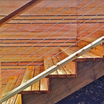
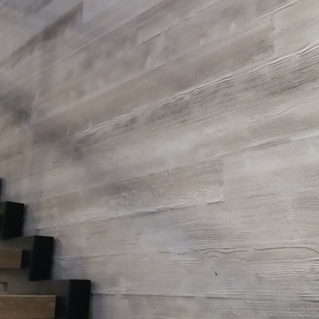
a board formed concrete wall sets a backdrop behind a steel cut stringer carrying open wood treads with skylights above
Staircase - large modern wooden straight open staircase idea in Vancouver
Staircase - large modern wooden straight open staircase idea in Vancouver

 OVKO Art & Design
Blue Urban Abstract Wall Art has an undeniably modern hip flow. A futuristic digital painting, created with the technique of long exposure photography captures the motion of light as brushstrokes. A blend of blue green colors provides a soothing and calm expression. The lines are curvy and rhythmic adding to the smooth style. The overall style is reminiscent of graffiti, pushing the boundaries of new media art to the future. The work is mounted under a stunning plexiglass which provides a sleek finish and ultra modern feel.
 Bosch Services Ltd.
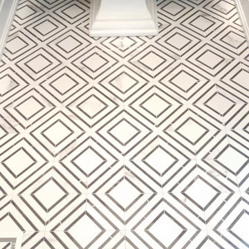
Powder room floor tile with custom tile vent
Inspiration for a small contemporary bathroom remodel in Toronto
Inspiration for a small contemporary bathroom remodel in Toronto
 Southern Staircase
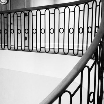
Ornamental Iron Handrail System
Inspiration for a timeless home design remodel in Atlanta
Inspiration for a timeless home design remodel in Atlanta

 Contempo Studio
Inspiration for a mid-sized transitional gender-neutral light wood floor and white floor built-in closet remodel in Toronto with flat-panel cabinets and white cabinets

 Campion Walker Landscapes
A breathtaking hilltop view of the Pacific was the reference point for this dramatic landscape transformation. The Campion Walker team utilized succulents, water falls, textured concrete and steel to integrate the house and the raw untouched land surrounding it.

 Advance Design Studio, Ltd.
After six years of living in their Huntley IL home, Chris and Meghan were tired of their dark, dingy, outdated kitchen and it was finally time for a long-anticipated change. “The kitchen is the place where we live, it’s where we do everything,” Meghan said. “It was important that it be a space where we wanted to be.” Meghan loves cooking and enjoys including their girls in healthy meal prepping, this led them to want a brighter, more enjoyable kitchen with increased functionality and improved storage.
For Chris especially, the laundry room was an entirely dysfunctional eyesore. “We had a washer and a dryer, but it was all kind-of cobbled together!” Chris said. “There were always laundry piles everywhere, we weren’t really sure what we wanted to do in there, but it was time for us to make a change.” The mess of the space was stressful every time they walked in the door from the garage each day. Kids’ backpacks and shoes piled up haphazardly in the makeshift boot-bench closet left the family feeling disorganized and stressed. They needed space for folding clothes and locker cubbies to help keep the family organized.
Having known Christine and Todd in the Huntley community for years, Chris and Meghan were familiar with their work. “We already trusted them personally and having seen their projects for years we knew they did top notch work. After we reviewed the initial round of designs, we knew that hiring them was definitely the right choice,” Meghan and Chris said. Although Chris had done a lot of work in their home himself, the kitchen and laundry room renovation was such a large undertaking that he didn’t want to steal time away from his family to spend what would surely be many long weekends doing the job himself. “That would not have been a wise choice for us,” Chris laughed.
“Our designer, Michelle was very, very, easy to work with; anything we wanted to see or weren’t sure about, she went above and beyond to make this easy for us. She was easy to get hold of and always quick to respond,” the couple said. Michelle pulled ideas that mirrored the couple’s taste and style and was adept at directing the couple to limited choices that didn’t overwhelm them and kept the process moving. “I have a hard time making decisions. Michelle made the decision-making process so easy. I loved how she listened to what I liked and then presented three great options for me to choose from,” Meghan said.
The main objectives for the kitchen were better storage solutions, they wanted the space to reflect their lifestyle and taste, and they wanted it to last for years with low maintenance. One of the first steps in creating a more functional kitchen was relocating the refrigerator, creating an improved workflow for the busy family.
“We didn’t know that we could even move the refrigerator to a new location where it is now, that was something that we never would have thought of,” Chris said. “The new refrigerator location makes the kitchen feel so much bigger. We didn’t add any space, but our whole kitchen with the new design just seems like it’s so much larger than before!” Meghan said.
The perimeter mist colored cabinets helped warm and brighten the entire room, while the graphite colored cabinets on the island added contrast. Using this fresh, clean color palette satisfied the couple’s desire for a bright space that was the exact opposite of what they had before. Organization accessories were also added to the cabinets such as a spice drawer tray and roll outs to create hidden convenience.
“I absolutely love the hidden spices – it makes cooking so much more enjoyable!” Chris said. “And all the pull outs, and the double trash bin, who would think you could get so excited about organization!” the couple said in unison.
One thing they hated in their original kitchen was how dark the space felt. Added lighting on the ceiling with the new light fixtures combined with the lighter cabinetry colors throughout solved this problem. “Our new kitchen has this warm, almost cozy feeling that our old kitchen never had, it’s just a space that I love spending my time in now,” Meghan said. The light airy feeling was accentuated with the use of floating white shelves on either side of the decorative range hood. “We have so much cabinetry space, the new design is amazing we actually have more storage space than we will ever need,” Meghan said.
The island was extended to create more work surface and added space for stool seating. “The new island changes how we live. Now the kids can be in the kitchen with us, doing homework, eating breakfast, and the three of us have special dinners there when Chris is working late,” Meghan said.
The Carrara Marmi Quartz countertops were chosen because they are, not only beautiful, but are made from hard-working material that doesn’t require maintenance. The white subway tile backsplash that wraps to the ceiling behind the focal point cooktop range/hood compliments the crisp white countertops perfectly, while brushed brass hardware and light fixtures keep the design fresh and new.
The couple had a few fears at the beginning of the project, as most homeowners do. Their biggest fear was being out of their kitchen and laundry room for an extended time. The crew made it very easy for the family to work in a limited space keeping the washer and dryer hooked up the majority of the time, and also getting appliances working with minimal downtime.
“They above and beyond accommodated us to get us through the process,” Meghan said. “They did a great job making sure we were as comfortable as possible throughout the process,” Chris added.
“Our project manager DJ did a great job. He was very good at updating us on schedule changes, getting guys in as quickly as possible. Everyone that stepped in the house was nice and did great work,” said Chris. They thought Advance’s carpenter was phenomenal and were impressed when he took a conceptual idea from a photograph and worked with designer Michelle to create a one of a kind range/hood that has become the topic of conversation with friends and family who visit the new kitchen. “He was in our house literally every day for several weeks. He was easy to work with and good at what he did,” Meghan and Chris said.
The focal point of the kitchen; a hand-crafted, custom-built ventilation hood was clad with handpicked reclaimed barnwood. Advance Design’s carpenter built the framework and the cladding to create a one-of-a-kind design element that the couple loves.
“I think it was especially fun for him to create something unique from scratch, showcasing his talent in this area,” Meghan said. “I love that my kitchen is not like everyone else’s. I got to pick out the wood on my hood and watch it being built and was able to choose what pieces of wood went where on it. It’s totally unique.”
Red Oak flooring was toothed-in throughout the kitchen and the rest of the first floor anywhere changes were made. Then the whole floor was refinished to tone down the orange undertones in the existing floor stain, ultimately changing the color complexion of the entire first floor. The result is a completely new feeling to the entire home.
Renovating the laundry room was extremely important to Meghan and Chris, but they had trouble visualizing what the possibilities were for the seemingly small space. Michelle produced beautiful 3D illustrations that helped them envision the space in a whole new way.
“I must have told Michelle 100 times that I am a visual person, seeing the designs in 3D made it so easy to make decisions and see what we could really do with our space,” Meghan said.
A dividing wall and doorway were removed between the existing laundry room and hallway formerly containing a coat closet, providing space to design specialized graphite colored cabinetry matching the kitchen island to house custom storage cubbies for each family member. Adding the tall utility cabinetry in the new laundry area helped solve the storage issue, tucking away cleaning supplies, household items, and even the cat got its own cubby.
“I love how everything is now hidden in its own space. I can’t tell you how much I hated coming home and seeing everything sitting around on counters,” Chris said.
Electrical outlets were planned for the inside of utility cabinets, so devices could charge in hidden locations. Stacking the washer and dryer allowed for wider countertop space to provide a folding area and a special space for clothes to hang. “The way I do laundry has been completely transformed! I can actually fold clothes and hang them now right out of the washer and dryer,” Meghan said.
“The end result in the kitchen and the laundry/mud room was an updated light and bright space, with a smarter work flow that better meets the needs of this family,” Michelle said.
“I would totally recommend Advance Design,” Meghan said. “Sometimes I sit and just look at my kitchen and laundry room and think ‘Wow, I can’t believe I get to live here!’ It’s an understatement to say we love our new space.”
47