
Search results for "Conflicts" in Home Design Ideas
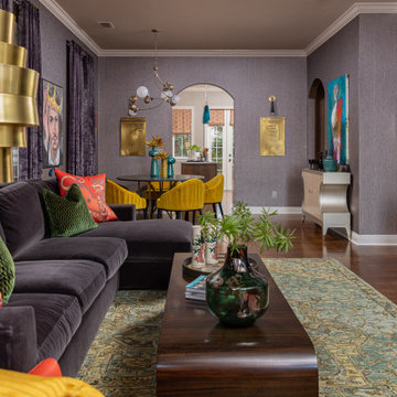
 In Detail Interiors
Colorful and rich style
When a repeat client shows up on your doorstep with his third home to furnish and wants to start from scratch and go really bold, you just embrace him, scoot him right up to the resource room, and don’t ask questions! I mean, who does not love a client that embraces velvet, leather, silk and wallcoverings?
This lush, vibrant lounge space was all created from the want to really deep dive into something different, eclectic and more traveled. The original small, narrow, dimly lit room totally delivered on helping accomplish that mood. Mixing a little of that Ming dynasty-inspired strawberry red with a deep chocolate mohair on the sectional and cladding the room in a soft, amethyst woven wallcovering. We loved the interplay and “non-matchiness” that this space embraced.
Lighting and art were both about telling a story in this room – accenting conversational opportunities and an almost gallery-esque feel. Designating a more dynamic and unusual, sculptural feel – from the harder lines of the statement floor lamp in the living room across to the sprawling, slightly modern bloom of the dining area fixture.
Jewel of a space
The area rug had to ground the already bold furniture and lend itself to the darker wood floors, and a dusky green wool proved the ticket. We loved the almost pixelated pattern the hand-knotted wool lent to the overall design. A little hint of oxblood, chocolate and blue picked up in accents elsewhere, but the tone of almost jade really caught us about this piece.
Not enough can be said about the accent of a dining space either (which in terms of space planning was the only way to balance this long, narrow “hallway” of a room off the kitchen). Citron velvet on the low-profile chairs left the space feeling open, but fun for games and cocktail parties. Plus, the cerused wood dining table was a great complement – offering depth without a conflict to the existing flooring or nearby sectional.
Being able to view this space as a whole was very important to us! From the selection of sconces carried throughout (that wonky placement was existing and with so little opportunity to add cans we had to play up the new fixtures in a way that make them feel purposeful and desirable.), to the balance of color and temperature in each furniture grouping. Sometimes working floor to ceiling in an existing space can pose a lot of unique challenges when it comes to furnishing projects. However, we loved that the client embraced our drive to really punch up the visual feel of this living/dining combo. Also, we know the enjoyment he gets from the finished product is a testament to hunting for the right pieces, designing with unusual and luxe fabric combinations, and managing the inclusion of budget-friendly surprises that always balance a job well done.
What the client says
“From the moment that Cheryl arrived, I felt that she was definitely the designer that I needed to help facilitate & execute my vision for the space. I’m not the “cookie cutter” type, and I immediately realized that Cheryl had a knack for envisioning ideas that were unique, yet tasteful, timeless, and sophisticated.”
From its beginnings as a plain Jane envelope, this combination living/dining space becomes a study in texture and color!
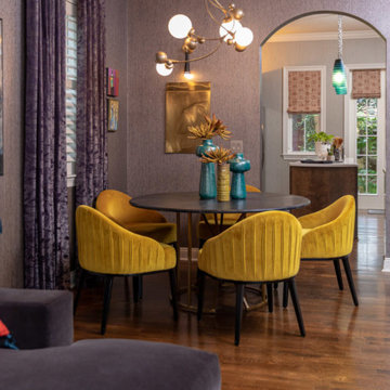 In Detail Interiors
Colorful and rich style
When a repeat client shows up on your doorstep with his third home to furnish and wants to start from scratch and go really bold, you just embrace him, scoot him right up to the resource room, and don’t ask questions! I mean, who does not love a client that embraces velvet, leather, silk and wallcoverings?
This lush, vibrant lounge space was all created from the want to really deep dive into something different, eclectic and more traveled. The original small, narrow, dimly lit room totally delivered on helping accomplish that mood. Mixing a little of that Ming dynasty-inspired strawberry red with a deep chocolate mohair on the sectional and cladding the room in a soft, amethyst woven wallcovering. We loved the interplay and “non-matchiness” that this space embraced.
Lighting and art were both about telling a story in this room – accenting conversational opportunities and an almost gallery-esque feel. Designating a more dynamic and unusual, sculptural feel – from the harder lines of the statement floor lamp in the living room across to the sprawling, slightly modern bloom of the dining area fixture.
Jewel of a space
The area rug had to ground the already bold furniture and lend itself to the darker wood floors, and a dusky green wool proved the ticket. We loved the almost pixelated pattern the hand-knotted wool lent to the overall design. A little hint of oxblood, chocolate and blue picked up in accents elsewhere, but the tone of almost jade really caught us about this piece.
Not enough can be said about the accent of a dining space either (which in terms of space planning was the only way to balance this long, narrow “hallway” of a room off the kitchen). Citron velvet on the low-profile chairs left the space feeling open, but fun for games and cocktail parties. Plus, the cerused wood dining table was a great complement – offering depth without a conflict to the existing flooring or nearby sectional.
Being able to view this space as a whole was very important to us! From the selection of sconces carried throughout (that wonky placement was existing and with so little opportunity to add cans we had to play up the new fixtures in a way that make them feel purposeful and desirable.), to the balance of color and temperature in each furniture grouping. Sometimes working floor to ceiling in an existing space can pose a lot of unique challenges when it comes to furnishing projects. However, we loved that the client embraced our drive to really punch up the visual feel of this living/dining combo. Also, we know the enjoyment he gets from the finished product is a testament to hunting for the right pieces, designing with unusual and luxe fabric combinations, and managing the inclusion of budget-friendly surprises that always balance a job well done.
What the client says
“From the moment that Cheryl arrived, I felt that she was definitely the designer that I needed to help facilitate & execute my vision for the space. I’m not the “cookie cutter” type, and I immediately realized that Cheryl had a knack for envisioning ideas that were unique, yet tasteful, timeless, and sophisticated.”
From its beginnings as a plain Jane envelope, this combination living/dining space becomes a study in texture and color!

 Tracey Stephens Design, LLC
Wing Wong, Memories TTL
Small eclectic marble floor home design photo in New York with a wall-mount sink, a wall-mount toilet and multicolored walls
Small eclectic marble floor home design photo in New York with a wall-mount sink, a wall-mount toilet and multicolored walls
Find the right local pro for your project

 BAUFORMAT
Wavy mother of pearl porcelain tile, wavy white tile for bathroom shower or backsplash. Perfect for fireplace or accent wall
Example of a trendy bathroom design in Los Angeles
Example of a trendy bathroom design in Los Angeles
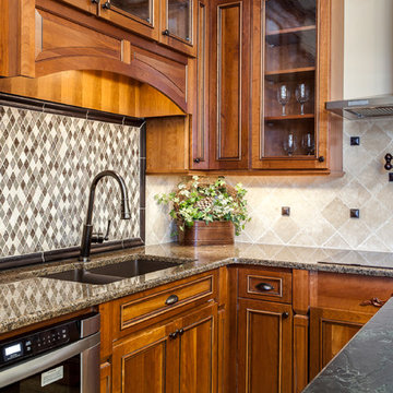
 JM Kitchen & Bath Design
One of our demo kitchens at the showroom at 2324 S. Colorado Blvd. Denver, CO 80222
Phone: (303) 300-4400 Denver
Photo Credit: JM Kitchen & Bath Denver Colorado
 HAUS | Architecture For Modern Lifestyles
Living space with curved clear cedar ceilings, built-in media and storage walls, custom artwork and custom furniture - Interior Architecture: HAUS | Architecture + LEVEL Interiors - Photography: Ryan Kurtz
 Amy Pearson Design
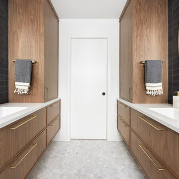
The primary bedroom and bathroom are the showstoppers of this phase! Unused and awkwardly located closets in both the bedroom and bathroom were removed to make way for additional square-footage in the bath and replaced with a sizable and functional reach-in closet in the bedroom. A dated and cramped shower stall was removed in favor for an expansive step in shower spanning the width of the bathroom and a new transom window washes the room in natural light. While the previous bathroom was only able to accommodate a single vanity, the new layout allowed us to create double matching vanities mirrored across from each other - a much appreciated addition for a primary bath. Floating walnut vanities boast impressive storage and are capped with tower cabinets with hidden outlets for charging and storing electronic bathroom tools. While the color palette is restrained - black, white, gray, and brown - the result is a timelessly modern and masculine space that is at once striking and warm. Modern geometric patterns play with each other throughout the material selections.

 MSI
MSIExquisite and unique, Calacatta Classique Quartz stuns with its clean whites and striking through-body veining. This showstopper countertop offers the look of luxurious marble in durable and maintenance-free quartz.
 By Design Interiors Inc
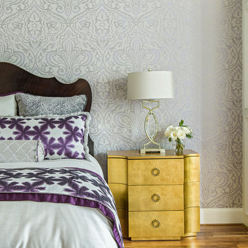
Creating a cozy yet elegant sanctuary in this large space definitely posed a design. An edgy damask patterned wall paper serves as the perfect backdrop for the stunning wood bed with chrome accents. Custom bedding and pillows were made with a assortment of fabrics mixing silvers, golds, creams, and pops of deep purple.
Erika Barczak, By Design Interiors Inc.
Photo Credit: Daniel Angulo www.danielangulo.com
Builder: Kichi Creek Builders
 In Detail Interiors
Colorful and rich style
When a repeat client shows up on your doorstep with his third home to furnish and wants to start from scratch and go really bold, you just embrace him, scoot him right up to the resource room, and don’t ask questions! I mean, who does not love a client that embraces velvet, leather, silk and wallcoverings?
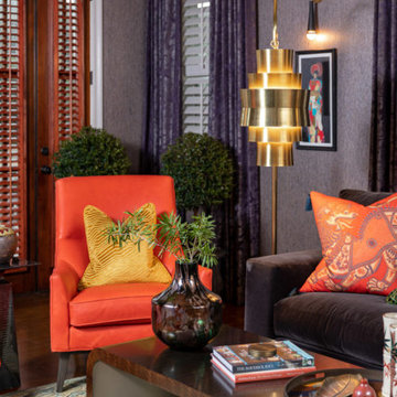
This lush, vibrant lounge space was all created from the want to really deep dive into something different, eclectic and more traveled. The original small, narrow, dimly lit room totally delivered on helping accomplish that mood. Mixing a little of that Ming dynasty-inspired strawberry red with a deep chocolate mohair on the sectional and cladding the room in a soft, amethyst woven wallcovering. We loved the interplay and “non-matchiness” that this space embraced.
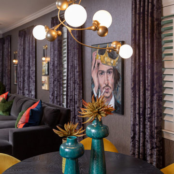
Lighting and art were both about telling a story in this room – accenting conversational opportunities and an almost gallery-esque feel. Designating a more dynamic and unusual, sculptural feel – from the harder lines of the statement floor lamp in the living room across to the sprawling, slightly modern bloom of the dining area fixture.
Jewel of a space
The area rug had to ground the already bold furniture and lend itself to the darker wood floors, and a dusky green wool proved the ticket. We loved the almost pixelated pattern the hand-knotted wool lent to the overall design. A little hint of oxblood, chocolate and blue picked up in accents elsewhere, but the tone of almost jade really caught us about this piece.
Not enough can be said about the accent of a dining space either (which in terms of space planning was the only way to balance this long, narrow “hallway” of a room off the kitchen). Citron velvet on the low-profile chairs left the space feeling open, but fun for games and cocktail parties. Plus, the cerused wood dining table was a great complement – offering depth without a conflict to the existing flooring or nearby sectional.
Being able to view this space as a whole was very important to us! From the selection of sconces carried throughout (that wonky placement was existing and with so little opportunity to add cans we had to play up the new fixtures in a way that make them feel purposeful and desirable.), to the balance of color and temperature in each furniture grouping. Sometimes working floor to ceiling in an existing space can pose a lot of unique challenges when it comes to furnishing projects. However, we loved that the client embraced our drive to really punch up the visual feel of this living/dining combo. Also, we know the enjoyment he gets from the finished product is a testament to hunting for the right pieces, designing with unusual and luxe fabric combinations, and managing the inclusion of budget-friendly surprises that always balance a job well done.
What the client says
“From the moment that Cheryl arrived, I felt that she was definitely the designer that I needed to help facilitate & execute my vision for the space. I’m not the “cookie cutter” type, and I immediately realized that Cheryl had a knack for envisioning ideas that were unique, yet tasteful, timeless, and sophisticated.”
From its beginnings as a plain Jane envelope, this combination living/dining space becomes a study in texture and color!
 In Detail Interiors
Colorful and rich style
When a repeat client shows up on your doorstep with his third home to furnish and wants to start from scratch and go really bold, you just embrace him, scoot him right up to the resource room, and don’t ask questions! I mean, who does not love a client that embraces velvet, leather, silk and wallcoverings?
This lush, vibrant lounge space was all created from the want to really deep dive into something different, eclectic and more traveled. The original small, narrow, dimly lit room totally delivered on helping accomplish that mood. Mixing a little of that Ming dynasty-inspired strawberry red with a deep chocolate mohair on the sectional and cladding the room in a soft, amethyst woven wallcovering. We loved the interplay and “non-matchiness” that this space embraced.
Lighting and art were both about telling a story in this room – accenting conversational opportunities and an almost gallery-esque feel. Designating a more dynamic and unusual, sculptural feel – from the harder lines of the statement floor lamp in the living room across to the sprawling, slightly modern bloom of the dining area fixture.
Jewel of a space
The area rug had to ground the already bold furniture and lend itself to the darker wood floors, and a dusky green wool proved the ticket. We loved the almost pixelated pattern the hand-knotted wool lent to the overall design. A little hint of oxblood, chocolate and blue picked up in accents elsewhere, but the tone of almost jade really caught us about this piece.
Not enough can be said about the accent of a dining space either (which in terms of space planning was the only way to balance this long, narrow “hallway” of a room off the kitchen). Citron velvet on the low-profile chairs left the space feeling open, but fun for games and cocktail parties. Plus, the cerused wood dining table was a great complement – offering depth without a conflict to the existing flooring or nearby sectional.
Being able to view this space as a whole was very important to us! From the selection of sconces carried throughout (that wonky placement was existing and with so little opportunity to add cans we had to play up the new fixtures in a way that make them feel purposeful and desirable.), to the balance of color and temperature in each furniture grouping. Sometimes working floor to ceiling in an existing space can pose a lot of unique challenges when it comes to furnishing projects. However, we loved that the client embraced our drive to really punch up the visual feel of this living/dining combo. Also, we know the enjoyment he gets from the finished product is a testament to hunting for the right pieces, designing with unusual and luxe fabric combinations, and managing the inclusion of budget-friendly surprises that always balance a job well done.
What the client says
“From the moment that Cheryl arrived, I felt that she was definitely the designer that I needed to help facilitate & execute my vision for the space. I’m not the “cookie cutter” type, and I immediately realized that Cheryl had a knack for envisioning ideas that were unique, yet tasteful, timeless, and sophisticated.”
From its beginnings as a plain Jane envelope, this combination living/dining space becomes a study in texture and color!
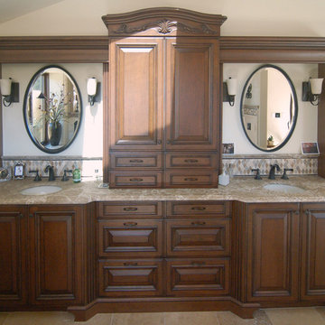
 San Luis Kitchen Co.
When the homeowners decided to move from San Francisco to the Central Coast, they were looking for a more relaxed lifestyle, a unique place to call their own, and an environment conducive to raising their young children. They found it all in San Luis Obispo. They had owned a house here in SLO for several years that they had used as a rental. As the homeowners own and run a contracting business and relocation was not impossible, they decided to move their business and make this SLO rental into their dream home.
As a rental, the house was in a bare-bones condition. The kitchen had old white cabinets, boring white tile counters, and a horrendous vinyl tile floor. Not only was the kitchen out-of-date and old-fashioned, it was also pretty worn out. The tiles were cracking and the grout was stained, the cabinet doors were sagging, and the appliances were conflicting (ie: you could not open the stove and dishwasher at the same time).
To top it all off, the kitchen was just too small for the custom home the homeowners wanted to create.
Thus enters San Luis Kitchen. At the beginning of their quest to remodel, the homeowners visited San Luis Kitchen’s showroom and fell in love with our Tuscan Grotto display. They sat down with our designers and together we worked out the scope of the project, the budget for cabinetry and how that fit into their overall budget, and then we worked on the new design for the home starting with the kitchen.
As the homeowners felt the kitchen was cramped, it was decided to expand by moving the window wall out onto the existing porch. Besides the extra space gained, moving the wall brought the kitchen window out from under the porch roof – increasing the natural light available in the space. (It really helps when the homeowner both understands building and can do his own contracting and construction.) A new arched window and stone clad wall now highlights the end of the kitchen. As we gained wall space, we were able to move the range and add a plaster hood, creating a focal nice focal point for the kitchen.
The other long wall now houses a Sub-Zero refrigerator and lots of counter workspace. Then we completed the kitchen by adding a wrap-around wet bar extending into the old dining space. We included a pull-out pantry unit with open shelves above it, wine cubbies, a cabinet for glassware recessed into the wall, under-counter refrigerator drawers, sink base and trash cabinet, along with a decorative bookcase cabinet and bar seating. Lots of function in this corner of the kitchen; a bar for entertaining and a snack station for the kids.
After the kitchen design was finalized and ordered, the homeowners turned their attention to the rest of the house. They asked San Luis Kitchen to help with their master suite, a guest bath, their home control center (essentially a deck tucked under the main staircase) and finally their laundry room. Here are the photos:
I wish I could show you the rest of the house. The homeowners took a poor rental house and turned it into a showpiece! They added custom concrete floors, unique fiber optic lighting, large picture windows, and much more. There is now an outdoor kitchen complete with pizza oven, an outdoor shower and exquisite garden. They added a dedicated dog run to the side yard for their pooches and a rooftop deck at the very peak. Such a fun house.
Wood-Mode Fine Custom Cabinetry, Barcelona
 In Detail Interiors
Colorful and rich style
When a repeat client shows up on your doorstep with his third home to furnish and wants to start from scratch and go really bold, you just embrace him, scoot him right up to the resource room, and don’t ask questions! I mean, who does not love a client that embraces velvet, leather, silk and wallcoverings?
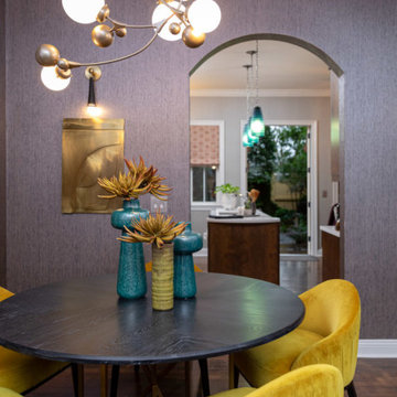
This lush, vibrant lounge space was all created from the want to really deep dive into something different, eclectic and more traveled. The original small, narrow, dimly lit room totally delivered on helping accomplish that mood. Mixing a little of that Ming dynasty-inspired strawberry red with a deep chocolate mohair on the sectional and cladding the room in a soft, amethyst woven wallcovering. We loved the interplay and “non-matchiness” that this space embraced.
Lighting and art were both about telling a story in this room – accenting conversational opportunities and an almost gallery-esque feel. Designating a more dynamic and unusual, sculptural feel – from the harder lines of the statement floor lamp in the living room across to the sprawling, slightly modern bloom of the dining area fixture.
Jewel of a space
The area rug had to ground the already bold furniture and lend itself to the darker wood floors, and a dusky green wool proved the ticket. We loved the almost pixelated pattern the hand-knotted wool lent to the overall design. A little hint of oxblood, chocolate and blue picked up in accents elsewhere, but the tone of almost jade really caught us about this piece.
Not enough can be said about the accent of a dining space either (which in terms of space planning was the only way to balance this long, narrow “hallway” of a room off the kitchen). Citron velvet on the low-profile chairs left the space feeling open, but fun for games and cocktail parties. Plus, the cerused wood dining table was a great complement – offering depth without a conflict to the existing flooring or nearby sectional.
Being able to view this space as a whole was very important to us! From the selection of sconces carried throughout (that wonky placement was existing and with so little opportunity to add cans we had to play up the new fixtures in a way that make them feel purposeful and desirable.), to the balance of color and temperature in each furniture grouping. Sometimes working floor to ceiling in an existing space can pose a lot of unique challenges when it comes to furnishing projects. However, we loved that the client embraced our drive to really punch up the visual feel of this living/dining combo. Also, we know the enjoyment he gets from the finished product is a testament to hunting for the right pieces, designing with unusual and luxe fabric combinations, and managing the inclusion of budget-friendly surprises that always balance a job well done.
What the client says
“From the moment that Cheryl arrived, I felt that she was definitely the designer that I needed to help facilitate & execute my vision for the space. I’m not the “cookie cutter” type, and I immediately realized that Cheryl had a knack for envisioning ideas that were unique, yet tasteful, timeless, and sophisticated.”
From its beginnings as a plain Jane envelope, this combination living/dining space becomes a study in texture and color!
 Maraya Interior Design
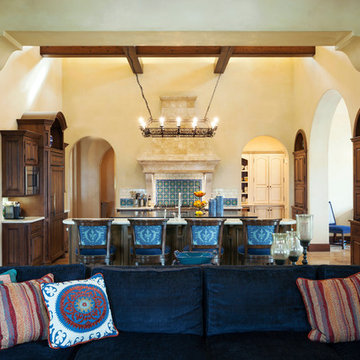
Old world Spanish Villa with deep, thick plaster walls and groin vaults. Arches are plentiful, along with views of the Thousand Oaks and Westlake valley. This comfortable home is designed for a wonderful, fun family with two children. The place of many gatherings of friends and family, it radiates a warmth and love of good times with great friends. Deep rich blues, aqua and terra cotta colors throughout this home, with travertine versaille patterned floors.
Deep loggia and patios all around the home take advantage of all the mountain and valley views, while keeping the family and friends warm in cooler times. The entire sprawling villa is wrapped around an inside patio with a fountain and hand made Malibu Tile pots. All furniture is hand made, from distressed and rustic tables to custom upholstery in jewel tones. A built in bar for entertaining in the great room, a very large family room with deep blue fabric wrap around sofa, hand knotted rugs in the living room, master bedroom and family room. A master suite with light creamy white walls, a plaster fireplace and a metal poster bed looks through a sitting room with turquoise accents. The home has 6 fireplaces, of which three are outside, some carved in limestone, others in spanish plaster.
Designed by Maraya Interior Design. From their beautiful resort town of Ojai, they serve clients in Montecito, Hope Ranch, Malibu, Westlake and Calabasas, across the tri-county areas of Santa Barbara, Ventura and Los Angeles, south to Hidden Hills- north through Solvang and more. Patrick Price photography
 Ann Kenkel Interiors DC PREMIERE DESIGN FIRM
Ann Kenkel Interiors
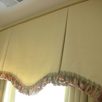
Coastal Estate in St. Michael's Maryland on the Chesapeake Bay. House was designed after the original 1770's house on the property. Home was designed to be a formal house but was now being used as a weekend retreat. Ann Kenkel had to decorate the house in a manner which was coastal enough so owner's felt like they were on vacation yet formal enough for the style of the house.
AK found the house filled with wallpaper from the 1980's. Wallpaper from every room was removed and all trim had to be painted a neutral color.
The formal dining room only had one entry. AK opened up a second entry into the dining room which provided a view of the Chesapeake Bay.
Keywords: coastal estate, bay estate, luxury estate on Chesapeake Bay, St. Michael's home, best designer in St. Michael's, best coastal designer, best Chesapeake bay designer, window treatments, window treatments for over transom windows, chenille sofas, silk pillows, TV over fireplace, blue and yellow bedroom, coral and beige bedroom, british plantation style, blue toile bedroom, blue and green bedroom, coral dining room, red dining room, hand planed table, neutral living room, neutral sunroom, blue and green kitchen, blue family room, cherry paneled library, Ralph Lauren leather chairs, yellow chinoiserie wallpaper, shell mirror, tole lamps, gated drive, pea gravel drive, circular drive, piano, zebra fabric, trim on pillows, trim on draperies, panels and valances, georgian house, sunburst mirror, glass coffee table, star lamps, red and yellow toile draperies, ivory painted chairs, white painted chairs, nautical accessories, coastal coral bedroom, coastal blue bedroom, coastal yellow bedroom, blue and green toile bedroom, stables, paddock, outdoor stainless kitchen, dock, tan draperies, neutral chenille sofas, blue sofas, blue chairs with white frame, needlepoint rug, shell plates, bamboo silverware, white bedroom furniture, dark wood bedroom furniture, plaid chairs, wilton carpet, bright sunroom, chairs and ottomans, regency valance, scarf swags, swags, red leopard pillows, toile bedding, game table, game table chairs on coaster, shells, hydrangeas, shell lamp, sailboat art, sailboat paintings, cane headboard, 4 poster bed.


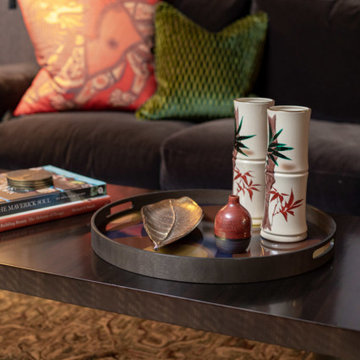 In Detail Interiors
Colorful and rich style
When a repeat client shows up on your doorstep with his third home to furnish and wants to start from scratch and go really bold, you just embrace him, scoot him right up to the resource room, and don’t ask questions! I mean, who does not love a client that embraces velvet, leather, silk and wallcoverings?
This lush, vibrant lounge space was all created from the want to really deep dive into something different, eclectic and more traveled. The original small, narrow, dimly lit room totally delivered on helping accomplish that mood. Mixing a little of that Ming dynasty-inspired strawberry red with a deep chocolate mohair on the sectional and cladding the room in a soft, amethyst woven wallcovering. We loved the interplay and “non-matchiness” that this space embraced.
Lighting and art were both about telling a story in this room – accenting conversational opportunities and an almost gallery-esque feel. Designating a more dynamic and unusual, sculptural feel – from the harder lines of the statement floor lamp in the living room across to the sprawling, slightly modern bloom of the dining area fixture.
Jewel of a space
The area rug had to ground the already bold furniture and lend itself to the darker wood floors, and a dusky green wool proved the ticket. We loved the almost pixelated pattern the hand-knotted wool lent to the overall design. A little hint of oxblood, chocolate and blue picked up in accents elsewhere, but the tone of almost jade really caught us about this piece.
Not enough can be said about the accent of a dining space either (which in terms of space planning was the only way to balance this long, narrow “hallway” of a room off the kitchen). Citron velvet on the low-profile chairs left the space feeling open, but fun for games and cocktail parties. Plus, the cerused wood dining table was a great complement – offering depth without a conflict to the existing flooring or nearby sectional.
Being able to view this space as a whole was very important to us! From the selection of sconces carried throughout (that wonky placement was existing and with so little opportunity to add cans we had to play up the new fixtures in a way that make them feel purposeful and desirable.), to the balance of color and temperature in each furniture grouping. Sometimes working floor to ceiling in an existing space can pose a lot of unique challenges when it comes to furnishing projects. However, we loved that the client embraced our drive to really punch up the visual feel of this living/dining combo. Also, we know the enjoyment he gets from the finished product is a testament to hunting for the right pieces, designing with unusual and luxe fabric combinations, and managing the inclusion of budget-friendly surprises that always balance a job well done.
What the client says
“From the moment that Cheryl arrived, I felt that she was definitely the designer that I needed to help facilitate & execute my vision for the space. I’m not the “cookie cutter” type, and I immediately realized that Cheryl had a knack for envisioning ideas that were unique, yet tasteful, timeless, and sophisticated.”
From its beginnings as a plain Jane envelope, this combination living/dining space becomes a study in texture and color!



 Borden Interiors & Associates
Riad Tile
Bathroom - contemporary cement tile floor and pink floor bathroom idea in Santa Barbara
Bathroom - contemporary cement tile floor and pink floor bathroom idea in Santa Barbara
28