
Search results for "Confusion" in Home Design Ideas
 birdRock Project Studio Inc.
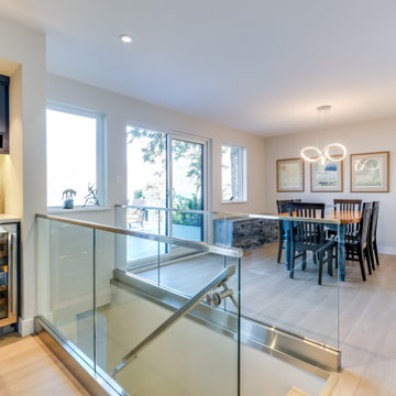
Ever heard some say “It has good bones?” Well, no one had ever said that about this house; it needed a major overhaul - “A TOTAL GUT.”
It’s saving grace was:
1. It’s enthusiastic new homeowners.
2. The expansive and gorgeous views of Okanagan Lake.
We were asked to assist our clients with big-picture-planning for their newest investment property.
Upon initial walk through of the home, it was immediately evident there were many previous ‘bandaid-type’ updates that it had gone through over the years.
This house was in prime need of an overhaul inside and out:
- multiple dropped Ceilings with layers of Plumbing add ons
- wall to wall Carpet
-a tired Bathtub directly inside the Master Bedroom
- a “dreaded” Corner Kitchen Sink
-multiple add ons involving three confusing front entry doors
Discovering what was previously done and the quandary of why these things were done is always so interesting to discover and can be very overwhelming for clients.
A big part of what we love most about Design is helping to propose new ideas to revitalize and improve all that has come before. It is one of the most challenging and rewarding parts of our work.
Our Renovation Strategy began in Layout Design for optimizing Interior & Exterior flow, moving into Concept & Style Planning, Millwork and Finish Selections.
We then created an ordered implementation sequence which would allow the homeowners to live on one floor while the other was being renovated Later they would move to the finished floor and renovate the remaining areas.
Once complete, the home quickly sold and we look forwards to assisting these happy investors on their next endeavour.
 birdRock Project Studio Inc.
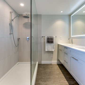
Ever heard some say “It has good bones?” Well, no one had ever said that about this house; it needed a major overhaul - “A TOTAL GUT.”
It’s saving grace was:
1. It’s enthusiastic new homeowners.
2. The expansive and gorgeous views of Okanagan Lake.
We were asked to assist our clients with big-picture-planning for their newest investment property.
Upon initial walk through of the home, it was immediately evident there were many previous ‘bandaid-type’ updates that it had gone through over the years.
This house was in prime need of an overhaul inside and out:
- multiple dropped Ceilings with layers of Plumbing add ons
- wall to wall Carpet
-a tired Bathtub directly inside the Master Bedroom
- a “dreaded” Corner Kitchen Sink
-multiple add ons involving three confusing front entry doors
Discovering what was previously done and the quandary of why these things were done is always so interesting to discover and can be very overwhelming for clients.
A big part of what we love most about Design is helping to propose new ideas to revitalize and improve all that has come before. It is one of the most challenging and rewarding parts of our work.
Our Renovation Strategy began in Layout Design for optimizing Interior & Exterior flow, moving into Concept & Style Planning, Millwork and Finish Selections.
We then created an ordered implementation sequence which would allow the homeowners to live on one floor while the other was being renovated Later they would move to the finished floor and renovate the remaining areas.
Once complete, the home quickly sold and we look forwards to assisting these happy investors on their next endeavour.
 birdRock Project Studio Inc.
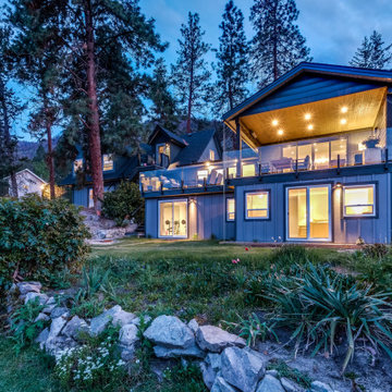
Ever heard some say “It has good bones?” Well, no one had ever said that about this house; it needed a major overhaul - “A TOTAL GUT.”
It’s saving grace was:
1. It’s enthusiastic new homeowners.
2. The expansive and gorgeous views of Okanagan Lake.
We were asked to assist our clients with big-picture-planning for their newest investment property.
Upon initial walk through of the home, it was immediately evident there were many previous ‘bandaid-type’ updates that it had gone through over the years.
This house was in prime need of an overhaul inside and out:
- multiple dropped Ceilings with layers of Plumbing add ons
- wall to wall Carpet
-a tired Bathtub directly inside the Master Bedroom
- a “dreaded” Corner Kitchen Sink
-multiple add ons involving three confusing front entry doors
Discovering what was previously done and the quandary of why these things were done is always so interesting to discover and can be very overwhelming for clients.
A big part of what we love most about Design is helping to propose new ideas to revitalize and improve all that has come before. It is one of the most challenging and rewarding parts of our work.
Our Renovation Strategy began in Layout Design for optimizing Interior & Exterior flow, moving into Concept & Style Planning, Millwork and Finish Selections.
We then created an ordered implementation sequence which would allow the homeowners to live on one floor while the other was being renovated Later they would move to the finished floor and renovate the remaining areas.
Once complete, the home quickly sold and we look forwards to assisting these happy investors on their next endeavour.
Find the right local pro for your project
 Janvrin & Co.
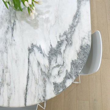
A transformation of a modest raised ranch into a modern oasis. I was the interior designer and general contractor from mechanicals to finishing. It’s also my personal home.
The interior design style is that of modern minimalist meets organic modern. I wanted a space that reduced distractions and let the eyes, head, and soul rest. Where everything inside the home has a specific use and purpose. The objects in our home are fewer but each hold a great personal value. You might expect to see this airy aesthetic, with its gallery white walls, in California or New York. Not nestled in a modest 50 year old neighborhood in Omaha, Nebraska. Creating a minimal aesthetic is one of the trickiest design styles to pull off. It is more than just less stuff and lots of white. It means sticking to these design principals:
-weaving in an abundance of textures
-incorporating natural finishes
-keenly curating art
-giving extra attention to scale
-limiting purely decorative items
-maximizing natural light
This style is not to be confused with the frugality of reductive design. I have incorporated many elevated basics that create an aesthetic of quiet luxury:
-architectural bead for trim-less doors
-first-of-its kind interior door hardware made of terrazzo
-historical marble found in landmark interiors like the NY Public Library
-premium flush air vents that disappear out of site
-luxury appliances from GE Café and Signature
-elegant and resilient terrazzo field tiles
Ours was not a simple interior remodel and addition:
-gutted and remodeled the existing 2,000 SF
-added on approximately another 1,000 SF
-moved and installed all new major mechanicals i.e. heating, plumbing and electrical.
-knocked through foundation walls to extend the space back
-dug down and built up

 Citrine® Quartz Stone, Inc
You say you don’t know what color can match your kitchen or bath decor, because your floor is beige or black or some other color that no one match, your cabinets are dark brown or who knows what and your appliance are stainless steel or you have a kaleidoscope of colors and you are all confused because nothing looks good, Don’t despair, Introducing Kashmir White, Stock # PW-987 comes in 119” X 56“ Citrine® Quartz Stone, Inc. and it is more affordable then you think.
As you already may know, quartz is one of the hardest materials on earth, making it more durable than granite, marble or soapstone. Only diamond, sapphire, and topaz are stronger than quartz. However, since no counter tops are made from those elements, quartz is the king of the counter top because of its durability luminescence and elegance. Citrine® Quartz is 94% natural quartz and only 6% resin it will never require any sanding, sealing or polishing, and unlike granite or marble they do not accumulate molds or soap scum when property maintained. They are sure to always remain just as glossy and smooth as the first day they were installed, and we back it up with a LIFETIME WARRANTY.
Citrine® Quartz Stone has drastically risen in popularity and has even began to supplant the natural stones. Consumer Reports rates it as “The best counter tops material”. Citrine® quartz is the ideal option for a stress-free counter top, if you are remodeling your kitchen, bathroom, office or even building a new one.
We can also fabricate if you provide the drawings with measurements to our email; quartz@citrineus.com our estimator will contact you with a preliminary estimate.
Citrine® Quartz tip # 002 Our Master Quartz installers use miter joints, which reduces the use of grout or caulk by about 80% and gives the aesthetics of one continuous flowing slab.
Customer’s tip # 138 Use Hope’s Perfect Granite Spray it is 100% streak free and will give your luminous Quartz a mirror like finish.
Customer’s tip # 150 Use Isopropyl alcohol to remove ink marks by rubbing on the affected area with a cloth. No cleaning required after removal.

 Revealing Redesign
This farmhouse, with it's original foundation dating back to 1778, had a lot of charm--but with its bad carpeting, dark paint colors, and confusing layout, it was hard to see at first just how welcoming, charming, and cozy it could be.
The first focus of our renovation was creating a master bedroom suite--since there wasn't one, and one was needed for the modern family that was living here day-in and day-out.
To do this, a collection of small rooms (some of them previously without heat or electrical outlets) were combined to create a gorgeous, serene space in the eaves of the oldest part of the house, complete with master bath containing a double vanity, and spacious shower. Even though these rooms are new, it is hard to see that they weren't original to the farmhouse from day one.
In the rest of the house we removed walls that were added in the 1970's that made spaces seem smaller and more choppy, added a second upstairs bathroom for the family's two children, reconfigured the kitchen using existing cabinets to cut costs ( & making sure to keep the old sink with all of its character & charm) and create a more workable layout with dedicated eating area.
Also added was an outdoor living space with a deck sheltered by a pergola--a spot that the family spends tons of time enjoying during the warmer months.
A family room addition had been added to the house by the previous owner in the 80's, so to make this space feel less like it was tacked on, we installed historically accurate new windows to tie it in visually with the original house, and replaced carpeting with hardwood floors to make a more seamless transition from the historic to the new.
To complete the project, we refinished the original hardwoods throughout the rest of the house, and brightened the outlook of the whole home with a fresh, bright, updated color scheme.
Photos by Laura Kicey
 Adobe Interiors
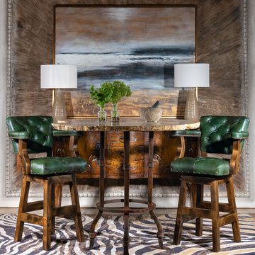
Our Chisum Hunter Barstool is available in both counter and bar height. Featuring a full 360 degree swivel, padded arm rest and button tufted seat and back. Using a rich, olive green burnished leather give the chisum Hunters Barstool a rustic elegant sophistication. American Alder wood is used to construct the frame with a dark walnut hand rubbed finish. The Chisum Hunter Barstool is 100% American Made to the highest standards of quality and craftsmanship.
Overall Barstool Dimensions: 43" H x 26" W x 22" D
Seat Height: 30"
Top of Arm Height: 40"
Overall Counter Stool Dimension: 38" H x 26" W x 22" D
Seat Height: 25"
Top of Arm Height: 35"
Leather Description: Dyes and waxes are hand applied to South American raw material to impart a transparent clarity. This coupled with substrate gives the leather a sophisticated, pebble grain appearance. All of the aniline dyes applied to the hides are hand rubbed in North Carolina by skilled artisans drawing from years of creative experience creating an impressive patina. The absence of pigments adds to the natural softness of the hides. A light protective top, utilizing a proprietary formulation developed by the tannery creates the exquisite touch this leather is known for and makes the leather suitable for active family homes. Because of the depth and transparency of this leather, natural markings will be exposed and should not be confused as defects or deficiencies, but appreciated as Nature's Autograph of Authenticity found in the finest full grain leathers.
100% top grain cowhide leather is characterized by variations in shade, texture, color and grain. Healed marks and scars are to be expected and enhance the natural beauty of the hides. These variations should not be considered defects as they are normal and unique features of genuine 100% top grain cowhide leather.
Frame Construction: Made with American Alder Wood, our frames are glued, screwed and dowelled at the joints. Two coats of high quality stain is hand rubbed on the wood finish and then sealed with industrial grade clear coat.
 Eco Design & Builders Inc.
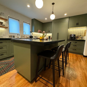
Custom made kitchen cabinets with a color that we created after many tests and the results...wow. I love simplicity, even when I write to you what you see, so lets do this:
The custom cabinets are 3/4'' plywood frame and the doors and the face of the drawers are maple as well. Remember, when you hear Maple kitchen cabinets, that is what it means.
NOT all of it Maple, there is but very uncommon. Unless you can afford it and really want it so why not, right?
Self close, smart stops, pantry. Regarding any pantry, custom cabinets or semi custom, they both have pull out shelves but up to 5' high. City Code.
The city worry that nothing will full on you or little children.
The counter is Hond, no sheen Quartz with straight edge.
The floor is the original Oak. It always amaze me that they used to build houses with solid Oak floor. WOW!! The backsplash is Porcelain with wavy look.
The floating shelves are heavy duty, meaning, the wood is solid and we need to create a custom metal to drill it to the shelve and installing it to the studs. This is if you want to put heavy stuff like plats, glasses etc.
Island with a sitting area so we extended the counter out by 16''. If you want to extend more, brackets will ne needed for supporting the countertop.
That is it basically.
I hope I made it clear. I know it's not easy to do/plan a project with many challenges and the main one is to who are you going to give your savings, your money to do the remodeling, to create your dream. I know. Just follow your heart, take 3 bids, no need more, you will just get more confused.
Much blessing to you.
Ori

 Nautilus Architects
Located on a marsh in the upper reaches of the Lieutenant River in Old Lyme, the existing house was well-sited and well-built, but the design failed to exploit the views and more importantly was a confused combination of contemporary and traditional elements. The new homeowners, a successful businesswoman and an accomplished artist and photographer, were interested in creating a fully-contemporary environment to open up space, connect indoors with outdoors, display artwork and showcase the husband’s distinctive photographs.
One glaring deficiency was the curb appeal and approach sequence: the grade sloped down and the path to the house followed, but this led to an uncomfortable dip and abrupt rise to the front door. By creating a virtual “moat,” occupied by a grid of raised-bed grasses contained in aluminum-clad boxes, and spanning the moat with an ipe bridge, the approach becomes level and engaging. The façade of the existing house was blank and bland, and with no cover. Adding a deep overhang with a wide porch creates a welcoming, covered condition, accentuated by a 6’ wide pivoting front door that feels more like a moving piece of wall.
Another deficiency was the connection to the outdoors. By adding glass to the front and back of the house, and removing interior walls selectively, the house takes on a diaphanous quality that allows one to see through to the marsh beyond, even when in the driveway. The raised-bed grasses act as abstract, geometric versions of the marsh beyond. A large, pyramidal skylight establishes a spatial hierarchy around which the rooms revolve.
The house featured several tray-ceilinged spaces – living room, kitchen, and master bedroom – that were poorly-proportioned and with panels at the top that resembled inset flat panel doors. The solution was to use a different strategy for each: the bedroom turns the ceiling into an eggshell through the use of a creative trim detail; the living room has an oversized sculptural, backlit lighting element; and the kitchen has a collage of painted rectangular forms that support or include lighting pieces.
A palette of concrete, blackened steel, stainless steel and colors carefully chosen by homeowner and architect create an interior and exterior environment punctuated by moments that are as artistic as the featured works in the black-ceilinged gallery.

 TVL Creative Ltd.
These wonderful clients returned to us for their newest home remodel adventure. Their newly purchased custom built 1970s modern ranch sits in one of the loveliest neighborhoods south of the city but the current conditions of the home were out-dated and not so lovely. Upon entering the front door through the court you were greeted abruptly by a very boring staircase and an excessive number of doors. Just to the left of the double door entry was a large slider and on your right once inside the home was a soldier line up of doors. This made for an uneasy and uninviting entry that guests would quickly forget and our clients would often avoid. We also had our hands full in the kitchen. The existing space included many elements that felt out of place in a modern ranch including a rustic mountain scene backsplash, cherry cabinets with raised panel and detailed profile, and an island so massive you couldn’t pass a drink across the stone. Our design sought to address the functional pain points of the home and transform the overall aesthetic into something that felt like home for our clients.
For the entry, we re-worked the front door configuration by switching from the double door to a large single door with side lights. The sliding door next to the main entry door was replaced with a large window to eliminate entry door confusion. In our re-work of the entry staircase, guesta are now greeted into the foyer which features the Coral Pendant by David Trubridge. Guests are drawn into the home by stunning views of the front range via the large floor-to-ceiling glass wall in the living room. To the left, the staircases leading down to the basement and up to the master bedroom received a massive aesthetic upgrade. The rebuilt 2nd-floor staircase has a center spine with wood rise and run appearing to float upwards towards the master suite. A slatted wall of wood separates the two staircases which brings more light into the basement stairwell. Black metal railings add a stunning contrast to the light wood.
Other fabulous upgrades to this home included new wide plank flooring throughout the home, which offers both modernity and warmth. The once too-large kitchen island was downsized to create a functional focal point that is still accessible and intimate. The old dark and heavy kitchen cabinetry was replaced with sleek white cabinets, brightening up the space and elevating the aesthetic of the entire room. The kitchen countertops are marble look quartz with dramatic veining that offers an artistic feature behind the range and across all horizontal surfaces in the kitchen. As a final touch, cascading island pendants were installed which emphasize the gorgeous ceiling vault and provide warm feature lighting over the central point of the kitchen.
This transformation reintroduces light and simplicity to this gorgeous home, and we are so happy that our clients can reap the benefits of this elegant and functional design for years to come.
 Janvrin & Co.
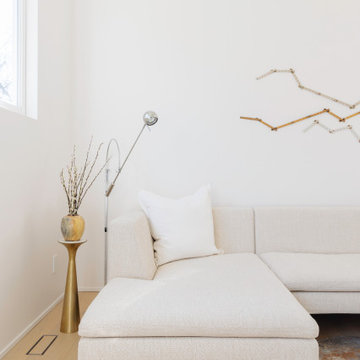
A transformation of a modest raised ranch into a modern oasis. I was the interior designer and general contractor from mechanicals to finishing. It’s also my personal home.
The interior design style is that of modern minimalist meets organic modern. I wanted a space that reduced distractions and let the eyes, head, and soul rest. Where everything inside the home has a specific use and purpose. The objects in our home are fewer but each hold a great personal value. You might expect to see this airy aesthetic, with its gallery white walls, in California or New York. Not nestled in a modest 50 year old neighborhood in Omaha, Nebraska. Creating a minimal aesthetic is one of the trickiest design styles to pull off. It is more than just less stuff and lots of white. It means sticking to these design principals:
-weaving in an abundance of textures
-incorporating natural finishes
-keenly curating art
-giving extra attention to scale
-limiting purely decorative items
-maximizing natural light
This style is not to be confused with the frugality of reductive design. I have incorporated many elevated basics that create an aesthetic of quiet luxury:
-architectural bead for trim-less doors
-first-of-its kind interior door hardware made of terrazzo
-historical marble found in landmark interiors like the NY Public Library
-premium flush air vents that disappear out of site
-luxury appliances from GE Café and Signature
-elegant and resilient terrazzo field tiles
Ours was not a simple interior remodel and addition:
-gutted and remodeled the existing 2,000 SF
-added on approximately another 1,000 SF
-moved and installed all new major mechanicals i.e. heating, plumbing and electrical.
-knocked through foundation walls to extend the space back
-dug down and built up
 Nautilus Architects
Located on a marsh in the upper reaches of the Lieutenant River in Old Lyme, the existing house was well-sited and well-built, but the design failed to exploit the views and more importantly was a confused combination of contemporary and traditional elements. The new homeowners, a successful businesswoman and an accomplished artist and photographer, were interested in creating a fully-contemporary environment to open up space, connect indoors with outdoors, display artwork and showcase the husband’s distinctive photographs.
One glaring deficiency was the curb appeal and approach sequence: the grade sloped down and the path to the house followed, but this led to an uncomfortable dip and abrupt rise to the front door. By creating a virtual “moat,” occupied by a grid of raised-bed grasses contained in aluminum-clad boxes, and spanning the moat with an ipe bridge, the approach becomes level and engaging. The façade of the existing house was blank and bland, and with no cover. Adding a deep overhang with a wide porch creates a welcoming, covered condition, accentuated by a 6’ wide pivoting front door that feels more like a moving piece of wall.
Another deficiency was the connection to the outdoors. By adding glass to the front and back of the house, and removing interior walls selectively, the house takes on a diaphanous quality that allows one to see through to the marsh beyond, even when in the driveway. The raised-bed grasses act as abstract, geometric versions of the marsh beyond. A large, pyramidal skylight establishes a spatial hierarchy around which the rooms revolve.
The house featured several tray-ceilinged spaces – living room, kitchen, and master bedroom – that were poorly-proportioned and with panels at the top that resembled inset flat panel doors. The solution was to use a different strategy for each: the bedroom turns the ceiling into an eggshell through the use of a creative trim detail; the living room has an oversized sculptural, backlit lighting element; and the kitchen has a collage of painted rectangular forms that support or include lighting pieces.
A palette of concrete, blackened steel, stainless steel and colors carefully chosen by homeowner and architect create an interior and exterior environment punctuated by moments that are as artistic as the featured works in the black-ceilinged gallery.
 Eco Design & Builders Inc.
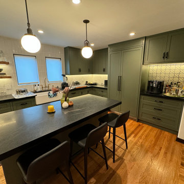
Custom made kitchen cabinets with a color that we created after many tests and the results...wow. I love simplicity, even when I write to you what you see, so lets do this:
The custom cabinets are 3/4'' plywood frame and the doors and the face of the drawers are maple as well. Remember, when you hear Maple kitchen cabinets, that is what it means.
NOT all of it Maple, there is but very uncommon. Unless you can afford it and really want it so why not, right?
Self close, smart stops, pantry. Regarding any pantry, custom cabinets or semi custom, they both have pull out shelves but up to 5' high. City Code.
The city worry that nothing will full on you or little children.
The counter is Hond, no sheen Quartz with straight edge.
The floor is the original Oak. It always amaze me that they used to build houses with solid Oak floor. WOW!! The backsplash is Porcelain with wavy look.
The floating shelves are heavy duty, meaning, the wood is solid and we need to create a custom metal to drill it to the shelve and installing it to the studs. This is if you want to put heavy stuff like plats, glasses etc.
Island with a sitting area so we extended the counter out by 16''. If you want to extend more, brackets will ne needed for supporting the countertop.
That is it basically.
I hope I made it clear. I know it's not easy to do/plan a project with many challenges and the main one is to who are you going to give your savings, your money to do the remodeling, to create your dream. I know. Just follow your heart, take 3 bids, no need more, you will just get more confused.
Much blessing to you.
Ori
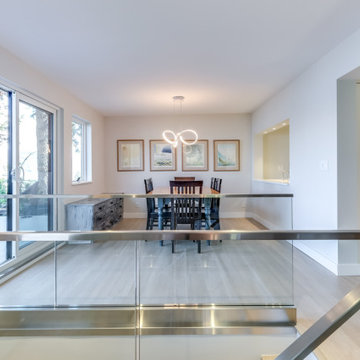 birdRock Project Studio Inc.
Ever heard some say “It has good bones?” Well, no one had ever said that about this house; it needed a major overhaul - “A TOTAL GUT.”
It’s saving grace was:
1. It’s enthusiastic new homeowners.
2. The expansive and gorgeous views of Okanagan Lake.
We were asked to assist our clients with big-picture-planning for their newest investment property.
Upon initial walk through of the home, it was immediately evident there were many previous ‘bandaid-type’ updates that it had gone through over the years.
This house was in prime need of an overhaul inside and out:
- multiple dropped Ceilings with layers of Plumbing add ons
- wall to wall Carpet
-a tired Bathtub directly inside the Master Bedroom
- a “dreaded” Corner Kitchen Sink
-multiple add ons involving three confusing front entry doors
Discovering what was previously done and the quandary of why these things were done is always so interesting to discover and can be very overwhelming for clients.
A big part of what we love most about Design is helping to propose new ideas to revitalize and improve all that has come before. It is one of the most challenging and rewarding parts of our work.
Our Renovation Strategy began in Layout Design for optimizing Interior & Exterior flow, moving into Concept & Style Planning, Millwork and Finish Selections.
We then created an ordered implementation sequence which would allow the homeowners to live on one floor while the other was being renovated Later they would move to the finished floor and renovate the remaining areas.
Once complete, the home quickly sold and we look forwards to assisting these happy investors on their next endeavour.
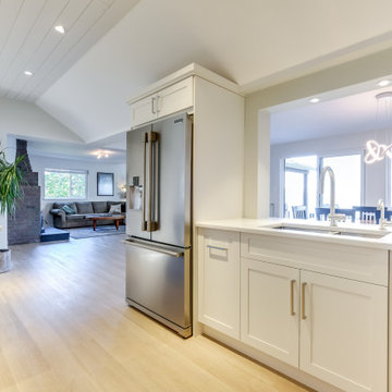 birdRock Project Studio Inc.
Ever heard some say “It has good bones?” Well, no one had ever said that about this house; it needed a major overhaul - “A TOTAL GUT.”
It’s saving grace was:
1. It’s enthusiastic new homeowners.
2. The expansive and gorgeous views of Okanagan Lake.
We were asked to assist our clients with big-picture-planning for their newest investment property.
Upon initial walk through of the home, it was immediately evident there were many previous ‘bandaid-type’ updates that it had gone through over the years.
This house was in prime need of an overhaul inside and out:
- multiple dropped Ceilings with layers of Plumbing add ons
- wall to wall Carpet
-a tired Bathtub directly inside the Master Bedroom
- a “dreaded” Corner Kitchen Sink
-multiple add ons involving three confusing front entry doors
Discovering what was previously done and the quandary of why these things were done is always so interesting to discover and can be very overwhelming for clients.
A big part of what we love most about Design is helping to propose new ideas to revitalize and improve all that has come before. It is one of the most challenging and rewarding parts of our work.
Our Renovation Strategy began in Layout Design for optimizing Interior & Exterior flow, moving into Concept & Style Planning, Millwork and Finish Selections.
We then created an ordered implementation sequence which would allow the homeowners to live on one floor while the other was being renovated Later they would move to the finished floor and renovate the remaining areas.
Once complete, the home quickly sold and we look forwards to assisting these happy investors on their next endeavour.
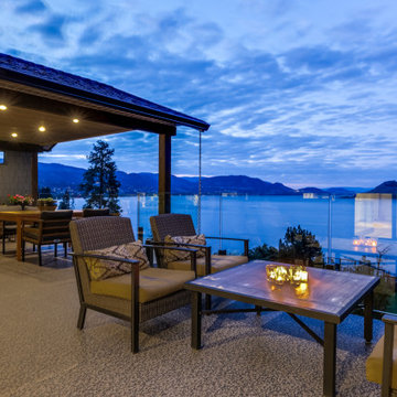 birdRock Project Studio Inc.
Ever heard some say “It has good bones?” Well, no one had ever said that about this house; it needed a major overhaul - “A TOTAL GUT.”
It’s saving grace was:
1. It’s enthusiastic new homeowners.
2. The expansive and gorgeous views of Okanagan Lake.
We were asked to assist our clients with big-picture-planning for their newest investment property.
Upon initial walk through of the home, it was immediately evident there were many previous ‘bandaid-type’ updates that it had gone through over the years.
This house was in prime need of an overhaul inside and out:
- multiple dropped Ceilings with layers of Plumbing add ons
- wall to wall Carpet
-a tired Bathtub directly inside the Master Bedroom
- a “dreaded” Corner Kitchen Sink
-multiple add ons involving three confusing front entry doors
Discovering what was previously done and the quandary of why these things were done is always so interesting to discover and can be very overwhelming for clients.
A big part of what we love most about Design is helping to propose new ideas to revitalize and improve all that has come before. It is one of the most challenging and rewarding parts of our work.
Our Renovation Strategy began in Layout Design for optimizing Interior & Exterior flow, moving into Concept & Style Planning, Millwork and Finish Selections.
We then created an ordered implementation sequence which would allow the homeowners to live on one floor while the other was being renovated Later they would move to the finished floor and renovate the remaining areas.
Once complete, the home quickly sold and we look forwards to assisting these happy investors on their next endeavour.


 Nautilus Architects
Located on a marsh in the upper reaches of the Lieutenant River in Old Lyme, the existing house was well-sited and well-built, but the design failed to exploit the views and more importantly was a confused combination of contemporary and traditional elements. The new homeowners, a successful businesswoman and an accomplished artist and photographer, were interested in creating a fully-contemporary environment to open up space, connect indoors with outdoors, display artwork and showcase the husband’s distinctive photographs.
One glaring deficiency was the curb appeal and approach sequence: the grade sloped down and the path to the house followed, but this led to an uncomfortable dip and abrupt rise to the front door. By creating a virtual “moat,” occupied by a grid of raised-bed grasses contained in aluminum-clad boxes, and spanning the moat with an ipe bridge, the approach becomes level and engaging. The façade of the existing house was blank and bland, and with no cover. Adding a deep overhang with a wide porch creates a welcoming, covered condition, accentuated by a 6’ wide pivoting front door that feels more like a moving piece of wall.
Another deficiency was the connection to the outdoors. By adding glass to the front and back of the house, and removing interior walls selectively, the house takes on a diaphanous quality that allows one to see through to the marsh beyond, even when in the driveway. The raised-bed grasses act as abstract, geometric versions of the marsh beyond. A large, pyramidal skylight establishes a spatial hierarchy around which the rooms revolve.
The house featured several tray-ceilinged spaces – living room, kitchen, and master bedroom – that were poorly-proportioned and with panels at the top that resembled inset flat panel doors. The solution was to use a different strategy for each: the bedroom turns the ceiling into an eggshell through the use of a creative trim detail; the living room has an oversized sculptural, backlit lighting element; and the kitchen has a collage of painted rectangular forms that support or include lighting pieces.
A palette of concrete, blackened steel, stainless steel and colors carefully chosen by homeowner and architect create an interior and exterior environment punctuated by moments that are as artistic as the featured works in the black-ceilinged gallery.
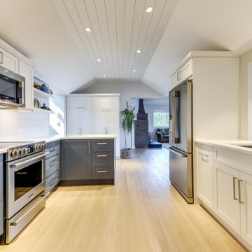 birdRock Project Studio Inc.
Ever heard some say “It has good bones?” Well, no one had ever said that about this house; it needed a major overhaul - “A TOTAL GUT.”
It’s saving grace was:
1. It’s enthusiastic new homeowners.
2. The expansive and gorgeous views of Okanagan Lake.
We were asked to assist our clients with big-picture-planning for their newest investment property.
Upon initial walk through of the home, it was immediately evident there were many previous ‘bandaid-type’ updates that it had gone through over the years.
This house was in prime need of an overhaul inside and out:
- multiple dropped Ceilings with layers of Plumbing add ons
- wall to wall Carpet
-a tired Bathtub directly inside the Master Bedroom
- a “dreaded” Corner Kitchen Sink
-multiple add ons involving three confusing front entry doors
Discovering what was previously done and the quandary of why these things were done is always so interesting to discover and can be very overwhelming for clients.
A big part of what we love most about Design is helping to propose new ideas to revitalize and improve all that has come before. It is one of the most challenging and rewarding parts of our work.
Our Renovation Strategy began in Layout Design for optimizing Interior & Exterior flow, moving into Concept & Style Planning, Millwork and Finish Selections.
We then created an ordered implementation sequence which would allow the homeowners to live on one floor while the other was being renovated Later they would move to the finished floor and renovate the remaining areas.
Once complete, the home quickly sold and we look forwards to assisting these happy investors on their next endeavour.
 Nautilus Architects
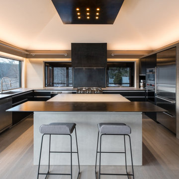
Located on a marsh in the upper reaches of the Lieutenant River in Old Lyme, the existing house was well-sited and well-built, but the design failed to exploit the views and more importantly was a confused combination of contemporary and traditional elements. The new homeowners, a successful businesswoman and an accomplished artist and photographer, were interested in creating a fully-contemporary environment to open up space, connect indoors with outdoors, display artwork and showcase the husband’s distinctive photographs.
One glaring deficiency was the curb appeal and approach sequence: the grade sloped down and the path to the house followed, but this led to an uncomfortable dip and abrupt rise to the front door. By creating a virtual “moat,” occupied by a grid of raised-bed grasses contained in aluminum-clad boxes, and spanning the moat with an ipe bridge, the approach becomes level and engaging. The façade of the existing house was blank and bland, and with no cover. Adding a deep overhang with a wide porch creates a welcoming, covered condition, accentuated by a 6’ wide pivoting front door that feels more like a moving piece of wall.
Another deficiency was the connection to the outdoors. By adding glass to the front and back of the house, and removing interior walls selectively, the house takes on a diaphanous quality that allows one to see through to the marsh beyond, even when in the driveway. The raised-bed grasses act as abstract, geometric versions of the marsh beyond. A large, pyramidal skylight establishes a spatial hierarchy around which the rooms revolve.
The house featured several tray-ceilinged spaces – living room, kitchen, and master bedroom – that were poorly-proportioned and with panels at the top that resembled inset flat panel doors. The solution was to use a different strategy for each: the bedroom turns the ceiling into an eggshell through the use of a creative trim detail; the living room has an oversized sculptural, backlit lighting element; and the kitchen has a collage of painted rectangular forms that support or include lighting pieces.
A palette of concrete, blackened steel, stainless steel and colors carefully chosen by homeowner and architect create an interior and exterior environment punctuated by moments that are as artistic as the featured works in the black-ceilinged gallery.
37