
Search results for "Consideration remodeling" in Home Design Ideas

 LINEA Design Build Remodel
LINEA Design Build Remodel has worked for these clients again and again, this time blowing out most of the wall between their kitchen, at the back of the house, and the dining area, at the front of the house, to let the light shine through and allow the family with two young children to actually use and enjoy their dining room on a daily basis... all while still maintaining a sense of functional separation. At LINEA we're experts at finding the right architectural balance between sometimes competing considerations that will transform your living spaces into the optimum environment for your lifestyle.
 Brooks + Scarpa Architects
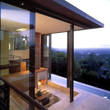
Description: In early 1994, the architects began work on the project and while in construction (demolition, grading and foundations) the owner, due to circumstances beyond his control, halted all construction of the project. Seven years later the owner returned to the architects and asked them to complete the partially constructed house. Due to code changes, city ordinances and a wide variety of obstacles it was determined that the house was unable to be completed as originally designed.
After much consideration the client asked the architect if it were possible to alter/remodel the partially constructed house, which was a remodel/addition to a 1970’s ranch style house, into a project that fit into current zoning and structural codes. The owner also requested that the house’s footprint and partially constructed foundations remain to avoid the need for further entitlements and delays on an already long overdue and difficult hillside site.
The architects’ main challenge was how to alter the design that reflected an outdated philosophical approach to architecture that was nearly a decade old. How could the house be re-conceived reflecting the architect and client’s maturity on a ten-year-old footprint?
The answer was to remove almost all of the previously proposed existing interior walls and transform the existing footprint into a pavilion-like structure that allows the site to in a sense “pass through the house”. This allowed the client to take better advantage of a limited and restricted building area while capturing extraordinary panoramic views of the San Fernando Valley and Hollywood Hills. Large 22-foot high custom sliding glass doors allow the interior and exterior to become one. Even the studio is separated from the house and connected only by an exterior bridge. Private spaces are treated as loft-like spaces capturing volume and views while maintaining privacy.
Limestone floors extend from inside to outside and into the lap pool that runs the entire length of the house creating a horizon line at the edge of the view. Other natural materials such as board formed concrete, copper, steel and cherry provides softness to the objects that seem to float within the interior volume. By placing objects and materials "outside the frame," a new frame of reference deepens our sense of perception. Art does not reproduce what we see; rather it makes us see.
 Saikley Architects
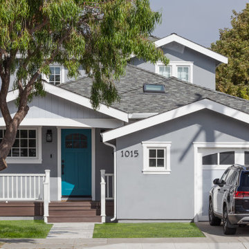
This house was a very small mid-century bungalow with previous additions that resulted in a large but chaotic layout. The owners wanted to convert the house to a super-efficient, and charming Craftsman-style, 6 bedroom home for their large family and work at home.
We achieved the space needs by moving a few walls for a more efficient, organized layout, setting up spaces for overlapping uses, and making a small upstairs addition. Every bit of square footage was optimized to meet the goals of the project without making the house huge or adding unnecessary cost.
Much thought was given to the entry sequence near the front door. A large flow-through mudroom with storage for each family member, and adjacent laundry, make it easy for children to be taught to keep their things organized and to contribute to household chores. A mail station and central home admin area at the mudroom help keep clutter down at other areas and minimize home management tasks. A garage door near the kitchen gives quick access to bulk items.
The existing house had too much view to the street from the living room through large corner windows, and too little entry transition, to the extent that the family did not feel comfortable using the living room much without shades drawn. We raised the window sills and brought the new windows in from the corner of the house, allowing plenty of light while protecting privacy and a sense of enclosure in the living room. We enlarged the front porch to create a more graceful transition from the public to private space. We located the front door so that the circulation from entry into the house would allow for furnishing the living room with a sitting circle that is not intruded upon by people walking through the room.
Sight lines through the living spaces were an important consideration in the design. The owners wanted discreet spaces for living room, kitchen, dining and family room, but also wanted the living spaces to feel connected and to be able to easily watch their children. Being able to see the children playing in the yard while getting things done inside the house was also important. While largely working with the existing structure, we opened walls and rearranged the use of spaces to make a series of connected living spaces with long views through them.
The character of the remodeled house is a contemporary Craftsman with classic materials and cool, consistent colors. A few arches echo through the house to frame spaces and soften the feeling of the rooms.
Photography: Kurt Manley
https://saikleyarchitects.com/portfolio/bungalow-expansion/
Find the right local pro for your project
 12/12 Architects & Planners
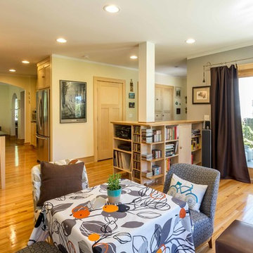
The back of this 1920s brick and siding Cape Cod gets a compact addition to create a new Family room, open Kitchen, Covered Entry, and Master Bedroom Suite above. European-styling of the interior was a consideration throughout the design process, as well as with the materials and finishes. The project includes all cabinetry, built-ins, shelving and trim work (even down to the towel bars!) custom made on site by the home owner.
Photography by Kmiecik Imagery
 Kitchen Solvers of Spring Hill
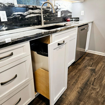
This homeowner was looking for a unicorn while searching for a contractor to remodel her kitchen. After reading our reviews she knew she found one in us! On top of being known for our quality and precision she wanted a designer to help her make the right decisions for HER kitchen. There was not a whole lot we could do with the space until we suggested adding 13” to the fridge wall which allowed for additional cabinetry and opened up the space considerably! By adding an island, we were able to accommodate a seating area, prep space for baking, and create a cohesive space with a bold look!
Finding the right tile for this homeowner was making the space feel very traditional and generic, so the idea of taking the countertops up the backsplash and seeing it in the rendering sealed the deal and made it an easy “yes to the design”! Now this really cool house fits the really cool homeowner!
 Foster Remodeling Solutions, Inc.
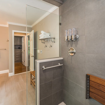
Transitional Aging in Place master suite with double vanity and considerable walk-in shower.
Inspiration for a large transitional master ceramic tile and double-sink bathroom remodel in DC Metro with recessed-panel cabinets, brown cabinets, a two-piece toilet, an undermount sink, marble countertops, white countertops and a built-in vanity
Inspiration for a large transitional master ceramic tile and double-sink bathroom remodel in DC Metro with recessed-panel cabinets, brown cabinets, a two-piece toilet, an undermount sink, marble countertops, white countertops and a built-in vanity
 Saikley Architects
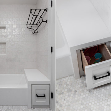
This house was a very small mid-century bungalow with previous additions that resulted in a large but chaotic layout. The owners wanted to convert the house to a super-efficient, and charming Craftsman-style, 6 bedroom home for their large family and work at home.
We achieved the space needs by moving a few walls for a more efficient, organized layout, setting up spaces for overlapping uses, and making a small upstairs addition. Every bit of square footage was optimized to meet the goals of the project without making the house huge or adding unnecessary cost.
Much thought was given to the entry sequence near the front door. A large flow-through mudroom with storage for each family member, and adjacent laundry, make it easy for children to be taught to keep their things organized and to contribute to household chores. A mail station and central home admin area at the mudroom help keep clutter down at other areas and minimize home management tasks. A garage door near the kitchen gives quick access to bulk items.
The existing house had too much view to the street from the living room through large corner windows, and too little entry transition, to the extent that the family did not feel comfortable using the living room much without shades drawn. We raised the window sills and brought the new windows in from the corner of the house, allowing plenty of light while protecting privacy and a sense of enclosure in the living room. We enlarged the front porch to create a more graceful transition from the public to private space. We located the front door so that the circulation from entry into the house would allow for furnishing the living room with a sitting circle that is not intruded upon by people walking through the room.
Sight lines through the living spaces were an important consideration in the design. The owners wanted discreet spaces for living room, kitchen, dining and family room, but also wanted the living spaces to feel connected and to be able to easily watch their children. Being able to see the children playing in the yard while getting things done inside the house was also important. While largely working with the existing structure, we opened walls and rearranged the use of spaces to make a series of connected living spaces with long views through them.
The character of the remodeled house is a contemporary Craftsman with classic materials and cool, consistent colors. A few arches echo through the house to frame spaces and soften the feeling of the rooms.
Photography: Kurt Manley
https://saikleyarchitects.com/portfolio/bungalow-expansion/
Sponsored
Delaware, OH

Buckeye Basements, Inc.
Central Ohio's Basement Finishing ExpertsBest Of Houzz '13-'21
 Lifetime Remodeling Systems
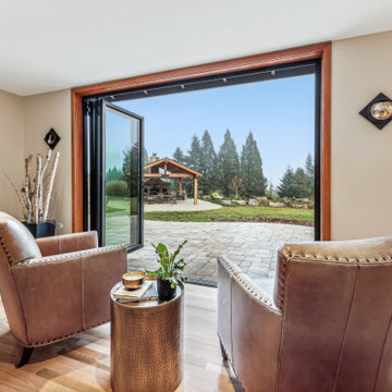
For this project, the customer envisioned enhancing their kitchen, creating a seamless connection to the living and dining areas, which had been raised. We presented options for the addition, showcasing designs that married simplicity with elegance. The first options featured straightforward roofing solutions, while the final design embraced the home's curves, incorporating the graceful rounded windows, entryway, and chimney.
We crafted the addition with a stunning barrel ceiling adorned with rich walnut wood paneling and accent lighting, creating an inviting atmosphere. After careful consideration, the clients chose the more intricate design, perfectly complementing their home's aesthetic. To elevate the space, we added a round window and an arched window in the kitchen, enhancing its character.
In the living area, they selected a Nana Wall door, allowing for a harmonious flow between indoors and the outdoor entertainment space. The kitchen showcases exquisite walnut cabinets, accented with white painted cabinets in a sleek shallow shaker style. The 2cm Dekton countertops & backsplash were designed with an island height of 2 1/4 inches, creating a more dynamic space.
As passionate cooks and bakers, the clients chose Wolf and SubZero appliances, panel-ready to harmonize beautifully with their kitchen design. This project turned out breathtakingly, and the clients are overjoyed to possess a kitchen that embodies beauty and functionality, exceeding their dreams and aspirations.
 lavish
When a professional office space needs to make a lasting impression on clients and create an inspiring environment for staff, the design details matter just as much as they do at home. This thoughtful commercial interior refresh transformed a dated, purely functional office into a warm, sophisticated, and beautifully layered space — one that feels more like a high-end boutique or luxury residence than a typical workplace.
The guiding philosophy throughout was clear: every space, no matter how utilitarian its purpose, deserves intentional design. From the reception corridor to the staff break room, from the client restrooms to the storage corridor, each area received careful attention to finish, color, and texture.
Restrooms Reimagined
The two client-facing restrooms were the most dramatic transformations in the project. Rather than the builder-grade wallpaper and basic fixtures typically found in commercial spaces, both were treated as true design moments.
The first features floor-to-ceiling wallpaper in a rich taupe with a delicate white botanical branch pattern, creating an immersive, jewel-box feel. A white shaker vanity with dark granite countertop grounds the space, while an arched frameless mirror and brushed gold wall sconce add glamour. A tall gold and glass etagere serves as both decorative storage and a sculptural element, styled with woven baskets, greenery, and stacked accessories. Framed landscape watercolor art adds a serene, organic note, and a freestanding brass toilet paper holder elevates a typically overlooked detail.
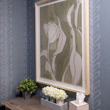
The second restroom takes an entirely different but equally compelling direction — soft, dusty blue-grey grasscloth-style wallpaper printed with a tone-on-tone chevron leaf stripe wraps every wall, creating a calm, spa-like atmosphere. A weathered wood console provides casual charm beneath a large-scale botanical tulip artwork in sage and cream. The wall-mount sink with exposed plumbing adds an intentional, editorial touch. An arched mirror with a sleek multi-bulb bar sconce in brushed nickel completes the look, while a pair of sculptural brass branch wall sculptures mounted directly to the wallpaper serve as unexpected, memorable art.
Storage Made Beautiful
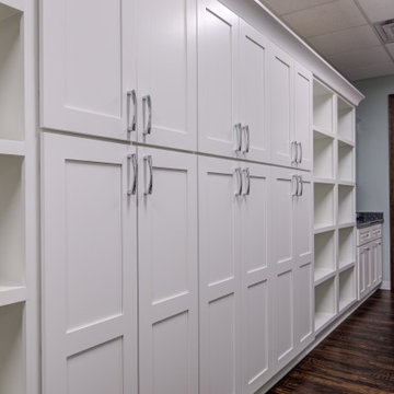
The internal storage corridor received a full wall of custom floor-to-ceiling white shaker cabinetry with chrome pulls, flanked by open shelving sections for accessible display and storage. Clean, crisp, and highly organized — this space proves that even a purely functional corridor can be architectural and refined.
The Break Room & Kitchenette
The staff break room was updated with white shaker cabinetry, light speckled granite countertops, stainless appliances — including a French door refrigerator, dishwasher, and over-counter microwave — and warm sage green walls that bring a restful, refreshing energy to the space. Dark hardwood luxury vinyl plank flooring runs throughout the room, warming the look considerably. A round walnut dining table with upholstered chairs creates a proper gathering space for the team, and framed landscape oil art in an ornate gold frame adds a touch of collected character to the room.
Reception & Corridor Details
The reception and corridor spaces were treated with deep navy blue paint — bold, sophisticated, and unexpected in a commercial setting. A large abstract landscape painting in warm blues, blush, and gold hangs in a gilded frame against the navy wall, making an immediate statement. A brass and lucite table lamp sits on a floating brass-trimmed shelf alongside a sculptural art object, creating a vignette that communicates creativity and intentionality from the moment clients arrive.
The result is a professional environment that communicates confidence, taste, and care — one that clients will remember long after their visit, and one that staff will genuinely enjoy working in every day.
 Red House Remodeling
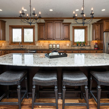
Confident in their desire to bid farewell to a rarely used formal dining room, these homeowners let us design and build a large and highly functional kitchen using the space previously occupied by the formal dining room and kitchen. Careful consideration was taken to blend the new space with the old. The outcome is an eat-in kitchen with rich wood and high end elements that make entertaining and every day dining a pleasure for this family.
Photography by Jake Boyd Photo
 Cavare Interiors Corp
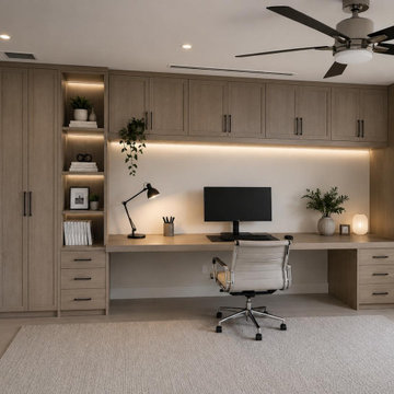
This custom home office project was designed to create a sophisticated, highly functional workspace that seamlessly blends productivity with modern luxury. The centerpiece of the renovation is a fully custom-built furniture package, tailored to the homeowner’s specific needs, work style, and aesthetic preferences.
The design features bespoke cabinetry, integrated shelving, custom storage solutions, and a beautifully crafted desk that maximizes organization while maintaining a clean, elegant appearance. Every detail was carefully planned to optimize workflow, conceal clutter, and create a professional environment suitable for remote work, virtual meetings, and daily business operations.
Premium materials, refined finishes, and custom millwork were selected to elevate the space and provide a timeless look. Thoughtful lighting, ergonomic considerations, and personalized design elements ensure both comfort and efficiency throughout the day.
The result is a dedicated home office that combines craftsmanship, functionality, and contemporary design delivering a workspace that is both inspiring and practical while reflecting the homeowner’s personal style and professional ambitions.
 Nip Tuck Remodeling
No more orange wood...
There was so much cherry and fir throughout the main floor, the color was distracting and dated, as was the older fireplace surround and flanking shelves.
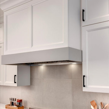
The clients wished to modernize the aesthetic, update and improve the appliances (with a fully plumbed espresso machine), and lighten the visual load in the family room.
To dramatically change the scale of an architectural element, the space still needed to feel livable. A larger fireplace profile, larger appliances, and a larger island were all key considerations for the final look and balance of the project.
 Red House Remodeling
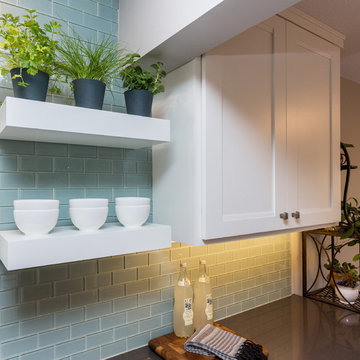
A kitchen that was previously boxed in by bulkheads and a peninsula felt even smaller with stained oak cabinets and poor lighting. Light cabinets now fill the available wall space. Not only is there considerably more storage, but the kitchen looks far more open than before. Can lighting and under cabinet lighting provide plenty of general and task lighting.
Sponsored
Plain City, OH

Kuhns Contracting, Inc.
Central Ohio's Trusted Home Remodeler Specializing in Kitchens & Baths
 SALA Architects
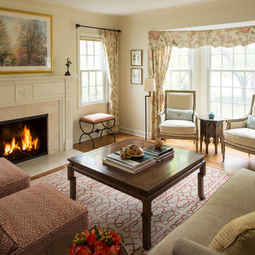
Set within a beautiful city neighborhood off West River Road, this 1940’s cottage was completely updated, remodeled and added to, resulting in a “new house” for the enjoyment of its long-term owners, who plans to remain in the home indefinitely. Each room in the house was restored and refreshed and new spaces were added including kitchen, family room, mudroom, guest bedroom and studio. A new detached garage was sited to provide a screen from the alley and to create a courtyard for a more private backyard. Careful consideration was given to the streetscape and neighboring houses on both the front and back elevations to assure that massing, new materials and exterior details complemented the existing house, street and neighborhood. Finally a new covered porch was added to protect from the elements and present a more welcoming entry from the street.
Construction by Flynn Construction, Inc.
Landscape Architecture by Tupper and Associates
Interior Design by InUnison Design
Photographs by Troy Thies
 ADM Bathroom
Shipping is Always Free to any of the 48 Contiguous States. Please feel free to call 888-864-5853 to either schedule an appointment for our showroom or for more information.
We are located at: 3340 Leonis Blvd. Vernon, CA, 90058
Hours of operation are: Monday - Friday 8:00 am - 4:30 pm.
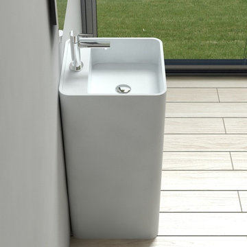
Our sinks have the appearance of natural stone, but are considerably lighter so they can be safely installed in the average home. The composite stone material is hard-wearing, stain resistant and easy to keep clean, which is why our sinks can be found installed in 5-star luxury hotels around the world. These luxury sinks are comfortable and soft to the touch – they offer a sensual washing experience. The classic minimalist designs make our sinks the ideal center piece for any bathroom. Our materials are fire retardant and resistant to mold, mildew and bacteria. Eco-friendly insulation properties help maintain the temperature of the water in our sinks for a longer, more relaxing washing experience.
 lavish
When a professional office space needs to make a lasting impression on clients and create an inspiring environment for staff, the design details matter just as much as they do at home. This thoughtful commercial interior refresh transformed a dated, purely functional office into a warm, sophisticated, and beautifully layered space — one that feels more like a high-end boutique or luxury residence than a typical workplace.
The guiding philosophy throughout was clear: every space, no matter how utilitarian its purpose, deserves intentional design. From the reception corridor to the staff break room, from the client restrooms to the storage corridor, each area received careful attention to finish, color, and texture.
Restrooms Reimagined
The two client-facing restrooms were the most dramatic transformations in the project. Rather than the builder-grade wallpaper and basic fixtures typically found in commercial spaces, both were treated as true design moments.
The first features floor-to-ceiling wallpaper in a rich taupe with a delicate white botanical branch pattern, creating an immersive, jewel-box feel. A white shaker vanity with dark granite countertop grounds the space, while an arched frameless mirror and brushed gold wall sconce add glamour. A tall gold and glass etagere serves as both decorative storage and a sculptural element, styled with woven baskets, greenery, and stacked accessories. Framed landscape watercolor art adds a serene, organic note, and a freestanding brass toilet paper holder elevates a typically overlooked detail.
The second restroom takes an entirely different but equally compelling direction — soft, dusty blue-grey grasscloth-style wallpaper printed with a tone-on-tone chevron leaf stripe wraps every wall, creating a calm, spa-like atmosphere. A weathered wood console provides casual charm beneath a large-scale botanical tulip artwork in sage and cream. The wall-mount sink with exposed plumbing adds an intentional, editorial touch. An arched mirror with a sleek multi-bulb bar sconce in brushed nickel completes the look, while a pair of sculptural brass branch wall sculptures mounted directly to the wallpaper serve as unexpected, memorable art.
Storage Made Beautiful
The internal storage corridor received a full wall of custom floor-to-ceiling white shaker cabinetry with chrome pulls, flanked by open shelving sections for accessible display and storage. Clean, crisp, and highly organized — this space proves that even a purely functional corridor can be architectural and refined.
The Break Room & Kitchenette
The staff break room was updated with white shaker cabinetry, light speckled granite countertops, stainless appliances — including a French door refrigerator, dishwasher, and over-counter microwave — and warm sage green walls that bring a restful, refreshing energy to the space. Dark hardwood luxury vinyl plank flooring runs throughout the room, warming the look considerably. A round walnut dining table with upholstered chairs creates a proper gathering space for the team, and framed landscape oil art in an ornate gold frame adds a touch of collected character to the room.
Reception & Corridor Details
The reception and corridor spaces were treated with deep navy blue paint — bold, sophisticated, and unexpected in a commercial setting. A large abstract landscape painting in warm blues, blush, and gold hangs in a gilded frame against the navy wall, making an immediate statement. A brass and lucite table lamp sits on a floating brass-trimmed shelf alongside a sculptural art object, creating a vignette that communicates creativity and intentionality from the moment clients arrive.
The result is a professional environment that communicates confidence, taste, and care — one that clients will remember long after their visit, and one that staff will genuinely enjoy working in every day.
 Red House Remodeling
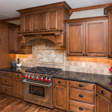
Confident in their desire to bid farewell to a rarely used formal dining room, these homeowners let us design and build a large and highly functional kitchen using the space previously occupied by the formal dining room and kitchen. Careful consideration was taken to blend the new space with the old. The outcome is an eat-in kitchen with rich wood and high end elements that make entertaining and every day dining a pleasure for this family.
Photography by Jake Boyd Photo
Sponsored
Galena, OH

Buckeye Restoration & Remodeling Inc.
Central Ohio's Premier Home Remodelers Since 1996
 Closet Factory
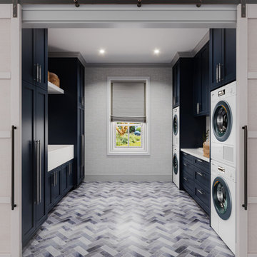
Revamping the laundry room brings a blend of functionality and style to an often-overlooked space. Upgrading appliances to energy-efficient models enhances efficiency while minimizing environmental impact.
Custom cabinetry and shelving solutions maximize storage for detergents, cleaning supplies, and laundry essentials, promoting an organized and clutter-free environment. Consideration of ergonomic design, such as a folding counter or ironing station, streamlines tasks and adds a touch of convenience.
Thoughtful lighting choices, perhaps with LED fixtures or natural light sources, contribute to a bright and inviting atmosphere. Flooring upgrades for durability, such as water-resistant tiles or easy-to-clean materials, can withstand the demands of laundry tasks.
Ultimately, a remodeled laundry room not only elevates its practical functionality but also transforms it into a well-designed, efficient space that makes the often-dreaded chore of laundry a more pleasant experience.
 ALL Renovation & Design LLC
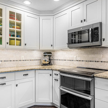
Mrs. Deighan loved to cook, but hated her kitchen.
It was nonfunctional, inefficient, and an eyesore.
The sink was in the corner under low cabinets. The awkwardly placed fridge made it impractical for the entire family to be working together.
And that was a big deal.
She wanted a beautiful place to cook and entertain.
Besides the cramped space, the old, brown plywood cabinets were falling apart.
Because the cabinets were low, under-cabinet lighting was useless.
The kitchen was dark.
The previous owners had updated the flooring, but only by putting uglier tiles over the old vinyl.
And the ceiling had a leak stain.
It was time for a big change.
The Deighan's called Amos from ALL Renovation & Design.
Amos’s many successful remodeling projects done for them over the years had forged a friendship that made him the obvious contractor of choice.
Amos sat down with them and asked them to make a dream kitchen list.
If budget were of no concern, what would the space look like?
Once the Deighan's had their list, Amos helped them to evaluate each investment, taking into consideration the age and value of the home.
Then Amos presented a plan that fit perfectly in the Deighan's budget.
The basic U-shaped kitchen layout stayed the same.
Modern, creamy white custom cabinets replaced the dark plywood cabinets.
The fridge moved to make space for more cabinets.
The biggest challenge was moving the laundry room wall a few feet.
Moving it was necessary to add more space, but, since the wall was load-bearing, moving it required extra attention.
It was worth it.
Extra space allowed the counter to extend and the sink to move.
After the hard work ended, the reason for the transformation became reality.
Now “we can have the whole family in there comfortably and working together,” Mrs. Deighan said.
She loves her kitchen.
Especially the windowed cabinets that show off her fiestaware.
And when you see the beautiful St. Cecilia granite countertops, with Milstone Sari porcelain mosaic tile backsplash, maple flat-panel cabinets with under-cabinet lighting, and all new appliances including a double oven, you will see why she does.
 Lifetime Remodeling Systems
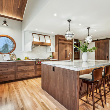
For this project, the customer envisioned enhancing their kitchen, creating a seamless connection to the living and dining areas, which had been raised. We presented options for the addition, showcasing designs that married simplicity with elegance. The first options featured straightforward roofing solutions, while the final design embraced the home's curves, incorporating the graceful rounded windows, entryway, and chimney.
We crafted the addition with a stunning barrel ceiling adorned with rich walnut wood paneling and accent lighting, creating an inviting atmosphere. After careful consideration, the clients chose the more intricate design, perfectly complementing their home's aesthetic. To elevate the space, we added a round window and an arched window in the kitchen, enhancing its character.
In the living area, they selected a Nana Wall door, allowing for a harmonious flow between indoors and the outdoor entertainment space. The kitchen showcases exquisite walnut cabinets, accented with white painted cabinets in a sleek shallow shaker style. The 2cm Dekton countertops & backsplash were designed with an island height of 2 1/4 inches, creating a more dynamic space.
As passionate cooks and bakers, the clients chose Wolf and SubZero appliances, panel-ready to harmonize beautifully with their kitchen design. This project turned out breathtakingly, and the clients are overjoyed to possess a kitchen that embodies beauty and functionality, exceeding their dreams and aspirations.
34