
Search results for "Constructed precisely" in Home Design Ideas
 Chermak Construction, Inc.
Our client’s intention was to make this bathroom suite a very specialized spa retreat. She envisioned exquisite, highly crafted components and loved the colors gold and purple. We were challenged to mix contemporary, traditional and rustic features.
Also on the wish-list were a sizeable wardrobe room and a meditative loft-like retreat. Hydronic heated flooring was installed throughout. The numerous features in this project required replacement of the home’s plumbing and electrical systems. The cedar ceiling and other places in the room replicate what is found in the rest of the home. The project encompassed 400 sq. feet.
Features found at one end of the suite are new stained glass windows – designed to match to existing, a Giallo Rio slab granite platform and a Carlton clawfoot tub. The platform is banded at the floor by a mosaic of 1″ x 1″ glass tile.
Near the tub platform area is a large walnut stained vanity with Contemporary slab door fronts and shaker drawers. This is the larger of two separate vanities. Each are enhanced with hand blown artisan pendant lighting.
A custom fireplace is centrally placed as a dominant design feature. The hammered copper that surrounds the fireplace and vent pipe were crafted by a talented local tradesman. It is topped with a Café Imperial marble.
A lavishly appointed shower is the centerpiece of the bathroom suite. The many slabs of granite used on this project were chosen for the beautiful veins of quartz, purple and gold that our client adores.
Two distinct spaces flank a small vanity; the wardrobe and the loft-like Magic Room. Both precisely fulfill their intended practical and meditative purposes. A floor to ceiling wardrobe and oversized built-in dresser keep clothing, shoes and accessories organized. The dresser is topped with the same marble used atop the fireplace and inset into the wardrobe flooring.
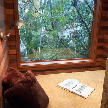
The Magic Room is a space for resting, reading or just gazing out on the serene setting. The reading lights are Oil Rubbed Bronze. A drawer within the step up to the loft keeps reading and writing materials neatly tucked away.
Within the highly customized space, marble, granite, copper and art glass come together in a harmonious design that is organized for maximum rejuvenation that pleases our client to not end!
Photo,Matt Hesselgrave
 Chermak Construction, Inc.
Our client’s intension was to make this bathroom suite a very specialized spa retreat. She envisioned exquisite, highly crafted components and loved the colors gold and purple. We were challenged to mix contemporary, traditional and rustic features.
Also on the wish-list were a sizeable wardrobe room and a meditative loft-like retreat. Hydronic heated flooring was installed throughout. The numerous features in this project required replacement of the home’s plumbing and electrical systems. The cedar ceiling and other places in the room replicate what is found in the rest of the home. The project encompassed 400 sq. feet.
Features found at one end of the suite are new stained glass windows – designed to match to existing, a Giallo Rio slab granite platform and a Carlton clawfoot tub. The platform is banded at the floor by a mosaic of 1″ x 1″ glass tile.
Near the tub platform area is a large walnut stained vanity with Contemporary slab door fronts and shaker drawers. This is the larger of two separate vanities. Each are enhanced with hand blown artisan pendant lighting.
A custom fireplace is centrally placed as a dominant design feature. The hammered copper that surrounds the fireplace and vent pipe were crafted by a talented local tradesman. It is topped with a Café Imperial marble.
A lavishly appointed shower is the centerpiece of the bathroom suite. The many slabs of granite used on this project were chosen for the beautiful veins of quartz, purple and gold that our client adores.
Two distinct spaces flank a small vanity; the wardrobe and the loft-like Magic Room. Both precisely fulfill their intended practical and meditative purposes. A floor to ceiling wardrobe and oversized built-in dresser keep clothing, shoes and accessories organized. The dresser is topped with the same marble used atop the fireplace and inset into the wardrobe flooring.
The Magic Room is a space for resting, reading or just gazing out on the serene setting. The reading lights are Oil Rubbed Bronze. A drawer within the step up to the loft keeps reading and writing materials neatly tucked away.
Within the highly customized space, marble, granite, copper and art glass come together in a harmonious design that is organized for maximum rejuvenation that pleases our client to not end!
Photo,
Matt Hesselgrave

 Ernest M. Ferizi
German Embassy in Pristina - Kosovo, contracted the architecture office “Ferizi + Ferizi Architects” to plan and implement an Annex Office building for their purposes. As detached part of this building is designed the waiting area, as alone standing structure.
This Office Building is constructed by assembling of Eight used office containers that were delivered on trucks and set up after only a few hours on the basis of the LEGO principle, according to the planning on strip foundations.
By removing the flexible exterior wall panels, a large room of 115 m² was created, with the counter wall as a room partition between two office spaces, each with seven workstations as well as three counters for agents on one side and a room for visitors on the other side.
With this system, room solutions can be easily implemented in all dimensions.
The container, seen as a geometric shape, is a simple, octagonal, solid box.
The standardized perfection of its dimensions is striking: 2.44 meters wide, 2.59 meters high and 6.06 meters or 12.19 meters long.
Since its introduction in 1956 by the American transport entrepreneur Malcom McLean, the container has become a standardized transport module worldwide, whether on ships, trucks or construction sites.
The shipping containers have additionally revolutionized the transport industry, pushed the globalization noticeably, and thus directly or indirectly influenced all our lives.
But after only a few years, when the first overseas containers wore out, many engineers recognized the positive properties of used shipping containers for building houses, especially since they are robust, flexible, multifunctional and second-hand relatively inexpensive to purchase. The time has long passed by to treat containers exclusively as transport objects.
As a "measure of all things", containers can hardly be ignored in construction.
Their use is no longer limited to temporary use since school containers, information containers, office containers or entire residential buildings are now part of our everyday life in the construction industry.
However, current examples of the container architecture prove that even the most demanding solutions for container building are feasible. For their specific aesthetic and spatial qualities, containers also serve as design parameters for the development of new forms of architecture and urbanity.
The office building as an extension of the visa section, characterized by modern materials and contemporary aesthetics has been designed and built mainly as a low-energy building.
Extensive insulation to achieve a comfortable and sustainable constant temperature in the interior, high window quality and low energy consumption make the building energy-efficient.
The sophisticated lighting technology, networks, heating systems and air-conditioning systems are also components of this equipment.
It creates an overall harmonic picture and guarantees the highest standard in sustainable construction, taking into consideration the fact that environmentally friendly recycling and reutilization have become an increasingly important issue in our society.
West and East side of the wooden facade is compact and has few openings, while the southern facade is completely open with lot of glass. Its spatial openness ensures a transparent, friendly work environment, which allows a lot of light into the space.
This openness allows an uninterrupted, pleasant and close-to-nature view from interior spaces into the beautiful garden. During the installation of sophisticated light sources in the garden, emphasis was not only put on functionality and security, but also on the beauty of the garden shown through the illumination in the evening.
Large, horizontal white “brisole” serve as external sun protection systems, mounted on the canopies of the entrance areas of the modular construction and the enclosure, adeptly cast shade on these areas and at the same time shape the entire architectural language.
While on one hand, the two quadratic ledges suspended in the air, are docked with steel stairs and match the wooden façade, lead the staff to their office space, the artful modern interior, on the other hand, perfectly unites the functionality, innovative technology, culture and positive effects on the employees' efficiency and wellbeing.
A lot of white, interjected by warm wooden and colored accents, determines the ambience.
In the case of the lighting solution, the mainly linear ceiling lighting is used as the overlapping design element both for the offices of the visa section as well as for the counters and the waiting area for the visitors.
They underline the puristic design in order to create a pleasant light for a desired general illumination and ensure optimal light conditions without causing disturbing reflections on the computer screens.
In addition, precisely positioned pendant luminaires are installed at the workstations, which ensure pleasant room brightness.
In the entrance area, the harmonic and uniform lighting effect from the ground highlights the integration of photography and architecture.
Photographs of landscapes, people, places, expressing unforgettable, impressive moments and memories have been lovingly engraved on 8 x 8cm square oak blocks.
The idea of an effective, impressive environment that stimulates and inspires the work was the premiss on which the whole design concept was based. Consequently, the modular construction was no longer viewed through its history of utilization and scars, but rather as a structure of work ambiance, art and elegance.
FERIZI + FERIZI Architects
Photo: Arben Llapashtica
Find the right local pro for your project
 Pennsylvania Landscape & Nursery Association
Kimicata Brothers, INC http://www.kimicatabrothers.com
Project Entry: Johnson
2014 PLNA Awards for Landscape Excellence Winner
Category: Hardscaping-Residential $30,000-$60,000
Award Level: Honorable Mention
Photo Description:
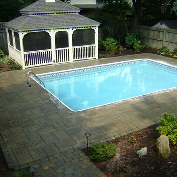
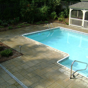
We were contacted by the Johnson’s to update their backyard fenced in pool area in the summer of 2012. Over the years the deck around the pool had deteriorated and the plants had become over grown and made walking around the deck difficult. The old concrete patio was small and only lit by bright 120 volt spot lights. What made this job difficult was the access to the backyard was limited to using a neighbor’s backyard for the project. We had to bring all debris out and materials in from a neighboring street, down the neighbor’s driveway, across the backyard, through an 8’ section that was in the far corner of the neighbor’s yard that corresponded to the entrance to Johnson’s backyard. They had a plan that they wanted to work from. Since access was a problem, we had to secure permission from the neighbor before we could consider bidding the job. After the neighbor’s permission was obtained we discussed materials for the drawing they had. It only included the hardscape and gazebo. Other difficulties included not damaging lighting and plumbing for the pool during excavation and construction. Also the ladders into the pool fit into cups screwed to the deck. These had to be replaced with precisely placed pipes mounted into the base for stability. Care had to be taken to make sure water would not drain from the deck into the pool. So we had to place channel drains between the patio area and pool deck area. A channel drain was placed between the exposed aggregate finished slab for the gazebo and the pool deck. This allowed for proper sloping of the hardscape to provide the drains to move rain away from the pool. We used polymeric sand in the paver joints to prevent breakdown of the installation and avoid wind and water moving sand into the pool. The slab for the gazebo was an exposed aggregate finish that measured 12’ 6” x 16’ 6”. The pagoda style roof for the gazebo and screening make it attractive and functional as a bug free area to entertain in. We discussed adding low voltage lighting, 120 volt plugs and drip irrigation early on so we could place conduits during the construction. After the hardscape installation we installed the low voltage lighting. We installed a transformer with a timer and an optional dusk to dawn photocell. The Johnsons did not like the old 120 volt spot light to light the back, they wanted something softer. We installed 20 path lights to illuminate the hardscape and 3 wall wash lights to add evening depth to the yard. We installed the plantings and Hunter drip irrigation system in the spring of 2013. It was easy to convince them that the drip system was the proper way to irrigate the area. There would be no spray to blow onto patio furniture or into the gazebo. Also drip irrigation uses less water so they are economical to operate. This gave them a low maintenance yard, a nice finished look and something blooming throughout the growing season. The Johnsons have been very happy with the look and the functionality of the pool deck, patio, lights, irrigation and gazebo.
 May Construction, Inc.
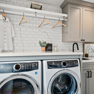
The laundry room was a major transformation that was majorly needed, once a dark and gloomy dungeon is now a bright, and functional room that would make anyone be happy. The Ornate tile flooring brings in a fun funky feel to the well-organized room, while white subway backsplash tile keeps it cool and calm. To accommodate the newest furriest member of the family, a hidden litter box pull-out was included in the cabinetry and cute-custom cat door allows the new kitten to get in and out through its very own purrfect passageway.

 Tuscanbasins
The Berkeley is designed with clean and simple styling in mind and finished in an elegant mocha stain. The Berkeley makes any living room, den or man cave really stand out.
The Berkeley TV lift cabinet was inspired by the same construction and finish of the Brookside TV lift cabinet. Taking from it's subtle lines and mocha finish it has quickly become one of our most popular units. The Berkeley features interior shelf lighting and tons of room behind the cabinet doors for your component and media storage.
The Berkeley accommodates most 60" diagonal flat panel plasma and LCD TVs, measuring 55"W x 4.5"D x 35"H. Behind the front doors is ample storage space for your DVD movie & video game boxes. The cabinet is equipped with sliding rear panels for easy access to your TV connections.
Video
Product Features:
Universal Mounting System: Simple mounting kit includes all the hardware and brackets you need to hold your flat screen TV on the Touchstone lift mechanism.
Component Storage Space: The Berkeley has 8" of vertical storage height and 50" of width horizontal space for your Satellite Box, Cable Box, Recorders, Amps, Surround Sound, and Video Games.
Personal Storage Space: The Berkeley has 4 adjustable shelves for your DVD boxes, Video Game boxes and CD cases.
RF Remote Control: Includes 1 RF remote control for raising/lowering the lift mechanism without requiring line of sight.
Backup Wired Remote Control: Each unit has a backup on/off switch and set control switch inside the cabinet.
Finishing Process: Our thorough 7 step finishing process uses a combination of hand-staining and automated application tools that insures all woods and stains are applied uniformly and precisely to produce a quality cabinet that will last a lifetime.
English Dovetail Joints: A time-honored fine cabinet-making technique, Dovetail joints become self-locking even before the glue is applied, so solid overall construction can be guaranteed.
Solid Wood Tongue and Groove Corner Blocks: Incorporates the side panels of the cabinet with the foot of the cabinet, adding structural support which enhances durability.
24 point QC audit inspection of every cabinet.
Specifications
Cabinet Wood Finish: Mocha
Unit Dimensions: 59"W x 23"D x 41.5"H
Maximum Cabinet TV Size: 55"W x 4.5"D x 35"H (TV plus component height)
Unit Weight: 321 lbs.
Unit Shipping Weight:395 lbs.
Touchstone's TV Lift System
The Berkeley is ready for entertainment action with Touchstone's quiet and smooth TV lift system for your flatscreen television. The Berkeley includes a wireless RF remote control for operation of the cabinet's lift as well as a backup controller wired into the inside of the cabinet just in case you ever lose or can’t find the wireless remote.
 Ernest M. Ferizi
German Embassy in Pristina - Kosovo, contracted the architecture office “Ferizi + Ferizi Architects” to plan and implement an Annex Office building for their purposes. As detached part of this building is designed the waiting area, as alone standing structure.
This Office Building is constructed by assembling of Eight used office containers that were delivered on trucks and set up after only a few hours on the basis of the LEGO principle, according to the planning on strip foundations.
By removing the flexible exterior wall panels, a large room of 115 m² was created, with the counter wall as a room partition between two office spaces, each with seven workstations as well as three counters for agents on one side and a room for visitors on the other side.
With this system, room solutions can be easily implemented in all dimensions.
The container, seen as a geometric shape, is a simple, octagonal, solid box.
The standardized perfection of its dimensions is striking: 2.44 meters wide, 2.59 meters high and 6.06 meters or 12.19 meters long.
Since its introduction in 1956 by the American transport entrepreneur Malcom McLean, the container has become a standardized transport module worldwide, whether on ships, trucks or construction sites.
The shipping containers have additionally revolutionized the transport industry, pushed the globalization noticeably, and thus directly or indirectly influenced all our lives.
But after only a few years, when the first overseas containers wore out, many engineers recognized the positive properties of used shipping containers for building houses, especially since they are robust, flexible, multifunctional and second-hand relatively inexpensive to purchase. The time has long passed by to treat containers exclusively as transport objects.
As a "measure of all things", containers can hardly be ignored in construction.
Their use is no longer limited to temporary use since school containers, information containers, office containers or entire residential buildings are now part of our everyday life in the construction industry.
However, current examples of the container architecture prove that even the most demanding solutions for container building are feasible. For their specific aesthetic and spatial qualities, containers also serve as design parameters for the development of new forms of architecture and urbanity.
The office building as an extension of the visa section, characterized by modern materials and contemporary aesthetics has been designed and built mainly as a low-energy building.
Extensive insulation to achieve a comfortable and sustainable constant temperature in the interior, high window quality and low energy consumption make the building energy-efficient.
The sophisticated lighting technology, networks, heating systems and air-conditioning systems are also components of this equipment.
It creates an overall harmonic picture and guarantees the highest standard in sustainable construction, taking into consideration the fact that environmentally friendly recycling and reutilization have become an increasingly important issue in our society.
West and East side of the wooden facade is compact and has few openings, while the southern facade is completely open with lot of glass. Its spatial openness ensures a transparent, friendly work environment, which allows a lot of light into the space.
This openness allows an uninterrupted, pleasant and close-to-nature view from interior spaces into the beautiful garden. During the installation of sophisticated light sources in the garden, emphasis was not only put on functionality and security, but also on the beauty of the garden shown through the illumination in the evening.
Large, horizontal white “brisole” serve as external sun protection systems, mounted on the canopies of the entrance areas of the modular construction and the enclosure, adeptly cast shade on these areas and at the same time shape the entire architectural language.
While on one hand, the two quadratic ledges suspended in the air, are docked with steel stairs and match the wooden façade, lead the staff to their office space, the artful modern interior, on the other hand, perfectly unites the functionality, innovative technology, culture and positive effects on the employees' efficiency and wellbeing.
A lot of white, interjected by warm wooden and colored accents, determines the ambience.
In the case of the lighting solution, the mainly linear ceiling lighting is used as the overlapping design element both for the offices of the visa section as well as for the counters and the waiting area for the visitors.
They underline the puristic design in order to create a pleasant light for a desired general illumination and ensure optimal light conditions without causing disturbing reflections on the computer screens.
In addition, precisely positioned pendant luminaires are installed at the workstations, which ensure pleasant room brightness.
In the entrance area, the harmonic and uniform lighting effect from the ground highlights the integration of photography and architecture.
Photographs of landscapes, people, places, expressing unforgettable, impressive moments and memories have been lovingly engraved on 8 x 8cm square oak blocks.
The idea of an effective, impressive environment that stimulates and inspires the work was the premiss on which the whole design concept was based. Consequently, the modular construction was no longer viewed through its history of utilization and scars, but rather as a structure of work ambiance, art and elegance.
FERIZI + FERIZI Architects
Photo: Arben Llapashtica

 Chermak Construction, Inc.
Our client’s intension was to make this bathroom suite a very specialized spa retreat. She envisioned exquisite, highly crafted components and loved the colors gold and purple. We were challenged to mix contemporary, traditional and rustic features.
Also on the wish-list were a sizeable wardrobe room and a meditative loft-like retreat. Hydronic heated flooring was installed throughout. The numerous features in this project required replacement of the home’s plumbing and electrical systems. The cedar ceiling and other places in the room replicate what is found in the rest of the home. The project encompassed 400 sq. feet.
Features found at one end of the suite are new stained glass windows – designed to match to existing, a Giallo Rio slab granite platform and a Carlton clawfoot tub. The platform is banded at the floor by a mosaic of 1″ x 1″ glass tile.
Near the tub platform area is a large walnut stained vanity with Contemporary slab door fronts and shaker drawers. This is the larger of two separate vanities. Each are enhanced with hand blown artisan pendant lighting.
A custom fireplace is centrally placed as a dominant design feature. The hammered copper that surrounds the fireplace and vent pipe were crafted by a talented local tradesman. It is topped with a Café Imperial marble.
A lavishly appointed shower is the centerpiece of the bathroom suite. The many slabs of granite used on this project were chosen for the beautiful veins of quartz, purple and gold that our client adores.
Two distinct spaces flank a small vanity; the wardrobe and the loft-like Magic Room. Both precisely fulfill their intended practical and meditative purposes. A floor to ceiling wardrobe and oversized built-in dresser keep clothing, shoes and accessories organized. The dresser is topped with the same marble used atop the fireplace and inset into the wardrobe flooring.
The Magic Room is a space for resting, reading or just gazing out on the serene setting. The reading lights are Oil Rubbed Bronze. A drawer within the step up to the loft keeps reading and writing materials neatly tucked away.
Within the highly customized space, marble, granite, copper and art glass come together in a harmonious design that is organized for maximum rejuvenation that pleases our client to not end!
Photo, Matt Hesselgrave
 Pennsylvania Landscape & Nursery Association
Kimicata Brothers, INC http://www.kimicatabrothers.com
Project Entry: Johnson
2014 PLNA Awards for Landscape Excellence Winner
Category: Hardscaping-Residential $30,000-$60,000
Award Level: Honorable Mention
Photo Description:
We were contacted by the Johnson’s to update their backyard fenced in pool area in the summer of 2012. Over the years the deck around the pool had deteriorated and the plants had become over grown and made walking around the deck difficult. The old concrete patio was small and only lit by bright 120 volt spot lights. What made this job difficult was the access to the backyard was limited to using a neighbor’s backyard for the project. We had to bring all debris out and materials in from a neighboring street, down the neighbor’s driveway, across the backyard, through an 8’ section that was in the far corner of the neighbor’s yard that corresponded to the entrance to Johnson’s backyard. They had a plan that they wanted to work from. Since access was a problem, we had to secure permission from the neighbor before we could consider bidding the job. After the neighbor’s permission was obtained we discussed materials for the drawing they had. It only included the hardscape and gazebo. Other difficulties included not damaging lighting and plumbing for the pool during excavation and construction. Also the ladders into the pool fit into cups screwed to the deck. These had to be replaced with precisely placed pipes mounted into the base for stability. Care had to be taken to make sure water would not drain from the deck into the pool. So we had to place channel drains between the patio area and pool deck area. A channel drain was placed between the exposed aggregate finished slab for the gazebo and the pool deck. This allowed for proper sloping of the hardscape to provide the drains to move rain away from the pool. We used polymeric sand in the paver joints to prevent breakdown of the installation and avoid wind and water moving sand into the pool. The slab for the gazebo was an exposed aggregate finish that measured 12’ 6” x 16’ 6”. The pagoda style roof for the gazebo and screening make it attractive and functional as a bug free area to entertain in. We discussed adding low voltage lighting, 120 volt plugs and drip irrigation early on so we could place conduits during the construction. After the hardscape installation we installed the low voltage lighting. We installed a transformer with a timer and an optional dusk to dawn photocell. The Johnsons did not like the old 120 volt spot light to light the back, they wanted something softer. We installed 20 path lights to illuminate the hardscape and 3 wall wash lights to add evening depth to the yard. We installed the plantings and Hunter drip irrigation system in the spring of 2013. It was easy to convince them that the drip system was the proper way to irrigate the area. There would be no spray to blow onto patio furniture or into the gazebo. Also drip irrigation uses less water so they are economical to operate. This gave them a low maintenance yard, a nice finished look and something blooming throughout the growing season. The Johnsons have been very happy with the look and the functionality of the pool deck, patio, lights, irrigation and gazebo.

 Klopf Architecture
Nestled in the hills of Orinda, California, this 1951 residence is one of only seven extant homes, now known as “The Magnificent Seven”, designed by architect Olof Dahlstrand, a protégé of Frank Lloyd Wright. With its low-slung rooflines, natural materials, and deep integration with the sloping landscape, the home is a pristine example of mid-century modern design inspired by Wright’s organic principles. Over the years, prior homeowners have emphasized preservation, ensuring that the house remained relatively untouched. Each owner has respected the original architecture and stayed true to Dahlstrand’s intent. When a family of five—two college-aged sons and a middle school-aged daughter—acquired the property, they were captivated by its history, legacy of care, and architectural significance. While they appreciated Dahlstrand’s original vision, they also recognized the need to adapt the home for contemporary living while preserving its design integrity.
The remodel was conceived as a thoughtful response to the past—an effort to bring the house into the 21st century without compromising its soul. The primary mandate was to maintain architectural continuity while improving the functionality, comfort, and livability for a modern family. The design team—architects and contractor alike—worked with a shared reverence for the original architecture, allowing that mindset to guide even the most technical or pragmatic decisions.
A key objective was to increase natural light in the kitchen—a departure from Wrightian principles of enclosed, intimate cooking spaces—while maintaining the home’s architectural language. The kitchen was reconfigured to foster a stronger connection to adjacent living spaces while retaining the underlying concept of spatial separation. One of the most transformative architectural changes was the removal of a ridge beam that was originally planned to remain visible through the kitchen. During construction, the team collaborated on a better solution: a wide-flanged steel beam concealed within the roof envelope. This subtle move preserved the clean lines and ceiling continuity, a modern update carried out with utmost respect for the existing framework.
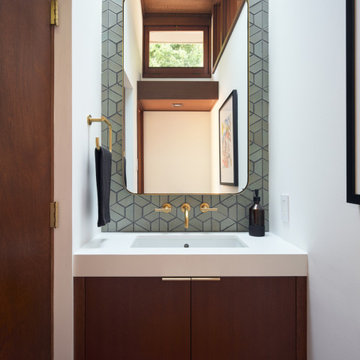
The home’s original powder room, previously accessible only through the kitchen, was relocated for better flow and privacy. A new powder room was carved out of former kitchen cabinetry—a narrow, interior space that could have felt dark and enclosed. To avoid this, the design extended the line of original transom windows into the new powder room and added a skylight above the vanity. The result is a bright and airy space that feels consistent with the rest of the home. Other updates included the installation of new solid-core interior doors with veneers carefully matched to the original mahogany, enhancing the continuity of the interiors. Even smaller decisions, such as placing the door knobs at 42 inches high, mirrored the original proportions. Every choice reflected a shared belief between the architect, contractor, and client: that new work should serve the integrity of the old.
The home’s extensive interior redwood millwork and paneling was meticulously restored. Where new materials were introduced—such as the replacement redwood soffit paneling—the contractor took pains to find finish nails that matched the original, rather than using modern equivalents. This level of craftsmanship and collaboration defined the project. It extended even to the detailing of a blind door to the new powder room, which had to disappear into the existing redwood board-and-batten wall. It was a team effort: the owner found a suitable handle, the architects devised the custom in-swing mechanism, and the contractor executed it so the door aligned precisely with the battens. Throughout, the homeowners were deeply engaged in the design process. One, a meticulous design enthusiast, focused on aesthetic integrity and historic detail. The other brought a practical and function-driven perspective, ensuring that new fixtures and materials would be durable and require minimal maintenance.
While the home’s location posed no major site challenges, sustainability was a key concern. The team upgraded the roof insulation, installed solar panels with battery storage, and added ductless mini-split cooling systems. Lighting was another area where modern technology was woven into a historic framework: new square LED fixtures echo the original custom perimeter soffit lights, maintaining the design language while offering advanced performance.
A planned expansion of a bedroom into suite with a bathroom had to be shelved due to budget constraints and the high cost of below-grade foundation work. Still, the team focused their efforts on making the most of the existing footprint, resolving constraints through design ingenuity rather than adding square footage. This renovation represents a collaborative achievement in preserving and evolving a historically significant home. Every decision was shaped by a shared ethos among clients, architects, and contractor: to maintain the home’s architectural soul while updating it for contemporary life. The result is a timeless modernist residence that continues Olof Dahlstrand’s legacy, remaining grounded in nature, craftsmanship, and human-scale design.
Klopf Architecture Team: John Klopf, AIA, Klara Kevane, Fernanda Bernardes
Interior Architectural Design: Klopf Architecture
Structural Engineer: Daniel Bastiao
Contractor: Don Larwood, Larwood Construction
Photography: Mariko Reed
Year Completed: 2022
 Rhodes Architecture + Light
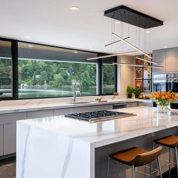
A transformation inspired by the owner’s love of modern architecture, art and color (and the adjacent sand, rock, water, and the northwest landscape), the Indianola House sought to bring the soul of a home to a colorless muted box. The original house was a drab 1990’s-era box with no personality or presence sited on a beautiful secluded bay, facing water and island views, northwest of the City of Seattle. The existing mono-colored stucco-clad exterior and pyramidal glass-block openings had led the neighborhood to dub the structure, unflatteringly, “The Miami Vice House”.
Rhodes Architecture’s Residential Architects careful use of natural light, rich, collaged finishes and ability to open the house to gardens, beach, and outdoor gathering was critical to the design. The house soon became “The Gallery”.
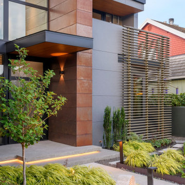
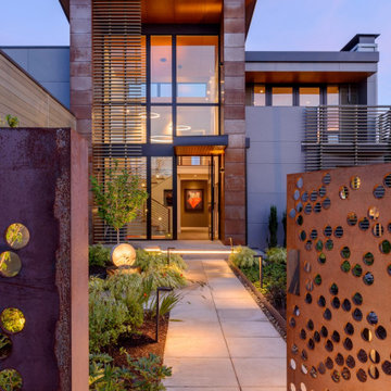
The original home’s grey stucco exterior made the house seem both large and featureless; the introduction of no-maintenance exterior materials that collage and complement each other was a goal of the homeowner and the Seattle Architects who teamed up for this residential design. The bloated scale of the house cried out for the establishment and definition of the parts of the structure, a breaking down of the home’s form and its apparent bland size.
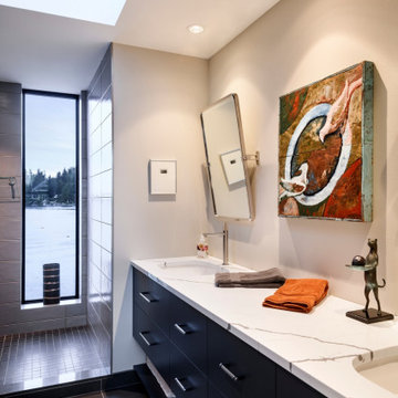
Living, sleeping, and bathing areas that started as staid spaces were in need of opening to the natural environment with additions of large doors, folding glass walls and useable balconies were crucial to each space having a dialogue with the outdoors.
The owner’s extensive art collection was highlighted and became the focus of interior places, well-lit naturally and through a new lighting system. Energy use and sustainable systems were a key component of the design which used high-efficacy lighting, better cladding on a rain-screen system, high-efficiency doors and windows, new insulation and weather barriers, and which added a photovoltaic-generated electrical system. The contemporary design sought to integrate all of these systems, materials, and finishes into a seamless whole that lent interest and drama to a residence which was previously lusterless.
How radically this house was transformed is evident in the exteriors, gardens and the natural spaces the house now opens to, as well as the gallery-like interiors. This home is a stunning testament to what is possible “before-and-after” when remade by Rhodes Architecture + Light.
The clients are an older couple with long professional and political careers, a love of art and a clear desire to connect with the Northwest environment and enliven their daily lives with spaces full of color and natural light.
Rhodes Architecture + Light was hired in 2019 to add new exteriors and interiors, natural light, larger openings to beach and bay, seismic and foundation upgrades to the home, and to infuse life into the house through the re-use of existing space and varied materials, color, textures, and lighting. The only actual change to the exterior “shell” of the house was the introduction of a low “gull-wing” roof with wood soffits above the central atrium space, to add drama and bring natural light into the entry gallery space. Interior spaces, including bedrooms and bathrooms, were re-planned and opened to each other, to greater natural light, to roof decks, and to the incredible views and sea-side environment.
The Builder, Fairbank Construction Company of Bainbridge Island, Washington, met the challenge of the design, first completely deconstructing the finishes inside and out, then precisely interlocking new claddings, windows and doors, cabinetry, finishes and a new gull-wing central roof in a beautiful transformation. The construction was total, thorough, and very detailed, resulting a house that, far from seeming a “remodeling”, is far more present and fitting to the owner’s lives and the natural environment than the house we started with.
 Rhodes Architecture + Light
A transformation inspired by the owner’s love of modern architecture, art and color (and the adjacent sand, rock, water, and the northwest landscape), the Indianola House sought to bring the soul of a home to a colorless muted box. The original house was a drab 1990’s-era box with no personality or presence sited on a beautiful secluded bay, facing water and island views, northwest of the City of Seattle. The existing mono-colored stucco-clad exterior and pyramidal glass-block openings had led the neighborhood to dub the structure, unflatteringly, “The Miami Vice House”.
Rhodes Architecture’s Residential Architects careful use of natural light, rich, collaged finishes and ability to open the house to gardens, beach, and outdoor gathering was critical to the design. The house soon became “The Gallery”.
The original home’s grey stucco exterior made the house seem both large and featureless; the introduction of no-maintenance exterior materials that collage and complement each other was a goal of the homeowner and the Seattle Architects who teamed up for this residential design. The bloated scale of the house cried out for the establishment and definition of the parts of the structure, a breaking down of the home’s form and its apparent bland size.
Living, sleeping, and bathing areas that started as staid spaces were in need of opening to the natural environment with additions of large doors, folding glass walls and useable balconies were crucial to each space having a dialogue with the outdoors.
The owner’s extensive art collection was highlighted and became the focus of interior places, well-lit naturally and through a new lighting system. Energy use and sustainable systems were a key component of the design which used high-efficacy lighting, better cladding on a rain-screen system, high-efficiency doors and windows, new insulation and weather barriers, and which added a photovoltaic-generated electrical system. The contemporary design sought to integrate all of these systems, materials, and finishes into a seamless whole that lent interest and drama to a residence which was previously lusterless.
How radically this house was transformed is evident in the exteriors, gardens and the natural spaces the house now opens to, as well as the gallery-like interiors. This home is a stunning testament to what is possible “before-and-after” when remade by Rhodes Architecture + Light.
The clients are an older couple with long professional and political careers, a love of art and a clear desire to connect with the Northwest environment and enliven their daily lives with spaces full of color and natural light.
Rhodes Architecture + Light was hired in 2019 to add new exteriors and interiors, natural light, larger openings to beach and bay, seismic and foundation upgrades to the home, and to infuse life into the house through the re-use of existing space and varied materials, color, textures, and lighting. The only actual change to the exterior “shell” of the house was the introduction of a low “gull-wing” roof with wood soffits above the central atrium space, to add drama and bring natural light into the entry gallery space. Interior spaces, including bedrooms and bathrooms, were re-planned and opened to each other, to greater natural light, to roof decks, and to the incredible views and sea-side environment.
The Builder, Fairbank Construction Company of Bainbridge Island, Washington, met the challenge of the design, first completely deconstructing the finishes inside and out, then precisely interlocking new claddings, windows and doors, cabinetry, finishes and a new gull-wing central roof in a beautiful transformation. The construction was total, thorough, and very detailed, resulting a house that, far from seeming a “remodeling”, is far more present and fitting to the owner’s lives and the natural environment than the house we started with.
Sponsored
Fredericksburg, OH

High Point Cabinets
Columbus' Experienced Custom Cabinet Builder | 4x Best of Houzz Winner
 Rhodes Architecture + Light
A transformation inspired by the owner’s love of modern architecture, art and color (and the adjacent sand, rock, water, and the northwest landscape), the Indianola House sought to bring the soul of a home to a colorless muted box. The original house was a drab 1990’s-era box with no personality or presence sited on a beautiful secluded bay, facing water and island views, northwest of the City of Seattle. The existing mono-colored stucco-clad exterior and pyramidal glass-block openings had led the neighborhood to dub the structure, unflatteringly, “The Miami Vice House”.
Rhodes Architecture’s Residential Architects careful use of natural light, rich, collaged finishes and ability to open the house to gardens, beach, and outdoor gathering was critical to the design. The house soon became “The Gallery”.
The original home’s grey stucco exterior made the house seem both large and featureless; the introduction of no-maintenance exterior materials that collage and complement each other was a goal of the homeowner and the Seattle Architects who teamed up for this residential design. The bloated scale of the house cried out for the establishment and definition of the parts of the structure, a breaking down of the home’s form and its apparent bland size.
Living, sleeping, and bathing areas that started as staid spaces were in need of opening to the natural environment with additions of large doors, folding glass walls and useable balconies were crucial to each space having a dialogue with the outdoors.
The owner’s extensive art collection was highlighted and became the focus of interior places, well-lit naturally and through a new lighting system. Energy use and sustainable systems were a key component of the design which used high-efficacy lighting, better cladding on a rain-screen system, high-efficiency doors and windows, new insulation and weather barriers, and which added a photovoltaic-generated electrical system. The contemporary design sought to integrate all of these systems, materials, and finishes into a seamless whole that lent interest and drama to a residence which was previously lusterless.
How radically this house was transformed is evident in the exteriors, gardens and the natural spaces the house now opens to, as well as the gallery-like interiors. This home is a stunning testament to what is possible “before-and-after” when remade by Rhodes Architecture + Light.
The clients are an older couple with long professional and political careers, a love of art and a clear desire to connect with the Northwest environment and enliven their daily lives with spaces full of color and natural light.
Rhodes Architecture + Light was hired in 2019 to add new exteriors and interiors, natural light, larger openings to beach and bay, seismic and foundation upgrades to the home, and to infuse life into the house through the re-use of existing space and varied materials, color, textures, and lighting. The only actual change to the exterior “shell” of the house was the introduction of a low “gull-wing” roof with wood soffits above the central atrium space, to add drama and bring natural light into the entry gallery space. Interior spaces, including bedrooms and bathrooms, were re-planned and opened to each other, to greater natural light, to roof decks, and to the incredible views and sea-side environment.
The Builder, Fairbank Construction Company of Bainbridge Island, Washington, met the challenge of the design, first completely deconstructing the finishes inside and out, then precisely interlocking new claddings, windows and doors, cabinetry, finishes and a new gull-wing central roof in a beautiful transformation. The construction was total, thorough, and very detailed, resulting a house that, far from seeming a “remodeling”, is far more present and fitting to the owner’s lives and the natural environment than the house we started with.
 Rhodes Architecture + Light
A transformation inspired by the owner’s love of modern architecture, art and color (and the adjacent sand, rock, water, and the northwest landscape), the Indianola House sought to bring the soul of a home to a colorless muted box. The original house was a drab 1990’s-era box with no personality or presence sited on a beautiful secluded bay, facing water and island views, northwest of the City of Seattle. The existing mono-colored stucco-clad exterior and pyramidal glass-block openings had led the neighborhood to dub the structure, unflatteringly, “The Miami Vice House”.
Rhodes Architecture’s Residential Architects careful use of natural light, rich, collaged finishes and ability to open the house to gardens, beach, and outdoor gathering was critical to the design. The house soon became “The Gallery”.
The original home’s grey stucco exterior made the house seem both large and featureless; the introduction of no-maintenance exterior materials that collage and complement each other was a goal of the homeowner and the Seattle Architects who teamed up for this residential design. The bloated scale of the house cried out for the establishment and definition of the parts of the structure, a breaking down of the home’s form and its apparent bland size.
Living, sleeping, and bathing areas that started as staid spaces were in need of opening to the natural environment with additions of large doors, folding glass walls and useable balconies were crucial to each space having a dialogue with the outdoors.
The owner’s extensive art collection was highlighted and became the focus of interior places, well-lit naturally and through a new lighting system. Energy use and sustainable systems were a key component of the design which used high-efficacy lighting, better cladding on a rain-screen system, high-efficiency doors and windows, new insulation and weather barriers, and which added a photovoltaic-generated electrical system. The contemporary design sought to integrate all of these systems, materials, and finishes into a seamless whole that lent interest and drama to a residence which was previously lusterless.
How radically this house was transformed is evident in the exteriors, gardens and the natural spaces the house now opens to, as well as the gallery-like interiors. This home is a stunning testament to what is possible “before-and-after” when remade by Rhodes Architecture + Light.
The clients are an older couple with long professional and political careers, a love of art and a clear desire to connect with the Northwest environment and enliven their daily lives with spaces full of color and natural light.
Rhodes Architecture + Light was hired in 2019 to add new exteriors and interiors, natural light, larger openings to beach and bay, seismic and foundation upgrades to the home, and to infuse life into the house through the re-use of existing space and varied materials, color, textures, and lighting. The only actual change to the exterior “shell” of the house was the introduction of a low “gull-wing” roof with wood soffits above the central atrium space, to add drama and bring natural light into the entry gallery space. Interior spaces, including bedrooms and bathrooms, were re-planned and opened to each other, to greater natural light, to roof decks, and to the incredible views and sea-side environment.
The Builder, Fairbank Construction Company of Bainbridge Island, Washington, met the challenge of the design, first completely deconstructing the finishes inside and out, then precisely interlocking new claddings, windows and doors, cabinetry, finishes and a new gull-wing central roof in a beautiful transformation. The construction was total, thorough, and very detailed, resulting a house that, far from seeming a “remodeling”, is far more present and fitting to the owner’s lives and the natural environment than the house we started with.
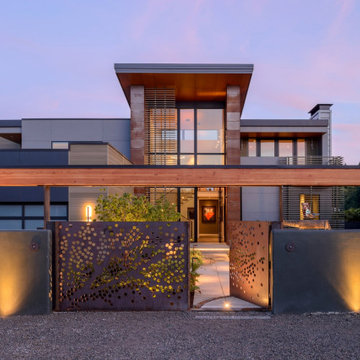 Rhodes Architecture + Light
A transformation inspired by the owner’s love of modern architecture, art and color (and the adjacent sand, rock, water, and the northwest landscape), the Indianola House sought to bring the soul of a home to a colorless muted box. The original house was a drab 1990’s-era box with no personality or presence sited on a beautiful secluded bay, facing water and island views, northwest of the City of Seattle. The existing mono-colored stucco-clad exterior and pyramidal glass-block openings had led the neighborhood to dub the structure, unflatteringly, “The Miami Vice House”.
Rhodes Architecture’s Residential Architects careful use of natural light, rich, collaged finishes and ability to open the house to gardens, beach, and outdoor gathering was critical to the design. The house soon became “The Gallery”.
The original home’s grey stucco exterior made the house seem both large and featureless; the introduction of no-maintenance exterior materials that collage and complement each other was a goal of the homeowner and the Seattle Architects who teamed up for this residential design. The bloated scale of the house cried out for the establishment and definition of the parts of the structure, a breaking down of the home’s form and its apparent bland size.
Living, sleeping, and bathing areas that started as staid spaces were in need of opening to the natural environment with additions of large doors, folding glass walls and useable balconies were crucial to each space having a dialogue with the outdoors.
The owner’s extensive art collection was highlighted and became the focus of interior places, well-lit naturally and through a new lighting system. Energy use and sustainable systems were a key component of the design which used high-efficacy lighting, better cladding on a rain-screen system, high-efficiency doors and windows, new insulation and weather barriers, and which added a photovoltaic-generated electrical system. The contemporary design sought to integrate all of these systems, materials, and finishes into a seamless whole that lent interest and drama to a residence which was previously lusterless.
How radically this house was transformed is evident in the exteriors, gardens and the natural spaces the house now opens to, as well as the gallery-like interiors. This home is a stunning testament to what is possible “before-and-after” when remade by Rhodes Architecture + Light.
The clients are an older couple with long professional and political careers, a love of art and a clear desire to connect with the Northwest environment and enliven their daily lives with spaces full of color and natural light.
Rhodes Architecture + Light was hired in 2019 to add new exteriors and interiors, natural light, larger openings to beach and bay, seismic and foundation upgrades to the home, and to infuse life into the house through the re-use of existing space and varied materials, color, textures, and lighting. The only actual change to the exterior “shell” of the house was the introduction of a low “gull-wing” roof with wood soffits above the central atrium space, to add drama and bring natural light into the entry gallery space. Interior spaces, including bedrooms and bathrooms, were re-planned and opened to each other, to greater natural light, to roof decks, and to the incredible views and sea-side environment.
The Builder, Fairbank Construction Company of Bainbridge Island, Washington, met the challenge of the design, first completely deconstructing the finishes inside and out, then precisely interlocking new claddings, windows and doors, cabinetry, finishes and a new gull-wing central roof in a beautiful transformation. The construction was total, thorough, and very detailed, resulting a house that, far from seeming a “remodeling”, is far more present and fitting to the owner’s lives and the natural environment than the house we started with.
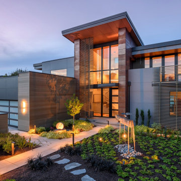 Rhodes Architecture + Light
A transformation inspired by the owner’s love of modern architecture, art and color (and the adjacent sand, rock, water, and the northwest landscape), the Indianola House sought to bring the soul of a home to a colorless muted box. The original house was a drab 1990’s-era box with no personality or presence sited on a beautiful secluded bay, facing water and island views, northwest of the City of Seattle. The existing mono-colored stucco-clad exterior and pyramidal glass-block openings had led the neighborhood to dub the structure, unflatteringly, “The Miami Vice House”.
Rhodes Architecture’s Residential Architects careful use of natural light, rich, collaged finishes and ability to open the house to gardens, beach, and outdoor gathering was critical to the design. The house soon became “The Gallery”.
The original home’s grey stucco exterior made the house seem both large and featureless; the introduction of no-maintenance exterior materials that collage and complement each other was a goal of the homeowner and the Seattle Architects who teamed up for this residential design. The bloated scale of the house cried out for the establishment and definition of the parts of the structure, a breaking down of the home’s form and its apparent bland size.
Living, sleeping, and bathing areas that started as staid spaces were in need of opening to the natural environment with additions of large doors, folding glass walls and useable balconies were crucial to each space having a dialogue with the outdoors.
The owner’s extensive art collection was highlighted and became the focus of interior places, well-lit naturally and through a new lighting system. Energy use and sustainable systems were a key component of the design which used high-efficacy lighting, better cladding on a rain-screen system, high-efficiency doors and windows, new insulation and weather barriers, and which added a photovoltaic-generated electrical system. The contemporary design sought to integrate all of these systems, materials, and finishes into a seamless whole that lent interest and drama to a residence which was previously lusterless.
How radically this house was transformed is evident in the exteriors, gardens and the natural spaces the house now opens to, as well as the gallery-like interiors. This home is a stunning testament to what is possible “before-and-after” when remade by Rhodes Architecture + Light.
The clients are an older couple with long professional and political careers, a love of art and a clear desire to connect with the Northwest environment and enliven their daily lives with spaces full of color and natural light.
Rhodes Architecture + Light was hired in 2019 to add new exteriors and interiors, natural light, larger openings to beach and bay, seismic and foundation upgrades to the home, and to infuse life into the house through the re-use of existing space and varied materials, color, textures, and lighting. The only actual change to the exterior “shell” of the house was the introduction of a low “gull-wing” roof with wood soffits above the central atrium space, to add drama and bring natural light into the entry gallery space. Interior spaces, including bedrooms and bathrooms, were re-planned and opened to each other, to greater natural light, to roof decks, and to the incredible views and sea-side environment.
The Builder, Fairbank Construction Company of Bainbridge Island, Washington, met the challenge of the design, first completely deconstructing the finishes inside and out, then precisely interlocking new claddings, windows and doors, cabinetry, finishes and a new gull-wing central roof in a beautiful transformation. The construction was total, thorough, and very detailed, resulting a house that, far from seeming a “remodeling”, is far more present and fitting to the owner’s lives and the natural environment than the house we started with.
Sponsored
Fredericksburg, OH
High Point Cabinets
Columbus' Experienced Custom Cabinet Builder | 4x Best of Houzz Winner
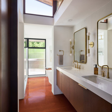 Klopf Architecture
Nestled in the hills of Orinda, California, this 1951 residence is one of only seven extant homes, now known as “The Magnificent Seven”, designed by architect Olof Dahlstrand, a protégé of Frank Lloyd Wright. With its low-slung rooflines, natural materials, and deep integration with the sloping landscape, the home is a pristine example of mid-century modern design inspired by Wright’s organic principles. Over the years, prior homeowners have emphasized preservation, ensuring that the house remained relatively untouched. Each owner has respected the original architecture and stayed true to Dahlstrand’s intent. When a family of five—two college-aged sons and a middle school-aged daughter—acquired the property, they were captivated by its history, legacy of care, and architectural significance. While they appreciated Dahlstrand’s original vision, they also recognized the need to adapt the home for contemporary living while preserving its design integrity.
The remodel was conceived as a thoughtful response to the past—an effort to bring the house into the 21st century without compromising its soul. The primary mandate was to maintain architectural continuity while improving the functionality, comfort, and livability for a modern family. The design team—architects and contractor alike—worked with a shared reverence for the original architecture, allowing that mindset to guide even the most technical or pragmatic decisions.
A key objective was to increase natural light in the kitchen—a departure from Wrightian principles of enclosed, intimate cooking spaces—while maintaining the home’s architectural language. The kitchen was reconfigured to foster a stronger connection to adjacent living spaces while retaining the underlying concept of spatial separation. One of the most transformative architectural changes was the removal of a ridge beam that was originally planned to remain visible through the kitchen. During construction, the team collaborated on a better solution: a wide-flanged steel beam concealed within the roof envelope. This subtle move preserved the clean lines and ceiling continuity, a modern update carried out with utmost respect for the existing framework.
The home’s original powder room, previously accessible only through the kitchen, was relocated for better flow and privacy. A new powder room was carved out of former kitchen cabinetry—a narrow, interior space that could have felt dark and enclosed. To avoid this, the design extended the line of original transom windows into the new powder room and added a skylight above the vanity. The result is a bright and airy space that feels consistent with the rest of the home. Other updates included the installation of new solid-core interior doors with veneers carefully matched to the original mahogany, enhancing the continuity of the interiors. Even smaller decisions, such as placing the door knobs at 42 inches high, mirrored the original proportions. Every choice reflected a shared belief between the architect, contractor, and client: that new work should serve the integrity of the old.
The home’s extensive interior redwood millwork and paneling was meticulously restored. Where new materials were introduced—such as the replacement redwood soffit paneling—the contractor took pains to find finish nails that matched the original, rather than using modern equivalents. This level of craftsmanship and collaboration defined the project. It extended even to the detailing of a blind door to the new powder room, which had to disappear into the existing redwood board-and-batten wall. It was a team effort: the owner found a suitable handle, the architects devised the custom in-swing mechanism, and the contractor executed it so the door aligned precisely with the battens. Throughout, the homeowners were deeply engaged in the design process. One, a meticulous design enthusiast, focused on aesthetic integrity and historic detail. The other brought a practical and function-driven perspective, ensuring that new fixtures and materials would be durable and require minimal maintenance.
While the home’s location posed no major site challenges, sustainability was a key concern. The team upgraded the roof insulation, installed solar panels with battery storage, and added ductless mini-split cooling systems. Lighting was another area where modern technology was woven into a historic framework: new square LED fixtures echo the original custom perimeter soffit lights, maintaining the design language while offering advanced performance.
A planned expansion of a bedroom into suite with a bathroom had to be shelved due to budget constraints and the high cost of below-grade foundation work. Still, the team focused their efforts on making the most of the existing footprint, resolving constraints through design ingenuity rather than adding square footage. This renovation represents a collaborative achievement in preserving and evolving a historically significant home. Every decision was shaped by a shared ethos among clients, architects, and contractor: to maintain the home’s architectural soul while updating it for contemporary life. The result is a timeless modernist residence that continues Olof Dahlstrand’s legacy, remaining grounded in nature, craftsmanship, and human-scale design.
Klopf Architecture Team: John Klopf, AIA, Klara Kevane, Fernanda Bernardes
Interior Architectural Design: Klopf Architecture
Structural Engineer: Daniel Bastiao
Contractor: Don Larwood, Larwood Construction
Photography: Mariko Reed
Year Completed: 2022
 Rhodes Architecture + Light
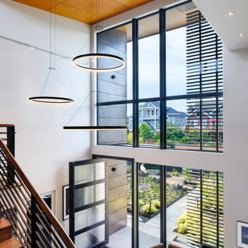
A transformation inspired by the owner’s love of modern architecture, art and color (and the adjacent sand, rock, water, and the northwest landscape), the Indianola House sought to bring the soul of a home to a colorless muted box. The original house was a drab 1990’s-era box with no personality or presence sited on a beautiful secluded bay, facing water and island views, northwest of the City of Seattle. The existing mono-colored stucco-clad exterior and pyramidal glass-block openings had led the neighborhood to dub the structure, unflatteringly, “The Miami Vice House”.
Rhodes Architecture’s Residential Architects careful use of natural light, rich, collaged finishes and ability to open the house to gardens, beach, and outdoor gathering was critical to the design. The house soon became “The Gallery”.
The original home’s grey stucco exterior made the house seem both large and featureless; the introduction of no-maintenance exterior materials that collage and complement each other was a goal of the homeowner and the Seattle Architects who teamed up for this residential design. The bloated scale of the house cried out for the establishment and definition of the parts of the structure, a breaking down of the home’s form and its apparent bland size.
Living, sleeping, and bathing areas that started as staid spaces were in need of opening to the natural environment with additions of large doors, folding glass walls and useable balconies were crucial to each space having a dialogue with the outdoors.
The owner’s extensive art collection was highlighted and became the focus of interior places, well-lit naturally and through a new lighting system. Energy use and sustainable systems were a key component of the design which used high-efficacy lighting, better cladding on a rain-screen system, high-efficiency doors and windows, new insulation and weather barriers, and which added a photovoltaic-generated electrical system. The contemporary design sought to integrate all of these systems, materials, and finishes into a seamless whole that lent interest and drama to a residence which was previously lusterless.
How radically this house was transformed is evident in the exteriors, gardens and the natural spaces the house now opens to, as well as the gallery-like interiors. This home is a stunning testament to what is possible “before-and-after” when remade by Rhodes Architecture + Light.
The clients are an older couple with long professional and political careers, a love of art and a clear desire to connect with the Northwest environment and enliven their daily lives with spaces full of color and natural light.
Rhodes Architecture + Light was hired in 2019 to add new exteriors and interiors, natural light, larger openings to beach and bay, seismic and foundation upgrades to the home, and to infuse life into the house through the re-use of existing space and varied materials, color, textures, and lighting. The only actual change to the exterior “shell” of the house was the introduction of a low “gull-wing” roof with wood soffits above the central atrium space, to add drama and bring natural light into the entry gallery space. Interior spaces, including bedrooms and bathrooms, were re-planned and opened to each other, to greater natural light, to roof decks, and to the incredible views and sea-side environment.
The Builder, Fairbank Construction Company of Bainbridge Island, Washington, met the challenge of the design, first completely deconstructing the finishes inside and out, then precisely interlocking new claddings, windows and doors, cabinetry, finishes and a new gull-wing central roof in a beautiful transformation. The construction was total, thorough, and very detailed, resulting a house that, far from seeming a “remodeling”, is far more present and fitting to the owner’s lives and the natural environment than the house we started with.
 Rhodes Architecture + Light
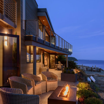
A transformation inspired by the owner’s love of modern architecture, art and color (and the adjacent sand, rock, water, and the northwest landscape), the Indianola House sought to bring the soul of a home to a colorless muted box. The original house was a drab 1990’s-era box with no personality or presence sited on a beautiful secluded bay, facing water and island views, northwest of the City of Seattle. The existing mono-colored stucco-clad exterior and pyramidal glass-block openings had led the neighborhood to dub the structure, unflatteringly, “The Miami Vice House”.
Rhodes Architecture’s Residential Architects careful use of natural light, rich, collaged finishes and ability to open the house to gardens, beach, and outdoor gathering was critical to the design. The house soon became “The Gallery”.
The original home’s grey stucco exterior made the house seem both large and featureless; the introduction of no-maintenance exterior materials that collage and complement each other was a goal of the homeowner and the Seattle Architects who teamed up for this residential design. The bloated scale of the house cried out for the establishment and definition of the parts of the structure, a breaking down of the home’s form and its apparent bland size.
Living, sleeping, and bathing areas that started as staid spaces were in need of opening to the natural environment with additions of large doors, folding glass walls and useable balconies were crucial to each space having a dialogue with the outdoors.
The owner’s extensive art collection was highlighted and became the focus of interior places, well-lit naturally and through a new lighting system. Energy use and sustainable systems were a key component of the design which used high-efficacy lighting, better cladding on a rain-screen system, high-efficiency doors and windows, new insulation and weather barriers, and which added a photovoltaic-generated electrical system. The contemporary design sought to integrate all of these systems, materials, and finishes into a seamless whole that lent interest and drama to a residence which was previously lusterless.
How radically this house was transformed is evident in the exteriors, gardens and the natural spaces the house now opens to, as well as the gallery-like interiors. This home is a stunning testament to what is possible “before-and-after” when remade by Rhodes Architecture + Light.
The clients are an older couple with long professional and political careers, a love of art and a clear desire to connect with the Northwest environment and enliven their daily lives with spaces full of color and natural light.
Rhodes Architecture + Light was hired in 2019 to add new exteriors and interiors, natural light, larger openings to beach and bay, seismic and foundation upgrades to the home, and to infuse life into the house through the re-use of existing space and varied materials, color, textures, and lighting. The only actual change to the exterior “shell” of the house was the introduction of a low “gull-wing” roof with wood soffits above the central atrium space, to add drama and bring natural light into the entry gallery space. Interior spaces, including bedrooms and bathrooms, were re-planned and opened to each other, to greater natural light, to roof decks, and to the incredible views and sea-side environment.
The Builder, Fairbank Construction Company of Bainbridge Island, Washington, met the challenge of the design, first completely deconstructing the finishes inside and out, then precisely interlocking new claddings, windows and doors, cabinetry, finishes and a new gull-wing central roof in a beautiful transformation. The construction was total, thorough, and very detailed, resulting a house that, far from seeming a “remodeling”, is far more present and fitting to the owner’s lives and the natural environment than the house we started with.
21