
Search results for "Continual" in Home Design Ideas

 Klopf Architecture
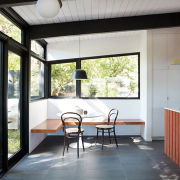
The Roger Lee designed house from 1962 was purchased by the current homeowners in almost original condition, as the previous owners elected to defer most maintenance projects over the years. The clients were able to see beyond the dated materials and finishes, single-paned glass and uninsulated walls and they approached Klopf Architecture to help them expand and update the entire home, one the family could settle into and enjoy for years to come. It was important that the new designs were aligned with Lee's original intent not only because of the client's appreciation for mid-century modern architecture, but also because the house was deemed historical. The Stanford Real Estate Office requires a stringent design review which safeguards the integrity of the community, which Klopf Architecture was happy to oblige going into their updated designs.
As with many original mid-century modern homes, the house was scaled to the 1960s lifestyle where rooms were smaller and openings to views were limited and tightly framed. The original conditions defined the direction the family of four would take in updating the house and making it comfortable for their modern lifestyle. Klopf designed a full gut remodel and major addition to bring the house into the 21st century and provide the living area needed for the client's family. The newly expanded house added just about 1,100 sf to create an airy, comfortable and family friendly house, taking full advantage of the beautiful southwestern views that extend out to the hills beyond. The enclosed garage created an additional 240 sf of covered space for long-term storage.
A cracked swimming pool created an eyesore taking up a majority of the backyard landscape, so it was one of the first elements to go during the transformation. Working with Outer Space Landscape Architects, the family asked for a mix of relaxing outdoor patio spaces that eventually blend into the native landscaping, extending their views outward toward the natural greenery of the trees beyond their property. Filling in the old pool was a smart way to expand the living spaces outward. The orientation of the house was designed to enjoy the views, but the original architecture provided the first homeowners with mere glimpses of the landscape outside.
Klopf was able to broaden those views, continuing and extending on the original architecture to take full advantage of the unobstructed natural views across the rear facade of the house. Small horizontal openings in the primary bedroom and office were replaced with much taller windows that now follow the angled roof line upward, extending across almost all of the facade. We worked with Western Windows, whose designs included an oblique-shaped, operable casement that allowed our design to rise with the slope. A new corner office added to the primary suite, offers a bright and functional work-from-home solution that looks out at the distant views and added natural light from the expanded window configuration that now wraps around the corner.
The existing lower level was designed by Lee as a utilitarian space, serving as a wet pool room with a drain in the center of the floor, bathroom, laundry and storage areas. Without the need for a pool room, Klopf was able to convert the area into a much more comfortable and functional living space with a new family room and guest suite. The new spaces enjoy easy access to a new outdoor patio through floor to ceiling, full-width glass sliders.
Continuing along the rear facade, a previously exposed deck extending from the living room and hallway provided access to the backyard through a single set of stairs leading toward the side of the house which made sense when the pool was in place. The new deck was re-envisioned as an extension of the main living room and now serves as a second outdoor living room. A new slatted pergola above provides the homeowners welcome relief from the hot afternoon sun. A second set of stairs now creates a better connection to the redesigned lower level. Klopf was able to reconfigure the spaces, extending the living room outward toward the views, where the family now claims it as the heart of the home, spending a large majority of their time outdoors.
Back inside, the original wood-burning Malm fireplace was beautifully restored and a gas burner installed to comply with California's strict air standards. It now rests in front of a wall of Heath accent tiles where a dated red brick wall used to stand. A new taller window brings more light and views into the refreshed interior living room. The original glass doors opposite the fireplace were replaced by larger sliders that when fully opened, create a seamless transition to the new outdoor living area so the two spaces feel like one connected space. The original utilitarian kitchen was needlessly tucked into the far back corner and closed-off, out of sight from the living room, so the clients asked Klopf to open it up and expand the kitchen forward so it felt more connected. Today the much larger kitchen is connected to the living area where a short wall with a cutout offers a visual glimpse into the kitchen and a handy pass-through counter for serving guests. A new breakfast nook was also added to create another spot where the family can gather for casual meals. Just outside, a new built-in outdoor grill and prep area extends the kitchen outside and connects to a new outdoor dining spot nestled amongst the trees, taking advantage of the views out back.
Klopf was able to expand the other two bedrooms, add a new laundry room and half-bath and convert the carport to an enclosed garage to add more storage areas which was lost when the pool house was converted to the family and guest room.
To maintain a historical connection to the original designs, the exterior siding was repeated on all exterior walls, a full-height stained glass window at the front entryway restored, and an interior slatted screen element repeated outside at the exterior entry courtyard and over the new outdoor living room to create a shade trellis. The new house stands proudly and shines against it's new landscaping features, while respecting and expanding on the original intent of Roger Lee's designs epitomizing the comforts of indoor-outdoor living in Northern California.
Completion year: 2020
Klopf Architecture project team: John Klopf, Klara Kevane, Noel Andrade
Contractor: ORB Construction, Brendan O'Reilly
Structural engineer: Sezen and Moon
Landscape architect: Outer space
Furnishings and decoration: Urbanism Designs
Photographer: Mariko Reed
 Jennifer Gilmer Kitchen & Bath
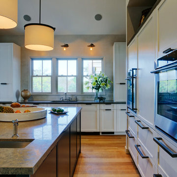
Nantucket, Massachusetts - Transitional - Sophisticated Kitchen.
Designed by #JenniferGilmer
Photography by Bob Narod
http://www.gilmerkitchens.com/
Find the right local pro for your project

 Tracy Berman Interiors
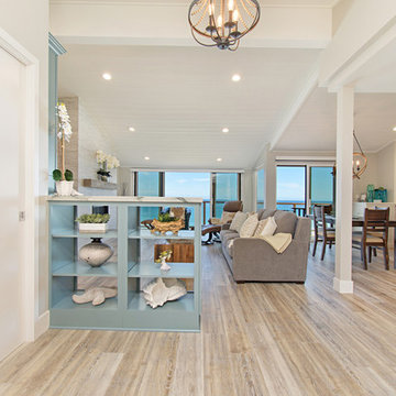
This gorgeous beach condo sits on the banks of the Pacific ocean in Solana Beach, CA. The previous design was dark, heavy and out of scale for the square footage of the space. We removed an outdated bulit in, a column that was not supporting and all the detailed trim work. We replaced it with white kitchen cabinets, continuous vinyl plank flooring and clean lines throughout. The entry was created by pulling the lower portion of the bookcases out past the wall to create a foyer. The shelves are open to both sides so the immediate view of the ocean is not obstructed. New patio sliders now open in the center to continue the view. The shiplap ceiling was updated with a fresh coat of paint and smaller LED can lights. The bookcases are the inspiration color for the entire design. Sea glass green, the color of the ocean, is sprinkled throughout the home. The fireplace is now a sleek contemporary feel with a tile surround. The mantel is made from old barn wood. A very special slab of quartzite was used for the bookcase counter, dining room serving ledge and a shelf in the laundry room. The kitchen is now white and bright with glass tile that reflects the colors of the water. The hood and floating shelves have a weathered finish to reflect drift wood. The laundry room received a face lift starting with new moldings on the door, fresh paint, a rustic cabinet and a stone shelf. The guest bathroom has new white tile with a beachy mosaic design and a fresh coat of paint on the vanity. New hardware, sinks, faucets, mirrors and lights finish off the design. The master bathroom used to be open to the bedroom. We added a wall with a barn door for privacy. The shower has been opened up with a beautiful pebble tile water fall. The pebbles are repeated on the vanity with a natural edge finish. The vanity received a fresh paint job, new hardware, faucets, sinks, mirrors and lights. The guest bedroom has a custom double bunk with reading lamps for the kiddos. This space now reflects the community it is in, and we have brought the beach inside.
 Godwin Residential Construction
© Wing Wong
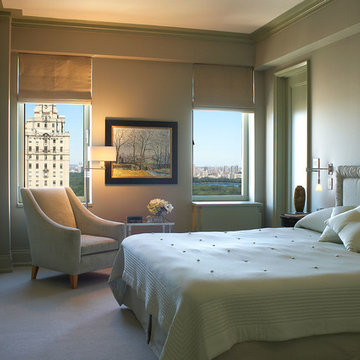
This two bedroom apartment on New York's Upper West Side underwent a gut renovation to allow continuous sight lines and views in three directions: east to Central Park, north to the George Washington Bridge, and east to the Hudson River. The master bedroom was reconfigured to create an adjacent study with two exposures. Mondrian-inspired pocket doors allow light to penetrate the apartment while also providing a private study. The project was completed in an accelerated time frame and within a strict budget.

 Cellar Ridge Construction
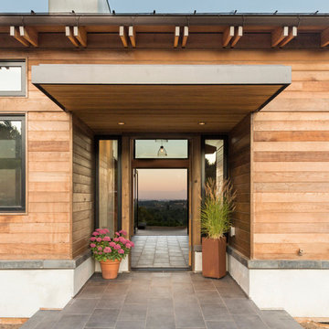
Front door - contemporary gray floor front door idea in Portland with brown walls
 HartmanBaldwin Design/Build
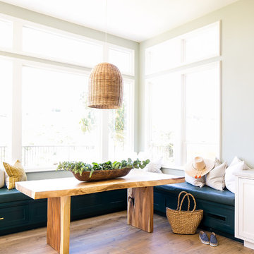
The shaker-style detailing continues into the breakfast nook area, and the panels seamlessly disguise the storage drawer built into this custom banquette.
Photography by Ryan Garvin
 TKS Design Group
Download our free ebook, Creating the Ideal Kitchen. DOWNLOAD NOW
Lakefront property in the northwest suburbs of Chicago is hard to come by, so when we were hired by this young family with exactly that, we were immediately inspired by not just the unusually large footprint of this 1950’s colonial revival but also the lovely views of the manmade lake it was sited on. The large 5-bedroom home was solidly stuck in the 1980’s, but we saw tons of potential. We started out by updating the existing staircase with a fresh coat of paint and adding new herringbone slate to the entry hall.
The powder room off the entryway also got a refresh - new flooring, new cabinets and fixtures. We ran the new slate right through into this space for some consistency. A fun wallpaper and shiplap trim add a welcoming feel and set the tone for the home.
Next, we tackled the kitchen. Located away from the rest of the first floor, the kitchen felt a little isolated, so we immediately began planning for how to better connect it to the rest of the first floor. We landed on removing the wall between the kitchen and dining room and designed a modified galley style space with separate cooking and clean up zones. The cooking zone consists of the refrigerator, prep sink and cooktop, along with a nice long run of prep space at the island. The cleanup side of the kitchen consists of the main sink and dishwasher. Both areas are situated so that the user can view the lake during prep work and cleanup!
One of the home’s main puzzles was how to incorporate the mudroom and area in front of the patio doors at the back of the house. We already had a breakfast table area, so the space by the patio doors was a bit of a no man’s land. We decided to separate the kitchen proper from what became the new mudroom with a large set of barn doors. That way you can quickly hide any mudroom messes but have easy access to the light coming in through the patio doors as well as the outdoor grilling station. We also love the impact the barn doors add to the overall space.
The homeowners’ first words to us were “it’s time to ditch the brown,” so we did! We chose a lovely blue pallet that reflects the home’s location on the lake which is also vibrant yet easy on the eye. Countertops are white quartz, and the natural oak floor works well with the other honey accents. The breakfast table was given a refresh with new chairs, chandelier and window treatments that frame the gorgeous views of the lake out the back.
We coordinated the slate mudroom flooring with that used in the home’s main entrance for a consistent feel. The storage area consists of open and closed storage to allow for some clutter control as needed.
Next on our “to do” list was revamping the dated brown bar area in the neighboring dining room. We eliminated the clutter by adding some closed cabinets and did some easy updates to help the space feel more current. One snag we ran into here was the discovery of a beam above the existing open shelving that had to be modified with a smaller structural beam to allow for our new design to work. This was an unexpected surprise, but in the end we think it was well worth it!
We kept the colors here a bit more muted to blend with the homeowner’s existing furnishings. Open shelving and polished nickel hardware add some simple detail to the new entertainment zone which also looks out onto the lake!
Next we tackled the upstairs starting with the homeowner’s son’s bath. The bath originally had both a tub shower and a separate shower, so we decided to swap out the shower for a new laundry area. This freed up some space downstairs in what used to be the mudroom/laundry room and is much more convenient for daily laundry needs.
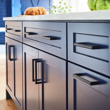
We continued the blue palette here with navy cabinetry and the navy tile in the shower. Porcelain floor tile and chrome fixtures keep maintenance to a minimum while matte black mirrors and lighting add some depth the design. A low maintenance runner adds some warmth underfoot and ties the whole space together.
We added a pocket door to the bathroom to minimize interference with the door swings. The left door of the laundry closet is on a 180 degree hinge to allow for easy full access to the machines. Next we tackled the master bath which is an en suite arrangement. The original was typical of the 1980’s with the vanity outside of the bathroom, situated near the master closet. And the brown theme continued here with multiple shades of brown.
Our first move was to segment off the bath and the closet from the master bedroom. We created a short hall from the bedroom to the bathroom with his and hers walk-in closets on the left and right as well as a separate toilet closet outside of the main bathroom for privacy and flexibility.
The original bathroom had a giant soaking tub with steps (dangerous!) as well as a small shower that did not work well for our homeowner who is 6’3”. With other bathtubs in the home, they decided to eliminate the tub and create an oversized shower which takes up the space where the old tub was located. The double vanity is on the opposite wall and a bench is located under the window for morning conversations and a place to set a couple of towels.
The pallet in here is light and airy with a mix of blond wood, creamy porcelain and marble tile, and brass accents. A simple roman shade adds some texture and it’s top-down mechanism allows for light and privacy.
This large whole house remodel gave our homeowners not only the ability to maximize the potential of their home but also created a lovely new frame from which to view their fabulous lake views.
Designed by: Susan Klimala, CKD, CBD
Photography by: Michael Kaskel
For more information on kitchen and bath design ideas go to: www.kitchenstudio-ge.com
 Walczak Design And Build
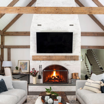
The project continued into the Great Room and was an exercise in creating congruent yet unique spaces with their own specific functions for the family. Cozy yet carefully curated.
Refinishing of the floors and beams continued into the Great Room. To add more light, a new window was added and all existing wood window casings and sills were painted white.
Additionally the fireplace received a lime wash treatment and a new reclaimed beam mantle.


 Go Home Builders
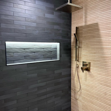
Upon stepping into this stylish japandi modern fusion bathroom nestled in the heart of Pasadena, you are instantly greeted by the unique visual journey of maple ribbon tiles These tiles create an inviting path that extends from the entrance of the bathroom, leading you all the way to the shower. They artistically cover half the wall, adding warmth and texture to the space. Indeed, creating a japandi modern fusion style that combines the best of both worlds. You might just even say japandi bathroom with a modern twist.
Elegance and Boldness
Above the tiles, the walls are bathed in fresh white paint. Particularly, he crisp whiteness of the paint complements the earthy tones of the maple tiles, resulting in a harmonious blend of simplicity and elegance.
Moving forward, you encounter the vanity area, featuring dual sinks. Each sink is enhanced by flattering vanity mirror lighting. This creates a well-lit space, perfect for grooming routines.
Balanced Contrast
Adding a contemporary touch, custom black cabinets sit beneath and in between the sinks. Obviously, they offer ample storage while providing each sink its private space. Even so, bronze handles adorn these cabinets, adding a sophisticated touch that echoes the bathroom’s understated luxury.
The journey continues towards the shower area, where your eye is drawn to the striking charcoal subway tiles. Clearly, these tiles add a modern edge to the shower’s back wall. Alongside, a built-in ledge subtly integrates lighting, adding both functionality and a touch of ambiance.
The shower’s side walls continue the narrative of the maple ribbon tiles from the main bathroom area. Definitely, their warm hues against the cool charcoal subway tiles create a visual contrast that’s both appealing and invigorating.
Beautiful Details
Adding to the seamless design is a sleek glass sliding shower door. Apart from this, this transparent element allows light to flow freely, enhancing the overall brightness of the space. In addition, a bronze handheld shower head complements the other bronze elements in the room, tying the design together beautifully.
Underfoot, you’ll find luxurious tile flooring. Furthermore, this material not only adds to the room’s opulence but also provides a durable, easy-to-maintain surface.
Finally, the entire japandi modern fusion bathroom basks in the soft glow of recessed LED lighting. Without a doubt, this lighting solution adds depth and dimension to the space, accentuating the unique features of the bathroom design. Unquestionably, making this bathroom have a japandi bathroom with a modern twist.
 Ofer Wolberger, LTD.
© Ofer Wolberger
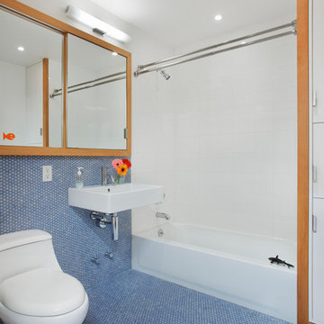
Example of a trendy blue tile and mosaic tile mosaic tile floor bathroom design in New York with a wall-mount sink, a one-piece toilet and white walls
Example of a trendy blue tile and mosaic tile mosaic tile floor bathroom design in New York with a wall-mount sink, a one-piece toilet and white walls

 Metropolis Drafting and Construction Inc
An original 1930’s English Tudor with only 2 bedrooms and 1 bath spanning about 1730 sq.ft. was purchased by a family with 2 amazing young kids, we saw the potential of this property to become a wonderful nest for the family to grow.
The plan was to reach a 2550 sq. ft. home with 4 bedroom and 4 baths spanning over 2 stories.
With continuation of the exiting architectural style of the existing home.
A large 1000sq. ft. addition was constructed at the back portion of the house to include the expended master bedroom and a second-floor guest suite with a large observation balcony overlooking the mountains of Angeles Forest.
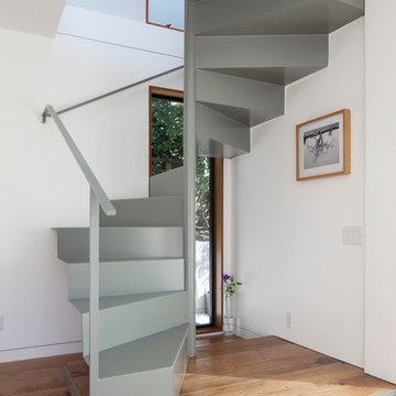
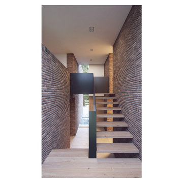
An L shape staircase leading to the upstairs creates a moment of modern art with an all white walls and ceilings of this vaulted space act as a picture frame for a tall window facing the northern mountains almost as a live landscape painting that changes throughout the different times of day.
Tall high sloped roof created an amazing, vaulted space in the guest suite with 4 uniquely designed windows extruding out with separate gable roof above.
The downstairs bedroom boasts 9’ ceilings, extremely tall windows to enjoy the greenery of the backyard, vertical wood paneling on the walls add a warmth that is not seen very often in today’s new build.
The master bathroom has a showcase 42sq. walk-in shower with its own private south facing window to illuminate the space with natural morning light. A larger format wood siding was using for the vanity backsplash wall and a private water closet for privacy.
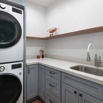
In the interior reconfiguration and remodel portion of the project the area serving as a family room was transformed to an additional bedroom with a private bath, a laundry room and hallway.
The old bathroom was divided with a wall and a pocket door into a powder room the leads to a tub room.
The biggest change was the kitchen area, as befitting to the 1930’s the dining room, kitchen, utility room and laundry room were all compartmentalized and enclosed.
We eliminated all these partitions and walls to create a large open kitchen area that is completely open to the vaulted dining room. This way the natural light the washes the kitchen in the morning and the rays of sun that hit the dining room in the afternoon can be shared by the two areas.
The opening to the living room remained only at 8’ to keep a division of space.
 Becker Studios
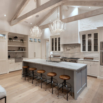
Example of a tuscan l-shaped light wood floor and beige floor kitchen design in Santa Barbara with a farmhouse sink, shaker cabinets, beige cabinets, gray backsplash, stone slab backsplash, stainless steel appliances, an island and gray countertops
 Cummings Architecture + Interiors
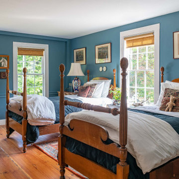
With expansive fields and beautiful farmland surrounding it, this historic farmhouse celebrates these views with floor-to-ceiling windows from the kitchen and sitting area. Originally constructed in the late 1700’s, the main house is connected to the barn by a new addition, housing a master bedroom suite and new two-car garage with carriage doors. We kept and restored all of the home’s existing historic single-pane windows, which complement its historic character. On the exterior, a combination of shingles and clapboard siding were continued from the barn and through the new addition.
 Maugel DeStefano Architects
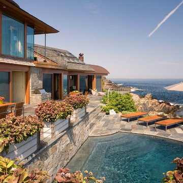
High on the cliffs overlooking the sea, this residence exudes a sense of place—seemingly originating from the ledge that supports it. Jutting forms and crashing volumes are reminiscent of the relationship between the land and the sea. An irregular footprint radiates from the entry tower. Strictly following the client's wish for minimal use of structure and maximum use of glass, the walls rise up on ball bearings and effortlessly roll away. The second and third stories of the tower feature the master bath suite. With a glass-enclosed shower on an outside wall, the openness continues. The jacuzzi tub offers a 360-degree vista of the five lighthouses adorning the coast from Maine to Cape Ann.
Photos: Michael Penney
 Matarozzi Pelsinger Builders
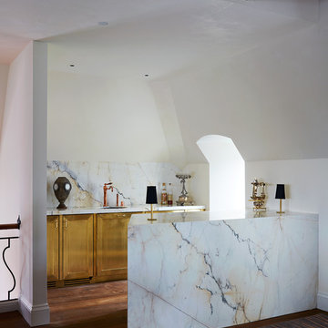
Originally built in 1929 and designed by famed architect Albert Farr who was responsible for the Wolf House that was built for Jack London in Glen Ellen, this building has always had tremendous historical significance. In keeping with tradition, the new design incorporates intricate plaster crown moulding details throughout with a splash of contemporary finishes lining the corridors. From venetian plaster finishes to German engineered wood flooring this house exhibits a delightful mix of traditional and contemporary styles. Many of the rooms contain reclaimed wood paneling, discretely faux-finished Trufig outlets and a completely integrated Savant Home Automation system. Equipped with radiant flooring and forced air-conditioning on the upper floors as well as a full fitness, sauna and spa recreation center at the basement level, this home truly contains all the amenities of modern-day living. The primary suite area is outfitted with floor to ceiling Calacatta stone with an uninterrupted view of the Golden Gate bridge from the bathtub. This building is a truly iconic and revitalized space.
202