
Search results for "Continually enhancing" in Home Design Ideas
 Drury Design
THE SETUP
Multiple ovens, multiple workspaces, multiple sinks – when you think about it, non-jewish kitchens have been adapting the criteria of kosher kitchens for years.
Gladys’ clients in West Rogers Park are Orthodox Jewish. The house they bought already had a kosher kitchen – it just wasn’t done that well. It needed some more things to be duplicated for the dairy side and the meat side. Plus, it was dark and the configuration wasn’t very conducive for a family of eight.
It was time for a remodel.
Design Objectives
Improve kosher kitchen
Add more storage in the island
Better lighting
More open, lighter feel
Change the wood floor in the kitchen to tile
THE REMODEL
Design Challenges
- We had originally planned on removing a wing wall by the breakfast area. During demolition, we learned it contained a support beam.
- The kitchen is a substantial size, but having two sinks, dishwashers, and ovens presented a challenge – how do we fit it all in and make it flow with the storage still accessible near the work areas?
Where do you stop the materials for the new space? - -- The right tile, paint, lighting, etc. would be needed to make the remodeled area cohesive with the rest of the main floor.
- An existing column limited cabinet options and thus, storage capacity. Could we conceal it without disrupting the cabinetry flow?
Design Solutions
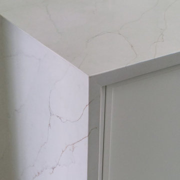
- We had to keep the wing wall, but decided to continue the tile on the sides of the cabinets and maintain the height of the tile to line up with the rest of the backsplash. This actually presented a very nice and cohesive look, especially since the opposite side has a wing wall to the left of the refrigerator.
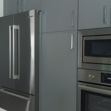
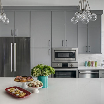
- We used “L-shaped” corner sinks instead of the rectangular ones set on an angle. This gave us more of the legs of the triangles versus the hypotenuse, which allowed for the two dishwashers, and the pullout utensil canisters and spice pullouts while still keeping the 3-drawer cabinets on either side of the range (by the sinks). The old island had the recess for stools which the family never used. By extending the width of the island 6” and utilizing this leg space, we were able to fit 18”-deep cabinets on this side – adding lots of accessible storage. The family can now work simultaneously on the dairy side (the side with the fridge) and the meat side (opposite) without getting in each other’s way. We separated the cooking by using the range oven for the meat and a built-in microwave in the base cabinet. The wall oven with built-in microwave on top is for dairy.
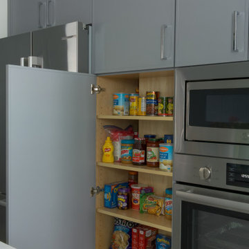
- Corner sinks opened up the middle area for a wider range – we went from a 30” to a 36”. Removing all the wall cabinets (on the range wall) made a big difference. That opened up the entire space while adding some visual impact. (Not pictured: We also made the cabinets directly opposite the range wall tall and removed the countertop, resulting in more room for rollouts and even more storage!) The kitchen now has more storage than it did before.
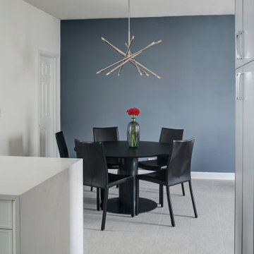
- We ended up painting the ceiling of the kitchen into the hallway that leads to the foyer. The living and dining rooms were separated by a soffit, so that became a natural boundary. We kept the tile in the kitchen by stopping it short of the hallway and lining it up with the pantry wall. This creates a border between the breakfast area and family room. The rest of the existing wood floors were refinished to refresh and make the hue darker. We also painted a dark accent wall and carried it into the breakfast area to make the rooms look deeper.
- The in-the-way column housed plumbing and couldn’t be moved. We still built cabinets in that spot – we just had to build a chase inside it to conceal the pipes. There was still plenty of room for new storage. We also took the cabinets all the way to the ceiling. The continuous tall cabinets added a functional elegance to the space.
THE RENEWED SPACE
The client’s long-awaited dream of a better kosher kitchen has finally been achieved, beautifully combining enhanced storage solutions with adherence to the family’s orthodox dietary laws. The kitchen’s standout feature, an expanded island, now offers a spacious and efficient workspace. This allows several family members to cook together comfortably, without the inconvenience of bumping into each other, ensuring a harmonious and productive cooking environment.
 Drury Design
THE SETUP
Multiple ovens, multiple workspaces, multiple sinks – when you think about it, non-jewish kitchens have been adapting the criteria of kosher kitchens for years.
Gladys’ clients in West Rogers Park are Orthodox Jewish. The house they bought already had a kosher kitchen – it just wasn’t done that well. It needed some more things to be duplicated for the dairy side and the meat side. Plus, it was dark and the configuration wasn’t very conducive for a family of eight.
It was time for a remodel.
Design Objectives
Improve kosher kitchen
Add more storage in the island
Better lighting
More open, lighter feel
Change the wood floor in the kitchen to tile
THE REMODEL
Design Challenges
- We had originally planned on removing a wing wall by the breakfast area. During demolition, we learned it contained a support beam.
- The kitchen is a substantial size, but having two sinks, dishwashers, and ovens presented a challenge – how do we fit it all in and make it flow with the storage still accessible near the work areas?
Where do you stop the materials for the new space? - -- The right tile, paint, lighting, etc. would be needed to make the remodeled area cohesive with the rest of the main floor.
- An existing column limited cabinet options and thus, storage capacity. Could we conceal it without disrupting the cabinetry flow?
Design Solutions
- We had to keep the wing wall, but decided to continue the tile on the sides of the cabinets and maintain the height of the tile to line up with the rest of the backsplash. This actually presented a very nice and cohesive look, especially since the opposite side has a wing wall to the left of the refrigerator.
- We used “L-shaped” corner sinks instead of the rectangular ones set on an angle. This gave us more of the legs of the triangles versus the hypotenuse, which allowed for the two dishwashers, and the pullout utensil canisters and spice pullouts while still keeping the 3-drawer cabinets on either side of the range (by the sinks). The old island had the recess for stools which the family never used. By extending the width of the island 6” and utilizing this leg space, we were able to fit 18”-deep cabinets on this side – adding lots of accessible storage. The family can now work simultaneously on the dairy side (the side with the fridge) and the meat side (opposite) without getting in each other’s way. We separated the cooking by using the range oven for the meat and a built-in microwave in the base cabinet. The wall oven with built-in microwave on top is for dairy.
- Corner sinks opened up the middle area for a wider range – we went from a 30” to a 36”. Removing all the wall cabinets (on the range wall) made a big difference. That opened up the entire space while adding some visual impact. (Not pictured: We also made the cabinets directly opposite the range wall tall and removed the countertop, resulting in more room for rollouts and even more storage!) The kitchen now has more storage than it did before.
- We ended up painting the ceiling of the kitchen into the hallway that leads to the foyer. The living and dining rooms were separated by a soffit, so that became a natural boundary. We kept the tile in the kitchen by stopping it short of the hallway and lining it up with the pantry wall. This creates a border between the breakfast area and family room. The rest of the existing wood floors were refinished to refresh and make the hue darker. We also painted a dark accent wall and carried it into the breakfast area to make the rooms look deeper.
- The in-the-way column housed plumbing and couldn’t be moved. We still built cabinets in that spot – we just had to build a chase inside it to conceal the pipes. There was still plenty of room for new storage. We also took the cabinets all the way to the ceiling. The continuous tall cabinets added a functional elegance to the space.
THE RENEWED SPACE
The client’s long-awaited dream of a better kosher kitchen has finally been achieved, beautifully combining enhanced storage solutions with adherence to the family’s orthodox dietary laws. The kitchen’s standout feature, an expanded island, now offers a spacious and efficient workspace. This allows several family members to cook together comfortably, without the inconvenience of bumping into each other, ensuring a harmonious and productive cooking environment.
 Drury Design
THE SETUP
Multiple ovens, multiple workspaces, multiple sinks – when you think about it, non-jewish kitchens have been adapting the criteria of kosher kitchens for years.
Gladys’ clients in West Rogers Park are Orthodox Jewish. The house they bought already had a kosher kitchen – it just wasn’t done that well. It needed some more things to be duplicated for the dairy side and the meat side. Plus, it was dark and the configuration wasn’t very conducive for a family of eight.
It was time for a remodel.
Design Objectives
Improve kosher kitchen
Add more storage in the island
Better lighting
More open, lighter feel
Change the wood floor in the kitchen to tile
THE REMODEL
Design Challenges
- We had originally planned on removing a wing wall by the breakfast area. During demolition, we learned it contained a support beam.
- The kitchen is a substantial size, but having two sinks, dishwashers, and ovens presented a challenge – how do we fit it all in and make it flow with the storage still accessible near the work areas?
Where do you stop the materials for the new space? - -- The right tile, paint, lighting, etc. would be needed to make the remodeled area cohesive with the rest of the main floor.
- An existing column limited cabinet options and thus, storage capacity. Could we conceal it without disrupting the cabinetry flow?
Design Solutions
- We had to keep the wing wall, but decided to continue the tile on the sides of the cabinets and maintain the height of the tile to line up with the rest of the backsplash. This actually presented a very nice and cohesive look, especially since the opposite side has a wing wall to the left of the refrigerator.
- We used “L-shaped” corner sinks instead of the rectangular ones set on an angle. This gave us more of the legs of the triangles versus the hypotenuse, which allowed for the two dishwashers, and the pullout utensil canisters and spice pullouts while still keeping the 3-drawer cabinets on either side of the range (by the sinks). The old island had the recess for stools which the family never used. By extending the width of the island 6” and utilizing this leg space, we were able to fit 18”-deep cabinets on this side – adding lots of accessible storage. The family can now work simultaneously on the dairy side (the side with the fridge) and the meat side (opposite) without getting in each other’s way. We separated the cooking by using the range oven for the meat and a built-in microwave in the base cabinet. The wall oven with built-in microwave on top is for dairy.
- Corner sinks opened up the middle area for a wider range – we went from a 30” to a 36”. Removing all the wall cabinets (on the range wall) made a big difference. That opened up the entire space while adding some visual impact. (Not pictured: We also made the cabinets directly opposite the range wall tall and removed the countertop, resulting in more room for rollouts and even more storage!) The kitchen now has more storage than it did before.
- We ended up painting the ceiling of the kitchen into the hallway that leads to the foyer. The living and dining rooms were separated by a soffit, so that became a natural boundary. We kept the tile in the kitchen by stopping it short of the hallway and lining it up with the pantry wall. This creates a border between the breakfast area and family room. The rest of the existing wood floors were refinished to refresh and make the hue darker. We also painted a dark accent wall and carried it into the breakfast area to make the rooms look deeper.
- The in-the-way column housed plumbing and couldn’t be moved. We still built cabinets in that spot – we just had to build a chase inside it to conceal the pipes. There was still plenty of room for new storage. We also took the cabinets all the way to the ceiling. The continuous tall cabinets added a functional elegance to the space.
THE RENEWED SPACE
The client’s long-awaited dream of a better kosher kitchen has finally been achieved, beautifully combining enhanced storage solutions with adherence to the family’s orthodox dietary laws. The kitchen’s standout feature, an expanded island, now offers a spacious and efficient workspace. This allows several family members to cook together comfortably, without the inconvenience of bumping into each other, ensuring a harmonious and productive cooking environment.
Find the right local pro for your project
 Drury Design
THE SETUP
Multiple ovens, multiple workspaces, multiple sinks – when you think about it, non-jewish kitchens have been adapting the criteria of kosher kitchens for years.
Gladys’ clients in West Rogers Park are Orthodox Jewish. The house they bought already had a kosher kitchen – it just wasn’t done that well. It needed some more things to be duplicated for the dairy side and the meat side. Plus, it was dark and the configuration wasn’t very conducive for a family of eight.
It was time for a remodel.
Design Objectives
Improve kosher kitchen
Add more storage in the island
Better lighting
More open, lighter feel
Change the wood floor in the kitchen to tile
THE REMODEL
Design Challenges
- We had originally planned on removing a wing wall by the breakfast area. During demolition, we learned it contained a support beam.
- The kitchen is a substantial size, but having two sinks, dishwashers, and ovens presented a challenge – how do we fit it all in and make it flow with the storage still accessible near the work areas?
Where do you stop the materials for the new space? - -- The right tile, paint, lighting, etc. would be needed to make the remodeled area cohesive with the rest of the main floor.
- An existing column limited cabinet options and thus, storage capacity. Could we conceal it without disrupting the cabinetry flow?
Design Solutions
- We had to keep the wing wall, but decided to continue the tile on the sides of the cabinets and maintain the height of the tile to line up with the rest of the backsplash. This actually presented a very nice and cohesive look, especially since the opposite side has a wing wall to the left of the refrigerator.
- We used “L-shaped” corner sinks instead of the rectangular ones set on an angle. This gave us more of the legs of the triangles versus the hypotenuse, which allowed for the two dishwashers, and the pullout utensil canisters and spice pullouts while still keeping the 3-drawer cabinets on either side of the range (by the sinks). The old island had the recess for stools which the family never used. By extending the width of the island 6” and utilizing this leg space, we were able to fit 18”-deep cabinets on this side – adding lots of accessible storage. The family can now work simultaneously on the dairy side (the side with the fridge) and the meat side (opposite) without getting in each other’s way. We separated the cooking by using the range oven for the meat and a built-in microwave in the base cabinet. The wall oven with built-in microwave on top is for dairy.
- Corner sinks opened up the middle area for a wider range – we went from a 30” to a 36”. Removing all the wall cabinets (on the range wall) made a big difference. That opened up the entire space while adding some visual impact. (Not pictured: We also made the cabinets directly opposite the range wall tall and removed the countertop, resulting in more room for rollouts and even more storage!) The kitchen now has more storage than it did before.
- We ended up painting the ceiling of the kitchen into the hallway that leads to the foyer. The living and dining rooms were separated by a soffit, so that became a natural boundary. We kept the tile in the kitchen by stopping it short of the hallway and lining it up with the pantry wall. This creates a border between the breakfast area and family room. The rest of the existing wood floors were refinished to refresh and make the hue darker. We also painted a dark accent wall and carried it into the breakfast area to make the rooms look deeper.
- The in-the-way column housed plumbing and couldn’t be moved. We still built cabinets in that spot – we just had to build a chase inside it to conceal the pipes. There was still plenty of room for new storage. We also took the cabinets all the way to the ceiling. The continuous tall cabinets added a functional elegance to the space.
THE RENEWED SPACE
The client’s long-awaited dream of a better kosher kitchen has finally been achieved, beautifully combining enhanced storage solutions with adherence to the family’s orthodox dietary laws. The kitchen’s standout feature, an expanded island, now offers a spacious and efficient workspace. This allows several family members to cook together comfortably, without the inconvenience of bumping into each other, ensuring a harmonious and productive cooking environment.
 Drury Design
THE SETUP
Multiple ovens, multiple workspaces, multiple sinks – when you think about it, non-jewish kitchens have been adapting the criteria of kosher kitchens for years.
Gladys’ clients in West Rogers Park are Orthodox Jewish. The house they bought already had a kosher kitchen – it just wasn’t done that well. It needed some more things to be duplicated for the dairy side and the meat side. Plus, it was dark and the configuration wasn’t very conducive for a family of eight.
It was time for a remodel.
Design Objectives
Improve kosher kitchen
Add more storage in the island
Better lighting
More open, lighter feel
Change the wood floor in the kitchen to tile
THE REMODEL
Design Challenges
- We had originally planned on removing a wing wall by the breakfast area. During demolition, we learned it contained a support beam.
- The kitchen is a substantial size, but having two sinks, dishwashers, and ovens presented a challenge – how do we fit it all in and make it flow with the storage still accessible near the work areas?
Where do you stop the materials for the new space? - -- The right tile, paint, lighting, etc. would be needed to make the remodeled area cohesive with the rest of the main floor.
- An existing column limited cabinet options and thus, storage capacity. Could we conceal it without disrupting the cabinetry flow?
Design Solutions
- We had to keep the wing wall, but decided to continue the tile on the sides of the cabinets and maintain the height of the tile to line up with the rest of the backsplash. This actually presented a very nice and cohesive look, especially since the opposite side has a wing wall to the left of the refrigerator.
- We used “L-shaped” corner sinks instead of the rectangular ones set on an angle. This gave us more of the legs of the triangles versus the hypotenuse, which allowed for the two dishwashers, and the pullout utensil canisters and spice pullouts while still keeping the 3-drawer cabinets on either side of the range (by the sinks). The old island had the recess for stools which the family never used. By extending the width of the island 6” and utilizing this leg space, we were able to fit 18”-deep cabinets on this side – adding lots of accessible storage. The family can now work simultaneously on the dairy side (the side with the fridge) and the meat side (opposite) without getting in each other’s way. We separated the cooking by using the range oven for the meat and a built-in microwave in the base cabinet. The wall oven with built-in microwave on top is for dairy.
- Corner sinks opened up the middle area for a wider range – we went from a 30” to a 36”. Removing all the wall cabinets (on the range wall) made a big difference. That opened up the entire space while adding some visual impact. (Not pictured: We also made the cabinets directly opposite the range wall tall and removed the countertop, resulting in more room for rollouts and even more storage!) The kitchen now has more storage than it did before.
- We ended up painting the ceiling of the kitchen into the hallway that leads to the foyer. The living and dining rooms were separated by a soffit, so that became a natural boundary. We kept the tile in the kitchen by stopping it short of the hallway and lining it up with the pantry wall. This creates a border between the breakfast area and family room. The rest of the existing wood floors were refinished to refresh and make the hue darker. We also painted a dark accent wall and carried it into the breakfast area to make the rooms look deeper.
- The in-the-way column housed plumbing and couldn’t be moved. We still built cabinets in that spot – we just had to build a chase inside it to conceal the pipes. There was still plenty of room for new storage. We also took the cabinets all the way to the ceiling. The continuous tall cabinets added a functional elegance to the space.
THE RENEWED SPACE
The client’s long-awaited dream of a better kosher kitchen has finally been achieved, beautifully combining enhanced storage solutions with adherence to the family’s orthodox dietary laws. The kitchen’s standout feature, an expanded island, now offers a spacious and efficient workspace. This allows several family members to cook together comfortably, without the inconvenience of bumping into each other, ensuring a harmonious and productive cooking environment.
 Drury Design
THE SETUP
Multiple ovens, multiple workspaces, multiple sinks – when you think about it, non-jewish kitchens have been adapting the criteria of kosher kitchens for years.
Gladys’ clients in West Rogers Park are Orthodox Jewish. The house they bought already had a kosher kitchen – it just wasn’t done that well. It needed some more things to be duplicated for the dairy side and the meat side. Plus, it was dark and the configuration wasn’t very conducive for a family of eight.
It was time for a remodel.
Design Objectives
Improve kosher kitchen
Add more storage in the island
Better lighting
More open, lighter feel
Change the wood floor in the kitchen to tile
THE REMODEL
Design Challenges
- We had originally planned on removing a wing wall by the breakfast area. During demolition, we learned it contained a support beam.
- The kitchen is a substantial size, but having two sinks, dishwashers, and ovens presented a challenge – how do we fit it all in and make it flow with the storage still accessible near the work areas?
Where do you stop the materials for the new space? - -- The right tile, paint, lighting, etc. would be needed to make the remodeled area cohesive with the rest of the main floor.
- An existing column limited cabinet options and thus, storage capacity. Could we conceal it without disrupting the cabinetry flow?
Design Solutions
- We had to keep the wing wall, but decided to continue the tile on the sides of the cabinets and maintain the height of the tile to line up with the rest of the backsplash. This actually presented a very nice and cohesive look, especially since the opposite side has a wing wall to the left of the refrigerator.
- We used “L-shaped” corner sinks instead of the rectangular ones set on an angle. This gave us more of the legs of the triangles versus the hypotenuse, which allowed for the two dishwashers, and the pullout utensil canisters and spice pullouts while still keeping the 3-drawer cabinets on either side of the range (by the sinks). The old island had the recess for stools which the family never used. By extending the width of the island 6” and utilizing this leg space, we were able to fit 18”-deep cabinets on this side – adding lots of accessible storage. The family can now work simultaneously on the dairy side (the side with the fridge) and the meat side (opposite) without getting in each other’s way. We separated the cooking by using the range oven for the meat and a built-in microwave in the base cabinet. The wall oven with built-in microwave on top is for dairy.
- Corner sinks opened up the middle area for a wider range – we went from a 30” to a 36”. Removing all the wall cabinets (on the range wall) made a big difference. That opened up the entire space while adding some visual impact. (Not pictured: We also made the cabinets directly opposite the range wall tall and removed the countertop, resulting in more room for rollouts and even more storage!) The kitchen now has more storage than it did before.
- We ended up painting the ceiling of the kitchen into the hallway that leads to the foyer. The living and dining rooms were separated by a soffit, so that became a natural boundary. We kept the tile in the kitchen by stopping it short of the hallway and lining it up with the pantry wall. This creates a border between the breakfast area and family room. The rest of the existing wood floors were refinished to refresh and make the hue darker. We also painted a dark accent wall and carried it into the breakfast area to make the rooms look deeper.
- The in-the-way column housed plumbing and couldn’t be moved. We still built cabinets in that spot – we just had to build a chase inside it to conceal the pipes. There was still plenty of room for new storage. We also took the cabinets all the way to the ceiling. The continuous tall cabinets added a functional elegance to the space.
THE RENEWED SPACE
The client’s long-awaited dream of a better kosher kitchen has finally been achieved, beautifully combining enhanced storage solutions with adherence to the family’s orthodox dietary laws. The kitchen’s standout feature, an expanded island, now offers a spacious and efficient workspace. This allows several family members to cook together comfortably, without the inconvenience of bumping into each other, ensuring a harmonious and productive cooking environment.
 Drury Design
THE SETUP
Multiple ovens, multiple workspaces, multiple sinks – when you think about it, non-jewish kitchens have been adapting the criteria of kosher kitchens for years.
Gladys’ clients in West Rogers Park are Orthodox Jewish. The house they bought already had a kosher kitchen – it just wasn’t done that well. It needed some more things to be duplicated for the dairy side and the meat side. Plus, it was dark and the configuration wasn’t very conducive for a family of eight.
It was time for a remodel.
Design Objectives
Improve kosher kitchen
Add more storage in the island
Better lighting
More open, lighter feel
Change the wood floor in the kitchen to tile
THE REMODEL
Design Challenges
- We had originally planned on removing a wing wall by the breakfast area. During demolition, we learned it contained a support beam.
- The kitchen is a substantial size, but having two sinks, dishwashers, and ovens presented a challenge – how do we fit it all in and make it flow with the storage still accessible near the work areas?
Where do you stop the materials for the new space? - -- The right tile, paint, lighting, etc. would be needed to make the remodeled area cohesive with the rest of the main floor.
- An existing column limited cabinet options and thus, storage capacity. Could we conceal it without disrupting the cabinetry flow?
Design Solutions
- We had to keep the wing wall, but decided to continue the tile on the sides of the cabinets and maintain the height of the tile to line up with the rest of the backsplash. This actually presented a very nice and cohesive look, especially since the opposite side has a wing wall to the left of the refrigerator.
- We used “L-shaped” corner sinks instead of the rectangular ones set on an angle. This gave us more of the legs of the triangles versus the hypotenuse, which allowed for the two dishwashers, and the pullout utensil canisters and spice pullouts while still keeping the 3-drawer cabinets on either side of the range (by the sinks). The old island had the recess for stools which the family never used. By extending the width of the island 6” and utilizing this leg space, we were able to fit 18”-deep cabinets on this side – adding lots of accessible storage. The family can now work simultaneously on the dairy side (the side with the fridge) and the meat side (opposite) without getting in each other’s way. We separated the cooking by using the range oven for the meat and a built-in microwave in the base cabinet. The wall oven with built-in microwave on top is for dairy.
- Corner sinks opened up the middle area for a wider range – we went from a 30” to a 36”. Removing all the wall cabinets (on the range wall) made a big difference. That opened up the entire space while adding some visual impact. (Not pictured: We also made the cabinets directly opposite the range wall tall and removed the countertop, resulting in more room for rollouts and even more storage!) The kitchen now has more storage than it did before.
- We ended up painting the ceiling of the kitchen into the hallway that leads to the foyer. The living and dining rooms were separated by a soffit, so that became a natural boundary. We kept the tile in the kitchen by stopping it short of the hallway and lining it up with the pantry wall. This creates a border between the breakfast area and family room. The rest of the existing wood floors were refinished to refresh and make the hue darker. We also painted a dark accent wall and carried it into the breakfast area to make the rooms look deeper.
- The in-the-way column housed plumbing and couldn’t be moved. We still built cabinets in that spot – we just had to build a chase inside it to conceal the pipes. There was still plenty of room for new storage. We also took the cabinets all the way to the ceiling. The continuous tall cabinets added a functional elegance to the space.
THE RENEWED SPACE
The client’s long-awaited dream of a better kosher kitchen has finally been achieved, beautifully combining enhanced storage solutions with adherence to the family’s orthodox dietary laws. The kitchen’s standout feature, an expanded island, now offers a spacious and efficient workspace. This allows several family members to cook together comfortably, without the inconvenience of bumping into each other, ensuring a harmonious and productive cooking environment.
 Drury Design
THE SETUP
Multiple ovens, multiple workspaces, multiple sinks – when you think about it, non-jewish kitchens have been adapting the criteria of kosher kitchens for years.
Gladys’ clients in West Rogers Park are Orthodox Jewish. The house they bought already had a kosher kitchen – it just wasn’t done that well. It needed some more things to be duplicated for the dairy side and the meat side. Plus, it was dark and the configuration wasn’t very conducive for a family of eight.
It was time for a remodel.
Design Objectives
Improve kosher kitchen
Add more storage in the island
Better lighting
More open, lighter feel
Change the wood floor in the kitchen to tile
THE REMODEL
Design Challenges
- We had originally planned on removing a wing wall by the breakfast area. During demolition, we learned it contained a support beam.
- The kitchen is a substantial size, but having two sinks, dishwashers, and ovens presented a challenge – how do we fit it all in and make it flow with the storage still accessible near the work areas?
Where do you stop the materials for the new space? - -- The right tile, paint, lighting, etc. would be needed to make the remodeled area cohesive with the rest of the main floor.
- An existing column limited cabinet options and thus, storage capacity. Could we conceal it without disrupting the cabinetry flow?
Design Solutions
- We had to keep the wing wall, but decided to continue the tile on the sides of the cabinets and maintain the height of the tile to line up with the rest of the backsplash. This actually presented a very nice and cohesive look, especially since the opposite side has a wing wall to the left of the refrigerator.
- We used “L-shaped” corner sinks instead of the rectangular ones set on an angle. This gave us more of the legs of the triangles versus the hypotenuse, which allowed for the two dishwashers, and the pullout utensil canisters and spice pullouts while still keeping the 3-drawer cabinets on either side of the range (by the sinks). The old island had the recess for stools which the family never used. By extending the width of the island 6” and utilizing this leg space, we were able to fit 18”-deep cabinets on this side – adding lots of accessible storage. The family can now work simultaneously on the dairy side (the side with the fridge) and the meat side (opposite) without getting in each other’s way. We separated the cooking by using the range oven for the meat and a built-in microwave in the base cabinet. The wall oven with built-in microwave on top is for dairy.
- Corner sinks opened up the middle area for a wider range – we went from a 30” to a 36”. Removing all the wall cabinets (on the range wall) made a big difference. That opened up the entire space while adding some visual impact. (Not pictured: We also made the cabinets directly opposite the range wall tall and removed the countertop, resulting in more room for rollouts and even more storage!) The kitchen now has more storage than it did before.
- We ended up painting the ceiling of the kitchen into the hallway that leads to the foyer. The living and dining rooms were separated by a soffit, so that became a natural boundary. We kept the tile in the kitchen by stopping it short of the hallway and lining it up with the pantry wall. This creates a border between the breakfast area and family room. The rest of the existing wood floors were refinished to refresh and make the hue darker. We also painted a dark accent wall and carried it into the breakfast area to make the rooms look deeper.
- The in-the-way column housed plumbing and couldn’t be moved. We still built cabinets in that spot – we just had to build a chase inside it to conceal the pipes. There was still plenty of room for new storage. We also took the cabinets all the way to the ceiling. The continuous tall cabinets added a functional elegance to the space.
THE RENEWED SPACE
The client’s long-awaited dream of a better kosher kitchen has finally been achieved, beautifully combining enhanced storage solutions with adherence to the family’s orthodox dietary laws. The kitchen’s standout feature, an expanded island, now offers a spacious and efficient workspace. This allows several family members to cook together comfortably, without the inconvenience of bumping into each other, ensuring a harmonious and productive cooking environment.

 OMNIA Group Architects
Joseph M. Kitchen Photography. Perched above the beautiful Delaware River in the historic village of New Hope, Bucks County, Pennsylvania sits this magnificent custom home designed by OMNIA Group Architects. According to Partner, Brian Mann,"This riverside property required a nuanced approach so that it could at once be both a part of this eclectic village streetscape and take advantage of the spectacular waterfront setting." Further complicating the study, the lot was narrow, it resides in the floodplain and the program required the Master Suite to be on the main level. To meet these demands, OMNIA dispensed with conventional historicist styles and created an open plan blended with traditional forms punctuated by vast rows of glass windows and doors to bring in the panoramic views of Lambertville, the bridge, the wooded opposite bank and the river. Mann adds, "Because I too live along the river, I have a special respect for its ever changing beauty - and I appreciate that riverfront structures have a responsibility to enhance the views from those on the water." Hence the riverside facade is as beautiful as the street facade. A sweeping front porch integrates the entry with the vibrant pedestrian streetscape. Low garden walls enclose a beautifully landscaped courtyard defining private space without turning its back on the street. Once inside, the natural setting explodes into view across the back of each of the main living spaces. For a home with so few walls, spaces feel surprisingly intimate and well defined. The foyer is elegant and features a free flowing curved stair that rises in a turret like enclosure dotted with windows that follow the ascending stairs like a sculpture. "Using changes in ceiling height, finish materials and lighting, we were able to define spaces without boxing spaces in" says Mann adding, "the dynamic horizontality of the river is echoed along the axis of the living space; the natural movement from kitchen to dining to living rooms following the current of the river." Service elements are concentrated along the front to create a visual and noise barrier from the street and buttress a calm hall that leads to the Master Suite. The master bedroom shares the views of the river, while the bath and closet program are set up for pure luxuriating. The second floor features a common loft area with a large balcony overlooking the water. Two children's suites flank the loft - each with their own exquisitely crafted baths and closets. Continuing the balance between street and river, an open air bell-tower sits above the entry porch to bring life and light to the street. Outdoor living was part of the program from the start. A covered porch with outdoor kitchen and dining and lounge area and a fireplace brings 3-season living to the river. And a lovely curved patio lounge surrounded by grand landscaping by LDG finishes the experience. OMNIA was able to bring their design talents to the finish materials too including cabinetry, lighting, fixtures, colors and furniture
 Powell Construction
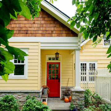
Originally built in 1938, this bungalow cottage had enduring character, but its traditional closed kitchen layout – typical of the era – didn’t align with the way the homeowners envisioned living in the space. Inspired by their travels through England’s Cotswolds, the French countryside, and Carmel’s whimsical Storybook Cottages by the Sea, the homeowners dreamed of a home that captured the romance of cottages and one that would seamlessly connect with their stunning English-style garden.
After years of attempting to reimagine the kitchen in its original location the homeowners realized it would never truly suit the way they lived & wanted to entertain. The original kitchen was historical & was built when the kitchen was the last room you wanted guests to see. It was tucked into the front corner of the home off a hallway leading to the main level bedrooms and bath. To reach the dining room, you passed through a servery swing door, then continued into the living room. While the original door had charm, it disrupted the flow and connection between the kitchen and the main living areas.
To bring the homeowners’ vision to life, the design called for a bold move—relocating the kitchen entirely. We designed a 560-square-foot addition off the living room – placing the kitchen at the heart of the home and connecting it to the gardens. The new space includes a sunlit breakfast nook, a charming butler’s pantry, a garden vestibule with its own entry porch, and a wraparound porch that encourages indoor-outdoor living. The main level remodel also redefined existing spaces: the old dining room was transformed into a cozy study library, while a former bedroom became an elegant dining room just off the new kitchen.
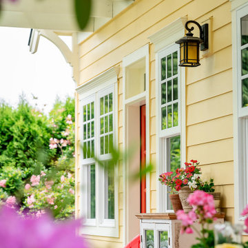
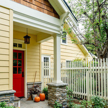
Every design decision honored the home’s original 1938 architecture and character. Matching the home’s original 1.5-story proportions, the new kitchen wing was designed with intersecting gables that echo the scale and pitch of the existing roofline. A stone-wrapped chimney topped with a handcrafted copper cap is straight from the pages of a storybook. Decorative corbels, intricate window trim, and cedar shake in the gable ends further connect the new architecture to the home’s historic detailing.
Finishes and fixtures were thoughtfully chosen to marry the home’s moodier, character-rich original rooms with the brighter, lighter new spaces. The result is a timeless transformation that feels as though it has always been part of the home – an enchanting blend of storybook charm, functional design, and garden-centered living.
At the ground level, a Pennsylvania bluestone porch and stone skirting ground the addition in traditional materials. Inside, a tongue-and-groove ceiling with hand-hewn beams gives purpose and intimacy to the heightened kitchen ceiling. The home’s signature arched openings were meticulously replicated in the new kitchen, breakfast nook, and dining room, ensuring a seamless transition between old and new. Every element – inside and out – was chosen to honor the original home while enhancing the charm, character, and connection to the garden.
Photos by MK Photography
 Powell Construction
Originally built in 1938, this bungalow cottage had enduring character, but its traditional closed kitchen layout – typical of the era – didn’t align with the way the homeowners envisioned living in the space. Inspired by their travels through England’s Cotswolds, the French countryside, and Carmel’s whimsical Storybook Cottages by the Sea, the homeowners dreamed of a home that captured the romance of cottages and one that would seamlessly connect with their stunning English-style garden.
After years of attempting to reimagine the kitchen in its original location the homeowners realized it would never truly suit the way they lived & wanted to entertain. The original kitchen was historical & was built when the kitchen was the last room you wanted guests to see. It was tucked into the front corner of the home off a hallway leading to the main level bedrooms and bath. To reach the dining room, you passed through a servery swing door, then continued into the living room. While the original door had charm, it disrupted the flow and connection between the kitchen and the main living areas.
To bring the homeowners’ vision to life, the design called for a bold move—relocating the kitchen entirely. We designed a 560-square-foot addition off the living room – placing the kitchen at the heart of the home and connecting it to the gardens. The new space includes a sunlit breakfast nook, a charming butler’s pantry, a garden vestibule with its own entry porch, and a wraparound porch that encourages indoor-outdoor living. The main level remodel also redefined existing spaces: the old dining room was transformed into a cozy study library, while a former bedroom became an elegant dining room just off the new kitchen.
Every design decision honored the home’s original 1938 architecture and character. Matching the home’s original 1.5-story proportions, the new kitchen wing was designed with intersecting gables that echo the scale and pitch of the existing roofline. A stone-wrapped chimney topped with a handcrafted copper cap is straight from the pages of a storybook. Decorative corbels, intricate window trim, and cedar shake in the gable ends further connect the new architecture to the home’s historic detailing.
Finishes and fixtures were thoughtfully chosen to marry the home’s moodier, character-rich original rooms with the brighter, lighter new spaces. The result is a timeless transformation that feels as though it has always been part of the home – an enchanting blend of storybook charm, functional design, and garden-centered living.
At the ground level, a Pennsylvania bluestone porch and stone skirting ground the addition in traditional materials. Inside, a tongue-and-groove ceiling with hand-hewn beams gives purpose and intimacy to the heightened kitchen ceiling. The home’s signature arched openings were meticulously replicated in the new kitchen, breakfast nook, and dining room, ensuring a seamless transition between old and new. Every element – inside and out – was chosen to honor the original home while enhancing the charm, character, and connection to the garden.
Photos by MK Photography
 Housing & Building Association of Colorado Springs
The Home
A charming reflection of its surroundings, the farmhouse-inspired Salida appeals to everyone from families with young children to
growing families with teenagers. The home’s well-placed rear-entry garage and oversized front porch provide a warm and welcoming
façade with contrasting board and batten details brimming with curb appeal. Inside, an entry hall flanked on either side by a private
study and powder room expands to an inviting light and bright open-concept design uniting the kitchen, dining and family rooms that
extend entertaining spaces with the adjoining patio. Alternatively, the upstairs provides family members with their own sense of space.
The tranquil owner’s retreat with owner’s bath and spacious walk-in closet is set at the rear of the home and two secondary bedrooms
flanking the full bathroom are ideally located at the front – providing the ultimate in privacy. A second-floor utility room makes laundry
day a breeze. To provide for a growing family and expand the gathering spaces, an unfinished basement offers a wealth of flexibility with the options of a fourth bedroom, third full bath and game room.
The Builder
Founded in 1976, David Weekley Homes is the nation’s second largest privately-held homebuilder. Headquartered in Houston, TX, the company operates in 20 cities, including three communities in Colorado Springs.
David Weekley Homes was the first builder in the United States to be awarded the “Triple Crown of American Homebuilding,” an honor which includes “America’s Best Builder,” “National Housing Quality Award” and “National Builder of the Year.” Nationwide, the company has received more than 1,300 product design and service awards, a reflection of the company’s commitment to Building Dreams, Enhancing Lives for more than 100,000 homebuyers.
By utilizing buyer demographic information and incorporating the latest trends, Kathy Andrews Interiors (KAI) serves as the creative force behind the builder’s model homes where buyers can see and touch the quality craftsmanship. KAI also selects finishes like flooring and furnishings to create one-of-a-kind homes for buyers!
The Interior Design
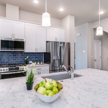
The Salida’s interior design boasts an edgy sensibility with an ivory and gray color palette providing an ideal backdrop to modern decor elements. Soft gray laminate flooring is punctuated by accents of dark gray, white and navy contrasted by pops of lime green for a modern look. Glass elements throughout add to this contemporary impression. At center stage, the kitchen features two-tone cabinetry in slate gray and white complemented by white marbled quartz countertops and twilight blue glass brick-laid tile backsplash. Details like the pencil edge countertops add a modern look. The sophisticated, navy blue theme continues through several spaces, including in the owner’s retreat where pale gray brick-laid subway tile pops against the navy vertical stripe accent with glass mosaic tiles in a herringbone pattern, creating a floor-to-ceiling focal point. The secondary bathroom features a similar memory point with showstopping navy glass tile accents.
 Powell Construction
Originally built in 1938, this bungalow cottage had enduring character, but its traditional closed kitchen layout – typical of the era – didn’t align with the way the homeowners envisioned living in the space. Inspired by their travels through England’s Cotswolds, the French countryside, and Carmel’s whimsical Storybook Cottages by the Sea, the homeowners dreamed of a home that captured the romance of cottages and one that would seamlessly connect with their stunning English-style garden.
After years of attempting to reimagine the kitchen in its original location the homeowners realized it would never truly suit the way they lived & wanted to entertain. The original kitchen was historical & was built when the kitchen was the last room you wanted guests to see. It was tucked into the front corner of the home off a hallway leading to the main level bedrooms and bath. To reach the dining room, you passed through a servery swing door, then continued into the living room. While the original door had charm, it disrupted the flow and connection between the kitchen and the main living areas.
To bring the homeowners’ vision to life, the design called for a bold move—relocating the kitchen entirely. We designed a 560-square-foot addition off the living room – placing the kitchen at the heart of the home and connecting it to the gardens. The new space includes a sunlit breakfast nook, a charming butler’s pantry, a garden vestibule with its own entry porch, and a wraparound porch that encourages indoor-outdoor living. The main level remodel also redefined existing spaces: the old dining room was transformed into a cozy study library, while a former bedroom became an elegant dining room just off the new kitchen.
Every design decision honored the home’s original 1938 architecture and character. Matching the home’s original 1.5-story proportions, the new kitchen wing was designed with intersecting gables that echo the scale and pitch of the existing roofline. A stone-wrapped chimney topped with a handcrafted copper cap is straight from the pages of a storybook. Decorative corbels, intricate window trim, and cedar shake in the gable ends further connect the new architecture to the home’s historic detailing.
Finishes and fixtures were thoughtfully chosen to marry the home’s moodier, character-rich original rooms with the brighter, lighter new spaces. The result is a timeless transformation that feels as though it has always been part of the home – an enchanting blend of storybook charm, functional design, and garden-centered living.
At the ground level, a Pennsylvania bluestone porch and stone skirting ground the addition in traditional materials. Inside, a tongue-and-groove ceiling with hand-hewn beams gives purpose and intimacy to the heightened kitchen ceiling. The home’s signature arched openings were meticulously replicated in the new kitchen, breakfast nook, and dining room, ensuring a seamless transition between old and new. Every element – inside and out – was chosen to honor the original home while enhancing the charm, character, and connection to the garden.
Photos by MK Photography
 kimberly peck architect
For this project, we transformed the top floor of a Park Slope brownstone into a modern, lightfilled
home tailored to the needs of a busy couple. The original space was outdated and lacked
cohesion, so our design focused on creating a harmonious and functional layout that reflects the
clients’ lifestyle while introducing moments of drama and creativity.
At the heart of the penthouse is an open-concept dining room, living room, and kitchen. The
living room accommodates multiple areas, including a cozy seating nook illuminated by
multicolored glass pendant lights. A dramatic custom-built feature spans the entire length of the
living room, integrating storage, display areas, and a unique guardwall that separates the
staircase to the couple's rooftop garden from the living space. This built-in showcases a dynamic
geometric design, with select sections backed in soft mauve for depth and visual interest. Along
the front of the space, a bespoke oak window seat with modern slatted wood fronts conceals the
AC and radiators while providing ample storage. The main seating area centers around a creamy
marble fireplace surround, a refined focal point in the living area. Wide-plank oak flooring
extends throughout the apartment and up the staircase, where a minimal aesthetic enhances the
clean, modern feel.
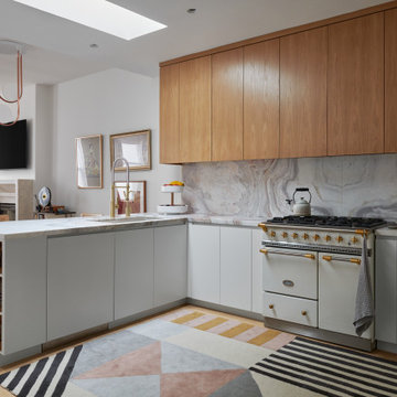
The kitchen continues the theme of modern sophistication with a palette of soft white lacquered
lower cabinets and oak upper cabinetry. The countertops and backsplash are crafted from a
striking quartzite in cream, peach, and mauve tones, adding a subtle vibrancy to the space. A
cream-enameled range takes center stage, complemented by a hidden coffee station and a
dedicated cabinet for AV supplies, ensuring a clutter-free aesthetic.
The hall guest bathroom is a playful yet refined mix of materials and textures. Peach-toned
concrete tiles cover the walls, while the floor features cream zellige tiles. Brass fixtures, a brass
mirror, and a brass wall sconce lend a touch of warmth and luxury, harmonizing with the custom
pecan-veneered vanity and custom concrete sink,
The primary bedroom suite is a serene retreat, painted in a rich, deep blue that sets a calming
tone. Accessed through a bespoke millwork closet, the ensuite bathroom is a small yet striking
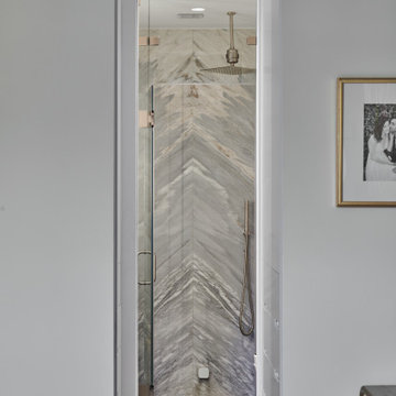
space, showcasing impeccable craftsmanship. The rear wall of the shower is clad in floor-toceiling
slabs of light blue quartzite, creating a dramatic focal point visible from the bedroom.
This quartzite extends seamlessly to form a sculptural bench within the shower, which transitions
outward into a custom sink. Beneath the sink, two wood drawers provide discreet storage. The
remaining walls are finished in soft beige Moroccan tadelakt plaster, adding a warm contrast to
the cool tones of the quartzite.
This Park Slope penthouse is a carefully curated blend of modern elegance and thoughtful
functionality, with bespoke details and rich materiality that celebrate both the character of the
space and the needs of its owners.
 Housing & Building Association of Colorado Springs
The Home
A charming reflection of its surroundings, the farmhouse-inspired Salida appeals to everyone from families with young children to
growing families with teenagers. The home’s well-placed rear-entry garage and oversized front porch provide a warm and welcoming
façade with contrasting board and batten details brimming with curb appeal. Inside, an entry hall flanked on either side by a private
study and powder room expands to an inviting light and bright open-concept design uniting the kitchen, dining and family rooms that
extend entertaining spaces with the adjoining patio. Alternatively, the upstairs provides family members with their own sense of space.
The tranquil owner’s retreat with owner’s bath and spacious walk-in closet is set at the rear of the home and two secondary bedrooms
flanking the full bathroom are ideally located at the front – providing the ultimate in privacy. A second-floor utility room makes laundry
day a breeze. To provide for a growing family and expand the gathering spaces, an unfinished basement offers a wealth of flexibility with the options of a fourth bedroom, third full bath and game room.
The Builder
Founded in 1976, David Weekley Homes is the nation’s second largest privately-held homebuilder. Headquartered in Houston, TX, the company operates in 20 cities, including three communities in Colorado Springs.
David Weekley Homes was the first builder in the United States to be awarded the “Triple Crown of American Homebuilding,” an honor which includes “America’s Best Builder,” “National Housing Quality Award” and “National Builder of the Year.” Nationwide, the company has received more than 1,300 product design and service awards, a reflection of the company’s commitment to Building Dreams, Enhancing Lives for more than 100,000 homebuyers.
By utilizing buyer demographic information and incorporating the latest trends, Kathy Andrews Interiors (KAI) serves as the creative force behind the builder’s model homes where buyers can see and touch the quality craftsmanship. KAI also selects finishes like flooring and furnishings to create one-of-a-kind homes for buyers!
The Interior Design
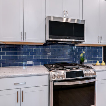
The Salida’s interior design boasts an edgy sensibility with an ivory and gray color palette providing an ideal backdrop to modern decor elements. Soft gray laminate flooring is punctuated by accents of dark gray, white and navy contrasted by pops of lime green for a modern look. Glass elements throughout add to this contemporary impression. At center stage, the kitchen features two-tone cabinetry in slate gray and white complemented by white marbled quartz countertops and twilight blue glass brick-laid tile backsplash. Details like the pencil edge countertops add a modern look. The sophisticated, navy blue theme continues through several spaces, including in the owner’s retreat where pale gray brick-laid subway tile pops against the navy vertical stripe accent with glass mosaic tiles in a herringbone pattern, creating a floor-to-ceiling focal point. The secondary bathroom features a similar memory point with showstopping navy glass tile accents.
 Powell Construction
Originally built in 1938, this bungalow cottage had enduring character, but its traditional closed kitchen layout – typical of the era – didn’t align with the way the homeowners envisioned living in the space. Inspired by their travels through England’s Cotswolds, the French countryside, and Carmel’s whimsical Storybook Cottages by the Sea, the homeowners dreamed of a home that captured the romance of cottages and one that would seamlessly connect with their stunning English-style garden.
After years of attempting to reimagine the kitchen in its original location the homeowners realized it would never truly suit the way they lived & wanted to entertain. The original kitchen was historical & was built when the kitchen was the last room you wanted guests to see. It was tucked into the front corner of the home off a hallway leading to the main level bedrooms and bath. To reach the dining room, you passed through a servery swing door, then continued into the living room. While the original door had charm, it disrupted the flow and connection between the kitchen and the main living areas.
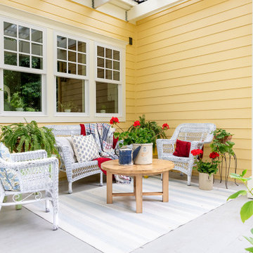
To bring the homeowners’ vision to life, the design called for a bold move—relocating the kitchen entirely. We designed a 560-square-foot addition off the living room – placing the kitchen at the heart of the home and connecting it to the gardens. The new space includes a sunlit breakfast nook, a charming butler’s pantry, a garden vestibule with its own entry porch, and a wraparound porch that encourages indoor-outdoor living. The main level remodel also redefined existing spaces: the old dining room was transformed into a cozy study library, while a former bedroom became an elegant dining room just off the new kitchen.
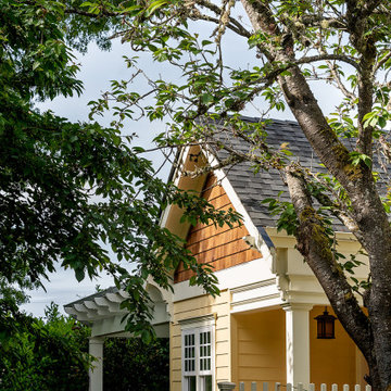
Every design decision honored the home’s original 1938 architecture and character. Matching the home’s original 1.5-story proportions, the new kitchen wing was designed with intersecting gables that echo the scale and pitch of the existing roofline. A stone-wrapped chimney topped with a handcrafted copper cap is straight from the pages of a storybook. Decorative corbels, intricate window trim, and cedar shake in the gable ends further connect the new architecture to the home’s historic detailing.
Finishes and fixtures were thoughtfully chosen to marry the home’s moodier, character-rich original rooms with the brighter, lighter new spaces. The result is a timeless transformation that feels as though it has always been part of the home – an enchanting blend of storybook charm, functional design, and garden-centered living.
At the ground level, a Pennsylvania bluestone porch and stone skirting ground the addition in traditional materials. Inside, a tongue-and-groove ceiling with hand-hewn beams gives purpose and intimacy to the heightened kitchen ceiling. The home’s signature arched openings were meticulously replicated in the new kitchen, breakfast nook, and dining room, ensuring a seamless transition between old and new. Every element – inside and out – was chosen to honor the original home while enhancing the charm, character, and connection to the garden.
Photos by MK Photography
 Powell Construction
Originally built in 1938, this bungalow cottage had enduring character, but its traditional closed kitchen layout – typical of the era – didn’t align with the way the homeowners envisioned living in the space. Inspired by their travels through England’s Cotswolds, the French countryside, and Carmel’s whimsical Storybook Cottages by the Sea, the homeowners dreamed of a home that captured the romance of cottages and one that would seamlessly connect with their stunning English-style garden.
After years of attempting to reimagine the kitchen in its original location the homeowners realized it would never truly suit the way they lived & wanted to entertain. The original kitchen was historical & was built when the kitchen was the last room you wanted guests to see. It was tucked into the front corner of the home off a hallway leading to the main level bedrooms and bath. To reach the dining room, you passed through a servery swing door, then continued into the living room. While the original door had charm, it disrupted the flow and connection between the kitchen and the main living areas.
To bring the homeowners’ vision to life, the design called for a bold move—relocating the kitchen entirely. We designed a 560-square-foot addition off the living room – placing the kitchen at the heart of the home and connecting it to the gardens. The new space includes a sunlit breakfast nook, a charming butler’s pantry, a garden vestibule with its own entry porch, and a wraparound porch that encourages indoor-outdoor living. The main level remodel also redefined existing spaces: the old dining room was transformed into a cozy study library, while a former bedroom became an elegant dining room just off the new kitchen.
Every design decision honored the home’s original 1938 architecture and character. Matching the home’s original 1.5-story proportions, the new kitchen wing was designed with intersecting gables that echo the scale and pitch of the existing roofline. A stone-wrapped chimney topped with a handcrafted copper cap is straight from the pages of a storybook. Decorative corbels, intricate window trim, and cedar shake in the gable ends further connect the new architecture to the home’s historic detailing.
Finishes and fixtures were thoughtfully chosen to marry the home’s moodier, character-rich original rooms with the brighter, lighter new spaces. The result is a timeless transformation that feels as though it has always been part of the home – an enchanting blend of storybook charm, functional design, and garden-centered living.
At the ground level, a Pennsylvania bluestone porch and stone skirting ground the addition in traditional materials. Inside, a tongue-and-groove ceiling with hand-hewn beams gives purpose and intimacy to the heightened kitchen ceiling. The home’s signature arched openings were meticulously replicated in the new kitchen, breakfast nook, and dining room, ensuring a seamless transition between old and new. Every element – inside and out – was chosen to honor the original home while enhancing the charm, character, and connection to the garden.
Photos by MK Photography
 kimberly peck architect
For this project, we transformed the top floor of a Park Slope brownstone into a modern, lightfilled
home tailored to the needs of a busy couple. The original space was outdated and lacked
cohesion, so our design focused on creating a harmonious and functional layout that reflects the
clients’ lifestyle while introducing moments of drama and creativity.
At the heart of the penthouse is an open-concept dining room, living room, and kitchen. The
living room accommodates multiple areas, including a cozy seating nook illuminated by
multicolored glass pendant lights. A dramatic custom-built feature spans the entire length of the
living room, integrating storage, display areas, and a unique guardwall that separates the
staircase to the couple's rooftop garden from the living space. This built-in showcases a dynamic
geometric design, with select sections backed in soft mauve for depth and visual interest. Along
the front of the space, a bespoke oak window seat with modern slatted wood fronts conceals the
AC and radiators while providing ample storage. The main seating area centers around a creamy
marble fireplace surround, a refined focal point in the living area. Wide-plank oak flooring
extends throughout the apartment and up the staircase, where a minimal aesthetic enhances the
clean, modern feel.
The kitchen continues the theme of modern sophistication with a palette of soft white lacquered
lower cabinets and oak upper cabinetry. The countertops and backsplash are crafted from a
striking quartzite in cream, peach, and mauve tones, adding a subtle vibrancy to the space. A
cream-enameled range takes center stage, complemented by a hidden coffee station and a
dedicated cabinet for AV supplies, ensuring a clutter-free aesthetic.
The hall guest bathroom is a playful yet refined mix of materials and textures. Peach-toned
concrete tiles cover the walls, while the floor features cream zellige tiles. Brass fixtures, a brass
mirror, and a brass wall sconce lend a touch of warmth and luxury, harmonizing with the custom
pecan-veneered vanity and custom concrete sink,
The primary bedroom suite is a serene retreat, painted in a rich, deep blue that sets a calming
tone. Accessed through a bespoke millwork closet, the ensuite bathroom is a small yet striking
space, showcasing impeccable craftsmanship. The rear wall of the shower is clad in floor-toceiling
slabs of light blue quartzite, creating a dramatic focal point visible from the bedroom.
This quartzite extends seamlessly to form a sculptural bench within the shower, which transitions
outward into a custom sink. Beneath the sink, two wood drawers provide discreet storage. The
remaining walls are finished in soft beige Moroccan tadelakt plaster, adding a warm contrast to
the cool tones of the quartzite.
This Park Slope penthouse is a carefully curated blend of modern elegance and thoughtful
functionality, with bespoke details and rich materiality that celebrate both the character of the
space and the needs of its owners.
 Housing & Building Association of Colorado Springs
The Home
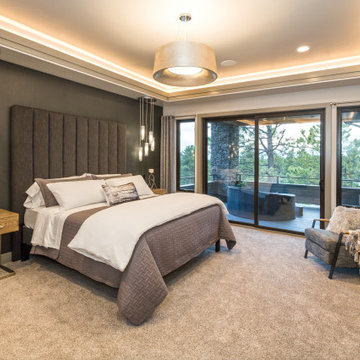
The Knollwood’s exquisite exterior is inspired by American architect Frank Lloyd Wright. It is a prairie architectural style, containing elements to blend in with the natural surroundings. This custom floorplan was specifically designed with a unique arrangement to allow each room on the main level to experience a Pikes Peak view and abundant sunlight.
A wall of sliding windows in the great room and lower recreation room showcases the panoramic view of the three-acre, treed property to blend indoor with outdoor living. The expansive covered deck offers a built-in grill, fire pit, hot tub deck and ample seating to experience the best of Colorado outdoor living.
The Master retreat includes two fireplaces, a large soaking tub and a spacious, zero-entry glass shower. The closet features a custom shelving system, tall windows and a large bench for putting on shoes or placing suitcases for packing. It also offers direct access to the main-level laundry room.
The heated garage offers generous space for four cars, plus additional space for storage or an excellent workshop. The lower-level includes three bedrooms and four baths, laundry, play area, wine room and large rec room with space for multiple game tables.
The Builder
Our goal, as Alliance Builders, is to build a home with incomparable design and functionality, while creating the perfect fit for your lifestyle and budget. As a design/build company, Alliance Builders will help with all aspects of site selection, design, construction and financing. There is no disconnect between the designer and builder. We handle it all! Our team has over 80 years of combined, new home building experience in the Colorado Springs area, and we continue due to our reputation and understanding of our customer’s wants and needs.
Alliance Builders understands the significance of customer care – before, during and after move in. As a small building company, we believe our reputation is extremely important for our future success. We invite you to visit one of our homes and see for yourself the foundation of experience our homes are built upon.
The Interior Design
The vision for The Knollwood, by Alliance Builder’s Interior Designer Jennifer Van Dyke, was to bring the beauty of the natural surroundings indoors. Rich warm woods, organic elements and soft grays are complimented by vibrant pops of color and black in this Frank Lloyd Wright meets mountain contemporary style home.
Drawing inspiration from the classic prairie-style exterior, the interior of the home creates the perfect setting to enjoy the breathtaking Pikes Peak view. The home features massive stone columns, custom wood beams and an exquisite oversized entry door. The home is enhanced with warm, wood cabinets and rich, live-sawn, oak flooring, which compliments the crisp gray wall color perfectly. Quartz waterfall accents, sleek modern light fixtures and custom tile details throughout create a luxurious feel. The beautifully designed spacious floor plan and expansive outdoor living area make this a great space for relaxing at home or entertaining!

 Jolene Rightmyer-Macolini Team at Howard Hanna
With this Cayuga Lake home you are sure to have something to do all day long, all year-round...don't take my word for it -- come check it out Down the long, stone private drive, nestled on a breathtaking hillside, awaits a custom built home -- a vision where love and quality craftsmanship go hand-in-hand Outstanding Cayuga Lake views can be enjoy throughout most of the home, patios and deck. The lush perennials frame around the home as if it was an illustration in a classic storybook. This home has a touch of elegance, yet the comforts of home. The new hardwood floors are stunning -- extending throughout most of the main level. A set of French doors welcome you to your place setting in the spacious formal dining room -- a "fine dining" ambiance is instantly created, and includes a view into the flourishing garden through the wall of windows. The family room is impeccable with floor to ceiling windows, and French doors that open to the front patio/outdoor screened-in room. A panoramic lake view that extends inside to out. The cozy fireplace will fill the room with warmth, and create a peaceful environment. The eat-in kitchen is a chef’s dream come true with a Viking sub-zero refrigerator, six-burner gas range, Brookhaven cabinets, complimented with granite countertops, a center island with seating for two, and over the counter lake views. For ease of entertaining, there is a dining area centrally located between the kitchen and living room -- and includes an easy access point to the side patio. The dining area has a tray ceiling that illuminates above -- a decadent addition. The living room continues the theme of wall of windows AND an additional wood burning fireplace. The hallway is a work of art -- quite literally -- the design was inspired by the Isabella Stewart Gardner museum in Boston. The upper level includes 3 large bedrooms with large closets, a home office, hallway full bathroom (with a separate shower room) and a laundry chute. The master suite is magnificent -- definitely a room that you wouldn't mind waking up in every morning! The dramatic cathedral ceiling is enhanced by the wall of windows and lake views. Completing this master suite you get a private balcony, TWO walk-in closets (that are the size of small rooms), and an en-suite that includes his & hers granite topped vanities, and a tile steam shower with built-in bench. Down to the newly repainted, generously sized finished walkout lower level, you have a media room, bedroom, full bathroom, and large storage/utility room. The French doors open to the back deck where you can find the hot tub, and sturdy steps that lead to the deep water dock and Cayuga Lake! Outbuilding can conveniently hold your outdoor tools and toys. The 9.87 acres allows you room to build a garage This home will leave a lasting impression on you and your guests! Photo Credit: James Klafehn
178