
Search results for "Continually increasing" in Home Design Ideas
 User
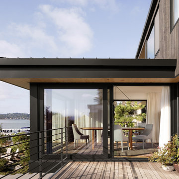
Wide sweeping windows up to 13’ and full-lite doors were installed throughout the home preserving the unobstructed views from the home. Additionally, four 12’ wide Lift and Slide doors were installed in the living room and dining room. Increased natural light, fewer framing members, and the ability to open the door wide for indoor/outdoor living are just a few of the benefits of such large sliding doors. The rear of the home takes full advantage of the expansive marine landscape with full height windows and doors.
Glo A5h and A5s Series were selected with concealed hinges. The Glo A5h, hidden sash, ensures that operational windows share the same profile thickness as fixed units. A uniform and cohesive look adds simplicity to the overall aesthetic, supporting the minimalist design. The A5s is Glo’s slimmest profile, allowing for more glass, less frame, and wider sight lines. The concealed hinge creates a clean interior look while also providing a more energy efficient air-tight window. The increased performance is also seen in the triple pane glazing used in both series. The windows and doors alike provide a larger continuous thermal break, multiple air seals, high performance spacers, low-e glass, and argon filled glazing, with U-values as low as 0.20. Energy efficiency and effortless minimalism creates a breathtaking Scandinavian-style remodel.
 Neil Kelly Company
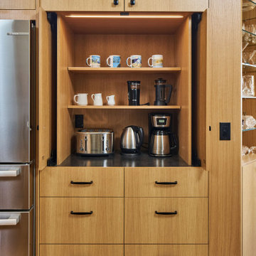
We moved the kitchen to the opposite side of the room to provide a better overall layout with more cabinets and continuous countertop space. Cabinets were placed under clerestory windows, allowing them to act as a light shelf and exponentially increasing natural light in the space. We removed the dropped ceiling to open up the space and create more evenly dispersed natural light.
New appliances were installed, including a separate cooktop and wall oven to accommodate different cooking and baking zones. We implemented a warm Pacific Northwest material pallet with quarter-sawn oak cabinets, and added neutral yet sharp finishes in black, white, and chrome.

 Rolf Schroeder General Contractors, Inc.
The layout of this early 90’s home was adequate for the husband when he was just living there. However, now the family of three and their loving cat live there together; the space quickly became confined and inadequate. The Clients contacted us to discuss what their options may be to help the home feel more spacious. After a few weeks of design and engineering, we went to work on opening up the first floor to increase the size of the rooms while creating continuity with the adjoining rooms. A once tired and confined layout became a spacious, comfortable, & aesthetically pleasing space to live and entertain.
Find the right local pro for your project
 Neil Kelly Company
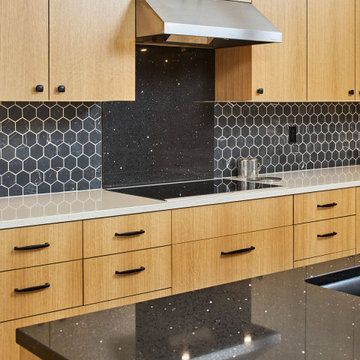
We moved the kitchen to the opposite side of the room to provide a better overall layout with more cabinets and continuous countertop space. Cabinets were placed under clerestory windows, allowing them to act as a light shelf and exponentially increasing natural light in the space. We removed the dropped ceiling to open up the space and create more evenly dispersed natural light.
New appliances were installed, including a separate cooktop and wall oven to accommodate different cooking and baking zones. We implemented a warm Pacific Northwest material pallet with quarter-sawn oak cabinets, and added neutral yet sharp finishes in black, white, and chrome.

 ZeroEnergy Design
This renovated brick rowhome in Boston’s South End offers a modern aesthetic within a historic structure, creative use of space, exceptional thermal comfort, a reduced carbon footprint, and a passive stream of income.
DESIGN PRIORITIES. The goals for the project were clear - design the primary unit to accommodate the family’s modern lifestyle, rework the layout to create a desirable rental unit, improve thermal comfort and introduce a modern aesthetic. We designed the street-level entry as a shared entrance for both the primary and rental unit. The family uses it as their everyday entrance - we planned for bike storage and an open mudroom with bench and shoe storage to facilitate the change from shoes to slippers or bare feet as they enter their home. On the main level, we expanded the kitchen into the dining room to create an eat-in space with generous counter space and storage, as well as a comfortable connection to the living space. The second floor serves as master suite for the couple - a bedroom with a walk-in-closet and ensuite bathroom, and an adjacent study, with refinished original pumpkin pine floors. The upper floor, aside from a guest bedroom, is the child's domain with interconnected spaces for sleeping, work and play. In the play space, which can be separated from the work space with new translucent sliding doors, we incorporated recreational features inspired by adventurous and competitive television shows, at their son’s request.
MODERN MEETS TRADITIONAL. We left the historic front facade of the building largely unchanged - the security bars were removed from the windows and the single pane windows were replaced with higher performing historic replicas. We designed the interior and rear facade with a vision of warm modernism, weaving in the notable period features. Each element was either restored or reinterpreted to blend with the modern aesthetic. The detailed ceiling in the living space, for example, has a new matte monochromatic finish, and the wood stairs are covered in a dark grey floor paint, whereas the mahogany doors were simply refinished. New wide plank wood flooring with a neutral finish, floor-to-ceiling casework, and bold splashes of color in wall paint and tile, and oversized high-performance windows (on the rear facade) round out the modern aesthetic.
RENTAL INCOME. The existing rowhome was zoned for a 2-family dwelling but included an undesirable, single-floor studio apartment at the garden level with low ceiling heights and questionable emergency egress. In order to increase the quality and quantity of space in the rental unit, we reimagined it as a two-floor, 1 or 2 bedroom, 2 bathroom apartment with a modern aesthetic, increased ceiling height on the lowest level and provided an in-unit washer/dryer. The apartment was listed with Jackie O'Connor Real Estate and rented immediately, providing the owners with a source of passive income.
ENCLOSURE WITH BENEFITS. The homeowners sought a minimal carbon footprint, enabled by their urban location and lifestyle decisions, paired with the benefits of a high-performance home. The extent of the renovation allowed us to implement a deep energy retrofit (DER) to address air tightness, insulation, and high-performance windows. The historic front facade is insulated from the interior, while the rear facade is insulated on the exterior. Together with these building enclosure improvements, we designed an HVAC system comprised of continuous fresh air ventilation, and an efficient, all-electric heating and cooling system to decouple the house from natural gas. This strategy provides optimal thermal comfort and indoor air quality, improved acoustic isolation from street noise and neighbors, as well as a further reduced carbon footprint. We also took measures to prepare the roof for future solar panels, for when the South End neighborhood’s aging electrical infrastructure is upgraded to allow them.
URBAN LIVING. The desirable neighborhood location allows the both the homeowners and tenant to walk, bike, and use public transportation to access the city, while each charging their respective plug-in electric cars behind the building to travel greater distances.
OVERALL. The understated rowhouse is now ready for another century of urban living, offering the owners comfort and convenience as they live life as an expression of their values.
Eric Roth Photo
 Edit Design Build Studio, LLC
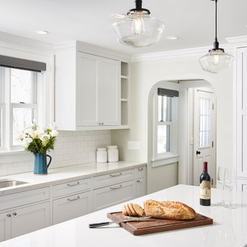
Like many Minneapolis homes from the 1920s, the original kitchen footprint was simply too small to accommodate the needs of its current homeowners. An earlier addition added square footage, but was poorly constructed and was not well integrated into the original space. The new layout included a 24” deep cantilevered addition to the back of the house that increased the footprint and allowed the kitchen to be unified into one continuous room. With the added space and the newly created arched opening to the dining room, enough space was created to include a spacious island for prep-work and family meals. The project included fully custom cabinetry with inset doors, marbled Cambria countertops and a flashy blue BluStar range. Period appropriate lighting fixtures, cabinet hardware and classic subway tile further integrate this stunning kitchen into the surrounding home.
 Neil Kelly Company
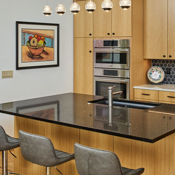
We moved the kitchen to the opposite side of the room to provide a better overall layout with more cabinets and continuous countertop space. Cabinets were placed under clerestory windows, allowing them to act as a light shelf and exponentially increasing natural light in the space. We removed the dropped ceiling to open up the space and create more evenly dispersed natural light.
New appliances were installed, including a separate cooktop and wall oven to accommodate different cooking and baking zones. We implemented a warm Pacific Northwest material pallet with quarter-sawn oak cabinets, and added neutral yet sharp finishes in black, white, and chrome.
 Neil Kelly Company
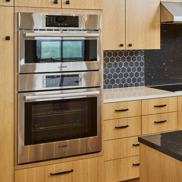
We moved the kitchen to the opposite side of the room to provide a better overall layout with more cabinets and continuous countertop space. Cabinets were placed under clerestory windows, allowing them to act as a light shelf and exponentially increasing natural light in the space. We removed the dropped ceiling to open up the space and create more evenly dispersed natural light.
New appliances were installed, including a separate cooktop and wall oven to accommodate different cooking and baking zones. We implemented a warm Pacific Northwest material pallet with quarter-sawn oak cabinets, and added neutral yet sharp finishes in black, white, and chrome.
 Neil Kelly Company
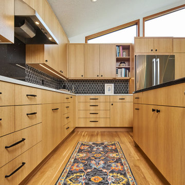
We moved the kitchen to the opposite side of the room to provide a better overall layout with more cabinets and continuous countertop space. Cabinets were placed under clerestory windows, allowing them to act as a light shelf and exponentially increasing natural light in the space. We removed the dropped ceiling to open up the space and create more evenly dispersed natural light.
New appliances were installed, including a separate cooktop and wall oven to accommodate different cooking and baking zones. We implemented a warm Pacific Northwest material pallet with quarter-sawn oak cabinets, and added neutral yet sharp finishes in black, white, and chrome.
 Rolf Schroeder General Contractors, Inc.
The layout of this early 90’s home was adequate for the husband when he was just living there. However, now the family of three and their loving cat live there together; the space quickly became confined and inadequate. The Clients contacted us to discuss what their options may be to help the home feel more spacious. After a few weeks of design and engineering, we went to work on opening up the first floor to increase the size of the rooms while creating continuity with the adjoining rooms. A once tired and confined layout became a spacious, comfortable, & aesthetically pleasing space to live and entertain.
 H2D Architecture + Design
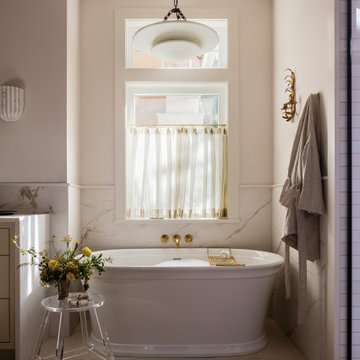
 developed a comprehensive vision for the renovation of this Bellevue residence, creating a cohesive master plan that can be implemented in phased construction to align with the homeowners' priorities, budget, and timeline. The first phase reimagined the primary suite, including a redesigned bathroom, reconfigured closet and bedroom. Strategic space planning enhanced the functionality and flow of each space while creating a serene, spa-inspired retreat tailored to the homeowners' lifestyle. Future phases will transform the home's main living areas through a complete reconfiguration of the kitchen, dining room, entry, and living room. The design will improve circulation, increase functionality, and create light-filled, beautifully connected spaces.
Architecture: H2D Architecture + Design
www.h2darchitects.com
Interiors: Kat Lawton Interiors
Photos by: John Granen
 Edit Design Build Studio, LLC
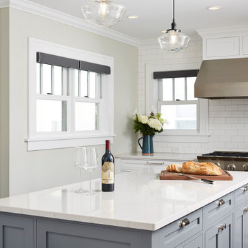
Like many Minneapolis homes from the 1920s, the original kitchen footprint was simply too small to accommodate the needs of its current homeowners. An earlier addition added square footage, but was poorly constructed and was not well integrated into the original space. The new layout included a 24” deep cantilevered addition to the back of the house that increased the footprint and allowed the kitchen to be unified into one continuous room. With the added space and the newly created arched opening to the dining room, enough space was created to include a spacious island for prep-work and family meals. The project included fully custom cabinetry with inset doors, marbled Cambria countertops and a flashy blue BluStar range. Period appropriate lighting fixtures, cabinet hardware and classic subway tile further integrate this stunning kitchen into the surrounding home.

 Align Design LLC
This project was focused on eeking out space for another bathroom for this growing family. The three bedroom, Craftsman bungalow was originally built with only one bathroom, which is typical for the era. The challenge was to find space without compromising the existing storage in the home. It was achieved by claiming the closet areas between two bedrooms, increasing the original 29" depth and expanding into the larger of the two bedrooms. The result was a compact, yet efficient bathroom. Classic finishes are respectful of the vernacular and time period of the home.

 Century Tile
We are a customer-driven company, focused on increasing our sales and market share. We differ from our competition by our products, presentation, and service while continuing to support our reputation for value and selection. Quickly put…to make Century Tile “simply the best."
Century Tile’s eleven locations and commitment to Chicago for over 65 years; First Quality Flooring, Value Pricing, Best In-stock Selection and Knowledgeable Staff.
We also have the Midwest’s largest in-stock selection of flooring.
We carry over 10,000 styles and colors of floor coverings which we import direct; as well as carry many of the major flooring brands domestically offered.
Century Tile’s size and buying power allows us to offer you the best selection of products at the lowest price and best value in Chicago that you can take home today.
Century Tile offers you Chicago’s most knowledgeable people who have an average of 12 years flooring experience. Our sales staff will assist you with any flooring project that you might have.
 MAC Reno Design Build LTD ( MAC Renovations)
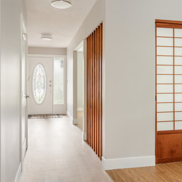
This thoughtfully executed renovation has transformed a beloved family home into a retirement-ready haven. The design, anchored by a family heirloom—a shoji door made by the owner's father—brings a sense of history and warmth with its rich wood tones. The reimagined kitchen shines with increased space and light, becoming a baker's dream, while maintaining its functionality for everyday use. Alongside, the powder room and laundry have received functional upgrades, enhancing the home's overall efficiency. Every detail is a blend of personal legacy and modern living, ensuring this home continues to be a place of comfort and ease for years to come.
 Rolf Schroeder General Contractors, Inc.
The layout of this early 90’s home was adequate for the husband when he was just living there. However, now the family of three and their loving cat live there together; the space quickly became confined and inadequate. The Clients contacted us to discuss what their options may be to help the home feel more spacious. After a few weeks of design and engineering, we went to work on opening up the first floor to increase the size of the rooms while creating continuity with the adjoining rooms. A once tired and confined layout became a spacious, comfortable, & aesthetically pleasing space to live and entertain.

 Pleotint LLC
Pleotint is the world’s top innovator in self-tinting windows and produces Suntuitive®, a simple glass technology that uses heat from sunlight to tint windows when necessary. On sunny days, Suntuitive® will gradually darken its tint to balance the intensity of light and heat coming through your windows, all while continuing to preserve your view outside. Pleotint is dedicated to provide customers with naturally brilliant windows that increase energy efficiency and optimize their comfort and view.

 The Artisans Group, Inc.
Winner of the 2018 Tour of Homes Best Remodel, this whole house re-design of a 1963 Bennet & Johnson mid-century raised ranch home is a beautiful example of the magic we can weave through the application of more sustainable modern design principles to existing spaces.
We worked closely with our client on extensive updates to create a modernized MCM gem.
Extensive alterations include:
- a completely redesigned floor plan to promote a more intuitive flow throughout
- vaulted the ceilings over the great room to create an amazing entrance and feeling of inspired openness
- redesigned entry and driveway to be more inviting and welcoming as well as to experientially set the mid-century modern stage
- the removal of a visually disruptive load bearing central wall and chimney system that formerly partitioned the homes’ entry, dining, kitchen and living rooms from each other
- added clerestory windows above the new kitchen to accentuate the new vaulted ceiling line and create a greater visual continuation of indoor to outdoor space
- drastically increased the access to natural light by increasing window sizes and opening up the floor plan
- placed natural wood elements throughout to provide a calming palette and cohesive Pacific Northwest feel
- incorporated Universal Design principles to make the home Aging In Place ready with wide hallways and accessible spaces, including single-floor living if needed
- moved and completely redesigned the stairway to work for the home’s occupants and be a part of the cohesive design aesthetic
- mixed custom tile layouts with more traditional tiling to create fun and playful visual experiences
- custom designed and sourced MCM specific elements such as the entry screen, cabinetry and lighting
- development of the downstairs for potential future use by an assisted living caretaker
- energy efficiency upgrades seamlessly woven in with much improved insulation, ductless mini splits and solar gain

 Jaeger & Ernst Custom Cabinetmakers
White on White Kitchen 6008.2
Small Kitchens in traditional older homes present an opportunity for the designer and cabinet maker. Function, space and ease in accommodating a guest or two represent a few of the necessary considerations. Careful planning while creating custom features will ensure a useful kitchen in harmony with contemporary living. Establishing upper cabinets at the ceiling height extends storage while glass doors at the bar area continues to push open the kitchen. By placing the bar surface at the same height as the counter we’ve established an unbroken line to further increase the sense of space. Designing valence and header panels over the window in the same style as the kitchen's doors provides continuity to this custom kitchen and to the history of the home.
The home was built in the 1920's in an urban Virginia environment. As was so often the case in the appointments of the home the kitchen was given little space and short attention to design. Opening the kitchen to a hall space with careful attention to simple but functional design enabled a successful arrangement serving the modern lifestyle.
 Rolf Schroeder General Contractors, Inc.
The layout of this early 90’s home was adequate for the husband when he was just living there. However, now the family of three and their loving cat live there together; the space quickly became confined and inadequate. The Clients contacted us to discuss what their options may be to help the home feel more spacious. After a few weeks of design and engineering, we went to work on opening up the first floor to increase the size of the rooms while creating continuity with the adjoining rooms. A once tired and confined layout became a spacious, comfortable, & aesthetically pleasing space to live and entertain.
21