
Search results for "Continually increasing" in Home Design Ideas
 HDR Remodeling Inc.
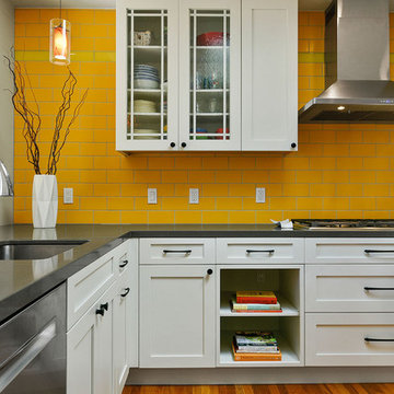
Our design team rose to the occasion, making the yellow backsplash tile the true star of the show while the grey quartz counter tops and classic white shaker cabinets kept the space feeling contemporary and fresh.
Incorporation of the original skylight, the vaulted ceiling, and full light glass patio doors add a sense of spaciousness and connection to the outdoors that had been lacking in the original space.
Open Homes Photography, Inc.
 User
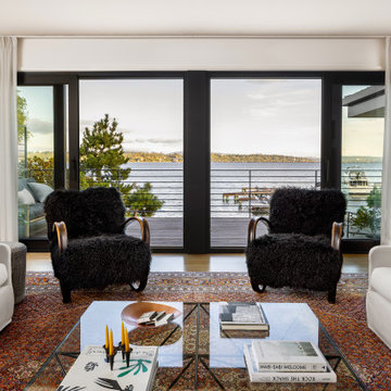
UserWide sweeping windows up to 13’ and full-lite doors were installed throughout the home preserving the unobstructed views from the home. Additionally, four 12’ wide Lift and Slide doors were installed in the living room and dining room. Increased natural light, fewer framing members, and the ability to open the door wide for indoor/outdoor living are just a few of the benefits of such large sliding doors. The rear of the home takes full advantage of the expansive marine landscape with full height windows and doors.
Glo A5h and A5s Series were selected with concealed hinges. The Glo A5h, hidden sash, ensures that operational windows share the same profile thickness as fixed units. A uniform and cohesive look adds simplicity to the overall aesthetic, supporting the minimalist design. The A5s is Glo’s slimmest profile, allowing for more glass, less frame, and wider sight lines. The concealed hinge creates a clean interior look while also providing a more energy efficient air-tight window. The increased performance is also seen in the triple pane glazing used in both series. The windows and doors alike provide a larger continuous thermal break, multiple air seals, high performance spacers, low-e glass, and argon filled glazing, with U-values as low as 0.20. Energy efficiency and effortless minimalism creates a breathtaking Scandinavian-style remodel.
 Century Tile
DT_Brancacci_RES_01
Brancacci
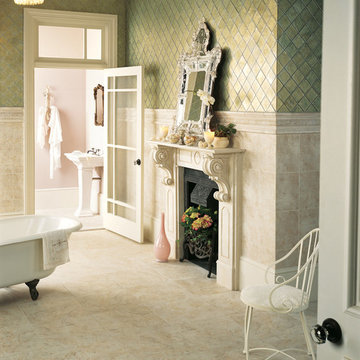
Photo features Aria Ivory 18 x 18 field tile on the floor. Wall features coordinating Aria Ivory 9 x 12 wall tile with Floral Listello and chair rail. Continuing up the wall is Cristallo Glass in Peridot 4 x 4 field tile.
We are a customer driven company, focused on increasing our sales and market share. We differ from our competition by our products, presentation, and service while continuing to support our reputation for value and selection. Quickly put…to make Century Tile “simply the best."
Century Tile’s eleven locations and commitment to Chicago for over 65 years; First Quality Flooring, Value Pricing, Best In-stock Selection and Knowledgeable Staff.
We also have the Midwest’s largest in-stock selection of flooring.
We carry over 10,000 styles and colors of floor coverings which we import direct; as well as carry many of the major flooring brands domestically offered.
Century Tile’s size and buying power allows us to offer you the best selection of products at the lowest price and best value in Chicago that you can take home today.
Century Tile offers you Chicago’s most knowledgeable people who have an average of 12 years flooring experience. Our sales staff will assist you with any flooring project that you might have.
Find the right local pro for your project
 EAG Studio
Reimagining an Urban Classic
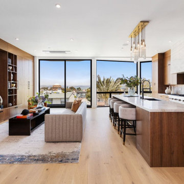
Perched high above San Francisco’s Cow Hollow neighborhood, this meticulously reimagined residence represents a thoughtful transformation of a classic urban home into a contemporary, light-filled sanctuary. The project involved a comprehensive renovation paired with both vertical and horizontal expansion, dramatically increasing the home’s footprint while enhancing its relationship to sweeping views of the Bay, the Palace of Fine Arts, and the surrounding hillside neighborhoods.
The design strategy focused on opening the home to light, air, and vistas—elements often constrained in the dense urban fabric of San Francisco. By extending the structure upward and outward, the architects created a dynamic four-level residence that unfolds gradually, culminating in expansive living spaces and rooftop terraces oriented toward panoramic city and water views.
Architecture that Frames the View
At the heart of the design is a careful orchestration of sightlines and natural light. Large black-framed windows punctuate the façade and interior spaces, deliberately positioned to capture iconic San Francisco vistas while flooding the home with daylight. The architecture prioritizes openness, allowing rooms to flow seamlessly while maintaining a strong visual connection to the surrounding landscape.
A dramatic skylight above the central stairwell anchors the vertical circulation of the home. This architectural gesture not only brings daylight deep into the interior but also reinforces the sense of spatial continuity between floors.
Warm Modern Interiors
Inside, the home balances architectural clarity with warm materiality. Wide-plank oak floors run throughout the residence, creating visual cohesion and grounding the interiors with natural warmth. Custom walnut millwork—integrated shelving, cabinetry, and wall panels—introduces depth and texture while complementing the clean lines of the architecture.
The interiors are intentionally restrained yet richly layered. Contemporary furnishings, sculptural lighting, and curated artwork add personality while maintaining the calm, sophisticated palette that defines the home.
The Social Heart of the Home
The main living level serves as the social centerpiece of the residence. An open-plan kitchen, dining area, and lounge space unfold toward the view, creating an environment that feels both expansive and intimate.
A sculptural marble island anchors the kitchen, functioning as both workspace and gathering hub. Surrounded by walnut cabinetry and professional-grade appliances, the kitchen merges elegance with functionality. Above, a cascading chandelier introduces a sense of vertical movement, reflecting the home’s emphasis on light and architectural rhythm.
Living areas are arranged to encourage conversation and connection. Generous seating, layered rugs, and thoughtful lighting define distinct zones within the open plan while maintaining uninterrupted sightlines toward the cityscape beyond.
Private Retreats Above the City
Upper levels of the home are dedicated to quieter, more intimate spaces. The primary suite is conceived as a private retreat, where expansive windows frame treetop views and invite natural light throughout the day.
The accompanying bathroom continues the home’s refined material palette. Marble surfaces, warm wood cabinetry, and brushed brass fixtures create a spa-like environment that balances luxury with tranquility.
Additional bedrooms and flexible living spaces offer comfort for family and guests, each designed with the same attention to light, proportion, and material richness.
Spaces for Entertaining
Lower levels provide additional areas for gathering and entertaining. A lounge and bar area offer a relaxed setting for hosting, while custom wine storage adds a sophisticated touch for collectors and enthusiasts.
These spaces transition easily to outdoor areas, reinforcing the home’s emphasis on indoor-outdoor living.
A Rooftop Above the Neighborhood
The transformation extends beyond the interior to include thoughtfully designed outdoor spaces. A landscaped rear yard introduces greenery and privacy at ground level, offering a serene urban escape.
Above it all, the rooftop terrace becomes the crown jewel of the residence. Elevated above the neighborhood, it provides sweeping views of the San Francisco Bay and the Palace of Fine Arts. Comfortable seating areas, lush planters, and open sky create an ideal setting for outdoor entertaining, sunset gatherings, or quiet moments overlooking the city.
A Contemporary Urban Sanctuary
The completed residence demonstrates the power of thoughtful renovation and expansion within a historic urban neighborhood. By combining contemporary architecture, warm materiality, and an intentional relationship to the surrounding landscape, the project transforms a traditional San Francisco home into a modern sanctuary above the city.
 U.S. Green Building Council (USGBC)
LEED Certification Level: V4
Builder: BPC Green Builders, LLC
Architect: Trillium Architects
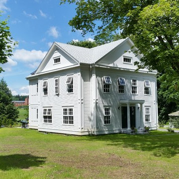
The Taft School faculty home serves as a high performance residence and learning lab for students. The project also earned certification through ENERGY STAR, Indoor airPLUS, Water Sense, PHIUS, and Department of Energy Zero Energy Ready Homes with Living Building Challenge Petal recognition pending. The project team was honored with third place in the 2014 Connecticut Zero Energy Home Challenge. Excluding the photovoltaic installation the HERS index was 33, and with the 13.1 kW the HERS index is -14. A year of utility bills show the home is producing more electricity than it uses.
Located on a quiet street adjacent to campus the existing, historic home was deconstructed and materials donated or reused where possible. Challenged to find high efficiency windows that were historic commission acceptable, the team installed Klearwall awnings or casements over fixed glass (to mimic double hungs) with simulated divided lites (u-values as low as 0.13). A high solar heat gain coefficient (0.58) facilitates the passive solar gain for winter months, while well designed overhangs and a pergola shade summer sun. Double stud walls have 2¼” closed cell foam plus 8½” dense pack cellulose for a R-49 cavity. The exterior sheathing is R-6.6 Zip Wall System with taped seams to create the continuous air barrier. Inside the solid concrete foundation is 3” closed cell foam behind 2x4 stud walls and R-32 cellulose in the cavity. Prefabricated TJI joists frame the attic floor, an insulated “room” houses the heat recovery ventilator and ductwork, and blown in cellulose blankets it all in R-86. The house tested 0.6ACH50 proving the effectiveness of its air-tight envelope and attention to air sealing.
Heating and cooling is provided by efficient air source heat pumps (9.2 HSPF, 16.5 SEER) and delivered by short duct runs which tested extremely tight. A heat pump water heater provides domestic hot water and an on-demand switch, with an occupancy sensor at each bath, ensures hot water is delivered fast and efficiently. Low flow fixtures are WaterSense certified, appliances are Energy Star labeled, and all LED lighting. A Zehnder Novus 300 (93.3% efficient) HRV supplies 112 cfm of continuous fresh air while using only 32 watts of power and running quietly. The homeowners control the mechanical ventilation through the intuitive wall-mounted control pad to shut off or increase the ventilation. Chemicals and contaminants were reduced by using low VOC and GreenGuard certified sealants, adhesives, primers, and paints. A walk-off matt at the side entry and hardwood floors help control dirt and dust. The granite front steps were salvaged and local stone used for the patio and stone walls. Storm water runoff from the roof, patio, and driveway is managed by the rain garden. The native landscaping is low maintenance, a community garden produces vegetables, and the chicken coop is powered by its own roof mounted PV panels.
Taft School Director of Environmental Stewardship, Carly Borken has used the design and construction process as a teaching tool for her science classes. With access to the home monitoring system they can virtually access the residents’ consumption.
 Drury Design
THE SETUP
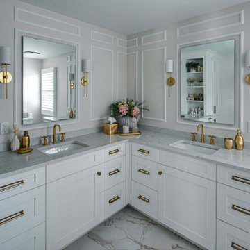
The original primary bathroom was characterized by a disjointed and segmented layout. The shower featured a bulky glass-block enclosure that overwhelmed the space visually. There was a considerable amount of open, unused space, and despite having a his and hers vanity, the arrangement lacked personal space for each user, as they shared the conjoined space between the sinks. The toilet was inconveniently located right by the door, with a half-wall partition meant to provide privacy but instead contributing to a cramped and unbalanced feel. Overall, the bathroom’s layout and design were fragmented, failing to make the most of the available space and lacking adequate storage solutions.
Design objectives:
- Reconfigure the layout to enhance functionality and flow.
- Create an elegant, upscale aesthetic that is light and bright.
- Incorporate specialized storage solutions for female hair care needs.
- Increase overall storage capacity.
- Develop a spa-like shower experience.
- Provide a significant wow factor to the space.
THE REMODEL
Design challenges to be solved:
- Repositioning the toilet to a more suitable location.
- Designing hair care storage solutions without cluttering the elegant space.
- Balancing an upscale, elegant design with a feminine touch in the color palette.
- Increasing the brightness of the room without adding windows.
- Completely replacing the existing shower to create a spa-like experience.
- Planning new storage solutions without adding bulkiness or clutter to the cabinetry.
THE RENEWED SPACE
Design solutions:
Toilet Relocation: Moved the toilet by the window, creating a better overall layout that also opened up two full walls for cabinetry and storage solutions.
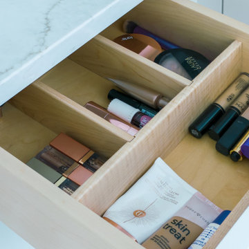
Specialized Vanity Storage: The left side of the left vanity is the wife’s. Open shelves facing across the vanity can be used for decorative or daily needs items. Pull-out docking drawers with power outlets and metal basins handle hot hair appliances.
Bright and Elegant Color Scheme: White cabinets, countertops, floors, and shower walls keep the space bright. The just-off-white wall color with a hint of pink adds a feminine touch. Thin wainscoting with white trim offers traditional-leaning elegance.
Layered Lighting Strategy: Ceiling can lights, sconces, lighted mirrors, and toe-kick lighting were installed. Natural light-rated bulbs keep the space bright and natural-feeling.
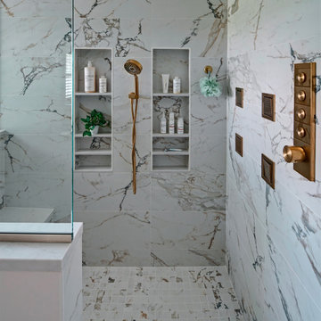
Spa-Like Shower: An extra-large shower was created using the same floor tile materials for continuity. Equipped with a Kohler Anthem system with a shower head, hand-held, and four body sprays. His and Hers niches for separate body care product storage.
Enhanced Storage Solutions: Added a linen cabinet within the vanity area for efficient storage of towels and bathroom essentials.
This elegant bathroom feels incredibly spacious now. The color palette and lights keep the room bright and cheery. Gold fixtures, the herringbone pattern on the floor, and exquisite trim work add an elegant touch. With the husband and wife having their own vanity wall sections joined at the corner, each user truly has their own space within the space. The clients are very happy with the final result.

 TVL Creative Ltd.
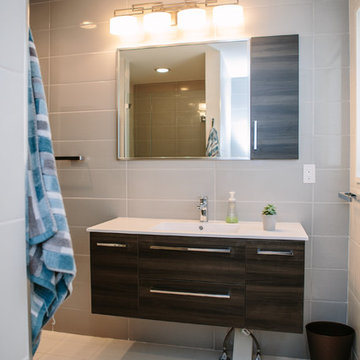
We took our Boulder clients through an amazing transformation! Almost every room in their home has been remodeled to better reflect their tastes and create spaces that functions better for their family. We utilized natural materials every step of the way and designed a balance of mid-century inspired touches and cool contemporary finishes. In the living room we removed the existing half-wall to open up the entry and dining room and create an easier transition between spaces. To make the fireplace the focal point of the living room we designed a beautiful wall of honed sandstone and sourced a reclaimed wood mantel. Increasing storage was a necessity for this home, so we added a much needed closet to the dining room, and designed semi custom floating cabinetry for the living room & dining room. We added a custom barn door to their family room to give them the option of closing the television off from the rest of their home. The clients really wanted to brighten up their dark kitchen, so we removed the black cabinets and red backsplash to make room for beautiful natural wood cabinets and a custom clay tile backsplash. Contemporary touches like a zero radius stainless steel sink, concrete light fixtures, and a double waterfall counter-top continue to echo the clean lines utilized through out the rest of the home. For the two first floor bathrooms we removed barrels full of mosaic tile and installed large scale white and grey tiles, making the rooms feel larger and reign in the visual texture. We continued to use the cool tones and clean lines in the bathrooms to tie them in with the rest of the home and give us a unified feel between spaces.
 TVL Creative Ltd.
We took our Boulder clients through an amazing transformation! Almost every room in their home has been remodeled to better reflect their tastes and create spaces that functions better for their family. We utilized natural materials every step of the way and designed a balance of mid-century inspired touches and cool contemporary finishes. In the living room we removed the existing half-wall to open up the entry and dining room and create an easier transition between spaces. To make the fireplace the focal point of the living room we designed a beautiful wall of honed sandstone and sourced a reclaimed wood mantel. Increasing storage was a necessity for this home, so we added a much needed closet to the dining room, and designed semi custom floating cabinetry for the living room & dining room. We added a custom barn door to their family room to give them the option of closing the television off from the rest of their home. The clients really wanted to brighten up their dark kitchen, so we removed the black cabinets and red backsplash to make room for beautiful natural wood cabinets and a custom clay tile backsplash. Contemporary touches like a zero radius stainless steel sink, concrete light fixtures, and a double waterfall counter-top continue to echo the clean lines utilized through out the rest of the home. For the two first floor bathrooms we removed barrels full of mosaic tile and installed large scale white and grey tiles, making the rooms feel larger and reign in the visual texture. We continued to use the cool tones and clean lines in the bathrooms to tie them in with the rest of the home and give us a unified feel between spaces.
 Tracy Berman Interiors
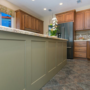
Raising the visual presence of this kitchen was the first priority. Removing the soffit that went around most of the kitchen allowed the cabinets to be taller. We raised the backsplash from 18" to 21" to further add to the visual lift. The previous foot print stopped after the sink area. By continuing the cabinets down the wall we increased the square footage of the room and were able to increase the size of the island as well. A sage brown cabinet warmed up the room and a pesto green island added a modern flair. A beautiful slab of granite on the island helped tie all of the choices together.
 Drury Design
THE SETUP
The original primary bathroom was characterized by a disjointed and segmented layout. The shower featured a bulky glass-block enclosure that overwhelmed the space visually. There was a considerable amount of open, unused space, and despite having a his and hers vanity, the arrangement lacked personal space for each user, as they shared the conjoined space between the sinks. The toilet was inconveniently located right by the door, with a half-wall partition meant to provide privacy but instead contributing to a cramped and unbalanced feel. Overall, the bathroom’s layout and design were fragmented, failing to make the most of the available space and lacking adequate storage solutions.
Design objectives:
- Reconfigure the layout to enhance functionality and flow.
- Create an elegant, upscale aesthetic that is light and bright.
- Incorporate specialized storage solutions for female hair care needs.
- Increase overall storage capacity.
- Develop a spa-like shower experience.
- Provide a significant wow factor to the space.
THE REMODEL
Design challenges to be solved:
- Repositioning the toilet to a more suitable location.
- Designing hair care storage solutions without cluttering the elegant space.
- Balancing an upscale, elegant design with a feminine touch in the color palette.
- Increasing the brightness of the room without adding windows.
- Completely replacing the existing shower to create a spa-like experience.
- Planning new storage solutions without adding bulkiness or clutter to the cabinetry.
THE RENEWED SPACE
Design solutions:
Toilet Relocation: Moved the toilet by the window, creating a better overall layout that also opened up two full walls for cabinetry and storage solutions.
Specialized Vanity Storage: The left side of the left vanity is the wife’s. Open shelves facing across the vanity can be used for decorative or daily needs items. Pull-out docking drawers with power outlets and metal basins handle hot hair appliances.
Bright and Elegant Color Scheme: White cabinets, countertops, floors, and shower walls keep the space bright. The just-off-white wall color with a hint of pink adds a feminine touch. Thin wainscoting with white trim offers traditional-leaning elegance.
Layered Lighting Strategy: Ceiling can lights, sconces, lighted mirrors, and toe-kick lighting were installed. Natural light-rated bulbs keep the space bright and natural-feeling.
Spa-Like Shower: An extra-large shower was created using the same floor tile materials for continuity. Equipped with a Kohler Anthem system with a shower head, hand-held, and four body sprays. His and Hers niches for separate body care product storage.
Enhanced Storage Solutions: Added a linen cabinet within the vanity area for efficient storage of towels and bathroom essentials.
This elegant bathroom feels incredibly spacious now. The color palette and lights keep the room bright and cheery. Gold fixtures, the herringbone pattern on the floor, and exquisite trim work add an elegant touch. With the husband and wife having their own vanity wall sections joined at the corner, each user truly has their own space within the space. The clients are very happy with the final result.
 Archatrak Inc.
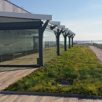
Green roofs have become increasingly popular recently, and in some locations have become mandatory, with rooftop plantings reducing energy costs, improving air quality, increasing biodiversity and reducing storm water runoff. One of the easiest methods of creating an instant green roof is to use plastic planter trays pre-filled with growing medium and plants. This 4,600 sq. ft. rooftop terrace on the 8th floor showcases Archatrak porcelain planks in the color Oak and provides breathtaking views from the Washington Monument to the Potomac River. Hickok Cole Architects are responsible for the beautifully designed rooftop. This installation is a beautiful example of interior to exterior paving, as the porcelain planks give a look of seamless continuity as they flow from the interior atrium to the outside rooftop.
 Drury Design
THE SETUP
The original primary bathroom was characterized by a disjointed and segmented layout. The shower featured a bulky glass-block enclosure that overwhelmed the space visually. There was a considerable amount of open, unused space, and despite having a his and hers vanity, the arrangement lacked personal space for each user, as they shared the conjoined space between the sinks. The toilet was inconveniently located right by the door, with a half-wall partition meant to provide privacy but instead contributing to a cramped and unbalanced feel. Overall, the bathroom’s layout and design were fragmented, failing to make the most of the available space and lacking adequate storage solutions.
Design objectives:
- Reconfigure the layout to enhance functionality and flow.
- Create an elegant, upscale aesthetic that is light and bright.
- Incorporate specialized storage solutions for female hair care needs.
- Increase overall storage capacity.
- Develop a spa-like shower experience.
- Provide a significant wow factor to the space.
THE REMODEL
Design challenges to be solved:
- Repositioning the toilet to a more suitable location.
- Designing hair care storage solutions without cluttering the elegant space.
- Balancing an upscale, elegant design with a feminine touch in the color palette.
- Increasing the brightness of the room without adding windows.
- Completely replacing the existing shower to create a spa-like experience.
- Planning new storage solutions without adding bulkiness or clutter to the cabinetry.
THE RENEWED SPACE
Design solutions:
Toilet Relocation: Moved the toilet by the window, creating a better overall layout that also opened up two full walls for cabinetry and storage solutions.
Specialized Vanity Storage: The left side of the left vanity is the wife’s. Open shelves facing across the vanity can be used for decorative or daily needs items. Pull-out docking drawers with power outlets and metal basins handle hot hair appliances.
Bright and Elegant Color Scheme: White cabinets, countertops, floors, and shower walls keep the space bright. The just-off-white wall color with a hint of pink adds a feminine touch. Thin wainscoting with white trim offers traditional-leaning elegance.
Layered Lighting Strategy: Ceiling can lights, sconces, lighted mirrors, and toe-kick lighting were installed. Natural light-rated bulbs keep the space bright and natural-feeling.
Spa-Like Shower: An extra-large shower was created using the same floor tile materials for continuity. Equipped with a Kohler Anthem system with a shower head, hand-held, and four body sprays. His and Hers niches for separate body care product storage.
Enhanced Storage Solutions: Added a linen cabinet within the vanity area for efficient storage of towels and bathroom essentials.
This elegant bathroom feels incredibly spacious now. The color palette and lights keep the room bright and cheery. Gold fixtures, the herringbone pattern on the floor, and exquisite trim work add an elegant touch. With the husband and wife having their own vanity wall sections joined at the corner, each user truly has their own space within the space. The clients are very happy with the final result.
 TVL Creative Ltd.
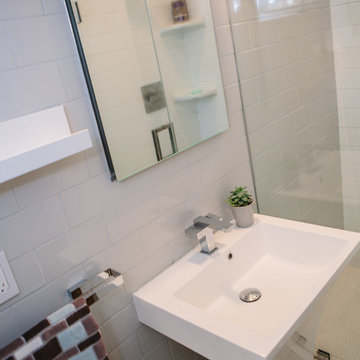
We took our Boulder clients through an amazing transformation! Almost every room in their home has been remodeled to better reflect their tastes and create spaces that functions better for their family. We utilized natural materials every step of the way and designed a balance of mid-century inspired touches and cool contemporary finishes. In the living room we removed the existing half-wall to open up the entry and dining room and create an easier transition between spaces. To make the fireplace the focal point of the living room we designed a beautiful wall of honed sandstone and sourced a reclaimed wood mantel. Increasing storage was a necessity for this home, so we added a much needed closet to the dining room, and designed semi custom floating cabinetry for the living room & dining room. We added a custom barn door to their family room to give them the option of closing the television off from the rest of their home. The clients really wanted to brighten up their dark kitchen, so we removed the black cabinets and red backsplash to make room for beautiful natural wood cabinets and a custom clay tile backsplash. Contemporary touches like a zero radius stainless steel sink, concrete light fixtures, and a double waterfall counter-top continue to echo the clean lines utilized through out the rest of the home. For the two first floor bathrooms we removed barrels full of mosaic tile and installed large scale white and grey tiles, making the rooms feel larger and reign in the visual texture. We continued to use the cool tones and clean lines in the bathrooms to tie them in with the rest of the home and give us a unified feel between spaces.
 Tracy Berman Interiors
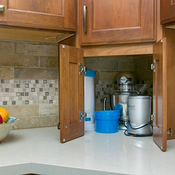
Raising the visual presence of this kitchen was the first priority. Removing the soffit that went around most of the kitchen allowed the cabinets to be taller. We raised the backsplash from 18" to 21" to further add to the visual lift. The previous foot print stopped after the sink area. By continuing the cabinets down the wall we increased the square footage of the room and were able to increase the size of the island as well. A sage brown cabinet warmed up the room and a pesto green island added a modern flair. A beautiful slab of granite on the island helped tie all of the choices together.
 TVL Creative Ltd.
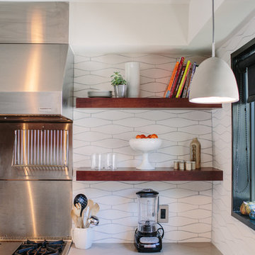
We took our Boulder clients through an amazing transformation! Almost every room in their home has been remodeled to better reflect their tastes and create spaces that functions better for their family. We utilized natural materials every step of the way and designed a balance of mid-century inspired touches and cool contemporary finishes. In the living room we removed the existing half-wall to open up the entry and dining room and create an easier transition between spaces. To make the fireplace the focal point of the living room we designed a beautiful wall of honed sandstone and sourced a reclaimed wood mantel. Increasing storage was a necessity for this home, so we added a much needed closet to the dining room, and designed semi custom floating cabinetry for the living room & dining room. We added a custom barn door to their family room to give them the option of closing the television off from the rest of their home. The clients really wanted to brighten up their dark kitchen, so we removed the black cabinets and red backsplash to make room for beautiful natural wood cabinets and a custom clay tile backsplash. Contemporary touches like a zero radius stainless steel sink, concrete light fixtures, and a double waterfall counter-top continue to echo the clean lines utilized through out the rest of the home. For the two first floor bathrooms we removed barrels full of mosaic tile and installed large scale white and grey tiles, making the rooms feel larger and reign in the visual texture. We continued to use the cool tones and clean lines in the bathrooms to tie them in with the rest of the home and give us a unified feel between spaces.
 EAG Studio
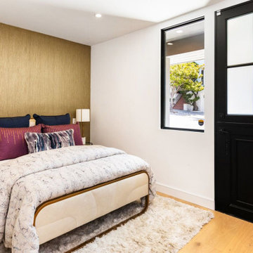
Reimagining an Urban Classic
Perched high above San Francisco’s Cow Hollow neighborhood, this meticulously reimagined residence represents a thoughtful transformation of a classic urban home into a contemporary, light-filled sanctuary. The project involved a comprehensive renovation paired with both vertical and horizontal expansion, dramatically increasing the home’s footprint while enhancing its relationship to sweeping views of the Bay, the Palace of Fine Arts, and the surrounding hillside neighborhoods.
The design strategy focused on opening the home to light, air, and vistas—elements often constrained in the dense urban fabric of San Francisco. By extending the structure upward and outward, the architects created a dynamic four-level residence that unfolds gradually, culminating in expansive living spaces and rooftop terraces oriented toward panoramic city and water views.
Architecture that Frames the View
At the heart of the design is a careful orchestration of sightlines and natural light. Large black-framed windows punctuate the façade and interior spaces, deliberately positioned to capture iconic San Francisco vistas while flooding the home with daylight. The architecture prioritizes openness, allowing rooms to flow seamlessly while maintaining a strong visual connection to the surrounding landscape.
A dramatic skylight above the central stairwell anchors the vertical circulation of the home. This architectural gesture not only brings daylight deep into the interior but also reinforces the sense of spatial continuity between floors.
Warm Modern Interiors
Inside, the home balances architectural clarity with warm materiality. Wide-plank oak floors run throughout the residence, creating visual cohesion and grounding the interiors with natural warmth. Custom walnut millwork—integrated shelving, cabinetry, and wall panels—introduces depth and texture while complementing the clean lines of the architecture.
The interiors are intentionally restrained yet richly layered. Contemporary furnishings, sculptural lighting, and curated artwork add personality while maintaining the calm, sophisticated palette that defines the home.
The Social Heart of the Home
The main living level serves as the social centerpiece of the residence. An open-plan kitchen, dining area, and lounge space unfold toward the view, creating an environment that feels both expansive and intimate.
A sculptural marble island anchors the kitchen, functioning as both workspace and gathering hub. Surrounded by walnut cabinetry and professional-grade appliances, the kitchen merges elegance with functionality. Above, a cascading chandelier introduces a sense of vertical movement, reflecting the home’s emphasis on light and architectural rhythm.
Living areas are arranged to encourage conversation and connection. Generous seating, layered rugs, and thoughtful lighting define distinct zones within the open plan while maintaining uninterrupted sightlines toward the cityscape beyond.
Private Retreats Above the City
Upper levels of the home are dedicated to quieter, more intimate spaces. The primary suite is conceived as a private retreat, where expansive windows frame treetop views and invite natural light throughout the day.
The accompanying bathroom continues the home’s refined material palette. Marble surfaces, warm wood cabinetry, and brushed brass fixtures create a spa-like environment that balances luxury with tranquility.
Additional bedrooms and flexible living spaces offer comfort for family and guests, each designed with the same attention to light, proportion, and material richness.
Spaces for Entertaining
Lower levels provide additional areas for gathering and entertaining. A lounge and bar area offer a relaxed setting for hosting, while custom wine storage adds a sophisticated touch for collectors and enthusiasts.
These spaces transition easily to outdoor areas, reinforcing the home’s emphasis on indoor-outdoor living.
A Rooftop Above the Neighborhood
The transformation extends beyond the interior to include thoughtfully designed outdoor spaces. A landscaped rear yard introduces greenery and privacy at ground level, offering a serene urban escape.
Above it all, the rooftop terrace becomes the crown jewel of the residence. Elevated above the neighborhood, it provides sweeping views of the San Francisco Bay and the Palace of Fine Arts. Comfortable seating areas, lush planters, and open sky create an ideal setting for outdoor entertaining, sunset gatherings, or quiet moments overlooking the city.
A Contemporary Urban Sanctuary
The completed residence demonstrates the power of thoughtful renovation and expansion within a historic urban neighborhood. By combining contemporary architecture, warm materiality, and an intentional relationship to the surrounding landscape, the project transforms a traditional San Francisco home into a modern sanctuary above the city.
 Tracy Berman Interiors
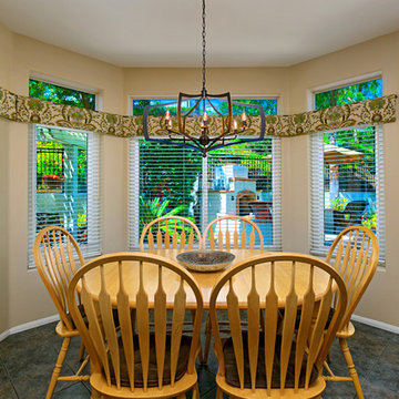
Raising the visual presence of this kitchen was the first priority. Removing the soffit that went around most of the kitchen allowed the cabinets to be taller. We raised the backsplash from 18" to 21" to further add to the visual lift. The previous foot print stopped after the sink area. By continuing the cabinets down the wall we increased the square footage of the room and were able to increase the size of the island as well. A sage brown cabinet warmed up the room and a pesto green island added a modern flair. A beautiful slab of granite on the island helped tie all of the choices together.

 Total System Service
As a manager of a building or property, you quickly learn the art of mediation. One minute you may be working with a vendor to keep the building’s operating system running efficient and smooth; the next moment you may be calming a tenant down after finding the change in the system disrupted his office’s workflow. Give and take; it’s the only way to make sure every day runs perfectly.
Overall, you have two goals to strive for in everything you do.
1. Keep the building running properly, upgrading systems as appropriate, and striving to do all you can on a pre-established budget.
2. Keep the building occupants happy, with as little disruption as possible.
While some changes are minor, barely registering on a building occupant’s mind, with HVAC challenges, that’s rarely the case. If a HVAC contractor is replacing an air handler, for instance, and disconnects one and moves to the next unit, it may cause major disruptions to sensitive areas of a building. And if the occupant wasn’t prepared for the disruption, you can have a mighty unhappy customer on your hand.
Anytime you are working on HVAC projects throughout your building, there are strategies you can put into place to keep things running smooth.
Communicate with occupants
Communication is key to any good relationship, and as a property manager, this rule is a great place to start. If you will be working with the HVAC equipment, block out the timeframe for work to be done, and understand the potential consequences of the process. Then communicate this process with every point of contact you have throughout the building. The more detail you can provide, the less surprises you’ll have throughout the process. You can also work with your building’s occupants before the process begins, finding out if there are better timeframes than others.
Establish a realistic schedule
As a property manager, its easy to provide your expectations for the HVAC project at hand, and request that the proposal be written in such a way that work is completed on your timeframe. Unfortunately, many contractors want your business and will agree to anything upfront in order to win the bid, knowing full well the work will take longer than specified. Instead of projecting your timeframes into the proposal process, ask for HVAC project bids to establish realistic schedules of how long the process will take, and what areas of your property will be most effected throughout the schedule. This will help you avoid crises between you and the contractor, and you and your tenants.
Plan for the whole system
If one small piece of your HVAC system is weak, its easy to fix that one small piece. But how will that impact your overall system? Will it cause weak spots in different parts of the building – maybe a corner office will have reduced air flow, and therefore be colder in the winter and warmer in the summer? When retrofitting new pieces with older existing systems, its easy to reduce the efficiency of your entire system. Before agreeing to certain repairs, make sure you understand how it will impact your entire system overall. An easy way of handling this problem is by working with the same HVAC contractor again and again, He will understand your system’s potential, and know when to make repairs, and when to replace.
Have points of contact available for immediate assistance
In many cases, problems arise because connections can’t be made. Can the HVAC contractor get a hold or you or another person that can make decisions at a moments notice if a problem arises? Do you have access to decision makers throughout the building that may be impacted by this change? Many projects have been put on hold simply because a person in authority can’t be found to give the go-ahead to move forward. If you have access to these people during the time of the project, you’ll be able to complete the project in record time.
Test
Finally, if you can test things in stages, or test when the potential for problems is the smallest, you reduce the chances of bigger emergency issues falling into your lap. If you’ll be installing a new terminal unit, can you make the switch on a Saturday morning when the building is largely unoccupied? If you’re replacing a large system, can you replace and test in phases so the entire project isn’t released at once?
Most issues can be avoided with just a little strategy from the beginning. If you’ve never had a HVAC maintenance team to help you stay on track with your building’s heating and cooling, now may be the time to find out how easy a team approach makes the process.
 Drury Design
THE SETUP
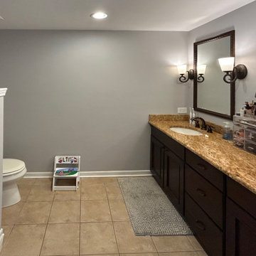
The original primary bathroom was characterized by a disjointed and segmented layout. The shower featured a bulky glass-block enclosure that overwhelmed the space visually. There was a considerable amount of open, unused space, and despite having a his and hers vanity, the arrangement lacked personal space for each user, as they shared the conjoined space between the sinks. The toilet was inconveniently located right by the door, with a half-wall partition meant to provide privacy but instead contributing to a cramped and unbalanced feel. Overall, the bathroom’s layout and design were fragmented, failing to make the most of the available space and lacking adequate storage solutions.
Design objectives:
- Reconfigure the layout to enhance functionality and flow.
- Create an elegant, upscale aesthetic that is light and bright.
- Incorporate specialized storage solutions for female hair care needs.
- Increase overall storage capacity.
- Develop a spa-like shower experience.
- Provide a significant wow factor to the space.
THE REMODEL
Design challenges to be solved:
- Repositioning the toilet to a more suitable location.
- Designing hair care storage solutions without cluttering the elegant space.
- Balancing an upscale, elegant design with a feminine touch in the color palette.
- Increasing the brightness of the room without adding windows.
- Completely replacing the existing shower to create a spa-like experience.
- Planning new storage solutions without adding bulkiness or clutter to the cabinetry.
THE RENEWED SPACE
Design solutions:
Toilet Relocation: Moved the toilet by the window, creating a better overall layout that also opened up two full walls for cabinetry and storage solutions.
Specialized Vanity Storage: The left side of the left vanity is the wife’s. Open shelves facing across the vanity can be used for decorative or daily needs items. Pull-out docking drawers with power outlets and metal basins handle hot hair appliances.
Bright and Elegant Color Scheme: White cabinets, countertops, floors, and shower walls keep the space bright. The just-off-white wall color with a hint of pink adds a feminine touch. Thin wainscoting with white trim offers traditional-leaning elegance.
Layered Lighting Strategy: Ceiling can lights, sconces, lighted mirrors, and toe-kick lighting were installed. Natural light-rated bulbs keep the space bright and natural-feeling.
Spa-Like Shower: An extra-large shower was created using the same floor tile materials for continuity. Equipped with a Kohler Anthem system with a shower head, hand-held, and four body sprays. His and Hers niches for separate body care product storage.
Enhanced Storage Solutions: Added a linen cabinet within the vanity area for efficient storage of towels and bathroom essentials.
This elegant bathroom feels incredibly spacious now. The color palette and lights keep the room bright and cheery. Gold fixtures, the herringbone pattern on the floor, and exquisite trim work add an elegant touch. With the husband and wife having their own vanity wall sections joined at the corner, each user truly has their own space within the space. The clients are very happy with the final result.
 komandor
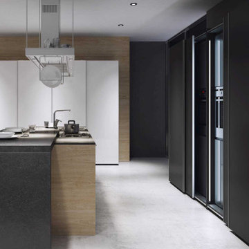
Kitchen, Sliding Doors & Storage by Komandor. With any good kitchen layout, storage and flow are key. Continuing from last week’s theme…sliding doors can be a great addition to your kitchen or pantry. The main features being the increase in flow and the decrease in clutter in the kitchen. An open cabinet door protruding into your space is always cumbersome. Sliding doors can save valuable space and increase flow in high traffic areas. Not to mention that they are right on trend! Sliding doors can also be used to create a work station with a counter top and extra storage above and below. Food prep and frequently working appliances can be hidden away with the push of a door. Unexpected guests…no problem…with sliding doors a tidy kitchen is always just a slide away!
22