
Search results for "Continue reading" in Home Design Ideas
 EAG Studio
Refined Continuity: Bridging Classical Architecture and Modern Living
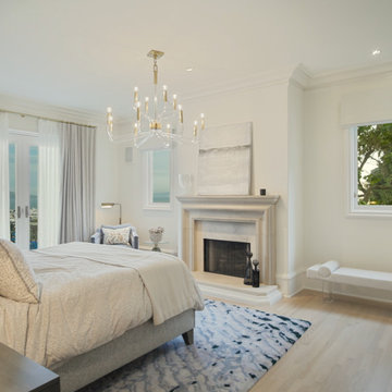
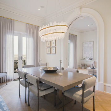
This comprehensive remodel of a grand Cow Hollow residence reimagines a historically expressive envelope through a lens of contemporary livability, precision detailing, and material restraint. The design approach carefully balances the home’s classical proportions and ornamental heritage with a refined, modern sensibility—evident in the disciplined palette of warm neutrals, soft plasters, pale oak flooring, and tailored millwork. Circulation has been clarified and subtly expanded to enhance spatial flow, while openings are leveraged to capture light, garden outlooks, and distant water views. Throughout, architectural interventions are executed with a high level of craft, ensuring that new insertions—whether cabinetry, railings, or apertures—read as seamless continuations of the original structure rather than applied elements.
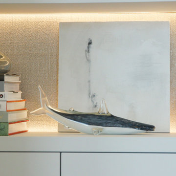
The kitchen serves as the operational and visual anchor of the home, conceived as a sculptural yet highly functional environment. Custom rift-cut cabinetry, softened through a desaturated finish, is paired with honed stone surfaces and integrated brass hardware to create a quiet, tactile richness. A monolithic island establishes a central gathering point, while perimeter work zones are carefully layered with concealed storage, integrated appliances, and open, backlit shelving that elevates everyday objects into curated displays. The adjacent bar and entertaining areas extend this language, reinforcing a cohesive hospitality-driven program. In parallel, the primary bathroom is designed as a serene, spa-like retreat, where bookmatched stone, frameless glass enclosures, and finely detailed metalwork converge. The composition prioritizes symmetry, clarity, and light—balancing generous volumes with intimate moments through integrated lighting, custom vanities, and a restrained material hierarchy.
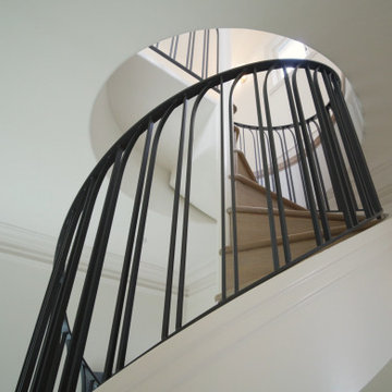
The library and ancillary living spaces introduce a more intimate scale, anchored by bespoke built-ins that combine closed storage with illuminated display niches, creating depth and rhythm along the walls. Here, material transitions and furniture integration are handled with particular nuance, allowing the architecture to support both quiet retreat and social gathering. A continuous language of custom railings—executed in refined metal profiles—threads through the interior and extends outward, where the exterior gate and garden elements have been reinterpreted to align with the home’s renewed identity. The entry sequence is now defined by a calibrated interplay of solidity and transparency, with sculptural metalwork and landscape integration establishing a sense of arrival that is both secure and elegant. Collectively, the project reflects a holistic transformation—one that elevates performance, livability, and aesthetic clarity while preserving the inherent dignity of the original architecture.
 EAG Studio
Refined Continuity: Bridging Classical Architecture and Modern Living
This comprehensive remodel of a grand Cow Hollow residence reimagines a historically expressive envelope through a lens of contemporary livability, precision detailing, and material restraint. The design approach carefully balances the home’s classical proportions and ornamental heritage with a refined, modern sensibility—evident in the disciplined palette of warm neutrals, soft plasters, pale oak flooring, and tailored millwork. Circulation has been clarified and subtly expanded to enhance spatial flow, while openings are leveraged to capture light, garden outlooks, and distant water views. Throughout, architectural interventions are executed with a high level of craft, ensuring that new insertions—whether cabinetry, railings, or apertures—read as seamless continuations of the original structure rather than applied elements.
The kitchen serves as the operational and visual anchor of the home, conceived as a sculptural yet highly functional environment. Custom rift-cut cabinetry, softened through a desaturated finish, is paired with honed stone surfaces and integrated brass hardware to create a quiet, tactile richness. A monolithic island establishes a central gathering point, while perimeter work zones are carefully layered with concealed storage, integrated appliances, and open, backlit shelving that elevates everyday objects into curated displays. The adjacent bar and entertaining areas extend this language, reinforcing a cohesive hospitality-driven program. In parallel, the primary bathroom is designed as a serene, spa-like retreat, where bookmatched stone, frameless glass enclosures, and finely detailed metalwork converge. The composition prioritizes symmetry, clarity, and light—balancing generous volumes with intimate moments through integrated lighting, custom vanities, and a restrained material hierarchy.
The library and ancillary living spaces introduce a more intimate scale, anchored by bespoke built-ins that combine closed storage with illuminated display niches, creating depth and rhythm along the walls. Here, material transitions and furniture integration are handled with particular nuance, allowing the architecture to support both quiet retreat and social gathering. A continuous language of custom railings—executed in refined metal profiles—threads through the interior and extends outward, where the exterior gate and garden elements have been reinterpreted to align with the home’s renewed identity. The entry sequence is now defined by a calibrated interplay of solidity and transparency, with sculptural metalwork and landscape integration establishing a sense of arrival that is both secure and elegant. Collectively, the project reflects a holistic transformation—one that elevates performance, livability, and aesthetic clarity while preserving the inherent dignity of the original architecture.
 EAG Studio
Refined Continuity: Bridging Classical Architecture and Modern Living
This comprehensive remodel of a grand Cow Hollow residence reimagines a historically expressive envelope through a lens of contemporary livability, precision detailing, and material restraint. The design approach carefully balances the home’s classical proportions and ornamental heritage with a refined, modern sensibility—evident in the disciplined palette of warm neutrals, soft plasters, pale oak flooring, and tailored millwork. Circulation has been clarified and subtly expanded to enhance spatial flow, while openings are leveraged to capture light, garden outlooks, and distant water views. Throughout, architectural interventions are executed with a high level of craft, ensuring that new insertions—whether cabinetry, railings, or apertures—read as seamless continuations of the original structure rather than applied elements.
The kitchen serves as the operational and visual anchor of the home, conceived as a sculptural yet highly functional environment. Custom rift-cut cabinetry, softened through a desaturated finish, is paired with honed stone surfaces and integrated brass hardware to create a quiet, tactile richness. A monolithic island establishes a central gathering point, while perimeter work zones are carefully layered with concealed storage, integrated appliances, and open, backlit shelving that elevates everyday objects into curated displays. The adjacent bar and entertaining areas extend this language, reinforcing a cohesive hospitality-driven program. In parallel, the primary bathroom is designed as a serene, spa-like retreat, where bookmatched stone, frameless glass enclosures, and finely detailed metalwork converge. The composition prioritizes symmetry, clarity, and light—balancing generous volumes with intimate moments through integrated lighting, custom vanities, and a restrained material hierarchy.
The library and ancillary living spaces introduce a more intimate scale, anchored by bespoke built-ins that combine closed storage with illuminated display niches, creating depth and rhythm along the walls. Here, material transitions and furniture integration are handled with particular nuance, allowing the architecture to support both quiet retreat and social gathering. A continuous language of custom railings—executed in refined metal profiles—threads through the interior and extends outward, where the exterior gate and garden elements have been reinterpreted to align with the home’s renewed identity. The entry sequence is now defined by a calibrated interplay of solidity and transparency, with sculptural metalwork and landscape integration establishing a sense of arrival that is both secure and elegant. Collectively, the project reflects a holistic transformation—one that elevates performance, livability, and aesthetic clarity while preserving the inherent dignity of the original architecture.
Find the right local pro for your project
 EAG Studio
Refined Continuity: Bridging Classical Architecture and Modern Living
This comprehensive remodel of a grand Cow Hollow residence reimagines a historically expressive envelope through a lens of contemporary livability, precision detailing, and material restraint. The design approach carefully balances the home’s classical proportions and ornamental heritage with a refined, modern sensibility—evident in the disciplined palette of warm neutrals, soft plasters, pale oak flooring, and tailored millwork. Circulation has been clarified and subtly expanded to enhance spatial flow, while openings are leveraged to capture light, garden outlooks, and distant water views. Throughout, architectural interventions are executed with a high level of craft, ensuring that new insertions—whether cabinetry, railings, or apertures—read as seamless continuations of the original structure rather than applied elements.
The kitchen serves as the operational and visual anchor of the home, conceived as a sculptural yet highly functional environment. Custom rift-cut cabinetry, softened through a desaturated finish, is paired with honed stone surfaces and integrated brass hardware to create a quiet, tactile richness. A monolithic island establishes a central gathering point, while perimeter work zones are carefully layered with concealed storage, integrated appliances, and open, backlit shelving that elevates everyday objects into curated displays. The adjacent bar and entertaining areas extend this language, reinforcing a cohesive hospitality-driven program. In parallel, the primary bathroom is designed as a serene, spa-like retreat, where bookmatched stone, frameless glass enclosures, and finely detailed metalwork converge. The composition prioritizes symmetry, clarity, and light—balancing generous volumes with intimate moments through integrated lighting, custom vanities, and a restrained material hierarchy.
The library and ancillary living spaces introduce a more intimate scale, anchored by bespoke built-ins that combine closed storage with illuminated display niches, creating depth and rhythm along the walls. Here, material transitions and furniture integration are handled with particular nuance, allowing the architecture to support both quiet retreat and social gathering. A continuous language of custom railings—executed in refined metal profiles—threads through the interior and extends outward, where the exterior gate and garden elements have been reinterpreted to align with the home’s renewed identity. The entry sequence is now defined by a calibrated interplay of solidity and transparency, with sculptural metalwork and landscape integration establishing a sense of arrival that is both secure and elegant. Collectively, the project reflects a holistic transformation—one that elevates performance, livability, and aesthetic clarity while preserving the inherent dignity of the original architecture.
 EAG Studio
Refined Continuity: Bridging Classical Architecture and Modern Living
This comprehensive remodel of a grand Cow Hollow residence reimagines a historically expressive envelope through a lens of contemporary livability, precision detailing, and material restraint. The design approach carefully balances the home’s classical proportions and ornamental heritage with a refined, modern sensibility—evident in the disciplined palette of warm neutrals, soft plasters, pale oak flooring, and tailored millwork. Circulation has been clarified and subtly expanded to enhance spatial flow, while openings are leveraged to capture light, garden outlooks, and distant water views. Throughout, architectural interventions are executed with a high level of craft, ensuring that new insertions—whether cabinetry, railings, or apertures—read as seamless continuations of the original structure rather than applied elements.
The kitchen serves as the operational and visual anchor of the home, conceived as a sculptural yet highly functional environment. Custom rift-cut cabinetry, softened through a desaturated finish, is paired with honed stone surfaces and integrated brass hardware to create a quiet, tactile richness. A monolithic island establishes a central gathering point, while perimeter work zones are carefully layered with concealed storage, integrated appliances, and open, backlit shelving that elevates everyday objects into curated displays. The adjacent bar and entertaining areas extend this language, reinforcing a cohesive hospitality-driven program. In parallel, the primary bathroom is designed as a serene, spa-like retreat, where bookmatched stone, frameless glass enclosures, and finely detailed metalwork converge. The composition prioritizes symmetry, clarity, and light—balancing generous volumes with intimate moments through integrated lighting, custom vanities, and a restrained material hierarchy.
The library and ancillary living spaces introduce a more intimate scale, anchored by bespoke built-ins that combine closed storage with illuminated display niches, creating depth and rhythm along the walls. Here, material transitions and furniture integration are handled with particular nuance, allowing the architecture to support both quiet retreat and social gathering. A continuous language of custom railings—executed in refined metal profiles—threads through the interior and extends outward, where the exterior gate and garden elements have been reinterpreted to align with the home’s renewed identity. The entry sequence is now defined by a calibrated interplay of solidity and transparency, with sculptural metalwork and landscape integration establishing a sense of arrival that is both secure and elegant. Collectively, the project reflects a holistic transformation—one that elevates performance, livability, and aesthetic clarity while preserving the inherent dignity of the original architecture.
 EAG Studio
Refined Continuity: Bridging Classical Architecture and Modern Living
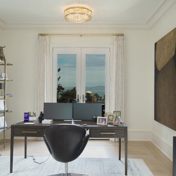
This comprehensive remodel of a grand Cow Hollow residence reimagines a historically expressive envelope through a lens of contemporary livability, precision detailing, and material restraint. The design approach carefully balances the home’s classical proportions and ornamental heritage with a refined, modern sensibility—evident in the disciplined palette of warm neutrals, soft plasters, pale oak flooring, and tailored millwork. Circulation has been clarified and subtly expanded to enhance spatial flow, while openings are leveraged to capture light, garden outlooks, and distant water views. Throughout, architectural interventions are executed with a high level of craft, ensuring that new insertions—whether cabinetry, railings, or apertures—read as seamless continuations of the original structure rather than applied elements.
The kitchen serves as the operational and visual anchor of the home, conceived as a sculptural yet highly functional environment. Custom rift-cut cabinetry, softened through a desaturated finish, is paired with honed stone surfaces and integrated brass hardware to create a quiet, tactile richness. A monolithic island establishes a central gathering point, while perimeter work zones are carefully layered with concealed storage, integrated appliances, and open, backlit shelving that elevates everyday objects into curated displays. The adjacent bar and entertaining areas extend this language, reinforcing a cohesive hospitality-driven program. In parallel, the primary bathroom is designed as a serene, spa-like retreat, where bookmatched stone, frameless glass enclosures, and finely detailed metalwork converge. The composition prioritizes symmetry, clarity, and light—balancing generous volumes with intimate moments through integrated lighting, custom vanities, and a restrained material hierarchy.
The library and ancillary living spaces introduce a more intimate scale, anchored by bespoke built-ins that combine closed storage with illuminated display niches, creating depth and rhythm along the walls. Here, material transitions and furniture integration are handled with particular nuance, allowing the architecture to support both quiet retreat and social gathering. A continuous language of custom railings—executed in refined metal profiles—threads through the interior and extends outward, where the exterior gate and garden elements have been reinterpreted to align with the home’s renewed identity. The entry sequence is now defined by a calibrated interplay of solidity and transparency, with sculptural metalwork and landscape integration establishing a sense of arrival that is both secure and elegant. Collectively, the project reflects a holistic transformation—one that elevates performance, livability, and aesthetic clarity while preserving the inherent dignity of the original architecture.
 EAG Studio
Refined Continuity: Bridging Classical Architecture and Modern Living
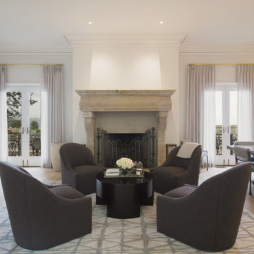
This comprehensive remodel of a grand Cow Hollow residence reimagines a historically expressive envelope through a lens of contemporary livability, precision detailing, and material restraint. The design approach carefully balances the home’s classical proportions and ornamental heritage with a refined, modern sensibility—evident in the disciplined palette of warm neutrals, soft plasters, pale oak flooring, and tailored millwork. Circulation has been clarified and subtly expanded to enhance spatial flow, while openings are leveraged to capture light, garden outlooks, and distant water views. Throughout, architectural interventions are executed with a high level of craft, ensuring that new insertions—whether cabinetry, railings, or apertures—read as seamless continuations of the original structure rather than applied elements.
The kitchen serves as the operational and visual anchor of the home, conceived as a sculptural yet highly functional environment. Custom rift-cut cabinetry, softened through a desaturated finish, is paired with honed stone surfaces and integrated brass hardware to create a quiet, tactile richness. A monolithic island establishes a central gathering point, while perimeter work zones are carefully layered with concealed storage, integrated appliances, and open, backlit shelving that elevates everyday objects into curated displays. The adjacent bar and entertaining areas extend this language, reinforcing a cohesive hospitality-driven program. In parallel, the primary bathroom is designed as a serene, spa-like retreat, where bookmatched stone, frameless glass enclosures, and finely detailed metalwork converge. The composition prioritizes symmetry, clarity, and light—balancing generous volumes with intimate moments through integrated lighting, custom vanities, and a restrained material hierarchy.
The library and ancillary living spaces introduce a more intimate scale, anchored by bespoke built-ins that combine closed storage with illuminated display niches, creating depth and rhythm along the walls. Here, material transitions and furniture integration are handled with particular nuance, allowing the architecture to support both quiet retreat and social gathering. A continuous language of custom railings—executed in refined metal profiles—threads through the interior and extends outward, where the exterior gate and garden elements have been reinterpreted to align with the home’s renewed identity. The entry sequence is now defined by a calibrated interplay of solidity and transparency, with sculptural metalwork and landscape integration establishing a sense of arrival that is both secure and elegant. Collectively, the project reflects a holistic transformation—one that elevates performance, livability, and aesthetic clarity while preserving the inherent dignity of the original architecture.


 Tracy Berman Interiors
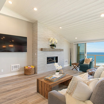
This gorgeous beach condo sits on the banks of the Pacific ocean in Solana Beach, CA. The previous design was dark, heavy and out of scale for the square footage of the space. We removed an outdated bulit in, a column that was not supporting and all the detailed trim work. We replaced it with white kitchen cabinets, continuous vinyl plank flooring and clean lines throughout. The entry was created by pulling the lower portion of the bookcases out past the wall to create a foyer. The shelves are open to both sides so the immediate view of the ocean is not obstructed. New patio sliders now open in the center to continue the view. The shiplap ceiling was updated with a fresh coat of paint and smaller LED can lights. The bookcases are the inspiration color for the entire design. Sea glass green, the color of the ocean, is sprinkled throughout the home. The fireplace is now a sleek contemporary feel with a tile surround. The mantel is made from old barn wood. A very special slab of quartzite was used for the bookcase counter, dining room serving ledge and a shelf in the laundry room. The kitchen is now white and bright with glass tile that reflects the colors of the water. The hood and floating shelves have a weathered finish to reflect drift wood. The laundry room received a face lift starting with new moldings on the door, fresh paint, a rustic cabinet and a stone shelf. The guest bathroom has new white tile with a beachy mosaic design and a fresh coat of paint on the vanity. New hardware, sinks, faucets, mirrors and lights finish off the design. The master bathroom used to be open to the bedroom. We added a wall with a barn door for privacy. The shower has been opened up with a beautiful pebble tile water fall. The pebbles are repeated on the vanity with a natural edge finish. The vanity received a fresh paint job, new hardware, faucets, sinks, mirrors and lights. The guest bedroom has a custom double bunk with reading lamps for the kiddos. This space now reflects the community it is in, and we have brought the beach inside.
 Fiorito Interior Design
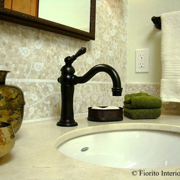
Like many California ranch homes built in the 1950s, this original master bathroom was not really a "master bath." My clients, who only three years ago purchased the home from the family of the original owner, were saddled with a small, dysfunctional space. Chief among the dysfunctions: a vanity only 30" high, and an inconveniently placed window that forced the too-low vanity mirror to reflect only the waist and partial torso--not the face--of anyone standing in front of it. They wanted not only a more spacious bathroom but a bedroom as well, so we worked in tandem with an architect and contractor to come up with a fantastic new space: a true Master Suite. In order to refine a design concept for the soon-to-be larger space, and thereby narrow down material choices, my clients and I had a brainstorming session: we spoke of an elegant Old World/ European bedroom and bathroom, a luxurious bath that would reference a Roman spa, and finally the idea of a Hammam was brought into the mix. We blended these ideas together in oil-rubbed bronze fixtures, and a tiny tile mosaic in beautiful Bursa Beige marble from Turkey and white Thassos marble from Greece. The new generously sized bathroom boasts a jetted soaking tub, a very large walk-in shower, a double-sided fireplace (facing the tub on the bath side), and a luxurious 8' long vanity with double sinks and a storage tower.
The vanity wall is covered with a mosaic vine pattern in a beautiful Bursa Beige marble from Turkey and white Thassos marble from Greece,. The custom Larson Juhl framed mirrors are flanked by gorgeous hand-wrought scones from Hubbardton Forge which echo the vine and leaf pattern in the mosaic. And the vanity itself features an LED strip in the toe-kick which allows one to see in the middle of the night without having to turn on a shockingly bright overhead fixture. At the other end of the master bath, a luxurious jetted tub nestles by a fireplace in the bay window area. Views of my clients' garden can be seen while soaking in bubbles. The over-sized walk-in shower features a paneled wainscoting effect which I designed in Crema Marfil marble. The vine mosaic continues in the shower, topped by green onyx squares. A rainshower head and a hand-held spray on a bar provides showering options. The shower floor slopes gently in one direction toward a hidden linear drain; this allows the floor to be read as a continuation of the main space, without being interrupted by a center drain.
Photo by Jeff Fiorito

 Daniel Scerri Periti
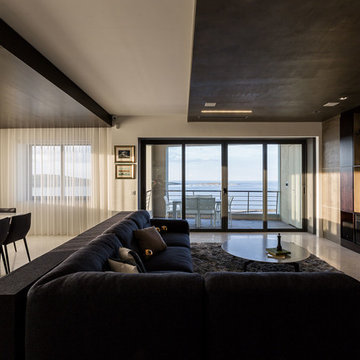
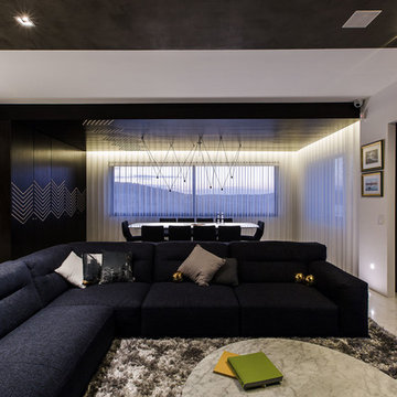
We were approached with a request to design the furnishings for an existing ‘finished’ apartment. The intention was to move in relatively fast, and the property already had an existing marble floor, kitchen and bathrooms which had to be kept. The property also boasted a fantastic 270 degree view, seen from most of the apartment. The clients had a very important role in the completion of the project. They were very involved during the design process and through various decoration choices. The final design was kept as a rigid guideline when faced with picking out all the different elements.
Once clear of all previous furniture, the space felt cold and bare; so we immediately felt the need for warmth, and raw, natural elements and textures to complement the cold marble floor while visually tying in the design of the whole apartment together.
Since the existing kitchen had a touch of dark walnut stain, we felt this material was one we should add to the palette of materials to contest the stark materials. A raw cement finish was another material we felt would add an interesting contrast and could be used in a variety of ways, from cabinets to walls and ceilings, to tie up the design of various areas of the apartment.
To warm up the living/dining area, keeping the existing marble floor but visually creating zones within the large living/dining area without hindering the flow, a dark timber custom-made soffit, continuous with a floor-to-ceiling drinks cabinet zones the dining area, giving it a degree of much-needed warmth.
The various windows with a stupendous 270 degree view needed to be visually tied together. This was done by introducing a continuous sheer [drape] which also doubled up as a sound-absorbing material along 2 of the 4 walls of the space.
A very large sofa was required to fill up the space correctly, also required for the size of the young family.
Services were integrated within the units and soffits, while a customized design in the corner between the kitchen and the living room took into consideration the viewpoints from the main areas to create a pantry without hindering the flow or views. A strategically placed floor-to-ceiling mirror doubles up the space and extends the view to the inner parts of the apartment.
The daughter’s bedroom was a small challenge in itself, and a fun task, where we wanted to achieve the perception of a cozy niche with its own enclosed reading nook [for reading fairy tales], behind see-through curtains and a custom-ordered wall print sporting the girl’s favorite colors.
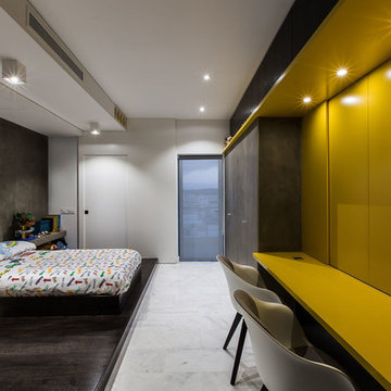
The sons’ bedroom had double the requirements in terms of space needed: more wardrobe, more homework desk space, a tv/play station area… “We combined a raised platform area between the boys’ beds to become an area with cushions where the kids can lay down and play, and face a hidden screen behind the homework desk’s sliding back panel for their play station”. The color of the homework desk was chosen in relation to the boys’ ages. A more masculine material palette was chosen for this room, in contrast to the light pastel palette of the girl’s bedroom. Again, this colour can easily be changed over time for a more mature look.
PROJECT DATA:
St. Paul’s Bay, Malta
DESIGN TEAM:
Perit Rebecca Zammit, Perit Daniel Scerri, Elyse Tonna
OTHER CREDITS:
Photography: Tonio Lombardi
Styling : TKS
 Sherri Blum | Jack and Jill Interiors, Inc.
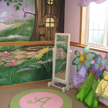
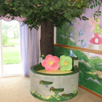
Three year old Avery was diagnosed with inoperable brain cancer at age two. Her wish through Make a Wish Foundation was to receive a Fairy Garden Playroom for her sister, Maddy and herself. Avery has gone through so very much in her young life and is such a strong, brave little girl. When Make a Wish coordinator, Jenny Hauser contacted Sherri Blum of Jack and Jill Interiors, Inc. to design this very special room for Avery, we jumped on it. Sherri and her assistant, Lisa O’Brien worked for months meticulously planning the space which included a life-like tree, a custom designed reading nook that we now refer to as the “Fairy Fountain”, a dress up corner, play house, tea table complete with tea set, an art station (not seen in the images, as it was back ordered) and a spot for movie viewing. We solicited the extremely talented Patrice Hoban to paint our fairy mural and she really knocked our socks off with the details! She added glitter and gems and the room really came to life with her vision! We thank Cheryl of Sweet Lullaby for designing and donating the sweet curtains and valances, Chris Jones of Kidtropolisbuild.com for designing the Fairy Fountain reading perch, Levels of Discovery for their donation of the tea table and toybox, New Arrivals, Inc for donating the peg hook, and Creative Carpet Design for donating the monogrammed rug. Avery and her family have a long road ahead of them. They will continue treatments at St. Jude Children’s Hospital (to whom Jack and Jill Interiors has donated monthly for about 10 years) and we will continue to love and pray for this wonderful and inspiring family. Please consider donating as well. Thank you!
 Sherri Blum | Jack and Jill Interiors, Inc.
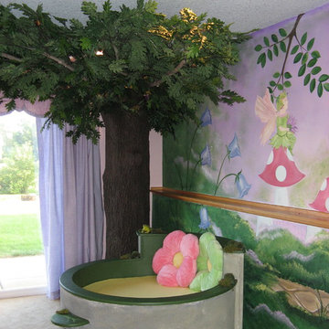
Three year old Avery was diagnosed with inoperable brain cancer at age two. Her wish through Make a Wish Foundation was to receive a Fairy Garden Playroom for her sister, Maddy and herself. Avery has gone through so very much in her young life and is such a strong, brave little girl. When Make a Wish coordinator, Jenny Hauser contacted Sherri Blum of Jack and Jill Interiors, Inc. to design this very special room for Avery, we jumped on it. Sherri and her assistant, Lisa O’Brien worked for months meticulously planning the space which included a life-like tree, a custom designed reading nook that we now refer to as the “Fairy Fountain”, a dress up corner, play house, tea table complete with tea set, an art station (not seen in the images, as it was back ordered) and a spot for movie viewing. We solicited the extremely talented Patrice Hoban to paint our fairy mural and she really knocked our socks off with the details! She added glitter and gems and the room really came to life with her vision! We thank Cheryl of Sweet Lullaby for designing and donating the sweet curtains and valances, Chris Jones of Kidtropolisbuild.com for designing the Fairy Fountain reading perch, Levels of Discovery for their donation of the tea table and toybox, New Arrivals, Inc for donating the peg hook, and Creative Carpet Design for donating the monogrammed rug. Avery and her family have a long road ahead of them. They will continue treatments at St. Jude Children’s Hospital (to whom Jack and Jill Interiors has donated monthly for about 10 years) and we will continue to love and pray for this wonderful and inspiring family. Please consider donating as well. Thank you!

Sponsored
Sunbury, OH

J.Holderby - Renovations
Franklin County's Leading General Contractors - 2X Best of Houzz!
 Daniel Scerri Periti
We were approached with a request to design the furnishings for an existing ‘finished’ apartment. The intention was to move in relatively fast, and the property already had an existing marble floor, kitchen and bathrooms which had to be kept. The property also boasted a fantastic 270 degree view, seen from most of the apartment. The clients had a very important role in the completion of the project. They were very involved during the design process and through various decoration choices. The final design was kept as a rigid guideline when faced with picking out all the different elements.
Once clear of all previous furniture, the space felt cold and bare; so we immediately felt the need for warmth, and raw, natural elements and textures to complement the cold marble floor while visually tying in the design of the whole apartment together.
Since the existing kitchen had a touch of dark walnut stain, we felt this material was one we should add to the palette of materials to contest the stark materials. A raw cement finish was another material we felt would add an interesting contrast and could be used in a variety of ways, from cabinets to walls and ceilings, to tie up the design of various areas of the apartment.
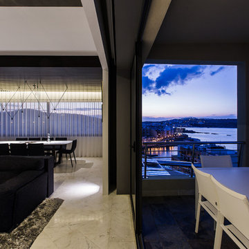
To warm up the living/dining area, keeping the existing marble floor but visually creating zones within the large living/dining area without hindering the flow, a dark timber custom-made soffit, continuous with a floor-to-ceiling drinks cabinet zones the dining area, giving it a degree of much-needed warmth.
The various windows with a stupendous 270 degree view needed to be visually tied together. This was done by introducing a continuous sheer [drape] which also doubled up as a sound-absorbing material along 2 of the 4 walls of the space.
A very large sofa was required to fill up the space correctly, also required for the size of the young family.
Services were integrated within the units and soffits, while a customized design in the corner between the kitchen and the living room took into consideration the viewpoints from the main areas to create a pantry without hindering the flow or views. A strategically placed floor-to-ceiling mirror doubles up the space and extends the view to the inner parts of the apartment.
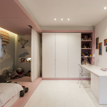
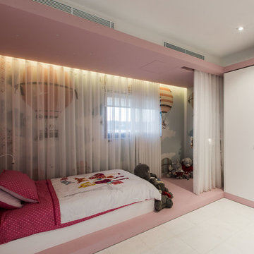
The daughter’s bedroom was a small challenge in itself, and a fun task, where we wanted to achieve the perception of a cozy niche with its own enclosed reading nook [for reading fairy tales], behind see-through curtains and a custom-ordered wall print sporting the girl’s favorite colors.
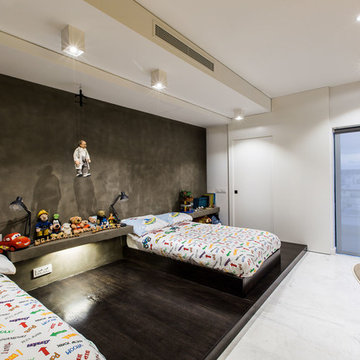
The sons’ bedroom had double the requirements in terms of space needed: more wardrobe, more homework desk space, a tv/play station area… “We combined a raised platform area between the boys’ beds to become an area with cushions where the kids can lay down and play, and face a hidden screen behind the homework desk’s sliding back panel for their play station”. The color of the homework desk was chosen in relation to the boys’ ages. A more masculine material palette was chosen for this room, in contrast to the light pastel palette of the girl’s bedroom. Again, this colour can easily be changed over time for a more mature look.
PROJECT DATA:
St. Paul’s Bay, Malta
DESIGN TEAM:
Perit Rebecca Zammit, Perit Daniel Scerri, Elyse Tonna
OTHER CREDITS:
Photography: Tonio Lombardi
Styling : TKS
 Daniel Scerri Periti
We were approached with a request to design the furnishings for an existing ‘finished’ apartment. The intention was to move in relatively fast, and the property already had an existing marble floor, kitchen and bathrooms which had to be kept. The property also boasted a fantastic 270 degree view, seen from most of the apartment. The clients had a very important role in the completion of the project. They were very involved during the design process and through various decoration choices. The final design was kept as a rigid guideline when faced with picking out all the different elements.
Once clear of all previous furniture, the space felt cold and bare; so we immediately felt the need for warmth, and raw, natural elements and textures to complement the cold marble floor while visually tying in the design of the whole apartment together.
Since the existing kitchen had a touch of dark walnut stain, we felt this material was one we should add to the palette of materials to contest the stark materials. A raw cement finish was another material we felt would add an interesting contrast and could be used in a variety of ways, from cabinets to walls and ceilings, to tie up the design of various areas of the apartment.
To warm up the living/dining area, keeping the existing marble floor but visually creating zones within the large living/dining area without hindering the flow, a dark timber custom-made soffit, continuous with a floor-to-ceiling drinks cabinet zones the dining area, giving it a degree of much-needed warmth.
The various windows with a stupendous 270 degree view needed to be visually tied together. This was done by introducing a continuous sheer [drape] which also doubled up as a sound-absorbing material along 2 of the 4 walls of the space.
A very large sofa was required to fill up the space correctly, also required for the size of the young family.
Services were integrated within the units and soffits, while a customized design in the corner between the kitchen and the living room took into consideration the viewpoints from the main areas to create a pantry without hindering the flow or views. A strategically placed floor-to-ceiling mirror doubles up the space and extends the view to the inner parts of the apartment.
The daughter’s bedroom was a small challenge in itself, and a fun task, where we wanted to achieve the perception of a cozy niche with its own enclosed reading nook [for reading fairy tales], behind see-through curtains and a custom-ordered wall print sporting the girl’s favorite colors.
The sons’ bedroom had double the requirements in terms of space needed: more wardrobe, more homework desk space, a tv/play station area… “We combined a raised platform area between the boys’ beds to become an area with cushions where the kids can lay down and play, and face a hidden screen behind the homework desk’s sliding back panel for their play station”. The color of the homework desk was chosen in relation to the boys’ ages. A more masculine material palette was chosen for this room, in contrast to the light pastel palette of the girl’s bedroom. Again, this colour can easily be changed over time for a more mature look.
PROJECT DATA:
St. Paul’s Bay, Malta
DESIGN TEAM:
Perit Rebecca Zammit, Perit Daniel Scerri, Elyse Tonna
OTHER CREDITS:
Photography: Tonio Lombardi
Styling : TKS
 Daniel Scerri Periti
We were approached with a request to design the furnishings for an existing ‘finished’ apartment. The intention was to move in relatively fast, and the property already had an existing marble floor, kitchen and bathrooms which had to be kept. The property also boasted a fantastic 270 degree view, seen from most of the apartment. The clients had a very important role in the completion of the project. They were very involved during the design process and through various decoration choices. The final design was kept as a rigid guideline when faced with picking out all the different elements.
Once clear of all previous furniture, the space felt cold and bare; so we immediately felt the need for warmth, and raw, natural elements and textures to complement the cold marble floor while visually tying in the design of the whole apartment together.
Since the existing kitchen had a touch of dark walnut stain, we felt this material was one we should add to the palette of materials to contest the stark materials. A raw cement finish was another material we felt would add an interesting contrast and could be used in a variety of ways, from cabinets to walls and ceilings, to tie up the design of various areas of the apartment.
To warm up the living/dining area, keeping the existing marble floor but visually creating zones within the large living/dining area without hindering the flow, a dark timber custom-made soffit, continuous with a floor-to-ceiling drinks cabinet zones the dining area, giving it a degree of much-needed warmth.
The various windows with a stupendous 270 degree view needed to be visually tied together. This was done by introducing a continuous sheer [drape] which also doubled up as a sound-absorbing material along 2 of the 4 walls of the space.
A very large sofa was required to fill up the space correctly, also required for the size of the young family.
Services were integrated within the units and soffits, while a customized design in the corner between the kitchen and the living room took into consideration the viewpoints from the main areas to create a pantry without hindering the flow or views. A strategically placed floor-to-ceiling mirror doubles up the space and extends the view to the inner parts of the apartment.
The daughter’s bedroom was a small challenge in itself, and a fun task, where we wanted to achieve the perception of a cozy niche with its own enclosed reading nook [for reading fairy tales], behind see-through curtains and a custom-ordered wall print sporting the girl’s favorite colors.
The sons’ bedroom had double the requirements in terms of space needed: more wardrobe, more homework desk space, a tv/play station area… “We combined a raised platform area between the boys’ beds to become an area with cushions where the kids can lay down and play, and face a hidden screen behind the homework desk’s sliding back panel for their play station”. The color of the homework desk was chosen in relation to the boys’ ages. A more masculine material palette was chosen for this room, in contrast to the light pastel palette of the girl’s bedroom. Again, this colour can easily be changed over time for a more mature look.
PROJECT DATA:
St. Paul’s Bay, Malta
DESIGN TEAM:
Perit Rebecca Zammit, Perit Daniel Scerri, Elyse Tonna
OTHER CREDITS:
Photography: Tonio Lombardi
Styling : TKS
 Daniel Scerri Periti
We were approached with a request to design the furnishings for an existing ‘finished’ apartment. The intention was to move in relatively fast, and the property already had an existing marble floor, kitchen and bathrooms which had to be kept. The property also boasted a fantastic 270 degree view, seen from most of the apartment. The clients had a very important role in the completion of the project. They were very involved during the design process and through various decoration choices. The final design was kept as a rigid guideline when faced with picking out all the different elements.
Once clear of all previous furniture, the space felt cold and bare; so we immediately felt the need for warmth, and raw, natural elements and textures to complement the cold marble floor while visually tying in the design of the whole apartment together.
Since the existing kitchen had a touch of dark walnut stain, we felt this material was one we should add to the palette of materials to contest the stark materials. A raw cement finish was another material we felt would add an interesting contrast and could be used in a variety of ways, from cabinets to walls and ceilings, to tie up the design of various areas of the apartment.
To warm up the living/dining area, keeping the existing marble floor but visually creating zones within the large living/dining area without hindering the flow, a dark timber custom-made soffit, continuous with a floor-to-ceiling drinks cabinet zones the dining area, giving it a degree of much-needed warmth.
The various windows with a stupendous 270 degree view needed to be visually tied together. This was done by introducing a continuous sheer [drape] which also doubled up as a sound-absorbing material along 2 of the 4 walls of the space.
A very large sofa was required to fill up the space correctly, also required for the size of the young family.
Services were integrated within the units and soffits, while a customized design in the corner between the kitchen and the living room took into consideration the viewpoints from the main areas to create a pantry without hindering the flow or views. A strategically placed floor-to-ceiling mirror doubles up the space and extends the view to the inner parts of the apartment.
The daughter’s bedroom was a small challenge in itself, and a fun task, where we wanted to achieve the perception of a cozy niche with its own enclosed reading nook [for reading fairy tales], behind see-through curtains and a custom-ordered wall print sporting the girl’s favorite colors.
The sons’ bedroom had double the requirements in terms of space needed: more wardrobe, more homework desk space, a tv/play station area… “We combined a raised platform area between the boys’ beds to become an area with cushions where the kids can lay down and play, and face a hidden screen behind the homework desk’s sliding back panel for their play station”. The color of the homework desk was chosen in relation to the boys’ ages. A more masculine material palette was chosen for this room, in contrast to the light pastel palette of the girl’s bedroom. Again, this colour can easily be changed over time for a more mature look.
PROJECT DATA:
St. Paul’s Bay, Malta
DESIGN TEAM:
Perit Rebecca Zammit, Perit Daniel Scerri, Elyse Tonna
OTHER CREDITS:
Photography: Tonio Lombardi
Styling : TKS
Sponsored
Columbus, OH

Snider & Metcalf Interior Design, LTD
Leading Interior Designers in Columbus, Ohio & Ponte Vedra, Florida
 Daniel Scerri Periti
We were approached with a request to design the furnishings for an existing ‘finished’ apartment. The intention was to move in relatively fast, and the property already had an existing marble floor, kitchen and bathrooms which had to be kept. The property also boasted a fantastic 270 degree view, seen from most of the apartment. The clients had a very important role in the completion of the project. They were very involved during the design process and through various decoration choices. The final design was kept as a rigid guideline when faced with picking out all the different elements.
Once clear of all previous furniture, the space felt cold and bare; so we immediately felt the need for warmth, and raw, natural elements and textures to complement the cold marble floor while visually tying in the design of the whole apartment together.
Since the existing kitchen had a touch of dark walnut stain, we felt this material was one we should add to the palette of materials to contest the stark materials. A raw cement finish was another material we felt would add an interesting contrast and could be used in a variety of ways, from cabinets to walls and ceilings, to tie up the design of various areas of the apartment.
To warm up the living/dining area, keeping the existing marble floor but visually creating zones within the large living/dining area without hindering the flow, a dark timber custom-made soffit, continuous with a floor-to-ceiling drinks cabinet zones the dining area, giving it a degree of much-needed warmth.
The various windows with a stupendous 270 degree view needed to be visually tied together. This was done by introducing a continuous sheer [drape] which also doubled up as a sound-absorbing material along 2 of the 4 walls of the space.
A very large sofa was required to fill up the space correctly, also required for the size of the young family.
Services were integrated within the units and soffits, while a customized design in the corner between the kitchen and the living room took into consideration the viewpoints from the main areas to create a pantry without hindering the flow or views. A strategically placed floor-to-ceiling mirror doubles up the space and extends the view to the inner parts of the apartment.
The daughter’s bedroom was a small challenge in itself, and a fun task, where we wanted to achieve the perception of a cozy niche with its own enclosed reading nook [for reading fairy tales], behind see-through curtains and a custom-ordered wall print sporting the girl’s favorite colors.
The sons’ bedroom had double the requirements in terms of space needed: more wardrobe, more homework desk space, a tv/play station area… “We combined a raised platform area between the boys’ beds to become an area with cushions where the kids can lay down and play, and face a hidden screen behind the homework desk’s sliding back panel for their play station”. The color of the homework desk was chosen in relation to the boys’ ages. A more masculine material palette was chosen for this room, in contrast to the light pastel palette of the girl’s bedroom. Again, this colour can easily be changed over time for a more mature look.
PROJECT DATA:
St. Paul’s Bay, Malta
DESIGN TEAM:
Perit Rebecca Zammit, Perit Daniel Scerri, Elyse Tonna
OTHER CREDITS:
Photography: Tonio Lombardi
Styling : TKS
 Sherri Blum | Jack and Jill Interiors, Inc.
Three year old Avery was diagnosed with inoperable brain cancer at age two. Her wish through Make a Wish Foundation was to receive a Fairy Garden Playroom for her sister, Maddy and herself. Avery has gone through so very much in her young life and is such a strong, brave little girl. When Make a Wish coordinator, Jenny Hauser contacted Sherri Blum of Jack and Jill Interiors, Inc. to design this very special room for Avery, we jumped on it. Sherri and her assistant, Lisa O’Brien worked for months meticulously planning the space which included a life-like tree, a custom designed reading nook that we now refer to as the “Fairy Fountain”, a dress up corner, play house, tea table complete with tea set, an art station (not seen in the images, as it was back ordered) and a spot for movie viewing. We solicited the extremely talented Patrice Hoban to paint our fairy mural and she really knocked our socks off with the details! She added glitter and gems and the room really came to life with her vision! We thank Cheryl of Sweet Lullaby for designing and donating the sweet curtains and valances, Chris Jones of Kidtropolisbuild.com for designing the Fairy Fountain reading perch, Levels of Discovery for their donation of the tea table and toybox, New Arrivals, Inc for donating the peg hook, and Creative Carpet Design for donating the monogrammed rug. Avery and her family have a long road ahead of them. They will continue treatments at St. Jude Children’s Hospital (to whom Jack and Jill Interiors has donated monthly for about 10 years) and we will continue to love and pray for this wonderful and inspiring family. Please consider donating as well. Thank you!
 Daniel Scerri Periti
We were approached with a request to design the furnishings for an existing ‘finished’ apartment. The intention was to move in relatively fast, and the property already had an existing marble floor, kitchen and bathrooms which had to be kept. The property also boasted a fantastic 270 degree view, seen from most of the apartment. The clients had a very important role in the completion of the project. They were very involved during the design process and through various decoration choices. The final design was kept as a rigid guideline when faced with picking out all the different elements.
Once clear of all previous furniture, the space felt cold and bare; so we immediately felt the need for warmth, and raw, natural elements and textures to complement the cold marble floor while visually tying in the design of the whole apartment together.
Since the existing kitchen had a touch of dark walnut stain, we felt this material was one we should add to the palette of materials to contest the stark materials. A raw cement finish was another material we felt would add an interesting contrast and could be used in a variety of ways, from cabinets to walls and ceilings, to tie up the design of various areas of the apartment.
To warm up the living/dining area, keeping the existing marble floor but visually creating zones within the large living/dining area without hindering the flow, a dark timber custom-made soffit, continuous with a floor-to-ceiling drinks cabinet zones the dining area, giving it a degree of much-needed warmth.
The various windows with a stupendous 270 degree view needed to be visually tied together. This was done by introducing a continuous sheer [drape] which also doubled up as a sound-absorbing material along 2 of the 4 walls of the space.
A very large sofa was required to fill up the space correctly, also required for the size of the young family.
Services were integrated within the units and soffits, while a customized design in the corner between the kitchen and the living room took into consideration the viewpoints from the main areas to create a pantry without hindering the flow or views. A strategically placed floor-to-ceiling mirror doubles up the space and extends the view to the inner parts of the apartment.
The daughter’s bedroom was a small challenge in itself, and a fun task, where we wanted to achieve the perception of a cozy niche with its own enclosed reading nook [for reading fairy tales], behind see-through curtains and a custom-ordered wall print sporting the girl’s favorite colors.
The sons’ bedroom had double the requirements in terms of space needed: more wardrobe, more homework desk space, a tv/play station area… “We combined a raised platform area between the boys’ beds to become an area with cushions where the kids can lay down and play, and face a hidden screen behind the homework desk’s sliding back panel for their play station”. The color of the homework desk was chosen in relation to the boys’ ages. A more masculine material palette was chosen for this room, in contrast to the light pastel palette of the girl’s bedroom. Again, this colour can easily be changed over time for a more mature look.
PROJECT DATA:
St. Paul’s Bay, Malta
DESIGN TEAM:
Perit Rebecca Zammit, Perit Daniel Scerri, Elyse Tonna
OTHER CREDITS:
Photography: Tonio Lombardi
Styling : TKS
26