
Search results for "Continuing accessibility" in Home Design Ideas
 Brittanys Design
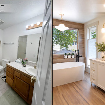
Have you ever wondered if your primary bathroom could triple in size? I know I have!
This client came to Brittany’s Design with that exact question. By thoughtfully reconfiguring the bedroom, closet, and existing 40-square-foot bathroom, we transformed the space into a stunning 128-square-foot primary bathroom—and don’t worry, there is still a generous walk-in closet!
The goal was to create a larger, more luxurious bathroom filled with durable, low-maintenance materials that would support long-term aging in place. A zero-threshold shower seamlessly integrates with the wood-look ceramic tile flooring, providing both accessibility and visual continuity. The shower walls are wrapped from floor to ceiling in a seamless Corian surround for effortless maintenance.
A gorgeous Cambria quartz countertop adds organic movement while beautifully uniting the warm hues throughout the room.
Mission accomplished: a once tiny and cramped bathroom is now an open, elegant, and highly functional primary retreat designed to be enjoyed for years to come!
 Kristen Elizabeth Design
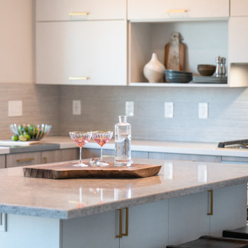
This home remodel was all about creating a modern oasis for easy entertaining and family life while accentuating the existing architecture of the home. It was critical to harmonize the kitchen with the remainder of the home and we achieved that by bringing a fresh and clean palette throughout the entry, living and kitchen areas. Every aspect of this design was thoughtfully curated in the best interest of the structure of the home and the desires of our clients.
We highlighted the negative wall space by adding a textured three dimensional tile to the entire back wall. To balance, we added an asymmetric lower bank of storage with open pockets for easy access. We blended a fine linen veneer that provides a soft contrast to the back wall cabinets and the island. For additional visual interest we added a grey wood veneer to complete the remainder of the space.
To continue the theme of harmony we needed to open up the divider wall between the living and kitchen, without removing it- as it was a critical structural shear wall. To problem solve, we mirrored the vaulted architecture of the kitchen in the opening to add consistency throughout the space.
The result: A crisp and contemporary aesthetic guests are sure to be WOW’d by.
 Arani Construction
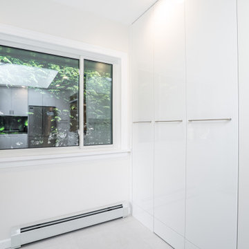
This photo highlights a custom storage wall installed during a full house renovation in the Kerrisdale neighbourhood of Vancouver by Arani Construction Inc. The design incorporates floor-to-ceiling cabinetry finished in a sleek white surface to maintain the clean and minimalist aesthetic carried throughout the kitchen.
Behind the first two tall cabinet doors, a concealed laundry area was integrated into the cabinetry, allowing the washer and dryer to remain hidden while maintaining easy access. This solution helps maximize functionality without interrupting the visual continuity of the kitchen space.
As part of the renovation, all windows in the area were replaced to improve energy efficiency and bring in clearer natural light. The home’s heating system was also upgraded to a boiler-based system with new baseboard heaters installed along the wall, providing efficient and consistent heating throughout the space.
These design and mechanical upgrades contribute to a highly organized and functional kitchen environment within this Kerrisdale Vancouver home renovation.
Find the right local pro for your project

 Century Stair Company
Gracefully curving through the home, this stunning stair is more than just an access point. It’s an experience. White oak handrail guides the hand upward, following the gentle sweep of the steps. The white risers balance the white oak treads, while the black metal balusters add a contemporary touch. Painted risers provide contrast to the warm oak treads, while black metal balusters introduce a crisp, contemporary edge. Framed by tall windows and illuminated by pendant lighting, the staircase becomes a study in precision and balance, where light, material, and form come together.
1976-2026 © Century Stair Company
 Century Stair Company
Gracefully curving through the home, this stunning stair is more than just an access point. It’s an experience. White oak handrail guides the hand upward, following the gentle sweep of the steps. The white risers balance the white oak treads, while the black metal balusters add a contemporary touch. Painted risers provide contrast to the warm oak treads, while black metal balusters introduce a crisp, contemporary edge. Framed by tall windows and illuminated by pendant lighting, the staircase becomes a study in precision and balance, where light, material, and form come together.
1976-2026 © Century Stair Company
 Century Stair Company
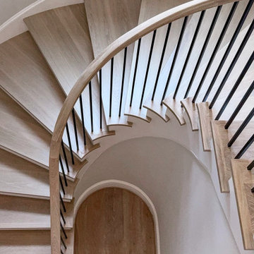
Gracefully curving through the home, this stunning stair is more than just an access point. It’s an experience. White oak handrail guides the hand upward, following the gentle sweep of the steps. The white risers balance the white oak treads, while the black metal balusters add a contemporary touch. Painted risers provide contrast to the warm oak treads, while black metal balusters introduce a crisp, contemporary edge. Framed by tall windows and illuminated by pendant lighting, the staircase becomes a study in precision and balance, where light, material, and form come together.
1976-2026 © Century Stair Company
 Century Stair Company
Gracefully curving through the home, this stunning stair is more than just an access point. It’s an experience. White oak handrail guides the hand upward, following the gentle sweep of the steps. The white risers balance the white oak treads, while the black metal balusters add a contemporary touch. Painted risers provide contrast to the warm oak treads, while black metal balusters introduce a crisp, contemporary edge. Framed by tall windows and illuminated by pendant lighting, the staircase becomes a study in precision and balance, where light, material, and form come together.
1976-2026 © Century Stair Company
Sponsored
Columbus, OH
Free consultation for landscape design!

Peabody Landscape Group
Columbus' Reliable Landscape Design & Contracting

 Klopf Architecture
Inspired by another mid-century modern home the client owned, this new residence represents a much larger 21st-century version built into the gently sloping hillside to take advantage of the sprawling hilltop views of the Sonoma valley. The quiet front facade leads guests into a formal entry that divides the house into private and public spaces. Rounding the corner into the great room, one is immediately hit by the breathtaking view that extends outward beyond the infinity pool and deck through a continuous wall of glass. In the opposite direction, each of the three bedrooms was designed with its own seating area and bathroom, creating private suites for family members and guests alike.
The linear design and open, flowing living spaces provide almost every room with outdoor access to the expansive patio, protected from the Sonoma heat by deep overhangs. Warm woods, clean lines, and a rhythmic post and beam ceiling design create a homey feeling of rest and relaxation, evoking the essence of modern California living.
Klopf Architecture project team: Geoff Campen, Ethan Taylor, Noel Andrade, and John Klopf
Landscape Architects: Arterra Landscape Architects
Structural Engineer: ZFA
Contractor: Eames Construction
Photography: ©2022 Mariko Reed
Completion year: 2022
 Century Stair Company
Gracefully curving through the home, this stunning stair is more than just an access point. It’s an experience. White oak handrail guides the hand upward, following the gentle sweep of the steps. The white risers balance the white oak treads, while the black metal balusters add a contemporary touch. Painted risers provide contrast to the warm oak treads, while black metal balusters introduce a crisp, contemporary edge. Framed by tall windows and illuminated by pendant lighting, the staircase becomes a study in precision and balance, where light, material, and form come together.
1976-2026 © Century Stair Company
 Century Stair Company
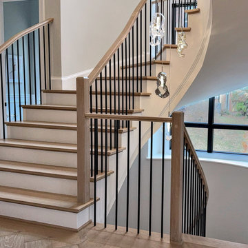
Gracefully curving through the home, this stunning stair is more than just an access point. It’s an experience. White oak handrail guides the hand upward, following the gentle sweep of the steps. The white risers balance the white oak treads, while the black metal balusters add a contemporary touch. Painted risers provide contrast to the warm oak treads, while black metal balusters introduce a crisp, contemporary edge. Framed by tall windows and illuminated by pendant lighting, the staircase becomes a study in precision and balance, where light, material, and form come together.
1976-2026 © Century Stair Company
 Kristen Elizabeth Design
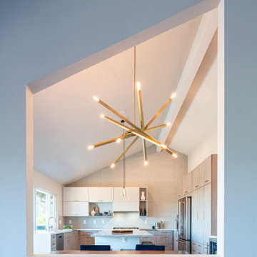
This home remodel was all about creating a modern oasis for easy entertaining and family life while accentuating the existing architecture of the home. It was critical to harmonize the kitchen with the remainder of the home and we achieved that by bringing a fresh and clean palette throughout the entry, living and kitchen areas. Every aspect of this design was thoughtfully curated in the best interest of the structure of the home and the desires of our clients.
We highlighted the negative wall space by adding a textured three dimensional tile to the entire back wall. To balance, we added an asymmetric lower bank of storage with open pockets for easy access. We blended a fine linen veneer that provides a soft contrast to the back wall cabinets and the island. For additional visual interest we added a grey wood veneer to complete the remainder of the space.
To continue the theme of harmony we needed to open up the divider wall between the living and kitchen, without removing it- as it was a critical structural shear wall. To problem solve, we mirrored the vaulted architecture of the kitchen in the opening to add consistency throughout the space.
The result: A crisp and contemporary aesthetic guests are sure to be WOW’d by.
 Quality Fence & Repair
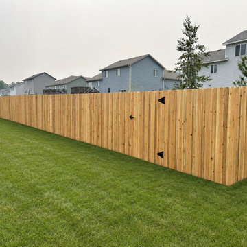
This cedar privacy fence creates a fully enclosed backyard with a clean, natural wood appearance. The custom wood gate and black hardware provide convenient access while maintaining the continuous privacy and security of the fence. Cedar is an excellent choice for homeowners looking for a durable, attractive fence with timeless character.
Quality Fence & Repair professionally installs cedar privacy fences and custom wood gates throughout Minnesota, including Zimmerman, Elk River, Big Lake, Becker, Clear Lake, Orrock, and surrounding communities. Our residential wood fences are built to provide lasting privacy, security, function, and curb appeal.
 Century Stair Company
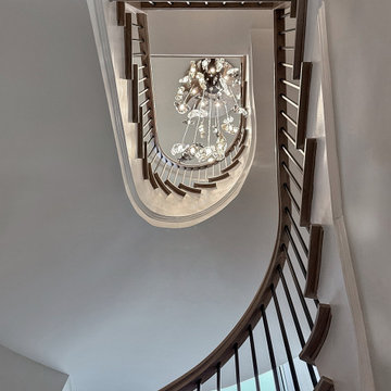
Gracefully curving through the home, this stunning stair is more than just an access point. It’s an experience. White oak handrail guides the hand upward, following the gentle sweep of the steps. The white risers balance the white oak treads, while the black metal balusters add a contemporary touch. Painted risers provide contrast to the warm oak treads, while black metal balusters introduce a crisp, contemporary edge. Framed by tall windows and illuminated by pendant lighting, the staircase becomes a study in precision and balance, where light, material, and form come together.
1976-2026 © Century Stair Company
Sponsored
Columbus, OH
Free consultation for landscape design!
Peabody Landscape Group
Columbus' Reliable Landscape Design & Contracting
 Brittanys Design
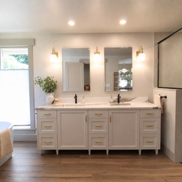
Have you ever wondered if your primary bathroom could triple in size? I know I have!
This client came to Brittany’s Design with that exact question. By thoughtfully reconfiguring the bedroom, closet, and existing 40-square-foot bathroom, we transformed the space into a stunning 128-square-foot primary bathroom—and don’t worry, there is still a generous walk-in closet!
The goal was to create a larger, more luxurious bathroom filled with durable, low-maintenance materials that would support long-term aging in place. A zero-threshold shower seamlessly integrates with the wood-look ceramic tile flooring, providing both accessibility and visual continuity. The shower walls are wrapped from floor to ceiling in a seamless Corian surround for effortless maintenance.
A gorgeous Cambria quartz countertop adds organic movement while beautifully uniting the warm hues throughout the room.
Mission accomplished: a once tiny and cramped bathroom is now an open, elegant, and highly functional primary retreat designed to be enjoyed for years to come!
 Century Stair Company
Gracefully curving through the home, this stunning stair is more than just an access point. It’s an experience. White oak handrail guides the hand upward, following the gentle sweep of the steps. The white risers balance the white oak treads, while the black metal balusters add a contemporary touch. Painted risers provide contrast to the warm oak treads, while black metal balusters introduce a crisp, contemporary edge. Framed by tall windows and illuminated by pendant lighting, the staircase becomes a study in precision and balance, where light, material, and form come together.
1976-2026 © Century Stair Company
 Jordan Design Build Group
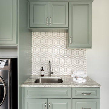
A reimagined laundry room is just what this stately home needed. A generous 110 square feet, the space housed only a washer, dryer and some basic wire shelving and wasn’t living up to its full potential. To maximize functionality, we repositioned appliances away from the wall and placed them on pedestals for improved ergonomics and accessibility. A tall storage cabinet was added to the left along with deep upper cabinets above – perfect for keeping essentials organized and within reach. The transformation continued with the addition of custom cabinetry, a deep utility sink, and a striking quartzite countertop that ties the whole space together. Rich green cabinetry is the true showstopper with custom touches such as crown molding and fully finished undersides. We replaced the dark, dated floor tiles with light, durable porcelain and introduced a beautiful hexagon tile backsplash for a refined yet hard-wearing finish. Two large windows flood the space with natural light, turning this once-forgotten utility space into a bright, welcoming hub you actually want to spend time in.

 ZeroEnergy Design
This renovated brick rowhome in Boston’s South End offers a modern aesthetic within a historic structure, creative use of space, exceptional thermal comfort, a reduced carbon footprint, and a passive stream of income.
DESIGN PRIORITIES. The goals for the project were clear - design the primary unit to accommodate the family’s modern lifestyle, rework the layout to create a desirable rental unit, improve thermal comfort and introduce a modern aesthetic. We designed the street-level entry as a shared entrance for both the primary and rental unit. The family uses it as their everyday entrance - we planned for bike storage and an open mudroom with bench and shoe storage to facilitate the change from shoes to slippers or bare feet as they enter their home. On the main level, we expanded the kitchen into the dining room to create an eat-in space with generous counter space and storage, as well as a comfortable connection to the living space. The second floor serves as master suite for the couple - a bedroom with a walk-in-closet and ensuite bathroom, and an adjacent study, with refinished original pumpkin pine floors. The upper floor, aside from a guest bedroom, is the child's domain with interconnected spaces for sleeping, work and play. In the play space, which can be separated from the work space with new translucent sliding doors, we incorporated recreational features inspired by adventurous and competitive television shows, at their son’s request.
MODERN MEETS TRADITIONAL. We left the historic front facade of the building largely unchanged - the security bars were removed from the windows and the single pane windows were replaced with higher performing historic replicas. We designed the interior and rear facade with a vision of warm modernism, weaving in the notable period features. Each element was either restored or reinterpreted to blend with the modern aesthetic. The detailed ceiling in the living space, for example, has a new matte monochromatic finish, and the wood stairs are covered in a dark grey floor paint, whereas the mahogany doors were simply refinished. New wide plank wood flooring with a neutral finish, floor-to-ceiling casework, and bold splashes of color in wall paint and tile, and oversized high-performance windows (on the rear facade) round out the modern aesthetic.
RENTAL INCOME. The existing rowhome was zoned for a 2-family dwelling but included an undesirable, single-floor studio apartment at the garden level with low ceiling heights and questionable emergency egress. In order to increase the quality and quantity of space in the rental unit, we reimagined it as a two-floor, 1 or 2 bedroom, 2 bathroom apartment with a modern aesthetic, increased ceiling height on the lowest level and provided an in-unit washer/dryer. The apartment was listed with Jackie O'Connor Real Estate and rented immediately, providing the owners with a source of passive income.
ENCLOSURE WITH BENEFITS. The homeowners sought a minimal carbon footprint, enabled by their urban location and lifestyle decisions, paired with the benefits of a high-performance home. The extent of the renovation allowed us to implement a deep energy retrofit (DER) to address air tightness, insulation, and high-performance windows. The historic front facade is insulated from the interior, while the rear facade is insulated on the exterior. Together with these building enclosure improvements, we designed an HVAC system comprised of continuous fresh air ventilation, and an efficient, all-electric heating and cooling system to decouple the house from natural gas. This strategy provides optimal thermal comfort and indoor air quality, improved acoustic isolation from street noise and neighbors, as well as a further reduced carbon footprint. We also took measures to prepare the roof for future solar panels, for when the South End neighborhood’s aging electrical infrastructure is upgraded to allow them.
URBAN LIVING. The desirable neighborhood location allows the both the homeowners and tenant to walk, bike, and use public transportation to access the city, while each charging their respective plug-in electric cars behind the building to travel greater distances.
OVERALL. The understated rowhouse is now ready for another century of urban living, offering the owners comfort and convenience as they live life as an expression of their values.
Eric Roth Photo
Sponsored
Sunbury, OH

J.Holderby - Renovations
Franklin County's Leading General Contractors - 2X Best of Houzz!
 Century Stair Company
Gracefully curving through the home, this stunning stair is more than just an access point. It’s an experience. White oak handrail guides the hand upward, following the gentle sweep of the steps. The white risers balance the white oak treads, while the black metal balusters add a contemporary touch. Painted risers provide contrast to the warm oak treads, while black metal balusters introduce a crisp, contemporary edge. Framed by tall windows and illuminated by pendant lighting, the staircase becomes a study in precision and balance, where light, material, and form come together.
1976-2026 © Century Stair Company
 Kristen Elizabeth Design
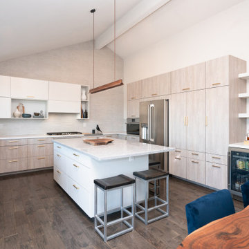
This home remodel was all about creating a modern oasis for easy entertaining and family life while accentuating the existing architecture of the home. It was critical to harmonize the kitchen with the remainder of the home and we achieved that by bringing a fresh and clean palette throughout the entry, living and kitchen areas. Every aspect of this design was thoughtfully curated in the best interest of the structure of the home and the desires of our clients.
We highlighted the negative wall space by adding a textured three dimensional tile to the entire back wall. To balance, we added an asymmetric lower bank of storage with open pockets for easy access. We blended a fine linen veneer that provides a soft contrast to the back wall cabinets and the island. For additional visual interest we added a grey wood veneer to complete the remainder of the space.
To continue the theme of harmony we needed to open up the divider wall between the living and kitchen, without removing it- as it was a critical structural shear wall. To problem solve, we mirrored the vaulted architecture of the kitchen in the opening to add consistency throughout the space.
The result: A crisp and contemporary aesthetic guests are sure to be WOW’d by.
 Kristen Elizabeth Design
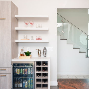
This home remodel was all about creating a modern oasis for easy entertaining and family life while accentuating the existing architecture of the home. It was critical to harmonize the kitchen with the remainder of the home and we achieved that by bringing a fresh and clean palette throughout the entry, living and kitchen areas. Every aspect of this design was thoughtfully curated in the best interest of the structure of the home and the desires of our clients.
We highlighted the negative wall space by adding a textured three dimensional tile to the entire back wall. To balance, we added an asymmetric lower bank of storage with open pockets for easy access. We blended a fine linen veneer that provides a soft contrast to the back wall cabinets and the island. For additional visual interest we added a grey wood veneer to complete the remainder of the space.
To continue the theme of harmony we needed to open up the divider wall between the living and kitchen, without removing it- as it was a critical structural shear wall. To problem solve, we mirrored the vaulted architecture of the kitchen in the opening to add consistency throughout the space.
The result: A crisp and contemporary aesthetic guests are sure to be WOW’d by.
122