
Search results for "Continuing accessibility" in Home Design Ideas


 Tradition Outdoor Living
This outdoor living project allows our clients to truly enjoy their outdoor space in Rosenberg, TX. On about an acre of land, the covered patio with outdoor kitchen is the perfect spot for sipping morning coffee and enjoying a gentle breeze. The workshop adjacent to the garage was built to look original to the home, and in fact, even has AC! Both projects add much appeal and practicality to this home.
The covered patio, extending from the existing porch cover, was also built to look original to the home with matching cedar wrapped columns with brick bases. Outdoor ceiling fans were wired to this space as well as recessed lights and flood lights. A large kitchen space was built with matching brick, beautiful granite countertops, and a bar seating. With plenty storage and counter space and a large grill, this outdoor kitchen suits our clients' needs.
The original flooring surface was replaced by stamped concrete and continued throughout the remainder of the project.
Later, we returned to build our clients' a workshop space. This space is complete with AC, indoor and outdoor lighting, and a garage door with ramp in the rear for ease of access with large equipment. The entire structure matches the original home, including cedar wrapped columns, partial brick and siding exterior.

 Altura Architects
This mid-century mountain modern home was originally designed in the early 1950s. The house has ample windows that provide dramatic views of the adjacent lake and surrounding woods. The current owners wanted to only enhance the home subtly, not alter its original character. The majority of exterior and interior materials were preserved, while the plan was updated with an enhanced kitchen and master suite. Added daylight to the kitchen was provided by the installation of a new operable skylight. New large format porcelain tile and walnut cabinets in the master suite provided a counterpoint to the primarily painted interior with brick floors.
Find the right local pro for your project

 Crystal Kitchen + Bath
A newly retired couple had purchased their 1989 home because it offered everything they needed on one level. He loved that the house was right on the Mississippi River with access for docking a boat. She loved that there was two bedrooms on the Main Level, so when the grandkids came to stay, they had their own room.
The dark, traditional style kitchen with wallpaper and coffered ceiling felt closed off from the adjacent Dining Room and Family Room. Although the island was large, there was no place for seating. We removed the peninsula and reconfigured the kitchen to create a more functional layout that includes 9-feet of 18-inch deep pantry cabinets The new island has seating for four and is orientated to the window that overlooks the back yard and river. Flat-paneled cabinets in a combination of horizontal wood and semi-gloss white paint add to the modern, updated look. A large format tile (24” x 24”) runs throughout the kitchen and into the adjacent rooms for a continuous, monolithic look.

 Reveal Design LLC
This is a rear yard landscape in Old Town, Chicago. The major defining element that we designed and build was the Ipe deck. The design and installation of the deck allowed for functional use and unobstructed views out to the landscape. The deck is blind fastened and the railings are stainless steel cable with ipe caps. The fence is completely rebuilt using cedar.. There is a decorative screen next to the planter boxes, which helps to bring down the scale of the neighboring house. The patio is travertine laid in a random pattern, and continues underneath the elevated deck. We added a mexican pebble bed on the edge of the patio which will help show a future sculpture/art piece. A stone walkway at the edge of the patio leads under the canopy of the upright trees, to access to the doorway that is underneath the deck. The landscape consists of two types of ground cover. The inner circle is a lower, purple-leafed, ajuga, and the outer edge is pachysandra. The fence and deck posts have climbing hydrangea planted underneath which will eventually grow to cover the vertical elements.

 Mark Brand Architecture
Our clients for this remodel of a 100 year old home in San Francisco’s Liberty Hill neighborhood recently moved to San Francisco. The house they purchased was very stately and had great bones, but lacked a true master suite and had recently been remodeled in a slightly generic modern style. We helped them with projects throughout the house. Our biggest project was creating a true master suite out of two bedrooms and an existing bathroom. We created an open concept bathroom with custom gray lacquer wardrobes and shoe storage units with a dramatic slot skylight overhead. Access to the master bedroom is through this room. The clean lines of the bathroom are complimented by a very long wall hung vanity with a CaesarStone counter which flows into the walk-in shower and becomes the curb. A variety of tiles including locally fabricated tile from Heath Ceramics were carefully selected to create a warm and inviting, yet modern, feeling. Oak floors similar to those in the rest of the house were used throughout the master suite for continuity. By using the same tile on the back wall of the bathroom we were able to create a visual unity from the shower through the vanity and the water closet. Our work also included a new fireplace in the living room. Photography by Christopher Stark.
 Randy Thueme Design Inc. - Landscape Architecture
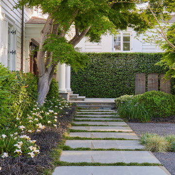
A comprehensive master plan for this property brought fresh vision to a time worn landscape surrounding this vintage home. Evolved through numerous iterations, the plan addressed the complexities of the site to achieve the objectives of the new owners. The property is located at the end of a cul-de-sac where a refurbished gate opens to a new gravel driveway and auto court welcoming family and friends. An expanded entrance terrace directs visitors to the front door while passing a quietly flowing fountain backdropped by lush landscape plantings. The expansive main terrace along the back of the home was redesigned at a single contiguous level. A new pool, spa and cold plunge were placed parallel to the main terrace allowing a generous lawn to bring continuity to the property. A guest house was sited to take advantage of views across the landscape with access through an adjacent olive tree shaded dining area. A detached garage with carport was tucked into the site providing buffer of a sport court and chicken coop. A hedged garden added at the kitchen wing of the home adds privacy to the side entrance and a place for kitchen gardening in a raised steel bed. Trees, hedges, shrubs, perennials, and lawns were planned to meld with desirable aspects of the former landscape.
Sponsored
Sunbury, OH

J.Holderby - Renovations
Franklin County's Leading General Contractors - 2X Best of Houzz!
 Randy Thueme Design Inc. - Landscape Architecture
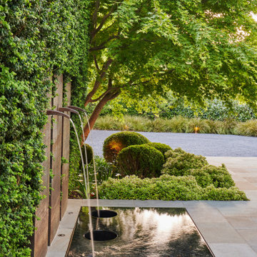
A comprehensive master plan for this property brought fresh vision to a time worn landscape surrounding this vintage home. Evolved through numerous iterations, the plan addressed the complexities of the site to achieve the objectives of the new owners. The property is located at the end of a cul-de-sac where a refurbished gate opens to a new gravel driveway and auto court welcoming family and friends. An expanded entrance terrace directs visitors to the front door while passing a quietly flowing fountain backdropped by lush landscape plantings. The expansive main terrace along the back of the home was redesigned at a single contiguous level. A new pool, spa and cold plunge were placed parallel to the main terrace allowing a generous lawn to bring continuity to the property. A guest house was sited to take advantage of views across the landscape with access through an adjacent olive tree shaded dining area. A detached garage with carport was tucked into the site providing buffer of a sport court and chicken coop. A hedged garden added at the kitchen wing of the home adds privacy to the side entrance and a place for kitchen gardening in a raised steel bed. Trees, hedges, shrubs, perennials, and lawns were planned to meld with desirable aspects of the former landscape.
 Randy Thueme Design Inc. - Landscape Architecture
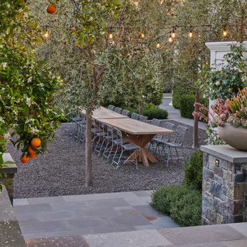
A comprehensive master plan for this property brought fresh vision to a time worn landscape surrounding this vintage home. Evolved through numerous iterations, the plan addressed the complexities of the site to achieve the objectives of the new owners. The property is located at the end of a cul-de-sac where a refurbished gate opens to a new gravel driveway and auto court welcoming family and friends. An expanded entrance terrace directs visitors to the front door while passing a quietly flowing fountain backdropped by lush landscape plantings. The expansive main terrace along the back of the home was redesigned at a single contiguous level. A new pool, spa and cold plunge were placed parallel to the main terrace allowing a generous lawn to bring continuity to the property. A guest house was sited to take advantage of views across the landscape with access through an adjacent olive tree shaded dining area. A detached garage with carport was tucked into the site providing buffer of a sport court and chicken coop. A hedged garden added at the kitchen wing of the home adds privacy to the side entrance and a place for kitchen gardening in a raised steel bed. Trees, hedges, shrubs, perennials, and lawns were planned to meld with desirable aspects of the former landscape.
 Klopf Architecture
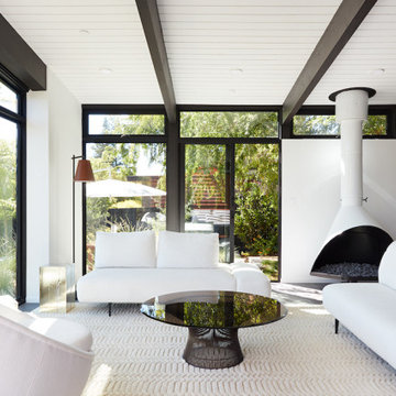
The Roger Lee designed house from 1962 was purchased by the current homeowners in almost original condition, as the previous owners elected to defer most maintenance projects over the years. The clients were able to see beyond the dated materials and finishes, single-paned glass and uninsulated walls and they approached Klopf Architecture to help them expand and update the entire home, one the family could settle into and enjoy for years to come. It was important that the new designs were aligned with Lee's original intent not only because of the client's appreciation for mid-century modern architecture, but also because the house was deemed historical. The Stanford Real Estate Office requires a stringent design review which safeguards the integrity of the community, which Klopf Architecture was happy to oblige going into their updated designs.
As with many original mid-century modern homes, the house was scaled to the 1960s lifestyle where rooms were smaller and openings to views were limited and tightly framed. The original conditions defined the direction the family of four would take in updating the house and making it comfortable for their modern lifestyle. Klopf designed a full gut remodel and major addition to bring the house into the 21st century and provide the living area needed for the client's family. The newly expanded house added just about 1,100 sf to create an airy, comfortable and family friendly house, taking full advantage of the beautiful southwestern views that extend out to the hills beyond. The enclosed garage created an additional 240 sf of covered space for long-term storage.
A cracked swimming pool created an eyesore taking up a majority of the backyard landscape, so it was one of the first elements to go during the transformation. Working with Outer Space Landscape Architects, the family asked for a mix of relaxing outdoor patio spaces that eventually blend into the native landscaping, extending their views outward toward the natural greenery of the trees beyond their property. Filling in the old pool was a smart way to expand the living spaces outward. The orientation of the house was designed to enjoy the views, but the original architecture provided the first homeowners with mere glimpses of the landscape outside.
Klopf was able to broaden those views, continuing and extending on the original architecture to take full advantage of the unobstructed natural views across the rear facade of the house. Small horizontal openings in the primary bedroom and office were replaced with much taller windows that now follow the angled roof line upward, extending across almost all of the facade. We worked with Western Windows, whose designs included an oblique-shaped, operable casement that allowed our design to rise with the slope. A new corner office added to the primary suite, offers a bright and functional work-from-home solution that looks out at the distant views and added natural light from the expanded window configuration that now wraps around the corner.
The existing lower level was designed by Lee as a utilitarian space, serving as a wet pool room with a drain in the center of the floor, bathroom, laundry and storage areas. Without the need for a pool room, Klopf was able to convert the area into a much more comfortable and functional living space with a new family room and guest suite. The new spaces enjoy easy access to a new outdoor patio through floor to ceiling, full-width glass sliders.
Continuing along the rear facade, a previously exposed deck extending from the living room and hallway provided access to the backyard through a single set of stairs leading toward the side of the house which made sense when the pool was in place. The new deck was re-envisioned as an extension of the main living room and now serves as a second outdoor living room. A new slatted pergola above provides the homeowners welcome relief from the hot afternoon sun. A second set of stairs now creates a better connection to the redesigned lower level. Klopf was able to reconfigure the spaces, extending the living room outward toward the views, where the family now claims it as the heart of the home, spending a large majority of their time outdoors.
Back inside, the original wood-burning Malm fireplace was beautifully restored and a gas burner installed to comply with California's strict air standards. It now rests in front of a wall of Heath accent tiles where a dated red brick wall used to stand. A new taller window brings more light and views into the refreshed interior living room. The original glass doors opposite the fireplace were replaced by larger sliders that when fully opened, create a seamless transition to the new outdoor living area so the two spaces feel like one connected space. The original utilitarian kitchen was needlessly tucked into the far back corner and closed-off, out of sight from the living room, so the clients asked Klopf to open it up and expand the kitchen forward so it felt more connected. Today the much larger kitchen is connected to the living area where a short wall with a cutout offers a visual glimpse into the kitchen and a handy pass-through counter for serving guests. A new breakfast nook was also added to create another spot where the family can gather for casual meals. Just outside, a new built-in outdoor grill and prep area extends the kitchen outside and connects to a new outdoor dining spot nestled amongst the trees, taking advantage of the views out back.
Klopf was able to expand the other two bedrooms, add a new laundry room and half-bath and convert the carport to an enclosed garage to add more storage areas which was lost when the pool house was converted to the family and guest room.
To maintain a historical connection to the original designs, the exterior siding was repeated on all exterior walls, a full-height stained glass window at the front entryway restored, and an interior slatted screen element repeated outside at the exterior entry courtyard and over the new outdoor living room to create a shade trellis. The new house stands proudly and shines against it's new landscaping features, while respecting and expanding on the original intent of Roger Lee's designs epitomizing the comforts of indoor-outdoor living in Northern California.
Completion year: 2020
Klopf Architecture project team: John Klopf, Klara Kevane, Noel Andrade
Contractor: ORB Construction, Brendan O'Reilly
Structural engineer: Sezen and Moon
Landscape architect: Outer space
Furnishings and decoration: Urbanism Designs
Photographer: Mariko Reed

 Housetrends Magazine
Since moving into her Dublin home two and a half years ago, Nancy Sanford has been peeling off the decades—quite literally. Built in the 1980s, the home was “very well-maintained, but very little had been done to it” in terms of updating the finishes or style, Sanford says. Plush white carpet ran from wall-to-wall-to-wall, almond-colored laminate coated the kitchen cabinets and wallpaper ran rampant—even covering some ceilings.
Despite her efforts, Sanford knew it was going to take more than cosmetic editing to shake the ‘80s and make the home her own. Although she lives in the traditional-leaning Muirfield community, Sanford adores a minimalist, contemporary style—and admits to devouring design magazines “ad nauseam.”
To implement her thoroughly modern vision, Sanford turned to Brigid Norton, an interior designer and family friend, and Kristi Youles, a kitchen designer with The JAE Company. Working together, the trio created a carefully considered contemporary design that’s easy on the eyes, and the body.
In addition to improving the flow of the kitchen—by removing a V-shaped peninsula that angled out into the room—and adding appliances like a stainless steel refrigerator, Sanford’s short list of must-haves included clean, uncluttered lines and no wall cabinets over the countertops. “I’ve found as I’ve aged, I’ve gotten shorter and just don’t use the upper cabinets,” Sanford explains.
Easy-access, smooth-slide drawers with clean slab fronts were the answer—resulting in strong visual lines, an open, airy feel and enhanced ergonomics. Starting with a “needs assessment,” Youles and Norton designed the space quite literally around Nancy. By looking at factors such as her height and which items she uses most frequently, they were able to determine the optimum placement for everything from canned goods in the pantry to cutlery, pans and plates in the customized drawers, all of which helped to achieve the ultimate kitchen organization.
But there’s more to the kitchen cabinets smooth façade than clean-lined storage. Walnut drawer fronts—found on the oven and the base of the island—are book-matched, allowing the grain to continue from drawer to drawer. And even in spaces where drawers weren’t feasible, beneath the sink and in a desk area, the designers continued the look with cabinet doors crafted to resemble drawers.
The visual continuity of these lines might not be as impactful if it weren’t for the careful selection of contrasting finishes. The designers filled the space with pure, glossy white—using a specific type of quartz, White Cliff by Cambria, to accent the bold rectangular design of the island. Then, to break up the expanse of accompanying white painted drawers, walnut was selected to bring the contrasting warmth and grain of wood without red undertones. It is commonly found in modern furniture design, as well as current productions of mid-century designs like the iconic Eames Lounge Chair from Herman Miller, Youles says.

 Katie Hutchison Studio
Constructed in two phases, this renovation, with a few small additions, touched nearly every room in this late ‘50’s ranch house. The owners raised their family within the original walls and love the house’s location, which is not far from town and also borders conservation land. But they didn’t love how chopped up the house was and the lack of exposure to natural daylight and views of the lush rear woods. Plus, they were ready to de-clutter for a more stream-lined look. As a result, KHS collaborated with them to create a quiet, clean design to support the lifestyle they aspire to in retirement.
To transform the original ranch house, KHS proposed several significant changes that would make way for a number of related improvements. Proposed changes included the removal of the attached enclosed breezeway (which had included a stair to the basement living space) and the two-car garage it partially wrapped, which had blocked vital eastern daylight from accessing the interior. Together the breezeway and garage had also contributed to a long, flush front façade. In its stead, KHS proposed a new two-car carport, attached storage shed, and exterior basement stair in a new location. The carport is bumped closer to the street to relieve the flush front facade and to allow access behind it to eastern daylight in a relocated rear kitchen. KHS also proposed a new, single, more prominent front entry, closer to the driveway to replace the former secondary entrance into the dark breezeway and a more formal main entrance that had been located much farther down the facade and curiously bordered the bedroom wing.
Inside, low ceilings and soffits in the primary family common areas were removed to create a cathedral ceiling (with rod ties) over a reconfigured semi-open living, dining, and kitchen space. A new gas fireplace serving the relocated dining area -- defined by a new built-in banquette in a new bay window -- was designed to back up on the existing wood-burning fireplace that continues to serve the living area. A shared full bath, serving two guest bedrooms on the main level, was reconfigured, and additional square footage was captured for a reconfigured master bathroom off the existing master bedroom. A new whole-house color palette, including new finishes and new cabinetry, complete the transformation. Today, the owners enjoy a fresh and airy re-imagining of their familiar ranch house.
Photos by Katie Hutchison
 Randy Thueme Design Inc. - Landscape Architecture
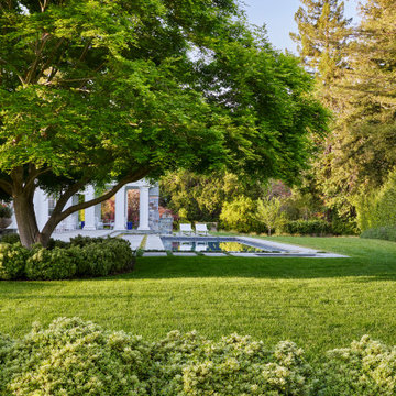
A comprehensive master plan for this property brought fresh vision to a time worn landscape surrounding this vintage home. Evolved through numerous iterations, the plan addressed the complexities of the site to achieve the objectives of the new owners. The property is located at the end of a cul-de-sac where a refurbished gate opens to a new gravel driveway and auto court welcoming family and friends. An expanded entrance terrace directs visitors to the front door while passing a quietly flowing fountain backdropped by lush landscape plantings. The expansive main terrace along the back of the home was redesigned at a single contiguous level. A new pool, spa and cold plunge were placed parallel to the main terrace allowing a generous lawn to bring continuity to the property. A guest house was sited to take advantage of views across the landscape with access through an adjacent olive tree shaded dining area. A detached garage with carport was tucked into the site providing buffer of a sport court and chicken coop. A hedged garden added at the kitchen wing of the home adds privacy to the side entrance and a place for kitchen gardening in a raised steel bed. Trees, hedges, shrubs, perennials, and lawns were planned to meld with desirable aspects of the former landscape.
Sponsored
Columbus, OH
Free consultation for landscape design!

Peabody Landscape Group
Franklin County's Reliable Landscape Design & Contracting
 Tradition Outdoor Living
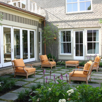
This outdoor living project allows our clients to truly enjoy their outdoor space in Rosenberg, TX. On about an acre of land, the covered patio with outdoor kitchen is the perfect spot for sipping morning coffee and enjoying a gentle breeze. The workshop adjacent to the garage was built to look original to the home, and in fact, even has AC! Both projects add much appeal and practicality to this home.
The covered patio, extending from the existing porch cover, was also built to look original to the home with matching cedar wrapped columns with brick bases. Outdoor ceiling fans were wired to this space as well as recessed lights and flood lights. A large kitchen space was built with matching brick, beautiful granite countertops, and a bar seating. With plenty storage and counter space and a large grill, this outdoor kitchen suits our clients' needs.
The original flooring surface was replaced by stamped concrete and continued throughout the remainder of the project.
Later, we returned to build our clients' a workshop space. This space is complete with AC, indoor and outdoor lighting, and a garage door with ramp in the rear for ease of access with large equipment. The entire structure matches the original home, including cedar wrapped columns, partial brick and siding exterior.
 Joshua Zinder Architecture + Design
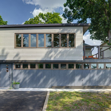
A married pair of artists sought to expand and adapt this salt box-style house into a functional, attractive live/work space while retaining certain nostalgic elements (this was the wife’s childhood home.) Their objectives included adding on a dining room; expanding the master bedroom and downstairs studio spaces; maximizing natural light; and continuing occupancy throughout.
The through-block property is sited between a high-traffic road and another that provides vehicular access to the house. The architect’s solution effectively reversed the entry sequence. The studio elevation, with the master bedroom, dining room and terrace above, is now the formal front of the house, while the former front entrance from the busy road is now secondary.
Today, visitors arrive at the new primary entrance, greeted by a façade suggesting a simple folded ribbon: metal panels that wrap the expanded master bedroom and the new terrace.
Recladding with fiber cement composite rainscreen (a choice inspired by the clients’ travels in Finland) unifies the addition with the existing. The new dining room enjoys views of Meadowlands sunsets through the 12-foot length of full-height glass and the cable rails of the new deck outside. The L-shaped artist studio/office downstairs now gains light from transom-height windows running the width of the house.

 Stacey Kocevar Designs, LLC
This kitchen went from dark and dated, to bright and timeless! We achieved this look by removing the soffits above the cabinetry, along with the patterned wallpaper, dark cabinetry, and view obstructing cabinets and pendants. The white cabinets with a charcoal glaze were the perfect color to go along with the hardwood floors that were brought in from the living room, which helped to tie the spaces together seamlessly. The homeowner wanted a maintenance-free and bright backsplash, so we took the Ceasarstone "London Gray" quartz countertops and continued them up the wall; in the thinner 2cm thick material. The sleek look was maintained by using Adorne under-cabinet outlets, as well as Hafele's LOOX modular switches for the under-cabinet, above-cabinet, and interior-cabinet lights, which were also installed under the cabinets. The new windows and doors made all the difference by increasing the view to the outside and pool area, as well as allowing more natural light to flood into the space. Although the layout did not change drastically, this kitchen is packed with accessories and details that make this a truly beautiful and classy kitchen that will be enjoyed for many years to come. Photography by: Bob Skalkowski Photography
 Randy Thueme Design Inc. - Landscape Architecture
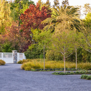
A comprehensive master plan for this property brought fresh vision to a time worn landscape surrounding this vintage home. Evolved through numerous iterations, the plan addressed the complexities of the site to achieve the objectives of the new owners. The property is located at the end of a cul-de-sac where a refurbished gate opens to a new gravel driveway and auto court welcoming family and friends. An expanded entrance terrace directs visitors to the front door while passing a quietly flowing fountain backdropped by lush landscape plantings. The expansive main terrace along the back of the home was redesigned at a single contiguous level. A new pool, spa and cold plunge were placed parallel to the main terrace allowing a generous lawn to bring continuity to the property. A guest house was sited to take advantage of views across the landscape with access through an adjacent olive tree shaded dining area. A detached garage with carport was tucked into the site providing buffer of a sport court and chicken coop. A hedged garden added at the kitchen wing of the home adds privacy to the side entrance and a place for kitchen gardening in a raised steel bed. Trees, hedges, shrubs, perennials, and lawns were planned to meld with desirable aspects of the former landscape.
Sponsored
Sunbury, OH
J.Holderby - Renovations
Franklin County's Leading General Contractors - 2X Best of Houzz!
 Stacey Kocevar Designs, LLC
This kitchen went from dark and dated, to bright and timeless! We achieved this look by removing the soffits above the cabinetry, along with the patterned wallpaper, dark cabinetry, and view obstructing cabinets and pendants. The white cabinets with a charcoal glaze were the perfect color to go along with the hardwood floors that were brought in from the living room, which helped to tie the spaces together seamlessly. The homeowner wanted a maintenance-free and bright backsplash, so we took the Ceasarstone "London Gray" quartz countertops and continued them up the wall; in the thinner 2cm thick material. The sleek look was maintained by using Adorne under-cabinet outlets, as well as Hafele's LOOX modular switches for the under-cabinet, above-cabinet, and interior-cabinet lights, which were also installed under the cabinets. The new windows and doors made all the difference by increasing the view to the outside and pool area, as well as allowing more natural light to flood into the space. Although the layout did not change drastically, this kitchen is packed with accessories and details that make this a truly beautiful and classy kitchen that will be enjoyed for many years to come. Photography by: Bob Skalkowski Photography
 Katie Hutchison Studio
Constructed in two phases, this renovation, with a few small additions, touched nearly every room in this late ‘50’s ranch house. The owners raised their family within the original walls and love the house’s location, which is not far from town and also borders conservation land. But they didn’t love how chopped up the house was and the lack of exposure to natural daylight and views of the lush rear woods. Plus, they were ready to de-clutter for a more stream-lined look. As a result, KHS collaborated with them to create a quiet, clean design to support the lifestyle they aspire to in retirement.
To transform the original ranch house, KHS proposed several significant changes that would make way for a number of related improvements. Proposed changes included the removal of the attached enclosed breezeway (which had included a stair to the basement living space) and the two-car garage it partially wrapped, which had blocked vital eastern daylight from accessing the interior. Together the breezeway and garage had also contributed to a long, flush front façade. In its stead, KHS proposed a new two-car carport, attached storage shed, and exterior basement stair in a new location. The carport is bumped closer to the street to relieve the flush front facade and to allow access behind it to eastern daylight in a relocated rear kitchen. KHS also proposed a new, single, more prominent front entry, closer to the driveway to replace the former secondary entrance into the dark breezeway and a more formal main entrance that had been located much farther down the facade and curiously bordered the bedroom wing.
Inside, low ceilings and soffits in the primary family common areas were removed to create a cathedral ceiling (with rod ties) over a reconfigured semi-open living, dining, and kitchen space. A new gas fireplace serving the relocated dining area -- defined by a new built-in banquette in a new bay window -- was designed to back up on the existing wood-burning fireplace that continues to serve the living area. A shared full bath, serving two guest bedrooms on the main level, was reconfigured, and additional square footage was captured for a reconfigured master bathroom off the existing master bedroom. A new whole-house color palette, including new finishes and new cabinetry, complete the transformation. Today, the owners enjoy a fresh and airy re-imagining of their familiar ranch house.
Photos by Katie Hutchison
 Randy Thueme Design Inc. - Landscape Architecture
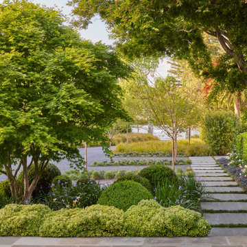
A comprehensive master plan for this property brought fresh vision to a time worn landscape surrounding this vintage home. Evolved through numerous iterations, the plan addressed the complexities of the site to achieve the objectives of the new owners. The property is located at the end of a cul-de-sac where a refurbished gate opens to a new gravel driveway and auto court welcoming family and friends. An expanded entrance terrace directs visitors to the front door while passing a quietly flowing fountain backdropped by lush landscape plantings. The expansive main terrace along the back of the home was redesigned at a single contiguous level. A new pool, spa and cold plunge were placed parallel to the main terrace allowing a generous lawn to bring continuity to the property. A guest house was sited to take advantage of views across the landscape with access through an adjacent olive tree shaded dining area. A detached garage with carport was tucked into the site providing buffer of a sport court and chicken coop. A hedged garden added at the kitchen wing of the home adds privacy to the side entrance and a place for kitchen gardening in a raised steel bed. Trees, hedges, shrubs, perennials, and lawns were planned to meld with desirable aspects of the former landscape.
138