
Search results for "Continuing accessibility" in Home Design Ideas
 Phoenix Home Remodeling
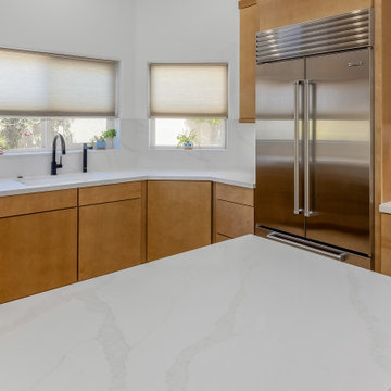
Kenny & Laura set out to refresh their kitchen with a focus on better storage, and thoughtful design. They wanted to maintain the existing layout while introducing upgraded finishes and efficient cabinetry throughout the space.
Waypoint 530S Maple Rye cabinets were chosen for all base, upper, and tall storage units. To achieve a sleek appearance, Blum push-to-open hardware was added to all doors and drawers.
Cabinet interiors were enhanced with deep pantry roll-out trays, a wastebasket pull-out, a spice drawer, and inserts for cutlery, knives, and utensils. This tailored storage approach supports both organization and ease of access.
MSI’s Calacatta Elysio quartz was installed for a flush-mount cooktop. Countertops were extended into the window frame, above the stovetop, and beneath the floating shelves to add visual continuity and extra functionality.
Matching quartz backsplash was installed from countertop to upper cabinets and along open areas under shelving.
The sink area received a Blanco Diamond single basin in white, paired with a Delta Trinsic pull-down faucet and a Delta Contemporary beverage faucet, both in matte black. A matching air switch was included for the garbage disposal.
They now enjoy a space that looks cleaner, functions better, and feels more inviting. Every detail from appliance panels to custom drawer inserts was selected to support a seamless and comfortable kitchen experience.
 Phoenix Home Remodeling
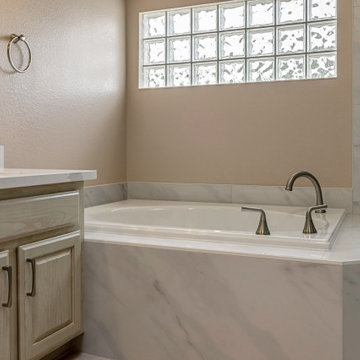
The goal for Bonnie's master bathroom was to create a spa-like retreat by upgrading the core features while preserving elements that were still in great shape. The layout remained the same, but the finishes and functionality were completely transformed.
A zero-threshold shower was built with the floor raised to match the rest of the bathroom. The shower floor features white elongated hex tiles, and the walls are covered in large-format Lenci White polished porcelain tiles stacked horizontally for a sleek, continuous look.
Delta Kayra fixtures in Brilliance Stainless were installed, including a handheld sprayer and relocated valve for easy access. The shower was finished with a recessed niche, corner bench, and a frameless glass with brushed nickel clips.
The original tub was replaced with a 59” Avano St. Croix acrylic drop-in bathtub. Tile from the same Lenci collection was used around the deck, wall, and tub face to create a cohesive visual connection with the shower.
Cabinetry was kept but enhanced with soft-close hidden hinges and brushed satin nickel pulls. The countertop was replaced with Ripieno Honed quartz from Arizona Tile, finished with an eased edge and a 4” backsplash.
Two new undermount porcelain sinks and Delta Kayra faucets in Brilliance Stainless were installed, along with all-new under-sink plumbing and angle stops.
Accessories including towel rings, robe hooks, and a toilet paper holder were also updated to match the new hardware and fixtures.
 Joshua Zinder Architecture + Design
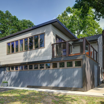
A married pair of artists sought to expand and adapt this salt box-style house into a functional, attractive live/work space while retaining certain nostalgic elements (this was the wife’s childhood home.) Their objectives included adding on a dining room; expanding the master bedroom and downstairs studio spaces; maximizing natural light; and continuing occupancy throughout.
The through-block property is sited between a high-traffic road and another that provides vehicular access to the house. The architect’s solution effectively reversed the entry sequence. The studio elevation, with the master bedroom, dining room and terrace above, is now the formal front of the house, while the former front entrance from the busy road is now secondary.
Today, visitors arrive at the new primary entrance, greeted by a façade suggesting a simple folded ribbon: metal panels that wrap the expanded master bedroom and the new terrace.
Recladding with fiber cement composite rainscreen (a choice inspired by the clients’ travels in Finland) unifies the addition with the existing. The new dining room enjoys views of Meadowlands sunsets through the 12-foot length of full-height glass and the cable rails of the new deck outside. The L-shaped artist studio/office downstairs now gains light from transom-height windows running the width of the house.
Find the right local pro for your project

 Design Perspective Interior Design, LLC
I was hired by my previous employer, Corvallis Custom Kitchens and Baths to assist these homeowners with all of the materials, fixtures and finish choices to complete this master bathroom remodel.
Brian Egan, owner and designer at CCKB in Sept 2017, since retired), designed this aging-in-place, accessible shower (previously a shower and separate soaker tub) for the clients who reside in an over 55 community here in Corvallis.
Large format 12x24 unpolished Crossville Kosmos Moonstruck tile was chosen for the bathroom floor and the shower walls to minimize grout lines. For the shower floor/pan small 1x1 DalTile Keystones Marble color tile was used to aid in making the floor feel extra slip resistant as the Keystones tiles do not have grittier feeling surface than porcelain tile.
For safety and a non-industrial look, Moen Align chrome designer grab bars were installed in the shower and toilet room. The handshower and rainshower head system by Grohe beautifully combines the 2 systems in one unit called Retrofit 160. To allow the homeowners to turn the shower on and warm up without them having to step in the direct spray of the shower head, the controls were placed under the window near the shower entry. This would also allow a helper to assist anyone using the shower in the future should the need arise.
A linear drain was installed to pull water away from the zero threshold shower entry. Installing a linear shower drain allows for a no threshold shower which can allow for the shower to be accessible with a walker or roll-in with a wheelchair as the shower was designed almost 40" wide.
The homeowners were thrilled with the transformation of their bathroom. The design and material choices fit their tastes and needs perfectly. Now they can continue to age in place and not worry about how they would be able to bathe if something were to decrease their mobility.
Photos by: H. Needham
 Lagois Design Build Renovate
Living in place with flex:
The mother of the homeowner needed a home that is fully accessible for living in place, so we created a barrier-free entry and installed grab bars. The new suite contains a full bedroom and bath and a small living room with a kitchenette.
One of the homeowners especially loves to cook. Now he has a new kitchen with more space, more storage, and better functionality.
Fresh paint, wallpaper and a new look:
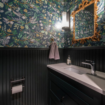
We refinished the hardwood floors throughout and gave the whole home a fresh new look. We updated a powder room with paint, new tile, new fixtures, new lighting, and wallpaper.
Kitchen with space, flow, and storage:
The kitchen was cut off from the rest of the home. It had a long peninsula with awkward flow around the kitchen that just didn’t work. We removed the peninsula and instead created a large island with seating for three. With the new island, counter space is much more usable now. We put hidden cupboards underneath for added storage. The island also holds the built-in microwave with a steel drawer front below for continuity. We used banked drawers rather than cupboards for ease of access. We also installed new large appliances.
Coffee station, cookbooks, and spices:
We removed two clumsy closed pantries and an unused main door, and this allowed space for more cabinetry. We added an open shelf section with herringbone tile and a counter for a coffee station and cookbooks. Other features were a waste bin pullout with garbage bag storage and a tall spice pullout drawer.
The kitchen now has a big double-wide appliance garage where all small appliances are stored and organized in a big pantry with a light inside. All the appliances are front and centre (rather than buried in the back somewhere), yet hidden behind a door.
Flex space means other new spaces for everyone:
In creating a flex space for the mother on the main floor, the homeowners lost their space for a family room, although there is still a formal living and dining room on that floor. We solved it by creating a new finished basement with a family room to replace the one upstairs. This gives the family and the mother their own spaces and at the same time comfortable places for all of them.
 Cowbell Designs
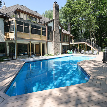
- Deck Renovation: The existing deck now wraps around the back corner of the house, providing ample outdoor space for relaxation and entertainment.
- Materials & Comfort: TimberTech composite decking with Advanced Cooling Technology ensures visual appeal and comfort on hot days.
- Modern Aesthetic: Aluminum railing offers safety while maintaining open sightlines and a sleek profile.
- User-Friendly Access: Multiple stairs and entry points create seamless movement between deck levels and ground.
- Architectural Integration: The deck’s design aligns perfectly with the home’s overall style and rooflines.
- Screened Porch Addition: Positioned on the second level above the deck, the porch is surrounded by large windows that welcome natural light while shielding from insects.
- Versatile Retreat: Spacious enough for seating, dining, or a small outdoor office, it enhances year-round usability.
- Functional Enhancement: The porch adds inviting shelter and scenic views to the home’s outdoor footprint.
- Balcony Replacement: The second-level balcony was replaced and thoughtfully reinstalled above the new porch to maximize outdoor living space.
- Design Continuity: Its location and detailing complement the screened porch below and the deck beyond.
- Private Nook: Offers a secluded spot for morning coffee or evening stargazing.
 Phoenix Home Remodeling
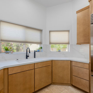
Kenny & Laura set out to refresh their kitchen with a focus on better storage, and thoughtful design. They wanted to maintain the existing layout while introducing upgraded finishes and efficient cabinetry throughout the space.
Waypoint 530S Maple Rye cabinets were chosen for all base, upper, and tall storage units. To achieve a sleek appearance, Blum push-to-open hardware was added to all doors and drawers.
Cabinet interiors were enhanced with deep pantry roll-out trays, a wastebasket pull-out, a spice drawer, and inserts for cutlery, knives, and utensils. This tailored storage approach supports both organization and ease of access.
MSI’s Calacatta Elysio quartz was installed for a flush-mount cooktop. Countertops were extended into the window frame, above the stovetop, and beneath the floating shelves to add visual continuity and extra functionality.
Matching quartz backsplash was installed from countertop to upper cabinets and along open areas under shelving.
The sink area received a Blanco Diamond single basin in white, paired with a Delta Trinsic pull-down faucet and a Delta Contemporary beverage faucet, both in matte black. A matching air switch was included for the garbage disposal.
They now enjoy a space that looks cleaner, functions better, and feels more inviting. Every detail from appliance panels to custom drawer inserts was selected to support a seamless and comfortable kitchen experience.
Sponsored
Sunbury, OH

J.Holderby - Renovations
Franklin County's Leading General Contractors - 2X Best of Houzz!
 Phoenix Home Remodeling
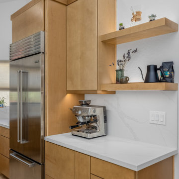
Kenny & Laura set out to refresh their kitchen with a focus on better storage, and thoughtful design. They wanted to maintain the existing layout while introducing upgraded finishes and efficient cabinetry throughout the space.
Waypoint 530S Maple Rye cabinets were chosen for all base, upper, and tall storage units. To achieve a sleek appearance, Blum push-to-open hardware was added to all doors and drawers.
Cabinet interiors were enhanced with deep pantry roll-out trays, a wastebasket pull-out, a spice drawer, and inserts for cutlery, knives, and utensils. This tailored storage approach supports both organization and ease of access.
MSI’s Calacatta Elysio quartz was installed for a flush-mount cooktop. Countertops were extended into the window frame, above the stovetop, and beneath the floating shelves to add visual continuity and extra functionality.
Matching quartz backsplash was installed from countertop to upper cabinets and along open areas under shelving.
The sink area received a Blanco Diamond single basin in white, paired with a Delta Trinsic pull-down faucet and a Delta Contemporary beverage faucet, both in matte black. A matching air switch was included for the garbage disposal.
They now enjoy a space that looks cleaner, functions better, and feels more inviting. Every detail from appliance panels to custom drawer inserts was selected to support a seamless and comfortable kitchen experience.
 Phoenix Home Remodeling
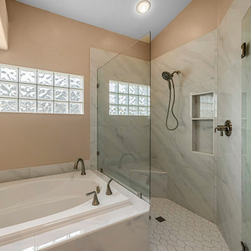
The goal for Bonnie's master bathroom was to create a spa-like retreat by upgrading the core features while preserving elements that were still in great shape. The layout remained the same, but the finishes and functionality were completely transformed.
A zero-threshold shower was built with the floor raised to match the rest of the bathroom. The shower floor features white elongated hex tiles, and the walls are covered in large-format Lenci White polished porcelain tiles stacked horizontally for a sleek, continuous look.
Delta Kayra fixtures in Brilliance Stainless were installed, including a handheld sprayer and relocated valve for easy access. The shower was finished with a recessed niche, corner bench, and a frameless glass with brushed nickel clips.
The original tub was replaced with a 59” Avano St. Croix acrylic drop-in bathtub. Tile from the same Lenci collection was used around the deck, wall, and tub face to create a cohesive visual connection with the shower.
Cabinetry was kept but enhanced with soft-close hidden hinges and brushed satin nickel pulls. The countertop was replaced with Ripieno Honed quartz from Arizona Tile, finished with an eased edge and a 4” backsplash.
Two new undermount porcelain sinks and Delta Kayra faucets in Brilliance Stainless were installed, along with all-new under-sink plumbing and angle stops.
Accessories including towel rings, robe hooks, and a toilet paper holder were also updated to match the new hardware and fixtures.

 Tradition Outdoor Living
This outdoor living project allows our clients to truly enjoy their outdoor space in Rosenberg, TX. On about an acre of land, the covered patio with outdoor kitchen is the perfect spot for sipping morning coffee and enjoying a gentle breeze. The workshop adjacent to the garage was built to look original to the home, and in fact, even has AC! Both projects add much appeal and practicality to this home.
The covered patio, extending from the existing porch cover, was also built to look original to the home with matching cedar wrapped columns with brick bases. Outdoor ceiling fans were wired to this space as well as recessed lights and flood lights. A large kitchen space was built with matching brick, beautiful granite countertops, and a bar seating. With plenty storage and counter space and a large grill, this outdoor kitchen suits our clients' needs.
The original flooring surface was replaced by stamped concrete and continued throughout the remainder of the project.
Later, we returned to build our clients' a workshop space. This space is complete with AC, indoor and outdoor lighting, and a garage door with ramp in the rear for ease of access with large equipment. The entire structure matches the original home, including cedar wrapped columns, partial brick and siding exterior.

 Advance Design Studio, Ltd.
Jennifer and Dan have lived in their Deer Park Illinois home for 15 years, slowly making minor fixes like painting and decorating; but they had a new plan for their kitchen the entire time. An awkwardly placed garage door, and an island cooktop with a terrible downdraft made a full-scale kitchen remodel an absolute must. Jennifer had many ideas in mind and wanted to work with a company that could provide high-end work, while partnering with a designer that would tailor the kitchen to her ideas.
She was intrigued by the phrase “Common Sense Remodeling” in Advance Design’s feature she discovered while perusing an issue of the community’s Quintessential Barrington Magazine. Doing further research on the company’s website, as she looked through project profiles and read about Advance Design’s “Common Sense Remodeling” philosophy, she promptly scheduled an appointment to see if the people and ideas she read about were truly who they said they were. The more she read, the more she knew that the “Common Sense” approach to remodeling they described was exactly the type of company she was looking for.
The partnership was sealed after an initial consultation with Owner Todd Jurs and Project Designer Michelle Lecinski. They displayed a combination of friendliness, professionalism and respect that was unmatched by any of the other companies Jennifer talked to. She knew that with Advance Design, she would be able to retain the vision that she had in mind with high-quality craftsmanship.
“I reached out to Advance Design because of the ‘Common Sense Remodeling’ tagline,” Jennifer said. “That’s what lingered for me”. “Advance Design was the most respectful- of the house and of my design ideas, and the most professional of the handful of companies that looked at my project”.
Soon after the meeting Jennifer began working with Michelle on the project design. They quickly developed chemistry. Jennifer loved how Michelle researched and located every detail that Jennifer wanted for the kitchen. Between the two of them, every concept and idea was worked through and perfected. “Jennifer had definite ideas about what she wanted the new kitchen to look like, she just didn’t know how to bring it all together. We worked together really well to make her ideas into the practical reality necessary for a well-functioning kitchen, with the look and feel that she had envisioned”, says Michelle.
“Michelle was wonderful in using the CAD system she would show me new drawings every time we changed the layout while working through the design,” Jennifer said. “She was a really wonderful partner in execution, she made sure everything happened quickly and easily.”
The finished design drew out elements of Jennifer’s style and personality. The pair call the look “sophisticated farmhouse” to describe the kitchen renovation to family and friends. The result was a beautifully crafted, authentic-feeling space that satisfied Jennifer’s dreams 15 years in the making. The whole project consisted of a kitchen remodel, mudroom upgrade with powder room, and garage entry relocation. “The projects I personally like the best, are the ones that put the client’s dreams on display,” Project Designer Michelle said. “And this is one of those projects.”
The main focal point of the kitchen is custom zinc and brass ventilation hood with a vintage sheen, which was hand made to order by a small company in Indiana named Vogler Metalworking. “It’s like sculpture, a true work of art”, says Jennifer. Your eye is immediately drawn towards this elegant yet practical hood that eliminated the home’s downdraft problem and added a striking conversation piece at the same time. The carpenters had to use special gloves when transporting and installing it, so they didn’t smudge it with fingerprints. The beautiful hood centers proudly over the stunning black enamel and brass LaCornue Range. “I had a friend who had a LaCornue range and after learning how easy it was to cook perfect meals, I was convinced I wanted to have one”, says Jennifer. This unique, breathtaking combination anchors the entire kitchen and is apparent immediately as you walk into the great room the surrounds the space.
DuraSupreme Crestwood cabinets with a Kendall Panel add function and sophistication. A custom gray paint color paired with a storm blue was developed so that the new kitchen looked like it belonged to the existing space. Unlacquered brass faucets and hardware were important to Jennifer because she wanted the living finishes to age over time. Remarkable brass diamond mesh cabinet door inserts imported from the UK continue to add this one-of-a-kind kitchen renovation; giving it a “you won’t see this everywhere” quality. The use of old railcar flooring for the coffee bar countertop and reclaimed oak for the open shelving gives an authenticity to the space uncommon in kitchens today.
Jennifer and Michelle fell in love with the Limestone Grey Stone while they were investigating unique island countertop ideas. They liked the fact that the limestone as a living finish will age and change over time. Calcutta Miel Quartz countertops made for an excellent pairing around the perimeter, as it’s durable and perfect for cooking preparations. A textured white subway tile backsplash that runs to the ceiling keeps your eye moving towards the open shelving, and to the main focal point of the stunning range hood combination.
“The kitchen functions beautifully, and it’s gorgeous,” beams Jennifer as she gestures with both hands while smiling ear to ear. “The most important thing was I wanted a kitchen that had a wonderful flow, cooked beautiful meals and was a great gathering place for family and friends, and this space does that perfectly! Beauty wise, it turned out exactly how I had envisioned. I felt the function part was the hardest part, and that was nailed”!
Relocating the garage entry to the new mudroom was a huge priority and has finally separated the family’s arriving home functions from their kitchen. Now coats and shoes and bags have their own area for dropping once members arrive home. Matching gray DuraSupreme cabinetry helped create gorgeous, purposeful lockers for the family. A reclaimed vintage sink and custom wall paper were added to the tiny powder room to beautify the once previously only functional space. Advance Design was even able to create a custom space for their dog to sleep while the family is away.
“It was unbelievable that a project of this size was completed in such a short time, and I think that’s because of the large amount of planning and preparation that went into it,” Jennifer marveled, “When we started, we were ready, and everything was prepared”.
When it came to execution, Project Manager Justin Davis and his crew were quick, accessible, and organized. Projects like this kitchen are typically completed in as little as 8-10 weeks. Jennifer’s kitchen however despite the relocation of some challenging HVAC in a soffit and moving of an exterior door was completed remarkably fast in part because the team was working with an existing tile floor that ran throughout the first floor that the client really loved.
“You get to know these people really well because they’re living in your house while you’re living in your house. They were so fast and really good, it didn’t take as long as even planned” reported Jennifer. “I would text Justin and he always responded almost immediately. I got to know all the guys who were working in our house and they were all wonderful people”.
Details in a customized kitchen like this one require skill and care from the people who install it. “All the guys on the job were skilled at what the did. I wanted small details like little feet to look like furniture, that is where their carpentry skill came in to make these all perfect”, said Jennifer. “The tile guys were wonderful. They even let me determine how I wanted the texture with the grout to appear for a salt and pepper look; now that is a very skilled trade person making it custom”.
In Jennifer’s interview, she continued to reference Advance Design’s “Common Sense Remodeling”, so I took a minute to ask her exactly what that phrase meant to her and how it played out in her experience with her project and the Advance Design team. Here is what she said: “I was intrigued about Common Sense Remodeling and in my head that there would be clear costs and prices, great communication between the design team, the execution team and me”, said Jennifer. They did deliver on that, it was so clear about the cost breakdown, what I could expect from everyone who came to my house, and everything that we had ordered. That to me is the Common Sense”!
It’s great to see a client take literally our assertion that a well-planned remodeling project is simply “Common Sense”! She anticipated each step of the way would be clear, concise, and predictable, all the while protecting the outcome due to the careful upfront planning. “Advance Design delivered on their ‘Common Sense Remodeling’ promise,” Jennifer said. “From the design team, to the execution team - everything was straight forward like I imagined. The project turned out exactly how I envisioned, I enjoyed this process and absolutely would recommend Advance Design Studio to anyone.”
 Klopf Architecture
The Roger Lee designed house from 1962 was purchased by the current homeowners in almost original condition, as the previous owners elected to defer most maintenance projects over the years. The clients were able to see beyond the dated materials and finishes, single-paned glass and uninsulated walls and they approached Klopf Architecture to help them expand and update the entire home, one the family could settle into and enjoy for years to come. It was important that the new designs were aligned with Lee's original intent not only because of the client's appreciation for mid-century modern architecture, but also because the house was deemed historical. The Stanford Real Estate Office requires a stringent design review which safeguards the integrity of the community, which Klopf Architecture was happy to oblige going into their updated designs.
As with many original mid-century modern homes, the house was scaled to the 1960s lifestyle where rooms were smaller and openings to views were limited and tightly framed. The original conditions defined the direction the family of four would take in updating the house and making it comfortable for their modern lifestyle. Klopf designed a full gut remodel and major addition to bring the house into the 21st century and provide the living area needed for the client's family. The newly expanded house added just about 1,100 sf to create an airy, comfortable and family friendly house, taking full advantage of the beautiful southwestern views that extend out to the hills beyond. The enclosed garage created an additional 240 sf of covered space for long-term storage.
A cracked swimming pool created an eyesore taking up a majority of the backyard landscape, so it was one of the first elements to go during the transformation. Working with Outer Space Landscape Architects, the family asked for a mix of relaxing outdoor patio spaces that eventually blend into the native landscaping, extending their views outward toward the natural greenery of the trees beyond their property. Filling in the old pool was a smart way to expand the living spaces outward. The orientation of the house was designed to enjoy the views, but the original architecture provided the first homeowners with mere glimpses of the landscape outside.
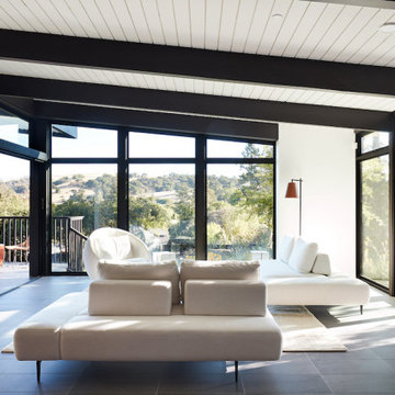
Klopf was able to broaden those views, continuing and extending on the original architecture to take full advantage of the unobstructed natural views across the rear facade of the house. Small horizontal openings in the primary bedroom and office were replaced with much taller windows that now follow the angled roof line upward, extending across almost all of the facade. We worked with Western Windows, whose designs included an oblique-shaped, operable casement that allowed our design to rise with the slope. A new corner office added to the primary suite, offers a bright and functional work-from-home solution that looks out at the distant views and added natural light from the expanded window configuration that now wraps around the corner.
The existing lower level was designed by Lee as a utilitarian space, serving as a wet pool room with a drain in the center of the floor, bathroom, laundry and storage areas. Without the need for a pool room, Klopf was able to convert the area into a much more comfortable and functional living space with a new family room and guest suite. The new spaces enjoy easy access to a new outdoor patio through floor to ceiling, full-width glass sliders.
Continuing along the rear facade, a previously exposed deck extending from the living room and hallway provided access to the backyard through a single set of stairs leading toward the side of the house which made sense when the pool was in place. The new deck was re-envisioned as an extension of the main living room and now serves as a second outdoor living room. A new slatted pergola above provides the homeowners welcome relief from the hot afternoon sun. A second set of stairs now creates a better connection to the redesigned lower level. Klopf was able to reconfigure the spaces, extending the living room outward toward the views, where the family now claims it as the heart of the home, spending a large majority of their time outdoors.
Back inside, the original wood-burning Malm fireplace was beautifully restored and a gas burner installed to comply with California's strict air standards. It now rests in front of a wall of Heath accent tiles where a dated red brick wall used to stand. A new taller window brings more light and views into the refreshed interior living room. The original glass doors opposite the fireplace were replaced by larger sliders that when fully opened, create a seamless transition to the new outdoor living area so the two spaces feel like one connected space. The original utilitarian kitchen was needlessly tucked into the far back corner and closed-off, out of sight from the living room, so the clients asked Klopf to open it up and expand the kitchen forward so it felt more connected. Today the much larger kitchen is connected to the living area where a short wall with a cutout offers a visual glimpse into the kitchen and a handy pass-through counter for serving guests. A new breakfast nook was also added to create another spot where the family can gather for casual meals. Just outside, a new built-in outdoor grill and prep area extends the kitchen outside and connects to a new outdoor dining spot nestled amongst the trees, taking advantage of the views out back.
Klopf was able to expand the other two bedrooms, add a new laundry room and half-bath and convert the carport to an enclosed garage to add more storage areas which was lost when the pool house was converted to the family and guest room.
To maintain a historical connection to the original designs, the exterior siding was repeated on all exterior walls, a full-height stained glass window at the front entryway restored, and an interior slatted screen element repeated outside at the exterior entry courtyard and over the new outdoor living room to create a shade trellis. The new house stands proudly and shines against it's new landscaping features, while respecting and expanding on the original intent of Roger Lee's designs epitomizing the comforts of indoor-outdoor living in Northern California.
Completion year: 2020
Klopf Architecture project team: John Klopf, Klara Kevane, Noel Andrade
Contractor: ORB Construction, Brendan O'Reilly
Structural engineer: Sezen and Moon
Landscape architect: Outer space
Furnishings and decoration: Urbanism Designs
Photographer: Mariko Reed
 Anima Architects
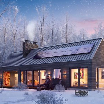
After having spent several years living in a trailer getting to know their rural property in La Pine Oregon, our clients made the decision to build a small off-the-grid modern cabin that they can retire in and use as a hub for entertaining family and friends. Keeping the cabin modest in scale and construction cost was critical to this couple since they planned to build the cabin themselves and didn’t want to overextend themselves financially so they can continue pursuing their love for international travel and maximize time spent with their loved ones.
Set amongst a grove of lodge pole pines, the cabin was designed with simplicity in mind and utilizes materials that help it fit in seamlessly with the surrounding high desert environment while being low maintenance and fire resistant. Although the cabin is compact in footprint, the interior spaces are all designed to open out onto a large outdoor deck, effectively doubling the usable living space, while a covered breezeway provides protected access to the main entry and houses an outdoor kitchen for entertaining in warmer weather and wood storage for use in the indoor/ outdoor fireplace during the winter months. The compact 600 square foot interior footprint also has a 200 square foot flexible loft space which can be used to work from and house guests alike. The exterior breezeway, main living space and loft was designed to be open to the vaulted wood rafters, steel collar ties and skylights above, creating a seamless transition between the interior and exterior and a sense of openness and lightness unusual for such a compact footprint.
Sponsored
Columbus, OH
Free consultation for landscape design!

Peabody Landscape Group
Franklin County's Reliable Landscape Design & Contracting
 Klopf Architecture
The Roger Lee designed house from 1962 was purchased by the current homeowners in almost original condition, as the previous owners elected to defer most maintenance projects over the years. The clients were able to see beyond the dated materials and finishes, single-paned glass and uninsulated walls and they approached Klopf Architecture to help them expand and update the entire home, one the family could settle into and enjoy for years to come. It was important that the new designs were aligned with Lee's original intent not only because of the client's appreciation for mid-century modern architecture, but also because the house was deemed historical. The Stanford Real Estate Office requires a stringent design review which safeguards the integrity of the community, which Klopf Architecture was happy to oblige going into their updated designs.
As with many original mid-century modern homes, the house was scaled to the 1960s lifestyle where rooms were smaller and openings to views were limited and tightly framed. The original conditions defined the direction the family of four would take in updating the house and making it comfortable for their modern lifestyle. Klopf designed a full gut remodel and major addition to bring the house into the 21st century and provide the living area needed for the client's family. The newly expanded house added just about 1,100 sf to create an airy, comfortable and family friendly house, taking full advantage of the beautiful southwestern views that extend out to the hills beyond. The enclosed garage created an additional 240 sf of covered space for long-term storage.
A cracked swimming pool created an eyesore taking up a majority of the backyard landscape, so it was one of the first elements to go during the transformation. Working with Outer Space Landscape Architects, the family asked for a mix of relaxing outdoor patio spaces that eventually blend into the native landscaping, extending their views outward toward the natural greenery of the trees beyond their property. Filling in the old pool was a smart way to expand the living spaces outward. The orientation of the house was designed to enjoy the views, but the original architecture provided the first homeowners with mere glimpses of the landscape outside.
Klopf was able to broaden those views, continuing and extending on the original architecture to take full advantage of the unobstructed natural views across the rear facade of the house. Small horizontal openings in the primary bedroom and office were replaced with much taller windows that now follow the angled roof line upward, extending across almost all of the facade. We worked with Western Windows, whose designs included an oblique-shaped, operable casement that allowed our design to rise with the slope. A new corner office added to the primary suite, offers a bright and functional work-from-home solution that looks out at the distant views and added natural light from the expanded window configuration that now wraps around the corner.
The existing lower level was designed by Lee as a utilitarian space, serving as a wet pool room with a drain in the center of the floor, bathroom, laundry and storage areas. Without the need for a pool room, Klopf was able to convert the area into a much more comfortable and functional living space with a new family room and guest suite. The new spaces enjoy easy access to a new outdoor patio through floor to ceiling, full-width glass sliders.
Continuing along the rear facade, a previously exposed deck extending from the living room and hallway provided access to the backyard through a single set of stairs leading toward the side of the house which made sense when the pool was in place. The new deck was re-envisioned as an extension of the main living room and now serves as a second outdoor living room. A new slatted pergola above provides the homeowners welcome relief from the hot afternoon sun. A second set of stairs now creates a better connection to the redesigned lower level. Klopf was able to reconfigure the spaces, extending the living room outward toward the views, where the family now claims it as the heart of the home, spending a large majority of their time outdoors.
Back inside, the original wood-burning Malm fireplace was beautifully restored and a gas burner installed to comply with California's strict air standards. It now rests in front of a wall of Heath accent tiles where a dated red brick wall used to stand. A new taller window brings more light and views into the refreshed interior living room. The original glass doors opposite the fireplace were replaced by larger sliders that when fully opened, create a seamless transition to the new outdoor living area so the two spaces feel like one connected space. The original utilitarian kitchen was needlessly tucked into the far back corner and closed-off, out of sight from the living room, so the clients asked Klopf to open it up and expand the kitchen forward so it felt more connected. Today the much larger kitchen is connected to the living area where a short wall with a cutout offers a visual glimpse into the kitchen and a handy pass-through counter for serving guests. A new breakfast nook was also added to create another spot where the family can gather for casual meals. Just outside, a new built-in outdoor grill and prep area extends the kitchen outside and connects to a new outdoor dining spot nestled amongst the trees, taking advantage of the views out back.
Klopf was able to expand the other two bedrooms, add a new laundry room and half-bath and convert the carport to an enclosed garage to add more storage areas which was lost when the pool house was converted to the family and guest room.
To maintain a historical connection to the original designs, the exterior siding was repeated on all exterior walls, a full-height stained glass window at the front entryway restored, and an interior slatted screen element repeated outside at the exterior entry courtyard and over the new outdoor living room to create a shade trellis. The new house stands proudly and shines against it's new landscaping features, while respecting and expanding on the original intent of Roger Lee's designs epitomizing the comforts of indoor-outdoor living in Northern California.
Completion year: 2020
Klopf Architecture project team: John Klopf, Klara Kevane, Noel Andrade
Contractor: ORB Construction, Brendan O'Reilly
Structural engineer: Sezen and Moon
Landscape architect: Outer space
Furnishings and decoration: Urbanism Designs
Photographer: Mariko Reed

 Benson Homes LLC
Many families ponder the idea of adding extra living space for a few years before they are actually ready to remodel. Then, all-of-the sudden, something will happen that makes them realize that they can’t wait any longer. In the case of this remodeling story, it was the snowstorm of 2016 that spurred the homeowners into action. As the family was stuck in the house with nowhere to go, they longed for more space. The parents longed for a getaway spot for themselves that could also double as a hangout area for the kids and their friends. As they considered their options, there was one clear choice…to renovate the detached garage.
The detached garage previously functioned as a workshop and storage room and offered plenty of square footage to create a family room, kitchenette, and full bath. It’s location right beside the outdoor kitchen made it an ideal spot for entertaining and provided an easily accessible bathroom during the summertime. Even the canine family members get to enjoy it as they have their own personal entrance, through a bathroom doggie door.
Our design team listened carefully to our client’s wishes to create a space that had a modern rustic feel and found selections that fit their aesthetic perfectly. To set the tone, Blackstone Oak luxury vinyl plank flooring was installed throughout. The kitchenette area features Maple Shaker style cabinets in a pecan shell stain, Uba Tuba granite countertops, and an eye-catching amber glass and antique bronze pulley sconce. Rather than use just an ordinary door for the bathroom entry, a gorgeous Knotty Alder barn door creates a stunning focal point of the room.
The fantastic selections continue in the full bath. A reclaimed wood double vanity with a gray washed pine finish anchors the room. White, semi-recessed sinks with chrome faucets add some contemporary accents, while the glass and oil-rubbed bronze mini pendant lights are a balance between both rustic and modern. The design called for taking the shower tile to the ceiling and it really paid off. A sliced pebble tile floor in the shower is curbed with Uba Tuba granite, creating a clean line and another accent detail.
The new multi-functional space looks like a natural extension of their home, with its matching exterior lights, new windows, doors, and sliders. And with winter approaching and snow on the way, this family is ready to hunker down and ride out the storm in comfort and warmth. When summer arrives, they have a designated bathroom for outdoor entertaining and a wonderful area for guests to hang out.
It was a pleasure to create this beautiful remodel for our clients and we hope that they continue to enjoy it for many years to come.
 Lagois Design Build Renovate
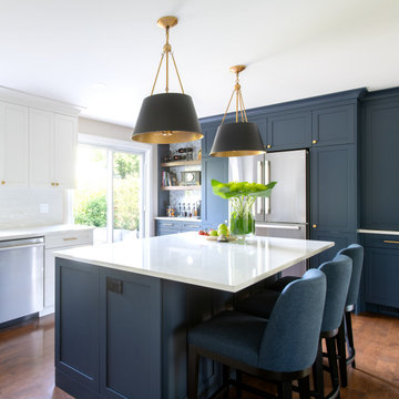
Living in place with flex:
The mother of the homeowner needed a home that is fully accessible for living in place, so we created a barrier-free entry and installed grab bars. The new suite contains a full bedroom and bath and a small living room with a kitchenette.
One of the homeowners especially loves to cook. Now he has a new kitchen with more space, more storage, and better functionality.
Fresh paint, wallpaper and a new look:
We refinished the hardwood floors throughout and gave the whole home a fresh new look. We updated a powder room with paint, new tile, new fixtures, new lighting, and wallpaper.
Kitchen with space, flow, and storage:
The kitchen was cut off from the rest of the home. It had a long peninsula with awkward flow around the kitchen that just didn’t work. We removed the peninsula and instead created a large island with seating for three. With the new island, counter space is much more usable now. We put hidden cupboards underneath for added storage. The island also holds the built-in microwave with a steel drawer front below for continuity. We used banked drawers rather than cupboards for ease of access. We also installed new large appliances.
Coffee station, cookbooks, and spices:
We removed two clumsy closed pantries and an unused main door, and this allowed space for more cabinetry. We added an open shelf section with herringbone tile and a counter for a coffee station and cookbooks. Other features were a waste bin pullout with garbage bag storage and a tall spice pullout drawer.
The kitchen now has a big double-wide appliance garage where all small appliances are stored and organized in a big pantry with a light inside. All the appliances are front and centre (rather than buried in the back somewhere), yet hidden behind a door.
Flex space means other new spaces for everyone:
In creating a flex space for the mother on the main floor, the homeowners lost their space for a family room, although there is still a formal living and dining room on that floor. We solved it by creating a new finished basement with a family room to replace the one upstairs. This gives the family and the mother their own spaces and at the same time comfortable places for all of them.

 Michael Nash Design, Build & Homes
Side Addition to Oak Hill Home
After living in their Oak Hill home for several years, they decided that they needed a larger, multi-functional laundry room, a side entrance and mudroom that suited their busy lifestyles.
A small powder room was a closet placed in the middle of the kitchen, while a tight laundry closet space overflowed into the kitchen.
After meeting with Michael Nash Custom Kitchens, plans were drawn for a side addition to the right elevation of the home. This modification filled in an open space at end of driveway which helped boost the front elevation of this home.
Covering it with matching brick facade made it appear as a seamless addition.
The side entrance allows kids easy access to mudroom, for hang clothes in new lockers and storing used clothes in new large laundry room. This new state of the art, 10 feet by 12 feet laundry room is wrapped up with upscale cabinetry and a quartzite counter top.
The garage entrance door was relocated into the new mudroom, with a large side closet allowing the old doorway to become a pantry for the kitchen, while the old powder room was converted into a walk-in pantry.
A new adjacent powder room covered in plank looking porcelain tile was furnished with embedded black toilet tanks. A wall mounted custom vanity covered with stunning one-piece concrete and sink top and inlay mirror in stone covered black wall with gorgeous surround lighting. Smart use of intense and bold color tones, help improve this amazing side addition.
Dark grey built-in lockers complementing slate finished in place stone floors created a continuous floor place with the adjacent kitchen flooring.
Now this family are getting to enjoy every bit of the added space which makes life easier for all.
Sponsored
Columbus, OH
Free consultation for landscape design!
Peabody Landscape Group
Franklin County's Reliable Landscape Design & Contracting
 Tradition Outdoor Living
This outdoor living project allows our clients to truly enjoy their outdoor space in Rosenberg, TX. On about an acre of land, the covered patio with outdoor kitchen is the perfect spot for sipping morning coffee and enjoying a gentle breeze. The workshop adjacent to the garage was built to look original to the home, and in fact, even has AC! Both projects add much appeal and practicality to this home.
The covered patio, extending from the existing porch cover, was also built to look original to the home with matching cedar wrapped columns with brick bases. Outdoor ceiling fans were wired to this space as well as recessed lights and flood lights. A large kitchen space was built with matching brick, beautiful granite countertops, and a bar seating. With plenty storage and counter space and a large grill, this outdoor kitchen suits our clients' needs.
The original flooring surface was replaced by stamped concrete and continued throughout the remainder of the project.
Later, we returned to build our clients' a workshop space. This space is complete with AC, indoor and outdoor lighting, and a garage door with ramp in the rear for ease of access with large equipment. The entire structure matches the original home, including cedar wrapped columns, partial brick and siding exterior.
 Lagois Design Build Renovate
Living in place with flex:
The mother of the homeowner needed a home that is fully accessible for living in place, so we created a barrier-free entry and installed grab bars. The new suite contains a full bedroom and bath and a small living room with a kitchenette.
One of the homeowners especially loves to cook. Now he has a new kitchen with more space, more storage, and better functionality.
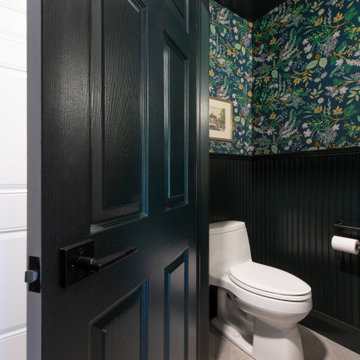
Fresh paint, wallpaper and a new look:
We refinished the hardwood floors throughout and gave the whole home a fresh new look. We updated a powder room with paint, new tile, new fixtures, new lighting, and wallpaper.
Kitchen with space, flow, and storage:
The kitchen was cut off from the rest of the home. It had a long peninsula with awkward flow around the kitchen that just didn’t work. We removed the peninsula and instead created a large island with seating for three. With the new island, counter space is much more usable now. We put hidden cupboards underneath for added storage. The island also holds the built-in microwave with a steel drawer front below for continuity. We used banked drawers rather than cupboards for ease of access. We also installed new large appliances.
Coffee station, cookbooks, and spices:
We removed two clumsy closed pantries and an unused main door, and this allowed space for more cabinetry. We added an open shelf section with herringbone tile and a counter for a coffee station and cookbooks. Other features were a waste bin pullout with garbage bag storage and a tall spice pullout drawer.
The kitchen now has a big double-wide appliance garage where all small appliances are stored and organized in a big pantry with a light inside. All the appliances are front and centre (rather than buried in the back somewhere), yet hidden behind a door.
Flex space means other new spaces for everyone:
In creating a flex space for the mother on the main floor, the homeowners lost their space for a family room, although there is still a formal living and dining room on that floor. We solved it by creating a new finished basement with a family room to replace the one upstairs. This gives the family and the mother their own spaces and at the same time comfortable places for all of them.

 Katie Hutchison Studio
Constructed in two phases, this renovation, with a few small additions, touched nearly every room in this late ‘50’s ranch house. The owners raised their family within the original walls and love the house’s location, which is not far from town and also borders conservation land. But they didn’t love how chopped up the house was and the lack of exposure to natural daylight and views of the lush rear woods. Plus, they were ready to de-clutter for a more stream-lined look. As a result, KHS collaborated with them to create a quiet, clean design to support the lifestyle they aspire to in retirement.
To transform the original ranch house, KHS proposed several significant changes that would make way for a number of related improvements. Proposed changes included the removal of the attached enclosed breezeway (which had included a stair to the basement living space) and the two-car garage it partially wrapped, which had blocked vital eastern daylight from accessing the interior. Together the breezeway and garage had also contributed to a long, flush front façade. In its stead, KHS proposed a new two-car carport, attached storage shed, and exterior basement stair in a new location. The carport is bumped closer to the street to relieve the flush front facade and to allow access behind it to eastern daylight in a relocated rear kitchen. KHS also proposed a new, single, more prominent front entry, closer to the driveway to replace the former secondary entrance into the dark breezeway and a more formal main entrance that had been located much farther down the facade and curiously bordered the bedroom wing.
Inside, low ceilings and soffits in the primary family common areas were removed to create a cathedral ceiling (with rod ties) over a reconfigured semi-open living, dining, and kitchen space. A new gas fireplace serving the relocated dining area -- defined by a new built-in banquette in a new bay window -- was designed to back up on the existing wood-burning fireplace that continues to serve the living area. A shared full bath, serving two guest bedrooms on the main level, was reconfigured, and additional square footage was captured for a reconfigured master bathroom off the existing master bedroom. A new whole-house color palette, including new finishes and new cabinetry, complete the transformation. Today, the owners enjoy a fresh and airy re-imagining of their familiar ranch house.
Photos by Katie Hutchison
142