
Search results for "Continuing process" in Home Design Ideas
 STUDIO TASHIMA
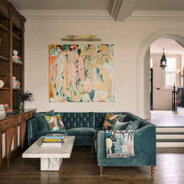
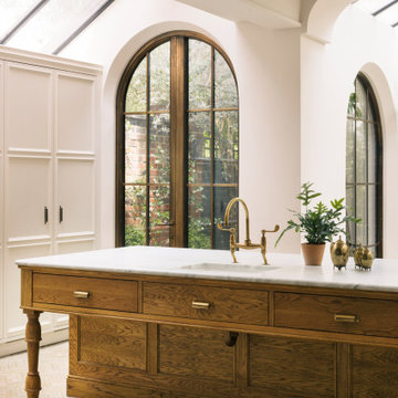
Keyes Road is a two-storey, semi-detached red brick house dating to around 1890-1910. The focus of our work was on the ground floor where we were asked to improve the layout and use of the main living areas of the house, for an active family of four. Important to the design was to maximise the quality and amount of light as well as connection to the garden and flow to the rest of the house.
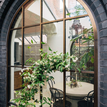
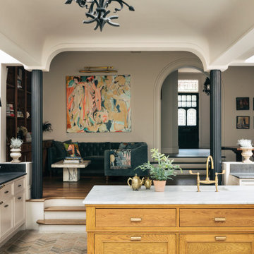
Our proposal introduces three single storey extensions, comprising a central, large space that extends the main outrigger of the house. To each side are smaller volumes, affording a full width kitchen. While defining a series of discrete volumes, it was important for us to ensure that the kitchen, living, family and dining rooms that are interconnecting and continuous. The result is a big space punctuated by a series of differently sized arches, defining spaces to ensure their intimacy.
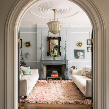
It was important for our client to have a sense of warmth and comfort - perhaps not dissimilar to the qualities of a hotel lobby. The colour scheme of the rooms are warm white painted plaster, natural wood flooring with black, bronze and brass accents. Indirect and carefully placed light fittings pulls together the atmosphere of the rooms - particularly in the evenings.
Externally, we felt it important to differentiate the extensions from the main house by using a dark, charcoal grey brick. This sets up a contrasting yet complimentary relationship to the rich red coloured brick house. The facets of the brick play with light and depth as do the graduated brick arches.
During the design process, we grappled with floor levels, the direction of sunlight, and care to not encroach on the neighbouring properties. As the house is in a conservation area, we worked closely with our trusted planning advisor. Throughout, we pursued a sensitive design strategy, using pitched roofs, matching materials and careful detailing. Internally, many of the original details are intact. This has enabled us to create an eclectic ensemble of elements, colours and materials varying in age and period.
 STUDIO TASHIMA
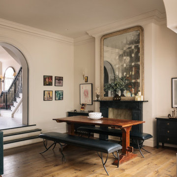
Keyes Road is a two-storey, semi-detached red brick house dating to around 1890-1910. The focus of our work was on the ground floor where we were asked to improve the layout and use of the main living areas of the house, for an active family of four. Important to the design was to maximise the quality and amount of light as well as connection to the garden and flow to the rest of the house.
Our proposal introduces three single storey extensions, comprising a central, large space that extends the main outrigger of the house. To each side are smaller volumes, affording a full width kitchen. While defining a series of discrete volumes, it was important for us to ensure that the kitchen, living, family and dining rooms that are interconnecting and continuous. The result is a big space punctuated by a series of differently sized arches, defining spaces to ensure their intimacy.
It was important for our client to have a sense of warmth and comfort - perhaps not dissimilar to the qualities of a hotel lobby. The colour scheme of the rooms are warm white painted plaster, natural wood flooring with black, bronze and brass accents. Indirect and carefully placed light fittings pulls together the atmosphere of the rooms - particularly in the evenings.
Externally, we felt it important to differentiate the extensions from the main house by using a dark, charcoal grey brick. This sets up a contrasting yet complimentary relationship to the rich red coloured brick house. The facets of the brick play with light and depth as do the graduated brick arches.
During the design process, we grappled with floor levels, the direction of sunlight, and care to not encroach on the neighbouring properties. As the house is in a conservation area, we worked closely with our trusted planning advisor. Throughout, we pursued a sensitive design strategy, using pitched roofs, matching materials and careful detailing. Internally, many of the original details are intact. This has enabled us to create an eclectic ensemble of elements, colours and materials varying in age and period.

 Gallery KBNY
The owner of this historic and landmarked town-home renovation in Hudson Square, originally built in 1826, hired Gallery Kitchen and Bath to fully gut-renovate this 3-unit row-home. The scope of work included a full-scale renovation of the owners unit, including the renovation of the kitchen, one 4-piece master ensuite bathroom, one 3-piece bathroom with a walk-in steam shower, and a beautiful powder room. Additional work in the owners unit also included flooring, electrical upgrade, major plumbing work, new HVAC system, restoration of a fireplace, installation of a fully integrated smart home system and landmarked approved windows.
CELLAR RENOVATION IN NYC LANDMARKED TOWN-HOME
Rounding out the owners unit we renovated the cellar, which was converted into an entertainment space and featured a custom glass curtain wall, along with a custom staircase with an exposed brick wall. During the demolition phase of the cellar, our team discovered 56 wine jugs filled with wine from the prohibition era, leading us to name this project the prohibition house. For the two tenant units, Gallery Kitchen and Bath undertook the renovation of 2 kitchens, 4 bathrooms, new hardwood flooring throughout, along with detailed carpentry work in the entire home.
WHY GALLERY KITCHEN AND BATH
After interviewing multiple contractors, our client decided on Gallery Kitchen and Bath primarily because of our turnkey design, selection, and build process. In a renovation of this magnitude it is crucial to have a centralized full service contractor under one roof to handle all of the aspects and simultaneous moving parts of the project. Decentralizing the entire process by having multiple unaffiliated vendors handle various parts of the process can easily become chaotic, time consuming, and costly.
Because Gallery Kitchen and Bath undertook the entire process, from the design of the entire space to the selection and procurement of all finishes and fixtures, down to the procurement of all permits and LPC filings, it made a seemingly chaotic project a’lot more manageable.
PHASE 1: DESIGN, SELECTION, PROCUREMENT
Our client wanted the renovation to incorporate a fully modern design into his Hudson Square town-house. Being that this is a landmarked property, the exterior facade had to be restored and kept with the original aesthetic, the interior of the home however was a whole different story.
In keeping up with the modern aesthetic, our designers went to work to design a custom kitchen that included fully custom flat panel base cabinets in a white high gloss finish and an absolute matte black appliance/pantry wall. The kitchen design also included a white quartz countertop and backsplash with a waterfall edge island. To bring warmth to the modern kitchen, our designers incorporated a rifted and quartered select oak wood floor in a herringbone pattern, and custom blended stain with matte polyurethane finish. For continuity, the wood floor was also extended throughout the entire owners unit.
In the ensuite bathroom we created a “wet area” which houses a standalone soaking tub as well as a beautiful rainfall shower, completely leveled with the rest of the floor in the bathroom. Some highlights within this space include a tiled square drain, large niche cutouts with a carrera marble accents. Once again, to bring warmth to this modern bathroom, our designers incorporated a floating rustic oak vanity and carrera marble mosaic floor tile.
Last on the list on the owners unit floor was the cellar, which our client wanted to utilize as an entertainment space for his friends and family. During the design phase, we incorporated an open concept layout, wedding the indoor and outdoor space with a custom glass curtain wall. The design also included custom walnut built-ins that serve as a custom wet bar and storage piece.
With the design approved and selections made our office liaisons moved to procure all of the material selections and finishes.
PHASE 2: DEMO
Because this home is almost two centuries old, we had to take extra precaution during the interior demolition phase of the project. One specific area that we had to pay special attention to was the existing brick. Over time the mortar in old brick homes deteriorates and turns into dust – for this reason it was extremely important that a thorough and ongoing inspection of the exteriors and interior walls took place during the demolition of the space.
After 14 30-yard debris containers and 56 wine filled jugs from the prohibition era later , the demolition of this historic Hudson Square town-home came to an end. If you are wondering whether we tried the wine? After notifying the owner we agreed to open one of the jugs and try them together – nothing but vinegar.
PHASE 3: BUILD
One of the challenges in a renovation project of this scope is nailing down the logistics and delivery of fixtures and finish material. Adding to this challenge was a narrow entry door that required us to use a boom truck in order to deliver some of the larger materials on site. To ensure a succinct time schedule, we boomed all of the materials through the 3rd floor for the entire project and worked our renovation work from top floor to cellar. This technique also insured that any unexpected water issues during the renovation process would not damage a finished floor.
With all roughing and framing complete, the Gallery KBNY team proceeded to execute on the design plan.
THE REVEAL
From what was once a dilapidated town-home with nothing but potential, to a glamorous and luxurious modern interior space – the prohibition house was complete. Ready to speak with us about your renovation project? Contact us to schedule your free consultation and let Gallery KBNY show you why our all-inclusive approach to your renovation is the smartest way to renovating in NYC.
Find the right local pro for your project

 John R. Schroeder, AIA
Photography by Caryn B. Davis
Located in the Cornfield Point area of Old Saybrook along Long Island Sound, this project brought a classic, yet forgotten beach house back to life. Through a little detective work and some creative ingenuity, we restored and enhanced the exterior to it’s former glory and transformed the interior to a highly efficient and functional home all the while uplifting its quaint cottage charm. On the exterior, we recreated a wonderful, airy front porch with cozy bench seats that look out to the water. The white cedar shingle siding is pre-bleached with a subtle flair at the bottom and a delicate break at mid-elevation. The asphalt shingles are not only beautifully matched with the siding, but offer superior reflective qualities to dissipate the heat of the summer sun. On the interior, we joined the front seasonal porch with the family room to form a larger, open living and dining space with paneled walls and ceilings anchored by the original round stone fireplace. In the rear, we carefully crafted a galley kitchen and laundry space with an adjacent first floor master suite. The diminutive house and property posed multiple practical and regulatory challenges which were overcome by a strong team effort, due diligence, and a commitment to the process.
John R. Schroeder, AIA is a professional design firm specializing in architecture, interiors, and planning. We have over 30 years experience with projects of all types, sizes, and levels of complexity. Because we love what we do, we approach our work with enthusiasm and dedication. We are committed to the highest level of design and service on each and every project. We engage our clients in positive and rewarding collaborations. We strive to exceed expectations through our attention to detail, our understanding of the “big picture”, and our ability to effectively manage a team of design professionals, industry representatives, and building contractors. We carefully analyze budgets and project objectives to assist clients with wise fund allocation.
We continually monitor and research advances in technology, materials, and construction methods, both sustainable and otherwise, to provide a responsible, well-suited, and cost effective product. Our design solutions are highly functional using both innovative and traditional approaches. Our aesthetic style is flexible and open, blending cues from client desires, building function, site context, and material properties, making each project unique, personalized, and enduring.

 TaylorPro Design and Remodeling, Inc.
"We decided to do a complete remodel of our kitchen after the pipe burst in our kitchen. We picked Taylor Pro to work with after getting extensive quotes and looked at many reviews. Easy to work with, always on time, and cleaned up everyday. The TaylorPro crew installed everything from new cabinets and hardware, plumbing, appliances, and contracted painters, granite installer, and flooring for us. They raised our kitchen ceiling by six inches, installed new lighting, and fixed the area of damaged wall in the kitchen and dining room. Any issues we ran into during this long process were fixed immediately by Kerry or his team. The crew was friendly, punctual and cleaned up on a daily basis as well as an in-depth cleaning at the end of the remodel. We got our up dream kitchen and are so happy the way the dining room and family room look with new paint, lighting fixtures, and flooring. Although it was tough to be without a kitchen, the end result was more than worth it!"
~ Adam L, Client
Cabinets by Kitchen Emporium, Jenn-Air appliances, hardwood floors by Joe's Hardwood, granite backsplash, under cabinet lighting, rectangular sink, corner cabinet, glass cabinet, lazy susan.
Photo by: Kerry W. Taylor
 STUDIO TASHIMA
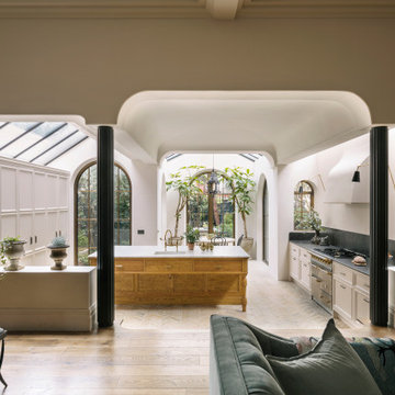
Keyes Road is a two-storey, semi-detached red brick house dating to around 1890-1910. The focus of our work was on the ground floor where we were asked to improve the layout and use of the main living areas of the house, for an active family of four. Important to the design was to maximise the quality and amount of light as well as connection to the garden and flow to the rest of the house.
Our proposal introduces three single storey extensions, comprising a central, large space that extends the main outrigger of the house. To each side are smaller volumes, affording a full width kitchen. While defining a series of discrete volumes, it was important for us to ensure that the kitchen, living, family and dining rooms that are interconnecting and continuous. The result is a big space punctuated by a series of differently sized arches, defining spaces to ensure their intimacy.
It was important for our client to have a sense of warmth and comfort - perhaps not dissimilar to the qualities of a hotel lobby. The colour scheme of the rooms are warm white painted plaster, natural wood flooring with black, bronze and brass accents. Indirect and carefully placed light fittings pulls together the atmosphere of the rooms - particularly in the evenings.
Externally, we felt it important to differentiate the extensions from the main house by using a dark, charcoal grey brick. This sets up a contrasting yet complimentary relationship to the rich red coloured brick house. The facets of the brick play with light and depth as do the graduated brick arches.
During the design process, we grappled with floor levels, the direction of sunlight, and care to not encroach on the neighbouring properties. As the house is in a conservation area, we worked closely with our trusted planning advisor. Throughout, we pursued a sensitive design strategy, using pitched roofs, matching materials and careful detailing. Internally, many of the original details are intact. This has enabled us to create an eclectic ensemble of elements, colours and materials varying in age and period.
 STUDIO TASHIMA
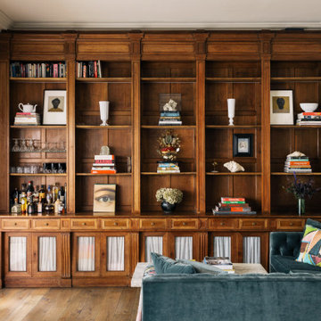
Keyes Road is a two-storey, semi-detached red brick house dating to around 1890-1910. The focus of our work was on the ground floor where we were asked to improve the layout and use of the main living areas of the house, for an active family of four. Important to the design was to maximise the quality and amount of light as well as connection to the garden and flow to the rest of the house.
Our proposal introduces three single storey extensions, comprising a central, large space that extends the main outrigger of the house. To each side are smaller volumes, affording a full width kitchen. While defining a series of discrete volumes, it was important for us to ensure that the kitchen, living, family and dining rooms that are interconnecting and continuous. The result is a big space punctuated by a series of differently sized arches, defining spaces to ensure their intimacy.
It was important for our client to have a sense of warmth and comfort - perhaps not dissimilar to the qualities of a hotel lobby. The colour scheme of the rooms are warm white painted plaster, natural wood flooring with black, bronze and brass accents. Indirect and carefully placed light fittings pulls together the atmosphere of the rooms - particularly in the evenings.
Externally, we felt it important to differentiate the extensions from the main house by using a dark, charcoal grey brick. This sets up a contrasting yet complimentary relationship to the rich red coloured brick house. The facets of the brick play with light and depth as do the graduated brick arches.
During the design process, we grappled with floor levels, the direction of sunlight, and care to not encroach on the neighbouring properties. As the house is in a conservation area, we worked closely with our trusted planning advisor. Throughout, we pursued a sensitive design strategy, using pitched roofs, matching materials and careful detailing. Internally, many of the original details are intact. This has enabled us to create an eclectic ensemble of elements, colours and materials varying in age and period.
 STUDIO TASHIMA
Keyes Road is a two-storey, semi-detached red brick house dating to around 1890-1910. The focus of our work was on the ground floor where we were asked to improve the layout and use of the main living areas of the house, for an active family of four. Important to the design was to maximise the quality and amount of light as well as connection to the garden and flow to the rest of the house.
Our proposal introduces three single storey extensions, comprising a central, large space that extends the main outrigger of the house. To each side are smaller volumes, affording a full width kitchen. While defining a series of discrete volumes, it was important for us to ensure that the kitchen, living, family and dining rooms that are interconnecting and continuous. The result is a big space punctuated by a series of differently sized arches, defining spaces to ensure their intimacy.
It was important for our client to have a sense of warmth and comfort - perhaps not dissimilar to the qualities of a hotel lobby. The colour scheme of the rooms are warm white painted plaster, natural wood flooring with black, bronze and brass accents. Indirect and carefully placed light fittings pulls together the atmosphere of the rooms - particularly in the evenings.
Externally, we felt it important to differentiate the extensions from the main house by using a dark, charcoal grey brick. This sets up a contrasting yet complimentary relationship to the rich red coloured brick house. The facets of the brick play with light and depth as do the graduated brick arches.
During the design process, we grappled with floor levels, the direction of sunlight, and care to not encroach on the neighbouring properties. As the house is in a conservation area, we worked closely with our trusted planning advisor. Throughout, we pursued a sensitive design strategy, using pitched roofs, matching materials and careful detailing. Internally, many of the original details are intact. This has enabled us to create an eclectic ensemble of elements, colours and materials varying in age and period.
 STUDIO TASHIMA
Keyes Road is a two-storey, semi-detached red brick house dating to around 1890-1910. The focus of our work was on the ground floor where we were asked to improve the layout and use of the main living areas of the house, for an active family of four. Important to the design was to maximise the quality and amount of light as well as connection to the garden and flow to the rest of the house.
Our proposal introduces three single storey extensions, comprising a central, large space that extends the main outrigger of the house. To each side are smaller volumes, affording a full width kitchen. While defining a series of discrete volumes, it was important for us to ensure that the kitchen, living, family and dining rooms that are interconnecting and continuous. The result is a big space punctuated by a series of differently sized arches, defining spaces to ensure their intimacy.
It was important for our client to have a sense of warmth and comfort - perhaps not dissimilar to the qualities of a hotel lobby. The colour scheme of the rooms are warm white painted plaster, natural wood flooring with black, bronze and brass accents. Indirect and carefully placed light fittings pulls together the atmosphere of the rooms - particularly in the evenings.
Externally, we felt it important to differentiate the extensions from the main house by using a dark, charcoal grey brick. This sets up a contrasting yet complimentary relationship to the rich red coloured brick house. The facets of the brick play with light and depth as do the graduated brick arches.
During the design process, we grappled with floor levels, the direction of sunlight, and care to not encroach on the neighbouring properties. As the house is in a conservation area, we worked closely with our trusted planning advisor. Throughout, we pursued a sensitive design strategy, using pitched roofs, matching materials and careful detailing. Internally, many of the original details are intact. This has enabled us to create an eclectic ensemble of elements, colours and materials varying in age and period.
 STUDIO TASHIMA
Keyes Road is a two-storey, semi-detached red brick house dating to around 1890-1910. The focus of our work was on the ground floor where we were asked to improve the layout and use of the main living areas of the house, for an active family of four. Important to the design was to maximise the quality and amount of light as well as connection to the garden and flow to the rest of the house.
Our proposal introduces three single storey extensions, comprising a central, large space that extends the main outrigger of the house. To each side are smaller volumes, affording a full width kitchen. While defining a series of discrete volumes, it was important for us to ensure that the kitchen, living, family and dining rooms that are interconnecting and continuous. The result is a big space punctuated by a series of differently sized arches, defining spaces to ensure their intimacy.
It was important for our client to have a sense of warmth and comfort - perhaps not dissimilar to the qualities of a hotel lobby. The colour scheme of the rooms are warm white painted plaster, natural wood flooring with black, bronze and brass accents. Indirect and carefully placed light fittings pulls together the atmosphere of the rooms - particularly in the evenings.
Externally, we felt it important to differentiate the extensions from the main house by using a dark, charcoal grey brick. This sets up a contrasting yet complimentary relationship to the rich red coloured brick house. The facets of the brick play with light and depth as do the graduated brick arches.
During the design process, we grappled with floor levels, the direction of sunlight, and care to not encroach on the neighbouring properties. As the house is in a conservation area, we worked closely with our trusted planning advisor. Throughout, we pursued a sensitive design strategy, using pitched roofs, matching materials and careful detailing. Internally, many of the original details are intact. This has enabled us to create an eclectic ensemble of elements, colours and materials varying in age and period.
 STUDIO TASHIMA
Keyes Road is a two-storey, semi-detached red brick house dating to around 1890-1910. The focus of our work was on the ground floor where we were asked to improve the layout and use of the main living areas of the house, for an active family of four. Important to the design was to maximise the quality and amount of light as well as connection to the garden and flow to the rest of the house.
Our proposal introduces three single storey extensions, comprising a central, large space that extends the main outrigger of the house. To each side are smaller volumes, affording a full width kitchen. While defining a series of discrete volumes, it was important for us to ensure that the kitchen, living, family and dining rooms that are interconnecting and continuous. The result is a big space punctuated by a series of differently sized arches, defining spaces to ensure their intimacy.
It was important for our client to have a sense of warmth and comfort - perhaps not dissimilar to the qualities of a hotel lobby. The colour scheme of the rooms are warm white painted plaster, natural wood flooring with black, bronze and brass accents. Indirect and carefully placed light fittings pulls together the atmosphere of the rooms - particularly in the evenings.
Externally, we felt it important to differentiate the extensions from the main house by using a dark, charcoal grey brick. This sets up a contrasting yet complimentary relationship to the rich red coloured brick house. The facets of the brick play with light and depth as do the graduated brick arches.
During the design process, we grappled with floor levels, the direction of sunlight, and care to not encroach on the neighbouring properties. As the house is in a conservation area, we worked closely with our trusted planning advisor. Throughout, we pursued a sensitive design strategy, using pitched roofs, matching materials and careful detailing. Internally, many of the original details are intact. This has enabled us to create an eclectic ensemble of elements, colours and materials varying in age and period.
 STUDIO TASHIMA
Keyes Road is a two-storey, semi-detached red brick house dating to around 1890-1910. The focus of our work was on the ground floor where we were asked to improve the layout and use of the main living areas of the house, for an active family of four. Important to the design was to maximise the quality and amount of light as well as connection to the garden and flow to the rest of the house.
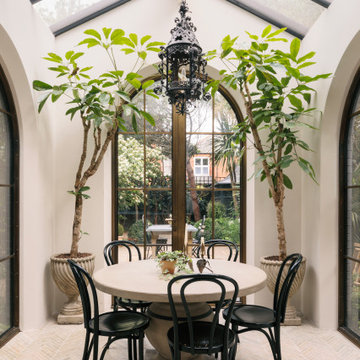
Our proposal introduces three single storey extensions, comprising a central, large space that extends the main outrigger of the house. To each side are smaller volumes, affording a full width kitchen. While defining a series of discrete volumes, it was important for us to ensure that the kitchen, living, family and dining rooms that are interconnecting and continuous. The result is a big space punctuated by a series of differently sized arches, defining spaces to ensure their intimacy.
It was important for our client to have a sense of warmth and comfort - perhaps not dissimilar to the qualities of a hotel lobby. The colour scheme of the rooms are warm white painted plaster, natural wood flooring with black, bronze and brass accents. Indirect and carefully placed light fittings pulls together the atmosphere of the rooms - particularly in the evenings.
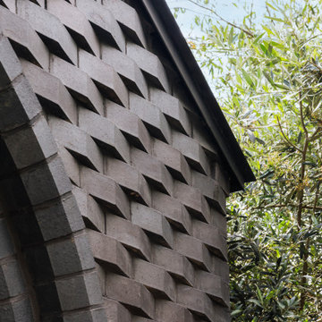
Externally, we felt it important to differentiate the extensions from the main house by using a dark, charcoal grey brick. This sets up a contrasting yet complimentary relationship to the rich red coloured brick house. The facets of the brick play with light and depth as do the graduated brick arches.
During the design process, we grappled with floor levels, the direction of sunlight, and care to not encroach on the neighbouring properties. As the house is in a conservation area, we worked closely with our trusted planning advisor. Throughout, we pursued a sensitive design strategy, using pitched roofs, matching materials and careful detailing. Internally, many of the original details are intact. This has enabled us to create an eclectic ensemble of elements, colours and materials varying in age and period.
 STUDIO TASHIMA
Keyes Road is a two-storey, semi-detached red brick house dating to around 1890-1910. The focus of our work was on the ground floor where we were asked to improve the layout and use of the main living areas of the house, for an active family of four. Important to the design was to maximise the quality and amount of light as well as connection to the garden and flow to the rest of the house.
Our proposal introduces three single storey extensions, comprising a central, large space that extends the main outrigger of the house. To each side are smaller volumes, affording a full width kitchen. While defining a series of discrete volumes, it was important for us to ensure that the kitchen, living, family and dining rooms that are interconnecting and continuous. The result is a big space punctuated by a series of differently sized arches, defining spaces to ensure their intimacy.
It was important for our client to have a sense of warmth and comfort - perhaps not dissimilar to the qualities of a hotel lobby. The colour scheme of the rooms are warm white painted plaster, natural wood flooring with black, bronze and brass accents. Indirect and carefully placed light fittings pulls together the atmosphere of the rooms - particularly in the evenings.
Externally, we felt it important to differentiate the extensions from the main house by using a dark, charcoal grey brick. This sets up a contrasting yet complimentary relationship to the rich red coloured brick house. The facets of the brick play with light and depth as do the graduated brick arches.
During the design process, we grappled with floor levels, the direction of sunlight, and care to not encroach on the neighbouring properties. As the house is in a conservation area, we worked closely with our trusted planning advisor. Throughout, we pursued a sensitive design strategy, using pitched roofs, matching materials and careful detailing. Internally, many of the original details are intact. This has enabled us to create an eclectic ensemble of elements, colours and materials varying in age and period.

 Cummings Architecture + Interiors
When Cummings Architects first met with the owners of this understated country farmhouse, the building’s layout and design was an incoherent jumble. The original bones of the building were almost unrecognizable. All of the original windows, doors, flooring, and trims – even the country kitchen – had been removed. Mathew and his team began a thorough design discovery process to find the design solution that would enable them to breathe life back into the old farmhouse in a way that acknowledged the building’s venerable history while also providing for a modern living by a growing family.
The redesign included the addition of a new eat-in kitchen, bedrooms, bathrooms, wrap around porch, and stone fireplaces. To begin the transforming restoration, the team designed a generous, twenty-four square foot kitchen addition with custom, farmers-style cabinetry and timber framing. The team walked the homeowners through each detail the cabinetry layout, materials, and finishes. Salvaged materials were used and authentic craftsmanship lent a sense of place and history to the fabric of the space.
The new master suite included a cathedral ceiling showcasing beautifully worn salvaged timbers. The team continued with the farm theme, using sliding barn doors to separate the custom-designed master bath and closet. The new second-floor hallway features a bold, red floor while new transoms in each bedroom let in plenty of light. A summer stair, detailed and crafted with authentic details, was added for additional access and charm.
Finally, a welcoming farmer’s porch wraps around the side entry, connecting to the rear yard via a gracefully engineered grade. This large outdoor space provides seating for large groups of people to visit and dine next to the beautiful outdoor landscape and the new exterior stone fireplace.
Though it had temporarily lost its identity, with the help of the team at Cummings Architects, this lovely farmhouse has regained not only its former charm but also a new life through beautifully integrated modern features designed for today’s family.
Photo by Eric Roth
 STUDIO TASHIMA
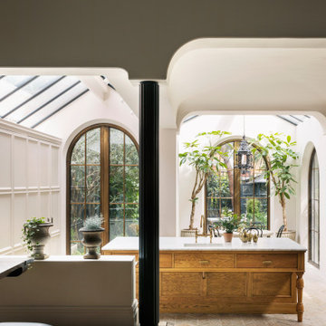
Keyes Road is a two-storey, semi-detached red brick house dating to around 1890-1910. The focus of our work was on the ground floor where we were asked to improve the layout and use of the main living areas of the house, for an active family of four. Important to the design was to maximise the quality and amount of light as well as connection to the garden and flow to the rest of the house.
Our proposal introduces three single storey extensions, comprising a central, large space that extends the main outrigger of the house. To each side are smaller volumes, affording a full width kitchen. While defining a series of discrete volumes, it was important for us to ensure that the kitchen, living, family and dining rooms that are interconnecting and continuous. The result is a big space punctuated by a series of differently sized arches, defining spaces to ensure their intimacy.
It was important for our client to have a sense of warmth and comfort - perhaps not dissimilar to the qualities of a hotel lobby. The colour scheme of the rooms are warm white painted plaster, natural wood flooring with black, bronze and brass accents. Indirect and carefully placed light fittings pulls together the atmosphere of the rooms - particularly in the evenings.
Externally, we felt it important to differentiate the extensions from the main house by using a dark, charcoal grey brick. This sets up a contrasting yet complimentary relationship to the rich red coloured brick house. The facets of the brick play with light and depth as do the graduated brick arches.
During the design process, we grappled with floor levels, the direction of sunlight, and care to not encroach on the neighbouring properties. As the house is in a conservation area, we worked closely with our trusted planning advisor. Throughout, we pursued a sensitive design strategy, using pitched roofs, matching materials and careful detailing. Internally, many of the original details are intact. This has enabled us to create an eclectic ensemble of elements, colours and materials varying in age and period.
 Klopf Architecture
Nestled in the hills of Orinda, California, this 1951 residence is one of only seven extant homes, now known as “The Magnificent Seven”, designed by architect Olof Dahlstrand, a protégé of Frank Lloyd Wright. With its low-slung rooflines, natural materials, and deep integration with the sloping landscape, the home is a pristine example of mid-century modern design inspired by Wright’s organic principles. Over the years, prior homeowners have emphasized preservation, ensuring that the house remained relatively untouched. Each owner has respected the original architecture and stayed true to Dahlstrand’s intent. When a family of five—two college-aged sons and a middle school-aged daughter—acquired the property, they were captivated by its history, legacy of care, and architectural significance. While they appreciated Dahlstrand’s original vision, they also recognized the need to adapt the home for contemporary living while preserving its design integrity.
The remodel was conceived as a thoughtful response to the past—an effort to bring the house into the 21st century without compromising its soul. The primary mandate was to maintain architectural continuity while improving the functionality, comfort, and livability for a modern family. The design team—architects and contractor alike—worked with a shared reverence for the original architecture, allowing that mindset to guide even the most technical or pragmatic decisions.
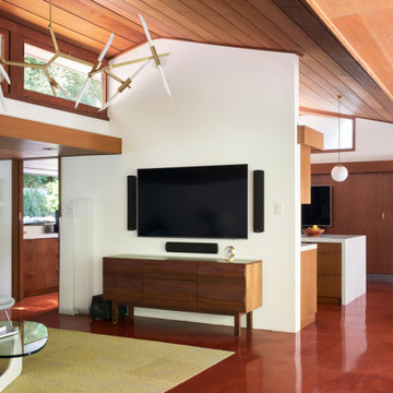
A key objective was to increase natural light in the kitchen—a departure from Wrightian principles of enclosed, intimate cooking spaces—while maintaining the home’s architectural language. The kitchen was reconfigured to foster a stronger connection to adjacent living spaces while retaining the underlying concept of spatial separation. One of the most transformative architectural changes was the removal of a ridge beam that was originally planned to remain visible through the kitchen. During construction, the team collaborated on a better solution: a wide-flanged steel beam concealed within the roof envelope. This subtle move preserved the clean lines and ceiling continuity, a modern update carried out with utmost respect for the existing framework.
The home’s original powder room, previously accessible only through the kitchen, was relocated for better flow and privacy. A new powder room was carved out of former kitchen cabinetry—a narrow, interior space that could have felt dark and enclosed. To avoid this, the design extended the line of original transom windows into the new powder room and added a skylight above the vanity. The result is a bright and airy space that feels consistent with the rest of the home. Other updates included the installation of new solid-core interior doors with veneers carefully matched to the original mahogany, enhancing the continuity of the interiors. Even smaller decisions, such as placing the door knobs at 42 inches high, mirrored the original proportions. Every choice reflected a shared belief between the architect, contractor, and client: that new work should serve the integrity of the old.
The home’s extensive interior redwood millwork and paneling was meticulously restored. Where new materials were introduced—such as the replacement redwood soffit paneling—the contractor took pains to find finish nails that matched the original, rather than using modern equivalents. This level of craftsmanship and collaboration defined the project. It extended even to the detailing of a blind door to the new powder room, which had to disappear into the existing redwood board-and-batten wall. It was a team effort: the owner found a suitable handle, the architects devised the custom in-swing mechanism, and the contractor executed it so the door aligned precisely with the battens. Throughout, the homeowners were deeply engaged in the design process. One, a meticulous design enthusiast, focused on aesthetic integrity and historic detail. The other brought a practical and function-driven perspective, ensuring that new fixtures and materials would be durable and require minimal maintenance.
While the home’s location posed no major site challenges, sustainability was a key concern. The team upgraded the roof insulation, installed solar panels with battery storage, and added ductless mini-split cooling systems. Lighting was another area where modern technology was woven into a historic framework: new square LED fixtures echo the original custom perimeter soffit lights, maintaining the design language while offering advanced performance.
A planned expansion of a bedroom into suite with a bathroom had to be shelved due to budget constraints and the high cost of below-grade foundation work. Still, the team focused their efforts on making the most of the existing footprint, resolving constraints through design ingenuity rather than adding square footage. This renovation represents a collaborative achievement in preserving and evolving a historically significant home. Every decision was shaped by a shared ethos among clients, architects, and contractor: to maintain the home’s architectural soul while updating it for contemporary life. The result is a timeless modernist residence that continues Olof Dahlstrand’s legacy, remaining grounded in nature, craftsmanship, and human-scale design.
Klopf Architecture Team: John Klopf, AIA, Klara Kevane, Fernanda Bernardes
Interior Architectural Design: Klopf Architecture
Structural Engineer: Daniel Bastiao
Contractor: Don Larwood, Larwood Construction
Photography: Mariko Reed
Year Completed: 2022
 Gallery KBNY
The owner of this historic and landmarked town-home renovation in Hudson Square, originally built in 1826, hired Gallery Kitchen and Bath to fully gut-renovate this 3-unit row-home. The scope of work included a full-scale renovation of the owners unit, including the renovation of the kitchen, one 4-piece master ensuite bathroom, one 3-piece bathroom with a walk-in steam shower, and a beautiful powder room. Additional work in the owners unit also included flooring, electrical upgrade, major plumbing work, new HVAC system, restoration of a fireplace, installation of a fully integrated smart home system and landmarked approved windows.
CELLAR RENOVATION IN NYC LANDMARKED TOWN-HOME
Rounding out the owners unit we renovated the cellar, which was converted into an entertainment space and featured a custom glass curtain wall, along with a custom staircase with an exposed brick wall. During the demolition phase of the cellar, our team discovered 56 wine jugs filled with wine from the prohibition era, leading us to name this project the prohibition house. For the two tenant units, Gallery Kitchen and Bath undertook the renovation of 2 kitchens, 4 bathrooms, new hardwood flooring throughout, along with detailed carpentry work in the entire home.
WHY GALLERY KITCHEN AND BATH
After interviewing multiple contractors, our client decided on Gallery Kitchen and Bath primarily because of our turnkey design, selection, and build process. In a renovation of this magnitude it is crucial to have a centralized full service contractor under one roof to handle all of the aspects and simultaneous moving parts of the project. Decentralizing the entire process by having multiple unaffiliated vendors handle various parts of the process can easily become chaotic, time consuming, and costly.
Because Gallery Kitchen and Bath undertook the entire process, from the design of the entire space to the selection and procurement of all finishes and fixtures, down to the procurement of all permits and LPC filings, it made a seemingly chaotic project a’lot more manageable.
PHASE 1: DESIGN, SELECTION, PROCUREMENT
Our client wanted the renovation to incorporate a fully modern design into his Hudson Square town-house. Being that this is a landmarked property, the exterior facade had to be restored and kept with the original aesthetic, the interior of the home however was a whole different story.
In keeping up with the modern aesthetic, our designers went to work to design a custom kitchen that included fully custom flat panel base cabinets in a white high gloss finish and an absolute matte black appliance/pantry wall. The kitchen design also included a white quartz countertop and backsplash with a waterfall edge island. To bring warmth to the modern kitchen, our designers incorporated a rifted and quartered select oak wood floor in a herringbone pattern, and custom blended stain with matte polyurethane finish. For continuity, the wood floor was also extended throughout the entire owners unit.
In the ensuite bathroom we created a “wet area” which houses a standalone soaking tub as well as a beautiful rainfall shower, completely leveled with the rest of the floor in the bathroom. Some highlights within this space include a tiled square drain, large niche cutouts with a carrera marble accents. Once again, to bring warmth to this modern bathroom, our designers incorporated a floating rustic oak vanity and carrera marble mosaic floor tile.
Last on the list on the owners unit floor was the cellar, which our client wanted to utilize as an entertainment space for his friends and family. During the design phase, we incorporated an open concept layout, wedding the indoor and outdoor space with a custom glass curtain wall. The design also included custom walnut built-ins that serve as a custom wet bar and storage piece.
With the design approved and selections made our office liaisons moved to procure all of the material selections and finishes.
PHASE 2: DEMO
Because this home is almost two centuries old, we had to take extra precaution during the interior demolition phase of the project. One specific area that we had to pay special attention to was the existing brick. Over time the mortar in old brick homes deteriorates and turns into dust – for this reason it was extremely important that a thorough and ongoing inspection of the exteriors and interior walls took place during the demolition of the space.
After 14 30-yard debris containers and 56 wine filled jugs from the prohibition era later , the demolition of this historic Hudson Square town-home came to an end. If you are wondering whether we tried the wine? After notifying the owner we agreed to open one of the jugs and try them together – nothing but vinegar.
PHASE 3: BUILD
One of the challenges in a renovation project of this scope is nailing down the logistics and delivery of fixtures and finish material. Adding to this challenge was a narrow entry door that required us to use a boom truck in order to deliver some of the larger materials on site. To ensure a succinct time schedule, we boomed all of the materials through the 3rd floor for the entire project and worked our renovation work from top floor to cellar. This technique also insured that any unexpected water issues during the renovation process would not damage a finished floor.
With all roughing and framing complete, the Gallery KBNY team proceeded to execute on the design plan.
THE REVEAL
From what was once a dilapidated town-home with nothing but potential, to a glamorous and luxurious modern interior space – the prohibition house was complete. Ready to speak with us about your renovation project? Contact us to schedule your free consultation and let Gallery KBNY show you why our all-inclusive approach to your renovation is the smartest way to renovating in NYC.
 Klopf Architecture
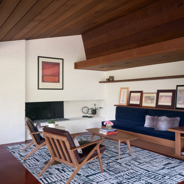
Nestled in the hills of Orinda, California, this 1951 residence is one of only seven extant homes, now known as “The Magnificent Seven”, designed by architect Olof Dahlstrand, a protégé of Frank Lloyd Wright. With its low-slung rooflines, natural materials, and deep integration with the sloping landscape, the home is a pristine example of mid-century modern design inspired by Wright’s organic principles. Over the years, prior homeowners have emphasized preservation, ensuring that the house remained relatively untouched. Each owner has respected the original architecture and stayed true to Dahlstrand’s intent. When a family of five—two college-aged sons and a middle school-aged daughter—acquired the property, they were captivated by its history, legacy of care, and architectural significance. While they appreciated Dahlstrand’s original vision, they also recognized the need to adapt the home for contemporary living while preserving its design integrity.
The remodel was conceived as a thoughtful response to the past—an effort to bring the house into the 21st century without compromising its soul. The primary mandate was to maintain architectural continuity while improving the functionality, comfort, and livability for a modern family. The design team—architects and contractor alike—worked with a shared reverence for the original architecture, allowing that mindset to guide even the most technical or pragmatic decisions.
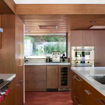
A key objective was to increase natural light in the kitchen—a departure from Wrightian principles of enclosed, intimate cooking spaces—while maintaining the home’s architectural language. The kitchen was reconfigured to foster a stronger connection to adjacent living spaces while retaining the underlying concept of spatial separation. One of the most transformative architectural changes was the removal of a ridge beam that was originally planned to remain visible through the kitchen. During construction, the team collaborated on a better solution: a wide-flanged steel beam concealed within the roof envelope. This subtle move preserved the clean lines and ceiling continuity, a modern update carried out with utmost respect for the existing framework.
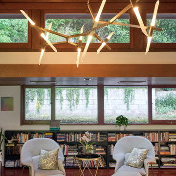
The home’s original powder room, previously accessible only through the kitchen, was relocated for better flow and privacy. A new powder room was carved out of former kitchen cabinetry—a narrow, interior space that could have felt dark and enclosed. To avoid this, the design extended the line of original transom windows into the new powder room and added a skylight above the vanity. The result is a bright and airy space that feels consistent with the rest of the home. Other updates included the installation of new solid-core interior doors with veneers carefully matched to the original mahogany, enhancing the continuity of the interiors. Even smaller decisions, such as placing the door knobs at 42 inches high, mirrored the original proportions. Every choice reflected a shared belief between the architect, contractor, and client: that new work should serve the integrity of the old.
The home’s extensive interior redwood millwork and paneling was meticulously restored. Where new materials were introduced—such as the replacement redwood soffit paneling—the contractor took pains to find finish nails that matched the original, rather than using modern equivalents. This level of craftsmanship and collaboration defined the project. It extended even to the detailing of a blind door to the new powder room, which had to disappear into the existing redwood board-and-batten wall. It was a team effort: the owner found a suitable handle, the architects devised the custom in-swing mechanism, and the contractor executed it so the door aligned precisely with the battens. Throughout, the homeowners were deeply engaged in the design process. One, a meticulous design enthusiast, focused on aesthetic integrity and historic detail. The other brought a practical and function-driven perspective, ensuring that new fixtures and materials would be durable and require minimal maintenance.
While the home’s location posed no major site challenges, sustainability was a key concern. The team upgraded the roof insulation, installed solar panels with battery storage, and added ductless mini-split cooling systems. Lighting was another area where modern technology was woven into a historic framework: new square LED fixtures echo the original custom perimeter soffit lights, maintaining the design language while offering advanced performance.
A planned expansion of a bedroom into suite with a bathroom had to be shelved due to budget constraints and the high cost of below-grade foundation work. Still, the team focused their efforts on making the most of the existing footprint, resolving constraints through design ingenuity rather than adding square footage. This renovation represents a collaborative achievement in preserving and evolving a historically significant home. Every decision was shaped by a shared ethos among clients, architects, and contractor: to maintain the home’s architectural soul while updating it for contemporary life. The result is a timeless modernist residence that continues Olof Dahlstrand’s legacy, remaining grounded in nature, craftsmanship, and human-scale design.
Klopf Architecture Team: John Klopf, AIA, Klara Kevane, Fernanda Bernardes
Interior Architectural Design: Klopf Architecture
Structural Engineer: Daniel Bastiao
Contractor: Don Larwood, Larwood Construction
Photography: Mariko Reed
Year Completed: 2022
 Klopf Architecture
Nestled in the hills of Orinda, California, this 1951 residence is one of only seven extant homes, now known as “The Magnificent Seven”, designed by architect Olof Dahlstrand, a protégé of Frank Lloyd Wright. With its low-slung rooflines, natural materials, and deep integration with the sloping landscape, the home is a pristine example of mid-century modern design inspired by Wright’s organic principles. Over the years, prior homeowners have emphasized preservation, ensuring that the house remained relatively untouched. Each owner has respected the original architecture and stayed true to Dahlstrand’s intent. When a family of five—two college-aged sons and a middle school-aged daughter—acquired the property, they were captivated by its history, legacy of care, and architectural significance. While they appreciated Dahlstrand’s original vision, they also recognized the need to adapt the home for contemporary living while preserving its design integrity.
The remodel was conceived as a thoughtful response to the past—an effort to bring the house into the 21st century without compromising its soul. The primary mandate was to maintain architectural continuity while improving the functionality, comfort, and livability for a modern family. The design team—architects and contractor alike—worked with a shared reverence for the original architecture, allowing that mindset to guide even the most technical or pragmatic decisions.
A key objective was to increase natural light in the kitchen—a departure from Wrightian principles of enclosed, intimate cooking spaces—while maintaining the home’s architectural language. The kitchen was reconfigured to foster a stronger connection to adjacent living spaces while retaining the underlying concept of spatial separation. One of the most transformative architectural changes was the removal of a ridge beam that was originally planned to remain visible through the kitchen. During construction, the team collaborated on a better solution: a wide-flanged steel beam concealed within the roof envelope. This subtle move preserved the clean lines and ceiling continuity, a modern update carried out with utmost respect for the existing framework.
The home’s original powder room, previously accessible only through the kitchen, was relocated for better flow and privacy. A new powder room was carved out of former kitchen cabinetry—a narrow, interior space that could have felt dark and enclosed. To avoid this, the design extended the line of original transom windows into the new powder room and added a skylight above the vanity. The result is a bright and airy space that feels consistent with the rest of the home. Other updates included the installation of new solid-core interior doors with veneers carefully matched to the original mahogany, enhancing the continuity of the interiors. Even smaller decisions, such as placing the door knobs at 42 inches high, mirrored the original proportions. Every choice reflected a shared belief between the architect, contractor, and client: that new work should serve the integrity of the old.
The home’s extensive interior redwood millwork and paneling was meticulously restored. Where new materials were introduced—such as the replacement redwood soffit paneling—the contractor took pains to find finish nails that matched the original, rather than using modern equivalents. This level of craftsmanship and collaboration defined the project. It extended even to the detailing of a blind door to the new powder room, which had to disappear into the existing redwood board-and-batten wall. It was a team effort: the owner found a suitable handle, the architects devised the custom in-swing mechanism, and the contractor executed it so the door aligned precisely with the battens. Throughout, the homeowners were deeply engaged in the design process. One, a meticulous design enthusiast, focused on aesthetic integrity and historic detail. The other brought a practical and function-driven perspective, ensuring that new fixtures and materials would be durable and require minimal maintenance.
While the home’s location posed no major site challenges, sustainability was a key concern. The team upgraded the roof insulation, installed solar panels with battery storage, and added ductless mini-split cooling systems. Lighting was another area where modern technology was woven into a historic framework: new square LED fixtures echo the original custom perimeter soffit lights, maintaining the design language while offering advanced performance.
A planned expansion of a bedroom into suite with a bathroom had to be shelved due to budget constraints and the high cost of below-grade foundation work. Still, the team focused their efforts on making the most of the existing footprint, resolving constraints through design ingenuity rather than adding square footage. This renovation represents a collaborative achievement in preserving and evolving a historically significant home. Every decision was shaped by a shared ethos among clients, architects, and contractor: to maintain the home’s architectural soul while updating it for contemporary life. The result is a timeless modernist residence that continues Olof Dahlstrand’s legacy, remaining grounded in nature, craftsmanship, and human-scale design.
Klopf Architecture Team: John Klopf, AIA, Klara Kevane, Fernanda Bernardes
Interior Architectural Design: Klopf Architecture
Structural Engineer: Daniel Bastiao
Contractor: Don Larwood, Larwood Construction
Photography: Mariko Reed
Year Completed: 2022
 Klopf Architecture
Nestled in the hills of Orinda, California, this 1951 residence is one of only seven extant homes, now known as “The Magnificent Seven”, designed by architect Olof Dahlstrand, a protégé of Frank Lloyd Wright. With its low-slung rooflines, natural materials, and deep integration with the sloping landscape, the home is a pristine example of mid-century modern design inspired by Wright’s organic principles. Over the years, prior homeowners have emphasized preservation, ensuring that the house remained relatively untouched. Each owner has respected the original architecture and stayed true to Dahlstrand’s intent. When a family of five—two college-aged sons and a middle school-aged daughter—acquired the property, they were captivated by its history, legacy of care, and architectural significance. While they appreciated Dahlstrand’s original vision, they also recognized the need to adapt the home for contemporary living while preserving its design integrity.
The remodel was conceived as a thoughtful response to the past—an effort to bring the house into the 21st century without compromising its soul. The primary mandate was to maintain architectural continuity while improving the functionality, comfort, and livability for a modern family. The design team—architects and contractor alike—worked with a shared reverence for the original architecture, allowing that mindset to guide even the most technical or pragmatic decisions.
A key objective was to increase natural light in the kitchen—a departure from Wrightian principles of enclosed, intimate cooking spaces—while maintaining the home’s architectural language. The kitchen was reconfigured to foster a stronger connection to adjacent living spaces while retaining the underlying concept of spatial separation. One of the most transformative architectural changes was the removal of a ridge beam that was originally planned to remain visible through the kitchen. During construction, the team collaborated on a better solution: a wide-flanged steel beam concealed within the roof envelope. This subtle move preserved the clean lines and ceiling continuity, a modern update carried out with utmost respect for the existing framework.
The home’s original powder room, previously accessible only through the kitchen, was relocated for better flow and privacy. A new powder room was carved out of former kitchen cabinetry—a narrow, interior space that could have felt dark and enclosed. To avoid this, the design extended the line of original transom windows into the new powder room and added a skylight above the vanity. The result is a bright and airy space that feels consistent with the rest of the home. Other updates included the installation of new solid-core interior doors with veneers carefully matched to the original mahogany, enhancing the continuity of the interiors. Even smaller decisions, such as placing the door knobs at 42 inches high, mirrored the original proportions. Every choice reflected a shared belief between the architect, contractor, and client: that new work should serve the integrity of the old.
The home’s extensive interior redwood millwork and paneling was meticulously restored. Where new materials were introduced—such as the replacement redwood soffit paneling—the contractor took pains to find finish nails that matched the original, rather than using modern equivalents. This level of craftsmanship and collaboration defined the project. It extended even to the detailing of a blind door to the new powder room, which had to disappear into the existing redwood board-and-batten wall. It was a team effort: the owner found a suitable handle, the architects devised the custom in-swing mechanism, and the contractor executed it so the door aligned precisely with the battens. Throughout, the homeowners were deeply engaged in the design process. One, a meticulous design enthusiast, focused on aesthetic integrity and historic detail. The other brought a practical and function-driven perspective, ensuring that new fixtures and materials would be durable and require minimal maintenance.
While the home’s location posed no major site challenges, sustainability was a key concern. The team upgraded the roof insulation, installed solar panels with battery storage, and added ductless mini-split cooling systems. Lighting was another area where modern technology was woven into a historic framework: new square LED fixtures echo the original custom perimeter soffit lights, maintaining the design language while offering advanced performance.
A planned expansion of a bedroom into suite with a bathroom had to be shelved due to budget constraints and the high cost of below-grade foundation work. Still, the team focused their efforts on making the most of the existing footprint, resolving constraints through design ingenuity rather than adding square footage. This renovation represents a collaborative achievement in preserving and evolving a historically significant home. Every decision was shaped by a shared ethos among clients, architects, and contractor: to maintain the home’s architectural soul while updating it for contemporary life. The result is a timeless modernist residence that continues Olof Dahlstrand’s legacy, remaining grounded in nature, craftsmanship, and human-scale design.
Klopf Architecture Team: John Klopf, AIA, Klara Kevane, Fernanda Bernardes
Interior Architectural Design: Klopf Architecture
Structural Engineer: Daniel Bastiao
Contractor: Don Larwood, Larwood Construction
Photography: Mariko Reed
Year Completed: 2022
48