
Search results for "Continuing process" in Home Design Ideas
 Cooperman & Co. Luxury Interior Design
The Petal & Poppy Home is a vibrant, collected family residence defined by bold color, layered pattern, and a confident sense of personality. Designed over several years as the young family grew, the home reflects an evolving story rooted in warmth, creativity, and a love of expressive interiors.
Color guided the design from the outset. A blue grasscloth dining room and an existing pink Persian rug in the formal living room became the foundation for a palette that unfolded organically throughout the home. With clients eager to mix patterns and embrace saturated hues, the design process focused on contrast, cohesion, and joyful self-expression.
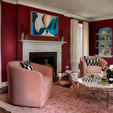
The entry makes an immediate statement with a playful spotted stair runner, oversized artwork, and a high-gloss black handrail that introduces graphic contrast. The formal living room, designed for entertaining, is the moodiest space in the home. Dark garnet walls and a commissioned piece by local artist Carrie Gillen create a dramatic backdrop, while pink tweed swivel chairs and a tailored charcoal sofa complete a space designed for lingering.
Beyond French doors, the home office is an immersive mix of pattern and color, with wallpaper wrapping both walls and ceiling. A leopard carpet and modern crystal chandelier add a touch of glamour, resulting in a space that feels energizing and personal. The dining room continues the confident use of blue, layering patterns around a custom round pedestal table designed for everyday meals and gatherings alike.
At the heart of the home, the family room was designed for togetherness. A bright blue sectional anchors the space, complemented by custom ottomans on hidden casters and softened with tailored throw pillows. Existing bookshelves are refreshed with a Peter Fasano wallcovering, creating a collected, lived-in backdrop.
Upstairs, the primary suite offers a softer expression of color, blending blues, oranges, and pinks, while built-in window benches add moments of comfort. The children’s bedrooms balance playfulness with longevity, layered with color and texture designed to grow alongside them.
The Petal & Poppy Home is a celebration of color, creativity, and family life—an interior that feels intentionally layered, expressive, and deeply personal, designed to evolve over time.
 Lincoln Lighthill Architect
This project is a story of how buildings and relationships evolve over time, and how the two are intertwined in the making of architecture.
The client, a single man, had just purchased a classic Edwardian flat on San Francisco’s Liberty Street, known for its historic homes and famous neighbors like Tracy Chapman, when his realtor connected him with LLA. The initial brief was to integrate a modern, minimalist kitchen and bathroom with the apartment's traditional aesthetic. The existing condition was a series of cramped rooms and a long hallway that divided the apartment into many separate spaces, some without natural light.
The solution was to remove most of the walls in the middle of the flat, with extensive structural work hidden from view. This created an open connection between the living, dining and kitchen areas that flooded the formerly dark core of the apartment with light.
Midway through the design process, the client and his partner, and avid cook, decided it was time to move in together. The project evolved further and LLA found inventive ways to pack more features and amenities into a design that was fundamentally about simplicity.
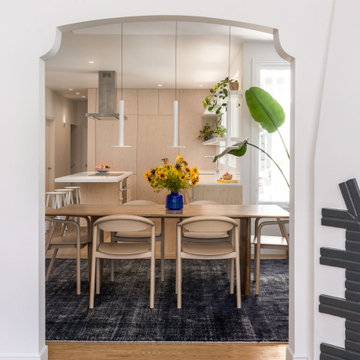
The result of this creative tension is a large open kitchen with deceptively simple forms- a long back counter with three rows of drawers below, an island with a central cooktop and double cantilevers for seating, and a slightly mysterious wood box at the back. The box conceals the refrigerator, storage, linens, and laundry, and through a secret door, a large walk-in pantry.
The bathroom evolved into a mini-spa, with a walk-through shower and Japanese-style soaking tub. The space shares light with the kitchen through a floor-to-ceiling translucent glass panel. Each client has a large dog, and so a small sliver of space under the upstairs neighbor's stair was turned into the perfect doggie den, complete with period correct doorway.
The newly blended family moved in together when the project was completed. A poignant footnote, Maverick, the blonder, fluffier dog in the photos, was very old and sadly passed away shortly after they moved in. It made the photoshoot feel like a special event that honored and preserved his memory in pictures. Like all families, theirs continues to evolve and change, just as their home has over its 90 year life.
 Lincoln Lighthill Architect
This project is a story of how buildings and relationships evolve over time, and how the two are intertwined in the making of architecture.
The client, a single man, had just purchased a classic Edwardian flat on San Francisco’s Liberty Street, known for its historic homes and famous neighbors like Tracy Chapman, when his realtor connected him with LLA. The initial brief was to integrate a modern, minimalist kitchen and bathroom with the apartment's traditional aesthetic. The existing condition was a series of cramped rooms and a long hallway that divided the apartment into many separate spaces, some without natural light.
The solution was to remove most of the walls in the middle of the flat, with extensive structural work hidden from view. This created an open connection between the living, dining and kitchen areas that flooded the formerly dark core of the apartment with light.
Midway through the design process, the client and his partner, and avid cook, decided it was time to move in together. The project evolved further and LLA found inventive ways to pack more features and amenities into a design that was fundamentally about simplicity.
The result of this creative tension is a large open kitchen with deceptively simple forms- a long back counter with three rows of drawers below, an island with a central cooktop and double cantilevers for seating, and a slightly mysterious wood box at the back. The box conceals the refrigerator, storage, linens, and laundry, and through a secret door, a large walk-in pantry.
The bathroom evolved into a mini-spa, with a walk-through shower and Japanese-style soaking tub. The space shares light with the kitchen through a floor-to-ceiling translucent glass panel. Each client has a large dog, and so a small sliver of space under the upstairs neighbor's stair was turned into the perfect doggie den, complete with period correct doorway.
The newly blended family moved in together when the project was completed. A poignant footnote, Maverick, the blonder, fluffier dog in the photos, was very old and sadly passed away shortly after they moved in. It made the photoshoot feel like a special event that honored and preserved his memory in pictures. Like all families, theirs continues to evolve and change, just as their home has over its 90 year life.
Find the right local pro for your project
 Cooperman & Co. Luxury Interior Design
The Petal & Poppy Home is a vibrant, collected family residence defined by bold color, layered pattern, and a confident sense of personality. Designed over several years as the young family grew, the home reflects an evolving story rooted in warmth, creativity, and a love of expressive interiors.
Color guided the design from the outset. A blue grasscloth dining room and an existing pink Persian rug in the formal living room became the foundation for a palette that unfolded organically throughout the home. With clients eager to mix patterns and embrace saturated hues, the design process focused on contrast, cohesion, and joyful self-expression.
The entry makes an immediate statement with a playful spotted stair runner, oversized artwork, and a high-gloss black handrail that introduces graphic contrast. The formal living room, designed for entertaining, is the moodiest space in the home. Dark garnet walls and a commissioned piece by local artist Carrie Gillen create a dramatic backdrop, while pink tweed swivel chairs and a tailored charcoal sofa complete a space designed for lingering.
Beyond French doors, the home office is an immersive mix of pattern and color, with wallpaper wrapping both walls and ceiling. A leopard carpet and modern crystal chandelier add a touch of glamour, resulting in a space that feels energizing and personal. The dining room continues the confident use of blue, layering patterns around a custom round pedestal table designed for everyday meals and gatherings alike.
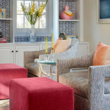
At the heart of the home, the family room was designed for togetherness. A bright blue sectional anchors the space, complemented by custom ottomans on hidden casters and softened with tailored throw pillows. Existing bookshelves are refreshed with a Peter Fasano wallcovering, creating a collected, lived-in backdrop.
Upstairs, the primary suite offers a softer expression of color, blending blues, oranges, and pinks, while built-in window benches add moments of comfort. The children’s bedrooms balance playfulness with longevity, layered with color and texture designed to grow alongside them.
The Petal & Poppy Home is a celebration of color, creativity, and family life—an interior that feels intentionally layered, expressive, and deeply personal, designed to evolve over time.
 Lincoln Lighthill Architect
This project is a story of how buildings and relationships evolve over time, and how the two are intertwined in the making of architecture.
The client, a single man, had just purchased a classic Edwardian flat on San Francisco’s Liberty Street, known for its historic homes and famous neighbors like Tracy Chapman, when his realtor connected him with LLA. The initial brief was to integrate a modern, minimalist kitchen and bathroom with the apartment's traditional aesthetic. The existing condition was a series of cramped rooms and a long hallway that divided the apartment into many separate spaces, some without natural light.
The solution was to remove most of the walls in the middle of the flat, with extensive structural work hidden from view. This created an open connection between the living, dining and kitchen areas that flooded the formerly dark core of the apartment with light.
Midway through the design process, the client and his partner, and avid cook, decided it was time to move in together. The project evolved further and LLA found inventive ways to pack more features and amenities into a design that was fundamentally about simplicity.
The result of this creative tension is a large open kitchen with deceptively simple forms- a long back counter with three rows of drawers below, an island with a central cooktop and double cantilevers for seating, and a slightly mysterious wood box at the back. The box conceals the refrigerator, storage, linens, and laundry, and through a secret door, a large walk-in pantry.
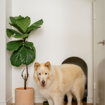
The bathroom evolved into a mini-spa, with a walk-through shower and Japanese-style soaking tub. The space shares light with the kitchen through a floor-to-ceiling translucent glass panel. Each client has a large dog, and so a small sliver of space under the upstairs neighbor's stair was turned into the perfect doggie den, complete with period correct doorway.
The newly blended family moved in together when the project was completed. A poignant footnote, Maverick, the blonder, fluffier dog in the photos, was very old and sadly passed away shortly after they moved in. It made the photoshoot feel like a special event that honored and preserved his memory in pictures. Like all families, theirs continues to evolve and change, just as their home has over its 90 year life.
 Pathway Design & Construction
Water leaks can be frustrating and happen often unexpectedly… especially when the water is coming from your upstairs neighbor!
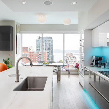
Once the leak occurred, the homeowners decided that it was the perfect opportunity to create their dream kitchen and entryway. The decision was made and the homeowners went shopping to purchase materials for their renovation. One problem; they hadn’t hired a contractor yet. They quickly discovered they would need help building their dream kitchen and entryway which is where we came in.
Scope:
Create a versatile space that reflects the homeowners’ vibrant personalities where they could cook, work, relax and entertain.
Desired features include:
Color changing LED tape lighting was essential to help create ambiance.
Smaller can lights with updated trim to modernize the lighting.
Disguising a “workspace” into the island design.
Installing a compost bin that doubles as a wine chiller for entertaining.
Separate wine bar.
Installing an intricate piece of mirror art and lighting in the entryway.
Installing custom waved back splash tile.
Challenges:
Creating a working set of construction plans from cabinet drawings was a challenge. The process entailed continuous communication with the clients including several walkthroughs before final installation of each aspect throughout the project.
Incorporating high-gloss and muted surfaces into the space without creating glare from the natural light coming in from many existing windows.
Wavy tile became difficult to install with the desired layout of backsplash outlet style and locations.
Solutions:
The core design issues were resolved with exceptional communication between our field team and the homeowners.
Satin finish countertops and matte paint offset the high gloss cabinetry and backsplash.
Because of the size of tiles in the space, the outlets needed to be cut in the center of the tile to look uniform. Time and a steady hand made this possible for the best visual result.
Result:
Thoughtful execution helped to create a versatile dream kitchen and entry way that also provides an at-home workspace. This now versatile space is useful and aesthetically pleasing, exceeding the homeowners’ vision. The small details ranging from accent lighting to the compost bin turned wine chiller make this a luxurious statement piece.

 John R. Schroeder, AIA
Photography by Caryn B. Davis
Located in the Cornfield Point area of Old Saybrook along Long Island Sound, this project brought a classic, yet forgotten beach house back to life. Through a little detective work and some creative ingenuity, we restored and enhanced the exterior to it’s former glory and transformed the interior to a highly efficient and functional home all the while uplifting its quaint cottage charm. On the exterior, we recreated a wonderful, airy front porch with cozy bench seats that look out to the water. The white cedar shingle siding is pre-bleached with a subtle flair at the bottom and a delicate break at mid-elevation. The asphalt shingles are not only beautifully matched with the siding, but offer superior reflective qualities to dissipate the heat of the summer sun. On the interior, we joined the front seasonal porch with the family room to form a larger, open living and dining space with paneled walls and ceilings anchored by the original round stone fireplace. In the rear, we carefully crafted a galley kitchen and laundry space with an adjacent first floor master suite. The diminutive house and property posed multiple practical and regulatory challenges which were overcome by a strong team effort, due diligence, and a commitment to the process.
John R. Schroeder, AIA is a professional design firm specializing in architecture, interiors, and planning. We have over 30 years experience with projects of all types, sizes, and levels of complexity. Because we love what we do, we approach our work with enthusiasm and dedication. We are committed to the highest level of design and service on each and every project. We engage our clients in positive and rewarding collaborations. We strive to exceed expectations through our attention to detail, our understanding of the “big picture”, and our ability to effectively manage a team of design professionals, industry representatives, and building contractors. We carefully analyze budgets and project objectives to assist clients with wise fund allocation.
We continually monitor and research advances in technology, materials, and construction methods, both sustainable and otherwise, to provide a responsible, well-suited, and cost effective product. Our design solutions are highly functional using both innovative and traditional approaches. Our aesthetic style is flexible and open, blending cues from client desires, building function, site context, and material properties, making each project unique, personalized, and enduring.

 E. F. San Juan
A Modern Penthouse on Choctawhatchee Bay
Private Residence / Destin, Florida
Builder: Ron Porter, Regal Stephens Construction
The team at E. F. San Juan worked closely with the homeowner and builder on this bayside penthouse condo to create custom walnut wall paneling, trim, baseboards, and casing, plus twelve-foot hidden doors to match.
Challenges:
The greatest challenge on this project was that the design was very contemporary and had been entirely envisioned by the homeowner. We met the challenge with great enthusiasm by working with the homeowner and the builder (Ron Porter of Regal Stephens Construction) to bring their vision to reality. Ron was an enthusiastic participant in the project, giving us free rein to design and engineer a solution that would provide the look the homeowner desired.
Solution:
To achieve a component of the contemporary look the homeowner sought—inconspicuous trim—we ground custom moulding knives exclusive for this project’s baseboard and casing. The baseboard throughout the residence was designed to be discreet and also includes recessed lighting. The walnut bump-outs on the wall surrounding the fireplace were a great challenge, as were the highly figured, flush walnut doors flanking the fireplace. When open, these twelve-foot-tall doors are hidden and look like paneled sections that blend into a recess in the wall; when closed, the doors also blend seamlessly with the flanking walnut wall. This creates a long, continuous wall of walnut wood when viewed from the kitchen area. E. F. San Juan also created custom leather-covered barn doors between the dining room and the living room.
We thoroughly enjoyed working on this project. The homeowner knew exactly what she wanted from a design perspective, and the builder was an encouraging partner throughout the process. The result is a unique and beautiful reflection of a memorable collaborative endeavor.
---
Photography courtesy of Regal Stephens Construction
 Cooperman & Co. Luxury Interior Design
The Petal & Poppy Home is a vibrant, collected family residence defined by bold color, layered pattern, and a confident sense of personality. Designed over several years as the young family grew, the home reflects an evolving story rooted in warmth, creativity, and a love of expressive interiors.
Color guided the design from the outset. A blue grasscloth dining room and an existing pink Persian rug in the formal living room became the foundation for a palette that unfolded organically throughout the home. With clients eager to mix patterns and embrace saturated hues, the design process focused on contrast, cohesion, and joyful self-expression.
The entry makes an immediate statement with a playful spotted stair runner, oversized artwork, and a high-gloss black handrail that introduces graphic contrast. The formal living room, designed for entertaining, is the moodiest space in the home. Dark garnet walls and a commissioned piece by local artist Carrie Gillen create a dramatic backdrop, while pink tweed swivel chairs and a tailored charcoal sofa complete a space designed for lingering.
Beyond French doors, the home office is an immersive mix of pattern and color, with wallpaper wrapping both walls and ceiling. A leopard carpet and modern crystal chandelier add a touch of glamour, resulting in a space that feels energizing and personal. The dining room continues the confident use of blue, layering patterns around a custom round pedestal table designed for everyday meals and gatherings alike.
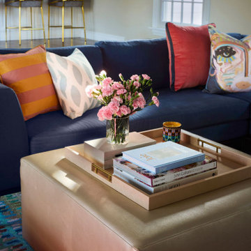
At the heart of the home, the family room was designed for togetherness. A bright blue sectional anchors the space, complemented by custom ottomans on hidden casters and softened with tailored throw pillows. Existing bookshelves are refreshed with a Peter Fasano wallcovering, creating a collected, lived-in backdrop.
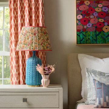
Upstairs, the primary suite offers a softer expression of color, blending blues, oranges, and pinks, while built-in window benches add moments of comfort. The children’s bedrooms balance playfulness with longevity, layered with color and texture designed to grow alongside them.
The Petal & Poppy Home is a celebration of color, creativity, and family life—an interior that feels intentionally layered, expressive, and deeply personal, designed to evolve over time.
 Cooperman & Co. Luxury Interior Design
The Petal & Poppy Home is a vibrant, collected family residence defined by bold color, layered pattern, and a confident sense of personality. Designed over several years as the young family grew, the home reflects an evolving story rooted in warmth, creativity, and a love of expressive interiors.
Color guided the design from the outset. A blue grasscloth dining room and an existing pink Persian rug in the formal living room became the foundation for a palette that unfolded organically throughout the home. With clients eager to mix patterns and embrace saturated hues, the design process focused on contrast, cohesion, and joyful self-expression.
The entry makes an immediate statement with a playful spotted stair runner, oversized artwork, and a high-gloss black handrail that introduces graphic contrast. The formal living room, designed for entertaining, is the moodiest space in the home. Dark garnet walls and a commissioned piece by local artist Carrie Gillen create a dramatic backdrop, while pink tweed swivel chairs and a tailored charcoal sofa complete a space designed for lingering.
Beyond French doors, the home office is an immersive mix of pattern and color, with wallpaper wrapping both walls and ceiling. A leopard carpet and modern crystal chandelier add a touch of glamour, resulting in a space that feels energizing and personal. The dining room continues the confident use of blue, layering patterns around a custom round pedestal table designed for everyday meals and gatherings alike.
At the heart of the home, the family room was designed for togetherness. A bright blue sectional anchors the space, complemented by custom ottomans on hidden casters and softened with tailored throw pillows. Existing bookshelves are refreshed with a Peter Fasano wallcovering, creating a collected, lived-in backdrop.
Upstairs, the primary suite offers a softer expression of color, blending blues, oranges, and pinks, while built-in window benches add moments of comfort. The children’s bedrooms balance playfulness with longevity, layered with color and texture designed to grow alongside them.
The Petal & Poppy Home is a celebration of color, creativity, and family life—an interior that feels intentionally layered, expressive, and deeply personal, designed to evolve over time.
 Cooperman & Co. Luxury Interior Design
The Petal & Poppy Home is a vibrant, collected family residence defined by bold color, layered pattern, and a confident sense of personality. Designed over several years as the young family grew, the home reflects an evolving story rooted in warmth, creativity, and a love of expressive interiors.
Color guided the design from the outset. A blue grasscloth dining room and an existing pink Persian rug in the formal living room became the foundation for a palette that unfolded organically throughout the home. With clients eager to mix patterns and embrace saturated hues, the design process focused on contrast, cohesion, and joyful self-expression.
The entry makes an immediate statement with a playful spotted stair runner, oversized artwork, and a high-gloss black handrail that introduces graphic contrast. The formal living room, designed for entertaining, is the moodiest space in the home. Dark garnet walls and a commissioned piece by local artist Carrie Gillen create a dramatic backdrop, while pink tweed swivel chairs and a tailored charcoal sofa complete a space designed for lingering.
Beyond French doors, the home office is an immersive mix of pattern and color, with wallpaper wrapping both walls and ceiling. A leopard carpet and modern crystal chandelier add a touch of glamour, resulting in a space that feels energizing and personal. The dining room continues the confident use of blue, layering patterns around a custom round pedestal table designed for everyday meals and gatherings alike.
At the heart of the home, the family room was designed for togetherness. A bright blue sectional anchors the space, complemented by custom ottomans on hidden casters and softened with tailored throw pillows. Existing bookshelves are refreshed with a Peter Fasano wallcovering, creating a collected, lived-in backdrop.
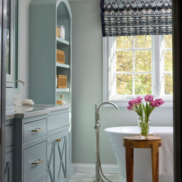
Upstairs, the primary suite offers a softer expression of color, blending blues, oranges, and pinks, while built-in window benches add moments of comfort. The children’s bedrooms balance playfulness with longevity, layered with color and texture designed to grow alongside them.
The Petal & Poppy Home is a celebration of color, creativity, and family life—an interior that feels intentionally layered, expressive, and deeply personal, designed to evolve over time.

 Klopf Architecture
Klopf Architecture and Jesse Ososki Art remodeled an existing Eichler atrium home into a brighter, more open, and more functional version of its original self.
The goals were to preserve the Eichler look and feel without the need to strictly adhere to it. The scope of work included re-configuring the master bedroom/bath, the kitchen, and the hall bath/laundry area, as well as updating interior finishes throughout to be more sophisticated.
The owners are detail-oriented and were very involved in the design process, down to the selection of lighting controls and stainless steel faceplates.Their design aesthetic leans toward the Scandinavian — light and bright, with simple straight lines and pure geometric shapes.
The finish flooring is large porcelain tile (24” x 24”) in a neutral grey tone, providing a uniform backdrop against which other materials can stand out. The same tile continues into the shower floor (with a different finish texture for slip-resistance) and up the shower/tub walls (in a smaller size). Heath Classic Field ceramic tile in Modern Blue was used sparingly, to add color at the hall bath vanity backsplash and at the shampoo niches in both bathrooms. Back-painted soda glass in pale blue to match the Heath tile was used at the kitchen backsplash. This same accent color was also used at the front entry atrium door. Kitchen cabinetry, countertops, appliances, and light fixtures are all white, making the kitchen feel more airy and light. Countertops are Caesarstone Blizzard.
The owners chose to keep some of the original Eichler elements: the concrete masonry fireplace; the stained tongue-and-groove redwood ceiling decking; and the luan wall paneling. The luan paneling was lightly sanded, cleaned, and re-stained. The owners also kept an added element that was installed by a previous owner: sliding shoji panels at all bedroom windows and sliding glass doors, for both privacy and sun control. Grooves were cut into the new tile flooring for the shoji panels to slide in, creating a more integrated look. Walnut was used to add warmth and contrast at the kitchen bar top and niche, the bathroom vanities, and the window sill/ledge under the kitchen window.
This Burlingame Eichler Remodel is a 2,121 sf, 4 bedroom/2 bath home located in the heart of Silicon Valley.
Klopf Architecture Project Team: John Klopf, Klara Kevane and Yegvenia Torres Zavala
Contractor: Jesse Ososki Art
Structural Engineer: Emmanuel Pun
Photography ©2018 Mariko Reed
Location: Burlingame, CA
Year completed: 2017

 Custom Surface Solutions
Custom Surface Solutions (www.css-tile.com) - Owner Craig Thompson (512) 430-1215. This project shows new 12 x 24 tile installed vertically with offset layout pattern on wall and floor. Includes shower box with linear glass accent tile back and vertical glass accent band. Tile edges are finished with Schluter Jolly satin aluminum profile edge trim.

 InnovationLand
We are so excited about this stylish Houston patio addition!
It's one of our most recent outdoor living space design projects - and one of our new favorites!
We particularly love the rustic corner fireplace, the beautiful, vaulted pine ceiling and the Restoration Hardware furniture and accessories.
"Even though this space has an outdoor kitchen - often the highlight of our projects - the focus here is beautiful, comfortable outdoor living," says Outdoor Homescapes of Houston owner Wayne Franks. "And I have to say, I think this is one of the most gorgeous spaces we've created for doing that - in style."
"This project was special from the start, as we were creating this space for a friend of Wayne’s who had been a long time mentor to his boys growing up," adds Lisha Maxey, owner of LGH Designs in Houston (she coordinated furniture and finishes for the project). "This client was the principal of their high school and knew all of them very well and Wayne, too. This made it very personal, indeed, and we wanted everything to be perfect!"
The 23- by 16-foot addition, located at the back of the house in Cypress, looks out onto a manmade lake in the homeowners' subdivision. The focal point? A 9-foot-8-inch-high-by-7-foot-wide corner fireplace in Earth Grey rustic ledgestone from Colorstone in Houston. The fireplace features a custom wooden mantel, stone bench seating and a 52-inch Sunbrite outdoor TV.
Another highlight is the flooring - silver travertine tile laid out in a Versailles pattern. "We chose silver travertine in a 'Tumbled' color palette with variations of cream and brown," says Lisha. "So we had those two colors, plus grey, to pull from."
The 7-foot-long, stucco outdoor kitchen island's countertops are also noteworthy - Absolute Black granite in a leathered finish offering a modern look and a dark grey hue that works perfectly with the color palette. The kitchen island also houses an RCS 30-inch grill and fridge.
The seating area includes a sectional couch, coffee table, two swivel chairs and two ottomans - all from Restoration Hardware.
"We used Restoration Hardware's Biscayne sectional, swivel chairs and ottomans in gray, with textured linen weave in Sand and cushions and peacock accent pillows in gray," says Lisha. The coffee table is made of solid teak with a concrete top - as is the matching side table.
"We added a console table, also in teak, behind the sofa. And for accents, we added three Amalfi lanterns from Restoration Hardware in weathered zinc."
A Sunbrella® Heathered area rug (in Gray) was added to anchor the space and visually tie it together.
"The space as a whole leans towards a transitional style, in that it has many traditional cozy comforts and colors, but the furniture gives it a more contemporary look," says Lisha. "The idea from the beginning was to marry these two styles, as our clients wanted a look that would not age and be in vogue for years to come."
On the exterior, you can see how we worked to make the addition blend with the existing home - matching the shingles and stucco and continuing the landscaping.
3D graphic renderings and a virtual video tour allowed the clients to know exactly what the space would look like beforehand.
"It takes a lot of the guesswork out of the process," says Outdoor Homescapes' graphic designer, Kristy Buell Franks. "Floor plans and elevation drawings are good for giving an idea of the overall scope of the project, but it's the 3D renderings that really show what the space is going to look like."
The 3D graphics and video tours also help immensely when choosing finishing materials and furniture, she says: "The clients' choices can be put into the design to allow the clients to see how the materials will work with the existing materials on the house and how the furniture will look in the space."
What do you like about this space? Post a comment and let us know!
URL http://www.outdoorhomescapes.com
 Klopf Architecture
Klopf Architecture and Jesse Ososki Art remodeled an existing Eichler atrium home into a brighter, more open, and more functional version of its original self.
The goals were to preserve the Eichler look and feel without the need to strictly adhere to it. The scope of work included re-configuring the master bedroom/bath, the kitchen, and the hall bath/laundry area, as well as updating interior finishes throughout to be more sophisticated.
The owners are detail-oriented and were very involved in the design process, down to the selection of lighting controls and stainless steel faceplates.Their design aesthetic leans toward the Scandinavian — light and bright, with simple straight lines and pure geometric shapes.
The finish flooring is large porcelain tile (24” x 24”) in a neutral grey tone, providing a uniform backdrop against which other materials can stand out. The same tile continues into the shower floor (with a different finish texture for slip-resistance) and up the shower/tub walls (in a smaller size). Heath Classic Field ceramic tile in Modern Blue was used sparingly, to add color at the hall bath vanity backsplash and at the shampoo niches in both bathrooms. Back-painted soda glass in pale blue to match the Heath tile was used at the kitchen backsplash. This same accent color was also used at the front entry atrium door. Kitchen cabinetry, countertops, appliances, and light fixtures are all white, making the kitchen feel more airy and light. Countertops are Caesarstone Blizzard.
The owners chose to keep some of the original Eichler elements: the concrete masonry fireplace; the stained tongue-and-groove redwood ceiling decking; and the luan wall paneling. The luan paneling was lightly sanded, cleaned, and re-stained. The owners also kept an added element that was installed by a previous owner: sliding shoji panels at all bedroom windows and sliding glass doors, for both privacy and sun control. Grooves were cut into the new tile flooring for the shoji panels to slide in, creating a more integrated look. Walnut was used to add warmth and contrast at the kitchen bar top and niche, the bathroom vanities, and the window sill/ledge under the kitchen window.
This Burlingame Eichler Remodel is a 2,121 sf, 4 bedroom/2 bath home located in the heart of Silicon Valley.
Klopf Architecture Project Team: John Klopf, Klara Kevane and Yegvenia Torres Zavala
Contractor: Jesse Ososki Art
Structural Engineer: Emmanuel Pun
Photography ©2018 Mariko Reed
Location: Burlingame, CA
Year completed: 2017

 Renovisions
This South Shore of Boston couple reached out to Renovisions to design and build a beautiful, maintenance free and easy to use ‘his and hers’ master bathroom with plenty of storage. The former bath which had a single sink, one mirror, a vanity cabinet with not enough storage and a tired fiberglass shower stall was the last room in their home to be remodeled. They envisioned a more spa-like feel with a brighter walk-in shower and stylish cabinetry with double sinks and more storage.
Renovisions re-designed this bath with a fresh approach to a classic style; boasting two sinks and framed mirrors that match the custom oak cabinetry with a grey stain and cherused finish (a process that allows raising of the wood grain, creating a beautiful texture).
Choosing a white and grey palette with Carrara-look tiles in the shower opened up the space, tied in nicely with the weathered grey vanity and exemplified the feeling of casual luxury. The bright and airy walk-in shower with double recessed niches and dual shower heads affords both his and hers showering needs. Stunning and dramatic chevron patterned mosaic glass tile defines the niche spaces and lends a pretty, decorative touch to the overall look. The soft blue-green hue on the walls match perfectly with this tile and continue the serene and spa-like appeal throughout the bath.
Replacing the existing double-hung window with a smaller, decorative cut glass casement window not only provided a stunning focal point to the bathroom, but also allowed for additional cabinetry that includes a pull-out hamper and two deep drawers. Silestone’s stunning ‘white diamond’ quartz looks great with the color scheme and provides more countertop space for make-up and cosmetics.
The clients were thrilled with their ‘Renovision’ that imparts clean aesthetic and beautifully appointed classic details.
"Just wanted to say thank you for a job well done. We absolutely love our bathroom. From start to finish you were all so pleasant and professional. The fact that Ed is determined to come up with a solution for our bathroom door shows your commitment to your clients and the pride you take in your work. I can say from experience that not all contractors would care to or be as determined as Ed to say “I will come up with a solution just give me some time” especially after being paid in full. So thank you again. I would highly recommend your company to anyone looking for a bathroom ‘Renovision’! All the best!"
- Dan & Deb S. (Hanover)
 John R. Schroeder, AIA
Photography by Caryn B. Davis
Located in the Cornfield Point area of Old Saybrook along Long Island Sound, this project brought a classic, yet forgotten beach house back to life. Through a little detective work and some creative ingenuity, we restored and enhanced the exterior to it’s former glory and transformed the interior to a highly efficient and functional home all the while uplifting its quaint cottage charm. On the exterior, we recreated a wonderful, airy front porch with cozy bench seats that look out to the water. The white cedar shingle siding is pre-bleached with a subtle flair at the bottom and a delicate break at mid-elevation. The asphalt shingles are not only beautifully matched with the siding, but offer superior reflective qualities to dissipate the heat of the summer sun. On the interior, we joined the front seasonal porch with the family room to form a larger, open living and dining space with paneled walls and ceilings anchored by the original round stone fireplace. In the rear, we carefully crafted a galley kitchen and laundry space with an adjacent first floor master suite. The diminutive house and property posed multiple practical and regulatory challenges which were overcome by a strong team effort, due diligence, and a commitment to the process.
John R. Schroeder, AIA is a professional design firm specializing in architecture, interiors, and planning. We have over 30 years experience with projects of all types, sizes, and levels of complexity. Because we love what we do, we approach our work with enthusiasm and dedication. We are committed to the highest level of design and service on each and every project. We engage our clients in positive and rewarding collaborations. We strive to exceed expectations through our attention to detail, our understanding of the “big picture”, and our ability to effectively manage a team of design professionals, industry representatives, and building contractors. We carefully analyze budgets and project objectives to assist clients with wise fund allocation.
We continually monitor and research advances in technology, materials, and construction methods, both sustainable and otherwise, to provide a responsible, well-suited, and cost effective product. Our design solutions are highly functional using both innovative and traditional approaches. Our aesthetic style is flexible and open, blending cues from client desires, building function, site context, and material properties, making each project unique, personalized, and enduring.
 Tile Doctor Ltd
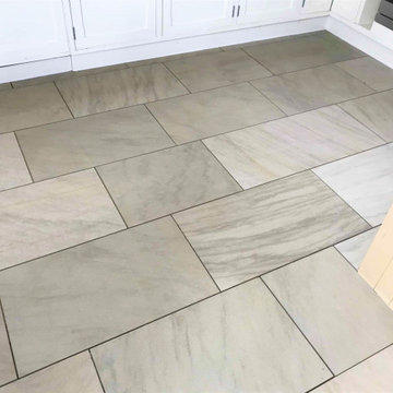
I received an enquiry from a property in Crowthorne to come and survey an unknown Flagstone Floor in a converted barn that was ready to be rented out. The owners where concerned the stone was letting the rest of the property down due to it being dirty and heavily stained, particularly around the kitchen and entrance areas. If your selling or renting out a property it really needs to look its best if you want to achieve a good price. Having spoken over the phone we agreed a date for me to pop over to complete a survey.
From further inspection I confirmed the stone was in fact a Sandstone, it was also clear that the sealer protecting the stone from ingrained dirt had worn away and was now allowing dirt and staining to ruin the appearance of the flagstones. It was a large floor so I measured up so I could work out the quantities of cleaning and sealing products needed and then walked the customer through the cleaning process. Later that day I sent over a detailed quotation which was accepted, and a date agreed for my return.
I should mention this work took place during the Covid restrictions, fortunately being a rental property, I was able to work in the property alone.
To deep clean the floor and remove the ingrained dirt and staining I used a strong dilution of Tile Doctor Pro-Clean. It is sprayed onto the floor and left to soak in for five minutes before agitating with a Black scrubbing pad fitted to a weighted buffing machine. The resultant slurry was then wet extracted away using a powerful high-pressure van mounted extracting system.
This action cleaned up most of the stone nicely however certain areas where heavily stained, particularly in the kitchen area where food and drink stains were more apparent. To tackle this, I applied a stronger cleaner/stripper product called Tile Doctor Remove and Go this time allowing ten minutes for it to soak in before scrubbing the surface with a very coarse 100-grit soft milling pad. This took quite a few attempts each time extracting the slurry away and then inspecting the floor to see if more work was needed.
Happy the stains have been removed, I then focused on renovating the surface Sandstone after the application of the coarse pad. This involves the application of several finer grit burnishing pads which close the pores and adds a subtle polish to the Sandstone. As I started with 100-grit pad it was necessary to gradually refine the surface with an incremental series of pads that included 200, 400 and finally 800-grit pads. Then to ensure a uniform finish across the floor I continued the 400 and 800 grit pads throughout the property. Water is used to lubricate the process and this turns into a fine slurry that is rinse extracted as before.
The cleaning process took up the whole of the first day and I am pleased to say the Sandstone floor looked very clean after I had finished.
The stone was then allowed dry off overnight with the aid of an industrial air mover and I returned later the next day to apply a new protective seal. In the meantime, my customer had been over to check out the floor and were over the moon with how it looked and wanted to keep the finish as natural as possible.
With this in mind, I applied Tile Doctor Ultra-Seal sealer to the Sandstone throughout, only two coats were needed. This is a premium sealer that is almost invisible and works by penetrating the stone thus preventing dirt from becoming ingrained. Once done the floor looked very clean and much brighter than before, it now had that wow factor which will help it attract a good yield in the rental market.
The trouble with rental properties of course is making sure the tenant uses the right product to maintain the floor and not a typical supermarket tile cleaner that are only designed for use on Ceramic and Porcelain tiles. In fact, these types of cleaning product can slowly strip the sealer off the floor so it’s always worth checking the label before purchasing. Fortunately Tile Doctor sells a product called Neutral Cleaner that is ideal for maintaining sealed stone floors, so I left them with a complimentary bottle and recommended they get some more to leave under the sink for the new tenant.
Dennis Buckland
Berkshire Tile Doctor
 Renovisions
This South Shore of Boston couple reached out to Renovisions to design and build a beautiful, maintenance free and easy to use ‘his and hers’ master bathroom with plenty of storage. The former bath which had a single sink, one mirror, a vanity cabinet with not enough storage and a tired fiberglass shower stall was the last room in their home to be remodeled. They envisioned a more spa-like feel with a brighter walk-in shower and stylish cabinetry with double sinks and more storage.
Renovisions re-designed this bath with a fresh approach to a classic style; boasting two sinks and framed mirrors that match the custom oak cabinetry with a grey stain and cherused finish (a process that allows raising of the wood grain, creating a beautiful texture).
Choosing a white and grey palette with Carrara-look tiles in the shower opened up the space, tied in nicely with the weathered grey vanity and exemplified the feeling of casual luxury. The bright and airy walk-in shower with double recessed niches and dual shower heads affords both his and hers showering needs. Stunning and dramatic chevron patterned mosaic glass tile defines the niche spaces and lends a pretty, decorative touch to the overall look. The soft blue-green hue on the walls match perfectly with this tile and continue the serene and spa-like appeal throughout the bath.
Replacing the existing double-hung window with a smaller, decorative cut glass casement window not only provided a stunning focal point to the bathroom, but also allowed for additional cabinetry that includes a pull-out hamper and two deep drawers. Silestone’s stunning ‘white diamond’ quartz looks great with the color scheme and provides more countertop space for make-up and cosmetics.
The clients were thrilled with their ‘Renovision’ that imparts clean aesthetic and beautifully appointed classic details.
"Just wanted to say thank you for a job well done. We absolutely love our bathroom. From start to finish you were all so pleasant and professional. The fact that Ed is determined to come up with a solution for our bathroom door shows your commitment to your clients and the pride you take in your work. I can say from experience that not all contractors would care to or be as determined as Ed to say “I will come up with a solution just give me some time” especially after being paid in full. So thank you again. I would highly recommend your company to anyone looking for a bathroom ‘Renovision’! All the best!"
- Dan & Deb S. (Hanover)

 Kitchen Design Concepts
We introduce to you one of our newer services we are providing here at Kitchen Design Concepts: spaces that just need a little reviving! As of recent, we are taking on projects that are in need of minimal updating, as in, spaces that don’t need a full-on remodel. Yes, you heard right! If your space has good bones, you like the layout of your kitchen, and you just need a few cosmetic changes, then today’s feature is for you! Recently, we updated a space where we did just this! The kitchen was in need of a little love, some fresh paint, and new finishes. And if we’re being honest here, the result looks almost as if the kitchen had a full-on remodel! To learn more about this space and how we did our magic, continue reading below:
The Before and After
First, see what an impact new finishes can make! The “before” image shows a kitchen with outdated finishes such as the tile countertops, backsplash, and cabinetry finish. The “after” image, is a kitchen that looks almost as if its brand new, the image speaks for itself!
Cabinetry
With the wooden cabinetry in this kitchen already having great bones, all we needed to do was our refinishing process that involved removing door and drawer fronts, sanding, priming, and painting. The main color of the cabinetry is white (Sherwin Williams Pure White 7005) and as an accent, we applied a deep navy blue that really pops in this space (Sherwin Willaims Naval 6244). As a special design element, we incorporated a natural wooden band across the hood which is subtle but adds an element of surprise.
Countertops
The original countertops in this space were a 12×12 tile with cracks and discolored grout from all the wear and tear. To replace the countertops, we installed a clean and crisp quartz that is not only durable but easy to maintain (no grout here!). The 3cm countertops are a Cambria quartz in a grey-tone color (Carrick).
Backsplash
Keeping things simple, yet classic, we installed a 3×6 subway tile from Interceramic. The crisp white pairs well with all the other finishes of the space and really brighten the space up! To spice things up, we paired the white tile with a contrasting grout color (Cape Grey) that matches the countertop. This is a simple method to add interest to your white backsplash!
Fixtures and Fittings
For the fixtures and fittings of the kitchen, we wanted pieces that made a statement. That’s why we selected this industrial style faucet from Brizo! The faucet is a Brizo LITZE™ PULL-DOWN FAUCET WITH ARC SPOUT AND INDUSTRIAL HANDLE (63044LF-BLGL). The matte black paired with the luxe gold elements really make a statement! To match the gold elements of the faucet, we installed cabinetry hardware from Topknobs in the same gold finish. The hardware is a Channing pull TK743HB. Lastly, the large single bowl sink (who doesn’t want a large sink?!) is a great functional touch to the kitchen. The sink is a Blanco Precision 16″ R10 super single with 16″ Drainer in stainless steel (516216).
52