
Search results for "Continuous entrance" in Home Design Ideas
 TKS Design Group
Download our free ebook, Creating the Ideal Kitchen. DOWNLOAD NOW
Lakefront property in the northwest suburbs of Chicago is hard to come by, so when we were hired by this young family with exactly that, we were immediately inspired by not just the unusually large footprint of this 1950’s colonial revival but also the lovely views of the manmade lake it was sited on. The large 5-bedroom home was solidly stuck in the 1980’s, but we saw tons of potential. We started out by updating the existing staircase with a fresh coat of paint and adding new herringbone slate to the entry hall.
The powder room off the entryway also got a refresh - new flooring, new cabinets and fixtures. We ran the new slate right through into this space for some consistency. A fun wallpaper and shiplap trim add a welcoming feel and set the tone for the home.
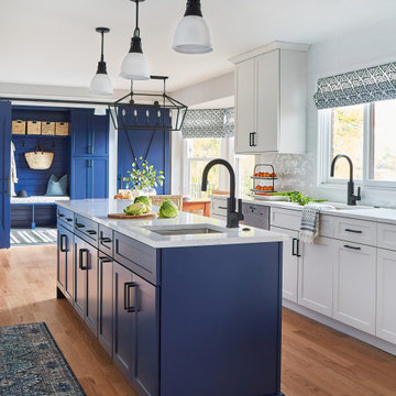
Next, we tackled the kitchen. Located away from the rest of the first floor, the kitchen felt a little isolated, so we immediately began planning for how to better connect it to the rest of the first floor. We landed on removing the wall between the kitchen and dining room and designed a modified galley style space with separate cooking and clean up zones. The cooking zone consists of the refrigerator, prep sink and cooktop, along with a nice long run of prep space at the island. The cleanup side of the kitchen consists of the main sink and dishwasher. Both areas are situated so that the user can view the lake during prep work and cleanup!
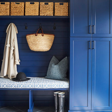
One of the home’s main puzzles was how to incorporate the mudroom and area in front of the patio doors at the back of the house. We already had a breakfast table area, so the space by the patio doors was a bit of a no man’s land. We decided to separate the kitchen proper from what became the new mudroom with a large set of barn doors. That way you can quickly hide any mudroom messes but have easy access to the light coming in through the patio doors as well as the outdoor grilling station. We also love the impact the barn doors add to the overall space.
The homeowners’ first words to us were “it’s time to ditch the brown,” so we did! We chose a lovely blue pallet that reflects the home’s location on the lake which is also vibrant yet easy on the eye. Countertops are white quartz, and the natural oak floor works well with the other honey accents. The breakfast table was given a refresh with new chairs, chandelier and window treatments that frame the gorgeous views of the lake out the back.
We coordinated the slate mudroom flooring with that used in the home’s main entrance for a consistent feel. The storage area consists of open and closed storage to allow for some clutter control as needed.
Next on our “to do” list was revamping the dated brown bar area in the neighboring dining room. We eliminated the clutter by adding some closed cabinets and did some easy updates to help the space feel more current. One snag we ran into here was the discovery of a beam above the existing open shelving that had to be modified with a smaller structural beam to allow for our new design to work. This was an unexpected surprise, but in the end we think it was well worth it!
We kept the colors here a bit more muted to blend with the homeowner’s existing furnishings. Open shelving and polished nickel hardware add some simple detail to the new entertainment zone which also looks out onto the lake!
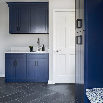
Next we tackled the upstairs starting with the homeowner’s son’s bath. The bath originally had both a tub shower and a separate shower, so we decided to swap out the shower for a new laundry area. This freed up some space downstairs in what used to be the mudroom/laundry room and is much more convenient for daily laundry needs.
We continued the blue palette here with navy cabinetry and the navy tile in the shower. Porcelain floor tile and chrome fixtures keep maintenance to a minimum while matte black mirrors and lighting add some depth the design. A low maintenance runner adds some warmth underfoot and ties the whole space together.
We added a pocket door to the bathroom to minimize interference with the door swings. The left door of the laundry closet is on a 180 degree hinge to allow for easy full access to the machines. Next we tackled the master bath which is an en suite arrangement. The original was typical of the 1980’s with the vanity outside of the bathroom, situated near the master closet. And the brown theme continued here with multiple shades of brown.
Our first move was to segment off the bath and the closet from the master bedroom. We created a short hall from the bedroom to the bathroom with his and hers walk-in closets on the left and right as well as a separate toilet closet outside of the main bathroom for privacy and flexibility.
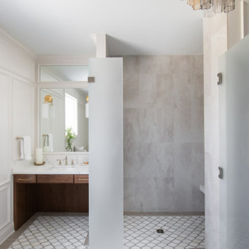
The original bathroom had a giant soaking tub with steps (dangerous!) as well as a small shower that did not work well for our homeowner who is 6’3”. With other bathtubs in the home, they decided to eliminate the tub and create an oversized shower which takes up the space where the old tub was located. The double vanity is on the opposite wall and a bench is located under the window for morning conversations and a place to set a couple of towels.
The pallet in here is light and airy with a mix of blond wood, creamy porcelain and marble tile, and brass accents. A simple roman shade adds some texture and it’s top-down mechanism allows for light and privacy.
This large whole house remodel gave our homeowners not only the ability to maximize the potential of their home but also created a lovely new frame from which to view their fabulous lake views.
Designed by: Susan Klimala, CKD, CBD
Photography by: Michael Kaskel
For more information on kitchen and bath design ideas go to: www.kitchenstudio-ge.com
 ZeroEnergy Design
This renovated brick rowhome in Boston’s South End offers a modern aesthetic within a historic structure, creative use of space, exceptional thermal comfort, a reduced carbon footprint, and a passive stream of income.
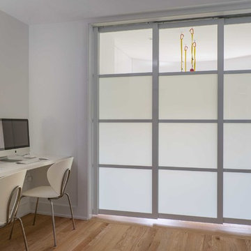
DESIGN PRIORITIES. The goals for the project were clear - design the primary unit to accommodate the family’s modern lifestyle, rework the layout to create a desirable rental unit, improve thermal comfort and introduce a modern aesthetic. We designed the street-level entry as a shared entrance for both the primary and rental unit. The family uses it as their everyday entrance - we planned for bike storage and an open mudroom with bench and shoe storage to facilitate the change from shoes to slippers or bare feet as they enter their home. On the main level, we expanded the kitchen into the dining room to create an eat-in space with generous counter space and storage, as well as a comfortable connection to the living space. The second floor serves as master suite for the couple - a bedroom with a walk-in-closet and ensuite bathroom, and an adjacent study, with refinished original pumpkin pine floors. The upper floor, aside from a guest bedroom, is the child's domain with interconnected spaces for sleeping, work and play. In the play space, which can be separated from the work space with new translucent sliding doors, we incorporated recreational features inspired by adventurous and competitive television shows, at their son’s request.
MODERN MEETS TRADITIONAL. We left the historic front facade of the building largely unchanged - the security bars were removed from the windows and the single pane windows were replaced with higher performing historic replicas. We designed the interior and rear facade with a vision of warm modernism, weaving in the notable period features. Each element was either restored or reinterpreted to blend with the modern aesthetic. The detailed ceiling in the living space, for example, has a new matte monochromatic finish, and the wood stairs are covered in a dark grey floor paint, whereas the mahogany doors were simply refinished. New wide plank wood flooring with a neutral finish, floor-to-ceiling casework, and bold splashes of color in wall paint and tile, and oversized high-performance windows (on the rear facade) round out the modern aesthetic.
RENTAL INCOME. The existing rowhome was zoned for a 2-family dwelling but included an undesirable, single-floor studio apartment at the garden level with low ceiling heights and questionable emergency egress. In order to increase the quality and quantity of space in the rental unit, we reimagined it as a two-floor, 1 or 2 bedroom, 2 bathroom apartment with a modern aesthetic, increased ceiling height on the lowest level and provided an in-unit washer/dryer. The apartment was listed with Jackie O'Connor Real Estate and rented immediately, providing the owners with a source of passive income.
ENCLOSURE WITH BENEFITS. The homeowners sought a minimal carbon footprint, enabled by their urban location and lifestyle decisions, paired with the benefits of a high-performance home. The extent of the renovation allowed us to implement a deep energy retrofit (DER) to address air tightness, insulation, and high-performance windows. The historic front facade is insulated from the interior, while the rear facade is insulated on the exterior. Together with these building enclosure improvements, we designed an HVAC system comprised of continuous fresh air ventilation, and an efficient, all-electric heating and cooling system to decouple the house from natural gas. This strategy provides optimal thermal comfort and indoor air quality, improved acoustic isolation from street noise and neighbors, as well as a further reduced carbon footprint. We also took measures to prepare the roof for future solar panels, for when the South End neighborhood’s aging electrical infrastructure is upgraded to allow them.
URBAN LIVING. The desirable neighborhood location allows the both the homeowners and tenant to walk, bike, and use public transportation to access the city, while each charging their respective plug-in electric cars behind the building to travel greater distances.
OVERALL. The understated rowhouse is now ready for another century of urban living, offering the owners comfort and convenience as they live life as an expression of their values.
Eric Roth Photo
 BWArchitects
practical(ly) studios ©2014
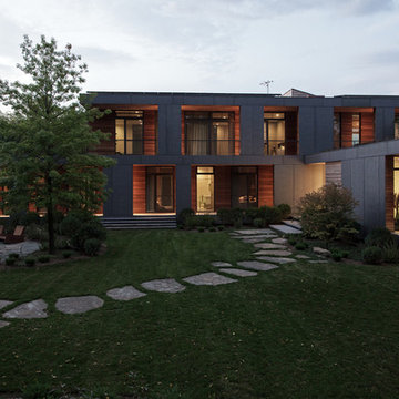
Example of a trendy gray two-story exterior home design in New York
Example of a trendy gray two-story exterior home design in New York
Find the right local pro for your project
 TKS Design Group
Download our free ebook, Creating the Ideal Kitchen. DOWNLOAD NOW
Lakefront property in the northwest suburbs of Chicago is hard to come by, so when we were hired by this young family with exactly that, we were immediately inspired by not just the unusually large footprint of this 1950’s colonial revival but also the lovely views of the manmade lake it was sited on. The large 5-bedroom home was solidly stuck in the 1980’s, but we saw tons of potential. We started out by updating the existing staircase with a fresh coat of paint and adding new herringbone slate to the entry hall.
The powder room off the entryway also got a refresh - new flooring, new cabinets and fixtures. We ran the new slate right through into this space for some consistency. A fun wallpaper and shiplap trim add a welcoming feel and set the tone for the home.
Next, we tackled the kitchen. Located away from the rest of the first floor, the kitchen felt a little isolated, so we immediately began planning for how to better connect it to the rest of the first floor. We landed on removing the wall between the kitchen and dining room and designed a modified galley style space with separate cooking and clean up zones. The cooking zone consists of the refrigerator, prep sink and cooktop, along with a nice long run of prep space at the island. The cleanup side of the kitchen consists of the main sink and dishwasher. Both areas are situated so that the user can view the lake during prep work and cleanup!
One of the home’s main puzzles was how to incorporate the mudroom and area in front of the patio doors at the back of the house. We already had a breakfast table area, so the space by the patio doors was a bit of a no man’s land. We decided to separate the kitchen proper from what became the new mudroom with a large set of barn doors. That way you can quickly hide any mudroom messes but have easy access to the light coming in through the patio doors as well as the outdoor grilling station. We also love the impact the barn doors add to the overall space.
The homeowners’ first words to us were “it’s time to ditch the brown,” so we did! We chose a lovely blue pallet that reflects the home’s location on the lake which is also vibrant yet easy on the eye. Countertops are white quartz, and the natural oak floor works well with the other honey accents. The breakfast table was given a refresh with new chairs, chandelier and window treatments that frame the gorgeous views of the lake out the back.
We coordinated the slate mudroom flooring with that used in the home’s main entrance for a consistent feel. The storage area consists of open and closed storage to allow for some clutter control as needed.
Next on our “to do” list was revamping the dated brown bar area in the neighboring dining room. We eliminated the clutter by adding some closed cabinets and did some easy updates to help the space feel more current. One snag we ran into here was the discovery of a beam above the existing open shelving that had to be modified with a smaller structural beam to allow for our new design to work. This was an unexpected surprise, but in the end we think it was well worth it!
We kept the colors here a bit more muted to blend with the homeowner’s existing furnishings. Open shelving and polished nickel hardware add some simple detail to the new entertainment zone which also looks out onto the lake!
Next we tackled the upstairs starting with the homeowner’s son’s bath. The bath originally had both a tub shower and a separate shower, so we decided to swap out the shower for a new laundry area. This freed up some space downstairs in what used to be the mudroom/laundry room and is much more convenient for daily laundry needs.
We continued the blue palette here with navy cabinetry and the navy tile in the shower. Porcelain floor tile and chrome fixtures keep maintenance to a minimum while matte black mirrors and lighting add some depth the design. A low maintenance runner adds some warmth underfoot and ties the whole space together.
We added a pocket door to the bathroom to minimize interference with the door swings. The left door of the laundry closet is on a 180 degree hinge to allow for easy full access to the machines. Next we tackled the master bath which is an en suite arrangement. The original was typical of the 1980’s with the vanity outside of the bathroom, situated near the master closet. And the brown theme continued here with multiple shades of brown.
Our first move was to segment off the bath and the closet from the master bedroom. We created a short hall from the bedroom to the bathroom with his and hers walk-in closets on the left and right as well as a separate toilet closet outside of the main bathroom for privacy and flexibility.
The original bathroom had a giant soaking tub with steps (dangerous!) as well as a small shower that did not work well for our homeowner who is 6’3”. With other bathtubs in the home, they decided to eliminate the tub and create an oversized shower which takes up the space where the old tub was located. The double vanity is on the opposite wall and a bench is located under the window for morning conversations and a place to set a couple of towels.
The pallet in here is light and airy with a mix of blond wood, creamy porcelain and marble tile, and brass accents. A simple roman shade adds some texture and it’s top-down mechanism allows for light and privacy.
This large whole house remodel gave our homeowners not only the ability to maximize the potential of their home but also created a lovely new frame from which to view their fabulous lake views.
Designed by: Susan Klimala, CKD, CBD
Photography by: Michael Kaskel
For more information on kitchen and bath design ideas go to: www.kitchenstudio-ge.com
 OMNIA Group Architects
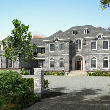
Inspired by the rustic and refined French Style Homes, this artistic drawing is a work in progress with our future custom build homeowners. This magnificent custom home design welcomes a grand entrance with a large formal driveway, garages, a service court and gardens located in the rear. With the design aspects leaning towards the refined side of the European and French style, this OMNIA Group Architects rendering, promises wonderful entertaining spaces on a grand scale, suitable for large and intimate social gatherings. This is only one of the elevations offered to our clients for their futures. OMNIA Group Architects realizes that many homeowner's custom dream homes are inspirational and everchanging. We continue to offer design and changes to meet the architectural needs and desires of our clients.
 ZeroEnergy Design
This renovated brick rowhome in Boston’s South End offers a modern aesthetic within a historic structure, creative use of space, exceptional thermal comfort, a reduced carbon footprint, and a passive stream of income.
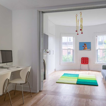
DESIGN PRIORITIES. The goals for the project were clear - design the primary unit to accommodate the family’s modern lifestyle, rework the layout to create a desirable rental unit, improve thermal comfort and introduce a modern aesthetic. We designed the street-level entry as a shared entrance for both the primary and rental unit. The family uses it as their everyday entrance - we planned for bike storage and an open mudroom with bench and shoe storage to facilitate the change from shoes to slippers or bare feet as they enter their home. On the main level, we expanded the kitchen into the dining room to create an eat-in space with generous counter space and storage, as well as a comfortable connection to the living space. The second floor serves as master suite for the couple - a bedroom with a walk-in-closet and ensuite bathroom, and an adjacent study, with refinished original pumpkin pine floors. The upper floor, aside from a guest bedroom, is the child's domain with interconnected spaces for sleeping, work and play. In the play space, which can be separated from the work space with new translucent sliding doors, we incorporated recreational features inspired by adventurous and competitive television shows, at their son’s request.
MODERN MEETS TRADITIONAL. We left the historic front facade of the building largely unchanged - the security bars were removed from the windows and the single pane windows were replaced with higher performing historic replicas. We designed the interior and rear facade with a vision of warm modernism, weaving in the notable period features. Each element was either restored or reinterpreted to blend with the modern aesthetic. The detailed ceiling in the living space, for example, has a new matte monochromatic finish, and the wood stairs are covered in a dark grey floor paint, whereas the mahogany doors were simply refinished. New wide plank wood flooring with a neutral finish, floor-to-ceiling casework, and bold splashes of color in wall paint and tile, and oversized high-performance windows (on the rear facade) round out the modern aesthetic.
RENTAL INCOME. The existing rowhome was zoned for a 2-family dwelling but included an undesirable, single-floor studio apartment at the garden level with low ceiling heights and questionable emergency egress. In order to increase the quality and quantity of space in the rental unit, we reimagined it as a two-floor, 1 or 2 bedroom, 2 bathroom apartment with a modern aesthetic, increased ceiling height on the lowest level and provided an in-unit washer/dryer. The apartment was listed with Jackie O'Connor Real Estate and rented immediately, providing the owners with a source of passive income.
ENCLOSURE WITH BENEFITS. The homeowners sought a minimal carbon footprint, enabled by their urban location and lifestyle decisions, paired with the benefits of a high-performance home. The extent of the renovation allowed us to implement a deep energy retrofit (DER) to address air tightness, insulation, and high-performance windows. The historic front facade is insulated from the interior, while the rear facade is insulated on the exterior. Together with these building enclosure improvements, we designed an HVAC system comprised of continuous fresh air ventilation, and an efficient, all-electric heating and cooling system to decouple the house from natural gas. This strategy provides optimal thermal comfort and indoor air quality, improved acoustic isolation from street noise and neighbors, as well as a further reduced carbon footprint. We also took measures to prepare the roof for future solar panels, for when the South End neighborhood’s aging electrical infrastructure is upgraded to allow them.
URBAN LIVING. The desirable neighborhood location allows the both the homeowners and tenant to walk, bike, and use public transportation to access the city, while each charging their respective plug-in electric cars behind the building to travel greater distances.
OVERALL. The understated rowhouse is now ready for another century of urban living, offering the owners comfort and convenience as they live life as an expression of their values.
Eric Roth Photo
 Ginkgo Leaf Studio
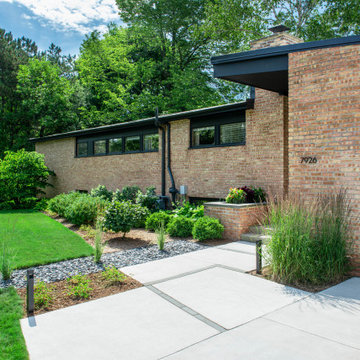
The angles of the new front walk carry through to the angled bedline across the front of the mid-century modern home.
Renn Kuhnen Photography
Inspiration for a mid-sized 1950s entryway remodel in Milwaukee
Inspiration for a mid-sized 1950s entryway remodel in Milwaukee

Sponsored
Delaware, OH

Buckeye Basements, Inc.
Central Ohio's Basement Finishing ExpertsBest Of Houzz '13-'21
 TKS Design Group
Download our free ebook, Creating the Ideal Kitchen. DOWNLOAD NOW
Lakefront property in the northwest suburbs of Chicago is hard to come by, so when we were hired by this young family with exactly that, we were immediately inspired by not just the unusually large footprint of this 1950’s colonial revival but also the lovely views of the manmade lake it was sited on. The large 5-bedroom home was solidly stuck in the 1980’s, but we saw tons of potential. We started out by updating the existing staircase with a fresh coat of paint and adding new herringbone slate to the entry hall.
The powder room off the entryway also got a refresh - new flooring, new cabinets and fixtures. We ran the new slate right through into this space for some consistency. A fun wallpaper and shiplap trim add a welcoming feel and set the tone for the home.
Next, we tackled the kitchen. Located away from the rest of the first floor, the kitchen felt a little isolated, so we immediately began planning for how to better connect it to the rest of the first floor. We landed on removing the wall between the kitchen and dining room and designed a modified galley style space with separate cooking and clean up zones. The cooking zone consists of the refrigerator, prep sink and cooktop, along with a nice long run of prep space at the island. The cleanup side of the kitchen consists of the main sink and dishwasher. Both areas are situated so that the user can view the lake during prep work and cleanup!
One of the home’s main puzzles was how to incorporate the mudroom and area in front of the patio doors at the back of the house. We already had a breakfast table area, so the space by the patio doors was a bit of a no man’s land. We decided to separate the kitchen proper from what became the new mudroom with a large set of barn doors. That way you can quickly hide any mudroom messes but have easy access to the light coming in through the patio doors as well as the outdoor grilling station. We also love the impact the barn doors add to the overall space.
The homeowners’ first words to us were “it’s time to ditch the brown,” so we did! We chose a lovely blue pallet that reflects the home’s location on the lake which is also vibrant yet easy on the eye. Countertops are white quartz, and the natural oak floor works well with the other honey accents. The breakfast table was given a refresh with new chairs, chandelier and window treatments that frame the gorgeous views of the lake out the back.
We coordinated the slate mudroom flooring with that used in the home’s main entrance for a consistent feel. The storage area consists of open and closed storage to allow for some clutter control as needed.
Next on our “to do” list was revamping the dated brown bar area in the neighboring dining room. We eliminated the clutter by adding some closed cabinets and did some easy updates to help the space feel more current. One snag we ran into here was the discovery of a beam above the existing open shelving that had to be modified with a smaller structural beam to allow for our new design to work. This was an unexpected surprise, but in the end we think it was well worth it!
We kept the colors here a bit more muted to blend with the homeowner’s existing furnishings. Open shelving and polished nickel hardware add some simple detail to the new entertainment zone which also looks out onto the lake!
Next we tackled the upstairs starting with the homeowner’s son’s bath. The bath originally had both a tub shower and a separate shower, so we decided to swap out the shower for a new laundry area. This freed up some space downstairs in what used to be the mudroom/laundry room and is much more convenient for daily laundry needs.
We continued the blue palette here with navy cabinetry and the navy tile in the shower. Porcelain floor tile and chrome fixtures keep maintenance to a minimum while matte black mirrors and lighting add some depth the design. A low maintenance runner adds some warmth underfoot and ties the whole space together.
We added a pocket door to the bathroom to minimize interference with the door swings. The left door of the laundry closet is on a 180 degree hinge to allow for easy full access to the machines. Next we tackled the master bath which is an en suite arrangement. The original was typical of the 1980’s with the vanity outside of the bathroom, situated near the master closet. And the brown theme continued here with multiple shades of brown.
Our first move was to segment off the bath and the closet from the master bedroom. We created a short hall from the bedroom to the bathroom with his and hers walk-in closets on the left and right as well as a separate toilet closet outside of the main bathroom for privacy and flexibility.
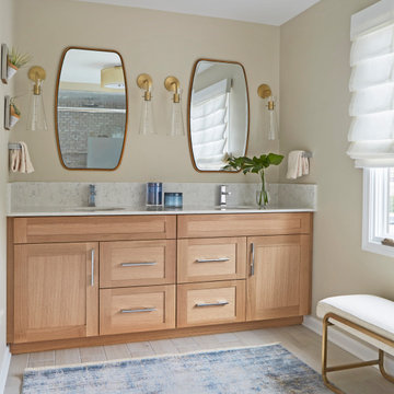
The original bathroom had a giant soaking tub with steps (dangerous!) as well as a small shower that did not work well for our homeowner who is 6’3”. With other bathtubs in the home, they decided to eliminate the tub and create an oversized shower which takes up the space where the old tub was located. The double vanity is on the opposite wall and a bench is located under the window for morning conversations and a place to set a couple of towels.
The pallet in here is light and airy with a mix of blond wood, creamy porcelain and marble tile, and brass accents. A simple roman shade adds some texture and it’s top-down mechanism allows for light and privacy.
This large whole house remodel gave our homeowners not only the ability to maximize the potential of their home but also created a lovely new frame from which to view their fabulous lake views.
Designed by: Susan Klimala, CKD, CBD
Photography by: Michael Kaskel
For more information on kitchen and bath design ideas go to: www.kitchenstudio-ge.com
 Dave Fox Design Build Remodelers
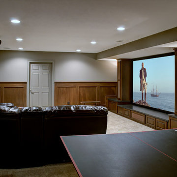
This project involved converting a partially finished basement into an ultimate media room with an English pub. The family is big on entertaining and enjoys watching movies and college football. It was important to combine the media area with the pub to create options for guests within the same space. Although the home has a full sized basement the staircase was centrally located, which made it difficult for special configuration. As a result, we were able to work with the existing plan be designing a media area large enough for a sectional sofa and additional seating with the English pub at the far end of the room.
The home owner had a projection screen on a bare wall with the electrical components stacked on boxes. The new plan involved installing new cabinets to accommodate components and surround the screen to give it a built-in finish. Open shelving also allows the homeowner to feature some of their collectible sports memorabilia. As if the 130 inch projection screen wasn’t large enough, the surround sound system makes you feel like you are part of the action. It is as close to the I MAX viewing experience as you are going to get in a home. Sound-deadening insulation was installed in the ceiling and walls to prevent noise from penetrating the second floor.
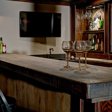
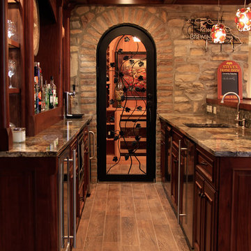
The design of the pub was inspired by the home owner’s favorite local pub, Brazenhead. The bar countertop with lift-top entrance was custom built by our carpenters to simulate aged wood. The finish looks rough, but it is smooth enough to wipe down easily. The top encloses the bar and provides seating for guests. A TV at the bar allows guest to follow along with the game on the big screen or tune into another game. The game table provides even another option for entertainment in the media room. Stacked stone with thick mortar joints was installed on the face of the bar and to an opposite wall containing the entrance to a wine room. Hand scrapped hardwood floors were installed in the pub portion of the media room to provide yet another touch to “Brazenhead” their own pub.
The wet bar is under a soffit area that continues into the media area due to existing duct work. We wanted to creatively find a way to separate the two spaces. Adding trim on the ceiling and front of soffit at the bar defined the area and made a great transition from the drywall soffit to the wet bar. A tin ceiling was installed which added to the ambience of the pub wet bar and further aided in defining the soffit as an intentional part of the design. Custom built wainscoting borders the perimeter of the media room. The end result allows the client to comfortably entertain in a space designed just for them.
 Dave Fox Design Build Remodelers
This project involved converting a partially finished basement into an ultimate media room with an English pub. The family is big on entertaining and enjoys watching movies and college football. It was important to combine the media area with the pub to create options for guests within the same space. Although the home has a full sized basement the staircase was centrally located, which made it difficult for special configuration. As a result, we were able to work with the existing plan be designing a media area large enough for a sectional sofa and additional seating with the English pub at the far end of the room.
The home owner had a projection screen on a bare wall with the electrical components stacked on boxes. The new plan involved installing new cabinets to accommodate components and surround the screen to give it a built-in finish. Open shelving also allows the homeowner to feature some of their collectible sports memorabilia. As if the 130 inch projection screen wasn’t large enough, the surround sound system makes you feel like you are part of the action. It is as close to the I MAX viewing experience as you are going to get in a home. Sound-deadening insulation was installed in the ceiling and walls to prevent noise from penetrating the second floor.
The design of the pub was inspired by the home owner’s favorite local pub, Brazenhead. The bar countertop with lift-top entrance was custom built by our carpenters to simulate aged wood. The finish looks rough, but it is smooth enough to wipe down easily. The top encloses the bar and provides seating for guests. A TV at the bar allows guest to follow along with the game on the big screen or tune into another game. The game table provides even another option for entertainment in the media room. Stacked stone with thick mortar joints was installed on the face of the bar and to an opposite wall containing the entrance to a wine room. Hand scrapped hardwood floors were installed in the pub portion of the media room to provide yet another touch to “Brazenhead” their own pub.
The wet bar is under a soffit area that continues into the media area due to existing duct work. We wanted to creatively find a way to separate the two spaces. Adding trim on the ceiling and front of soffit at the bar defined the area and made a great transition from the drywall soffit to the wet bar. A tin ceiling was installed which added to the ambience of the pub wet bar and further aided in defining the soffit as an intentional part of the design. Custom built wainscoting borders the perimeter of the media room. The end result allows the client to comfortably entertain in a space designed just for them.
 Architecture Smith + Scully Ltd
Intense Photography
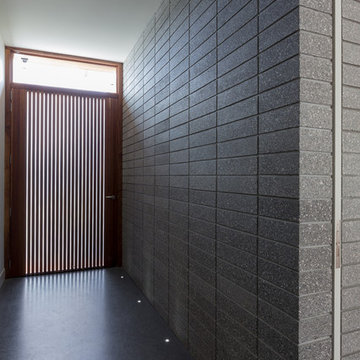
Large minimalist concrete floor entryway photo in Auckland with white walls and a medium wood front door
Large minimalist concrete floor entryway photo in Auckland with white walls and a medium wood front door
 Dave Fox Design Build Remodelers
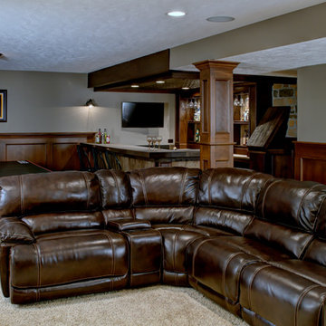
This project involved converting a partially finished basement into an ultimate media room with an English pub. The family is big on entertaining and enjoys watching movies and college football. It was important to combine the media area with the pub to create options for guests within the same space. Although the home has a full sized basement the staircase was centrally located, which made it difficult for special configuration. As a result, we were able to work with the existing plan be designing a media area large enough for a sectional sofa and additional seating with the English pub at the far end of the room.
The home owner had a projection screen on a bare wall with the electrical components stacked on boxes. The new plan involved installing new cabinets to accommodate components and surround the screen to give it a built-in finish. Open shelving also allows the homeowner to feature some of their collectible sports memorabilia. As if the 130 inch projection screen wasn’t large enough, the surround sound system makes you feel like you are part of the action. It is as close to the I MAX viewing experience as you are going to get in a home. Sound-deadening insulation was installed in the ceiling and walls to prevent noise from penetrating the second floor.
The design of the pub was inspired by the home owner’s favorite local pub, Brazenhead. The bar countertop with lift-top entrance was custom built by our carpenters to simulate aged wood. The finish looks rough, but it is smooth enough to wipe down easily. The top encloses the bar and provides seating for guests. A TV at the bar allows guest to follow along with the game on the big screen or tune into another game. The game table provides even another option for entertainment in the media room. Stacked stone with thick mortar joints was installed on the face of the bar and to an opposite wall containing the entrance to a wine room. Hand scrapped hardwood floors were installed in the pub portion of the media room to provide yet another touch to “Brazenhead” their own pub.
The wet bar is under a soffit area that continues into the media area due to existing duct work. We wanted to creatively find a way to separate the two spaces. Adding trim on the ceiling and front of soffit at the bar defined the area and made a great transition from the drywall soffit to the wet bar. A tin ceiling was installed which added to the ambience of the pub wet bar and further aided in defining the soffit as an intentional part of the design. Custom built wainscoting borders the perimeter of the media room. The end result allows the client to comfortably entertain in a space designed just for them.
 TKS Design Group
Download our free ebook, Creating the Ideal Kitchen. DOWNLOAD NOW
Lakefront property in the northwest suburbs of Chicago is hard to come by, so when we were hired by this young family with exactly that, we were immediately inspired by not just the unusually large footprint of this 1950’s colonial revival but also the lovely views of the manmade lake it was sited on. The large 5-bedroom home was solidly stuck in the 1980’s, but we saw tons of potential. We started out by updating the existing staircase with a fresh coat of paint and adding new herringbone slate to the entry hall.
The powder room off the entryway also got a refresh - new flooring, new cabinets and fixtures. We ran the new slate right through into this space for some consistency. A fun wallpaper and shiplap trim add a welcoming feel and set the tone for the home.
Next, we tackled the kitchen. Located away from the rest of the first floor, the kitchen felt a little isolated, so we immediately began planning for how to better connect it to the rest of the first floor. We landed on removing the wall between the kitchen and dining room and designed a modified galley style space with separate cooking and clean up zones. The cooking zone consists of the refrigerator, prep sink and cooktop, along with a nice long run of prep space at the island. The cleanup side of the kitchen consists of the main sink and dishwasher. Both areas are situated so that the user can view the lake during prep work and cleanup!
One of the home’s main puzzles was how to incorporate the mudroom and area in front of the patio doors at the back of the house. We already had a breakfast table area, so the space by the patio doors was a bit of a no man’s land. We decided to separate the kitchen proper from what became the new mudroom with a large set of barn doors. That way you can quickly hide any mudroom messes but have easy access to the light coming in through the patio doors as well as the outdoor grilling station. We also love the impact the barn doors add to the overall space.
The homeowners’ first words to us were “it’s time to ditch the brown,” so we did! We chose a lovely blue pallet that reflects the home’s location on the lake which is also vibrant yet easy on the eye. Countertops are white quartz, and the natural oak floor works well with the other honey accents. The breakfast table was given a refresh with new chairs, chandelier and window treatments that frame the gorgeous views of the lake out the back.
We coordinated the slate mudroom flooring with that used in the home’s main entrance for a consistent feel. The storage area consists of open and closed storage to allow for some clutter control as needed.
Next on our “to do” list was revamping the dated brown bar area in the neighboring dining room. We eliminated the clutter by adding some closed cabinets and did some easy updates to help the space feel more current. One snag we ran into here was the discovery of a beam above the existing open shelving that had to be modified with a smaller structural beam to allow for our new design to work. This was an unexpected surprise, but in the end we think it was well worth it!
We kept the colors here a bit more muted to blend with the homeowner’s existing furnishings. Open shelving and polished nickel hardware add some simple detail to the new entertainment zone which also looks out onto the lake!
Next we tackled the upstairs starting with the homeowner’s son’s bath. The bath originally had both a tub shower and a separate shower, so we decided to swap out the shower for a new laundry area. This freed up some space downstairs in what used to be the mudroom/laundry room and is much more convenient for daily laundry needs.
We continued the blue palette here with navy cabinetry and the navy tile in the shower. Porcelain floor tile and chrome fixtures keep maintenance to a minimum while matte black mirrors and lighting add some depth the design. A low maintenance runner adds some warmth underfoot and ties the whole space together.
We added a pocket door to the bathroom to minimize interference with the door swings. The left door of the laundry closet is on a 180 degree hinge to allow for easy full access to the machines. Next we tackled the master bath which is an en suite arrangement. The original was typical of the 1980’s with the vanity outside of the bathroom, situated near the master closet. And the brown theme continued here with multiple shades of brown.
Our first move was to segment off the bath and the closet from the master bedroom. We created a short hall from the bedroom to the bathroom with his and hers walk-in closets on the left and right as well as a separate toilet closet outside of the main bathroom for privacy and flexibility.
The original bathroom had a giant soaking tub with steps (dangerous!) as well as a small shower that did not work well for our homeowner who is 6’3”. With other bathtubs in the home, they decided to eliminate the tub and create an oversized shower which takes up the space where the old tub was located. The double vanity is on the opposite wall and a bench is located under the window for morning conversations and a place to set a couple of towels.
The pallet in here is light and airy with a mix of blond wood, creamy porcelain and marble tile, and brass accents. A simple roman shade adds some texture and it’s top-down mechanism allows for light and privacy.
This large whole house remodel gave our homeowners not only the ability to maximize the potential of their home but also created a lovely new frame from which to view their fabulous lake views.
Designed by: Susan Klimala, CKD, CBD
Photography by: Michael Kaskel
For more information on kitchen and bath design ideas go to: www.kitchenstudio-ge.com
Sponsored
Delaware, OH
Buckeye Basements, Inc.
Central Ohio's Basement Finishing ExpertsBest Of Houzz '13-'21

 User
User
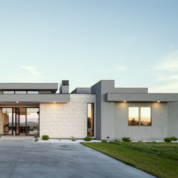
Entering the home through a floor-to-ceiling full light pivoting front door provides a sense of grandeur that continues through the home with immediate sightlines through the 16-foot wide sliding door at the opposite wall. The distinct black window frames provide a sleek modern aesthetic while providing European performance standards. The Glo A5h Series with double-pane glazing outperforms most North American triple pane windows due to high performance spacers, low iron glass, a larger continuous thermal break, and multiple air seals. By going double-pane the homeowners have been able to realize tremendous efficiency and cost effective durability while maintaining the clean architectural lines of the home design. The selection of our hidden sash option further cements the modern design by providing a seamless aesthetic on the exterior between fixed and operable windows.
 ZeroEnergy Design
This renovated brick rowhome in Boston’s South End offers a modern aesthetic within a historic structure, creative use of space, exceptional thermal comfort, a reduced carbon footprint, and a passive stream of income.
DESIGN PRIORITIES. The goals for the project were clear - design the primary unit to accommodate the family’s modern lifestyle, rework the layout to create a desirable rental unit, improve thermal comfort and introduce a modern aesthetic. We designed the street-level entry as a shared entrance for both the primary and rental unit. The family uses it as their everyday entrance - we planned for bike storage and an open mudroom with bench and shoe storage to facilitate the change from shoes to slippers or bare feet as they enter their home. On the main level, we expanded the kitchen into the dining room to create an eat-in space with generous counter space and storage, as well as a comfortable connection to the living space. The second floor serves as master suite for the couple - a bedroom with a walk-in-closet and ensuite bathroom, and an adjacent study, with refinished original pumpkin pine floors. The upper floor, aside from a guest bedroom, is the child's domain with interconnected spaces for sleeping, work and play. In the play space, which can be separated from the work space with new translucent sliding doors, we incorporated recreational features inspired by adventurous and competitive television shows, at their son’s request.
MODERN MEETS TRADITIONAL. We left the historic front facade of the building largely unchanged - the security bars were removed from the windows and the single pane windows were replaced with higher performing historic replicas. We designed the interior and rear facade with a vision of warm modernism, weaving in the notable period features. Each element was either restored or reinterpreted to blend with the modern aesthetic. The detailed ceiling in the living space, for example, has a new matte monochromatic finish, and the wood stairs are covered in a dark grey floor paint, whereas the mahogany doors were simply refinished. New wide plank wood flooring with a neutral finish, floor-to-ceiling casework, and bold splashes of color in wall paint and tile, and oversized high-performance windows (on the rear facade) round out the modern aesthetic.
RENTAL INCOME. The existing rowhome was zoned for a 2-family dwelling but included an undesirable, single-floor studio apartment at the garden level with low ceiling heights and questionable emergency egress. In order to increase the quality and quantity of space in the rental unit, we reimagined it as a two-floor, 1 or 2 bedroom, 2 bathroom apartment with a modern aesthetic, increased ceiling height on the lowest level and provided an in-unit washer/dryer. The apartment was listed with Jackie O'Connor Real Estate and rented immediately, providing the owners with a source of passive income.
ENCLOSURE WITH BENEFITS. The homeowners sought a minimal carbon footprint, enabled by their urban location and lifestyle decisions, paired with the benefits of a high-performance home. The extent of the renovation allowed us to implement a deep energy retrofit (DER) to address air tightness, insulation, and high-performance windows. The historic front facade is insulated from the interior, while the rear facade is insulated on the exterior. Together with these building enclosure improvements, we designed an HVAC system comprised of continuous fresh air ventilation, and an efficient, all-electric heating and cooling system to decouple the house from natural gas. This strategy provides optimal thermal comfort and indoor air quality, improved acoustic isolation from street noise and neighbors, as well as a further reduced carbon footprint. We also took measures to prepare the roof for future solar panels, for when the South End neighborhood’s aging electrical infrastructure is upgraded to allow them.
URBAN LIVING. The desirable neighborhood location allows the both the homeowners and tenant to walk, bike, and use public transportation to access the city, while each charging their respective plug-in electric cars behind the building to travel greater distances.
OVERALL. The understated rowhouse is now ready for another century of urban living, offering the owners comfort and convenience as they live life as an expression of their values.
Photography: Eric Roth Photo

 Design Harmony
Working with repeat clients is always a dream! The had perfect timing right before the pandemic for their vacation home to get out city and relax in the mountains. This modern mountain home is stunning. Check out every custom detail we did throughout the home to make it a unique experience!

 TKS Design Group
Download our free ebook, Creating the Ideal Kitchen. DOWNLOAD NOW
Lakefront property in the northwest suburbs of Chicago is hard to come by, so when we were hired by this young family with exactly that, we were immediately inspired by not just the unusually large footprint of this 1950’s colonial revival but also the lovely views of the manmade lake it was sited on. The large 5-bedroom home was solidly stuck in the 1980’s, but we saw tons of potential. We started out by updating the existing staircase with a fresh coat of paint and adding new herringbone slate to the entry hall.
The powder room off the entryway also got a refresh - new flooring, new cabinets and fixtures. We ran the new slate right through into this space for some consistency. A fun wallpaper and shiplap trim add a welcoming feel and set the tone for the home.
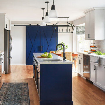
Next, we tackled the kitchen. Located away from the rest of the first floor, the kitchen felt a little isolated, so we immediately began planning for how to better connect it to the rest of the first floor. We landed on removing the wall between the kitchen and dining room and designed a modified galley style space with separate cooking and clean up zones. The cooking zone consists of the refrigerator, prep sink and cooktop, along with a nice long run of prep space at the island. The cleanup side of the kitchen consists of the main sink and dishwasher. Both areas are situated so that the user can view the lake during prep work and cleanup!
One of the home’s main puzzles was how to incorporate the mudroom and area in front of the patio doors at the back of the house. We already had a breakfast table area, so the space by the patio doors was a bit of a no man’s land. We decided to separate the kitchen proper from what became the new mudroom with a large set of barn doors. That way you can quickly hide any mudroom messes but have easy access to the light coming in through the patio doors as well as the outdoor grilling station. We also love the impact the barn doors add to the overall space.
The homeowners’ first words to us were “it’s time to ditch the brown,” so we did! We chose a lovely blue pallet that reflects the home’s location on the lake which is also vibrant yet easy on the eye. Countertops are white quartz, and the natural oak floor works well with the other honey accents. The breakfast table was given a refresh with new chairs, chandelier and window treatments that frame the gorgeous views of the lake out the back.
We coordinated the slate mudroom flooring with that used in the home’s main entrance for a consistent feel. The storage area consists of open and closed storage to allow for some clutter control as needed.
Next on our “to do” list was revamping the dated brown bar area in the neighboring dining room. We eliminated the clutter by adding some closed cabinets and did some easy updates to help the space feel more current. One snag we ran into here was the discovery of a beam above the existing open shelving that had to be modified with a smaller structural beam to allow for our new design to work. This was an unexpected surprise, but in the end we think it was well worth it!
We kept the colors here a bit more muted to blend with the homeowner’s existing furnishings. Open shelving and polished nickel hardware add some simple detail to the new entertainment zone which also looks out onto the lake!
Next we tackled the upstairs starting with the homeowner’s son’s bath. The bath originally had both a tub shower and a separate shower, so we decided to swap out the shower for a new laundry area. This freed up some space downstairs in what used to be the mudroom/laundry room and is much more convenient for daily laundry needs.
We continued the blue palette here with navy cabinetry and the navy tile in the shower. Porcelain floor tile and chrome fixtures keep maintenance to a minimum while matte black mirrors and lighting add some depth the design. A low maintenance runner adds some warmth underfoot and ties the whole space together.
We added a pocket door to the bathroom to minimize interference with the door swings. The left door of the laundry closet is on a 180 degree hinge to allow for easy full access to the machines. Next we tackled the master bath which is an en suite arrangement. The original was typical of the 1980’s with the vanity outside of the bathroom, situated near the master closet. And the brown theme continued here with multiple shades of brown.
Our first move was to segment off the bath and the closet from the master bedroom. We created a short hall from the bedroom to the bathroom with his and hers walk-in closets on the left and right as well as a separate toilet closet outside of the main bathroom for privacy and flexibility.
The original bathroom had a giant soaking tub with steps (dangerous!) as well as a small shower that did not work well for our homeowner who is 6’3”. With other bathtubs in the home, they decided to eliminate the tub and create an oversized shower which takes up the space where the old tub was located. The double vanity is on the opposite wall and a bench is located under the window for morning conversations and a place to set a couple of towels.
The pallet in here is light and airy with a mix of blond wood, creamy porcelain and marble tile, and brass accents. A simple roman shade adds some texture and it’s top-down mechanism allows for light and privacy.
This large whole house remodel gave our homeowners not only the ability to maximize the potential of their home but also created a lovely new frame from which to view their fabulous lake views.
Designed by: Susan Klimala, CKD, CBD
Photography by: Michael Kaskel
For more information on kitchen and bath design ideas go to: www.kitchenstudio-ge.com
 Envision Web
Becky Hulsey, Envision Virtual Tours
The Lodge at Gold Mine Falls
A Once in a Lifetime Opportunity Awaits….
Have you dreamed of owning your own spectacular waterfall, a serene trout pond, or a one of a kind mountain lodge filled with high end touches, all near Lake Burton? If the answer is yes…..then “The Lodge at Gold Mine Falls” is for you!
Located just off HW 76 .3 miles to Anchorage Marina, this unique 2.8 acre property borders the National Forest, boasts a fully remodeled 3 bedroom, 3 bath, 2000+ square foot rock lodge that is adjacent to its own private, spectacular 60 foot waterfall all surrounded by native landscape such as rhododendron and mountain laurel. Tumbling under the 40 foot suspension bridge, the pristine, crystal clear water continues to ramble on its way to large pond ready to be stocked with trout. Picture yourself fly fishing for a trout dinner right at your front door, or delight your friends or family while entertaining on your new porch or extensive, multi-level deck that connects your new home to your own waterfall. The kids or grandkids will be entertained for hours wading in the pool at the base of the waterfall, exploring the crooks and crannies among the stream’s boulders while looking for salamanders, or panning for “fool’s gold” in the stream. Just imagine….The Lodge at Gold Mine Falls has all this and more!
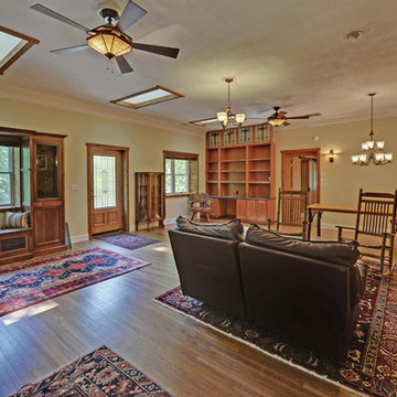
As you walk up the front steps to The Lodge at Gold Mine Falls, you will notice the craftsmanship of this uniquely one of a kind home made from local stone and granite from a period gone by. If you look closely at some of the stones, you will find raw garnets, some the size of a nail head. Upon opening the front door constructed of solid oak and a tasteful piece of leaded glass, you will be amazed at the spaciousness of the lodge room. Once upon a time, the 20 x 30 foot room with 10 foot ceilings was the entire home. The focal piece of the room is the new floor to ceiling field stone fireplace, hand honed solid maple mantel, rounded hearth, accentuated by a hand-cut keystone, and flanked by raw cedar columns. The new gas logs can be remotely controlled with programmable heat. A built-in floor to ceiling cherry wood wall unit, with granite serving surface, highlights a side wall and is topped off with a large piece of stained glass from an English pub. The mood lighting behind the stained glass and the antique library ladder really highlights this unique bookcase. Distinctive lighting fixtures and fans provide dining area lighting and circulation from the cool breezes off of Lake Burton. On the bottom, the solid oak 1.5 inch flooring is a remnant of the past on the top, the height of the ceilings is enhanced by double crown moldings throughout and a touch of the outdoors is brought indoors by the three new skylights. Surrounded by rustic cedar window boxes, additional ambient light streams through the four windows facing south, and the new French doors.
As you open the French doors to the new porch, you are immediately struck by the sights and sound produced by the rushing water as it cascades over the spectacular multilevel waterfall. You will also notice that the mountain has literally been carved away as you view the layers and striations in the granite that surround the back of the porch. The peaked cathedral ceiling sports a glass apex and the bead board on the ceiling accentuated by the raw cedar plank framing and the five cedar trees used as cornerstones all bring the outdoors within your reach. The addition of “E-Z Breeze” vinyl windows along with the cast iron gas stove will allow you and your family to enjoy the beauty and continually changing scenery at The Lodge at Gold Mine Fall during all four seasons.
Opening the Adirondack style door on the other side of the lodge room allows you to step into the Lodge’s addition built at a later date. The four foot wide hallway boasts stained glass light fixtures and an architectural feature from the new stairwell that divides the living and the bedroom spaces. Knowing that the east wall in the kitchen and study were once on the home’s exterior allowed us to investigate and reveal the true character of these walls by removing the two layers of drywall and 4 inches of plaster exposing a striking addition to both rooms…… beautiful granite rock walls. The hallway flows into the granite breakfast bar which fully complements the newly exposed granite wall. From the Viking SS refrigerator to gas Jenn Air ceramic cooktop and microwave the appliances are a chef’s delight. Lighting is a critical component in a gourmet kitchen and the light from the double window is enhanced by two spotlights over the cooking area, LED task lighting under the cabinets, mood lighting over the top cabinets, and four “Murano” hand blown glass pendant lights over the sink and bar area. Scoring points in the design category, the full wood “Thomasville” two tone glazed cabinets that are country white and palomino scream style and sophistication, and are accentuated by the cool copper glass backsplash and refined stainless steel hardware. The porcelain, two bowl farmhouse sink is large enough for your biggest pots while the stainless steel sink guards will protect it from scratches. The SS faucet is professional quality and the Insinkerator will help the chef in the house save time with instant 190 degree water. An eight foot long exposed cedar tree trunk hangs over the cooking area allowing the chef to hang his/her favorite utensils and pots or pans in full lodge style. And who wouldn’t crave a large walk in pantry with commercial grade slides that will up to 120 pounds. With all these features, the cook/cooks in the family will love spending time in this room.
Across from the kitchen is a study/office area which can be closed off from the hallway by a double barn door. Except for the remarkable exposed granite rock wall mentioned earlier, the entire room has been paneled with raw cedar boards treated with Australian Tree Oil for true lodge feel. The triple crank out window provides a superb view of the pond and blazing Japanese maple trees in the fall. Outside, the hallway leads to the utility room which has been fully upgraded with all the modern amenities. The oak cabinetry with granite tops also has an extra deep sink with commercial kitchen sprayer. The sink area is surrounded by white subway tile while slate and green glass mini tile accents bring the outdoor colors inside. The doggy door, new exterior door and crank out window provide access to the back yard and additional light. From the new “Rinnai” point of use, gas hot water heater to the new “LG” full size, stackable washer and dryer, this utility room delivers.
The master bedroom has four windows which provide outstanding light and air circulation. To take the chill off of nippy evenings, this bedroom also has its own romantic fireplace with travertine marble surround, remote controlled gas logs, and a beautiful antique oak and mirror mantle. To top it off, the en-suite bath contains high end fixtures, a spacious vanity, and floor to ceiling rain shower with independent valves allowing you to turn on the shower and not get wet. Multiple safety handrails and a fold down shower seat give bathers assurance and provide an additional measure of safety. The earthy color tiles, glass tile accents and hand blown light fixtures continue the lodge theme in this end of the house. Located across the hall, the guest bedroom is light and airy with its white window boxes and double crown molding, and also has an attached bathroom. This bathroom also has an entrance door leading to the hallway and doubles as the guest bathroom for the house. Its antique oak vanity and mirror, stained glass lights and wrought iron accents remind me of a past era while the vessel sink, modern fixtures, and floor to ceiling travertine and glass tile rain shower all bring the bathroom up to modern standards.
Located at the end of the hallway, and next to the guest bathroom, is the handcrafted stairwell leading to the sleeping loft. The distinctive maple stair treads with their grain and raw edge being displayed, were milled locally in Clayton and then installed from underneath so that no screw or nail heads are visible. The staircase was completed with wrought iron spindles, raw cedar handrail and floor to ceiling end post. Upon your entry into the sleeping loft, you will notice the amount of light that enters through the two skylights and large window facing the pond. The sound of water rushing over the pond’s spillway is a delightful addition to this large sleeping loft. Finished with engineered hardwood flooring and two built in double beds with tree trunks for legs, the room can accommodate four additional twin beds. The sleeping loft is also equipped with a kitchenette and a distinctive cedar and rock walled bathroom. The bath features an antique dresser vanity with marble vessel sink, distinctive fixtures and a floor to ceiling polished travertine marble shower with rain head. This bathroom also has an exterior door leading to a secondary upstairs staircase in the back yard. Just envision the great sleepovers the kids or grandkids will have here or how your out of town friends or family will just love this special area designed with their comfort and needs in mind.
Originally constructed in 1925 by “off Broadway” star Rose Grant, this property is rich in history. In the early years, this home was one of the first in Rabun County to generate its own electric from the waterfall. Several small cabins were also built on the property and rented out to guests who came for the waterfall, swim in the pond and connect with nature. Other notable residents were Mrs. and Doctor Fowler who was a local pediatrician. According to an aged newspaper article, Mrs. Fowler was very interested in the indigenous flora and fauna and grew a variety of native plants on the property including some that were rare or endangered. Many metal name tags still remain along the various paths on the property thus reminding you of times gone by and the true beauty of property.
Lastly, this solidly built home has just been structurally solidified, become more energy efficient, and reconfigured to further usable space all while retaining the Lodge’s original charm. After removing the flooring in the kitchen, hall and both bathrooms, the home’s structure and roof were fortified with numerous concrete footers to support both bathrooms, kitchen, and stairwell walls that extend from floor to roof. To make this home more comfortable, energy efficient, and bring it up to modern standards, the electrical system was upgraded to 220 service with the wiring, outlets, electrical panels and fixtures replaced throughout the entire home. A whole house surge protector was also installed to protect against damage that may occur with lightning strikes. Speaking of electric…..the pond’s newly poured formed concrete wall contains a pipe enabling you to install your own hydro-electric system. And whether you might decide to tie into the grid or store you energy in a battery system, you could generate your own electric 24/7. The homes plumbing was also replaced with new pipes, energy/water efficient fixtures in each bathroom (including three Toto toilets), and a new cistern was installed behind the garage with a laboratory grade water filtration system. The task of water heating was completed by a gas Rinnai point of use hot water heater in the utility room and all windows were replaced with Anderson thermal pane and 6 Velux skylights were mounted to bring the outdoors inside. The home’s HVAC system was top of the line several years ago and both sets of new gas logs are controlled with remotes. Formerly a summer home, all exterior walls were studded out with insulation added, and whole house fans were installed in the attic and upstairs bathroom. Although many of these upgrades may not be visible, they allow the home to be more energy efficient and more comfortable……allowing The Lodge at Gold Mine Falls to become your four season retreat.
 ZeroEnergy Design
This renovated brick rowhome in Boston’s South End offers a modern aesthetic within a historic structure, creative use of space, exceptional thermal comfort, a reduced carbon footprint, and a passive stream of income.
DESIGN PRIORITIES. The goals for the project were clear - design the primary unit to accommodate the family’s modern lifestyle, rework the layout to create a desirable rental unit, improve thermal comfort and introduce a modern aesthetic. We designed the street-level entry as a shared entrance for both the primary and rental unit. The family uses it as their everyday entrance - we planned for bike storage and an open mudroom with bench and shoe storage to facilitate the change from shoes to slippers or bare feet as they enter their home. On the main level, we expanded the kitchen into the dining room to create an eat-in space with generous counter space and storage, as well as a comfortable connection to the living space. The second floor serves as master suite for the couple - a bedroom with a walk-in-closet and ensuite bathroom, and an adjacent study, with refinished original pumpkin pine floors. The upper floor, aside from a guest bedroom, is the child's domain with interconnected spaces for sleeping, work and play. In the play space, which can be separated from the work space with new translucent sliding doors, we incorporated recreational features inspired by adventurous and competitive television shows, at their son’s request.
MODERN MEETS TRADITIONAL. We left the historic front facade of the building largely unchanged - the security bars were removed from the windows and the single pane windows were replaced with higher performing historic replicas. We designed the interior and rear facade with a vision of warm modernism, weaving in the notable period features. Each element was either restored or reinterpreted to blend with the modern aesthetic. The detailed ceiling in the living space, for example, has a new matte monochromatic finish, and the wood stairs are covered in a dark grey floor paint, whereas the mahogany doors were simply refinished. New wide plank wood flooring with a neutral finish, floor-to-ceiling casework, and bold splashes of color in wall paint and tile, and oversized high-performance windows (on the rear facade) round out the modern aesthetic.
RENTAL INCOME. The existing rowhome was zoned for a 2-family dwelling but included an undesirable, single-floor studio apartment at the garden level with low ceiling heights and questionable emergency egress. In order to increase the quality and quantity of space in the rental unit, we reimagined it as a two-floor, 1 or 2 bedroom, 2 bathroom apartment with a modern aesthetic, increased ceiling height on the lowest level and provided an in-unit washer/dryer. The apartment was listed with Jackie O'Connor Real Estate and rented immediately, providing the owners with a source of passive income.
ENCLOSURE WITH BENEFITS. The homeowners sought a minimal carbon footprint, enabled by their urban location and lifestyle decisions, paired with the benefits of a high-performance home. The extent of the renovation allowed us to implement a deep energy retrofit (DER) to address air tightness, insulation, and high-performance windows. The historic front facade is insulated from the interior, while the rear facade is insulated on the exterior. Together with these building enclosure improvements, we designed an HVAC system comprised of continuous fresh air ventilation, and an efficient, all-electric heating and cooling system to decouple the house from natural gas. This strategy provides optimal thermal comfort and indoor air quality, improved acoustic isolation from street noise and neighbors, as well as a further reduced carbon footprint. We also took measures to prepare the roof for future solar panels, for when the South End neighborhood’s aging electrical infrastructure is upgraded to allow them.
URBAN LIVING. The desirable neighborhood location allows the both the homeowners and tenant to walk, bike, and use public transportation to access the city, while each charging their respective plug-in electric cars behind the building to travel greater distances.
OVERALL. The understated rowhouse is now ready for another century of urban living, offering the owners comfort and convenience as they live life as an expression of their values.
Eric Roth Photo
12