
Search results for "Continuous improvement" in Home Design Ideas
 JWT Associates
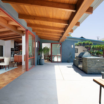
The overhang seen here is new. The interior ceiling is original. The bluestone outdoor kitchen was designed around the existing Cypress tree. The door threshold seen here was designed to be completely flush inside and out.
 Milgard Windows & Doors
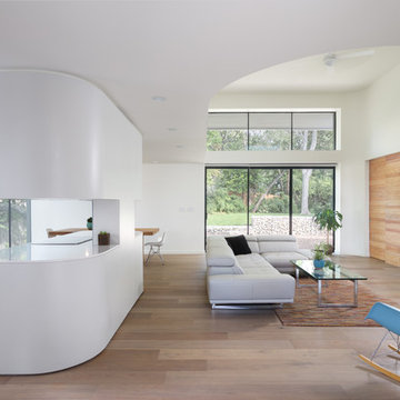
The Kiguchi family moved into their Austin, Texas home in 1994. Built in the 1980’s as part of a neighborhood development, they happily raised their family here but longed for something more contemporary. Once they became empty nesters, they decided it was time for a major remodel. After spending many years visiting Austin AIA Home Tours that highlight contemporary residential architecture, they had a lot of ideas and in 2013 were ready to interview architects and get their renovation underway.
The project turned into a major remodel due to an unstable foundation. Architects Ben Arbib and Ed Hughey, of Arbib Hughey Design were hired to solve the structural issue and look for inspiration in the bones of the house, which sat on top of a hillside and was surrounded by great views.
Unfortunately, with the old floor plan, the beautiful views were hidden by small windows that were poorly placed. In order to bring more natural light into the house the window sizes and configurations had to be addressed, all while keeping in mind the homeowners desire for a modern look and feel.
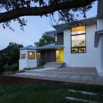
To achieve a more contemporary and sophisticated front of house, a new entry was designed that included removing a two-story bay window and porch. The entrance of the home also became more integrated with the landscape creating a template for new foliage to be planted. Older exterior materials were updated to incorporate a more muted palette of colors with a metal roof, dark grey siding in the back and white stucco in the front. Deep eaves were added over many of the new large windows for clean lines and sun protection.
“Inside it was about opening up the floor plan, expanding the views throughout the house, and updating the material palette to get a modern look that was also warm and inviting,” said Ben from Arbib Hughey Design. “Prior to the remodel, the house had the typical separation of rooms. We removed the walls between them and changed all of the windows to Milgard Thermally Improved Aluminum to connect the inside with the outside. No matter where you are you get nice views and natural light.”
The architects wanted to create some drama, which they accomplished with the window placement and opening up the interior floor plan to an open concept approach. Cabinetry was used to help delineate intimate spaces. To add warmth to an all-white living room, white-washed oak wood floors were installed and pine planks were used around the fireplace. The large windows served as artwork bringing the color of nature into the space.
An octagon shaped, elevated dining room, (named “the turret”), had a big impact on the design of the house. They architects rounded the corners and added larger window openings overlooking a new sunken garden. The great room was also softened by rounding out the corners and that circular theme continued throughout the house, being picked up in skylight wells and kitchen cabinetry. A staircase leading to a catwalk was added and the result was a two-story window wall that flooded the home with natural light.
When asked why Milgard® Thermally Improved Aluminum windows were selected, the architectural team listed many reasons:
1) Aesthetics: “We liked the slim profiles and narrow sightlines. The window frames never get in the way of the view and that was important to us. They also have a very contemporary look that went well with our design.”
2) Options: “We liked that we could get large sliding doors that matched the windows, giving us a very cohesive look and feel throughout the project.”
3) Cost Effective: “Milgard windows are affordable. You get a good product at a good price.”
4) Custom Sizes: “Milgard windows are customizable, which allowed us to get the right window for each location.”
Ready to take on your own traditional to modern home remodeling project? Arbib Hughey Design advises, “Work with a good architect. That means picking a team that is creative, communicative, listens well and is responsive. We think it’s important for an architect to listen to their clients and give them something they want, not something the architect thinks they should have. At the same time you want an architect who is willing and able to think outside the box and offer up design options that you may not have considered. Design is about a lot of back and forth, trying out ideas, getting feedback and trying again.”
The home was completely transformed into a unique, contemporary house perfectly integrated with its site. Internally the home has a natural flow for the occupants and externally it is integrated with the surroundings taking advantage of great natural light. As a side note, it was highly praised as part of the Austin AIA homes tour.
 Milgard Windows & Doors
The Kiguchi family moved into their Austin, Texas home in 1994. Built in the 1980’s as part of a neighborhood development, they happily raised their family here but longed for something more contemporary. Once they became empty nesters, they decided it was time for a major remodel. After spending many years visiting Austin AIA Home Tours that highlight contemporary residential architecture, they had a lot of ideas and in 2013 were ready to interview architects and get their renovation underway.
The project turned into a major remodel due to an unstable foundation. Architects Ben Arbib and Ed Hughey, of Arbib Hughey Design were hired to solve the structural issue and look for inspiration in the bones of the house, which sat on top of a hillside and was surrounded by great views.
Unfortunately, with the old floor plan, the beautiful views were hidden by small windows that were poorly placed. In order to bring more natural light into the house the window sizes and configurations had to be addressed, all while keeping in mind the homeowners desire for a modern look and feel.
To achieve a more contemporary and sophisticated front of house, a new entry was designed that included removing a two-story bay window and porch. The entrance of the home also became more integrated with the landscape creating a template for new foliage to be planted. Older exterior materials were updated to incorporate a more muted palette of colors with a metal roof, dark grey siding in the back and white stucco in the front. Deep eaves were added over many of the new large windows for clean lines and sun protection.
“Inside it was about opening up the floor plan, expanding the views throughout the house, and updating the material palette to get a modern look that was also warm and inviting,” said Ben from Arbib Hughey Design. “Prior to the remodel, the house had the typical separation of rooms. We removed the walls between them and changed all of the windows to Milgard Thermally Improved Aluminum to connect the inside with the outside. No matter where you are you get nice views and natural light.”
The architects wanted to create some drama, which they accomplished with the window placement and opening up the interior floor plan to an open concept approach. Cabinetry was used to help delineate intimate spaces. To add warmth to an all-white living room, white-washed oak wood floors were installed and pine planks were used around the fireplace. The large windows served as artwork bringing the color of nature into the space.
An octagon shaped, elevated dining room, (named “the turret”), had a big impact on the design of the house. They architects rounded the corners and added larger window openings overlooking a new sunken garden. The great room was also softened by rounding out the corners and that circular theme continued throughout the house, being picked up in skylight wells and kitchen cabinetry. A staircase leading to a catwalk was added and the result was a two-story window wall that flooded the home with natural light.
When asked why Milgard® Thermally Improved Aluminum windows were selected, the architectural team listed many reasons:
1) Aesthetics: “We liked the slim profiles and narrow sightlines. The window frames never get in the way of the view and that was important to us. They also have a very contemporary look that went well with our design.”
2) Options: “We liked that we could get large sliding doors that matched the windows, giving us a very cohesive look and feel throughout the project.”
3) Cost Effective: “Milgard windows are affordable. You get a good product at a good price.”
4) Custom Sizes: “Milgard windows are customizable, which allowed us to get the right window for each location.”
Ready to take on your own traditional to modern home remodeling project? Arbib Hughey Design advises, “Work with a good architect. That means picking a team that is creative, communicative, listens well and is responsive. We think it’s important for an architect to listen to their clients and give them something they want, not something the architect thinks they should have. At the same time you want an architect who is willing and able to think outside the box and offer up design options that you may not have considered. Design is about a lot of back and forth, trying out ideas, getting feedback and trying again.”
The home was completely transformed into a unique, contemporary house perfectly integrated with its site. Internally the home has a natural flow for the occupants and externally it is integrated with the surroundings taking advantage of great natural light. As a side note, it was highly praised as part of the Austin AIA homes tour.
Find the right local pro for your project
 E_ Designs
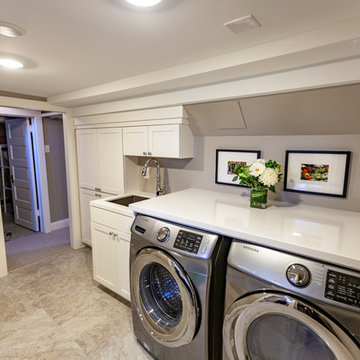
Tired of doing laundry in an unfinished rugged basement? These homeowner's were as well! They contacted Castle to help them with their basement planning and build for a finished laundry space and new bathroom with shower.
After the designer and client walked through ideas to improve flow of space, we decided to eliminate the existing 1/2 bath in the family room, and move the new bathroom into the existing laundry room. The full laundry room was finished to include new walls, ceilings, new plumbing, new Adura luxury vinyl tile flooring, beautiful shaker style cabinetry with beadboard panel, Glossy white Cultured marble countertops, a new Blanco composite sink, and Kohler Bellera faucet.
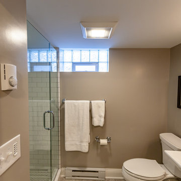
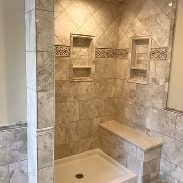
In the new bathroom space, we continued the Adura luxury vinyl flooring. Finishes in the bathroom include Kohler Memoirs pedestal sink, Kohler Archer faucet, custom hex tile shower floor, subway tile walls, and custom frameless glass shower enclosure.
Additional improvements were made to improve the health of the home including asbestos tile abatement, new drain tile and sump pump, new spray foam insulation, new glass block window, and a new Panasonic bathroom fan. We also decided to save and restore some original pieces in the home like their existing 5-panel doors and repurposing one salvaged door into a pocket door for the new bathroom.
The homeowner completed the basement finish with new carpeting in the family room. The whole basement feels fresh, new, and has a great flow. They will enjoy their happy and healthy home for years to come.
 E_ Designs
Tired of doing laundry in an unfinished rugged basement? These homeowner's were as well! They contacted Castle to help them with their basement planning and build for a finished laundry space and new bathroom with shower.
After the designer and client walked through ideas to improve flow of space, we decided to eliminate the existing 1/2 bath in the family room, and move the new bathroom into the existing laundry room. The full laundry room was finished to include new walls, ceilings, new plumbing, new Adura luxury vinyl tile flooring, beautiful shaker style cabinetry with beadboard panel, Glossy white Cultured marble countertops, a new Blanco composite sink, and Kohler Bellera faucet.
In the new bathroom space, we continued the Adura luxury vinyl flooring. Finishes in the bathroom include Kohler Memoirs pedestal sink, Kohler Archer faucet, custom hex tile shower floor, subway tile walls, and custom frameless glass shower enclosure.
Additional improvements were made to improve the health of the home including asbestos tile abatement, new drain tile and sump pump, new spray foam insulation, new glass block window, and a new Panasonic bathroom fan. We also decided to save and restore some original pieces in the home like their existing 5-panel doors and repurposing one salvaged door into a pocket door for the new bathroom.
The homeowner completed the basement finish with new carpeting in the family room. The whole basement feels fresh, new, and has a great flow. They will enjoy their happy and healthy home for years to come.
 Jarrett Design
Jarrett Design is grateful for repeat clients, especially when they have impeccable taste.
In this case, we started with their guest bath. An antique-inspired, hand-pegged vanity from our Nest collection, in hand-planed quarter-sawn cherry with metal capped feet, sets the tone. Calcutta Gold marble warms the room while being complimented by a white marble top and traditional backsplash. Polished nickel fixtures, lighting, and hardware selected by the client add elegance. A special bathroom for special guests.
Next on the list were the laundry area, bar and fireplace. The laundry area greets those who enter through the casual back foyer of the home. It also backs up to the kitchen and breakfast nook. The clients wanted this area to be as beautiful as the other areas of the home and the visible washer and dryer were detracting from their vision. They also were hoping to allow this area to serve double duty as a buffet when they were entertaining. So, the decision was made to hide the washer and dryer with pocket doors. The new cabinetry had to match the existing wall cabinets in style and finish, which is no small task. Our Nest artist came to the rescue. A five-piece soapstone sink and distressed counter top complete the space with a nod to the past.
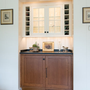
Our clients wished to add a beverage refrigerator to the existing bar. The wall cabinets were kept in place again. Inspired by a beloved antique corner cupboard also in this sitting room, we decided to use stained cabinetry for the base and refrigerator panel. Soapstone was used for the top and new fireplace surround, bringing continuity from the nearby back foyer.
Last, but definitely not least, the kitchen, banquette and powder room were addressed. The clients removed a glass door in lieu of a wide window to create a cozy breakfast nook featuring a Nest banquette base and table. Brackets for the bench were designed in keeping with the traditional details of the home. A handy drawer was incorporated. The double vase pedestal table with breadboard ends seats six comfortably.
The powder room was updated with another antique reproduction vanity and beautiful vessel sink.
While the kitchen was beautifully done, it was showing its age and functional improvements were desired. This room, like the laundry room, was a project that included existing cabinetry mixed with matching new cabinetry. Precision was necessary. For better function and flow, the cooking surface was relocated from the island to the side wall. Instead of a cooktop with separate wall ovens, the clients opted for a pro style range. These design changes not only make prepping and cooking in the space much more enjoyable, but also allow for a wood hood flanked by bracketed glass cabinets to act a gorgeous focal point. Other changes included removing a small desk in lieu of a dresser style counter height base cabinet. This provided improved counter space and storage. The new island gave better storage, uninterrupted counter space and a perch for the cook or company. Calacatta Gold quartz tops are complimented by a natural limestone floor. A classic apron sink and faucet along with thoughtful cabinetry details are the icing on the cake. Don’t miss the clients’ fabulous collection of serving and display pieces! We told you they have impeccable taste!
 Powell Construction
These homeowners came to us wanting to upgrade the curb appeal of their home and improve the layout of the interior. They hoped for an entry that would welcome guests to their home both inside and out, while also creating more defined and purposeful space within the home. The main goals of the project were to add a covered wrap around porch, add more windows for natural light, create a formal entry that housed the client’s baby grand piano, and add a home office for the clients to work from home.
With a dated exterior and facade that lacked dimension, there was little charm to be had. The front door was hidden from visitors and a lack of windows made the exterior unoriginal. We approached the exterior design pulling inspiration from the farmhouse style, southern porches, and craftsman style homes. Eventually we landed on a design that added numerous windows to the front façade, reminiscent of a farmhouse, and turned a Dutch hipped roof into an extended gable roof, creating a large front porch and adding curb appeal interest. By relocating the entry door to the front of the house and adding a gable accent over this new door, it created a focal point for guests and passersby. In addition to those design elements, we incorporated some exterior shutters rated for our northwest climate that echoed the southern style homes our client loved. A greige paint color (Benjamin Moore Cape May Cobblestone) accented with a white trim (Benjamin Moore Swiss Coffee) and a black front door, shutters, and window box (Sherwin Williams Black Magic) all work together to create a charming and welcoming façade.
On the interior we removed a half wall and coat closet that separated the original cramped entryway from the front room. The front room was a multipurpose space that didn’t have a designated use for the family, it became a catch-all space that was easily cluttered. Through the design process we came up with a plan to split the spaces into 2 rooms, a large open semi-formal entryway and a home office. The semi-formal entryway was intentionally designed to house the homeowner’s baby grand piano – a real showstopper. The flow created by this entryway is welcoming and ushers you into a beautifully curated home.
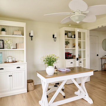
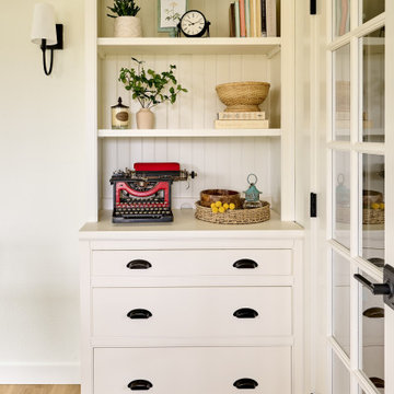
A new office now sits right off the entryway with beautiful French doors, built-in cabinetry, and an abundance of natural light – everything that one dreams of for their home office. The home office looks out to the front porch and front yard as well as the pastural side yard where the children frequently play. The office is an ideal location for a moment of inspiration, reflection, and focus. A warm white paint (Benjamin Moore Swiss Coffee) combined with the newly installed light oak luxury vinyl plank flooring runs throughout the home, creating continuity and a neutral canvas. Traditional and schoolhouse style statement light fixtures coordinate with the black door hardware for an added level of contrast.
There is one more improvement that made a big difference to this family. In the family room, we added a built-in window seat. This created a cozy nook that is used by all for reading and extra seating. This relatively small improvement had a big impact on how the family uses and enjoys the space.
Sponsored
Delaware County, OH

Whisler Home Improvement
Franklin County's Committed Home Improvement Professionals
 Powell Construction
These homeowners came to us wanting to upgrade the curb appeal of their home and improve the layout of the interior. They hoped for an entry that would welcome guests to their home both inside and out, while also creating more defined and purposeful space within the home. The main goals of the project were to add a covered wrap around porch, add more windows for natural light, create a formal entry that housed the client’s baby grand piano, and add a home office for the clients to work from home.
With a dated exterior and facade that lacked dimension, there was little charm to be had. The front door was hidden from visitors and a lack of windows made the exterior unoriginal. We approached the exterior design pulling inspiration from the farmhouse style, southern porches, and craftsman style homes. Eventually we landed on a design that added numerous windows to the front façade, reminiscent of a farmhouse, and turned a Dutch hipped roof into an extended gable roof, creating a large front porch and adding curb appeal interest. By relocating the entry door to the front of the house and adding a gable accent over this new door, it created a focal point for guests and passersby. In addition to those design elements, we incorporated some exterior shutters rated for our northwest climate that echoed the southern style homes our client loved. A greige paint color (Benjamin Moore Cape May Cobblestone) accented with a white trim (Benjamin Moore Swiss Coffee) and a black front door, shutters, and window box (Sherwin Williams Black Magic) all work together to create a charming and welcoming façade.
On the interior we removed a half wall and coat closet that separated the original cramped entryway from the front room. The front room was a multipurpose space that didn’t have a designated use for the family, it became a catch-all space that was easily cluttered. Through the design process we came up with a plan to split the spaces into 2 rooms, a large open semi-formal entryway and a home office. The semi-formal entryway was intentionally designed to house the homeowner’s baby grand piano – a real showstopper. The flow created by this entryway is welcoming and ushers you into a beautifully curated home.
A new office now sits right off the entryway with beautiful French doors, built-in cabinetry, and an abundance of natural light – everything that one dreams of for their home office. The home office looks out to the front porch and front yard as well as the pastural side yard where the children frequently play. The office is an ideal location for a moment of inspiration, reflection, and focus. A warm white paint (Benjamin Moore Swiss Coffee) combined with the newly installed light oak luxury vinyl plank flooring runs throughout the home, creating continuity and a neutral canvas. Traditional and schoolhouse style statement light fixtures coordinate with the black door hardware for an added level of contrast.
There is one more improvement that made a big difference to this family. In the family room, we added a built-in window seat. This created a cozy nook that is used by all for reading and extra seating. This relatively small improvement had a big impact on how the family uses and enjoys the space.
 The Kitchen Design Group
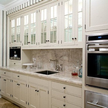
Example of a mid-sized classic l-shaped travertine floor and beige floor eat-in kitchen design in Los Angeles with an undermount sink, shaker cabinets, white cabinets, marble countertops, beige backsplash, stone slab backsplash, stainless steel appliances and an island
 Byggmeister Inc
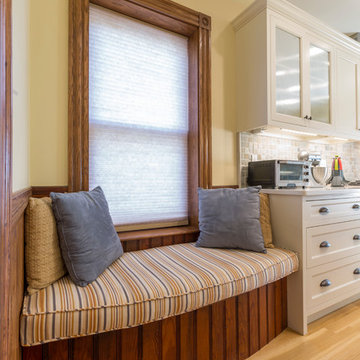
The owner of this distinguished Somerville late Victorian wanted not just a new kitchen, but a more efficient and healthier house overall. The challenge wasn’t just to capture the light and view towards the Boston skyline; we also needed to improve the space plan and work flow. Overlaid on those goals, we needed to respect the carefully maintained Victorian character of the rest of the home and bring that sensibility back into the kitchen space.
OPENING THE SPACE
We removed the wall that isolated the sink space to create one unified kitchen area. We relocated the sink to a center island so that we could replace the small window with a large sliding glass door out onto the deck and the view of the skyline.
REPURPOSING MATERIALS
We salvaged and re-used the honey-colored southern yellow pine wainscoting; we matched and extended it to a window seat and laundry room door to create continuity and tie those new elements to the old. The cabinets and counters have traditional styling in light colors to reflect the light from the new sliding doors deep into the space. More light from the rear utility stairs is brought into the space by means of a frosted glass door.
IMPROVING EFFICIENCY
More prosaically, but just as important to the client and the project team, we upgraded the insulation and air-sealing throughout the house to improve the home’s comfort and efficiency.
Photo by Jim Raycroft
 Powell Construction
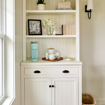
These homeowners came to us wanting to upgrade the curb appeal of their home and improve the layout of the interior. They hoped for an entry that would welcome guests to their home both inside and out, while also creating more defined and purposeful space within the home. The main goals of the project were to add a covered wrap around porch, add more windows for natural light, create a formal entry that housed the client’s baby grand piano, and add a home office for the clients to work from home.
With a dated exterior and facade that lacked dimension, there was little charm to be had. The front door was hidden from visitors and a lack of windows made the exterior unoriginal. We approached the exterior design pulling inspiration from the farmhouse style, southern porches, and craftsman style homes. Eventually we landed on a design that added numerous windows to the front façade, reminiscent of a farmhouse, and turned a Dutch hipped roof into an extended gable roof, creating a large front porch and adding curb appeal interest. By relocating the entry door to the front of the house and adding a gable accent over this new door, it created a focal point for guests and passersby. In addition to those design elements, we incorporated some exterior shutters rated for our northwest climate that echoed the southern style homes our client loved. A greige paint color (Benjamin Moore Cape May Cobblestone) accented with a white trim (Benjamin Moore Swiss Coffee) and a black front door, shutters, and window box (Sherwin Williams Black Magic) all work together to create a charming and welcoming façade.
On the interior we removed a half wall and coat closet that separated the original cramped entryway from the front room. The front room was a multipurpose space that didn’t have a designated use for the family, it became a catch-all space that was easily cluttered. Through the design process we came up with a plan to split the spaces into 2 rooms, a large open semi-formal entryway and a home office. The semi-formal entryway was intentionally designed to house the homeowner’s baby grand piano – a real showstopper. The flow created by this entryway is welcoming and ushers you into a beautifully curated home.
A new office now sits right off the entryway with beautiful French doors, built-in cabinetry, and an abundance of natural light – everything that one dreams of for their home office. The home office looks out to the front porch and front yard as well as the pastural side yard where the children frequently play. The office is an ideal location for a moment of inspiration, reflection, and focus. A warm white paint (Benjamin Moore Swiss Coffee) combined with the newly installed light oak luxury vinyl plank flooring runs throughout the home, creating continuity and a neutral canvas. Traditional and schoolhouse style statement light fixtures coordinate with the black door hardware for an added level of contrast.
There is one more improvement that made a big difference to this family. In the family room, we added a built-in window seat. This created a cozy nook that is used by all for reading and extra seating. This relatively small improvement had a big impact on how the family uses and enjoys the space.
 Medina Exteriors & Remodeling
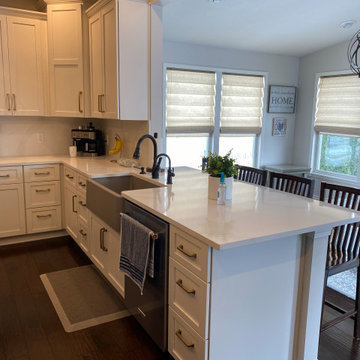
The homeowners already had a nice kitchen in the city of Brunswick, but they were wanting to make a few functional changes and create a bigger feel within the space. We accomplished this by brightening up the space with off white cabinets and then creating dimension with the island being a stunning blue. Also, we removed their 2-tier breakfast wall on the sink wall of cabinets and turned it into a true breakfast bar with an overhang, where their kids can sit and be present while they cook.
They wanted a wow factor in this space, which for them was having their countertops continue up as their backsplash. They did oil rubbed bronze finishes for the plumbing fixtures, which brought out the brown hues in the “Calacutta Gold” quartz product by Silestone. Honey bronze was used as their hardware and lighting metal finish, which added that perfect touch to compliment the blue island.
 E_ Designs
Tired of doing laundry in an unfinished rugged basement? These homeowner's were as well! They contacted Castle to help them with their basement planning and build for a finished laundry space and new bathroom with shower.
After the designer and client walked through ideas to improve flow of space, we decided to eliminate the existing 1/2 bath in the family room, and move the new bathroom into the existing laundry room. The full laundry room was finished to include new walls, ceilings, new plumbing, new Adura luxury vinyl tile flooring, beautiful shaker style cabinetry with beadboard panel, Glossy white Cultured marble countertops, a new Blanco composite sink, and Kohler Bellera faucet.
In the new bathroom space, we continued the Adura luxury vinyl flooring. Finishes in the bathroom include Kohler Memoirs pedestal sink, Kohler Archer faucet, custom hex tile shower floor, subway tile walls, and custom frameless glass shower enclosure.
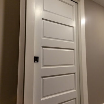
Additional improvements were made to improve the health of the home including asbestos tile abatement, new drain tile and sump pump, new spray foam insulation, new glass block window, and a new Panasonic bathroom fan. We also decided to save and restore some original pieces in the home like their existing 5-panel doors and repurposing one salvaged door into a pocket door for the new bathroom.
The homeowner completed the basement finish with new carpeting in the family room. The whole basement feels fresh, new, and has a great flow. They will enjoy their happy and healthy home for years to come.

 Byggmeister Inc
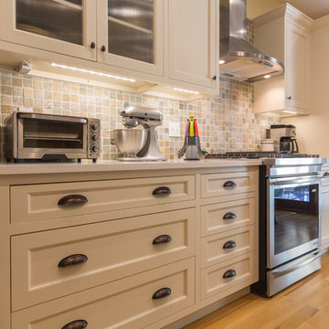
The owner of this distinguished Somerville late Victorian wanted not just a new kitchen, but a more efficient and healthier house overall. The challenge wasn’t just to capture the light and view towards the Boston skyline; we also needed to improve the space plan and work flow. Overlaid on those goals, we needed to respect the carefully maintained Victorian character of the rest of the home and bring that sensibility back into the kitchen space.
OPENING THE SPACE
We removed the wall that isolated the sink space to create one unified kitchen area. We relocated the sink to a center island so that we could replace the small window with a large sliding glass door out onto the deck and the view of the skyline.
REPURPOSING MATERIALS
We salvaged and re-used the honey-colored southern yellow pine wainscoting; we matched and extended it to a window seat and laundry room door to create continuity and tie those new elements to the old. The cabinets and counters have traditional styling in light colors to reflect the light from the new sliding doors deep into the space. More light from the rear utility stairs is brought into the space by means of a frosted glass door.
IMPROVING EFFICIENCY
More prosaically, but just as important to the client and the project team, we upgraded the insulation and air-sealing throughout the house to improve the home’s comfort and efficiency.
Photo by Jim Raycroft
 E_ Designs
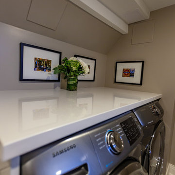
Tired of doing laundry in an unfinished rugged basement? These homeowner's were as well! They contacted Castle to help them with their basement planning and build for a finished laundry space and new bathroom with shower.
After the designer and client walked through ideas to improve flow of space, we decided to eliminate the existing 1/2 bath in the family room, and move the new bathroom into the existing laundry room. The full laundry room was finished to include new walls, ceilings, new plumbing, new Adura luxury vinyl tile flooring, beautiful shaker style cabinetry with beadboard panel, Glossy white Cultured marble countertops, a new Blanco composite sink, and Kohler Bellera faucet.
In the new bathroom space, we continued the Adura luxury vinyl flooring. Finishes in the bathroom include Kohler Memoirs pedestal sink, Kohler Archer faucet, custom hex tile shower floor, subway tile walls, and custom frameless glass shower enclosure.
Additional improvements were made to improve the health of the home including asbestos tile abatement, new drain tile and sump pump, new spray foam insulation, new glass block window, and a new Panasonic bathroom fan. We also decided to save and restore some original pieces in the home like their existing 5-panel doors and repurposing one salvaged door into a pocket door for the new bathroom.
The homeowner completed the basement finish with new carpeting in the family room. The whole basement feels fresh, new, and has a great flow. They will enjoy their happy and healthy home for years to come.
 Byggmeister Inc
Photo by Jim Raycroft
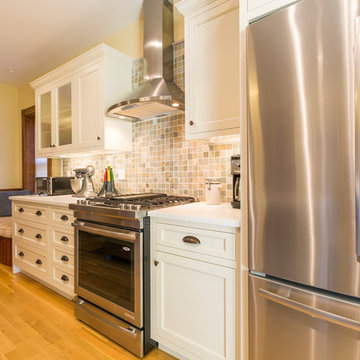
The owner of this distinguished Somerville late Victorian wanted not just a new kitchen, but a more efficient and healthier house overall. The challenge wasn’t just to capture the light and view towards the Boston skyline; we also needed to improve the space plan and work flow. Overlaid on those goals, we needed to respect the carefully maintained Victorian character of the rest of the home and bring that sensibility back into the kitchen space.
OPENING THE SPACE
We removed the wall that isolated the sink space to create one unified kitchen area. We relocated the sink to a center island so that we could replace the small window with a large sliding glass door out onto the deck and the view of the skyline.
REPURPOSING MATERIALS
We salvaged and re-used the honey-colored southern yellow pine wainscoting; we matched and extended it to a window seat and laundry room door to create continuity and tie those new elements to the old. The cabinets and counters have traditional styling in light colors to reflect the light from the new sliding doors deep into the space. More light from the rear utility stairs is brought into the space by means of a frosted glass door.
IMPROVING EFFICIENCY
More prosaically, but just as important to the client and the project team, we upgraded the insulation and air-sealing throughout the house to improve the home’s comfort and efficiency.
 Medina Exteriors & Remodeling
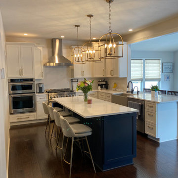
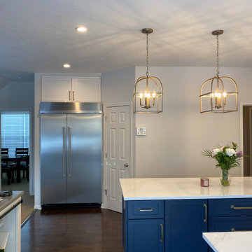
The homeowners already had a nice kitchen in the city of Brunswick, but they were wanting to make a few functional changes and create a bigger feel within the space. We accomplished this by brightening up the space with off white cabinets and then creating dimension with the island being a stunning blue. Also, we removed their 2-tier breakfast wall on the sink wall of cabinets and turned it into a true breakfast bar with an overhang, where their kids can sit and be present while they cook.
They wanted a wow factor in this space, which for them was having their countertops continue up as their backsplash. They did oil rubbed bronze finishes for the plumbing fixtures, which brought out the brown hues in the “Calacutta Gold” quartz product by Silestone. Honey bronze was used as their hardware and lighting metal finish, which added that perfect touch to compliment the blue island.
 Medina Exteriors & Remodeling
The homeowners already had a nice kitchen in the city of Brunswick, but they were wanting to make a few functional changes and create a bigger feel within the space. We accomplished this by brightening up the space with off white cabinets and then creating dimension with the island being a stunning blue. Also, we removed their 2-tier breakfast wall on the sink wall of cabinets and turned it into a true breakfast bar with an overhang, where their kids can sit and be present while they cook.
They wanted a wow factor in this space, which for them was having their countertops continue up as their backsplash. They did oil rubbed bronze finishes for the plumbing fixtures, which brought out the brown hues in the “Calacutta Gold” quartz product by Silestone. Honey bronze was used as their hardware and lighting metal finish, which added that perfect touch to compliment the blue island.
 E_ Designs
Tired of doing laundry in an unfinished rugged basement? These homeowner's were as well! They contacted Castle to help them with their basement planning and build for a finished laundry space and new bathroom with shower.
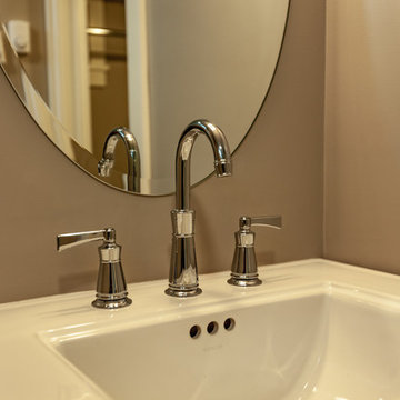
After the designer and client walked through ideas to improve flow of space, we decided to eliminate the existing 1/2 bath in the family room, and move the new bathroom into the existing laundry room. The full laundry room was finished to include new walls, ceilings, new plumbing, new Adura luxury vinyl tile flooring, beautiful shaker style cabinetry with beadboard panel, Glossy white Cultured marble countertops, a new Blanco composite sink, and Kohler Bellera faucet.
In the new bathroom space, we continued the Adura luxury vinyl flooring. Finishes in the bathroom include Kohler Memoirs pedestal sink, Kohler Archer faucet, custom hex tile shower floor, subway tile walls, and custom frameless glass shower enclosure.
Additional improvements were made to improve the health of the home including asbestos tile abatement, new drain tile and sump pump, new spray foam insulation, new glass block window, and a new Panasonic bathroom fan. We also decided to save and restore some original pieces in the home like their existing 5-panel doors and repurposing one salvaged door into a pocket door for the new bathroom.
The homeowner completed the basement finish with new carpeting in the family room. The whole basement feels fresh, new, and has a great flow. They will enjoy their happy and healthy home for years to come.
 Powell Construction
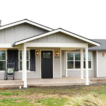
These homeowners came to us wanting to upgrade the curb appeal of their home and improve the layout of the interior. They hoped for an entry that would welcome guests to their home both inside and out, while also creating more defined and purposeful space within the home. The main goals of the project were to add a covered wrap around porch, add more windows for natural light, create a formal entry that housed the client’s baby grand piano, and add a home office for the clients to work from home.
With a dated exterior and facade that lacked dimension, there was little charm to be had. The front door was hidden from visitors and a lack of windows made the exterior unoriginal. We approached the exterior design pulling inspiration from the farmhouse style, southern porches, and craftsman style homes. Eventually we landed on a design that added numerous windows to the front façade, reminiscent of a farmhouse, and turned a Dutch hipped roof into an extended gable roof, creating a large front porch and adding curb appeal interest. By relocating the entry door to the front of the house and adding a gable accent over this new door, it created a focal point for guests and passersby. In addition to those design elements, we incorporated some exterior shutters rated for our northwest climate that echoed the southern style homes our client loved. A greige paint color (Benjamin Moore Cape May Cobblestone) accented with a white trim (Benjamin Moore Swiss Coffee) and a black front door, shutters, and window box (Sherwin Williams Black Magic) all work together to create a charming and welcoming façade.
On the interior we removed a half wall and coat closet that separated the original cramped entryway from the front room. The front room was a multipurpose space that didn’t have a designated use for the family, it became a catch-all space that was easily cluttered. Through the design process we came up with a plan to split the spaces into 2 rooms, a large open semi-formal entryway and a home office. The semi-formal entryway was intentionally designed to house the homeowner’s baby grand piano – a real showstopper. The flow created by this entryway is welcoming and ushers you into a beautifully curated home.
A new office now sits right off the entryway with beautiful French doors, built-in cabinetry, and an abundance of natural light – everything that one dreams of for their home office. The home office looks out to the front porch and front yard as well as the pastural side yard where the children frequently play. The office is an ideal location for a moment of inspiration, reflection, and focus. A warm white paint (Benjamin Moore Swiss Coffee) combined with the newly installed light oak luxury vinyl plank flooring runs throughout the home, creating continuity and a neutral canvas. Traditional and schoolhouse style statement light fixtures coordinate with the black door hardware for an added level of contrast.
There is one more improvement that made a big difference to this family. In the family room, we added a built-in window seat. This created a cozy nook that is used by all for reading and extra seating. This relatively small improvement had a big impact on how the family uses and enjoys the space.
21