
Search results for "Continuous learning" in Home Design Ideas


 Kitchen Design Concepts
we wanted to preserve the mid-century modern feel (talk about a real flashback!), and boy, do we love the results! This kitchen is another perfect example of a project where we did the “lipstick and make-up” – another term for replacing the more cosmetic features such as countertops, backsplash, and the door and drawer fronts. Even doing so, the resulting kitchen leaves us with a breath of fresh air! To learn more about this space, continue reading below:
Cabinetry
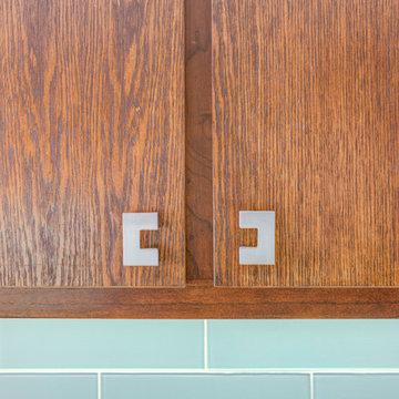
To start, we removed the soffit in the kitchen making the space look taller. Next, we did not rip out the cabinetry boxes, because we were inspired by the finish and look of what existed. Maintaining the finish of the cabinets helped preserve the retro feel and is a good example of repurposing what you already have! As a result, we replaced the door and drawer fronts with a new slab style in a matching medium stain. In addition to the cabinetry fronts, we installed floating shelves – a perfect spot to display!
Countertops
For countertops we wanted something light and bright, and also something that would look good with the other finishes. As a result, we kept it simple with a light and bright surface from Caesarstone in the color “Blizzard”
Backsplash
Now for a little fun and a pop of color, the tile. The tile we selected is fresh, exciting, and also ties everything together giving that mid-century modern feel. In a brick-lay installation, we have a Glazzio Crystile Series, in a 4×12 size, with a finish of Soft Mint.
Fixtures and Fittings
Completing the space, we finished the cabinetry with U-Turn knob’s on the doors, and U-turn pulls on the drawers. Then from Blanco, we have a Quatrus stainless steel sink and a Culina mini faucet in satin nickel.
 Kitchen Design Concepts
we wanted to preserve the mid-century modern feel (talk about a real flashback!), and boy, do we love the results! This kitchen is another perfect example of a project where we did the “lipstick and make-up” – another term for replacing the more cosmetic features such as countertops, backsplash, and the door and drawer fronts. Even doing so, the resulting kitchen leaves us with a breath of fresh air! To learn more about this space, continue reading below:
Cabinetry
To start, we removed the soffit in the kitchen making the space look taller. Next, we did not rip out the cabinetry boxes, because we were inspired by the finish and look of what existed. Maintaining the finish of the cabinets helped preserve the retro feel and is a good example of repurposing what you already have! As a result, we replaced the door and drawer fronts with a new slab style in a matching medium stain. In addition to the cabinetry fronts, we installed floating shelves – a perfect spot to display!
Countertops
For countertops we wanted something light and bright, and also something that would look good with the other finishes. As a result, we kept it simple with a light and bright surface from Caesarstone in the color “Blizzard”
Backsplash
Now for a little fun and a pop of color, the tile. The tile we selected is fresh, exciting, and also ties everything together giving that mid-century modern feel. In a brick-lay installation, we have a Glazzio Crystile Series, in a 4×12 size, with a finish of Soft Mint.
Fixtures and Fittings
Completing the space, we finished the cabinetry with U-Turn knob’s on the doors, and U-turn pulls on the drawers. Then from Blanco, we have a Quatrus stainless steel sink and a Culina mini faucet in satin nickel.
Find the right local pro for your project


 Everett Custom Homes
Example of a mid-sized farmhouse l-shaped dark wood floor and brown floor eat-in kitchen design in Charlotte with an undermount sink, shaker cabinets, white cabinets, granite countertops, gray backsplash, stainless steel appliances and an island

 Accent Window Fashions LLC
HUNTER DOUGLAS DESIGNER SCREEN SHADES
Hunter Douglas Designer Screen Shades are Made to Shade
For excellent UV protection while maintaining your view of the outdoors, Hunter Douglas Designer Screen Shades are available in sturdy and easy-to-clean fabrics—perfect for your patio or sunroom.
Hunter Douglas Designer Screen Shades are an innovative combination of sheer beauty and functional technology, offering visibility of the outdoors while protecting valuable furnishings from harmful UV rays indoors.
Headrail Option UPGRADE YOUR LOOK
Choose to upgrade to a variety of top treatments that conceal the fabric roll and clutch for a clean, attractive look. Complement or match your shade with a separate fabric for the top.
Bottom Treatments DESIGN FLEXIBILITY
Create a finished look with a wide choice of bottom treatment options.
UV protection SUNSCREEN FOR YOUR VALUABLES
Protect your furniture, flooring and artwork from fading with at least 75% protection from harmful UV rays.
Platinum™ Technology CONTROL FROM YOUR PHONE OR TABLET
Controlling your window treatments with a mobile device means you can set your blinds to movie mode, work mode, or 8 a.m. mode with the touch of a button, without leaving your seat. It’s effortless, fun and smart—with perfectly smooth operation.
Lifetime Guarantee FOR LIFE
Hunter Douglas products are designed and custom-assembled in the U.S. with the highest level of quality. But just in case, every window treatment from Hunter Douglas is covered by our lifetime limited guarantee. Read the Hunter Douglas Warranty to learn more.
Sizes Available:
Width: 12" to 192"
Height: 12" to 144"
Material/Color Options:
232 Combinations
Available from Accent Window Fashions LLC (715) 355-0772
Hunter Douglas Designer Screen Roller Shades with Standard Clutch Operated Continuous Loop
Material: New Orleans 10%
Color: Chicory
Operating Systems: Standard Clutch Operated Continuous Loop
Room: Den, Living Room
Room Styles: Casual, Contemporary
Hunter Douglas Showcase Priority Dealer
Hunter Douglas Certified Installer
Hunter Douglas Certified Professional Dealer
#Hunter_Douglas #Designer #Screen_Shades #Roller_Shades #Shades #Window_Shades #Remote_Control #Standard_Clutch #Den #Living_Room #Casual #Contemporary #Window_Treatments #HunterDouglas #Accent_Window_Fashions
Copyright 2001-2014 Hunter Douglas, Inc. All rights reserved.

 Michelle Lord Interiors
.Mid-century custom cabinets wall to ceiling with 42 inch double door refrigerator with beautiful natural walnut matching pattern door panels, pull out pantry for extra storage

 Lauren King Interior Design
This project was a part of the 2017 Decorators' Showhouse in Columbus, Ohio. Twelve designers each created a room within the Columbus Museum of Art, making this the first showhouse to take place within a museum. Each designer was allowed to use a piece of artwork from the museum's collection in their space.
The intent of this design was to create a contemporary, gender-neutral nursery with touches of mid-century modern style. Mid-century modern design is sleek, simple, functional and bright. Here, the combination of vintage and contemporary furnishings and accessories all come together to create a space that is calm, yet inspires creative play.
The artwork, California Landscape by Stanton Macdonald-Wright, sets this tone. His modern abstract, devoid of illustration uses blocks of color to create space and form. This idea of geometric abstracts is repeated throughout the design of the room. Interesting shapes that can be manipulated with eye or hand are very fitting for a nursery. This is a space where a child can dream and play, grow and learn, and also rest. It is a room that could evolve over time while continuing to inspire a child for many years.
“I strive to divest my work of all anecdote and illustration and to purify it to the point where the emotions of the spectator will be wholly aesthetic, as when listening to good music…”
- Stanton Macdonald-Wright, circa 1915
Photo Credit: Marshall Evan Photography
Construction: Jameson Building Co.

 South Hill Interiors
Photo by: Donna Griffith Photography
Inspiration for an eclectic kids' room remodel in Toronto
Inspiration for an eclectic kids' room remodel in Toronto
 U.S. Green Building Council (USGBC)
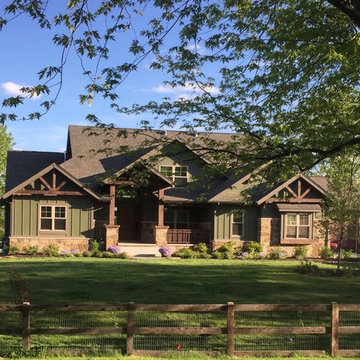
LEED certification level: Platinum.
Going beyond LEED this home is the start of a brand new line of "eco-smart" homes in the Chicagoland area that are committing to Net Zero Energy. Under the GreenHome Institute's new Zero Energy Capable program which was designed to help project teams achieve actual zero energy in their homes if operated right and market it in a simple way, this home has shown that it can be done. Their 2nd home is already underway, and they hope to make zero energy capable just a standard part of their business model. They also have been a part of local USGBCIL Green Built Home Tour and are educating 100's about LEED and zero energy. Learn more https://greenhomeinstitute.org/grand-teton-eco-smart-home-goes-leed-platinum-zero-energy-capable-il/
 Lauren King Interior Design
This project was a part of the 2017 Decorators' Showhouse in Columbus, Ohio. Twelve designers each created a room within the Columbus Museum of Art, making this the first showhouse to take place within a museum. Each designer was allowed to use a piece of artwork from the museum's collection in their space.
The intent of this design was to create a contemporary, gender-neutral nursery with touches of mid-century modern style. Mid-century modern design is sleek, simple, functional and bright. Here, the combination of vintage and contemporary furnishings and accessories all come together to create a space that is calm, yet inspires creative play.
The artwork, California Landscape by Stanton Macdonald-Wright, sets this tone. His modern abstract, devoid of illustration uses blocks of color to create space and form. This idea of geometric abstracts is repeated throughout the design of the room. Interesting shapes that can be manipulated with eye or hand are very fitting for a nursery. This is a space where a child can dream and play, grow and learn, and also rest. It is a room that could evolve over time while continuing to inspire a child for many years.
“I strive to divest my work of all anecdote and illustration and to purify it to the point where the emotions of the spectator will be wholly aesthetic, as when listening to good music…”
- Stanton Macdonald-Wright, circa 1915
Photo Credit: Marshall Evan Photography
Construction: Jameson Building Co.
 Kitchen Design Concepts
Many times, a kitchen does not need a complete gut, rather more of a cosmetic redo. Which is exactly what we’ve done here! This particular kitchen already had great bones and beautiful sky blue cabinetry, it just needed some finishing touches to get that make-over look. To learn more, continue reading below!
Countertops
With cabinetry already having a fresh sky blue color, we didn’t have to touch the cabinets. However, by lowering the pony wall, and dropping it to cabinet-height, really helped to open up the kitchen. The original countertops were a dark and outdated tile application that needed a redo. So out with the old and in with the new 3 cm Cambria Quartz in Ella. The brightness of the new countertops was a much-needed cosmetic change for this kitchen space to liven up!
Backsplash
The original backsplash was an outdated light-brown 4×4″ square installed in a mixture of straight and diamond lay. The new backsplash was a Daltile Artigiano 3×6 glazed ceramic wall tile in Italian Alps. This tile has a hand-painted look with irregular edges, giving it a hand-made look.
Fixtures and Fittings
To complete this kitchen, a new sink, faucet, and hardware is a must! From Blanco, we have a Diamond super single bowl in a granite composite sink in the color Truffle (441765), and Meridian semi-professional faucet in Satin Nickel (440557). Lastly, the new hardware on the cabinetry are Amerock Blackrock pulls in Satin Nickel (BP55276-G10).
 Kitchen Design Concepts
we wanted to preserve the mid-century modern feel (talk about a real flashback!), and boy, do we love the results! This kitchen is another perfect example of a project where we did the “lipstick and make-up” – another term for replacing the more cosmetic features such as countertops, backsplash, and the door and drawer fronts. Even doing so, the resulting kitchen leaves us with a breath of fresh air! To learn more about this space, continue reading below:
Cabinetry
To start, we removed the soffit in the kitchen making the space look taller. Next, we did not rip out the cabinetry boxes, because we were inspired by the finish and look of what existed. Maintaining the finish of the cabinets helped preserve the retro feel and is a good example of repurposing what you already have! As a result, we replaced the door and drawer fronts with a new slab style in a matching medium stain. In addition to the cabinetry fronts, we installed floating shelves – a perfect spot to display!
Countertops
For countertops we wanted something light and bright, and also something that would look good with the other finishes. As a result, we kept it simple with a light and bright surface from Caesarstone in the color “Blizzard”
Backsplash
Now for a little fun and a pop of color, the tile. The tile we selected is fresh, exciting, and also ties everything together giving that mid-century modern feel. In a brick-lay installation, we have a Glazzio Crystile Series, in a 4×12 size, with a finish of Soft Mint.
Fixtures and Fittings
Completing the space, we finished the cabinetry with U-Turn knob’s on the doors, and U-turn pulls on the drawers. Then from Blanco, we have a Quatrus stainless steel sink and a Culina mini faucet in satin nickel.

 Garret Cord Werner Architects & Interior Designers
Photography by David O. Marlow
Inspiration for a huge contemporary l-shaped porcelain tile and gray floor open concept kitchen remodel in Seattle with an undermount sink, flat-panel cabinets, medium tone wood cabinets, granite countertops, white backsplash, glass tile backsplash, stainless steel appliances, an island and gray countertops
Inspiration for a huge contemporary l-shaped porcelain tile and gray floor open concept kitchen remodel in Seattle with an undermount sink, flat-panel cabinets, medium tone wood cabinets, granite countertops, white backsplash, glass tile backsplash, stainless steel appliances, an island and gray countertops

 Eldorado Stone
The interior of this home blurs the line between modern and traditional, forging a relaxed living environment. The arched, copper porch, which features Eldorado Stone’s modern LedgeCut33, creates an inviting presentation with its continuous linear pattern displayed throughout this residence. Additionally, Eldorado Stone’s Sage LegdeCut33 adds a modern element with its lines while its cool color palette blends into the surrounding elements, which allows the home to reveal itself progressively.
Builder: Zetterberg Custom Homes & Remodels
Website: www.zetterberg.com
Phone: (253) 770-1730
Facebook: Zetterberg Custom Homes and Remodeling
 Kitchen Design Concepts
Many times, a kitchen does not need a complete gut, rather more of a cosmetic redo. Which is exactly what we’ve done here! This particular kitchen already had great bones and beautiful sky blue cabinetry, it just needed some finishing touches to get that make-over look. To learn more, continue reading below!
Countertops
With cabinetry already having a fresh sky blue color, we didn’t have to touch the cabinets. However, by lowering the pony wall, and dropping it to cabinet-height, really helped to open up the kitchen. The original countertops were a dark and outdated tile application that needed a redo. So out with the old and in with the new 3 cm Cambria Quartz in Ella. The brightness of the new countertops was a much-needed cosmetic change for this kitchen space to liven up!
Backsplash
The original backsplash was an outdated light-brown 4×4″ square installed in a mixture of straight and diamond lay. The new backsplash was a Daltile Artigiano 3×6 glazed ceramic wall tile in Italian Alps. This tile has a hand-painted look with irregular edges, giving it a hand-made look.
Fixtures and Fittings
To complete this kitchen, a new sink, faucet, and hardware is a must! From Blanco, we have a Diamond super single bowl in a granite composite sink in the color Truffle (441765), and Meridian semi-professional faucet in Satin Nickel (440557). Lastly, the new hardware on the cabinetry are Amerock Blackrock pulls in Satin Nickel (BP55276-G10).
 Benjamin Moore
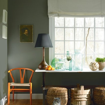
Walls: Carter Gray CW-80, Regal Select, Eggshell
Trim: Bruton White CW-710, Regal Select, Semi-Gloss
Ceiling: Bruton White CW-710, Waterborne Ceiling Paint
A gray sitting room is accented through an array of decorations featuring a bright orange chair, wicker baskets, and decorative vases & topiary.
 Kitchen Design Concepts
With a home on the lake, our clients were looking for a kitchen revival to match their love of a coastal modern look. Their original kitchen was monotone and bland with cabinets matching their flooring, and no pops of color. But with views overlooking the lake, bringing some of those natural elements inside along with a pop of color is just what this kitchen needed. As a result, we did a little minor demo, replaced door and drawer fronts, and incorporated new appliances, countertops, and backsplash. To learn more about this kitchen, continue reading below!
Cabinets
To revive this kitchen, we replaced the door and drawer fronts with brand new oak slab fronts from Woodmont to give it a modern look. We then incorporated new cabinetry on the island from Crestwood in a Metro door style and Ebony stain finish giving this kitchen a unified look and great functionality.
Appliances
New appliances include a Zephyr Tempest II hood in stainless steel, a 24" Dacor microwave drawer, and a 30" Dacor Distinctive dual-fuel range.
Countertops
As a contrast to the new darker stained cabinetry, we installed a bright quartz countertop from Caesarstone in the color Blizzard, giving this kitchen a balanced feel.
Backsplash
The backsplash is a reflection of the beautiful views our clients have of the lake. The shimmering and vibrant backsplash is a Hirsch Glass, in hourglass shape, and iridescent finish (XM0006).
Fixtures and Finishes
To complete this space, a new sink from Blanco (515824), a new pull-down faucet, also from Blanco (440616), and cabinet hardware from Top Knobs in brushed nickel (M1158) become the last elements that tie this space together.
 Kitchen Design Concepts
we wanted to preserve the mid-century modern feel (talk about a real flashback!), and boy, do we love the results! This kitchen is another perfect example of a project where we did the “lipstick and make-up” – another term for replacing the more cosmetic features such as countertops, backsplash, and the door and drawer fronts. Even doing so, the resulting kitchen leaves us with a breath of fresh air! To learn more about this space, continue reading below:
Cabinetry
To start, we removed the soffit in the kitchen making the space look taller. Next, we did not rip out the cabinetry boxes, because we were inspired by the finish and look of what existed. Maintaining the finish of the cabinets helped preserve the retro feel and is a good example of repurposing what you already have! As a result, we replaced the door and drawer fronts with a new slab style in a matching medium stain. In addition to the cabinetry fronts, we installed floating shelves – a perfect spot to display!
Countertops
For countertops we wanted something light and bright, and also something that would look good with the other finishes. As a result, we kept it simple with a light and bright surface from Caesarstone in the color “Blizzard”
Backsplash
Now for a little fun and a pop of color, the tile. The tile we selected is fresh, exciting, and also ties everything together giving that mid-century modern feel. In a brick-lay installation, we have a Glazzio Crystile Series, in a 4×12 size, with a finish of Soft Mint.
Fixtures and Fittings
Completing the space, we finished the cabinetry with U-Turn knob’s on the doors, and U-turn pulls on the drawers. Then from Blanco, we have a Quatrus stainless steel sink and a Culina mini faucet in satin nickel.
 Kitchen Design Concepts
Many times, a kitchen does not need a complete gut, rather more of a cosmetic redo. Which is exactly what we’ve done here! This particular kitchen already had great bones and beautiful sky blue cabinetry, it just needed some finishing touches to get that make-over look. To learn more, continue reading below!
Countertops
With cabinetry already having a fresh sky blue color, we didn’t have to touch the cabinets. However, by lowering the pony wall, and dropping it to cabinet-height, really helped to open up the kitchen. The original countertops were a dark and outdated tile application that needed a redo. So out with the old and in with the new 3 cm Cambria Quartz in Ella. The brightness of the new countertops was a much-needed cosmetic change for this kitchen space to liven up!
Backsplash
The original backsplash was an outdated light-brown 4×4″ square installed in a mixture of straight and diamond lay. The new backsplash was a Daltile Artigiano 3×6 glazed ceramic wall tile in Italian Alps. This tile has a hand-painted look with irregular edges, giving it a hand-made look.
Fixtures and Fittings
To complete this kitchen, a new sink, faucet, and hardware is a must! From Blanco, we have a Diamond super single bowl in a granite composite sink in the color Truffle (441765), and Meridian semi-professional faucet in Satin Nickel (440557). Lastly, the new hardware on the cabinetry are Amerock Blackrock pulls in Satin Nickel (BP55276-G10).
22