
Search results for "Continuous learning" in Home Design Ideas

 Advance Design Studio, Ltd.
Jennifer and Dan have lived in their Deer Park Illinois home for 15 years, slowly making minor fixes like painting and decorating; but they had a new plan for their kitchen the entire time. An awkwardly placed garage door, and an island cooktop with a terrible downdraft made a full-scale kitchen remodel an absolute must. Jennifer had many ideas in mind and wanted to work with a company that could provide high-end work, while partnering with a designer that would tailor the kitchen to her ideas.
She was intrigued by the phrase “Common Sense Remodeling” in Advance Design’s feature she discovered while perusing an issue of the community’s Quintessential Barrington Magazine. Doing further research on the company’s website, as she looked through project profiles and read about Advance Design’s “Common Sense Remodeling” philosophy, she promptly scheduled an appointment to see if the people and ideas she read about were truly who they said they were. The more she read, the more she knew that the “Common Sense” approach to remodeling they described was exactly the type of company she was looking for.
The partnership was sealed after an initial consultation with Owner Todd Jurs and Project Designer Michelle Lecinski. They displayed a combination of friendliness, professionalism and respect that was unmatched by any of the other companies Jennifer talked to. She knew that with Advance Design, she would be able to retain the vision that she had in mind with high-quality craftsmanship.
“I reached out to Advance Design because of the ‘Common Sense Remodeling’ tagline,” Jennifer said. “That’s what lingered for me”. “Advance Design was the most respectful- of the house and of my design ideas, and the most professional of the handful of companies that looked at my project”.
Soon after the meeting Jennifer began working with Michelle on the project design. They quickly developed chemistry. Jennifer loved how Michelle researched and located every detail that Jennifer wanted for the kitchen. Between the two of them, every concept and idea was worked through and perfected. “Jennifer had definite ideas about what she wanted the new kitchen to look like, she just didn’t know how to bring it all together. We worked together really well to make her ideas into the practical reality necessary for a well-functioning kitchen, with the look and feel that she had envisioned”, says Michelle.
“Michelle was wonderful in using the CAD system she would show me new drawings every time we changed the layout while working through the design,” Jennifer said. “She was a really wonderful partner in execution, she made sure everything happened quickly and easily.”
The finished design drew out elements of Jennifer’s style and personality. The pair call the look “sophisticated farmhouse” to describe the kitchen renovation to family and friends. The result was a beautifully crafted, authentic-feeling space that satisfied Jennifer’s dreams 15 years in the making. The whole project consisted of a kitchen remodel, mudroom upgrade with powder room, and garage entry relocation. “The projects I personally like the best, are the ones that put the client’s dreams on display,” Project Designer Michelle said. “And this is one of those projects.”
The main focal point of the kitchen is custom zinc and brass ventilation hood with a vintage sheen, which was hand made to order by a small company in Indiana named Vogler Metalworking. “It’s like sculpture, a true work of art”, says Jennifer. Your eye is immediately drawn towards this elegant yet practical hood that eliminated the home’s downdraft problem and added a striking conversation piece at the same time. The carpenters had to use special gloves when transporting and installing it, so they didn’t smudge it with fingerprints. The beautiful hood centers proudly over the stunning black enamel and brass LaCornue Range. “I had a friend who had a LaCornue range and after learning how easy it was to cook perfect meals, I was convinced I wanted to have one”, says Jennifer. This unique, breathtaking combination anchors the entire kitchen and is apparent immediately as you walk into the great room the surrounds the space.
DuraSupreme Crestwood cabinets with a Kendall Panel add function and sophistication. A custom gray paint color paired with a storm blue was developed so that the new kitchen looked like it belonged to the existing space. Unlacquered brass faucets and hardware were important to Jennifer because she wanted the living finishes to age over time. Remarkable brass diamond mesh cabinet door inserts imported from the UK continue to add this one-of-a-kind kitchen renovation; giving it a “you won’t see this everywhere” quality. The use of old railcar flooring for the coffee bar countertop and reclaimed oak for the open shelving gives an authenticity to the space uncommon in kitchens today.
Jennifer and Michelle fell in love with the Limestone Grey Stone while they were investigating unique island countertop ideas. They liked the fact that the limestone as a living finish will age and change over time. Calcutta Miel Quartz countertops made for an excellent pairing around the perimeter, as it’s durable and perfect for cooking preparations. A textured white subway tile backsplash that runs to the ceiling keeps your eye moving towards the open shelving, and to the main focal point of the stunning range hood combination.
“The kitchen functions beautifully, and it’s gorgeous,” beams Jennifer as she gestures with both hands while smiling ear to ear. “The most important thing was I wanted a kitchen that had a wonderful flow, cooked beautiful meals and was a great gathering place for family and friends, and this space does that perfectly! Beauty wise, it turned out exactly how I had envisioned. I felt the function part was the hardest part, and that was nailed”!
Relocating the garage entry to the new mudroom was a huge priority and has finally separated the family’s arriving home functions from their kitchen. Now coats and shoes and bags have their own area for dropping once members arrive home. Matching gray DuraSupreme cabinetry helped create gorgeous, purposeful lockers for the family. A reclaimed vintage sink and custom wall paper were added to the tiny powder room to beautify the once previously only functional space. Advance Design was even able to create a custom space for their dog to sleep while the family is away.
“It was unbelievable that a project of this size was completed in such a short time, and I think that’s because of the large amount of planning and preparation that went into it,” Jennifer marveled, “When we started, we were ready, and everything was prepared”.
When it came to execution, Project Manager Justin Davis and his crew were quick, accessible, and organized. Projects like this kitchen are typically completed in as little as 8-10 weeks. Jennifer’s kitchen however despite the relocation of some challenging HVAC in a soffit and moving of an exterior door was completed remarkably fast in part because the team was working with an existing tile floor that ran throughout the first floor that the client really loved.
“You get to know these people really well because they’re living in your house while you’re living in your house. They were so fast and really good, it didn’t take as long as even planned” reported Jennifer. “I would text Justin and he always responded almost immediately. I got to know all the guys who were working in our house and they were all wonderful people”.
Details in a customized kitchen like this one require skill and care from the people who install it. “All the guys on the job were skilled at what the did. I wanted small details like little feet to look like furniture, that is where their carpentry skill came in to make these all perfect”, said Jennifer. “The tile guys were wonderful. They even let me determine how I wanted the texture with the grout to appear for a salt and pepper look; now that is a very skilled trade person making it custom”.
In Jennifer’s interview, she continued to reference Advance Design’s “Common Sense Remodeling”, so I took a minute to ask her exactly what that phrase meant to her and how it played out in her experience with her project and the Advance Design team. Here is what she said: “I was intrigued about Common Sense Remodeling and in my head that there would be clear costs and prices, great communication between the design team, the execution team and me”, said Jennifer. They did deliver on that, it was so clear about the cost breakdown, what I could expect from everyone who came to my house, and everything that we had ordered. That to me is the Common Sense”!
It’s great to see a client take literally our assertion that a well-planned remodeling project is simply “Common Sense”! She anticipated each step of the way would be clear, concise, and predictable, all the while protecting the outcome due to the careful upfront planning. “Advance Design delivered on their ‘Common Sense Remodeling’ promise,” Jennifer said. “From the design team, to the execution team - everything was straight forward like I imagined. The project turned out exactly how I envisioned, I enjoyed this process and absolutely would recommend Advance Design Studio to anyone.”

 Eldorado Stone
The interior of this home blurs the line between modern and traditional, forging a relaxed living environment. The arched, copper porch, which features Eldorado Stone’s modern LedgeCut33, creates an inviting presentation with its continuous linear pattern displayed throughout this residence. Additionally, Eldorado Stone’s Sage LegdeCut33 adds a modern element with its lines while its cool color palette blends into the surrounding elements, which allows the home to reveal itself progressively.
Builder: Zetterberg Custom Homes & Remodels
Website: www.zetterberg.com
Phone: (253) 770-1730
Facebook: Zetterberg Custom Homes and Remodeling
 Gore Design Co., LLC
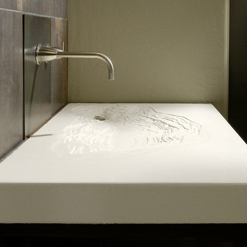
The Erosion Sink is a defining design for Gore Design Co. First created for a client in 2004 and shortly thereafter published in Dwell Magazine™, the Erosion Sink remains special to us.
Each one is unique, no two are the same. All aspects of this topographic sink can be customized, from color and size to the shape and layout of the erosion pattern. Brandon Gore personally creates each concrete Erosion Sink, spending more than 40 hours on the form and 200-300% more time hand-finishing the cast sink.
This original design is often imitated but never duplicated as the essence and nuance cannot be gained by impersonation. If you want to learn more, please visit our website at www.goredesignco.com
Find the right local pro for your project

 Kitchen Design Concepts
One of the biggest investments you can make in your home is in your kitchen. Now with the Revive model, you don’t have to break the bank to get an updated kitchen with new finishes and a whole new look! This powder blue kitchen we are sharing today is a classic example of such a space! The kitchen had a great layout, the cabinets had good bones, and all it needed were some simple updates. To learn more about what we did, continue reading below!
Cabinets
As previously mentioned, the kitchen cabinetry already had great bones. So, in this case, we were able to refinish them to a painted cream on the perimeter. As for the island, we created a new design where new cabinetry was installed. New cabinets are from WWWoods Shiloh, with a raised panel door style, and a custom painted finish for these powder blue cabinets.
Countertops
The existing kitchen countertops were able to remain because they were already in great condition. Plus, it matched the new finishes perfectly. This is a classic case of “don’t fix it if it ain’t broke”!
Backsplash
For the backsplash, we kept it simple with subway tile but played around with different sizes, colors, and patterns. The main backsplash tile is a Daltile Modern Dimensions, in a 4.5×8.5 size, in the color Elemental Tan, and installed in a brick-lay formation. The splash over the cooktop is a Daltile Rittenhouse Square, in a 3×6 size, in the color Arctic White, and installed in a herringbone pattern.
Fixtures and Finishes
The plumbing fixtures we planned to reuse from the start since they were in great condition. In addition, the oil-rubbed bronze finish went perfectly with the new finishes of the kitchen. We did, however, install new hardware because the original kitchen did not have any. So, from Amerock we selected Muholland pulls which were installed on all the doors and drawers.
 Kitchen Design Concepts
One of the biggest investments you can make in your home is in your kitchen. Now with the Revive model, you don’t have to break the bank to get an updated kitchen with new finishes and a whole new look! This powder blue kitchen we are sharing today is a classic example of such a space! The kitchen had a great layout, the cabinets had good bones, and all it needed were some simple updates. To learn more about what we did, continue reading below!
Cabinets
As previously mentioned, the kitchen cabinetry already had great bones. So, in this case, we were able to refinish them to a painted cream on the perimeter. As for the island, we created a new design where new cabinetry was installed. New cabinets are from WWWoods Shiloh, with a raised panel door style, and a custom painted finish for these powder blue cabinets.
Countertops
The existing kitchen countertops were able to remain because they were already in great condition. Plus, it matched the new finishes perfectly. This is a classic case of “don’t fix it if it ain’t broke”!
Backsplash
For the backsplash, we kept it simple with subway tile but played around with different sizes, colors, and patterns. The main backsplash tile is a Daltile Modern Dimensions, in a 4.5×8.5 size, in the color Elemental Tan, and installed in a brick-lay formation. The splash over the cooktop is a Daltile Rittenhouse Square, in a 3×6 size, in the color Arctic White, and installed in a herringbone pattern.
Fixtures and Finishes
The plumbing fixtures we planned to reuse from the start since they were in great condition. In addition, the oil-rubbed bronze finish went perfectly with the new finishes of the kitchen. We did, however, install new hardware because the original kitchen did not have any. So, from Amerock we selected Muholland pulls which were installed on all the doors and drawers.

 Lauren King Interior Design
This project was a part of the 2017 Decorators' Showhouse in Columbus, Ohio. Twelve designers each created a room within the Columbus Museum of Art, making this the first showhouse to take place within a museum. Each designer was allowed to use a piece of artwork from the museum's collection in their space.
The intent of this design was to create a contemporary, gender-neutral nursery with touches of mid-century modern style. Mid-century modern design is sleek, simple, functional and bright. Here, the combination of vintage and contemporary furnishings and accessories all come together to create a space that is calm, yet inspires creative play.
The artwork, California Landscape by Stanton Macdonald-Wright, sets this tone. His modern abstract, devoid of illustration uses blocks of color to create space and form. This idea of geometric abstracts is repeated throughout the design of the room. Interesting shapes that can be manipulated with eye or hand are very fitting for a nursery. This is a space where a child can dream and play, grow and learn, and also rest. It is a room that could evolve over time while continuing to inspire a child for many years.
“I strive to divest my work of all anecdote and illustration and to purify it to the point where the emotions of the spectator will be wholly aesthetic, as when listening to good music…”
- Stanton Macdonald-Wright, circa 1915
Photo Credit: Marshall Evan Photography
Construction: Jameson Building Co.
 Kitchen Design Concepts
With a home on the lake, our clients were looking for a kitchen revival to match their love of a coastal modern look. Their original kitchen was monotone and bland with cabinets matching their flooring, and no pops of color. But with views overlooking the lake, bringing some of those natural elements inside along with a pop of color is just what this kitchen needed. As a result, we did a little minor demo, replaced door and drawer fronts, and incorporated new appliances, countertops, and backsplash. To learn more about this kitchen, continue reading below!
Cabinets
To revive this kitchen, we replaced the door and drawer fronts with brand new oak slab fronts from Woodmont to give it a modern look. We then incorporated new cabinetry on the island from Crestwood in a Metro door style and Ebony stain finish giving this kitchen a unified look and great functionality.
Appliances
New appliances include a Zephyr Tempest II hood in stainless steel, a 24" Dacor microwave drawer, and a 30" Dacor Distinctive dual-fuel range.
Countertops
As a contrast to the new darker stained cabinetry, we installed a bright quartz countertop from Caesarstone in the color Blizzard, giving this kitchen a balanced feel.
Backsplash
The backsplash is a reflection of the beautiful views our clients have of the lake. The shimmering and vibrant backsplash is a Hirsch Glass, in hourglass shape, and iridescent finish (XM0006).
Fixtures and Finishes
To complete this space, a new sink from Blanco (515824), a new pull-down faucet, also from Blanco (440616), and cabinet hardware from Top Knobs in brushed nickel (M1158) become the last elements that tie this space together.
 Lauren King Interior Design
This project was a part of the 2017 Decorators' Showhouse in Columbus, Ohio. Twelve designers each created a room within the Columbus Museum of Art, making this the first showhouse to take place within a museum. Each designer was allowed to use a piece of artwork from the museum's collection in their space.
The intent of this design was to create a contemporary, gender-neutral nursery with touches of mid-century modern style. Mid-century modern design is sleek, simple, functional and bright. Here, the combination of vintage and contemporary furnishings and accessories all come together to create a space that is calm, yet inspires creative play.
The artwork, California Landscape by Stanton Macdonald-Wright, sets this tone. His modern abstract, devoid of illustration uses blocks of color to create space and form. This idea of geometric abstracts is repeated throughout the design of the room. Interesting shapes that can be manipulated with eye or hand are very fitting for a nursery. This is a space where a child can dream and play, grow and learn, and also rest. It is a room that could evolve over time while continuing to inspire a child for many years.
“I strive to divest my work of all anecdote and illustration and to purify it to the point where the emotions of the spectator will be wholly aesthetic, as when listening to good music…”
- Stanton Macdonald-Wright, circa 1915
Photo Credit: Marshall Evan Photography
Construction: Jameson Building Co.
 Kitchen Design Concepts
One of the biggest investments you can make in your home is in your kitchen. Now with the Revive model, you don’t have to break the bank to get an updated kitchen with new finishes and a whole new look! This powder blue kitchen we are sharing today is a classic example of such a space! The kitchen had a great layout, the cabinets had good bones, and all it needed were some simple updates. To learn more about what we did, continue reading below!
Cabinets
As previously mentioned, the kitchen cabinetry already had great bones. So, in this case, we were able to refinish them to a painted cream on the perimeter. As for the island, we created a new design where new cabinetry was installed. New cabinets are from WWWoods Shiloh, with a raised panel door style, and a custom painted finish for these powder blue cabinets.
Countertops
The existing kitchen countertops were able to remain because they were already in great condition. Plus, it matched the new finishes perfectly. This is a classic case of “don’t fix it if it ain’t broke”!
Backsplash
For the backsplash, we kept it simple with subway tile but played around with different sizes, colors, and patterns. The main backsplash tile is a Daltile Modern Dimensions, in a 4.5×8.5 size, in the color Elemental Tan, and installed in a brick-lay formation. The splash over the cooktop is a Daltile Rittenhouse Square, in a 3×6 size, in the color Arctic White, and installed in a herringbone pattern.
Fixtures and Finishes
The plumbing fixtures we planned to reuse from the start since they were in great condition. In addition, the oil-rubbed bronze finish went perfectly with the new finishes of the kitchen. We did, however, install new hardware because the original kitchen did not have any. So, from Amerock we selected Muholland pulls which were installed on all the doors and drawers.
 Phoenix Home Remodeling
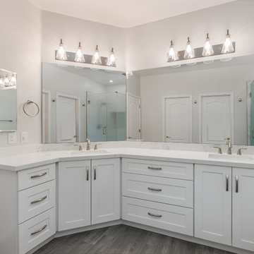
After meeting with Mark, we determined that the goal of his remodel was that he wanted to convert his typical 2000s master bath into a transitional and functional area and get more storage. The standard cultured marble walls and soaking tub wasn’t exactly what he wanted any longer.
After learning about his style, we determined a large format tile and larger base cabinets would do the trick. From the white cabinetry, and striking vein large format tile and deep soaking tub.
The white shaker cabinets are for Sollid Cabinetry. We minimized the sink bases so that Mark could control what is under those cabinets, however do you see those drawer bases? They are large enough to hold anything you desire.
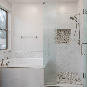
The two-toned shower and tub deck tile feature a striking vein that appears to go on for days. The wall tiles size is a large format tile measuring at 24X48.
This size allows for two great design elements. The first, allowing the vein to be continuous. Second, less wall grout. A total of 9 tiles used on the walls. To accentuate this vein we installed an oversized niche allows for a spotlight for the pebble mosaic to be a feature on the wall and the shower pan.
The tub deck and curb tiles are from Arizona Tile as well. It is the Cemento Rasato – Bianco 12X24. By pairing these tiles together, it supports the wall tile and allows that to be the star of the show.
The bathroom floor is Frassino, from the collection of Porta Nouva from Arizona Tile. Laid in a horizontal random offset. This selection pops the whites and grounds the elements.
This bathroom features a Calcatta quartz countertops that showcase a slight vein that supports the wall tile. The bathroom accessories, lighting fixtures and faucets are all brushed nickel.
 Phoenix Home Remodeling
After meeting with Mark, we determined that the goal of his remodel was that he wanted to convert his typical 2000s master bath into a transitional and functional area and get more storage. The standard cultured marble walls and soaking tub wasn’t exactly what he wanted any longer.
After learning about his style, we determined a large format tile and larger base cabinets would do the trick. From the white cabinetry, and striking vein large format tile and deep soaking tub.
The white shaker cabinets are for Sollid Cabinetry. We minimized the sink bases so that Mark could control what is under those cabinets, however do you see those drawer bases? They are large enough to hold anything you desire.
The two-toned shower and tub deck tile feature a striking vein that appears to go on for days. The wall tiles size is a large format tile measuring at 24X48.
This size allows for two great design elements. The first, allowing the vein to be continuous. Second, less wall grout. A total of 9 tiles used on the walls. To accentuate this vein we installed an oversized niche allows for a spotlight for the pebble mosaic to be a feature on the wall and the shower pan.
The tub deck and curb tiles are from Arizona Tile as well. It is the Cemento Rasato – Bianco 12X24. By pairing these tiles together, it supports the wall tile and allows that to be the star of the show.
The bathroom floor is Frassino, from the collection of Porta Nouva from Arizona Tile. Laid in a horizontal random offset. This selection pops the whites and grounds the elements.
This bathroom features a Calcatta quartz countertops that showcase a slight vein that supports the wall tile. The bathroom accessories, lighting fixtures and faucets are all brushed nickel.
 Kitchen Design Concepts
One of the biggest investments you can make in your home is in your kitchen. Now with the Revive model, you don’t have to break the bank to get an updated kitchen with new finishes and a whole new look! This powder blue kitchen we are sharing today is a classic example of such a space! The kitchen had a great layout, the cabinets had good bones, and all it needed were some simple updates. To learn more about what we did, continue reading below!
Cabinets
As previously mentioned, the kitchen cabinetry already had great bones. So, in this case, we were able to refinish them to a painted cream on the perimeter. As for the island, we created a new design where new cabinetry was installed. New cabinets are from WWWoods Shiloh, with a raised panel door style, and a custom painted finish for these powder blue cabinets.
Countertops
The existing kitchen countertops were able to remain because they were already in great condition. Plus, it matched the new finishes perfectly. This is a classic case of “don’t fix it if it ain’t broke”!
Backsplash
For the backsplash, we kept it simple with subway tile but played around with different sizes, colors, and patterns. The main backsplash tile is a Daltile Modern Dimensions, in a 4.5×8.5 size, in the color Elemental Tan, and installed in a brick-lay formation. The splash over the cooktop is a Daltile Rittenhouse Square, in a 3×6 size, in the color Arctic White, and installed in a herringbone pattern.
Fixtures and Finishes
The plumbing fixtures we planned to reuse from the start since they were in great condition. In addition, the oil-rubbed bronze finish went perfectly with the new finishes of the kitchen. We did, however, install new hardware because the original kitchen did not have any. So, from Amerock we selected Muholland pulls which were installed on all the doors and drawers.
 Phoenix Home Remodeling
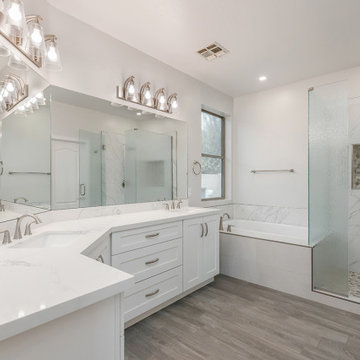
After meeting with Mark, we determined that the goal of his remodel was that he wanted to convert his typical 2000s master bath into a transitional and functional area and get more storage. The standard cultured marble walls and soaking tub wasn’t exactly what he wanted any longer.
After learning about his style, we determined a large format tile and larger base cabinets would do the trick. From the white cabinetry, and striking vein large format tile and deep soaking tub.
The white shaker cabinets are for Sollid Cabinetry. We minimized the sink bases so that Mark could control what is under those cabinets, however do you see those drawer bases? They are large enough to hold anything you desire.
The two-toned shower and tub deck tile feature a striking vein that appears to go on for days. The wall tiles size is a large format tile measuring at 24X48.
This size allows for two great design elements. The first, allowing the vein to be continuous. Second, less wall grout. A total of 9 tiles used on the walls. To accentuate this vein we installed an oversized niche allows for a spotlight for the pebble mosaic to be a feature on the wall and the shower pan.
The tub deck and curb tiles are from Arizona Tile as well. It is the Cemento Rasato – Bianco 12X24. By pairing these tiles together, it supports the wall tile and allows that to be the star of the show.
The bathroom floor is Frassino, from the collection of Porta Nouva from Arizona Tile. Laid in a horizontal random offset. This selection pops the whites and grounds the elements.
This bathroom features a Calcatta quartz countertops that showcase a slight vein that supports the wall tile. The bathroom accessories, lighting fixtures and faucets are all brushed nickel.
 Kitchen Design Concepts
One of the biggest investments you can make in your home is in your kitchen. Now with the Revive model, you don’t have to break the bank to get an updated kitchen with new finishes and a whole new look! This powder blue kitchen we are sharing today is a classic example of such a space! The kitchen had a great layout, the cabinets had good bones, and all it needed were some simple updates. To learn more about what we did, continue reading below!
Cabinets
As previously mentioned, the kitchen cabinetry already had great bones. So, in this case, we were able to refinish them to a painted cream on the perimeter. As for the island, we created a new design where new cabinetry was installed. New cabinets are from WWWoods Shiloh, with a raised panel door style, and a custom painted finish for these powder blue cabinets.
Countertops
The existing kitchen countertops were able to remain because they were already in great condition. Plus, it matched the new finishes perfectly. This is a classic case of “don’t fix it if it ain’t broke”!
Backsplash
For the backsplash, we kept it simple with subway tile but played around with different sizes, colors, and patterns. The main backsplash tile is a Daltile Modern Dimensions, in a 4.5×8.5 size, in the color Elemental Tan, and installed in a brick-lay formation. The splash over the cooktop is a Daltile Rittenhouse Square, in a 3×6 size, in the color Arctic White, and installed in a herringbone pattern.
Fixtures and Finishes
The plumbing fixtures we planned to reuse from the start since they were in great condition. In addition, the oil-rubbed bronze finish went perfectly with the new finishes of the kitchen. We did, however, install new hardware because the original kitchen did not have any. So, from Amerock we selected Muholland pulls which were installed on all the doors and drawers.
 Kitchen Design Concepts
One of the biggest investments you can make in your home is in your kitchen. Now with the Revive model, you don’t have to break the bank to get an updated kitchen with new finishes and a whole new look! This powder blue kitchen we are sharing today is a classic example of such a space! The kitchen had a great layout, the cabinets had good bones, and all it needed were some simple updates. To learn more about what we did, continue reading below!
Cabinets
As previously mentioned, the kitchen cabinetry already had great bones. So, in this case, we were able to refinish them to a painted cream on the perimeter. As for the island, we created a new design where new cabinetry was installed. New cabinets are from WWWoods Shiloh, with a raised panel door style, and a custom painted finish for these powder blue cabinets.
Countertops
The existing kitchen countertops were able to remain because they were already in great condition. Plus, it matched the new finishes perfectly. This is a classic case of “don’t fix it if it ain’t broke”!
Backsplash
For the backsplash, we kept it simple with subway tile but played around with different sizes, colors, and patterns. The main backsplash tile is a Daltile Modern Dimensions, in a 4.5×8.5 size, in the color Elemental Tan, and installed in a brick-lay formation. The splash over the cooktop is a Daltile Rittenhouse Square, in a 3×6 size, in the color Arctic White, and installed in a herringbone pattern.
Fixtures and Finishes
The plumbing fixtures we planned to reuse from the start since they were in great condition. In addition, the oil-rubbed bronze finish went perfectly with the new finishes of the kitchen. We did, however, install new hardware because the original kitchen did not have any. So, from Amerock we selected Muholland pulls which were installed on all the doors and drawers.
 Kitchen Design Concepts
One of the biggest investments you can make in your home is in your kitchen. Now with the Revive model, you don’t have to break the bank to get an updated kitchen with new finishes and a whole new look! This powder blue kitchen we are sharing today is a classic example of such a space! The kitchen had a great layout, the cabinets had good bones, and all it needed were some simple updates. To learn more about what we did, continue reading below!
Cabinets
As previously mentioned, the kitchen cabinetry already had great bones. So, in this case, we were able to refinish them to a painted cream on the perimeter. As for the island, we created a new design where new cabinetry was installed. New cabinets are from WWWoods Shiloh, with a raised panel door style, and a custom painted finish for these powder blue cabinets.
Countertops
The existing kitchen countertops were able to remain because they were already in great condition. Plus, it matched the new finishes perfectly. This is a classic case of “don’t fix it if it ain’t broke”!
Backsplash
For the backsplash, we kept it simple with subway tile but played around with different sizes, colors, and patterns. The main backsplash tile is a Daltile Modern Dimensions, in a 4.5×8.5 size, in the color Elemental Tan, and installed in a brick-lay formation. The splash over the cooktop is a Daltile Rittenhouse Square, in a 3×6 size, in the color Arctic White, and installed in a herringbone pattern.
Fixtures and Finishes
The plumbing fixtures we planned to reuse from the start since they were in great condition. In addition, the oil-rubbed bronze finish went perfectly with the new finishes of the kitchen. We did, however, install new hardware because the original kitchen did not have any. So, from Amerock we selected Muholland pulls which were installed on all the doors and drawers.
 Kitchen Design Concepts
We introduce to you one of our newer services we are providing here at Kitchen Design Concepts: spaces that just need a little reviving! As of recent, we are taking on projects that are in need of minimal updating, as in, spaces that don’t need a full-on remodel. Yes, you heard right! If your space has good bones, you like the layout of your kitchen, and you just need a few cosmetic changes, then today’s feature is for you! Recently, we updated a space where we did just this! The kitchen was in need of a little love, some fresh paint, and new finishes. And if we’re being honest here, the result looks almost as if the kitchen had a full-on remodel! To learn more about this space and how we did our magic, continue reading below:
The Before and After
First, see what an impact new finishes can make! The “before” image shows a kitchen with outdated finishes such as the tile countertops, backsplash, and cabinetry finish. The “after” image, is a kitchen that looks almost as if its brand new, the image speaks for itself!
Cabinetry
With the wooden cabinetry in this kitchen already having great bones, all we needed to do was our refinishing process that involved removing door and drawer fronts, sanding, priming, and painting. The main color of the cabinetry is white (Sherwin Williams Pure White 7005) and as an accent, we applied a deep navy blue that really pops in this space (Sherwin Willaims Naval 6244). As a special design element, we incorporated a natural wooden band across the hood which is subtle but adds an element of surprise.
Countertops
The original countertops in this space were a 12×12 tile with cracks and discolored grout from all the wear and tear. To replace the countertops, we installed a clean and crisp quartz that is not only durable but easy to maintain (no grout here!). The 3cm countertops are a Cambria quartz in a grey-tone color (Carrick).
Backsplash
Keeping things simple, yet classic, we installed a 3×6 subway tile from Interceramic. The crisp white pairs well with all the other finishes of the space and really brighten the space up! To spice things up, we paired the white tile with a contrasting grout color (Cape Grey) that matches the countertop. This is a simple method to add interest to your white backsplash!
Fixtures and Fittings
For the fixtures and fittings of the kitchen, we wanted pieces that made a statement. That’s why we selected this industrial style faucet from Brizo! The faucet is a Brizo LITZE™ PULL-DOWN FAUCET WITH ARC SPOUT AND INDUSTRIAL HANDLE (63044LF-BLGL). The matte black paired with the luxe gold elements really make a statement! To match the gold elements of the faucet, we installed cabinetry hardware from Topknobs in the same gold finish. The hardware is a Channing pull TK743HB. Lastly, the large single bowl sink (who doesn’t want a large sink?!) is a great functional touch to the kitchen. The sink is a Blanco Precision 16″ R10 super single with 16″ Drainer in stainless steel (516216).
 Kitchen Design Concepts
The builder we partnered with for this beauty original wanted to use his cabinet person (who builds and finishes on site) but the clients advocated for manufactured cabinets - and we agree with them! These homeowners were just wonderful to work with and wanted materials that were a little more "out of the box" than the standard "white kitchen" you see popping up everywhere today - and their dog, who came along to every meeting, agreed to something with longevity, and a good warranty!
The cabinets are from WW Woods, their Eclipse (Frameless, Full Access) line in the Aspen door style
- a shaker with a little detail. The perimeter kitchen and scullery cabinets are a Poplar wood with their Seagull stain finish, and the kitchen island is a Maple wood with their Soft White paint finish. The space itself was a little small, and they loved the cabinetry material, so we even paneled their built in refrigeration units to make the kitchen feel a little bigger. And the open shelving in the scullery acts as the perfect go-to pantry, without having to go through a ton of doors - it's just behind the hood wall!
 Kitchen Design Concepts
With a little bit of love, you can transform your kitchen into a space you love to spend time in! Many people are so used to their surroundings that we don’t realize what a little bit of paint and new finishes can do to change a room. That’s exactly the case of this kitchen. Actually, the cabinetry was already refinished prior to us coming into the picture, our clients couldn’t wait! So, we had the opportunity to incorporate those finishing touches to really seal the deal of this space. Today, this kitchen is up-to-date and classic. It really will stand the test of time! To learn more about this space, continue reading below:
Cabinets
The cabinetry was already refinished prior to us doing our magic. But we love how the crisp and clean finishes of the cabinetry pairs so well with the new finishes and materials we incorporated. To elevate the cabinetry, we embellished the doors and drawers with 5 inch “Emerald” hardware from Top Knobs (TK288BSN).
Countertops
At first glance, you may have noticed we incorporated beautiful marble countertops to this space. So, what if we told you those countertops are not made of marble? Actually, not even close! These countertops are a beautiful 3cm Cambria quartz in the finish “Ironsbridge”. The specs of grey and veining in the countertops might have fooled you! We love the way it looks in this space.
Backsplash
Subway tiles have been around a long time. Still, we love the classic look of subway tile and our clients are always requesting it! A simple way to add interested to subway tile is to utilize tile with beveling, create a contrasting pattern, and add contrasting grout color, as we have done here. Here we have utilized a 3×6 Daltile Rittenhouse Square with beveled edges as the main tile. Then, over the range, we have framed the tile and changed the pattern to herringbone to add some pop!
Fixtures
The fixtures of this space are classically styled as well. From Blanco, we have the main sink in a Precis Super Single Bowl in White paired with an Atura kitchen faucet with pull-down spray in stainless steel. Then on the island, we have a Precis Medium Bowl in White and an Atura Pulldown bar faucet in stainless steel, also from Blanco.
 Kitchen Design Concepts
With a little bit of love, you can transform your kitchen into a space you love to spend time in! Many people are so used to their surroundings that we don’t realize what a little bit of paint and new finishes can do to change a room. That’s exactly the case of this kitchen. Actually, the cabinetry was already refinished prior to us coming into the picture, our clients couldn’t wait! So, we had the opportunity to incorporate those finishing touches to really seal the deal of this space. Today, this kitchen is up-to-date and classic. It really will stand the test of time! To learn more about this space, continue reading below:
Cabinets
The cabinetry was already refinished prior to us doing our magic. But we love how the crisp and clean finishes of the cabinetry pairs so well with the new finishes and materials we incorporated. To elevate the cabinetry, we embellished the doors and drawers with 5 inch “Emerald” hardware from Top Knobs (TK288BSN).
Countertops
At first glance, you may have noticed we incorporated beautiful marble countertops to this space. So, what if we told you those countertops are not made of marble? Actually, not even close! These countertops are a beautiful 3cm Cambria quartz in the finish “Ironsbridge”. The specs of grey and veining in the countertops might have fooled you! We love the way it looks in this space.
Backsplash
Subway tiles have been around a long time. Still, we love the classic look of subway tile and our clients are always requesting it! A simple way to add interested to subway tile is to utilize tile with beveling, create a contrasting pattern, and add contrasting grout color, as we have done here. Here we have utilized a 3×6 Daltile Rittenhouse Square with beveled edges as the main tile. Then, over the range, we have framed the tile and changed the pattern to herringbone to add some pop!
Fixtures
The fixtures of this space are classically styled as well. From Blanco, we have the main sink in a Precis Super Single Bowl in White paired with an Atura kitchen faucet with pull-down spray in stainless steel. Then on the island, we have a Precis Medium Bowl in White and an Atura Pulldown bar faucet in stainless steel, also from Blanco.
24