Search results for "Convinced" in Home Design Ideas
3d architectural visualization has visualized a residential apartment in Chicago, Illinois. The studio used a variety of software, including 3ds Max, V-Ray, and Photoshop. The finished product is a realistic and accurate representation of the proposed Residential Apartments. The 3D visualisation help's you to convince the local authorities to approve the project. Yantram 3d architectural design services created Residential Apartments in Chicago, Illinois. Here you can see the exterior of an amazing residential apartment and a beautiful garden where you can enjoy your morning exercise or do some yoga. There is a huge parking area and also a thoroughfare where you can walk or you can use a bicycle.
3d architectural visualization communicates your clients' proposed designs and beautifully tells their story with realistic elements such as carpets, furniture, paintings, and lights can also be added and their effects can be observed in detail. Yantram 3d architectural design services provide clients with clear and concise images that depict their ideas for the design of a space and allow you to see your project from every angle and make changes before construction even begins.
For More Visit: https://www.yantramstudio.com/

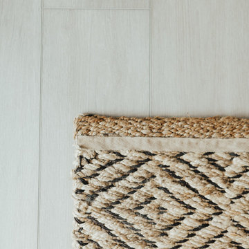
A classic select grade natural oak. Timeless and versatile. The Modin Rigid luxury vinyl plank flooring collection is the new standard in resilient flooring.
Modin Rigid offers true embossed-in-register texture, creating a surface that is convincing to the eye and to the touch; a low sheen level to ensure a natural look that wears well over time; four-sided enhanced bevels to more accurately emulate the look of real wood floors; wider and longer waterproof planks; an industry-leading wear layer; and a pre-attached underlayment.
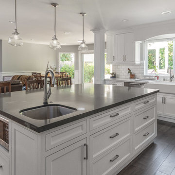
Inspiration for a large shabby-chic style u-shaped medium tone wood floor and brown floor enclosed kitchen remodel in San Francisco with a farmhouse sink, recessed-panel cabinets, white cabinets, quartz countertops, white backsplash, ceramic backsplash, stainless steel appliances, an island and beige countertops
Find the right local pro for your project
Nestled on the shore of New Hampshire’s Lake Winnipesaukee, is a family’s winter ski retreat. Contrary to the norm, this vacation home sees more use in the winter months than in the summer season. Breathtaking views of Mount Washington against a backdrop of shoreline dominate the scene; this vista was a driving force in the decision-making process. Doors and windows on the lakeside of the house were enlarged and expanded on to enhance the owners’ appreciation of their vantage point. The homeowners embraced, with a bit of convincing, a dark blue trim color for the exterior rather than the ubiquitous forest green common in the White Mountains. What began as a small renovation project morphed into a full renovation; the location warranted the upgrade. The client’s trust in the design team resulted in a home that is unique: contemporary while still offering the warmth and coziness of a winter retreat. The introduction of soft wood tones, a custom copper kitchen hood, and a warm muted color palate for interior trim and doors brings a coziness to the space without evoking a mountain ski lodge. The materials chosen further enhanced the natural elements of the site location: organic features include an antler chandelier, salvaged wood throughout for the mantel, ceilings, stair newels, and interior barn doors, and a live edge built-in bench in the mudroom.
Spaces were designed to encourage family interaction and togetherness. The importance of solitude was thoughtfully crafted into the architecture and interiors of the family’s vacation home. SV Design made sure there were spaces where individual family members can pursue their own interests: a dedicated craft space, a family office, and a kids’ loft area.
The redesign was forward thinking, to take the family into future phases in life, from the current teenage years through college years, and into the beyond of expanded family possibilities.

About Replica Kubus Chair Josef Hoffmann:
Creaated in 1910 by Josef Hoffmann, the Kubus Arm Chair shows the interesting geometric lines and 3D squares that turned into Hoffmann’s trademark amid the mid twentieth century. His capacity to make convincing furniture utilizing clean lines and geometrical shapes set him separated from his peers and secured his remarkable style – a style that was to motivate both the precursors of Art Deco and the Modernist Movement. A piece of the Kubus Collection of furniture, the Hoffmann Kubus Chair is without a doubt the highlight of the extent: a current masterpiece and a lavishly useful bit of furniture all moved into one. The seat’s special shape is both tough and delightful, and the fantastic cubic outline brings style to any environment: home, workspace or capacity room.
This is a high quality replica made of genuine Italian leather from the original piece.
Replica Kubus Chair Josef Hoffman DETAIL:
This is a high quality reproduction. The Kubus Chair is formed on high-quality hardwood, and upholstered in full-grain Italian leather that is luxuriously soft to the touch. The tactile cubes are precision stitched and piped, and create a thick body of cushioning that is so relaxing.
Replica Kubus Chair Josef Hoffman MATERIAL:
* Padded hardwood Frame.
* Covered in 100% Italian Leather in its entirety.

Our clients wanted to make the most of space so we gutted the home and rebuilt the inside to create a functional and kid-friendly home with timeless style.
Our clients’ vision was clear: They wanted a warm and timeless design that was easy to clean and maintain with two-active boys.
“It’s not unusual for our friends and family to drop past unannounced any day of the week. And we love it!” They told us during our initial Design Therapy Sesh.
We knew immediately what she meant - we have an open-door policy with our families, too! Which was why we consciously created living spaces that were open, inviting and welcoming.
Now, the only problem our clients would have would be convincing their guests to leave!
Our clients also enjoy coffee and tea so we created a separate coffee nook to help them kick start their day.
Photography: Helynn Ospina

These clients (who were referred by their realtor) are lucky enough to escape the brutal Minnesota winters. They trusted the PID team to remodel their home with Landmark Remodeling while they were away enjoying the sun and escaping the pains of remodeling... dust, noise, so many boxes.
The clients wanted to update without a major remodel. They also wanted to keep some of the warm golden oak in their space...something we are not used to!
We laded on painting the cabinetry, new counters, new back splash, lighting, and floors.
We also refaced the corner fireplace in the living room with a natural stacked stone and mantle.
The powder bath got a little facelift too and convinced another victim... we mean the client that wallpaper was a must.

About to paint the cabinets to BM Swiss Coffee or White Dove. Would like suggestions on the hardware/knobs for the cabinets since I will be replacing the drawer pulls with the classic farmhouse style pulls.
A little background on this kitchen: The yellow tile is staying for now. It is the original kitchen tile when house was built and previous owners retained them for their first update, which revolved around this cool farmhouse sink they got. They put in carrera marble stone for the counters and backsplash. We like them and will keep them. The cabinetry with darker shades of wood is the original millwork. Previous owners custom made cabinets at two different times to try to match the original wood work (cabinets under sink and to the right). Result now is 3 different cabinetry in here, which I am not fond of at all. There is no convincing me to keep the wood. It'll be painted.

This classic 1970's rambler was purchased by our clients as their 'forever' retirement home and as a gathering place for their large, extended family. Situated on a large, verdant lot, the house was burdened with extremely dated finishes and poorly conceived spaces. These flaws were more than offset by the overwhelming advantages of a single level plan and spectacular sunset views. Weighing their options, our clients executed their purchase fully intending to hire us to immediately remodel this structure for them.
Our first task was to open up this plan and give the house a fresh, contemporary look that emphasizes views toward Lake Washington and the Olympic Mountains in the distance. Our initial response was to recreate our favorite Great Room plan. This started with the elimination of a large, masonry fireplace awkwardly located in the middle of the plan and to then tear out all the walls. We then flipped the Kitchen and Dining Room and inserted a walk-in pantry between the Garage and new Kitchen location.
While our clients' initial intention was to execute a simple Kitchen remodel, the project scope grew during the design phase. We convinced them that the original ill-conceived entry needed a make-over as well as both bathrooms on the main level. Now, instead of an entry sequence that looks like an afterthought, there is a formal court on axis with an entry art wall that arrests views before moving into the heart of the plan. The master suite was updated by sliding the wall between the bedroom and Great Room into the family area and then placing closets along this wall - in essence, using these closets as an acoustical buffer between the Master Suite and the Great Room. Moving these closets then freed up space for a 5-piece master bath, a more efficient hall bath and a stacking washer/dryer in a closet at the top of the stairs.

This 1,200 square-foot Provincetown condominium lives large, both functionally and aesthetically, thanks to its recent renovation. The waterfront home, overlooking Cape Cod Bay, is part of an historic grouping of three individual buildings on Commercial Street that have been combined into condominiums.
Begun in November 2014 and completed just in time for summer in May 2016, b Architecture Studios and Cape Associates Builders worked with a budget of $366,000 to transform this prosaic dwelling into a stunning light-flooded space—designed to maximize both the living space and the mesmerizing views of the bay.
“The space was totally reconfigured,” said project manager Jon Ziperman. “It was a total gut job requiring leveling of floors, straightening of walls, removing a chimney and fireplace that ran up to the above neighbors’ unit.” The renovation also required a complete rewiring and plumbing system that involved wires and pipes that were integrated into the surrounding units. From wall to wall and floor to ceiling, there was nothing that could be salvaged from the original space.
One of the most prominent changes was moving the stairway from its original placement, where it originally broke up the living and dining space and blocked views to the bay beyond. The stairway now sits on the opposite side of the condominium. With the stairs tucked to the left side of the living area, the sightline now extends from the entry straight through the living and dining areas to the water. The new design allowed for storage space beneath the stairs, which lead to an airy sleeping loft, and room for a desk niche. A light well, where the former sleeping area was, and new windows bring abundant natural light to the central living area.
Innovative features in the entry room include a Murphy bed and sliding glass door separating it from the living area, so that the space can double as a guest room.
“The Murphy bed fit in nicely, allowing for a flush wall at the entry/guest room and a desk niche in the adjacent room,” Brown said. “Convincing the client to create the wrap-around chair rail, lined up with the divided lights of the sliding glass door, makes a purposeful connection in a small space.”
Neolith countertops in the open kitchen and details like the flush minimal baseboard contribute to the sleek, modern aesthetic, now complemented by the owner’s contemporary furnishings. This complete renovation has rendered this compact home worthy of its beautiful setting.

Presenting a quality product is an essential item for any professional who wants to stand out in the market today.
You need to go beyond feasibility studies and project design to get customer approval.
And we know that a good part of this convincing process occurs in a visual way, where the professional and client can clearly understand the final result of the project.
Maybe that's exactly why 3D Rendering has been drawing so much attention from architects, engineers and interior designers to be used as a marketing tool.
Want to know more? Contact us for more information!
Project: Juliana Acar
3D Visualization: Gananca Design

Presenting a quality product is an essential item for any professional who wants to stand out in the market today.
You need to go beyond feasibility studies and project design to get customer approval.
And we know that a good part of this convincing process occurs in a visual way, where the professional and client can clearly understand the final result of the project.
Maybe that's exactly why 3D Rendering has been drawing so much attention from architects, engineers and interior designers to be used as a marketing tool.
Want to know more? Contact us for more information!
Project: Juliana Acar
3D Visualization: Gananca Design

This image showcases a bright and airy open-concept dining room with a modern minimalist aesthetic. Featuring a large wooden dining table surrounded by sleek, white upholstered chairs and a contemporary area rug, the space blends functional design with sophisticated style. The room is accented with natural light from large windows, a white modular shelving unit filled with curated decor, and a vibrant floral centerpiece, creating an inviting and inspiring home interior.

Get Cozy in this Renovated 1870’s Home with Modern Classic Charm
The Challenge: Replacing and rebuilding an entire floor to coincide with the style and charm of the historic home
For a lot of people, nothing can compare to the charm and warmth of a unique heritage property. As an interior designer, it is remarkable to walk into a home that was built in Fredericton during the 1870s. To be surrounded with such architectural details is a designer’s dream, so you stop and pause and realize the character, charm and warmth should never be comprised, it must be protected. I had every intention of doing so, I wanted to bring the space under renovation back to a luster and original beauty by providing a modern yet classic appeal.
The first thing I noticed was the wasted space that we could capitalize on. The bay window was the perfect backdrop for a custom window bench and the current heritage bookshelves required symmetry, so a decision to build an adjoining custom piece was designed. The floors required complete replacement and the entrance tile was outdated and did not align with the hardwood floor.
With a heritage home renovation comes special challenges that don’t normally present themselves in a newer home renovation. Unfortunately, the original floor had to be replaced, it could not be salvaged. We chose a warm hickory hardwood that aligned perfectly with the warmth and comfort of the home. The entrance tile…took some convincing. In the end the home owners agreed to my recommendation of Casa Roma tile.
The real challenge came when the floor had to be replaced, there were so many issues from rotten wood to uneven floor joists. The contractor and his team were meticulous, ensuring the new floor was safe, balanced and aligned to perfection with the adjoining floor. The entrance floor was removed and a seamless transition from tile to hardwood was perfected. The result – true perfection, like the hardwood and the tile had been married together for years.
The adjoining custom piece was designed to house the electronics in the room but with a great deal of detail to ensure it appeared to have always been there. The real challenge was matching the stain to the existing bookcases, there was no stain on the market that matched. A call to Fredericton’s Stain Doctor and the perfect stain was custom created.
I utilized the colour undertones in the home owners art collection to create the colour palate. I wanted to ensure the furniture and furnishings were worthy of this magnificent home. I developed a soft, warm palate of greys, blues and lavender using different textures yet providing a cozy, modern and classic appeal.
I can’t imagine anyone not wanting to curl up in either of these rooms with a good book, a glass of wine, get lost and let the world go by
Bang On Photography

About this Project:
The home remodeling included a kitchen renovation, second floor space reconfigurations, and first floor addition. The purpose was to expand the existing kitchen and create a casual atmosphere by eliminating the formal appearance and unify the kitchen and family room. The homeowners were looking for a traditional kitchen that could be used for dining, entertaining, doing homework while providing ample storage space and a workstation area for bill paying. Demolition was necessary of the existing kitchen and partial exterior of the back of the house and excavation for the addition. The scope of work included new painted kitchen cabinetry and dramatic Cambria stone countertops, new tigerwood exotic hardwood flooring throughout the first floor, new recessed, hanging & under cabinet lighting, and painting of the first floor. The wall paint ushers in a vibrant yet relaxing feeling to the home. Painting existing trim and moldings throughout the first floor refreshes & updates the home. The hardwood flooring flows from the front door to the back door of the first floor and adds a cozy warmth to the home. The finished result is a stunning, warm, spacious kitchen for family and friends to gather.
--------------------------------------------------------------------------------
Testmonial:
"I wanted to let you know once again how thrilled we are with the work J. Francis Company recently completed on our home. When we purchased the house we were not convinced that it could become our "home". However after all the work has now been completed we both easily refer to it as our "Home" and not just a house. Your entire team truly made the project - which is never easy - almost enjoyable (or at least as enjoyable a project can be while living without a kitchen!)! Not only was J. Francis extremely professional with respect to the actual construction (JK was absolutely fantastic!!) and the selection of finishes, but they also provided design ideas which we never envisioned. For example the concept of increasing the size of one of our son's bedrooms by taking space from our other son's bedroom was ingenious and in turn it created two equally sized bedrooms which are loved by each of our boys! All told, I would strongly recommend J. Francis to anyone looking for construction needs (in fact I have already made such a recommendation!)."
-------------------------------------------------------------------------------------
Photography © Steven Dietz

Trying to gather ideas to dress up my curb appeal. I'm open to all suggestions and I'm trying to convince my wife to paint the brick (any pictures to help my case would be great). The grass looks a lot better now, we've raised all the trees up, and have a yard treatment contract in place so it's time to focus on the house itself. Thanks in advance.

Nestled on the shore of New Hampshire’s Lake Winnipesaukee, is a family’s winter ski retreat. Contrary to the norm, this vacation home sees more use in the winter months than in the summer season. Breathtaking views of Mount Washington against a backdrop of shoreline dominate the scene; this vista was a driving force in the decision-making process. Doors and windows on the lakeside of the house were enlarged and expanded on to enhance the owners’ appreciation of their vantage point. The homeowners embraced, with a bit of convincing, a dark blue trim color for the exterior rather than the ubiquitous forest green common in the White Mountains. What began as a small renovation project morphed into a full renovation; the location warranted the upgrade. The client’s trust in the design team resulted in a home that is unique: contemporary while still offering the warmth and coziness of a winter retreat. The introduction of soft wood tones, a custom copper kitchen hood, and a warm muted color palate for interior trim and doors brings a coziness to the space without evoking a mountain ski lodge. The materials chosen further enhanced the natural elements of the site location: organic features include an antler chandelier, salvaged wood throughout for the mantel, ceilings, stair newels, and interior barn doors, and a live edge built-in bench in the mudroom.
Spaces were designed to encourage family interaction and togetherness. The importance of solitude was thoughtfully crafted into the architecture and interiors of the family’s vacation home. SV Design made sure there were spaces where individual family members can pursue their own interests: a dedicated craft space, a family office, and a kids’ loft area.
The redesign was forward thinking, to take the family into future phases in life, from the current teenage years through college years, and into the beyond of expanded family possibilities.

Joe and Denise purchased a large Tudor style home that never truly fit their needs. While interviewing contractors to replace the roof and stucco on their home, it prompted them to consider a complete remodel. With two young daughters and pets in the home, our clients were convinced they needed an open concept to entertain and enjoy family and friends together. The couple also desired a blend of traditional and contemporary styles with sophisticated finishes for the project.
JRP embarked on a new floor plan design for both stories of the home. The top floor would include a complete rearrangement of the master suite allowing for separate vanities, spacious master shower, soaking tub, and bigger walk-in closet. On the main floor, walls separating the kitchen and formal dining room would come down. Steel beams and new SQFT was added to open the spaces up to one another. Central to the open-concept layout is a breathtaking great room with an expansive 6-panel bi-folding door creating a seamless view to the gorgeous hills. It became an entirely new space with structural changes, additional living space, and all-new finishes, inside and out to embody our clients’ dream home.
PROJECT DETAILS:
• Style: Transitional
• Colors: Gray & White
• Countertops: Kitchen = Quartzite / Bathrooms = Calacatta Nuvo (Caesarstone)
• Cabinets: Kitchen = Frameless Shaker, White & Slate Gray / Bathrooms = Frameless Shaker, White (DeWils) *fully integrated dishwasher & fridge = blend seamlessly with cabinetry as if they aren’t even there
• Hardware/Plumbing Fixture Finish: Chrome
• Lighting Fixtures: unique and bold lighting fixtures throughout every room in the house (pendant lighting, chandeliers, sconces, etc)
• Flooring: White Oak (Titanium wash)
• Tile/Backsplash: varies throughout home – specialty areas noted below
o Kitchen: Calacatta Borghini Marble - Circle Mosaic Tiles
o Bathroom Walls: Calacatta Marble
• Photographer: Andrew (Open House VC)

This classic 1970's rambler was purchased by our clients as their 'forever' retirement home and as a gathering place for their large, extended family. Situated on a large, verdant lot, the house was burdened with extremely dated finishes and poorly conceived spaces. These flaws were more than offset by the overwhelming advantages of a single level plan and spectacular sunset views. Weighing their options, our clients executed their purchase fully intending to hire us to immediately remodel this structure for them.
Our first task was to open up this plan and give the house a fresh, contemporary look that emphasizes views toward Lake Washington and the Olympic Mountains in the distance. Our initial response was to recreate our favorite Great Room plan. This started with the elimination of a large, masonry fireplace awkwardly located in the middle of the plan and to then tear out all the walls. We then flipped the Kitchen and Dining Room and inserted a walk-in pantry between the Garage and new Kitchen location.
While our clients' initial intention was to execute a simple Kitchen remodel, the project scope grew during the design phase. We convinced them that the original ill-conceived entry needed a make-over as well as both bathrooms on the main level. Now, instead of an entry sequence that looks like an afterthought, there is a formal court on axis with an entry art wall that arrests views before moving into the heart of the plan. The master suite was updated by sliding the wall between the bedroom and Great Room into the family area and then placing closets along this wall - in essence, using these closets as an acoustical buffer between the Master Suite and the Great Room. Moving these closets then freed up space for a 5-piece master bath, a more efficient hall bath and a stacking washer/dryer in a closet at the top of the stairs.

 
Free ebook, Creating the Ideal Kitchen. DOWNLOAD NOW
 
The clients thought that they did not want the sink on the island, however, Klimala convinced them that locating it there would provide them with a more comfortable work triangle and allow breathing room for the design.
A new arched opening to the dining room provides for more of an open space for ease of daily use and practical entertaining.
The large island workspace seats three comfortably and provides a view to the backyard in two directions while cozying up to the existing fireplace which is a lovely focal point for the space.
The clients love of nature and desire for a tranquil space helped determine the beach inspired palette of sand, green and blue.
A textured off white subway tile backsplash with bands of colored glass tile give a sense of rhythm to the simple lines of the space. A farm sink and a decorative stainless hood add personality to the room.
Designed by: Susan Klimala, CKD, CBD
Photography by: Carlos Vergara
For more information on kitchen and bath design ideas go to: www.kitchenstudio-ge.com
33