
Search results for "Costly pick" in Home Design Ideas

 RAJ Kitchen and Bath, LLC
**Check out the video of this transformation on our website**
This small kitchen was way too small for this 2 bedrooms, 2 bathrooms apartment. Not only was it a very small kitchen, but the physical location of it made it very difficult to make it any bigger. There wasn't much that could have been done without incurring astronomical cost, which would get little or no return on the investment. The client wanted a kitchen that can be optimized in its current location to add a ton of value for resale.
This was difficult to do, because there was no moving of any mechanical around in the kitchen and even if we wanted to, the management of the building would not allow. For those of you who live in condos, co-ops or apartment building, you know how difficult it is to rework these foot prints. When we showed up, we saw the problems, but we also saw a huge opportunity where we can achieve those goals in the small space. This was accomplished by making some key changes and to incorporate some new things that was not possible when this kitchen was built years ago.
The crucial part of the design that would drive the entire new layout, was selecting the only appliance; that was the Refrigerator. Once we nailed down that refrigerator, we then proceeded to design the kitchen around it. We moved it to the other side of the wall where the sink was so that we can tap into the water line from the sink plumbing. It was crucial that it stays exactly 24" deep, not an inch more because we had to keep the entry as open as possible. Also, it was going to be directly in front of another big storage unit - The pantry. It is not ideal in most cases, but we needed the rest of the space to ramp up the design and open feel towards the side where all of the activities would take place, which happend to be the dining room and the view.
Once all that was figured out, we re-positioned the sink, dishwasher and the range and proceeded to wrap the cabinets around the columns to integrate them into the space. Thirty- six inches cabinets height was used so that they can be installed higher towards the ceiling height to give more room rather than the standard 18" required height between the counter tops. This was done to make the room feel a lot bigger than it really was. Not to mention, we also didn't want the faucet to be buried under the cabinets so that was also a necessary design detail for the space.
We then lowered both knee walls so that the counter top can sit on top of them, by removing that stop point that would have otherwise defined the kitchen area. This allowed us to pick up that extra footprint into the room for added prep space and enabled us to create the illusion of a kitchen that is looking longer than it really is. Every inch mattered when designing this kitchen and we made a conscious decision to use every one of that inch.
White cabinets were selected to do just what white cabinets are design to do; make a small or dark room appear bigger, brighter and more open. In this kitchen, this was amplified the more because of the kitchen location. It was perfect! We knew we did justice to the space because while we were there taking some photos, a few potential buyers walked in and went straight for the kitchen! They said its design just to fit the apartment.
Pantry roll out shelving, Double recycle bin, fancy handles, LED lighting, Quartz counter top, beautiful backslash tiles and grey linen floors finished off the kitchen which looked over a beautiful view of the George Washington Bridge from the top of this lovely 4th floor apartment.
Credit to Masterpiece Tile and Marble (Annmarie on the selection of Tiles and countertop and Val on the Construction to complete this project).
Davor Kokic Photography
 RAJ Kitchen and Bath, LLC
**Check out the video of this transformation on our website**
This small kitchen was way too small for this 2 bedrooms, 2 bathrooms apartment. Not only was it a very small kitchen, but the physical location of it made it very difficult to make it any bigger. There wasn't much that could have been done without incurring astronomical cost, which would get little or no return on the investment. The client wanted a kitchen that can be optimized in its current location to add a ton of value for resale.
This was difficult to do, because there was no moving of any mechanical around in the kitchen and even if we wanted to, the management of the building would not allow. For those of you who live in condos, co-ops or apartment building, you know how difficult it is to rework these foot prints. When we showed up, we saw the problems, but we also saw a huge opportunity where we can achieve those goals in the small space. This was accomplished by making some key changes and to incorporate some new things that was not possible when this kitchen was built years ago.
The crucial part of the design that would drive the entire new layout, was selecting the only appliance; that was the Refrigerator. Once we nailed down that refrigerator, we then proceeded to design the kitchen around it. We moved it to the other side of the wall where the sink was so that we can tap into the water line from the sink plumbing. It was crucial that it stays exactly 24" deep, not an inch more because we had to keep the entry as open as possible. Also, it was going to be directly in front of another big storage unit - The pantry. It is not ideal in most cases, but we needed the rest of the space to ramp up the design and open feel towards the side where all of the activities would take place, which happend to be the dining room and the view.
Once all that was figured out, we re-positioned the sink, dishwasher and the range and proceeded to wrap the cabinets around the columns to integrate them into the space. Thirty- six inches cabinets height was used so that they can be installed higher towards the ceiling height to give more room rather than the standard 18" required height between the counter tops. This was done to make the room feel a lot bigger than it really was. Not to mention, we also didn't want the faucet to be buried under the cabinets so that was also a necessary design detail for the space.
We then lowered both knee walls so that the counter top can sit on top of them, by removing that stop point that would have otherwise defined the kitchen area. This allowed us to pick up that extra footprint into the room for added prep space and enabled us to create the illusion of a kitchen that is looking longer than it really is. Every inch mattered when designing this kitchen and we made a conscious decision to use every one of that inch.
White cabinets were selected to do just what white cabinets are design to do; make a small or dark room appear bigger, brighter and more open. In this kitchen, this was amplified the more because of the kitchen location. It was perfect! We knew we did justice to the space because while we were there taking some photos, a few potential buyers walked in and went straight for the kitchen! They said its design just to fit the apartment.
Pantry roll out shelving, Double recycle bin, fancy handles, LED lighting, Quartz counter top, beautiful backslash tiles and grey linen floors finished off the kitchen which looked over a beautiful view of the George Washington Bridge from the top of this lovely 4th floor apartment.
Credit to Masterpiece Tile and Marble (Annmarie on the selection of Tiles and countertop and Val on the Construction to complete this project).
Davor Kokic Photography
 User
Exquisite Worktops and High-end Kitchen Guide
Homeowners
The fuel to every person's happiness: food; is stored in a kitchen. We gotta agree that even if life is created in a bedroom, it is certainly lived in a kitchen. Hence, It is undeniable that every homeowner would want to invest mindfully in creating a proper outlook of a place that nourishes the heart of both its family and its guests. While designing a kitchen unlike other spaces of a home one must pay attention to the choice of materials for worktops, floors, sinks, etc that suit the hygiene purposes alongside the aesthetic point of view, which might usually result in a very high budget plan. So this is where practicality hits a common man as no matter what one`s wishlist is, execution ultimately depends on their capability of expenditure.
However, with sufficient guidance on kitchen design planning, one can drastically minimise the expenses without necessarily having to purchase cheap worktops. The choice of the right materials is just as important as the ability to financially invest in the same, if not more. This means if a person has enough knowledge of what they are looking for, they can cleverly create an exquisite look under a much lesser budget-friendly scheme.
Key Points to Consider When on a Mission to Create a High-end Kitchen Under Restrained Pockets
Estimating a Budget Plan:
Setting a realistic budget before the investment is a very important aspect which shouldn't be overlooked. According to NKBA, a proper guide to setting one`s kitchen budget while planning a new one should look like- 29% cabinets and hardware, 17% installation, 14% appliances and ventilation, 10% countertops, 7% flooring, 5% walls and ceilings, 5% lighting, 5% faucets and plumbing, 4% doors and windows, 4% design fees and 1% miscellaneous.
Pick Your Beautiful Stone for Work-top:
As we all know, beauty is not just conventional, so natural stones, as well as engineered stones, are beautiful in their own way. Engineered countertops are still impressively resistant to scratch and stains. They can almost replicate the intrinsic character and sparkle of granite and marbles. The manufacturing technique of engineered stones has made it so that, wherever they are incorporated, they add a sense of style and class. And with minimal maintenance, they can last for a very long time in a household. One can even go for the mix and matching technique where one can use both expensive and inexpensive buys in such a way that the former occupies the areas on display while the latter covers up for other units.
Being on a budget, though, must not mean hiring inexperienced fabricators to compromise on cost. The short-term result might be tempting but doing so will only increase the future risk thus being more of a loss than an advantage. However, if one is confident enough in their skills, DIY-ing the fittings will drastically reduce the cost of expenditure.
Reusing and Recycling Off Cuts:
While extending or renovating one always has the option to think about how some materials from the previous space can be given a second life. Worktops can be altered to fit a new plan, cupboard doors can be fitted to the kitchen and given a fresh look by repainting, and old appliances can be sold on to help contribute towards pitching in some money for purchasing new ones. The stone remnants and offcuts can always be utilised for smaller projects. Check out these Remnants that are available within your region.
Flooring:
Renovating a floor on a tight budget doesn't necessarily mean that one doesn't care about durability or looks. Ideally, one will still want a decent lifespan and great finish even if it's the most affordable kitchen floor out there. To avail this best possible combination of durability, style, and affordability, consider laminate and vinyl flooring designs. They mimic wood and tile flooring convincingly enough.
Work-top Lights:
Light fixtures are easy and impactful and one of the easiest ways to upgrade a room's look. Impeccable lighting not only makes the room look stunning but also provides effective task lighting to make the space easier and more enjoyable to use. If the plan is to introduce new lighting to an existing kitchen, one can try using battery-operated LED spotlights and strips that don’t need wiring in. Installing them over worktops, under cabinets and inside open or glass-fronted cupboards can create an expensive appearance.
Colour Details:
Choosing the right colour of paint has the potential to drastically change the outlook. For example, just visualise a completely white kitchen worktop. Done? Now similarly, a completely black kitchen. You can't deny that both would bring out completely different aesthetic values. Colour is one of the best ways to inject personality into a space but it's important to get the proportions right. For a guaranteed unregretted approach, you can choose neutral tones for the structural elements that are more costly and difficult to replace, including cabinets, floors, worktops, kitchen countertops, and appliances. Then introduce colour with less-expensive updates to the walls, backsplash, window treatments, lighting, and other accents. With this strategy, you can easily and affordably swap out your colour scheme as your tastes and popular trends change.
Creating Interest:
Worktops
One unique way to enhance the design is by introducing an interesting element to catch the eye and provide a focal point.
Decorating Walls:
Attractive wallpapers add a sense of style to the kitchen. It is a great way to freshen up a room without needing to do a lot of work or spending much money. In a rental property, one can try vinyl wall decals or temporary wallpaper. However, overdoing the work in the hype of excitement will make it worse than doing good.
Open Shelf:
One can utilize an empty wall for open shelves. It adds more storage and creates a display area. Go for a decorative or contrasting shelf to add character. Keeping the shelves clear of clutter and using them as a design piece to show off styled arrangements of recipe books, beautiful objects and interesting pieces is always recommended.
Upgrading Cabinet Doors:
Replacing the cabinet doors is a simple way to give the appearance a brand-new look. As long as the units are standard size and the main framework is in good condition, one can just swap the doors without having to worry about the worktop, splashback, plumbing or electrics. Another simple way to upgrade the units is to replace the handles. Vintage cabinets can be given a modification to look contemporary or vice versa with this simple trick. Similarly, cheap, basic-looking handles can be replaced with beautiful handmade ceramic knobs or adding a stylish leather door pull can upgrade the kitchen’s chic factor.
With all these points and our collection of stones, you will have an exquisite kitchen right in front of you. Our service charges are minimum to make kitchen renovation an achievable dream for all homeowners. Email info@work-tops.com for free quotes and to know about our special offers.
Find the right local pro for your project
 RAJ Kitchen and Bath, LLC
**Check out the video of this transformation on our website**
This small kitchen was way too small for this 2 bedrooms, 2 bathrooms apartment. Not only was it a very small kitchen, but the physical location of it made it very difficult to make it any bigger. There wasn't much that could have been done without incurring astronomical cost, which would get little or no return on the investment. The client wanted a kitchen that can be optimized in its current location to add a ton of value for resale.
This was difficult to do, because there was no moving of any mechanical around in the kitchen and even if we wanted to, the management of the building would not allow. For those of you who live in condos, co-ops or apartment building, you know how difficult it is to rework these foot prints. When we showed up, we saw the problems, but we also saw a huge opportunity where we can achieve those goals in the small space. This was accomplished by making some key changes and to incorporate some new things that was not possible when this kitchen was built years ago.
The crucial part of the design that would drive the entire new layout, was selecting the only appliance; that was the Refrigerator. Once we nailed down that refrigerator, we then proceeded to design the kitchen around it. We moved it to the other side of the wall where the sink was so that we can tap into the water line from the sink plumbing. It was crucial that it stays exactly 24" deep, not an inch more because we had to keep the entry as open as possible. Also, it was going to be directly in front of another big storage unit - The pantry. It is not ideal in most cases, but we needed the rest of the space to ramp up the design and open feel towards the side where all of the activities would take place, which happend to be the dining room and the view.
Once all that was figured out, we re-positioned the sink, dishwasher and the range and proceeded to wrap the cabinets around the columns to integrate them into the space. Thirty- six inches cabinets height was used so that they can be installed higher towards the ceiling height to give more room rather than the standard 18" required height between the counter tops. This was done to make the room feel a lot bigger than it really was. Not to mention, we also didn't want the faucet to be buried under the cabinets so that was also a necessary design detail for the space.
We then lowered both knee walls so that the counter top can sit on top of them, by removing that stop point that would have otherwise defined the kitchen area. This allowed us to pick up that extra footprint into the room for added prep space and enabled us to create the illusion of a kitchen that is looking longer than it really is. Every inch mattered when designing this kitchen and we made a conscious decision to use every one of that inch.
White cabinets were selected to do just what white cabinets are design to do; make a small or dark room appear bigger, brighter and more open. In this kitchen, this was amplified the more because of the kitchen location. It was perfect! We knew we did justice to the space because while we were there taking some photos, a few potential buyers walked in and went straight for the kitchen! They said its design just to fit the apartment.
Pantry roll out shelving, Double recycle bin, fancy handles, LED lighting, Quartz counter top, beautiful backslash tiles and grey linen floors finished off the kitchen which looked over a beautiful view of the George Washington Bridge from the top of this lovely 4th floor apartment.
Credit to Masterpiece Tile and Marble (Annmarie on the selection of Tiles and countertop and Val on the Construction to complete this project).
Davor Kokic Photography
 RAJ Kitchen and Bath, LLC
**Check out the video of this transformation on our website**
This small kitchen was way too small for this 2 bedrooms, 2 bathrooms apartment. Not only was it a very small kitchen, but the physical location of it made it very difficult to make it any bigger. There wasn't much that could have been done without incurring astronomical cost, which would get little or no return on the investment. The client wanted a kitchen that can be optimized in its current location to add a ton of value for resale.
This was difficult to do, because there was no moving of any mechanical around in the kitchen and even if we wanted to, the management of the building would not allow. For those of you who live in condos, co-ops or apartment building, you know how difficult it is to rework these foot prints. When we showed up, we saw the problems, but we also saw a huge opportunity where we can achieve those goals in the small space. This was accomplished by making some key changes and to incorporate some new things that was not possible when this kitchen was built years ago.
The crucial part of the design that would drive the entire new layout, was selecting the only appliance; that was the Refrigerator. Once we nailed down that refrigerator, we then proceeded to design the kitchen around it. We moved it to the other side of the wall where the sink was so that we can tap into the water line from the sink plumbing. It was crucial that it stays exactly 24" deep, not an inch more because we had to keep the entry as open as possible. Also, it was going to be directly in front of another big storage unit - The pantry. It is not ideal in most cases, but we needed the rest of the space to ramp up the design and open feel towards the side where all of the activities would take place, which happend to be the dining room and the view.
Once all that was figured out, we re-positioned the sink, dishwasher and the range and proceeded to wrap the cabinets around the columns to integrate them into the space. Thirty- six inches cabinets height was used so that they can be installed higher towards the ceiling height to give more room rather than the standard 18" required height between the counter tops. This was done to make the room feel a lot bigger than it really was. Not to mention, we also didn't want the faucet to be buried under the cabinets so that was also a necessary design detail for the space.
We then lowered both knee walls so that the counter top can sit on top of them, by removing that stop point that would have otherwise defined the kitchen area. This allowed us to pick up that extra footprint into the room for added prep space and enabled us to create the illusion of a kitchen that is looking longer than it really is. Every inch mattered when designing this kitchen and we made a conscious decision to use every one of that inch.
White cabinets were selected to do just what white cabinets are design to do; make a small or dark room appear bigger, brighter and more open. In this kitchen, this was amplified the more because of the kitchen location. It was perfect! We knew we did justice to the space because while we were there taking some photos, a few potential buyers walked in and went straight for the kitchen! They said its design just to fit the apartment.
Pantry roll out shelving, Double recycle bin, fancy handles, LED lighting, Quartz counter top, beautiful backslash tiles and grey linen floors finished off the kitchen which looked over a beautiful view of the George Washington Bridge from the top of this lovely 4th floor apartment.
Credit to Masterpiece Tile and Marble (Annmarie on the selection of Tiles and countertop and Val on the Construction to complete this project).
Davor Kokic Photography
 Phoenix Home Remodeling
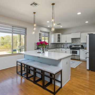
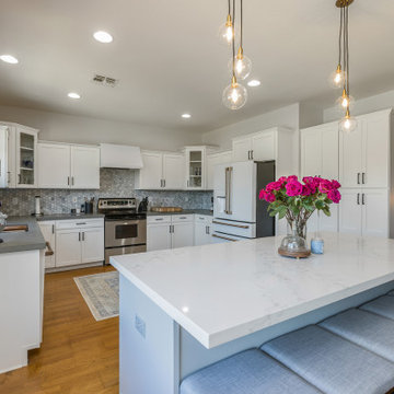
We had a blast helping Maggie & Chris with their kitchen renovation project. After planning with Maggie we knew it was our mission to transform their outdated kitchen into a modern and bright area.
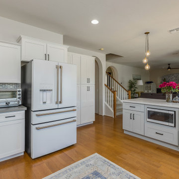
The perimeter cabinets were refinished, and a new custom island finished in colors from Sherwin Williams. The perimeter cabinet is Snowbound, and the Island is Online. In the design of the custom Island, they wanted to remove the countertop microwave. The new island features the built-in appliance and accommodate a beverage fridge. Because this island would be a family meeting place. They asked us to equip the island for maximum charging devices.
To balance the two-toned cabinets, we installed a darker countertop on the perimeter called Metropolitan Grey. Metropolitan Grey has a concrete texture that added a whole new dimension to the project. The island countertop is called Arabescato Como. Which adds a clean and classic appearance to the project. Both countertops are sustainable quartz from Arizona Tile.
For the backsplash we wanted to go classic. Carrara Marble Bianco Carrara Hexagon. This mosaic was a mix of the cool and warm tones which highlighted the other selections of the home. We grouted the mosaic with a warm grey grout which makes the individual hexagons pop and warm the space.
With Maggie’s personality we had to install these pendant lights. This pendant has many different installation options, we installed them in a unique pattern which gives it a nice three-dimensional element.
Ahwatukee Kitchen Remodel...
We had a blast helping Maggie & Chris with their kitchen renovation project. After planning with Maggie we knew it was our mission to transform their outdated kitchen into a modern and bright area.
The perimeter cabinets were refinished, and a new custom island finished in colors from Sherwin Williams. The perimeter cabinet is Snowbound, and the Island is Online. In the design of the custom Island, they wanted to remove the countertop microwave. The new island features the built-in appliance and accommodate a beverage fridge. Because this island would be a family meeting place. They asked us to equip the island for maximum charging devices.
To balance the two-toned cabinets, we installed a darker countertop on the perimeter called Metropolitan Grey. Metropolitan Grey has a concrete texture that added a whole new dimension to the project. The island countertop is called Arabescato Como. Which adds a clean and classic appearance to the project. Both countertops are sustainable quartz from Arizona Tile.
For the backsplash we wanted to go classic. Carrara Marble Bianco Carrara Hexagon. This mosaic was a mix of the cool and warm tones which highlighted the other selections of the home. We grouted the mosaic with a warm grey grout which makes the individual hexagons pop and warm the space.
With Maggie’s personality we had to install these pendant lights. This pendant has many different installation options, we installed them in a unique pattern which gives it a nice three-dimensional element.
spacious kitchen renovation in phoenix az
kitchen island with white countertop remodeling phoenix az
With the help of our designer, picking every element for the new kitchen, each one of them provides a unique and sleek feel. A few items that help achieve that sleek look, was a modern modular stainless steel kitchen sink that came with accessories such as a removable drying rack, cutting board and a waste basket for food prep. The faucet comes from Delta. The Delta Essa kitchen faucet in matte black provides that slim low-profile.
Finally, the kitchen was painted with Sherwin William Drift Of Mist. This color is a chameleon and is a champ of tying warm tones to cool tones. The crisp line of white from the cabinetry to the natural wood tones in the floor.
 RAJ Kitchen and Bath, LLC
**Check out the video of this transformation on our website**
This small kitchen was way too small for this 2 bedrooms, 2 bathrooms apartment. Not only was it a very small kitchen, but the physical location of it made it very difficult to make it any bigger. There wasn't much that could have been done without incurring astronomical cost, which would get little or no return on the investment. The client wanted a kitchen that can be optimized in its current location to add a ton of value for resale.
This was difficult to do, because there was no moving of any mechanical around in the kitchen and even if we wanted to, the management of the building would not allow. For those of you who live in condos, co-ops or apartment building, you know how difficult it is to rework these foot prints. When we showed up, we saw the problems, but we also saw a huge opportunity where we can achieve those goals in the small space. This was accomplished by making some key changes and to incorporate some new things that was not possible when this kitchen was built years ago.
The crucial part of the design that would drive the entire new layout, was selecting the only appliance; that was the Refrigerator. Once we nailed down that refrigerator, we then proceeded to design the kitchen around it. We moved it to the other side of the wall where the sink was so that we can tap into the water line from the sink plumbing. It was crucial that it stays exactly 24" deep, not an inch more because we had to keep the entry as open as possible. Also, it was going to be directly in front of another big storage unit - The pantry. It is not ideal in most cases, but we needed the rest of the space to ramp up the design and open feel towards the side where all of the activities would take place, which happend to be the dining room and the view.
Once all that was figured out, we re-positioned the sink, dishwasher and the range and proceeded to wrap the cabinets around the columns to integrate them into the space. Thirty- six inches cabinets height was used so that they can be installed higher towards the ceiling height to give more room rather than the standard 18" required height between the counter tops. This was done to make the room feel a lot bigger than it really was. Not to mention, we also didn't want the faucet to be buried under the cabinets so that was also a necessary design detail for the space.
We then lowered both knee walls so that the counter top can sit on top of them, by removing that stop point that would have otherwise defined the kitchen area. This allowed us to pick up that extra footprint into the room for added prep space and enabled us to create the illusion of a kitchen that is looking longer than it really is. Every inch mattered when designing this kitchen and we made a conscious decision to use every one of that inch.
White cabinets were selected to do just what white cabinets are design to do; make a small or dark room appear bigger, brighter and more open. In this kitchen, this was amplified the more because of the kitchen location. It was perfect! We knew we did justice to the space because while we were there taking some photos, a few potential buyers walked in and went straight for the kitchen! They said its design just to fit the apartment.
Pantry roll out shelving, Double recycle bin, fancy handles, LED lighting, Quartz counter top, beautiful backslash tiles and grey linen floors finished off the kitchen which looked over a beautiful view of the George Washington Bridge from the top of this lovely 4th floor apartment.
Credit to Masterpiece Tile and Marble (Annmarie on the selection of Tiles and countertop and Val on the Construction to complete this project).
Davor Kokic Photography
Sponsored
Delaware, OH

Buckeye Basements, Inc.
Central Ohio's Basement Finishing ExpertsBest Of Houzz '13-'21
 RAJ Kitchen and Bath, LLC
**Check out the video of this transformation on our website**
This small kitchen was way too small for this 2 bedrooms, 2 bathrooms apartment. Not only was it a very small kitchen, but the physical location of it made it very difficult to make it any bigger. There wasn't much that could have been done without incurring astronomical cost, which would get little or no return on the investment. The client wanted a kitchen that can be optimized in its current location to add a ton of value for resale.
This was difficult to do, because there was no moving of any mechanical around in the kitchen and even if we wanted to, the management of the building would not allow. For those of you who live in condos, co-ops or apartment building, you know how difficult it is to rework these foot prints. When we showed up, we saw the problems, but we also saw a huge opportunity where we can achieve those goals in the small space. This was accomplished by making some key changes and to incorporate some new things that was not possible when this kitchen was built years ago.
The crucial part of the design that would drive the entire new layout, was selecting the only appliance; that was the Refrigerator. Once we nailed down that refrigerator, we then proceeded to design the kitchen around it. We moved it to the other side of the wall where the sink was so that we can tap into the water line from the sink plumbing. It was crucial that it stays exactly 24" deep, not an inch more because we had to keep the entry as open as possible. Also, it was going to be directly in front of another big storage unit - The pantry. It is not ideal in most cases, but we needed the rest of the space to ramp up the design and open feel towards the side where all of the activities would take place, which happend to be the dining room and the view.
Once all that was figured out, we re-positioned the sink, dishwasher and the range and proceeded to wrap the cabinets around the columns to integrate them into the space. Thirty- six inches cabinets height was used so that they can be installed higher towards the ceiling height to give more room rather than the standard 18" required height between the counter tops. This was done to make the room feel a lot bigger than it really was. Not to mention, we also didn't want the faucet to be buried under the cabinets so that was also a necessary design detail for the space.
We then lowered both knee walls so that the counter top can sit on top of them, by removing that stop point that would have otherwise defined the kitchen area. This allowed us to pick up that extra footprint into the room for added prep space and enabled us to create the illusion of a kitchen that is looking longer than it really is. Every inch mattered when designing this kitchen and we made a conscious decision to use every one of that inch.
White cabinets were selected to do just what white cabinets are design to do; make a small or dark room appear bigger, brighter and more open. In this kitchen, this was amplified the more because of the kitchen location. It was perfect! We knew we did justice to the space because while we were there taking some photos, a few potential buyers walked in and went straight for the kitchen! They said its design just to fit the apartment.
Pantry roll out shelving, Double recycle bin, fancy handles, LED lighting, Quartz counter top, beautiful backslash tiles and grey linen floors finished off the kitchen which looked over a beautiful view of the George Washington Bridge from the top of this lovely 4th floor apartment.
Credit to Masterpiece Tile and Marble (Annmarie on the selection of Tiles and countertop and Val on the Construction to complete this project).
Davor Kokic Photography
 Phoenix Home Remodeling
We had a blast helping Maggie & Chris with their kitchen renovation project. After planning with Maggie we knew it was our mission to transform their outdated kitchen into a modern and bright area.
The perimeter cabinets were refinished, and a new custom island finished in colors from Sherwin Williams. The perimeter cabinet is Snowbound, and the Island is Online. In the design of the custom Island, they wanted to remove the countertop microwave. The new island features the built-in appliance and accommodate a beverage fridge. Because this island would be a family meeting place. They asked us to equip the island for maximum charging devices.
To balance the two-toned cabinets, we installed a darker countertop on the perimeter called Metropolitan Grey. Metropolitan Grey has a concrete texture that added a whole new dimension to the project. The island countertop is called Arabescato Como. Which adds a clean and classic appearance to the project. Both countertops are sustainable quartz from Arizona Tile.
For the backsplash we wanted to go classic. Carrara Marble Bianco Carrara Hexagon. This mosaic was a mix of the cool and warm tones which highlighted the other selections of the home. We grouted the mosaic with a warm grey grout which makes the individual hexagons pop and warm the space.
With Maggie’s personality we had to install these pendant lights. This pendant has many different installation options, we installed them in a unique pattern which gives it a nice three-dimensional element.
Ahwatukee Kitchen Remodel...
We had a blast helping Maggie & Chris with their kitchen renovation project. After planning with Maggie we knew it was our mission to transform their outdated kitchen into a modern and bright area.
The perimeter cabinets were refinished, and a new custom island finished in colors from Sherwin Williams. The perimeter cabinet is Snowbound, and the Island is Online. In the design of the custom Island, they wanted to remove the countertop microwave. The new island features the built-in appliance and accommodate a beverage fridge. Because this island would be a family meeting place. They asked us to equip the island for maximum charging devices.
To balance the two-toned cabinets, we installed a darker countertop on the perimeter called Metropolitan Grey. Metropolitan Grey has a concrete texture that added a whole new dimension to the project. The island countertop is called Arabescato Como. Which adds a clean and classic appearance to the project. Both countertops are sustainable quartz from Arizona Tile.
For the backsplash we wanted to go classic. Carrara Marble Bianco Carrara Hexagon. This mosaic was a mix of the cool and warm tones which highlighted the other selections of the home. We grouted the mosaic with a warm grey grout which makes the individual hexagons pop and warm the space.
With Maggie’s personality we had to install these pendant lights. This pendant has many different installation options, we installed them in a unique pattern which gives it a nice three-dimensional element.
spacious kitchen renovation in phoenix az
kitchen island with white countertop remodeling phoenix az
With the help of our designer, picking every element for the new kitchen, each one of them provides a unique and sleek feel. A few items that help achieve that sleek look, was a modern modular stainless steel kitchen sink that came with accessories such as a removable drying rack, cutting board and a waste basket for food prep. The faucet comes from Delta. The Delta Essa kitchen faucet in matte black provides that slim low-profile.
Finally, the kitchen was painted with Sherwin William Drift Of Mist. This color is a chameleon and is a champ of tying warm tones to cool tones. The crisp line of white from the cabinetry to the natural wood tones in the floor.
 Phoenix Home Remodeling
We had a blast helping Maggie & Chris with their kitchen renovation project. After planning with Maggie we knew it was our mission to transform their outdated kitchen into a modern and bright area.
The perimeter cabinets were refinished, and a new custom island finished in colors from Sherwin Williams. The perimeter cabinet is Snowbound, and the Island is Online. In the design of the custom Island, they wanted to remove the countertop microwave. The new island features the built-in appliance and accommodate a beverage fridge. Because this island would be a family meeting place. They asked us to equip the island for maximum charging devices.
To balance the two-toned cabinets, we installed a darker countertop on the perimeter called Metropolitan Grey. Metropolitan Grey has a concrete texture that added a whole new dimension to the project. The island countertop is called Arabescato Como. Which adds a clean and classic appearance to the project. Both countertops are sustainable quartz from Arizona Tile.
For the backsplash we wanted to go classic. Carrara Marble Bianco Carrara Hexagon. This mosaic was a mix of the cool and warm tones which highlighted the other selections of the home. We grouted the mosaic with a warm grey grout which makes the individual hexagons pop and warm the space.
With Maggie’s personality we had to install these pendant lights. This pendant has many different installation options, we installed them in a unique pattern which gives it a nice three-dimensional element.
Ahwatukee Kitchen Remodel...
We had a blast helping Maggie & Chris with their kitchen renovation project. After planning with Maggie we knew it was our mission to transform their outdated kitchen into a modern and bright area.
The perimeter cabinets were refinished, and a new custom island finished in colors from Sherwin Williams. The perimeter cabinet is Snowbound, and the Island is Online. In the design of the custom Island, they wanted to remove the countertop microwave. The new island features the built-in appliance and accommodate a beverage fridge. Because this island would be a family meeting place. They asked us to equip the island for maximum charging devices.
To balance the two-toned cabinets, we installed a darker countertop on the perimeter called Metropolitan Grey. Metropolitan Grey has a concrete texture that added a whole new dimension to the project. The island countertop is called Arabescato Como. Which adds a clean and classic appearance to the project. Both countertops are sustainable quartz from Arizona Tile.
For the backsplash we wanted to go classic. Carrara Marble Bianco Carrara Hexagon. This mosaic was a mix of the cool and warm tones which highlighted the other selections of the home. We grouted the mosaic with a warm grey grout which makes the individual hexagons pop and warm the space.
With Maggie’s personality we had to install these pendant lights. This pendant has many different installation options, we installed them in a unique pattern which gives it a nice three-dimensional element.
spacious kitchen renovation in phoenix az
kitchen island with white countertop remodeling phoenix az
With the help of our designer, picking every element for the new kitchen, each one of them provides a unique and sleek feel. A few items that help achieve that sleek look, was a modern modular stainless steel kitchen sink that came with accessories such as a removable drying rack, cutting board and a waste basket for food prep. The faucet comes from Delta. The Delta Essa kitchen faucet in matte black provides that slim low-profile.
Finally, the kitchen was painted with Sherwin William Drift Of Mist. This color is a chameleon and is a champ of tying warm tones to cool tones. The crisp line of white from the cabinetry to the natural wood tones in the floor.
 SUPERIOR CHIMNEY SERVICES CORPORATION
As the temperatures continue to climb, and we finally get a chance to enjoy some warm weather, we start to walk around the neighborhood, or even our own homes, to find that lots of work needs to be done. Whether it be weed picking or changing bulbs in the light fixtures there’s always something that needs to be done. However, there’s one thing that can’t wait for your attention and that’s chimney tuckpointing. Why is it so important? Let’s take a look.
Weather and Tuckpointing, Not a Good Match
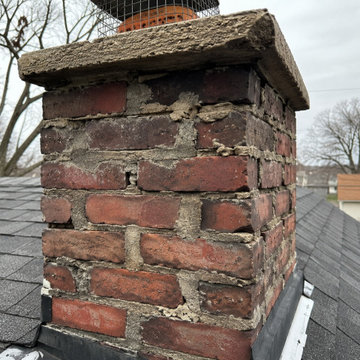
You might have guessed that Chicago and Chicagoland’s weather is brutal on masonry. The city and suburbs average around 35 freeze-thaw cycles every single winter. Every time the cycle occurs, it takes a toll on the chimney's mortar joints. When water gets in and temperatures drop, the water freezes & expands as ice with enough force to crack brick and stone. When Spring comes around, what once was a hairline crack, now gets bigger and allows rain to enter into your home.
This is why the yearly chimney inspection is not optional, according to the CSIA (Chimney Safety Institute of America).
A Little Chicago History
Most homes in neighborhoods like Beverly, Oak Park, Evanston and across the North Shore were built between the 1890s and 1950s. The mortar used in that era had a lifespan of roughly 25–30 years under normal conditions. Under Chicago and Chicagoland conditions? It is reduced. Homeowners buying older properties frequently inherit chimneys that haven't been maintained in a very long time.
When the chimney along with the flashing, bricks, chimney cap and chimney crown are not checked and maintained, loss of structural integrity begins. Water working its way through deteriorated joints reaches the interior of the chimney. This is where it can cause damage to the fire liner while it finds its way into the home. In some situations, compromised masonry near the fireplace can create fire safety concerns.
Getting a Chimney Inspection Early Makes All the Difference
The good news is that chimney tuckpointing, diagnosed early, is simply a repair. The bad news is that homeowners who wait too long can turn the issue into a partial rebuild, or a full chimney rebuild. By the time mortar is visibly crumbling from the street, the damage has already progressed deeper into the chimney structure.
A professional inspection every year is the most cost-effective way to keep the chimney and home heathy. It's often the difference between a few hundred dollars and several thousand.
Not All Tuckpointing Is Equal
One thing worth understanding is that proper tuckpointing requires removing the old mortar to a depth of approximately three-quarters of an inch before new mortar can be applied. Anything less and the new mortar won't bond with longevity / correctly. DIY or companies that just smear new mortar over old joints are doing what's sometimes called "skim coating," and it's essentially cosmetic work that won't hold up.
The type of mortar mix matters too. More modern cement mortars are actually harder than historic brick, which causes the brick itself to absorb, stress and crack rather than the mortar joint. A knowledgeable mason from Superior Chimney will match mortar composition to the brick, only something a real expert can get right.
Contact Superior Chimney today to get a chimney inspection which includes inspecting the exterior chimney today at 877-244-6349.

 San Luis Kitchen Co.
A beach house that combines the rustic with the formal. Using heartwood maple for visual interest and an aged driftwood feel, we added hand-carved trim details, rope moulding and a highlighting glaze to refine the final rustic Old World appeal.
Wood-Mode Fine Custom Cabinetry: Brookhaven's Andover

 Quality Edge
TruCedar Steel Siding shown in 10" Board & Batten in Napa Vine.
Beige two-story metal exterior home idea in Grand Rapids
Beige two-story metal exterior home idea in Grand Rapids

 Riemer Floors, Inc.
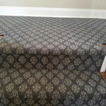
Riemer Floors installed Milliken Carpet, Stitches in Silver Taupe.
Mid-sized transitional carpeted u-shaped staircase photo in Detroit with carpeted risers
Mid-sized transitional carpeted u-shaped staircase photo in Detroit with carpeted risers

 DISC Interiors
Inspiration for a modern kitchen remodel in Los Angeles with flat-panel cabinets and light wood cabinets


 Village Home Stores
Full-overlay Rustic Beech cabinets in the "Charleston" door style and "Briarwood" finish.
Village Home Stores
Example of a large mountain style kitchen design in Chicago
Example of a large mountain style kitchen design in Chicago

 Elegant Hardwood Floors
maple hardwood floor, water-popped, and stained with 50% rosewood and 50% neutral stains.
Inspiration for a timeless medium tone wood floor living room remodel in Salt Lake City
Inspiration for a timeless medium tone wood floor living room remodel in Salt Lake City
 J&S by STARK
Mid-sized elegant carpeted straight wood railing home design photo in New York with carpeted risers

 Advance Design Studio, Ltd.
Jennifer and Dan have lived in their Deer Park Illinois home for 15 years, slowly making minor fixes like painting and decorating; but they had a new plan for their kitchen the entire time. An awkwardly placed garage door, and an island cooktop with a terrible downdraft made a full-scale kitchen remodel an absolute must. Jennifer had many ideas in mind and wanted to work with a company that could provide high-end work, while partnering with a designer that would tailor the kitchen to her ideas.
She was intrigued by the phrase “Common Sense Remodeling” in Advance Design’s feature she discovered while perusing an issue of the community’s Quintessential Barrington Magazine. Doing further research on the company’s website, as she looked through project profiles and read about Advance Design’s “Common Sense Remodeling” philosophy, she promptly scheduled an appointment to see if the people and ideas she read about were truly who they said they were. The more she read, the more she knew that the “Common Sense” approach to remodeling they described was exactly the type of company she was looking for.
The partnership was sealed after an initial consultation with Owner Todd Jurs and Project Designer Michelle Lecinski. They displayed a combination of friendliness, professionalism and respect that was unmatched by any of the other companies Jennifer talked to. She knew that with Advance Design, she would be able to retain the vision that she had in mind with high-quality craftsmanship.
“I reached out to Advance Design because of the ‘Common Sense Remodeling’ tagline,” Jennifer said. “That’s what lingered for me”. “Advance Design was the most respectful- of the house and of my design ideas, and the most professional of the handful of companies that looked at my project”.
Soon after the meeting Jennifer began working with Michelle on the project design. They quickly developed chemistry. Jennifer loved how Michelle researched and located every detail that Jennifer wanted for the kitchen. Between the two of them, every concept and idea was worked through and perfected. “Jennifer had definite ideas about what she wanted the new kitchen to look like, she just didn’t know how to bring it all together. We worked together really well to make her ideas into the practical reality necessary for a well-functioning kitchen, with the look and feel that she had envisioned”, says Michelle.
“Michelle was wonderful in using the CAD system she would show me new drawings every time we changed the layout while working through the design,” Jennifer said. “She was a really wonderful partner in execution, she made sure everything happened quickly and easily.”
The finished design drew out elements of Jennifer’s style and personality. The pair call the look “sophisticated farmhouse” to describe the kitchen renovation to family and friends. The result was a beautifully crafted, authentic-feeling space that satisfied Jennifer’s dreams 15 years in the making. The whole project consisted of a kitchen remodel, mudroom upgrade with powder room, and garage entry relocation. “The projects I personally like the best, are the ones that put the client’s dreams on display,” Project Designer Michelle said. “And this is one of those projects.”
The main focal point of the kitchen is custom zinc and brass ventilation hood with a vintage sheen, which was hand made to order by a small company in Indiana named Vogler Metalworking. “It’s like sculpture, a true work of art”, says Jennifer. Your eye is immediately drawn towards this elegant yet practical hood that eliminated the home’s downdraft problem and added a striking conversation piece at the same time. The carpenters had to use special gloves when transporting and installing it, so they didn’t smudge it with fingerprints. The beautiful hood centers proudly over the stunning black enamel and brass LaCornue Range. “I had a friend who had a LaCornue range and after learning how easy it was to cook perfect meals, I was convinced I wanted to have one”, says Jennifer. This unique, breathtaking combination anchors the entire kitchen and is apparent immediately as you walk into the great room the surrounds the space.
DuraSupreme Crestwood cabinets with a Kendall Panel add function and sophistication. A custom gray paint color paired with a storm blue was developed so that the new kitchen looked like it belonged to the existing space. Unlacquered brass faucets and hardware were important to Jennifer because she wanted the living finishes to age over time. Remarkable brass diamond mesh cabinet door inserts imported from the UK continue to add this one-of-a-kind kitchen renovation; giving it a “you won’t see this everywhere” quality. The use of old railcar flooring for the coffee bar countertop and reclaimed oak for the open shelving gives an authenticity to the space uncommon in kitchens today.
Jennifer and Michelle fell in love with the Limestone Grey Stone while they were investigating unique island countertop ideas. They liked the fact that the limestone as a living finish will age and change over time. Calcutta Miel Quartz countertops made for an excellent pairing around the perimeter, as it’s durable and perfect for cooking preparations. A textured white subway tile backsplash that runs to the ceiling keeps your eye moving towards the open shelving, and to the main focal point of the stunning range hood combination.
“The kitchen functions beautifully, and it’s gorgeous,” beams Jennifer as she gestures with both hands while smiling ear to ear. “The most important thing was I wanted a kitchen that had a wonderful flow, cooked beautiful meals and was a great gathering place for family and friends, and this space does that perfectly! Beauty wise, it turned out exactly how I had envisioned. I felt the function part was the hardest part, and that was nailed”!
Relocating the garage entry to the new mudroom was a huge priority and has finally separated the family’s arriving home functions from their kitchen. Now coats and shoes and bags have their own area for dropping once members arrive home. Matching gray DuraSupreme cabinetry helped create gorgeous, purposeful lockers for the family. A reclaimed vintage sink and custom wall paper were added to the tiny powder room to beautify the once previously only functional space. Advance Design was even able to create a custom space for their dog to sleep while the family is away.
“It was unbelievable that a project of this size was completed in such a short time, and I think that’s because of the large amount of planning and preparation that went into it,” Jennifer marveled, “When we started, we were ready, and everything was prepared”.
When it came to execution, Project Manager Justin Davis and his crew were quick, accessible, and organized. Projects like this kitchen are typically completed in as little as 8-10 weeks. Jennifer’s kitchen however despite the relocation of some challenging HVAC in a soffit and moving of an exterior door was completed remarkably fast in part because the team was working with an existing tile floor that ran throughout the first floor that the client really loved.
“You get to know these people really well because they’re living in your house while you’re living in your house. They were so fast and really good, it didn’t take as long as even planned” reported Jennifer. “I would text Justin and he always responded almost immediately. I got to know all the guys who were working in our house and they were all wonderful people”.
Details in a customized kitchen like this one require skill and care from the people who install it. “All the guys on the job were skilled at what the did. I wanted small details like little feet to look like furniture, that is where their carpentry skill came in to make these all perfect”, said Jennifer. “The tile guys were wonderful. They even let me determine how I wanted the texture with the grout to appear for a salt and pepper look; now that is a very skilled trade person making it custom”.
In Jennifer’s interview, she continued to reference Advance Design’s “Common Sense Remodeling”, so I took a minute to ask her exactly what that phrase meant to her and how it played out in her experience with her project and the Advance Design team. Here is what she said: “I was intrigued about Common Sense Remodeling and in my head that there would be clear costs and prices, great communication between the design team, the execution team and me”, said Jennifer. They did deliver on that, it was so clear about the cost breakdown, what I could expect from everyone who came to my house, and everything that we had ordered. That to me is the Common Sense”!
It’s great to see a client take literally our assertion that a well-planned remodeling project is simply “Common Sense”! She anticipated each step of the way would be clear, concise, and predictable, all the while protecting the outcome due to the careful upfront planning. “Advance Design delivered on their ‘Common Sense Remodeling’ promise,” Jennifer said. “From the design team, to the execution team - everything was straight forward like I imagined. The project turned out exactly how I envisioned, I enjoyed this process and absolutely would recommend Advance Design Studio to anyone.”
25