
Search results for "Creating considerable" in Home Design Ideas
 Alleylane Homes
Functionality of layout
Unique design elements
Choice of materials
Environmental considerations (energy, comfort, health)
Construction details/techniques to achieve industry best practices
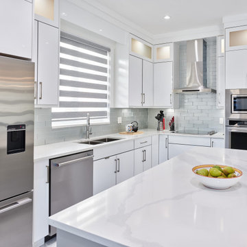
Open-concept and filled with sunshine, a culinary hub that’s designed to be the social heart of this home and a subtle reference to the engaged, family-first lifestyle that would have been found in the original, heritage farmhouse located on this property.
8x5-foot* island (with seating for 4-5 people) includes storage on each side plus convenient USB outlets to keep everyone’s electronics powered up and ready to go. Easy flow when entertaining is appreciated by family/guests alike who want to engage with chefs-at-work without intruding into their workspace.
Pendant lighting above island is purposefully absent. View-lines to adjacent great-room remains unobstructed, thus fulfilling clients desire to provide the entire family (from teen to grandparents) with welcoming space to simply hang out together.
Gas cooktop (with elegantly-curved, chimney hood-fan) and two, full-sized wall-ovens (regular and microwave/convection) conveniently located adjacent to each other on the back wall where it’s easy to transfer steaming dishes directly onto the island ready for your guests/family to help themselves.
Subway-tile (3x6-inch) quartz backsplash creates visual continuity with the solid-slab island surface and perimeter countertops.
Custom millwork (in contemporary white with brushed chrome handles) designed with full-height cabinets with upper shelves back-lit for warm night-time visual. Extra bonus storage and reduced dusting: always a winning combo.
Easy-access spice kitchen includes all the features today’s savvy buyers expect from their cooking space: full-sized range with induction* cooktop, fridge, dishwasher, and 36-inch* sink that’s deep enough to effortlessly handle the biggest spaghetti/corn pots. A caterer’s dream too.
Large format (3x3-foot) marble-inspired porcelain floor-tiling is extension of material used throughout main floor. Elegant, contemporary, dramatic. Warm on the feet, thanks to energy-efficient, in-floor radiant heating.

 Ernest M. Ferizi
German Embassy in Pristina - Kosovo, contracted the architecture office “Ferizi + Ferizi Architects” to plan and implement an Annex Office building for their purposes. As detached part of this building is designed the waiting area, as alone standing structure.
This Office Building is constructed by assembling of Eight used office containers that were delivered on trucks and set up after only a few hours on the basis of the LEGO principle, according to the planning on strip foundations.
By removing the flexible exterior wall panels, a large room of 115 m² was created, with the counter wall as a room partition between two office spaces, each with seven workstations as well as three counters for agents on one side and a room for visitors on the other side.
With this system, room solutions can be easily implemented in all dimensions.
The container, seen as a geometric shape, is a simple, octagonal, solid box.
The standardized perfection of its dimensions is striking: 2.44 meters wide, 2.59 meters high and 6.06 meters or 12.19 meters long.
Since its introduction in 1956 by the American transport entrepreneur Malcom McLean, the container has become a standardized transport module worldwide, whether on ships, trucks or construction sites.
The shipping containers have additionally revolutionized the transport industry, pushed the globalization noticeably, and thus directly or indirectly influenced all our lives.
But after only a few years, when the first overseas containers wore out, many engineers recognized the positive properties of used shipping containers for building houses, especially since they are robust, flexible, multifunctional and second-hand relatively inexpensive to purchase. The time has long passed by to treat containers exclusively as transport objects.
As a "measure of all things", containers can hardly be ignored in construction.
Their use is no longer limited to temporary use since school containers, information containers, office containers or entire residential buildings are now part of our everyday life in the construction industry.
However, current examples of the container architecture prove that even the most demanding solutions for container building are feasible. For their specific aesthetic and spatial qualities, containers also serve as design parameters for the development of new forms of architecture and urbanity.
The office building as an extension of the visa section, characterized by modern materials and contemporary aesthetics has been designed and built mainly as a low-energy building.
Extensive insulation to achieve a comfortable and sustainable constant temperature in the interior, high window quality and low energy consumption make the building energy-efficient.
The sophisticated lighting technology, networks, heating systems and air-conditioning systems are also components of this equipment.
It creates an overall harmonic picture and guarantees the highest standard in sustainable construction, taking into consideration the fact that environmentally friendly recycling and reutilization have become an increasingly important issue in our society.
West and East side of the wooden facade is compact and has few openings, while the southern facade is completely open with lot of glass. Its spatial openness ensures a transparent, friendly work environment, which allows a lot of light into the space.
This openness allows an uninterrupted, pleasant and close-to-nature view from interior spaces into the beautiful garden. During the installation of sophisticated light sources in the garden, emphasis was not only put on functionality and security, but also on the beauty of the garden shown through the illumination in the evening.
Large, horizontal white “brisole” serve as external sun protection systems, mounted on the canopies of the entrance areas of the modular construction and the enclosure, adeptly cast shade on these areas and at the same time shape the entire architectural language.
While on one hand, the two quadratic ledges suspended in the air, are docked with steel stairs and match the wooden façade, lead the staff to their office space, the artful modern interior, on the other hand, perfectly unites the functionality, innovative technology, culture and positive effects on the employees' efficiency and wellbeing.
A lot of white, interjected by warm wooden and colored accents, determines the ambience.
In the case of the lighting solution, the mainly linear ceiling lighting is used as the overlapping design element both for the offices of the visa section as well as for the counters and the waiting area for the visitors.
They underline the puristic design in order to create a pleasant light for a desired general illumination and ensure optimal light conditions without causing disturbing reflections on the computer screens.
In addition, precisely positioned pendant luminaires are installed at the workstations, which ensure pleasant room brightness.
In the entrance area, the harmonic and uniform lighting effect from the ground highlights the integration of photography and architecture.
Photographs of landscapes, people, places, expressing unforgettable, impressive moments and memories have been lovingly engraved on 8 x 8cm square oak blocks.
The idea of an effective, impressive environment that stimulates and inspires the work was the premiss on which the whole design concept was based. Consequently, the modular construction was no longer viewed through its history of utilization and scars, but rather as a structure of work ambiance, art and elegance.
FERIZI + FERIZI Architects
Photo: Arben Llapashtica

 Michael Nash Design, Build & Homes
Starting Each Day Clean and Refreshed In This Classically-Modern, Marble Masterpiece
In 1985, the previous owner of the house had added an addition of which part included a 17 feet by 13 feet space off the master bedroom for both a master bath and walk-in closet. Irrespective of the dated red carpet that blanketed the entire bathroom of this 1964 colonial in Annandale, VA, the combination bathroom/closet space had its other oddities, primarily in that there was no shower. The current homeowners -- a family of five, who has been in the home for 7 years, was tired of going down the hall to use the kids’ bathroom to take a shower before work. The renovation that they have created now is a bright and luxurious space that one could bask in all day. They used this bathroom renovation opportunity to total remake the layout and function of this essential room that sets the tone for the day ahead.
Prior to the renovation, the existing bathroom oddly had two entrances, a typical one off of the master bedroom, but another straight off the upstairs hallway. As the toilet was out in the open in the previous design, ensuring that this second door was closed when company was in town was essential and a nuisance. As you entered the room, situated below the arc window, a large soaking tub that was covered on three sides with wooden steps dominated the room from the corner it projected. A relatively small 42” single bowl sink did not leave much space for his and hers toiletries, and there was no other linen closet or cabinetry for storage in the bathroom. The 8 foot by 5 foot closet with accordion doors had poorly laid out rungs not letting the storage space to be fully utilized. At over 220 square feet, the room did offer considerable space to work with, yet the existing layout, which even included a partition wall behind the vanity, felt cramped and dysfunctional.
The homeowners wished to create a classic yet modern, private, deluxe bathroom that would better integrate into their master suite and enable them to start and end each day in a luxurious way. They wanted to maintain having a soaking tub, add in a large shower, have an enclosed commode, expand to include double sinks, and add more storage for toiletries and linens. We worked with the customer to develop a creative design with extensive plumbing rework that accomplished all these needs and more.
The first order of business was to gut out all the carpet, tub, cabinetry, and non-load bearing partition walls. The new tub would be generally in the same location, but as the previous walk-in closet would be repurposed for the commode and the walk-in shower additional water lines, plumbing, and draining needed to be added; fortunately the room below is the garage, which enabled the team to frame out some bulkheads to accomplish this complex plumbing. Following the framing, including walling up the second entrance to the bathroom, adding in a pocket door for the commode, and creating the shape of the new shower, the team also laid down the wiring for one of the luxuries of this room – heated flooring. A glossy percaline boarder, and two-inch hexagon shape percaline tiles cover the entire floor, making it much easier and cleaner than the previous carpet.
Marble look tile is predominant throughout the bathroom as despite the angled frameless glass door, the entire shower is covered in 18 inch polished marble look tiles. The shower coats the user in water from either the overhead rain head, large main showerhead and/or the hand held sprayer. Over 7 feet of white Italian Statuetto marble countertop, enable the couple to have two sink bowls and plenty of room on each side. The bowls are exposed in this stainless steel console sink design which required the team to ensure that the exposed plumbing looked pristine, and painting the bottom of the porcelain bowl to match the coloring.
The white cast-iron 72-inch Cecilia claw-foot soaking tub and its chrome lion’s paws complement that other chrome and white used throughout the room. A tall, almost floor-to-ceiling linen closet finished in arctic white is nestled in the corner near the tub, enabling ample storage of towels, etc. Other cabinetry includes an 18 inch-wide vanity with decorative footing is centered between the two sinks, and a 27 inch wall mounted cabinet with shelf is above the Kohler Devonshire elongated toilet.
Billowing cloud colored grey blue paint was a great choice for this room to pick up on the veining in the marble. Mirrored medicine chests, a chandelier, wall sconces, and overhead recessed lighting also were incorporated into the design and function of the new room.
The artful combination of classic design from material choices, such as free-standing Victorian claw-foot tub along with the modern design as seen in the angled shower, frameless medicine cabinet mirrors, and frosted glass pocket door on the commode, make this bathroom quite a masterpiece.
The clients are enjoying having their private space and not having the use the kids’ bathroom anymore.
Find the right local pro for your project
 Alleylane Homes
Functionality of layout
Unique design elements
Choice of materials
Environmental considerations (energy, comfort, health)
Construction details/techniques to achieve industry best practices
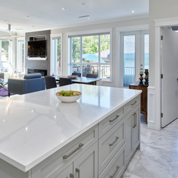
Open-concept and filled with sunshine, a culinary hub that’s designed to be the social heart of this home and a subtle reference to the engaged, family-first lifestyle that would have been found in the original, heritage farmhouse located on this property.
8x5-foot* island (with seating for 4-5 people) includes storage on each side plus convenient USB outlets to keep everyone’s electronics powered up and ready to go. Easy flow when entertaining is appreciated by family/guests alike who want to engage with chefs-at-work without intruding into their workspace.
Pendant lighting above island is purposefully absent. View-lines to adjacent great-room remains unobstructed, thus fulfilling clients desire to provide the entire family (from teen to grandparents) with welcoming space to simply hang out together.
Gas cooktop (with elegantly-curved, chimney hood-fan) and two, full-sized wall-ovens (regular and microwave/convection) conveniently located adjacent to each other on the back wall where it’s easy to transfer steaming dishes directly onto the island ready for your guests/family to help themselves.
Subway-tile (3x6-inch) quartz backsplash creates visual continuity with the solid-slab island surface and perimeter countertops.
Custom millwork (in contemporary white with brushed chrome handles) designed with full-height cabinets with upper shelves back-lit for warm night-time visual. Extra bonus storage and reduced dusting: always a winning combo.
Easy-access spice kitchen includes all the features today’s savvy buyers expect from their cooking space: full-sized range with induction* cooktop, fridge, dishwasher, and 36-inch* sink that’s deep enough to effortlessly handle the biggest spaghetti/corn pots. A caterer’s dream too.
Large format (3x3-foot) marble-inspired porcelain floor-tiling is extension of material used throughout main floor. Elegant, contemporary, dramatic. Warm on the feet, thanks to energy-efficient, in-floor radiant heating.
 Saikley Architects
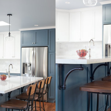
This house was a very small mid-century bungalow with previous additions that resulted in a large but chaotic layout. The owners wanted to convert the house to a super-efficient, and charming Craftsman-style, 6 bedroom home for their large family and work at home.
We achieved the space needs by moving a few walls for a more efficient, organized layout, setting up spaces for overlapping uses, and making a small upstairs addition. Every bit of square footage was optimized to meet the goals of the project without making the house huge or adding unnecessary cost.
Much thought was given to the entry sequence near the front door. A large flow-through mudroom with storage for each family member, and adjacent laundry, make it easy for children to be taught to keep their things organized and to contribute to household chores. A mail station and central home admin area at the mudroom help keep clutter down at other areas and minimize home management tasks. A garage door near the kitchen gives quick access to bulk items.
The existing house had too much view to the street from the living room through large corner windows, and too little entry transition, to the extent that the family did not feel comfortable using the living room much without shades drawn. We raised the window sills and brought the new windows in from the corner of the house, allowing plenty of light while protecting privacy and a sense of enclosure in the living room. We enlarged the front porch to create a more graceful transition from the public to private space. We located the front door so that the circulation from entry into the house would allow for furnishing the living room with a sitting circle that is not intruded upon by people walking through the room.
Sight lines through the living spaces were an important consideration in the design. The owners wanted discreet spaces for living room, kitchen, dining and family room, but also wanted the living spaces to feel connected and to be able to easily watch their children. Being able to see the children playing in the yard while getting things done inside the house was also important. While largely working with the existing structure, we opened walls and rearranged the use of spaces to make a series of connected living spaces with long views through them.
The character of the remodeled house is a contemporary Craftsman with classic materials and cool, consistent colors. A few arches echo through the house to frame spaces and soften the feeling of the rooms.
Photography: Kurt Manley
https://saikleyarchitects.com/portfolio/bungalow-expansion/

 J Design Group - Interior Designers Miami - Modern
A TOUCHDOWN BY DESIGN
Interior design by Jennifer Corredor, J Design Group, Coral Gables, Florida
Text by Christine Davis
Photography by Daniel Newcomb, Palm Beach Gardens, FL
What did Detroit Lions linebacker, Stephen Tulloch, do when he needed a decorator for his new Miami 10,000-square-foot home? He tackled the situation by hiring interior designer Jennifer Corredor. Never defensive, he let her have run of the field. “He’d say, ‘Jen, do your thing,’” she says. And she did it well.
The first order of the day was to get a lay of the land and a feel for what he wanted. For his primary residence, Tulloch chose a home in Pinecrest, Florida. — a great family neighborhood known for its schools and ample lot sizes. “His lot is huge,” Corredor says. “He could practice his game there if he wanted.”
A laidback feeling permeates the suburban village, where mostly Mediterranean homes intermix with a few modern styles. With views toward the pool and a landscaped yard, Tulloch’s 10,000-square-foot home touches on both, a Mediterranean exterior with chic contemporary interiors.
Step inside, where high ceilings and a sculptural stairway with oak treads and linear spindles immediately capture the eye. “Knowing he was more inclined toward an uncluttered look, and taking into consideration his age and lifestyle, I naturally took the path of choosing more modern furnishings,” the designer says.
In the dining room, Tulloch specifically asked for a round table and Corredor found “Xilos Simplice” by Maxalto, a table that seats six to eight and has a Lazy Susan.
And just past the stairway, two armless chairs from Calligaris and a semi-round sofa shape the living room. In keeping with Tulloch’s desire for a simple no-fuss lifestyle, leather is often used for upholstery. “He preferred wipe-able areas,” she says. “Nearly everything in the living room is clad in leather.”
An architecturally striking, oak-coffered ceiling warms the family room, while Saturnia marble flooring grounds the space in cool comfort. “Since it’s just off the kitchen, this relaxed space provides the perfect place for family and friends to congregate — somewhere to hang out,” Corredor says. The deep-seated sofa wrapped in tan leather and Minotti armchairs in white join a pair of linen-clad ottomans for ample seating.
With eight bedrooms in the home, there was “plenty of space to repurpose,” Corredor says. “Five are used for sleeping quarters, but the others have been converted into a billiard room, a home office and the memorabilia room.” On the first floor, the billiard room is set for fun and entertainment with doors that open to the pool area.
The memorabilia room presented quite a challenge. Undaunted, Corredor delved into a seemingly never-ending collection of mementos to create a tribute to Tulloch’s career. “His team colors are blue and white, so we used those colors in this space,” she says.
In a nod to Tulloch’s career on and off the field, his home office displays awards, recognition plaques and photos from his foundation. A Copenhagen desk, Herman Miller chair and leather-topped credenza further an aura of masculinity.
All about relaxation, the master bedroom would not be complete without its own sitting area for viewing sports updates or late-night movies. Here, lounge chairs recline to create the perfect spot for Tulloch to put his feet up and watch TV. “He wanted it to be really comfortable,” Corredor says
A total redo was required in the master bath, where the now 12-foot-long shower is a far cry from those in a locker room. “This bath is more like a launching pad to get you going in the morning,” Corredor says.
“All in all, it’s a fun, warm and beautiful environment,” the designer says. “I wanted to create something unique, that would make my client proud and happy.” In Tulloch’s world, that’s a touchdown.
Your friendly Interior design firm in Miami at your service.
Contemporary - Modern Interior designs.
Top Interior Design Firm in Miami – Coral Gables.
Office,
Offices,
Kitchen,
Kitchens,
Bedroom,
Bedrooms,
Bed,
Queen bed,
King Bed,
Single bed,
House Interior Designer,
House Interior Designers,
Home Interior Designer,
Home Interior Designers,
Residential Interior Designer,
Residential Interior Designers,
Modern Interior Designers,
Miami Beach Designers,
Best Miami Interior Designers,
Miami Beach Interiors,
Luxurious Design in Miami,
Top designers,
Deco Miami,
Luxury interiors,
Miami modern,
Interior Designer Miami,
Contemporary Interior Designers,
Coco Plum Interior Designers,
Miami Interior Designer,
Sunny Isles Interior Designers,
Pinecrest Interior Designers,
Interior Designers Miami,
J Design Group interiors,
South Florida designers,
Best Miami Designers,
Miami interiors,
Miami décor,
Miami Beach Luxury Interiors,
Miami Interior Design,
Miami Interior Design Firms,
Beach front,
Top Interior Designers,
top décor,
Top Miami Decorators,
Miami luxury condos,
Top Miami Interior Decorators,
Top Miami Interior Designers,
Modern Designers in Miami,
modern interiors,
Modern,
Pent house design,
white interiors,
Miami, South Miami, Miami Beach, South Beach, Williams Island, Sunny Isles, Surfside, Fisher Island, Aventura, Brickell, Brickell Key, Key Biscayne, Coral Gables, CocoPlum, Coconut Grove, Pinecrest, Miami Design District, Golden Beach, Downtown Miami, Miami Interior Designers, Miami Interior Designer, Interior Designers Miami, Modern Interior Designers, Modern Interior Designer, Modern interior decorators, Contemporary Interior Designers, Interior decorators, Interior decorator, Interior designer, Interior designers, Luxury, modern, best, unique, real estate, decor
J Design Group – Miami Interior Design Firm – Modern – Contemporary
Contact us: (305) 444-4611
http://www.JDesignGroup.com

 CHRISTIAN DEAN ARCHITECTURE, LLC
Photo by: Chad Holder
Inspiration for a modern wooden straight open staircase remodel in Minneapolis
Inspiration for a modern wooden straight open staircase remodel in Minneapolis
Sponsored
Delaware, OH

Buckeye Basements, Inc.
Central Ohio's Basement Finishing ExpertsBest Of Houzz '13-'21
 Alleylane Homes
Functionality of layout
Unique design elements
Choice of materials
Environmental considerations (energy, comfort, health)
Construction details/techniques to achieve industry best practices
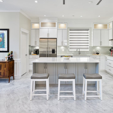
Open-concept and filled with sunshine, a culinary hub that’s designed to be the social heart of this home and a subtle reference to the engaged, family-first lifestyle that would have been found in the original, heritage farmhouse located on this property.
8x5-foot* island (with seating for 4-5 people) includes storage on each side plus convenient USB outlets to keep everyone’s electronics powered up and ready to go. Easy flow when entertaining is appreciated by family/guests alike who want to engage with chefs-at-work without intruding into their workspace.
Pendant lighting above island is purposefully absent. View-lines to adjacent great-room remains unobstructed, thus fulfilling clients desire to provide the entire family (from teen to grandparents) with welcoming space to simply hang out together.
Gas cooktop (with elegantly-curved, chimney hood-fan) and two, full-sized wall-ovens (regular and microwave/convection) conveniently located adjacent to each other on the back wall where it’s easy to transfer steaming dishes directly onto the island ready for your guests/family to help themselves.
Subway-tile (3x6-inch) quartz backsplash creates visual continuity with the solid-slab island surface and perimeter countertops.
Custom millwork (in contemporary white with brushed chrome handles) designed with full-height cabinets with upper shelves back-lit for warm night-time visual. Extra bonus storage and reduced dusting: always a winning combo.
Easy-access spice kitchen includes all the features today’s savvy buyers expect from their cooking space: full-sized range with induction* cooktop, fridge, dishwasher, and 36-inch* sink that’s deep enough to effortlessly handle the biggest spaghetti/corn pots. A caterer’s dream too.
Large format (3x3-foot) marble-inspired porcelain floor-tiling is extension of material used throughout main floor. Elegant, contemporary, dramatic. Warm on the feet, thanks to energy-efficient, in-floor radiant heating.
 Michael Nash Design, Build & Homes
2010 NATIONAL NARI REGIONAL AWARD WINNER
Project Scope
The owners of this 7,000 square foot colonial in Oakton, Virginia, were seeking a multi-level Mediterranean-style indoor/outdoor living space off the back of their home. They turned to Michael Nash Design, Build & Homes for a design solution that would include a stone patio, a second-story deck, a screened-in porch and linking staircases.
While the structure was designed primarily for family dining and entertaining, it also had to accommodate periodic social gatherings of one hundred guests or more. To meet these needs, the project would include a fully-equipped outdoor kitchen, several serving counters with permanent refrigeration, and well-delineated socializing and dining zones.
The existing home’s setting offered several impressive assets the new outdoor living area was designed to exploit. The sprawling acreage features old stand trees, wooded paths and a private lake. Beautifully landscaped, it unfolds as an idyllic panorama that naturally draws people to the outdoors.
Challenges
Since the rear elevation was situated on a slope that drops away from the house, the Michael Nash team had to raise the grade two feet within in a 2,000 square foot area extending out from the back of the house. Infrastructure plans also called for a sophisticated drainage system that had to accommodate a whole series of water “runoff” considerations to be integrated into the decking itself. Excavation included constructing retaining walls to bolster the elevated grade—which also had to support a concrete slab, the primary foundation for the entire complex.
Solutions
The ground level decking consists of a 2,000 square foot flagstone patio level with the home’s lower level doors. There is a decorative water fountain mid-patio—an ornate collectible acquired in Florida. Food preparation is concentrated within a specially designed semi-circular wall that creates an “outdoor kitchen” equipped with a 60” Viking barbecue grill, a prep sink, a warming drawer, refrigerator and appropriate storage. There is a granite surfaced dining counter with seating for eight.
Wrought iron railing and approximately 20 decorative columns (some encasing steel vertical supports) are incorporated into the design scheme. Many of the columns house accent lights.
The top level—supported by horizontal steel beams– is a 2,500 square foot deck constructed entirely of Trex decking. The open air decking is, again, directly accessible from rooms on the second level of the house including the kitchen, sunroom and family room.
The platform’s most prominent feature is a U-shaped “kitchenette” with cedar shake shingle roofing. Like its counterpart one level below, the facility is equipped with grill, refrigerator and stainless steel cabinetry.
One portion of the deck has been allocated for a 16’ x 16’ octagonal screened-in porch crowned by a pair of 2’ x 4’ skylights. The porch can be accessed from the home’s conservatory via a set of French doors. With its mosaic tile flooring, stained cedar panel ceiling and honed granite counters, the interior is elegant and calming. Hand-painted stenciling and a wall-mounted water feature provide distinctive detailing.
Finally, the design introduced elements to highlight and reinforce an awareness of the lovely bucolic setting. Fountains and water features combined with textured surfaces and mosaic tiling and backsplashes to present a villa-like ambiance well-suited to the Virginia countryside.
 J Design Group - Interior Designers Miami - Modern
A TOUCHDOWN BY DESIGN
Interior design by Jennifer Corredor, J Design Group, Coral Gables, Florida
Text by Christine Davis
Photography by Daniel Newcomb, Palm Beach Gardens, FL
What did Detroit Lions linebacker, Stephen Tulloch, do when he needed a decorator for his new Miami 10,000-square-foot home? He tackled the situation by hiring interior designer Jennifer Corredor. Never defensive, he let her have run of the field. “He’d say, ‘Jen, do your thing,’” she says. And she did it well.
The first order of the day was to get a lay of the land and a feel for what he wanted. For his primary residence, Tulloch chose a home in Pinecrest, Florida. — a great family neighborhood known for its schools and ample lot sizes. “His lot is huge,” Corredor says. “He could practice his game there if he wanted.”
A laidback feeling permeates the suburban village, where mostly Mediterranean homes intermix with a few modern styles. With views toward the pool and a landscaped yard, Tulloch’s 10,000-square-foot home touches on both, a Mediterranean exterior with chic contemporary interiors.
Step inside, where high ceilings and a sculptural stairway with oak treads and linear spindles immediately capture the eye. “Knowing he was more inclined toward an uncluttered look, and taking into consideration his age and lifestyle, I naturally took the path of choosing more modern furnishings,” the designer says.
In the dining room, Tulloch specifically asked for a round table and Corredor found “Xilos Simplice” by Maxalto, a table that seats six to eight and has a Lazy Susan.
And just past the stairway, two armless chairs from Calligaris and a semi-round sofa shape the living room. In keeping with Tulloch’s desire for a simple no-fuss lifestyle, leather is often used for upholstery. “He preferred wipe-able areas,” she says. “Nearly everything in the living room is clad in leather.”
An architecturally striking, oak-coffered ceiling warms the family room, while Saturnia marble flooring grounds the space in cool comfort. “Since it’s just off the kitchen, this relaxed space provides the perfect place for family and friends to congregate — somewhere to hang out,” Corredor says. The deep-seated sofa wrapped in tan leather and Minotti armchairs in white join a pair of linen-clad ottomans for ample seating.
With eight bedrooms in the home, there was “plenty of space to repurpose,” Corredor says. “Five are used for sleeping quarters, but the others have been converted into a billiard room, a home office and the memorabilia room.” On the first floor, the billiard room is set for fun and entertainment with doors that open to the pool area.
The memorabilia room presented quite a challenge. Undaunted, Corredor delved into a seemingly never-ending collection of mementos to create a tribute to Tulloch’s career. “His team colors are blue and white, so we used those colors in this space,” she says.
In a nod to Tulloch’s career on and off the field, his home office displays awards, recognition plaques and photos from his foundation. A Copenhagen desk, Herman Miller chair and leather-topped credenza further an aura of masculinity.
All about relaxation, the master bedroom would not be complete without its own sitting area for viewing sports updates or late-night movies. Here, lounge chairs recline to create the perfect spot for Tulloch to put his feet up and watch TV. “He wanted it to be really comfortable,” Corredor says
A total redo was required in the master bath, where the now 12-foot-long shower is a far cry from those in a locker room. “This bath is more like a launching pad to get you going in the morning,” Corredor says.
“All in all, it’s a fun, warm and beautiful environment,” the designer says. “I wanted to create something unique, that would make my client proud and happy.” In Tulloch’s world, that’s a touchdown.
Your friendly Interior design firm in Miami at your service.
Contemporary - Modern Interior designs.
Top Interior Design Firm in Miami – Coral Gables.
Office,
Offices,
Kitchen,
Kitchens,
Bedroom,
Bedrooms,
Bed,
Queen bed,
King Bed,
Single bed,
House Interior Designer,
House Interior Designers,
Home Interior Designer,
Home Interior Designers,
Residential Interior Designer,
Residential Interior Designers,
Modern Interior Designers,
Miami Beach Designers,
Best Miami Interior Designers,
Miami Beach Interiors,
Luxurious Design in Miami,
Top designers,
Deco Miami,
Luxury interiors,
Miami modern,
Interior Designer Miami,
Contemporary Interior Designers,
Coco Plum Interior Designers,
Miami Interior Designer,
Sunny Isles Interior Designers,
Pinecrest Interior Designers,
Interior Designers Miami,
J Design Group interiors,
South Florida designers,
Best Miami Designers,
Miami interiors,
Miami décor,
Miami Beach Luxury Interiors,
Miami Interior Design,
Miami Interior Design Firms,
Beach front,
Top Interior Designers,
top décor,
Top Miami Decorators,
Miami luxury condos,
Top Miami Interior Decorators,
Top Miami Interior Designers,
Modern Designers in Miami,
modern interiors,
Modern,
Pent house design,
white interiors,
Miami, South Miami, Miami Beach, South Beach, Williams Island, Sunny Isles, Surfside, Fisher Island, Aventura, Brickell, Brickell Key, Key Biscayne, Coral Gables, CocoPlum, Coconut Grove, Pinecrest, Miami Design District, Golden Beach, Downtown Miami, Miami Interior Designers, Miami Interior Designer, Interior Designers Miami, Modern Interior Designers, Modern Interior Designer, Modern interior decorators, Contemporary Interior Designers, Interior decorators, Interior decorator, Interior designer, Interior designers, Luxury, modern, best, unique, real estate, decor
J Design Group – Miami Interior Design Firm – Modern – Contemporary
Contact us: (305) 444-4611
http://www.JDesignGroup.com

 SunSwallow Design, LLC
The clients called me on the recommendation from a neighbor of mine who had met them at a conference and learned of their need for an architect. They contacted me and after meeting to discuss their project they invited me to visit their site, not far from White Salmon in Washington State.
Initially, the couple discussed building a ‘Weekend’ retreat on their 20± acres of land. Their site was in the foothills of a range of mountains that offered views of both Mt. Adams to the North and Mt. Hood to the South. They wanted to develop a place that was ‘cabin-like’ but with a degree of refinement to it and take advantage of the primary views to the north, south and west. They also wanted to have a strong connection to their immediate outdoors.
Before long my clients came to the conclusion that they no longer perceived this as simply a weekend retreat but were now interested in making this their primary residence. With this new focus we concentrated on keeping the refined cabin approach but needed to add some additional functions and square feet to the original program.
They wanted to downsize from their current 3,500± SF city residence to a more modest 2,000 – 2,500 SF space. They desired a singular open Living, Dining and Kitchen area but needed to have a separate room for their television and upright piano. They were empty nesters and wanted only two bedrooms and decided that they would have two ‘Master’ bedrooms, one on the lower floor and the other on the upper floor (they planned to build additional ‘Guest’ cabins to accommodate others in the near future). The original scheme for the weekend retreat was only one floor with the second bedroom tucked away on the north side of the house next to the breezeway opposite of the carport.
Another consideration that we had to resolve was that the particular location that was deemed the best building site had diametrically opposed advantages and disadvantages. The views and primary solar orientations were also the source of the prevailing winds, out of the Southwest.
The resolve was to provide a semi-circular low-profile earth berm on the south/southwest side of the structure to serve as a wind-foil directing the strongest breezes up and over the structure. Because our selected site was in a saddle of land that then sloped off to the south/southwest the combination of the earth berm and the sloping hill would effectively created a ‘nestled’ form allowing the winds rushing up the hillside to shoot over most of the house. This allowed me to keep the favorable orientation to both the views and sun without being completely compromised by the winds.
 SunSwallow Design, LLC
The clients called me on the recommendation from a neighbor of mine who had met them at a conference and learned of their need for an architect. They contacted me and after meeting to discuss their project they invited me to visit their site, not far from White Salmon in Washington State.
Initially, the couple discussed building a ‘Weekend’ retreat on their 20± acres of land. Their site was in the foothills of a range of mountains that offered views of both Mt. Adams to the North and Mt. Hood to the South. They wanted to develop a place that was ‘cabin-like’ but with a degree of refinement to it and take advantage of the primary views to the north, south and west. They also wanted to have a strong connection to their immediate outdoors.
Before long my clients came to the conclusion that they no longer perceived this as simply a weekend retreat but were now interested in making this their primary residence. With this new focus we concentrated on keeping the refined cabin approach but needed to add some additional functions and square feet to the original program.
They wanted to downsize from their current 3,500± SF city residence to a more modest 2,000 – 2,500 SF space. They desired a singular open Living, Dining and Kitchen area but needed to have a separate room for their television and upright piano. They were empty nesters and wanted only two bedrooms and decided that they would have two ‘Master’ bedrooms, one on the lower floor and the other on the upper floor (they planned to build additional ‘Guest’ cabins to accommodate others in the near future). The original scheme for the weekend retreat was only one floor with the second bedroom tucked away on the north side of the house next to the breezeway opposite of the carport.
Another consideration that we had to resolve was that the particular location that was deemed the best building site had diametrically opposed advantages and disadvantages. The views and primary solar orientations were also the source of the prevailing winds, out of the Southwest.
The resolve was to provide a semi-circular low-profile earth berm on the south/southwest side of the structure to serve as a wind-foil directing the strongest breezes up and over the structure. Because our selected site was in a saddle of land that then sloped off to the south/southwest the combination of the earth berm and the sloping hill would effectively created a ‘nestled’ form allowing the winds rushing up the hillside to shoot over most of the house. This allowed me to keep the favorable orientation to both the views and sun without being completely compromised by the winds.

 Daniel Scerri Periti
We were approached with a request to design the furnishings for an existing ‘finished’ apartment. The intention was to move in relatively fast, and the property already had an existing marble floor, kitchen and bathrooms which had to be kept. The property also boasted a fantastic 270 degree view, seen from most of the apartment. The clients had a very important role in the completion of the project. They were very involved during the design process and through various decoration choices. The final design was kept as a rigid guideline when faced with picking out all the different elements.
Once clear of all previous furniture, the space felt cold and bare; so we immediately felt the need for warmth, and raw, natural elements and textures to complement the cold marble floor while visually tying in the design of the whole apartment together.
Since the existing kitchen had a touch of dark walnut stain, we felt this material was one we should add to the palette of materials to contest the stark materials. A raw cement finish was another material we felt would add an interesting contrast and could be used in a variety of ways, from cabinets to walls and ceilings, to tie up the design of various areas of the apartment.
To warm up the living/dining area, keeping the existing marble floor but visually creating zones within the large living/dining area without hindering the flow, a dark timber custom-made soffit, continuous with a floor-to-ceiling drinks cabinet zones the dining area, giving it a degree of much-needed warmth.
The various windows with a stupendous 270 degree view needed to be visually tied together. This was done by introducing a continuous sheer [drape] which also doubled up as a sound-absorbing material along 2 of the 4 walls of the space.
A very large sofa was required to fill up the space correctly, also required for the size of the young family.
Services were integrated within the units and soffits, while a customized design in the corner between the kitchen and the living room took into consideration the viewpoints from the main areas to create a pantry without hindering the flow or views. A strategically placed floor-to-ceiling mirror doubles up the space and extends the view to the inner parts of the apartment.
The daughter’s bedroom was a small challenge in itself, and a fun task, where we wanted to achieve the perception of a cozy niche with its own enclosed reading nook [for reading fairy tales], behind see-through curtains and a custom-ordered wall print sporting the girl’s favorite colors.
The sons’ bedroom had double the requirements in terms of space needed: more wardrobe, more homework desk space, a tv/play station area… “We combined a raised platform area between the boys’ beds to become an area with cushions where the kids can lay down and play, and face a hidden screen behind the homework desk’s sliding back panel for their play station”. The color of the homework desk was chosen in relation to the boys’ ages. A more masculine material palette was chosen for this room, in contrast to the light pastel palette of the girl’s bedroom. Again, this colour can easily be changed over time for a more mature look.
PROJECT DATA:
St. Paul’s Bay, Malta
DESIGN TEAM:
Perit Rebecca Zammit, Perit Daniel Scerri, Elyse Tonna
OTHER CREDITS:
Photography: Tonio Lombardi
Styling : TKS
Sponsored
Delaware, OH
Buckeye Basements, Inc.
Central Ohio's Basement Finishing ExpertsBest Of Houzz '13-'21
 Daniel Scerri Periti
We were approached with a request to design the furnishings for an existing ‘finished’ apartment. The intention was to move in relatively fast, and the property already had an existing marble floor, kitchen and bathrooms which had to be kept. The property also boasted a fantastic 270 degree view, seen from most of the apartment. The clients had a very important role in the completion of the project. They were very involved during the design process and through various decoration choices. The final design was kept as a rigid guideline when faced with picking out all the different elements.
Once clear of all previous furniture, the space felt cold and bare; so we immediately felt the need for warmth, and raw, natural elements and textures to complement the cold marble floor while visually tying in the design of the whole apartment together.
Since the existing kitchen had a touch of dark walnut stain, we felt this material was one we should add to the palette of materials to contest the stark materials. A raw cement finish was another material we felt would add an interesting contrast and could be used in a variety of ways, from cabinets to walls and ceilings, to tie up the design of various areas of the apartment.
To warm up the living/dining area, keeping the existing marble floor but visually creating zones within the large living/dining area without hindering the flow, a dark timber custom-made soffit, continuous with a floor-to-ceiling drinks cabinet zones the dining area, giving it a degree of much-needed warmth.
The various windows with a stupendous 270 degree view needed to be visually tied together. This was done by introducing a continuous sheer [drape] which also doubled up as a sound-absorbing material along 2 of the 4 walls of the space.
A very large sofa was required to fill up the space correctly, also required for the size of the young family.
Services were integrated within the units and soffits, while a customized design in the corner between the kitchen and the living room took into consideration the viewpoints from the main areas to create a pantry without hindering the flow or views. A strategically placed floor-to-ceiling mirror doubles up the space and extends the view to the inner parts of the apartment.
The daughter’s bedroom was a small challenge in itself, and a fun task, where we wanted to achieve the perception of a cozy niche with its own enclosed reading nook [for reading fairy tales], behind see-through curtains and a custom-ordered wall print sporting the girl’s favorite colors.
The sons’ bedroom had double the requirements in terms of space needed: more wardrobe, more homework desk space, a tv/play station area… “We combined a raised platform area between the boys’ beds to become an area with cushions where the kids can lay down and play, and face a hidden screen behind the homework desk’s sliding back panel for their play station”. The color of the homework desk was chosen in relation to the boys’ ages. A more masculine material palette was chosen for this room, in contrast to the light pastel palette of the girl’s bedroom. Again, this colour can easily be changed over time for a more mature look.
PROJECT DATA:
St. Paul’s Bay, Malta
DESIGN TEAM:
Perit Rebecca Zammit, Perit Daniel Scerri, Elyse Tonna
OTHER CREDITS:
Photography: Tonio Lombardi
Styling : TKS
 Ernest M. Ferizi
German Embassy in Pristina - Kosovo, contracted the architecture office “Ferizi + Ferizi Architects” to plan and implement an Annex Office building for their purposes. As detached part of this building is designed the waiting area, as alone standing structure.
This Office Building is constructed by assembling of Eight used office containers that were delivered on trucks and set up after only a few hours on the basis of the LEGO principle, according to the planning on strip foundations.
By removing the flexible exterior wall panels, a large room of 115 m² was created, with the counter wall as a room partition between two office spaces, each with seven workstations as well as three counters for agents on one side and a room for visitors on the other side.
With this system, room solutions can be easily implemented in all dimensions.
The container, seen as a geometric shape, is a simple, octagonal, solid box.
The standardized perfection of its dimensions is striking: 2.44 meters wide, 2.59 meters high and 6.06 meters or 12.19 meters long.
Since its introduction in 1956 by the American transport entrepreneur Malcom McLean, the container has become a standardized transport module worldwide, whether on ships, trucks or construction sites.
The shipping containers have additionally revolutionized the transport industry, pushed the globalization noticeably, and thus directly or indirectly influenced all our lives.
But after only a few years, when the first overseas containers wore out, many engineers recognized the positive properties of used shipping containers for building houses, especially since they are robust, flexible, multifunctional and second-hand relatively inexpensive to purchase. The time has long passed by to treat containers exclusively as transport objects.
As a "measure of all things", containers can hardly be ignored in construction.
Their use is no longer limited to temporary use since school containers, information containers, office containers or entire residential buildings are now part of our everyday life in the construction industry.
However, current examples of the container architecture prove that even the most demanding solutions for container building are feasible. For their specific aesthetic and spatial qualities, containers also serve as design parameters for the development of new forms of architecture and urbanity.
The office building as an extension of the visa section, characterized by modern materials and contemporary aesthetics has been designed and built mainly as a low-energy building.
Extensive insulation to achieve a comfortable and sustainable constant temperature in the interior, high window quality and low energy consumption make the building energy-efficient.
The sophisticated lighting technology, networks, heating systems and air-conditioning systems are also components of this equipment.
It creates an overall harmonic picture and guarantees the highest standard in sustainable construction, taking into consideration the fact that environmentally friendly recycling and reutilization have become an increasingly important issue in our society.
West and East side of the wooden facade is compact and has few openings, while the southern facade is completely open with lot of glass. Its spatial openness ensures a transparent, friendly work environment, which allows a lot of light into the space.
This openness allows an uninterrupted, pleasant and close-to-nature view from interior spaces into the beautiful garden. During the installation of sophisticated light sources in the garden, emphasis was not only put on functionality and security, but also on the beauty of the garden shown through the illumination in the evening.
Large, horizontal white “brisole” serve as external sun protection systems, mounted on the canopies of the entrance areas of the modular construction and the enclosure, adeptly cast shade on these areas and at the same time shape the entire architectural language.
While on one hand, the two quadratic ledges suspended in the air, are docked with steel stairs and match the wooden façade, lead the staff to their office space, the artful modern interior, on the other hand, perfectly unites the functionality, innovative technology, culture and positive effects on the employees' efficiency and wellbeing.
A lot of white, interjected by warm wooden and colored accents, determines the ambience.
In the case of the lighting solution, the mainly linear ceiling lighting is used as the overlapping design element both for the offices of the visa section as well as for the counters and the waiting area for the visitors.
They underline the puristic design in order to create a pleasant light for a desired general illumination and ensure optimal light conditions without causing disturbing reflections on the computer screens.
In addition, precisely positioned pendant luminaires are installed at the workstations, which ensure pleasant room brightness.
In the entrance area, the harmonic and uniform lighting effect from the ground highlights the integration of photography and architecture.
Photographs of landscapes, people, places, expressing unforgettable, impressive moments and memories have been lovingly engraved on 8 x 8cm square oak blocks.
The idea of an effective, impressive environment that stimulates and inspires the work was the premiss on which the whole design concept was based. Consequently, the modular construction was no longer viewed through its history of utilization and scars, but rather as a structure of work ambiance, art and elegance.
FERIZI + FERIZI Architects
Photo: Arben Llapashtica
 J Design Group - Interior Designers Miami - Modern
A TOUCHDOWN BY DESIGN
Interior design by Jennifer Corredor, J Design Group, Coral Gables, Florida
Text by Christine Davis
Photography by Pablo Corredor Miami, Florida
What did Detroit Lions linebacker, Stephen Tulloch, do when he needed a decorator for his new Miami 10,000-square-foot home? He tackled the situation by hiring interior designer Jennifer Corredor. Never defensive, he let her have run of the field. “He’d say, ‘Jen, do your thing,’” she says. And she did it well.
The first order of the day was to get a lay of the land and a feel for what he wanted. For his primary residence, Tulloch chose a home in Pinecrest, Florida. — a great family neighborhood known for its schools and ample lot sizes. “His lot is huge,” Corredor says. “He could practice his game there if he wanted.”
A laidback feeling permeates the suburban village, where mostly Mediterranean homes intermix with a few modern styles. With views toward the pool and a landscaped yard, Tulloch’s 10,000-square-foot home touches on both, a Mediterranean exterior with chic contemporary interiors.
Step inside, where high ceilings and a sculptural stairway with oak treads and linear spindles immediately capture the eye. “Knowing he was more inclined toward an uncluttered look, and taking into consideration his age and lifestyle, I naturally took the path of choosing more modern furnishings,” the designer says.
In the dining room, Tulloch specifically asked for a round table and Corredor found “Xilos Simplice” by Maxalto, a table that seats six to eight and has a Lazy Susan.
And just past the stairway, two armless chairs from Calligaris and a semi-round sofa shape the living room. In keeping with Tulloch’s desire for a simple no-fuss lifestyle, leather is often used for upholstery. “He preferred wipe-able areas,” she says. “Nearly everything in the living room is clad in leather.”
An architecturally striking, oak-coffered ceiling warms the family room, while Saturnia marble flooring grounds the space in cool comfort. “Since it’s just off the kitchen, this relaxed space provides the perfect place for family and friends to congregate — somewhere to hang out,” Corredor says. The deep-seated sofa wrapped in tan leather and Minotti armchairs in white join a pair of linen-clad ottomans for ample seating.
With eight bedrooms in the home, there was “plenty of space to repurpose,” Corredor says. “Five are used for sleeping quarters, but the others have been converted into a billiard room, a home office and the memorabilia room.” On the first floor, the billiard room is set for fun and entertainment with doors that open to the pool area.
The memorabilia room presented quite a challenge. Undaunted, Corredor delved into a seemingly never-ending collection of mementos to create a tribute to Tulloch’s career. “His team colors are blue and white, so we used those colors in this space,” she says.
In a nod to Tulloch’s career on and off the field, his home office displays awards, recognition plaques and photos from his foundation. A Copenhagen desk, Herman Miller chair and leather-topped credenza further an aura of masculinity.
All about relaxation, the master bedroom would not be complete without its own sitting area for viewing sports updates or late-night movies. Here, lounge chairs recline to create the perfect spot for Tulloch to put his feet up and watch TV. “He wanted it to be really comfortable,” Corredor says
A total redo was required in the master bath, where the now 12-foot-long shower is a far cry from those in a locker room. “This bath is more like a launching pad to get you going in the morning,” Corredor says.
“All in all, it’s a fun, warm and beautiful environment,” the designer says. “I wanted to create something unique, that would make my client proud and happy.” In Tulloch’s world, that’s a touchdown.
Your friendly Interior design firm in Miami at your service.
Contemporary - Modern Interior designs.
Top Interior Design Firm in Miami – Coral Gables.
Office,
Offices,
Kitchen,
Kitchens,
Bedroom,
Bedrooms,
Bed,
Queen bed,
King Bed,
Single bed,
House Interior Designer,
House Interior Designers,
Home Interior Designer,
Home Interior Designers,
Residential Interior Designer,
Residential Interior Designers,
Modern Interior Designers,
Miami Beach Designers,
Best Miami Interior Designers,
Miami Beach Interiors,
Luxurious Design in Miami,
Top designers,
Deco Miami,
Luxury interiors,
Miami modern,
Interior Designer Miami,
Contemporary Interior Designers,
Coco Plum Interior Designers,
Miami Interior Designer,
Sunny Isles Interior Designers,
Pinecrest Interior Designers,
Interior Designers Miami,
J Design Group interiors,
South Florida designers,
Best Miami Designers,
Miami interiors,
Miami décor,
Miami Beach Luxury Interiors,
Miami Interior Design,
Miami Interior Design Firms,
Beach front,
Top Interior Designers,
top décor,
Top Miami Decorators,
Miami luxury condos,
Top Miami Interior Decorators,
Top Miami Interior Designers,
Modern Designers in Miami,
modern interiors,
Modern,
Pent house design,
white interiors,
Miami, South Miami, Miami Beach, South Beach, Williams Island, Sunny Isles, Surfside, Fisher Island, Aventura, Brickell, Brickell Key, Key Biscayne, Coral Gables, CocoPlum, Coconut Grove, Pinecrest, Miami Design District, Golden Beach, Downtown Miami, Miami Interior Designers, Miami Interior Designer, Interior Designers Miami, Modern Interior Designers, Modern Interior Designer, Modern interior decorators, Contemporary Interior Designers, Interior decorators, Interior decorator, Interior designer, Interior designers, Luxury, modern, best, unique, real estate, decor
J Design Group – Miami Interior Design Firm – Modern – Contemporary
Contact us: (305) 444-4611 http://www.JDesignGroup.com
 Michael Nash Design, Build & Homes
2010 NATIONAL NARI REGIONAL AWARD WINNER
Project Scope
The owners of this 7,000 square foot colonial in Oakton, Virginia, were seeking a multi-level Mediterranean-style indoor/outdoor living space off the back of their home. They turned to Michael Nash Design, Build & Homes for a design solution that would include a stone patio, a second-story deck, a screened-in porch and linking staircases.
While the structure was designed primarily for family dining and entertaining, it also had to accommodate periodic social gatherings of one hundred guests or more. To meet these needs, the project would include a fully-equipped outdoor kitchen, several serving counters with permanent refrigeration, and well-delineated socializing and dining zones.
The existing home’s setting offered several impressive assets the new outdoor living area was designed to exploit. The sprawling acreage features old stand trees, wooded paths and a private lake. Beautifully landscaped, it unfolds as an idyllic panorama that naturally draws people to the outdoors.
Challenges
Since the rear elevation was situated on a slope that drops away from the house, the Michael Nash team had to raise the grade two feet within in a 2,000 square foot area extending out from the back of the house. Infrastructure plans also called for a sophisticated drainage system that had to accommodate a whole series of water “runoff” considerations to be integrated into the decking itself. Excavation included constructing retaining walls to bolster the elevated grade—which also had to support a concrete slab, the primary foundation for the entire complex.
Solutions
The ground level decking consists of a 2,000 square foot flagstone patio level with the home’s lower level doors. There is a decorative water fountain mid-patio—an ornate collectible acquired in Florida. Food preparation is concentrated within a specially designed semi-circular wall that creates an “outdoor kitchen” equipped with a 60” Viking barbecue grill, a prep sink, a warming drawer, refrigerator and appropriate storage. There is a granite surfaced dining counter with seating for eight.
Wrought iron railing and approximately 20 decorative columns (some encasing steel vertical supports) are incorporated into the design scheme. Many of the columns house accent lights.
The top level—supported by horizontal steel beams– is a 2,500 square foot deck constructed entirely of Trex decking. The open air decking is, again, directly accessible from rooms on the second level of the house including the kitchen, sunroom and family room.
The platform’s most prominent feature is a U-shaped “kitchenette” with cedar shake shingle roofing. Like its counterpart one level below, the facility is equipped with grill, refrigerator and stainless steel cabinetry.
One portion of the deck has been allocated for a 16’ x 16’ octagonal screened-in porch crowned by a pair of 2’ x 4’ skylights. The porch can be accessed from the home’s conservatory via a set of French doors. With its mosaic tile flooring, stained cedar panel ceiling and honed granite counters, the interior is elegant and calming. Hand-painted stenciling and a wall-mounted water feature provide distinctive detailing.
Finally, the design introduced elements to highlight and reinforce an awareness of the lovely bucolic setting. Fountains and water features combined with textured surfaces and mosaic tiling and backsplashes to present a villa-like ambiance well-suited to the Virginia countryside.
Sponsored
Plain City, OH

The Creative Kitchen Company
Columbus Area Kitchen Remodeling and Refacing Professional

 Hudson Place Realty
Extraordinary 28-foot wide Queen Anne mansion perched on historic Hudson Street, one of Hoboken’s most coveted blocks. Custom built in 1901, this home has been respectfully restored to showcase the original features and thoughtfully renovated to include an elevator servicing all four levels of this exceptional 6,600+ square foot, 7+ bedroom, 5½ bathroom home. Anchored on a 40×100 foot lot with a timeless façade and storybook stone turret, 925 Hudson Street’s appeal is further enhanced by beautifully scaled rooms, balanced with intimate spaces thus transforming this house into a true family home. The parlor level takes careful consideration to function and flow beginning at the dramatic foyer, flanked by an original fireplace mantle and pocket doors. The drawing room opens to a formal dining room, elevator and powder room. At the rear of the home, the great room provides a flexible, family friendly space with dining nook and an open kitchen with access to the rear yard. Glittering with natural light, the second floor master retreat encompasses a lounge warmed by a working gas fireplace with original mantle and surround, sleeping quarters, dressing hall and en-suite bath. Luxurious and functional, the master bathroom is well appointed with an oversized marble steam shower with barrel ceiling, free standing Victoria + Albert volcanic limestone bath, radiant heat flooring and separate water closet. The remainder of the second and third floors are comprised of five additional bedrooms, home office, three full baths and crowned by an original oval sky light and wide top floor corridor featuring a full wet bar with stone counter and refrigerator. From the terraced front area with mature plantings, to the newly finished side and back yards, the 925 Hudson Street is surrounded by greenery and inviting outdoor spaces. The rear lawn features an Ipé deck, low maintenance SynLawn, fire and water features. An automatic drip irrigation system services the planting beds and the wall of Hornbeam trees provide beauty in every season. Ideal for au pair suite, guest quarters or revenue generating rental, the garden level includes a private 1,000 sq. ft., 2 bedroom 1 bath apartment with a separate entrance. This floor is further outfitted with ample built-in storage, wine closet, and laundry room. Truly a one of a kind home with intricate hardwood flooring, classic plaster moldings, soaring ceilings, original pocket doors, shutters, 3 decorative fireplace mantles and 3 working gas fireplaces, 7 zone central heating and cooling system and a state of the art Control4 fully automated home with security, sound, lighting and HVAC controls. Call today to schedule a private viewing.
- See more at: 925hudson.com
 Daniel Scerri Periti
We were approached with a request to design the furnishings for an existing ‘finished’ apartment. The intention was to move in relatively fast, and the property already had an existing marble floor, kitchen and bathrooms which had to be kept. The property also boasted a fantastic 270 degree view, seen from most of the apartment. The clients had a very important role in the completion of the project. They were very involved during the design process and through various decoration choices. The final design was kept as a rigid guideline when faced with picking out all the different elements.
Once clear of all previous furniture, the space felt cold and bare; so we immediately felt the need for warmth, and raw, natural elements and textures to complement the cold marble floor while visually tying in the design of the whole apartment together.
Since the existing kitchen had a touch of dark walnut stain, we felt this material was one we should add to the palette of materials to contest the stark materials. A raw cement finish was another material we felt would add an interesting contrast and could be used in a variety of ways, from cabinets to walls and ceilings, to tie up the design of various areas of the apartment.
To warm up the living/dining area, keeping the existing marble floor but visually creating zones within the large living/dining area without hindering the flow, a dark timber custom-made soffit, continuous with a floor-to-ceiling drinks cabinet zones the dining area, giving it a degree of much-needed warmth.
The various windows with a stupendous 270 degree view needed to be visually tied together. This was done by introducing a continuous sheer [drape] which also doubled up as a sound-absorbing material along 2 of the 4 walls of the space.
A very large sofa was required to fill up the space correctly, also required for the size of the young family.
Services were integrated within the units and soffits, while a customized design in the corner between the kitchen and the living room took into consideration the viewpoints from the main areas to create a pantry without hindering the flow or views. A strategically placed floor-to-ceiling mirror doubles up the space and extends the view to the inner parts of the apartment.
The daughter’s bedroom was a small challenge in itself, and a fun task, where we wanted to achieve the perception of a cozy niche with its own enclosed reading nook [for reading fairy tales], behind see-through curtains and a custom-ordered wall print sporting the girl’s favorite colors.
The sons’ bedroom had double the requirements in terms of space needed: more wardrobe, more homework desk space, a tv/play station area… “We combined a raised platform area between the boys’ beds to become an area with cushions where the kids can lay down and play, and face a hidden screen behind the homework desk’s sliding back panel for their play station”. The color of the homework desk was chosen in relation to the boys’ ages. A more masculine material palette was chosen for this room, in contrast to the light pastel palette of the girl’s bedroom. Again, this colour can easily be changed over time for a more mature look.
PROJECT DATA:
St. Paul’s Bay, Malta
DESIGN TEAM:
Perit Rebecca Zammit, Perit Daniel Scerri, Elyse Tonna
OTHER CREDITS:
Photography: Tonio Lombardi
Styling : TKS
 SunSwallow Design, LLC
The clients called me on the recommendation from a neighbor of mine who had met them at a conference and learned of their need for an architect. They contacted me and after meeting to discuss their project they invited me to visit their site, not far from White Salmon in Washington State.
Initially, the couple discussed building a ‘Weekend’ retreat on their 20± acres of land. Their site was in the foothills of a range of mountains that offered views of both Mt. Adams to the North and Mt. Hood to the South. They wanted to develop a place that was ‘cabin-like’ but with a degree of refinement to it and take advantage of the primary views to the north, south and west. They also wanted to have a strong connection to their immediate outdoors.
Before long my clients came to the conclusion that they no longer perceived this as simply a weekend retreat but were now interested in making this their primary residence. With this new focus we concentrated on keeping the refined cabin approach but needed to add some additional functions and square feet to the original program.
They wanted to downsize from their current 3,500± SF city residence to a more modest 2,000 – 2,500 SF space. They desired a singular open Living, Dining and Kitchen area but needed to have a separate room for their television and upright piano. They were empty nesters and wanted only two bedrooms and decided that they would have two ‘Master’ bedrooms, one on the lower floor and the other on the upper floor (they planned to build additional ‘Guest’ cabins to accommodate others in the near future). The original scheme for the weekend retreat was only one floor with the second bedroom tucked away on the north side of the house next to the breezeway opposite of the carport.
Another consideration that we had to resolve was that the particular location that was deemed the best building site had diametrically opposed advantages and disadvantages. The views and primary solar orientations were also the source of the prevailing winds, out of the Southwest.
The resolve was to provide a semi-circular low-profile earth berm on the south/southwest side of the structure to serve as a wind-foil directing the strongest breezes up and over the structure. Because our selected site was in a saddle of land that then sloped off to the south/southwest the combination of the earth berm and the sloping hill would effectively created a ‘nestled’ form allowing the winds rushing up the hillside to shoot over most of the house. This allowed me to keep the favorable orientation to both the views and sun without being completely compromised by the winds.
124