
Search results for "Creating considerable" in Home Design Ideas

 Ernest M. Ferizi
German Embassy in Pristina - Kosovo, contracted the architecture office “Ferizi + Ferizi Architects” to plan and implement an Annex Office building for their purposes. As detached part of this building is designed the waiting area, as alone standing structure.
This Office Building is constructed by assembling of Eight used office containers that were delivered on trucks and set up after only a few hours on the basis of the LEGO principle, according to the planning on strip foundations.
By removing the flexible exterior wall panels, a large room of 115 m² was created, with the counter wall as a room partition between two office spaces, each with seven workstations as well as three counters for agents on one side and a room for visitors on the other side.
With this system, room solutions can be easily implemented in all dimensions.
The container, seen as a geometric shape, is a simple, octagonal, solid box.
The standardized perfection of its dimensions is striking: 2.44 meters wide, 2.59 meters high and 6.06 meters or 12.19 meters long.
Since its introduction in 1956 by the American transport entrepreneur Malcom McLean, the container has become a standardized transport module worldwide, whether on ships, trucks or construction sites.
The shipping containers have additionally revolutionized the transport industry, pushed the globalization noticeably, and thus directly or indirectly influenced all our lives.
But after only a few years, when the first overseas containers wore out, many engineers recognized the positive properties of used shipping containers for building houses, especially since they are robust, flexible, multifunctional and second-hand relatively inexpensive to purchase. The time has long passed by to treat containers exclusively as transport objects.
As a "measure of all things", containers can hardly be ignored in construction.
Their use is no longer limited to temporary use since school containers, information containers, office containers or entire residential buildings are now part of our everyday life in the construction industry.
However, current examples of the container architecture prove that even the most demanding solutions for container building are feasible. For their specific aesthetic and spatial qualities, containers also serve as design parameters for the development of new forms of architecture and urbanity.
The office building as an extension of the visa section, characterized by modern materials and contemporary aesthetics has been designed and built mainly as a low-energy building.
Extensive insulation to achieve a comfortable and sustainable constant temperature in the interior, high window quality and low energy consumption make the building energy-efficient.
The sophisticated lighting technology, networks, heating systems and air-conditioning systems are also components of this equipment.
It creates an overall harmonic picture and guarantees the highest standard in sustainable construction, taking into consideration the fact that environmentally friendly recycling and reutilization have become an increasingly important issue in our society.
West and East side of the wooden facade is compact and has few openings, while the southern facade is completely open with lot of glass. Its spatial openness ensures a transparent, friendly work environment, which allows a lot of light into the space.
This openness allows an uninterrupted, pleasant and close-to-nature view from interior spaces into the beautiful garden. During the installation of sophisticated light sources in the garden, emphasis was not only put on functionality and security, but also on the beauty of the garden shown through the illumination in the evening.
Large, horizontal white “brisole” serve as external sun protection systems, mounted on the canopies of the entrance areas of the modular construction and the enclosure, adeptly cast shade on these areas and at the same time shape the entire architectural language.
While on one hand, the two quadratic ledges suspended in the air, are docked with steel stairs and match the wooden façade, lead the staff to their office space, the artful modern interior, on the other hand, perfectly unites the functionality, innovative technology, culture and positive effects on the employees' efficiency and wellbeing.
A lot of white, interjected by warm wooden and colored accents, determines the ambience.
In the case of the lighting solution, the mainly linear ceiling lighting is used as the overlapping design element both for the offices of the visa section as well as for the counters and the waiting area for the visitors.
They underline the puristic design in order to create a pleasant light for a desired general illumination and ensure optimal light conditions without causing disturbing reflections on the computer screens.
In addition, precisely positioned pendant luminaires are installed at the workstations, which ensure pleasant room brightness.
In the entrance area, the harmonic and uniform lighting effect from the ground highlights the integration of photography and architecture.
Photographs of landscapes, people, places, expressing unforgettable, impressive moments and memories have been lovingly engraved on 8 x 8cm square oak blocks.
The idea of an effective, impressive environment that stimulates and inspires the work was the premiss on which the whole design concept was based. Consequently, the modular construction was no longer viewed through its history of utilization and scars, but rather as a structure of work ambiance, art and elegance.
FERIZI + FERIZI Architects
Photo: Arben Llapashtica
 THE Remodel Group
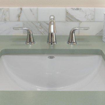
Creating a forever home requires more than beautiful finishes. It requires thoughtful planning, adaptable design, and spaces that can evolve alongside the people who live in them. This NE Portland remodel combined a complete kitchen transformation with a custom aging-in-place addition, allowing the homeowners to enjoy greater comfort, accessibility, and independence for years to come.
At the heart of the project was a kitchen that no longer served the homeowners' needs. The original space felt cramped and inefficient, with limited countertop workspace, underutilized corner storage, and numerous circulation pinch points. An awkward dining nook offered little functionality, while a soffit ceiling unnecessarily reduced cabinet height and valuable storage potential. Even simple everyday tasks were becoming increasingly challenging within the confined layout.
Through a comprehensive design-build approach, the kitchen was completely reimagined to improve both function and flow. While maintaining the existing sink and range locations to maximize budget efficiency, the layout was strategically redesigned to create significantly more usable workspace and storage. A previously wasted corner now houses a functional lazy Susan, the dishwasher was relocated beside the sink for improved workflow, and custom cabinet solutions provide dedicated storage for spices, oils, pots, and pans. Replacing the former sliding glass door with a window allowed for an expansive L-shaped countertop and cabinetry run, transforming the former dining nook into a highly functional extension of the kitchen.
The updated material palette reflects a warm Northwest aesthetic. Lightly stained cabinetry, a timeless cream subway tile backsplash, and crisp white trim create an inviting foundation, while durable luxury vinyl tile flooring offers the appearance of natural stone with the comfort, resiliency, and water resistance needed for everyday living. A robin's egg blue granite composite sink, chosen in the homeowner's favorite color, introduces a playful yet sophisticated focal point within the otherwise neutral space. Preserving the home's original archway helped maintain architectural character while seamlessly connecting the renovated spaces.
Equally transformative was the addition of a 441-square-foot aging-in-place suite designed to support long-term independence while feeling fully integrated with the existing home. Built off the dining room, the addition provides a future-ready living environment that can function as a private primary suite should mobility challenges arise. Covered pathways connect the home and detached garage, while a sheltered accessibility ramp offers an alternative entrance, ensuring safe and convenient access regardless of weather conditions.
Inside, universal design principles guided every decision. The spacious bedroom comfortably accommodates sleeping and sitting areas while allowing room for mobility aids if needed in the future. A walk-in closet includes a secondary laundry area with side-by-side washer and dryer access, eliminating the need to navigate basement stairs for essential daily tasks.
The bathroom was thoughtfully designed to support changing mobility needs without sacrificing style. A generous vanity provides knee clearance for seated use, while the layout includes ample transfer space around the toilet for accessibility. The oversized curbless shower offers exceptional maneuverability, including space for wheelchair turning radii and future adaptability. Multiple showering options, including a hand shower mounted to a grab bar system, provide flexibility, comfort, and additional support. Integrated grab bars, slip-resistant porcelain tile flooring, and strategic lighting solutions further enhance safety while maintaining a refined residential aesthetic.
Natural light was another priority. A new skylight floods the bathroom with daylight while also providing soft moonlight illumination after dark. An LED medicine cabinet delivers additional task lighting, storage, and nighttime visibility without relying solely on overhead fixtures.
Throughout the addition, careful material selections create continuity with the remodeled kitchen. Warm-toned luxury vinyl plank flooring, coordinating cabinetry finishes, chrome plumbing fixtures, and a soft sage-green quartz countertop contribute to a calming and cohesive environment. On the exterior, matching siding, paint colors, rooflines, and black-framed windows ensure the addition blends seamlessly with the original architecture, making it appear as though it has always been part of the home.
What makes this project especially meaningful is how it balances immediate lifestyle improvements with long-term planning. By incorporating universal design strategies, accessibility features, and aging-in-place considerations into a beautiful and highly functional remodel, the homeowners gained both peace of mind and enhanced everyday living. The result is a home that supports independence, promotes comfort, and remains ready for whatever the future may bring.
 THE Remodel Group
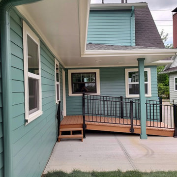
Creating a forever home requires more than beautiful finishes. It requires thoughtful planning, adaptable design, and spaces that can evolve alongside the people who live in them. This NE Portland remodel combined a complete kitchen transformation with a custom aging-in-place addition, allowing the homeowners to enjoy greater comfort, accessibility, and independence for years to come.
At the heart of the project was a kitchen that no longer served the homeowners' needs. The original space felt cramped and inefficient, with limited countertop workspace, underutilized corner storage, and numerous circulation pinch points. An awkward dining nook offered little functionality, while a soffit ceiling unnecessarily reduced cabinet height and valuable storage potential. Even simple everyday tasks were becoming increasingly challenging within the confined layout.
Through a comprehensive design-build approach, the kitchen was completely reimagined to improve both function and flow. While maintaining the existing sink and range locations to maximize budget efficiency, the layout was strategically redesigned to create significantly more usable workspace and storage. A previously wasted corner now houses a functional lazy Susan, the dishwasher was relocated beside the sink for improved workflow, and custom cabinet solutions provide dedicated storage for spices, oils, pots, and pans. Replacing the former sliding glass door with a window allowed for an expansive L-shaped countertop and cabinetry run, transforming the former dining nook into a highly functional extension of the kitchen.
The updated material palette reflects a warm Northwest aesthetic. Lightly stained cabinetry, a timeless cream subway tile backsplash, and crisp white trim create an inviting foundation, while durable luxury vinyl tile flooring offers the appearance of natural stone with the comfort, resiliency, and water resistance needed for everyday living. A robin's egg blue granite composite sink, chosen in the homeowner's favorite color, introduces a playful yet sophisticated focal point within the otherwise neutral space. Preserving the home's original archway helped maintain architectural character while seamlessly connecting the renovated spaces.
Equally transformative was the addition of a 441-square-foot aging-in-place suite designed to support long-term independence while feeling fully integrated with the existing home. Built off the dining room, the addition provides a future-ready living environment that can function as a private primary suite should mobility challenges arise. Covered pathways connect the home and detached garage, while a sheltered accessibility ramp offers an alternative entrance, ensuring safe and convenient access regardless of weather conditions.
Inside, universal design principles guided every decision. The spacious bedroom comfortably accommodates sleeping and sitting areas while allowing room for mobility aids if needed in the future. A walk-in closet includes a secondary laundry area with side-by-side washer and dryer access, eliminating the need to navigate basement stairs for essential daily tasks.
The bathroom was thoughtfully designed to support changing mobility needs without sacrificing style. A generous vanity provides knee clearance for seated use, while the layout includes ample transfer space around the toilet for accessibility. The oversized curbless shower offers exceptional maneuverability, including space for wheelchair turning radii and future adaptability. Multiple showering options, including a hand shower mounted to a grab bar system, provide flexibility, comfort, and additional support. Integrated grab bars, slip-resistant porcelain tile flooring, and strategic lighting solutions further enhance safety while maintaining a refined residential aesthetic.
Natural light was another priority. A new skylight floods the bathroom with daylight while also providing soft moonlight illumination after dark. An LED medicine cabinet delivers additional task lighting, storage, and nighttime visibility without relying solely on overhead fixtures.
Throughout the addition, careful material selections create continuity with the remodeled kitchen. Warm-toned luxury vinyl plank flooring, coordinating cabinetry finishes, chrome plumbing fixtures, and a soft sage-green quartz countertop contribute to a calming and cohesive environment. On the exterior, matching siding, paint colors, rooflines, and black-framed windows ensure the addition blends seamlessly with the original architecture, making it appear as though it has always been part of the home.
What makes this project especially meaningful is how it balances immediate lifestyle improvements with long-term planning. By incorporating universal design strategies, accessibility features, and aging-in-place considerations into a beautiful and highly functional remodel, the homeowners gained both peace of mind and enhanced everyday living. The result is a home that supports independence, promotes comfort, and remains ready for whatever the future may bring.
Find the right local pro for your project

 SunSwallow Design, LLC
The clients called me on the recommendation from a neighbor of mine who had met them at a conference and learned of their need for an architect. They contacted me and after meeting to discuss their project they invited me to visit their site, not far from White Salmon in Washington State.
Initially, the couple discussed building a ‘Weekend’ retreat on their 20± acres of land. Their site was in the foothills of a range of mountains that offered views of both Mt. Adams to the North and Mt. Hood to the South. They wanted to develop a place that was ‘cabin-like’ but with a degree of refinement to it and take advantage of the primary views to the north, south and west. They also wanted to have a strong connection to their immediate outdoors.
Before long my clients came to the conclusion that they no longer perceived this as simply a weekend retreat but were now interested in making this their primary residence. With this new focus we concentrated on keeping the refined cabin approach but needed to add some additional functions and square feet to the original program.
They wanted to downsize from their current 3,500± SF city residence to a more modest 2,000 – 2,500 SF space. They desired a singular open Living, Dining and Kitchen area but needed to have a separate room for their television and upright piano. They were empty nesters and wanted only two bedrooms and decided that they would have two ‘Master’ bedrooms, one on the lower floor and the other on the upper floor (they planned to build additional ‘Guest’ cabins to accommodate others in the near future). The original scheme for the weekend retreat was only one floor with the second bedroom tucked away on the north side of the house next to the breezeway opposite of the carport.
Another consideration that we had to resolve was that the particular location that was deemed the best building site had diametrically opposed advantages and disadvantages. The views and primary solar orientations were also the source of the prevailing winds, out of the Southwest.
The resolve was to provide a semi-circular low-profile earth berm on the south/southwest side of the structure to serve as a wind-foil directing the strongest breezes up and over the structure. Because our selected site was in a saddle of land that then sloped off to the south/southwest the combination of the earth berm and the sloping hill would effectively created a ‘nestled’ form allowing the winds rushing up the hillside to shoot over most of the house. This allowed me to keep the favorable orientation to both the views and sun without being completely compromised by the winds.
 THE Remodel Group
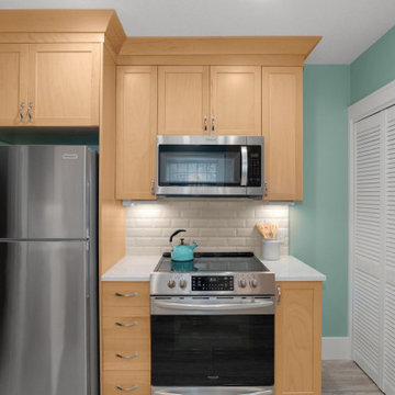
Creating a forever home requires more than beautiful finishes. It requires thoughtful planning, adaptable design, and spaces that can evolve alongside the people who live in them. This NE Portland remodel combined a complete kitchen transformation with a custom aging-in-place addition, allowing the homeowners to enjoy greater comfort, accessibility, and independence for years to come.
At the heart of the project was a kitchen that no longer served the homeowners' needs. The original space felt cramped and inefficient, with limited countertop workspace, underutilized corner storage, and numerous circulation pinch points. An awkward dining nook offered little functionality, while a soffit ceiling unnecessarily reduced cabinet height and valuable storage potential. Even simple everyday tasks were becoming increasingly challenging within the confined layout.
Through a comprehensive design-build approach, the kitchen was completely reimagined to improve both function and flow. While maintaining the existing sink and range locations to maximize budget efficiency, the layout was strategically redesigned to create significantly more usable workspace and storage. A previously wasted corner now houses a functional lazy Susan, the dishwasher was relocated beside the sink for improved workflow, and custom cabinet solutions provide dedicated storage for spices, oils, pots, and pans. Replacing the former sliding glass door with a window allowed for an expansive L-shaped countertop and cabinetry run, transforming the former dining nook into a highly functional extension of the kitchen.
The updated material palette reflects a warm Northwest aesthetic. Lightly stained cabinetry, a timeless cream subway tile backsplash, and crisp white trim create an inviting foundation, while durable luxury vinyl tile flooring offers the appearance of natural stone with the comfort, resiliency, and water resistance needed for everyday living. A robin's egg blue granite composite sink, chosen in the homeowner's favorite color, introduces a playful yet sophisticated focal point within the otherwise neutral space. Preserving the home's original archway helped maintain architectural character while seamlessly connecting the renovated spaces.
Equally transformative was the addition of a 441-square-foot aging-in-place suite designed to support long-term independence while feeling fully integrated with the existing home. Built off the dining room, the addition provides a future-ready living environment that can function as a private primary suite should mobility challenges arise. Covered pathways connect the home and detached garage, while a sheltered accessibility ramp offers an alternative entrance, ensuring safe and convenient access regardless of weather conditions.
Inside, universal design principles guided every decision. The spacious bedroom comfortably accommodates sleeping and sitting areas while allowing room for mobility aids if needed in the future. A walk-in closet includes a secondary laundry area with side-by-side washer and dryer access, eliminating the need to navigate basement stairs for essential daily tasks.
The bathroom was thoughtfully designed to support changing mobility needs without sacrificing style. A generous vanity provides knee clearance for seated use, while the layout includes ample transfer space around the toilet for accessibility. The oversized curbless shower offers exceptional maneuverability, including space for wheelchair turning radii and future adaptability. Multiple showering options, including a hand shower mounted to a grab bar system, provide flexibility, comfort, and additional support. Integrated grab bars, slip-resistant porcelain tile flooring, and strategic lighting solutions further enhance safety while maintaining a refined residential aesthetic.
Natural light was another priority. A new skylight floods the bathroom with daylight while also providing soft moonlight illumination after dark. An LED medicine cabinet delivers additional task lighting, storage, and nighttime visibility without relying solely on overhead fixtures.
Throughout the addition, careful material selections create continuity with the remodeled kitchen. Warm-toned luxury vinyl plank flooring, coordinating cabinetry finishes, chrome plumbing fixtures, and a soft sage-green quartz countertop contribute to a calming and cohesive environment. On the exterior, matching siding, paint colors, rooflines, and black-framed windows ensure the addition blends seamlessly with the original architecture, making it appear as though it has always been part of the home.
What makes this project especially meaningful is how it balances immediate lifestyle improvements with long-term planning. By incorporating universal design strategies, accessibility features, and aging-in-place considerations into a beautiful and highly functional remodel, the homeowners gained both peace of mind and enhanced everyday living. The result is a home that supports independence, promotes comfort, and remains ready for whatever the future may bring.

 Daniel Scerri Periti
We were approached with a request to design the furnishings for an existing ‘finished’ apartment. The intention was to move in relatively fast, and the property already had an existing marble floor, kitchen and bathrooms which had to be kept. The property also boasted a fantastic 270 degree view, seen from most of the apartment. The clients had a very important role in the completion of the project. They were very involved during the design process and through various decoration choices. The final design was kept as a rigid guideline when faced with picking out all the different elements.
Once clear of all previous furniture, the space felt cold and bare; so we immediately felt the need for warmth, and raw, natural elements and textures to complement the cold marble floor while visually tying in the design of the whole apartment together.
Since the existing kitchen had a touch of dark walnut stain, we felt this material was one we should add to the palette of materials to contest the stark materials. A raw cement finish was another material we felt would add an interesting contrast and could be used in a variety of ways, from cabinets to walls and ceilings, to tie up the design of various areas of the apartment.
To warm up the living/dining area, keeping the existing marble floor but visually creating zones within the large living/dining area without hindering the flow, a dark timber custom-made soffit, continuous with a floor-to-ceiling drinks cabinet zones the dining area, giving it a degree of much-needed warmth.
The various windows with a stupendous 270 degree view needed to be visually tied together. This was done by introducing a continuous sheer [drape] which also doubled up as a sound-absorbing material along 2 of the 4 walls of the space.
A very large sofa was required to fill up the space correctly, also required for the size of the young family.
Services were integrated within the units and soffits, while a customized design in the corner between the kitchen and the living room took into consideration the viewpoints from the main areas to create a pantry without hindering the flow or views. A strategically placed floor-to-ceiling mirror doubles up the space and extends the view to the inner parts of the apartment.
The daughter’s bedroom was a small challenge in itself, and a fun task, where we wanted to achieve the perception of a cozy niche with its own enclosed reading nook [for reading fairy tales], behind see-through curtains and a custom-ordered wall print sporting the girl’s favorite colors.
The sons’ bedroom had double the requirements in terms of space needed: more wardrobe, more homework desk space, a tv/play station area… “We combined a raised platform area between the boys’ beds to become an area with cushions where the kids can lay down and play, and face a hidden screen behind the homework desk’s sliding back panel for their play station”. The color of the homework desk was chosen in relation to the boys’ ages. A more masculine material palette was chosen for this room, in contrast to the light pastel palette of the girl’s bedroom. Again, this colour can easily be changed over time for a more mature look.
PROJECT DATA:
St. Paul’s Bay, Malta
DESIGN TEAM:
Perit Rebecca Zammit, Perit Daniel Scerri, Elyse Tonna
OTHER CREDITS:
Photography: Tonio Lombardi
Styling : TKS
 Daniel Scerri Periti
We were approached with a request to design the furnishings for an existing ‘finished’ apartment. The intention was to move in relatively fast, and the property already had an existing marble floor, kitchen and bathrooms which had to be kept. The property also boasted a fantastic 270 degree view, seen from most of the apartment. The clients had a very important role in the completion of the project. They were very involved during the design process and through various decoration choices. The final design was kept as a rigid guideline when faced with picking out all the different elements.
Once clear of all previous furniture, the space felt cold and bare; so we immediately felt the need for warmth, and raw, natural elements and textures to complement the cold marble floor while visually tying in the design of the whole apartment together.
Since the existing kitchen had a touch of dark walnut stain, we felt this material was one we should add to the palette of materials to contest the stark materials. A raw cement finish was another material we felt would add an interesting contrast and could be used in a variety of ways, from cabinets to walls and ceilings, to tie up the design of various areas of the apartment.
To warm up the living/dining area, keeping the existing marble floor but visually creating zones within the large living/dining area without hindering the flow, a dark timber custom-made soffit, continuous with a floor-to-ceiling drinks cabinet zones the dining area, giving it a degree of much-needed warmth.
The various windows with a stupendous 270 degree view needed to be visually tied together. This was done by introducing a continuous sheer [drape] which also doubled up as a sound-absorbing material along 2 of the 4 walls of the space.
A very large sofa was required to fill up the space correctly, also required for the size of the young family.
Services were integrated within the units and soffits, while a customized design in the corner between the kitchen and the living room took into consideration the viewpoints from the main areas to create a pantry without hindering the flow or views. A strategically placed floor-to-ceiling mirror doubles up the space and extends the view to the inner parts of the apartment.
The daughter’s bedroom was a small challenge in itself, and a fun task, where we wanted to achieve the perception of a cozy niche with its own enclosed reading nook [for reading fairy tales], behind see-through curtains and a custom-ordered wall print sporting the girl’s favorite colors.
The sons’ bedroom had double the requirements in terms of space needed: more wardrobe, more homework desk space, a tv/play station area… “We combined a raised platform area between the boys’ beds to become an area with cushions where the kids can lay down and play, and face a hidden screen behind the homework desk’s sliding back panel for their play station”. The color of the homework desk was chosen in relation to the boys’ ages. A more masculine material palette was chosen for this room, in contrast to the light pastel palette of the girl’s bedroom. Again, this colour can easily be changed over time for a more mature look.
PROJECT DATA:
St. Paul’s Bay, Malta
DESIGN TEAM:
Perit Rebecca Zammit, Perit Daniel Scerri, Elyse Tonna
OTHER CREDITS:
Photography: Tonio Lombardi
Styling : TKS
Sponsored
Delaware, OH

Buckeye Basements, Inc.
Central Ohio's Basement Finishing ExpertsBest Of Houzz '13-'21
 Daniel Scerri Periti
We were approached with a request to design the furnishings for an existing ‘finished’ apartment. The intention was to move in relatively fast, and the property already had an existing marble floor, kitchen and bathrooms which had to be kept. The property also boasted a fantastic 270 degree view, seen from most of the apartment. The clients had a very important role in the completion of the project. They were very involved during the design process and through various decoration choices. The final design was kept as a rigid guideline when faced with picking out all the different elements.
Once clear of all previous furniture, the space felt cold and bare; so we immediately felt the need for warmth, and raw, natural elements and textures to complement the cold marble floor while visually tying in the design of the whole apartment together.
Since the existing kitchen had a touch of dark walnut stain, we felt this material was one we should add to the palette of materials to contest the stark materials. A raw cement finish was another material we felt would add an interesting contrast and could be used in a variety of ways, from cabinets to walls and ceilings, to tie up the design of various areas of the apartment.
To warm up the living/dining area, keeping the existing marble floor but visually creating zones within the large living/dining area without hindering the flow, a dark timber custom-made soffit, continuous with a floor-to-ceiling drinks cabinet zones the dining area, giving it a degree of much-needed warmth.
The various windows with a stupendous 270 degree view needed to be visually tied together. This was done by introducing a continuous sheer [drape] which also doubled up as a sound-absorbing material along 2 of the 4 walls of the space.
A very large sofa was required to fill up the space correctly, also required for the size of the young family.
Services were integrated within the units and soffits, while a customized design in the corner between the kitchen and the living room took into consideration the viewpoints from the main areas to create a pantry without hindering the flow or views. A strategically placed floor-to-ceiling mirror doubles up the space and extends the view to the inner parts of the apartment.
The daughter’s bedroom was a small challenge in itself, and a fun task, where we wanted to achieve the perception of a cozy niche with its own enclosed reading nook [for reading fairy tales], behind see-through curtains and a custom-ordered wall print sporting the girl’s favorite colors.
The sons’ bedroom had double the requirements in terms of space needed: more wardrobe, more homework desk space, a tv/play station area… “We combined a raised platform area between the boys’ beds to become an area with cushions where the kids can lay down and play, and face a hidden screen behind the homework desk’s sliding back panel for their play station”. The color of the homework desk was chosen in relation to the boys’ ages. A more masculine material palette was chosen for this room, in contrast to the light pastel palette of the girl’s bedroom. Again, this colour can easily be changed over time for a more mature look.
PROJECT DATA:
St. Paul’s Bay, Malta
DESIGN TEAM:
Perit Rebecca Zammit, Perit Daniel Scerri, Elyse Tonna
OTHER CREDITS:
Photography: Tonio Lombardi
Styling : TKS
 Simply Perfect
With Pinterest, Houzz and HGTV, homeowners have more sources for inspiration than ever before. You may have found, however, that replicating what you see online or on TV isn’t always that simple. Mastering proportion and scale can be especially challenging.
Let’s say you fall in love with an oversized vase which looks like it will fit with the colors and textures in your living room. But once it’s there, the vase doesn’t look the way you expected and you don’t know now to make it work.
Fortunately, designers are experienced not only in dealing with proportion and scale, but in handling multiple elements at once.
In the meantime, here are a few tips to help you understand some of the considerations regarding size.
Proportion Tips
1. Less is more
In the home shown here, the rooms are on the smaller side, where it would seem counterintuitive to use oversized pieces. But using smaller pieces can look busy—and can actually make the rooms feel smaller, especially when you add personal belongings to the space.
2. Keep it simple
Several oversized pieces can create clean, simple lines. We put this principle to work using oversized items as anchors on both sides of the fireplace in the living room.
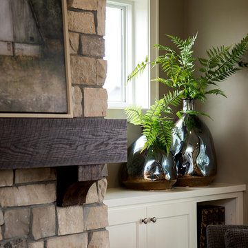
On one side, we have two oversized blown-glass vases with amber, silver and purple tones. The irregular shapes in these beautiful pieces create interest and contrast; you can see through them and you can see the room reflected in them.
On the other side of the fireplace sit two oversized brass lanterns filled with driftwood and greenery; the contents can be switched out seasonally, as well.
The vases on one side and lanterns on the other side establish pattern (two of each, in descending order), balance and simplicity.
3. Embrace the unexpected
On the mantle above the fireplace rests another oversized piece—a painting of a barn. Its neutral colors pick up the tones in the stone behind it and again, it works to bring simplicity to the space, rather than overly fussy detail.
Nearby, just up the stairs, is an unusually spacious landing. A bench and pillows transform it into a special reading or conversation spot. The pair of hammered nickel vases on the window sill repeats the pattern established on either side of the fireplace. Using oversized vases in lieu of a window treatment is unexpected—as is incorporating sleek, modern-shaped vases like these in a farmhouse-style home. Yet because of the other oversized objects nearby, the vases feel distinctive and delightful.
4. Coordinate pattern and rhythm
Another oversized item is the table lamp in the living room. It’s a powerful light; aside from the overhead can lights, it’s the room’s only light source. The ridges on its ceramic base echo the pieces of wicker in the stunning basket behind the sofa.
This oversized wicker basket, which we’re a bit in love with, features a very large weave along with elegant leather straps. It’s ideal for storing throws, cushions, board games or anything else you want out of sight.
5. Proximity matters
This home’s dining room is just to the right of the entry. An immense floor mirror—double-framed in weathered wood—is placed opposite the front windows. Measuring seven feet high, it’s a bold piece. And it works perfectly in this space to reflect light and make the room feel larger.
An oversized ceramic vase, with a porous, matte-stone finish, sits atop a table next to the mirror. Other regular-sized items share the small table, including a bottle of wine and a glass vase. But because of the enormous mirror, it was important to have one oversized item on that table, for balance.
 Ernest M. Ferizi
German Embassy in Pristina - Kosovo, contracted the architecture office “Ferizi + Ferizi Architects” to plan and implement an Annex Office building for their purposes. As detached part of this building is designed the waiting area, as alone standing structure.
This Office Building is constructed by assembling of Eight used office containers that were delivered on trucks and set up after only a few hours on the basis of the LEGO principle, according to the planning on strip foundations.
By removing the flexible exterior wall panels, a large room of 115 m² was created, with the counter wall as a room partition between two office spaces, each with seven workstations as well as three counters for agents on one side and a room for visitors on the other side.
With this system, room solutions can be easily implemented in all dimensions.
The container, seen as a geometric shape, is a simple, octagonal, solid box.
The standardized perfection of its dimensions is striking: 2.44 meters wide, 2.59 meters high and 6.06 meters or 12.19 meters long.
Since its introduction in 1956 by the American transport entrepreneur Malcom McLean, the container has become a standardized transport module worldwide, whether on ships, trucks or construction sites.
The shipping containers have additionally revolutionized the transport industry, pushed the globalization noticeably, and thus directly or indirectly influenced all our lives.
But after only a few years, when the first overseas containers wore out, many engineers recognized the positive properties of used shipping containers for building houses, especially since they are robust, flexible, multifunctional and second-hand relatively inexpensive to purchase. The time has long passed by to treat containers exclusively as transport objects.
As a "measure of all things", containers can hardly be ignored in construction.
Their use is no longer limited to temporary use since school containers, information containers, office containers or entire residential buildings are now part of our everyday life in the construction industry.
However, current examples of the container architecture prove that even the most demanding solutions for container building are feasible. For their specific aesthetic and spatial qualities, containers also serve as design parameters for the development of new forms of architecture and urbanity.
The office building as an extension of the visa section, characterized by modern materials and contemporary aesthetics has been designed and built mainly as a low-energy building.
Extensive insulation to achieve a comfortable and sustainable constant temperature in the interior, high window quality and low energy consumption make the building energy-efficient.
The sophisticated lighting technology, networks, heating systems and air-conditioning systems are also components of this equipment.
It creates an overall harmonic picture and guarantees the highest standard in sustainable construction, taking into consideration the fact that environmentally friendly recycling and reutilization have become an increasingly important issue in our society.
West and East side of the wooden facade is compact and has few openings, while the southern facade is completely open with lot of glass. Its spatial openness ensures a transparent, friendly work environment, which allows a lot of light into the space.
This openness allows an uninterrupted, pleasant and close-to-nature view from interior spaces into the beautiful garden. During the installation of sophisticated light sources in the garden, emphasis was not only put on functionality and security, but also on the beauty of the garden shown through the illumination in the evening.
Large, horizontal white “brisole” serve as external sun protection systems, mounted on the canopies of the entrance areas of the modular construction and the enclosure, adeptly cast shade on these areas and at the same time shape the entire architectural language.
While on one hand, the two quadratic ledges suspended in the air, are docked with steel stairs and match the wooden façade, lead the staff to their office space, the artful modern interior, on the other hand, perfectly unites the functionality, innovative technology, culture and positive effects on the employees' efficiency and wellbeing.
A lot of white, interjected by warm wooden and colored accents, determines the ambience.
In the case of the lighting solution, the mainly linear ceiling lighting is used as the overlapping design element both for the offices of the visa section as well as for the counters and the waiting area for the visitors.
They underline the puristic design in order to create a pleasant light for a desired general illumination and ensure optimal light conditions without causing disturbing reflections on the computer screens.
In addition, precisely positioned pendant luminaires are installed at the workstations, which ensure pleasant room brightness.
In the entrance area, the harmonic and uniform lighting effect from the ground highlights the integration of photography and architecture.
Photographs of landscapes, people, places, expressing unforgettable, impressive moments and memories have been lovingly engraved on 8 x 8cm square oak blocks.
The idea of an effective, impressive environment that stimulates and inspires the work was the premiss on which the whole design concept was based. Consequently, the modular construction was no longer viewed through its history of utilization and scars, but rather as a structure of work ambiance, art and elegance.
FERIZI + FERIZI Architects
Photo: Arben Llapashtica
 Daniel Scerri Periti
We were approached with a request to design the furnishings for an existing ‘finished’ apartment. The intention was to move in relatively fast, and the property already had an existing marble floor, kitchen and bathrooms which had to be kept. The property also boasted a fantastic 270 degree view, seen from most of the apartment. The clients had a very important role in the completion of the project. They were very involved during the design process and through various decoration choices. The final design was kept as a rigid guideline when faced with picking out all the different elements.
Once clear of all previous furniture, the space felt cold and bare; so we immediately felt the need for warmth, and raw, natural elements and textures to complement the cold marble floor while visually tying in the design of the whole apartment together.
Since the existing kitchen had a touch of dark walnut stain, we felt this material was one we should add to the palette of materials to contest the stark materials. A raw cement finish was another material we felt would add an interesting contrast and could be used in a variety of ways, from cabinets to walls and ceilings, to tie up the design of various areas of the apartment.
To warm up the living/dining area, keeping the existing marble floor but visually creating zones within the large living/dining area without hindering the flow, a dark timber custom-made soffit, continuous with a floor-to-ceiling drinks cabinet zones the dining area, giving it a degree of much-needed warmth.
The various windows with a stupendous 270 degree view needed to be visually tied together. This was done by introducing a continuous sheer [drape] which also doubled up as a sound-absorbing material along 2 of the 4 walls of the space.
A very large sofa was required to fill up the space correctly, also required for the size of the young family.
Services were integrated within the units and soffits, while a customized design in the corner between the kitchen and the living room took into consideration the viewpoints from the main areas to create a pantry without hindering the flow or views. A strategically placed floor-to-ceiling mirror doubles up the space and extends the view to the inner parts of the apartment.
The daughter’s bedroom was a small challenge in itself, and a fun task, where we wanted to achieve the perception of a cozy niche with its own enclosed reading nook [for reading fairy tales], behind see-through curtains and a custom-ordered wall print sporting the girl’s favorite colors.
The sons’ bedroom had double the requirements in terms of space needed: more wardrobe, more homework desk space, a tv/play station area… “We combined a raised platform area between the boys’ beds to become an area with cushions where the kids can lay down and play, and face a hidden screen behind the homework desk’s sliding back panel for their play station”. The color of the homework desk was chosen in relation to the boys’ ages. A more masculine material palette was chosen for this room, in contrast to the light pastel palette of the girl’s bedroom. Again, this colour can easily be changed over time for a more mature look.
PROJECT DATA:
St. Paul’s Bay, Malta
DESIGN TEAM:
Perit Rebecca Zammit, Perit Daniel Scerri, Elyse Tonna
OTHER CREDITS:
Photography: Tonio Lombardi
Styling : TKS
 Daniel Scerri Periti
We were approached with a request to design the furnishings for an existing ‘finished’ apartment. The intention was to move in relatively fast, and the property already had an existing marble floor, kitchen and bathrooms which had to be kept. The property also boasted a fantastic 270 degree view, seen from most of the apartment. The clients had a very important role in the completion of the project. They were very involved during the design process and through various decoration choices. The final design was kept as a rigid guideline when faced with picking out all the different elements.
Once clear of all previous furniture, the space felt cold and bare; so we immediately felt the need for warmth, and raw, natural elements and textures to complement the cold marble floor while visually tying in the design of the whole apartment together.
Since the existing kitchen had a touch of dark walnut stain, we felt this material was one we should add to the palette of materials to contest the stark materials. A raw cement finish was another material we felt would add an interesting contrast and could be used in a variety of ways, from cabinets to walls and ceilings, to tie up the design of various areas of the apartment.
To warm up the living/dining area, keeping the existing marble floor but visually creating zones within the large living/dining area without hindering the flow, a dark timber custom-made soffit, continuous with a floor-to-ceiling drinks cabinet zones the dining area, giving it a degree of much-needed warmth.
The various windows with a stupendous 270 degree view needed to be visually tied together. This was done by introducing a continuous sheer [drape] which also doubled up as a sound-absorbing material along 2 of the 4 walls of the space.
A very large sofa was required to fill up the space correctly, also required for the size of the young family.
Services were integrated within the units and soffits, while a customized design in the corner between the kitchen and the living room took into consideration the viewpoints from the main areas to create a pantry without hindering the flow or views. A strategically placed floor-to-ceiling mirror doubles up the space and extends the view to the inner parts of the apartment.
The daughter’s bedroom was a small challenge in itself, and a fun task, where we wanted to achieve the perception of a cozy niche with its own enclosed reading nook [for reading fairy tales], behind see-through curtains and a custom-ordered wall print sporting the girl’s favorite colors.
The sons’ bedroom had double the requirements in terms of space needed: more wardrobe, more homework desk space, a tv/play station area… “We combined a raised platform area between the boys’ beds to become an area with cushions where the kids can lay down and play, and face a hidden screen behind the homework desk’s sliding back panel for their play station”. The color of the homework desk was chosen in relation to the boys’ ages. A more masculine material palette was chosen for this room, in contrast to the light pastel palette of the girl’s bedroom. Again, this colour can easily be changed over time for a more mature look.
PROJECT DATA:
St. Paul’s Bay, Malta
DESIGN TEAM:
Perit Rebecca Zammit, Perit Daniel Scerri, Elyse Tonna
OTHER CREDITS:
Photography: Tonio Lombardi
Styling : TKS
 Ernest M. Ferizi
German Embassy in Pristina - Kosovo, contracted the architecture office “Ferizi + Ferizi Architects” to plan and implement an Annex Office building for their purposes. As detached part of this building is designed the waiting area, as alone standing structure.
This Office Building is constructed by assembling of Eight used office containers that were delivered on trucks and set up after only a few hours on the basis of the LEGO principle, according to the planning on strip foundations.
By removing the flexible exterior wall panels, a large room of 115 m² was created, with the counter wall as a room partition between two office spaces, each with seven workstations as well as three counters for agents on one side and a room for visitors on the other side.
With this system, room solutions can be easily implemented in all dimensions.
The container, seen as a geometric shape, is a simple, octagonal, solid box.
The standardized perfection of its dimensions is striking: 2.44 meters wide, 2.59 meters high and 6.06 meters or 12.19 meters long.
Since its introduction in 1956 by the American transport entrepreneur Malcom McLean, the container has become a standardized transport module worldwide, whether on ships, trucks or construction sites.
The shipping containers have additionally revolutionized the transport industry, pushed the globalization noticeably, and thus directly or indirectly influenced all our lives.
But after only a few years, when the first overseas containers wore out, many engineers recognized the positive properties of used shipping containers for building houses, especially since they are robust, flexible, multifunctional and second-hand relatively inexpensive to purchase. The time has long passed by to treat containers exclusively as transport objects.
As a "measure of all things", containers can hardly be ignored in construction.
Their use is no longer limited to temporary use since school containers, information containers, office containers or entire residential buildings are now part of our everyday life in the construction industry.
However, current examples of the container architecture prove that even the most demanding solutions for container building are feasible. For their specific aesthetic and spatial qualities, containers also serve as design parameters for the development of new forms of architecture and urbanity.
The office building as an extension of the visa section, characterized by modern materials and contemporary aesthetics has been designed and built mainly as a low-energy building.
Extensive insulation to achieve a comfortable and sustainable constant temperature in the interior, high window quality and low energy consumption make the building energy-efficient.
The sophisticated lighting technology, networks, heating systems and air-conditioning systems are also components of this equipment.
It creates an overall harmonic picture and guarantees the highest standard in sustainable construction, taking into consideration the fact that environmentally friendly recycling and reutilization have become an increasingly important issue in our society.
West and East side of the wooden facade is compact and has few openings, while the southern facade is completely open with lot of glass. Its spatial openness ensures a transparent, friendly work environment, which allows a lot of light into the space.
This openness allows an uninterrupted, pleasant and close-to-nature view from interior spaces into the beautiful garden. During the installation of sophisticated light sources in the garden, emphasis was not only put on functionality and security, but also on the beauty of the garden shown through the illumination in the evening.
Large, horizontal white “brisole” serve as external sun protection systems, mounted on the canopies of the entrance areas of the modular construction and the enclosure, adeptly cast shade on these areas and at the same time shape the entire architectural language.
While on one hand, the two quadratic ledges suspended in the air, are docked with steel stairs and match the wooden façade, lead the staff to their office space, the artful modern interior, on the other hand, perfectly unites the functionality, innovative technology, culture and positive effects on the employees' efficiency and wellbeing.
A lot of white, interjected by warm wooden and colored accents, determines the ambience.
In the case of the lighting solution, the mainly linear ceiling lighting is used as the overlapping design element both for the offices of the visa section as well as for the counters and the waiting area for the visitors.
They underline the puristic design in order to create a pleasant light for a desired general illumination and ensure optimal light conditions without causing disturbing reflections on the computer screens.
In addition, precisely positioned pendant luminaires are installed at the workstations, which ensure pleasant room brightness.
In the entrance area, the harmonic and uniform lighting effect from the ground highlights the integration of photography and architecture.
Photographs of landscapes, people, places, expressing unforgettable, impressive moments and memories have been lovingly engraved on 8 x 8cm square oak blocks.
The idea of an effective, impressive environment that stimulates and inspires the work was the premiss on which the whole design concept was based. Consequently, the modular construction was no longer viewed through its history of utilization and scars, but rather as a structure of work ambiance, art and elegance.
FERIZI + FERIZI Architects
Photo: Arben Llapashtica
Sponsored
Delaware, OH
Buckeye Basements, Inc.
Central Ohio's Basement Finishing ExpertsBest Of Houzz '13-'21
 Drury Design
The Setup
The homeowners of this Barrington Hills residence approached Drury Design with a clear vision: transform their existing kitchen into a space that would better serve their active family of four. With two young children who are homeschooled and love to bake with their mom, plus two dogs, this kitchen needed to function as the true heart of the home.
The existing kitchen was functional but didn’t maximize the potential of the beautiful natural light and scenic views available through the floor-to-ceiling windows. The space was locked between the dining room and family room, which limited structural modifications, but the homeowners wanted to create a more family-friendly environment that would complement the warm walnut built-ins and furnishings in the adjacent dining room while staying true to the home’s overall aesthetic.
Design Objectives:
Create a highly functional workspace that accommodates multiple family members cooking and gathering simultaneously
Maximize the connection to the beautiful outdoor scenery and natural light through thoughtful design choices
Establish a cohesive color palette that complements the existing walnut elements in the adjacent dining room without becoming too tone-on-tone (aka “matchy matchy”)
Improve the seating arrangement to take advantage of the stunning views (rather than facing away from the windows)
Work within the existing architectural constraints, including a curved soffit that could not be removed
Increase storage capacity while maintaining clean, uncluttered sightlines throughout the space
Design Challenges:
The curved soffit presented a design dilemma of whether to echo the curve throughout the kitchen or work with it in a more subtle way
The relatively low ceiling height required careful consideration to avoid making the space feel cramped or cave-like
The existing hardwood floor could not be refinished, which meant the new kitchen footprint had to match or exceed the original layout exactly
Finding the right balance of warm and neutral tones to complement both the existing walnut elements nearby and the natural outdoor views proved challenging
The refrigerator placement was constrained by door swing requirements, which affected the entire layout and prevented centering the sink on the back wall
Rethinking the original seating, which faced inward toward the kitchen (turning backs to the beautiful windows and outdoor views)
Pendant lighting from the previous kitchen obstructed views to the outdoors despite the abundant natural light available
The Renewed Space
Design Solutions:
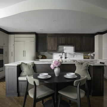
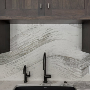
The curved soffit was embraced subtly through the full slab backsplash, which echoes the curve without requiring curved cabinetry or architectural elements that might feel forced
Low ceiling challenges were addressed by using lighter painted cabinets for some tall elements, including the double oven, pantries, and refrigerator area, creating an airy feel while reserving the darker stained walnut for the center section and island
The floor constraint was managed by designing the new layout to cover all previously unfinished areas while maintaining the exact footprint, with only minor touch-ups needed in a few areas
The color palette balances warm walnut stain (harmonizing with the dining room built-ins) with soft, neutral painted cabinets – avoiding stark white that wouldn’t complement the home’s warm aesthetic
Refrigerator placement was optimized with a slim pullout pantry to the left, allowing proper door clearance while maintaining the desired layout flow and enabling the main pantry to be positioned adjacently
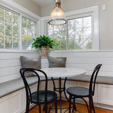
The seating was completely reimagined with a built-in banquette facing the windows, allowing diners to enjoy the outdoor views while providing flexible seating for two to four people
Decorative pendant lighting was eliminated in favor of recessed can lights, preserving the unobstructed views to the beautiful outdoor scenery
This kitchen transformation demonstrates how thoughtful design can dramatically improve functionality for a busy family while honoring existing architectural elements. The children immediately began cooking and baking with their mother in the new space, and the window-facing banquette has become a favorite gathering spot where the family can enjoy both meals and the beautiful outdoor views.
 Daniel Scerri Periti
We were approached with a request to design the furnishings for an existing ‘finished’ apartment. The intention was to move in relatively fast, and the property already had an existing marble floor, kitchen and bathrooms which had to be kept. The property also boasted a fantastic 270 degree view, seen from most of the apartment. The clients had a very important role in the completion of the project. They were very involved during the design process and through various decoration choices. The final design was kept as a rigid guideline when faced with picking out all the different elements.
Once clear of all previous furniture, the space felt cold and bare; so we immediately felt the need for warmth, and raw, natural elements and textures to complement the cold marble floor while visually tying in the design of the whole apartment together.
Since the existing kitchen had a touch of dark walnut stain, we felt this material was one we should add to the palette of materials to contest the stark materials. A raw cement finish was another material we felt would add an interesting contrast and could be used in a variety of ways, from cabinets to walls and ceilings, to tie up the design of various areas of the apartment.
To warm up the living/dining area, keeping the existing marble floor but visually creating zones within the large living/dining area without hindering the flow, a dark timber custom-made soffit, continuous with a floor-to-ceiling drinks cabinet zones the dining area, giving it a degree of much-needed warmth.
The various windows with a stupendous 270 degree view needed to be visually tied together. This was done by introducing a continuous sheer [drape] which also doubled up as a sound-absorbing material along 2 of the 4 walls of the space.
A very large sofa was required to fill up the space correctly, also required for the size of the young family.
Services were integrated within the units and soffits, while a customized design in the corner between the kitchen and the living room took into consideration the viewpoints from the main areas to create a pantry without hindering the flow or views. A strategically placed floor-to-ceiling mirror doubles up the space and extends the view to the inner parts of the apartment.
The daughter’s bedroom was a small challenge in itself, and a fun task, where we wanted to achieve the perception of a cozy niche with its own enclosed reading nook [for reading fairy tales], behind see-through curtains and a custom-ordered wall print sporting the girl’s favorite colors.
The sons’ bedroom had double the requirements in terms of space needed: more wardrobe, more homework desk space, a tv/play station area… “We combined a raised platform area between the boys’ beds to become an area with cushions where the kids can lay down and play, and face a hidden screen behind the homework desk’s sliding back panel for their play station”. The color of the homework desk was chosen in relation to the boys’ ages. A more masculine material palette was chosen for this room, in contrast to the light pastel palette of the girl’s bedroom. Again, this colour can easily be changed over time for a more mature look.
PROJECT DATA:
St. Paul’s Bay, Malta
DESIGN TEAM:
Perit Rebecca Zammit, Perit Daniel Scerri, Elyse Tonna
OTHER CREDITS:
Photography: Tonio Lombardi
Styling : TKS
 Drury Design
The Setup
The homeowners of this Barrington Hills residence approached Drury Design with a clear vision: transform their existing kitchen into a space that would better serve their active family of four. With two young children who are homeschooled and love to bake with their mom, plus two dogs, this kitchen needed to function as the true heart of the home.
The existing kitchen was functional but didn’t maximize the potential of the beautiful natural light and scenic views available through the floor-to-ceiling windows. The space was locked between the dining room and family room, which limited structural modifications, but the homeowners wanted to create a more family-friendly environment that would complement the warm walnut built-ins and furnishings in the adjacent dining room while staying true to the home’s overall aesthetic.
Design Objectives:
Create a highly functional workspace that accommodates multiple family members cooking and gathering simultaneously
Maximize the connection to the beautiful outdoor scenery and natural light through thoughtful design choices
Establish a cohesive color palette that complements the existing walnut elements in the adjacent dining room without becoming too tone-on-tone (aka “matchy matchy”)
Improve the seating arrangement to take advantage of the stunning views (rather than facing away from the windows)
Work within the existing architectural constraints, including a curved soffit that could not be removed
Increase storage capacity while maintaining clean, uncluttered sightlines throughout the space
Design Challenges:
The curved soffit presented a design dilemma of whether to echo the curve throughout the kitchen or work with it in a more subtle way
The relatively low ceiling height required careful consideration to avoid making the space feel cramped or cave-like
The existing hardwood floor could not be refinished, which meant the new kitchen footprint had to match or exceed the original layout exactly
Finding the right balance of warm and neutral tones to complement both the existing walnut elements nearby and the natural outdoor views proved challenging
The refrigerator placement was constrained by door swing requirements, which affected the entire layout and prevented centering the sink on the back wall
Rethinking the original seating, which faced inward toward the kitchen (turning backs to the beautiful windows and outdoor views)
Pendant lighting from the previous kitchen obstructed views to the outdoors despite the abundant natural light available
The Renewed Space
Design Solutions:
The curved soffit was embraced subtly through the full slab backsplash, which echoes the curve without requiring curved cabinetry or architectural elements that might feel forced
Low ceiling challenges were addressed by using lighter painted cabinets for some tall elements, including the double oven, pantries, and refrigerator area, creating an airy feel while reserving the darker stained walnut for the center section and island
The floor constraint was managed by designing the new layout to cover all previously unfinished areas while maintaining the exact footprint, with only minor touch-ups needed in a few areas
The color palette balances warm walnut stain (harmonizing with the dining room built-ins) with soft, neutral painted cabinets – avoiding stark white that wouldn’t complement the home’s warm aesthetic
Refrigerator placement was optimized with a slim pullout pantry to the left, allowing proper door clearance while maintaining the desired layout flow and enabling the main pantry to be positioned adjacently
The seating was completely reimagined with a built-in banquette facing the windows, allowing diners to enjoy the outdoor views while providing flexible seating for two to four people
Decorative pendant lighting was eliminated in favor of recessed can lights, preserving the unobstructed views to the beautiful outdoor scenery
This kitchen transformation demonstrates how thoughtful design can dramatically improve functionality for a busy family while honoring existing architectural elements. The children immediately began cooking and baking with their mother in the new space, and the window-facing banquette has become a favorite gathering spot where the family can enjoy both meals and the beautiful outdoor views.
 Drury Design
The Setup
The homeowners of this Barrington Hills residence approached Drury Design with a clear vision: transform their existing kitchen into a space that would better serve their active family of four. With two young children who are homeschooled and love to bake with their mom, plus two dogs, this kitchen needed to function as the true heart of the home.
The existing kitchen was functional but didn’t maximize the potential of the beautiful natural light and scenic views available through the floor-to-ceiling windows. The space was locked between the dining room and family room, which limited structural modifications, but the homeowners wanted to create a more family-friendly environment that would complement the warm walnut built-ins and furnishings in the adjacent dining room while staying true to the home’s overall aesthetic.
Design Objectives:
Create a highly functional workspace that accommodates multiple family members cooking and gathering simultaneously
Maximize the connection to the beautiful outdoor scenery and natural light through thoughtful design choices
Establish a cohesive color palette that complements the existing walnut elements in the adjacent dining room without becoming too tone-on-tone (aka “matchy matchy”)
Improve the seating arrangement to take advantage of the stunning views (rather than facing away from the windows)
Work within the existing architectural constraints, including a curved soffit that could not be removed
Increase storage capacity while maintaining clean, uncluttered sightlines throughout the space
Design Challenges:
The curved soffit presented a design dilemma of whether to echo the curve throughout the kitchen or work with it in a more subtle way
The relatively low ceiling height required careful consideration to avoid making the space feel cramped or cave-like
The existing hardwood floor could not be refinished, which meant the new kitchen footprint had to match or exceed the original layout exactly
Finding the right balance of warm and neutral tones to complement both the existing walnut elements nearby and the natural outdoor views proved challenging
The refrigerator placement was constrained by door swing requirements, which affected the entire layout and prevented centering the sink on the back wall
Rethinking the original seating, which faced inward toward the kitchen (turning backs to the beautiful windows and outdoor views)
Pendant lighting from the previous kitchen obstructed views to the outdoors despite the abundant natural light available
The Renewed Space
Design Solutions:
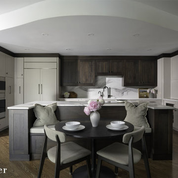
The curved soffit was embraced subtly through the full slab backsplash, which echoes the curve without requiring curved cabinetry or architectural elements that might feel forced
Low ceiling challenges were addressed by using lighter painted cabinets for some tall elements, including the double oven, pantries, and refrigerator area, creating an airy feel while reserving the darker stained walnut for the center section and island
The floor constraint was managed by designing the new layout to cover all previously unfinished areas while maintaining the exact footprint, with only minor touch-ups needed in a few areas
The color palette balances warm walnut stain (harmonizing with the dining room built-ins) with soft, neutral painted cabinets – avoiding stark white that wouldn’t complement the home’s warm aesthetic
Refrigerator placement was optimized with a slim pullout pantry to the left, allowing proper door clearance while maintaining the desired layout flow and enabling the main pantry to be positioned adjacently
The seating was completely reimagined with a built-in banquette facing the windows, allowing diners to enjoy the outdoor views while providing flexible seating for two to four people
Decorative pendant lighting was eliminated in favor of recessed can lights, preserving the unobstructed views to the beautiful outdoor scenery
This kitchen transformation demonstrates how thoughtful design can dramatically improve functionality for a busy family while honoring existing architectural elements. The children immediately began cooking and baking with their mother in the new space, and the window-facing banquette has become a favorite gathering spot where the family can enjoy both meals and the beautiful outdoor views.
Sponsored
Columbus, OH

Hope Restoration & General Contracting
Columbus Design-Build, Kitchen & Bath Remodeling, Historic Renovations
 Drury Design
The Setup
The homeowners of this Barrington Hills residence approached Drury Design with a clear vision: transform their existing kitchen into a space that would better serve their active family of four. With two young children who are homeschooled and love to bake with their mom, plus two dogs, this kitchen needed to function as the true heart of the home.
The existing kitchen was functional but didn’t maximize the potential of the beautiful natural light and scenic views available through the floor-to-ceiling windows. The space was locked between the dining room and family room, which limited structural modifications, but the homeowners wanted to create a more family-friendly environment that would complement the warm walnut built-ins and furnishings in the adjacent dining room while staying true to the home’s overall aesthetic.
Design Objectives:
Create a highly functional workspace that accommodates multiple family members cooking and gathering simultaneously
Maximize the connection to the beautiful outdoor scenery and natural light through thoughtful design choices
Establish a cohesive color palette that complements the existing walnut elements in the adjacent dining room without becoming too tone-on-tone (aka “matchy matchy”)
Improve the seating arrangement to take advantage of the stunning views (rather than facing away from the windows)
Work within the existing architectural constraints, including a curved soffit that could not be removed
Increase storage capacity while maintaining clean, uncluttered sightlines throughout the space
Design Challenges:
The curved soffit presented a design dilemma of whether to echo the curve throughout the kitchen or work with it in a more subtle way
The relatively low ceiling height required careful consideration to avoid making the space feel cramped or cave-like
The existing hardwood floor could not be refinished, which meant the new kitchen footprint had to match or exceed the original layout exactly
Finding the right balance of warm and neutral tones to complement both the existing walnut elements nearby and the natural outdoor views proved challenging
The refrigerator placement was constrained by door swing requirements, which affected the entire layout and prevented centering the sink on the back wall
Rethinking the original seating, which faced inward toward the kitchen (turning backs to the beautiful windows and outdoor views)
Pendant lighting from the previous kitchen obstructed views to the outdoors despite the abundant natural light available
The Renewed Space
Design Solutions:
The curved soffit was embraced subtly through the full slab backsplash, which echoes the curve without requiring curved cabinetry or architectural elements that might feel forced
Low ceiling challenges were addressed by using lighter painted cabinets for some tall elements, including the double oven, pantries, and refrigerator area, creating an airy feel while reserving the darker stained walnut for the center section and island
The floor constraint was managed by designing the new layout to cover all previously unfinished areas while maintaining the exact footprint, with only minor touch-ups needed in a few areas
The color palette balances warm walnut stain (harmonizing with the dining room built-ins) with soft, neutral painted cabinets – avoiding stark white that wouldn’t complement the home’s warm aesthetic
Refrigerator placement was optimized with a slim pullout pantry to the left, allowing proper door clearance while maintaining the desired layout flow and enabling the main pantry to be positioned adjacently
The seating was completely reimagined with a built-in banquette facing the windows, allowing diners to enjoy the outdoor views while providing flexible seating for two to four people
Decorative pendant lighting was eliminated in favor of recessed can lights, preserving the unobstructed views to the beautiful outdoor scenery
This kitchen transformation demonstrates how thoughtful design can dramatically improve functionality for a busy family while honoring existing architectural elements. The children immediately began cooking and baking with their mother in the new space, and the window-facing banquette has become a favorite gathering spot where the family can enjoy both meals and the beautiful outdoor views.
 Drury Design
The Setup
The homeowners of this Barrington Hills residence approached Drury Design with a clear vision: transform their existing kitchen into a space that would better serve their active family of four. With two young children who are homeschooled and love to bake with their mom, plus two dogs, this kitchen needed to function as the true heart of the home.
The existing kitchen was functional but didn’t maximize the potential of the beautiful natural light and scenic views available through the floor-to-ceiling windows. The space was locked between the dining room and family room, which limited structural modifications, but the homeowners wanted to create a more family-friendly environment that would complement the warm walnut built-ins and furnishings in the adjacent dining room while staying true to the home’s overall aesthetic.
Design Objectives:
Create a highly functional workspace that accommodates multiple family members cooking and gathering simultaneously
Maximize the connection to the beautiful outdoor scenery and natural light through thoughtful design choices
Establish a cohesive color palette that complements the existing walnut elements in the adjacent dining room without becoming too tone-on-tone (aka “matchy matchy”)
Improve the seating arrangement to take advantage of the stunning views (rather than facing away from the windows)
Work within the existing architectural constraints, including a curved soffit that could not be removed
Increase storage capacity while maintaining clean, uncluttered sightlines throughout the space
Design Challenges:
The curved soffit presented a design dilemma of whether to echo the curve throughout the kitchen or work with it in a more subtle way
The relatively low ceiling height required careful consideration to avoid making the space feel cramped or cave-like
The existing hardwood floor could not be refinished, which meant the new kitchen footprint had to match or exceed the original layout exactly
Finding the right balance of warm and neutral tones to complement both the existing walnut elements nearby and the natural outdoor views proved challenging
The refrigerator placement was constrained by door swing requirements, which affected the entire layout and prevented centering the sink on the back wall
Rethinking the original seating, which faced inward toward the kitchen (turning backs to the beautiful windows and outdoor views)
Pendant lighting from the previous kitchen obstructed views to the outdoors despite the abundant natural light available
The Renewed Space
Design Solutions:
The curved soffit was embraced subtly through the full slab backsplash, which echoes the curve without requiring curved cabinetry or architectural elements that might feel forced
Low ceiling challenges were addressed by using lighter painted cabinets for some tall elements, including the double oven, pantries, and refrigerator area, creating an airy feel while reserving the darker stained walnut for the center section and island
The floor constraint was managed by designing the new layout to cover all previously unfinished areas while maintaining the exact footprint, with only minor touch-ups needed in a few areas
The color palette balances warm walnut stain (harmonizing with the dining room built-ins) with soft, neutral painted cabinets – avoiding stark white that wouldn’t complement the home’s warm aesthetic
Refrigerator placement was optimized with a slim pullout pantry to the left, allowing proper door clearance while maintaining the desired layout flow and enabling the main pantry to be positioned adjacently
The seating was completely reimagined with a built-in banquette facing the windows, allowing diners to enjoy the outdoor views while providing flexible seating for two to four people
Decorative pendant lighting was eliminated in favor of recessed can lights, preserving the unobstructed views to the beautiful outdoor scenery
This kitchen transformation demonstrates how thoughtful design can dramatically improve functionality for a busy family while honoring existing architectural elements. The children immediately began cooking and baking with their mother in the new space, and the window-facing banquette has become a favorite gathering spot where the family can enjoy both meals and the beautiful outdoor views.
 Daniel Scerri Periti
We were approached with a request to design the furnishings for an existing ‘finished’ apartment. The intention was to move in relatively fast, and the property already had an existing marble floor, kitchen and bathrooms which had to be kept. The property also boasted a fantastic 270 degree view, seen from most of the apartment. The clients had a very important role in the completion of the project. They were very involved during the design process and through various decoration choices. The final design was kept as a rigid guideline when faced with picking out all the different elements.
Once clear of all previous furniture, the space felt cold and bare; so we immediately felt the need for warmth, and raw, natural elements and textures to complement the cold marble floor while visually tying in the design of the whole apartment together.
Since the existing kitchen had a touch of dark walnut stain, we felt this material was one we should add to the palette of materials to contest the stark materials. A raw cement finish was another material we felt would add an interesting contrast and could be used in a variety of ways, from cabinets to walls and ceilings, to tie up the design of various areas of the apartment.
To warm up the living/dining area, keeping the existing marble floor but visually creating zones within the large living/dining area without hindering the flow, a dark timber custom-made soffit, continuous with a floor-to-ceiling drinks cabinet zones the dining area, giving it a degree of much-needed warmth.
The various windows with a stupendous 270 degree view needed to be visually tied together. This was done by introducing a continuous sheer [drape] which also doubled up as a sound-absorbing material along 2 of the 4 walls of the space.
A very large sofa was required to fill up the space correctly, also required for the size of the young family.
Services were integrated within the units and soffits, while a customized design in the corner between the kitchen and the living room took into consideration the viewpoints from the main areas to create a pantry without hindering the flow or views. A strategically placed floor-to-ceiling mirror doubles up the space and extends the view to the inner parts of the apartment.
The daughter’s bedroom was a small challenge in itself, and a fun task, where we wanted to achieve the perception of a cozy niche with its own enclosed reading nook [for reading fairy tales], behind see-through curtains and a custom-ordered wall print sporting the girl’s favorite colors.
The sons’ bedroom had double the requirements in terms of space needed: more wardrobe, more homework desk space, a tv/play station area… “We combined a raised platform area between the boys’ beds to become an area with cushions where the kids can lay down and play, and face a hidden screen behind the homework desk’s sliding back panel for their play station”. The color of the homework desk was chosen in relation to the boys’ ages. A more masculine material palette was chosen for this room, in contrast to the light pastel palette of the girl’s bedroom. Again, this colour can easily be changed over time for a more mature look.
PROJECT DATA:
St. Paul’s Bay, Malta
DESIGN TEAM:
Perit Rebecca Zammit, Perit Daniel Scerri, Elyse Tonna
OTHER CREDITS:
Photography: Tonio Lombardi
Styling : TKS
126