
Search results for "Creating considerable" in Home Design Ideas
 Drury Design
The Setup
The homeowners of this Barrington Hills residence approached Drury Design with a clear vision: transform their existing kitchen into a space that would better serve their active family of four. With two young children who are homeschooled and love to bake with their mom, plus two dogs, this kitchen needed to function as the true heart of the home.
The existing kitchen was functional but didn’t maximize the potential of the beautiful natural light and scenic views available through the floor-to-ceiling windows. The space was locked between the dining room and family room, which limited structural modifications, but the homeowners wanted to create a more family-friendly environment that would complement the warm walnut built-ins and furnishings in the adjacent dining room while staying true to the home’s overall aesthetic.
Design Objectives:
Create a highly functional workspace that accommodates multiple family members cooking and gathering simultaneously
Maximize the connection to the beautiful outdoor scenery and natural light through thoughtful design choices
Establish a cohesive color palette that complements the existing walnut elements in the adjacent dining room without becoming too tone-on-tone (aka “matchy matchy”)
Improve the seating arrangement to take advantage of the stunning views (rather than facing away from the windows)
Work within the existing architectural constraints, including a curved soffit that could not be removed
Increase storage capacity while maintaining clean, uncluttered sightlines throughout the space
Design Challenges:
The curved soffit presented a design dilemma of whether to echo the curve throughout the kitchen or work with it in a more subtle way
The relatively low ceiling height required careful consideration to avoid making the space feel cramped or cave-like
The existing hardwood floor could not be refinished, which meant the new kitchen footprint had to match or exceed the original layout exactly
Finding the right balance of warm and neutral tones to complement both the existing walnut elements nearby and the natural outdoor views proved challenging
The refrigerator placement was constrained by door swing requirements, which affected the entire layout and prevented centering the sink on the back wall
Rethinking the original seating, which faced inward toward the kitchen (turning backs to the beautiful windows and outdoor views)
Pendant lighting from the previous kitchen obstructed views to the outdoors despite the abundant natural light available
The Renewed Space
Design Solutions:
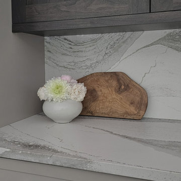
The curved soffit was embraced subtly through the full slab backsplash, which echoes the curve without requiring curved cabinetry or architectural elements that might feel forced
Low ceiling challenges were addressed by using lighter painted cabinets for some tall elements, including the double oven, pantries, and refrigerator area, creating an airy feel while reserving the darker stained walnut for the center section and island
The floor constraint was managed by designing the new layout to cover all previously unfinished areas while maintaining the exact footprint, with only minor touch-ups needed in a few areas
The color palette balances warm walnut stain (harmonizing with the dining room built-ins) with soft, neutral painted cabinets – avoiding stark white that wouldn’t complement the home’s warm aesthetic
Refrigerator placement was optimized with a slim pullout pantry to the left, allowing proper door clearance while maintaining the desired layout flow and enabling the main pantry to be positioned adjacently
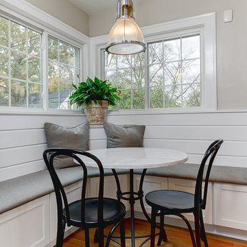
The seating was completely reimagined with a built-in banquette facing the windows, allowing diners to enjoy the outdoor views while providing flexible seating for two to four people
Decorative pendant lighting was eliminated in favor of recessed can lights, preserving the unobstructed views to the beautiful outdoor scenery
This kitchen transformation demonstrates how thoughtful design can dramatically improve functionality for a busy family while honoring existing architectural elements. The children immediately began cooking and baking with their mother in the new space, and the window-facing banquette has become a favorite gathering spot where the family can enjoy both meals and the beautiful outdoor views.
 Drury Design
The Setup
The homeowners of this Barrington Hills residence approached Drury Design with a clear vision: transform their existing kitchen into a space that would better serve their active family of four. With two young children who are homeschooled and love to bake with their mom, plus two dogs, this kitchen needed to function as the true heart of the home.
The existing kitchen was functional but didn’t maximize the potential of the beautiful natural light and scenic views available through the floor-to-ceiling windows. The space was locked between the dining room and family room, which limited structural modifications, but the homeowners wanted to create a more family-friendly environment that would complement the warm walnut built-ins and furnishings in the adjacent dining room while staying true to the home’s overall aesthetic.
Design Objectives:
Create a highly functional workspace that accommodates multiple family members cooking and gathering simultaneously
Maximize the connection to the beautiful outdoor scenery and natural light through thoughtful design choices
Establish a cohesive color palette that complements the existing walnut elements in the adjacent dining room without becoming too tone-on-tone (aka “matchy matchy”)
Improve the seating arrangement to take advantage of the stunning views (rather than facing away from the windows)
Work within the existing architectural constraints, including a curved soffit that could not be removed
Increase storage capacity while maintaining clean, uncluttered sightlines throughout the space
Design Challenges:
The curved soffit presented a design dilemma of whether to echo the curve throughout the kitchen or work with it in a more subtle way
The relatively low ceiling height required careful consideration to avoid making the space feel cramped or cave-like
The existing hardwood floor could not be refinished, which meant the new kitchen footprint had to match or exceed the original layout exactly
Finding the right balance of warm and neutral tones to complement both the existing walnut elements nearby and the natural outdoor views proved challenging
The refrigerator placement was constrained by door swing requirements, which affected the entire layout and prevented centering the sink on the back wall
Rethinking the original seating, which faced inward toward the kitchen (turning backs to the beautiful windows and outdoor views)
Pendant lighting from the previous kitchen obstructed views to the outdoors despite the abundant natural light available
The Renewed Space
Design Solutions:
The curved soffit was embraced subtly through the full slab backsplash, which echoes the curve without requiring curved cabinetry or architectural elements that might feel forced
Low ceiling challenges were addressed by using lighter painted cabinets for some tall elements, including the double oven, pantries, and refrigerator area, creating an airy feel while reserving the darker stained walnut for the center section and island
The floor constraint was managed by designing the new layout to cover all previously unfinished areas while maintaining the exact footprint, with only minor touch-ups needed in a few areas
The color palette balances warm walnut stain (harmonizing with the dining room built-ins) with soft, neutral painted cabinets – avoiding stark white that wouldn’t complement the home’s warm aesthetic
Refrigerator placement was optimized with a slim pullout pantry to the left, allowing proper door clearance while maintaining the desired layout flow and enabling the main pantry to be positioned adjacently
The seating was completely reimagined with a built-in banquette facing the windows, allowing diners to enjoy the outdoor views while providing flexible seating for two to four people
Decorative pendant lighting was eliminated in favor of recessed can lights, preserving the unobstructed views to the beautiful outdoor scenery
This kitchen transformation demonstrates how thoughtful design can dramatically improve functionality for a busy family while honoring existing architectural elements. The children immediately began cooking and baking with their mother in the new space, and the window-facing banquette has become a favorite gathering spot where the family can enjoy both meals and the beautiful outdoor views.
 Drury Design
The Setup
The homeowners of this Barrington Hills residence approached Drury Design with a clear vision: transform their existing kitchen into a space that would better serve their active family of four. With two young children who are homeschooled and love to bake with their mom, plus two dogs, this kitchen needed to function as the true heart of the home.
The existing kitchen was functional but didn’t maximize the potential of the beautiful natural light and scenic views available through the floor-to-ceiling windows. The space was locked between the dining room and family room, which limited structural modifications, but the homeowners wanted to create a more family-friendly environment that would complement the warm walnut built-ins and furnishings in the adjacent dining room while staying true to the home’s overall aesthetic.
Design Objectives:
Create a highly functional workspace that accommodates multiple family members cooking and gathering simultaneously
Maximize the connection to the beautiful outdoor scenery and natural light through thoughtful design choices
Establish a cohesive color palette that complements the existing walnut elements in the adjacent dining room without becoming too tone-on-tone (aka “matchy matchy”)
Improve the seating arrangement to take advantage of the stunning views (rather than facing away from the windows)
Work within the existing architectural constraints, including a curved soffit that could not be removed
Increase storage capacity while maintaining clean, uncluttered sightlines throughout the space
Design Challenges:
The curved soffit presented a design dilemma of whether to echo the curve throughout the kitchen or work with it in a more subtle way
The relatively low ceiling height required careful consideration to avoid making the space feel cramped or cave-like
The existing hardwood floor could not be refinished, which meant the new kitchen footprint had to match or exceed the original layout exactly
Finding the right balance of warm and neutral tones to complement both the existing walnut elements nearby and the natural outdoor views proved challenging
The refrigerator placement was constrained by door swing requirements, which affected the entire layout and prevented centering the sink on the back wall
Rethinking the original seating, which faced inward toward the kitchen (turning backs to the beautiful windows and outdoor views)
Pendant lighting from the previous kitchen obstructed views to the outdoors despite the abundant natural light available
The Renewed Space
Design Solutions:
The curved soffit was embraced subtly through the full slab backsplash, which echoes the curve without requiring curved cabinetry or architectural elements that might feel forced
Low ceiling challenges were addressed by using lighter painted cabinets for some tall elements, including the double oven, pantries, and refrigerator area, creating an airy feel while reserving the darker stained walnut for the center section and island
The floor constraint was managed by designing the new layout to cover all previously unfinished areas while maintaining the exact footprint, with only minor touch-ups needed in a few areas
The color palette balances warm walnut stain (harmonizing with the dining room built-ins) with soft, neutral painted cabinets – avoiding stark white that wouldn’t complement the home’s warm aesthetic
Refrigerator placement was optimized with a slim pullout pantry to the left, allowing proper door clearance while maintaining the desired layout flow and enabling the main pantry to be positioned adjacently
The seating was completely reimagined with a built-in banquette facing the windows, allowing diners to enjoy the outdoor views while providing flexible seating for two to four people
Decorative pendant lighting was eliminated in favor of recessed can lights, preserving the unobstructed views to the beautiful outdoor scenery
This kitchen transformation demonstrates how thoughtful design can dramatically improve functionality for a busy family while honoring existing architectural elements. The children immediately began cooking and baking with their mother in the new space, and the window-facing banquette has become a favorite gathering spot where the family can enjoy both meals and the beautiful outdoor views.
Find the right local pro for your project
 SabaRehman Abdulrehman
In today’s world of smart interiors and luxury-inspired home décor, LED Mirror backlit designs have become a defining trend. From elegant bathrooms to sophisticated dressing areas and premium commercial spaces, LED Mirrors are now more than just reflective surfaces—they are statement pieces that combine technology, style, and functionality.
Whether you are renovating your home, upgrading a salon, designing a hotel, or creating a modern workspace, investing in a high-quality LED mirror can instantly elevate the atmosphere. The perfect balance of illumination and aesthetics makes these mirrors one of the most sought-after interior additions in contemporary architecture.
This blog explores everything you need to know about LED Mirror backlit solutions, their benefits, applications, features, and why they are becoming essential in modern living spaces.
What Is an LED Mirror Backlit Design?
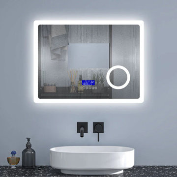
An LED Mirror backlit system refers to a mirror equipped with LED lighting installed behind the mirror surface. Instead of visible front-facing bulbs, the light gently radiates from the rear edges, producing a soft halo effect around the mirror.
This indirect illumination creates a luxurious and ambient glow while providing practical lighting for everyday tasks such as grooming, makeup application, shaving, and skincare routines.
Unlike traditional mirrors, LED Mirrors offer:
- Energy-efficient illumination
- Elegant visual appeal
- Better light distribution
- Enhanced functionality
- Modern smart features
- Bathrooms
- Bedrooms
- Dressing rooms
- Salons
- Hotels
- Restaurants
- Retail stores
- Reduces harsh shadows
- Improves visibility
- Enhances facial clarity
- Creates a comfortable lighting experience
- Reduce energy bills
- Lower electricity usage
- Support eco-friendly living
- Increase long-term savings
- Turn lights on/off
- Adjust brightness
- Change color temperature
- Bright white light for makeup application
- Warm soft light for relaxation
- Neutral lighting for everyday grooming
- Bluetooth speakers
- Digital clocks
- Temperature displays
- Voice control
- Motion sensors
- Better lighting for shaving and makeup
- Enhanced bathroom aesthetics
- Increased property value
- Luxurious visual appeal
- Salons
- Spas
- Hotels
- Restaurants
- Retail stores
- Compact rectangular mirrors work best
- Oversized backlit mirrors create a dramatic statement
- Rectangular
- Oval
- Round
- Square
- Custom geometric designs
- Warm White (cozy ambiance)
- Cool White (bright and crisp)
- Natural White (balanced daylight effect)
- Improve visual appeal
- Increase perceived luxury
- Enhance property value
- Small bathrooms
- Compact apartments
- Narrow dressing areas
 Drury Design
The Setup
The homeowners of this Barrington Hills residence approached Drury Design with a clear vision: transform their existing kitchen into a space that would better serve their active family of four. With two young children who are homeschooled and love to bake with their mom, plus two dogs, this kitchen needed to function as the true heart of the home.
The existing kitchen was functional but didn’t maximize the potential of the beautiful natural light and scenic views available through the floor-to-ceiling windows. The space was locked between the dining room and family room, which limited structural modifications, but the homeowners wanted to create a more family-friendly environment that would complement the warm walnut built-ins and furnishings in the adjacent dining room while staying true to the home’s overall aesthetic.
Design Objectives:
Create a highly functional workspace that accommodates multiple family members cooking and gathering simultaneously
Maximize the connection to the beautiful outdoor scenery and natural light through thoughtful design choices
Establish a cohesive color palette that complements the existing walnut elements in the adjacent dining room without becoming too tone-on-tone (aka “matchy matchy”)
Improve the seating arrangement to take advantage of the stunning views (rather than facing away from the windows)
Work within the existing architectural constraints, including a curved soffit that could not be removed
Increase storage capacity while maintaining clean, uncluttered sightlines throughout the space
Design Challenges:
The curved soffit presented a design dilemma of whether to echo the curve throughout the kitchen or work with it in a more subtle way
The relatively low ceiling height required careful consideration to avoid making the space feel cramped or cave-like
The existing hardwood floor could not be refinished, which meant the new kitchen footprint had to match or exceed the original layout exactly
Finding the right balance of warm and neutral tones to complement both the existing walnut elements nearby and the natural outdoor views proved challenging
The refrigerator placement was constrained by door swing requirements, which affected the entire layout and prevented centering the sink on the back wall
Rethinking the original seating, which faced inward toward the kitchen (turning backs to the beautiful windows and outdoor views)
Pendant lighting from the previous kitchen obstructed views to the outdoors despite the abundant natural light available
The Renewed Space
Design Solutions:
The curved soffit was embraced subtly through the full slab backsplash, which echoes the curve without requiring curved cabinetry or architectural elements that might feel forced
Low ceiling challenges were addressed by using lighter painted cabinets for some tall elements, including the double oven, pantries, and refrigerator area, creating an airy feel while reserving the darker stained walnut for the center section and island
The floor constraint was managed by designing the new layout to cover all previously unfinished areas while maintaining the exact footprint, with only minor touch-ups needed in a few areas
The color palette balances warm walnut stain (harmonizing with the dining room built-ins) with soft, neutral painted cabinets – avoiding stark white that wouldn’t complement the home’s warm aesthetic
Refrigerator placement was optimized with a slim pullout pantry to the left, allowing proper door clearance while maintaining the desired layout flow and enabling the main pantry to be positioned adjacently
The seating was completely reimagined with a built-in banquette facing the windows, allowing diners to enjoy the outdoor views while providing flexible seating for two to four people
Decorative pendant lighting was eliminated in favor of recessed can lights, preserving the unobstructed views to the beautiful outdoor scenery
This kitchen transformation demonstrates how thoughtful design can dramatically improve functionality for a busy family while honoring existing architectural elements. The children immediately began cooking and baking with their mother in the new space, and the window-facing banquette has become a favorite gathering spot where the family can enjoy both meals and the beautiful outdoor views.

 J Design Group - Interior Designers Miami - Modern
A TOUCHDOWN BY DESIGN
Interior design by Jennifer Corredor, J Design Group, Coral Gables, Florida
Text by Christine Davis
Photography by Daniel Newcomb, Palm Beach Gardens, FL
What did Detroit Lions linebacker, Stephen Tulloch, do when he needed a decorator for his new Miami 10,000-square-foot home? He tackled the situation by hiring interior designer Jennifer Corredor. Never defensive, he let her have run of the field. “He’d say, ‘Jen, do your thing,’” she says. And she did it well.
The first order of the day was to get a lay of the land and a feel for what he wanted. For his primary residence, Tulloch chose a home in Pinecrest, Florida. — a great family neighborhood known for its schools and ample lot sizes. “His lot is huge,” Corredor says. “He could practice his game there if he wanted.”
A laidback feeling permeates the suburban village, where mostly Mediterranean homes intermix with a few modern styles. With views toward the pool and a landscaped yard, Tulloch’s 10,000-square-foot home touches on both, a Mediterranean exterior with chic contemporary interiors.
Step inside, where high ceilings and a sculptural stairway with oak treads and linear spindles immediately capture the eye. “Knowing he was more inclined toward an uncluttered look, and taking into consideration his age and lifestyle, I naturally took the path of choosing more modern furnishings,” the designer says.
In the dining room, Tulloch specifically asked for a round table and Corredor found “Xilos Simplice” by Maxalto, a table that seats six to eight and has a Lazy Susan.
And just past the stairway, two armless chairs from Calligaris and a semi-round sofa shape the living room. In keeping with Tulloch’s desire for a simple no-fuss lifestyle, leather is often used for upholstery. “He preferred wipe-able areas,” she says. “Nearly everything in the living room is clad in leather.”
An architecturally striking, oak-coffered ceiling warms the family room, while Saturnia marble flooring grounds the space in cool comfort. “Since it’s just off the kitchen, this relaxed space provides the perfect place for family and friends to congregate — somewhere to hang out,” Corredor says. The deep-seated sofa wrapped in tan leather and Minotti armchairs in white join a pair of linen-clad ottomans for ample seating.
With eight bedrooms in the home, there was “plenty of space to repurpose,” Corredor says. “Five are used for sleeping quarters, but the others have been converted into a billiard room, a home office and the memorabilia room.” On the first floor, the billiard room is set for fun and entertainment with doors that open to the pool area.
The memorabilia room presented quite a challenge. Undaunted, Corredor delved into a seemingly never-ending collection of mementos to create a tribute to Tulloch’s career. “His team colors are blue and white, so we used those colors in this space,” she says.
In a nod to Tulloch’s career on and off the field, his home office displays awards, recognition plaques and photos from his foundation. A Copenhagen desk, Herman Miller chair and leather-topped credenza further an aura of masculinity.
All about relaxation, the master bedroom would not be complete without its own sitting area for viewing sports updates or late-night movies. Here, lounge chairs recline to create the perfect spot for Tulloch to put his feet up and watch TV. “He wanted it to be really comfortable,” Corredor says
A total redo was required in the master bath, where the now 12-foot-long shower is a far cry from those in a locker room. “This bath is more like a launching pad to get you going in the morning,” Corredor says.
“All in all, it’s a fun, warm and beautiful environment,” the designer says. “I wanted to create something unique, that would make my client proud and happy.” In Tulloch’s world, that’s a touchdown.
Your friendly Interior design firm in Miami at your service.
Contemporary - Modern Interior designs.
Top Interior Design Firm in Miami – Coral Gables.
Office,
Offices,
Kitchen,
Kitchens,
Bedroom,
Bedrooms,
Bed,
Queen bed,
King Bed,
Single bed,
House Interior Designer,
House Interior Designers,
Home Interior Designer,
Home Interior Designers,
Residential Interior Designer,
Residential Interior Designers,
Modern Interior Designers,
Miami Beach Designers,
Best Miami Interior Designers,
Miami Beach Interiors,
Luxurious Design in Miami,
Top designers,
Deco Miami,
Luxury interiors,
Miami modern,
Interior Designer Miami,
Contemporary Interior Designers,
Coco Plum Interior Designers,
Miami Interior Designer,
Sunny Isles Interior Designers,
Pinecrest Interior Designers,
Interior Designers Miami,
J Design Group interiors,
South Florida designers,
Best Miami Designers,
Miami interiors,
Miami décor,
Miami Beach Luxury Interiors,
Miami Interior Design,
Miami Interior Design Firms,
Beach front,
Top Interior Designers,
top décor,
Top Miami Decorators,
Miami luxury condos,
Top Miami Interior Decorators,
Top Miami Interior Designers,
Modern Designers in Miami,
modern interiors,
Modern,
Pent house design,
white interiors,
Miami, South Miami, Miami Beach, South Beach, Williams Island, Sunny Isles, Surfside, Fisher Island, Aventura, Brickell, Brickell Key, Key Biscayne, Coral Gables, CocoPlum, Coconut Grove, Pinecrest, Miami Design District, Golden Beach, Downtown Miami, Miami Interior Designers, Miami Interior Designer, Interior Designers Miami, Modern Interior Designers, Modern Interior Designer, Modern interior decorators, Contemporary Interior Designers, Interior decorators, Interior decorator, Interior designer, Interior designers, Luxury, modern, best, unique, real estate, decor
J Design Group – Miami Interior Design Firm – Modern – Contemporary
Contact us: (305) 444-4611
http://www.JDesignGroup.com

 Polanco Home Furniture & Interior Decor Solutions
Recently, Mandy Renfrew collaborated with Gemstone Developments to stage their beautiful newly built modern custom home. Gemstone built this home with an incredible attention to detail. From floor plan to finishes, they demanded perfection each step along the way. Polanco Home Decor’s staging experts continued this high level of thought and consideration into the furniture and decor selection to prepare this house for sale.
“894 Colonel By Dr. was designed to complement urban, sophisticated living in one of the city’s most sought-after locations. This brand new, custom home includes endless high end features
such as a flawlessly crafted master suite, gourmet Irpinia kitchen facing a spacious raised patio, and expansive entertaining spaces all made accessible with a private elevator. ” Josh Zaret, Gemstone Developments http://gemstonecorp.com/portfolio/894-colonel-by-drive/
“While the building is a masterpiece on its own, it also boasts breath-taking views of the scenic Rideau Canal and manicured green space. By spring, enjoy the sights of the Canadian Tulip Festival and in winter participate in the capital’s renowned Winterlude celebrations by taking steps to the world’s largest skating rink, the Rideau canal.” Josh Zaret, Gemstone Developments http://gemstonecorp.com/portfolio/894-colonel-by-drive/
Furniture Store Ottawa - Ottawa StagingThis modern open concept home, designed by Barry Hobin, included 10 foot ceilings with gorgeous floor to ceiling windows. It was important to create an inviting atmosphere with the furnishings we chose, creating a space that anyone who enters could envision themselves living in. We wanted to create a distinction between the living and dining room, as the home featured a very open concept space. Polanco’s designers wanted to create the look of a home meant for entertaining, in which you could enjoy a dining experience as well as socialize in the living room area. The breathtaking view of the Rideau Canal seen from all seating areas in the living space accentuated the spacious feeling of the home.
A custom sized Martha sectional from Marcantonio Designs was the perfect choice for this grand open living room. Upholstered in a soft off-white leather, this style with metal legs complements the contemporary style of this home. We paired the sectional with a square fully tufted ottoman in a similar creamy-white leather to complete the seating area. The solid maple Verona sideboard from Handstone Furniture in a vintage silver stain gives buyers a sense of where to position their media centre. Above this piece, in lieu of a TV, we opted to bring some colour into the space with a piece from Celadon Art. To tie the artwork to the rest of the area, beautiful toss cushions in varying tones of blue were placed on the furniture pieces. Two matching Cassandra chairs upholstered in a simple grey linen fabric were selected to complement the neutral tones of the other furniture pieces. White accessories from Torre & Tagus placed on the ottoman are the final element of decor to this gorgeous open concept living space.
We wanted to continue with a light and airy look, and chose to place a custom Albany console from Artage on the wall opposite to the Verona sideboard. We decorated the console with white accessories from Torre & Tagus and a Bangkok mirror from Renwil. This mirror is a Polanco favourite due to its size and versatility – it matches both classic and modern designs. The round shape of the mirror adds softness and complements the wall sconces.
Furniture Store Ottawa - Ottawa Home StagingMoving into the dining room, we selected the Cordova dining table from Handstone Furniture. The functionality of a pedestal table allowed for more seating so buyers could envision how many guests they could seat in this large open space dining room. We chose the same vintage silver stain on the dining room table as well as on the living room sideboard to create consistency from room to room. To contrast with the darker stain of the table, we paired it with white leather Linda chairs from Elite Living. At the head of the table, the Albany bar cart from Artage in a bright chrome finish completes the room with a unique entertaining piece.
Furniture Store Ottawa - Ottawa Home StagingMatching Linda white leather counter stools were used in the kitchen to create continuity from one room to another. In the family area off of the kitchen, we placed the Melynda swivel chair from Marcantonio Designs in a complementary white leather. The swivel feature on the chair allows buyers to envision how the space would function – if you were sitting in this area you could easily swivel your chair to talk to people in the kitchen as well as enjoying the contemporary fireplace. Opposite this chair is the Melrose love seat upholstered in a light grey linen fabric. It was chosen for its low profile look, as it does not obstruct the view of the beautiful terrace at the back of the house. In the centre of both pieces is the Orion coffee table also in a bright chrome finish. The Orion coffee table, light in design, was a strategic choice, making the room appear larger. Patterned toss cushions complement the geometric texture of the tiled fireplace while bringing the design elements of the space and furniture together.
Furniture Store Ottawa - Ottawa Home StagingIn the master bedroom, we selected the stunning Layla king size bed upholstered in a light grey linen fabric. The soft curve of its headboard complements the curved Capricorn chairs placed in the seating area near the window of this room. Crisp, white linens from Cuddle Down Products were chosen to dress the bed, accentuated by Polanco’s own decorative toss cushions in fabrics from Robert Allen Design. On each side of the bed we chose custom wide Brooklyn nightstands painted in Benjamin Moore Chantilly Lace and accentuated with decorative glass knobs. Silver accents are continued throughout the room, as shown with the nailheads on the upholstered bed and occasional chairs, cabinet knobs, lamps, and accessories.
The spare bedroom was designed specifically to allow future home buyers to envision their own furniture in the space. We chose the Linea queen bed in a neutral grey fabric for its simple and elegant design and paired it with crisp white linens from Cuddle Down Products. A silver end table from Torre & Tagus and a silver table lamp from Arteriors Home finish the space.
The entranceway was decorated with a large simple 48” round mirror with a decorative upholstered Thomas bench in a contemporary grey velvet fabric. We accented the design of the entrance bench with toss cushions to create an inviting feel upon entering this exquisite home.
Furniture Store Ottawa - Ottawa Home StagingOpen to the entranceway, the large den has magnificent floor to ceiling windows showcasing the view of the gardens along the Rideau Canal. We chose to show this space as a home office, featuring a live edge solid cherry desk from Harden Furniture. We positioned a Wilson chair in blue fabric at the desk, facing towards the breathtaking views of the canal. To complete this office look, a Timeout chair and ottoman were placed in the corner of the room paired with the Funco side table. Artwork was chosen to create interest and add colour, complementing the contemporary wing back desk chair.
It was a pleasure working with Gemstone Developments on this stunning modern home designed by Barry Hobin Architecture. Our goal was to furnish and decorate the home in such a way that potential buyers could envision themselves living in the space, while also accentuating the existing interior design. We are pleased to announce 894 Colonel By Drive was sold just three months after the staging project was completed.
Sponsored
Columbus, OH

Hope Restoration & General Contracting
Columbus Design-Build, Kitchen & Bath Remodeling, Historic Renovations
 Kariouk Associates
m.o.r.e. Cabin
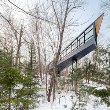
The paradigmatic North American cottage is romanticized as a wilderness log cabin. Nonetheless, typical cottages are “woodsy” versions of suburban homes with every modern convenience. These buildings sustain the myth that appearing to be one with the land equates to a reduced impact on the environment.
The m.o.r.e. Cabin inverts this idea through a separation from the landscape that is more sustainably constructed than other cottages. This unravelling of eco-fictions is not cynical, but optimistic: while organic environments are being degraded, what remains can be engaged more responsibly.
To this end, m.o.r.e. Cabin touches the land lightly through:
- Interpreting the law creatively to uphold its principles.
- Reducing foundation size through a steel mast.
- Low-waste cross-laminated timber (CLT) structure.
- Achieving greater tensile strength through a “folded” structure.
- Off-grid power and high-efficiency heating.
- Creating a home for endangered bats.
Interpreting the Law with Finesse
Zoning rules required a 100-foot (30-metre) setback from the lake. A cliff face at that 100-foot mark was incorporated into the design, whereas conventional construction approaches would entail blasting.
To minimize harm to the hillside and forest, a zoning variance was obtained to allow the front of m.o.r.e. Cabin to hover above, rather than sit on, the 100-foot (30-metre) mark.
The Mast
The technical solution to the environmental issue involved a single concrete footing and a steel “mast” placed within the required setback.
Avoiding a conventional large foundation preserved the watershed and prevented erosion, as did elevating the construction zone. Use of carbon-intensive concrete was also reduced for a lower carbon footprint.
m.o.r.e. Than One Way to Skin a Home
m.o.r.e. Cabin is built with suitably-sourced CLT panels and glulam beams.
The CLT was milled offsite then hoisted into place, avoiding damage to the landscape by the maneuvering of construction machinery.
Cabin-as-Beam
m.o.r.e. Cabin’s environmental considerations yielded structural innovation. Our challenge became to develop a structural strategy using cantilevered CLT panels as a response to the zoning variance that we obtained; CLT is fundamentally deployed in vertical/compressive sections, not horizontally in tension.
Conventional 5-ply CLT is too heavy to support itself over longer spans. The solution used thinner 3-ply CLT, with structural capacity ensured through “folding” (just like paper gains strength when folded).
Off-Grid
The home is solar-powered.
The elevated cottage catches more breezes and has excellent cross-ventilation. Heat is provided by a high-efficiency “green carbon” wood stove. Good R-value and thermal comfort are provided by CLT’s mass, and precise joinery provides air-tightness.
Inviting Over the Neighbours
One goal of the home was to create extensive lodging for endangered brown bats. Bat pods were integrated into the mast to provide safety from climbing predators and a clear flight path to the lake.
*“m.o.r.e.” stands for the clients’ grandmothers’ names; all of whom did more with less — and gracefully so.

 Taylor Knights
Peter Clarke
Staircase - small contemporary metal straight metal railing staircase idea in Melbourne with metal risers
Staircase - small contemporary metal straight metal railing staircase idea in Melbourne with metal risers

 Daniel Scerri Periti
We were approached with a request to design the furnishings for an existing ‘finished’ apartment. The intention was to move in relatively fast, and the property already had an existing marble floor, kitchen and bathrooms which had to be kept. The property also boasted a fantastic 270 degree view, seen from most of the apartment. The clients had a very important role in the completion of the project. They were very involved during the design process and through various decoration choices. The final design was kept as a rigid guideline when faced with picking out all the different elements.
Once clear of all previous furniture, the space felt cold and bare; so we immediately felt the need for warmth, and raw, natural elements and textures to complement the cold marble floor while visually tying in the design of the whole apartment together.
Since the existing kitchen had a touch of dark walnut stain, we felt this material was one we should add to the palette of materials to contest the stark materials. A raw cement finish was another material we felt would add an interesting contrast and could be used in a variety of ways, from cabinets to walls and ceilings, to tie up the design of various areas of the apartment.
To warm up the living/dining area, keeping the existing marble floor but visually creating zones within the large living/dining area without hindering the flow, a dark timber custom-made soffit, continuous with a floor-to-ceiling drinks cabinet zones the dining area, giving it a degree of much-needed warmth.
The various windows with a stupendous 270 degree view needed to be visually tied together. This was done by introducing a continuous sheer [drape] which also doubled up as a sound-absorbing material along 2 of the 4 walls of the space.
A very large sofa was required to fill up the space correctly, also required for the size of the young family.
Services were integrated within the units and soffits, while a customized design in the corner between the kitchen and the living room took into consideration the viewpoints from the main areas to create a pantry without hindering the flow or views. A strategically placed floor-to-ceiling mirror doubles up the space and extends the view to the inner parts of the apartment.
The daughter’s bedroom was a small challenge in itself, and a fun task, where we wanted to achieve the perception of a cozy niche with its own enclosed reading nook [for reading fairy tales], behind see-through curtains and a custom-ordered wall print sporting the girl’s favorite colors.
The sons’ bedroom had double the requirements in terms of space needed: more wardrobe, more homework desk space, a tv/play station area… “We combined a raised platform area between the boys’ beds to become an area with cushions where the kids can lay down and play, and face a hidden screen behind the homework desk’s sliding back panel for their play station”. The color of the homework desk was chosen in relation to the boys’ ages. A more masculine material palette was chosen for this room, in contrast to the light pastel palette of the girl’s bedroom. Again, this colour can easily be changed over time for a more mature look.
PROJECT DATA:
St. Paul’s Bay, Malta
DESIGN TEAM:
Perit Rebecca Zammit, Perit Daniel Scerri, Elyse Tonna
OTHER CREDITS:
Photography: Tonio Lombardi
Styling : TKS

 Michael Nash Design, Build & Homes
Starting Each Day Clean and Refreshed In This Classically-Modern, Marble Masterpiece
In 1985, the previous owner of the house had added an addition of which part included a 17 feet by 13 feet space off the master bedroom for both a master bath and walk-in closet. Irrespective of the dated red carpet that blanketed the entire bathroom of this 1964 colonial in Annandale, VA, the combination bathroom/closet space had its other oddities, primarily in that there was no shower. The current homeowners -- a family of five, who has been in the home for 7 years, was tired of going down the hall to use the kids’ bathroom to take a shower before work. The renovation that they have created now is a bright and luxurious space that one could bask in all day. They used this bathroom renovation opportunity to total remake the layout and function of this essential room that sets the tone for the day ahead.
Prior to the renovation, the existing bathroom oddly had two entrances, a typical one off of the master bedroom, but another straight off the upstairs hallway. As the toilet was out in the open in the previous design, ensuring that this second door was closed when company was in town was essential and a nuisance. As you entered the room, situated below the arc window, a large soaking tub that was covered on three sides with wooden steps dominated the room from the corner it projected. A relatively small 42” single bowl sink did not leave much space for his and hers toiletries, and there was no other linen closet or cabinetry for storage in the bathroom. The 8 foot by 5 foot closet with accordion doors had poorly laid out rungs not letting the storage space to be fully utilized. At over 220 square feet, the room did offer considerable space to work with, yet the existing layout, which even included a partition wall behind the vanity, felt cramped and dysfunctional.
The homeowners wished to create a classic yet modern, private, deluxe bathroom that would better integrate into their master suite and enable them to start and end each day in a luxurious way. They wanted to maintain having a soaking tub, add in a large shower, have an enclosed commode, expand to include double sinks, and add more storage for toiletries and linens. We worked with the customer to develop a creative design with extensive plumbing rework that accomplished all these needs and more.
The first order of business was to gut out all the carpet, tub, cabinetry, and non-load bearing partition walls. The new tub would be generally in the same location, but as the previous walk-in closet would be repurposed for the commode and the walk-in shower additional water lines, plumbing, and draining needed to be added; fortunately the room below is the garage, which enabled the team to frame out some bulkheads to accomplish this complex plumbing. Following the framing, including walling up the second entrance to the bathroom, adding in a pocket door for the commode, and creating the shape of the new shower, the team also laid down the wiring for one of the luxuries of this room – heated flooring. A glossy percaline boarder, and two-inch hexagon shape percaline tiles cover the entire floor, making it much easier and cleaner than the previous carpet.
Marble look tile is predominant throughout the bathroom as despite the angled frameless glass door, the entire shower is covered in 18 inch polished marble look tiles. The shower coats the user in water from either the overhead rain head, large main showerhead and/or the hand held sprayer. Over 7 feet of white Italian Statuetto marble countertop, enable the couple to have two sink bowls and plenty of room on each side. The bowls are exposed in this stainless steel console sink design which required the team to ensure that the exposed plumbing looked pristine, and painting the bottom of the porcelain bowl to match the coloring.
The white cast-iron 72-inch Cecilia claw-foot soaking tub and its chrome lion’s paws complement that other chrome and white used throughout the room. A tall, almost floor-to-ceiling linen closet finished in arctic white is nestled in the corner near the tub, enabling ample storage of towels, etc. Other cabinetry includes an 18 inch-wide vanity with decorative footing is centered between the two sinks, and a 27 inch wall mounted cabinet with shelf is above the Kohler Devonshire elongated toilet.
Billowing cloud colored grey blue paint was a great choice for this room to pick up on the veining in the marble. Mirrored medicine chests, a chandelier, wall sconces, and overhead recessed lighting also were incorporated into the design and function of the new room.
The artful combination of classic design from material choices, such as free-standing Victorian claw-foot tub along with the modern design as seen in the angled shower, frameless medicine cabinet mirrors, and frosted glass pocket door on the commode, make this bathroom quite a masterpiece.
The clients are enjoying having their private space and not having the use the kids’ bathroom anymore.

 Smart-Solutiions
The Science of Light and Learning
To understand the relationship between lighting and learning, it’s critical to grasp the concept of correlated colour temperature (CCT). CCT refers to the warmth or coolness of light, measured in Kelvin (K). Lower CCTs (around 3000K) provide a warm, cosy atmosphere, while higher CCTs (5000K or above) emit a cool, daylight-like glow. Studies have shown that cool white light, which mimics natural daylight, can increase alertness and mood, contributing to improved cognitive performance. LED lighting, with its ability to produce this desired CCT, makes an ideal choice for educational settings.
LED Lighting: Brightening the Future of Education
Energy Efficiency and Cost Effectiveness
One of the main advantages of LED lighting is its energy efficiency. Traditional lighting solutions like fluorescent and incandescent bulbs consume much more energy to produce the same amount of light as LEDs, which is not only environmentally harmful but also financially costly. Switching to LED lights can result in substantial cost savings for schools, enabling them to redirect funds to other critical areas of education.
Durability and Longevity
LED lights are renowned for their durability and longevity. They have a significantly longer lifespan compared to conventional lights, which means less frequent replacement and reduced maintenance costs. This durability also minimises disruptions caused by light failure, providing a consistent, well-lit learning environment.
Improved Visibility and Reduced Eye Strain
With their superior colour rendering index (CRI), LED lights render colours more accurately, leading to improved visibility. This is particularly beneficial in educational settings, where activities often require distinguishing fine details and colours. LED lights also emit less glare than traditional lighting solutions, reducing eye strain and fatigue. This can lead to better concentration and increased comfort for both students and teachers.
Incorporating LED Lighting in Classrooms: Practical Considerations
When transitioning to LED lighting in classrooms, a few key factors need to be taken into account. Firstly, the lighting design should ensure an even distribution of light, preventing shadowy or overly bright spots that could distract or discomfort students. Secondly, the integration of dimming capabilities can provide flexibility, allowing educators to adjust the lighting level based on the task at hand. Finally, lighting controls can be used to take advantage of natural light, automatically dimming or turning off the LEDs when sufficient daylight is present.
Conclusion: The Bright Promise of LED Lighting in Education
As education systems continue to evolve, it’s imperative to keep sight of the physical factors that significantly impact learning, one of which is lighting. LED technology, with its myriad benefits, offers an innovative and effective way to enhance the quality of lighting in classrooms. By prioritising investments in such improvements, we can take a significant step towards creating an optimised learning environment that nurtures the educational success of future generations.
 Simply Home Decorating
There are not many things better than a room full of your favourite people. As you gather you smell dinner cooking in the kitchen and music playing in the background, as joyful conversation and laughter fill the room. I feel so grateful that we are inching our way back to these days. How about you?
The project I’m sharing with you today has beautiful moments like these at its heart. Spaces that invite people in, foster connection, and make everyday living so simple that it’s impossible not to enjoy...
Meet our Delightful Clients:
The family behind this 1950s North Vancouver home transformation enjoy entertaining friends just as much as cosying up to watch a movie together. A professional couple (I'll call them Jon and Anna) with two elementary school-aged sons, Anna and Jon approached us with the task of furnishing the main floor living spaces and the basement of their family home.
Anna is a busy lawyer who is now working almost full time from home, and Jon works in the film industry. With full careers, two active boys, and a love of gathering, they craved a home that could support their everyday lifestyle.
Design and Lifestyle Goals:
Our central goal for this project was simple: to uncover the hidden potential in their home and create a family-friendly space that functioned well and flowed seamlessly.
On the main floor, our clients tasked us with creating an area for the family to relax and entertain, along with crafting a work and play space for the boys. They also dreamed of a more functional and bright basement, which they envisioned as a dual purpose family room and home office for Anna.
Reveal: Comfortable and Welcoming Entryway & Living Room:
Imagine you are coming home, and you walk through a bright, sunny front door like this one. You are met by this entryway of calming earth and sea tones, paired with warm, natural wood flooring. You feel instantly welcomed and eager to venture further inside... The same is now true for our clients!
The simple details in their entryway are thoughtfully arranged with clean lines and colourful art as the focal point, achieving a timeless and friendly aesthetic. Dried wheat brings movement into the space and plays up the beauty of nature, while the vibrant yet warm colours and textures evoke feelings of comfort and homecoming.
The entry flows seamlessly into this connected living area, which is adorned with ample seating strategically arranged to host and accommodate joyful conversations. With the fireplace and wood mantel as the focal point, these natural elements and hues warm up the room to make it feel beautifully lived-in (not like an untouchable museum).
Another colourful work of art graces the space above Jon’s and Anna’s sofa, and we used decorative pillows and a throw blanket to tempt those colours into the rest of the room. A simply styled coffee table keeps the space feeling open and engaged. Reading material, anyone?
Just beyond this living area, you get a glimpse of the second space our clients requested on their main floor...
A Collected Space for Children to Work + Play:
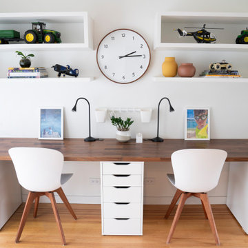
When Jon and Anna realised that their formal dining area wasn’t being used to its full potential, they imagined creating a work and play space for their boys instead. We came up with a plan to create a shared desk area with plentiful storage.
This timeless natural wood desk was the perfect way to maximise surface area and give the boys plenty of space to do homework during the school year, or spend time crafting or building LEGOs during the summers. The drawers provide storage for all the wonderful items that fuel their productivity or creativity. Or both.
I also love how the white floating shelves display a collection of nostalgic toys, providing just the right amount of childhood endearment to this sophisticated and functional space. This workspace now has endless possibilities for the boys, and it helps Jon and Anna keep their minds and spaces clear, too. Which brings us to...
Basement Family Room & Home Office:
In general, we knew we had to maximise surface area in this ‘50s home, and this was especially true for our clients’ basement. I’m happy to say that we designed an effortlessly comfortable space that focuses on family and makes it simple to settle in and work… or leave the workday behind.
Welcome to this dual-function office and family room. Toward the back of the room, we strategically positioned Anna’s wraparound desk facing out into the room and gave her a wallpaper-and-art backdrop for stunning Zoom calls (she has already received glowing compliments). There is plenty of storage for easy organization including a space to store the family’s shared printer near the door… so they don’t have to interrupt “Mom” to get to it.
Anna also wanted the freedom to be able to relax in this space with her family and turn her back on the work day — quite literally! The sofa is perfectly positioned backing onto the desk allowing her to do just that.
We relocated an existing mustard yellow chair and used pops of the same colour to integrate it into the overall scheme. The wood armrests on this modular sectional provide surfaces for snacks and drinks where there was no room for an end table. The walnut finish carries the theme of natural comfort from the upstairs spaces down into the family room.
The view from the sectional is less business and more pleasure, featuring cosy seating and throw pillows in cheerful colours and patterns.
The highlight of this space? A wallpapered accent wall where we were able to achieve the high-end feel of custom built-in shelving with a simple IKEA hack. The shelves and cabinetry around the television offer plenty of much needed storage space to house family games and movies at a budget price point.
This fun room is the perfect balance of work and play, accommodating and supporting our clients’ daily family adventures.
What Our Clients Had to Say...
Our clients could not be happier with their warm yet functional new rooms. With thoughtful consideration and a plan of action, we were able to transform two areas of their home into spaces that function well and feel good. In fact, they had this to say:
“Lori and her team were everything we were looking for: great listeners, wonderfully creative and highly professional. We couldn't be happier with our interior makeover.” — Clients
That is why we do what we do. If you're ready to start your redesign project, we would love to help. Reach out to us here, and let's get to know more about each other.
Sponsored
Delaware, OH

Buckeye Basements, Inc.
Central Ohio's Basement Finishing ExpertsBest Of Houzz '13-'21

 Ernest M. Ferizi
German Embassy in Pristina - Kosovo, contracted the architecture office “Ferizi + Ferizi Architects” to plan and implement an Annex Office building for their purposes. As detached part of this building is designed the waiting area, as alone standing structure.
This Office Building is constructed by assembling of Eight used office containers that were delivered on trucks and set up after only a few hours on the basis of the LEGO principle, according to the planning on strip foundations.
By removing the flexible exterior wall panels, a large room of 115 m² was created, with the counter wall as a room partition between two office spaces, each with seven workstations as well as three counters for agents on one side and a room for visitors on the other side.
With this system, room solutions can be easily implemented in all dimensions.
The container, seen as a geometric shape, is a simple, octagonal, solid box.
The standardized perfection of its dimensions is striking: 2.44 meters wide, 2.59 meters high and 6.06 meters or 12.19 meters long.
Since its introduction in 1956 by the American transport entrepreneur Malcom McLean, the container has become a standardized transport module worldwide, whether on ships, trucks or construction sites.
The shipping containers have additionally revolutionized the transport industry, pushed the globalization noticeably, and thus directly or indirectly influenced all our lives.
But after only a few years, when the first overseas containers wore out, many engineers recognized the positive properties of used shipping containers for building houses, especially since they are robust, flexible, multifunctional and second-hand relatively inexpensive to purchase. The time has long passed by to treat containers exclusively as transport objects.
As a "measure of all things", containers can hardly be ignored in construction.
Their use is no longer limited to temporary use since school containers, information containers, office containers or entire residential buildings are now part of our everyday life in the construction industry.
However, current examples of the container architecture prove that even the most demanding solutions for container building are feasible. For their specific aesthetic and spatial qualities, containers also serve as design parameters for the development of new forms of architecture and urbanity.
The office building as an extension of the visa section, characterized by modern materials and contemporary aesthetics has been designed and built mainly as a low-energy building.
Extensive insulation to achieve a comfortable and sustainable constant temperature in the interior, high window quality and low energy consumption make the building energy-efficient.
The sophisticated lighting technology, networks, heating systems and air-conditioning systems are also components of this equipment.
It creates an overall harmonic picture and guarantees the highest standard in sustainable construction, taking into consideration the fact that environmentally friendly recycling and reutilization have become an increasingly important issue in our society.
West and East side of the wooden facade is compact and has few openings, while the southern facade is completely open with lot of glass. Its spatial openness ensures a transparent, friendly work environment, which allows a lot of light into the space.
This openness allows an uninterrupted, pleasant and close-to-nature view from interior spaces into the beautiful garden. During the installation of sophisticated light sources in the garden, emphasis was not only put on functionality and security, but also on the beauty of the garden shown through the illumination in the evening.
Large, horizontal white “brisole” serve as external sun protection systems, mounted on the canopies of the entrance areas of the modular construction and the enclosure, adeptly cast shade on these areas and at the same time shape the entire architectural language.
While on one hand, the two quadratic ledges suspended in the air, are docked with steel stairs and match the wooden façade, lead the staff to their office space, the artful modern interior, on the other hand, perfectly unites the functionality, innovative technology, culture and positive effects on the employees' efficiency and wellbeing.
A lot of white, interjected by warm wooden and colored accents, determines the ambience.
In the case of the lighting solution, the mainly linear ceiling lighting is used as the overlapping design element both for the offices of the visa section as well as for the counters and the waiting area for the visitors.
They underline the puristic design in order to create a pleasant light for a desired general illumination and ensure optimal light conditions without causing disturbing reflections on the computer screens.
In addition, precisely positioned pendant luminaires are installed at the workstations, which ensure pleasant room brightness.
In the entrance area, the harmonic and uniform lighting effect from the ground highlights the integration of photography and architecture.
Photographs of landscapes, people, places, expressing unforgettable, impressive moments and memories have been lovingly engraved on 8 x 8cm square oak blocks.
The idea of an effective, impressive environment that stimulates and inspires the work was the premiss on which the whole design concept was based. Consequently, the modular construction was no longer viewed through its history of utilization and scars, but rather as a structure of work ambiance, art and elegance.
FERIZI + FERIZI Architects
Photo: Arben Llapashtica
 Michael Nash Design, Build & Homes
Starting Each Day Clean and Refreshed In This Classically-Modern, Marble Masterpiece
In 1985, the previous owner of the house had added an addition of which part included a 17 feet by 13 feet space off the master bedroom for both a master bath and walk-in closet. Irrespective of the dated red carpet that blanketed the entire bathroom of this 1964 colonial in Annandale, VA, the combination bathroom/closet space had its other oddities, primarily in that there was no shower. The current homeowners -- a family of five, who has been in the home for 7 years, was tired of going down the hall to use the kids’ bathroom to take a shower before work. The renovation that they have created now is a bright and luxurious space that one could bask in all day. They used this bathroom renovation opportunity to total remake the layout and function of this essential room that sets the tone for the day ahead.
Prior to the renovation, the existing bathroom oddly had two entrances, a typical one off of the master bedroom, but another straight off the upstairs hallway. As the toilet was out in the open in the previous design, ensuring that this second door was closed when company was in town was essential and a nuisance. As you entered the room, situated below the arc window, a large soaking tub that was covered on three sides with wooden steps dominated the room from the corner it projected. A relatively small 42” single bowl sink did not leave much space for his and hers toiletries, and there was no other linen closet or cabinetry for storage in the bathroom. The 8 foot by 5 foot closet with accordion doors had poorly laid out rungs not letting the storage space to be fully utilized. At over 220 square feet, the room did offer considerable space to work with, yet the existing layout, which even included a partition wall behind the vanity, felt cramped and dysfunctional.
The homeowners wished to create a classic yet modern, private, deluxe bathroom that would better integrate into their master suite and enable them to start and end each day in a luxurious way. They wanted to maintain having a soaking tub, add in a large shower, have an enclosed commode, expand to include double sinks, and add more storage for toiletries and linens. We worked with the customer to develop a creative design with extensive plumbing rework that accomplished all these needs and more.
The first order of business was to gut out all the carpet, tub, cabinetry, and non-load bearing partition walls. The new tub would be generally in the same location, but as the previous walk-in closet would be repurposed for the commode and the walk-in shower additional water lines, plumbing, and draining needed to be added; fortunately the room below is the garage, which enabled the team to frame out some bulkheads to accomplish this complex plumbing. Following the framing, including walling up the second entrance to the bathroom, adding in a pocket door for the commode, and creating the shape of the new shower, the team also laid down the wiring for one of the luxuries of this room – heated flooring. A glossy percaline boarder, and two-inch hexagon shape percaline tiles cover the entire floor, making it much easier and cleaner than the previous carpet.
Marble look tile is predominant throughout the bathroom as despite the angled frameless glass door, the entire shower is covered in 18 inch polished marble look tiles. The shower coats the user in water from either the overhead rain head, large main showerhead and/or the hand held sprayer. Over 7 feet of white Italian Statuetto marble countertop, enable the couple to have two sink bowls and plenty of room on each side. The bowls are exposed in this stainless steel console sink design which required the team to ensure that the exposed plumbing looked pristine, and painting the bottom of the porcelain bowl to match the coloring.
The white cast-iron 72-inch Cecilia claw-foot soaking tub and its chrome lion’s paws complement that other chrome and white used throughout the room. A tall, almost floor-to-ceiling linen closet finished in arctic white is nestled in the corner near the tub, enabling ample storage of towels, etc. Other cabinetry includes an 18 inch-wide vanity with decorative footing is centered between the two sinks, and a 27 inch wall mounted cabinet with shelf is above the Kohler Devonshire elongated toilet.
Billowing cloud colored grey blue paint was a great choice for this room to pick up on the veining in the marble. Mirrored medicine chests, a chandelier, wall sconces, and overhead recessed lighting also were incorporated into the design and function of the new room.
The artful combination of classic design from material choices, such as free-standing Victorian claw-foot tub along with the modern design as seen in the angled shower, frameless medicine cabinet mirrors, and frosted glass pocket door on the commode, make this bathroom quite a masterpiece.
The clients are enjoying having their private space and not having the use the kids’ bathroom anymore.
 Daniel Scerri Periti
We were approached with a request to design the furnishings for an existing ‘finished’ apartment. The intention was to move in relatively fast, and the property already had an existing marble floor, kitchen and bathrooms which had to be kept. The property also boasted a fantastic 270 degree view, seen from most of the apartment. The clients had a very important role in the completion of the project. They were very involved during the design process and through various decoration choices. The final design was kept as a rigid guideline when faced with picking out all the different elements.
Once clear of all previous furniture, the space felt cold and bare; so we immediately felt the need for warmth, and raw, natural elements and textures to complement the cold marble floor while visually tying in the design of the whole apartment together.
Since the existing kitchen had a touch of dark walnut stain, we felt this material was one we should add to the palette of materials to contest the stark materials. A raw cement finish was another material we felt would add an interesting contrast and could be used in a variety of ways, from cabinets to walls and ceilings, to tie up the design of various areas of the apartment.
To warm up the living/dining area, keeping the existing marble floor but visually creating zones within the large living/dining area without hindering the flow, a dark timber custom-made soffit, continuous with a floor-to-ceiling drinks cabinet zones the dining area, giving it a degree of much-needed warmth.
The various windows with a stupendous 270 degree view needed to be visually tied together. This was done by introducing a continuous sheer [drape] which also doubled up as a sound-absorbing material along 2 of the 4 walls of the space.
A very large sofa was required to fill up the space correctly, also required for the size of the young family.
Services were integrated within the units and soffits, while a customized design in the corner between the kitchen and the living room took into consideration the viewpoints from the main areas to create a pantry without hindering the flow or views. A strategically placed floor-to-ceiling mirror doubles up the space and extends the view to the inner parts of the apartment.
The daughter’s bedroom was a small challenge in itself, and a fun task, where we wanted to achieve the perception of a cozy niche with its own enclosed reading nook [for reading fairy tales], behind see-through curtains and a custom-ordered wall print sporting the girl’s favorite colors.
The sons’ bedroom had double the requirements in terms of space needed: more wardrobe, more homework desk space, a tv/play station area… “We combined a raised platform area between the boys’ beds to become an area with cushions where the kids can lay down and play, and face a hidden screen behind the homework desk’s sliding back panel for their play station”. The color of the homework desk was chosen in relation to the boys’ ages. A more masculine material palette was chosen for this room, in contrast to the light pastel palette of the girl’s bedroom. Again, this colour can easily be changed over time for a more mature look.
PROJECT DATA:
St. Paul’s Bay, Malta
DESIGN TEAM:
Perit Rebecca Zammit, Perit Daniel Scerri, Elyse Tonna
OTHER CREDITS:
Photography: Tonio Lombardi
Styling : TKS
 Simply Perfect
With Pinterest, Houzz and HGTV, homeowners have more sources for inspiration than ever before. You may have found, however, that replicating what you see online or on TV isn’t always that simple. Mastering proportion and scale can be especially challenging.
Let’s say you fall in love with an oversized vase which looks like it will fit with the colors and textures in your living room. But once it’s there, the vase doesn’t look the way you expected and you don’t know now to make it work.
Fortunately, designers are experienced not only in dealing with proportion and scale, but in handling multiple elements at once.
In the meantime, here are a few tips to help you understand some of the considerations regarding size.
Proportion Tips
1. Less is more
In the home shown here, the rooms are on the smaller side, where it would seem counterintuitive to use oversized pieces. But using smaller pieces can look busy—and can actually make the rooms feel smaller, especially when you add personal belongings to the space.
2. Keep it simple
Several oversized pieces can create clean, simple lines. We put this principle to work using oversized items as anchors on both sides of the fireplace in the living room.
On one side, we have two oversized blown-glass vases with amber, silver and purple tones. The irregular shapes in these beautiful pieces create interest and contrast; you can see through them and you can see the room reflected in them.
On the other side of the fireplace sit two oversized brass lanterns filled with driftwood and greenery; the contents can be switched out seasonally, as well.
The vases on one side and lanterns on the other side establish pattern (two of each, in descending order), balance and simplicity.
3. Embrace the unexpected
On the mantle above the fireplace rests another oversized piece—a painting of a barn. Its neutral colors pick up the tones in the stone behind it and again, it works to bring simplicity to the space, rather than overly fussy detail.
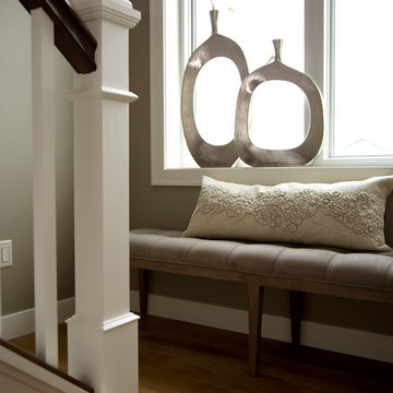
Nearby, just up the stairs, is an unusually spacious landing. A bench and pillows transform it into a special reading or conversation spot. The pair of hammered nickel vases on the window sill repeats the pattern established on either side of the fireplace. Using oversized vases in lieu of a window treatment is unexpected—as is incorporating sleek, modern-shaped vases like these in a farmhouse-style home. Yet because of the other oversized objects nearby, the vases feel distinctive and delightful.
4. Coordinate pattern and rhythm
Another oversized item is the table lamp in the living room. It’s a powerful light; aside from the overhead can lights, it’s the room’s only light source. The ridges on its ceramic base echo the pieces of wicker in the stunning basket behind the sofa.
This oversized wicker basket, which we’re a bit in love with, features a very large weave along with elegant leather straps. It’s ideal for storing throws, cushions, board games or anything else you want out of sight.
5. Proximity matters
This home’s dining room is just to the right of the entry. An immense floor mirror—double-framed in weathered wood—is placed opposite the front windows. Measuring seven feet high, it’s a bold piece. And it works perfectly in this space to reflect light and make the room feel larger.
An oversized ceramic vase, with a porous, matte-stone finish, sits atop a table next to the mirror. Other regular-sized items share the small table, including a bottle of wine and a glass vase. But because of the enormous mirror, it was important to have one oversized item on that table, for balance.
Sponsored
Plain City, OH

The Creative Kitchen Company
Columbus Area Kitchen Remodeling and Refacing Professional
 Simply Perfect
With Pinterest, Houzz and HGTV, homeowners have more sources for inspiration than ever before. You may have found, however, that replicating what you see online or on TV isn’t always that simple. Mastering proportion and scale can be especially challenging.
Let’s say you fall in love with an oversized vase which looks like it will fit with the colors and textures in your living room. But once it’s there, the vase doesn’t look the way you expected and you don’t know now to make it work.
Fortunately, designers are experienced not only in dealing with proportion and scale, but in handling multiple elements at once.
In the meantime, here are a few tips to help you understand some of the considerations regarding size.
Proportion Tips
1. Less is more
In the home shown here, the rooms are on the smaller side, where it would seem counterintuitive to use oversized pieces. But using smaller pieces can look busy—and can actually make the rooms feel smaller, especially when you add personal belongings to the space.
2. Keep it simple
Several oversized pieces can create clean, simple lines. We put this principle to work using oversized items as anchors on both sides of the fireplace in the living room.
On one side, we have two oversized blown-glass vases with amber, silver and purple tones. The irregular shapes in these beautiful pieces create interest and contrast; you can see through them and you can see the room reflected in them.
On the other side of the fireplace sit two oversized brass lanterns filled with driftwood and greenery; the contents can be switched out seasonally, as well.
The vases on one side and lanterns on the other side establish pattern (two of each, in descending order), balance and simplicity.
3. Embrace the unexpected
On the mantle above the fireplace rests another oversized piece—a painting of a barn. Its neutral colors pick up the tones in the stone behind it and again, it works to bring simplicity to the space, rather than overly fussy detail.
Nearby, just up the stairs, is an unusually spacious landing. A bench and pillows transform it into a special reading or conversation spot. The pair of hammered nickel vases on the window sill repeats the pattern established on either side of the fireplace. Using oversized vases in lieu of a window treatment is unexpected—as is incorporating sleek, modern-shaped vases like these in a farmhouse-style home. Yet because of the other oversized objects nearby, the vases feel distinctive and delightful.
4. Coordinate pattern and rhythm
Another oversized item is the table lamp in the living room. It’s a powerful light; aside from the overhead can lights, it’s the room’s only light source. The ridges on its ceramic base echo the pieces of wicker in the stunning basket behind the sofa.
This oversized wicker basket, which we’re a bit in love with, features a very large weave along with elegant leather straps. It’s ideal for storing throws, cushions, board games or anything else you want out of sight.
5. Proximity matters
This home’s dining room is just to the right of the entry. An immense floor mirror—double-framed in weathered wood—is placed opposite the front windows. Measuring seven feet high, it’s a bold piece. And it works perfectly in this space to reflect light and make the room feel larger.
An oversized ceramic vase, with a porous, matte-stone finish, sits atop a table next to the mirror. Other regular-sized items share the small table, including a bottle of wine and a glass vase. But because of the enormous mirror, it was important to have one oversized item on that table, for balance.
 Publisher
The kitchen, often considered the heart of the home, is a space where functionality and aesthetics coalesce. Among the myriad choices homeowners face when designing or renovating their kitchens, selecting a suitable kitchen splashback is crucial. In recent years, glass splashbacks have emerged as a versatile and universally appealing option. This article delves into the reasons why a glass kitchen splashback is suitable for everyone, blending seamlessly with diverse preferences, lifestyles, and design aesthetics.
Versatility in Design
One of the key factors that make glass kitchen splashbacks universally suitable is their versatility in design. Glass offers a neutral and timeless aesthetic, effortlessly complementing various interior styles, from modern and minimalist to classic and eclectic. Whether your kitchen embodies a sleek, contemporary vibe or a rustic, traditional charm, a glass splashback seamlessly integrates into the design landscape.
Furthermore, the transparency of glass allows it to adapt to any colour scheme or pattern in the surrounding space. Whether you prefer bold and vibrant hues or a more subdued palette, a glass splashback can be customised to match your preferences, making it an ideal choice for homeowners seeking design flexibility.
Enhanced Perception of Space
Glass has a unique ability to create an illusion of space and openness in a room. This quality is particularly beneficial for smaller kitchens or those with limited natural light. A glass kitchen splashback reflects sunlight, making the space brighter and more expansive. By enhancing the perception of the room, glass splashbacks contribute to an overall sense of airiness and openness, creating an inviting atmosphere that suits various home sizes and layouts.
Easy Maintenance and Hygiene
Practicality is a paramount consideration in kitchen design, and glass splashbacks excel in ease of maintenance and hygiene. Unlike porous materials such as tiles or grout, glass provides a smooth, non-absorbent surface that is easy to clean and maintain. Spills and splatters can be effortlessly wiped away with a damp cloth, ensuring a hygienic and sanitary kitchen environment.
The non-porous nature of glass also prevents mould and bacteria growth, making it a suitable choice for families with young children or individuals with allergies. The low-maintenance aspect of glass makes it a universally appealing option for those who value a clean and sanitary kitchen without the hassle of extensive upkeep.
Durability and Longevity
Glass kitchen splashbacks are known for their durability and longevity. The tempered glass commonly used in splashbacks is heat-resistant, ensuring it can withstand the rigours of a busy kitchen without compromising its integrity. This durability makes glass splashbacks suitable for households with avid home cooks who frequently use high-temperature cooking techniques.
Moreover, the longevity of glass ensures that it remains a sustainable and cost-effective choice over the long term. Unlike some materials that may wear out or become dated, a well-maintained glass splashback retains its aesthetic appeal and functionality for years, making it an investment that stands the test of time.
Customisation Options
Personalisation is a crucial aspect of home design, and glass kitchen splashbacks offer various customisation options. From selecting the colour and pattern to incorporating personalised designs or digitally printed images, homeowners can tailor their glass splashbacks to reflect their style and preferences.
The ability to customise glass splashbacks makes them suitable for everyone, allowing individuals to express their creativity and personality in the heart of their homes. Whether you opt for a bold, statement-making design or a subtle, elegant finish, the customisation options inherent in glass splashbacks ensure a perfect fit for diverse tastes.
Conclusion
In conclusion, the universality of glass kitchen splashbacks lies in their ability to seamlessly integrate into various design styles, enhance the perception of space, offer easy maintenance and hygiene, exhibit durability, and provide many customisation options. As a versatile and timeless choice, glass splashbacks cater to homeowners' preferences and practical needs across different demographics.
Whether you reside in a compact urban apartment or a spacious suburban home, whether your aesthetic leans towards modern minimalism or classic elegance, a glass kitchen splashback is a fitting and universal solution. Its adaptability to different lifestyles and design preferences positions it as a versatile and enduring element in the ever-evolving kitchen design landscape.
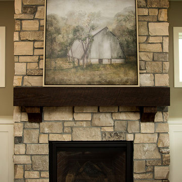 Simply Perfect
With Pinterest, Houzz and HGTV, homeowners have more sources for inspiration than ever before. You may have found, however, that replicating what you see online or on TV isn’t always that simple. Mastering proportion and scale can be especially challenging.
Let’s say you fall in love with an oversized vase which looks like it will fit with the colors and textures in your living room. But once it’s there, the vase doesn’t look the way you expected and you don’t know now to make it work.
Fortunately, designers are experienced not only in dealing with proportion and scale, but in handling multiple elements at once.
In the meantime, here are a few tips to help you understand some of the considerations regarding size.
Proportion Tips
1. Less is more
In the home shown here, the rooms are on the smaller side, where it would seem counterintuitive to use oversized pieces. But using smaller pieces can look busy—and can actually make the rooms feel smaller, especially when you add personal belongings to the space.
2. Keep it simple
Several oversized pieces can create clean, simple lines. We put this principle to work using oversized items as anchors on both sides of the fireplace in the living room.
On one side, we have two oversized blown-glass vases with amber, silver and purple tones. The irregular shapes in these beautiful pieces create interest and contrast; you can see through them and you can see the room reflected in them.
On the other side of the fireplace sit two oversized brass lanterns filled with driftwood and greenery; the contents can be switched out seasonally, as well.
The vases on one side and lanterns on the other side establish pattern (two of each, in descending order), balance and simplicity.
3. Embrace the unexpected
On the mantle above the fireplace rests another oversized piece—a painting of a barn. Its neutral colors pick up the tones in the stone behind it and again, it works to bring simplicity to the space, rather than overly fussy detail.
Nearby, just up the stairs, is an unusually spacious landing. A bench and pillows transform it into a special reading or conversation spot. The pair of hammered nickel vases on the window sill repeats the pattern established on either side of the fireplace. Using oversized vases in lieu of a window treatment is unexpected—as is incorporating sleek, modern-shaped vases like these in a farmhouse-style home. Yet because of the other oversized objects nearby, the vases feel distinctive and delightful.
4. Coordinate pattern and rhythm
Another oversized item is the table lamp in the living room. It’s a powerful light; aside from the overhead can lights, it’s the room’s only light source. The ridges on its ceramic base echo the pieces of wicker in the stunning basket behind the sofa.
This oversized wicker basket, which we’re a bit in love with, features a very large weave along with elegant leather straps. It’s ideal for storing throws, cushions, board games or anything else you want out of sight.
5. Proximity matters
This home’s dining room is just to the right of the entry. An immense floor mirror—double-framed in weathered wood—is placed opposite the front windows. Measuring seven feet high, it’s a bold piece. And it works perfectly in this space to reflect light and make the room feel larger.
An oversized ceramic vase, with a porous, matte-stone finish, sits atop a table next to the mirror. Other regular-sized items share the small table, including a bottle of wine and a glass vase. But because of the enormous mirror, it was important to have one oversized item on that table, for balance.
127