
Search results for "Creating considerable" in Home Design Ideas
 Building Designers Association of Australia
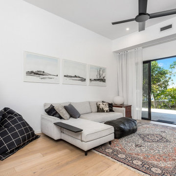
The knock down & rebuild revolution is here to stay. This new modern family home replaces a tired old house that was not designed to capitalise on its location, whereas this new contemporary modern building has been designed to capitalise on the natural environment – natural sunlight, sea breezes & sea views, to create a very liveable coastal family home. This new residence with its contemporary coastal styling utilises the natural finishes of modern materials to ground this family home’s context into this locations evolving executive seaside neighbourhood. This buildings design is a balance of form & function with a deliberate consideration of passive solar liveable design techniques, designed to capture the natural sunlight, sea breezes & sea views that this property offers. This new residence has been designed with a variety of indoor & outdoor living areas to capitalise on the natural environment & climate of this property’s location. This house incorporates design elements to allow the house to be comfortable all year round, providing a variety of areas for occupants to utilise, whether it be capturing natural sunlight & warmth in winter, creating cooling cross ventilation from sea breezes in summer & then there is the direct access to a beautifully natural landscaped garden, this new house will provide the occupants with a low maintenance, healthy living environment for years to come.
 Braen Supply
Building a Dream Backyard
When this homeowner started the design process of a new backyard, Braen Supply was immediately there to supply all the stone materials. The home was part of a new development, so the challenge was to make the home stand out while still addressing specific areas of the existing backyard, such as the steep grade.
Working With the Experts
Taking the steep grade into consideration, moss rock boulders were selected to create stairs down to the lower area of the backyard where the fire pit sits. The grade of the backyard also allowed for the infinity pool, full color bluestone pattern was selected as the veneer for the back wall of the infinity pool.
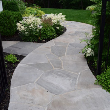
Braen Supply chose Tennessee gray and bluestone to create a seamless transition from the front of the house to the back of the house. Although they are two different stones, they work nicely together to complete the overall design and tone of the home. It all came together and made the perfect backyard.
Materials Used:
Belgium Blocks
Full Color Bluestone Pattern
Bluestone Caps
Tennessee Gray Irregular
Moss Rock Boulders
Full Color Bluestone Irregular
Kearney Stone Steps
Granite Mosaic Veneer
Completed Areas:
Front Walkway & Porch
Driveway Edging
Backyard Walkways
Pool Patio & Coping
Pool Water Features
Fireplace Hearth & Mantal
Wading Pool
Raised Hot Tub
 Garner Homes
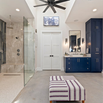
Ideal for extensive entertaining and comfortable everyday living, we designed an open floor plan that offered easy flow between the living room, bar, dining space and kitchen. Multiple horizontal and vertical offsets created visual interest on all four elevations while custom-built light fixtures produced sleek task lighting in work areas without sacrificing style. To create additional texture and character, we utilized transitional architecture by uses massing, materials, and lines found in the Hill Country in new ways with architectural limestone blocks, rough chopped Texas limestone, and stucco with metal reveals. Particular consideration was given to the views visible from bedrooms as well as always achieving cross-lighting to capture as much natural light as possible, as seen in the master bath where both windows in the wet room light the space throughout the day. We also featured aluminum clad wood window package, an anodized aluminum window wall in the living room, and a custom design steel and glass entry door.
Find the right local pro for your project
 Simply Perfect
With Pinterest, Houzz and HGTV, homeowners have more sources for inspiration than ever before. You may have found, however, that replicating what you see online or on TV isn’t always that simple. Mastering proportion and scale can be especially challenging.
Let’s say you fall in love with an oversized vase which looks like it will fit with the colors and textures in your living room. But once it’s there, the vase doesn’t look the way you expected and you don’t know now to make it work.
Fortunately, designers are experienced not only in dealing with proportion and scale, but in handling multiple elements at once.
In the meantime, here are a few tips to help you understand some of the considerations regarding size.
Proportion Tips
1. Less is more
In the home shown here, the rooms are on the smaller side, where it would seem counterintuitive to use oversized pieces. But using smaller pieces can look busy—and can actually make the rooms feel smaller, especially when you add personal belongings to the space.
2. Keep it simple
Several oversized pieces can create clean, simple lines. We put this principle to work using oversized items as anchors on both sides of the fireplace in the living room.
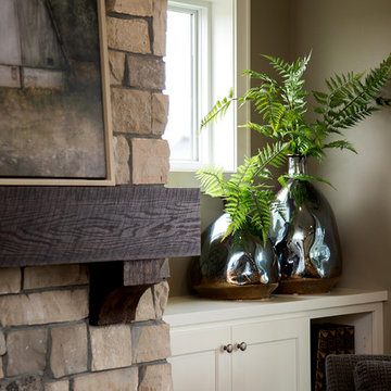
On one side, we have two oversized blown-glass vases with amber, silver and purple tones. The irregular shapes in these beautiful pieces create interest and contrast; you can see through them and you can see the room reflected in them.
On the other side of the fireplace sit two oversized brass lanterns filled with driftwood and greenery; the contents can be switched out seasonally, as well.
The vases on one side and lanterns on the other side establish pattern (two of each, in descending order), balance and simplicity.
3. Embrace the unexpected
On the mantle above the fireplace rests another oversized piece—a painting of a barn. Its neutral colors pick up the tones in the stone behind it and again, it works to bring simplicity to the space, rather than overly fussy detail.
Nearby, just up the stairs, is an unusually spacious landing. A bench and pillows transform it into a special reading or conversation spot. The pair of hammered nickel vases on the window sill repeats the pattern established on either side of the fireplace. Using oversized vases in lieu of a window treatment is unexpected—as is incorporating sleek, modern-shaped vases like these in a farmhouse-style home. Yet because of the other oversized objects nearby, the vases feel distinctive and delightful.
4. Coordinate pattern and rhythm
Another oversized item is the table lamp in the living room. It’s a powerful light; aside from the overhead can lights, it’s the room’s only light source. The ridges on its ceramic base echo the pieces of wicker in the stunning basket behind the sofa.
This oversized wicker basket, which we’re a bit in love with, features a very large weave along with elegant leather straps. It’s ideal for storing throws, cushions, board games or anything else you want out of sight.
5. Proximity matters
This home’s dining room is just to the right of the entry. An immense floor mirror—double-framed in weathered wood—is placed opposite the front windows. Measuring seven feet high, it’s a bold piece. And it works perfectly in this space to reflect light and make the room feel larger.
An oversized ceramic vase, with a porous, matte-stone finish, sits atop a table next to the mirror. Other regular-sized items share the small table, including a bottle of wine and a glass vase. But because of the enormous mirror, it was important to have one oversized item on that table, for balance.
 Simply Perfect
With Pinterest, Houzz and HGTV, homeowners have more sources for inspiration than ever before. You may have found, however, that replicating what you see online or on TV isn’t always that simple. Mastering proportion and scale can be especially challenging.
Let’s say you fall in love with an oversized vase which looks like it will fit with the colors and textures in your living room. But once it’s there, the vase doesn’t look the way you expected and you don’t know now to make it work.
Fortunately, designers are experienced not only in dealing with proportion and scale, but in handling multiple elements at once.
In the meantime, here are a few tips to help you understand some of the considerations regarding size.
Proportion Tips
1. Less is more
In the home shown here, the rooms are on the smaller side, where it would seem counterintuitive to use oversized pieces. But using smaller pieces can look busy—and can actually make the rooms feel smaller, especially when you add personal belongings to the space.
2. Keep it simple
Several oversized pieces can create clean, simple lines. We put this principle to work using oversized items as anchors on both sides of the fireplace in the living room.
On one side, we have two oversized blown-glass vases with amber, silver and purple tones. The irregular shapes in these beautiful pieces create interest and contrast; you can see through them and you can see the room reflected in them.
On the other side of the fireplace sit two oversized brass lanterns filled with driftwood and greenery; the contents can be switched out seasonally, as well.
The vases on one side and lanterns on the other side establish pattern (two of each, in descending order), balance and simplicity.
3. Embrace the unexpected
On the mantle above the fireplace rests another oversized piece—a painting of a barn. Its neutral colors pick up the tones in the stone behind it and again, it works to bring simplicity to the space, rather than overly fussy detail.
Nearby, just up the stairs, is an unusually spacious landing. A bench and pillows transform it into a special reading or conversation spot. The pair of hammered nickel vases on the window sill repeats the pattern established on either side of the fireplace. Using oversized vases in lieu of a window treatment is unexpected—as is incorporating sleek, modern-shaped vases like these in a farmhouse-style home. Yet because of the other oversized objects nearby, the vases feel distinctive and delightful.
4. Coordinate pattern and rhythm
Another oversized item is the table lamp in the living room. It’s a powerful light; aside from the overhead can lights, it’s the room’s only light source. The ridges on its ceramic base echo the pieces of wicker in the stunning basket behind the sofa.
This oversized wicker basket, which we’re a bit in love with, features a very large weave along with elegant leather straps. It’s ideal for storing throws, cushions, board games or anything else you want out of sight.
5. Proximity matters
This home’s dining room is just to the right of the entry. An immense floor mirror—double-framed in weathered wood—is placed opposite the front windows. Measuring seven feet high, it’s a bold piece. And it works perfectly in this space to reflect light and make the room feel larger.
An oversized ceramic vase, with a porous, matte-stone finish, sits atop a table next to the mirror. Other regular-sized items share the small table, including a bottle of wine and a glass vase. But because of the enormous mirror, it was important to have one oversized item on that table, for balance.
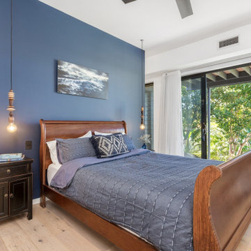 Building Designers Association of Australia
The knock down & rebuild revolution is here to stay. This new modern family home replaces a tired old house that was not designed to capitalise on its location, whereas this new contemporary modern building has been designed to capitalise on the natural environment – natural sunlight, sea breezes & sea views, to create a very liveable coastal family home. This new residence with its contemporary coastal styling utilises the natural finishes of modern materials to ground this family home’s context into this locations evolving executive seaside neighbourhood. This buildings design is a balance of form & function with a deliberate consideration of passive solar liveable design techniques, designed to capture the natural sunlight, sea breezes & sea views that this property offers. This new residence has been designed with a variety of indoor & outdoor living areas to capitalise on the natural environment & climate of this property’s location. This house incorporates design elements to allow the house to be comfortable all year round, providing a variety of areas for occupants to utilise, whether it be capturing natural sunlight & warmth in winter, creating cooling cross ventilation from sea breezes in summer & then there is the direct access to a beautifully natural landscaped garden, this new house will provide the occupants with a low maintenance, healthy living environment for years to come.
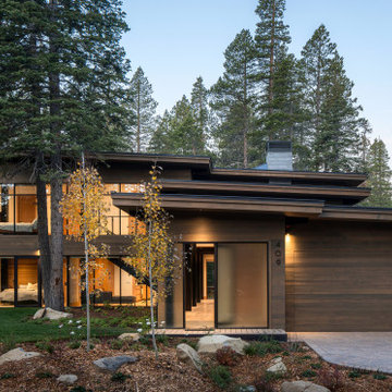
 MacCracken Robinson Architects
Our introduction to the Tahoe site was in late winter, on a clear sunny day with filtered light and long shadows through snow-laden fir and pine bows. It made a strong impression, stored for future consideration but the impetus for the design came soon after the spring snow melt. A powerful sense of horizontal layering of vegetation and various stages of decomposing downed timber on the two-acre site, juxtaposed with pine and fir trees and the dense canopy of the surrounding forest. The site is located near the historic 1960 Olympic Nordic track, situated on the edge of wetlands and seasonal streams.
The homeowners were previous clients and dreamt of having a retreat in the Sierras away from their home base in Berkeley, CA. Among skiers, bike riders, hikers, and boaters, they found the ideal central location for their home base near Lake Tahoe.
The home is organized as a series of linked spaces, each providing a unique sensory experience and connection to different parts of the site, both vertically and horizontally. The design includes extensive use of glass to create a true indoor/outdoor connection and maximize natural light. At the center of the site are two large fir trees, which the building respectfully wraps around in an L shape to create a focal point in the landscaped courtyard.
A refined, context-driven palette of natural materials including cedar, oak, fir, and steel is used to harmoniously blend in among the surroundings. The construction includes advanced details such as thermally broken steel beams supporting layered roof planes engineered to hold snow rather than shed it. Designed to resist significant load, we exposed the steel structure as a recurring element in the interior spaces. The resulting columns and support beams contribute to the familiar design aspects of each room and provide a better understanding of how the building was constructed. The second floor features cantilevered volumes that reach out into the nearby evergreen limbs, likening the experience to being in a tree house. The house incorporates features such as radiant heating, solar panels, and operable windows for passive cooling. Fire safety measures include the use of naturally fire-resistant materials, a Class A roof construction, sprinklers, and drought-tolerant landscaping beyond the defensible space.
Sponsored
Delaware, OH

Buckeye Basements, Inc.
Central Ohio's Basement Finishing ExpertsBest Of Houzz '13-'21
 The Myers Touch
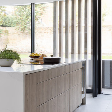
In collaboration with the client’s architect, AR Design the layout of the kitchen was already in place. However, upon meeting the client it was clear she wanted a ‘wow’ island, symmetry in design and plenty of functional storage.
As well as a contemporary, family-friendly space it was also important the space that still respected the heritage of the house. The original walls of the property had many angled walls and featured some tight spaces, so careful consideration of SieMatic's cabinetry choices was given to ensure maximum functionality in those spaces. After much consideration, The Myers Touch specified SieMatic’s SC10 Cabinetry in a Provence Oak Laminate finish which was placed in a framed-style at the rear wall.
The same cabinetry was specified for under the island to create contrast with the new and original material features in the space. In order for the family to keep the kitchen uncluttered, careful planning of internal storage systems was considered in the form of using SieMatic’s internal Drawer boxes and their MultiMatic internal storage system which were used to store smaller items such as spices and sauces, as well whilst providing space for slide-out drawers and storage baskets.
To ensure an elegant yet ‘wow’ factor central island, The Myers Touch combined contrasting textures by using 30mm Silestone Eternal Calacatta natural stone, polished worktops with ‘waterfall island’ edges and a Corian solid surface back panel. The distinctive geometric patterned Corian panel in Cameo White looks particularly spectacular at night when the owner's turn on the architectural-toned lighting under the island.
Appliances chosen for the island included a sophisticated Elica Illusion extractor hood so it could be totally integrated in the new architectural space without visual distraction, a Siemens iQ500 Induction Hob with touch-slide control and a Caple Under-counter Wine cabinet.
To maximise every inch of the new space, and to ensure the owners had a place for everything, The Myers Touch also used additional cabinetry and storage options in the island such as extra deep drawers to store saucepans, cutlery, and everyday crockery.
The eye-catching Antique-bronze mirrored splashback not only helps to provide the illusion of extra space, but reinforces family ‘togetherness’ as it reflects and links the rear of the kitchen ‘snug’ area where family members can sit and relax or work when not in the main kitchen extension area.
The original toned brickwork and 18th Century steel windows in the original part of the extension also helps to tell the story about the older part of the house which now juxtaposes to the new, contemporary kitchen living extension. A handy door was also included in the extension which leads to the garage on the main road for family convenience and over-flow storage.
Photography by Paul Craig (Reproduction of image by request only - joy@bakerpr.co.uk)
 Interior Design Imports
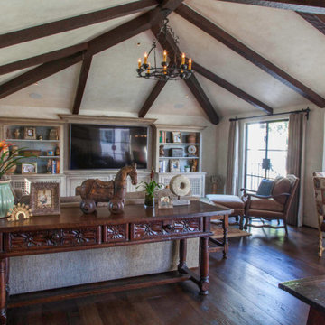
An historic Spanish Colonial residence built in 1925 being redesigned and furnished for a modern-day Southern California family was the challenge. The interiors of the main house needed the backgrounds set and then a timeless collection created for its furnishings. Lifestyle was always a consideration as well as the interiors relating to the strong architecture of the residence. Natural colors such as terra cotta, tans, blues, greens, old red and soft vintage shades were incorporated throughout. Our goal was to maintain the historic character of the residence combining design elements and materials considered classic in Southern California Spanish Colonial architecture. Natural fiber textiles, leathers and woven linens were the predominated upholstery choices. A 7000 square foot basement was added and furnished to provide a gym, Star Wars theater, game areas, spa area and a simulator for indoor golf and other sports.
Antiques were selected throughout the world, fine art from major galleries, custom reproductions fabricated in the old-world style. Collectible carpets were selected for the reclaimed hardwood flooring in all the areas. An estancia and garden over the basement were created and furnished with old world designs and materials as reclaimed woods, terra cotta and French limestone flooring.
 KSI Kitchen & Bath
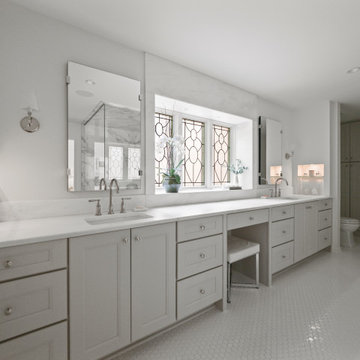
An art-loving client came to us with an enticing whole-condo remodel project: could we create a warm, clean, contemporary aesthetic throughout her space while blending maximized storage and functionality with aging-in-place considerations? We were excited to dig in and help the client create a timeless space that met her needs!
 AppWood Custom Woodwork
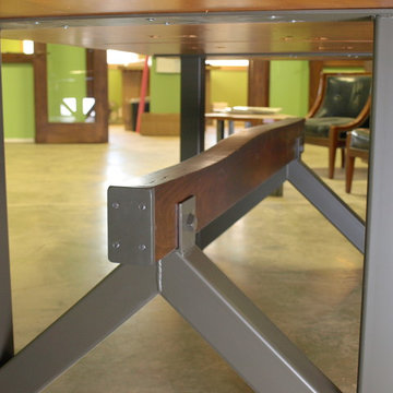
Many times we are asked, especially by former clients, to create “other” special projects for them. Here is one such project. A former AppWood Door client contacted us 3 years after receiving her custom door asking us to design and build a Dining Table for her that meshed some elements of her sleek and modern Front Entry Door while contrasting others.
After considerable thought, sketches and multiple drawings, we developed this “Live Edge”
Sycamore and Walnut table with a shop-made metal base. It incorporates the modern elements of her wood and metal door but with a softer, more organic and warm overall feel. The oblong shape of the Sycamore slab required a way to “widen” it on one end so it would be more uniform in size. We created a solid Walnut panel with soft curving lines and piston-fit it in the middle of the table to widen it and make it uniform in size.
Metal still meets wood… organically! Needless to say, she loves it
 Interior Design Imports
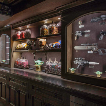
An historic Spanish Colonial residence built in 1925 being redesigned and furnished for a modern-day Southern California family was the challenge. The interiors of the main house needed the backgrounds set and then a timeless collection created for its furnishings. Lifestyle was always a consideration as well as the interiors relating to the strong architecture of the residence. Natural colors such as terra cotta, tans, blues, greens, old red and soft vintage shades were incorporated throughout. Our goal was to maintain the historic character of the residence combining design elements and materials considered classic in Southern California Spanish Colonial architecture. Natural fiber textiles, leathers and woven linens were the predominated upholstery choices. A 7000 square foot basement was added and furnished to provide a gym, Star Wars theater, game areas, spa area and a simulator for indoor golf and other sports.
Antiques were selected throughout the world, fine art from major galleries, custom reproductions fabricated in the old-world style. Collectible carpets were selected for the reclaimed hardwood flooring in all the areas. An estancia and garden over the basement were created and furnished with old world designs and materials as reclaimed woods, terra cotta and French limestone flooring.
 KSI Kitchen & Bath
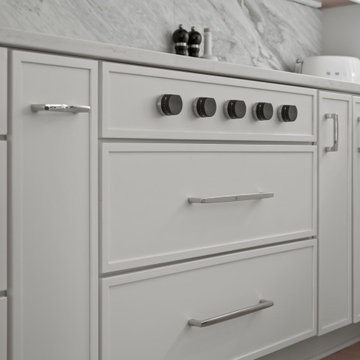
An art-loving client came to us with an enticing whole-condo remodel project: could we create a warm, clean, contemporary aesthetic throughout her space while blending maximized storage and functionality with aging-in-place considerations? We were excited to dig in and help the client create a timeless space that met her needs!
Sponsored
Columbus, OH

Hope Restoration & General Contracting
Columbus Design-Build, Kitchen & Bath Remodeling, Historic Renovations
 KB Design Firm
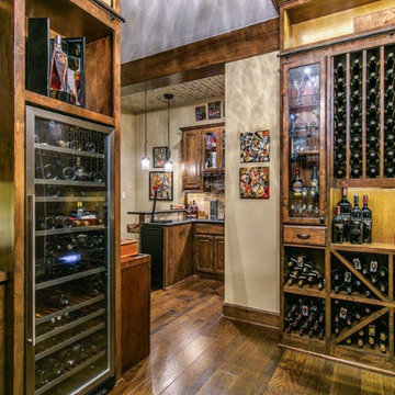
DULL BEDROOM TRANSFORMED TO THE ULTIMATE IN BAR/WINE RETREAT!
This unused bedroom was positioned off a hall close to the breakfast area. KB Design enclosed an existing hall, converted a closet space and removed a Hollywood bath vanity area to reposition entry and create a cozy bar as you walk into this fabulous wine room. Beams were added along with brick accents and custom designed storage to meet every need for the client's extensive collection of wines, champagnes and cigars. Special consideration was given to the arched entrance and the lighting throughout to create the ultimate atmosphere for this wine room!
 Skill Construction & Design, LLC
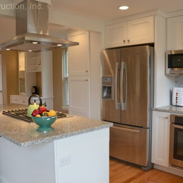
There are so many design elements to this kitchen, I almost don’t know where to start. Bright and airy with crisp clean white cabinets, the kitchen is open and welcoming. Still crisp but gently contrasting, the stainless steel appliance add depth amid the white. To keep this kitchen warm, natural oak covers the floors and a toasted wheat color washes the walls. And then there is the architectural elements. You know. That post and beam in the middle of the room. It’s the center of attention.
When you walk into a room your eyes roam around, establishing the size and shape of the room as your feet take you forward. From the front door of this home straight ahead you encountered this wall. The dining area to the right gives you a glimpse of things to come. Where there is a dining room you will usually find a kitchen.
The architecture of years gone by consistently hides the kitchen, the heart of the home, behind walls. I sympathize with my Mom, and all the other Moms, who have had to spend so much time tucked into a tight kitchen, away from the family. This wall had to go, but it was structural. We needed its support but not its bulk.
So we got rid of the bulk and only the bulk. Instead of a wall we have a post and beam, offering all of the structure we need. We could have installed a huge steel beam and reconfigure the joists to upset the beam, but why? The small beam and post add an incredible architectural element. It’s turning lemons into lemon, we simply made the most of what we had. It may be functional but it’s so fantastic. It looks like we created the effect just for the drama.
The original kitchen may have had a working triangle and some counter space, but it was fairly small, with each area only a step or two away. The dark cabinets made the space feel even smaller and the butcher block patterned laminate counter tops were very dated. The appliances were feeling their age as well, from a coil burner electric stove to a top freezer refrigerator. To keep this kitchen within its space, a half wall separated it from the dining area.
With the wall gone we borrowed some space from the living room and extended what was a U shaped kitchen into an L. At the living room window we start our new kitchen. We kept a small part of the wall to support the other end of our decorative beam. Sandwiched between a large pantry and our new French door refrigerator, the wall disappears. With our new open floor plan a sizable island was in order.
We split our cooking areas and installed a continuous grill gas cooktop into the island. A sleek island hood takes care of exhaust and adds an extra element to our architectural feature. Under the cooktop we added over-sized drawers for pots and pan storage. The frameless cabinets from New River Cabinetry are maple, painted white, with the Herndon door style. With the cooktop safely nestled into our island, we still had to add an oven.
We used the space where the old range sat for a large single oven of stainless steel and glass. If it worked for one, why not two? We created a home for a microwave in the wall cabinets. It’s perfect for heating leftovers so close to the refrigerator.
An important consideration for hot spots in your kitchen is landing zones. Each of our cooking areas have generous landing zones, one on each side of the cooktop and an entire counter area above or below the ovens, depending on which one you’re using.
We wanted to give the sink area more room so the half wall had to come out. We moved the trash and recycle cans into a cabinet, removed the heavy soffits and kept the sink under the window.
With that little bit of extra space we were able to add a larger cabinet above the dishwasher and slide it all down. This used to be where the carpeting met the vinyl floor, but all of it is gone. Long oak planks eliminate that final divide between the kitchen and the dining area, while adding visual length to the area. White wall cabinets on each side of the window reflect the sunlight for a brighter view.
With all of the darker cabinetry the backsplash walls had been painted white. Even still, there was a darkness in the corners and it wasn’t very exciting. We wanted to add visual interest and reflect the new under-cabinet lighting, eliminating the shadows in this corner.
With 1″x 2″ Arabescato Honed marble mosaics and those under-cabinet lights, we achieved the perfect balance. The marble has subtle swirls in gray and beige on a clean white background, but with the honed finish the light is softly reflected instead of glaring. For granite, we chose the soft gray tones of Luna Pearl. The speckles of gray and beige are a gentle contrast to the white cabinets and emulate the color of the stainless steel.
Between the carpet, red half wall, dark railing and dated light fixture, the dining area felt tired. Since the kitchen lacked sufficient storage, a large utility cabinet crowded the table space without adding any decorate elements.
Although it didn’t get any bigger, our dining area feels fresher and more open too. With the oak flooring joining the area to the rest of our space and the toasted wheat on the walls, the white table and chairs compliment the cabinetry while contrasting the warmer colors. We replaced the chandelier with recessed lighting and changed that railing too.
With our new open floor plan, we ended up with a fairly open area in between our foyer closet and the living room window. Not one to miss an opportunity, we filled the space with a multi-functional work space.
With the sunlight streaming in this bright corner works for anything this family needs.
There’s plenty of space for a chair under this large desk drawer. A closed cabinet below, glass doors above and lots of open shelving let you store and or showcase your belongings. We added a lite area at the top to keep away the darker corners.
The transformation is complete. This kitchen and all of its features are truly the center of attention in this home.
http://www.designsbyskill.com/
http://www.rjkconstructioninc.com/
 KSI Kitchen & Bath
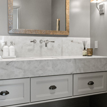
An art-loving client came to us with an enticing whole-condo remodel project: could we create a warm, clean, contemporary aesthetic throughout her space while blending maximized storage and functionality with aging-in-place considerations? We were excited to dig in and help the client create a timeless space that met her needs!
 Building Designers Association of Australia
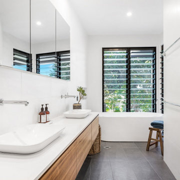
The knock down & rebuild revolution is here to stay. This new modern family home replaces a tired old house that was not designed to capitalise on its location, whereas this new contemporary modern building has been designed to capitalise on the natural environment – natural sunlight, sea breezes & sea views, to create a very liveable coastal family home. This new residence with its contemporary coastal styling utilises the natural finishes of modern materials to ground this family home’s context into this locations evolving executive seaside neighbourhood. This buildings design is a balance of form & function with a deliberate consideration of passive solar liveable design techniques, designed to capture the natural sunlight, sea breezes & sea views that this property offers. This new residence has been designed with a variety of indoor & outdoor living areas to capitalise on the natural environment & climate of this property’s location. This house incorporates design elements to allow the house to be comfortable all year round, providing a variety of areas for occupants to utilise, whether it be capturing natural sunlight & warmth in winter, creating cooling cross ventilation from sea breezes in summer & then there is the direct access to a beautifully natural landscaped garden, this new house will provide the occupants with a low maintenance, healthy living environment for years to come.
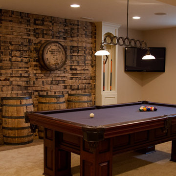
Sponsored
Delaware, OH
Buckeye Basements, Inc.
Central Ohio's Basement Finishing ExpertsBest Of Houzz '13-'21

 Business_Name_Placeholder
?? 24/7 Support
⭐️ Top-Rated Service
? Fast Response
? Premium Quality
✈️◆► Telegram: @Pvatopzone
?◆► WhatsApp: +1 (579) 550-8030
?◆► Discord: accountservice
✈️◆► https://t.me/Pvatopzone
?◆► Email: Pvatopzone@gmail.com
 Interior Design Imports
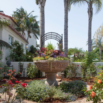
An historic Spanish Colonial residence built in 1925 being redesigned and furnished for a modern-day Southern California family was the challenge. The interiors of the main house needed the backgrounds set and then a timeless collection created for its furnishings. Lifestyle was always a consideration as well as the interiors relating to the strong architecture of the residence. Natural colors such as terra cotta, tans, blues, greens, old red and soft vintage shades were incorporated throughout. Our goal was to maintain the historic character of the residence combining design elements and materials considered classic in Southern California Spanish Colonial architecture. Natural fiber textiles, leathers and woven linens were the predominated upholstery choices. A 7000 square foot basement was added and furnished to provide a gym, Star Wars theater, game areas, spa area and a simulator for indoor golf and other sports.
Antiques were selected throughout the world, fine art from major galleries, custom reproductions fabricated in the old-world style. Collectible carpets were selected for the reclaimed hardwood flooring in all the areas. An estancia and garden over the basement were created and furnished with old world designs and materials as reclaimed woods, terra cotta and French limestone flooring.
 Renovisions
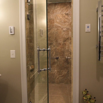
It’s no surprise these Hanover clients reached out to Cathy and Ed of Renovisions for design and build services as they wanted a local professional bath specialist to turn their plain builder-grade bath into a luxurious handicapped accessible master bath.
Renovisions had safety and universal design in mind while creating this customized two-person super shower and well-appointed master bath so their clients could escape to a special place to relax and energize their senses while also helping to conserve time and water as it is used simultaneously by them.
This completely water proofed spacious 4’x8’ walk-in curb-less shower with lineal drain system and larger format porcelain tiles was a must have for our senior client –with larger tiles there are less grout lines, easier to clean and easier to maneuver using a walker to enter and exit the master bath.
Renovisions collaborated with their clients to design a spa-like bath with several amenities and added conveniences with safety considerations. The bench seat that spans the width of the wall was a great addition to the shower. It’s a comfortable place to sit down and stretch out and also to keep warm as electric mesh warming materials were used along with a programmable thermostat to keep these homeowners toasty and cozy!
Careful attention to all of the details in this master suite created a peaceful and elegant environment that, simply put, feels divine. Adding details such as the warming towel rack, mosaic tiled shower niche, shiny polished chrome decorative safety grab bars that also serve as towel racks and a towel rack inside the shower area added a measure of style. A stately framed mirror over the pedestal sink matches the warm white painted finish of the linen storage cabinetry that provides functionality and good looks to this space. Pull-down safety grab bars on either side of the comfort height high-efficiency toilet was essential to keep safety as a top priority.
Water, water everywhere for this well deserving couple – multiple shower heads enhances the bathing experience for our client with mobility issues as 54 soft sprays from each wall jet provide a soothing and cleansing effect – a great choice because they do not require gripping and manipulating handles yet provide a sleek look with easy cleaning. The thermostatic valve maintains desired water temperature and volume controls allows the bather to utilize the adjustable hand-held shower on a slide-bar- an ideal fixture to shower and spray down shower area when done.
A beautiful, frameless clear glass enclosure maintains a clean, open look without taking away from the stunning and richly grained marble-look tiles and decorative elements inside the shower. In addition to its therapeutic value, this shower is truly a design focal point of the master bath with striking tile work, beautiful chrome fixtures including several safety grab bars adding aesthetic value as well as safety benefits.
69