
Search results for "Current age" in Home Design Ideas
 Cinnabar Interiors
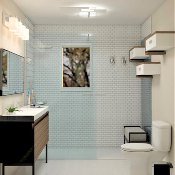
This is a realistic rendering of Option 3. Clients Final Choice.
Current Master Bathroom is very outdated. Client wanted to create a spa feel keeping it mid century modern style as the rest of their home. The bathroom is small so a spacious feeling was important. There is a window they wanted to focus on. A walk in shower was a must that eventually would accomodate an easy walk in as they aged.
 Granit Architects + Interiors
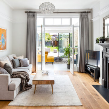
Our clients for this project are a professional couple with a young family. They approached us to help with extending and improving their home in London SW2 to create an enhanced space both aesthetically and functionally for their growing family. We were appointed to provide a full architectural and interior design service, including the design of some bespoke furniture too.
A core element of the brief was to design a kitchen living and dining space that opened into the garden and created clear links from inside to out. This new space would provide a large family area they could enjoy all year around. We were also asked to retain the good bits of the current period living spaces while creating a more modern day area in an extension to the rear.
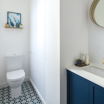
It was also a key requirement to refurbish the upstairs bathrooms while the extension and refurbishment works were underway.
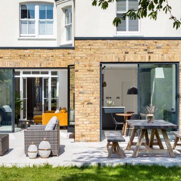
The solution was a 21m2 extension to the rear of the property that mirrored the neighbouring property in shape and size. However, we added some additional features, such as the projecting glass box window seat. The new kitchen features a large island unit to create a workspace with storage, but also room for seating that is perfect for entertaining friends, or homework when the family gets to that age.
The sliding folding doors, paired with floor tiling that ran from inside to out, created a clear link from the garden to the indoor living space. Exposed brick blended with clean white walls creates a very contemporary finish throughout the extension, while the period features have been retained in the original parts of the house.
 Granit Architects + Interiors
Our clients for this project are a professional couple with a young family. They approached us to help with extending and improving their home in London SW2 to create an enhanced space both aesthetically and functionally for their growing family. We were appointed to provide a full architectural and interior design service, including the design of some bespoke furniture too.
A core element of the brief was to design a kitchen living and dining space that opened into the garden and created clear links from inside to out. This new space would provide a large family area they could enjoy all year around. We were also asked to retain the good bits of the current period living spaces while creating a more modern day area in an extension to the rear.
It was also a key requirement to refurbish the upstairs bathrooms while the extension and refurbishment works were underway.
The solution was a 21m2 extension to the rear of the property that mirrored the neighbouring property in shape and size. However, we added some additional features, such as the projecting glass box window seat. The new kitchen features a large island unit to create a workspace with storage, but also room for seating that is perfect for entertaining friends, or homework when the family gets to that age.
The sliding folding doors, paired with floor tiling that ran from inside to out, created a clear link from the garden to the indoor living space. Exposed brick blended with clean white walls creates a very contemporary finish throughout the extension, while the period features have been retained in the original parts of the house.
Find the right local pro for your project
 Granit Architects + Interiors
Our clients for this project are a professional couple with a young family. They approached us to help with extending and improving their home in London SW2 to create an enhanced space both aesthetically and functionally for their growing family. We were appointed to provide a full architectural and interior design service, including the design of some bespoke furniture too.
A core element of the brief was to design a kitchen living and dining space that opened into the garden and created clear links from inside to out. This new space would provide a large family area they could enjoy all year around. We were also asked to retain the good bits of the current period living spaces while creating a more modern day area in an extension to the rear.
It was also a key requirement to refurbish the upstairs bathrooms while the extension and refurbishment works were underway.
The solution was a 21m2 extension to the rear of the property that mirrored the neighbouring property in shape and size. However, we added some additional features, such as the projecting glass box window seat. The new kitchen features a large island unit to create a workspace with storage, but also room for seating that is perfect for entertaining friends, or homework when the family gets to that age.
The sliding folding doors, paired with floor tiling that ran from inside to out, created a clear link from the garden to the indoor living space. Exposed brick blended with clean white walls creates a very contemporary finish throughout the extension, while the period features have been retained in the original parts of the house.
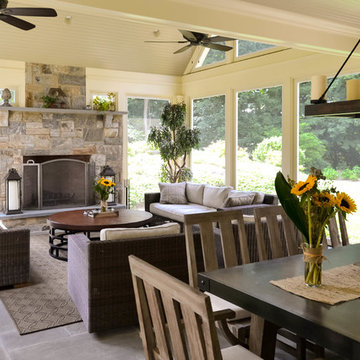
 Daniel Contelmo Architects
New screened porch addition with fireplace
Mid-sized classic porch idea in New York
Mid-sized classic porch idea in New York
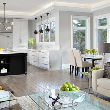
 My Design Studio, Yasmine Goodwin
Castleform Developments -Builder
Larry Arnal Photography
My Design Studio - Interior Design
Inspiration for a mid-sized transitional l-shaped medium tone wood floor open concept kitchen remodel in Toronto with a single-bowl sink, shaker cabinets, marble countertops, white backsplash, stone slab backsplash, paneled appliances and an island
Inspiration for a mid-sized transitional l-shaped medium tone wood floor open concept kitchen remodel in Toronto with a single-bowl sink, shaker cabinets, marble countertops, white backsplash, stone slab backsplash, paneled appliances and an island
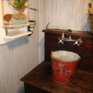
 Restoring Texas
Appearing as though this structure has stood in it's current spot for decades, this amazing pool house was created by Restoring Texas using mostly reclaimed materials harvested from local dilapidated Texas historical structures. Particularly, the siding, columns, doors, windows and many of other elements were salvaged from a Texas Craftsman style sharecropper home built in 1930. The tin was taken from the roofs of an early 1900's Texas barn. Historic signs such as the "Poss Pool Palace" sign bearing the name of its owners are reproduced and personalized by a local artist. Restoring Texas works closely with skilled builders and designers, and of course the home owners, throughout Texas to build these amazing works of art.


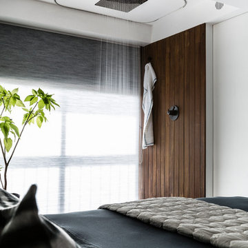
 Architecture BRIO
Jignesh Jhaveri
Bedroom - small contemporary master concrete floor bedroom idea in Pune with white walls
Bedroom - small contemporary master concrete floor bedroom idea in Pune with white walls
 McCabe By Design LLC
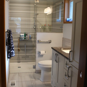
By removing the wall between the toilet shower room and the vanity, space was made for a tall storage cabinet and a pocket door to close off the vanity from the bedroom. Needing to work within the original foot print of the room, a zero threshold shower, grab bars, hand-held shower head on a slide bar, shower seat and electrical plug by the toilet ensure that these homeowners can safely age in place.
The shower surround is book matched the full dimension of the shower.
A new operative window was incorporated into the remodel to provide natural light to a room that was previously windowless. Remodeled in 2019
 Kimberlee Marie Interiors
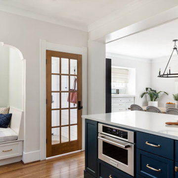
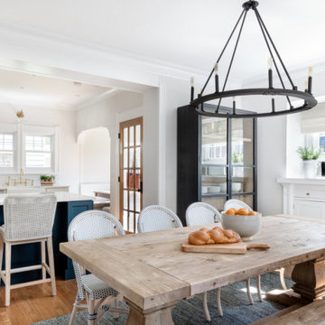
The owners of this cheery and bright kitchen and dining room are a young family with a busy and active life. They approached KMI because they needed an updated kitchen that functionally served their needs better and allowed for more connection to the dining room for entertaining. Where the peninsula stands currently, there once stood a wall completely segmenting the two spaces. We worked with a structural engineer to help our clients eliminate that wall so we could create the open floor plan they were dreaming of.
We also helped our clients think creatively about maximizing storage in their small but mighty kitchen. In smaller spaces, good organization is all the more important. We added a pantry cabinet, utilized dead space by the fridge for open shelves, and added storage drawers to the built-in bench seat in the breakfast nook – not for storing serveware, but for their two boys' Lego collection that once lived on the table.
When it came to the finishes and the design, we knew this kitchen needed to fit into the historic craftsman home. We chose colors and fixtures that honored the age and style of the home while allowing the kitchen to also fit the aesthetic of a modern family. Wood accents, brass hardware, and the pop of deep blue in the peninsula were chosen to add warmth and character to the space, while the creamy off-white cabinets add an air of lightness and brightness to the kitchen, ultimately creating an effortlessly balanced design.
 Kimberlee Marie Interiors
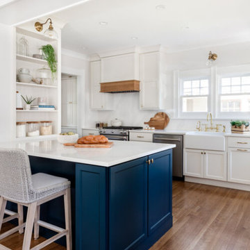
The owners of this cheery and bright kitchen and dining room are a young family with a busy and active life. They approached KMI because they needed an updated kitchen that functionally served their needs better and allowed for more connection to the dining room for entertaining. Where the peninsula stands currently, there once stood a wall completely segmenting the two spaces. We worked with a structural engineer to help our clients eliminate that wall so we could create the open floor plan they were dreaming of.
We also helped our clients think creatively about maximizing storage in their small but mighty kitchen. In smaller spaces, good organization is all the more important. We added a pantry cabinet, utilized dead space by the fridge for open shelves, and added storage drawers to the built-in bench seat in the breakfast nook – not for storing serveware, but for their two boys' Lego collection that once lived on the table.
When it came to the finishes and the design, we knew this kitchen needed to fit into the historic craftsman home. We chose colors and fixtures that honored the age and style of the home while allowing the kitchen to also fit the aesthetic of a modern family. Wood accents, brass hardware, and the pop of deep blue in the peninsula were chosen to add warmth and character to the space, while the creamy off-white cabinets add an air of lightness and brightness to the kitchen, ultimately creating an effortlessly balanced design.
 Kimberlee Marie Interiors
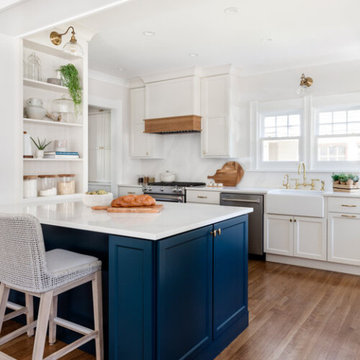
The owners of this cheery and bright kitchen and dining room are a young family with a busy and active life. They approached KMI because they needed an updated kitchen that functionally served their needs better and allowed for more connection to the dining room for entertaining. Where the peninsula stands currently, there once stood a wall completely segmenting the two spaces. We worked with a structural engineer to help our clients eliminate that wall so we could create the open floor plan they were dreaming of.
We also helped our clients think creatively about maximizing storage in their small but mighty kitchen. In smaller spaces, good organization is all the more important. We added a pantry cabinet, utilized dead space by the fridge for open shelves, and added storage drawers to the built-in bench seat in the breakfast nook – not for storing serveware, but for their two boys' Lego collection that once lived on the table.
When it came to the finishes and the design, we knew this kitchen needed to fit into the historic craftsman home. We chose colors and fixtures that honored the age and style of the home while allowing the kitchen to also fit the aesthetic of a modern family. Wood accents, brass hardware, and the pop of deep blue in the peninsula were chosen to add warmth and character to the space, while the creamy off-white cabinets add an air of lightness and brightness to the kitchen, ultimately creating an effortlessly balanced design.
 Kimberlee Marie Interiors
The owners of this cheery and bright kitchen and dining room are a young family with a busy and active life. They approached KMI because they needed an updated kitchen that functionally served their needs better and allowed for more connection to the dining room for entertaining. Where the peninsula stands currently, there once stood a wall completely segmenting the two spaces. We worked with a structural engineer to help our clients eliminate that wall so we could create the open floor plan they were dreaming of.
We also helped our clients think creatively about maximizing storage in their small but mighty kitchen. In smaller spaces, good organization is all the more important. We added a pantry cabinet, utilized dead space by the fridge for open shelves, and added storage drawers to the built-in bench seat in the breakfast nook – not for storing serveware, but for their two boys' Lego collection that once lived on the table.
When it came to the finishes and the design, we knew this kitchen needed to fit into the historic craftsman home. We chose colors and fixtures that honored the age and style of the home while allowing the kitchen to also fit the aesthetic of a modern family. Wood accents, brass hardware, and the pop of deep blue in the peninsula were chosen to add warmth and character to the space, while the creamy off-white cabinets add an air of lightness and brightness to the kitchen, ultimately creating an effortlessly balanced design.

 Housetrends Magazine
Since moving into her Dublin home two and a half years ago, Nancy Sanford has been peeling off the decades—quite literally. Built in the 1980s, the home was “very well-maintained, but very little had been done to it” in terms of updating the finishes or style, Sanford says. Plush white carpet ran from wall-to-wall-to-wall, almond-colored laminate coated the kitchen cabinets and wallpaper ran rampant—even covering some ceilings.
Despite her efforts, Sanford knew it was going to take more than cosmetic editing to shake the ‘80s and make the home her own. Although she lives in the traditional-leaning Muirfield community, Sanford adores a minimalist, contemporary style—and admits to devouring design magazines “ad nauseam.”
To implement her thoroughly modern vision, Sanford turned to Brigid Norton, an interior designer and family friend, and Kristi Youles, a kitchen designer with The JAE Company. Working together, the trio created a carefully considered contemporary design that’s easy on the eyes, and the body.
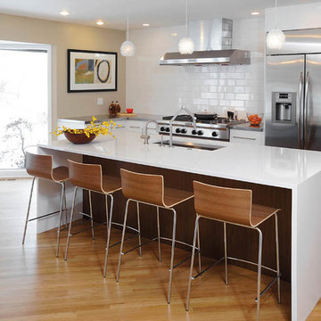
In addition to improving the flow of the kitchen—by removing a V-shaped peninsula that angled out into the room—and adding appliances like a stainless steel refrigerator, Sanford’s short list of must-haves included clean, uncluttered lines and no wall cabinets over the countertops. “I’ve found as I’ve aged, I’ve gotten shorter and just don’t use the upper cabinets,” Sanford explains.
Easy-access, smooth-slide drawers with clean slab fronts were the answer—resulting in strong visual lines, an open, airy feel and enhanced ergonomics. Starting with a “needs assessment,” Youles and Norton designed the space quite literally around Nancy. By looking at factors such as her height and which items she uses most frequently, they were able to determine the optimum placement for everything from canned goods in the pantry to cutlery, pans and plates in the customized drawers, all of which helped to achieve the ultimate kitchen organization.
But there’s more to the kitchen cabinets smooth façade than clean-lined storage. Walnut drawer fronts—found on the oven and the base of the island—are book-matched, allowing the grain to continue from drawer to drawer. And even in spaces where drawers weren’t feasible, beneath the sink and in a desk area, the designers continued the look with cabinet doors crafted to resemble drawers.
The visual continuity of these lines might not be as impactful if it weren’t for the careful selection of contrasting finishes. The designers filled the space with pure, glossy white—using a specific type of quartz, White Cliff by Cambria, to accent the bold rectangular design of the island. Then, to break up the expanse of accompanying white painted drawers, walnut was selected to bring the contrasting warmth and grain of wood without red undertones. It is commonly found in modern furniture design, as well as current productions of mid-century designs like the iconic Eames Lounge Chair from Herman Miller, Youles says.
 Amethyst Interiors LLC
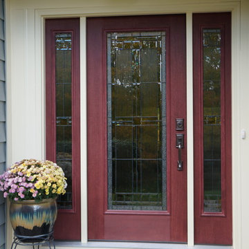
new craftsman style entry door with stained glass
Entryway - mid-sized craftsman brick floor entryway idea in Indianapolis with a glass front door and beige walls
Entryway - mid-sized craftsman brick floor entryway idea in Indianapolis with a glass front door and beige walls
 Kimberlee Marie Interiors
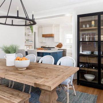
The owners of this cheery and bright kitchen and dining room are a young family with a busy and active life. They approached KMI because they needed an updated kitchen that functionally served their needs better and allowed for more connection to the dining room for entertaining. Where the peninsula stands currently, there once stood a wall completely segmenting the two spaces. We worked with a structural engineer to help our clients eliminate that wall so we could create the open floor plan they were dreaming of.
We also helped our clients think creatively about maximizing storage in their small but mighty kitchen. In smaller spaces, good organization is all the more important. We added a pantry cabinet, utilized dead space by the fridge for open shelves, and added storage drawers to the built-in bench seat in the breakfast nook – not for storing serveware, but for their two boys' Lego collection that once lived on the table.
When it came to the finishes and the design, we knew this kitchen needed to fit into the historic craftsman home. We chose colors and fixtures that honored the age and style of the home while allowing the kitchen to also fit the aesthetic of a modern family. Wood accents, brass hardware, and the pop of deep blue in the peninsula were chosen to add warmth and character to the space, while the creamy off-white cabinets add an air of lightness and brightness to the kitchen, ultimately creating an effortlessly balanced design.
 Kimberlee Marie Interiors
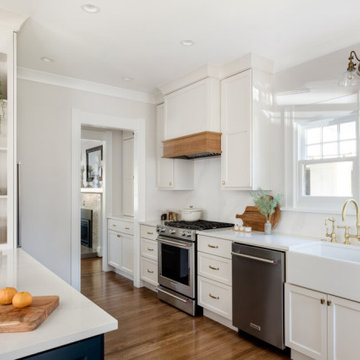
The owners of this cheery and bright kitchen and dining room are a young family with a busy and active life. They approached KMI because they needed an updated kitchen that functionally served their needs better and allowed for more connection to the dining room for entertaining. Where the peninsula stands currently, there once stood a wall completely segmenting the two spaces. We worked with a structural engineer to help our clients eliminate that wall so we could create the open floor plan they were dreaming of.
We also helped our clients think creatively about maximizing storage in their small but mighty kitchen. In smaller spaces, good organization is all the more important. We added a pantry cabinet, utilized dead space by the fridge for open shelves, and added storage drawers to the built-in bench seat in the breakfast nook – not for storing serveware, but for their two boys' Lego collection that once lived on the table.
When it came to the finishes and the design, we knew this kitchen needed to fit into the historic craftsman home. We chose colors and fixtures that honored the age and style of the home while allowing the kitchen to also fit the aesthetic of a modern family. Wood accents, brass hardware, and the pop of deep blue in the peninsula were chosen to add warmth and character to the space, while the creamy off-white cabinets add an air of lightness and brightness to the kitchen, ultimately creating an effortlessly balanced design.
Sponsored
Delaware, OH

Buckeye Basements, Inc.
Central Ohio's Basement Finishing ExpertsBest Of Houzz '13-'21
 Kimberlee Marie Interiors
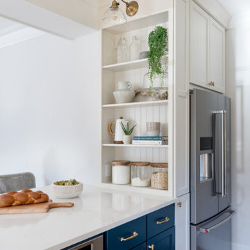
The owners of this cheery and bright kitchen and dining room are a young family with a busy and active life. They approached KMI because they needed an updated kitchen that functionally served their needs better and allowed for more connection to the dining room for entertaining. Where the peninsula stands currently, there once stood a wall completely segmenting the two spaces. We worked with a structural engineer to help our clients eliminate that wall so we could create the open floor plan they were dreaming of.
We also helped our clients think creatively about maximizing storage in their small but mighty kitchen. In smaller spaces, good organization is all the more important. We added a pantry cabinet, utilized dead space by the fridge for open shelves, and added storage drawers to the built-in bench seat in the breakfast nook – not for storing serveware, but for their two boys' Lego collection that once lived on the table.
When it came to the finishes and the design, we knew this kitchen needed to fit into the historic craftsman home. We chose colors and fixtures that honored the age and style of the home while allowing the kitchen to also fit the aesthetic of a modern family. Wood accents, brass hardware, and the pop of deep blue in the peninsula were chosen to add warmth and character to the space, while the creamy off-white cabinets add an air of lightness and brightness to the kitchen, ultimately creating an effortlessly balanced design.
 Granit Architects + Interiors
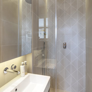
Our clients for this project are a professional couple with a young family. They approached us to help with extending and improving their home in London SW2 to create an enhanced space both aesthetically and functionally for their growing family. We were appointed to provide a full architectural and interior design service, including the design of some bespoke furniture too.
A core element of the brief was to design a kitchen living and dining space that opened into the garden and created clear links from inside to out. This new space would provide a large family area they could enjoy all year around. We were also asked to retain the good bits of the current period living spaces while creating a more modern day area in an extension to the rear.
It was also a key requirement to refurbish the upstairs bathrooms while the extension and refurbishment works were underway.
The solution was a 21m2 extension to the rear of the property that mirrored the neighbouring property in shape and size. However, we added some additional features, such as the projecting glass box window seat. The new kitchen features a large island unit to create a workspace with storage, but also room for seating that is perfect for entertaining friends, or homework when the family gets to that age.
The sliding folding doors, paired with floor tiling that ran from inside to out, created a clear link from the garden to the indoor living space. Exposed brick blended with clean white walls creates a very contemporary finish throughout the extension, while the period features have been retained in the original parts of the house.
 White Birch Design
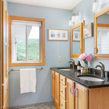
This bathroom was remodeled with the purpose of being able for the homeowners to age in place. The original bathroom had a small enclosed shower, an oversized, underused whirlpool, short vanity, and limited storage. We took the tub space and created a large walk in shower, with no curb! We also fully fitted this shower with grab bars at the entry, in the shower, and the slide bar on the handheld is an actual grab bar! Backing was also added behind the tile for a seat to be mounted in the future. Where the shower used to be is now a large linen closet with large drawers for storage. The vanity is the existing vanity, but we raised it up to today's current taller vanity height, added a new top, undermount sinks & faucets. We also added additional storage in the recessed medicine cabinets above each sink. Interested in learning more? Check us out at whitebirchdesignllc.com
27