
Search results for "Customers interact" in Home Design Ideas
 User
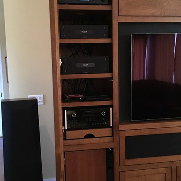
UserThe audio/ video gear area with adjustable shelving. The rollout tray for the preamp/ processor allows easier access for gear changes or repairs.
The down-firing subwoofer is below and mounted on an Auralex Subdude isolation platform to minimize interaction with the cabinet. Sub area also includes extensive acoustic foam for minimum cabinet reflection and better low frequency clarity.
In front of the sub is a cutout for max airflow to the gear cooling fans mounted below the rollout tray. Warm air from the gear is routed through the top of the cabinet via a hidden vent behind the upper shelves.
 Metaamo Studio
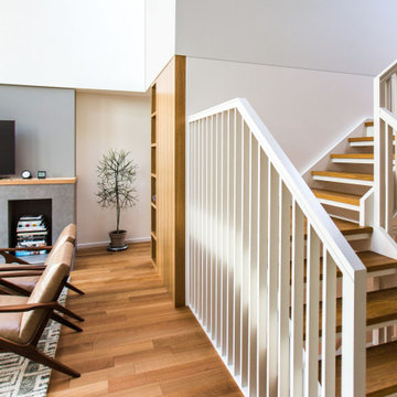
Inspiration for a modern wooden u-shaped open and wood railing staircase remodel in Portland
 Bloomin Blinds of North Charlotte
Discover how premium light-filtering materials and smart-home automation can secure street-level entryway glass without losing natural daylight.
Choosing the right window treatments for a home's front entrance is one of the most challenging design decisions a homeowner can face. The front door is the focal point of a home's curb appeal, often featuring expansive glass panels or side-by-side double doors designed to make a grand architectural statement.
During the day, these large glass features are an asset, flooding entryways and foyers with beautiful natural daylight. However, for homes situated on busy local roads or highly trafficked street-level lots, the dynamic completely changes once the sun goes down.
The moment interior lights are switched on in the evening, a stark contrast is created with the dark outdoors. This creates a severe privacy issue, leaving the entire foyer completely exposed to passing traffic and pedestrians. Finding a solution that delivers absolute evening privacy without permanently plunging the front entrance into darkness during the day requires understanding how modern window treatment materials and operating systems interact.
Light-Filtering vs. Blackout Fabrics
The first step in solving street-level privacy is selecting the correct fabric type. Many homeowners mistakenly assume they need heavy, opaque blackout shades to secure their home from outside eyes at night. While blackout fabrics certainly block 100% of the view, they also block 100% of the natural daylight during the day, forcing you to constantly raise and lower the shades just to see inside your own foyer.
A more effective approach for entryways utilizes premium light-filtering materials. These specialized fabrics are engineered with a precise, tight weave that operates on the principles of directional light and optical density.
Daytime Functionality: When the sun is shining outside, the exterior light levels are significantly higher than the interior light levels. The light-filtering fabric diffuses the intense, direct sunlight into a soft, ambient glow throughout the entryway. This keeps the home bright, eliminates harsh glares, and protects interior hardwood flooring, paint, and trim from damaging UV rays.
Night-Time Functionality: At night, the lighting dynamic reverses. The interior foyer lights make the inside bright, while the outside is dark. Because of the specialized tight weave, the fabric blocks the transmission of clear shapes and details. To a person standing out on the street or driving by on a busy road, the view inside is completely obstructed, delivering total privacy when the family is home for the evening.
Challenges of Front Door Installations
Securing privacy for a double wide front entrance introduces unique structural hurdles that standard windows do not face. Traditional blinds with hanging cords or manual pull chains are poorly suited for front doors. They disrupt the clean architectural lines of a grand foyer, create a safety hazard, and can easily get tangled or damaged when the doors are opened and closed.
The window treatments must be mounted high and wide enough above the door trim to ensure that the front doors can swing open and close freely without ever catching on the fabric or the lower hem bar.
How We Applied These Principles in Sherrills Ford, NC
Applying these exact educational principles to real-world homes is what Cole and I do every day at Bloomin' Blinds of North Charlotte. We recently worked with a homeowner in Sherrills Ford whose beautiful new construction property sat on a highly trafficked road. They loved their double wide front door entrance but felt entirely too exposed to the street at night.
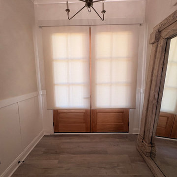
We brought our mobile showroom directly to their driveway. This allowed us to hold up premium light-filtering fabric samples directly against their entryway glass, matching the materials perfectly to their home's natural lighting, interior paint, and trim before making a single cut.
To solve their street-level privacy issue, we custom-built and installed two matching light-filtering roller shades, mounting them flawlessly side-by-side above the front door frame. To keep the home’s interior design completely cohesive, we carried the exact same style to the back of the house, installing a matching single roller shade on the rear door.
Smart Home Window Automation at Your Fingertips
Because entryway windows can be tall and awkward to reach manually, our family team integrated advanced smart-home motorization into this Sherrills Ford project.
Beyond the convenience of a handheld remote control, these automated roller shades feature seamless Wi-Fi integration. The homeowners can control their privacy through a dedicated smartphone app or link the system directly to their existing voice-activated smart home networks, including Amazon Alexa, Google Assistant, and Apple HomeKit.
This allows for complete hands-free window automation. The clients can program custom daily routines—such as setting the front entry shades to automatically lower exactly at sunset—or simply use a voice command to secure the foyer instantly from the comfort of the couch.
Find the right local pro for your project
 Granite Countertops by Mogastone
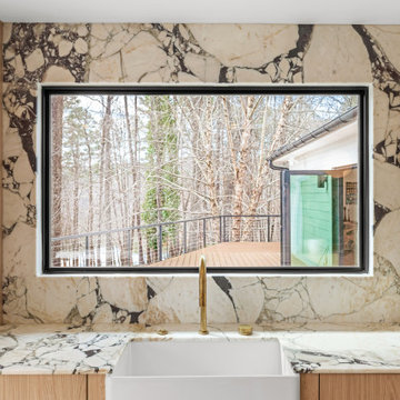
Luxury Calacatta Viola Marble Kitchen with Bookmatched Backsplash | Cary, NC
This luxury kitchen project in Cary, North Carolina showcases the power of natural stone as a true architectural centerpiece. Designed with a refined balance of modern minimalism and bold material expression, the space is defined by a dramatic installation of Calacatta Viola marble, expertly fabricated and installed by Mogastone.
The focal point of the kitchen is the full-height, bookmatched marble backsplash, where large-format slabs create a continuous, symmetrical composition. The bold veining and rich contrast of Calacatta Viola transform the cooking area into a statement feature, elevating the entire space with a gallery-like presence.
A custom waterfall island extends the same marble throughout the kitchen, reinforcing continuity and visual impact. The island’s sculptural form highlights the natural movement of the stone while providing a functional centerpiece for gathering, preparation, and entertaining.
Warm white oak cabinetry introduces a soft, organic contrast to the expressive marble, creating a balanced material palette that feels both modern and inviting. Integrated lighting beneath the cabinetry and island enhances the floating effect while adding depth and ambiance to the space.
The kitchen is further elevated by architectural elements including a curved archway, skylight, and open-concept layout, allowing natural light to interact with the stone surfaces throughout the day. This interplay of light highlights the depth, texture, and variation within the marble, emphasizing its natural beauty.
Every detail of this project reflects precision craftsmanship and advanced fabrication techniques. From digital templating to CNC and waterjet cutting, Mogastone ensured seamless installation, tight tolerances, and a flawless finish across all surfaces.
This project is a perfect example of how premium natural stone, when paired with thoughtful design and expert execution, can transform a kitchen into a timeless luxury environment.
Project Details:
• Material: Calacatta Viola Marble
• Application: Full-height backsplash, waterfall island, countertops
• Cabinetry: Custom white oak
• Location: Cary, North Carolina
• Fabrication & Installation: Mogastone
 Walczak Design And Build
What once felt dark, segmented, and inefficient is now a bright, connected, and highly functional first floor designed for real family living.
Our clients, Terry and Lou, came to us with a home that simply wasn’t keeping up with their growing family. The kitchen was cramped, with tight working lanes and limited light. The laundry room doubled as a powder room—yet functioned poorly as both. Sightlines between spaces were cut off, making it difficult to stay connected to their young children throughout the day. Across the board, the home felt dated and disconnected.
Through thoughtful planning and strategic structural changes, we reimagined the entire first floor to better support how this family truly lives.
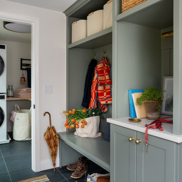
We began by redefining the entry experience—creating a true foyer complete with a dedicated drop zone and custom cubby storage. This space now acts as a natural landing point, bringing order and intention to everyday comings and goings.
Adjacent to the new entry, we relocated and redesigned the laundry room. Now positioned exactly where it needs to be, it functions as a hardworking utility space with countertops for folding, a utility sink for immediate stain treatment, and the ability to be closed off—keeping daily life contained when needed.
Separating the previous shared function allowed us to carve out a distinct, personality-filled powder room. Wrapped in a bold wave-patterned wallpaper and grounded by a custom reeded oak vanity with warm brass accents, this space delivers a moment of delight and individuality within the home.
The kitchen transformation is where the impact is felt most deeply.
What was once a dark, restrictive layout has been opened into a spacious, highly efficient U-shaped kitchen with generous clearances and an oversized island for gathering. A thoughtful mix of painted cabinetry and rift white oak introduces warmth and balance, while the custom reeded hood becomes a sculptural focal point. Open shelving, integrated pantry storage, and layered lighting ensure the space is as functional as it is beautiful.
Beyond aesthetics, the redesign prioritizes flow—both in movement and in connection. Sightlines between the kitchen, dining, and living areas were intentionally opened, allowing for ease of interaction and visibility throughout the main living spaces.
To unify the home, existing hardwood floors were refinished and extended, creating continuity and a seamless visual experience from one space to the next.
The result is a home that feels lighter, more open, and deeply aligned with how this family lives day to day—designed not just to look beautiful, but to support everything from busy mornings to slow, shared evenings.
 Lamont Bros. Design & Construction
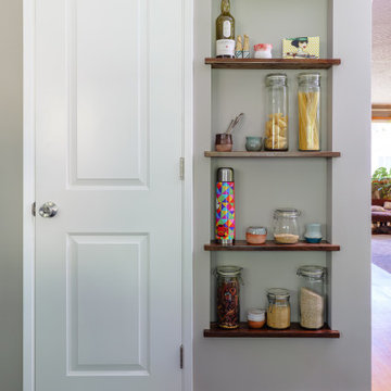
This Portland kitchen transformation focused on reimagining the flow and functionality of the space, while also refreshing its look and feel. The original layout featured a peninsula that created a visual and physical barrier between the cooking and dining areas—and the patio outside—limiting both movement and social interaction.
The homeowners goal was to remove this dividing element and replacing it with a thoughtfully designed custom island that serves as both a functional workspace and a natural gathering point. This strategic change opened up the entire space, creating a seamless flow while maintaining distinct zones for cooking and dining.
Because one of the homeowners is a talented woodworker, we were able to incorporate some really lovely, custom handmade elements throughout the kitchen and dining room.
The result is a kitchen that not only functions better but creates a more inviting environment for both everyday living and entertaining.
 Sonoma Building Company
Frogman Interactive
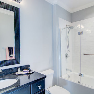
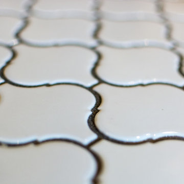
Inspiration for a huge transitional beige tile and ceramic tile ceramic tile bathroom remodel in Other with granite countertops
Inspiration for a huge transitional beige tile and ceramic tile ceramic tile bathroom remodel in Other with granite countertops

 Centre Sky Architecture Ltd
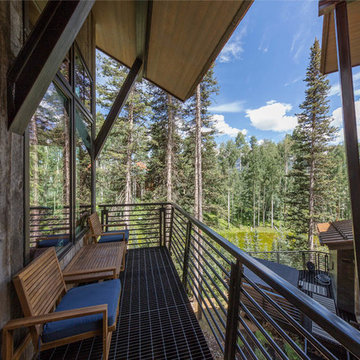
Nestled in the surrounding hillside of Telluride Ski Resort, this mountain home was born from the idea of integrating a home in to it’s site and having it interact with the natural vegetation and impressive circling views. This did not come without design challenges, but the result was a rustic modern structure clad in steel, glass, wood, and stone.
Floor to ceiling glass walls lend to breathtaking views of Mount Emma, Dallas, and Iron Mountain. Transparency through the structure was very important to the clients as it allowed them to feel apart of the natural environment. You can see through the formal entry through the great room and out the back of the house. This created a spacious feel to the already open floor plan of the great room, dining room, and kitchen.
http://www.centresky.com/telluride-mountain-home-video-tour
Photos by Whit Richardson
 Lamont Bros. Design & Construction
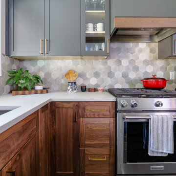
This Portland kitchen transformation focused on reimagining the flow and functionality of the space, while also refreshing its look and feel. The original layout featured a peninsula that created a visual and physical barrier between the cooking and dining areas—and the patio outside—limiting both movement and social interaction.
The homeowners goal was to remove this dividing element and replacing it with a thoughtfully designed custom island that serves as both a functional workspace and a natural gathering point. This strategic change opened up the entire space, creating a seamless flow while maintaining distinct zones for cooking and dining.
Because one of the homeowners is a talented woodworker, we were able to incorporate some really lovely, custom handmade elements throughout the kitchen and dining room.
The result is a kitchen that not only functions better but creates a more inviting environment for both everyday living and entertaining.
 Sonoma Building Company
Frogman Interactive
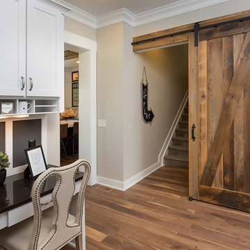
Inspiration for a huge transitional home design remodel in Other
Inspiration for a huge transitional home design remodel in Other
 J. Duggan & Associates PC-Landscape Architecture
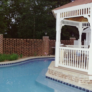
View shows bench in pool adjacent to gazebo. This allows for interaction between users in both areas. The brick wall beyond provides separation from the pool area to the estate at large.
 Sherri Blum | Jack and Jill Interiors, Inc.
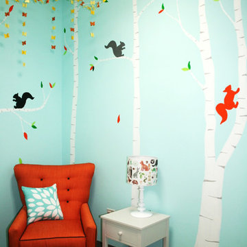
Children’s waiting room interior design project at Princeton University. I was beyond thrilled when contacted by a team of scientists ( psychologists and neurologists ) at Princeton University. This group of professors and graduate students from the Turk-Brown Laboratory are conducting research on the infant’s brain by using functional magnetic resonance imaging (or fMRI), to see how they learn, remember and think. My job was to turn a tiny 7’x10′ windowless study room into an inviting but not too “clinical” waiting room for the mothers or fathers and siblings of the babies being studied.
We needed to ensure a comfortable place for parents to rock and feed their babies while waiting their turn to go back to the laboratory, as well as a place to change the babies if needed. We wanted to stock some shelves with good books and while the room looks complete, we’re still sourcing something interactive to mount to the wall to help entertain toddlers who want something more active than reading or building blocks.
Since there are no windows, I wanted to bring the outdoors inside. Princeton University‘s colors are orange, gray and black and the history behind those colors is very interesting. It seems there are a lot of squirrels on campus and these colors were selected for the three colors of squirrels often seem scampering around the university grounds. The orange squirrels are now extinct, but the gray and black squirrels are abundant, as I found when touring the campus with my son on installation day. Therefore we wanted to reflect this history in the room and decided to paint silhouettes of squirrels in these three colors throughout the room.
While the ceilings are 10′ high in this tiny room, they’re very drab and boring. Given that it’s a drop ceiling, we can’t paint it a fun color as I typically do in my nurseries and kids’ rooms. To distract from the ugly ceiling, I contacted My Custom Creation through their Etsy shop and commissioned them to create a custom butterfly mobile to suspend from the ceiling to create a swath of butterflies moving across the room. Their customer service was impeccable and the end product was exactly what we wanted!
The flooring in the space was simply coated concrete so I decided to use Flor carpet tiles to give it warmth and a grass-like appeal. These tiles are super easy to install and can easily be removed without any residual on the floor. I’ll be using them more often for sure!
See more photos of our commercial interior design job below and contact us if you need a unique space designed for children. We don’t just design nurseries and bedrooms! We’re game for anything!

Sponsored
Fredericksburg, OH

High Point Cabinets
Columbus' Experienced Custom Cabinet Builder | 4x Best of Houzz Winner
 Walczak Design And Build
What once felt dark, segmented, and inefficient is now a bright, connected, and highly functional first floor designed for real family living.
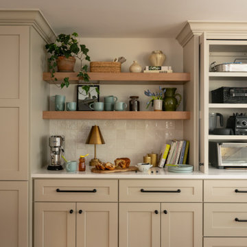
Our clients, Terry and Lou, came to us with a home that simply wasn’t keeping up with their growing family. The kitchen was cramped, with tight working lanes and limited light. The laundry room doubled as a powder room—yet functioned poorly as both. Sightlines between spaces were cut off, making it difficult to stay connected to their young children throughout the day. Across the board, the home felt dated and disconnected.
Through thoughtful planning and strategic structural changes, we reimagined the entire first floor to better support how this family truly lives.
We began by redefining the entry experience—creating a true foyer complete with a dedicated drop zone and custom cubby storage. This space now acts as a natural landing point, bringing order and intention to everyday comings and goings.
Adjacent to the new entry, we relocated and redesigned the laundry room. Now positioned exactly where it needs to be, it functions as a hardworking utility space with countertops for folding, a utility sink for immediate stain treatment, and the ability to be closed off—keeping daily life contained when needed.
Separating the previous shared function allowed us to carve out a distinct, personality-filled powder room. Wrapped in a bold wave-patterned wallpaper and grounded by a custom reeded oak vanity with warm brass accents, this space delivers a moment of delight and individuality within the home.
The kitchen transformation is where the impact is felt most deeply.
What was once a dark, restrictive layout has been opened into a spacious, highly efficient U-shaped kitchen with generous clearances and an oversized island for gathering. A thoughtful mix of painted cabinetry and rift white oak introduces warmth and balance, while the custom reeded hood becomes a sculptural focal point. Open shelving, integrated pantry storage, and layered lighting ensure the space is as functional as it is beautiful.
Beyond aesthetics, the redesign prioritizes flow—both in movement and in connection. Sightlines between the kitchen, dining, and living areas were intentionally opened, allowing for ease of interaction and visibility throughout the main living spaces.
To unify the home, existing hardwood floors were refinished and extended, creating continuity and a seamless visual experience from one space to the next.
The result is a home that feels lighter, more open, and deeply aligned with how this family lives day to day—designed not just to look beautiful, but to support everything from busy mornings to slow, shared evenings.
 Lamont Bros. Design & Construction
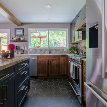
This Portland kitchen transformation focused on reimagining the flow and functionality of the space, while also refreshing its look and feel. The original layout featured a peninsula that created a visual and physical barrier between the cooking and dining areas—and the patio outside—limiting both movement and social interaction.
The homeowners goal was to remove this dividing element and replacing it with a thoughtfully designed custom island that serves as both a functional workspace and a natural gathering point. This strategic change opened up the entire space, creating a seamless flow while maintaining distinct zones for cooking and dining.
Because one of the homeowners is a talented woodworker, we were able to incorporate some really lovely, custom handmade elements throughout the kitchen and dining room.
The result is a kitchen that not only functions better but creates a more inviting environment for both everyday living and entertaining.
 Lamont Bros. Design & Construction
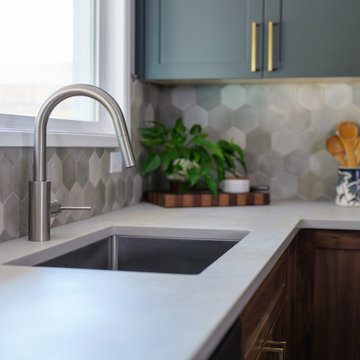
This Portland kitchen transformation focused on reimagining the flow and functionality of the space, while also refreshing its look and feel. The original layout featured a peninsula that created a visual and physical barrier between the cooking and dining areas—and the patio outside—limiting both movement and social interaction.
The homeowners goal was to remove this dividing element and replacing it with a thoughtfully designed custom island that serves as both a functional workspace and a natural gathering point. This strategic change opened up the entire space, creating a seamless flow while maintaining distinct zones for cooking and dining.
Because one of the homeowners is a talented woodworker, we were able to incorporate some really lovely, custom handmade elements throughout the kitchen and dining room.
The result is a kitchen that not only functions better but creates a more inviting environment for both everyday living and entertaining.
 Walczak Design And Build
What once felt dark, segmented, and inefficient is now a bright, connected, and highly functional first floor designed for real family living.
Our clients, Terry and Lou, came to us with a home that simply wasn’t keeping up with their growing family. The kitchen was cramped, with tight working lanes and limited light. The laundry room doubled as a powder room—yet functioned poorly as both. Sightlines between spaces were cut off, making it difficult to stay connected to their young children throughout the day. Across the board, the home felt dated and disconnected.
Through thoughtful planning and strategic structural changes, we reimagined the entire first floor to better support how this family truly lives.
We began by redefining the entry experience—creating a true foyer complete with a dedicated drop zone and custom cubby storage. This space now acts as a natural landing point, bringing order and intention to everyday comings and goings.
Adjacent to the new entry, we relocated and redesigned the laundry room. Now positioned exactly where it needs to be, it functions as a hardworking utility space with countertops for folding, a utility sink for immediate stain treatment, and the ability to be closed off—keeping daily life contained when needed.
Separating the previous shared function allowed us to carve out a distinct, personality-filled powder room. Wrapped in a bold wave-patterned wallpaper and grounded by a custom reeded oak vanity with warm brass accents, this space delivers a moment of delight and individuality within the home.
The kitchen transformation is where the impact is felt most deeply.
What was once a dark, restrictive layout has been opened into a spacious, highly efficient U-shaped kitchen with generous clearances and an oversized island for gathering. A thoughtful mix of painted cabinetry and rift white oak introduces warmth and balance, while the custom reeded hood becomes a sculptural focal point. Open shelving, integrated pantry storage, and layered lighting ensure the space is as functional as it is beautiful.
Beyond aesthetics, the redesign prioritizes flow—both in movement and in connection. Sightlines between the kitchen, dining, and living areas were intentionally opened, allowing for ease of interaction and visibility throughout the main living spaces.
To unify the home, existing hardwood floors were refinished and extended, creating continuity and a seamless visual experience from one space to the next.
The result is a home that feels lighter, more open, and deeply aligned with how this family lives day to day—designed not just to look beautiful, but to support everything from busy mornings to slow, shared evenings.
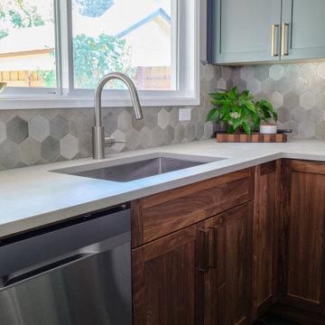 Lamont Bros. Design & Construction
This Portland kitchen transformation focused on reimagining the flow and functionality of the space, while also refreshing its look and feel. The original layout featured a peninsula that created a visual and physical barrier between the cooking and dining areas—and the patio outside—limiting both movement and social interaction.
The homeowners goal was to remove this dividing element and replacing it with a thoughtfully designed custom island that serves as both a functional workspace and a natural gathering point. This strategic change opened up the entire space, creating a seamless flow while maintaining distinct zones for cooking and dining.
Because one of the homeowners is a talented woodworker, we were able to incorporate some really lovely, custom handmade elements throughout the kitchen and dining room.
The result is a kitchen that not only functions better but creates a more inviting environment for both everyday living and entertaining.
35