
Search results for "Dads live" in Home Design Ideas
 Michael Nash Design, Build & Homes
 This 1975 split-level home in a wooded area of Reston, Virginia, is home to a growing family of six. Needless to say, space was at a premium and they needed more of it. So they turned to Michael Nash Design, Build & Homes to create a second-story expansion.
With limited ability to expand the footprint of the home due to lot restrictions, the design team created a 25’ x 35’ master suite addition to be placed over the existing first floor. The space would be located above the living room, dining room and kitchen, creating a private and secluded oasis for mom and dad. The children would have the home’s three middle level bedrooms and a bath of their own.
A New Master Suite
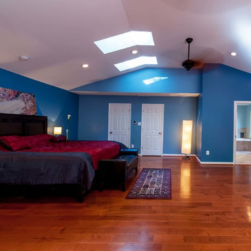
A new custom wooden staircase leads the homeowner to the doorstep of what she now calls her “heavenly space.” It’s a large master bedroom complete with a seating area, vaulted ceiling and skylights, and a beautiful Bordeaux-finish maple wood floor. Bright color paint was selected for the walls to complement the wood flooring and bedroom furniture.
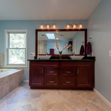
The new 11’x12’ master bathroom offers a spa-like experience. The new bath touts a large shower stall with a built-in bench and storage niches covered with flagstone tiles; a soaking whirlpool tub; and a long double vanity with granite top and fancy fixtures.
Exterior Ties It Together
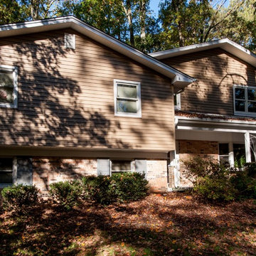
Like any large addition, this one required exterior renovation to make the addition look like the rest of the home. New vinyl siding and architectural shingles replaced the old cedar siding and run down shingles on the original structure.
A new front porch with half-stone columns and pillars maintains the home’s cottage look. A new double car garage replaces the original carport. Both are a big part of the home’s new front elevation which greatly improves its curbside appeal.
The end result of this project offers everyone in the family a place of their own. The children have new bedrooms and the parents have their sanctuary in their new master suite.

 Michael Nash Design, Build & Homes
 This 1975 split-level home in a wooded area of Reston, Virginia, is home to a growing family of six. Needless to say, space was at a premium and they needed more of it. So they turned to Michael Nash Design, Build & Homes to create a second-story expansion.
With limited ability to expand the footprint of the home due to lot restrictions, the design team created a 25’ x 35’ master suite addition to be placed over the existing first floor. The space would be located above the living room, dining room and kitchen, creating a private and secluded oasis for mom and dad. The children would have the home’s three middle level bedrooms and a bath of their own.
A New Master Suite
A new custom wooden staircase leads the homeowner to the doorstep of what she now calls her “heavenly space.” It’s a large master bedroom complete with a seating area, vaulted ceiling and skylights, and a beautiful Bordeaux-finish maple wood floor. Bright color paint was selected for the walls to complement the wood flooring and bedroom furniture.
The new 11’x12’ master bathroom offers a spa-like experience. The new bath touts a large shower stall with a built-in bench and storage niches covered with flagstone tiles; a soaking whirlpool tub; and a long double vanity with granite top and fancy fixtures.
Exterior Ties It Together
Like any large addition, this one required exterior renovation to make the addition look like the rest of the home. New vinyl siding and architectural shingles replaced the old cedar siding and run down shingles on the original structure.
A new front porch with half-stone columns and pillars maintains the home’s cottage look. A new double car garage replaces the original carport. Both are a big part of the home’s new front elevation which greatly improves its curbside appeal.
The end result of this project offers everyone in the family a place of their own. The children have new bedrooms and the parents have their sanctuary in their new master suite.
Find the right local pro for your project
 Michael Nash Design, Build & Homes
 This 1975 split-level home in a wooded area of Reston, Virginia, is home to a growing family of six. Needless to say, space was at a premium and they needed more of it. So they turned to Michael Nash Design, Build & Homes to create a second-story expansion.
With limited ability to expand the footprint of the home due to lot restrictions, the design team created a 25’ x 35’ master suite addition to be placed over the existing first floor. The space would be located above the living room, dining room and kitchen, creating a private and secluded oasis for mom and dad. The children would have the home’s three middle level bedrooms and a bath of their own.
A New Master Suite
A new custom wooden staircase leads the homeowner to the doorstep of what she now calls her “heavenly space.” It’s a large master bedroom complete with a seating area, vaulted ceiling and skylights, and a beautiful Bordeaux-finish maple wood floor. Bright color paint was selected for the walls to complement the wood flooring and bedroom furniture.
The new 11’x12’ master bathroom offers a spa-like experience. The new bath touts a large shower stall with a built-in bench and storage niches covered with flagstone tiles; a soaking whirlpool tub; and a long double vanity with granite top and fancy fixtures.
Exterior Ties It Together
Like any large addition, this one required exterior renovation to make the addition look like the rest of the home. New vinyl siding and architectural shingles replaced the old cedar siding and run down shingles on the original structure.
A new front porch with half-stone columns and pillars maintains the home’s cottage look. A new double car garage replaces the original carport. Both are a big part of the home’s new front elevation which greatly improves its curbside appeal.
The end result of this project offers everyone in the family a place of their own. The children have new bedrooms and the parents have their sanctuary in their new master suite.
 Cure Design Group
KITCHEN RENOVATION CURRENT CRAFTSMAN
This client started off just being curious about our services - what we could do, and if we could even help her update her kitchen. She and her husband with their two teenage kids have lived in their home for several years without updating anything since the house was originally built. They didn’t quite have a budget in mind yet. They didn’t know their style, or even if they had one. Their timeline was simple, “as fast as you can so we’re not without a kitchen for very long” (usually what we hear for kitchen updates).
After a very productive consultation: determining the scope of work and zeroing in on a budget, I was very excited to update this underwhelming space to something that is modern but timeless, something that is theirs. And, it was easy to see what type of design style they gravitated toward looking at the pieces they already own: Craftsman/Prairie Style. I left the meeting so excited to weave in yet another genre of design to my CDG portfolio! We circled in our contractor to discuss the changes they were looking to make and the scope of work that would be theirs. Then I was off to get designing:
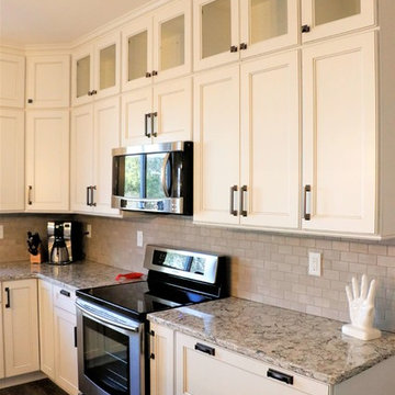
// Because the kitchen’s footprint and the defined breakfast space delineated by the bay, we kept the perimeter cabinetry as it was originally laid out. We updated these cabinets to a beautiful soft Alabaster White with a Barn Wood Glaze to highlight the simplicity of the shaker style doors. We added transom cabinets above the uppers, with only the back wall having seeded glass inserts to highlight some of their collectables.
// The original shaped island was counter-productive (See what I did there?) in functionality and design. We squared this off to reduce some of the angles and gain more storage. We highlighted the new island with a contrasting oak cabinet in a dark finish, to pay our respects to the craftsman style, and topped with a concrete-like countertop as a nod to the Prairie Style, allowing the homeowners to gain two extra seats and a massive -uninterrupted- work surface.
// The small section of cabinetry between the garage entry and fridge now is the perfect dump-station for mail, electronics, whatever is in their hands when they come into the house; and completely hidden by the refrigerator.
// The disconnected cabinetry in the breakfast area makes for a great place to have a working office. Accessible from the kitchen or the adjacent great room, this is the perfect place for the kids to do their homework while mom and dad are putting together dinner. The base cabinets are built out for office-type storage: paper and pencil drawers, filing systems, and cord management. Additionally, the long counter provides a ton of worksurface to spread out.
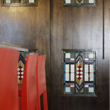
// The largest transformation was the pantry. We raised the height of the doorway and added huge custom designed bypass sliding barndoors. Finished with a dark stain to compliment the island and cut to inset 4 stained glass windows, typical of this style of design, and driving home the concept for the whole space.
// They were desperate to replace their flooring with something extremely durable to flow throughout the kitchen and the whole main level. This beautiful new flooring is actually a textured LVT(!) Which allowed them to save on overall cost and extend the life of their new flooring purchase.
// They loved their copper table, so we kept it and added new simple, mid-century modern chairs around it and a shiny new craftsman-style chandelier above. We added bright barstools in a burnt orange-red accent, and a bright woven rug to tie it all together.
// Because the kitchen renovation was shaping up to be pretty spectacular, they decided they needed to now replace their ‘now-these-look-a-little-too-old’ upholstered seating in the neighboring great room with 2 new sofas. We found the perfect sage-y-grey fabric which we covered on sofa frames that have and exposed oak-wood base, which we finished in a warm weathered grey.
// As every designer knows, a room isn’t finished until there’s something on the windows. Now that the new flooring was installed and every other room on the main level ‘seemed’ to be updated, we needed to update the window treatments in the dining, and great rooms to reflect their new design concept.
I hope you find the ‘after’ photos refreshing (as refreshing as it was for me to work on something that’s not a “Farm House” style that’s saturating the industry right now!) This was such a fun project and a great collaboration with our contractor.
 Cure Design Group
KITCHEN RENOVATION CURRENT CRAFTSMAN
This client started off just being curious about our services - what we could do, and if we could even help her update her kitchen. She and her husband with their two teenage kids have lived in their home for several years without updating anything since the house was originally built. They didn’t quite have a budget in mind yet. They didn’t know their style, or even if they had one. Their timeline was simple, “as fast as you can so we’re not without a kitchen for very long” (usually what we hear for kitchen updates).
After a very productive consultation: determining the scope of work and zeroing in on a budget, I was very excited to update this underwhelming space to something that is modern but timeless, something that is theirs. And, it was easy to see what type of design style they gravitated toward looking at the pieces they already own: Craftsman/Prairie Style. I left the meeting so excited to weave in yet another genre of design to my CDG portfolio! We circled in our contractor to discuss the changes they were looking to make and the scope of work that would be theirs. Then I was off to get designing:
// Because the kitchen’s footprint and the defined breakfast space delineated by the bay, we kept the perimeter cabinetry as it was originally laid out. We updated these cabinets to a beautiful soft Alabaster White with a Barn Wood Glaze to highlight the simplicity of the shaker style doors. We added transom cabinets above the uppers, with only the back wall having seeded glass inserts to highlight some of their collectables.
// The original shaped island was counter-productive (See what I did there?) in functionality and design. We squared this off to reduce some of the angles and gain more storage. We highlighted the new island with a contrasting oak cabinet in a dark finish, to pay our respects to the craftsman style, and topped with a concrete-like countertop as a nod to the Prairie Style, allowing the homeowners to gain two extra seats and a massive -uninterrupted- work surface.
// The small section of cabinetry between the garage entry and fridge now is the perfect dump-station for mail, electronics, whatever is in their hands when they come into the house; and completely hidden by the refrigerator.
// The disconnected cabinetry in the breakfast area makes for a great place to have a working office. Accessible from the kitchen or the adjacent great room, this is the perfect place for the kids to do their homework while mom and dad are putting together dinner. The base cabinets are built out for office-type storage: paper and pencil drawers, filing systems, and cord management. Additionally, the long counter provides a ton of worksurface to spread out.
// The largest transformation was the pantry. We raised the height of the doorway and added huge custom designed bypass sliding barndoors. Finished with a dark stain to compliment the island and cut to inset 4 stained glass windows, typical of this style of design, and driving home the concept for the whole space.
// They were desperate to replace their flooring with something extremely durable to flow throughout the kitchen and the whole main level. This beautiful new flooring is actually a textured LVT(!) Which allowed them to save on overall cost and extend the life of their new flooring purchase.
// They loved their copper table, so we kept it and added new simple, mid-century modern chairs around it and a shiny new craftsman-style chandelier above. We added bright barstools in a burnt orange-red accent, and a bright woven rug to tie it all together.
// Because the kitchen renovation was shaping up to be pretty spectacular, they decided they needed to now replace their ‘now-these-look-a-little-too-old’ upholstered seating in the neighboring great room with 2 new sofas. We found the perfect sage-y-grey fabric which we covered on sofa frames that have and exposed oak-wood base, which we finished in a warm weathered grey.
// As every designer knows, a room isn’t finished until there’s something on the windows. Now that the new flooring was installed and every other room on the main level ‘seemed’ to be updated, we needed to update the window treatments in the dining, and great rooms to reflect their new design concept.
I hope you find the ‘after’ photos refreshing (as refreshing as it was for me to work on something that’s not a “Farm House” style that’s saturating the industry right now!) This was such a fun project and a great collaboration with our contractor.


 Moore Designs Inc
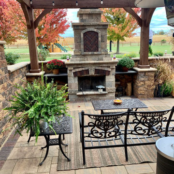
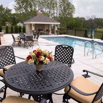
This newly constructed home in Menomonee Falls, WI, includes an outdoor living space with sprawling patio, in-ground pool, built-in gas grill and detached pool house with fireplace. Perfect for hot summer days or cooler nights!


46