
Search results for "Dating activity" in Home Design Ideas
 Jarrett Design
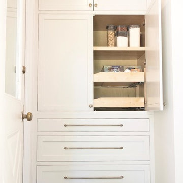
Our clients immediately recognized the potential of the home located in a highly sought-after section of Allentown. The dated kitchen needed significant rethinking but our clients knew it could be turned into something beautiful and inspiring. And, indeed, they were right.
Busy professionals with an active social life, our clients wanted an inviting space to host both intimate dinner parties and large social gatherings. With this in mind, we worked to reimagine the flow of traffic from one room to another. Extraneous walls and a desk inconveniently positioned in the middle of the main kitchen thoroughfare needed to be removed and tight workspace aisles and narrow passageways demanded widening to help alleviate the problem.
In addition to the kitchen’s flow concerns, the dark and dated space needed brightening. The wall between the kitchen and family room was opened up to unite the two spaces allowing more light into both rooms. Windows were also added at the sink wall so the room could be flooded with bright morning sun, while also offering a beautiful view of the park below. All-white cabinetry was selected to help reflect the additional light.
An unfortunate challenge of expanding the windows meant there were fewer wall cabinets to store dishes. We turned to the island where we installed large dish drawers featuring wood pegged interiors. We also relied on wall-to-counter cabinets for additional storage to help keep the room clutter-free as appliances were neatly tucked behind doors. A new, built-in pantry was also added.
The finished kitchen unites traditional with today and elegance with comfort to ensure perfection. We are thrilled for our clients who have an abundance of good taste, an eye for what is possible and a drive to see it accomplished.
Jacqueline Powell Photography
 Urbanology Designs
A captivating transformation in the coveted neighborhood of University Park, Dallas
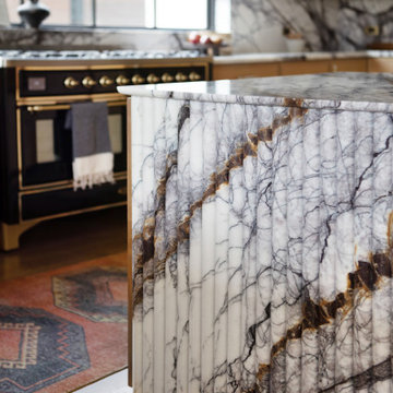
The heart of this home lies in the kitchen, where we embarked on a design endeavor that would leave anyone speechless. By opening up the main kitchen wall, we created a magnificent window system that floods the space with natural light and offers a breathtaking view of the picturesque surroundings. Suspended from the ceiling, a steel-framed marble vent hood floats a few inches from the window, showcasing a mesmerizing Lilac Marble. The same marble is skillfully applied to the backsplash and island, featuring a bold combination of color and pattern that exudes elegance.
Adding to the kitchen's allure is the Italian range, which not only serves as a showstopper but offers robust culinary features for even the savviest of cooks. However, the true masterpiece of the kitchen lies in the honed reeded marble-faced island. Each marble strip was meticulously cut and crafted by artisans to achieve a half-rounded profile, resulting in an island that is nothing short of breathtaking. This intricate process took several months, but the end result speaks for itself.
To complement the grandeur of the kitchen, we designed a combination of stain-grade and paint-grade cabinets in a thin raised panel door style. This choice adds an elegant yet simple look to the overall design. Inside each cabinet and drawer, custom interiors were meticulously designed to provide maximum functionality and organization for the day-to-day cooking activities. A vintage Turkish runner dating back to the 1960s, evokes a sense of history and character.
The breakfast nook boasts a stunning, vivid, and colorful artwork created by one of Dallas' top artist, Kyle Steed, who is revered for his mastery of his craft. Some of our favorite art pieces from the inspiring Haylee Yale grace the coffee station and media console, adding the perfect moment to pause and loose yourself in the story of her art.
The project extends beyond the kitchen into the living room, where the family's changing needs and growing children demanded a new design approach. Accommodating their new lifestyle, we incorporated a large sectional for family bonding moments while watching TV. The living room now boasts bolder colors, striking artwork a coffered accent wall, and cayenne velvet curtains that create an inviting atmosphere. Completing the room is a custom 22' x 15' rug, adding warmth and comfort to the space. A hidden coat closet door integrated into the feature wall adds an element of surprise and functionality.
This project is not just about aesthetics; it's about pushing the boundaries of design and showcasing the possibilities. By curating an out-of-the-box approach, we bring texture and depth to the space, employing different materials and original applications. The layered design achieved through repeated use of the same material in various forms, shapes, and locations demonstrates that unexpected elements can create breathtaking results.
The reason behind this redesign and remodel was the homeowners' desire to have a kitchen that not only provided functionality but also served as a beautiful backdrop to their cherished family moments. The previous kitchen lacked the "wow" factor they desired, prompting them to seek our expertise in creating a space that would be a source of joy and inspiration.
Inspired by well-curated European vignettes, sculptural elements, clean lines, and a natural color scheme with pops of color, this design reflects an elegant organic modern style. Mixing metals, contrasting textures, and utilizing clean lines were key elements in achieving the desired aesthetic. The living room introduces bolder moments and a carefully chosen color scheme that adds character and personality.
The client's must-haves were clear: they wanted a show stopping centerpiece for their home, enhanced natural light in the kitchen, and a design that reflected their family's dynamic. With the transformation of the range wall into a wall of windows, we fulfilled their desire for abundant natural light and breathtaking views of the surrounding landscape.
Our favorite rooms and design elements are numerous, but the kitchen remains a standout feature. The painstaking process of hand-cutting and crafting each reeded panel in the island to match the marble's veining resulted in a labor of love that emanates warmth and hospitality to all who enter.
In conclusion, this tastefully lux project in University Park, Dallas is an extraordinary example of a full gut remodel that has surpassed all expectations. The meticulous attention to detail, the masterful use of materials, and the seamless blend of functionality and aesthetics create an unforgettable space. It serves as a testament to the power of design and the transformative impact it can have on a home and its inhabitants.
Project by Texas' Urbanology Designs. Their North Richland Hills-based interior design studio serves Dallas, Highland Park, University Park, Fort Worth, and upscale clients nationwide.
 TVL Creative Ltd.
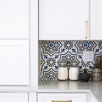
This kitchen took a tired, 80’s builder kitchen and revamped it into a personalized gathering space for our wonderful client. The existing space was split up by the dated configuration of eat-in kitchen table area to one side and cramped workspace on the other. It didn’t just under-serve our client’s needs; it flat out discouraged them from using the space. Our client desired an open kitchen with a central gathering space where family and friends could connect. To open things up, we removed the half wall separating the kitchen from the dining room and the wall that blocked sight lines to the family room and created a narrow hallway to the kitchen. The old oak cabinets weren't maximizing storage and were dated and dark. We used Waypoint Living Spaces cabinets in linen white to brighten up the room. On the east wall, we created a hutch-like stack that features an appliance garage that keeps often used countertop appliance on hand but out of sight. The hutch also acts as a transition from the cooking zone to the coffee and wine area. We eliminated the north window that looked onto the entry walkway and activated this wall as storage with refrigerator enclosure and pantry. We opted to leave the east window as-is and incorporated it into the new kitchen layout by creating a window well for growing plants and herbs. The countertops are Pental Quartz in Carrara. The sleek cabinet hardware is from our friends at Amerock in a gorgeous satin champagne bronze. One of the most striking features in the space is the pattern encaustic tile from Tile Shop. The pop of blue in the backsplash adds personality and contrast to the champagne accents. The reclaimed wood cladding surrounding the large east-facing window introduces a quintessential Colorado vibe, and the natural texture balances the crisp white cabinetry and geometric patterned tile. Minimalist modern lighting fixtures from Mitzi by Hudson Valley Lighting provide task lighting over the sink and at the wine/ coffee station. The visual lightness of the sink pendants maintains the openness and visual connection between the kitchen and dining room. Together the elements make for a sophisticated yet casual vibe-- a comfortable chic kitchen. We love the way this space turned out and are so happy that our clients now have such a bright and welcoming gathering space as the heart of their home!
Find the right local pro for your project
 Nar Design Group
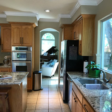
BEFORE PHOTO. Meal preparation & clean-up is a group activity for this family of 5, and full days are spent baking, cooking & canning together. They needed more functional storage and wished for a spacious and beautiful place to congregate and work seamlessly together. The peninsula and non-structural arch that divided the kitchen from the family room were removed in order to create a large open area. Also removed were the dated soffits which instantly created the feeling of higher ceilings and allowed a feature wall of beautiful encaustic tiles to run all the way up behind the custom plaster hood.
Turning and positioning the new island along the width of the window wall gave the family twice as much counter space and seating. The space that was once a hallway became the perfect place to position a dining table. The new 8' window washes the space in an abundance of inviting natural daylight, showcasing views to the greenbelt adjacent to their property. The hand distressed hickory cabinet run - custom designed to house a 5' Galley Workstation - has a furniture feel and its own distinctive hardware.
Classic patterned encaustic tiles and favorite colors were incorporated to reflect the family's preferences for a modern Spanish colonial feel. Wood grain porcelain tile floors make for easy cleanup for an active family with kids and dogs and a pool.
 Jarrett Design
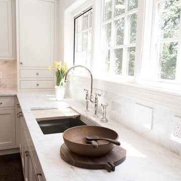
Our clients immediately recognized the potential of the home located in a highly sought-after section of Allentown. The dated kitchen needed significant rethinking but our clients knew it could be turned into something beautiful and inspiring. And, indeed, they were right.
Busy professionals with an active social life, our clients wanted an inviting space to host both intimate dinner parties and large social gatherings. With this in mind, we worked to reimagine the flow of traffic from one room to another. Extraneous walls and a desk inconveniently positioned in the middle of the main kitchen thoroughfare needed to be removed and tight workspace aisles and narrow passageways demanded widening to help alleviate the problem.
In addition to the kitchen’s flow concerns, the dark and dated space needed brightening. The wall between the kitchen and family room was opened up to unite the two spaces allowing more light into both rooms. Windows were also added at the sink wall so the room could be flooded with bright morning sun, while also offering a beautiful view of the park below. All-white cabinetry was selected to help reflect the additional light.
An unfortunate challenge of expanding the windows meant there were fewer wall cabinets to store dishes. We turned to the island where we installed large dish drawers featuring wood pegged interiors. We also relied on wall-to-counter cabinets for additional storage to help keep the room clutter-free as appliances were neatly tucked behind doors. A new, built-in pantry was also added.
The finished kitchen unites traditional with today and elegance with comfort to ensure perfection. We are thrilled for our clients who have an abundance of good taste, an eye for what is possible and a drive to see it accomplished.
Jacqueline Powell Photography
 Ulrich Inc
Ulrich designer: Julia Kleyman
Photography by Peter Rymwid
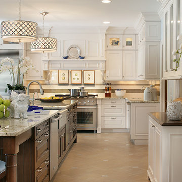
This grand Saddle River kitchen was created in support of the Hackensack University Medical Center Designer Showhouse of New Jersey in 2012. The new design transformed a dreary and dated 80's kitchen into a functional, comfortable and eye-pleasing space with clean transitional lines and touches of traditional charm in its detail. The rich brown finish of the island cabinetry gives the room warmth, and juxtaposes in lovely contrast the white cabinetry of the perimeter. Large pendant lights add modern "bling" and balance the large room.
 Jarrett Design
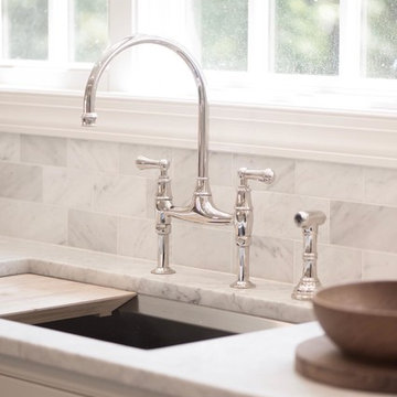
Our clients immediately recognized the potential of the home located in a highly sought-after section of Allentown. The dated kitchen needed significant rethinking but our clients knew it could be turned into something beautiful and inspiring. And, indeed, they were right.
Busy professionals with an active social life, our clients wanted an inviting space to host both intimate dinner parties and large social gatherings. With this in mind, we worked to reimagine the flow of traffic from one room to another. Extraneous walls and a desk inconveniently positioned in the middle of the main kitchen thoroughfare needed to be removed and tight workspace aisles and narrow passageways demanded widening to help alleviate the problem.
In addition to the kitchen’s flow concerns, the dark and dated space needed brightening. The wall between the kitchen and family room was opened up to unite the two spaces allowing more light into both rooms. Windows were also added at the sink wall so the room could be flooded with bright morning sun, while also offering a beautiful view of the park below. All-white cabinetry was selected to help reflect the additional light.
An unfortunate challenge of expanding the windows meant there were fewer wall cabinets to store dishes. We turned to the island where we installed large dish drawers featuring wood pegged interiors. We also relied on wall-to-counter cabinets for additional storage to help keep the room clutter-free as appliances were neatly tucked behind doors. A new, built-in pantry was also added.
The finished kitchen unites traditional with today and elegance with comfort to ensure perfection. We are thrilled for our clients who have an abundance of good taste, an eye for what is possible and a drive to see it accomplished.
Jacqueline Powell Photography

 Dallas Builders Association
Britain Way Apartments, located at 333 Lane St. in Irving, has reborn with a fresh rejuvenated appeal. Built in 1962, the original development structure had been noticeably deteriorating in recent years. It had limited amenities, 17 repetitive, monotonous buildings with dull colors and obsolete mansard roofs in dilapidated condition. There was poor on-site drainage and lighting, no perimeter fencing, and several city code violations were recorded in prior years. The Developer’s mission was to convert this dated project into a high quality, eco-friendly, modern, and affordable housing community for the citizens of Irving.
After the remodel was completed, enhanced features include visually pleasing facades using heavy stone accents and sloping roofs, and lush landscaping distributed throughout the site. Additional improvements include expanded kitchen areas with upgraded interior amenities and energy efficient appliances; second bathrooms added to select two- and three-bedroom units; a brand-new spacious clubhouse and community center was provided; pool and picnic areas and an on-site resident activities coordinator to lead an abundance of community services provided to residents at no extra cost. Strategic partnerships, with community-based organizations, local volunteer groups and non-profits offer lifestyle and learning activities such as arts and crafts and after-school reading and tutoring for children, computer classes, lifestyle enrichment classes, nutrition classes and aquatic activities for children and adults.
Britain Way is the first LEED Gold Certified affordable multifamily community in the city of Irving. LEED certification ensures the property will be healthier and safer for residents in addition to providing lower utility expenses, as well as, conserving energy and water. Obtaining LEED Gold Certification for a 60-year-old project was a herculean effort.
Further enhancing the project’s resident quality of life initiatives, the new, stylish Britain Way is designed per implementing “Crime Prevention Through Environmental Design” (CPTED) requirements. Among several other updates, the property was made safer by adding perimeter fencing and increasing lighting levels throughout the site.
To tour Britain Way or for more information on availability of this apartment community or any other available properties, please visit www.omhousing.com or https://www.britainwayapts.com/
This Home of the Week is presented by the Dallas Builders Association. For information on the Association please visit www.dallasbuilders.com.
 TVL Creative Ltd.
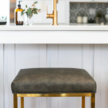
This kitchen took a tired, 80’s builder kitchen and revamped it into a personalized gathering space for our wonderful client. The existing space was split up by the dated configuration of eat-in kitchen table area to one side and cramped workspace on the other. It didn’t just under-serve our client’s needs; it flat out discouraged them from using the space. Our client desired an open kitchen with a central gathering space where family and friends could connect. To open things up, we removed the half wall separating the kitchen from the dining room and the wall that blocked sight lines to the family room and created a narrow hallway to the kitchen. The old oak cabinets weren't maximizing storage and were dated and dark. We used Waypoint Living Spaces cabinets in linen white to brighten up the room. On the east wall, we created a hutch-like stack that features an appliance garage that keeps often used countertop appliance on hand but out of sight. The hutch also acts as a transition from the cooking zone to the coffee and wine area. We eliminated the north window that looked onto the entry walkway and activated this wall as storage with refrigerator enclosure and pantry. We opted to leave the east window as-is and incorporated it into the new kitchen layout by creating a window well for growing plants and herbs. The countertops are Pental Quartz in Carrara. The sleek cabinet hardware is from our friends at Amerock in a gorgeous satin champagne bronze. One of the most striking features in the space is the pattern encaustic tile from Tile Shop. The pop of blue in the backsplash adds personality and contrast to the champagne accents. The reclaimed wood cladding surrounding the large east-facing window introduces a quintessential Colorado vibe, and the natural texture balances the crisp white cabinetry and geometric patterned tile. Minimalist modern lighting fixtures from Mitzi by Hudson Valley Lighting provide task lighting over the sink and at the wine/ coffee station. The visual lightness of the sink pendants maintains the openness and visual connection between the kitchen and dining room. Together the elements make for a sophisticated yet casual vibe-- a comfortable chic kitchen. We love the way this space turned out and are so happy that our clients now have such a bright and welcoming gathering space as the heart of their home!
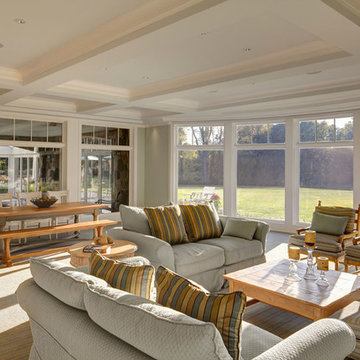
 Margaret O'Connor Design
This lower level walk out is the hangout for growing active kids, pets, and family relaxation. Washable slipcovers on the sofas and durable fabrics make up the upholstery story. Beautiful pine trestle table has a matching bench on one side and painted chairs on the other. The pine planked cocktail table is accented with hand painted trailing ivy. Both tables and bench, are dated and marked underneath with the date and family name.
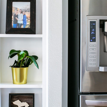 TVL Creative Ltd.
This kitchen took a tired, 80’s builder kitchen and revamped it into a personalized gathering space for our wonderful client. The existing space was split up by the dated configuration of eat-in kitchen table area to one side and cramped workspace on the other. It didn’t just under-serve our client’s needs; it flat out discouraged them from using the space. Our client desired an open kitchen with a central gathering space where family and friends could connect. To open things up, we removed the half wall separating the kitchen from the dining room and the wall that blocked sight lines to the family room and created a narrow hallway to the kitchen. The old oak cabinets weren't maximizing storage and were dated and dark. We used Waypoint Living Spaces cabinets in linen white to brighten up the room. On the east wall, we created a hutch-like stack that features an appliance garage that keeps often used countertop appliance on hand but out of sight. The hutch also acts as a transition from the cooking zone to the coffee and wine area. We eliminated the north window that looked onto the entry walkway and activated this wall as storage with refrigerator enclosure and pantry. We opted to leave the east window as-is and incorporated it into the new kitchen layout by creating a window well for growing plants and herbs. The countertops are Pental Quartz in Carrara. The sleek cabinet hardware is from our friends at Amerock in a gorgeous satin champagne bronze. One of the most striking features in the space is the pattern encaustic tile from Tile Shop. The pop of blue in the backsplash adds personality and contrast to the champagne accents. The reclaimed wood cladding surrounding the large east-facing window introduces a quintessential Colorado vibe, and the natural texture balances the crisp white cabinetry and geometric patterned tile. Minimalist modern lighting fixtures from Mitzi by Hudson Valley Lighting provide task lighting over the sink and at the wine/ coffee station. The visual lightness of the sink pendants maintains the openness and visual connection between the kitchen and dining room. Together the elements make for a sophisticated yet casual vibe-- a comfortable chic kitchen. We love the way this space turned out and are so happy that our clients now have such a bright and welcoming gathering space as the heart of their home!
 tahir mahmood Khan
Personalization is no longer just a design trend—it has become an essential part of creating spaces that truly feel like home. Our homes are much more than places where we live; they are reflections of our personalities, our values, and the memories we hold dear. Personalization allows homeowners to go beyond surface-level aesthetics and bring their unique stories to life through thoughtful design choices.
From one-of-a-kind decor to custom furniture, there are countless ways to make a space uniquely yours. This article explores the transformative power of personalization in home design, offering creative ideas and strategies to ensure your home feels as special as the people who live in it. By incorporating meaningful elements, sentimental keepsakes, and designs tailored to your lifestyle, you can create a home that speaks to your heart while remaining both functional and beautiful.
Why Personalization Is Transforming Home Design
Personalization in home design is a powerful trend that’s shaping how we live. It’s about more than just creating a stylish space—it’s about creating an emotional connection to your environment. Here’s why it matters:
Emotional Resonance: Personal touches make your home feel like a sanctuary. Items that carry sentimental value, such as family heirlooms or custom-made pieces, evoke memories and create a sense of belonging.
Individuality: Your home is a reflection of your personality. Personalization allows you to infuse your style into every corner, ensuring your space doesn’t look like a copy of someone else’s.
Functionality with Meaning: Customized furniture or decor isn’t just beautiful—it’s practical. Personalized design ensures every piece serves your specific needs while adding character to your home.
How to Add Personal Touches to Your Home Design
1. Customized Furniture and Decor
Investing in bespoke pieces is one of the best ways to personalize your home. Whether it’s a hand-carved coffee table or custom shelving designed to fit your space, tailored furniture adds both functionality and uniqueness.
Ideas for Customized Furniture:
A dining table engraved with a special date or family name.
Built-in bookshelves designed to fit your exact collection of novels and treasures.
Upholstered chairs or couches in fabrics that reflect your style and preferences.
For decor, consider smaller but impactful personalized items. For instance, displaying a meaningful keepsake, like a shadow box featuring a personalized necklace, can add an intimate touch to any room.
2. Symbolic Design Elements
Incorporating symbols that resonate with you is a thoughtful way to personalize your space. Items inspired by spiritual or cultural symbols, such as angel numbers, can serve as both decor and a reminder of values or goals that matter to you.
Examples of Symbolic Decor:
Wall art or prints featuring numbers, quotes, or patterns that hold personal significance.
Sculptures or figurines that represent qualities like protection, growth, or harmony.
Patterned rugs or textiles that subtly include symbols tied to your family’s history or beliefs.
3. Displaying Sentimental Items
A personalized home thrives on nostalgia and sentimentality. Displaying cherished keepsakes and mementos is a wonderful way to bring life and meaning into your space.
Ideas for Sentimental Displays:
Memory Galleries:
Create a gallery wall filled with family photos, travel souvenirs, and sentimental artwork.
Mix and match frames to add visual interest while showcasing your memories.
Functional Keepsakes:
Repurpose sentimental items into practical decor. For example, a gift for dad, such as a custom clock or framed photo, can double as both a functional and meaningful addition to your space.
Incorporate small family treasures, like vintage jewelry or heirlooms, into your decor.
Feature Pieces:
Highlight unique items in shadow boxes, such as wedding keepsakes, old letters, or jewelry. These displays turn your memories into a focal point of the room.
4. Personalized Artwork and Accessories
Custom artwork is one of the easiest ways to add a personal touch to your home. Whether it’s commissioning a piece or creating something yourself, personalized art instantly elevates a space.
Custom Art Ideas:
A commissioned painting of your family home, wedding venue, or favorite landscape.
Abstract art featuring colors or symbols that are meaningful to you.
Name plaques, monograms, or custom wall hangings.
Incorporating personalized accessories like cushions, throws, or coasters featuring family names or initials is another subtle yet effective way to customize your decor.
5. Seasonal Personalization
Switching up decor seasonally offers a great opportunity to incorporate personal touches. For example:
Display holiday-themed photos, such as a family portrait from last year’s festivities.
Rotate sentimental items based on the time of year, such as a fall centerpiece with family heirloom candlesticks.
Incorporate handmade seasonal crafts created with family members, making the decor feel both personal and festive.
Incorporating Personalization Into Outdoor Spaces
Personalization doesn’t stop at your front door. Outdoor spaces, like patios, gardens, and porches, offer plenty of opportunities for customization.
Ideas for Personalizing Outdoor Areas:
Custom Signs: Add a handmade welcome sign or a plaque with your family name to the front of your house.
Engraved Furniture: Outdoor benches or tables engraved with meaningful quotes or dates can create an intimate touch.
Garden Markers: Personalized garden markers or stepping stones with family names or inspirational words can make your garden truly yours.
Personalizing your home is not just about aesthetics; it’s about creating an environment that feels deeply connected to you and your loved ones. Every item, color, and design element can carry a piece of your story. In this section, we’ll dive deeper into actionable ideas for personalizing your living spaces, transforming them into meaningful reflections of your life.
6. Layering Sentimental Textiles and Accessories
Textiles such as rugs, curtains, and throw pillows are an excellent way to infuse personality into your home without a full-scale renovation. Opt for customized or sentimental fabrics that tie in your personal story.
Ideas for Textiles That Add Meaning
Custom Monogrammed Pillows
Add initials, family names, or even special dates to throw pillows for your living room or bedroom.
Memory Quilts
Use pieces of fabric from meaningful items, like old clothes or wedding attire, to create a quilt that tells a story.
Personalized Rugs
Consider a custom rug with patterns or symbols that resonate with your family’s heritage or values.
Incorporating textiles that tell a story not only makes your home feel cozier but also serves as a subtle reminder of cherished memories.
7. Meaningful Gifts as Decor
Some of the most cherished items in a home are gifts from loved ones. These pieces carry stories and emotional weight, making them perfect for display as decor.
For example, a gift for dad, such as a custom leather-bound journal or engraved keepsake, can be displayed in a home office or study. These items become part of the space’s character while celebrating the bond shared with a loved one.
Tips for Displaying Gifted Items:
Use bookshelves or mantels to showcase sentimental gifts alongside other decor elements.
Pair gifted items with complementary pieces, such as family photos or artwork, to create cohesive displays.
8. Personalized Storage Solutions
Functional spaces can also benefit from personalization. Custom storage solutions allow you to stay organized while reflecting your style and needs.
Ideas for Personalized Storage
Engraved Wooden Crates: Use crates with engraved names or labels for stylish, functional storage in living rooms or children’s play areas.
Custom Closet Systems: Design closets with features like jewelry drawers, tie racks, or shoe compartments tailored to your specific collection.
Sentimental Storage Bins: Store seasonal decorations, keepsakes, or family mementos in decorative bins labeled with meaningful phrases or designs.
By blending practicality and personalization, you can create spaces that are as functional as they are beautiful.
9. Creative Personalization for Kids’ Rooms
Children’s rooms are ideal spaces for playful and meaningful personalization. From custom artwork to interactive elements, you can design a room that reflects their personality while creating an inspiring space for them to grow.
Ideas for Kids’ Room Personalization
Name Signs and Wall Art: Incorporate their name in decorative signage or framed artwork to make their space uniquely theirs.
Growth Charts with Memories: Add personalized growth charts where you can mark milestones and attach small mementos.
Interactive Decor: Create activity walls featuring chalkboards, corkboards, or magnetic surfaces where kids can express their creativity.
These personal touches turn their rooms into a space that grows with them, capturing memories along the way.
10. Blending Modern Trends with Personalized Touches
If you’re drawn to modern design trends, you can still incorporate personalization without losing that sleek, contemporary feel. Here’s how:
Tips for a Modern Yet Personalized Space
Minimalist Monograms: Add subtle, elegant initials or symbols to decor pieces like vases, linens, or art prints.
Statement Lighting: Choose pendant lights or chandeliers with a customized design or engraving to reflect your style.
Neutral Colors with Personal Accents: Keep the base color palette neutral, but incorporate personal elements like family photos in modern frames or sentimental objects displayed in chic shadow boxes.
This approach ensures your home stays trendy while retaining meaningful personal elements.
11. Technology Meets Personalization
Technology can also play a role in making your home feel more personal. Smart home systems and digital tools can be customized to fit your preferences and lifestyle.
Ideas for Personalized Tech
Customized Smart Displays: Use smart screens to display rotating family photos or personal artwork.
Smart Lighting Scenes: Set up lighting presets for different moods, such as a cozy evening scene that highlights your favorite decor.
Voice-Activated Reminders: Program smart assistants to remind you of family birthdays, anniversaries, or even daily affirmations.
By integrating personalized technology, your home becomes both functional and deeply connected to your needs.
12. Seasonal Rotations with a Personal Touch
Personalization doesn’t have to be permanent. Changing up your decor with the seasons is a wonderful way to keep your home feeling fresh while adding meaningful elements.
Ideas for Seasonal Personalization
Holiday Decor with Family Themes: Create personalized ornaments, stockings, or wreaths that highlight your family’s story.
Seasonal Photo Swaps: Rotate family photos to reflect seasonal activities or vacations.
Custom Table Settings: Design table linens, centerpieces, or napkin rings featuring symbols or colors that are meaningful to your family.
Seasonal personalization allows you to constantly renew the look and feel of your space while keeping it tied to your personal story.
Turning a House Into Your Sanctuary
Personalization in home design is about more than creating a visually appealing space—it’s about creating a home that reflects your life, values, and memories. Every detail, from the textiles you choose to the sentimental items you display, adds a layer of meaning that makes your house truly yours.
By incorporating elements like customized decor, thoughtful gifts, and symbolic designs, you can craft a home that not only looks beautiful but also feels deeply personal. Take inspiration from these ideas to make your space a reflection of everything that matters most to you and your loved ones.

 Business_Name_Placeholder
?? 24/7 Support
⭐️ Top-Rated Service
? Fast Response
? Premium Quality
✈️◆► Telegram: @Pvatopzone
?◆► WhatsApp: +1 (579) 550-8030
?◆► Discord: accountservice
✈️◆► https://t.me/Pvatopzone
?◆► Email: Pvatopzone@gmail.com
 safe ZOnea
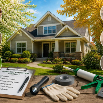
Maintaining a pest-free home requires attention throughout the year. Seasonal changes affect pest behavior, and understanding these patterns can save homeowners from costly damage and health hazards. In this guide, we will explore practical strategies for spring pest prevention tips, ensuring your property stays protected through every season. From spotting early signs to implementing proactive measures, these steps empower homeowners to take control before infestations occur.
Understanding Seasonal Pest Patterns
Pests adapt to changing weather, and knowing their patterns helps prevent infestations effectively.
Spring: Awakening Pests
Spring signals the end of winter dormancy for many pests. Rodents, ants, and termites start seeking food and warmth. Effective spring pest prevention tips include:
● Cleaning gutters and removing debris
● Sealing cracks and gaps in exterior walls
● Inspecting wood piles and compost areas
● Monitoring early signs of termite activity
Pro Tip: Conduct a termite inspection or a professional evaluation to catch infestations early before they spread.
Summer: Peak Pest Season
Warm temperatures accelerate pest breeding cycles. For a comprehensive summer pest prevention guide:
● Maintain lawns and trim vegetation away from homes
● Check window and door screens for tears
● Store food in sealed containers
● Inspect water sources that attract mosquitoes
Do You Know? Mosquitoes can lay eggs in a teaspoon of water. Eliminating stagnant water is crucial to reducing their population.
Fall: Preparing for Winter
As temperatures drop, pests search for warm indoor spaces. Key actions include:
● Inspecting for winter rodent entry points
● Sealing attic vents, crawl spaces, and foundation gaps
● Cleaning storage areas to minimize hiding spots
● Checking chimney and fireplace openings
Quick Fact: Rodents can enter homes through openings as small as ¼ inch.
Seasonal Pest Checklist for Homeowners
Creating a structured seasonal pest checklist simplifies preventive measures and ensures nothing is overlooked.
Season
Key Actions
Spring
Inspect for termites, seal exterior gaps, clean gutters, and check compost
Summer
Repair screens, trim vegetation, remove standing water, and secure food
Fall
Seal entry points, inspect attic/crawlspace, clear debris, and prepare storage
Winter
Monitor indoor activity, keep firewood away from walls, and maintain traps
Inspection & Maintenance Tips
● Schedule annual pest inspections by professional Virginia pest control consultation to detect hidden problems
● Keep a log of pest sightings and treatment dates
● Regularly replace weather stripping and caulk cracks
Note: Even small preventive steps, when consistently applied, drastically reduce infestations.
Common Pests and Their Seasonal Behaviors
Understanding how different pests behave each season helps homeowners take timely action to protect their property.
● Ants and Termites: Ants emerge in spring seeking food, while termites become active and can damage wood unnoticed. Early detection is critical.
● Rodents and Mice: Fall and winter increase rodent intrusions. Block all entry points and keep food sealed.
● Mosquitoes and Flies: Summer creates the ideal breeding environment for mosquitoes. Eliminate standing water and use physical barriers like nets.
● Spiders and Other Insects: Seasonal shifts cause spiders to move indoors. Regular vacuuming and decluttering reduce hiding spots.
Eco-Friendly Prevention Methods
● Use natural repellents like peppermint oil or diatomaceous earth
● Encourage beneficial insects, such as ladybugs, to reduce pest populations
● Plant pest-deterring plants near home boundaries, like marigolds or lavender
Integrated Pest Management (IPM)
Adopt an IPM approach by combining physical barriers, monitoring, and environmentally safe treatments. This minimizes chemical use while maintaining a pest-free home.
Quote: “Prevention is the most effective form of pest control.” – National Pest Management Association
Seasonal Pest Prevention Tools
● Snap traps and humane rodent traps
● Sticky traps for insects
● Outdoor perimeter sprays (eco-friendly)
● Moisture meters to detect early termite or mold problems
Pro Tip: Keep tools organized and accessible to act quickly when pest activity is noticed.
Planning: Annual Pest Calendar
Month
Recommended Action
March-April
Spring pest prevention tips: Inspect, seal, clean gutters
June-July
Summer pest prevention guide: Screens, standing water, food storage
September
Seasonal pest checklist: Seal entries, declutter, prep storage
November
Winter rodent entry points: Monitor indoors, maintain traps
Key Takeaways
● Seasonal awareness prevents infestations and property damage
● Consistent inspections and maintenance are essential
● Simple eco-friendly measures can significantly reduce pests
● Use a structured checklist and calendar for effective prevention
Conclusion
Homeowners who stay proactive and follow spring pest prevention tips, along with year-round monitoring, ensure their properties remain safe and comfortable. Using a summer pest prevention guide, checking winter rodent entry points, and maintaining a seasonal pest checklist ensure your home remains safe and comfortable. Remember to combine inspections, physical barriers, and environmentally friendly methods for the best results.
FAQs
Q1: How often should I perform a termite inspection?
A1: Conduct inspections annually, especially in spring, to detect early signs of termite activity and prevent extensive damage.
Q2: Can pests enter my home during winter?
A2: Yes, rodents and insects seek warmth and shelter indoors. Sealing entry points and monitoring for activity is crucial.
Q3: What is the most effective eco-friendly method for pest prevention?
A3: Using natural repellents, encouraging beneficial insects, and eliminating water sources effectively reduces pest populations without chemicals.
Ensure your home is ready for every season. Schedule a professional Virginia pest control consultation or a termite inspection in Suffolk, VA, today and stay ahead of potential infestations.
 safe ZOnea
Ask a kitchen designer in Chicago which countertop question comes up most and you will hear the same answer: white or off-white quartz, and which shade. Homeowners walk into showrooms with a photo saved on their phone, usually a bright, veined slab from a magazine spread, and leave an hour later realizing there are a dozen versions of that same look. The confusion is not about taste. It is about the fact that "white quartz" covers a huge range of patterns, undertones, and price points, and nobody explains the differences before the sale.
Older bungalows and newer builds alike are getting stripped of their dated laminate and butcher block in favor of quartz, and the reasons are practical rather than trendy. Quartz does not need sealing, resists the kind of staining that granite can suffer over decades, and holds up to the freeze-thaw humidity swings that Chicago basements and kitchens go through every year. Once a homeowner commits to quartz, though, the real decision starts: which white, and does the pattern justify the difference in cost.
This piece walks through three specific slabs that keep showing up in Chicago renovation projects, why designers reach for them in different rooms, and what actually separates a flat white surface from one with real depth. None of this requires a design background to follow. It is mostly about paying attention to how a slab behaves under kitchen lighting, how busy the vending gets, and how it photographs versus how it looks in person.
Why White Quartz Took Over Chicago Kitchens
Ten years ago, granite dominated Chicago kitchen remodels almost by default. It was durable, it looked expensive, and every fabricator in the metro area carried a wide range of colors. Quartz has since taken over that position, and the shift happened faster than most contractors expected. Engineered stone gave homeowners a more predictable surface, since natural granite varies slab to slab while quartz is manufactured to a consistent pattern batch after batch.
The other driver is light. Chicago winters are long and gray, and a lot of kitchens, especially in older two-flats and courtyard buildings, do not get much direct sun. A dark granite countertop in a dim kitchen can make the whole room feel smaller. White and light-toned quartz reflects what little natural light comes through the windows, and it makes a galley kitchen or a north-facing space feel noticeably brighter without touching the cabinetry or the layout.
There is also a resale argument that local real estate agents bring up constantly. White quartz photographs well for listings, reads as updated and low-maintenance to buyers touring in person, and does not compete visually with whatever cabinet color the next owner might prefer. It is a safer bet than a bold veined marble look or a colored quartz that might feel dated in five years.
Arctic White and the Cost Question
Among the flatter, more uniform whites, arctic white quartz price comes up constantly in budget conversations because the slab sits at a more approachable point than the heavily veined Italian-marble-inspired patterns. It reads as clean and bright without the busy movement that some homeowners find overwhelming in a small kitchen. Fabricators in the Chicago area tend to keep it in stock precisely because demand stays steady across both new construction and remodel projects.
Part of what keeps this slab affordable relative to its heavily patterned cousins comes down to manufacturing complexity. A quartz surface with minimal veining and a consistent white base is simpler to produce at scale than one that mimics the irregular, high-contrast movement of natural Calacatta marble. That production difference shows up directly in what a homeowner pays per square foot, and it is worth asking a fabricator to walk through that pricing before assuming every white quartz costs the same.
Homeowners planning a full kitchen, including an island, backsplash, and perimeter counters, often use a flatter white like this specifically because it lets other elements carry the visual interest. A patterned tile backsplash or a bold cabinet color reads more clearly against a calm countertop than against one already fighting for attention with heavy veining. Designers frequently pair simpler whites with statement lighting fixtures for exactly this reason.
What Makes Calacatta Patterns Different
Calacatta refers to a family of marble originally quarried in Italy, known for a bright white background broken up by bold, often gold-toned veining that moves in thick, dramatic streaks rather than thin gray lines. Natural Calacatta marble is soft, porous, and expensive to maintain, which is exactly why quartz manufacturers spent years developing engineered versions that replicate the look without the upkeep headaches.
The challenge with any Calacatta-style quartz is getting the veining to look organic instead of printed. Early generations of engineered stone struggled with repetitive patterns that gave away the fact the slab was manufactured rather than cut from actual marble. Modern digital printing and layering techniques have closed that gap considerably, and the better Calacatta-inspired quartz lines now vary the veining across each slab batch so two counters in the same kitchen do not look identical.
Chicago designers gravitate toward Calacatta patterns for kitchens that function as the visual centerpiece of an open floor plan, which describes a large share of the gut renovations happening in neighborhoods like Lincoln Park, Roscoe Village, and the North Shore suburbs. When the kitchen island is visible from the living room and dining area, a dramatic veined surface becomes part of the home's overall design language rather than a purely functional work surface.
Calacatta Arno Under Kitchen Lighting
One of the more popular options in this category, calacatta arno quartz, balances a warm white base with soft gray and gold veining that avoids looking too stark under the cooler LED lighting common in newer Chicago builds. Homeowners touring showrooms sometimes make the mistake of judging a slab entirely under warm incandescent lighting, then get surprised when the same surface looks slightly different once installed under their kitchen's actual fixtures.
What separates this particular pattern from flatter competitors is how the veining clusters rather than spreading evenly across the slab. That clustering mimics the way real quarried marble forms, with denser mineral deposits in some sections and cleaner stretches in others. Fabricators cutting a large island slab from a single piece will often orient the pattern intentionally so the busiest veining lands somewhere visually interesting rather than getting cut off at an edge.
Because the background reads warmer than a stark white, this pattern tends to pair well with brass or matte gold hardware, a combination that has been showing up repeatedly in Chicago kitchen remodels over the past few renovation seasons. Cabinet painters report a similar trend, with more clients requesting warm white or greige cabinet colors specifically because they complement this kind of veined quartz better than a cooler, blue-toned white would.
Silestone's Version of the Calacatta Look
Manufacturers compete directly in this Calacatta-inspired category, and silestone eternal calacatta gold represents one brand's specific take on the pattern, distinguished by richer gold veining set against a brighter white base than some competing slabs in the same family. Silestone has built a reputation around anti-bacterial surface treatments in addition to the standard quartz durability, a detail some homeowners specifically ask about for kitchens used heavily by families with young children.
The veining in this particular slab tends to run in longer, more continuous lines compared to the clustered pattern found in some other Calacatta-style options, which gives large island surfaces a sense of visual flow from one end to the other. Fabricators working with bigger islands, the kind increasingly common in open-concept Chicago remodels, often favor patterns like this because there is less need to worry about seams interrupting a busy, disconnected pattern.
Price positioning for this slab tends to sit toward the upper end of the engineered quartz category, reflecting both the brand's manufacturing process and the complexity of replicating that continuous gold veining consistently across production batches. Homeowners weighing this option against other Calacatta-style quartz should ask their fabricator directly about batch availability, since premium patterns sometimes have longer lead times than standard stock colors.
Living With Quartz Day to Day
Beyond how a slab looks in a showroom or a listing photo, the daily experience of owning quartz countertops matters more once the renovation dust settles. Quartz resists scratching far better than laminate and holds up to the acidic spills, hot pans, and general abuse of an active kitchen without the sealing maintenance that natural stone requires every year or two. That low-maintenance reputation is a large part of why quartz overtook granite in the first place.
Heat resistance is a detail that gets less attention than it should. While quartz handles moderate heat well, manufacturers generally recommend using a trivet or pad for very hot pots straight off the stove, since sudden temperature shock can occasionally cause stress marks in the resin binder that holds the engineered stone together. This is a minor precaution rather than a major limitation, but it is worth mentioning to anyone assuming quartz is entirely indestructible.
Cleaning routines stay simple across almost every pattern in this category. A damp cloth and mild soap handle daily messes, and the nonporous surface means wine, coffee, and tomato-based sauces do not soak in the way they can with unsealed granite or marble. Homeowners moving from an older stone counter often mention how much less they worry about everyday spills once quartz is installed, which is a quality-of-life change that rarely makes it into the initial design conversation.
Choosing Between the Three
There is no single correct answer among these three slabs, and that is exactly why they keep coming up together in the same design conversations across Chicago renovation projects. A flatter white with minimal veining suits kitchens where other elements need to carry the visual interest, while a bolder Calacatta-inspired pattern makes sense when the countertop itself is meant to be the centerpiece of an open floor plan.
Budget matters too, and it is worth having a direct conversation with a fabricator about where each option lands before falling in love with a specific slab in a showroom. Lighting, cabinet color, and how the kitchen connects to the rest of the home all play into which pattern will actually look right once installation is finished rather than just in a photo.
Whatever direction a homeowner leans, seeing a full slab in person under actual kitchen lighting remains the single most useful step before signing off. Photos only go so far once the countertop is sitting in the room it will live in for years.
 Lenton Company, Inc.
Modern Minimalism Meets Everyday Life in Lancaster
Project Overview
Challenge:
With three children, two cats, and frequent visits from friends and extended family, the homeowners needed a kitchen that could keep up with their active household. As certified foster parents, [LINK TO THIS MONTH’S BLOG POST] they also required secure, lockable storage for knives, alcohol, and cleaning supplies. While functional, the existing kitchen felt dated and lacked efficiency. Their vision: clean countertops, hidden appliances, and durable finishes with timeless appeal.
Design:
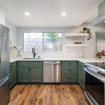
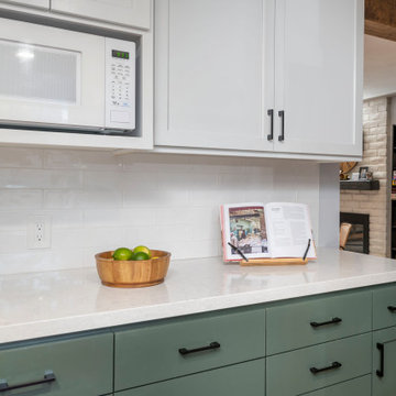
Lenton Company created a tailored plan that honored the family’s budget and priorities. The U-shaped layout was preserved, but the stove was moved to the opposite wall to improve flow for two active cooks. Dark green shaker-style base cabinets were paired with white uppers and quartz countertops, delivering a high-contrast, classic look. Water resistant, wood-tone flooring was installed throughout the kitchen and main living areas for durability and cohesion. The drop ceiling remained due to ductwork but was refinished for a fresh appearance.
Build:
Construction began with a full demo and was carefully sectioned off to maintain a safe environment. The remodel included all-new appliances, lighting, cabinetry, and finishes. Thoughtful features like soft-close drawers, oversized pull-out trash and recycling, locking storage, a hidden microwave, and dedicated space for a toaster oven contributed to a clutter-free and functional kitchen. Under-cabinet lighting, overhead fixtures, and a half lazy Susan further enhanced efficiency and usability.
Reveal:
In the words of our homeowners, “Working with Lenton Company made the process feel seamless and turnkey. Having the designer, project manager, and build team all under one roof was a huge advantage. Our designer really listened to our needs and design preferences, offering thoughtful layout options and guiding us toward choices that fit our style and budget. The build team was efficient, professional, and kept everything on track—and tidy! After the renovation, we knew without a doubt we had made the right decision.”

 Soda Pop Design Inc.
Custom design by Cynthia Soda of Soda Pop Design Inc. in Toronto, Canada. Photography by Stephani Buchman Photography.
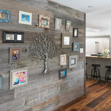
Inspiration for a transitional medium tone wood floor and brown floor hallway remodel in Toronto with beige walls
Inspiration for a transitional medium tone wood floor and brown floor hallway remodel in Toronto with beige walls
 Lenton Company, Inc.
Modern Minimalism Meets Everyday Life in Lancaster
Project Overview
Challenge:
With three children, two cats, and frequent visits from friends and extended family, the homeowners needed a kitchen that could keep up with their active household. As certified foster parents, [LINK TO THIS MONTH’S BLOG POST] they also required secure, lockable storage for knives, alcohol, and cleaning supplies. While functional, the existing kitchen felt dated and lacked efficiency. Their vision: clean countertops, hidden appliances, and durable finishes with timeless appeal.
Design:
Lenton Company created a tailored plan that honored the family’s budget and priorities. The U-shaped layout was preserved, but the stove was moved to the opposite wall to improve flow for two active cooks. Dark green shaker-style base cabinets were paired with white uppers and quartz countertops, delivering a high-contrast, classic look. Water resistant, wood-tone flooring was installed throughout the kitchen and main living areas for durability and cohesion. The drop ceiling remained due to ductwork but was refinished for a fresh appearance.
Build:
Construction began with a full demo and was carefully sectioned off to maintain a safe environment. The remodel included all-new appliances, lighting, cabinetry, and finishes. Thoughtful features like soft-close drawers, oversized pull-out trash and recycling, locking storage, a hidden microwave, and dedicated space for a toaster oven contributed to a clutter-free and functional kitchen. Under-cabinet lighting, overhead fixtures, and a half lazy Susan further enhanced efficiency and usability.
Reveal:
In the words of our homeowners, “Working with Lenton Company made the process feel seamless and turnkey. Having the designer, project manager, and build team all under one roof was a huge advantage. Our designer really listened to our needs and design preferences, offering thoughtful layout options and guiding us toward choices that fit our style and budget. The build team was efficient, professional, and kept everything on track—and tidy! After the renovation, we knew without a doubt we had made the right decision.”
9