
Search results for "Dating activity" in Home Design Ideas
 Traci Connell Interiors
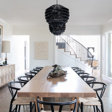
Perfectly embedded on an acre of land overlooking a pond, in the heart of Willow Bend of Plano, this dated, traditional home got more than a complete facelift. The wife is a “farmer’s daughter” and could have never imagined having a home like this to call her own one day. Finding a 15’ dining table was a tall task… especially for a family of four. Using a local craftsman, the most gorgeous white oak table was created to host everyone in the neighborhood! The clients told a lot of stories about their past and children. The designer realized that the stories were actually treasures as she incorporated their memories and symbols in every room. She brought these memories to life in a custom artwork collage above the family room mantel. From a tractor representing the grandfather, to the Russian alphabet portraying the roots of their adopted sons and some Cambodian script, there were meanings behind each piece. In order to bring nature indoors, the designer decided to demo the exterior wall to the patio to add a large folding door and blew out the wall dividing the formal dining room and breakfast room so there would be a clear sight through to the outdoors. Throughout the home, each family member was thought of. The fabrics and finishes had to withstand small boys, who were extremely active. The use of outdoor fabrics and beautiful scratch proof finishes were incorporated in every space – bring on the hotwheels.
 KGA Studio Architects, PC
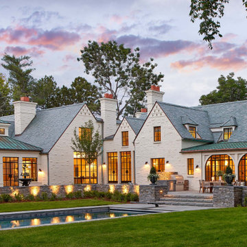
Much of today’s remodeling design ethos centers around complete transformation. And while that’s often necessary if a home requires it, Mahony’s approach to this luxury home remodel followed a more conservative and established set of design principles that still left room for lots of creativity.
There’s a lot to love about this historic Tudor’s original 1937 exterior — he simply removed the features that didn’t serve the design to let it shine. In fact, most of the home’s original elevations were kept intact. Dormers were also kept and refreshed, and chimneys were repaired or re-created down to the flue tile. Interestingly, various colors of brick were discovered during construction, leading us to believe the painted brick dates back to the original design.
 Urbanology Designs
A captivating transformation in the coveted neighborhood of University Park, Dallas
The heart of this home lies in the kitchen, where we embarked on a design endeavor that would leave anyone speechless. By opening up the main kitchen wall, we created a magnificent window system that floods the space with natural light and offers a breathtaking view of the picturesque surroundings. Suspended from the ceiling, a steel-framed marble vent hood floats a few inches from the window, showcasing a mesmerizing Lilac Marble. The same marble is skillfully applied to the backsplash and island, featuring a bold combination of color and pattern that exudes elegance.
Adding to the kitchen's allure is the Italian range, which not only serves as a showstopper but offers robust culinary features for even the savviest of cooks. However, the true masterpiece of the kitchen lies in the honed reeded marble-faced island. Each marble strip was meticulously cut and crafted by artisans to achieve a half-rounded profile, resulting in an island that is nothing short of breathtaking. This intricate process took several months, but the end result speaks for itself.
To complement the grandeur of the kitchen, we designed a combination of stain-grade and paint-grade cabinets in a thin raised panel door style. This choice adds an elegant yet simple look to the overall design. Inside each cabinet and drawer, custom interiors were meticulously designed to provide maximum functionality and organization for the day-to-day cooking activities. A vintage Turkish runner dating back to the 1960s, evokes a sense of history and character.
The breakfast nook boasts a stunning, vivid, and colorful artwork created by one of Dallas' top artist, Kyle Steed, who is revered for his mastery of his craft. Some of our favorite art pieces from the inspiring Haylee Yale grace the coffee station and media console, adding the perfect moment to pause and loose yourself in the story of her art.
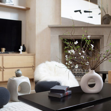
The project extends beyond the kitchen into the living room, where the family's changing needs and growing children demanded a new design approach. Accommodating their new lifestyle, we incorporated a large sectional for family bonding moments while watching TV. The living room now boasts bolder colors, striking artwork a coffered accent wall, and cayenne velvet curtains that create an inviting atmosphere. Completing the room is a custom 22' x 15' rug, adding warmth and comfort to the space. A hidden coat closet door integrated into the feature wall adds an element of surprise and functionality.
This project is not just about aesthetics; it's about pushing the boundaries of design and showcasing the possibilities. By curating an out-of-the-box approach, we bring texture and depth to the space, employing different materials and original applications. The layered design achieved through repeated use of the same material in various forms, shapes, and locations demonstrates that unexpected elements can create breathtaking results.
The reason behind this redesign and remodel was the homeowners' desire to have a kitchen that not only provided functionality but also served as a beautiful backdrop to their cherished family moments. The previous kitchen lacked the "wow" factor they desired, prompting them to seek our expertise in creating a space that would be a source of joy and inspiration.
Inspired by well-curated European vignettes, sculptural elements, clean lines, and a natural color scheme with pops of color, this design reflects an elegant organic modern style. Mixing metals, contrasting textures, and utilizing clean lines were key elements in achieving the desired aesthetic. The living room introduces bolder moments and a carefully chosen color scheme that adds character and personality.
The client's must-haves were clear: they wanted a show stopping centerpiece for their home, enhanced natural light in the kitchen, and a design that reflected their family's dynamic. With the transformation of the range wall into a wall of windows, we fulfilled their desire for abundant natural light and breathtaking views of the surrounding landscape.
Our favorite rooms and design elements are numerous, but the kitchen remains a standout feature. The painstaking process of hand-cutting and crafting each reeded panel in the island to match the marble's veining resulted in a labor of love that emanates warmth and hospitality to all who enter.
In conclusion, this tastefully lux project in University Park, Dallas is an extraordinary example of a full gut remodel that has surpassed all expectations. The meticulous attention to detail, the masterful use of materials, and the seamless blend of functionality and aesthetics create an unforgettable space. It serves as a testament to the power of design and the transformative impact it can have on a home and its inhabitants.
Project by Texas' Urbanology Designs. Their North Richland Hills-based interior design studio serves Dallas, Highland Park, University Park, Fort Worth, and upscale clients nationwide.
Find the right local pro for your project
 Foran Interior Design
Based on extensive interviews with our clients, our challenges were to create an environment that was an artistic mix of traditional and clean lines. They wanted it
dramatic and sophisticated. They also wanted each piece to be special and unique, as well as artsy. Because our clients were young and have an active son, they wanted their home to be comfortable and practical, as well as beautiful. The clients wanted a sophisticated and up-to-date look. They loved brown, turquoise and orange. The other challenge we faced, was to give each room its own identity while maintaining a consistent flow throughout the home. Each space shared a similar color palette and uniqueness, while the furnishings, draperies, and accessories provided individuality to each room.
We incorporated comfortable and stylish furniture with artistic accents in pillows, throws, artwork and accessories. Each piece was selected to not only be unique, but to create a beautiful and sophisticated environment. We hunted the markets for all the perfect accessories and artwork that are the jewelry in this artistic living area.
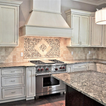
Some of the selections included clean moldings, walnut floors and a backsplash with mosaic glass tile. In the living room we went with a cleaner look, but used some traditional accents such as the embroidered casement fabric and the paisley fabric on the chair and pillows. A traditional bow front chest with a crackled turquoise lacquer was used in the foyer.
 Urbanology Designs
A captivating transformation in the coveted neighborhood of University Park, Dallas
The heart of this home lies in the kitchen, where we embarked on a design endeavor that would leave anyone speechless. By opening up the main kitchen wall, we created a magnificent window system that floods the space with natural light and offers a breathtaking view of the picturesque surroundings. Suspended from the ceiling, a steel-framed marble vent hood floats a few inches from the window, showcasing a mesmerizing Lilac Marble. The same marble is skillfully applied to the backsplash and island, featuring a bold combination of color and pattern that exudes elegance.
Adding to the kitchen's allure is the Italian range, which not only serves as a showstopper but offers robust culinary features for even the savviest of cooks. However, the true masterpiece of the kitchen lies in the honed reeded marble-faced island. Each marble strip was meticulously cut and crafted by artisans to achieve a half-rounded profile, resulting in an island that is nothing short of breathtaking. This intricate process took several months, but the end result speaks for itself.
To complement the grandeur of the kitchen, we designed a combination of stain-grade and paint-grade cabinets in a thin raised panel door style. This choice adds an elegant yet simple look to the overall design. Inside each cabinet and drawer, custom interiors were meticulously designed to provide maximum functionality and organization for the day-to-day cooking activities. A vintage Turkish runner dating back to the 1960s, evokes a sense of history and character.
The breakfast nook boasts a stunning, vivid, and colorful artwork created by one of Dallas' top artist, Kyle Steed, who is revered for his mastery of his craft. Some of our favorite art pieces from the inspiring Haylee Yale grace the coffee station and media console, adding the perfect moment to pause and loose yourself in the story of her art.
The project extends beyond the kitchen into the living room, where the family's changing needs and growing children demanded a new design approach. Accommodating their new lifestyle, we incorporated a large sectional for family bonding moments while watching TV. The living room now boasts bolder colors, striking artwork a coffered accent wall, and cayenne velvet curtains that create an inviting atmosphere. Completing the room is a custom 22' x 15' rug, adding warmth and comfort to the space. A hidden coat closet door integrated into the feature wall adds an element of surprise and functionality.
This project is not just about aesthetics; it's about pushing the boundaries of design and showcasing the possibilities. By curating an out-of-the-box approach, we bring texture and depth to the space, employing different materials and original applications. The layered design achieved through repeated use of the same material in various forms, shapes, and locations demonstrates that unexpected elements can create breathtaking results.
The reason behind this redesign and remodel was the homeowners' desire to have a kitchen that not only provided functionality but also served as a beautiful backdrop to their cherished family moments. The previous kitchen lacked the "wow" factor they desired, prompting them to seek our expertise in creating a space that would be a source of joy and inspiration.
Inspired by well-curated European vignettes, sculptural elements, clean lines, and a natural color scheme with pops of color, this design reflects an elegant organic modern style. Mixing metals, contrasting textures, and utilizing clean lines were key elements in achieving the desired aesthetic. The living room introduces bolder moments and a carefully chosen color scheme that adds character and personality.
The client's must-haves were clear: they wanted a show stopping centerpiece for their home, enhanced natural light in the kitchen, and a design that reflected their family's dynamic. With the transformation of the range wall into a wall of windows, we fulfilled their desire for abundant natural light and breathtaking views of the surrounding landscape.
Our favorite rooms and design elements are numerous, but the kitchen remains a standout feature. The painstaking process of hand-cutting and crafting each reeded panel in the island to match the marble's veining resulted in a labor of love that emanates warmth and hospitality to all who enter.
In conclusion, this tastefully lux project in University Park, Dallas is an extraordinary example of a full gut remodel that has surpassed all expectations. The meticulous attention to detail, the masterful use of materials, and the seamless blend of functionality and aesthetics create an unforgettable space. It serves as a testament to the power of design and the transformative impact it can have on a home and its inhabitants.
Project by Texas' Urbanology Designs. Their North Richland Hills-based interior design studio serves Dallas, Highland Park, University Park, Fort Worth, and upscale clients nationwide.
 Progressive Design Build
The Challenge
This beautiful waterfront home was begging for an update. Our clients wanted a contemporary design with modern finishes. They craved improved functionality in the kitchen, hardwood flooring in the living areas, and a spacious walk-in closet in the master bathroom. With two children in school, our clients also needed the project completed during their summer vacation – leaving a slim 90 days for the entire remodel. Could we do it? …Challenge accepted!
Our Solution
With their active summer travel schedule, our clients elected to vacate their home for the duration of the project. This was ideal for the intrusive nature of the scope of work.
In preparation, our design team created a project plan to suit our client’s needs. With such a clear timeline, we were able to select and order long-lead items in plenty of time for the project start date.
In the kitchen, we rearranged the layout to provide superior ventilation for the cooktop on the exterior wall. We added two large storage cabinets with glass doors, accented by a sleek mosaic backsplash of glass tile. We also incorporated a large contemporary waterfall island into the room. With seating at one end, the island provides both increased functionality and an eye-catching focal point for the center of the room. On the interior wall of the kitchen, we maximized storage with a wall of built-in cabinetry – complete with pullout pantry cabinets, a double oven, and a large stainless refrigerator.
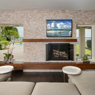
Our clients wisely chose rich, dark-colored wood flooring to add warmth to the contemporary design. After installing the flooring in the kitchen, we brought it into the main living areas as well. In the great room, we wrapped the existing gas fireplace in a neutral stack stone. The effect of the stone on the media and window wall is breathtaking.
In the master bathroom, we expanded the closet by pushing the wall back into the adjacent pass-through hallway. The new walk-in closet now includes an impressive closet organization system.
Returning to the master bathroom, we removed the single vanity and repositioned the toilet, allowing for a new, curb-less glass shower and a his-and-hers vanity. The entire vanity and shower wall is finished in white 12×24 porcelain tile. The vertical glass mosaic accent band and backlit floating mirrors add to the clean, modern style. To the left of the master bathroom entry, we even added a matching make-up area.
Finally, we installed a number of elegant enhancements in the remaining rooms. The clients chose a bronze metal relief accent wall as well as some colorful finishes and artwork for the entry and hallway.
Exceptional Results
Our clients were simply thrilled with the final product! Not only did they return from their summer vacation to a gorgeous home remodel, but we concluded the project a full week ahead of schedule. As a result, the family was able to move in sooner than planned, giving them plenty of time to acclimate to the renovated space before their kids returned to school. Ultimately, we provided the outstanding results and customer experience that our clients had been searching for.
“We met with many other contractors leading up to signing with Progressive Design Build. When we met Mike, we finally felt safe. We had heard so many horror stories about contractors! Progressive was the best move we could have made. They made our dream house become a reality. Vernon was in charge of our project and everything went better than we expected. Our project was completed earlier than expected, too. Our questions and concerns were dealt with quickly and professionally, the job site was always clean, and all subs were friendly and professional. We had a wonderful experience with Progressive Design Build. We’re so grateful we found them.” – The Mader Family
 Foran Interior Design
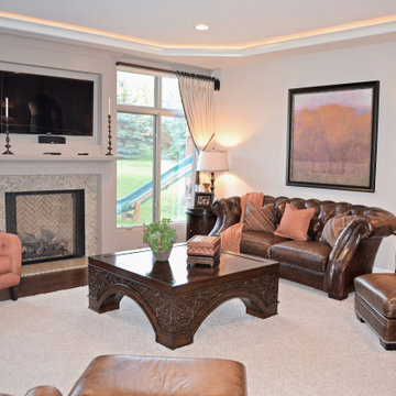
Based on extensive interviews with our clients, our challenges were to create an environment that was an artistic mix of traditional and clean lines. They wanted it
dramatic and sophisticated. They also wanted each piece to be special and unique, as well as artsy. Because our clients were young and have an active son, they wanted their home to be comfortable and practical, as well as beautiful. The clients wanted a sophisticated and up-to-date look. They loved brown, turquoise and orange. The other challenge we faced, was to give each room its own identity while maintaining a consistent flow throughout the home. Each space shared a similar color palette and uniqueness, while the furnishings, draperies, and accessories provided individuality to each room.
We incorporated comfortable and stylish furniture with artistic accents in pillows, throws, artwork and accessories. Each piece was selected to not only be unique, but to create a beautiful and sophisticated environment. We hunted the markets for all the perfect accessories and artwork that are the jewelry in this artistic living area.
Some of the selections included clean moldings, walnut floors and a backsplash with mosaic glass tile. In the living room we went with a cleaner look, but used some traditional accents such as the embroidered casement fabric and the paisley fabric on the chair and pillows. A traditional bow front chest with a crackled turquoise lacquer was used in the foyer.
 Urbanology Designs
A captivating transformation in the coveted neighborhood of University Park, Dallas
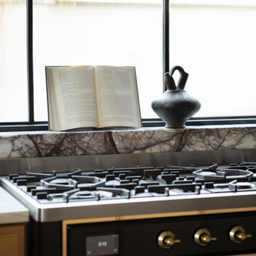
The heart of this home lies in the kitchen, where we embarked on a design endeavor that would leave anyone speechless. By opening up the main kitchen wall, we created a magnificent window system that floods the space with natural light and offers a breathtaking view of the picturesque surroundings. Suspended from the ceiling, a steel-framed marble vent hood floats a few inches from the window, showcasing a mesmerizing Lilac Marble. The same marble is skillfully applied to the backsplash and island, featuring a bold combination of color and pattern that exudes elegance.
Adding to the kitchen's allure is the Italian range, which not only serves as a showstopper but offers robust culinary features for even the savviest of cooks. However, the true masterpiece of the kitchen lies in the honed reeded marble-faced island. Each marble strip was meticulously cut and crafted by artisans to achieve a half-rounded profile, resulting in an island that is nothing short of breathtaking. This intricate process took several months, but the end result speaks for itself.
To complement the grandeur of the kitchen, we designed a combination of stain-grade and paint-grade cabinets in a thin raised panel door style. This choice adds an elegant yet simple look to the overall design. Inside each cabinet and drawer, custom interiors were meticulously designed to provide maximum functionality and organization for the day-to-day cooking activities. A vintage Turkish runner dating back to the 1960s, evokes a sense of history and character.
The breakfast nook boasts a stunning, vivid, and colorful artwork created by one of Dallas' top artist, Kyle Steed, who is revered for his mastery of his craft. Some of our favorite art pieces from the inspiring Haylee Yale grace the coffee station and media console, adding the perfect moment to pause and loose yourself in the story of her art.
The project extends beyond the kitchen into the living room, where the family's changing needs and growing children demanded a new design approach. Accommodating their new lifestyle, we incorporated a large sectional for family bonding moments while watching TV. The living room now boasts bolder colors, striking artwork a coffered accent wall, and cayenne velvet curtains that create an inviting atmosphere. Completing the room is a custom 22' x 15' rug, adding warmth and comfort to the space. A hidden coat closet door integrated into the feature wall adds an element of surprise and functionality.
This project is not just about aesthetics; it's about pushing the boundaries of design and showcasing the possibilities. By curating an out-of-the-box approach, we bring texture and depth to the space, employing different materials and original applications. The layered design achieved through repeated use of the same material in various forms, shapes, and locations demonstrates that unexpected elements can create breathtaking results.
The reason behind this redesign and remodel was the homeowners' desire to have a kitchen that not only provided functionality but also served as a beautiful backdrop to their cherished family moments. The previous kitchen lacked the "wow" factor they desired, prompting them to seek our expertise in creating a space that would be a source of joy and inspiration.
Inspired by well-curated European vignettes, sculptural elements, clean lines, and a natural color scheme with pops of color, this design reflects an elegant organic modern style. Mixing metals, contrasting textures, and utilizing clean lines were key elements in achieving the desired aesthetic. The living room introduces bolder moments and a carefully chosen color scheme that adds character and personality.
The client's must-haves were clear: they wanted a show stopping centerpiece for their home, enhanced natural light in the kitchen, and a design that reflected their family's dynamic. With the transformation of the range wall into a wall of windows, we fulfilled their desire for abundant natural light and breathtaking views of the surrounding landscape.
Our favorite rooms and design elements are numerous, but the kitchen remains a standout feature. The painstaking process of hand-cutting and crafting each reeded panel in the island to match the marble's veining resulted in a labor of love that emanates warmth and hospitality to all who enter.
In conclusion, this tastefully lux project in University Park, Dallas is an extraordinary example of a full gut remodel that has surpassed all expectations. The meticulous attention to detail, the masterful use of materials, and the seamless blend of functionality and aesthetics create an unforgettable space. It serves as a testament to the power of design and the transformative impact it can have on a home and its inhabitants.
Project by Texas' Urbanology Designs. Their North Richland Hills-based interior design studio serves Dallas, Highland Park, University Park, Fort Worth, and upscale clients nationwide.
 Renovisions
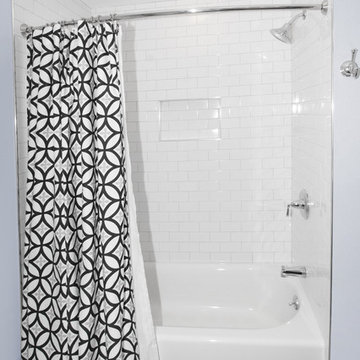
These South Shore of Boston homeowners are no different than many recent clients who show an interest in upgrading their dated and aged bathrooms. They are looking to modernize, reflecting today’s bath trends but also desire increased re-sale value with new fixtures, tile and ventilation system. Given the time we spend in our baths, it is not surprising. (A recent Houzz, survey found that 60% of people occupy their bathrooms for at least one hour per day plus 58% of people surveyed said they use their smart phone or tablet to handle a multitude of activities.)
This stunning full bath Renovision involved replacing the existing builder-grade vanity, sink and faucet with striking dark blue cabinetry featuring a bank of three deep drawers on each side of a two-door sink base. This client likes the new standard vanity height, no 34.5” which allows more storage space for cosmetic and cleaning supply items.
Silestone’s Blanco Zeus countertop clearly modernizes the look and feel of this bath and doesn’t take away from the grey wood-look planked porcelain tiled floor which is on trend. The tub/shower walls with niche for shampoos and 3”x6” white subway tiles reflect a classic, clean and fresh look. The curved shower rod provides additional room while showering and its chrome finish ties in with the new shiny fixtures.
Adding a few architectural elements definitely enhanced this bath. Renovisions re-worked the existing closet space with a custom built piece which included open shelving to store bath towels and door(s) on the bottom to accommodate laundry hamper.
This furniture-look closet along with the window, trims and plantation shutters were color matched in the same white painted finish; stylish and sensible indeed!
 Bilotta Kitchen & Home
When Maria Bilotta Distefano and her husband, George Distefano—each owners of their own home design/renovation businesses—purchased their home in North Salem, they knew they would have to make some pretty radical changes, starting with the kitchen.
“It was horrific,” Bilotta says. “A bathroom opened up right into the eating area. The space was small, the cooking area crammed. Cabinets were an inexpensive stock—pickled oak—and were falling apart. And the appliances were completely out of date. It was a kitchen-company owner’s worst nightmare.” She should know. Along with siblings Regina Bilotta and Jim Bilotta, Maria owns and runs Bilotta Kitchens, a full-service kitchen and bath company that specializes in cabinetry design.
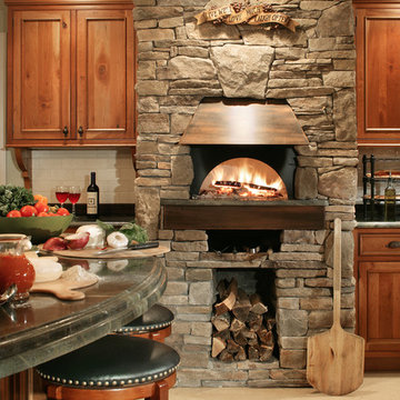
Maria Bilotta's 400-square-foot kitchen boasts a large hearth area with a stainless-steel dual-fuel range surrounded by crackled rectangular tiles, sconces, and an antique glass mirror. Over the range is a handy pot filler, an item frequently recommended by Bilotta for its ease of use. On the far wall next to the hearth stands a 48-inch side-by-side Sub-Zero refrigerator paneled in the same cherry as the cabinets. The generous island is equipped with an undermount Franke stainless-steel sink with a bronze oil-rubbed faucet by Rohl, a built-in ASKO dishwasher, and a double trash pull-out. The dining table’s unique copper top, along with the copper trim on the ledge leading into the family room and along the edge of the pizza oven, are all custom made and finished by George Distefano at his custom-metal shop, Ornametal, based in Newburgh, New York.
Bilotta wanted a kitchen that would not only accommodate her family’s lifestyle but embrace the best of the products and designs out there. To achieve this, she asked Mel Elion, a top designer in Bilotta’s Mamaroneck showroom, to work with architect Terry Lennon of Somers and general contractor Fred Boehmer of Boehmer Homes of La Grangeville, New York, to bring her dream kitchen to life. Bilotta looked to her past to hone her vision, recalling boisterous family gatherings where everyone pitched in to make the meal. Thus, Elion included in her design a large banquette area for casual sit-down meals and a wide multi-purpose island with three stools, designed for both food preparation and light dining.
In terms of style, Bilotta favors a rustic aesthetic, complete with state-of-the-art appliances and top-of-the-line amenities. And number-one on her wish list: a pizza oven. The Old World “appliance” brings back special memories of pizza-making with her siblings, cousins, and grandfather, an Italian immigrant who brought a love of cooking with him from Arpino.
To accommodate Bilotta’s request for a sophisticated country look, Elion recommended cherry cabinets from Bilotta Kitchens’ private cabinet collection, with perimeter cabinets sporting custom inset doors of rustic cherry wood and an island of antique cherry. Green Verde Vecchio granite countertops and a soft moss shade for the walls complement the warm wood. Sixteen-by-sixteen-inch honed limestone tiles used for the floors have decorative metal inserts that match the copper tabletop in the banquette area (hand-made and finished by George Distefano) and other copper accents, such as the pizza oven’s ledge.
A magnificent ivory-colored cherry hearth was designed to surround the 48-inch professional Wolf range. Behind the range, framed by the crackled tile backsplash from Waterworks, hangs an antique glass mirror with metal trim from Distefano’s shop, GlasSolutions, a New York-based architectural glass and metal company. Besides providing an interesting focal point, installing a mirror behind the range has a practical purpose, allowing the chef to keep an eye on the often boisterous and energetic activities while cooking.
 STUDIO TASHIMA
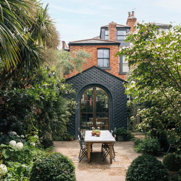
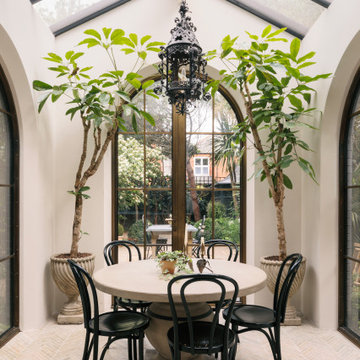
Keyes Road is a two-storey, semi-detached red brick house dating to around 1890-1910. The focus of our work was on the ground floor where we were asked to improve the layout and use of the main living areas of the house, for an active family of four. Important to the design was to maximise the quality and amount of light as well as connection to the garden and flow to the rest of the house.
Our proposal introduces three single storey extensions, comprising a central, large space that extends the main outrigger of the house. To each side are smaller volumes, affording a full width kitchen. While defining a series of discrete volumes, it was important for us to ensure that the kitchen, living, family and dining rooms that are interconnecting and continuous. The result is a big space punctuated by a series of differently sized arches, defining spaces to ensure their intimacy.
It was important for our client to have a sense of warmth and comfort - perhaps not dissimilar to the qualities of a hotel lobby. The colour scheme of the rooms are warm white painted plaster, natural wood flooring with black, bronze and brass accents. Indirect and carefully placed light fittings pulls together the atmosphere of the rooms - particularly in the evenings.
Externally, we felt it important to differentiate the extensions from the main house by using a dark, charcoal grey brick. This sets up a contrasting yet complimentary relationship to the rich red coloured brick house. The facets of the brick play with light and depth as do the graduated brick arches.
During the design process, we grappled with floor levels, the direction of sunlight, and care to not encroach on the neighbouring properties. As the house is in a conservation area, we worked closely with our trusted planning advisor. Throughout, we pursued a sensitive design strategy, using pitched roofs, matching materials and careful detailing. Internally, many of the original details are intact. This has enabled us to create an eclectic ensemble of elements, colours and materials varying in age and period.
 Drury Design
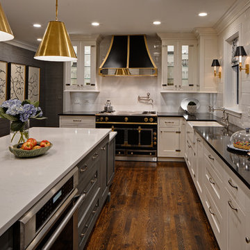
The existing kitchen was dated and had many flaws that needed some attention. The kitchen was an interior kitchen with natural light only in the eating area. The work triangle was very small for a very active family. The homeowner was an avid cook and the kitchen did not function well for her large family gatherings.
The wall was opened up into the eating area to bring more natural light into the space. An existing wall between the kitchen and butlers pantry was removed to enlarge the kitchen.
The new space incorporated multiple work areas. A peninsula was added with a prep sink for guests to use and seating on one side facing the kitchen. A full island was incorporated with seating on the opposite side to give total seating for eight people just in the kitchen alone. A drop-down baking area with a pull-up mixer stand was incorporated to accommodate the shorter homemaker who loved to bake.
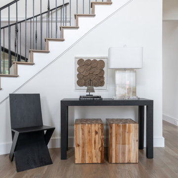 Traci Connell Interiors
Perfectly embedded on an acre of land overlooking a pond, in the heart of Willow Bend of Plano, this dated, traditional home got more than a complete facelift. The wife is a “farmer’s daughter” and could have never imagined having a home like this to call her own one day. Finding a 15’ dining table was a tall task… especially for a family of four. Using a local craftsman, the most gorgeous white oak table was created to host everyone in the neighborhood! The clients told a lot of stories about their past and children. The designer realized that the stories were actually treasures as she incorporated their memories and symbols in every room. She brought these memories to life in a custom artwork collage above the family room mantel. From a tractor representing the grandfather, to the Russian alphabet portraying the roots of their adopted sons and some Cambodian script, there were meanings behind each piece. In order to bring nature indoors, the designer decided to demo the exterior wall to the patio to add a large folding door and blew out the wall dividing the formal dining room and breakfast room so there would be a clear sight through to the outdoors. Throughout the home, each family member was thought of. The fabrics and finishes had to withstand small boys, who were extremely active. The use of outdoor fabrics and beautiful scratch proof finishes were incorporated in every space – bring on the hotwheels.
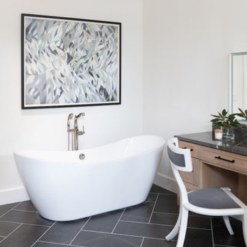 Traci Connell Interiors
Perfectly embedded on an acre of land overlooking a pond, in the heart of Willow Bend of Plano, this dated, traditional home got more than a complete facelift. The wife is a “farmer’s daughter” and could have never imagined having a home like this to call her own one day. Finding a 15’ dining table was a tall task… especially for a family of four. Using a local craftsman, the most gorgeous white oak table was created to host everyone in the neighborhood! The clients told a lot of stories about their past and children. The designer realized that the stories were actually treasures as she incorporated their memories and symbols in every room. She brought these memories to life in a custom artwork collage above the family room mantel. From a tractor representing the grandfather, to the Russian alphabet portraying the roots of their adopted sons and some Cambodian script, there were meanings behind each piece. In order to bring nature indoors, the designer decided to demo the exterior wall to the patio to add a large folding door and blew out the wall dividing the formal dining room and breakfast room so there would be a clear sight through to the outdoors. Throughout the home, each family member was thought of. The fabrics and finishes had to withstand small boys, who were extremely active. The use of outdoor fabrics and beautiful scratch proof finishes were incorporated in every space – bring on the hotwheels.
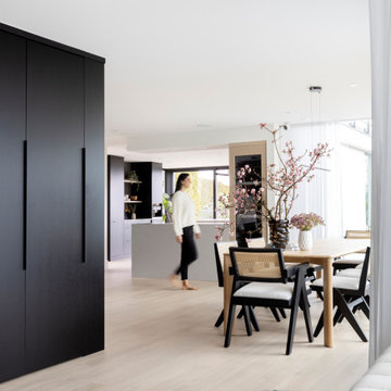
 Knight Varga Interiors
This project began with a young couple’s bold vision to transform a dated, traditional home into a modern, functional space that truly reflected their lifestyle. The property, a steel-and-glass structure, had a teal green exterior and outdated interior finishes more suited to classical architecture than the couple’s contemporary taste.
Our approach was to create a seamless flow between spaces, opening up the kitchen to the rest of the main floor to take full advantage of the stunning views and enhance their love for entertaining. Custom millwork was introduced throughout to provide both aesthetic interest and practical storage solutions. The design also focused on creating a sanctuary in the primary suite, with a larger walk-in closet, a redesigned ensuite, and easy access to a rooftop deck overlooking the city.
On the lower level, we reimagined the entrance to include a spacious mudroom, laundry room, and entertainment area, perfect for their active lifestyle and connection to the outdoors.
This renovation was not just about updating finishes—it was about creating a home that would grow with them, providing the perfect balance of beauty, function, and comfort for years to come.
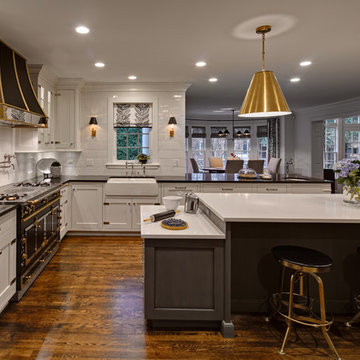 Drury Design
The existing kitchen was dated and had many flaws that needed some attention. The kitchen was an interior kitchen with natural light only in the eating area. The work triangle was very small for a very active family. The homeowner was an avid cook and the kitchen did not function well for her large family gatherings.
The wall was opened up into the eating area to bring more natural light into the space. An existing wall between the kitchen and butlers pantry was removed to enlarge the kitchen.
The new space incorporated multiple work areas. A peninsula was added with a prep sink for guests to use and seating on one side facing the kitchen. A full island was incorporated with seating on the opposite side to give total seating for eight people just in the kitchen alone. A drop-down baking area with a pull-up mixer stand was incorporated to accommodate the shorter homemaker who loved to bake.
 STUDIO TASHIMA
Keyes Road is a two-storey, semi-detached red brick house dating to around 1890-1910. The focus of our work was on the ground floor where we were asked to improve the layout and use of the main living areas of the house, for an active family of four. Important to the design was to maximise the quality and amount of light as well as connection to the garden and flow to the rest of the house.
Our proposal introduces three single storey extensions, comprising a central, large space that extends the main outrigger of the house. To each side are smaller volumes, affording a full width kitchen. While defining a series of discrete volumes, it was important for us to ensure that the kitchen, living, family and dining rooms that are interconnecting and continuous. The result is a big space punctuated by a series of differently sized arches, defining spaces to ensure their intimacy.
It was important for our client to have a sense of warmth and comfort - perhaps not dissimilar to the qualities of a hotel lobby. The colour scheme of the rooms are warm white painted plaster, natural wood flooring with black, bronze and brass accents. Indirect and carefully placed light fittings pulls together the atmosphere of the rooms - particularly in the evenings.
Externally, we felt it important to differentiate the extensions from the main house by using a dark, charcoal grey brick. This sets up a contrasting yet complimentary relationship to the rich red coloured brick house. The facets of the brick play with light and depth as do the graduated brick arches.
During the design process, we grappled with floor levels, the direction of sunlight, and care to not encroach on the neighbouring properties. As the house is in a conservation area, we worked closely with our trusted planning advisor. Throughout, we pursued a sensitive design strategy, using pitched roofs, matching materials and careful detailing. Internally, many of the original details are intact. This has enabled us to create an eclectic ensemble of elements, colours and materials varying in age and period.
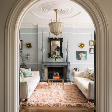 STUDIO TASHIMA
Keyes Road is a two-storey, semi-detached red brick house dating to around 1890-1910. The focus of our work was on the ground floor where we were asked to improve the layout and use of the main living areas of the house, for an active family of four. Important to the design was to maximise the quality and amount of light as well as connection to the garden and flow to the rest of the house.
Our proposal introduces three single storey extensions, comprising a central, large space that extends the main outrigger of the house. To each side are smaller volumes, affording a full width kitchen. While defining a series of discrete volumes, it was important for us to ensure that the kitchen, living, family and dining rooms that are interconnecting and continuous. The result is a big space punctuated by a series of differently sized arches, defining spaces to ensure their intimacy.
It was important for our client to have a sense of warmth and comfort - perhaps not dissimilar to the qualities of a hotel lobby. The colour scheme of the rooms are warm white painted plaster, natural wood flooring with black, bronze and brass accents. Indirect and carefully placed light fittings pulls together the atmosphere of the rooms - particularly in the evenings.
Externally, we felt it important to differentiate the extensions from the main house by using a dark, charcoal grey brick. This sets up a contrasting yet complimentary relationship to the rich red coloured brick house. The facets of the brick play with light and depth as do the graduated brick arches.
During the design process, we grappled with floor levels, the direction of sunlight, and care to not encroach on the neighbouring properties. As the house is in a conservation area, we worked closely with our trusted planning advisor. Throughout, we pursued a sensitive design strategy, using pitched roofs, matching materials and careful detailing. Internally, many of the original details are intact. This has enabled us to create an eclectic ensemble of elements, colours and materials varying in age and period.
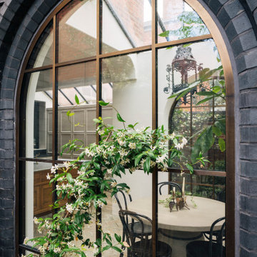 STUDIO TASHIMA
Keyes Road is a two-storey, semi-detached red brick house dating to around 1890-1910. The focus of our work was on the ground floor where we were asked to improve the layout and use of the main living areas of the house, for an active family of four. Important to the design was to maximise the quality and amount of light as well as connection to the garden and flow to the rest of the house.
Our proposal introduces three single storey extensions, comprising a central, large space that extends the main outrigger of the house. To each side are smaller volumes, affording a full width kitchen. While defining a series of discrete volumes, it was important for us to ensure that the kitchen, living, family and dining rooms that are interconnecting and continuous. The result is a big space punctuated by a series of differently sized arches, defining spaces to ensure their intimacy.
It was important for our client to have a sense of warmth and comfort - perhaps not dissimilar to the qualities of a hotel lobby. The colour scheme of the rooms are warm white painted plaster, natural wood flooring with black, bronze and brass accents. Indirect and carefully placed light fittings pulls together the atmosphere of the rooms - particularly in the evenings.
Externally, we felt it important to differentiate the extensions from the main house by using a dark, charcoal grey brick. This sets up a contrasting yet complimentary relationship to the rich red coloured brick house. The facets of the brick play with light and depth as do the graduated brick arches.
During the design process, we grappled with floor levels, the direction of sunlight, and care to not encroach on the neighbouring properties. As the house is in a conservation area, we worked closely with our trusted planning advisor. Throughout, we pursued a sensitive design strategy, using pitched roofs, matching materials and careful detailing. Internally, many of the original details are intact. This has enabled us to create an eclectic ensemble of elements, colours and materials varying in age and period.
 Designer's Edge Kitchen & Bath
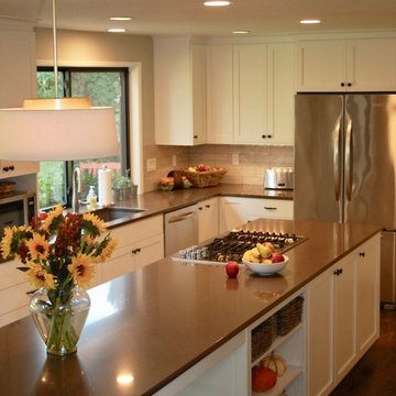
This active family purchased their home and began remodeling before moving in. The out-dated kitchen had oak cabinets and 4" orange tile on the countertops that had to go! (see before photos) It was replaced with a light and bright eat in kitchen. The expansive island provides ample counter space not only for baking and eating, but homework and crafts. Cabinetry with convenient access to blind corners, thoughtful layout for function and storage created a kitchen that is truly the heart of their home. The laundry room is clean and fresh with larger cabinets and a relocated laundry sink under the window. The family room fireplace was also updated with new surround and custom bookcases.
PHOTOS: Designer's Edge
10