
Search results for "Deceive" in Home Design Ideas
 Becky Farmer
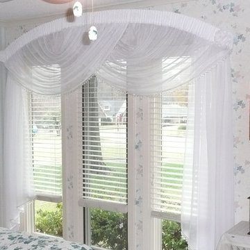
This faux arch deceives the eye and adds charm to this open, airy bedroom. The white sheer fabric adds lots of interest without weight.
Bedroom - eclectic bedroom idea in Other
Bedroom - eclectic bedroom idea in Other
 CITYDESKSTUDIO, Inc.
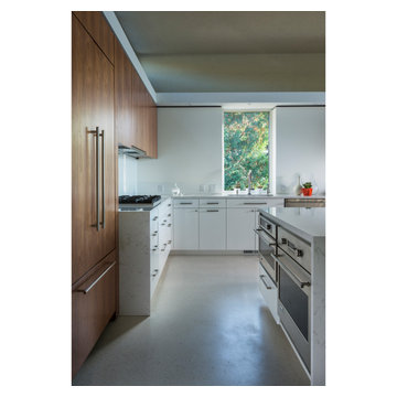
This home enjoys stunning views of Sweeney Lake from almost anywhere in the home; however it was in need of repair and a significant reorganization of the plan to take full advantage of site. The project is about the complete restoration and rethinking of this vintage 1965 mid-century gem. The house is deceivingly large with a full finished lower level and an indoor pool room; however it lived cramped and broken up. The entry was uninviting and small, the poolroom unused and poorly heated, the kitchen undersized, and the bedrooms and baths poorly accessed.
Our task was to open up the home through the rethinking of the floor plan and the introduction of a new central axis connecting and organizing the homes functions and spaces around view corridors and existing or new focal points. The home had beautiful features to build upon; the central brick fireplace, the raised roofs over the living and pool rooms, and the view to the lake itself. A fully redone exterior and interior preserve the homes proportion and scale, while at the same time bring greater connection to the site and a much needed clarity to the homes organization.
Project Team:
Ben Awes AIA, Principal-In-Charge
Bob Ganser AIA
Christian Dean AIA
Nate Dodge
 Cns builders & developers
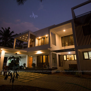
The stylistic analysis of the context is inspired by the classicism of casual modernism. From outside, the house has a peaceful quality; simple white walls with effortless openings. In many ways, it's like a person. Though deceivingly modest from the street view, the inside is colossal as a result of the way the design builds into the lush green landscape.
.
The appearance of the house is adorned by details such as the courtyards, the segregation of the social and private spaces and the volumetric play of the interior ceilings. This gives integrity and individuality to each space
Find the right local pro for your project
 Chanie Laree Designs
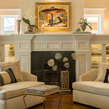
Black and champagne, set the stage for this slightly more polished Cosmopolitan look. But don't be deceived - this space doesn't stand on formality. Lush down-filled pillows and deep seating keep the space just as inviting and comfortable as its more casual counterparts.
Shelly Au Photography
 Top Drawer Custom Furniture Inc.
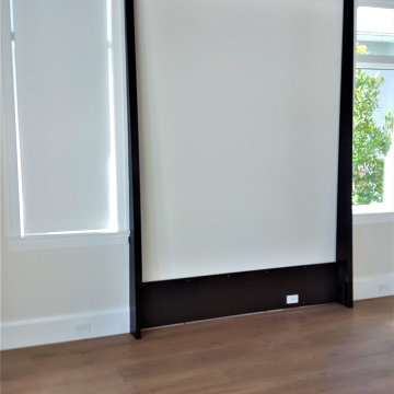
This is the headboard installed from window to window, waiting for the upholstered panels to go in. Looks can be deceiving, this headboard is 10 feet tall.
 Thompson Remodeling
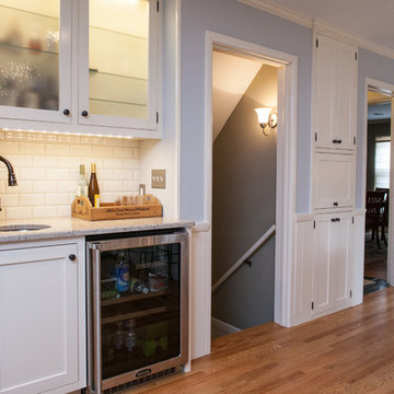
The kitchen in this 1950’s home needed a complete overhaul. It was dark, outdated and inefficient.
The homeowners wanted to give the space a modern feel without losing the 50’s vibe that is consistent throughout the rest of the home.
The homeowner’s needs included:
- Working within a fixed space, though reconfiguring or moving walls was okay
- Incorporating work space for two chefs
- Creating a mudroom
- Maintaining the existing laundry chute
- A concealed trash receptacle
The new kitchen makes use of every inch of space. To maximize counter and cabinet space, we closed in a second exit door and removed a wall between the kitchen and family room. This allowed us to create two L shaped workspaces and an eat-in bar space. A new mudroom entrance was gained by capturing space from an existing closet next to the main exit door.
The industrial lighting fixtures and wrought iron hardware bring a modern touch to this retro space. Inset doors on cabinets and beadboard details replicate details found throughout the rest of this 50’s era house.
 Resto-Modern Homes LLC
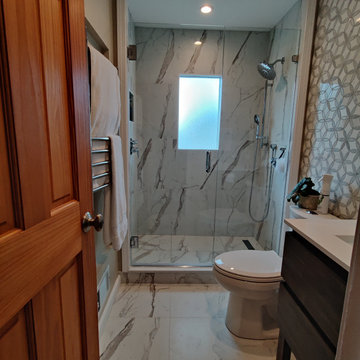
Dimensions can be deceiving! This bathroom is slightly less than 5 feet wide by only 7 feet deep.
Inspiration for a transitional bathroom remodel in Bridgeport
Inspiration for a transitional bathroom remodel in Bridgeport


 Novell Design Build & Novella Outdoors
By smoothing the curve of the wall and redesigning the hand railing, we were able to create an entranceway that drew your eyes upwards.
This would not have been possible without a Design Build team. While designing the custom angled scoop in the wall, and a custom recessed handrail, the biggest question for our team was “how do we actually build this”? We couldn’t find any examples that matched exactly what we envisioned, so our Design Build team found their own way! It was a collaborative and efficient effort; the biggest reward was making these deceivingly complex shapes feel effortless. Perhaps even more impressive is our completely seamless recessed hand railing!
 IL Decor
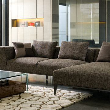
The Taylor sofa by Dellarobbia is a truly amazing update to classic mid-century designs of the fifties. The metal base has slightly flared legs that follow the angle of the sharp sides,, which contrast with the soft curves of the inner cushions. The base looks best in a contrasting fabric to the cushions. The deep tight seating area is deceivingly comfortable. The Taylor offers several configurable pieces to get the perfect seating arrangement. The Taylor can be upholstered in many fabric and microfiber selections. Manufactured By Dellarobbia.
 Axis Mundi Design
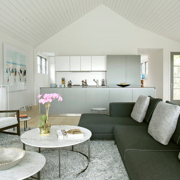
The exterior of what looks like a vernacular Hamptons shingle cottage, designed by architect Blaze Makoid, is intentionally deceiving. For the interiors, Axis Mundi typically decided not to play by the rules. Instead of de rigeur nautical artifacts, floppy sofas and wicker furniture, the firm responded to Makoid’s all-white interior envelope by injecting rooms with comfortable modern elegance that’s more contemporary Cap Ferrat than Eastern Long Island. Clean furniture silhouettes—from Cassina, Poltrona Frau and B&B Italia—a Massimo Vitali beach scene, a Moooi chandelier and industrial finishes (such as the steel of the fireplace surround and the anodized aluminum of a sleek Bulthaup kitchen) spark a creative tension between indoors and out. The gray palette provides a quiet backdrop for the nature outside, except for the master suite, where custom oak panels and blue shades create a reassuring warmth conducive to sleep.
Size: 1,920 sf
Project Team: John Beckmann, Nick Messerlian and Richard Rosenbloom
Architect: Blaze Makoid Architecture
Photographer: Mark Roskams
© Axis Mundi Design LLC
 Nar Design Group
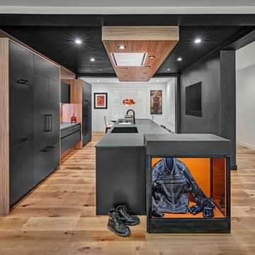
Part of an extensive home remodel, this kitchen design was born of one man’s love of all things Harley Davidson. Color inspiration came from the client’s own cherished bike which was a stunning combination of matte black and brushed steel. The client’s wish was to have a large open area in which he could “be one with his guests” when hosting large gatherings.
Cabinets, hardware and appliances all in black allow the focus to be on the beauty of the larger architectural elements as a whole. Included along the main storage wall is a hidden 42” refrigerator, dual pull-out pantries, and extra wide drawers below a pair of upper cabinets with matte black glass fold-up doors that open & close automatically via servo-drive technology.
The new island - which measures just shy of 16 ½ feet! - is a true central point around which all action revolves. Wide walkways on either side provide ease of flow for multiple sous chefs and guests alike. A textured cypress soffit above the island was designed to house the modern hood and also create a feeling of unity as it is the same size as the island below. Textured cypress wood also wraps matte black cabinetry and lines the main wall, changing grain direction to provide visual interest.
The 5’ Galley Workstation is a multi-functional marvel, easily transitioning from prep station to serving surface to clean-up with the addition of its built-in accessories. Placing an undercounter wine refrigerator on the back side of the island makes it easy for guests at the bar to help themselves. Close to the bar seating area, a 42” flat screen tv fits perfectly flush in the wall, practically disappearing when not in use.
Unique details include a large display cabinet with a metal framed front & side crafted out of steel by a local artisan. The glass is 2-way mirror so when the interior light is off, the treasure is concealed inside. The interior is painted in the trademark Harley orange.
Above a modern dining table, a one-of-a-kind chandelier was created from 3 bike helmets, painted in Harley orange by a local automobile detail shop. The interiors are finished in metallic silver for extra glow.
Adjacent to the Kitchen, and initially deceiving in its simplicity, the main tv wall was quite complex and challenging to realize. It has a convex curve from left to right and slopes back from floor to ceiling. The interior hollow space created room for a shallow tv niche on top and partially recessed deep media storage cabinets below. The planning and framing involved to create the proper compound miter connections required extra diligence from the designers and builder, but the finished product was worth the effort!
Photo credit: Fred Donham of Photographerlink
 CITYDESKSTUDIO, Inc.
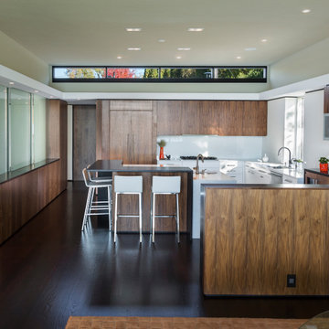
This home enjoys stunning views of Sweeney Lake from almost anywhere in the home; however it was in need of repair and a significant reorganization of the plan to take full advantage of site. The project is about the complete restoration and rethinking of this vintage 1965 mid-century gem. The house is deceivingly large with a full finished lower level and an indoor pool room; however it lived cramped and broken up. The entry was uninviting and small, the poolroom unused and poorly heated, the kitchen undersized, and the bedrooms and baths poorly accessed.
Our task was to open up the home through the rethinking of the floor plan and the introduction of a new central axis connecting and organizing the homes functions and spaces around view corridors and existing or new focal points. The home had beautiful features to build upon; the central brick fireplace, the raised roofs over the living and pool rooms, and the view to the lake itself. A fully redone exterior and interior preserve the homes proportion and scale, while at the same time bring greater connection to the site and a much needed clarity to the homes organization.
Project Team:
Ben Awes AIA, Principal-In-Charge
Bob Ganser AIA
Christian Dean AIA
Nate Dodge
 CITYDESKSTUDIO, Inc.
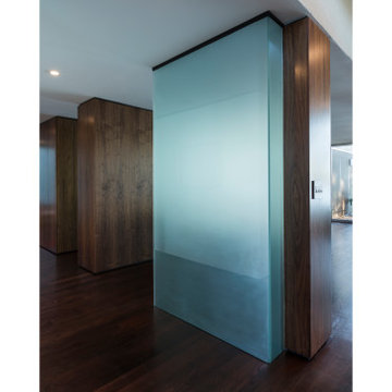
This home enjoys stunning views of Sweeney Lake from almost anywhere in the home; however it was in need of repair and a significant reorganization of the plan to take full advantage of site. The project is about the complete restoration and rethinking of this vintage 1965 mid-century gem. The house is deceivingly large with a full finished lower level and an indoor pool room; however it lived cramped and broken up. The entry was uninviting and small, the poolroom unused and poorly heated, the kitchen undersized, and the bedrooms and baths poorly accessed.
Our task was to open up the home through the rethinking of the floor plan and the introduction of a new central axis connecting and organizing the homes functions and spaces around view corridors and existing or new focal points. The home had beautiful features to build upon; the central brick fireplace, the raised roofs over the living and pool rooms, and the view to the lake itself. A fully redone exterior and interior preserve the homes proportion and scale, while at the same time bring greater connection to the site and a much needed clarity to the homes organization.
Project Team:
Ben Awes AIA, Principal-In-Charge
Bob Ganser AIA
Christian Dean AIA
Nate Dodge
16