
Search results for "Deceive" in Home Design Ideas
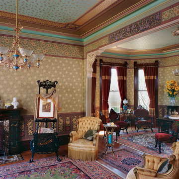
 Bradbury & Bradbury Art Wallpapers
Bradbury & Bradbury Art Wallpapers Inc.
Living room - living room idea in San Francisco
Living room - living room idea in San Francisco
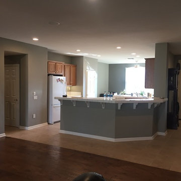
 Nar Design Group
BEFORE PHOTO: Part of an extensive home remodel, this kitchen design was born of one man’s love of all things Harley Davidson. Color inspiration came from the client’s own cherished bike which was a stunning combination of matte black and brushed steel. The client’s wish was to have a large open area in which he could “be one with his guests” when hosting large gatherings.
Cabinets, hardware and appliances all in black allow the focus to be on the beauty of the larger architectural elements as a whole. Included along the main storage wall is a hidden 42” refrigerator, dual pull-out pantries, and extra wide drawers below a pair of upper cabinets with matte black glass fold-up doors that open & close automatically via servo-drive technology.
The new island - which measures just shy of 16 ½ feet! - is a true central point around which all action revolves. Wide walkways on either side provide ease of flow for multiple sous chefs and guests alike. A textured cypress soffit above the island was designed to house the modern hood and also create a feeling of unity as it is the same size as the island below. Textured cypress wood also wraps matte black cabinetry and lines the main wall, changing grain direction to provide visual interest.
The 5’ Galley Workstation is a multi-functional marvel, easily transitioning from prep station to serving surface to clean-up with the addition of its built-in accessories. Placing an undercounter wine refrigerator on the back side of the island makes it easy for guests at the bar to help themselves. Close to the bar seating area, a 42” flat screen tv fits perfectly flush in the wall, practically disappearing when not in use.
Unique details include a large display cabinet with a metal framed front & side crafted out of steel by a local artisan. The glass is 2-way mirror so when the interior light is off, the treasure is concealed inside. The interior is painted in the trademark Harley orange.
Above a modern dining table, a one-of-a-kind chandelier was created from 3 bike helmets, painted in Harley orange by a local automobile detail shop. The interiors are finished in metallic silver for extra glow.
Adjacent to the Kitchen, and initially deceiving in its simplicity, the main tv wall was quite complex and challenging to realize. It has a convex curve from left to right and slopes back from floor to ceiling. The interior hollow space created room for a shallow tv niche on top and partially recessed deep media storage cabinets below. The planning and framing involved to create the proper compound miter connections required extra diligence from the designers and builder, but the finished product was worth the effort!
Photo credit: Fred Donham of Photographerlink
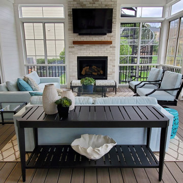
 Lauren Maroney for Ethan Allen Sterling, VA
This 3-Season Room addition to my client's house is the perfect extension of their interior. A fresh and bright palette brings the outside in, giving this family of 4 a space they can relax in after a day at the pool, or gather with friends for a cocktail in front of the fireplace.
And no! Your eyes are not deceiving you, we did seaglass fabric on the upholstery for a fun pop of color! The warm gray floors, white walls, and white washed fireplace is a great neutral base to design around, but desperately calls for a little color.
Find the right local pro for your project
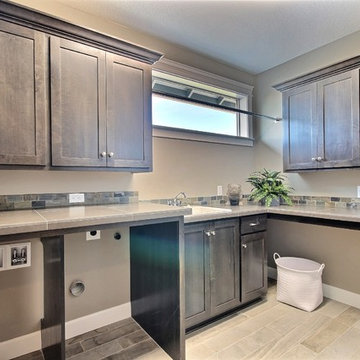
 Cascade West Development
The Brahmin - in Ridgefield Washington by Cascade West Development Inc.
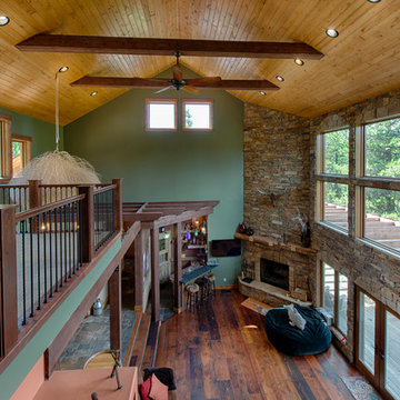
Every area of this home is designed to be spacious and accommodating. Its supersized nook area, the extra-large Pantry area to handle all the trips from Costco, down to the oversized Mud Room with benches, cubbies and large closet, to the spacious Guest Room with a private bath all of which are on the Main floor, but wait there is more! Head through the corner of the kitchen and you’ll find the “12th man Room” an incredibly cozy sized room, that features a 2nd Fireplace, Vaulted Ceilings, a Wet Bar with an under cabinet refrigerator, a sink, microwave for the popcorn and last but not least the Big Screen for Game Day! Be the Fan! Sit down, immerse yourself into the couch and turn it up! Commercial or Halftime?, …..just head outside and enjoy a breath of fresh air in the oversized back yard and throw some ball to remember the old days or drift into your favorite athlete’s stance and get geared up for the second half!
Cascade West Facebook: https://goo.gl/MCD2U1
Cascade West Website: https://goo.gl/XHm7Un
These photos, like many of ours, were taken by the good people of ExposioHDR - Portland, Or
Exposio Facebook: https://goo.gl/SpSvyo
Exposio Website: https://goo.gl/Cbm8Ya
 CITYDESKSTUDIO, Inc.
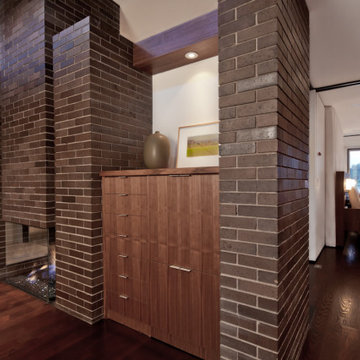
This home enjoys stunning views of Sweeney Lake from almost anywhere in the home; however it was in need of repair and a significant reorganization of the plan to take full advantage of site. The project is about the complete restoration and rethinking of this vintage 1965 mid-century gem. The house is deceivingly large with a full finished lower level and an indoor pool room; however it lived cramped and broken up. The entry was uninviting and small, the poolroom unused and poorly heated, the kitchen undersized, and the bedrooms and baths poorly accessed.
Our task was to open up the home through the rethinking of the floor plan and the introduction of a new central axis connecting and organizing the homes functions and spaces around view corridors and existing or new focal points. The home had beautiful features to build upon; the central brick fireplace, the raised roofs over the living and pool rooms, and the view to the lake itself. A fully redone exterior and interior preserve the homes proportion and scale, while at the same time bring greater connection to the site and a much needed clarity to the homes organization.
Project Team:
Ben Awes AIA, Principal-In-Charge
Bob Ganser AIA
Christian Dean AIA
Nate Dodge

 Lauren Maroney for Ethan Allen Sterling, VA
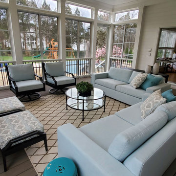
This 3-Season Room addition to my client's house is the perfect extension of their interior. A fresh and bright palette brings the outside in, giving this family of 4 a space they can relax in after a day at the pool, or gather with friends for a cocktail in front of the fireplace.
And no! Your eyes are not deceiving you, we did seaglass fabric on the upholstery for a fun pop of color! The warm gray floors, white walls, and white washed fireplace is a great neutral base to design around, but desperately calls for a little color.
 Lauren Maroney for Ethan Allen Sterling, VA
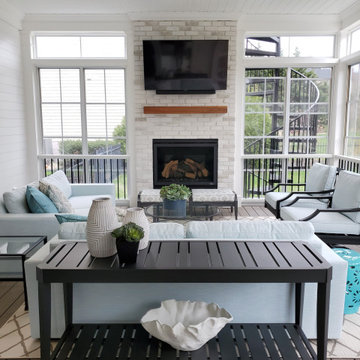
This 3-Season Room addition to my client's house is the perfect extension of their interior. A fresh and bright palette brings the outside in, giving this family of 4 a space they can relax in after a day at the pool, or gather with friends for a cocktail in front of the fireplace.
And no! Your eyes are not deceiving you, we did seaglass fabric on the upholstery for a fun pop of color! The warm gray floors, white walls, and white washed fireplace is a great neutral base to design around, but desperately calls for a little color.

 Axis Mundi Design
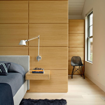
The exterior of what looks like a vernacular Hamptons shingle cottage, designed by architect Blaze Makoid, is intentionally deceiving. For the interiors, Axis Mundi typically decided not to play by the rules. Instead of de rigeur nautical artifacts, floppy sofas and wicker furniture, the firm responded to Makoid’s all-white interior envelope by injecting rooms with comfortable modern elegance that’s more contemporary Cap Ferrat than Eastern Long Island. Clean furniture silhouettes—from Cassina, Poltrona Frau and B&B Italia—a Massimo Vitali beach scene, a Moooi chandelier and industrial finishes (such as the steel of the fireplace surround and the anodized aluminum of a sleek Bulthaup kitchen) spark a creative tension between indoors and out. The gray palette provides a quiet backdrop for the nature outside, except for the master suite, where custom oak panels and blue shades create a reassuring warmth conducive to sleep.
Size: 1,920 sf
Project Team: John Beckmann, Nick Messerlian and Richard Rosenbloom
Architect: Blaze Makoid Architecture
Photographer: Mark Roskams
© Axis Mundi Design LLC
 User
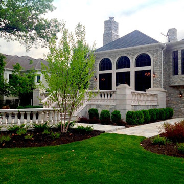
UserThe back yard shows how huge this home is from the front its deceiving
Huge traditional gray three-story stone exterior home idea in Cincinnati with a shingle roof
Huge traditional gray three-story stone exterior home idea in Cincinnati with a shingle roof
 Shelter Design Studio, LLC
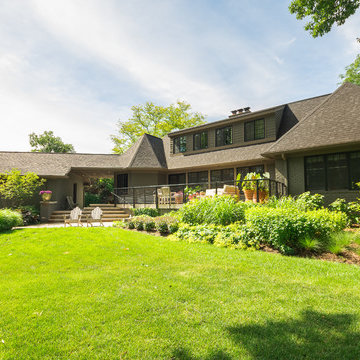
View from rear yard
Example of a transitional exterior home design in Detroit
Example of a transitional exterior home design in Detroit
 Tavia Douglass, Designer
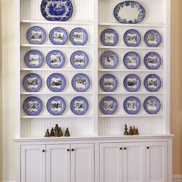
Mark Rockwood Photography- This custom china cabinet was built for the home's formal dining room. Although the picture is deceiving this piece stands over 9 feet tall. Proportionally the room commands something of this stature, although many times as the piece of being constructed in M.R. Brewer's custom shop, we questioned it's size. Once installed in the over sized dining room, all doubt quickly subsided as it is the perfect addition to the room.
 Axis Mundi
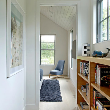
The exterior of what looks like a vernacular Hamptons shingle cottage, designed by architect Blaze Makoid, is intentionally deceiving. For the interiors, Axis Mundi typically decided not to play by the rules. Instead of de rigeur nautical artifacts, floppy sofas and wicker furniture, the firm responded to Makoid’s all-white interior envelope by injecting rooms with comfortable modern elegance that’s more contemporary Cap Ferrat than Eastern Long Island. Clean furniture silhouettes—from Cassina, Poltrona Frau and B&B Italia—a Massimo Vitali beach scene, a Moooi chandelier and industrial finishes (such as the steel of the fireplace surround and the anodized aluminum of a sleek Bulthaup kitchen) spark a creative tension between indoors and out. The gray palette provides a quiet backdrop for the nature outside, except for the master suite, where custom oak panels and blue shades create a reassuring warmth conducive to sleep.
Photography: Mark Roskams
 Axis Mundi | SF
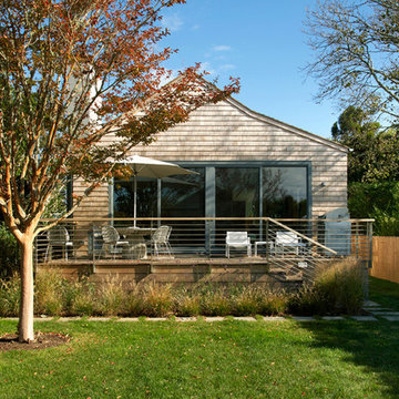
The exterior of what looks like a vernacular shingle cottage, designed by architect Blaze Makoid, is intentionally deceiving. For the interiors, Axis Mundi typically decided not to play by the rules. Instead of de rigeur nautical artifacts, floppy sofas and wicker furniture, the firm responded to Makoid’s all-white interior envelope by injecting rooms with comfortable modern elegance that’s more contemporary Cap Ferrat than Eastern Long Island. Clean furniture silhouettes—from Cassina, Poltrona Frau and B&B Italia—a Massimo Vitali beach scene, a Moooi chandelier and industrial finishes (such as the steel of the fireplace surround and the anodized aluminum of a sleek Bulthaup kitchen) spark a creative tension between indoors and out. The gray palette provides a quiet backdrop for the nature outside, except for the master suite, where custom oak panels and blue shades create a reassuring warmth conducive to sleep.
Size: 1,920 sf
Project Team: John Beckmann, Nick Messerlian and Richard Rosenbloom
Architect: Blaze Makoid Architecture
Contractor: Greg D'Angelo Construction Inc.
Photographer: Mark Roskams
© Axis Mundi Design LLC.
 Ferriss - Architectural Renderings
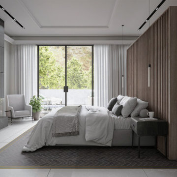
7 mistakes in bedroom design and ways to avoid them.
ERROR # 1 - Incorrect bed size.
This is a problem with any furniture in principle. When, according to the plan and ergonomic calculations, it becomes size to size, but in fact, it looks cumbersome, visually overflowing the space or, on the contrary, turns out to be too small and looks awkward.
How to avoid: Always be guided by the proportions of the size of the furniture in the room. Try to choose as big a bed as possible, but stay realistic. The main thing is that the width of the passageways in the bedroom should not be less than 70cm, and for comfortable movement, it is better to do everything 100cm.
ERROR # 2 - Poor lighting and switches.
Even in a small bedroom, you need multiple light sources. A single chandelier in the center of the ceiling is not enough, because it creates the effect of darkening the corners, and the room seems uncomfortable.
How to avoid: Hang a sconce over your headboard. Don't forget to light up the space next to the mirror and wardrobe. And be sure to place switches close to the bed so that you don't have to go to the other end of the room after an evening with a book in bed.
Do not forget about a sufficient number of outlets, this should be done even at the planning stage.
ERROR # 3 - Few storage locations
The fewer well-thought-out cabinets and shelving, the more things are visible. And the clutter spoils even the most stylish and expensive interior.
How to avoid: In addition to bedside tables, a chest of drawers (for storing small things) and a built-in wardrobe can be placed in a small bedroom: unlike a usual one, it takes up space from floor to ceiling, thereby accommodating more items. In addition, the built-in structure looks more solid and often merges with the walls, making the setting complete.
ERROR # 4 - Carpet of the wrong size.
The carpet in the bedroom is a great addition, and sometimes the final touch of the whole composition. But often people choose the wrong size or do not use it at all.
How to avoid: Choosing the right size can be guided by the unspoken rule, according to which the carpet should be 1 meter larger than the bed, both lengthwise and across. If the room is large, then it is recommended that the indentation of the carpet from the wall is 45-50 cm, if it is small, then 20-30 cm can be dispensed with.
ERROR # 5 Typical design.
If you buy a typical bed, bedside tables, and wardrobe from one manufacturer, then the interior will turn out to be formulaic and impersonal. No accessories and color schemes will help him.
How to avoid: The interior should reflect the character of its owner, and the person living in it will feel comfortable. Explore different collections of furniture and try to assemble a capsule in the same color scheme, but at the same time different in texture and shape.
ERROR # 6 Empty walls.
Even if the bedroom is a room for relaxation, it would be a mistake to make a space out of it that is intended solely for sleeping. Ascetic furnishings, unadorned walls, boring furniture, and bed linen - all this does not improve the mood at all, but, on the contrary, creates a gloomy mood.
How to avoid: The walls in the bedroom are a blank slate that you can transform into something original, beautiful, and unique to your liking. Even if you just paint one of the walls in a contrasting color, and decorate the other with several photos from the Internet, printed and inserted into frames, you can transform the atmosphere of the room as a whole.
ERROR # 7 Too dark interior.
One should not be deceived by the beauty of the thick dark tones of interior paint. It has long been known that dark blue, burgundy, blueberry, chocolate, and black for the bedroom should not be used in large quantities, since such an environment will have a tangible effect and interfere with a vigorous awakening in the morning.
How to avoid: If you like a rich range, try choosing derived shades a few tones lighter, for example, instead of black or graphite, choose gray-brown, dove-gray for the walls, and blue can be replaced with cornflower blue or azure.
Don't forget to combine dark tones with lots of whites, creams, complementing shimmery accessories, and vibrant décor.
https://www.ferriss.co/
#ferriss #We_bring_objects_to_life #3drendering #architecture #San_Francisco
 CITYDESKSTUDIO, Inc.
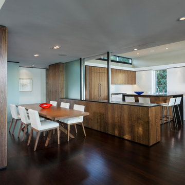
This home enjoys stunning views of Sweeney Lake from almost anywhere in the home; however it was in need of repair and a significant reorganization of the plan to take full advantage of site. The project is about the complete restoration and rethinking of this vintage 1965 mid-century gem. The house is deceivingly large with a full finished lower level and an indoor pool room; however it lived cramped and broken up. The entry was uninviting and small, the poolroom unused and poorly heated, the kitchen undersized, and the bedrooms and baths poorly accessed.
Our task was to open up the home through the rethinking of the floor plan and the introduction of a new central axis connecting and organizing the homes functions and spaces around view corridors and existing or new focal points. The home had beautiful features to build upon; the central brick fireplace, the raised roofs over the living and pool rooms, and the view to the lake itself. A fully redone exterior and interior preserve the homes proportion and scale, while at the same time bring greater connection to the site and a much needed clarity to the homes organization.
Project Team:
Ben Awes AIA, Principal-In-Charge
Bob Ganser AIA
Christian Dean AIA
Nate Dodge
 Lauren Maroney for Ethan Allen Sterling, VA
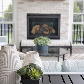
This 3-Season Room addition to my client's house is the perfect extension of their interior. A fresh and bright palette brings the outside in, giving this family of 4 a space they can relax in after a day at the pool, or gather with friends for a cocktail in front of the fireplace.
And no! Your eyes are not deceiving you, we did seaglass fabric on the upholstery for a fun pop of color! The warm gray floors, white walls, and white washed fireplace is a great neutral base to design around, but desperately calls for a little color.
 J.S. Brown & Co.
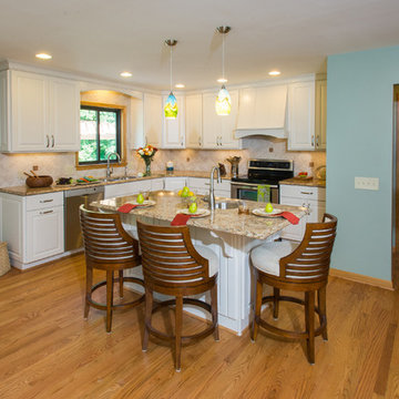
Remodel by J.S. Brown & Co. Design by Monica Lewis, CMKBD, MCR, UDCP.
Photo Credit: Todd Yarrington
Medium tone wood floor eat-in kitchen photo in Columbus with an undermount sink, raised-panel cabinets, white cabinets, quartz countertops, beige backsplash, ceramic backsplash, stainless steel appliances and an island
Medium tone wood floor eat-in kitchen photo in Columbus with an undermount sink, raised-panel cabinets, white cabinets, quartz countertops, beige backsplash, ceramic backsplash, stainless steel appliances and an island
 First Lamp
Tim Bies
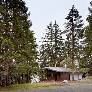
Small modern red two-story metal house exterior idea in Seattle with a shed roof and a metal roof
Small modern red two-story metal house exterior idea in Seattle with a shed roof and a metal roof
12