
Search results for "Deciding locations" in Home Design Ideas

 Two Street Studio
Deck - 1960s side yard second story wood railing deck idea in New York with no cover
 Pennsylvania Landscape & Nursery Association
Terran Landscapes http://www.terranlandscapes.com
Project Entry: Fishers Woodland Garden
2014 PLNA Awards for Landscape Excellence Winner
Category: Theme Garden $15,000-$30,000
Award Level: Bronze
Photo Description:
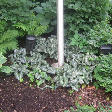
We were contracted by the client to design a calming space for their staff to relax, take a walk, and enjoy a leisurely lunch as well as to provide their grandchildren a place to run and pick flowers. The space was originally dominated by large trees and had been overgrown with ivy, sumac and aggressive vines, providing an unwelcome, dark space with little color or visual appeal. The client requested a colorful blend of shrubs and perennials that would provide interest throughout the seasons, as well as provide privacy by screening the street traffic along Carisbrooke Road.
Our goal was to create the privacy screen along the road by layering plants from the ground to the tree canopy. The theme was to let nature inspire the landscape, allowing a space that was originally woodland to become an enhanced version of itself, creating a beautiful habitat for birds and butterflies to excite the senses and satisfy all who enjoy the beauty of nature.
We began by clearing the brush and removing all aggressive vines and ivy that jeopardized the health of the trees. We kept and transplanted all non- invasive or native plant material in the area to various locations throughout the property. Several yards of compost were then tilled into the soil and the existing trees fertilized to provide a rich growing environment.
A few challenges occurred during the design process. It was decided that a new generator was to be installed in the woodland and due to a future addition to the house, we were forced to eliminate planned additional impervious pathway surfaces. We provided screening to hide the generator and buffer the noise, and created a meandering path and sitting area out of natural woodchips instead of the proposed bluestone to solve the impervious space issue. The woodchips add a sense of informality and invite the viewer to walk slowly through the space. The reduced noise from the additional screening of the generator allows for quiet reflection as chipmunks scurry and hummingbirds dart about between the flowers.
Our plant palette consists of shady understory plants that thrive and flower vigorously from spring through fall. A tall, lush, evergreen backdrop of Ilex opaca and Prunus laurocerasus ‘Schipkaensis’ provides the screening and blends into a middle layer of ‘Ivory Halo’ dogwood, hydrangeas and winterberry hollies. Beautiful perennials and groundcovers bloom along the woodland path, providing a low visual layer of color and texture. Movement throughout the garden is provided by the graceful Calamagrostis brachytricha and Hakenchloa that soften the nearby hardscaping. The woodland floor is full of shade-loving Solomon’s seal, hosta, astilbe, ferns, bleeding heart, Tiarella and Aconitum.
The street side of this woodland required plants with a preference for a little more sun and drought tolerance. A palette of oakleaf hydrangea, Agastache, Liatris and Rudbeckia softens the fence line and provides the desired color.
As designed and installed, the woodland garden successfully provides the client’s family and office staff a quiet space where they can take a peaceful moment and enjoy nature.
Photo Credit: Lisa C. Falls

 Milgard Windows & Doors
The Kiguchi family moved into their Austin, Texas home in 1994. Built in the 1980’s as part of a neighborhood development, they happily raised their family here but longed for something more contemporary. Once they became empty nesters, they decided it was time for a major remodel. After spending many years visiting Austin AIA Home Tours that highlight contemporary residential architecture, they had a lot of ideas and in 2013 were ready to interview architects and get their renovation underway.
The project turned into a major remodel due to an unstable foundation. Architects Ben Arbib and Ed Hughey, of Arbib Hughey Design were hired to solve the structural issue and look for inspiration in the bones of the house, which sat on top of a hillside and was surrounded by great views.
Unfortunately, with the old floor plan, the beautiful views were hidden by small windows that were poorly placed. In order to bring more natural light into the house the window sizes and configurations had to be addressed, all while keeping in mind the homeowners desire for a modern look and feel.
To achieve a more contemporary and sophisticated front of house, a new entry was designed that included removing a two-story bay window and porch. The entrance of the home also became more integrated with the landscape creating a template for new foliage to be planted. Older exterior materials were updated to incorporate a more muted palette of colors with a metal roof, dark grey siding in the back and white stucco in the front. Deep eaves were added over many of the new large windows for clean lines and sun protection.
“Inside it was about opening up the floor plan, expanding the views throughout the house, and updating the material palette to get a modern look that was also warm and inviting,” said Ben from Arbib Hughey Design. “Prior to the remodel, the house had the typical separation of rooms. We removed the walls between them and changed all of the windows to Milgard Thermally Improved Aluminum to connect the inside with the outside. No matter where you are you get nice views and natural light.”
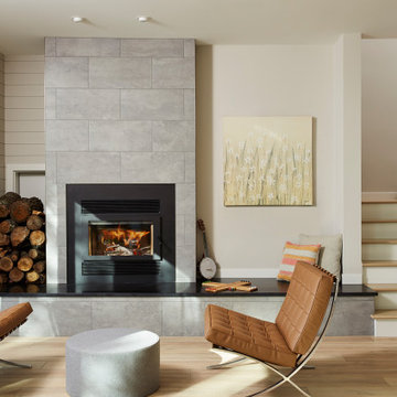
The architects wanted to create some drama, which they accomplished with the window placement and opening up the interior floor plan to an open concept approach. Cabinetry was used to help delineate intimate spaces. To add warmth to an all-white living room, white-washed oak wood floors were installed and pine planks were used around the fireplace. The large windows served as artwork bringing the color of nature into the space.
An octagon shaped, elevated dining room, (named “the turret”), had a big impact on the design of the house. They architects rounded the corners and added larger window openings overlooking a new sunken garden. The great room was also softened by rounding out the corners and that circular theme continued throughout the house, being picked up in skylight wells and kitchen cabinetry. A staircase leading to a catwalk was added and the result was a two-story window wall that flooded the home with natural light.
When asked why Milgard® Thermally Improved Aluminum windows were selected, the architectural team listed many reasons:
1) Aesthetics: “We liked the slim profiles and narrow sightlines. The window frames never get in the way of the view and that was important to us. They also have a very contemporary look that went well with our design.”
2) Options: “We liked that we could get large sliding doors that matched the windows, giving us a very cohesive look and feel throughout the project.”
3) Cost Effective: “Milgard windows are affordable. You get a good product at a good price.”
4) Custom Sizes: “Milgard windows are customizable, which allowed us to get the right window for each location.”
Ready to take on your own traditional to modern home remodeling project? Arbib Hughey Design advises, “Work with a good architect. That means picking a team that is creative, communicative, listens well and is responsive. We think it’s important for an architect to listen to their clients and give them something they want, not something the architect thinks they should have. At the same time you want an architect who is willing and able to think outside the box and offer up design options that you may not have considered. Design is about a lot of back and forth, trying out ideas, getting feedback and trying again.”
The home was completely transformed into a unique, contemporary house perfectly integrated with its site. Internally the home has a natural flow for the occupants and externally it is integrated with the surroundings taking advantage of great natural light. As a side note, it was highly praised as part of the Austin AIA homes tour.
Find the right local pro for your project
 CHRISTOPHER STROM ARCHITECTS
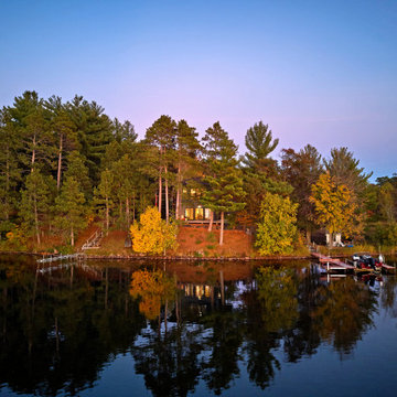
Sommerhus is a private retreat for two empty-nesters. The clients purchased the previous cabin after falling in love with its location on a private, lakefront peninsula. However, this beautiful site was a challenging site to build on, due to its position sandwiched between the lake and protected wet land. The clients disliked the old cabin because it could only be used in the summer months, due to its lack of both insulation and heat. In addition, it was too small for their needs. They wanted to build a new, larger retreat, but were met with yet another constraint: the new cabin would be limited to the previous cabin’s small footprint. Thus, they decided to approach an architect to design their dream cabin.
As the clients described, “We visited Denmark for a family wedding in 2015, and while biking near Gilleleje, a fishing village on the Baltic Sea, we fell in love with the aesthetic of ‘Sommerhus’: dark exteriors, clean, simple lines, and lots of windows.” We set out to design a cabin that fit this aesthetic while also meeting the site’s constraints.
The clients were committed to keeping all existing trees on their site. In addition, zoning codes required the new retreat to stay within the previous cabin's small footprint. Thus, to maximize the square footage of the cabin without removing trees or expanding the footprint, the new structure had to grow vertically. At the same time, the clients wanted to be good neighbors. To them, this meant that their cabin should disappear into the woods, especially when viewed from the lake. To accomplish both these requests, the architect selected a dark exterior metal façade that would visually retreat into the trees. The metal siding is a modern, low-maintenance, and cost-effective solution, especially when compared to traditional wood siding. Warm wood on the soffits of the large roof overhang contrast with the metal siding. Sommerhus's resulting exterior is just as the clients’ requested: boldly modern yet respectful of the serene surroundings.
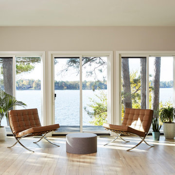
The homeowners desired a beach-house-inspired interior, full of light and warmth, in contrast to the dark exterior. As the homeowner explained, “I wanted it to feel like a porch inside.” To achieve this, the living room has two walls of sliding glass doors that connect to the wrap-around porch. This creates a beautiful, indoor-outdoor living space. The crisp and bright kitchen also connects to the porch with the window that opens to an outdoor counter - perfect for passing food and drinks to those lounging on the porch. The kitchen is open to the rest of the first-floor entertaining space, and brings a playful, beach-house feel to the cabin.
After the completion of the project, the homeowners remarked, “Working with Christopher and Eric [of CSA] was a wonderful experience. We absolutely love our home, and each season on the lake is more special than the last.”

 River Valley Landscapes
The property is one of the original farm houses located on the main street of a small town. It has been in the family for many years and our client just inherited the property. They were trying to have balance of preserving the old while realizing modern day living has its benefits too. The house had a large addition added using mostly old style materials, but designed with function and modern day luxuries. Our goal was to carry that theme to the outside.
Our first problem we had to address was how to transition between the first floor elevation changes. The lower room was the husband’s office. He stated in the future he may have clients over and it would be nice to have an area to sit outside. The wife’s main concern was to renew the four corner garden. She also felt it was very important to be able to see it from the kitchen area. Finally there was an old wishing well stuck right outside the kitchen. They both felt it would be neat to be able to incorporate this in some how. They wanted a patio area with a built in grill to accommodate there family and friends. They also wanted to keep a large play area for the kids.
We were able to pull this off successfully. We addressed the first issue by having a small lower level flagstone area. This area is large enough for 1 to 2 people to sit comfortably. It also provides a transition from his office to the larger patio area. We installed a simple small gravel sitting area opposite of the main patio. This provides our client a secluded place to relax or do business. Mrs.... told me she is amazed how much her and her husband enjoys this area. It is so peaceful looking at the small creek over a glass of wine.
We built a natural limestone retaining wall to create the patio terrace. The stone was chosen to extend the houses architectural elements into the landscape. Irregular broken flagstone was used to give it a more casual feel. We installed three Serviceberries into the patio terrace to replace some trees that were taken down during the remodeling. She was very concern that they would block the view of the four corner garden. We new they were crucial to nestle in the terrace, so we placed them for a couple days for her to decide. Fortunately she agreed they not only kept the view open, but helped frame the garden.
The four corner garden was designed to be viewed from afar and experienced up close. We wanted the space to have some formal structure while keeping with the casual farm house feel. Another natural limestone retaining wall was created. This leveled the garden terrace and helped associate it with the rest of the property. The four corner garden is nestled into the existing woods edge. This provides three distinct experiences to entering the garden; a more formal from the driveway, an open feel from the lower lawn, and a more natural / casual experience from the wooded area. The Plymouth brown gravel was used for the center of the garden. This helped highlight the stone post that was found during construction. The gravel also brings the sense of sound into the garden space. Lamb’s ear was chosen as a fun way to get kids interest in horticulture.
The balance of using the new to create the old feel is what makes this project a success. The property has already hosted a local historical society event and won an award for its preservation efforts. When Mrs.... can’t find her husband, she knows he is either reading the newspaper by the grill or resting in the hammock along the wood’s path.
 Milgard Windows & Doors
The Kiguchi family moved into their Austin, Texas home in 1994. Built in the 1980’s as part of a neighborhood development, they happily raised their family here but longed for something more contemporary. Once they became empty nesters, they decided it was time for a major remodel. After spending many years visiting Austin AIA Home Tours that highlight contemporary residential architecture, they had a lot of ideas and in 2013 were ready to interview architects and get their renovation underway.
The project turned into a major remodel due to an unstable foundation. Architects Ben Arbib and Ed Hughey, of Arbib Hughey Design were hired to solve the structural issue and look for inspiration in the bones of the house, which sat on top of a hillside and was surrounded by great views.
Unfortunately, with the old floor plan, the beautiful views were hidden by small windows that were poorly placed. In order to bring more natural light into the house the window sizes and configurations had to be addressed, all while keeping in mind the homeowners desire for a modern look and feel.
To achieve a more contemporary and sophisticated front of house, a new entry was designed that included removing a two-story bay window and porch. The entrance of the home also became more integrated with the landscape creating a template for new foliage to be planted. Older exterior materials were updated to incorporate a more muted palette of colors with a metal roof, dark grey siding in the back and white stucco in the front. Deep eaves were added over many of the new large windows for clean lines and sun protection.
“Inside it was about opening up the floor plan, expanding the views throughout the house, and updating the material palette to get a modern look that was also warm and inviting,” said Ben from Arbib Hughey Design. “Prior to the remodel, the house had the typical separation of rooms. We removed the walls between them and changed all of the windows to Milgard Thermally Improved Aluminum to connect the inside with the outside. No matter where you are you get nice views and natural light.”
The architects wanted to create some drama, which they accomplished with the window placement and opening up the interior floor plan to an open concept approach. Cabinetry was used to help delineate intimate spaces. To add warmth to an all-white living room, white-washed oak wood floors were installed and pine planks were used around the fireplace. The large windows served as artwork bringing the color of nature into the space.
An octagon shaped, elevated dining room, (named “the turret”), had a big impact on the design of the house. They architects rounded the corners and added larger window openings overlooking a new sunken garden. The great room was also softened by rounding out the corners and that circular theme continued throughout the house, being picked up in skylight wells and kitchen cabinetry. A staircase leading to a catwalk was added and the result was a two-story window wall that flooded the home with natural light.
When asked why Milgard® Thermally Improved Aluminum windows were selected, the architectural team listed many reasons:
1) Aesthetics: “We liked the slim profiles and narrow sightlines. The window frames never get in the way of the view and that was important to us. They also have a very contemporary look that went well with our design.”
2) Options: “We liked that we could get large sliding doors that matched the windows, giving us a very cohesive look and feel throughout the project.”
3) Cost Effective: “Milgard windows are affordable. You get a good product at a good price.”
4) Custom Sizes: “Milgard windows are customizable, which allowed us to get the right window for each location.”
Ready to take on your own traditional to modern home remodeling project? Arbib Hughey Design advises, “Work with a good architect. That means picking a team that is creative, communicative, listens well and is responsive. We think it’s important for an architect to listen to their clients and give them something they want, not something the architect thinks they should have. At the same time you want an architect who is willing and able to think outside the box and offer up design options that you may not have considered. Design is about a lot of back and forth, trying out ideas, getting feedback and trying again.”
The home was completely transformed into a unique, contemporary house perfectly integrated with its site. Internally the home has a natural flow for the occupants and externally it is integrated with the surroundings taking advantage of great natural light. As a side note, it was highly praised as part of the Austin AIA homes tour.
 CHRISTOPHER STROM ARCHITECTS
Sommerhus is a private retreat for two empty-nesters. The clients purchased the previous cabin after falling in love with its location on a private, lakefront peninsula. However, this beautiful site was a challenging site to build on, due to its position sandwiched between the lake and protected wet land. The clients disliked the old cabin because it could only be used in the summer months, due to its lack of both insulation and heat. In addition, it was too small for their needs. They wanted to build a new, larger retreat, but were met with yet another constraint: the new cabin would be limited to the previous cabin’s small footprint. Thus, they decided to approach an architect to design their dream cabin.
As the clients described, “We visited Denmark for a family wedding in 2015, and while biking near Gilleleje, a fishing village on the Baltic Sea, we fell in love with the aesthetic of ‘Sommerhus’: dark exteriors, clean, simple lines, and lots of windows.” We set out to design a cabin that fit this aesthetic while also meeting the site’s constraints.
The clients were committed to keeping all existing trees on their site. In addition, zoning codes required the new retreat to stay within the previous cabin's small footprint. Thus, to maximize the square footage of the cabin without removing trees or expanding the footprint, the new structure had to grow vertically. At the same time, the clients wanted to be good neighbors. To them, this meant that their cabin should disappear into the woods, especially when viewed from the lake. To accomplish both these requests, the architect selected a dark exterior metal façade that would visually retreat into the trees. The metal siding is a modern, low-maintenance, and cost-effective solution, especially when compared to traditional wood siding. Warm wood on the soffits of the large roof overhang contrast with the metal siding. Sommerhus's resulting exterior is just as the clients’ requested: boldly modern yet respectful of the serene surroundings.
The homeowners desired a beach-house-inspired interior, full of light and warmth, in contrast to the dark exterior. As the homeowner explained, “I wanted it to feel like a porch inside.” To achieve this, the living room has two walls of sliding glass doors that connect to the wrap-around porch. This creates a beautiful, indoor-outdoor living space. The crisp and bright kitchen also connects to the porch with the window that opens to an outdoor counter - perfect for passing food and drinks to those lounging on the porch. The kitchen is open to the rest of the first-floor entertaining space, and brings a playful, beach-house feel to the cabin.
After the completion of the project, the homeowners remarked, “Working with Christopher and Eric [of CSA] was a wonderful experience. We absolutely love our home, and each season on the lake is more special than the last.”
Sponsored
Columbus, OH

Hope Restoration & General Contracting
Columbus Design-Build, Kitchen & Bath Remodeling, Historic Renovations
 River Valley Landscapes
This project was the result of the owner’s desire to install a swimming pool and outdoor living space inspired by tropical resorts they had visited on family vacations. The one element asked for specifically was a large waterfall spilling into the pool. The challenge for the designers was how to achieve the look the owner’s wished without the use of clichéd items such as thatched huts and tiki torches. The designers decided lush full plantings using plants found in the northeast region that met certain design criteria would be the primary way of giving the tropical feel. Boulder outcroppings, irregular stone paving and fire bowls along the back of the pool would complete the look.
The property is located in a newer subdivision with homes on both sides and a school to the rear. A walkway connects the neighborhood and the school along one side. The desired privacy would be addressed by the placement of plants and trees around the perimeter in mounded beds. Placing the waterfall to the rear of the pool helped block the view of the school beyond. The township had restrictions on the amount of impervious material allowable on site. The patio was designed to the maximum allowable size with square footage going to where it would be most usable. Planting beds were cut into the patio to decrease unnecessary square footage, divide spaces, and allow for more places to add plants and trees.
A rectangular swimming pool was chosen to make it easier to install an automatic pool cover. The pool was designed, with input from the landscape designers, and contracted separately by the owner. The landscape designers chose the location of pool and waterfall so that it was prominently placed to be the focal point of the backyard. The pool includes a curving sunbathing shelf running from end to end, finished in a lighter color to make it more visible, with removable umbrellas for shade and to add to the resort feel. To tie into the boulders used throughout the design, a large boulder was used as a substitute for a diving board. The yard sloped down towards the back of the property which required a large amount of soil to be added and large boulder retaining wall along the back.
For the planting design, the designers choose to focus on plants with larger leaves, various leaf colors and textures, and plants with large flowers in bold colors. These plants were then arranged into a loose lush planting scheme mixed with more traditional northeast plants such as pines, grasses, and roses. Unique plants such as hardy bananas were added for their tropical and exotic look. The full planting beds help to nestle in and enclose the living space.
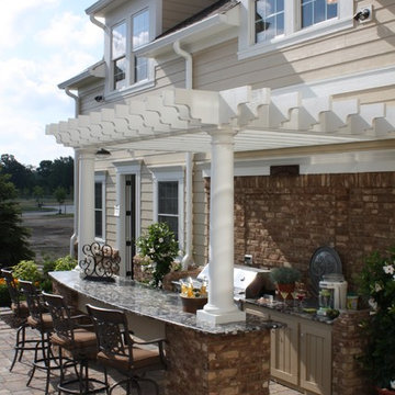
Broken flagstone was chosen for the patio and intentionally left irregular at the edges. PA flagstone was avoided and a stone with gold and brown tones was chosen. Boulder outcroppings added to the natural and tropical theme. The fire pit was designed with a large built-in bench to increase the amount of seating. The designers chose a rounded smooth shape and incorporated the same stone as the pool coping for the caps and bench. For entertaining guests the outdoor kitchen was outfitted with a large gas grill, beverage taps, refrigerator, sink and a dedicated lobster cooker. The kitchen was finished with granite countertops and stainless steel cabinets. Two strategically placed fire bowls, along with the low voltage lighting, add additional interest to the space at night.
While the designers were faced with many challenges the resulting design incorporated enough elements to achieve the desired look and feel. Using plants appropriate to the northeast that fit the design criteria and carefully choosing hardscaping materials was essential. The owner’s feel they now have their own tropical theme resort right in their Pennsylvania backyard.

 SunSwallow Design, LLC
The clients called me on the recommendation from a neighbor of mine who had met them at a conference and learned of their need for an architect. They contacted me and after meeting to discuss their project they invited me to visit their site, not far from White Salmon in Washington State.
Initially, the couple discussed building a ‘Weekend’ retreat on their 20± acres of land. Their site was in the foothills of a range of mountains that offered views of both Mt. Adams to the North and Mt. Hood to the South. They wanted to develop a place that was ‘cabin-like’ but with a degree of refinement to it and take advantage of the primary views to the north, south and west. They also wanted to have a strong connection to their immediate outdoors.
Before long my clients came to the conclusion that they no longer perceived this as simply a weekend retreat but were now interested in making this their primary residence. With this new focus we concentrated on keeping the refined cabin approach but needed to add some additional functions and square feet to the original program.
They wanted to downsize from their current 3,500± SF city residence to a more modest 2,000 – 2,500 SF space. They desired a singular open Living, Dining and Kitchen area but needed to have a separate room for their television and upright piano. They were empty nesters and wanted only two bedrooms and decided that they would have two ‘Master’ bedrooms, one on the lower floor and the other on the upper floor (they planned to build additional ‘Guest’ cabins to accommodate others in the near future). The original scheme for the weekend retreat was only one floor with the second bedroom tucked away on the north side of the house next to the breezeway opposite of the carport.
Another consideration that we had to resolve was that the particular location that was deemed the best building site had diametrically opposed advantages and disadvantages. The views and primary solar orientations were also the source of the prevailing winds, out of the Southwest.
The resolve was to provide a semi-circular low-profile earth berm on the south/southwest side of the structure to serve as a wind-foil directing the strongest breezes up and over the structure. Because our selected site was in a saddle of land that then sloped off to the south/southwest the combination of the earth berm and the sloping hill would effectively created a ‘nestled’ form allowing the winds rushing up the hillside to shoot over most of the house. This allowed me to keep the favorable orientation to both the views and sun without being completely compromised by the winds.
 River Valley Landscapes
This project was the result of the owner’s desire to install a swimming pool and outdoor living space inspired by tropical resorts they had visited on family vacations. The one element asked for specifically was a large waterfall spilling into the pool. The challenge for the designers was how to achieve the look the owner’s wished without the use of clichéd items such as thatched huts and tiki torches. The designers decided lush full plantings using plants found in the northeast region that met certain design criteria would be the primary way of giving the tropical feel. Boulder outcroppings, irregular stone paving and fire bowls along the back of the pool would complete the look.
The property is located in a newer subdivision with homes on both sides and a school to the rear. A walkway connects the neighborhood and the school along one side. The desired privacy would be addressed by the placement of plants and trees around the perimeter in mounded beds. Placing the waterfall to the rear of the pool helped block the view of the school beyond. The township had restrictions on the amount of impervious material allowable on site. The patio was designed to the maximum allowable size with square footage going to where it would be most usable. Planting beds were cut into the patio to decrease unnecessary square footage, divide spaces, and allow for more places to add plants and trees.
A rectangular swimming pool was chosen to make it easier to install an automatic pool cover. The pool was designed, with input from the landscape designers, and contracted separately by the owner. The landscape designers chose the location of pool and waterfall so that it was prominently placed to be the focal point of the backyard. The pool includes a curving sunbathing shelf running from end to end, finished in a lighter color to make it more visible, with removable umbrellas for shade and to add to the resort feel. To tie into the boulders used throughout the design, a large boulder was used as a substitute for a diving board. The yard sloped down towards the back of the property which required a large amount of soil to be added and large boulder retaining wall along the back.
For the planting design, the designers choose to focus on plants with larger leaves, various leaf colors and textures, and plants with large flowers in bold colors. These plants were then arranged into a loose lush planting scheme mixed with more traditional northeast plants such as pines, grasses, and roses. Unique plants such as hardy bananas were added for their tropical and exotic look. The full planting beds help to nestle in and enclose the living space.
Broken flagstone was chosen for the patio and intentionally left irregular at the edges. PA flagstone was avoided and a stone with gold and brown tones was chosen. Boulder outcroppings added to the natural and tropical theme. The fire pit was designed with a large built-in bench to increase the amount of seating. The designers chose a rounded smooth shape and incorporated the same stone as the pool coping for the caps and bench. For entertaining guests the outdoor kitchen was outfitted with a large gas grill, beverage taps, refrigerator, sink and a dedicated lobster cooker. The kitchen was finished with granite countertops and stainless steel cabinets. Two strategically placed fire bowls, along with the low voltage lighting, add additional interest to the space at night.
While the designers were faced with many challenges the resulting design incorporated enough elements to achieve the desired look and feel. Using plants appropriate to the northeast that fit the design criteria and carefully choosing hardscaping materials was essential. The owner’s feel they now have their own tropical theme resort right in their Pennsylvania backyard.

 RAJ Kitchen and Bath, LLC
There were a few difficulties in making this kitchen any better than how it was. There was a separate staircase that had access to the second floor which was located in the kitchen. This left just enough room to push the dining room to one side. Then, there was the porch. A really nice panoramic view of the back, but was somehow under-used by the family during the summer months. Then, it was the size of the kitchen. It simply was way too small for a growing family, and while it had a peninsular in place, the flow just didn’t work. I remember watching them one day demonstrating how awkward it was using the kitchen. We got it! We had our marching orders to go and figure out how to make this kitchen work for this family.
Everything in the room was fair play. The design was done to make the kitchen very open. For a few ideas, we incorporated the porch in the kitchen by using the nana wall idea but it ended up being too cost prohibitive to do so. We then decided to do a permanent fix by using a commercial glass wall application. Once we figured that out, we moved back inside and removed the staircase. This gave us two added benefits. One allowed us to really reconfigure the kitchen and the other opened up the second floor for a huge built in closet system.
We relocated the windows, added a fire place with a built In TV above. From there, it was onto the kitchen itself which contained a huge Island with seating, large kitchen sink and built in appliances which was set up in a way to take advantage of the new layout. We re-positioned the kitchen facing the beautiful views outside rather than looking towards a wall. Now, when you enter the house up the entry stairs, the kitchen now draws you into the magnificent new open space. This is now setup for entertaining, relaxation, hanging out and most of all, preparing meals in a room where you only have to leave if you want to.
This one was all about the design. Design was what made this space. Setting this space up for success was crucial, and this kitchen is a great example of how design can cover a multitude of sins in Kitchen designs.
… Just close your eyes for a second and imagine waking up one winter morning and having a cup of coffee and watching the snow fall through those huge windows, leaning up against those 3D feature walls while watching the kids sitting around the table enjoying those warm radiant heated floors in this spacious kitchen…..

 TKS Design Group
Free ebook, Creating the Ideal Kitchen. DOWNLOAD NOW
Sometimes it take a few tries to get a space to work how you want it to and that’s exactly what happened with this Hinsdale client. Their desire for a family friendly, open floor plan had them reworking an opening between the kitchen and family room and relocating some pantry cabinets in an attempt to make their home’s flow more suitable to their lifestyle. After living with this small change for a few years, they decided that a full kitchen remodel was really what was needed to make their home function the way they desired.
They came in with the stereotypical “sketch on a napkin” done by an architect friend, and we proceeded to make that design come to life with a few tweaks along the way. The space was quite unique and also a bit challenging because of its multiple angled walls. While interesting, angles can be a challenge when trying make a space functional.
The new kitchen has a great lineup of large appliances, including a large built-in fridge, steam oven and Galley workstation, which is a large prep sink that utilizes several inserts such as strainers and cutting boards and acts as a very large prep space. The new induction cooktop is easy to keep clean and a microwave drawer in the island is located away from the main prep space for convenient access.
The main perimeter has tons of countertop space, with additional prep space available at the island and a slightly raised peninsula for casual meals and nice homework spot for the couple’s teenaged children. The kitchen also included a large shallow depth pantry and a large counter height desk area for keeping track of paperwork.
The weathered finish on the cabinets and custom metal hood are a nice juxtaposition to the more sleek glass mosaic backsplash and waterfall countertops. The pendants and cabinet hardware provide modern details that provide an overall casual yet sophisticated feel in this transitional design.
Designed by: Susan Klimala, CKD, CBD
Photography by: Mike Kaskel
For more information on kitchen and bath design ideas go to: www.kitchenstudio-ge.com

 Story Homes
This is the story about a kitchen that was showing it’s age with white countertops and dark oak cabinets on a dark oak floor. It all worked once, but now the kitchen felt dark, cramped and dysfunctional. The owners were looking for a total kitchen transformation.
After a disastrous beginning with a contractor taking their money and vanishing into thin air, the owners were left with a completely gutted kitchen that consisted of only the walls. They hired Rick Jacobson to rescue them and restart the project.
The new kitchen design began with the idea of using Cobalt Blue as a primary color. The blue seen on many glassware pieces is Cobalt Blue, and it was decided to use it in the tile for the kitchen, as well as the pendant lights. Another goal was to make the kitchen brighter with an easier traffic flow, as well as completely updated cabinetry. And there were traffic patterns to improve, a refrigerator to move, and exhaust vents to reroute.
Rick Jacobson listened to the owners and worked to create the kitchen that the owners imagined. He began by thinking through the traffic flow patterns. He noted that the doorway from the dining room needed to be widened. He added rounded doorway headers to match the home’s existing décor.
He carefully thought through where the kitchen island should be, including how opening the oven doors would be in relation to people sitting at the kitchen island at a family gathering. Kitchen cabinet touches include off edge flat panel doors, soft close wooden drawers, and a spice cabinet with two slide-out racks. The new longer center island features a drawer microwave that opens and closes automatically with the push of a button. The center island also features two recycling bins and seating for four. Rick even thought of adding decorative elements to the existing half wall to make it look in line with the kitchen island. The kitchen’s black granite countertops offer an unusually appealing view: There are lots of interesting reflections throughout the kitchen.
Another of Rick’s touches is that all of the lights, including recessed ceiling lights, three cobalt blue pendant lights and below cabinet lights are on dimmers which work to balance daytime and nighttime lighting.
The under mounted stainless steel single sink is complemented with a gooseneck faucet. The stainless steel gas range is thin enough to allow for a wide drawer below for utensils, and the stainless steel vent hood is vented through the ceiling to outdoors, allowing additional storage space in the top cabinets. Double ovens with white doors are the perfect match to the cabinets, with a location that makes baking and roasting easier with the two large vertical storage for baking sheets and supplies nearby.
The result: A functional, open, bright and Cobalt blue kitchen.
Sponsored
Columbus, OH
Free consultation for landscape design!

Peabody Landscape Group
Columbus' Reliable Landscape Design & Contracting

 Red House Design Build
Newer Homes Need Makeovers Too
Yes, it’s true. The new home that you purchased not that long ago needs a makeover. It feels like just yesterday that you just moved in and are still settling into your new space. But the fact is, it’s already time to remodel. Homes that were built in the early 2000’s and even later are depreciating in value, aesthetically speaking. Kitchens and Baths are the top two culprits.
When our clients decided to move back to the New England area in 2012, they chose East Greenwich, RI as their destination. A quaint, centered town with an excellent school system that’s just 45 minutes to Boston and 3 hours to Manhattan (or a quick 40min direct flight). The 5-bedroom colonial they purchased was originally built in 1997, which at the time was only 15 years old. But they knew going into it that, eventually, they would have to make necessary updates for a higher return on investment.
In 2017, our clients came to Red House to help them reach their remodeling goals. The two focus areas were the outdated kitchen and a double entry full bathroom located on the second floor. The Red House design team got to work and presented a few design concepts that met our clients’ needs. After a bit of tweaking and refining of details, a fabulous yet functional space was created.
In the kitchen, traditional maple cabinets were replaced with linen white shaker style cabinets, making the space feel open and airy. An extra-large island was designed with added seating at one end, ideal for entertaining while the cooktop was replaced with a range and was relocated to a perimeter wall for ease of use. Complimenting the linen white cabinetry, cherry cabinets were used in bar area creating a nice contrast. Taking advantage of the soaring cathedral ceilings, outdated light fixtures were swapped out with 3 large hanging glass pendants by Kichler giving off more light. Granite countertops in River White were installed throughout and venetian bronze hardware by Baldwin was added to support uniformity and consistency. The wall color used was Sherman Williams Agreeable Gray.
Upstairs, the full bathroom is accessed from two separate entries, similar to that of a Jack and Jill layout. New custom white vanities with Quartz countertops in Calcutta Classique were installed at each of the two entrances. A glass shower was installed with white Carrara marble tile and natural slate floors. Polished nickel fixtures and hardware were used creating a classic look. The wall color used was Benjamin Moore Oyster Shell. Visit our website for more information!
Photo Credit: Aaron Usher Photography
Instagram: @redhousedesignbuild
 Milgard Windows & Doors
The Kiguchi family moved into their Austin, Texas home in 1994. Built in the 1980’s as part of a neighborhood development, they happily raised their family here but longed for something more contemporary. Once they became empty nesters, they decided it was time for a major remodel. After spending many years visiting Austin AIA Home Tours that highlight contemporary residential architecture, they had a lot of ideas and in 2013 were ready to interview architects and get their renovation underway.
The project turned into a major remodel due to an unstable foundation. Architects Ben Arbib and Ed Hughey, of Arbib Hughey Design were hired to solve the structural issue and look for inspiration in the bones of the house, which sat on top of a hillside and was surrounded by great views.
Unfortunately, with the old floor plan, the beautiful views were hidden by small windows that were poorly placed. In order to bring more natural light into the house the window sizes and configurations had to be addressed, all while keeping in mind the homeowners desire for a modern look and feel.
To achieve a more contemporary and sophisticated front of house, a new entry was designed that included removing a two-story bay window and porch. The entrance of the home also became more integrated with the landscape creating a template for new foliage to be planted. Older exterior materials were updated to incorporate a more muted palette of colors with a metal roof, dark grey siding in the back and white stucco in the front. Deep eaves were added over many of the new large windows for clean lines and sun protection.
“Inside it was about opening up the floor plan, expanding the views throughout the house, and updating the material palette to get a modern look that was also warm and inviting,” said Ben from Arbib Hughey Design. “Prior to the remodel, the house had the typical separation of rooms. We removed the walls between them and changed all of the windows to Milgard Thermally Improved Aluminum to connect the inside with the outside. No matter where you are you get nice views and natural light.”
The architects wanted to create some drama, which they accomplished with the window placement and opening up the interior floor plan to an open concept approach. Cabinetry was used to help delineate intimate spaces. To add warmth to an all-white living room, white-washed oak wood floors were installed and pine planks were used around the fireplace. The large windows served as artwork bringing the color of nature into the space.
An octagon shaped, elevated dining room, (named “the turret”), had a big impact on the design of the house. They architects rounded the corners and added larger window openings overlooking a new sunken garden. The great room was also softened by rounding out the corners and that circular theme continued throughout the house, being picked up in skylight wells and kitchen cabinetry. A staircase leading to a catwalk was added and the result was a two-story window wall that flooded the home with natural light.
When asked why Milgard® Thermally Improved Aluminum windows were selected, the architectural team listed many reasons:
1) Aesthetics: “We liked the slim profiles and narrow sightlines. The window frames never get in the way of the view and that was important to us. They also have a very contemporary look that went well with our design.”
2) Options: “We liked that we could get large sliding doors that matched the windows, giving us a very cohesive look and feel throughout the project.”
3) Cost Effective: “Milgard windows are affordable. You get a good product at a good price.”
4) Custom Sizes: “Milgard windows are customizable, which allowed us to get the right window for each location.”
Ready to take on your own traditional to modern home remodeling project? Arbib Hughey Design advises, “Work with a good architect. That means picking a team that is creative, communicative, listens well and is responsive. We think it’s important for an architect to listen to their clients and give them something they want, not something the architect thinks they should have. At the same time you want an architect who is willing and able to think outside the box and offer up design options that you may not have considered. Design is about a lot of back and forth, trying out ideas, getting feedback and trying again.”
The home was completely transformed into a unique, contemporary house perfectly integrated with its site. Internally the home has a natural flow for the occupants and externally it is integrated with the surroundings taking advantage of great natural light. As a side note, it was highly praised as part of the Austin AIA homes tour.

 Vintage Cellars - Luxury Custom Wine Cellars LA
This project is more than meets the eye! In a gorgeous neighborhood in Del Mar, San Diego, California, This unique small custom wine cellar truly acts as a showstopper. Originally within this house, the door which now faces outward used to be around the corner in a small hallway, virtually eliminating any visibility into this contemporary walk in custom wine cellar. Upon seeing the location of this space within the house, Gene Walder and the knowledgeable team at Vintage Cellars knew that to really take advantage of the room provided, (which is actually below the stairs), they needed to get rid of the original door and add a brand new one facing the main living space.
Just a small feat in a series of unique custom features within this cellar!
Here at Vintage Cellars, before any design takes shape, it is vital to understand what the clients wants and needs are based on their growing collection of wine. With a good idea of bottle sizes, shapes (some pinot noir bottles, for example have a wider bottom than a typical cabernet sauvignon bottle) and unique features desired, the team of wine cellar designers and wine cellar builders at Vintage Cellars are able to create a very special and desirable wine cellar for each client.
The owners of this beautiful home collaborated heavily with the Vintage Cellars team in the design process of this rustic custom wine cellar - something that we aim to do with every project. The homeowners wanted to showcase some of their favorite Magnum sized bottles in a high reveal horizontal display row, directly on top of another area highlighting the best 750 ml's in their collection.
This small custom wine room fills most of the left wall with single deep, individual bottle storage. Directly below this wine racking is room for wine case / wine bin storage. Centered within this wall is a nice space for opening and decanting wines with a gorgeous dark stone countertop and room for hanging wine glasses above.
The opposite wall is filled floor to ceiling with label revealing horizontal display rows. Again, this type of feature is very desirable in recent years. Homeowners want to be able to showcase the best bottles they own within their custom wine cellars in the most stunning and beautiful ways possible. Additionally, this feature is commonly replicated with metal bars for a more contemporary and modern look and feel.
Within Beach Cities such as Del Mar, La Jolla, Cardiff, Coronado, Rancho Santa Fe, Encinitas, Solana Beach, Newport Beach and Orange County alike, small walk wine cellars are all the rage. Custom Wine Closet s and Under the Stairs Custom Wine Room s are quickly becoming a commonplace feature within modern luxury homes.
Funny enough, because San Diego has become such a hub and mecca for craft beer breweries, luxury homes within communities such as La Jolla, Del Mar, Encinitas, Coronado, Cardiff, Rancho Santa Fe, Solana Beach, Carlsbad, La Costa and Torrey Pines have taken notice and began including space for unique beer storage within their custom wine cellars as well.
This right side wall horizontal display racking does just that. If you look closely, those intricately labeled bottles are craft brews kept at a chill and refreshing 55 Degrees- just waiting to be opened and enjoyed immediately.
Just when you thought the custom wine cellar tour was over, another unique feature catches your eye. You see the back stone wall? Press ever so gently in the top left corner two thirds of the way up and - Voila! - a secret door appears and slowly reveals more room under the stairway for case storage and the like.
The homeowner also decided to add interesting lighting to this cellar. The Custom wine room can turn any color of the rainbow - allowing you to focus on all lights or just one a time, creating that perfect mood lighting for the holidays, springtime, or summer.
This entire custom wine cellar and all wine racking were done in raw black walnut.
Vintage Cellars has built gorgeous custom wine cellars and wine storage rooms across the United States and World for over 25 years. We are your go-to business for anything wine cellar and wine storage related! Whether you're interested in a wine closet, wine racking, custom wine racks, a custom wine cellar door, or a cooling system for your existing space, Vintage Cellars has you covered!
We carry all kinds of wine cellar cooling and refrigeration systems, incuding: Breezaire, CellarCool, WhisperKool, Wine Guardian, CellarPro and Commercial systems.
We also carry many types of Wine Refrigerators, Wine Cabinets, and wine racking types, including La Cache, Marvel, N'Finity, Transtherm, Vinotheque, Vintage Series, Credenza, Walk in wine rooms, Climadiff, Riedel, Fontenay, and VintageView.
Vintage Cellars also does work in many styles, including Contemporary and Modern, Rustic, Farmhouse, Traditional, Craftsman, Industrial, Mediterranean, Mid-Century, Industrial and Eclectic.
Some locations we cover often include: San Diego, Rancho Santa Fe, Corona Del Mar, Del Mar, La Jolla, Newport Beach, Newport Coast, Huntington Beach, Del Mar, Solana Beach, Carlsbad, Orange County, Beverly Hills, Malibu, Pacific Palisades, Santa Monica, Bel Air, Los Angeles, Encinitas, Cardiff, Coronado, Manhattan Beach, Palos Verdes, San Marino, Ladera Heights, Santa Monica, Brentwood, Westwood, Hancock Park, Laguna Beach, Crystal Cove, Laguna Niguel, Torrey Pines, Thousand Oaks, Coto De Caza, Coronado Island, San Francisco, Danville, Walnut Creek, Marin, Tiburon, Hillsborough, Berkeley, Oakland, Napa, Sonoma, Agoura Hills, Hollywood Hills, Laurel Canyon, Sausalito, Mill Valley, San Rafael, Piedmont, Paso Robles, Carmel, Pebble Beach
Contact Vintage Cellars today with any of your Wine Cellar needs!
(800) 876-8789
Vintage Cellars
904 Rancheros Drive
San Marcos, California 92069
(800) 876-8789
 Cavé Studio
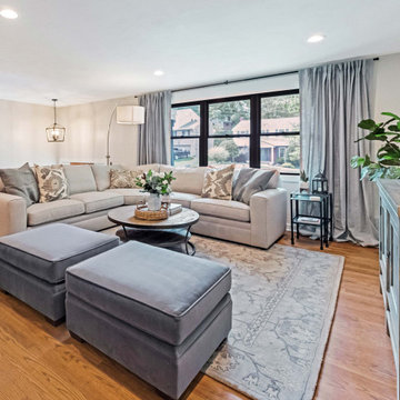
The living room took on a total transformation by changing the location of the TV and thus the furniture arrangement.
Custom French linen window treatments were added, which made the window seem much more expansive.
The exterior of the home received a major facelift and transformation, including new light fixtures, updated roof and facia, updated wood beams, wood door, wood ceiling and stone added to the entrance and more. This took the home from a dated look to an updated and fresh "modern farmhouse" aesthetic.
The kitchen layout remained intact, while appliances, fixtures, hardware, countertops and backsplashes were upgraded . All three bathrooms in the house were also renovated, original hardwood floors were refinished and carpet and tile flooring throughout replaced. Additionally, the dated built-in brick fireplace on the ground floor game room was redesigned. The new fireplace design would now directly tie in with the modern farmhouse style of the exterior, complete with the addition of a large wooden mantle.
DTSH Interiors formulated a plan for six rooms; the living room, dining room, master bedroom, two children's bedrooms and ground floor game room, with the inclusion of the complete fireplace re-design.
The interior also received major upgrades during the whole-house renovation. All of the walls and ceilings were resurfaced, the windows, doors and all interior trim was re-done.
The end result was a giant leap forward for this family; in design, style and functionality. The home felt completely new and refreshed, and once fully furnished, all elements of the renovation came together seamlessly and seemed to make all of the renovations shine.
During the "big reveal" moment, the day the family finally returned home for their summer away, it was difficult for me to decide who was more excited, the adults or the kids!
The home owners kept saying, with a look of delighted disbelief "I can't believe this is our house!"
As a designer, I absolutely loved this project, because it shows the potential of an average, older Pittsburgh area home, and how it can become a well designed and updated space.
It was rewarding to be part of a project which resulted in creating an elegant and serene living space the family loves coming home to everyday, while the exterior of the home became a standout gem in the neighborhood.
Sponsored
Columbus, OH
Free consultation for landscape design!
Peabody Landscape Group
Columbus' Reliable Landscape Design & Contracting
 SunSwallow Design, LLC
The clients called me on the recommendation from a neighbor of mine who had met them at a conference and learned of their need for an architect. They contacted me and after meeting to discuss their project they invited me to visit their site, not far from White Salmon in Washington State.
Initially, the couple discussed building a ‘Weekend’ retreat on their 20± acres of land. Their site was in the foothills of a range of mountains that offered views of both Mt. Adams to the North and Mt. Hood to the South. They wanted to develop a place that was ‘cabin-like’ but with a degree of refinement to it and take advantage of the primary views to the north, south and west. They also wanted to have a strong connection to their immediate outdoors.
Before long my clients came to the conclusion that they no longer perceived this as simply a weekend retreat but were now interested in making this their primary residence. With this new focus we concentrated on keeping the refined cabin approach but needed to add some additional functions and square feet to the original program.
They wanted to downsize from their current 3,500± SF city residence to a more modest 2,000 – 2,500 SF space. They desired a singular open Living, Dining and Kitchen area but needed to have a separate room for their television and upright piano. They were empty nesters and wanted only two bedrooms and decided that they would have two ‘Master’ bedrooms, one on the lower floor and the other on the upper floor (they planned to build additional ‘Guest’ cabins to accommodate others in the near future). The original scheme for the weekend retreat was only one floor with the second bedroom tucked away on the north side of the house next to the breezeway opposite of the carport.
Another consideration that we had to resolve was that the particular location that was deemed the best building site had diametrically opposed advantages and disadvantages. The views and primary solar orientations were also the source of the prevailing winds, out of the Southwest.
The resolve was to provide a semi-circular low-profile earth berm on the south/southwest side of the structure to serve as a wind-foil directing the strongest breezes up and over the structure. Because our selected site was in a saddle of land that then sloped off to the south/southwest the combination of the earth berm and the sloping hill would effectively created a ‘nestled’ form allowing the winds rushing up the hillside to shoot over most of the house. This allowed me to keep the favorable orientation to both the views and sun without being completely compromised by the winds.
 River Valley Landscapes
This project was the result of the owner’s desire to install a swimming pool and outdoor living space inspired by tropical resorts they had visited on family vacations. The one element asked for specifically was a large waterfall spilling into the pool. The challenge for the designers was how to achieve the look the owner’s wished without the use of clichéd items such as thatched huts and tiki torches. The designers decided lush full plantings using plants found in the northeast region that met certain design criteria would be the primary way of giving the tropical feel. Boulder outcroppings, irregular stone paving and fire bowls along the back of the pool would complete the look.
The property is located in a newer subdivision with homes on both sides and a school to the rear. A walkway connects the neighborhood and the school along one side. The desired privacy would be addressed by the placement of plants and trees around the perimeter in mounded beds. Placing the waterfall to the rear of the pool helped block the view of the school beyond. The township had restrictions on the amount of impervious material allowable on site. The patio was designed to the maximum allowable size with square footage going to where it would be most usable. Planting beds were cut into the patio to decrease unnecessary square footage, divide spaces, and allow for more places to add plants and trees.
A rectangular swimming pool was chosen to make it easier to install an automatic pool cover. The pool was designed, with input from the landscape designers, and contracted separately by the owner. The landscape designers chose the location of pool and waterfall so that it was prominently placed to be the focal point of the backyard. The pool includes a curving sunbathing shelf running from end to end, finished in a lighter color to make it more visible, with removable umbrellas for shade and to add to the resort feel. To tie into the boulders used throughout the design, a large boulder was used as a substitute for a diving board. The yard sloped down towards the back of the property which required a large amount of soil to be added and large boulder retaining wall along the back.
For the planting design, the designers choose to focus on plants with larger leaves, various leaf colors and textures, and plants with large flowers in bold colors. These plants were then arranged into a loose lush planting scheme mixed with more traditional northeast plants such as pines, grasses, and roses. Unique plants such as hardy bananas were added for their tropical and exotic look. The full planting beds help to nestle in and enclose the living space.
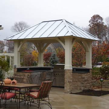
Broken flagstone was chosen for the patio and intentionally left irregular at the edges. PA flagstone was avoided and a stone with gold and brown tones was chosen. Boulder outcroppings added to the natural and tropical theme. The fire pit was designed with a large built-in bench to increase the amount of seating. The designers chose a rounded smooth shape and incorporated the same stone as the pool coping for the caps and bench. For entertaining guests the outdoor kitchen was outfitted with a large gas grill, beverage taps, refrigerator, sink and a dedicated lobster cooker. The kitchen was finished with granite countertops and stainless steel cabinets. Two strategically placed fire bowls, along with the low voltage lighting, add additional interest to the space at night.
While the designers were faced with many challenges the resulting design incorporated enough elements to achieve the desired look and feel. Using plants appropriate to the northeast that fit the design criteria and carefully choosing hardscaping materials was essential. The owner’s feel they now have their own tropical theme resort right in their Pennsylvania backyard.
 CHRISTOPHER STROM ARCHITECTS
Sommerhus is a private retreat for two empty-nesters. The clients purchased the previous cabin after falling in love with its location on a private, lakefront peninsula. However, this beautiful site was a challenging site to build on, due to its position sandwiched between the lake and protected wet land. The clients disliked the old cabin because it could only be used in the summer months, due to its lack of both insulation and heat. In addition, it was too small for their needs. They wanted to build a new, larger retreat, but were met with yet another constraint: the new cabin would be limited to the previous cabin’s small footprint. Thus, they decided to approach an architect to design their dream cabin.
As the clients described, “We visited Denmark for a family wedding in 2015, and while biking near Gilleleje, a fishing village on the Baltic Sea, we fell in love with the aesthetic of ‘Sommerhus’: dark exteriors, clean, simple lines, and lots of windows.” We set out to design a cabin that fit this aesthetic while also meeting the site’s constraints.
The clients were committed to keeping all existing trees on their site. In addition, zoning codes required the new retreat to stay within the previous cabin's small footprint. Thus, to maximize the square footage of the cabin without removing trees or expanding the footprint, the new structure had to grow vertically. At the same time, the clients wanted to be good neighbors. To them, this meant that their cabin should disappear into the woods, especially when viewed from the lake. To accomplish both these requests, the architect selected a dark exterior metal façade that would visually retreat into the trees. The metal siding is a modern, low-maintenance, and cost-effective solution, especially when compared to traditional wood siding. Warm wood on the soffits of the large roof overhang contrast with the metal siding. Sommerhus's resulting exterior is just as the clients’ requested: boldly modern yet respectful of the serene surroundings.
The homeowners desired a beach-house-inspired interior, full of light and warmth, in contrast to the dark exterior. As the homeowner explained, “I wanted it to feel like a porch inside.” To achieve this, the living room has two walls of sliding glass doors that connect to the wrap-around porch. This creates a beautiful, indoor-outdoor living space. The crisp and bright kitchen also connects to the porch with the window that opens to an outdoor counter - perfect for passing food and drinks to those lounging on the porch. The kitchen is open to the rest of the first-floor entertaining space, and brings a playful, beach-house feel to the cabin.
After the completion of the project, the homeowners remarked, “Working with Christopher and Eric [of CSA] was a wonderful experience. We absolutely love our home, and each season on the lake is more special than the last.”
112