
Search results for "Deeper connective" in Home Design Ideas
 Signature Designs Kitchen | Bath | Interiors
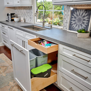
We took our clients home to the next level. A touch of glamour from every vantage point and a custom crafted the hood center stage finished in stainless and accented with matte brass. Sitting snuggly next to the custom hood are wall cabinets in a two-toned finish with X mullions. The inserts in the wall cabinets where chosen to be an antique mirror to add a big of glam but also to keep the mess hidden behind the door. It’s not just a place to cook dinner, it’s an interior design, it’s decor that deserves to be featured in a magazine. Metallic accents will give your kitchen a glamorous touch no matter its style or design: silver, bronze, rose or yellow gold work especially great in neutral black and white interiors.
Patterned, metallic, or textured, interesting backsplash tile bring this kitchen to the next level by adding character to the kitchen design. Across from the kitchen is the open family room area that lacked seating and flow.
Our design team felt like it was important to combine this kitchen and family room into a great room and not single entities. Every room should connect to those around it in some way. If they don't, you end up with a very choppy looking and disjointed home. From light redecorating to full remodels, we're here to help transform your home. Great Design. Unique Preferences. It’s our passion to connect your rooms and make them flow together.
 Mangum Design-Build, Inc.
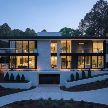
The Glenhill house settles gracefully into a mature pine forest, its form composed as a quiet
study of light, proportion, and crafted detail. A two-story residence lifted above a drive-through
garage, it is designed as a sequence of framed views — each room capturing the vertical
rhythm of pines, shifting daylight, and the subtle movement of the landscape. Boundaries
dissolve as floor-to-ceiling glass opens living spaces to broad terraces and cantilevered
balconies, allowing the forest to inhabit the interior as much as the residents inhabit the site.
A finely tuned steel frame enables deep overhangs and slender structural lines, giving the
house its floating clarity. These long spans soften the transition between indoors and out,
casting calibrated shadows across stone floors and hand-finished wood surfaces. Every
junction, from the precision-cut steel connections to the custom millwork, reflects an elevated
commitment to craft. Materials are chosen not only for their beauty but for the way they register
light—the warmth of timber, the quiet solidity of stone, the reflective sheen of metal.
The owner’s collection of art integrates seamlessly into the architectural language. Display walls
and open sightlines turn circulation paths into gallery promenades, while the garage level
becomes both threshold and exhibition space for the automobile collection. At dusk, the home
glows lantern-like within the pines, revealing a composition where structure, material, and
nature are held in delicate balance. It is a dwelling shaped less as an object in the woods and
more as a crafted extension of the forest itself.
The project began with an unexpected challenge: the original lot, once selected for its beauty,
became untenable when neighboring homeowners objected to the presence of a modern house.
Rather than compromise the vision, the team embraced a new site, one even more deeply
woven into the pine forest, and treated the change as an opportunity to refine the project’s
relationship to nature and craft.
Working within a densely wooded parcel required choreography as much as construction.
Limited access routes, the need to preserve mature trees, and the precision demands of steel
erection shaped a carefully phased process. Contractors navigated the site with restraint,
placing each piece of steel like a line of poetry between trunks. The resulting frame, powerful
yet minimal, was later infilled with lumber to create a hybrid system — efficient, warm, and
capable of carrying cantilevers far beyond what wood alone could achieve. These extended
overhangs became the project’s quiet gesture of shelter and shadow. Collaboration with the interior designer was integral to the home’s harmony. Together, the team
refined material transitions so stone, wood, and metal could pass from exterior to interior with a
single visual glance. Craftsmanship elevated everyday moments: concealed hardware, sculpted
millwork, and the sourcing of a solid limestone soaking tub, carved from a single block, all
contribute to the home’s sense of intentional calm.
What emerged is a house shaped by constraint, strengthened by collaboration, and refined
through an unwavering commitment to detail — an architectural refuge where complexity was
transformed into clarity, and obstacles into opportunities for deeper expression.
Material selection became an essential extension of the home’s design philosophy, reinforcing
the crafted clarity of each space. Hand-selected stone slabs were book-matched for the
fireplace and bath walls, creating veined compositions that read like natural murals. Custom-
built windows, engineered with specialty-coated glazing and rigorously pressure-tested, provide
both protection and extraordinary visual transparency. Above, concealed truss framing houses
recessed air diffusers and hidden shades, allowing ceilings to remain quiet and uninterrupted.
The horizontal planes of the flat roof are achieved with a commercial-grade membrane system,
delivering the crisp, modern silhouette the design demands. At the exterior, natural stone
grounds the home to its site, stitching the architecture to the forest floor and rooting the dwelling
in the land from which its materials are drawn.
 Skill Construction & Design, LLC
If you are looking for twice your normal bath experience, look no more. This master bath has plenty of room for two with double the storage, double the mirrors, sinks and faucets, and bathing is done two-way. The colors are warm and inviting, but it’s the subtle patterning that caught my eye. The overall effect is of a soft wash, yet on closer examination, the striations travel across the walls and criss-cross on the floor.
This expansive vanity was created with our homeowner’s needs in mind. Each “side” has a bank of drawers and under sink cabinet storage. A large undermount sink dips below the gorgeous stone counter top. Gently arching faucets in brushed nickel adorn each sink with a framed mirror above for reflection. Individual task lighting shine upon each sink and is reflected back into the room. For additional storage and to keep elbows from connecting, a large shared bank of drawers separate the two areas.
The vanities are rich with color and texture, from the swirling grain of the wood, to the raised panels and beading. The subtle beading is repeated on the drawers for a custom look. Our wood color is a deeper, more intense tone of the colors in our tiling.
Whether in a hurry or needing to relax and unwind, this bath can do both. Despite having two substantial pieces in the same area, the open glass panel that separate leaves each feeling open and airy.
This tub was made for soaking. The sides and back gently mold into arm and neck support for a truly relaxing experience. The lineal movement in the tile backsplash lend a long and lean feeling. For easy reach, toiletries are stored in a niche with accent multicolored mosaics.
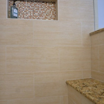
On the other side of the half wall a roomy shower awaits. The long tiles were installed in a brick pattern with striations of color wrapping the walls. The oversized tiles reduce the amount of grout, for a cleaner look. Here too we added a niche for maximum storage and a sprinkle more of the accenting mosaic. We capped the half wall and the generous bench with our vanity’s stone for a rich contrast.
We installed the tile up to the ceiling, which adds to the visual height of the room. We went with clean simple controls and showerhead, enhanced in a brushed nickel finish. So as to not obscure the view, we went frameless on our shower door and panels, using brushed nickel hinges and a simple handle.
At the end of our vanity, a half wall adds backsplash on the vanity side and a bit of privacy on the other. A simple toilet in crisp white is out of sight but functional in its own “alcove”.
Despite all the patterning, there is nothing busy about the room. For the floor we decided to change things up, using a large square version of the wall tiles. To keep the room from feeling too long, we installed them on the diagonal and then criss-crossed the lines for a dramatic look.
This bath is twice as nice and ready to be shared!
http://www.designsbyskill.com/
http://www.rjkconstructioninc.com/
Find the right local pro for your project
 A-K Design Professionals LLC
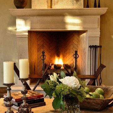
Inspiration for a mid-sized mediterranean open concept medium tone wood floor living room remodel in Other with beige walls, a standard fireplace, a stone fireplace and a media wall
 Design Connection, Inc.
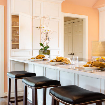
The existing kitchen layout was flipped in order to provide a better traffic flow into and out of the space. With the refrigerator now sitting flush with the wall depth, the kitchen is more streamlined and visually less bulky. . The relocation of the peninsula allowed for deeper base cabinets for more storage, as well as a more spacious seating area. The full-height wall cabinet next to the peninsula features hidden storage spaces for the client’s crystals, while visually balancing out the refrigerator wall on the other side.
 MATHISON | MATHISON ARCHITECTS
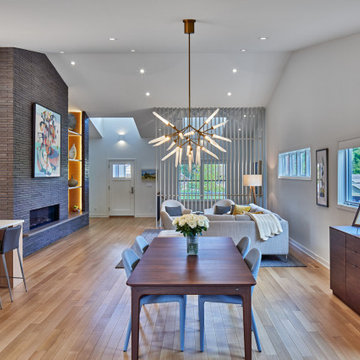
Watermark Residence was conceived as a “downsizing” project for Owners looking to transition from the home where they raised their family to a simpler lifestyle. The footprint and exterior massing of the single family condo was prescribed, but MMA wove new details into these constraints and was urged by the Owner to completely reinvent the interior experience.
From the exterior, the home sits subtly on a corner lot, referencing the neighborhood in its style, but with a warmth and crispness that speaks also to the interiors.
The primary goal of the project was to provide an open, inviting atmosphere of connected spaces that allowed natural light into all areas of the home. Upon entry, there is an immediate involvement in the daily activities with the living and dining rooms being the focal point, and a more intimate kitchen slightly out of view.
Throughout the home, the idea of privacy and transparency plays an important role in the organization of spaces and materials chosen. More private corridors lead to intimate bedroom spaces and functional laundry and mudrooms. A two-floor, semi-transparent slat wall shields direct visibility from the street, while also providing connection between the entertaining spaces of the home. Combined with the white oak, open staircase, the movement between levels feels intuitive and inviting.
A simple palette of materials, understated in their appearance but detailed in their execution, are threaded throughout the home. Gathering spaces are represented with open slats, grounding brick, white oak, and bright walls. Movement deeper into the house brings refined slat panels with integrated hardware at kitchen millwork, softly painted cabinetry, and warm tones of walnut in furniture elements. The most private spaces of the home further extrude the slat element into fluted panels, painted in deeper colors.
 The Tub Connection
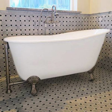
The "Gentry," one of the most fashionable type cast iron claw foot tubs, is the superb soaking tub for those who would enjoy venturing out into deeper waters. This 54" slipper tub with its 42 gallon capacity supplies the perfect soaking experience. The "Gentry," with its extra deep water design and smooth porcelain interior permits you to submerge yourself completely in chin deep water, developing the perfect combination of hydrotherapy and wholesome relaxation.
This 54" cast iron slipper tub is the ideal choice for including style and fashion to your luxurious bathroom. The 54" "Gentry," with its ball and claw feet (available in several finishes) and 42 gallon water capacity is the optimal choice for those seeking true bathing delight with an affordable cost. Purchase the "Gentry" cast iron claw foot bathtub today!
Slipper Tub Dimensions 30" x 54"
41 inches in-side tub floor space
Solid 320 lbs
Stylish Porcelain Interior
Deep Soaking Tub - 18" of Water Depth!
42 Gallon Capacity
Requires Drain & Overflow Assembly. Sold Separately
Feet Available in Polished Chrome, White, Matte or Glossy Black, Brushed Nickel, Antique Bronze or Oil Rubbed Bronze
Complete Manufacturers Warranty
 Paintzen, Inc.
For many, professional interior design is a luxury. Whether your home’s design project is large or small, having the ability to transform your house, apartment or condo into a beautiful, unique space is a wonderful opportunity for self-expression. Even if it is a just simple accent wall painted in a color that speaks to you, or a complete renovation of your cabinets to achieve the kitchen of your dreams, interior design allows you to create an environment that is both personal and comfortable.
That is exactly how interior designer and founder of Design Exchange Sean Carlson Perry feels about what he does for a living. “The reason that I love designing spaces, and value the impact of space design on people, is the way the spaces make us feel, the visceral appeal of good design. Good design should stimulate the senses and generate an emotionally engaging experience. As a designer, I get to massage and sculpt people’s experience of space!” Perry shared with us.
In late 2017, the Paintzen team connected with Perry regarding a very special design project he was working on. Design Exchange was renovating, redesigning and re-furnishing The Ali Forney Center. The Ali Forney Center, based in New York City, is the largest and most comprehensive organization dedicated to housing homeless LGBTQ youth. Nearly 40% of the homeless youth population is LGBTQ. Homeless LGBTQ youth are eight times more likely to experience violence, discrimination, and suicide. AFC houses 124 youths each night and provides services to over 1,400 homeless young people per year.
Although the organization does an incredible job to provide safety and shelter to homeless youth, Perry and his team felt the space itself could use some updating and could feel more welcoming. Rooms were dark, cold, and lacked proper storage. Furniture was in poor shape and didn’t work. The rooms were being under-utilized; overall, there was so much more that could be done within the walls of the AFC that could be improved using interior design & paint!
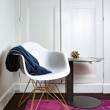
We at Paintzen were excited to partner with Design Exchange to do our part in this transformation. The dark, paneled walls were re-painted white. This entirely opened up the space, making it brighter, warmer and more welcoming. The white walls also served as a much better backdrop for smart lighting, as well as for the furniture, wall decor, and new flooring. Beyond painting, Perry and his team used FLOR carpet tiles for durability in a bright Fuchsia shade for a pop of color. They created a more functional layout to maximize the space and make better use of its architectural details and added new furniture including lamps, tables, throws, a sofa, a TV and a Roku to make the space beautiful, and even fun.
“Design increases connection and community,” Perry told us. “When we revamp a shelter space, history tells us that the residents spend more time in the space, more time with their peers, building connections and community; a greater sense of home.” Perry’s goal was to create an environment that set its residents up for success by improving their quality of life, outlook and self-esteem.
“This isn’t extreme home makeover (although I wish I had that budget!). It’s about improving the aesthetics of the space to create a better environment and experience for people who are going through challenging times. I’ve been lucky enough to have an amount of work that allows me to donate a portion of profits to Design Exchange Projects.”
Sean Carlson Perry founded Design Exchange as a way to use his talent, passion, and skills to help those who are struggling, or in a place of immediate need. He was searching to bring deeper meaning and a humanitarian component to his work. Perry has worked with clients in New York, San Francisco, and Los Angeles. “Good design—functionally, aesthetically and ergonomically—promotes a better quality of life.” This is a mantra that describes why Perry does what he does through Design Exchange, working to help the underserved of New York City and other cities across the country.
“I grew up gay in Nebraska, and have gone through some hard times when I was younger, but I can’t imagine going through what these kids go through – rejection from family, being kicked out of the house for being who they are, homeless and having nowhere else to turn,” said Perry. “Luckily, there is The Ali Forney Center. Doing these projects for AFC strikes close to home for me, so they are extra special and close to my heart.”
 Design Connection, Inc.
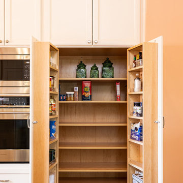
The existing kitchen layout was flipped in order to provide a better traffic flow into and out of the space. With the refrigerator now sitting flush with the wall depth, the kitchen is more streamlined and visually less bulky. . The relocation of the peninsula allowed for deeper base cabinets for more storage, as well as a more spacious seating area. The full-height wall cabinet next to the peninsula features hidden storage spaces for the client’s crystals, while visually balancing out the refrigerator wall on the other side.
 Westwind Woodworkers Inc.
This new two story home has a very clean and crisp color pallet. Large windows to the back yard bring in the beautiful views and provide a great connection between interior and exterior living spaces.
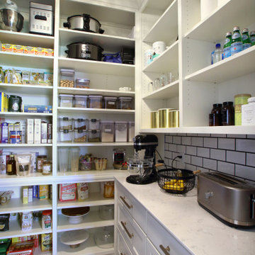
This large walk in pantry allows for great organization and keeps the clutter out of the kitchen. The extra counter space allows to prep things ahead of time when entertaining.
 Henne Creative LLC
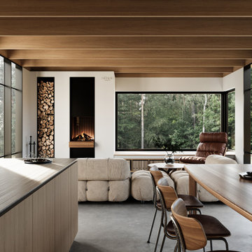
Nestled in the heart of nature, this 1,590 sqft home in Santa Barbara was crafted as a tranquil retreat where architecture and landscape exist in perfect harmony. Designed by HENNE Creative, the project blurs the boundaries between indoors and out, creating a seamless connection to the forest that surrounds it.
The exposed wooden ceiling beams echo the rhythm of the trees, while expansive glass panels flood the space with natural light transforming sunlight into a design element. A carefully curated palette of organic textures and tones gives the interior a timeless warmth: natural linen upholstery, walnut finishes, and earthy hues create a sense of calm and grounded elegance.
This space is designed not just to be lived in, but to be experienced. The open kitchen invites gathering and conversation, while the sunken lounge area and modern fireplace redefine comfort with sculptural softness.
Here, minimalism meets emotion. Every detail is intentional, every material chosen to foster a deeper connection with nature. It’s more than just a home it’s a daily ritual of serenity, simplicity, and beauty in its most essential form.
 Skill Construction & Design, LLC
If you are looking for twice your normal bath experience, look no more. This master bath has plenty of room for two with double the storage, double the mirrors, sinks and faucets, and bathing is done two-way. The colors are warm and inviting, but it’s the subtle patterning that caught my eye. The overall effect is of a soft wash, yet on closer examination, the striations travel across the walls and criss-cross on the floor.
This expansive vanity was created with our homeowner’s needs in mind. Each “side” has a bank of drawers and under sink cabinet storage. A large undermount sink dips below the gorgeous stone counter top. Gently arching faucets in brushed nickel adorn each sink with a framed mirror above for reflection. Individual task lighting shine upon each sink and is reflected back into the room. For additional storage and to keep elbows from connecting, a large shared bank of drawers separate the two areas.
The vanities are rich with color and texture, from the swirling grain of the wood, to the raised panels and beading. The subtle beading is repeated on the drawers for a custom look. Our wood color is a deeper, more intense tone of the colors in our tiling.
Whether in a hurry or needing to relax and unwind, this bath can do both. Despite having two substantial pieces in the same area, the open glass panel that separate leaves each feeling open and airy.
This tub was made for soaking. The sides and back gently mold into arm and neck support for a truly relaxing experience. The lineal movement in the tile backsplash lend a long and lean feeling. For easy reach, toiletries are stored in a niche with accent multicolored mosaics.
On the other side of the half wall a roomy shower awaits. The long tiles were installed in a brick pattern with striations of color wrapping the walls. The oversized tiles reduce the amount of grout, for a cleaner look. Here too we added a niche for maximum storage and a sprinkle more of the accenting mosaic. We capped the half wall and the generous bench with our vanity’s stone for a rich contrast.
We installed the tile up to the ceiling, which adds to the visual height of the room. We went with clean simple controls and showerhead, enhanced in a brushed nickel finish. So as to not obscure the view, we went frameless on our shower door and panels, using brushed nickel hinges and a simple handle.
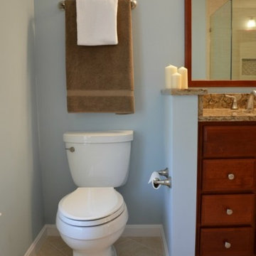
At the end of our vanity, a half wall adds backsplash on the vanity side and a bit of privacy on the other. A simple toilet in crisp white is out of sight but functional in its own “alcove”.
Despite all the patterning, there is nothing busy about the room. For the floor we decided to change things up, using a large square version of the wall tiles. To keep the room from feeling too long, we installed them on the diagonal and then criss-crossed the lines for a dramatic look.
This bath is twice as nice and ready to be shared!
http://www.designsbyskill.com/
http://www.rjkconstructioninc.com/
 David Price Construction
Helen Norona
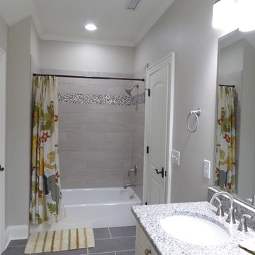
Bathroom - mid-sized transitional kids' gray tile and porcelain tile porcelain tile and gray floor bathroom idea in Raleigh with an undermount sink, recessed-panel cabinets, white cabinets, granite countertops, a one-piece toilet and gray walls
Bathroom - mid-sized transitional kids' gray tile and porcelain tile porcelain tile and gray floor bathroom idea in Raleigh with an undermount sink, recessed-panel cabinets, white cabinets, granite countertops, a one-piece toilet and gray walls
 MATHISON | MATHISON ARCHITECTS
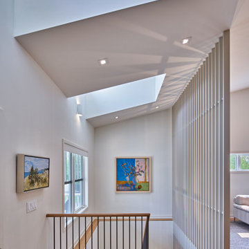
Watermark Residence was conceived as a “downsizing” project for Owners looking to transition from the home where they raised their family to a simpler lifestyle. The footprint and exterior massing of the single family condo was prescribed, but MMA wove new details into these constraints and was urged by the Owner to completely reinvent the interior experience.
From the exterior, the home sits subtly on a corner lot, referencing the neighborhood in its style, but with a warmth and crispness that speaks also to the interiors.
The primary goal of the project was to provide an open, inviting atmosphere of connected spaces that allowed natural light into all areas of the home. Upon entry, there is an immediate involvement in the daily activities with the living and dining rooms being the focal point, and a more intimate kitchen slightly out of view.
Throughout the home, the idea of privacy and transparency plays an important role in the organization of spaces and materials chosen. More private corridors lead to intimate bedroom spaces and functional laundry and mudrooms. A two-floor, semi-transparent slat wall shields direct visibility from the street, while also providing connection between the entertaining spaces of the home. Combined with the white oak, open staircase, the movement between levels feels intuitive and inviting.
A simple palette of materials, understated in their appearance but detailed in their execution, are threaded throughout the home. Gathering spaces are represented with open slats, grounding brick, white oak, and bright walls. Movement deeper into the house brings refined slat panels with integrated hardware at kitchen millwork, softly painted cabinetry, and warm tones of walnut in furniture elements. The most private spaces of the home further extrude the slat element into fluted panels, painted in deeper colors.
 Paintzen, Inc.
For many, professional interior design is a luxury. Whether your home’s design project is large or small, having the ability to transform your house, apartment or condo into a beautiful, unique space is a wonderful opportunity for self-expression. Even if it is a just simple accent wall painted in a color that speaks to you, or a complete renovation of your cabinets to achieve the kitchen of your dreams, interior design allows you to create an environment that is both personal and comfortable.
That is exactly how interior designer and founder of Design Exchange Sean Carlson Perry feels about what he does for a living. “The reason that I love designing spaces, and value the impact of space design on people, is the way the spaces make us feel, the visceral appeal of good design. Good design should stimulate the senses and generate an emotionally engaging experience. As a designer, I get to massage and sculpt people’s experience of space!” Perry shared with us.
In late 2017, the Paintzen team connected with Perry regarding a very special design project he was working on. Design Exchange was renovating, redesigning and re-furnishing The Ali Forney Center. The Ali Forney Center, based in New York City, is the largest and most comprehensive organization dedicated to housing homeless LGBTQ youth. Nearly 40% of the homeless youth population is LGBTQ. Homeless LGBTQ youth are eight times more likely to experience violence, discrimination, and suicide. AFC houses 124 youths each night and provides services to over 1,400 homeless young people per year.
Although the organization does an incredible job to provide safety and shelter to homeless youth, Perry and his team felt the space itself could use some updating and could feel more welcoming. Rooms were dark, cold, and lacked proper storage. Furniture was in poor shape and didn’t work. The rooms were being under-utilized; overall, there was so much more that could be done within the walls of the AFC that could be improved using interior design & paint!
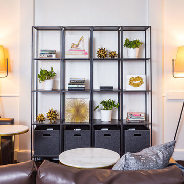
We at Paintzen were excited to partner with Design Exchange to do our part in this transformation. The dark, paneled walls were re-painted white. This entirely opened up the space, making it brighter, warmer and more welcoming. The white walls also served as a much better backdrop for smart lighting, as well as for the furniture, wall decor, and new flooring. Beyond painting, Perry and his team used FLOR carpet tiles for durability in a bright Fuchsia shade for a pop of color. They created a more functional layout to maximize the space and make better use of its architectural details and added new furniture including lamps, tables, throws, a sofa, a TV and a Roku to make the space beautiful, and even fun.
“Design increases connection and community,” Perry told us. “When we revamp a shelter space, history tells us that the residents spend more time in the space, more time with their peers, building connections and community; a greater sense of home.” Perry’s goal was to create an environment that set its residents up for success by improving their quality of life, outlook and self-esteem.
“This isn’t extreme home makeover (although I wish I had that budget!). It’s about improving the aesthetics of the space to create a better environment and experience for people who are going through challenging times. I’ve been lucky enough to have an amount of work that allows me to donate a portion of profits to Design Exchange Projects.”
Sean Carlson Perry founded Design Exchange as a way to use his talent, passion, and skills to help those who are struggling, or in a place of immediate need. He was searching to bring deeper meaning and a humanitarian component to his work. Perry has worked with clients in New York, San Francisco, and Los Angeles. “Good design—functionally, aesthetically and ergonomically—promotes a better quality of life.” This is a mantra that describes why Perry does what he does through Design Exchange, working to help the underserved of New York City and other cities across the country.
“I grew up gay in Nebraska, and have gone through some hard times when I was younger, but I can’t imagine going through what these kids go through – rejection from family, being kicked out of the house for being who they are, homeless and having nowhere else to turn,” said Perry. “Luckily, there is The Ali Forney Center. Doing these projects for AFC strikes close to home for me, so they are extra special and close to my heart.”
 Metropolis Drafting and Construction Inc
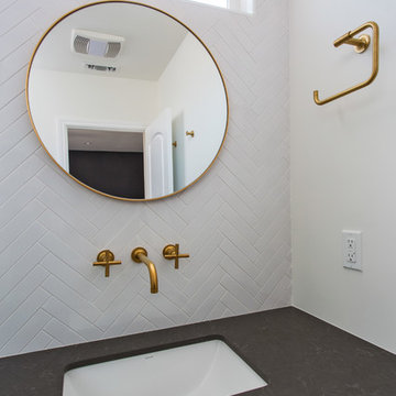
This bathroom is part of a new Master suite construction for a traditional house in the city of Burbank.
The space of this lovely bath is only 7.5' by 7.5'
Going for the minimalistic look and a linear pattern for the concept.
The floor tiles are 8"x8" concrete tiles with repetitive pattern imbedded in the, this pattern allows you to play with the placement of the tile and thus creating your own "Labyrinth" pattern.
The two main bathroom walls are covered with 2"x8" white subway tile layout in a Traditional herringbone pattern.
The toilet is wall mounted and has a hidden tank, the hidden tank required a small frame work that created a nice shelve to place decorative items above the toilet.
You can see a nice dark strip of quartz material running on top of the shelve and the pony wall then it continues to run down all the way to the floor, this is the same quartz material as the counter top that is sitting on top of the vanity thus connecting the two elements together.
For the final touch for this style we have used brushed brass plumbing fixtures and accessories.
 Crystal Kitchen + Bath
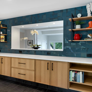
The homeowners wanted to transform their dining room into a more open, functional, and visually connected space while honoring the home’s modern, mid-century style. Their main goals included removing the massive wall of rough-textured cabinetry, adding a view of the backyard from the front door, creating a serving area with multiple outlets for small appliances, incorporating deep drawers for linens, and adding display space. They also wanted quarter sawn oak cabinetry with hardware instead of the nail breaking routed pocket pulls, black accents, and a backsplash tile in a fun color or shape.
Originally, the wall separating the dining room from the kitchen was slated for removal, but engineering requirements made this cost prohibitive. Instead, we collaborated with an architect and engineer to design a passthrough that maintained structural integrity. During construction, hidden HVAC was discovered, prompting us to build the wall out further, resulting in a deeper 16" passthrough; a happy accident that created an ideal display area with puck lighting.
The cabinetry features Crystal Cabinet Works’ Encore frameless line in Quarter Sawn White Oak with a Natural matte finish, paired with matte black ladder shelves for display. A tiled, extra-deep toekick covered in matching floor tile gives the appearance of floating cabinetry while ensuring easy, mop-friendly maintenance. The wall is finished in matte square Nemo tile with glossy accents, adding vibrant color and texture. Cambria’s Smithfield quartz countertops provide a durable serving surface, while black floor tile with a metallic finish grounds the design.
Now, the dining room serves as a hub for entertaining, with ample space for serving dishes, convenient power access, and a direct sightline from the kitchen to the backyard.
Ready for a dining space that serves looks as well as dinner? Pull up a chair and let’s talk.
 Bluedoor Design Group
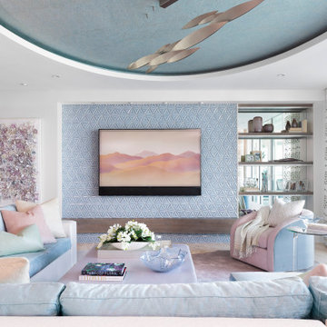
Inspiration for a contemporary beige floor and tray ceiling living room remodel in Miami with white walls and a wall-mounted tv
 MATHISON | MATHISON ARCHITECTS
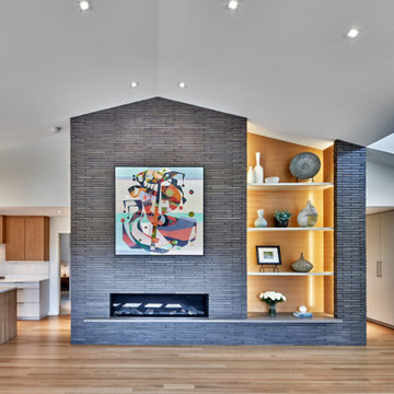
Watermark Residence was conceived as a “downsizing” project for Owners looking to transition from the home where they raised their family to a simpler lifestyle. The footprint and exterior massing of the single family condo was prescribed, but MMA wove new details into these constraints and was urged by the Owner to completely reinvent the interior experience.
From the exterior, the home sits subtly on a corner lot, referencing the neighborhood in its style, but with a warmth and crispness that speaks also to the interiors.
The primary goal of the project was to provide an open, inviting atmosphere of connected spaces that allowed natural light into all areas of the home. Upon entry, there is an immediate involvement in the daily activities with the living and dining rooms being the focal point, and a more intimate kitchen slightly out of view.
Throughout the home, the idea of privacy and transparency plays an important role in the organization of spaces and materials chosen. More private corridors lead to intimate bedroom spaces and functional laundry and mudrooms. A two-floor, semi-transparent slat wall shields direct visibility from the street, while also providing connection between the entertaining spaces of the home. Combined with the white oak, open staircase, the movement between levels feels intuitive and inviting.
A simple palette of materials, understated in their appearance but detailed in their execution, are threaded throughout the home. Gathering spaces are represented with open slats, grounding brick, white oak, and bright walls. Movement deeper into the house brings refined slat panels with integrated hardware at kitchen millwork, softly painted cabinetry, and warm tones of walnut in furniture elements. The most private spaces of the home further extrude the slat element into fluted panels, painted in deeper colors.
 Mountain + Beach Interiors - Schonewill Int'l
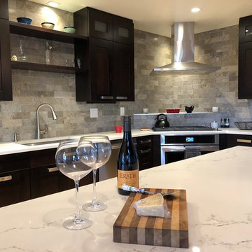
The original kitchen had an odd small island that was 2 levels. Upper cabinets that were short making the room feel small. The new design brings full height cabinets and backsplash-significant larger island, more cabinets and additional counter space. A very efficient kitchen to use made by utilizing a dead corner for the hood, drop in cooktop and wall oven center. The microwave in below the counter on the island. We could still use rich deeper espresso wood cabinets and the room feels much larger than before. We removed a stub wall near the refrigerator and a relocated a switch bank and then added a finish end panel to the refrigerator further connecting the kitchen br island to the living area. The natural stone backsplash is so subtle and a beautiful backdrop for the finish cabinetry.
4