
Search results for "Deliberation" in Home Design Ideas

 Your Favorite Room By Cathy Zaeske
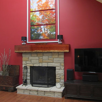
For years we lived with an ugly, too small and wimpy builders grade mantel that I couldn't wait to tear out. Turns out it made the perfect support for my new custom, one of a kind mantel. I conceived, designed and had this piece built onsite by my favorite carpenter. I wanted it to look like a continuous piece of wood that wrapped around on the edges, like I had seen done on benches, but with a live edge on the bottom not the top. This is a hand chosen, stunning Bubinga plank and it's feature is the variegated wood tones - it "goes with" everything!
I also had the floating picture frame custom made to make my favorite tree canvas art more in scale with the fireplace and wall. This tree stands next to our fire pit in Door County, WI and is a favorite view we wanted to bring home. The small chrome lamps are a deliberate play on scale for a touch of the unexpected.
The two trunks are antique indonesian pieces. The one on the left holds my firewood in the winter and the one on the right is the perfect place to store all of the media components.
Cathy Zaeske
 Miriam's River House Designs, LLC
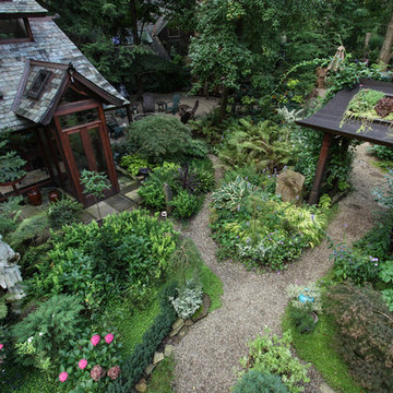
This photo shows the Arbor blending, through good design, to a near by structure. The Arbor roof, without slate, was deliberately left in its natural state so as to give more credence to the main structure.
Photo credits: Dan Drobnick
Find the right local pro for your project
 DEANE Inc | Distinctive Design & Cabinetry
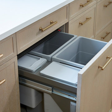
Located in the highly sought-after Allwood neighborhood of Darien, this spec house is the fourth collaboration with a client who first began with a renovation of her own home. While architecturally it is a traditional home from the exterior, the interiors are more transitional in style. In order to compete in the speculative market, our client’s directive was clear – ‘differentiation the kitchen design from every other spec house’. So we incorporated painted cabinetry but highlighted with rift-cut white oak base cabinets. This contrast between these finishes influenced our decision to select a subtle white quartzite countertop to deliberately highlight the striking porcelain backsplash.
The steel and glass partition frames the space – drawing the eye to the focal point of the kitchen, the custom stainless steel hood. Gold hardware adds a pop of flair to the space and warms the room. Walnut drawer inserts, stainless steel appliance garage, pull out trash drawers with compost bins and a stylish desk make this the Gold Standard of spec houses.
 DAB Interior Design, Inc.
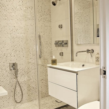
Client wanted to update her Bathroom, change the Tub to a Stall Shower, make it a little Bigger & Improve much needed organized Storage Space.
I am Proud to Announce, that this jewel of a small apartment co-op bath just:
"Won my Fifth National Award!"
Many of my Winning Awards for my "State of the Art Bathrooms", most of them were huge.
It is far harder to Create a Beautiful Bathroom that is 5' x 6" and not make it look cluttered, where the client can retreat, from their stress of the day. Even though small, this bath has many of the features of my large bathrooms. The judges commented, that they couldn't believe how many things, I had put in this bath & it wasn't cluttered at all. Every inch counts!
Firstly, the heavy cast iron tub was probably 60-70 years old. When we removed it, the back wall collapsed as they obviously used inferior products back then, behind the tile, which rotted. Then we removed the old vanity & found a heater under it, which had to be removed to accomodate the wall hung vanity.
To make matters worse , when you sat on the commode your knees practically hit the opposite wall & the ceiling was only 7' instead of 8' high which made you feel very
claustrophobic.
The first thing we did, was move the wall across from the
vanity back 1' taking the space from the linen closet and Master Bedroom Closet, which made all the difference in the world. Now we were able to move the bath door back, so you had more room on the commode and we were able to put a larger low rise commode & a wall to block it from the foyer.
It the client had agreed, I would have mirrored the ceiling to give the illusion of a much taller & larger space!
We deliberately selected soft light colors, recessed cabinets to increase the much needed storage
for her bathroom items. She actually has 25+ times the storage space, organized with the 2 draws in the wall hung vanity, mirrored inside/out recessed medicine & storage cabinet, with de-foggers, GFI plugs, & even a soft night light that emanates from an opening at the bottom of the medicine cabinet, that eliminates you turning on a bright light and waking you up, in the middle of the night!
Each individual detailed photos will give you additional details.
 City Homes, LLC
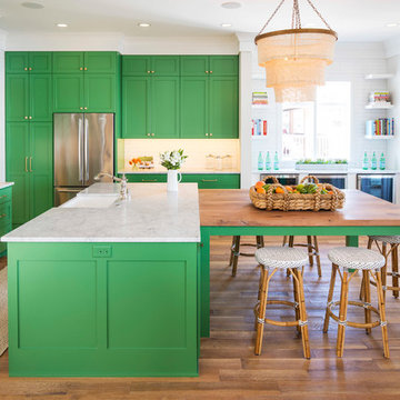
The work zone makes good use of the island, in which the sink and dishwasher are installed. It is across from the range and within easy reach of the refrigerator. The more social area of the kitchen is on the other side of the island, which has easy access to a drinks station. Placing the island extension and beverage station out of the way of the work zone was deliberate.
French cafe stools and a tiered coconut shell chandelier keep things laid-back and coastal. The shells on the chandelier bring in an earthy element. Brass hardware pops against the green cabinets.
 Studio TOOP
design: Carrie Preston (Studio TOOP) and Jasper Helmantel (Cruydt Hoeck), 2011
location: Appeltern, NL
status: built in 2012 by Appeltern Model Garden Complex
photos: Olga van Saane, October 2013
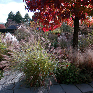
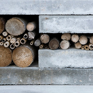
Designed as assignment from both the Dutch gardening magazine Groei & Bloei and the television and radio nature program Vara's Vroege Vogels, this garden serves as a model of how homeowners can incorporate lots of plant life and wildlife into the design but without sacrificing practicality or aesthetics. The garden is deliberately contemporary in its style to emphasize that nature-rich gardens need not look a certain way - insects and birds don't care if the lines are straight or curved.
At the same time the garden makes use of affordable, simple, no-nonsense materials. The 40x60 cm paving stones are one of the most common and affordable paving options in the Netherlands, available en masse for free on the Internet. Conceptually we imagined a garden completely paved with the tiles (as to many gardens are) and what would happen if took out some of these stones, used them to build benches and structure and added plants where the tiles had been. In the construction of the benches we include other materials such as bamboo sticks and insulation bricks that create habitat for insects such as solitary bees.
The plant palette is based on a selection of native and host plants in combination with the 26 plants plan set up by Groei & Boei -- a list of plants aimed at making the use of more plants in gardens accessible and less intimidating. The choice for the number 26 corresponds with the number of letters in the alphabet in line with the famous Dutch garden designer Mien Ruy's comment that if we only need 26 letters to create a whole language, we should be able to combine and mix 26 plants to express far more than we think.
 Studio TOOP
design: Carrie Preston (Studio TOOP) and Jasper Helmantel (Cruydt Hoeck), 2011
location: Appeltern, NL
status: built in 2012 by Appeltern Model Garden Complex
photos: Jolanthe Lalkens, October 2012
Designed as assignment from both the Dutch gardening magazine Groei & Bloei and the television and radio nature program Vara's Vroege Vogels, this garden serves as a model of how homeowners can incorporate lots of plant life and wildlife into the design but without sacrificing practicality or aesthetics. The garden is deliberately contemporary in its style to emphasize that nature-rich gardens need not look a certain way - insects and birds don't care if the lines are straight or curved.
At the same time the garden makes use of affordable, simple, no-nonsense materials. The 40x60 cm paving stones are one of the most common and affordable paving options in the Netherlands, available en masse for free on the Internet. Conceptually we imagined a garden completely paved with the tiles (as to many gardens are) and what would happen if took out some of these stones, used them to build benches and structure and added plants where the tiles had been. In the construction of the benches we include other materials such as bamboo sticks and insulation bricks that create habitat for insects such as solitary bees.
The plant palette is based on a selection of native and host plants in combination with the 26 plants plan set up by Groei & Boei -- a list of plants aimed at making the use of more plants in gardens accessible and less intimidating. The choice for the number 26 corresponds with the number of letters in the alphabet in line with the famous Dutch garden designer Mien Ruy's comment that if we only need 26 letters to create a whole language, we should be able to combine and mix 26 plants to express far more than we think.
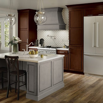
 KraftMaid
A mix-and-match approach can create a unified statement, as demonstrated by the high contrast between Aged River Rock (on the hood and island) and the Kaffé finish on the cabinets—then furthered by the tile and the deliberately inconsistent stain of the flooring.
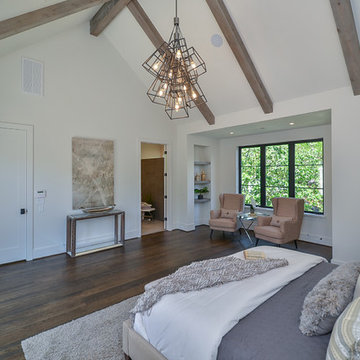
 Design DCA
primary bedroom with a vaulted cathedral ceiling featuring exposed grey wood beams radiating, anchored by a dramatic bronze chandelier. White walls and the white ceiling plane keep the room light and airy against the dark wide plank hardwood floors in a deep espresso tone as a deliberate contrast that grounds the room without heaviness.
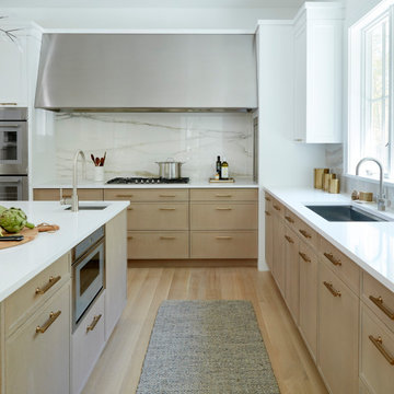 DEANE Inc | Distinctive Design & Cabinetry
Located in the highly sought-after Allwood neighborhood of Darien, this spec house is the fourth collaboration with a client who first began with a renovation of her own home. While architecturally it is a traditional home from the exterior, the interiors are more transitional in style. In order to compete in the speculative market, our client’s directive was clear – ‘differentiation the kitchen design from every other spec house’. So we incorporated painted cabinetry but highlighted with rift-cut white oak base cabinets. This contrast between these finishes influenced our decision to select a subtle white quartzite countertop to deliberately highlight the striking porcelain backsplash.
The steel and glass partition frames the space – drawing the eye to the focal point of the kitchen, the custom stainless steel hood. Gold hardware adds a pop of flair to the space and warms the room. Walnut drawer inserts, stainless steel appliance garage, pull out trash drawers with compost bins and a stylish desk make this the Gold Standard of spec houses.
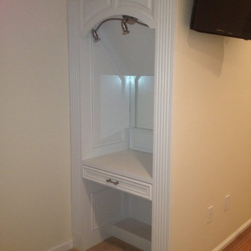
 CnS Contracting LLC
Part of a guest bedroom of a beach home in Lavallette, NJ. After much deliberation, we decided to take the staircase area (previously wasted space) and turn it into a makeup vanity! What do you think?

 User
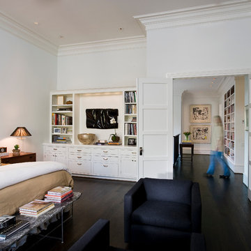
UserMaster bedroom with 12'-0 ceilings.
Photography: Kennon Evett
Bedroom - traditional bedroom idea in Houston
Bedroom - traditional bedroom idea in Houston

 30X40 Design Workshop
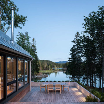
A residence designed for informal gathering and relaxation on a quiet cove near Acadia National Park. Conceived of as a compound of connected gathering spaces with adjacent private retreat spaces. The "village" of structures is designed to open and close seasonally with large sliding barn doors. These also modulate light, air and views into and out of the cottages.
Carefully positioned to take advantage of the rich variety of views and sloping topography, the cottages have integral terraces and retaining walls to negotiate the undulating land-form. One arrives at the high point of the site and the long barn axis and navigates between the cottages to the main entrance. Once inside, the home deliberately reveals unique views to the ocean, mountains and surrounding spruce forest.
 RHEINZINK
Photos images: Courtesy of the Homeowners
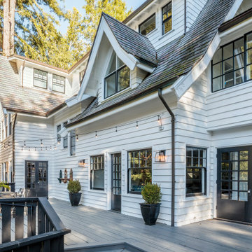
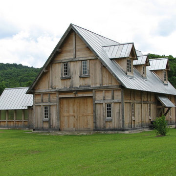
At the end of a dirt road in southern Vermont is a stunning timber and stone residence designed to resemble a small medieval Anglo-Norman manor house originally constructed in the 16th century. According to the owners, a husband and wife with a keen interest in both ancient and modern architecture, the 5,000 sq. ft. home was built slowly over eleven years by highly skilled craftsmen in order to complete all of the authentic hand-planed interior details. The craftsmen then spent an additional two years building the adjacent “ancient“ barn. “We always knew we wanted to take down a delapidated 19th-century hay barn and replace it with something of the period of the house,“ the husband said.
The owners designed the barn and began to consider zinc for the roof after looking at northern European architecture and discovering that zinc has been used extensively in Europe for 300 years. Approximately 4,200 sq. ft. of RHEINZINK prePATINA bright rolled Double Lock Standing Seam Roof Panels were utilized to roof the white oak structure. The bright rolled material was selected deliberately in order to achieve the “naturally aged look“ that the owners were seeking. “It’s gone almost immediately to a soft grey which is what we hoped would happen. As the years go by, the color of the weathering white oak and the aging zinc will come together in a dusty grey. Seeing this building in the fog five years from now will feel like seeing a 500-year-old ghost barn floating in the hills of Vermont.“
Installation of the RHEINZINK panels was done by Cold Hollow Contracting, Burlington, VT. “These folks had serious zinc-roofing experience and were clearly the most craft-oriented of all the roofers we met with,“ according to the husband.
The main focus was getting an “old look“ as quickly as possible, said Tim Heaghney, co-owner of Cold Hollow Contracting. “That’s really what makes the bright rolled so special—it ages quickly. We fabricated the 28 ft. panels on site and did the flashing fabrication in our shop. Many of the normal sheet metal skills apply to the zinc although we relied heavily on the RHEINZINK installation manual as well as personal support from their technical people. We used a radius cut and fold at the eve termination as opposed to the typical detail used in steel and copper where it‘s just cut at the 90 for the drip edge. The roof was steep but we do a lot of steeples and domes so we’re comfortable working at heights.“
The installers also utilized RHEINZINK’s AIR-Z structured underlayment to provide an air-gap behind the zinc.
The RHEINZINK distributor on the project was Beacon Sales, Shelburne, VT
 Your Favorite Room By Cathy Zaeske
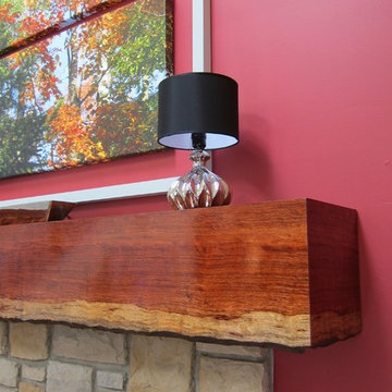
For years we lived with an ugly, too small and wimpy builders grade mantel that I couldn't wait to tear out. Turns out it made the perfect support for my new custom, one of a kind mantel. I conceived, designed and had this piece built onsite by my favorite carpenter. I wanted it to look like a continuous piece of wood that wrapped around on the edges, like I had seen done on benches, but with a live edge on the bottom not the top. This is a hand chosen, stunning Bubinga plank and it's feature is the variegated wood tones - it "goes with" everything!
I also had the floating picture frame custom made to make my favorite tree canvas art more in scale with the fireplace and wall. This tree stands next to our fire pit in Door County, WI and is a favorite view we wanted to bring home. The small chrome lamps are a deliberate play on scale for a touch of the unexpected.
The two trunks are antique indonesian pieces. The one on the left holds my firewood in the winter and the one on the right is the perfect place to store all of the media components.
Cathy Zaeske
 Live Beautifully, LLC
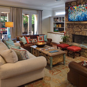
Brightly colored coral and aqua accessories and life to this rustic family room.
photography by Michael Hart
Large mountain style open concept dark wood floor family room photo in Houston with a stone fireplace, a wall-mounted tv, beige walls and a standard fireplace
Large mountain style open concept dark wood floor family room photo in Houston with a stone fireplace, a wall-mounted tv, beige walls and a standard fireplace
 User
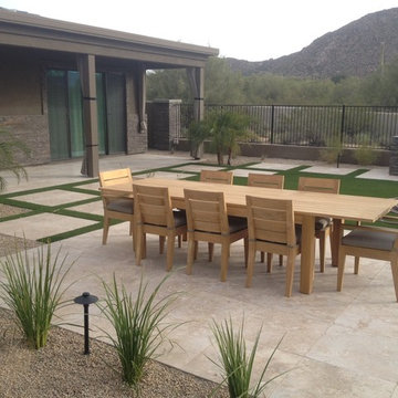
UserHere's yet another view of the backyard showing the BBQ and the dining room table in reference to the covered patio area. From this view, you can see that the chairs of the dining room table are covered. There is also outdoor lighting around the yard and that the plants are non-flowering green plants. The mountain in the background really sets the whole picture off!
10