
Search results for "Deliberation" in Home Design Ideas
 Whitefish Architecture
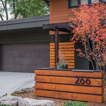
This garage addition and rehabilitation of a mid century modern home expands and enhances the original while respecting the scale and low, linear feel.
All exterior finishes are updated with the exception of the stone. A new entrance creates layers of screening to invite inquiry as well as create privacy and a sense of place. The garage is downplayed with dark materials to allow it to recede relative to the main house, which is deliberately brighter, warmer, and varied to remain the visual focus.
Lead Designer - Alex Jenkins
Designer - Valerie Wright
Photography - Steve Edgar

 RHEINZINK
Photos images: Courtesy of the Homeowners
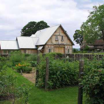
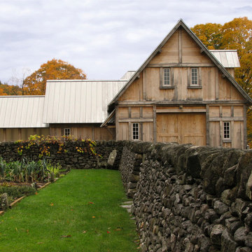
At the end of a dirt road in southern Vermont is a stunning timber and stone residence designed to resemble a small medieval Anglo-Norman manor house originally constructed in the 16th century. According to the owners, a husband and wife with a keen interest in both ancient and modern architecture, the 5,000 sq. ft. home was built slowly over eleven years by highly skilled craftsmen in order to complete all of the authentic hand-planed interior details. The craftsmen then spent an additional two years building the adjacent “ancient“ barn. “We always knew we wanted to take down a delapidated 19th-century hay barn and replace it with something of the period of the house,“ the husband said.
The owners designed the barn and began to consider zinc for the roof after looking at northern European architecture and discovering that zinc has been used extensively in Europe for 300 years. Approximately 4,200 sq. ft. of RHEINZINK prePATINA bright rolled Double Lock Standing Seam Roof Panels were utilized to roof the white oak structure. The bright rolled material was selected deliberately in order to achieve the “naturally aged look“ that the owners were seeking. “It’s gone almost immediately to a soft grey which is what we hoped would happen. As the years go by, the color of the weathering white oak and the aging zinc will come together in a dusty grey. Seeing this building in the fog five years from now will feel like seeing a 500-year-old ghost barn floating in the hills of Vermont.“
Installation of the RHEINZINK panels was done by Cold Hollow Contracting, Burlington, VT. “These folks had serious zinc-roofing experience and were clearly the most craft-oriented of all the roofers we met with,“ according to the husband.
The main focus was getting an “old look“ as quickly as possible, said Tim Heaghney, co-owner of Cold Hollow Contracting. “That’s really what makes the bright rolled so special—it ages quickly. We fabricated the 28 ft. panels on site and did the flashing fabrication in our shop. Many of the normal sheet metal skills apply to the zinc although we relied heavily on the RHEINZINK installation manual as well as personal support from their technical people. We used a radius cut and fold at the eve termination as opposed to the typical detail used in steel and copper where it‘s just cut at the 90 for the drip edge. The roof was steep but we do a lot of steeples and domes so we’re comfortable working at heights.“
The installers also utilized RHEINZINK’s AIR-Z structured underlayment to provide an air-gap behind the zinc.
The RHEINZINK distributor on the project was Beacon Sales, Shelburne, VT
Find the right local pro for your project
 Amy Carman Design
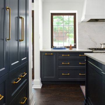
Formerly two rooms, we removed a wall and added leaded glass windows to brighten and enlarge the space. Room was borrowed from the former dining room to increase the size of the kitchen and add a back entrance mudroom. An island with seating, Calacatta quartzite countertops, navy cabinetry, and a deliberate choice not to include upper cabinets make the room feel bright, spacious, and timeless.
 Kelly Rogers Interiors
Eric Roth Photography
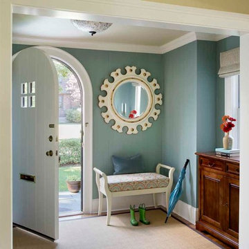
Example of a transitional entryway design in Boston with blue walls
Example of a transitional entryway design in Boston with blue walls


 CLB Architects
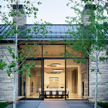
The forms of Five Shadows define a series of distinct and different outdoor experiences. The buildings were deliberately considered to enhance privacy, serenity, and a profound connection to the outdoors.
Architecture by CLB – Jackson, Wyoming – Bozeman, Montana. Interiors by Philip Nimmo Design.
 Dillon Kyle Architects (DKA)
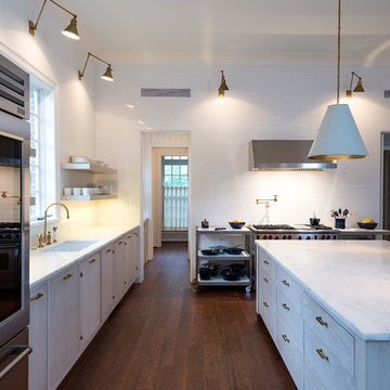
The design removed the kitchen peninsula and intermediate cabinetry wall. Light, cerused White Oak cabinetry replaced dark cabinets, and wood floors flow seamlessly with rest of the existing first floor. Danby counters with lighted, free-floating shelves above articulate the very simple and deliberate design. A floor-to-ceiling white tile wall behind the range adds subtle variation in texture.
Peter Molick Photography

 Studio TOOP
design: Carrie Preston (Studio TOOP) and Jasper Helmantel (Cruydt Hoeck), 2011
location: Appeltern, NL
status: built in 2012 by Appeltern Model Garden Complex
photos: Jolanthe Lalkens, June 2013
Designed as assignment from both the Dutch gardening magazine Groei & Bloei and the television and radio nature program Vara's Vroege Vogels, this garden serves as a model of how homeowners can incorporate lots of plant life and wildlife into the design but without sacrificing practicality or aesthetics. The garden is deliberately contemporary in its style to emphasize that nature-rich gardens need not look a certain way - insects and birds don't care if the lines are straight or curved.
At the same time the garden makes use of affordable, simple, no-nonsense materials. The 40x60 cm paving stones are one of the most common and affordable paving options in the Netherlands, available en masse for free on the Internet. Conceptually we imagined a garden completely paved with the tiles (as to many gardens are) and what would happen if took out some of these stones, used them to build benches and structure and added plants where the tiles had been. In the construction of the benches we include other materials such as bamboo sticks and insulation bricks that create habitat for insects such as solitary bees.
The plant palette is based on a selection of native and host plants in combination with the 26 plants plan set up by Groei & Boei -- a list of plants aimed at making the use of more plants in gardens accessible and less intimidating. The choice for the number 26 corresponds with the number of letters in the alphabet in line with the famous Dutch garden designer Mien Ruy's comment that if we only need 26 letters to create a whole language, we should be able to combine and mix 26 plants to express far more than we think.
 DEANE Inc | Distinctive Design & Cabinetry
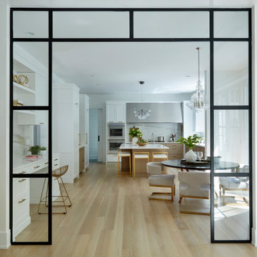
Located in the highly sought-after Allwood neighborhood of Darien, this spec house is the fourth collaboration with a client who first began with a renovation of her own home. While architecturally it is a traditional home from the exterior, the interiors are more transitional in style. In order to compete in the speculative market, our client’s directive was clear – ‘differentiation the kitchen design from every other spec house’. So we incorporated painted cabinetry but highlighted with rift-cut white oak base cabinets. This contrast between these finishes influenced our decision to select a subtle white quartzite countertop to deliberately highlight the striking porcelain backsplash.
The steel and glass partition frames the space – drawing the eye to the focal point of the kitchen, the custom stainless steel hood. Gold hardware adds a pop of flair to the space and warms the room. Walnut drawer inserts, stainless steel appliance garage, pull out trash drawers with compost bins and a stylish desk make this the Gold Standard of spec houses.
 30X40 Design Workshop
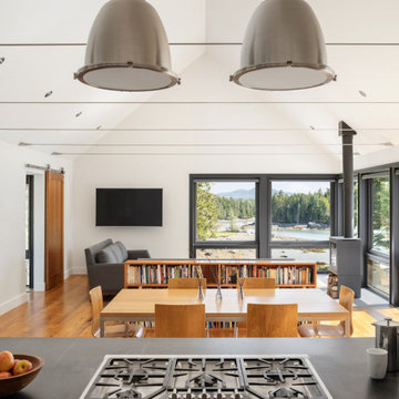
A residence designed for informal gathering and relaxation on a quiet cove near Acadia National Park. Conceived of as a compound of connected gathering spaces with adjacent private retreat spaces. The "village" of structures is designed to open and close seasonally with large sliding barn doors. These also modulate light, air and views into and out of the cottages.
Carefully positioned to take advantage of the rich variety of views and sloping topography, the cottages have integral terraces and retaining walls to negotiate the undulating land-form. One arrives at the high point of the site and the long barn axis and navigates between the cottages to the main entrance. Once inside, the home deliberately reveals unique views to the ocean, mountains and surrounding spruce forest.
 User
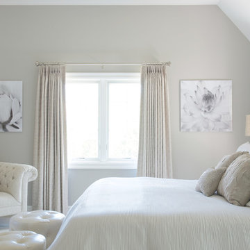
UserBedroom with light, neutral tones. Texture throughout the space on the bedding, furniture, and window treatments make the room feel cozy.
Photography by Jane Beiles http://www.janebeiles.com
 Astratto Design
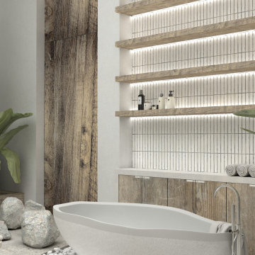
Embarking on the design journey of Wabi Sabi Refuge, I immersed myself in the profound quest for tranquility and harmony. This project became a testament to the pursuit of a tranquil haven that stirs a deep sense of calm within. Guided by the essence of wabi-sabi, my intention was to curate Wabi Sabi Refuge as a sacred space that nurtures an ethereal atmosphere, summoning a sincere connection with the surrounding world. Deliberate choices of muted hues and minimalist elements foster an environment of uncluttered serenity, encouraging introspection and contemplation. Embracing the innate imperfections and distinctive qualities of the carefully selected materials and objects added an exquisite touch of organic allure, instilling an authentic reverence for the beauty inherent in nature's creations. Wabi Sabi Refuge serves as a sanctuary, an evocative invitation for visitors to embrace the sublime simplicity, find solace in the imperfect, and uncover the profound and tranquil beauty that wabi-sabi unveils.
 RHEINZINK
Photos images: Courtesy of the Homeowners
At the end of a dirt road in southern Vermont is a stunning timber and stone residence designed to resemble a small medieval Anglo-Norman manor house originally constructed in the 16th century. According to the owners, a husband and wife with a keen interest in both ancient and modern architecture, the 5,000 sq. ft. home was built slowly over eleven years by highly skilled craftsmen in order to complete all of the authentic hand-planed interior details. The craftsmen then spent an additional two years building the adjacent “ancient“ barn. “We always knew we wanted to take down a delapidated 19th-century hay barn and replace it with something of the period of the house,“ the husband said.
The owners designed the barn and began to consider zinc for the roof after looking at northern European architecture and discovering that zinc has been used extensively in Europe for 300 years. Approximately 4,200 sq. ft. of RHEINZINK prePATINA bright rolled Double Lock Standing Seam Roof Panels were utilized to roof the white oak structure. The bright rolled material was selected deliberately in order to achieve the “naturally aged look“ that the owners were seeking. “It’s gone almost immediately to a soft grey which is what we hoped would happen. As the years go by, the color of the weathering white oak and the aging zinc will come together in a dusty grey. Seeing this building in the fog five years from now will feel like seeing a 500-year-old ghost barn floating in the hills of Vermont.“
Installation of the RHEINZINK panels was done by Cold Hollow Contracting, Burlington, VT. “These folks had serious zinc-roofing experience and were clearly the most craft-oriented of all the roofers we met with,“ according to the husband.
The main focus was getting an “old look“ as quickly as possible, said Tim Heaghney, co-owner of Cold Hollow Contracting. “That’s really what makes the bright rolled so special—it ages quickly. We fabricated the 28 ft. panels on site and did the flashing fabrication in our shop. Many of the normal sheet metal skills apply to the zinc although we relied heavily on the RHEINZINK installation manual as well as personal support from their technical people. We used a radius cut and fold at the eve termination as opposed to the typical detail used in steel and copper where it‘s just cut at the 90 for the drip edge. The roof was steep but we do a lot of steeples and domes so we’re comfortable working at heights.“
The installers also utilized RHEINZINK’s AIR-Z structured underlayment to provide an air-gap behind the zinc.
The RHEINZINK distributor on the project was Beacon Sales, Shelburne, VT
 FiveSTAR Landscape
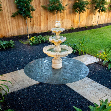
We recently finished this landscape design and installation project in the Tanglewood neighborhood of Houston, Texas. Our client, a Louisiana native who loves entertaining and wanted to stay connected to her NOLA roots, desired a space that could comfortably accommodate 30+ guests on a regular basis.
We deliberately designed the outdoor kitchen without a cover to preserve the view of the magnificent oak trees. Our aim was to create a kitchen that is both durable and visually appealing. The countertop is made of leathered granite, a material that can withstand the unpredictable Texas weather. All the appliances, including the grill, refrigerator, sink, and double side burner, were locally sourced and are made of stainless steel. Additionally, we utilized Austin limestone, which was quarried right here in Texas.
To infuse a touch of New Orleans charm into the backyard, we incorporated a fountain. The surrounding black star gravel was designed as a versatile space that can be used for additional dining, seating, or even as a meditation area.
To ensure privacy and shade as the plants mature, we strategically planted Eaglestone Holly and Japanese Yew along the fence line. Completing the landscape, we selected Amerishade grass for its excellent shade tolerance.
 Klopf Architecture
Built for the Bluff, A Sea Ranch Home is Remade from the Inside Out
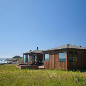
The house had always been grounded, on an ocean bluff at The Sea Ranch. It sits unencumbered, adjacent to one of the most dramatic stretches of the Sonoma coast with protected commons meadow to the east, uninterrupted Pacific views to the west, and a bluff trail running alongside. What it lacked was the feeling of home, one that could hold up its own against the natural landscape.
The owners are entrepreneurs with deep involvement across tech, real estate, and development and they know how things are built. The Sea Ranch house had been in their lives for years, a second residence and a place for family to gather. Built for a different time, it felt more compromising than comfortable. Sitting in a closed off nook, the kitchen fit one cook at a time and turned its back on the rest of the house. The entry was dim and compressed, divided by a structural column that presented itself at exactly the wrong moment. The primary suite was small relative to the view outside it. A large rear bedroom sat behind a lowered ceiling with a bathroom that had never been added. The house was certainly worth the trouble of doing it right.
What followed was not one project but four, each with its own design challenge, each addressed over a period of time.
Where the House Meets the Ocean
The most complex piece of the project, in both structural and spatial terms, was the kitchen expansion. The existing room was a single-person galley squeezed in as an afterthought with no meaningful connection to the dining room, the living space, or the deck outside. To make it useful for a family that cooks and gathers, it needed to grow outward into an existing patio and flow into the rooms around it.
A big challenge was the roofline. Several planes at different pitches and angles converged directly where additional volume was needed. A new form had to join that geometry without reading as a correction. The solution found the simplest possible connection between the existing angles, a roofline that from outside the structure, appears entirely original. From the bluff trail where the addition is visible, there is no discernible seam.
Inside, the kitchen is now open to the living and dining rooms without interruption. A large sliding glass door connects the space onto the rear deck. The deck itself was expanded and oriented so that the body of the house shields it from the coastal wind which is a common consideration that determines whether outdoor space at The Sea Ranch actually gets used. The result is a room that works for large family gatherings where no one feels cutoff, and one that makes the boundary between being inside and outside easy to ignore.
Welcoming Light
A structural column stood at the convergence of eight distinct roof planes in the entry. It was load-bearing, but it was also the reason the entry had always felt like a hallway rather than a welcoming arrival.
With the structural engineer, a custom steel connector was designed to receive beams from six separate directions, redistributing the load through a single new continuous beam. The column was surgically removed. Three triangular skylights were then cut into the roof above, their shapes drawn from the
existing geometry of the planes around them. The entry is now bright and open. The skylights feel native to the structure because they follow the logic already present in the roof.
Two Suites, Two Views
At opposite ends of the house, the two bedroom suites were each reconfigured, and each found a different way to introduce more of the landscape into the room.
An addition to the primary suite extended the structure outward to create a wraparound plan with a loop from the bedroom through bath and closet that had not been possible before. The expansion opened a slot view from the tub and shower toward the ocean. The view is precise and private. The ocean view is present and deliberate.
The rear bedroom absorbed an adjacent storage room to transform it into a full second suite with a vaulted ceiling, a large bathroom with a tub, a shower, and a sauna. A private fenced garden courtyard sits just beyond the glass bringing the outdoors inside. The tub was placed so that, looking past the courtyard and through the bedroom beyond, the ocean is visible at the far end. It is a long view and it makes the room feel larger and more settled than its footprint would suggest.
Glass on Four Sides, Fire at the Center
The main living and gathering room had always been caught between two competing facts: glass on four sides meant exceptional views but at The Sea Ranch, it also meant a cold room. A 360-degree cylindrical fireplace was added at the center on a raised stone base, providing radiant heat in every direction and giving the room a focal point around which a group naturally orients itself, whether that means two people at the end of the day or the whole family after dinner.
Owners Who Picked Up the Tools
The owner was not a passive client. they came with construction knowledge, specific ideas, and the desire to be an active part of the process, a dynamic that other architects may had found difficult, which Klopf Architecture accepted as an asset. They took it upon themselves to complete some of the work during construction, including the installation of a new radiant heating system beneath the floors.
The radiant system added to the older and less-desirable forced-air setup. At The Sea Ranch, that change matters as the house sits close enough to the ocean and moving air competes with the sound of it, where radiant heat does not. Solar panels were added to the roof as part of the new system. Insulation was upgraded throughout the walls, roof, and crawl space. The house that had always had the right setting now holds warmth the way a house on the bluff should.
They were also deeply involved in the design and selections throughout, and the finished house reflects both of them in ways that are specific rather than generic. The process took longer and moved through more iterations than a more arms-length relationship might have allowed. The result is more defined and personal because of it.
The Landscape Holds Priority
Every exterior decision was shaped by The Sea Ranch Design Standards, which require that buildings defer to the landscape around them rather than compete with it. Because this house sits on the bluff and is visible from the public trail, the additions faced a close review. Existing materials were matched. Geometries were resolved. The additions had to become indistinguishable from the original building.
From the trail, the house reads exactly as it always has — low, cedar-clad, secondary to the meadow and the water. The setting holds priority. Inside, the house has been remade.
Klopf Architecture Project Team: Geoff Campen and Trenton Jewett
Contractor: Shawn Bettega Construction
Photography: ©2025 Mariko Reed
Year Completed: 2023
Location: The Sea Ranch, CA
 Wendel Klein Builders, Inc.
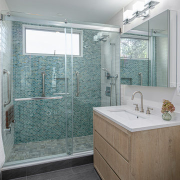
This expansive Cambridge residence was ready for a new chapter, and Wendel Klein Design Build was honored to lead the transformation. By meticulously remodeling both the interior and exterior, we struck a deliberate balance between modern functionality and historic charm. The result is a home that feels entirely current while honoring its original soul.
 Ridgewood Home Construction
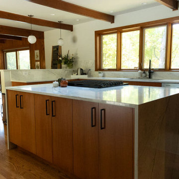
This mid-century modern Rockford home was updated in stages, and the kitchen needed a complete remodel. The homeowners desired a kitchen that felt current without breaking from the character that defined the rest of the house. That meant we needed to choose materials that fit the home and highlighted the home’s character.
Our team sourced pecky cypress and natural slate tile from non-traditional suppliers to get the exact look the home called for. The wood cabinetry was paired with a granite island, providing a gathering space in the kitchen without overpowering it. Because both materials required careful handling during installation, the crew worked more slowly and deliberately through this phase than a standard remodel. The result connected the kitchen directly to the living area, so the two spaces feel like one continuous room built in the same style as the rest of the home.
 Lola Cwikowski Studio
An Ohio family in search of a place to enjoy the Portuguese coast acquired a four-bedroom apartment just outside the center of Cascais. Our studio was engaged to turn a compartmented interior into a holiday residence for a household that gathers in numbers: one that could seat everyone at once and still hold the ease and lightness of a home by the beach.
The original plan included a kitchen and laundry room sealed off from the living room, floor finishes and levels that changed from threshold to threshold, and bathrooms in varying styles. Work began by redefining the alignments and circulation. The principal transformation was the opening of the kitchen, creating a more generous social setting centered on a bespoke island fitted with storage and seating.
The interior takes its cues from the building’s geometric façade, which projects and recedes in volumes and voids. Bespoke joinery in oak and lacquer carries continuity and order through the apartment. Concealed storage runs throughout: at the entrance, in the dining area, along the living area, and beneath built-in benches. The laundry is merged into the kitchen behind perforated doors for ventilation while keeping the service area discreet. Behind the sofa, a console slips a workspace into the living area without conceding its openness.
Curved elements answer the rectilinear architecture; artisanal glazed vertical tiles repeat from the backsplashes onto custom side tables. The palette stays deliberately narrow; the muted oak and lacquer are joined by a softened timber floor, Portuguese Lioz stone, and walls painted to the color of bare plaster. Existing doors and baseboards were repainted in a warm light gray that draws the original elements into the language of the new interior. Upholstery and decorative accents hint at the terracotta, sky blue, and yellow of the façade.
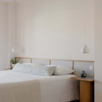
The bedrooms are set with upholstered headboards on oak frames, bedside tables that extend those outlines, and wardrobes fit for a long stay. Locally made rugs, bedcovers, and throw pillows soften the composition. In the bathrooms, the plans were reorganized and the showers enlarged. Lioz was used for the counters and sinks, shelves, shower bases, and bathtub surround, with microcement bringing a soothing warmth to the walls, and storage in floating cabinets. Deeper in tone than the rest of the apartment yet never dim, they are quietly elegant rooms made for lingering — taking one’s time getting ready, or unwinding at the end of a day.
PHOTOGRAPHY: © ALEXANDER BOGORODSKIY
12