
Search results for "Department" in Home Design Ideas


 Bilotta Kitchen & Home
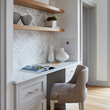
Traditional design is tempered for today’s lifestyle in this stunning kitchen. Custom Bilotta cabinetry with 1” doors exudes elegance with its flush inset construction and a clean-lined stepped Shaker door. “Repose Gray” by Sherwin Williams departs from omnipresent white, yet still maintains a bright ambiance, which is reinforced by natural while oak flooring.
A furniture appearance is accomplished by extending some base cabinet stiles into delicate legs. Tapered legs on the island create a “table” for casual meals. Appliances and the hood vent are paneled for a cohesive image. Taking the cabinets to the ceiling maximizes space. The range area has glass upper sections, while the countertop cabinet to the left of the window becomes a glass-fronted hutch. Emphasizing the kitchen’s traditional roots are an apron-front sink, marble countertops, and herringbone marble backsplashes.
Though the room isn’t massive, it packs a lot of function. There’s space for a 48” range, a prep sink, and even refrigerator drawers adjacent to the stools. A contemporary glass and walnut table anchors the breakfast area, which includes a planning desk with white oak floating shelves. Brushed brass hardware, plumbing fixtures, stool bases and lighting bring an up-to-date touch with their modern finishes and forms.
This kitchen was done in collaboration with lulu HOME. Photography by Paul Johnson Photography.

 Mark Brand Architecture
We were approached by a San Francisco firefighter to design a place for him and his girlfriend to live while also creating additional units he could sell to finance the project. He grew up in the house that was built on this site in approximately 1886. It had been remodeled repeatedly since it was first built so that there was only one window remaining that showed any sign of its Victorian heritage. The house had become so dilapidated over the years that it was a legitimate candidate for demolition. Furthermore, the house straddled two legal parcels, so there was an opportunity to build several new units in its place. At our client’s suggestion, we developed the left building as a duplex of which they could occupy the larger, upper unit and the right building as a large single-family residence. In addition to design, we handled permitting, including gathering support by reaching out to the surrounding neighbors and shepherding the project through the Planning Commission Discretionary Review process. The Planning Department insisted that we develop the two buildings so they had different characters and could not be mistaken for an apartment complex. The duplex design was inspired by Albert Frey’s Palm Springs modernism but clad in fibre cement panels and the house design was to be clad in wood. Because the site was steeply upsloping, the design required tall, thick retaining walls that we incorporated into the design creating sunken patios in the rear yards. All floors feature generous 10 foot ceilings and large windows with the upper, bedroom floors featuring 11 and 12 foot ceilings. Open plans are complemented by sleek, modern finishes throughout.
Find the right local pro for your project
 Bilotta Kitchen & Home
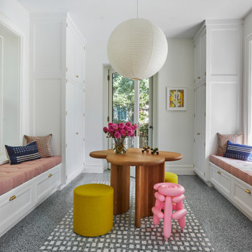
Despite its diamond-mullioned exterior, this stately home’s interior takes a more light-hearted approach to design. The Dove White inset cabinetry is classic, with recessed panel doors, a deep bevel inside profile and a matching hood. Streamlined brass cup pulls and knobs are timeless. Departing from the ubiquitous crown molding is a square top trim.
The layout supplies plenty of function: a paneled refrigerator; prep sink on the island; built-in microwave and second oven; built-in coffee maker; and a paneled wine refrigerator. Contrast is provided by the countertops and backsplash: honed black Jet Mist granite on the perimeter and a statement-making island top of exuberantly-patterned Arabescato Corchia Italian marble.
Flooring pays homage to terrazzo floors popular in the 70’s: “Geotzzo” tiles of inlaid gray and Bianco Dolomite marble. Field tiles in the breakfast area and cooking zone perimeter are a mix of small chips; feature tiles under the island have modern rectangular Bianco Dolomite shapes. Enameled metal pendants and maple stools and dining chairs add a mid-century Scandinavian touch. The turquoise on the table base is a delightful surprise.
An adjacent pantry has tall storage, cozy window seats, a playful petal table, colorful upholstered ottomans and a whimsical “balloon animal” stool.

 BK Landscape Design
San Rafael
Overview: This garden project began with the demolition of an existing pool and decks cantilevered over a hillside. The garden was originally a Japanese-themed garden retreat and free-form shaped pool. While the client wanted to update and replace many elements, they sought to keep the free-form characteristics of the existing design and repurpose existing materials. BK Landscape Design created a new garden with revetment walls and steps to a succulent garden with salvaged boulders from the pool and pool coping. We built a colored concrete path to access a new wood trellis constructed on the center-line view from the master bedroom. A combination of Bay friendly, native and evergreen plantings were chosen for the planting palette. The overhaul of the yard included low-voltage lighting and minimal drainage. A new wood deck replaced the existing one at the entrance as well as a deck off of the master bedroom that was also constructed from repurposed materials. The style mimics the architectural detail of the mansard roof and simple horizontal wood siding of the house. After removing a juniper (as required by the San Rafael Fire Department within the Wildland-Urban interface) we designed and developed a full front-yard planting plan. All plants are Bay-Friendly, native, and irrigated with a more efficient in-line drip irrigation system to minimize water use. Low-voltage lighting and minimal drainage were also part of the overhaul of the front yard redesign.
 Walczak Design And Build
THE PROBLEM
Our client adores their traditional layout and their traditional design style. But there were a few things that could be improved including flow and functionality in the kitchen - not to mention the cabinets, counters and appliances that had seen better days. The family room was used heavily for movie viewing, but it did not have a great set-up for the TV and was seriously lacking in the audio department. Their garage entry had become the primary way into the home for the homeowners, however it did not offer the welcoming feeling they wanted to have after a long day.
THE SOLUTION
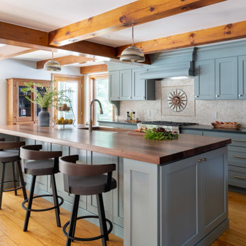
To create better flow, we shifted the entry from the mud hall down a bit which gave us the space to add another run of cabinetry and relocate the fridge. We closed up the former dining room wall and converted it into a new office space as both homeowners work from home. Due to the shift in the entry from the mud hall, we also were able to then center the island to where it should be in the room creating some much needed balance.
Because we were not creating an open floor plan and removing walls and such, there was more budget for high ticket finishes. One of which was a 11’ custom walnut countertop for the island which became the anchoring design element for the kitchen along with custom cabinetry and high-end appliances.
 Mark Brand Architecture
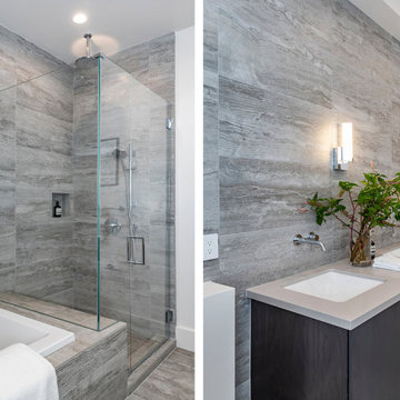
We were approached by a San Francisco firefighter to design a place for him and his girlfriend to live while also creating additional units he could sell to finance the project. He grew up in the house that was built on this site in approximately 1886. It had been remodeled repeatedly since it was first built so that there was only one window remaining that showed any sign of its Victorian heritage. The house had become so dilapidated over the years that it was a legitimate candidate for demolition. Furthermore, the house straddled two legal parcels, so there was an opportunity to build several new units in its place. At our client’s suggestion, we developed the left building as a duplex of which they could occupy the larger, upper unit and the right building as a large single-family residence. In addition to design, we handled permitting, including gathering support by reaching out to the surrounding neighbors and shepherding the project through the Planning Commission Discretionary Review process. The Planning Department insisted that we develop the two buildings so they had different characters and could not be mistaken for an apartment complex. The duplex design was inspired by Albert Frey’s Palm Springs modernism but clad in fibre cement panels and the house design was to be clad in wood. Because the site was steeply upsloping, the design required tall, thick retaining walls that we incorporated into the design creating sunken patios in the rear yards. All floors feature generous 10 foot ceilings and large windows with the upper, bedroom floors featuring 11 and 12 foot ceilings. Open plans are complemented by sleek, modern finishes throughout.
 Bilotta Kitchen & Home
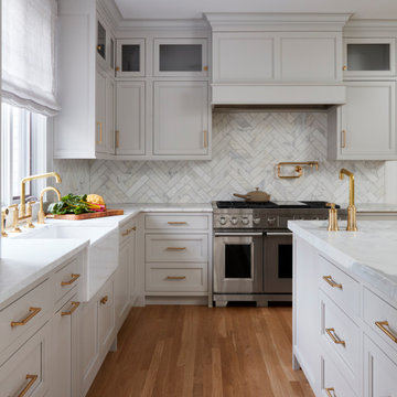
Traditional design is tempered for today’s lifestyle in this stunning kitchen. Custom Bilotta cabinetry with 1” doors exudes elegance with its flush inset construction and a clean-lined stepped Shaker door. “Repose Gray” by Sherwin Williams departs from omnipresent white, yet still maintains a bright ambiance, which is reinforced by natural while oak flooring.
A furniture appearance is accomplished by extending some base cabinet stiles into delicate legs. Tapered legs on the island create a “table” for casual meals. Appliances and the hood vent are paneled for a cohesive image. Taking the cabinets to the ceiling maximizes space. The range area has glass upper sections, while the countertop cabinet to the left of the window becomes a glass-fronted hutch. Emphasizing the kitchen’s traditional roots are an apron-front sink, marble countertops, and herringbone marble backsplashes.
Though the room isn’t massive, it packs a lot of function. There’s space for a 48” range, a prep sink, and even refrigerator drawers adjacent to the stools. A contemporary glass and walnut table anchors the breakfast area, which includes a planning desk with white oak floating shelves. Brushed brass hardware, plumbing fixtures, stool bases and lighting bring an up-to-date touch with their modern finishes and forms.
This kitchen was done in collaboration with lulu HOME. Photography by Paul Johnson Photography.
 Bilotta Kitchen & Home
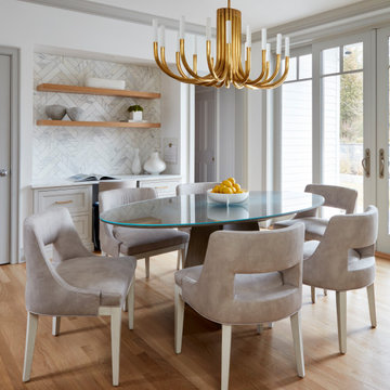
Traditional design is tempered for today’s lifestyle in this stunning kitchen. Custom Bilotta cabinetry with 1” doors exudes elegance with its flush inset construction and a clean-lined stepped Shaker door. “Repose Gray” by Sherwin Williams departs from omnipresent white, yet still maintains a bright ambiance, which is reinforced by natural while oak flooring.
A furniture appearance is accomplished by extending some base cabinet stiles into delicate legs. Tapered legs on the island create a “table” for casual meals. Appliances and the hood vent are paneled for a cohesive image. Taking the cabinets to the ceiling maximizes space. The range area has glass upper sections, while the countertop cabinet to the left of the window becomes a glass-fronted hutch. Emphasizing the kitchen’s traditional roots are an apron-front sink, marble countertops, and herringbone marble backsplashes.
Though the room isn’t massive, it packs a lot of function. There’s space for a 48” range, a prep sink, and even refrigerator drawers adjacent to the stools. A contemporary glass and walnut table anchors the breakfast area, which includes a planning desk with white oak floating shelves. Brushed brass hardware, plumbing fixtures, stool bases and lighting bring an up-to-date touch with their modern finishes and forms.
This kitchen was done in collaboration with lulu HOME. Photography by Paul Johnson Photography.
 Walczak Design And Build
THE PROBLEM
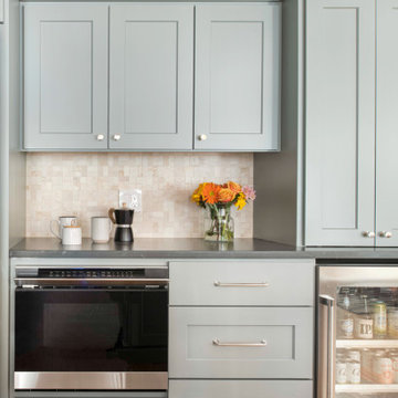
Our client adores their traditional layout and their traditional design style. But there were a few things that could be improved including flow and functionality in the kitchen - not to mention the cabinets, counters and appliances that had seen better days. The family room was used heavily for movie viewing, but it did not have a great set-up for the TV and was seriously lacking in the audio department. Their garage entry had become the primary way into the home for the homeowners, however it did not offer the welcoming feeling they wanted to have after a long day.
THE SOLUTION
To create better flow, we shifted the entry from the mud hall down a bit which gave us the space to add another run of cabinetry and relocate the fridge. We closed up the former dining room wall and converted it into a new office space as both homeowners work from home. Due to the shift in the entry from the mud hall, we also were able to then center the island to where it should be in the room creating some much needed balance.
Because we were not creating an open floor plan and removing walls and such, there was more budget for high ticket finishes. One of which was a 11’ custom walnut countertop for the island which became the anchoring design element for the kitchen along with custom cabinetry and high-end appliances.
 Walczak Design And Build
THE PROBLEM
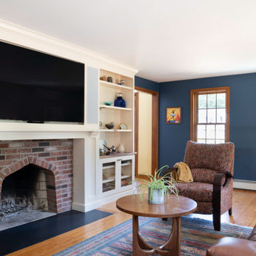
Our client adores their traditional layout and their traditional design style. But there were a few things that could be improved including flow and functionality in the kitchen - not to mention the cabinets, counters and appliances that had seen better days. The family room was used heavily for movie viewing, but it did not have a great set-up for the TV and was seriously lacking in the audio department. Their garage entry had become the primary way into the home for the homeowners, however it did not offer the welcoming feeling they wanted to have after a long day.
THE SOLUTION
To create better flow, we shifted the entry from the mud hall down a bit which gave us the space to add another run of cabinetry and relocate the fridge. We closed up the former dining room wall and converted it into a new office space as both homeowners work from home. Due to the shift in the entry from the mud hall, we also were able to then center the island to where it should be in the room creating some much needed balance.
Because we were not creating an open floor plan and removing walls and such, there was more budget for high ticket finishes. One of which was a 11’ custom walnut countertop for the island which became the anchoring design element for the kitchen along with custom cabinetry and high-end appliances.

 Bellingham Bay Builders
Situated on the north shore of Birch Point this high-performance beach home enjoys a view across Boundary Bay to White Rock, BC and the BC Coastal Range beyond. Designed for indoor, outdoor living the many decks, patios, porches, outdoor fireplace, and firepit welcome friends and family to gather outside regardless of the weather.
From a high-performance perspective this home was built to and certified by the Department of Energy’s Zero Energy Ready Home program and the EnergyStar program. In fact, an independent testing/rating agency was able to show that the home will only use 53% of the energy of a typical new home, all while being more comfortable and healthier. As with all high-performance homes we find a sweet spot that returns an excellent, comfortable, healthy home to the owners, while also producing a building that minimizes its environmental footprint.
Design by JWR Design
Photography by Radley Muller Photography
Interior Design by Markie Nelson Interior Design
 BK Landscape Design
San Rafael
Overview: This garden project began with the demolition of an existing pool and decks cantilevered over a hillside. The garden was originally a Japanese-themed garden retreat and free-form shaped pool. While the client wanted to update and replace many elements, they sought to keep the free-form characteristics of the existing design and repurpose existing materials. BK Landscape Design created a new garden with revetment walls and steps to a succulent garden with salvaged boulders from the pool and pool coping. We built a colored concrete path to access a new wood trellis constructed on the center-line view from the master bedroom. A combination of Bay friendly, native and evergreen plantings were chosen for the planting palette. The overhaul of the yard included low-voltage lighting and minimal drainage. A new wood deck replaced the existing one at the entrance as well as a deck off of the master bedroom that was also constructed from repurposed materials. The style mimics the architectural detail of the mansard roof and simple horizontal wood siding of the house. After removing a juniper (as required by the San Rafael Fire Department within the Wildland-Urban interface) we designed and developed a full front-yard planting plan. All plants are Bay-Friendly, native, and irrigated with a more efficient in-line drip irrigation system to minimize water use. Low-voltage lighting and minimal drainage were also part of the overhaul of the front yard redesign.

 Rejuvenation
In a previous life, around the turn of the century, the Pittock Double Sconce was used as an elevator indicator light in department stores across the U.S. It can be matched with any of our 3-1/4" fitter shades and is suitable for indoor and outdoor use.
 Mark Brand Architecture
We were approached by a San Francisco firefighter to design a place for him and his girlfriend to live while also creating additional units he could sell to finance the project. He grew up in the house that was built on this site in approximately 1886. It had been remodeled repeatedly since it was first built so that there was only one window remaining that showed any sign of its Victorian heritage. The house had become so dilapidated over the years that it was a legitimate candidate for demolition. Furthermore, the house straddled two legal parcels, so there was an opportunity to build several new units in its place. At our client’s suggestion, we developed the left building as a duplex of which they could occupy the larger, upper unit and the right building as a large single-family residence. In addition to design, we handled permitting, including gathering support by reaching out to the surrounding neighbors and shepherding the project through the Planning Commission Discretionary Review process. The Planning Department insisted that we develop the two buildings so they had different characters and could not be mistaken for an apartment complex. The duplex design was inspired by Albert Frey’s Palm Springs modernism but clad in fibre cement panels and the house design was to be clad in wood. Because the site was steeply upsloping, the design required tall, thick retaining walls that we incorporated into the design creating sunken patios in the rear yards. All floors feature generous 10 foot ceilings and large windows with the upper, bedroom floors featuring 11 and 12 foot ceilings. Open plans are complemented by sleek, modern finishes throughout.
 Mark Brand Architecture
We were approached by a San Francisco fire fighter to design a place for him and his girlfriend to live while also creating additional units he could sell to finance the project. He grew up in the house that was built on this site in approximately 1886. It had been remodeled repeatedly since it was first built so that there was only one window remaining that showed any sign of its Victorian heritage. The house had become so dilapidated over the years that it was a legitimate candidate for demolition. Furthermore, the house straddled two legal parcels, so there was an opportunity to build several new units in its place. At our client’s suggestion, we developed the left building as a duplex of which they could occupy the larger, upper unit and the right building as a large single-family residence. In addition to design, we handled permitting, including gathering support by reaching out to the surrounding neighbors and shepherding the project through the Planning Commission Discretionary Review process. The Planning Department insisted that we develop the two buildings so they had different characters and could not be mistaken for an apartment complex. The duplex design was inspired by Albert Frey’s Palm Springs modernism but clad in fibre cement panels and the house design was to be clad in wood. Because the sit
e was steeply upsloping, the design required tall, thick retaining walls that we incorporated into the design creating sunken patios in the rear yards. All floors feature generous 10 foot ceilings and large windows with the upper, bedroom floors featuring 11 and 12 foot ceilings. Open plans are complemented by sleek, modern finishes throughout.
 Bellingham Bay Builders
Situated on the north shore of Birch Point this high-performance beach home enjoys a view across Boundary Bay to White Rock, BC and the BC Coastal Range beyond. Designed for indoor, outdoor living the many decks, patios, porches, outdoor fireplace, and firepit welcome friends and family to gather outside regardless of the weather.
From a high-performance perspective this home was built to and certified by the Department of Energy’s Zero Energy Ready Home program and the EnergyStar program. In fact, an independent testing/rating agency was able to show that the home will only use 53% of the energy of a typical new home, all while being more comfortable and healthier. As with all high-performance homes we find a sweet spot that returns an excellent, comfortable, healthy home to the owners, while also producing a building that minimizes its environmental footprint.
Design by JWR Design
Photography by Radley Muller Photography
Interior Design by Markie Nelson Interior Design
 Bellingham Bay Builders
Situated on the north shore of Birch Point this high-performance beach home enjoys a view across Boundary Bay to White Rock, BC and the BC Coastal Range beyond. Designed for indoor, outdoor living the many decks, patios, porches, outdoor fireplace, and firepit welcome friends and family to gather outside regardless of the weather.
From a high-performance perspective this home was built to and certified by the Department of Energy’s Zero Energy Ready Home program and the EnergyStar program. In fact, an independent testing/rating agency was able to show that the home will only use 53% of the energy of a typical new home, all while being more comfortable and healthier. As with all high-performance homes we find a sweet spot that returns an excellent, comfortable, healthy home to the owners, while also producing a building that minimizes its environmental footprint.
Design by JWR Design
Photography by Radley Muller Photography
Interior Design by Markie Nelson Interior Design
 Walczak Design And Build
THE PROBLEM
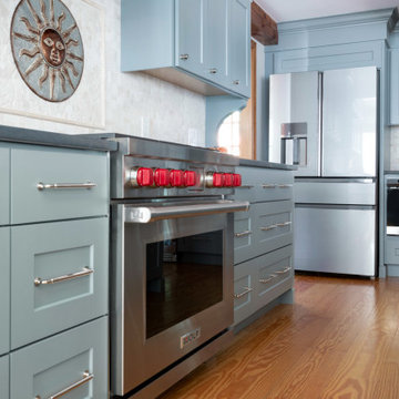
Our client adores their traditional layout and their traditional design style. But there were a few things that could be improved including flow and functionality in the kitchen - not to mention the cabinets, counters and appliances that had seen better days. The family room was used heavily for movie viewing, but it did not have a great set-up for the TV and was seriously lacking in the audio department. Their garage entry had become the primary way into the home for the homeowners, however it did not offer the welcoming feeling they wanted to have after a long day.
THE SOLUTION
To create better flow, we shifted the entry from the mud hall down a bit which gave us the space to add another run of cabinetry and relocate the fridge. We closed up the former dining room wall and converted it into a new office space as both homeowners work from home. Due to the shift in the entry from the mud hall, we also were able to then center the island to where it should be in the room creating some much needed balance.
Because we were not creating an open floor plan and removing walls and such, there was more budget for high ticket finishes. One of which was a 11’ custom walnut countertop for the island which became the anchoring design element for the kitchen along with custom cabinetry and high-end appliances.
 Bilotta Kitchen & Home
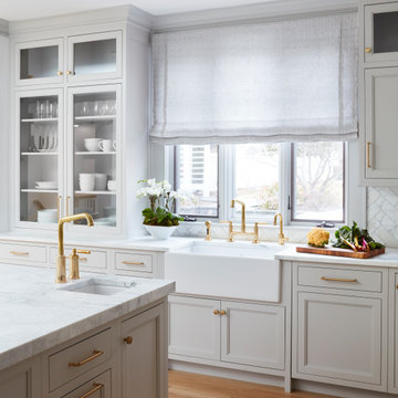
Traditional design is tempered for today’s lifestyle in this stunning kitchen. Custom Bilotta cabinetry with 1” doors exudes elegance with its flush inset construction and a clean-lined stepped Shaker door. “Repose Gray” by Sherwin Williams departs from omnipresent white, yet still maintains a bright ambiance, which is reinforced by natural while oak flooring.
A furniture appearance is accomplished by extending some base cabinet stiles into delicate legs. Tapered legs on the island create a “table” for casual meals. Appliances and the hood vent are paneled for a cohesive image. Taking the cabinets to the ceiling maximizes space. The range area has glass upper sections, while the countertop cabinet to the left of the window becomes a glass-fronted hutch. Emphasizing the kitchen’s traditional roots are an apron-front sink, marble countertops, and herringbone marble backsplashes.
Though the room isn’t massive, it packs a lot of function. There’s space for a 48” range, a prep sink, and even refrigerator drawers adjacent to the stools. A contemporary glass and walnut table anchors the breakfast area, which includes a planning desk with white oak floating shelves. Brushed brass hardware, plumbing fixtures, stool bases and lighting bring an up-to-date touch with their modern finishes and forms.
This kitchen was done in collaboration with lulu HOME. Photography by Paul Johnson Photography.
90