
Search results for "Depression" in Home Design Ideas
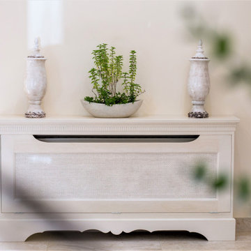
 Sofia Suri Design Office
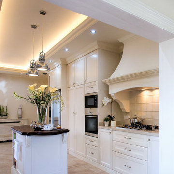
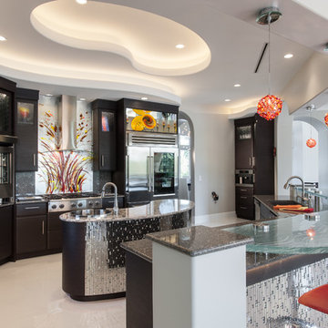
A depressing dark wooden kitchen gets a major face lift! As you can see from the before pictures, the kitchen was quite dark. Even during the daytime the lady of the house had to turn on the lights to work there. An exterior pergola on a much lower level prevented light from coming in the house and though the pergola was a favourite spot to seat in the summer the humidity in the air made it unbearable and the access to it was not very practical. So in essence the family had no real seating room either. My goal... to create a functional kitchen filled with light and an adjacent seating area. My challenges...the pergola was very low and, not enough space for a seating room...... So.....I came up with something I have never done before nor did I think possible. Using specialised equipment I lifted the existing pergola up all in one piece, without breaking it apart, then I raised the floor covered by the pergola to the level of the house and made an opening from the house to the pergola...Mission accomplished! Lots of light now coming in and more than enough space for the family seating area
 Kitchen Design Services
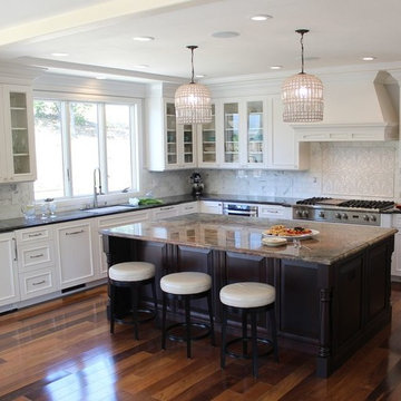
Large elegant u-shaped medium tone wood floor eat-in kitchen photo in San Francisco with an undermount sink, recessed-panel cabinets, white cabinets, granite countertops, white backsplash, stone tile backsplash, stainless steel appliances and an island
Find the right local pro for your project

 Dezinerwallz
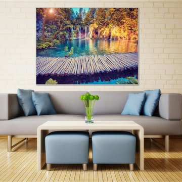
While a great deal of the research that has been conducted to measure the physical and emotional benefits of incorporating biophilic design elements as part of the interior design of a space has been done in the healthcare environment , and to a lesser degree, in the corporate environment, it is completely reasonable to assume that the extraordinary benefits that are experienced by patients, doctors, nurses and support staff working in the healthcare environment, as well as by employees working in a corporate environment will extend to families that introduce biophilic design elements into their own personal spaces.
Click on the next picture to continue reading………..
 Sofia Suri Design Office
A depressing dark wooden kitchen gets a major face lift! As you can see from the before pictures, the kitchen was quite dark. Even during the daytime the lady of the house had to turn on the lights to work there. An exterior pergola on a much lower level prevented light from coming in the house and though the pergola was a favourite spot to seat in the summer the humidity in the air made it unbearable and the access to it was not very practical. So in essence the family had no real seating room either. My goal... to create a functional kitchen filled with light and an adjacent seating area. My challenges...the pergola was very low and, not enough space for a seating room...... So.....I came up with something I have never done before nor did I think possible. Using specialised equipment I lifted the existing pergola up all in one piece, without breaking it apart, then I raised the floor covered by the pergola to the level of the house and made an opening from the house to the pergola...Mission accomplished! Lots of light now coming in and more than enough space for the family seating area
 Just the Thing Decorating, Staging, and Windows
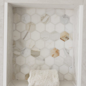
This 1980's home had a dark and depressing master bath. Now it s bursting with light and character!
Inspiration for a large transitional master beige tile and porcelain tile porcelain tile, beige floor and double-sink bathroom remodel in Dallas with recessed-panel cabinets, beige cabinets, a one-piece toilet, green walls, an undermount sink, quartz countertops, a hinged shower door, white countertops and a built-in vanity
Inspiration for a large transitional master beige tile and porcelain tile porcelain tile, beige floor and double-sink bathroom remodel in Dallas with recessed-panel cabinets, beige cabinets, a one-piece toilet, green walls, an undermount sink, quartz countertops, a hinged shower door, white countertops and a built-in vanity
 Britto Charette LLC - NYC Interiors
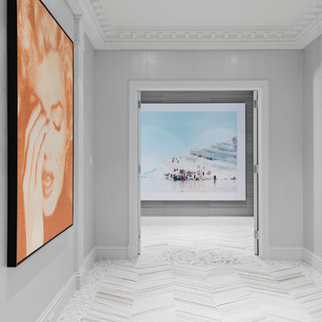
A classic pre-depression residence in the heart of Montreal is updated by removing the servants quarters and a redundant service stair to create a stunning contemporary interior to showcase the clients artwork and focus on family.
David Giral Photography
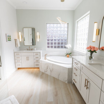 Just the Thing Decorating, Staging, and Windows
This 1980's home had a dark and depressing master bath. Now it s bursting with light and character!
Large transitional master beige tile and porcelain tile porcelain tile, beige floor and double-sink bathroom photo in Dallas with recessed-panel cabinets, beige cabinets, a one-piece toilet, green walls, an undermount sink, quartz countertops, a hinged shower door, white countertops and a built-in vanity
Large transitional master beige tile and porcelain tile porcelain tile, beige floor and double-sink bathroom photo in Dallas with recessed-panel cabinets, beige cabinets, a one-piece toilet, green walls, an undermount sink, quartz countertops, a hinged shower door, white countertops and a built-in vanity
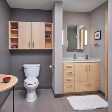
 Birch+Oak Construction
Reprioritizing & reconfiguring spaces to update master bath and create guest accommodations.
Project Details:
These homeowners loved the light, the views, and the compactness of their condo unit. The dining space could accommodate the whole family, they had private areas for quiet reading time, and they loved the location, the building and the community. They definitely did not want to leave.
However, the wasted space in the guest bath, the dark, depressing, heavy-feeling in the master bath and the lack of closet space for guests were all problems for them. They wanted a brighter, more inviting bathroom with more functionality and storage, better accommodations for guests, and the tv room to become a comfortable place to relax and actually enjoy the incredible view they had. The unit was designed specifically for the needs of the previous owner, but they needed their home to fit their own needs and lifestyle.
Our team helped this couple create the bright master bath they wanted, complete with additional functionality and storage options. The guest bath and sitting room were also both reconfigured. The guest bath was reworked to become smaller - but more functional, and the sitting room was expanded to become a fully-functioning guest room.
The reprioritization and reworking of spaces in this unit is a great example of working within an existing framework to create rooms that better fit the needs and wants of a homeowner. The new spaces are a much better fit for the lifestyle and aesthetic of this couple, while mimicking the warmth and welcoming feel of the existing spaces they already enjoyed. They are now able to fully take advantage of the views in all living areas of the unit and can easily accommodate guests in comfort whenever they desire.
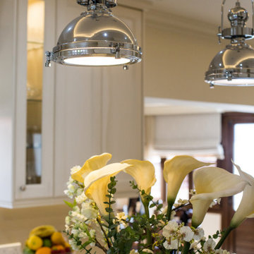 Sofia Suri Design Office
A depressing dark wooden kitchen gets a major face lift! As you can see from the before pictures, the kitchen was quite dark. Even during the daytime the lady of the house had to turn on the lights to work there. An exterior pergola on a much lower level prevented light from coming in the house and though the pergola was a favourite spot to seat in the summer the humidity in the air made it unbearable and the access to it was not very practical. So in essence the family had no real seating room either. My goal... to create a functional kitchen filled with light and an adjacent seating area. My challenges...the pergola was very low and, not enough space for a seating room...... So.....I came up with something I have never done before nor did I think possible. Using specialised equipment I lifted the existing pergola up all in one piece, without breaking it apart, then I raised the floor covered by the pergola to the level of the house and made an opening from the house to the pergola...Mission accomplished! Lots of light now coming in and more than enough space for the family seating area
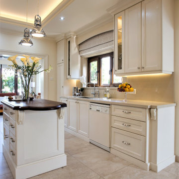 Sofia Suri Design Office
A depressing dark wooden kitchen gets a major face lift! As you can see from the before pictures, the kitchen was quite dark. Even during the daytime the lady of the house had to turn on the lights to work there. An exterior pergola on a much lower level prevented light from coming in the house and though the pergola was a favourite spot to seat in the summer the humidity in the air made it unbearable and the access to it was not very practical. So in essence the family had no real seating room either. My goal... to create a functional kitchen filled with light and an adjacent seating area. My challenges...the pergola was very low and, not enough space for a seating room...... So.....I came up with something I have never done before nor did I think possible. Using specialised equipment I lifted the existing pergola up all in one piece, without breaking it apart, then I raised the floor covered by the pergola to the level of the house and made an opening from the house to the pergola...Mission accomplished! Lots of light now coming in and more than enough space for the family seating area

 Dezinerwallz
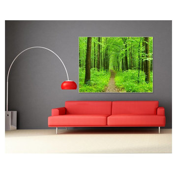
WHAT TO LOOK FOR WHEN LOOKING FOR BIOPHILIC WALL ART
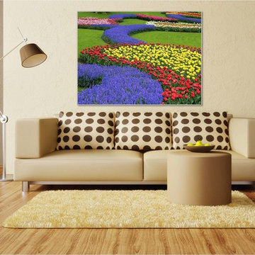
While you’ll never go wrong by choosing nature-based images, there are particular scenes, colors and styles that will produce the greatest biophilic impact in your space.
First and foremost, realistic photographic images of nature or nature scenes tend to produce the most robust biophilic benefits. Realistic scenes stimulate a person’s imagination in a gentle and comforting way, allowing his or her mind to calmly wander through a familiar view. When people look at photographs, they think to themselves, “I’ve never been there before but I know that this is a place that exists and I want to go there”.
 Just the Thing Decorating, Staging, and Windows
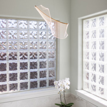
This 1980's home had a dark and depressing master bath. Now it s bursting with light and character!
Large transitional master beige tile and porcelain tile porcelain tile, beige floor and double-sink bathroom photo in Dallas with recessed-panel cabinets, beige cabinets, a one-piece toilet, green walls, an undermount sink, quartz countertops, a hinged shower door, white countertops and a built-in vanity
Large transitional master beige tile and porcelain tile porcelain tile, beige floor and double-sink bathroom photo in Dallas with recessed-panel cabinets, beige cabinets, a one-piece toilet, green walls, an undermount sink, quartz countertops, a hinged shower door, white countertops and a built-in vanity

 Sweet Smiling Landscape Design
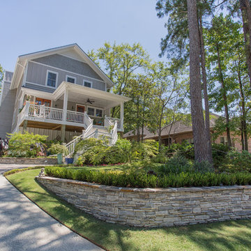
When I came to this property not only was the landscape a scrappy mess the property also had some very real grading and drainage issues that were jeopardizing the safety of this house. As recent transplants from New Jerseys to Southern California these clients were in awe of all the plants they were seeing in their neighborhood. Living on the water at the Ventura harbor they wanted to be able to take full advantage or the outdoor lifestyle and cool ocean breeze. Being environmentally conscious citizens, these clients were very concerned that their garden was designed with sustainability as a leading factor. As they said in our initial consultation, “Would want or garden be part of the solution not part of the problem.”
This property is the last house on the bottom of a gently sloping street. All the water from the neighbor’s houses drain onto this property. When I came into this project the back yard sloped into the house. When it would rain the water would pool up against the house causing water damage. To address the drainage we employed several tactics. Firstly, we had to invert the slope in the back yard so that water would not pool against the house. We created a very minor slope going away from the house so that water drains away but so the patio area feels flat.
The back of the back yard had an existing retaining wall made out of shabby looking slump stone. In front of that retaining wall we created a beautiful natural stone retaining wall. This retain wall severs many purposes. One it works as a place to put some of the soil removed from the grading giving this project a smaller carbon foot print (moving soil of a site burns a lot of fossil fuel). The retaining wall also helps obscure the shabby existing retaining wall and allows for planting space above the footing from the existing retaining wall. The soil behind the ne retaining wall is slightly lower than the top of the wall so that when the run on water on from the neighbor’s property flows it is slowed down and absorbed before it has a chance to get near the house. Finally, the wall is at a height designed to serve as overflow seating as these clients intend to have occasional large parties and gatherings.
Other efforts made to help keep the house safe and dry are that we used permeable paving. With the hardscape being comprised of flag stone with gravel in-between water has a chance to soak into the ground so it does not flow into spots where it will pool up.
The final element to help keep the house dry is the addition of infiltration swales. Infiltration swales are depressions in the landscape that capture rain water. The down spouts on the sides of the houses are connected to pipe that goes under the ground and conveys the water to the swales. In this project it helps move rain water away from the house. In general, these Infiltration swales are a powerful element in creating sustainable landscapes. These swales capture pollutants that accumulate on the roof and in the landscape. Biology in the soil in the swales can break down these pollutants. When run of watered is not captured by soil on a property the dirty water flows into water ways and then the ocean were the biology that breaks down the pollutants is not as prolific. This is particularly important in this project as it drains directly into the harbor. The water that is absorbed in to the swales can replenish aquafers as well as increasing the water available to the plants planted in that area recusing the amount of water that is needed from irrigation.
When it came to the planting we went with a California friendly tropical theme. Using lots of succulents and plants with colorful foliage we created vibrant lush landscape that will have year around color. We planted densely (the images in the picture were taken only a month after installation). Taller drought tolerant plants to help regulate the temperature and loss of water from the plants below them. The dense plantings will help keep the garden, the house and even the neighborhood cooler on hot days, will provide spaces for birds to enjoy and will create an illusion of depth in a somewhat narrow space.
Today this garden is a space these homeowners can fully enjoy while having the peace of mind that their house is protected from flooding and they are helping the environment.
 Masa Studio Architects
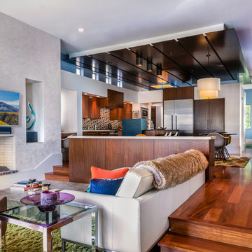
As the primary public level, the second floor consists of the living room, kitchen, breakfast, and formal dining spaces. In order to maximize the spatial relationship between the rooms on the main level and the first floor, the living room floor is depressed two feet -- achieved because of the location of the garage below. [photo by : emoMedia]
 TVL Creative Ltd.
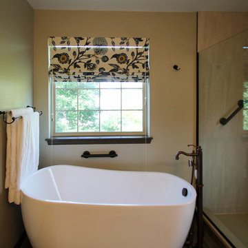
This remodel took a dated and cramped bathroom and transformed it into a classy oasis for our Lowry clients. The clients had a limited budget and wanted to leave the space as in-place as possible. However, the large drop in tub ate valuable floor space and a half wall between the shower and tub had become a holding place for random items without a home. The thick frame on the shower glass made the shower feel extremely small, and the dated lighting and fixtures further depressed the space. We proposed a traditional and elegant design that consider the client's budgetary and spatial constraints. We removed the existing drop-in tub and replaced it with a lovely free-standing soaker. The length of this tub is short, but the depth is exaggerated, making it an ideal replacement in this tiny footprint. The shower glass was swapped for framless glass that boldly expands space. We tore out the existing carpet and installed gorgeous wood-look tile that adds depth and warmth to the room. The clients opted to keep their existing vanity to save cost, so a new top was added to bring the aesthetic up to the level of the new additions. The wall paint was taken from a buttery yellow to a soft gray-green, accented by a darker version of this same color on the siding barn door and toilet room door. New vanity lights, faucets, and storage shelves were installed to help our clients organize and keep things off the counter tops. Finally, new custom up-down window shades were curated for the bathroom to add to the final touch. This space is a simple scope with a dramatic transformation that introduces a timeless look for years to come.

 Rain Garden Nursery LandscapeMakeoverDesignStaging
Scott & Catherine Buley, HTT&T, High Tech Turf & Trees, LandscapeMakeover.biz, Rain Garden Nursery. As a matter of fact, these protected seed pockets also hold fertilizer, water and soil amendments, reducing concern about irrigation or wind, traffic etc., disturbing the seed or seedlings. By taking one pass at around 4" deep, we bring up perfect aeration plugs, that are further broken up into topdressing when we take a final pass or two, at just 1/2" depth. All the surface depressions are then roughly 1/2" deep, with loosened soft soil and amendments to start the new seedlings. Very few aerators on the market will do this with perfectly vertical "un-crushable" seed pockets. Our aerators weight 1000 lbs. and up, but distribute weight to the tines only, as they have large suspending rollers. Their tines work perfectly vertically, something rental machines inherently can't do. Others place "leaning" plug holes, that crush down sideways under pressure, reducing ultimate seedling survival. We've found and use the largest diameter tines, to create plug pockets capable of growing seedlings for maximum early coverage and survival.
 Division 9 Inc.
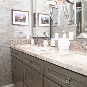
The guest bathroom plays an important role on how your guests will perceive the architecture and style of your home. In this house we totally transformed the outdated bathroom. In collaboration with Roberto Lugo a daring designer from New York, the design process was focused on creating a contemporary space that could be elegant and comfortable.
The initial renovation on this project started with the demolition of entire bathroom including doors, vanity, floor, plumbing and light fixture, toilet, tub, tile switches and outlet. An existing wall between toilet/shower room and vanity room was also removed. The existing door frame was expanded to 27" wide (interior) and the existing floor was inspected to determine a depression on the vanity side.
The existing door frame was converted into a pocket door frame (door opens to the right). To accommodate for standard crown molding the ceiling above the shower was dropped 4".
For the vanity, a furniture-like cabinet style with soft close hardware was installed. The grain stain was paired perfectly with a gray marble countertop.
The shower turned out beautifully. A Shower/Bathtub combination with a sliding door was installed. Porcelain tile was installed vertically on the returns walls, glass mosaic for the long walls, glass mosaic was also used along leading edge of tub enclosure. Porcelain tile was used on the floor.
16